RSS
 

Archive for September, 2014

How to use Program Mode to set Your ISO

07 Sep

When I’m teaching my photography classes, the students and I are often neck deep into discussions of the exposure triangle; shutter speed, aperture size and sensor sensitivity (ISO). You can find great discussions and explanations of the triangle here on the dPS. I’d like to dissect the ISO corner of the issue, and give you a simple technique you can use to set the ISO to the best value for the situation. Understanding ISO is one thing but setting it correctly on the fly is another.

Exposure triangle

An equilateral triangle represents a well-exposed image. If any corner is too long, (slower shutter speed for example) the image would be brighter. If the corner is short, the image would be darker.

First a definition of ISO:

ISO is an acronym for International Organization for Standardization. It is a group that sets all sorts of standards for science and industry, but the meaning of ISO for photographers with digital cameras, is that it places a numerical value on the sensitivity of the camera’s imaging component, the sensor. Often compared to the film sensitivity rating called ASA (originally developed by the American Standards Association).

ISO is often seen as numbers ranging from 100 to 6400 and higher. The lowest number your camera presents is the lowest sensitivity setting; the highest number is the most sensitive. So, you can use the ISO settings to help you shoot in a variety of situations; bright and dark. Often you are taught to boost the ISO when conditions get dark but the opposite might be true depending upon your intent.

You are also told that high ISO settings degrade the quality of the image in the form of digital noise. Noise is a visual distortion of specks of light. Some is colored, and some just looks grainy. It is a similar look to the grain we would see in film negatives of higher ASA’s. Noise is worse in the shadows and appears more with higher ISO settings. This is true but the degradation of the image is gradual, and you can sometimes use ISO numbers that are quite high and get great, usable images.

ISO setting in menu

Select ISO sensitivity in the menu, via the Info screen, or sometimes with a dedicated button.

You probably came to understand the concept of ISO as part of the exposure triangle, and then immediately asked, “What ISO should I set?” Hmmm, something is missing in the explanation!

Here are some tips for setting ISO:

First for tripod shooting, set your ISO to the lowest (thus highest quality) setting. There won’t be any camera shake if you practice good technique and your images will have the highest quality. This will hold true unless you need a shorter shutter speed for other reasons. If that is true, keep reading and use the handheld technique.

When shooting handheld, you need to balance the quality you are getting with the ISO setting versus the shutter speed that you can use to get a sharp shot, with no camera movement. For example, if you have your ISO at 100 and you need 1/10th of a second to expose the shot properly, you are going to have some camera movement, and your image will not be sharp.

Follow these steps:

  1. Make sure your camera is not set to Auto ISO.
  2. Set your camera’s exposure mode to Program (not Auto). Even if you need Shutter or Aperture Priority, set it to Program first.
  3. Next, note your present ISO setting.
  4. Now half press the shutter button to wake it up and point it around your shooting environment. Try several different directions. Maybe you are in a restaurant; point it at the tables, at a group of people, down the bar, etc.
  5. All the while, watch your camera’s information display. You can look through the viewfinder for the information, or turn on your INFO display on the back LCD display. As the camera’s meter evaluates all the different shots it will adjust the shutter speed. Program tries to keep both aperture and shutter settings in the normal ranges. Take mental note of those shutter speeds.
    ISO on Info screen

    Here the shutter speed is showing 1/3rd of a second. This is way too slow for handheld photography.

    Shutter apeture in viewfinder

    1/2 of a second shutter time as seen through the viewfinder.

  6. Your camera will go sleep in a few seconds if you don’t wake it up occasionally by half-pressing the shutter button. Let it focus, as that will give you a more accurate reading.
  7. If you are seeing shutter speeds that are slower than 1/60th or 1/80th of a second, then the ISO needs to be bumped to a higher number. Most people cannot hand hold a camera, and obtain sharp photos, at longer than 1/60th of a second. You need good solid technique to do hand hold at those speeds. NOTE: 1/60th is being used here as a typical situation that includes a lens with up to 55mm of zoom. If you are going to zoom further, see the note below on focal lengths.
  8. If your shutter speeds are really fast, (1/1000th or 1/2000th) then you can safely drop the ISO to a higher quality setting (lower ISO number).
  9. Keep repeating the above steps until you see shutter speeds that you are comfortable with using, for the image you intend to make. Now you have your ISO set correctly for handheld photography in your current location, lighting conditions, and focal length.
Camera shake example

An example of camera shake. Note the exposure information. This was taken with the lens zoomed to 62mm (93mm equivalent on a cropped sensor). 1/160th of a second would have been better, which I could have gotten with an ISO of 400 rather than 200.

Focal length makes a difference

The focal length of your lens makes a difference as well. The directions above assume you are using a lens that is typical to entry-level DSLR setups. For example the typical kit lens is a 18-55mm zoom. If you are using a longer zoom, say 200mm, then the slowest shutter speed you can hand hold is much shorter. The widely accepted rule states: one over the focal length (so 1/200th of a second in the above mentioned situation) is the longest shutter speed that you can hand hold for a sharp, no-shake image.

However, this is an old rule that was based on 35mm film (and it applies to full frame digital sensor cameras). Many digital cameras have a crop factor, or multiplier effect, for focal length because their sensor is smaller. Yours might be 1.5x, 1.6x or even 2.0x – check your camera’s manual to be sure. Assuming a 1.5x multiplier for a 200mm zoom shot, you would need 1.5 x 200 = 300, so 1/300th of a second is your slowest shutter speed for an image that has no camera shake blur.

What about Shutter and Aperture Priority?

At this point you may be thinking that you actually need Shutter or Aperture priority – that is fine. But now you know the ISO range that will work. Perhaps ISO 400 was where you ended up, and the meter was telling you that the shutter speed of 1/200 was going to work. Now you can switch to the mode you want. Let’s say you need Shutter priority to stop some subject movement. Set your camera to Shutter priority, let’s say a shutter speed of 1/400th of a second, and repeat the process of aiming at some possible compositions. If your camera starts blinking the aperture, you will know your setting is out of range. It is telling you the aperture cannot be opened any wider, so you’ll know you need to increase the ISO to use that shutter speed.

For Aperture priority, set the aperture you need for a desired depth of field and use the camera’s meter to evaluate the scenes as described above. If the shutter speed starts goes below your maximum for the lens you’ll know your settings are out of range. Then you will need to bump up the ISO.

What about Vibration Reduction?

Sometimes called Image Stabilization, this is technology that might be built into your lens or camera. It can allow you to shoot at speeds longer than normally recommended, since it counteracts the movement you introduce into the camera. Take the marketing information about how many stops longer you can shoot with a grain of salt. Do your own tests with your equipment, with your best steady technique. I find that most people can learn to get two extra stops of shutter speed latitude. So, in our scenarios above you could shoot at 1/15th and 1/50th of a second respectively.

VR button

Vibration Reduction switch on a Nikon lens.

Try this process for a while with the Program mode to get comfortable, then you can use all of the exposure modes to set your ISO quickly and correctly. As your experience grows you will set your ISO quickly with intelligent estimates. You will never have to guess about your ISO again.

No camera shake

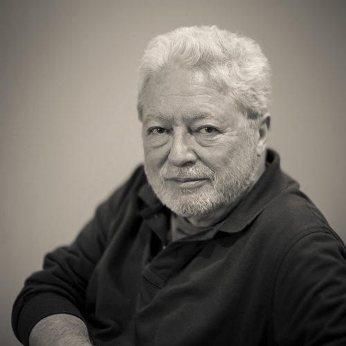
A higher ISO (3200) made little difference in quality here. The shutter speed of 1/250th assured a no-shake image and was fast enough to stop any subject motion.

The post How to use Program Mode to set Your ISO by Steve Gandy appeared first on Digital Photography School.


Digital Photography School

 
Comments Off on How to use Program Mode to set Your ISO

Posted in Photography


6 September, 2014 – Join Michael In Antarctica

07 Sep


This January and February Luminous-Landscape is once again traveling to Antarctica. This is a trip of a lifetime.  If you are a passionate photographer of nature and landscapes then this is a once in a lifetime trip.  This is a fly over the Drake Passage which avoids 5 days of sailing in some of the roughest seas in the world. We have assembled without a doubt one of the best line-ups of instructors for a workshop  – ever.  Now we are adding Michael Reichmann to the list.  Michael, the founder of Luminous-Landscape and the Luminous-Endowment will be joining us for both trips.  

I’m thrilled that Michael can join us.  If you have ever wanted to be part of one of Michael’s workshop then this is the one. With Michael’s involvement with The Endowment now it is hard for him to find the time to do workshops like this.  We have only a few spots left on each trip.  It’s not too late to be part of an amazing adventure with some amazing photographers and world class instructors.

Kevin Raber, CEO & Publisher of Luminous-Landscape will be having a one man show at the Tarkington Gallery in Indianapolis opening on Friday, September 12, 2014.  The Gallery is located at 4000 N. Meridian Street, Indianapolis, Indiana.  If you are in the area please joint Kevin for an opening reception from 5:30 – 7:30 PM on the evening of the 12th.  Kevin will be displaying a selection of large prints he has made from around the globe.  Any questions please EMAIL Kevin.


The Luminous Landscape – What’s New

 
Comments Off on 6 September, 2014 – Join Michael In Antarctica

Posted in News


Der morgendliche Blick aus dem Zelt

07 Sep

Wer reiselustig und abenteuerlich ist, der kennt es sicher. Morgens im Zelt aufwachen und erst einmal den grandiosen Ausblick genießen. Wenn ein Tag so anfängt, kann eigentlich nichts mehr schief gehen. Oleg Grigoryev hat in seiner Reiseserie genau diese Erinnerungen festgehalten. Er teilt mit uns seinen Blick aus dem Zelt hinaus auf beeidruckende Landschaften.

Die Bilder sind gerahmt von den Wänden seines Zeltes. Unten im Foto sieht man seine Beine, die immer auch verraten, wie das Wetter und die Anstrengungen der letzten Tage waren. Denn einmal trägt er dicke Hosen und feste Wanderschuhe, ein anderes Mal ist er barfuß und ein Verband schützt seine Füße. Jedes der Bilder weckt aber nach einer kleinen Pause, um die Landschaften zu genießen, den Wunsch schnell weiter auf Erkundung zu gehen oder direkt in den benachbarten See zu springen.

Blick aus einem zelt heraus auf eine wunderschöne Landschaft mit See und Bergen.

Blick aus einem Zelt heraus auf einen Berg.

Blick aus einem zelt heraus auf ein Gebirge.

Blick aus einem Zelt heraus auf einen See und Berge.

Blick aus einem Zelt heraus auf ein Gebirge.

Blick aus einem zelt heraus auf einen See und Berge.

Blick aus einem Zelt heraus auf einen See und Berge.

Blick aus einem Zelt heraus auf ein Gebirge.

Blick aus einem Zelt heraus auf Berge.

Oleg arbeitet als Rechtsanwalt und als Fotojournalist in der Wohltätigkeitsstiftung „Progress“. Als Rechtsanwalt bietet er kostenlose Rechtshilfe für mittellose Menschen, darunter auch viele Roma. Als Fotojournalist, erstellt er Foto-Essays zu sozialen Fragen über das Leben von sozial benachteiligten Personengruppen.

Das Reisen ist für Oleg eine Art professionelles Hobby geworden, besonders angezogen fühlt er sich von Bergen.

Von dort bringe ich Emotionen mit, die ich versuche in meinen Fotos auszudrücken, um Leute zum Reisen zu animieren und nicht zu angepasst zu sein.


kwerfeldein – Fotografie Magazin | Fotocommunity

 
Comments Off on Der morgendliche Blick aus dem Zelt

Posted in Equipment


Flexible Furniture: Mold this Seat into All Sorts of Shapes

07 Sep

[ By WebUrbanist in Design & Furniture & Decor. ]

the body modular seating

Sitting in a single position for long periods is not just uncomfortable but also a health hazard, but is the solution to be found in a single form or something more pliable and adaptable?

modular chair lying down

London designer Kirsi Enkovaara (images by Aava Anttinen) explores plasticity and comfort in this project titled The Body, a thesis work completed at the Royal College of Art.

the body chair design

The idea is in part to avoid presuppositions about ‘best ways’ to sit or lie down, letting a user bend and twist their furniture into shapes suitable for different activities and allowing for various positions of rest.

modular moldable furniture london

The structure itself is composed of canvass and filled with rice, giving it the right combination of flexibility and rigidity to support a person while also allowing it to be reshaped on demand.

modular seat design curve

From the designer: ‘The Body’ encourages a person to find their choice of sitting by discarding learned cultural norms. Trusting in their touch, movement and the feelings that arise in reaction to these in order to create the most comfortable way of sitting. The structure of ‘The Body’ is made from canvas and rice allowing it to be formed into reconfigurable rigid structures.

modular comfortable seat exploration

“The project started from an interest in emphasizing the psychology of sitting. When we are sitting or laying down we are less aware of our surroundings and in a more relaxed state. This is why the construction of the seat needed to reflect the qualities of human touch, the tactility and safety of which provides us with great comfort.” Many of her other works, both of art and design (or somewhere in between), likewise explore different relationships between ourselves and everyday objects.

Share on Facebook


[ By WebUrbanist in Design & Furniture & Decor. ]

[ WebUrbanist | Archives | Galleries | Privacy | TOS ]


WebUrbanist

 
Comments Off on Flexible Furniture: Mold this Seat into All Sorts of Shapes

Posted in Creativity


6. September 2014

06 Sep

Ein Beitrag von: Max Hazlewood

Weißer Hirsch


kwerfeldein – Fotografie Magazin | Fotocommunity

 
Comments Off on 6. September 2014

Posted in Equipment


Die Gewinnerin unserer Wacom-Aktion

06 Sep

Ein Beitrag von: Charlotte Grimm

Am ersten Juli hatten wir zu einer großen Aktion gemeinsam mit Wacom aufgerufen. Für die Chance das Grafiktablett „Wacom Cintiq Companion“ zu gewinnen, solltet Ihr die Grenzen der Fotografie durchbrechen, kreativ werden und ein neues Projekt umsetzen.

Dass das Ganze sehr anspruchsvoll war, zeigte auch die geringe Beteiligung. Am Ende hatten wir nur sechs gültige Einreichungen, in die dafür aber sichtlich viel Arbeit und Leidenschaft hinein geflossen waren.

Wir freuen uns sehr, heute die Gewinnerserie „Satyros“ von Charlotte Grimm zu präsentieren. Sie hat mit ihrer herausragenden Arbeit eine Gesamtpunktzahl von 271 von 320 möglichen Punkten erreicht und darf sich nun über das tolle Wacom Cintiq Companion freuen.

Im Folgenden berichtet Euch Charlotte selbst von der Entstehung ihrer Serie, in der sie Fotografie, Malerei und Zeichnung miteinander verschmelzen ließ.

Drei Bilder auf der Staffelei voller Farbe.

Der Songtext (und seine Übersetzung) von Fauns „Satyros“, inspirierte mich maßgeblich zu dieser Serie. Das Stück gibt alten Mythen eine musikalische Form. Über Nymphen und Satyrn und ihre Bindung zueinander, gibt es viele Geschichten. Mich faszinieren in meinen Bilderwelten Mythen, Märchen und die Natur ganz besonders. Also lag es nicht fern, mich endlich an einer Umsetzung des Themas zu versuchen.

Es war klar, dass ich Gehörn und Ziegenbein nicht mit Tricksereien zaubern wollte. Durch meine Vergangenheit als Malerin – die Fotografie begleitet mich erst seit Anfang 2013 – sah ich in dem Thema eine hervorragende Chance, meine eingestaubte Staffelei wieder hervor zu holen und so meine beiden Leidenschaften miteinander zu verbinden.

Eine hervorragende Gelegenheit, zwei wundervolle, talentierte Modelle für meinen Plan zu finden, bot mir ein Flickr-Meetup mit 33 anderen Fotografen im Bayrischen Wald. Ich schleppte meine beiden Auserkorenen also am vorletzten Tag samt eines Töpfchens weißer Farbe und meines selbstgemachten Lendenschurzes in ein nahegelegenes Waldstück und führte sie, nachdem ich und sie begeistert mit der Farbe aufeinander herum gemalt hatten, in meine Ideen ein und bat sie, sich in die jeweiligen Rollen zu versetzen.

Bild auf der StaffeleiBild auf der Staffelei

Ich wollte nicht viele aktive Anweisungen machen, sondern die beiden möglichst natürlich miteinander interagieren lassen, sodass die gesamte Szenerie so ungestellt wie nur möglich wirkte. Glücklicherweise harmonierten Sam und Nikolas hervorragend miteinander, sodass mein Ausgangsmaterial bereits vielversprechend war.

Mein nächster Schritt bestand darin, die Bilder in annehmbarer Größe drucken zu lassen, um manuell auf ihnen arbeiten zu können. Aus Geldgründen überlegte ich zunächst, schlichtes mattes Fotopapier zu wählen. Nach einem Test auf kleineren Abzügen war ich dann allerdings schnell der Meinung, dass Hahnemühle-Papier doch deutlich besser dazu geeignet war, allein schon der Oberflächenstruktur und der größeren Formate wegen.

Ich bestellte mir also 30 x 40 Zentimeter große Drucke und verbrachte die Wartezeit damit, mir Gedanken darüber zu machen, welche Hornform ich meinem Satyr verpassen sollte, und wohin eigentlich meine Acrylfarben verschwunden waren.

Glücklicherweise hatte ich diese Probleme gelöst, als die Post mit meinen Drucken kam, und so konnte ich direkt anfangen – zunächst etwas planlos, indem ich mit grüner Acrylfarbe grobe Ideen skizzierte. Dieses Stadium der Kindergartenkrickelei kenne ich von früher noch zu Genüge. Egal, was ich jemals gemalt habe, am Anfang sah es immer aus, als wäre jemandem der Stift aus der Hand gefallen.

Foto mit grünen Farbflecken.

Dem Grün gesellten sich dann noch einige andere Farben hinzu, und so langsam wurde aus der ganzen Sache eine etwas klarer umrissene Idee. Ich arbeitete immer parallel an allen drei Bildern, um dadurch das Entstehen von größeren Farbunterschieden zu vermeiden.

Nach einer Weile fiel mir eher durch Zufall als geplant, ein Stück Kohle in die Hand, und da ich schon immer ein großer Fan von Kreiden und Kohlen und generell trockenen Zeichenmitteln zur Ergänzung der Malerei war, skizzierte ich wild drauf los und hatte mich schnell dazu entschieden, die Veteranen meiner übrig gebliebenen Pastellkreiden ebenfalls in den Bildern zu verewigen.

Nachdem ich die manuelle Bepinselung und Bekreidung für abgeschlossen befunden hatte, fotografierte ich die Bilder mit meiner DSLR ab, und setzte mich daran, den Endschliff an Kontrasten mit Lightroom zu verfeinern und außerdem das mittlere Bild in ein quadratisches Format zu setzen, weil ich fand, dass sich die Serie so als Tryptichon besser ansehen (und auch hängen) ließe.

Ein Mann als Satyr bemalt und eine Frau von erhöhter Perspektive aufgenommen.

Eine Frau mit tuch bekleidet streckt sich zu einem Satyr, der auf einer Erhöhung sitzt.

Wassernympfe und Satyr küssen sich.

Bewusst ließ ich an einigen Stellen unfertige Striche stehen, um so das Skizzenhafte zu bewahren, das Fabelhafte einer Begegnung aus dem Reich der Sagen und Legenden, eine Idee, ein flüchtiges Festhalten zu unterstreichen. Dem Satyr gab ich Ziegenbeine, Schwanz und Hörner.

Bei der Wassernymphe, der ich schon beim Shooting an sich zur behelfsmäßigen Illustration eines Baches ein langes Tuch umlegte, ergänzte ich auf dem zentralen Bild einen stilisierten Wasserlauf, der ihre Figur umschmeichelt und so ihre Herkunft kennzeichnet.

Mich hat allein die Möglichkeit sehr bereichert, dieses schon so lange geplante Vorhaben endlich – motiviert durch diesen Wettbewerb! – umsetzen zu können. Ich denke, ich werde künftig weitere Mischprojekte zwischen Fotografie und Malerei anstreben.


kwerfeldein – Fotografie Magazin | Fotocommunity

 
Comments Off on Die Gewinnerin unserer Wacom-Aktion

Posted in Equipment


Epson launches A3+ SC-P600 printer with ‘industry’s highest black density’

06 Sep

Epson has announced a new A3+ desktop inkjet printer aimed at the professional and semi-professional photographer that it claims is capable of producing a maximum black density of 2.8. According to Epson this beats all competitors’ A3+ machines that use 6 or more inks. The SureColor SC-P600 is part of Epson’s plan to introduce ten new professional printers to the market under the ‘Sure’ brand by 2016, and is the first SureColor model to be aimed at the photo market. Click through to read more.

Articles: Digital Photography Review (dpreview.com)

 
Comments Off on Epson launches A3+ SC-P600 printer with ‘industry’s highest black density’

Posted in Uncategorized


Western Digital launches My Passport Wireless hard drive with built-in SD card reader

06 Sep

Western Digital has launched a new wireless-enabled hard drive that uniquely features a built-in SD card reader. The My Passport Wireless might be coming to the market after other wireless options like the LaCie Fuel drive, but it’s the inclusion of the SD card reader that makes this product of particular interest to photographers. Read more

Articles: Digital Photography Review (dpreview.com)

 
Comments Off on Western Digital launches My Passport Wireless hard drive with built-in SD card reader

Posted in Uncategorized


Black and White Portraits a Set of Images to Admire

06 Sep

Last week we looked at a collection of stunning black and white landscape photos. This week it’s all about portraits in the same modality.

Photograph So close together by Magda Constantin on 500px

So close together by Magda Constantin on 500px

For me there is something special about a portrait done in black and white, something about it that allows the photographer to exposure the subject’s very soul itself. The simplistic nature of being monochromatic means the focus is on light, shape, tone and emotion more so than with color, in my opinion anyway.

Black and white portraits transport me to a time of the master photographers like Karsh, Hurrell and Newman. If you don’t know those names – I suggest you google them with the word “portrait” and learn from them, as they were truly some of the best in portrait photography, possibly ever.

Without further ado, enjoy this set of black and white portraits, and if you want to learn more about black and white grab a copy of the newest dPS ebook The Essential Guide to Black and White Photography at early bird pricing only until September 13th.

Photograph K. by pkfruen  on 500px

K. by pkfruen on 500px

Photograph Fête de la musique by Jean-Paul Verjus on 500px

Fête de la musique by Jean-Paul Verjus on 500px

Photograph Sister love by Cathy Martineau on 500px

Sister love by Cathy Martineau on 500px

Photograph Rain by pkfruen  on 500px

Rain by pkfruen on 500px

Photograph Soul-division by Anthony De Faria on 500px

Soul-division by Anthony De Faria on 500px

Photograph David Hayman, King Lear by Tommy Ga-Ken Wan on 500px

David Hayman, King Lear by Tommy Ga-Ken Wan on 500px

Photograph FIlm Noir: Chris Botti by Brian Smith on 500px

FIlm Noir: Chris Botti by Brian Smith on 500px

Photograph second wind ,,, by Mete Ba?koçak on 500px

second wind ,,, by Mete Ba?koçak on 500px

Photograph my life... by Leila Raymond on 500px

my life… by Leila Raymond on 500px

Photograph Untitled by Lee Jeffries on 500px

Untitled by Lee Jeffries on 500px

Photograph shootout by David Mar Quinto on 500px

shootout by David Mar Quinto on 500px

Photograph Mans Best Friend by Drew Hopper on 500px

Mans Best Friend by Drew Hopper on 500px

Photograph Serge. by DrakSpirit on 500px

Serge. by DrakSpirit on 500px

Photograph Symmetry of Hate by Daniele Di Egidio on 500px

Symmetry of Hate by Daniele Di Egidio on 500px

Photograph Close-up portrait of a street by Mikhail Levit on 500px

Close-up portrait of a street by Mikhail Levit on 500px

Photograph A portrait of friend in a kitchen setting by Mikhail Levit on 500px

A portrait of friend in a kitchen setting by Mikhail Levit on 500px

Photograph Smoking Hot by Darcy Evans on 500px

Smoking Hot by Darcy Evans on 500px

Photograph Jill by Renee Robyn on 500px

Jill by Renee Robyn on 500px

Photograph Eye & Face by Andi Halil on 500px

Eye & Face by Andi Halil on 500px

Photograph The breath by Claudio L'Estremo Montegriffo on 500px

The breath by Claudio L'Estremo Montegriffo on 500px

Photograph mr thomas by Hegel Jorge on 500px

mr thomas by Hegel Jorge on 500px

Photograph When the soul cries(The true story of a tough life) by Silvia S. on 500px

When the soul cries(The true story of a tough life) by Silvia S. on 500px

Photograph Danka B&W by Gabor Jonas on 500px

Danka B&W by Gabor Jonas on 500px

Photograph Sometimes there are no words... just the moment by J.J. Taylor on 500px

Sometimes there are no words… just the moment by J.J. Taylor on 500px

Photograph thoughts by Danilo Veccia on 500px

thoughts by Danilo Veccia on 500px

Photograph Elusive by Federico  Ratano on 500px

Elusive by Federico Ratano on 500px

Photograph girl's eyes by marylexa on 500px

girl's eyes by marylexa on 500px

Photograph vamos bien by Angelo Tassitano on 500px

vamos bien by Angelo Tassitano on 500px

Photograph Master Monk by Anthony Pond on 500px

Master Monk by Anthony Pond on 500px

Photograph In the Brick Shed by Anthony Pond on 500px

In the Brick Shed by Anthony Pond on 500px

Photograph Three Prayers by Anthony Pond on 500px

Three Prayers by Anthony Pond on 500px

The post Black and White Portraits a Set of Images to Admire by Darlene Hildebrandt appeared first on Digital Photography School.


Digital Photography School

 
Comments Off on Black and White Portraits a Set of Images to Admire

Posted in Photography


Infographics 101: Selfie Boom – The Good, The Bad, and the Ugly

06 Sep

Unless you’ve been hiding under a rock (or just never check social media), you’ve likely heard of, or even participated in, the selfie trend. Although the trend first started back in the MySpace days, things really took off when Apple released the front-facing camera on the iPhone 4 in 2010. Since then, elementary schoolers, teenagers, and young adults alike have Continue Reading

The post Infographics 101: Selfie Boom – The Good, The Bad, and the Ugly appeared first on Photodoto.


Photodoto

 
Comments Off on Infographics 101: Selfie Boom – The Good, The Bad, and the Ugly

Posted in Photography