
Using different composition techniques can result in more dynamic images
You have likely heard of the Rule of Thirds, in fact it seems as if this is the only rule of composition. To be fair though, the Rule of Thirds is a good go to tool when you are unsure of how to put a scene together compositionally. There are many other techniques that can be used to improve your composition. Techniques like balance, leading lines, symmetry, depth of field, and so on, can all make a big difference to your image.
In many ways a photograph is very similar to a painting. Photographers learned early on that composition is a key component to engage people in an image. Composition literally means to put together, so when you think about composing an image, you need to think about the visual elements that you will put together in your image.
As a photographer, you need to decide when to use certain techniques, and when not to use them. Most compositional techniques are simply guidelines, or frameworks, there are very few hard and fast rules. What they do offer is a starting point for putting an image together. Perhaps you may look at a scene and not know how to capture it. That is a good time to put some of the techniques into action and work the scene from there. They have been tried and tested by visual artists (painters, photographers and moviemakers) around the world for decades. The only constraint is don’t be dogmatic about applying them. Once you understand how to use the rules, you will then know how to break, and break out of them. By doing this, you will take your photographic creativity to a new level and your images will become that much better.
As always, with anything photographic, you need to experiment and practice. Know your equipment, experiment by shooting different scenes under different lighting conditions. Find what works for you and hone that skill. The art of composition is not a particularly technical art, but it can make an amazing difference to your images.

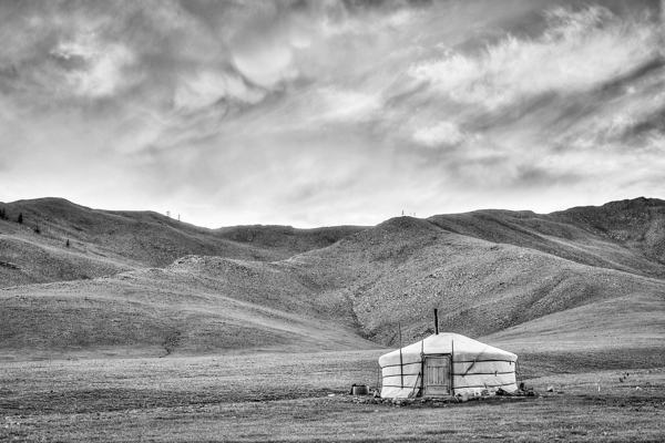
Good composition can make any subject interesting
The great thing about composition is that you don’t need specialist equipment. The most important pieces of equipment are your camera and your tripod. I know, I know, we all sigh when we hear about the tripod. Once you see how much easier your photographic life becomes with a tripod, you will not be so reluctant to carry it around. There are also better options for tripods nowadays (think Gorillapod and other travel-style ones). Remember though, a tripod is a key piece of equipment for successful composition. A tripod will help you to compose your image and keep that composition. Whenever possible, use a tripod to set up your shots, that way you can be sure that there is no movement when you photograph.
A lot of the time, you will be shooting images handheld. That is perfectly fine, and you can apply the compositional techniques to handheld shots. Sometimes you may need to take more than one image and adjust your composition to correct or change it.
Here are eight additional composition tips to help improve your images.

The yellow funicular and the blue house add an element of balance to this scene
1. Balance
Often when you place an image on one of the thirds, the rest of the frame may be left without much in the way of anything of interest. This is often referred to as negative space, not because it is bad, it is simply to point out that it is not the centre of interest. In some images, negative space can work well, but in other images there may need to be another object in the frame, or even a colour to balance the centre of interest. Photographers use this compositional tool to do exactly that, balance the centre of interest with another object.
2. Leading Lines
We look at an image in the same way that we read a page of words. In the western world that means we look at an image from left to right. Our eyes are naturally drawn into the image by lines. If you have a road or a river winding through your image, the viewers eye will automatically run along those lines. If your centre of interest is at the end of that river or road, that is a good way to compose the image. Sometimes it is enough to have the river or road meandering through the image as it makes the image interesting to look at.
The lines pull us into, and through the scene. The lines can be straight, diagonal, curving, zigzag, S – Shape and many other types. The important thing is to create as dynamic an entry point to an image if possible.

The numerous lines in this scene direct your eyes down the street
3. Symmetry and Patterns
We live in a world that is defined by symmetry and patterns. They are all around us in so many ways. There are natural patterns that are captivating to photograph and there are man-made objects that accentuate balance. It is very gratifying to photograph a perfectly uniform scene. The symmetry brings order to the scene and gives a sense of peace and harmony to your image. Sometimes it is good to break the symmetry, show it in a different way, and by doing so create a sense of tension.

A symmetrical doorway
4. Viewpoint

Kneel or lie down to get to the eye level of your subject
Changing your viewpoint when shooting a subject makes a huge difference to the visual impact. It is natural to shoot everything from your eye level. By doing that you tend to create images that have been seen before. By changing your viewpoint, you immediately give a different perspective on very familiar subjects. If you are taking photos of small children or pets and animals, try and get down to their eye level. This is a view that most adults won’t see very often and will make a big difference in the impact of your image. To change your viewpoint, try a few of these tips:
- Stand on a chair or ladder to get up higher than your subject
- Kneel or lie down to get underneath a subject, i.e. for shooting a field of flowers
- Photograph the subject directly from the top
- Shoot from a diagonal angle to emphasize shape or texture
The important thing here is to make sure that you change YOUR viewpoint and by doing that, you will breathe new life into a well known subject.
5. Background
A distracting background can completely ruin an image. The human eye will naturally settle on the area of an image that is: the brightest, most colorful, sharpest and has the most contrast. Be aware of what is behind your centre of interest. If there is a pole, a distracting pattern, an awkward colour or some other object, you may need to reconsider your shooting angle. This is not always possible, but sometimes, taking two or three steps to the left or right can make all the difference. Look around for an unobtrusive background, or change your aperture settings to achieve a shallow depth of field and by doing so, soften the background.

Move around your subject until the background is not distracting viewers from the subject
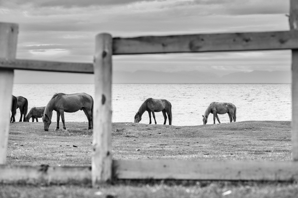
6. Depth
Photography is a two-dimensional art form. As a result, you use certain techniques to imply three-dimensionality. One way to do this is to have subject matter in the foreground, middle and background. This creates depth, and the eye will naturally walk through the image. This implies a deep depth of field from a technical point of view, so ensure that you use a smaller aperture (i.e. f/8, f/11 or f/16) making everything in the scene in focus. This technique is particularly important when photographing landscape images.

Sometimes, it is great to have a whole scene in focus
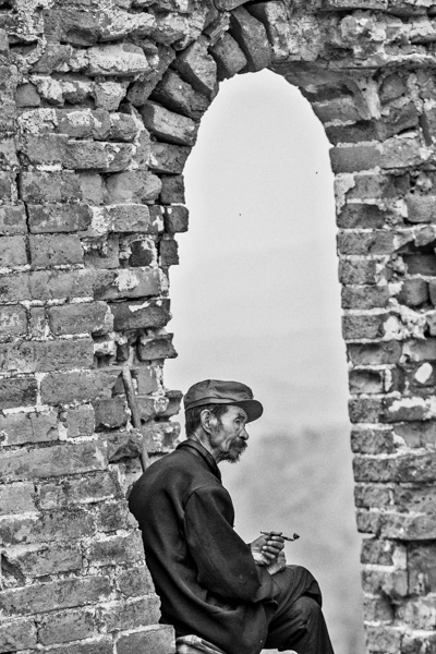
7. Framing
The world is full of natural objects that can be used to frame a subject (e.g., archways, tree lined streets, holes, and so on create natural frames). By placing your subject in the middle of these natural frames you will create a strong visual pull towards your centre of interest.

Use natural elements to frame your scene
8. Get in Tight

Sometimes, closer is better and less distracting.
It is often tempting to put more detail into a frame to show more about what was happening, but this can lead to confusion. The important maxim to remember is this: less is more. The art of simplifying an image is not easy, but if done correctly can make an image far more dramatic. When you find that your composition has more than one centre of interest, or seems confusing, try these steps:
- Get in as close as you can to your subject
- Simplify the composition
- Be sure to avoid any distracting colours or objects in the background
- Use a shallow depth of field
Finally
Composition and the rules around it are flexible. There really is no right or wrong way to compose an image, but there are better ways to do so. Some composition techniques can make a huge difference to an image and take it from being a snapshot to becoming a truly great photo. The important thing is to experiment with these techniques. Combine them wherever possible. Try them out as often as you can on different subject matter, and know when NOT to use them. The important part is to make sure that you master them. Use them when you need to. Find out what works for you and go from there. By doing this, not only will your images improve, so will your ability to see an image in a scene.
This is the most important part of photography and very often what separates an average photographer from a great photographer. The ability to see an image in a scene makes all the difference and these compositional techniques help you to do that.

Don’t forget to experiment and break the rules where necessary
The post 8 Quick Composition Tips to Help Improve Your Images by Barry J Brady appeared first on Digital Photography School.

Digital Photography School


 Tonality is easy to pick up right away if you are familiar with Lightroom or Photoshop RAW editing tools. The designers intentionally created an editing panel on the right hand side of your viewing window that looks almost exactly like Lightroom’s editing panel. It includes familiar tools like Exposure, Tone Curve, Split Toning, and Vignetting.


You must be logged in to post a comment.