RSS
 

Archive for August, 2014

browserFruits August, Ausgabe 3

17 Aug

Vielleicht ärgern sich jetzt leider einige von Euch, dass sie doch nicht mitgemacht haben: Wir haben genau sechs korrekte Einsendungen zum Wettbewerb „Kreativität entfesseln“ mit Wacom erhalten. (Drei weitere mussten wir leider wegen Formfehlern aussortieren.) Die Auswertung ist schon im Gange. Das Ergebnis werden wir Anfang September verkünden, dann hatten auch die zwei Redakteure, die im Moment noch ihren Urlaub genießen, Zeit zum Sichten und Bewerten.


Fotospecial: Vulkane

Flickr

500px


Deutschsprachig

• Ein interessantes Interview mit Kulturwissenschaftler Thomas Macho über Schönheitsideale und Unperfektheit.

• Der Stilpirat hat die Petzval-Linse von Lomography getestet und eine Art Hassliebe entwickelt.

• Mode ändert sich. Das wird besonders deutlich bei diesen USA-Touristenbildern aus den 80er Jahren.

• Zeitjung stellt „The Nu Project“ vor, das zeigen möchte, wie schön Frauen sind. Ohne Photoshop und mit alltäglichen Macken.

• Ihr seid reiselustig und voller Fernweh? Auf „Fernwehosophy“ gibt es jede Menge Reiseberichte geschmückt mit wunderschönen Bildern.

• „Freunde von Freunden“ hat Surf-Fotograf Dustin Humphrey getroffen, der einen kleinen Einblick in seine Arbeit und sein Leben gewährt.


International

• Lucy Hilmer fotografierte sich über 40 Jahre lang zu ihrem Geburtstag in weißer Unterhose. Eine schöne Serie über den Verlauf der Zeit, die Veränderungen des Körpers und ein tolles Geburtstagsritual.

• Lustig: Ein typisches Neugeborenenshooting ohne Neugeborenes. Dafür mit Hund.

• Mensch und Natur: Auf Stampsy veröffentlicht Elizabeth Gadd einige ihrer Bilder mit dem Titel „Breath“.

• Dudi Ben Simon aus Tel Aviv kombiniert alltägliche Dinge und schafft neue, lustige und erstaunliche Bilder.

• Brauchen kreative Menschen wirklich Unordnung und ist Chaos gut oder schlecht? Dieser Artikel versucht, den Fragen auf den Grund zu gehen.

• Jeder, der mit Programmen schon Panoramen erstellt hat, bekam sicher auch schon sehr verrückte Ergebnisse. Hier sind einige besonders absurde gesammelt.

• Wirklich atemberaubende Fotos von Landschafts- und Astrofotograf Nicholas Buer haben wir hier entdeckt.

• Martín De Pasquale hat einen Hang zum Absurden und erschafft Dank Fotomanipulationen verrückte Selbstportraits.


Neuerscheinungen und Tipps vom Foto-Büchermarkt

Buchtipps

• Viele der großen Stars aus den goldenen Jahren Hollywoods von etwa 1920 bis 1960 besaßen Hunde oder ließen sich aus Publicity-Gründen mit ihnen ablichten. Die Bilder des Bildbandes „Hollywood Dogs“* stammen aus der John Kobal Foundation und sind etwas für Fans von Hunden und Filmen.

• Ihr interessiert Euch für die Geschichte der Fotografie? Dann ist dieses Buch vielleicht etwas für Euch: „Neues Licht. Daguerre, Talbot und die Veröffentlichung der Fotografie im Jahr 1839“*. Es versammelt Texte und Diskurse zur frühen Fotografie.


Wettbewerbe

• Ein Wettbewerb für alle Kölner: Anlässlich des Kölner Fotografen Chargesheimer und seines letzten und berühmtesten Fotobuchs, „Köln 5 Uhr 30“, sollen menschenleere Bilder, die um 5:30 Uhr morgens in Köln aufgenommen wurden, eingereicht werden. Einsendeschluss ist bereits am Dienstag, den 19. August.


Zitat der Woche

My theory about creativity is that the more money one has, the more creative one can be.

Robert Mapplethorpe –

Mehr Zitate


Videos

Ein Making-of von Jan von Holleben.


Ihr wollt mit Film fotografieren und braucht noch Tipps? Hier gibt es schöne Videos, erklärt von einem Fotografen.


* Das ist ein Affiliate-Link zu Amazon. Wenn Ihr darüber etwas bestellt, erhält kwerfeldein eine kleine Provision, Ihr bezahlt aber keinen Cent mehr.


kwerfeldein – Fotografie Magazin | Fotocommunity

 
Comments Off on browserFruits August, Ausgabe 3

Posted in Equipment


A Quick Video with 7 Tips to Create More Powerful Images

17 Aug

In this short tutorial photographer Josh Cripps shares with you 7 tips to help you create more powerful images right now. You don’t have to buy any more gear, or take any classes. Put these tips into practice and get out there shooting.

So are you getting close enough to your subjects? How about composition? Do you create depth in your images? Are you practiced in the art of using leading lines? All your shots from eye level – why not change up the perspective a bit? How about using the light to your advantage?

That’s a quick summary of the tips in this video. Watch the whole thing to see some great image examples for each one. If you need ideas of what to shoot you can always check out the weekly photography challenge, this week it’s Blue. To see the current challenge you can always fine it in the right hand sidebar next to this article.

The post A Quick Video with 7 Tips to Create More Powerful Images by Darlene Hildebrandt appeared first on Digital Photography School.


Digital Photography School

 
Comments Off on A Quick Video with 7 Tips to Create More Powerful Images

Posted in Photography


Abseits touristischer Faszination

17 Aug

Ein Beitrag von: Tilman Haerdle

Juri Gottschall ist ein Fotograf aus München, der neben seiner journalistischen Tätigkeit für verschiedene Magazine ein sehenswertes Portfolio freier Arbeiten vorweisen kann. kwerfeldein-Gastautor Tilman Haerdle traf ihn in seinem Lieblingscafé.

Der Anruf kommt kurz vor eins. Um halb zwei würde es zeitlich für ein Gespräch passen. Juri Gottschall ist gut beschäftigt und so nutze ich die sich kurzfristig bietende Gelegenheit für ein Treffen mit ihm, um über seine Fotografie zu sprechen.

Am vereinbarten Treffpunkt angekommen, suche ich mir einen Tisch im Schatten, im Innenhof der Glyptothek am Münchner Königsplatz. Juri trifft kurz nach mir ein, er hatte dieses Café vorgeschlagen, ein schöner und stiller Ort, fast wie das Atrium eines römischen Hauses, mit altem Baumbestand, der in der Hitze willkommenen Schatten spendet.

Ein fast leerer Parkplatz.

Ein moderner Flur.

Juri Gottschall ist Fotograf, er arbeitet freiberuflich, häufig für die Süddeutsche Zeitung, unter anderem für das Jugendmagazin jetzt.de. Thema unseres Gesprächs ist nicht seine Arbeit als Journalist, sondern seine Projekte, die er als freischaffender Fotograf realisiert. Natürlich die Frage, wie er zur Fotografie kam.

Der Vater Fotograf, die Mutter Journalistin, da scheint der Weg vorbestimmt. Tatsächlich stellte er sich schon früh hinter die Kamera, experimentierte in der Dunkelkammer, lieferte Fotos für die Schülerzeitung.

Doch die Entscheidung, mit dem Bildermachen auch Geld zu verdienen, fiel erst spät und graduell. Man merkt, dass Juri Gottschall nicht süchtig danach ist, jederzeit den Auslöser betätigen zu können. Zum Termin kommt er ohne Kamera.

Grünfläche in einer Wohnanlage.

Teilweise abgerissenes Hotelgebäude.

Sieht man sich die Projekte an, die er auf seiner Website präsentiert, stellt sich anfangs Ratlosigkeit ein. Spektakuläre Bilder, die den Betrachter in Bruchteilen einer Sekunde, beim schnellen Durchscrollen anspringen, findet man hier nicht.

Fast könnte man den Eindruck gewinnen, er entzöge sich absichtlich dem Wettbewerb um das Extrem: Das höchste Gebäude, die schönste Frau, die irrwitzigste Straßenszene. In seiner Serie „Italia“ beschreibt er das Land, das eine seiner Lieblingsdestinationen ist, mit Bildern, immer knapp an Sehenswürdigkeiten vorbei, sorgsam bemüht, jedes postkartentaugliche Motiv zu vermeiden.

Die Zutaten sind alle da: Meer, Zypressen, der morbide Charme alter Gebäude. Die Vervollständigung passiert im Kopf des Betrachters, der die Bilder mit seiner eigenen Erfahrung des Landes kombiniert.

Portrait zweier Männer neben einer Wand mit verschiedenen Urnen.

Ein Mann sitzt einer Frau und einem Mann gegenüber und denkt.Portrait einer Frau.

In seiner Sammlung „Architektur“ wechseln sich ästhetische, stille Bilder von minimalistischen Innenräumen ab mit Parkplätzen von Supermärkten, Einfamilienhäusern vom Reißbrett und kargen, menschenleeren Grünflächen. Schnappschüsse? Visuelle Tagebücher?

Juri Gottschall plant seine Projekte, er recherchiert, konzipiert, besucht die anvisierten Orte mehrfach. Das gemachte Bild ist nur ein kleiner Teil dieses Prozesses und längst nicht der Endpunkt.

Die Nachbearbeitung des digitalen wie des analogen Bildes nimmt einen weiteren großen Teil seiner Zeit ein. Das Ergebnis ist zeitlos, keiner aktuellen Mode zuzuordnen. Sähe man nicht beispielsweise Autos aktuellen Baujahrs, könnten die Fotos auch Jahrzehnte alt sein.

An der handwerklichen Qualität gibt es keinen Zweifel. Was bewirkt jedoch, dass man sich an diese Bilder erinnert, obwohl auf den ersten Blick nichts dargestellt ist, was das Auge anzieht?

Ein Begriff, gelesen in einem anderen Blog, bringt vielleicht einen Ansatz: Es sind Bilder jenseits der touristischen Faszination. Bilder eines Menschen, der mit dem Terrain vertraut ist und der die naheliegenden Sehenswürdigkeiten bereits abgehakt hat.

Zwei Mädchen albern in der Dämmerung herum und lachen.Eingang zu einer Pizzeria.

Bunte Sonnenschirme auf einer Terrasse im Grünen.

Inmitten der Architektur-Serie ein Foto des im Abriss befindlichen Holiday Inn in Schwabing. Eine Münchner Institution. Das Bild ragt heraus, es ist auch Teil der in den USA gezeigten Ausstellung „The Art of Photography“. Die Entstehung? Gottschall kam mit dem Auto am Ort vorbei, das Licht stand günstig, der Himmel war perfekt blau.

Anhalten, dank Erlaubnis der Bauarbeiter die Baustelle betreten und fünf bis zehn Bilder machen. Spontan. Unüblich für einen, der sonst alles plant und vorbereitet. Der sich Zeit nimmt. Es scheint wie ein Beleg: Außergewöhnliche Ereignisse provozieren außergewöhnliche Bilder.

Ein paar spielt an einem Tischkicker vor einem Meer.Ein verlassener Tisch in einem Café am Strand.
Ein Betonbau in der Nacht.Parkhausausfahrt.

Für das Magazin „jetzt“ fotografiert er oft Menschen. Die Bilder erscheinen einfach, spontan. Tatsächlich sind sie, wie die Serie nächtlicher Heimkehrer, im Verlauf mehrerer Nächte entstanden. Nicht jeder kooperiert. „Architektur dagegen kann nicht weglaufen, sie erlaubt mir, den richtigen Zeitpunkt abzuwarten. Wenn es heute nicht klappt, dann ein andermal.“

Die Serie „Schüler“ erinnert mich an frühe Bilder von Thomas Ruff, der überlebensgroße, verstörende Portraits ausstellte. Die Parallele hat Gottschall bisher nicht gezogen, er sieht sie, aber es war keine Vorgabe für ihn. Man hat das Gefühl, den Menschen zu sehen, wie er ist. Kein veredelndes Schwarzweiß, keine beschönigende Lichtsetzung.

Eine Hausfassade mit vielen Fenstern.

Eine Hausfassade mit vielen Fenstern.

Für sein jüngstes Projekt, die Parkhäuser, verwendete er eine Großformatkamera. Hier kommt er zum ersten Mal ins Schwärmen. Das Arbeiten mit Film, mit großen Negativen macht ihm Freude. In Zeiten hochauflösender Digitalkameras vielleicht ein überholter Luxus. Der unglaubliche Detailreichtum dieses Formats reizt ihn.

Sein Wunschtraum: Einmal Abzüge direkt vom Großformat-Negativ machen zu lassen. Auch für dieses Projekt, für das er sich Objekte mit viel freier Fläche und sparsamer Bebauung suchte, war viel Recherche nötig.

Welches Parkhaus erfüllt die Kriterien? Wann ist der beste Zeitpunkt für das gewünschte Bild? Nicht überall lässt sich der Plan in die Tat umsetzen. Wenn jemand mit großem Stativ und auffälliger Kamera lange auf dem Dach eines Parkhauses steht, wird mancher misstrauisch.

Eine Imbissbude mit Koch und drei Gästen an einem Tisch davor.

Leinwand auf einem leeren Parkplatz.

Aktuell wird die Serie noch bis Mitte August im Münchner Goethe-Institut unter dem Titel „VISIONEN“ gezeigt. Im Oktober folgt eine Ausstellung in nochmals größerem Rahmen und Umfang. Die Arbeiten daran laufen schon jetzt. Ohne gute Vorbereitung stimmt auch hier für ihn das Ergebnis nicht.

Als wir uns trennen, steigen wir beide auf’s Rad. Das nächste Vorhaben beginnt bereits in der Nacht: Er begleitet eine Kollegin, die eine ganze Nacht lang mit dem Fahrrad durch München tourt. Auf die Bilder bin ich gespannt.

Mein Entschluss ist es, auch bei anderen Fotografen genauer hinter die Kulissen zu schauen. Wieso fotografieren sie so, wie sie es tun? Was ist der Weg zum Bild?


kwerfeldein – Fotografie Magazin | Fotocommunity

 
Comments Off on Abseits touristischer Faszination

Posted in Equipment


16. August 2014

17 Aug

Ein Beitrag von: Yann Koenig

Blick auf eine ehemalige Bäckerei.


kwerfeldein – Fotografie Magazin | Fotocommunity

 
Comments Off on 16. August 2014

Posted in Equipment


Chameleon Pen: Scan, Save & Draw Up to 16 Million Unique Hues

16 Aug

[ By WebUrbanist in Design & Products & Packaging. ]

scribble surface scan grab

Five years ago it was an mind-boggling design concept, but today the idea color-changing pen has morphed into a working prototype that draws colors from objects and surfaces, natural or artificial, then lets you use them in all kinds of creative ways. This real-world version can make over 16,000,000 different tones and store over 100,000 unique colors in its memory.

scribble drawing color picked

scribble pen in case

scribble pen user interface

Imagine the possibilities of Scribble, both artistic and practical: instead of trying to mix just the right paints to capture a landscape or replicate a color scheme for your interior remodel, you can scan the actual colors of environments and use those. Users can then upload, store, tag and share their color picks for future applications.

original color scanning pen


see n scan pen

The Color Picker by Jinsun Park (shown below) was a purely conceptual design model at the time, but operated on the same principle (like the Photoshop eyedropper tool), made to contain a series of inks that (much like a printer) would mix in the appropriate amounts, reproducing colors scanned into it. This new variant on the device also converts the colors into other formats (like binary, decimal and hexadecimal) that can be saved and deployed for digital art. And with cartridge refills, you will never need to buy another color of pen.

scribble pen prototype

The applications are myriad: “For the colour blind, kids, interior decorators, homeowners, teachers, artists, photographers, designers and students, the Scribble colour picker pen will make copying an exact colour, any colour from any object, an absolute breeze. With Scribble you can scan, match or compare colours, draw on paper or your mobile device.” Of course, you don’t have to scan in a new color – you can always mix your own on the computer and input that preferred tone too.

scribble nature scanning tool

scribble child user example

scribble tablet device upload

Here is the executive summary from the company: “Scribble is the first coloring device of its kind that can take the world of color around you and transfer it directly to either paper or your favourite mobile device. Simple hold the Scribble’s scanner up to any color, like on a wall, a book or magazine, a painting or even a child’s toy and within a second or two that color is stored in Scribble’s internal memory. You can now instantly draw on paper with the Scribble Ink Pen or draw on a digital device like an iPad or Wacom Tablet with the Scribble Stylus Pen.”

Share on Facebook


[ By WebUrbanist in Design & Products & Packaging. ]

[ WebUrbanist | Archives | Galleries | Privacy | TOS ]


WebUrbanist

 
Comments Off on Chameleon Pen: Scan, Save & Draw Up to 16 Million Unique Hues

Posted in Creativity


Freunde, Fremde, Begleiter. Hunde auf südindischen Straßen

16 Aug

Zwei Wochen nachdem mein Hund bei einem tragischen Unfall ums Leben kam, begab ich mich auf eine Fotoreise nach Südindien. Zwar befand ich mich emotional nicht in bester Reiseverfassung, aber eine Absage wäre auch keine Lösung gewesen.

Schon beim Arzttermin im Vorfeld kam das Thema der vielen Straßenhunde in Indien zur Sprache. Ich war ein wenig nervös bei dem Gedanken, die kommenden Tage ständig mit Hunden konfrontiert zu sein, von denen ich viele vermutlich am liebsten mitnehmen und aus ihrem Straßenköter-Dasein heraus holen wollen würde. Irrational und emotional, aber meiner Gefühlswelt entsprechend.

Zum Teil liefen diese Begegnungen auch genauso ab, wie ich es befürchtet hatte. Die folgenden Bilder entstanden daher auch aus der Flucht hinter die Kamera heraus. Trotz Abstand aus hygienischen Gründen (meine Tollwut-Impfung war nicht vollständig), suchte ich Beziehung zu diesen Hunden, die einen permanenten Überlebenskampf führen, die größtenteils humpelnd überfüllte Straßen überqueren müssen und keinen menschlichen besten Freund haben, so wie meiner es hatte. Aber es war schön, trotz allem würdevolle und anmutige Wesen in ihnen zu sehen, die die Welt mit uns teilen auch auf Indiens vollen Straßen immer wieder Freunde finden.

Hund auf der Straße

Hund auf der Straße

Hund auf der Straße

Hund auf der Straße

Hund und Mensch am Strand

Schlafender Hund

Hund am Strand

Drei Hunde und ihre Besitzer

Schlafender Hund am Strand

© Chris Hieronimus

© Chris Hieronimus

© Chris Hieronimus

Schlafender Hund

Hund neben einem Fisch Stand

The more I know about people, the better I like my dog.

– Mark Twain


kwerfeldein – Fotografie Magazin | Fotocommunity

 
Comments Off on Freunde, Fremde, Begleiter. Hunde auf südindischen Straßen

Posted in Equipment


How to Calibrate your Monitor with the Spyder 4 Express

16 Aug

Monitor calibration with Spyder 4 Express

If you want to obtain accurate colours in your photos in Lightroom (or indeed any other software), no matter what you may read elsewhere, you need to calibrate your computer monitor. If you don’t, the colours in your photos won’t be accurate, and you will never produce a print (or any other form of output, such as a Blurb book) that matches the colours on your screen. If you undertake client work, or sell your photos through stock libraries, it is essential to calibrate your monitor so that you know the colours of your photo are as intended.

The reason for this is simple. When monitors are manufactured, the colour is set incorrectly. Most monitors have a strong blue colour cast. The only exception seems to be Apple Mac computers. They still have a colour cast, but it’s not as strong.

I have no idea why this is. Whenever I’ve searched for the answer all I find is vague references to blue computer screens looking better in the shops, or that the blue colour cast suits graphic designers. Neither of these ideas seems credible to me.

Regardless, even if monitors were calibrated prior to shipping, you would still need to calibrate your monitor yourself at regular intervals because the colour of monitors drifts over time.

Take a look at these two black and white images. One is completely neutral in tone, the other isn’t. Can you tell which is which?

Monitor calibration with Spyder 4 Express

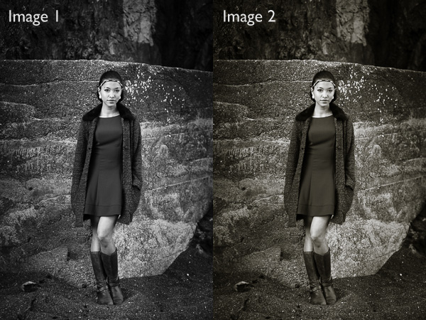
If you answered that Image 1 is neutral, you are correct. But it’s very difficult to tell on an uncalibrated monitor. If your monitor is uncalibrated (making everything look bluer than what it is) you probably picked Image 2 as the neutrally coloured one.

Using monitor calibration devices

The only way to calibrate your monitor accurately is to buy (or borrow) a device that measures the colours emitted by your monitor. They are called colorimetric devices and connect to your computer via the USB port.

If you research the topic online you will find articles that tell you how to calibrate your monitor without a colorimetric device. Pay no attention to them, their techniques don’t work. The only way to do it properly is with the correct device.

Colorimetric devices are easy to use, and come with software that guides you through the calibration process. It shows you where to place your device on the screen, then displays a series of colour patches for the device to measure.

It then compares the colour values recorded by the device, against the true colour values of the colour patches and creates a profile that compensates for the inaccuracies of the monitor. The profile is saved on your hard drive and used by your computer’s operating system to control the way colours are displayed on your monitor.

Computers and colour profiles

Once you have calibrated your monitor you can relax, knowing that the colours you see on your screen are as accurate as your monitor can render them. At least, that’s the idea. In real life, it’s a little more complex.

Mac owners will be fine. The Mac operating system (OS X) works very well with colour. Every program you use works with the monitor profile and displays accurate colour. It’s one of the reasons that many professional photographers use Apple computers.

If you have a Windows PC however the story is different. The operating system knows the monitor profile is there, but not all programs use it. It’s possible to have the same photo open in two programs, and for the colours in one to appear different to the other. One program is using the monitor profile, and the other isn’t.

All the professional level programs you use, such as Lightroom and Photoshop, utilize the monitor profile and display colours accurately. But not all software does. An example is ACDSee. It doesn’t use the monitor profile and won’t display colours accurately. If you’re unsure whether your software uses the monitor profile, a Google search should reveal the answer.

Just to make things even more complex, some PCs won’t load the monitor profile you created in the first place. It seems to be a problem with Windows Vista and Windows 7. This excellent article describes the problem in more detail and gives you a work around.

Another thing to watch out for is that the colours on your monitor drift over time. For that reason it’s a good idea to calibrate your monitor at monthly intervals, or before you carry out any critical work. The software that comes with your device can be set up to give you a reminder.

How to choose a monitor calibration device

Colorimetric devices are made by several manufacturers. The main players seem to be Datacolor (who make the Spyder models) and X-Rite (which makes Colormunki).

For many photographers, the least expensive model in each manufacturer’s range is probably sufficient. That’s good news because it means that you don’t have to spend a lot of money in order to calibrate your monitor.

But before you rush out and buy the cheapest device you can find, ask yourself these questions. Some photographers will require the features found in more expensive models.

  • Do you use a dual monitor set up? Some colorimetric devices only profile a single monitor.
  • Do you have a printer to profile as well? Some devices can calibrate printers as well as monitors, although they are a lot more expensive.
  • Do you want to adjust the gamma or white point of your monitor? Not all monitors let you do this, but if you have a monitor which allows it you will need a more advanced device to enable this feature.

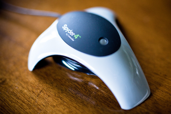
The Spyder 4 Express

I use a Spyder 4 Express to calibrate my monitor. Here’s how the process works. If you have a different device, the process will be similar.

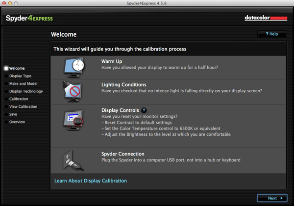
1. Run the Spyder4Express software that comes with the device

The first screen gives directions. The important points are that you should let your monitor warm up for half an hour before calibration and that there should be no intense light falling on the screen.

It also asks you to reset the contrast setting and set white balance to 6500K. This isn’t possible on all computers, especially laptops, so don’t worry about these settings if you can’t adjust them. The device will still work.

Monitor calibration with Spyder 4 Express

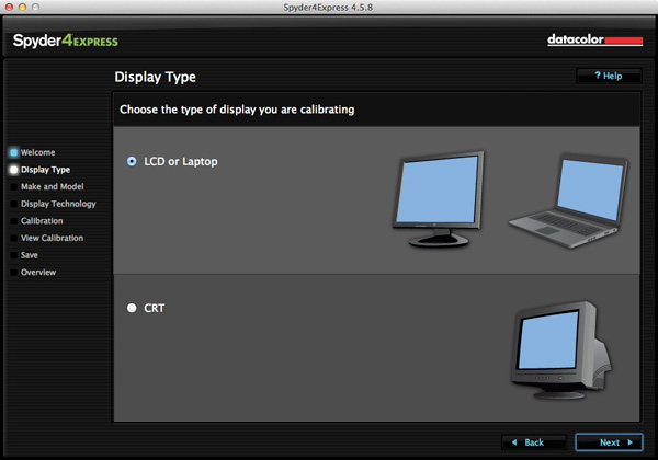
2. Then it asks you which type of display you have

Monitor calibration with Spyder 4 Express

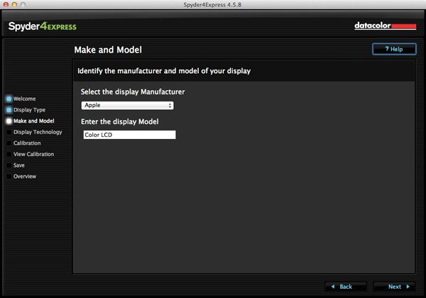
3. Next enter the manufacturer and model of your display

I selected Apple and the display model was filled in automatically. The Color LCD setting seems to be sufficient (confirmed by checking the monitor specs in System Information).
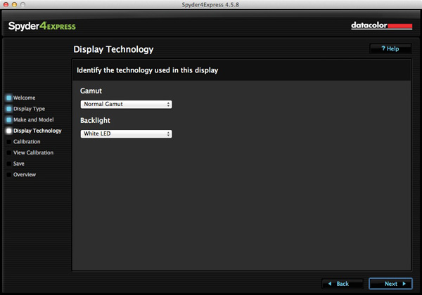
Monitor calibration with Spyder 4 Express

4. Set the Gamut

This next step is very important. Gamut is fairly easy. You’ll know if you have a wide gamut monitor because it will say so in the specs (that’s probably why you bought it). In fact, I tried setting wide gamut here to see what would happen and the software recognised that I didn’t have a wide gamut monitor and sent me back to change it.

The backlight setting is crucial. The instructions recommend that if you’re not sure what type of backlighting you have that you should set it to Unknown. I tried that and even I could see with my naked eye that the colour was wrong (the screen had a magenta cast).

If your monitor has the model number printed on it, simply Google the model number. You should find the spec sheet for the monitor which will tell you exactly what type of backlighting it has.

If you have a laptop it’s harder to verify. I found these instructions for my Macbook Pro. I’ve been unable to find any for Windows laptops, so if you how to do this I’d be grateful if you could let us know in the comments. Once you have the model, you can Google it for the spec sheet. That’s how I confirmed my laptop has a White LED backlight.

Monitor calibration with Spyder 4 Express

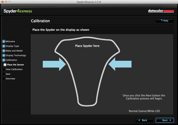
5. Placement of the device

The next screen shows where to place the Spyder 4 Express unit. It has a counterweight to hold it in position.

Monitor calibration with Spyder 4 Express

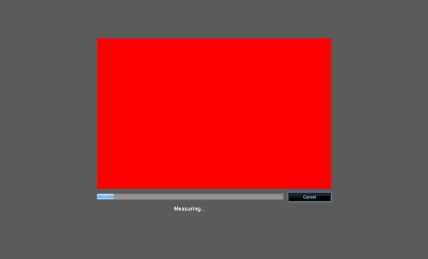
6. The software then displays a series of colour patches for the device to measure

Monitor calibration with Spyder 4 Express

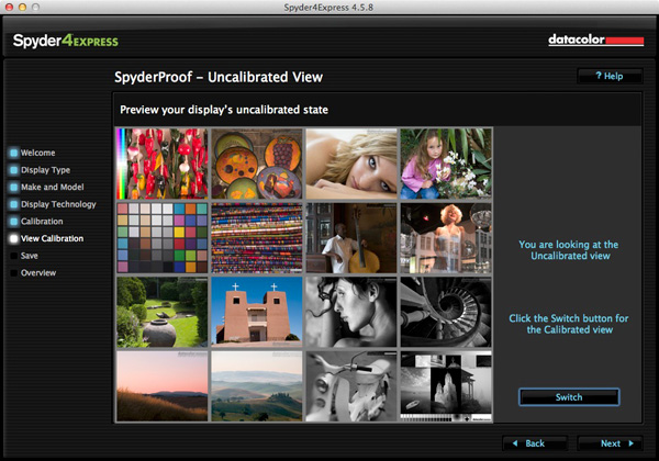
7. A new profile is created

When it’s finished, the program creates a new monitor profile that’s used by the computer from that point on. It also lets you switch between calibrated and uncalibrated versions to see the difference.
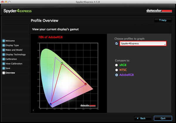
Monitor calibration with Spyder 4 Express

8. Gamut comparison

Finally, the program shows a graph comparing the colour gamut of the monitor compared to sRGB, NTSC and AdobeRGB colour spaces.

Monitor calibration with Spyder 4 Express

Conclusion

Monitor calibration is an essential part of your workflow as a photographer. Indeed, it’s an essential part of all post-processing. There’s no way around it, but luckily the process doesn’t have to be difficult or overly expensive.

I use the Spyder 4 Express, and it’s a great little unit. It’s easy to use and relatively inexpensive. The only potential sticking point seems to be working out what type of backlighting your LCD monitor has. It’s crucial to get that right or the calibration won’t be accurate. Also, if you need more advanced features, such as the ability to profile more than one monitor or set the colour temperature or white point, then you need a more advanced model of device.

Have you used a different model to calibrate your monitor? How did the device perform and how did you get on? Let us know in the comments.


Mastering Lightroom: Book Four – The Photos ebookMastering Lightroom: Book Four – The Photos

My new ebook Mastering Lightroom: Book Four – The Photos takes you through ten beautiful examples of photography and shows you how I processed them step-by-step in Lightroom. It explores some of my favourite Develop Presets and plug-ins as well as the techniques I use in Lightroom itself. Click the link to learn more.

The post How to Calibrate your Monitor with the Spyder 4 Express by Andrew S. Gibson appeared first on Digital Photography School.


Digital Photography School

 
Comments Off on How to Calibrate your Monitor with the Spyder 4 Express

Posted in Photography


DPR reader loses camera in fall, sustains injury and lives to tell the tale

16 Aug

Let’s get the important thing out of the way first – Greg Theulings is fine. His Fujifilm X-T1, on the other hand, is not. Keen landscape photographer and DPR forum member, Theulings was on a trip to to Luxembourg and the German Eifel photographing the some rapids when he slipped on a rock, fell into the water and dislocated his shoulder. His camera and lens were destroyed, but his memory card survived. See his photos and read his story – and maybe take a little extra care on those rocks when you’re out on your last photo trip of the summer.

Articles: Digital Photography Review (dpreview.com)

 
Comments Off on DPR reader loses camera in fall, sustains injury and lives to tell the tale

Posted in Uncategorized


Weekly Photography Challenge – Blue

16 Aug

Earlier I rounded up a set of blue images to inspire you. And as you may have guessed it’s that time again – the weekly challenge.

I was feeling a little blue this week myself after hearing about the passing of Robin Williams. Sad that someone who brought so much joy to so many, had so little in his own life. But I don’t want you to be that kind of blue!

Weekly photography challenge – blue

This week I want you to get out and notice anything and everything around you that is blue. Then – photograph it and share it with us here. Nature provides lots of things that are blue for you, try there and also look for man made things too like bicycles, cars, homes, you name it. Here are a few more ideas for you:

By Eric Bégin

By Raj Stevenson

By Syd Phillips

By Éole Wind

By Francisco Antunes

By Will Montague

By Yannis

By amira_a

Now it’s your turn!

Share your Blue photos

Simply upload your shot into the comment field (look for the little camera icon in the Disqus comments section as pictured below) and they’ll get embedded for us all to see or if you’d prefer upload them to your favourite photo sharing site and leave the link to them. Show me your leading lines using pathways and roads in this week’s challenge.

The post Weekly Photography Challenge – Blue by Darlene Hildebrandt appeared first on Digital Photography School.


Digital Photography School

 
Comments Off on Weekly Photography Challenge – Blue

Posted in Photography


Time in Color: Skatepark Graffiti Acts as a Working Sundial

16 Aug

[ By Steph in Architecture & Cities & Urbanism. ]

Skatepark Graffiti 1

Skaters at this park in Lugano, Switzerland don’t have to pull out their phones to check the time – they can just glance down at a series of colored lines painted right onto the concrete of the bowl as a modern sundial. A ribbon of rainbow hues curves up and down the undulating surface, the sun and shadows revealing the current hour.

Skatepark Graffiti 2

Skatepark Graffiti 3

A different line of color indicates each hour of the day, marked off as the sun passes overhead. Designed by Moscow group Zuk Club, the vibrant park is like an abstract modern mural customized specifically to the shape of the bowl and the surrounding area.

SKatepark Graffiti 4 Skatepark Graffiti 5

It’s an interesting and visually resting concept, though perhaps no match for the largest and most complex skate parks around the world. Skaters who find ordinary skate parks unimaginative should check out 13 examples of highly skateable architecture, ranging from the specially renovated interior of a hunting lodge to Zaha Hadid’s futuristic science center in Germany.

Share on Facebook


[ By Steph in Architecture & Cities & Urbanism. ]

[ WebUrbanist | Archives | Galleries | Privacy | TOS ]


WebUrbanist

 
Comments Off on Time in Color: Skatepark Graffiti Acts as a Working Sundial

Posted in Creativity