RSS
 

Archive for June, 2014

The Ultimate Photography Guide to Pricing That You Have to Read

18 Jun

Setting the proper price for your photography business is one of the most important, thus challenging, things you may face in your photography career. Photography pricing determines your priorities, profit potential, competition niche and business style. Bad pricing lists could not only cost you money, but also destroy your business before you can say Jack Robinson, if you know what Continue Reading

The post The Ultimate Photography Guide to Pricing That You Have to Read appeared first on Photodoto.


Photodoto

 
Comments Off on The Ultimate Photography Guide to Pricing That You Have to Read

Posted in Photography


ThinkTank introduces new ‘Airport Roller Derby’ bag

18 Jun

thinktank_derby.jpg

If you want to bring the intensity of a full contact sport to the way you transport your camera gear, ThinkTank’s new Airport Roller Derby bag may interest you. It’s a large rolling bag built to accommodate a 15-inch laptop, up to two standard DSLRs with lenses attached and six to seven standard zoom lenses or strobes. With four dual wheels it will roll upright, tilted back or on its side. Read more

News: Digital Photography Review (dpreview.com)

 
Comments Off on ThinkTank introduces new ‘Airport Roller Derby’ bag

Posted in Uncategorized


WAR PORN

18 Jun

Vorgeschichte

Während ich die Seiten des Buches War Porn* einzeln durchblättere, merke ich, wie mir schlecht wird. Die Kraft der Bilder schlägt mir sofort auf den Magen. So viel Leid, so viel Schmerz und Tod habe ich noch nie in einem so kleinen Büchlein komprimiert gesehen.

Ich blättere hastig weiter. Immer schneller schiebe ich die Bilder an mir vorbei. Ich will alles gesehen haben, aber ich merke, dass ich das alles gar nicht wahrhaben möchte. Ich bin schockiert und schließe das Buch. Ich würde es am liebsten verbrennen. Und mit dem Buch all das Leid, das darin ist.

Einen Tag später nehme ich den nächsten Anlauf. Es ist zwar immer noch hart, aber zumindest kann ich die Bilder nun alle auf einmal ansehen. Den Text lesen, den der Fotograf Christoph Bangert dazu verfasst hat. Mir ein genaueres Bild davon machen, worum es eigentlich geht.

Ein verletzter Soldat wird von zwei anderen Soldaten begutachtet.

Am dritten Tag nehme ich mir zwei DIN-A3-Blätter und klebe sie rechts und links an die Pressemeldung des Kehrer-Verlages, die mir mit dem Buch geliefert wurde. Ich muss etwas tun, was sichtbar ist. Also schreibe ich meine Gedanken und Ideen zum Buch auf, kreise Sätze ein, unterstreiche mir wichtig Gewordenes und nummeriere meine Collage nach Prioritäten.

Dabei fühle ich mich taub und traurig, würde am liebsten weinen. Weinen um die verletzten Menschen auf diesen Bildern, weinen, weil das alles viel zu krass, viel zu derb, viel zu schlimm ist. Ich muss erneut Abstand gewinnen, da mich die Wucht der Bilder völlig aus dem Rahmen wirft.

Eine Woche später, heute, fasse ich nochmals allen Mut zusammen. Um ehrlich zu sein, ist mir das Buch sehr, sehr unangenehm. Doch ich will. Ich will es nicht verdrängen. Ich muss mich dem Gräuel stellen.

Ein toter Mensch liegt auf einer Trage, von Menschen umgeben.

Rezension

War Porn. Der Titel des Buches ist eine Anspielung. Eine Anspielung auf die so oft genutzte Wortwahl PORN für etwas, das wir ganz besonders toll finden. Camera Porn. Food Porn. Gadget Porn.

Doch in Verbindung mit War, dem Krieg, bekommt die Zusammensetzung eine ganz eigenartige Wirkung, denn es ist eine Sprengung jeglicher Grenzen meines Vorstellungsvermögens.

Christoph Bangert ist Fotojournalist. Er arbeitet für die New York Times, die Neue Zürcher Zeitung und den Stern. Bangert berichtet regelmäßig aus Kriegs- und Krisengebieten.

Ein toter Mensch, dessen Hals angefressen wurde, liegt auf einer Müllhalde.

Seine Arbeit inmitten des Leides stellt ihn jedoch vor diese schwierige Frage:

Nutze ich die Menschen in meinen Bildern aus? Ist es moralisch zu rechtfertigen, als Fotograf in Kriegsgebieten zu arbeiten? Warum sind wir alle von Bildern des Elends anderer angezogen? Produziere ich Kriegs-Pornografie?

Doch bei dieser Frage soll es nicht bleiben. Bangert sieht sich ständig der Zensur dieser Bilder ausgesetzt. Zum einen können und werden viele Aufnahmen nicht publiziert, da Bildredakteure entscheiden, was zu krass ist und was nicht.

Die zusammengebundenen Hände eines auf dem Boden liegenden Mannes.

Weiter geht die Zensur in den Köpfen der Gesellschaft, die bestimmte Aufnahmen von den Folgen des Krieges nicht sehen will oder kann. Zu guter letzt sieht Bangert sich selbst in der Kritik und weiß, dass auch er zensiert, denn er kann sich bei manchen Bildern nicht mehr daran erinnern, wie er sie gemacht hat.

So kommt es zu diesem kleinen Buch – es ist gerade einmal 16 x 12 cm groß – in dem er eine Regel aufstellt: Keine Zensur. Es wird alles gezeigt, kein Bild ausgelassen, weil es zu heftig ist.

Die Bilder darin stammen aus zehn Jahren Arbeit in Afghanistan, dem Irak, Indonesien, dem Libanon und Gaza. Viele davon sind bisher unveröffentlicht. Dem ein oder anderen dämmert vielleicht, warum.

Wer das Buch nach dem ersten Schock etwas genauer ansieht, wird bemerken, dass es noch ein Buch im Buch gibt. Denn einige Seiten sind nicht geöffnet, sondern müssen entlang einer Perforation aufgetrennt werden. Damit stellt Bangert den Betrachter vor eine große Herausforderung:

Die zusammenlaufenden Seiten des Buches War Porn.

Du musst es entscheiden. Selbstzensur ist eine aktive Sache. Manchmal muss man sich sogar dazu zwingen. Und es kann ein Messer erfordern.

Was diese Besonderheit des Buches unmöglich macht, ist, die Bilder schnell durchzublättern und zu behaupten, man hätte jetzt alles gesehen. Selbst eine Schere oder ein Messer in die Hand zu nehmen und nicht zu wissen, was einen erwartet, ist keine leichte Aufgabe.

Doch dieser Akt hat eine symbolische Kraft. Denn wenn ich mich dazu entschlossen habe, ein Messer in die Hand zu nehmen und zwei Seiten voneinander trenne, überwinde ich den mir eigenen Impuls, wegzuschauen und werde selbst tätig. Ich überwinde die Selbstzensur.

Ein totes Mädchen, eingehüllt in eine weiße Decke.

Die Intention des Fotografen beschreibt er selbst im Vorwort des Buches:

Ich möchte einfach eine Konversation beginnen. Darüber, wie wir mit entsetzlichen Bildern umgehen – oder auch nicht. Es ist ein Experiment. Was passiert, wenn ich meine Selbst-Zensur ausschalte?

Und Bangert weiß sehr gut, dass es nicht einfach ist, diese Bilder anzusehen. Doch daraufhin drängt sich die Frage auf, wie es wohl für Menschen sein muss, die dieses Leiden erleben. Sie können nicht flüchten. Das Privileg der Zensur ist ihnen verwehrt.

War Porn selbst verkörpert dieses Leiden. Nicht nur mit den Bildern, nicht nur mit den zusammhängenden Bildern, sondern auch in seiner Form selbst. Denn: Die Fadenheftung mit offenem Rücken spricht Bände. Das Buch ist offen wie der Rücken eines verletzten Menschen.

War Porn © Christoph Bangert

Eines ist klar: Das Buch ist nicht schön. Es ist gar das Gegenteil davon, denn es zeigt eben ungeschönt die hässliche Fratze des Krieges und der Gewalt. War Porn offenbart das Versagen der Menschen, friedlich zusammenzuleben. Das provoziert. Dessen ist sich Bangert bewusst.

Manche sagen: „Was ist der Sinn davon, solche Dinge zu zeigen? Wir wissen, dass Kriege schreckliche Momente sind.“ Sind wir uns jedoch bewusst, WIE schrecklich Kriege sind? Ja? Warum sind sind wir dann von solchen Bildern so schockiert?

Epilog

Auch, wenn ich mich mittlerweile sehr intensiv mit War Porn auseinandergesetzt habe, ist es mir immer noch nicht gelungen, einen Großteil der perforierten Seiten zu öffnen. Ich habe großen Respekt vor der Arbeit Bangerts und ich nehme an, dass das Buch noch für sehr viel Aufsehen sorgen wird.

Meine Position als Pazifist wurde durch das Buch nicht geschwächt, sondern gestärkt. War Porn möchte ich jedem, der sich mit der Thematik des Krieges und seinen verheerenden Folgen auseinandersetzen will, empfehlen.

Die Vorderseite des Buches War Porn

Informationen zum Buch

Fotograf: Christoph Bangert
Gebundene Ausgabe: 192 Seiten
Verlag: KEHRER Heidelberg (Mai 2014)
Sprache: Englisch
Größe: 15,8 x 12 x 2,2 cm
Preis: 29,90 €*

* Das ist ein Affiliate-Link zu Amazon. Wenn Ihr darüber etwas bestellt, erhält kwerfeldein eine kleine Provision, Ihr zahlt aber keinen Cent mehr.


kwerfeldein – Fotografie Magazin | Fotocommunity

 
Comments Off on WAR PORN

Posted in Equipment


New Fujifilm X-series firmware adds direct instax printing

18 Jun

shared:download-button.png

Fujifilm has announced a firmware update for three of its X-Series camera, allowing them to print images instantly from the instax Share SP-1 printer. The Fujifilm XQ1, X-M1 and X-A1 cameras updated with the new firmware will be able to send photos directly to the compact instax printer, rather than by way of mobile device as is currently the case. The firmware should be available in late June, and Fujifilm plans to add the feature to more cameras. Learn more

News: Digital Photography Review (dpreview.com)

 
Comments Off on New Fujifilm X-series firmware adds direct instax printing

Posted in Uncategorized


Schwarzes Patagonien

18 Jun

Patagonien besitzt eine wunderschöne Landschaft, die jährlich unglaublich viele Touristen anlockt. Aber sie ist so wild und weit, dass man dennoch oft auf Landstrichen völlig allein ist. Neels Castillon hat seine Reise nach Patagonien in der Serie „Black Patagonia“ dokumentiert und die Stimmung, die dieses Land auf ihn ausübte, in seine Fotos gebannt.

Neels kam nach Patagonien, um die wilde Natur zu erleben und Inspiration zu finden. Ihn faszinieren Menschen und in seinen sonstigen Serien stehen vor allem Portraits und Straßenszenen im Mittelpunt. Aber in Patagonien konzentrierte er sich auf die Berge und diese faszinierende, wilde Natur.

Wir fuhren durch die Wüste, ich beobachtete schläfrig die Fetzen von Silberwolken, die über den Himmel wirbelten und das Meer aus grau-grünem Dornengestrüpp mit Durchlässen hier und dort, in Stufen wachsend und den weißen Staub, der von den Salzpfannen floss und, am Horizont, Land und Himmel, die sich in eine Abwesenheit von Farbe auflösten.
– Bruce Chatwin, In Patagonia.

Ein Auto mit viel Gepäck auf dem Dach.

Eine düstere Landschaft. Zwischen den Wolken schimmert der Mond hindurch.

Landschaft mit steilen Felsen.

Im Vordergrund ein Meer, über dem am Horizont Berge zu sehen sind.

Dunkle Wolken über einem fast schwarzen Meer.

Ein stark verzweigter Baum.

Ein Fuchs steht hinter einem umgefallenen Baumstamm.

Ein Fluss im Vordergrund. Im Hintergrund ein eisbehangener Berg.

Im Vordergrund ein Meer, über dem am Horizont Berge zu sehen sind.

Über dem Meer hängen dicke Wolken.

Neels Castillon lebt in Paris und fotografiert nicht nur, sondern macht auch schöne Kurzfilme, wie „Ein Vogel-Ballett“. Auf seiner Webseite bekommt Ihr einen Überblick über seine gesammtes Schaffen.


kwerfeldein – Fotografie Magazin | Fotocommunity

 
Comments Off on Schwarzes Patagonien

Posted in Equipment


Sony’s Curved Sensors May Allow for Simpler Lenses and Better Images

18 Jun

sony-curved-sensor.jpg

The sensors inside digital cameras are – generally – flat. But curved sensors promise greater sensitivity, better image quality, and provide scope for simpler lenses. Recently, Sony showed off some examples of curved image sensors, including (tantalizingly) a full-frame chip. Device manager Kazuichiro Itonaga claims: “The team has made somewhere in the vicinity of 100 full-size sensors with their bending machine. We are ready.” Read on to learn more about this exciting new tech, how it imitates the human eye, and how it may find it’s way into consumer products.

News: Digital Photography Review (dpreview.com)

 
Comments Off on Sony’s Curved Sensors May Allow for Simpler Lenses and Better Images

Posted in Uncategorized


Canon UK announces EF-M 55-200mm F4.5-6.3 IS STM for EOS M

18 Jun

EF-M-55-200mm.png

Canon UK has announced the EF-M 55-200mm f/4-6.3 IS STM, a compact telephoto zoom for the EOS M mirrorless system. Canon claims the new lens offers high-end optical performance, a ‘near-silent’ stepping motor and a 3.5-stop optical image stabilization system. Providing an 88-320mm equivalent range on the EOS M, it’s the fourth lens in the series, priced at €389.99/£329.99 with availability (at least in Europe) in July.

News: Digital Photography Review (dpreview.com)

 
Comments Off on Canon UK announces EF-M 55-200mm F4.5-6.3 IS STM for EOS M

Posted in Uncategorized


17. Juni 2014

18 Jun

Ein Beitrag von: Katharina Jung

Unterwasserfoto einer fallenden Frau in weißem Kleid


kwerfeldein – Fotografie Magazin | Fotocommunity

 
Comments Off on 17. Juni 2014

Posted in Equipment


How to Make Stronger Photographs Through the Process of Visual Design

18 Jun

Sails 600

Photography is an art that relies on light. It also relies heavily on the visual message. You have no way of communicating anything to your viewer except through the visual language you use. If you use strong visual elements, your images will be effective and people will stop and look. If you want to convey a message, use the most powerful visual imagery you can: color to enhance your scene, light to punctuate it, and use shapes and texture to fill in the details. Doing this will not only be more satisfying for you as a photographer, but will make your visual language stronger and your message more compelling.

It is right to assume that photography is about being able to see a scene, and then photograph it. I am going to challenge that assumption, and say that there is something vastly more important that comes after you “see” the scene, and before you photograph it. Most often, the next step is called composition.

Loosely defined, composition speaks about how the image is put together, what the components are in the scene, and how they work together. Very often, the first thing that we think of when we hear composition is, you guessed it, the Rule of Thirds. I truly believe that the Rule of Thirds is a good place to start, but it is by no means the only compositional tool. In fact, some of the most iconic images of our time have broken this very rule. So, the next step after you have decided on a scene is not to just snap away. Put some serious thought into how you will visually design your image, and then capture that scene photographically. After that, grab the camera!

Forest-Canopy-600b

What is visual design?

Visual design sounds like a fancy word for composition, but in reality it takes composition to the next level. It is not simply about making sure everything is aligned on a grid à la the Rule of Thirds. Rather, it is about working with the flow and dynamic elements in your scene. In this article I will discuss the nuances and tools you can use to improve your composition to get the most out of any scene.

There have been many times when I have looked at a photograph and I could almost feel the wind in the scene or smell the salty sea air. The photographer captured the image in such a way that when I looked at the scene, it evoked my memory of similar scenes I had witnessed in real life. At a very high level, people relate to images in a few different ways.

Waterfall 600
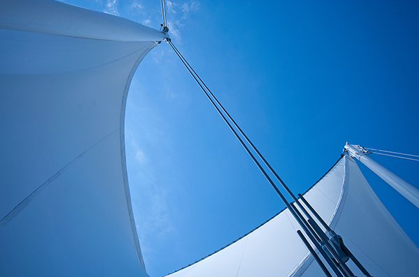
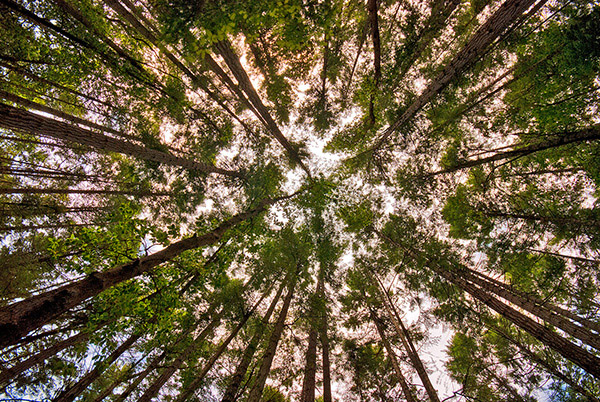
Photographs evoke emotions, memories or feelings based on what the person sees in the image. In many ways, the viewer’s perception is their reality. So, if the image is of a loved one, the person looking at the photograph will immediately be transported to a memory of that person, good or bad. That memory could cause them to be quite emotional. The reaction to the image could be utterly visceral depending on what emotion is recalled. The same is true in a landscape scene or a seascape scene. The goal of every photographer should be to visually translate the scene in such a way that the viewer can either relate to the scene or would like to be in that scene.

The goal here is to change your perception on composition, to help you break out of the mental constraints of the Rule of Thirds, and open up new pathways to explore in photographic visual design. Don’t get me wrong, I am not suggesting that the Rule of Thirds is bad; it is still a very relevant and useful tool. All I am saying is that it should not be your only tool.

What do we have to work with?

Light, color, and shape all play an integral role in visual design. Using these tools is a good start; however, now we will discuss some details about making more powerful visual design choices. The idea here is to move your images from good to spectacular. The new elements we will be talking about are:

  • Form
  • Color and color relationships
  • Texture
  • Unity
  • Coherence
  • Balance and rhythm
  • Space (positive and negative)

Form and texture

Form is similar to shape, but in this context I am referring to form in a more three-dimensional sense. Form is enhanced when there is side light to emphasize the shape of the object in the image. When the sun lights a rounded, polished rock from one side, the rounded form of the rock is emphasized. This gives the viewer some critical information about the object. Side light also emphasizes texture and that too is a key piece of information. With side lighting, you can emphasize the object’s shape and form to the point that the viewer can almost “feel” the three-dimensional aspects of the image. This is a really strong way to communicate visually.

009

At a higher level, when you want to communicate form and texture, side lighting is your best friend; soft side lighting is even better. The important idea to remember here is that side lighting adds dimensionality to your image. Try this on your next photo shoot: take a look where the sun is and take a photo of the subject with the sun over your shoulder. Then move to the side of the subject and take another shot. The difference will astound you. If you do this in the soft glow of sunrise or sunset, your results will be that much better.

Using color in your design

We all know how important color is. Think of your favourite image in color, then strip that color out and somehow it is not necessarily as impactful. That’s not to diminish the fact that black and white photography can be equally impressive – it absolutely is, however, to keep this article in context, we’ll leave black and white for a future article.

004

color gives the viewer crucial information about the scene. The warm colors of a fiery sunset or the cold blues of a glacier convey critical information about the scene. The overall color in your scene can determine how the viewer interprets it, so be purposeful with your use of color. If you want to convey warmth, choose reds, oranges, and yellows for your scene. If you want to convey cold, use blues, grays, and greens in your scene. You can see which colors are warm and which colors are cold if you look at the visual color wheel.

Colour Wheel

Certain colors draw the viewers’ eyes into the scene. Reds and yellows in particular cause the viewer to look at those colors (it’s not arbitrary that emergency vehicles are painted red and yellow warm colours,as they demand your attention). Be careful when you see anything that is red or yellow in your scene. It can either add value to the scene, if it is the subject of your image, or it could be distracting if it is not the subject of your image (in the background).

Rgb cmy

Let’s talk about color theory briefly. This is by no means an exhaustive guide to color theory, rather a quick introduction into it. Your camera can “see” three colors: Red, Green and Blue (RGB). These three colors are the primary colors in the visual color wheel (different to the color wheel used when painting). There are secondary colors too, namely, Cyan, Magenta and Yellow. These six colors and their combinations make up the visual color wheel. The hue (color) and saturation (richness or intensity) of all of these colors give us multitudes of combinations of colors. Understanding this aspect color theory will help you make better choices about color when photographing.

Using primary and secondary colors together makes your images compelling. So, looking at the color wheel, images that have red and yellow in the scene make very interesting photographs. Images with red and green in the scene work well too. The next time you look at a scene to photograph, try and look at what predominant colors are in the scene and try to photograph those colors only. This alone can make your images much more striking and visually interesting.

Take some time to practice intentionally composing your images using these techniques.

Ipad 005


The preceding article is a full-length excerpt from the CLARITY eBook series. Join other dPS readers today and dramatically improve your photography by learning the step-by-step process of visual storytelling and techniques for making stronger photographs. Get your CLARITY photography eBooks today!

The post How to Make Stronger Photographs Through the Process of Visual Design by Barry J Brady appeared first on Digital Photography School.


Digital Photography School

 
Comments Off on How to Make Stronger Photographs Through the Process of Visual Design

Posted in Photography


17 June, 2014 – Sony A7s Tests With Lower DR than A7r

18 Jun

Who do you trust? I trust my eyes. And so when I tested the Sony A7s the other day and found that I couldn’t see any dynamic range advantage over the A7r, that’s what I wrote. But, I was chastised by many because Sony claimed 15 stops of DR. Why the hell couldn’t Michael see it?

Now, two days later, DxO Labs has published their sensor test results for the A7s and indeed the A7s ranks almost a stop lower than the A7r. One may debate whether or not DxO and Sony use the same measurement criteria, but there’s no way to quibble about the fact that DxO has hundreds of self-consistent lab tests spanning years, regardless of the absolute numbers. I guess the eyes have it.


The Luminous Landscape – What’s New

 
Comments Off on 17 June, 2014 – Sony A7s Tests With Lower DR than A7r

Posted in News