RSS
 

Archive for May, 2014

Vertical Forests: 2 Lush Urban Towers Support 16,000 Plants

25 May

[ By WebUrbanist in Architecture & Houses & Residential. ]

green tower real life

Skeptics of improbably green skyscraper concepts might want to take a moment of silence to appreciate the successful construction of these two beautiful buildings now nearly completion.

green tower lush views

Designed by Stefano Boeri in Milan, Italy, the twin towers of the Bosco Verticale play host to nearly 1,000 trees, 5,000 shrubs and over 10,000 additional small plants.

green skyscraper tower design

The building was fully designed with its greenery in mind, including accommodations for irrigation, root systems, plant weights and wind loads within the city. This rich miniature ecosystem of plant life in turn helps filter the surrounding air, dampen urban noise and provide shade for residents. For its local environment, the building increases biodiversity and provides habitats for regional birds and insects.

green tower balcony trees

From the designers: The creation of a number of vertical forests in the city will be able to create a network of environmental corridors which will give life to the main parks in the city, bringing the green space of avenues and gardens and connecting various spaces of spontaneous vegetation growth. [This project] helps to build a micro-climate and to filter dust particles which are present in the urban environment. The diversity of the plants helps to create humidity, and absorb CO2 and dust, produces oxygen, protects people and houses from the suns rays and from acoustic pollution.”

Share on Facebook


[ By WebUrbanist in Architecture & Houses & Residential. ]

[ WebUrbanist | Archives | Galleries | Privacy | TOS ]


WebUrbanist

 
Comments Off on Vertical Forests: 2 Lush Urban Towers Support 16,000 Plants

Posted in Creativity


Find the Perfect Photography Location Using Google Maps

25 May

No matter if you’re planning your next photo road trip or you’re scouring the city streets looking for the perfect viewpoint, Google Maps and Google Earth are the most valuable tools to add to your arsenal for finding the perfect photography location.

Planning to Shoot

I usually travel for work, or with family, so I don’t have the luxury of as much time as I might want to search for the perfect vantage point in person. Nor to scout an area to compare locations that I want to dedicate to the one sunset that I’ll have time to shoot. Google Maps to the rescue!

While planning a trip from home, you have much more time to explore the area in a virtual capacity instead of being out there with boots on the ground. Nothing can compare with actually being there, but the tools available to you are getting better every day and the ability to nearly frame your shot is a realistic time saver. Time to turn the volume on your pre-visualization up to 11.

If I’m planning a trip or have an idea for a shot, I’ll start with Google Maps and zero in on the area that I want to shoot. You probably already do this, too, but let’s just take it a step further. Click the icon in the lower left corner labeled “Earth” to start the Google Earth browser plugin. This has replaced the satellite or aerial view for much of the world’s map, but instead of only offering a flat, two dimensional view of the map directly overhead, you can now tilt the map and see an approximation of topography, texture, and elevation.

Default Earth View

Normal mouse controls on the map let you pan in all directions, and zoom in or out with the mouse wheel. In order to adjust to a view that will help you get a better idea of the terrain, hold down the shift key, click and drag upward. That will rotate your point of view (POV) so that you now have an aerial view looking toward the horizon instead of straight down. Dragging left or right while holding shift will rotate your point of view instead of panning.

Rotated Earth View

But, you don’t have to be tied down to your desk to do this. Just two weeks ago, I was out with a friend exploring San Francisco and searching for a specific vantage point of the 101/280 freeway interchange. We knew the general area that we wanted to shoot from, but with so many streets winding around, using Google Earth on my mobile phone helped to eliminate some of the trial and error of driving around without a clue how to find what we wanted.

101 280 Framing the Shot Mobile

101 280 Framing the Shot

Desktop interface Google Earth view looking south

Joe Ercoli Land of Confusion 600

Finished image from location scouted using Google Maps/Earth

The example images from this article show the area that we shot in, including a screenshot taken from the mobile interface, and the completed image. Of course the view that you can get from the map interface is never as good as what you’ll see in person, but it’s an excellent way to help you hit the ground running when you get on-site with your camera in hand.

NOTE: The camera is facing South in the final composition, not North as in the initial Google Earth Point of View.

Have you used Google Maps to find any cool locations? What other tips or tricks have you tried? Please share in the comments below.

The post Find the Perfect Photography Location Using Google Maps by Joe Ercoli appeared first on Digital Photography School.


Digital Photography School

 
Comments Off on Find the Perfect Photography Location Using Google Maps

Posted in Photography


Mastering Color in Lightroom using the HSL Tab

24 May

Mastering colour in Lightroom

Color in Camera

Mastering color in Lightroom occurs in two steps. The first is when you take the photo. Successful color photography requires an awareness of the colors in the scene and how they work together. If you read about the topic of color composition you will come across a lot of advice, including articles about the emotional values of color. It’s all good background knowledge, but if there’s one tip I can give that will help you compose better color images right away it is to simplify. Color is powerful, and if there are too many colors in the photo they will either clash or weaken each other. Simplify the use of color to make your images stronger. This works because the colors you choose to leave in have more impact when there are fewer other hues in the frame to distract from them.

Here’s an example below. In the photo on the left the use of color is not as good as it could be. There are too many conflicting hues. The red stripes on the flag compete with the orange flowers on the porch, and the blue and violet paintwork. It is more of a snapshot than a carefully composed image.

In comparison the photo on the right is dominated by red and yellow, and the colors are much stronger.

Mastering colour in Lightroom

An easy way to simplify color is to use a telephoto lens to simplify the composition. Another is to  use a wide aperture to blur the background. Click the links to read my articles on those topics.

You can go into the topic of color in more depth by reading Mitchell Kanashkevich’s ebook Captivating Color.

Color in Lightroom

The next step, after you have taken your photo, is to get the best out of it in Lightroom. Today I’m going to focus on the first two tabs in the HSL / Color / B&W panel, and show you how to use them. If you’re a Photoshop user, you will find the same sliders in Adobe Camera Raw.

The HSL and Color tabs are essentially the same, but with the sliders arranged in a different order. In the Color tab, the sliders are grouped in eight colors.

Mastering colour in Lightroom

Mastering colour in Lightroom

Click on one of the colored squares at the top to show the sliders from a single color group.

The HSL tab groups the same eight color sliders into three categories: Hue, Saturation and Luminance. It is the tab I prefer to use as I find it easier to adjust by property (ie. hue, saturation or luminance) rather than color. It also has a Targeted Adjustment Tool (I will show you how to use that further on in the article), which the Color tab doesn’t.

Mastering colour in Lightroom

H=Hue, S=Saturation, L=Luminance

Now it’s time to take a look at the sliders under the HSL and Color tabs to see what they do. You can carry out most of these adjustments within either tab, but the examples I show you will all use the HSL tab.

Hue adjustment sliders

Hue is another word for color. The Hue sliders let you replace colors in your photo with neighbouring hues from the color wheel. Let’s take a look at the earlier photo again to see how it works. The image is dominated by the color red. This diagram shows you approximately where those red hues occur on the color wheel.

Mastering colour in Lightroom

When you move the Red slider under the Hue setting to +100 Lightroom replaces red with orange tones, located nearby on the color wheel.

Mastering colour in Lightroom

When you move the Red slider to -100 Lightroom replaces red with purple tones, located in the other direction on the color wheel.

Mastering colour in Lightroom

It is possible to make dramatic differences to the colors in your images using just the Hue sliders. Here, the right hand version of the image was created by setting Red to +100 and Blue to -100. Lightroom replaced the red and blue tones in the photo with other colors.

Mastering colour in Lightroom

Before left – after Hues adjusted on the right.

The Targeted Adjustment Tool

The Targeted Adjustment Tool gives you an alternative way to do the same thing. It is more precise than the sliders because most of the hues within your photos will fall somewhere between the color sliders in the HSL tab. The Targeted Adjustment Tool lets you target those colors exactly.

Start by clicking on the Targeted Adjustment Tool icon. Use the mouse to lay the crosshair over the hue you want to adjust. Click and hold the left mouse button down while you move the mouse upwards to replace the hues underneath the crosshair with neighbouring colors from the color wheel in one direction, and down to replace them with colors from the other direction.

When you do this, Lightroom moves colored sliders in whatever combination is required to adjust the color you have targeted. In the following example I used the Targeted Adjustment Tool to target the red colors in the wall. Lightroom moved both the Red and Orange sliders, indicating that the targeted color was comprised almost equally of those colors.

Mastering colour in Lightroom

You can use the Targeted Adjustment Tool to target colors with precision exactly the same way when you adjust Saturation and Luminance.

Saturation adjustment sliders

The term saturation refers to the strength of a color. If you increase Saturation, the color becomes stronger. Decrease it and it becomes weaker. Note: My article Color Composition: Using Subtle Color goes into the topic of using subtle colors in more detail.

One way to emphasize color in Lightroom is to desaturate surrounding colors. Here’s an example. The starting point is an image of an old car I took in Alaska. The composition is simple –  the red paintwork on the car contrasts against the blue wooden shingles on the house behind it and the patches of greenery.

Mastering colour in Lightroom

First I used the Targeted Adjustment Tool to reduce the saturation of the green patches. Lightroom reduced Saturation in the Yellow and Green sliders accordingly.

Mastering colour in Lightroom

This simplifies the color composition even more, leaving red and blue as the dominant hues.

Mastering colour in Lightroom

Then I used the Targeted Adjustment Tool again to reduce the saturation of the blue paint. Lightroom reduced Saturation in the Aqua and Blue sliders.

Mastering colour in Lightroom

This is the result. I’ve placed the original and the final versions together so you can see the difference.

Mastering colour in Lightroom

Here’s another technique you can use. I set every Saturation slider except Red to zero. This desaturated most of the colors, turning the entire image black and white with the exception of the red paintwork on the car. I added a slight vignette using the Post-Crop Vignetting tool and increased Contrast and Clarity in the Basic panel to arrive at this black and white conversion.

Mastering colour in Lightroom

Luminance adjustment sliders

Luminance is the brightness of a color. You can make colors brighter to make them stand out more, or darker to subdue them. Depending on how bright the color was to start with, reducing luminance may also increase saturation, and increasing it may reduce saturation.

Here’s a example showing the difference when I used the Targeted Adjustment Tool to reduce the luminance of the blue paintwork.

Mastering colour in Lightroom

Lightroom reduced luminance in the Blue and Purple sliders when I made this adjustment.

Mastering colour in Lightroom

Note that with some images the colors may go a little weird when you adjust luminance too much. Watch out for this and ease back on the luminance sliders if this happens to you.

Your turn

Now it’s your turn. How do use you use the HSL and Color tabs when processing your photos in Lightroom or Adobe Camera Raw? Have you come up with any interesting techniques you can share with our readers? Let us know in the comments.


Mastering Lightroom: Books One, Two and Three

Mastering Lightroom ebook bundle
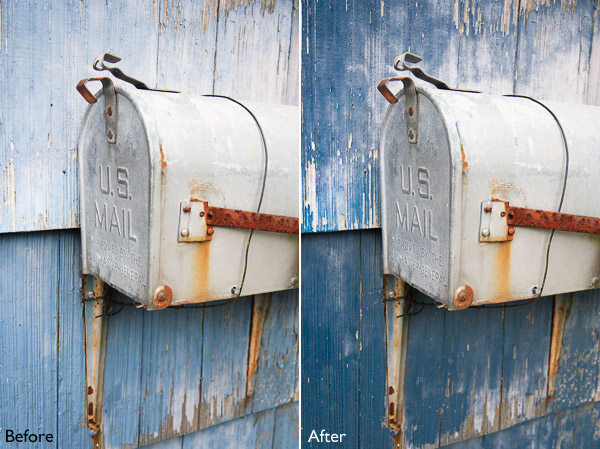
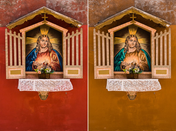
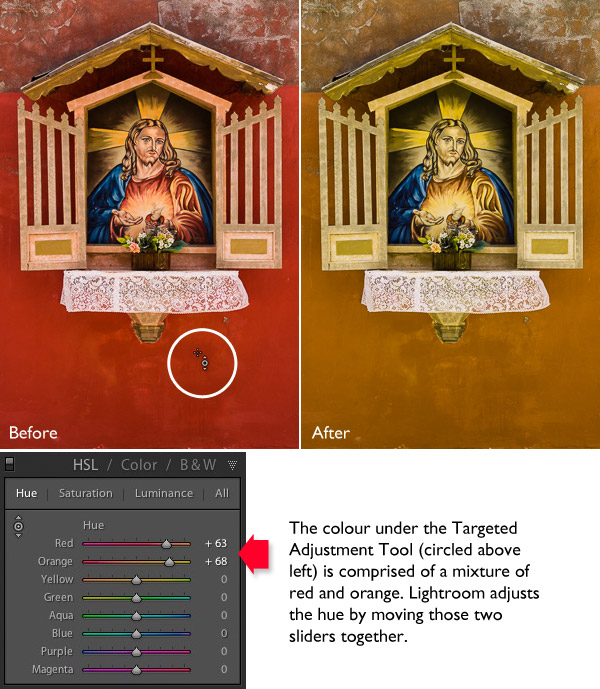
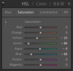
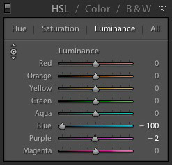
My Mastering Lightroom ebooks are a complete guide to using Lightroom’s Library and Develop modules. Written for Lightroom 4 & 5 books One and Two take you through every panel in both modules and show you how to import and organise your images, use Collections and creatively edit your photos. Book Three shows you how to create stunning black and white images in Lightroom.

The post Mastering Color in Lightroom using the HSL Tab by Andrew S. Gibson appeared first on Digital Photography School.


Digital Photography School

 
Comments Off on Mastering Color in Lightroom using the HSL Tab

Posted in Photography


Hydraulic Lift to Save House on Stilts from Future Flooding

24 May

[ By WebUrbanist in Architecture & Houses & Residential. ]

farnsworth home fall trees

A Modernist classic, the famous Farnsworth House by Mies van der Rohe was originally built with a raised platform but that has not managed to save it from floods, leading its custodians to an extreme solution: jacking the building up when the neighboring river rises.

home flooded

Per the Chicago Tribune, options under consideration include moving the home back away from the water’s edge or raising it permanently in place, but both of these (argue advocates of the third alternative) fail to preserve the structure in its planned context.

farnsworth house plans options

As ArchDaily reports, “The mechanism itself would use a series of trusses, which ordinarily lie flat on their side, but are raised to a vertical position by hydraulic rams when a flood is detected. The cost of installing the system is estimated at $ 2.5 million – $ 3 million.”

farnsworth over river hover

The cheapest option would be to move the house away from the river, but that, in turn, takes away its key views and a critical driver of its raised and cantilevered form – imagine, if you will, shifting Falling Water away from the river over which it sits.

farnsworth historic preservation site

The favored option might sound far-fetched, and raises preservation questions, like: what lengths should we go to in order to save widely-studied buildings, and how justified is their position in history books in the first place if their structural design features such flaws?

Share on Facebook


[ By WebUrbanist in Architecture & Houses & Residential. ]

[ WebUrbanist | Archives | Galleries | Privacy | TOS ]


WebUrbanist

 
Comments Off on Hydraulic Lift to Save House on Stilts from Future Flooding

Posted in Creativity


Eine Million Likes

24 May

Perfekt soll es sein, das Foto. Keine Makel, nur schillerne Großartigkeit, gepaart mit filigraner Bildbearbeitung und erfüllt mit solchem Drama, dass es ist, als ob man einem Liebslied zuhöre. Es soll sie begeistern, die Massen. Ihnen die Sprache verschlagen.

Das dachte ich. Als ich anfing mit der Fotografie. Ich wollte es so. Wünschte mir, dies einmal zu erreichen. Den Trick zu wissen, wie es funktioniert.

Damit ich es tausende Male wiederholen könnte, von jeder Sitiation ein perfektes Bild aufzunehmen. Ich sah mich mit dem Laser-Blick, der alles durchdringt und aus hunderttausend Perspektiven die beste findet.

Um allen zu zeigen, dass ich es kann. Dass meine Fotos einfach perfekt sind. Großartig. Unerreicht. Wahnsinn. Eine Million Likes bekommen.

Bullshit.

Ein Mann mit aufgeschminktem Hitlerbart guckt in die Kamera.

Was sich hinter meiner romantisierten Vorstellung der Fotografie versteckte, war die Sucht nach Anerkennung. Ja, wir haben Dich alle lieb und Du bist der Beste. Der Allergeilste.

Und der Angst vor Ablehnung. Wehe, mein Bild ist nicht perfekt. Wehe, es hat nicht mindestens so und so viele Favs und Likes. Wehe!

All das wollte ich übertrumpfen. Und allen gefallen. Die Fotografie war nur Mittel zum Zweck.

Doch diese Wunschvorstellung vom perfekten Bild erzeugte in mir vor allem das: Immensen Druck und eine riesige Kreativ-Blockade.

Moment, ich muss hier kurz ausschweifen. Kreativ. Das hört sich nervig esoterisch an. Kreativ-Workshop für Erwachsene. Töpfern mit Panflötenmusik. Ausdruckstanz in lilanen Kleidern. Irgendwie 80er.

Wenn ich „kreativ“ sage, dann meine ich nicht das. Wenn ich kreativ sage, dann meine ich, mit der Kamera unterwegs zu sein und einfach Spaß zu haben. Bock darauf zu haben, rauszugehen und zwei Stunden zu fotografieren, das Licht einzufangen und mich ins Chaos der Stadt zu werfen.

Verschiedene Menschen gucken in die Sonne und heben die Hand.

Das ist für mich kreativ sein.

Doch die bescheuerte Illision, das eine, perfekte Foto zu machen, torpedierte ein Kreativ-Werden die komplette Zeit über. Ich verkrampfte innerlich. Setzte mich unter Druck. War sehr, sehr streng zu mir.

Spaß am Fotografieren? Kaum. Ich verlor zunehmend die Lust daran. Zwang mich zwar immer wieder, loszuziehen und dachte, dass ich einfach nicht diszipliniert genug wäre. Einfach zu faul wäre und mich zwingen müsste.

Irgendwann würde ich es sicher machen, das

super
derb
geile

Foto.

Wenn ich gut genug wäre. Wenn ich meine Technik bis ins Hunderttausendstel ausgefeilt hätte. Dann. Irgndwie, irgendwo, irgendwann.

Ein Mann rast auf dem Fahrrad vorbei.

Dann würden mich die Leute beklatschen. Ich würde bekannt werden. Bekannt als Fotograf.

1.000.000 Personen gefällt das.

Doch, wie gesagt, es funktionierte einfach nicht. Ich bekam schon Kopfschmerzen beim Gedanken an die nächste Fototour. Alles fühlte sich taub und so komisch an.

Meine Vorbilder waren all diejenigen, die auf DeviantArt und Flickr absahnten. Die hunderttausend Views auf ihren Fotos hatten und die jeder geil zu finden schien. Sowas wollte ich. Das spornte mich an. Das war so… perfekt.

Und ich hörte auf die Foto-Profis, die ständig Disziplin predigten. Die allen erzählten, dass sie ihre Ärsche hochkriegen müssten. Die ach-so-erfahrenen, die jedem unter die Nase reiben, wie lange sie doch schon fotografierten und was für geile Burschen sie doch wären.

Nochmal Bullshit.

Ein Mann zieht eine Erotik-DVD heraus.

Der Perfektionismus hat meine Fotografie kaputt gemacht. Oder zumindest das, was ich mir unter perfekt so vorstellte. Dieser Hunger nach Anerkennung und die scheiß Angst davor, negative Kritiken, fiese Kommentare zu bekommen oder gänzlich links liegen gelassen zu werden.

Ja, all das hat meine Kreativität so lange gelähmt, bis ich in ein riesenfettes Loch fiel.

Das Loch war nicht schwarz und es war auch nicht rund. Nein, es sah so aus: Ich genehmigte mir ständig Fotopausen, die immer länger wurden. Noch eine. Dazwischen mal rausgehen, fotografieren, doch das reichte, um die alten Dämonen zu wecken und gleich wieder das Handtuch zu werfen.

Es fühlte sich an, als hätte ich alles verloren. So viel Hoffnung hatte ich auf die Fotografie gesetzt. So viel hineingewünscht, herbeigesehnt und so viel gewollt. Doch es schien so, als ob mir nicht mal ein einigermaßen gutes Foto gelingen könnte.

Klar, wenn der Maßstab perfekt ist.

Vor zirka fünf Jahren nahm ich dann Abstand von allem und fühlte in mich hinein. Spürte hin, was das alles mit mir machte und dachte nur eines:

Leckt mich doch. Alle.

Eine Frau steht von einer Fensterscheibe mit Plakatierungen zum Ausverkauf.

Denn langsam wurde ich wütend. Wütend auf alles, was ich mit (perfekter) Fotografie in Verbindung gebracht hatte. Auf alle tollen Fotorockstars, Superprofis und Disziplin-Prediger. Wütend Auf Kamera-Nerds, Foto-Blogger, Fotomagazine. Alles war scheiße. Und ich hätte am liebsten direkt aufgehört.

Vor allem aber war ich wütend auf mich. Ich wollte und konnte nicht zugeben, dass ausgerechnet ich jetzt in diesem Loch war. Ich, der doch schon zig Artikel über Disziplin und kreative Lösungen mit Blockaden geschrieben hatte. Ich, der doch dachte, alles verstanden zu haben. Der sein Blog „Digitale Fotografie Lernen“ genannt hatte.

Wie dumm.

Doch genau an diesen Punkt musste ich kommen. Denn irgendwann begann ich, diese Sehnsucht nach Perfektion und Anerkennung zu hinterfragen. Die Angst vor der Ablehnung anzusehen und zu überlegen, was denn daran so schlimm wäre, wenn meine Bilder auf einmal nicht mehr gemocht würden.

Keiner Person gefällt das.

Ein Mann mit Hornbrille.

Ja, und?

Ich fragte mich, ob es das alles wert ist. Überlegte, ob es nicht eigentlich alles anders wäre. Dass der Traum vom perfekten Fotografen ein Luftschloss war, in das ich mich selbst eingesperrt hatte.

Und irgendwann, ich weiß nicht mehr genau wann, machte es wortwörtlich klick. Ich schaute auf die letzten Monate zurück und entschied mich ganz bewusst gegen die Fotografie, wie ich sie bis dahin kannte. Und erfand meine eigene Version davon.

Ich stellte meine eigenen Regeln auf. Und die hießen ungefähr so:

1. Jedes Foto, das besser als völlige Scheiße ist, ist gut.
2. Ich fotografiere, was ich will und wie ich es will.
3. Ich ignoriere in den kommenden Monaten jede Meinung zu meinen Bildern. Auch die Lobhudeleien.
4. Wenn meine Fotos nicht gemocht werden, ist das nicht mein Problem.
5. Disziplin my ass.
6. Perfektion my ass.
7. Likes
8. My
9. Ass.
10. Ich glaube niemandem, der mir ungefragt meine Fotos „zerreißt“.

Für mich war erst einmal wichtig, zu klären, was ich nicht will. Um später eine Grundlage für das zu schaffen, was ich will.

Und auf einmal öffnete sich etwas in mir. Mir wurde im Herzen ganz warm und leicht. Hansi Hinterseer klingelte an meiner Tür und sang mir ein wunderschönes Lied.

Scherz.

Ein Mann spielt auf der Ziehharmonika – an der Wand hinter ihm steht LOL.

Scherz beiseite.

Irgendwann bekam ich wieder Lust. Hatte auf einmal wieder Bock auf’s Fotografieren. Wollte wieder losziehen. Neue Fotos machen.

Und das alles, ohne mich zu irgendetwas zwingen zu müssen. Ganz ohne Disziplin. Wer hätte das gedacht. Ich fand meinen Zugang zum Nicht-Perfekten. Zum Komplexen. Unfertigen.

~

All das ist heute Teil meines Fotografierens. Ich zwinge mich nicht, rauszugehen. Das Gegenteil ist der Fall: Ich habe heutzutage extrem viel Lust, neue Fotos zu machen und muss mich eher bremsen, damit der Rest der Arbeit nicht liegen bleibt.

Nein, ich bin nicht geheilt. Immer wieder werde ich neidisch auf andere Fotografen, die hunderttausend Fans auf Facebook haben oder ständig perfekte Fotos zaubern, die dann bejubelt werden.

Doch ich habe mich verändert. Ich verfalle dem Hype nicht mehr und weiß, dass es keinen Sinn macht, all dem hinterher zu hecheln. Der Wert meiner Bilder liegt nicht in der Anzahl der Likes.

Meine Fotos haben sich auch verändert. Ich habe mein Ding gefunden. Und ich weiß, dass meine Fotos nicht perfekt sind. Das müssen sie auch nicht mehr sein.

Einer Person gefällt das.

Mir.

Ein Mann lacht in die Kamera.


kwerfeldein – Fotografie Magazin | Fotocommunity

 
Comments Off on Eine Million Likes

Posted in Equipment


Nur oberflächlich dunkel

24 May

Man könnte meinen, dass sich unter der fotografierenden Jugend in unserem Nachbarland Polen ein ganz eigener Stil herausbildet. Zumindest steht die polnische Künstlerin Sonia Firlej, deren Arbeiten ich Euch heute vorstellen möchte, sehr eng in einer Reihe mit zum Beispiel Inpluvia Tenebrae. Vielleicht ist es aber auch nur mein Geschmack, der für diese Nähe sorgt, da ich beide ausgewählt habe.

Sonia Firlej ist Jahrgang ’88, studierte Textil- und Fashiondesignerin und fotografiert seit zehn Jahren. Sie sagt, dass sie Inspiration unter anderem aus der Musikrichtung Acid bezieht, die sie in enge Beziehung zu ihren Bildern setzt. Ohne Musik ist ein Bild leer und umgekehrt.

Eine andere Quelle der Inspiration ist das Innere des menschlichen Körpers und alles, was dort abläuft. Sowie das teilweise unerklärliche Verhalten und eigentümliche Angewohnheiten des Menschen. Nicht nur für ihre Fotografie, sondern auch für ihre Textilgestaltungen und Malereien – Kunst und Erschaffen im Allgemeinen.

Oberflächlich betrachtet sieht ihre Arbeit nach Dunkelheit aus. Aber sie sucht nach der Schönheit im Hässlichen, der Angst und einfachen Gegebenheiten. Gegenständen und hässlichen, alten, aber wahren Geschichten. Märchen sind für sie nur Geschichten mit aufgeblasener Bedeutung – uninteressant für sie, die tiefer gräbt.

Wie soll ich erklären, dass die Modelle in meinen Bildern seltsame Dinge tun und komische Kleidung tragen? Jeder von uns ist auf irgendeine Art ein „Freak“. Ich sammle zum Beispiel Porzellan-Puppenköpfe. Ich bin nicht dunkel, aber ich habe eine Menge Angst, eine böse Seite und bin so unperfekt wie jeder andere.

Ich weiß nicht, wer ich bin und ich möchte es lieber auch nicht wissen.

© Sonia Firlej

© Sonia Firlej

© Sonia Firlej

© Sonia Firlej

© Sonia Firlej

© Sonia Firlej

© Sonia Firlej

© Sonia Firlej

© Sonia Firlej

© Sonia Firlej

© Sonia Firlej

© Sonia Firlej© Sonia Firlej

Habt Ihr Lust bekommen, noch mehr Arbeiten von Sonia zu sehen und auf dem Laufenden über neue Kreationen zu bleiben? Dann besucht doch ihre Portfolios auf Facebook und deviantART oder ihre Webseite. Oder schaut, was sie aus Textilien macht.


kwerfeldein – Fotografie Magazin | Fotocommunity

 
Comments Off on Nur oberflächlich dunkel

Posted in Equipment


Street photography tips with Zack Arias

24 May

Screen_Shot_2014-05-22_at_2.03.28_PM.png

Photographer Zack Arias is particularly known for is his street work, and in a new video he shares some street photography tips while shooting with a Fuji X-T1 in Marrakech, Morocco. Even though the video is clearly sponsored by Fujifilm, it’s more than just a video tour of a new camera system. Arias talks about subjects and framing, composition and timing, and shows the resulting images after each technique. Learn more

News: Digital Photography Review (dpreview.com)

 
Comments Off on Street photography tips with Zack Arias

Posted in Uncategorized


Filmmaker links 50 Lumia 1020s to create ‘bullet time’ effect

24 May

Arc-of-Wonder-feat1.jpg

Filmmaker Paul Trillo has teamed up with Microsoft to build an apparatus which they call the ‘Lumia Arc of Wonder’. It consists of 50 Nokia Lumia 1020 smartphones fixed to a custom-built metal arc on casters, some networking equipment and external power sources. Click through to read more, and see the results on connect.dpreview.com

News: Digital Photography Review (dpreview.com)

 
Comments Off on Filmmaker links 50 Lumia 1020s to create ‘bullet time’ effect

Posted in Uncategorized


Sun Kissed With Bartek Szewczyk

24 May

Bartek Szewczyk Wins Fahion Photography Blog's Photo Of The Week Competition (FashionPhotographyBlog.com)
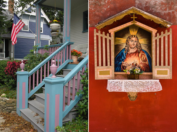
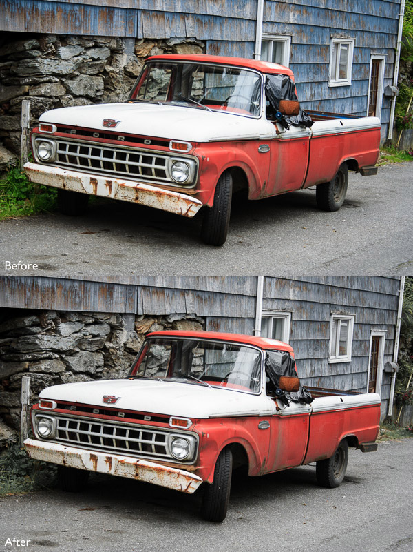
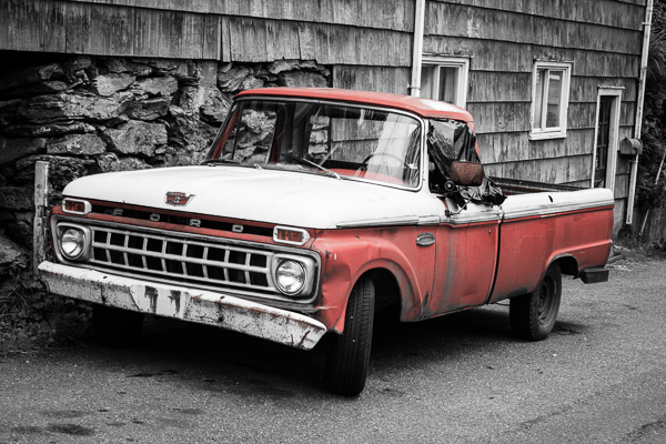
It was quite a close call when Bartek Szewczyk won his round of Photo of The Week, under the theme “sun kissed”. The week that the winning photo was short listed, it was up against some pretty strong and creative competition. The votes were predominantly split between this photo and another photo and it took one vote in the last minute that pushed the votes in this photo’s favor so there was only one point difference between first and second place.

I think why the readers chose the Polish portait photographer’s photo was because of the simplicity of its composition. It is a reserved and demure photo. At times, it can be easy to go over the top without restraint if you let your creativity loose but to able to pull back, edit and control the output of images in the shoot is a skill I think Bartek Szewczyk demonstrates well.
The control of natural light on the models hair, face and skin is superb. You can understand how this photo won Photo of the Week with theme, “sun kissed”. A halo in the hair with a golden honey glow, makes the model appear all the more innocent in personality, almost angelic, as she timidly breaks from her silent contemplation to turn and look directly at the viewer looking at her.
I do like how the quietness of the photo and perceived shyness of the model allows the contrast of the black and white checkered dress that she is wearing allowing it to speak. It definitely catches the eye as the difference against the golden greens of the background scenery makes the dress pop and grabs the viewers attention.
While there are apparent stand out points in this photo there are some elements that holds the photo back. I have an eye where little escapes my vision and when I see garments appearing awkward in photos I do take notice of it. In the case of this photo there are at least two things with the garment that distracts my attention from the beauty of the dress. The first is that the model is sitting on the dress and it appears to be poking out behind her through the seat like a large lump, and it is not looking the most flattering for that dress.
The second point, is that with stripes and patterns on garments it is important to make sure that those details resonate and are clearly visible to the viewer. By making the model pose in a crouched sitting pose, crushes the dress and the checkered patterns become distorted. By doing so, it is making the detail of the dress secondary in the picture which in turn makes this picture more towards a portrait of a female model wearing a nice dress, rather than being a fashion shot (which in fairness a portrait photo was what was the photographer’s intention I think). I’m also curious to see how this photo would look like in black and white given the striking checkered pattern on the dress and the delicate tones of the background.
To improve this photo I would suggest a couple of things. Firstly, I would work with the model to get her in more relaxed positions. Currently, they are looking quite stiff. The rigidness and heaviness of the model’s hands take away from the delicate ambiance and lightness resonating from this photo. I would also get the model to vary her poses across different levels of the seat, particularly standing positions to minimize distorting the pattern on the dress to showcase the dress.
Stylistically, I would try to pair the dress with another pair of shoes, perhaps something that will compliment the dress more, perhaps heals. Also, as a general guideline, with models wearing bangs as a fringe cut to make sure the eyes are visible in the photo as it can be easy for the model’s eyes to be covered unless that is the look you wanted to achieve. I know there are exceptions to this guideline, as I have seen images featuring bangs covering the eyes, but they were featuring hair care and hair styling products or for edgy fashion spreads, but in the case of a quiet portrait I’d be cautious of having so much hair covering the face and neck area, because it tends to hide the beauty of the model’s face, which is what you want to capture in a portrait shot.

To find out more of Bartek Szewczyk’s photo’s you can visit his website: BartekSzewczyk.com or blog: Blog.BartekSzewczyk.com


Currently, we have another round of Photo Of The Week running. To participate in the voting, make sure you “like” our Facebook page here and vote for your favorite photographer‘s photo out of the finalists in the comments section of the post. The photo with the most vote’s by the end of the week at Sunday midnight will win Photo of the Week and win the great prizes on offer.
Since FashionPhotographyBlog.com is Google’s #1 site on fashion photography in the world, you might be interested in entering our Photo Of The Week competition. this could be your entry to some great exposure if you submit your photo and win. To find out more details on how to enter, make sure you join our mailing list. We will send you the entry details via your email.
As a reminder, voting ends at the end of the week so make sure you get voting on our Facebook page here.
At the end of the day, the critique is just one opinion. You may agree or disagree and that’s healthy. We want to know what you think. Tell us in the comments below, do you agree with how this week’s voting outcome? What is your critique on this photo? We want to here from you!


Fashion Photography Blog

 
Comments Off on Sun Kissed With Bartek Szewczyk

Posted in Uncategorized


23. Mai 2014

24 May

Ein Beitrag von: Paul Weber

© Paul Weber


kwerfeldein – Fotografie Magazin | Fotocommunity

 
Comments Off on 23. Mai 2014

Posted in Equipment