If you’ve been using a digital camera for any length of time, you’ve probably heard about White Balance. You may still be wondering exactly what it is, and how to use it; or you may be using it right now and be wondering how it can possibly be something “creative”.

Different white balance settings create different looks
I’m going to show you some of my techniques for using White Balance to creatively enhance your landscape photography and with a few simple steps you can unlock the remarkable power of creative White Balance. Don’t worry, this is not a technical discussion, there are lots of references about that aspect of White Balance online. This article explains a simple shooting technique you can start using right now.
The Color of Light

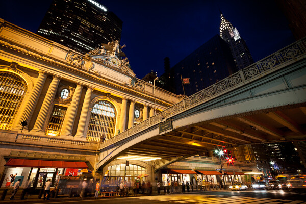
Daylight setting
Have you ever taken photos in an office, and been dismayed to see that your results had a sickly green cast to them? Or taken photos under cloudy, lifeless, skies only to see your images appear cold, flat and a little blue?
This happens because light comes in a variety of colors. The reasons for these colors is a result of wavelengths of light and the light spectrum. But we’re not going to get into this too deeply here. Just know that all light has different colors, and even the sun has different colors at different times of the day. Every landscape photographer knows about the “sweet light” or the “magic hour” – the times around sunrise and sunset when the color of the light is perfect for photography.
The crazy thing is that your eyes usually adjust to compensate for these color shifts, especially the subtle ones, so you won’t necessarily perceive these color differences, and in some cases your eyes are not as sensitive to color shifts as are the sensors in your camera. So you snap that office photo and the result isn’t as great as you had expected. Because of the color, those fluorescent bulbs cast a green pall over everything but you didn’t see it because your eyes “adjusted” the color for you.
This is where your White Balance settings play an important role in correcting potential problems by adjusting the color of the light in the camera. It is really important when you’re taking images of people, because the skin tones will be unattractive and far from natural looking.
But, if you are a landscape photographer, armed with the knowledge that light has color and your camera has a tool that can change the color of light, you can use this knowledge to do more creative landscape photography.
White Balance for Landscape Photography

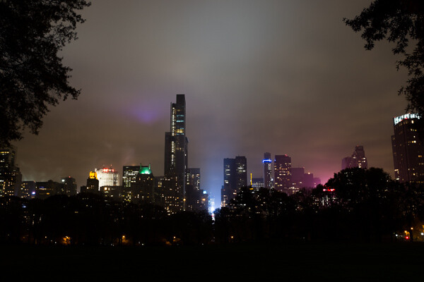
Fluorescent setting
I shoot a lot of landscapes, in fact I pretty much ONLY shoot outdoors. Thankfully I almost never have to deal with those ugly green fluorescent lights. But what I do deal with are sunsets, sunrises, autumn colors, mountains, flowers, etc. – all those good things we find in nature.
I noticed that sometimes my sunset images just didn’t pack the punch the way I SAW it at the location. Sure, I could go back to my computer and make adjustments. Or, without degrading any pixels, I could punch up my images in camera by purposely fooling it into using a different White Balance. In other words I don’t use White Balance to correct color casts, I use it to ADD color casts! I deliberately use the “wrong” White Balance setting.
Landscapes created at sunset or sunrise, snow and winter scenes, and those with night sky dominating lend themselves well to creative White Balance techniques.
Sunsets can become more warm, or more soothing, with violet overtones if you use the Cloudy White Balance setting. Autumn foliage pops with yellow and orange when you use Shade as your White Balance! The Aurora Borealis (Northern Lights) becomes a rich alien green, rolling through a deep royal blue sky, by changing your White Balance setting to Incandescent or Tungsten. Please note, that you use these settings regardless of actual light colour.

Fluorescent daylight camera setting
|

Custom white balance setting A3 M3
|

Auto white balance setting

Daylight white balance setting

Shade white balance setting
How to use Creative White Balance
To use creative White Balance, there are just a few things to understand about using White Balance in general.
Since White Balance is designed to correct color casts, the setting on your camera will compensate, or change the light, to be the opposite of the shooting situation. In other words, incandescent lights are too warm (orange), so changing your White Balance setting to Incandescent or Tungsten will add a blueish tinge. The light in the shade is blueish, so changing the White Balance setting on your camera to Shade adds warmth, orange and red.
To get creative with White Balance you’ll need to find the dial or menu for changing your White Balance settings. Most cameras have presets for Flash, Shade, Cloudy, Incandescent (Tungsten), Fluorescent, Sunny (or Daylight), and Auto.
Look for the ICONS – a cloud (cloudy), a house (shade), a sun (full sunlight), a fluorescent bulb – long and skinny (fluorescent), an old school light bulb (incandescent or tungsten), a lightning bolt (flash), and AUTO or A for automatic.
Next you’ll need to know how to set your White Balance for a specific type of shot. The best way is to experiment by trying all of your White Balance settings for the same scene. So if you want to ramp up your warm colors, say in an autumn scene or sunset, change your White Balance to Shade, Flash, and Cloudy! Compare your results.
Shooting the night sky or the Aurora Borealis, change to Tungsten or Incandescent to make the colors cooler, make that Aurora really pop! The added blue tones give the night sky a rich royal blue tone, while the green light of the Aurora turns an eerie alien glowing green.
Here’s a handy chart I made for you – so you can literally “dial it in”. All you need to do is change your settings according to the type of landscape scene, using the chart. This will give you a great place to start.

Supercharge your Creative White Balance
Depending on your camera, you may also be able to fine tune and supercharge your custom White Balance once you find one that provides the boost you like.
In Nikon DSLRs you may see this graph that enables you to make your own custom White Balance presets. It’s typically in your shooting menu under the White Balance tab. Consult your camera manual to see if your camera has this option, and how to apply it.


Custom white balance in camera
By selecting a specific color balance presets, you can ramp up the warmth and impact for sunrise and sunset, as well as boost the coolness for winter snow landscapes.
Easy Experimentation
If you shoot RAW, and can’t switch White Balance in the field, you can also easily adjust your White Balance in post-production. Lightroom, Photoshop, Nikon Capture and most other image editing programs have a RAW White Balance setting. Nikon shooters note that you’ll get the best results adjusting RAW [NEF] White Balance if you use Nikon Capture, as Nikon encrypts its White Balance “formula”. Other software can only read parts of the White Balance data so your results may not be as high impact as they could be.
If you have some landscape sunset or sunrise shots on your computer, give creative White Balance a try right now. Here are few of my Lightroom White Balance edits so you can see how much control you have over the drama and mood of your lighting.

Auto white balance in Lightroom

Cloudy custom white balance in Lightroom

Auto white balance adjustment in Lightroom

Auto white balance adjustment in Lightroom
Do you have some other tips you can share on using White Balance creatively? Please tell us about them in the comments below and share your images as well.
For some other landscape photography tips try some of these articles:
- 5 Steps to Help you Take Better Landscape Photos
- 10 Most Common Mistakes in Landscape Photography – and How to Overcome Them
- So you Want to Shoot Landscapes? [Top 12 dPS Landscape articles from 2013]
- Living Landscapes – A Guide To Stunning Landscape Photography – a dPS ebook
- Loving Landscapes A guide to landscape photography workflow and post-production – a brand new dPS ebook by the authors of Living Landscapes
The post Guide to Creative White Balance for Landscape Photography by Alex Morrison appeared first on Digital Photography School.

Digital Photography School


You must be logged in to post a comment.