Die meisten kennen wahrscheinlich das sogenannte „365-Tage-Projekt“.
Ein Jahr lang jeden Tag ein Foto machen. Jeden Tag! Man könnte auch sagen: Der Ironman unter den Fotografieprojekten.
Natürlich ist das je nach Anspruch an das tägliche Foto mehr oder weniger schwierig und aufwändig. Ich bewundere jedenfalls schon lange all die Leute, deren tägliche Fotos bei mir höchstens einmal pro Woche ins Zeit- und Kreativitätsmanagement passen würden. Ich bewundere sie aus einigem Abstand, mit ein wenig Neid und mit viel Respekt.
Immer wieder fällt mir auf, dass diejenigen, die es schaffen, das Projekt erfolgreich abzuschließen, beeindruckende Fortschritte gemacht haben. Sicher, in einem Jahr lernt man eben eine Menge, aber dieses Projekt scheint kleine Wunder zu bewirken. Wahrscheinlich ist das der Kontinuität und dem gewissen Schaffensdruck zu verdanken.
Da ich selbst keine Erfahrung habe, mich das Thema aber sehr interessiert, habe ich fünf junge Fotografen, die das Mammutprojekt gestemmt haben, nach ihren „365-Tage-Erlebnissen“ befragt.
~

Siréliss
Ich habe mein 365-Tage-Projekt angefangen, nachdem ich immer wieder sah, wie andere Fotografen es schafften und wie ihnen von allen Seiten gratuliert wurde. Ich wollte mich verbessern und vielleicht auch ein paar Gratulationen einheimsen.
Dank dieses Projektes habe ich die Brenizer-Methode kennengelernt, viele neue Werkzeuge in Gimp entdeckt und viel über Komposition, Licht und Schatten gelernt. Aber das Allerwichtige ist, dass ich das Gefühl habe, meinen eigenen Stil gefunden zu haben.
Das Projekt ist hart. Das kann ich nicht bestreiten. An manchen Tagen ist man müde oder hat keine Idee. Man fühlt sich wie eine ausgedrückte Orange. Man ist gerade mit dem einen Bild fertig und muss schon nach einer Idee für den nächsten Tag suchen.
Trotzdem würde ich das Projekt sofort weiterempfehlen. Ich weiß, dass ich ohne es niemals so schnell so viel gelernt hätte. Kurz war ich erleichtert, als es vorbei war, aber jetzt vermisse ich es total und überlege, es noch einmal zu wagen. Ich kann es jedem, der es sich zeitlich zutraut und unter Druck gut arbeiten kann – oder genau das lernen möchte – nur empfehlen. Es ist wie tägliches Workout, nur eben für den eigenen Stil und die eigenen Ideen, statt für die Muskeln.
~

Gillian Woods
Ich habe mich entschlossen, das Projekt anzufangen, weil ich meine fotografischen Kenntnisse, vor allem im Bereich Portrait, verbessern wollte. Am Anfang war ich sehr enthusiastisch, daher war es gar nicht schwer, jeden Tag ein Foto zu machen und dann ging es einfach in eine tägliche Routine über.
Ich habe erst durch mein 365-Tage-Projekt die Grundlagen der Fotografie gelernt. Vorher hatte ich wenig Ahnung davon, wie ich meine Kamera effektiv einsetzen konnte, aber das änderte sich durch die tägliche Übung sehr schnell. Außerdem habe ich sehr viel darüber gelernt, was ich gerne fotografiere und was weniger und dass ich viel kreativer bin als gedacht.
An manchen Tagen habe ich sehr viel Aufwand in das Bild gesteckt, an anderen Tagen ging das nicht, aber die Unterstützung von anderen hat mir bis zum Schluss geholfen, nicht aufzugeben und jetzt bin ich sehr stolz, dass ich es geschafft habe, ein Jahr lang jeden Tag ein Foto zu machen.
~

Kyle Thompson
Ich beschloss, ein 365-Tage-Projekt zu beginnen, weil ich mich unbedingt verbessern wollte. Ich fotografierte schon seit sechs Monaten, aber machte nur langsam Fortschritte. Ich würde sagen, durch dieses Projekt habe ich alles gelernt, was ich über Fotografie weiß. Allein dadurch, dass ich viel experimentierte und jeden Tag eine neue Idee ausprobierte.
Vor allem gegen Ende des Projektes wurde es aber auch immer schwerer, eine neue Idee zu entwickeln und Zeit für Fotos zu finden, während ich reiste, zur Schule ging und arbeitete.
Trotzdem kann ich es nur jedem empfehlen, der Einsteiger in der Fotografie ist. Die Fortschritte sind riesig und man hat danach schon ein großes Portfolio.
~

Grace Adams
Ich begann das Projekte an einem wichtigen Wendepunkt in meinem Leben und brauchte einfach ein Ziel, auf das ich mich konzentrieren konnte. Es begann also eher als Ablenkung, aber wurde schnell zu einem wunderbaren Weg für mich, meine Emotionen auszudrücken.
Sicherlich war es nicht immer einfach, aber es war doch weit weniger schwer als erwartet. Nachdem es zur täglichen Routine wurde, freute ich mich sogar immer darauf.
Neben den fotografischen Fortschritten ist für mich im Nachhinein viel wichtiger, dass ich jeden Tag dieses wichtigen Jahres dokumentiert habe. Es ist toll, zurückzublicken und Tag für Tag nachvollziehen zu können, wie ich mich entwickelt habe. Nicht nur als Künstlerin, sondern auch als Mensch. Ich bin nicht mit jedem Foto zufrieden, aber jedes einzelne bedeutet mir persönlich sehr viel und das ist es, was für mich wirklich zählt.
~

Grant Heinlein
Ich begann mein Projekt, weil ich sah, welche großartigen Bilder zum Beispiel Lauren Withrow and Alex Stoddard in ihrem 365-Tage-Projekt schossen. Außerdem mochte ich einfach die Herausforderung.
Für mich war das Tollste daran der Gedanke, etwas zu Ende zu bringen, was ich begonnen hatte und das Versprechen sich selbst gegenüber zu erfüllen. Es war definitiv nicht immer einfach. Vor allem, weil ich es zu 100% korrekt machen wollte. Also wirklich das jeweilige Foto am jeweiligen Tag.
Aber sobald man an Tag 200 oder so angekommen ist, gibt es einfach kein Zurück mehr. Es macht wahnsinnig Spaß, sich das erste Foto anzusehen und den Fortschritt zu erkennen. Man versucht sich ja mit jedem Bild zu verbessern und wenn das klappt, ist es einfach ein echt tolles Gefühl.
~
Wahrscheinlich spielt der eine oder andere jetzt doch mit dem Gedanken, es auch einmal zu wagen. Für die, die wissen, dass es zeitlich nicht machbar ist, gibt es aber auch Alternativen wie das 52-Wochen-Projekt – also jede Woche ein Foto – oder einfach verkürzte Projekte wie zum Beispiel das 100-Tage-Projekt.
Und wer sich überhaupt keinem Schema unterwerfen möchte, hat immer noch die Möglichkeit, täglich über die Ergebnisse der Menschen zu staunen, deren Tage scheinbar mehr als 24 Stunden haben.
Die Statements der einzelnen Künstler wurden von Laura aus dem Englischen ins Deutsche übersetzt.

kwerfeldein – Fotografie Magazin


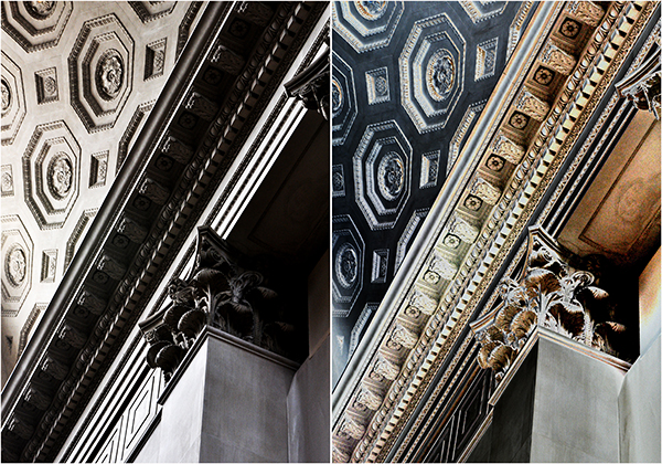
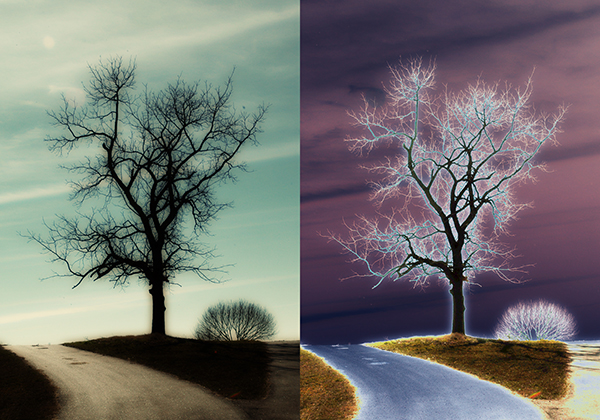
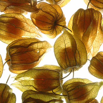 Photo by naughton321
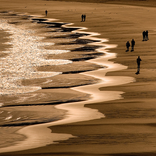 Photo by Ty-Dan
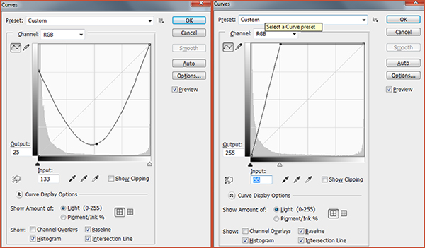
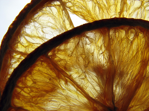 Photo by benefit of hindsight
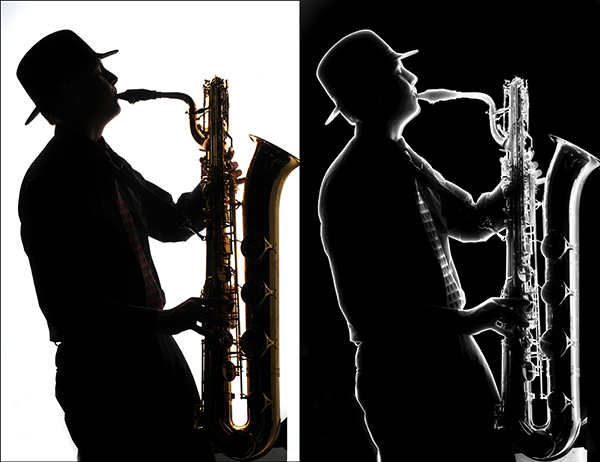
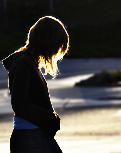 Photo by ‘SeraphimC
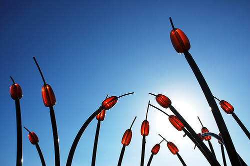 Photo by limonada
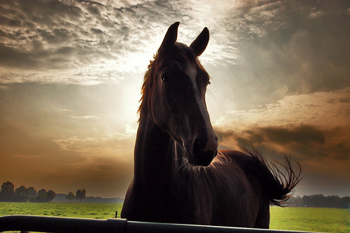 Photo by serni


You must be logged in to post a comment.