RSS
 

Archive for July, 2013

20 Million Sq Ft: World’s Biggest Building Opens in China

16 Jul

[ By WebUrbanist in Architecture & Offices & Commercial. ]

biggest building record breaking

Night never comes to this massive complex newly constructed in China. Complete with its own artificial sun (as well as beaches and waves), the world’s largest structure is not a skyscraper but a building both horizontally and vertically vast.

worlds biggest building design

biggest building night view

The New Century Global Center in Chengdu, Sichuan, has offices, shops and five-star hotels as you might expect, but it also has simulated exterior spaces with LED screens depicting views of artificial horizons as well as theaters, amusement park rides and an Olympic-sized ice skating rink.

worlds biggest interior space

Its square footage is hard to fathom, even in meters (1.7 million square), so its creators have come up with another way to visualize the enormity of the space: you could fit 20 Sydney Opera Houses inside of it, 3 copies of the Pentagon or 329 football fields.

worlds largest building china

Critics call it boring and massive, but fans admire its relative simplicity and highlight its variegated interior experiences. Though basically minimal overall, a thick and wavy roof line helps define it and provides a way to brand and identify it as both a Chinese structure and potentially iconic symbol.

Share on Facebook


[ By WebUrbanist in Architecture & Offices & Commercial. ]

[ WebUrbanist | Archives | Galleries | Privacy | TOS ]


WebUrbanist

 
Comments Off on 20 Million Sq Ft: World’s Biggest Building Opens in China

Posted in Creativity


Sigma 18-35mm F1.8 DC HSM preview updated with lens test data

16 Jul

18-35-news.png

We’ve just updated our preview of the Sigma 18-35mm F1.8 DC HSM with lens test data, courtesy of DxOMark. This lens has generated a lot of excitement as the fastest zoom ever made for SLRs, but the big question is whether its speed comes at the cost of optical quality. We’ve looked into this by comparing the 18-35mm to some current benchmark designs – and the results may surprise you. Click through to read all about it.

News: Digital Photography Review (dpreview.com)

 
Comments Off on Sigma 18-35mm F1.8 DC HSM preview updated with lens test data

Posted in Uncategorized


How to Photograph a Kiss without the Awkwardness

16 Jul

Is this real life or are you in a Taylor Swift music video? You’re in the middle of one of the best kisses of your life!

Amidst the fireworks, stars, and confetti, you catch a glimmer off a camera lens five inches from your face, followed by the sound of a shutter. Moment. Ruined.

Cameras might be notorious kiss-ruiners, but they don’t have to be! Our pal Haley Sheffield is a fantastic wedding photographer who’s a master at capturing kisses that look real, natural, and downright beautiful.

Haley’s tips will show you how to get your couple comfortable and how to direct them to get the best kissing photo possible. Most couples aren’t used to kissing in front of a camera, but they’ll be on-camera kissers in a no time.

Now you can have the best kiss of your life and catch it on camera, too.

Tips for Snapping the Perfect Kiss

p.s. We’re looking to re-invent what/how/where we publish online, and we’re seeking one amazing Editorial & Community Lead to lead the charge.

p.p.s. We’re still on the hunt for an awesome sauce Buyer for the Photojojo Shop. Is it you? Go here.

Why Eliminating Awkwardness Makes for Better Kisses

In my past couple of years as a wedding photographer, I’ve read several articles by some of the industry’s top photojournalists and thought I should be more of a fly-on-the-wall. I’m not giving my clients the room or the opportunity to let those natural moments happen.

Well, that the fly-on-the-wall approach is great in theory and–hey–it works for some people, but you know what I got from it? Photographs of fish-lipped kisses and near-make-out sessions.

In my experience, if you step back thirty feet and tell your clients to “do whatever feels natural”, your clients are not going to look like they just jumped out of a Ralph Lauren ad. They’re going to look uncomfortable. Or maybe a little too comfortable. In their heads, they look like every romance movie they’ve ever seen. In their heads, it’s perfect and magical and worthy of an Oscar.

I want my clients to look at photos of themselves and think, “We look awesome. We look in love. We look happy.” There’s nothing unnatural or inorganic about giving a little bit of direction.

So, if you’re wanting to photograph a kiss without the awkwardness, here are a few tips I’ve developed over the years.

1.HUMOR

If you’re funny, use it to your advantage.

Ask the clients to kiss and then crack a joke as they lean in. You’ll get this beautiful laugh/kiss/smile combo in a natural moment, and probably a sweet kiss with a little extra smirk. Unfortunately, I’m not that funny. So I most often use tip number two.

2. THE SIGNATURE KISS-AND-SMILE

I always, always love a good almost-kiss more than full lip-on-lip action.

There’s something about an almost-kiss or a post-kiss shot that lends to the idea that you’ve really captured a moment in time instead of simply asked the clients to kiss and snapped a picture of it.

This is pretty simple: Ask your clients to hug. Position their arms and hands in flattering pose (if this didn’t happen naturally). Then, ask them to kiss a few times and smile in-between.

It feels goofy, and there will be a little bit of nose-bumping and awkward timing (where one is kissing while the other one is smiling, etc.), but that will lend to an even better almost-kiss smile.

I normally start by saying “Alright, let’s do some kisses and smiles,” and then fire off a few shots until I get a good laugh from the couple. If it doesn’t induce laughter, I’ve found that it often creates this sweet flirtatious moment between them–almost like they’ve forgotten about me for a short time (which is always a good thing).

3. STEP BACK

beforeWhile I feel like my favorite kissing shots have ended up being the close-ups, your clients will always be more comfortable if you start off by giving them space.

So, in the cycle of shooting a kiss, pose or set-up the clients first, tell them you’d like them to kiss-and-smile for a little bit, then back up a good 20-30 feet and photograph them from far away.

This is a great time to get that landscape shot. I often photograph the kiss (and most poses/moments) in this order: landscape, full-body, ¾ body, and close-up.

4. DON’T BE AFRAID TO GIVE DIRECTION

beforeListen. Some people are just awkward. They smush noses or keep their eyes open or kiss like a face-eating-Zombie.

While it can be really uncomfortable to correct a kiss, sometimes you just have to do it.

Tell the clients to tilt their heads instead of smushing noses. If the girl is insecure about her nose, get her to tilt her head away from you.

Ask them to kiss softly if they’re getting a little too sloppy. Say “alright, this time let’s try that again, but both of you close your eyes.” Eliminate the weirdness in the beginning, so you don’t go home from the session praying there was just one frame without the groom’s eyes open.

5. USE MOVEMENT

beforeOftentimes, I’ve realized that clients stiffen up when you put them in uber romantic pretzel-poses.

As rad as the Spiderman kiss is, your clients aren’t Spiderman. They’re not used to hanging upside-down and maintaining a suave composure.

Try to loosen them up by asking them to walk hand-in-hand towards you, and then throw them off by asking them to steal a kiss while they’re walking.

If the couple is right for it, you can ask the guy to hug the girl and spin her around in a circle while exchanging some kisses and smiles.

One of the smallest movements that I’ve found makes a HUGE difference in kiss pictures, is to ask the groom to gently place his hand on the bride’s neck and softly brush her face with his thumb. I normally ask them to do this for a few moments without kissing–just forehead-to-forehead and with their eyes closed.

It really brings their attention into each other, and puts me on the outside just documenting the moment.

OTHER PORTRAIT TIPS

  1. Start out the session by asking the clients how they normally cuddle. Do they normally walk while holding hands? Does she normally wrap her arms around his arm and rest her head on his shoulder? Does he normally place his hand at a certain spot on her back?
  2. Create moments that bring them close, and lessen their time staring into the camera. I often ask my clients to get it really close–like nose-to-nose or forehead-to-forehead–otherwise it looks like they’re avoiding bad breath. (And that joke normally brings on a few chuckles). Sometimes I’ll ask them to walk and try to keep on looking at each other–only looking at the ground if they feel like they’re going to fall, but never looking up at me.
  3. Be yourself. I’m not really a funny girl, and I can be exceptionally calm while photographing (instead of the “YES! YES! Work it, work it!” approach, I’m often exclaiming “Oh, that is just beautiful.”). I don’t know that either approach is better, but I do know that my clients feel way more comfortable in front of my camera now than they did when I was putting on my pseudo-photographer personality. Just be you. Whatever that looks like. It will make them more comfortable being them.

Related posts:

  1. How to Photograph the Holidays — From Around the Web Points of Interest Got ideas for great New Year’s Photo…
  2. How to Photograph Lightning ~Have a cool photo product or site? Reach 270,000 photo…
  3. Schlieren Photography: How to Photograph the Invisible ~Have a cool photo product or site? Reach 270,000 photo…


Photojojo

 
Comments Off on How to Photograph a Kiss without the Awkwardness

Posted in Equipment


Aspect Ratio: What it is and Why it Matters

16 Jul

Aspect ratio

This article is written by Andrew S. Gibson, the author of Square, on sale now at Snap N Deals for a limited time.

Today I’d like to draw your attention to an area of composition that you might not have given much thought to: aspect ratio.

Aspect ratio is the term used to describe the dimensions of an image by comparing the width to the height and expressing it in ratio form.

The aspect ratio of your images is primarily determined by the dimensions of your camera’s sensor (or the film type plus camera design with film cameras). As these physical aspects are fixed, it is easy to take the aspect ratio of your images for granted, and to not consider the implications of the aspect ratio you are using in relation to composition.

Camera makers have realised that sometimes photographers like to work in different aspect ratios, and most recent digital cameras let you change the aspect ratio using the camera’s menu. You can also crop an image to a different aspect ratio in post-processing.

Why aspect ratio matters

Why does aspect ratio matter? It’s all to do with the relationship of the main subject to the sides of the frame, and the amount of empty space you end up with around the subject.

An awareness of the characteristics of the aspect ratio of your particular camera can help you compose better images. It also helps you recognise when cropping to a different aspect ratio will improve the composition of your image.

What is aspect ratio?

Aspect ratio describes the relationship between the width and height of an image. It’s written as a figure, in this form – width:height (width always comes first).

Virtually every digital camera comes with a sensor of one of two aspect ratios:
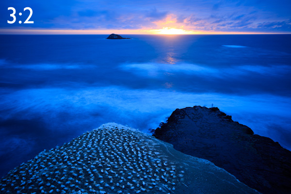
3:2

Aspect ratio

An aspect ratio used by 35mm crop sensor and full-frame SLRs, some Leica medium format cameras, mirrorless cameras, high end compacts and most 35mm film cameras. This aspect ratio has been with us ever since Leica made the first 35mm film cameras early last century.

35mm crop sensor and full-frame SLRs have an aspect ratio of 3:2. The sensor is 1.5 times as wide as it is high.

A full-frame 35mm sensor measures 36 x 24mm. You can express this figure as a ratio: 36:24. Mathematicians always like to simplify ratios so that the relationship between the two numbers is easy to visualise. In this case, you can divide both dimensions by twelve. That gives you 3:2.

Crop sensor cameras have smaller sensors, measuring approximately 22.5 x 15mm (the exact measurements vary, depending on brand and model). These figures conform to the 3:2 aspect ratio of the full-frame sensor.

4:3

Aspect ratio

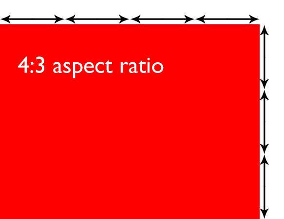
This aspect ratio is used by micro four-thirds cameras, many compact cameras, some medium format digital cameras plus medium format film cameras using the 6 x 4.5cm format.

Let’s compare the two:

Aspect ratio

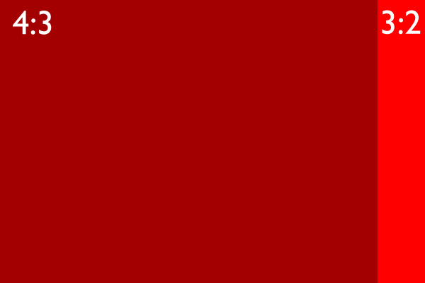
You can see that the 3:2 aspect ratio used by most digital SLRs is slightly longer than the 4:3 micro four-thirds frame. This may not seem like much, but it has great implications for composition. Take a look at the following images to see why. Here’s the original, 35mm version with a 3:2 aspect ratio:

Aspect ratio

And here’s the same image cropped to the 4:3 aspect ratio, as if it had been taken with a micro four-thirds camera:

Aspect ratio

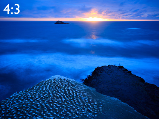
Do you see the difference? It’s subtle but it’s there. The 35mm frame is longer. And that can be challenging when it comes to composition, because you have to find a way of filling that length effectively. Landscape photography in particular often benefits from a shorter frame, and that’s one of the reasons for the popularity of the 6x7cm medium format (7:6 aspect ratio) and 5×4 view cameras (5:4 aspect ratio) amongst landscape photographers that use film cameras. Here’s what the same landscape would look like cropped to these formats:

Aspect ratio

Aspect ratio

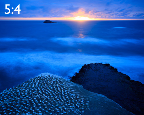
For me, the 7:6 aspect ratio is too short, but 5:4 is a very pleasing aspect ratio to work in.

Now, so far you may be thinking that the difference between aspect ratios is not a big deal. And often, when you are using the landscape format (ie. the camera positioned so that the frame is horizontal), the difference is minimal. It’s not so difficult to work within any of the above aspect ratios.

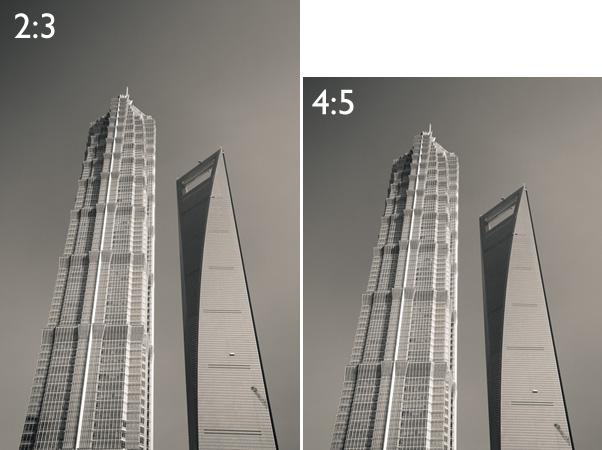
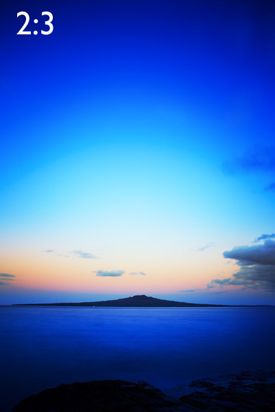
But change to the portrait format (a vertical frame) and it’s a different story. The 35mm frame suddenly becomes a lot harder to fill effectively, and the composition often benefits from cropping to a shorter rectangle. Here are some examples to show you what I mean:

Aspect ratio

Aspect ratio

Aspect ratio

The difficulty that I had with this landscape is that there was too much empty sky in the original image. I solved the problem by cropping to a shorter rectangle. The 4:5 aspect ratio seems to work nicely.

Of course, not all images will benefit from a crop to a shorter rectangle. But if you find yourself struggling to fill the frame, especially if you have a 35mm camera with the 3:2 aspect ratio, then it may be a sign that you would benefit from using a different aspect ratio.

Adventure and landscape photographer Bruce Percy has written an interesting article on this topic.

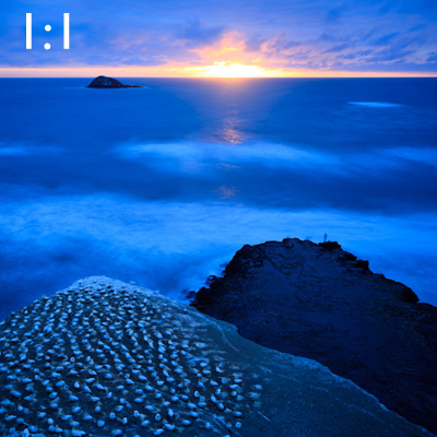
Out of interest, here is the first image cropped to a couple more common aspect ratios. They are the panoramic format (16:9) and the square format (1:1)

Aspect ratio

Aspect ratio

Adjusting aspect ratio in-camera

Many recent digital cameras give you the option of adjusting the aspect ratio using the camera’s menu. If you have a camera with an electronic viewfinder, it may be able to display the cropped image in the viewfinder.

If your camera doesn’t have an electronic viewfinder, you will need to use Live View mode in order to take advantage of the aspect ratio function. The camera will display the cropped image on the camera’s LCD screen.

Whichever option your camera has, you should be aware that if you use the JPEG format, the camera will crop the image. You won’t be able to retrieve the cropped part of the image. If you use Raw, the camera will save the image as captured by the entire sensor, and you can change your mind about the crop in post-processing. Check your camera’s manual for details if you have any doubts.

Cropping in post-processing

It’s often easier to crop in post-processing than in the field. If your camera doesn’t have an aspect ratio function it’s the only way you can do it. Another benefit is that you can go back to old images to see if they would benefit from cropping.

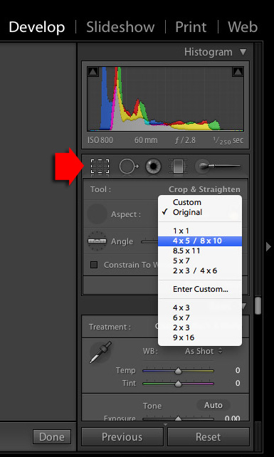
If you have Lightroom, cropping is easy. Just click the Crop icon and select an aspect ratio from the list provided:

Aspect ratio

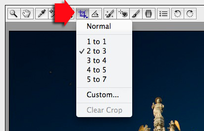
If you have Photoshop CS/CC, the Crop Tool in ACR works in a similar way:

Aspect ratio

Square

Aspect ratio

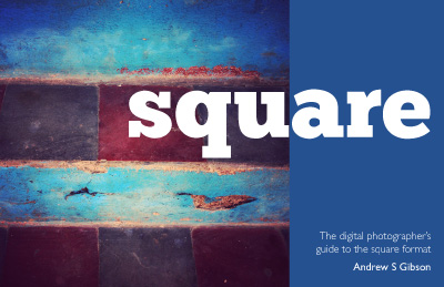
My ebook Square explores the square format from the digital photographer’s perspective. It shows you how to use the square format on your camera, and how to make the most out of what I think of as the fine art photographer’s format.It’s available now at Snap N Deals for a special price for a limited period.


Post originally from: Digital Photography Tips.

Check out our more Photography Tips at Photography Tips for Beginners, Portrait Photography Tips and Wedding Photography Tips.

Aspect Ratio: What it is and Why it Matters


Digital Photography School

 
Comments Off on Aspect Ratio: What it is and Why it Matters

Posted in Photography


Dokumentierte Inszenierung und inszenierte Dokumentation

16 Jul

Vielleicht liegt es daran, dass mein ursprünglicher beruflicher Hintergrund mit dem Schreiben und mit Literatur zu tun hat (und eine gängige Einteilung von Texten „fiktional“ und „nichtfiktional“ ist), aber in meinem Kopf sortiere ich meine Fotografie schon seit längerer Zeit nicht mehr in irgendwelche Genres, die mit dem Motiv des aufgenommenen Bildes zu tun haben, sondern zunächst in die beiden Kategorien „Dokumentation“ und „Inszenierung“.

Die beiden Kategorien scheinen mir als Einordnungskriterium für jede Art von Lichtbild deutlich schlüssiger als „Makro-“, „Straßen-“ oder „Menschenfotografie“, also jene Art von Schubladen, die entweder vom Motiv oder der technischen Herangehensweise an das Bild ausgehen.

In meiner Unterscheidung komme ich von meiner Arbeitsweise, als vom Fotografen: Will ich etwas dokumentieren, will ich also die Wirklichkeit möglichst originalgetreu festhalten, ohne selbst in die Szene einzugreifen oder will ich selbst eine Wirklichkeit erschaffen und diese inszenierte Welt abbilden?

Das ist für mich die wichtigste Frage, wenn ich fotografiere. Es sind zwei Herangehensweisen, die unterschiedlicher nicht sein könnten und sich maximal auf meine Arbeitsweise auswirken: Im ersteren Fall bin ich Beobachter der Welt, der mit einer Kamera ausgerüstet durch sie hindurch läuft, nach Motiven sucht und versucht, seine Entdeckungen auf eine spannende Art einzufangen und zu portraitieren, im zweiten Fall selbst Erschaffender, Künstler, der Dinge auswählt, neu zusammensetzt und inszeniert und diesen Prozess schließlich dokumentiert.

Natürlich sind auch bei dieser Form der Einteilung die Grenzen sehr fließend und wie so oft sind es gerade die Grenzfälle, die besonders spannend sind: Es sorgt für Irritation, wenn man dort dokumentiert, wo eigentlich Inszenierung die Regel ist, wie ich beispielsweise in den Kommentaren zu verschiedenen Straßenfotografie-Artikeln immer wieder feststelle.

Menschen müssen inszeniert abgebildet werden, so lautet der Konsens. Das Gegenteil gilt in weiten Teilen für Natur- und Reisefotografie, bei vielen Wettbewerben ist es geradezu verboten, selbst mit seinen Motiven zu interagieren und die Wirklichkeit dadurch zu verändern. Hier ist die Dokumentation der Standardfall und wenn man dagegen verstößt, produziert man im Zweifel einen kleinen Skandal.

Künstlerische Fotografie wird wiederum generell mit Inszenierung assoziiert, mindestens technischer Art (das Paradebeispiel sind die berühmten verwackelten, grobkörnigen Schwarzweißbilder, die die Foto-Technikfreaks immer belächeln). Konzert- und Eventfotografie beschäftigt sich schließlich mit der Dokumentation von Inszenierungen.

Die Technik spielt in einer solchen Dichotomie natürlich eine große Rolle, sie ist gar eine zweite Ebene, auf der entweder dokumentiert oder inszeniert werden kann: Gebe ich das Bild in den Farben wieder, die auch das menschliche Auge wahrnimmt oder nicht?

Und was passiert eigentlich, wenn ein Bild aus einer völlig unnatürlichen Perspektive aufgenommen wird, per Ultraweitwinkel und/oder mit stark das Bild beeinflussenden Filtern? Ist das noch dokumentarische Fotografie? Oder verfremdet es alles schon zur Inszenierung, weil es einen Blickwinkel zeigt, der für uns als Mensch mit unserem biologischen Wahrnehmungsapparat nicht zu erkennen ist? Die gleichen Fragen gelten analog für Highspeedaufnahmen und Lupenobjektive.

Die Frage, die man mir zu dem Bild, aus dem ein Ausschnitt über dem Artikel zu finden ist, einige Male gestellt hat, war: „Hast Du die beiden Schnecken aufeinander gesetzt?“ Die Antwort ist: „Nein, ich fand die Szene wirklich so vor“, aber ich lese aus der Frage, genau wie aus den Diskussionen über Streetfotos und den schier endlosen Streitereien über Bildbearbeitung, dass ich nicht der Einzige bin, der die Unterscheidung in diese beiden Kriterien vornimmt, dass viele Menschen Fotografie ebenfalls unbewusst so einzuordnen scheinen.

Gerade diese unausgesprochenen Gesetze zu brechen und darüber nachzudenken, was man eigentlich gerade tut, wie man als Fotograf mit seinem Bild umgeht und ob das auch auf eine andere Weise möglich wäre, erscheint mir sehr wichtig, denn an genau diesen Übergangsstellen verhindern unausgesprochene, aber verinnerlichte Dogmen oft innovative Ideen, wie man in den seitenlangen und niemals zielführenden Diskussionen in Fotoforen beobachten kann:

Viele lehnen reflexhaft das ab, was nicht in den Bereich fällt, in dem sie selbst aktiv sind. Der Naturdokumentar kann mit Fotomanipulationen nichts anfangen, der Kunst-Fotograf mit absichtlich verwackelten Schwarzweißbildern aus der Lomo lächelt über die detailversessene Präzision technischer Sportfotos, aber selten denken die beiden Gruppen darüber nach, was sie voneinander lernen und übernehmen könnten, wenn sie die gegenseitigen Herangehensweisen schätzen und verstehen würden. An den Stellen, an denen man in der Lage ist, sich von hergebrachten Schubladen zu lösen und Dinge anders zu denken, lauert irgendwo das Neue.


kwerfeldein – Fotografie Magazin

 
Comments Off on Dokumentierte Inszenierung und inszenierte Dokumentation

Posted in Equipment


3B Printing: Bees Create Bottle for Dewar’s Whiskey

16 Jul

[ By Steph in Design & Products & Packaging. ]

3B Printing Honeycomb Bottle
This ’3D-printed’ bottle wasn’t made by a machine, unless you consider an army of industrious honeybees a machine. For a new Dewar’s Whiskey campaign, 80,000 highlander honey bees producing the prime ingredient for its new highlander honey whiskey were enlisted to work on a side project: a three-dimensional bottle made of honeycomb.

3B Printing Whiskey Bottle Bees 2

The bees were placed inside a vessel that mimics their usual hive setup in all ways except one: the shape. They quickly got to work creating the honeycomb bottle. Sid Lee Creative Studio and The Ebeling Group call it ’3B Printing.’ Watch the video to see the process in action.

3B Printing Whiskey Bottle Bees 3
3B Printing Whiskey Bottle Bees 4

This isn’t the first time living creatures have been put to work on creating three-dimensional projects. The MIT Media Lab created a “collaboration between digital and biological fabrication” with a network of silk threads made by a CNC machine, which was then covered in a natural netting made by dozens of silkworms squirming all over its surfaces.

Share on Facebook


[ By Steph in Design & Products & Packaging. ]

[ WebUrbanist | Archives | Galleries | Privacy | TOS ]


WebUrbanist

 
Comments Off on 3B Printing: Bees Create Bottle for Dewar’s Whiskey

Posted in Creativity


How To Create Your Own Unique Textures and Apply Them To Your Photography

16 Jul

I would like to take you through a journey today and show you how some very ordinary looking photographs of the world around us can be combined to create some very interesting and one-of-a-kind pieces of art. Some might argue that what I’m doing is no longer considered photography, but I’d argue that everything presented within the final image was at one point captured using a camera, and therefore still falls under the category of photography albeit slightly manipulated.

The world around us is filled with textures and abstract patterns that often go overlooked in pursuit for larger more dramatic subjects. No matter what type of photographer you are and whether or not you’d go so far as to do what I’m sharing today I do think it’s worth it to spend some time learning about how to capture these kinds of images as it will help you see the world differently.

Texture-11

So What Is A Texture?

Texture in art (at least in how we’re using it today) can be defined as: the visual ”feel” of a two-dimensional work.

When I first started getting into photographing textures I wasn’t sure that it could be all that interesting. I thought that a texture had to be something very traditional like sand, or wood, or rust. I soon realized that in reality just about anything can be considered a texture if you want it to be, you just have to use it as such in your final image.

That said I do think the best textures are more abstract images with a bit of depth to them. If the image you’re using as a texture is too clearly defined then you’ll end up having a difficult time separating your texture from the subject of the image you end up applying it to.

Capturing Textures

texture2

There are simple textures like – wood, rust, paint, sand, stone – and more complex textures like – a dirt path through the woods, a canopy of a forest, a collection of flowers, the list goes on forever.

Ideas to Keep in Mind When Capturing Textures

  • Fill the Frame
  • Look for Compositional Elements (Like the beam in the photo above)
  • Don’t rule something out just because it doesn’t look like a texture.
  • Don’t worry too much about your camera’s settings
  • Be creative

Texture-8

Creating & Using Textures in Your Workflow

The first step in the process is to take the individual textures that you’ve collected and create your own unique texture.

Texture-8

This texture is the image that I applied to the lightning bolt photo at the bottom of this post and is a combination of the three textures that you’ve already seen above (the waterfall, the ceiling and the frozen lake).

I won’t go through every step, but instead I’ll give you a general idea of how I went about creating this texture in a simple five step process that you can use as a guideline to create your own.

Screen Shot 2013-07-14 at 4.01.37 PM

Click to Enlarge

  • Bring all your textures into photoshop as different layers
  • Determine what you’d like the strongest element of your texture to be – here I choose the ceiling and placed it as the bottom layer (the background).
  • Determine if you want to duplicate any of your textures for a stronger appearance . Here I choose to duplicate the frozen lake a total of 7 times.
  • You don’t have to keep all your layers in the same orientation. Here I’ve rotated two of the frozen lake layers slightly and flipped one upside down. I then applied various layer masks and blending modes to get the final look that I wanted.
  • Play with different blending modes. I find that overlay is my go to blending mode, but subtraction and soft-light work well too. Try them all and have some fun – after all this is creative expression through experimentation!

Once I create the texture I save it as a JPEG and toss the PSD. I find that there’s no need to really save the PSD as they take up more space and if I want to change the texture in the future I’d rather just try and create something completely different than make subtle changes to one I already have. Of course you’re free to do that differently if you so choose.

The next step is to apply our newly created texture to our subject photo and create our final piece of photographic art. To do this you pretty much do the same process as we went through above. Bring your texture and your photo into Photoshop as layers, set your photograph as the background and then blend your texture into your photograph.

Screen Shot 2013-07-14 at 4.44.02 PM

Click to Enlarge

For this photograph I dropped my texture in on top of the lightning bolt photo, popped it to an overlay and reduced the opacity slightly. I then applied a quick mask to remove some of the brightness that was created around the base of the lightning bolt, and finally converted the textured layer to black and white to let the true colors of the background layer show through.

I realize this style of processing photography isn’t for everyone and I might be pushing the limits of creativity and for some this might be too much, but I do find it fun and enjoyable to go about creating these images and I hope you’ve learned something today and maybe even got inspired to try it yourself.

A Few Examples Before I Go

In closing I’d like to share with you a few examples of what I’ve been able to come up with so far and I hope you enjoy what I’ve created.

Some Fun with Textures

TexturedExample3

lightningtextured

Post originally from: Digital Photography Tips.

Check out our more Photography Tips at Photography Tips for Beginners, Portrait Photography Tips and Wedding Photography Tips.

How To Create Your Own Unique Textures and Apply Them To Your Photography


Digital Photography School

 
Comments Off on How To Create Your Own Unique Textures and Apply Them To Your Photography

Posted in Photography


Eine gehörige Portion Idealismus

16 Jul

Auf der dreistündigen Fahrt von Berlin nach Hamburg habe ich endlich Zeit, mich einem hübschen und kleinen Magazin zu widmen, das in einem Umschlag zusammen mit fünf abgelaufenen Delta-Filmen steckte. Es trägt den Titel: I think we are alone now #2.

Dass es sich um ein Magazin für analoge Fotografie handelt, das verrät mir das Heft in kleineren Buchstaben unterhalb des Titels. Mit seinen Maßen 18 x 15 cm passt es auch perfekt in meine Reisetasche und in meine kleinen, wurstigen Fingerchen.

Auf den ersten Seiten muss ich schon schlucken, manchmal die Augen schließen, denn die Bilder einer Schlachtung gehen durch Mark und Bein. Die Bilder sind in schwarzweiß gehalten, dokumentarisch, nichts ist geschönt, keine Gesichter sind weichgezeichnet. Die Bilder reihen sich zu einer Geschichte zusammen. Am Ende zeigen sie Geselligkeit und lachende Gesichter. Die Bilder stammen von Oliver Weber. Wir kennen ihn schon auf kwerfeldein.

Oliver Weber © Florian Olomski

Bastian Kalous © Florian Olomski

Vier Künstler werden auf 64 Seiten in Bild und zwei von ihnen via Interview präsentiert. Und auch der zweite Fotograf, Bastian Kalous, kommt mir doch sehr bekannt vor. Das Magazin komprimiert, setzt meine kleine analoge Welt zusammen. Ich begegne Bekannten und Unbekannten. Fast schon fühlt es sich familiär an, dieses Magazin.

Über die im Interview vorgestellte Künstlerin Silke Seybold freue ich mich sehr. Denn sie zerschmettert meine Vorurteile, die ich zunächst, als ich mir das Titelbild ansah, hatte.

Nackte Frau sitzt auf einer Dampflok.

Toll, dachte ich – nicht! Meine Gedanken waren ganz böser Natur. War ich doch in meinem alten Schematagedenke gefangen: Ein Mann hätte wieder die grandiose Idee gehabt, nackte Frauen vor wuchtigen Industriekulissen zu präsentieren. Ich gähnte.

Dass es sich hier aber um Selbstportraits vor verlassenen Kulissen in Detroit handelt, das offenbart uns das Heft erst im Gespräch. Auch lässt mich die Künstlerin viel tiefer in ihre Arbeit „Silent Places“ blicken, als es ein flüchtiger Blick über ein Bild, bei dem ich kurz abwäge, ob ich es mag oder nicht, könnte.

Auch der vierte Künstler, Marcin Kubiak, weiß zu überzeugen, auch wenn schwebende Häuser nicht ganz mein Geschmack sind.

Silke Seybold © Florian Olomski

Marcin Kubiak © Florian Olomski

Florian Olomski ist der Herausgeber dieses kleinen und feinen Magazins. Er schreibt mir hierzu:

„I think we are alone now“ war Ende letzten Jahres das erste Zine, das rauskam, als Auftakt damals mit eigenen Arbeiten. Namensgebend war dieses Gefühl der Abgetrenntheit von einer hektischen Welt voller Eindrücke, das mich manchmal überkommt, der Name ist daher sehr persönlich geprägt. Außerdem passte es mir gut zur analogen Fotografie, es gibt nicht mehr viele, die sich dafür interessieren und damit auseinandersetzen, man fühlt sich manchmal wie einer der letzten Dinosaurier.

Ob es ein Konzept hinter dem Magazin gibt, möchte ich noch wissen und stelle lächelnd fest, dass es keines gibt und sich die ganze Sache aus sich selbst, ja, aus seiner Leidenschaft selbst, heraus entwickelt hat.

Eigentlich ist es denkbar einfach: Ich möchte mein Herz in etwas stecken und Fotografie teilen – das werdet Ihr bei kwerfeldein ja kennen. Ich sehe es jedoch als klaren Gegenentwurf zur online erlebten Fotografie der Social Networks. Mir ist es wichtig, Fotografie physisch zu erleben, meine Aufmerksamkeit darauf zu fokussieren und mich damit auseinanderzusetzen. Das mache zumindest ich online zu selten. Viel mehr habe ich da das Gefühl, es geht um zwei Sekunden Aufmerksamkeit, bis man das nächste Bild sieht. Durch den Überfluss an Information herrscht eine permanente Konkurrenz um Aufmerksamkeit und das lässt sich durch Printmedien durchbrechen.

Er sieht sein Projekt als alternativen Entwurf zu unserer austauschbaren digitalen Kultur. In unregelmäßigen Abständen soll das Zine nun erscheinen, ohne Zeit oder Erwartungsdruck. Und ohne Gewinn möchte er auch den niedrigen Preis von drei bis vier Euro halten. Dafür bedarf es einer gehörigen Portion Idealismus, Mut und Leidenschaft. Dass er dafür auch Unterstützer braucht, ist klar.

Das Magazin wird in einer sehr kleinen Auflage, bis zu 175 Stück produziert. Es wird bei einer Online Druckerei gedruckt und von ihm selbst zuhause zugeschnitten. So sind mit dem Preis gerade einmal die Druckkosten gedeckt. Und was jemand mehr zahlt, darüber freut er sich natürlich, denn dadurch können zukünftige Projekte einfacher finanziert werden. Beziehen könnt Ihr das Zine über die Webseite von I think we are alone now.

Und mal ehrlich, so allein sind diese Filmjunkies überhaupt nicht.


kwerfeldein – Fotografie Magazin

 
Comments Off on Eine gehörige Portion Idealismus

Posted in Equipment


New study investigates online reviews – makes surprising discoveries

16 Jul

Screen_Shot_2013-07-15_at_2.38.02_PM.png

Online product reviews are a huge part of our lives these days, and often, they’re the nearest thing we get to a ‘hands on experience’ before we buy something. But how do we know they’re honest? Dishonest reviews are a serious problem for retailers (and indeed for content websites like dpreview.com) and a team at the Massachusetts Institute of Technology has been investigating why people are driven to leave reviews of products that they haven’t actually used. Their findings might just surprise you. Click through to read more. 

News: Digital Photography Review (dpreview.com)

 
Comments Off on New study investigates online reviews – makes surprising discoveries

Posted in Uncategorized


15. Juli 2013

16 Jul

Ein Beitrag von: Florian Olomski

This Must Be Home © Florian Olomski


kwerfeldein – Fotografie Magazin

 
Comments Off on 15. Juli 2013

Posted in Equipment