Category: Photography

  • Using a Flat Picture Style for Better Finished Images

    During my career in photography, I’ve continued to evolve, both my shooting and editing styles, to achieve the results I wanted. Several years ago, while working with film editors on a cinema project, I came across a concept that I decided to apply to my own photography, and I have to say, it has improved my final images a great deal. Let me explain about using flat picture styles.
    Finished-Image

    When Hollywood studios film a movie using a digital cinema camera, many times the camera will be set to record what is known as Log Gamma. This is similar to the picture styles that we DSLR and camera users have come to know and love. But while picture styles or picture controls are for the most part intended to provide a finished look, Log Gamma does just the opposite. A video file shot using Log Gamma will be very flat, with little contrast and color saturation. The purpose of shooting video this way, is so that it retains as much information as possible about the range of tones in the image, so the colorists who work on the video later can bring out that detail, and create a visual look to the film. This process is called color grading.

    As I began to understand what the colorists were doing, I adjusted my workflow to allow me to take advantage of the same concepts. I find that by using a flat, low contrast, low saturation picture style, when I process the RAW file I can bring out better detail and contrast, and avoid clipping in the highlights and shadows.

    Choosing a Flat Picture Style
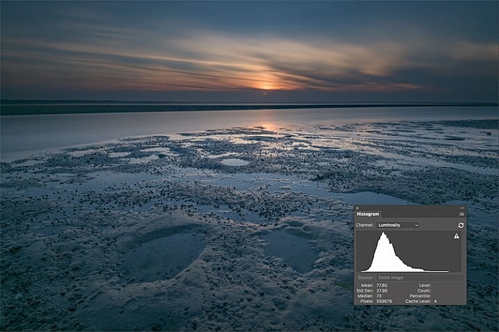
    Before Image With Histogram

    A flat or neutral picture style will give you an image with the least contrast, maintaining better highlight and shadow detail. This allows you to bring out those details in processing. The histogram on your camera, and later in Photoshop or Lightroom, allows you to see where your highlight and shadow tones fall, to avoid clipping.

    I had been shooting RAW for some time, but have left the Picture Style set to Standard or Landscape, for the most part. Once I saw this technique, I decided to change my picture style on my camera to Neutral (for Canon cameras) or Flat (on newer Nikons).
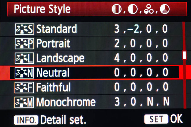
    Canon Picture Style

    Canon Picture Style

    The reason is that the histogram shown on the back of the camera, as well as the image preview, reflect the selected picture style. The result is that if the picture style selected is a more contrasty one, such as Landscape, the histogram will reflect that, and may indicate clipping of highlights or shadows, especially in a contrasty scene.
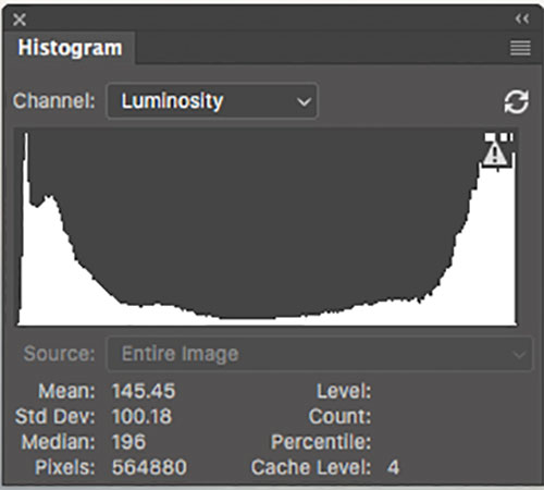
    Clipped Histogram

    This histogram shows clipped highlights, meaning detail is lost in the brightest areas of the image.

    On my Nikon D810, I use the Flat picture control, because it is the best choice for capturing the full range of tones in the scene, and those tones are reflected on the histogram on the back of the camera when I review the shots. This is important because I need an accurate indication of where the highlights and shadows in a scene fall in my histogram.
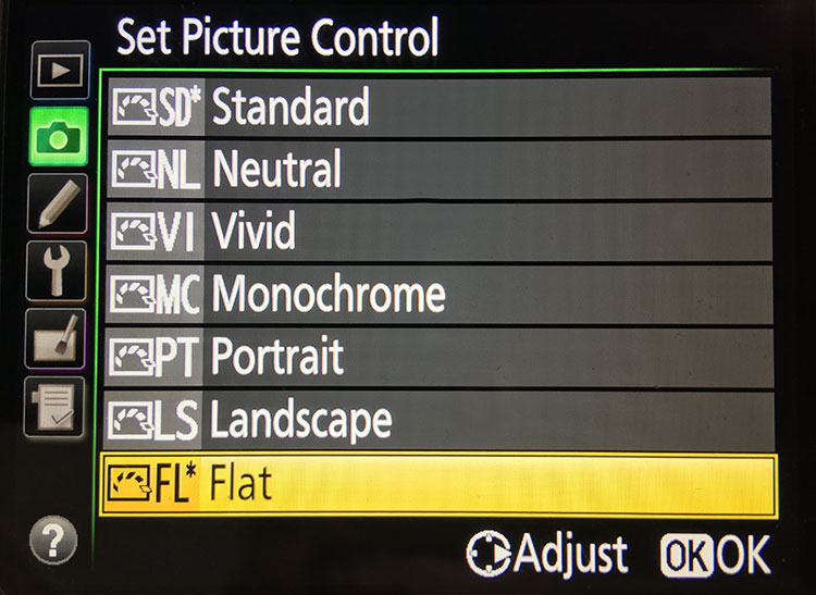
    Nikon 810 Flat Picture Control
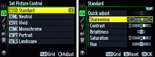
    Nikon 810 Flat Picture Control

    Nikon picture control

    Nikon picture control – if you do not have Flat, choose Neutral or Faithful

    The histogram on your camera is a graphed indication of where the pixels in your image fall in relation to highlights and shadows. The left edge represents blacks, the mid-left represents shadows, the middle is midtones, the mid-right is highlights, and the far right is whites. While not all cameras have a Flat picture control or style, most have a Neutral or Faithful picture style or control, that works similarly. Also, most cameras give you the ability to edit the picture styles, so you can turn down the contrast if you like, ensuring that you capture more highlight and shadow detail, and reducing the chances of clipping highlights or shadows.

    When you clip highlights, objects in the scene that are clipped will show as pure white with no detail. When shadows are clipped, objects in those areas will show as pure black in the scene, also with no detail. When viewing the histogram, if the squiggly lines that make up the graph are pushed up against either the left or the right side, that is called clipping. When that happens, you are losing detail in the shadows if it’s pushed against the left, and in the highlights if the graph is pushed against the right. By reducing the contrast in the picture style, you’ll reduce the chances of losing detail in the scene.

    Shooting RAW, and knowing I’ll be making adjustments in post, it doesn’t really matter what picture style I use, because I can change that when processing the RAW file. But it’s essential to be able to see an accurate histogram on my camera, to ensure I’ve captured as much tonal range as possible.

    Processing the RAW File
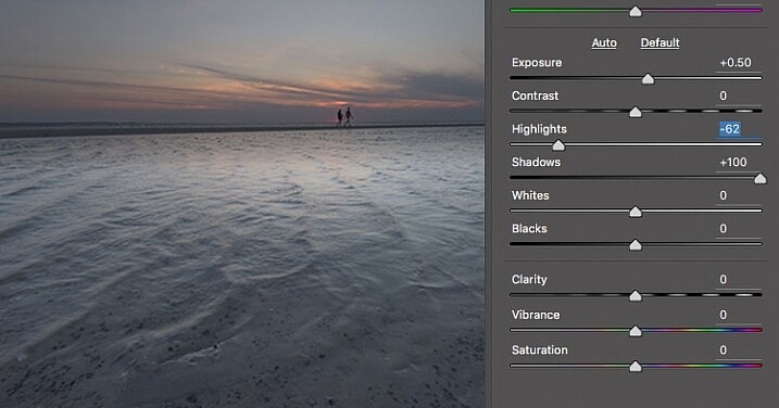
    Image photographed using flat picture control

    This image was shot using the Flat picture control, and then the highlight and shadow sliders in Adobe Camera RAW were adjusted to further reduce contrast.

    Once I begin processing the RAW file, I’ll do even more, if necessary, to flatten the image and compress the range of tones within the histogram. This includes using the Highlights and Shadows sliders in Adobe Camera RAW to bring out details on both ends of the histogram.  You can watch the histogram change in Adobe Camera Raw or Lightroom as you do so, to be sure you don’t go too far. If the highlights begin to look muddy, you’ve gone too far. By the same token, if the shadows start to look washed out, that’s probably too far as well. You want to maintain detail in each, but not lose the depth of tone completely. It’s important to note that this adjustment will vary for different images, depending on where the highlights and shadows fall in the images.

    In addition to adjusting the highlights, shadows, and contrast here, I will use the Dehaze slider, Lens Correction, and Spot Removal brush in Adobe Camera RAW. If you prefer, you can use the Vibrance, Saturation, and Adjustment Brush to complete the image in Adobe Camera RAW or Lightroom, but my preference is to work in Photoshop. There I can use a Layers workflow along with masking and Adjustment Layers and with various plugins, to achieve my final image.

    Building Up Color and Contrast
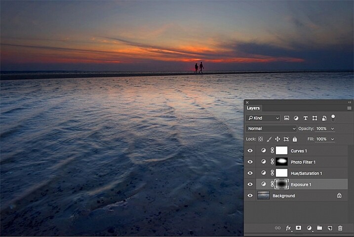
    Using Adjustment Layers

    Using Adjustment Layers in Photoshop, I built up the color saturation and contrast to achieve the final image.

    Once I have the image at the desired level of flatness, I then go about building up color saturation and contrast, or in Hollywood terms, color grading my image. After bringing the image into Photoshop, there are a number of ways you can go about this. The first is to use adjustment layers so that you can continually adjust each layer as desired, until you flatten the image for your final output. In addition, if you’re making an adjustment that you only want to apply in certain areas, you can use layer masks to hide or reveal it as desired.

    Many of these adjustments will be to personal taste. I personally prefer my images to have punchy color and contrast. So a set of adjustment layers I might use would be Vibrance, Exposure, Hue/Saturation, Curves, and Exposure.  The flexibility of using adjustment layers allows me to direct adjustments where I need them, rather than being forced to make them globally.
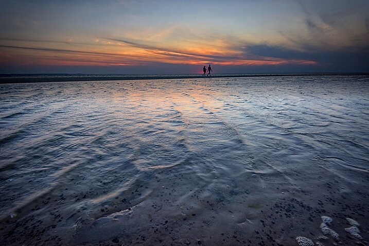
    Image processed with Nik Color Efex Pro

    This is the same image, but I used Nik Color Efex Pro to achieve the final image instead of adjustment layers.

    If adjustment layers aren’t your thing, perhaps using a plugin such as Google’s Nik Efex Pro. It’s now available at no cost, and is a software package I highly recommend. I’ve created several presets in Color Efex Pro, and will also use Viveza and its control points to further adjust my image. For landscapes, in Color Efex I have created a preset using Brilliance/Warmth, Pro Contrast, Skylight Filter, Detail Extractor, and Vignette:Lens, that I find to be pleasing for a majority of my landscape images. Depending on the image, I will tweak these settings to meet my vision.

    Summing Up
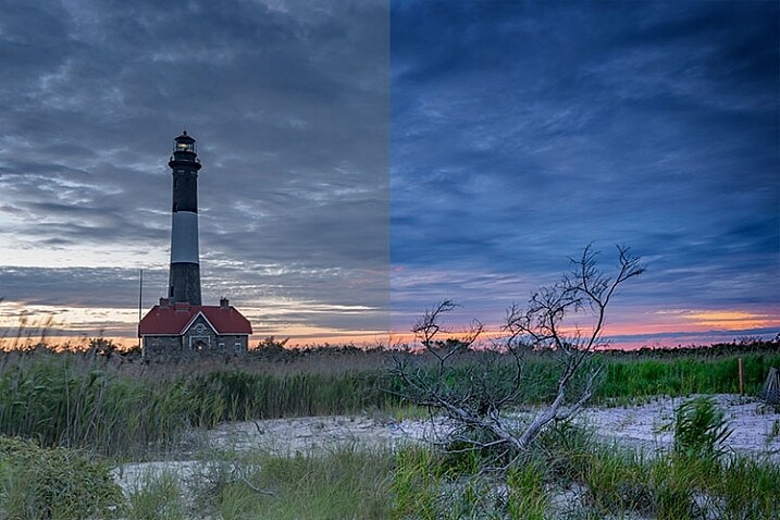
    Before and After

    On the left is the image with its tones flattened and desaturated, using a Flat picture control and adjusting highlights and shadows as needed. On the right is the image fully processed building contrast and color saturation.

    By starting with a flattened file, you give yourself room in the range of tones to build contrast and saturation, without clipping highlights, shadows, or any of the color channels. While shooting with a more finished picture style may look more pleasing on the camera’s LCD screen, or upon import into Lightroom or Photoshop, the contrast has already been adjusted to give it a pleasing look. Any adjustments to Saturation or color may result in a file that at the very least looks overcooked, and at worst, shows evidence of clipping highlights, shadows, or color channels.
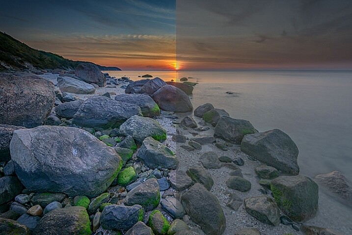
    An image showing before and after color grading.

    On the right is the image with the flat picture style, while the left has been “color graded” in Photoshop.
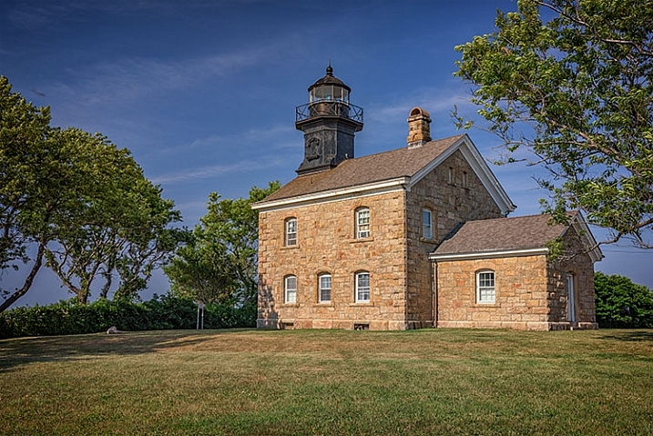
    Building-contrast-2

    googletag.cmd.push(function() {
    tablet_slots.push( googletag.defineSlot( “/1005424/_dPSv4_tab-all-article-bottom_(300×250)”, [300, 250], “pb-ad-78623” ).addService( googletag.pubads() ) ); } );

    googletag.cmd.push(function() {
    mobile_slots.push( googletag.defineSlot( “/1005424/_dPSv4_mob-all-article-bottom_(300×250)”, [300, 250], “pb-ad-78158” ).addService( googletag.pubads() ) ); } );

    The post Using a Flat Picture Style for Better Finished Images by Rick Berk appeared first on Digital Photography School.


    Digital Photography School

  • Weekly Photography Challenge – Wide Angle

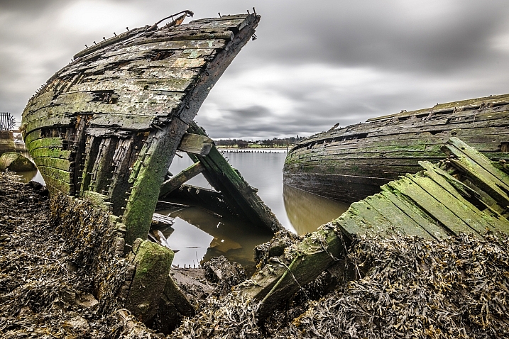
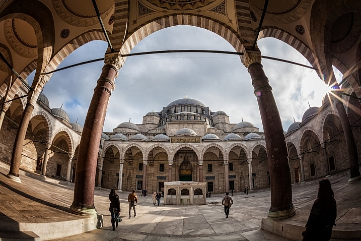
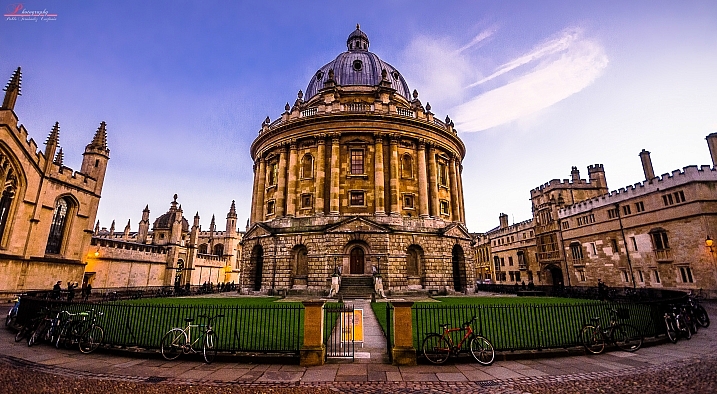
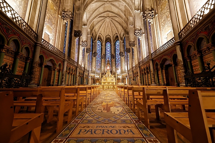
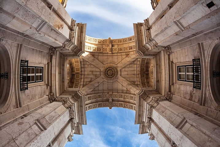
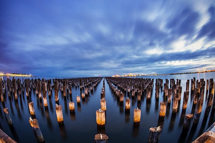
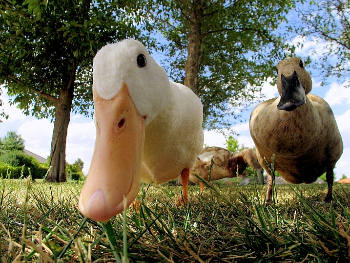
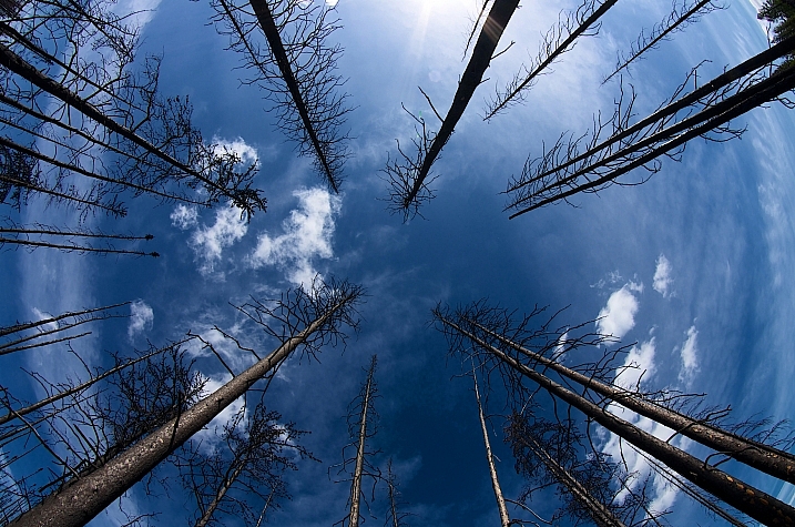
    Shooting with a wide angle can be challenging – to create an image that is engaging and has a good focal point. Check out these examples.

    Magnus Wrenninge

    By Magnus Wrenninge

    Aotaro

    By aotaro

    Weekly Photography Challenge – Wide Angle

    Here is some help for you if you need ideas:

    • Wide Angle Versus Telephoto Lenses for Beautiful Landscape Photography
    • How to Use a Wide-angle Lens with Wildlife for a New Perspective
    • How to Create Compelling Wide-Angle Portraits Using One Off-Camera Flash
    • 10 Tips for Photographing Wide-Angle Landscapes
    • How to Use a Wide-Angle Lens for People Photography
    Lee

    By lee

    Mariusz Kluzniak

    By mariusz kluzniak

    Giuseppe Milo

    By Giuseppe Milo

    Share your images below:

    Simply upload your shot into the comment field (look for the little camera icon in the Disqus comments section) and they’ll get embedded for us all to see or if you’d prefer upload them to your favourite photo sharing site and leave the link to them. Show me your best images in this week’s challenge. Sometimes it takes a while for an image to appear so be patient and try not to post the same image twice.

    Share in the dPS Facebook Group

    You can also share your images on the dPS Facebook group as the challenge is posted there each week as well.

    googletag.cmd.push(function() {
    tablet_slots.push( googletag.defineSlot( “/1005424/_dPSv4_tab-all-article-bottom_(300×250)”, [300, 250], “pb-ad-78623” ).addService( googletag.pubads() ) ); } );

    googletag.cmd.push(function() {
    mobile_slots.push( googletag.defineSlot( “/1005424/_dPSv4_mob-all-article-bottom_(300×250)”, [300, 250], “pb-ad-78158” ).addService( googletag.pubads() ) ); } );

    The post Weekly Photography Challenge – Wide Angle by Darlene Hildebrandt appeared first on Digital Photography School.


    Digital Photography School

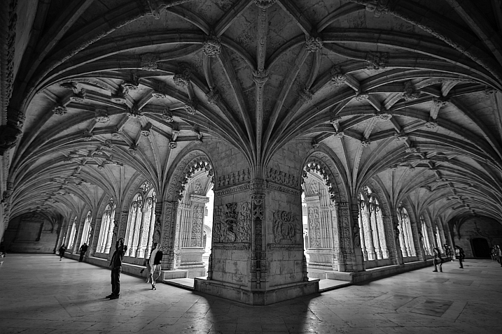
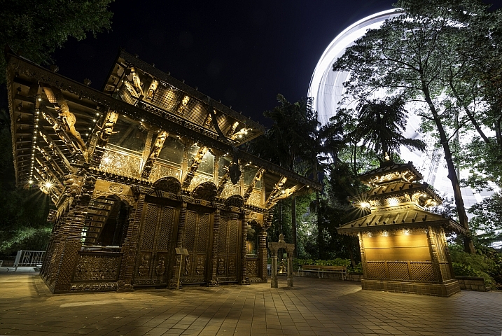
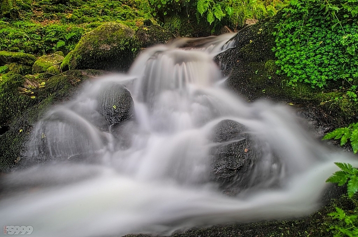
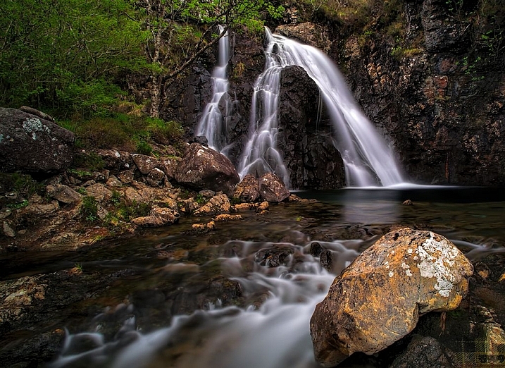
  • 15 Expansive Wide Angle Images

    Wide angle lenses provide a very different view of the world than what your eye sees. They are inclusive, meaning the viewer feels like they are included in the image – like they could step into it.

    These photographers have used the wide angle optics to great advantage – see if you enjoy them as much as I did:

    Dave Wild

    By Dave Wild

    Stròlic Furlàn - Davide Gabino

    By Stròlic Furlàn – Davide Gabino

    Indigo Skies Photography

    By Indigo Skies Photography

    Meg

    By meg

    David Tomic

    By David Tomic

    Mark Iocchelli

    By Mark Iocchelli

    Giuseppe Milo

    By Giuseppe Milo

    Stròlic Furlàn - Davide Gabino

    By Stròlic Furlàn – Davide Gabino

    Pablo Fernández

    By Pablo Fernández

    Guillaume DELEBARRE (Guigui-Lille)

    By Guillaume DELEBARRE (Guigui-Lille)

    Paulo Valdivieso

    By Paulo Valdivieso

    Lenny K Photography

    By Lenny K Photography

    Fs999

    By fs999

    Fs999

    By fs999

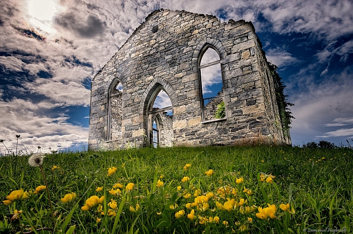
    Emmanuel Huybrechts

    By Emmanuel Huybrechts

    googletag.cmd.push(function() {
    tablet_slots.push( googletag.defineSlot( “/1005424/_dPSv4_tab-all-article-bottom_(300×250)”, [300, 250], “pb-ad-78623” ).addService( googletag.pubads() ) ); } );

    googletag.cmd.push(function() {
    mobile_slots.push( googletag.defineSlot( “/1005424/_dPSv4_mob-all-article-bottom_(300×250)”, [300, 250], “pb-ad-78158” ).addService( googletag.pubads() ) ); } );

    The post 15 Expansive Wide Angle Images by Darlene Hildebrandt appeared first on Digital Photography School.


    Digital Photography School

  • How to Be Different and Make Your Photography More Unique

    When starting on the path of learning photography, it is common for some to already have an idea about what their work is supposed to look like. They admire and look at the work of photographers and want to be able to do similar work themselves. While this is an important part of the learning process, the best photographers all eventually go off in their own direction, and creatively it’s very important to think in this way. You want your work to ultimately be different. Here are some steps to help you figure out how to go against the grain and make your photography more unique.

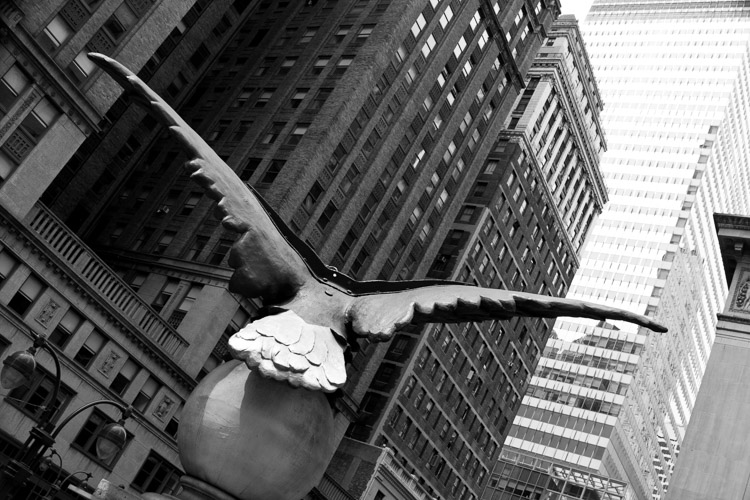
    Soaring, 42nd Street, NYC

    Soaring, 42nd Street, NYC.

    1. Put your own spin on things you’ve learned

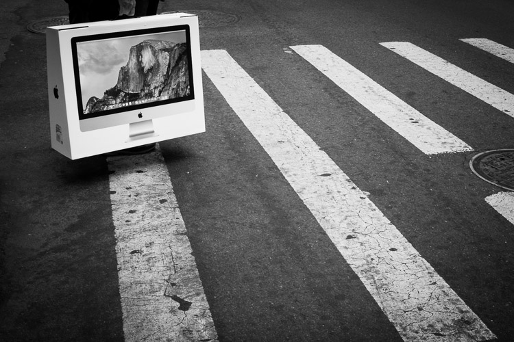
    Yosemite, Broadway, New York.

    Yosemite, Broadway, New York.

    You cannot go against the grain if you don’t first understand the traditional techniques of photography. Take all of the photographers that you admire and teach yourself how to do what they did. Take the best aspects from all of them, whether it be content matter, lighting, exposure, overall look, or other technical skills, and integrate them into your own work. Become a hybrid of them all.

    These photographers came before you for a reason, and it’s a luxury to be able to learn from them. You can still go in your own direction, however, you first need to create the foundation to be able to do that in the right way.

    2. Don’t be afraid of people not liking your work

    It is normal to feel like you need to cater to everyone’s interests. Obviously, you want to create work that a group of people enjoy, but try not to think about that at the beginning. No matter what you do, someone is not going to like your work, and probably more than a few people.

    New York.

    New York.

    The problem with chasing likes, is that you end up playing the game of popularity. You look at what photography succeeds the most on social media websites, at what gains the most wows, and it’s easy to think that it is the best photography, and that is what you need to do as well. However, what you are really doing is conforming to work that has already been done before many times. You end up creating work so common that it is a dime a dozen. The most popular looks right now are the ones that are the easiest to achieve, with a medium amount of technical proficiency. You can do better.

    There is no need to photograph for the purpose of getting likes. Seek out critiques and understand how people feel about your work, but your first aim should be to create work that means something to you. If you take everything else out of the equation, which of your images do you like the best? What has the most meaning behind it for you? This is often not a logical feeling. Rationally, you might think that a certain image is your best, but your gut may give a hint at something else.

    Follow your gut. Follow your instincts. Search through your archive, and find work that you’re afraid of showing. That is usually the best stuff. Put it front and center, and develop the ideas of that work further.

    3. Take some technical risks

    Trump Towers, New York.

    Trump Towers, New York.

    Try out as many alternatives to the traditional way of doing things as you can. Shoot in bad light, experiment with blurry photos, or create weird and off-kilter compositions. Make bright or dark images. Embrace imperfection and ambiguity. Not everything has to be beautiful.

    Shoot in a more spontaneous way and follow your gut. Go to places that you normally wouldn’t explore, and take images. Shoot during your daily life. Force yourself to go to the most mundane place you can think of, and figure out how to create an interesting photograph there.

    4. Think about, and create, exactly what you like

    Intimate work is what makes great art. Think about ideas and subjects that you are passionate about, and explore them. Create nuanced work, and don’t be afraid if people don’t understand it right away. They probably won’t at first. Particularly if you are showing your work on the Internet, people scan so quickly, and they usually respond to what pops out at them in the most obvious way. Nuanced, thoughtful, and intimate work might not catch their eye right away. Experiment with this type of work and forget about how people might react to it.

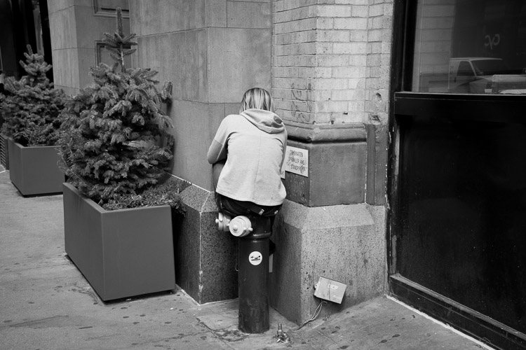
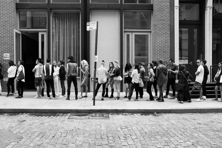
    Sample Sale, SoHo, New York.

    Sample Sale, SoHo, New York.

    What are you interested in? Maybe it is nature, sports, politics, identity, community, Pokemon, or a particular place nearby. Create a story. It literally could be anything. Think about what you are most interested in, no matter how ridiculous it may seem, and see if you can figure out a way to combine that with photography.

    Next, create a series based on your idea. This type of work displays extremely well in a series format, because you can cover more ground, tell more of a story, and people will take the time to go through it. It will be easier for them to understand the idea more as they explore, whereas their brain will often glaze over or miss the idea in a single image.

    5. Educate people

    There is a common misconception that you need to let art speak for itself. This is very true on one level, because great art will allow people to ponder, and to interpret it in different ways, without anything pushing that. However, people will often need to be grounded at some level, to let them start to understand the work and delve deeper into it in the first place. Then they can more effectively explore, and get lost in the work and their thoughts about it.

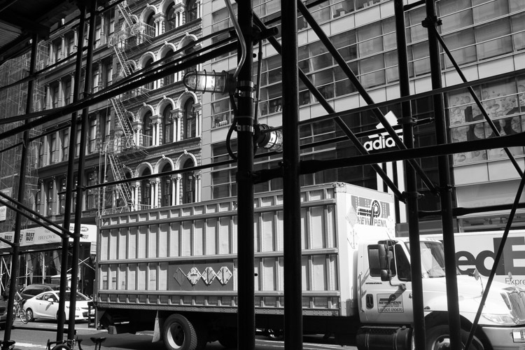
    Broadway, New York.

    Broadway, New York.

    Writing about your work is important, because a good introduction will set people on the path to gaining pleasure from the work, without you having to say too much about it. Hold some information back of course. No need to over-share.

    The bottom line

    Going against the grain means you can do your photography in any way that you please, and you don’t even have to take the advice here. This is just to get you started thinking uniquely and experimenting, and as the photography quote goes, “If everyone is looking one way, look the other way.”

    googletag.cmd.push(function() {
    tablet_slots.push( googletag.defineSlot( “/1005424/_dPSv4_tab-all-article-bottom_(300×250)”, [300, 250], “pb-ad-78623” ).addService( googletag.pubads() ) ); } );

    googletag.cmd.push(function() {
    mobile_slots.push( googletag.defineSlot( “/1005424/_dPSv4_mob-all-article-bottom_(300×250)”, [300, 250], “pb-ad-78158” ).addService( googletag.pubads() ) ); } );

    The post How to Be Different and Make Your Photography More Unique by James Maher appeared first on Digital Photography School.

    Digital Photography School

  • Gulf Photo Plus PopUP_Berlin is Live

    Just a quick note to let you know that tickets have just gone on sale for the Gulf Photo Plus PopUP event in Berlin for the weekend of October 29-30.

    If you are unfamiliar with GPP’s PopUP, it is a road version/distillation of their world-famous Photo Week in Dubai. Each year, it is held in a far-flung city somewhere in the world that is not Dubai. It is done over a weekend, so as to be able to be fit in with many peoples’ work schedules.

    The faculty sometimes varies, but this year it is the core group: Greg Heisler, Joe McNally, Zack Arias and me. The weekend will feature a half-day with each person. Basically, like being in front of a fire hose.

    This is the fourth PopUP GPP has held. I have been involved in three of them, and they are one of the most enjoyable photo events I can think of. If Berlin is reachable for you and you are available for a weekend this fall, I strongly encourage you to attend.

    (And as an FYI, Berlin has a large and thriving photo community, so this is expected to sell out quickly.)

    For more info, and/or to register, head over to the Gulf Photo Plus PopUP site.

    Cheers,
    David
    Strobist

  • 3 Tips for Taking Better Motorsport Photos

    If you’re a fan of motorsport, then you’ve probably tried to take photo of a race car on the track. It’s not as easy as it looks is it? The high speed nature of motorsport photography tests even the best photographers and cameras. So it takes a special skill set to move your motorsport photos up to the next level.

    Taking a photo of a car on track is one thing, but if you’d like to add one or more of the following elements to your photos, you’ll start to create some special images. So make sure you keep these three things in mind next time you are at a race track shooting motorsport: speed, action and emotion.

    DPS Panning 001

    #1 Speed

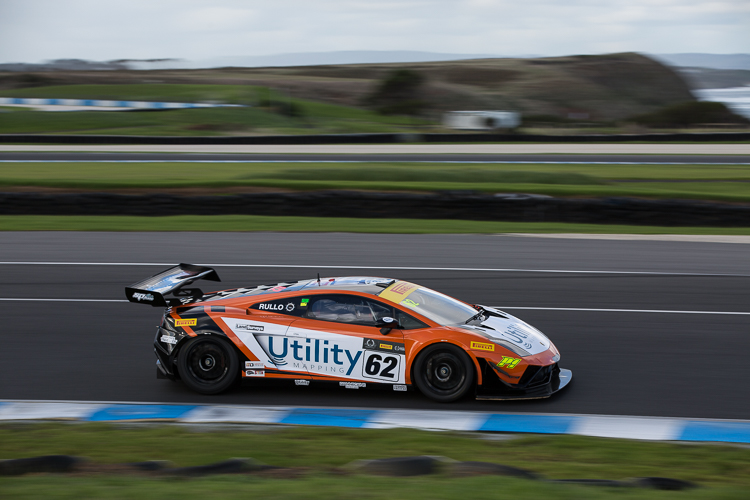
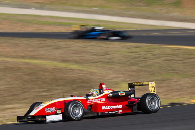
    One of the biggest things that draws people to motorsport is the speed. If you’d like your photos to stand out, you need to showcase that speed in your photos. The photographic technique for doing this is called panning.

    Panning is basically using a slow shutter speed to introduce motion blur into your photos. The easiest way to do this, is to focus on a particular point of the car, and move your camera in a smooth motion in the same direction as the car. This will keep the car nice and sharp, and blur out the background.

    I would recommend that you start with a shutter speed of around 1/200th of second. As it takes a lot of practice to get a nice smooth motion. As you improve your technique and grow in confidence, you can progress to slower shutter speeds.

    DPS Panning 002

    Panning is one of the hardest techniques in photography. It takes a lot of practice to get it right. The slower the shutter speed, the less likely you are to get the car sharp in the photo. But the trade off is a more dramatic the effect when you do get it right.

    Just remember that not even the professionals get every shot perfect, though they may not admit it. But once you have mastered the art of panning, you can look to add some more creativity to your shots by panning through objects, or using interesting angles.

    DPS Panning 003

    #2 Action

    Getting a photo of one car on track is great. But those action moments are what really tell the story of the race.

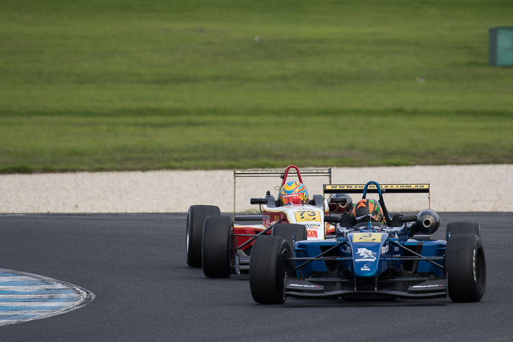
    Ideally you want to be on the look out for the moments when two or three cars are jostling for position. Usually in the opening laps of a race. Shots of the race leaders fighting for the lead will give your photographic story more definition.

    To capture those actions moments, you will want to position yourself at one of the slower corners of the track. One that encourages passing. To do this you’ll need to be familiar with the venue. Each and every track is different.

    DPS Action 001

    Photographically, you’ll be looking to use a fast shutter speed to freeze the action. I would recommend using a shutter speed of 1/1000th at a minimum. Although the speed really all depends on how fast the cars are traveling at that section of the track.

    Now, since you are freezing the action, you’ll still want to make the cars still look fast. To do this you will need to hide the wheels of the cars. Either shooting the cars directly front on, or from behind. Hiding the lack of motion in the wheels will give the cars a sense of speed, while still showcasing the action.

    DPS Action 002

    DPS Action 003

    #3 Emotion

    Motorsport, much like all sports, has high highs and low lows. That is reflected in the emotions you’ll see around the race track.

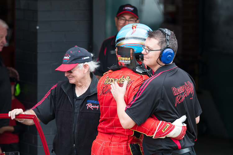
    To complete a photographic story of the race, you’ll need to capture either the fans, teams, or drivers celebrating victory. That could be a victory burnout, it could be driver waving to the crowd, or it could be the team applauding as their driver crosses the checkered flag.

    DPS Emotion 001

    While the highs are good, the lows also tell an equal part of the story. It could be a crash between two competitors. It could be a driver walking away from his broken down car. These all add up to telling the story of the race.

    Unfortunately, it takes a little bit of luck to capture the emotion in motorsport. That’s why these shots are the most rewarding.

    Photographically these emotional moments take split second decisions to capture. If you’re photographing a driver doing a burnout, you’ll need to quickly drop the shutter speed to showcase some motion in the wheels. but not so much that the car starts the blur. I’d suggest something along the lines of 1/250th.

    For capturing other celebrations, which are often just fleeting moments. I’d recommend a high shutter speed and wide aperture to create shallow depth of field to draw focus to the part of the celebration that tells the best story.

    DPS Emotion 002

    Summary

    If you can keep those three things in mind while you are taking photos trackside, you’ll take your motorsport photos to the next level. Then you’ll really telling the story of an event, instead of just capturing cars on a track.

    googletag.cmd.push(function() {
    tablet_slots.push( googletag.defineSlot( “/1005424/_dPSv4_tab-all-article-bottom_(300×250)”, [300, 250], “pb-ad-78623” ).addService( googletag.pubads() ) ); } );

    googletag.cmd.push(function() {
    mobile_slots.push( googletag.defineSlot( “/1005424/_dPSv4_mob-all-article-bottom_(300×250)”, [300, 250], “pb-ad-78158” ).addService( googletag.pubads() ) ); } );

    The post 3 Tips for Taking Better Motorsport Photos by Rhys Vandersyde appeared first on Digital Photography School.

    Digital Photography School

  • How to Find Great Backgrounds for Outdoor Portraits

    Outdoor portrait photography involves going outside, and utilizing the beauty (or the ugliness) of your surroundings. You probably already know some local beauty spots, and can think of some good places to take portraits right away. But once you start observing your local area with the aim of making portraits in mind, you will begin to see the potential, even in mundane locations. But how do you find great backgrounds for outdoor portraits?

    Portrait taken outdoors

    Here are some ideas to get you started.

    1. What lens are you going to use?

    This is important because, broadly speaking, there are two different ways to take portraits. Both involve the use of different types of lenses.

    The first is to to use a wide-angle lens to take an environmental portrait. This may be documentary in approach, or it may be more fashion or beauty orientated. Either way, the idea is that you use a wide-angle lens to take a portrait, and that the setting is as important as the model.

    The second is to use a longer focal length, and shoot with a wide aperture to throw the background out of focus. In this situation the requirements for the background are different, because you are looking for something that looks good out of focus. Also, because longer lenses have a narrower angle of view, you are using less of the setting in your portrait.

    Of course, it is more than likely that you can find opportunities to take both types of portraits, in the same setting. You may also make up your mind, once you have scouted a location and assessed its potential. But it helps immensely if you know what your approach to the shoot will be, while searching for a spot to shoot.

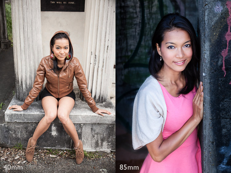
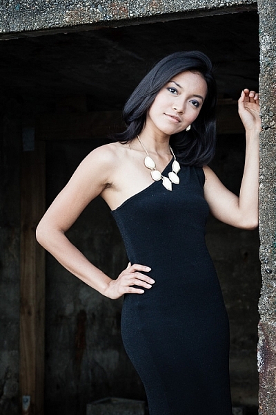
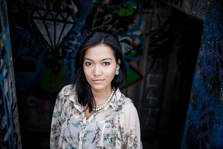
    These two portraits show the differences in the two approaches. The first was taken with a 40mm lens (on a full-frame camera), and shows the setting as well as the model. The second was taken with an 85mm lens (also on a full-frame camera) and shows much less of the setting.

    Portraits taken outdoors

    2. Where does the light fall?

    Some photographers tend to shoot portraits entirely in natural light; others use flash to supplement it. Whichever approach you take, it is still important to assess the quality of the light in your given location.

    Take into account the time of day you plan to do the shoot. To take full advantage of natural light you should aim to shoot in late afternoon or evening, during the golden hour, when the sun is close to the horizon. For this reason it helps if you do your scouting at the same time of day, so you can see how the location looks in this beautiful light.

    Another option is to take photos on a bright sunny day, but in the shade. The light bounces off nearby surfaces, which acts as a giant reflector. This is another type of natural light with beautiful qualities.

    Alternatively, you might like to shoot on a cloudy day. This means that time of day is not so important, but it does mean that the light is most likely to come from above, and may create shadows under your model’s eyes and chin. In this situation you can use a reflector or fill-flash to minimize shadows. So think about whether there is room to set up a light-stand (if using flash) or for somebody to stand and hold a reflector (if using natural light).

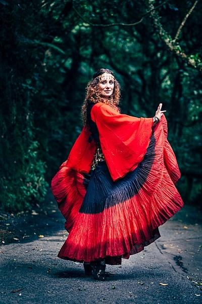
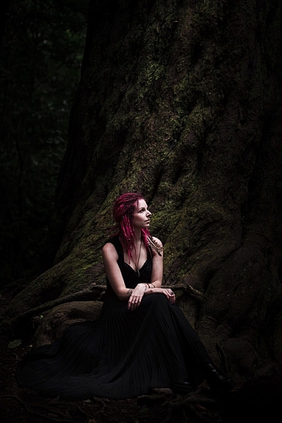
    This photo was taken in Wellington Botanical Gardens, and the model is illuminated by light coming from above, through the tree tops. As she is in costume, I thought the direction of the light was reminiscent of a spotlight on a stage, and appropriate to the style of portrait. I used a short telephoto lens (85mm, full-frame camera) to separate the model from the background.

    Portrait taken outdoors

    3. Use a smartphone to take photos

    You can use a smartphone to take photos of locations to help you remember what they look like. Of course, you can do this with any camera, but the advantage of a smartphone is that most of them have GPS, and this helps you remember, and find, the exact location again later. This could be important if you are out in the countryside somewhere. There is nothing more frustrating than finding a great place to take some portraits, then not being able to remember where it is.

    You could also import the photos into a specific Collection in Lightroom, and go to the Maps module to see the locations displayed on a map.

    Here are some types of location you can search for. Remember, it’s important to think about what type of lens you are going to use for your portraits, as well as to assess the quality of light.

    Backgrounds by the coast

    Any location by the sea is full of potential. The same place can look very different every day, thanks to changing tides, weather patterns, and light. If the coastline is rugged, look for locations where you can use the rocks and cliffs as a background. Each bay or beach has its own character, so get out and explore. You are likely to find a good variety of beautiful locations, even in a relatively small area.

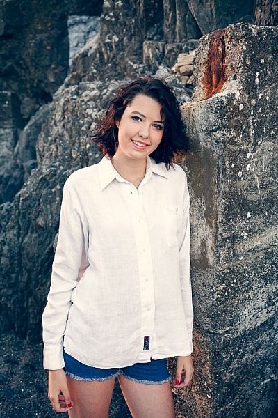
    This photo was taken on a local beach, which has become one of my favorite locations for taking portraits, using a 40mm lens on a full-frame camera. This lens has a slightly wider angle of view than a 50mm standard lens, and allowed me to include a little of the beautiful location, but still make the model the focal point of the photo.

    Portrait taken outdoors

    Graffiti backgrounds

    It may be bit of a cliche, but there’s no doubt that graffiti or street art, can make an interesting and colorful background.

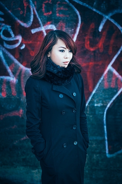
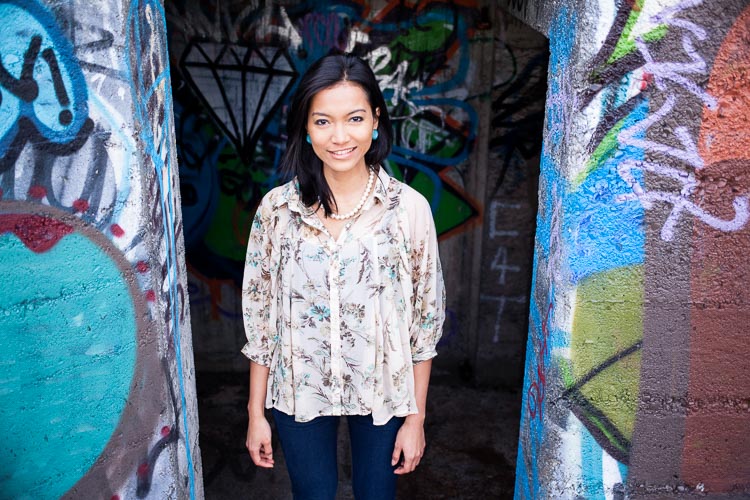
    This photo was taken on a local beach with a graffiti covered, concrete bunker in the background. I used an 85mm lens (on a full-frame camera) to include just a little of the artwork in the frame.

    Portrait taken outdoors

    Field and forest backgrounds

    Fields and woodlands often make good locations for taking portraits, especially in the spring and summer. Fields of flowers are gorgeous locations. Try using a telephoto lens, and shooting through the flowers so they are out of focus.

    The light in a forest is usually most suitable for portraits on a cloudy day. The light is soft, and unlike on a sunny day, your camera can easily cope with the brightness range. The one thing to watch out for is the direction of light. It comes from above, through the trees, and is highly directional. You will have to search for the places where gaps in the trees let light through. You may have to use a reflector to fill in the shadows created by the top light, or ask your model to tilt her face toward the light.

    On sunny days, try shooting at the end of the day, when the light is softer, and use backlighting.

    This portrait was taken on a cloudy day, in a thick forest where not much light penetrated through the trees. We found a clearing next to a large tree that we were able to use as a background. I used an 85mm lens (full-frame camera) to pull the tree in close to the model, and exclude most of the forest from the frame.

    Portrait taken outdoors

    Local buildings for backgrounds

    Keep an eye out for local buildings with public access that you can use for photos. I’m not talking about busy locations, as they are difficult places to work, unless both you and your model are very experienced. Let me give you some examples.

    Here’s an abandoned boat shed on a lonely beach. 

    outdoor-portrait-locations-12

    Test shot

    outdoor-portrait-locations-13

    This is the portrait we made at that location.

    The second example is a graffiti covered concrete bunker left over from WWII.

    Test shot.

    Test shot.

    Here’s a portrait we made there.

    Here’s a portrait we made there.

    In both examples I used a small part of the building as a background. You can see the same technique in the other photos in this article. The idea is to make sure the background complements the model in your portraits, and doesn’t overwhelm her.

    Summary

    The outdoors is a bit like a giant stage set, just waiting for you and your model to use. Wherever you live, I am sure that there are plenty of great locations for portrait photography nearby. It’s just a matter of learning to spot their potential, and thinking about which lens (or lenses) you will use for your portraits. 

    Share some of your images from your favorite spots in the comments below.


    Mastering Lenses

    If you want to know more about buying and using lenses then please check out my ebook Mastering Lenses: A Photographer’s Guide to Creating Beautiful Photos With Any Lens.

    googletag.cmd.push(function() {
    tablet_slots.push( googletag.defineSlot( “/1005424/_dPSv4_tab-all-article-bottom_(300×250)”, [300, 250], “pb-ad-78623” ).addService( googletag.pubads() ) ); } );

    googletag.cmd.push(function() {
    mobile_slots.push( googletag.defineSlot( “/1005424/_dPSv4_mob-all-article-bottom_(300×250)”, [300, 250], “pb-ad-78158” ).addService( googletag.pubads() ) ); } );

    The post How to Find Great Backgrounds for Outdoor Portraits by Andrew S. Gibson appeared first on Digital Photography School.

    Digital Photography School

  • Tips for Photographing Your Child and Their First Moments

    Seeing your little one begin to explore their world with their first solid food, crawl on the floor, or enjoy independent playtime is an amazing experience. But, photographing your child and capturing those moments to cherish forever is even more enjoyable!

    While you may not always capture the exact the moment a “first” happens, as little ones can be full of surprises, these tips will help you to capture beautiful storytelling images of those moments to look back on for years to come.

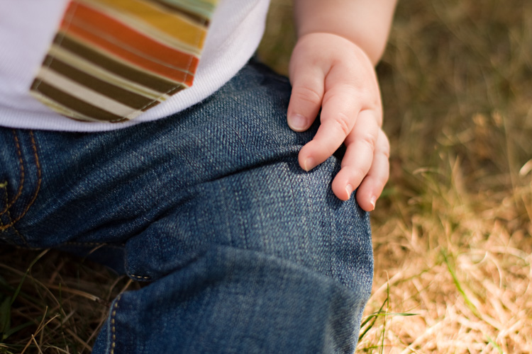
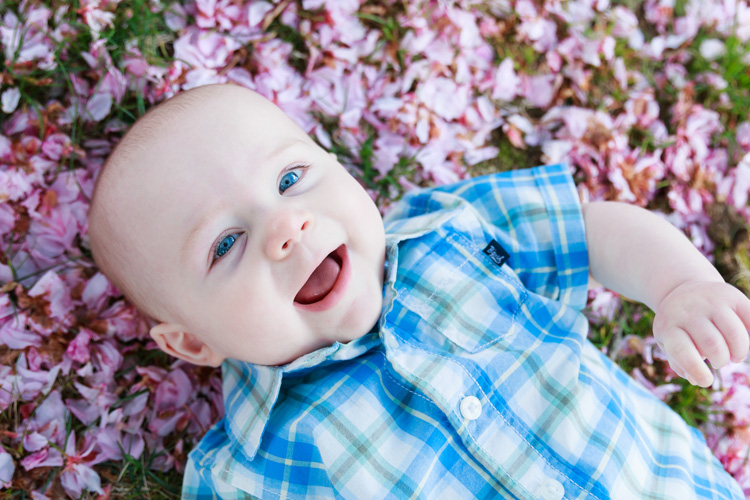
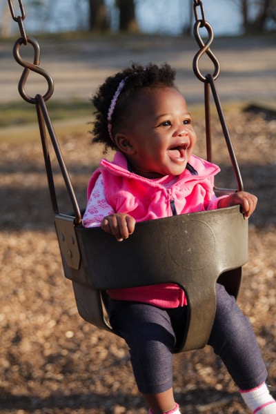
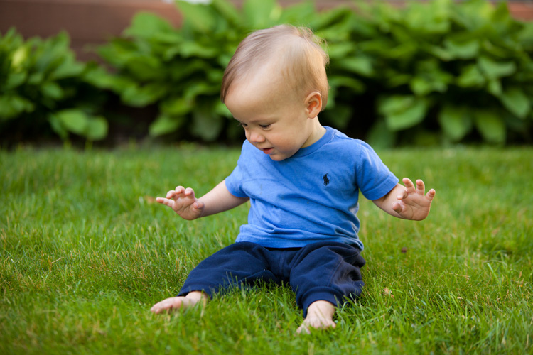
    Katenesi com 01

    1. Be prepared

    Anticipation of key moments in your child’s life will come naturally as they grow. An important piece of capturing those first moments is being prepared at all times, with a camera nearby. As they say, the best camera is the one you have with you. It doesn’t matter what camera you use, but having it on hand will be paramount to capturing those fleeting firsts.

    Oftentimes, I keep my DSLR in my living room, on the mantel, where it’s easily accessible in a moment of activity or at feeding times. It is in the On position ,with ISO settings at the lowest, and the aperture at f/2.8 for a nice shallow depth of field, and one that works with the natural lighting in my living and dining rooms. In addition, my mobile device is always ready in my purse hanging in the living room, or generally nearby in any room I walk into as well.

    child-photography-firsts-08

    When something new happens, you can quickly grab your camera and capture the moment!

    2. Get on their level

    As adults, we often forget what it is like to live so low to the ground. You might find yourself capturing your child’s firsts from the high perspective of standing upright, or from above.

    Katenesi com 10

    While this isn’t a bad perspective, over time your little one will become aware of your paparazzi-like actions and shy away. Try to get down low while playing, with your camera nearby, and capture the moment from their perspective. Often, they are unaware you are photographing them if you’re on their level, as it doesn’t appear as obvious from a distance than when you might be hovering above.

    Katenesi com 06

    3. Find your light

    If you are planning to take a few photos of your child when you know they might be headed into a first moment, or have done it maybe once before, scope out the scene. Where is the best light coming from? What time of day is best in that room or that location?

    Katenesi com 05

    You may want to position a toy, or your child, in a certain way to capture the moment with a better angle of light hitting their face for a smile, or backlight them for more of a story. Practicing often before those first moments, in your home with a camera and light angles, helps you to define the best locations and lighting, as well as camera settings to be prepared.

    Katenesi com 02

    4. Try new locations

    Firsts come in all shapes and sizes, as well as for years beyond the first 12 months of life. While most firsts just appear without planning, there are many moments you can create, and prepare for ahead of time.

    Katenesi com 09

    Eating their first solid food is one you can set-up and plan in advance, as well as capturing their reaction to the first time touching the beautiful plush grass.

    Katenesi com 07

    Plan to go to a new location and practice your photo, before you bring your child into the setting. Go to the beach at the best time for lighting, or for your child’s energy level, and prepare to photograph the first moment they set foot or fingers in the sand.

    Katenesi com 04

    5. Tell their story

    You know your children the best. You have spent countless hours with them, at all times of the day and night, and can read their responses and personalities the best. As a new parent, you have those gut feelings when something new is about to happen.

    Katenesi com 03

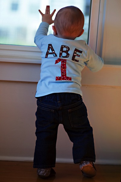
    When you’re photographing those moments, take time to tell their story. That is the story you’ll want to remember. Their favorite toy, their first moment peeking out the window, or touching the sand or grass. Keep in mind your child’s story, and how you want to tell that story with your images.

    In the end, firsts will come and go, but you’ll always have these beautiful storytelling images to share with them as they grow. Being prepared, change your position, lighting, or locations, and remember who your child is at heart, is the key to capturing those amazing moments in your heart and through your lens.

    Share your child’s first moments in the comments below. We’d love to see them.

    googletag.cmd.push(function() {
    tablet_slots.push( googletag.defineSlot( “/1005424/_dPSv4_tab-all-article-bottom_(300×250)”, [300, 250], “pb-ad-78623” ).addService( googletag.pubads() ) ); } );

    googletag.cmd.push(function() {
    mobile_slots.push( googletag.defineSlot( “/1005424/_dPSv4_mob-all-article-bottom_(300×250)”, [300, 250], “pb-ad-78158” ).addService( googletag.pubads() ) ); } );

    The post Tips for Photographing Your Child and Their First Moments by Kate Nesi appeared first on Digital Photography School.


    Digital Photography School

  • How to Use Split Toning to Make Your Photos Stand Out

    Have you ever taken a picture and then been disappointed, because it didn’t capture the moment? Maybe it looked exactly like what you saw, but when you viewed the image afterwards it was lacking something.

    This is one of the greatest challenges photographers face, to express a feeling or vision in a two-dimensional medium. One of the most overlooked tools in the photographer’s processing kit is color.

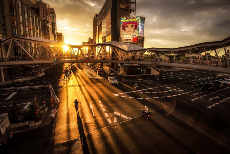
    Osaka Sunset

    Example of a warm split tone.

    I’m not talking about the color of the things in your photograph, like a red car or yellow dress. I mean the overall color cast, the tone of your image, is important too.

    Colors affect the way people feel, so much so that there is a whole body of science around it. Even some basic knowledge of color theory can help improve your photography.

    Beyond White Balance

    The first place to head when you want to change the tone is white balance. For instance, if it’s a gray cloudy day you might want to move the temperature slider towards the warmer side, making your image appear more yellow-orange, or sunny. Move it in the opposite direction, and your image will get cooler or more blue.

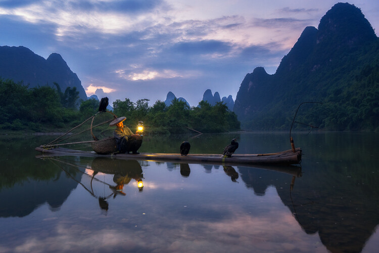
    Fisherman in Xingping China

    Example of a cool split tone.

    Although changing the white balance of an image is helpful, it is still a global adjustment – it affects the entire image. In other words, editing the tone of your image with just the white balance is like a mechanic trying to fix an engine with a sledgehammer. It may not be the right tool for the job.

    To make more fine-tuned adjustments, and thus have greater control on the overall mood of your images, you may want to have a look at Split Toning.

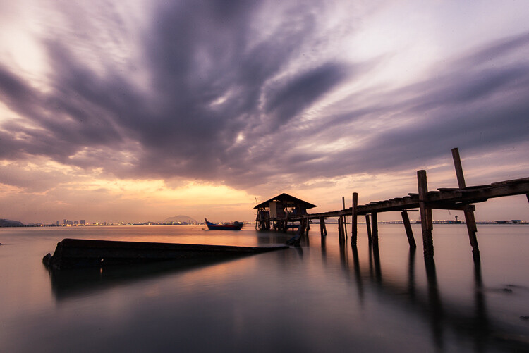
    Penang Sunrise at Fisherman Jetty

    Magenta and warm tones.

    A Bit of History of Toning

    Toning first started as a way to change the color of black and white photographs. For instance, in the past, chemicals were added to the development process to give prints a sepia tone. Later on, other chemicals toners were used to give images two different tones like red and blue.

    It may sound complicated, but in today’s digital darkroom, all split toning really means is that you add color to the shadows, highlights, or both. There are a number of ways you can split tone an image. One of the most common is to make the highlights yellow and shadows blue or vice versa. However, let’s take a look at how you can also adjust a single color, to create a particular mood in Adobe Lightroom (also possible in Photoshop and Bridge).

    Split Tone Window in Adobe Lightroom

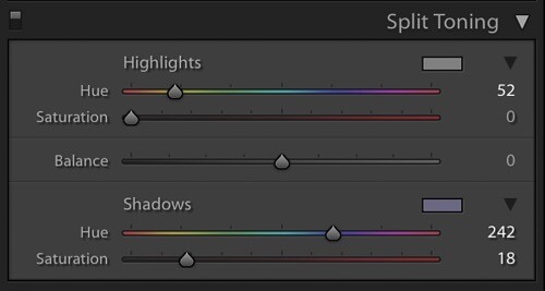
    This is what the Split Toning slider looks like in Adobe Lightroom.

    Magenta Zen

    My favorite color cast to add to my images is magenta. Like a yin and yang varnish, this color (a purplish-red) represents harmony, balance, love, and personal growth. It has a calming effect that stimulates creativity and happiness.

    When split toning for magenta, I usually make my adjustments to either the shadows or highlights. I rarely make changes to both, as it tends to be overkill. More often than not, I adjust the shadows, as it’s usually the underexposed darker parts of the image I am trying to bring out. If the image is very bright then I edit for the highlights.

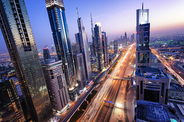
    Dubai Cityscape

    There is no rule as to how far you should move the sliders. However, I tend to move the hue slider somewhere between 230-250 and the saturation slider between 10-20. It all depends on the image and the intensity of the colors, shadows, and highlights. You can also use the eyedropper to choose the color.

    Another added bonus to adding some magenta is that it tends to take off the rough color edges. Browns, greens, and yellows are smoothed out, giving your photos a softer tone.

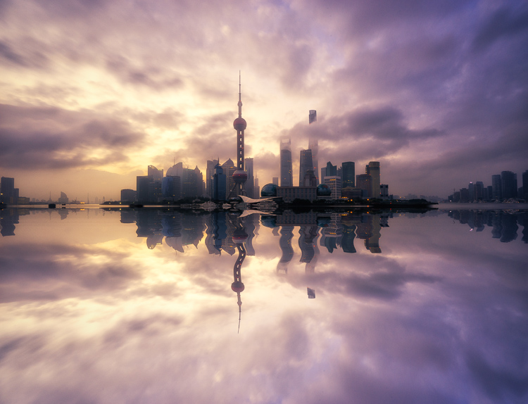
    Pudong Shanghai Cityscape

    Split Toning Keyboard Shortcuts for Lightroom

    There are a couple of shortcuts in the Lightroom Split Toning panel you’ll want to know about.

    First, it can be difficult to to choose the right color when the saturation strength is low. To briefly boost the hue up to %100 saturation, just press and hold Option on Mac (or Alt on Windows), then move the hue slider to either side. This will show the color at full strength so you can select it more easily.

    Second, to more easily view the colors split in the image, hold down Option/Alt and then drag the Balance slider in the Split Toning panel.

    Experiment

    Split Toning is much more than just magenta. Try adjusting the warmth or coolness in your photographs in the split toning panel, instead of using white balance for something different. You can also give your photos a cinematic feel, old film look, and more by split toning. Have fun, get creative, and find what works for you.

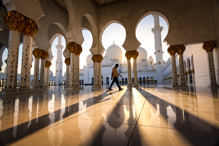
    Sunset at Sheikh Zayed Mosque in Abu Dhabi

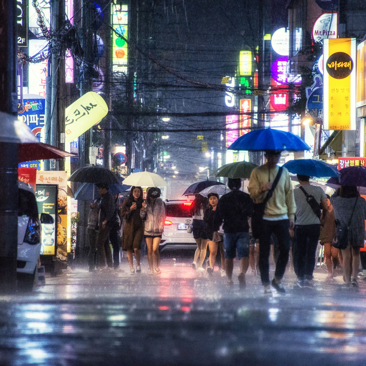
    Umbrellas in Busan Rain

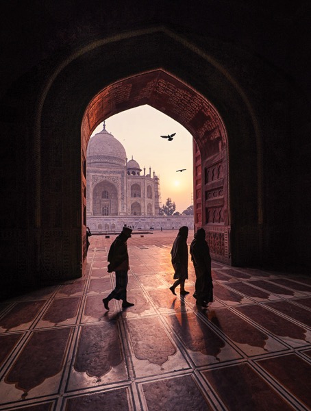
    Sunrise at Taj Majal

    googletag.cmd.push(function() {
    tablet_slots.push( googletag.defineSlot( “/1005424/_dPSv4_tab-all-article-bottom_(300×250)”, [300, 250], “pb-ad-78623” ).addService( googletag.pubads() ) ); } );

    googletag.cmd.push(function() {
    mobile_slots.push( googletag.defineSlot( “/1005424/_dPSv4_mob-all-article-bottom_(300×250)”, [300, 250], “pb-ad-78158” ).addService( googletag.pubads() ) ); } );

    The post How to Use Split Toning to Make Your Photos Stand Out by Pete DeMarco appeared first on Digital Photography School.

    Digital Photography School

  • Lightroom Mastery: The Power of the Adjustment Brush

    If there is one thing I wish I would have spent more time learning early on in my time with Lightroom, it’s the adjustment brush.

    Lightroom is an incredible editing tool, arguably the easiest one to use, and the quickest to learn. The one thing that took me a while to wrap my head around when starting out, was how to use the Adjustment Brush. In this article I’d like to share a quick excerpt from the new Lightroom Mastery course I created for Digital Photography School. I hope you find it helpful.

    Why the Adjustment Brush is Great

    Lightroom excels at making changes to the entire image (global adjustments) super simple and effective. It really becomes a joy to use Lightroom once you get the hang of it. Need to pull up the shadows in an overly-contrasty image?  No problem; just pull up the shadow slider.  Need to correct for overexposure?  Easy – just drop the exposure slider.

    But what do you do when you need to make a change to a very specific area (local adjustments), and you don’t want that to affect the rest of the image? This is exactly when you want to call upon the power of the Adjustment Brush.

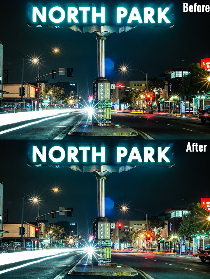
    Look at the difference an adjustment brush made in the sign, as well as brightening up the lower right corner.

    Look at the difference an adjustment brush made in the sign, as well as brightening up the lower right corner of this image.

    How the Adjustment Brush Works

    Instead of making a global change to the entire canvas, the Adjustment Brush enables you to get very specific and just paint over where you would like to make changes.

    This sounds simple, but is incredibly powerful – you now have the ability to affect big change in many different areas of your image, without resorting to bouncing the image over to Photoshop. Hey, I’m all about simplicity, and if I can get all my edits done in one program versus two, I’m all in!

    A Perfect Example – Corvettes and Chrome

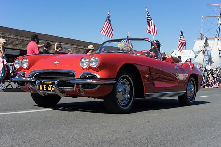
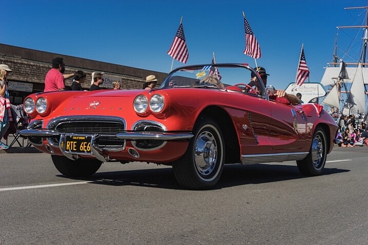
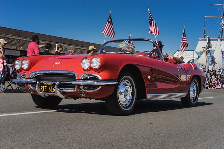
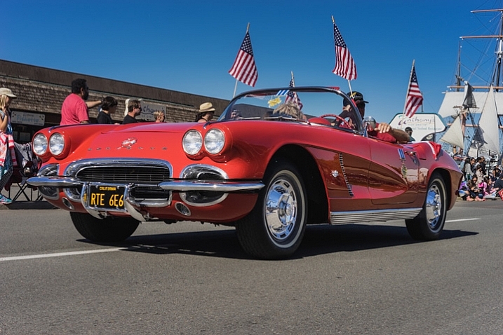
    A good friend had just come to visit me from China, we decided to walk around the neighborhood and managed to catch a parade. It may not look like it, but this was in November in San Diego, one of the benefits of fair weather every day. I caught this image of this beautiful car driving by:

    Lightroom adjustment brush, lightroom mastery course, lightroom mastery, dps, corvette, chrome, parade

    I darkened the sky a bit and applied some more contrast to the ground and ended up with this:

    Lightroom adjustment brush, lightroom mastery course, lightroom mastery, dps, corvette, chrome, parade

    That looks good, but the photo really wasn’t capturing how bright the chrome wheels and bumper accents were. In short, I needed to do some local editing on just those pieces. Adjustment brush to the rescue!

    Time to Shine – Creating a Chrome Adjustment Brush

    Deciding where to start when creating your custom brush

    I knew the key to making this photo pop was getting that chrome to come back to life. I first clicked into my Adjustment Brush window (hit K on your keyboard or select the Brush tool from the top of the right hand panel in the Develop Module) and reset all the sliders back to zero. Since the wheels were not facing the sun, they were underexposed and caught in shadow.

    Creating the brush itself

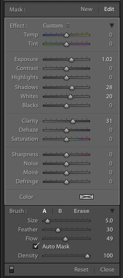
    Lightroom adjustment brush, lightroom mastery course, lightroom mastery, dps, corvette, chrome, paradeI decided to increase the exposure +1 stop, bump the shadows up to +28 to correct the darkness, and increase the whites to +20 to make the highlights in the chrome pop.

    For good measure I increased the clarity to +30 to make sure the edges in that chrome highlights were nice and snappy. Here is what the adjustment window looked like before I started painting (see right)

    This was an educated guess as to what I thought would work. If this worked well, I could leave it. If it didn’t, I could always move the sliders after painting, to change it as necessary.

    Painting with the Adjustment Brush – best practices

    There are a few guidelines I like to follow when painting with the Adjustment Brush. Here a few helpful tips to make this easy:

    • Use a brush size that is a bit smaller than the area you are trying to paint.  It helps if you don’t “color outside the lines”, although that is an easy fix if you do. A quick tip here: if you use a mouse with a scroll wheel you can change the size of your brush by scrolling up and down. It works the same with my Apple magic mouse.
    • Check the box for Auto Mask if you are painting something with fine edges you don’t want to go over. Auto Mask does a good job of keeping your brush inside the lines even if you go outside, which saves time.
    • I like to see the mask I’m painting versus the effects of the mask I’m painting. To have the mask show up in red either click Show selected mask overlay or simply click the O key on the keyboard to toggle the mask on and off.

    Let’s get painting!

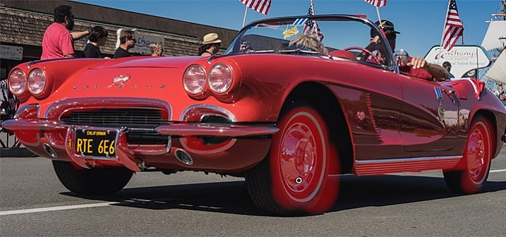
    I quickly painted over the wheels, front bumper, headlights, and any other chrome I could find. It’s a bit difficult to see, since the mask is nearly the same color as the car (you can change the mask color by clicking Shift+O repeated times until you find a better color) but here is what the mask looked like after my initial run:

    Lightroom adjustment brush, lightroom mastery course, lightroom mastery, dps, corvette, chrome, parade

    Using the eraser tool to clean up mistakes

    Wow, I’m apparently terrible at coloring inside the lines! In all reality, going outside the lines on this image didn’t make a noticeable difference, but we might as well do this right.

    To clean up areas where you’ve overpainted all you have to do is click Erase in your Adjustment Brush window. This will pull up a brush that will erase the mask area when you paint over it. This is important: make sure to click click the A or B brush after using the eraser so you don’t forget and start painting over areas with the eraser versus the brush by accident!

    After a quick clean-up I ended up with this, which is much better:

    Lightroom adjustment brush, lightroom mastery course, lightroom mastery, dps, corvette, chrome, parade

    Let’s turn off the mask and see how it looks

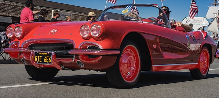
    Remember, to turn off the mask you can simply click the O key on your keyboard. Here you see my image after the adjustment brush has been applied:

    Lightroom adjustment brush, lightroom mastery course, lightroom mastery, dps, corvette, chrome, parade

    Much better!  The chrome wheels and bumper are much brighter now, and look a lot better.  The only thing I don’t like now, is how dark the drivers-side door is.

    It’s a pretty easy fix to create a new brush to bring up the shadows, so I’ll do that.

    Starting a new mask in the same image

    It’s important to think of masks like layers. The wheels and bumpers are painted with one mask, that has one group of settings.

    If I want to make a new adjustment brush with different settings for the door, I need to create a new mask, as opposed to just moving the sliders around. If I move the sliders around without creating a new mask, that will make changes to the current active mask (my wheels and bumpers).

    To make a new mask just click New at the top of the mask menu. I only increased the exposure setting to +1 to add a full stop of light to the side, painted over the door and rear of the car, and got this:

    Lightroom adjustment brush, lightroom mastery course, lightroom mastery, dps, corvette, chrome, parade

    Let’s compare that to the second edit before I used any adjustment brushes:

    Lightroom adjustment brush, lightroom mastery course, lightroom mastery, dps, corvette, chrome, parade

    Before Adjustment Brushes were applied.

    Much better!

    This is just one simple example, the sky’s the limit!

    There are endless possibilities with the adjustment brush. I could have changed the color of this entire car if I wanted to as well.

    You can lighten up dark areas of images and vice versa. You can apply sharpening or clarify to individual areas. You can do a whole host of beauty editing like whitening teeth, giving eyes more color,  and more.

    If you found this helpful, you will LOVE the new DPS Lightroom Mastery course!

    lightroom-mastery.jpg

    There are far too many excellent tips to learning how to master Lightroom to include in a blog post, so Digital Photography tasked me with creating the best and most comprehensive Lightroom video course on the web!

    In Lightroom Mastery I break down everything in Lightroom and teach you more in three hours, than most photographers learn in years. I cover every module, tool, tip, and trick from my 10 years using Lightroom.

    During the initial launch, dPS is doing a huge 50% discount on the course!  The price will regularly be $ 99, but during this special launch it’s only $ 49!

    Go grab the course before the sale is over

    You can click this link to learn more about what is included in the course, watch a preview video, and purchase the course!

    googletag.cmd.push(function() {
    tablet_slots.push( googletag.defineSlot( “/1005424/_dPSv4_tab-all-article-bottom_(300×250)”, [300, 250], “pb-ad-78623” ).addService( googletag.pubads() ) ); } );

    googletag.cmd.push(function() {
    mobile_slots.push( googletag.defineSlot( “/1005424/_dPSv4_mob-all-article-bottom_(300×250)”, [300, 250], “pb-ad-78158” ).addService( googletag.pubads() ) ); } );

    The post Lightroom Mastery: The Power of the Adjustment Brush by Mike Newton appeared first on Digital Photography School.

    Digital Photography School