Category: Photography

  • Behind the Scenes of Marvellous Macro Insect Imagery

    This project by British photographer Levon Bliss and the Oxford University Museum of Natural History is a breathtaking. Levon spends weeks taking thousands of images of a single insect and then edits them together into incredibly high resolution images of these tiny creatures.

    See more of Levon’s work on the Microsculpture site.

    Learn About Macro Photography

    While not on the scale of Levon’s project above we’ve compiled some Macro tutorials for those of you inspired to begin to explore this space.

    • Everything You Need to Know about Macro Photography
    • Getting Started Guide to Macro or Close-Up Photography
    • Macro Photography for Beginners (also see Part 2)
    • Tips for Depth of Field Control in Macro Photography
    • Macro Photography on a Budget: An introduction to Close-up Filters
    • It’s a Bug’s Life – 27 Super Macro Photography Images

    googletag.cmd.push(function() {
    tablet_slots.push( googletag.defineSlot( “/1005424/_dPSv4_tab-all-article-bottom_(300×250)”, [300, 250], “pb-ad-78623” ).addService( googletag.pubads() ) ); } );

    googletag.cmd.push(function() {
    mobile_slots.push( googletag.defineSlot( “/1005424/_dPSv4_mob-all-article-bottom_(300×250)”, [300, 250], “pb-ad-78158” ).addService( googletag.pubads() ) ); } );

    The post Behind the Scenes of Marvellous Macro Insect Imagery by Darren Rowse appeared first on Digital Photography School.


    Digital Photography School

  • 8 Steps to Getting Your Photography Business Noticed

    Photographers, photographers everywhere! It seems in this social media age, new digital photographers flood the industry every day. These “professionals” boast low prices and high quality. There’s nothing wrong with that, but how do you get your work to stand out from the pack? What makes your images different than Johnny Photographer who was given a DSLR for Christmas along Continue Reading

    The post 8 Steps to Getting Your Photography Business Noticed appeared first on Photodoto.


    Photodoto

  • Wise Words: Famous Photography Quotes and Their Relevance Today

    In the early years of my study, I remember leaning over the photography department work bench, trying not to look disheartened, as my lecturer scribbled notes on the glossy finish of yet another proof sheet in red marker. +1, -5, underexposed, out of focus, crop, the irrefutable question mark with an arrow pointing to a light leak of frustratingly mysterious origin, or worse – the dreaded RESHOOT.

    At the time, I was frustrated with my inconsistency both behind the camera and in the darkroom. My tutor’s favorite saying, “Your first 10,000 photographs are your worst” formed in my mind an image of piles and piles of failed photographs stacked up like an impassable mountain before me.

    Filmexample2megankennedy

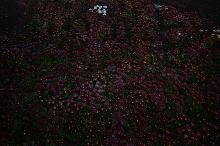
    Light leak from a film camera.

    It was only later in my career that I realized that what my teacher was saying was not a criticism, but her way of encouraging me to take advantage of the opportunity that the worst 10,000 provided. A foundation for the photography I hoped to produce in the future. Without those 10,000 duds my photographic feet would be steeped in the muddy waters of ambition with no way to see my visions through to a complete body of work.

    Those initial 10,000 photos – many of which I have kept stacked in visual diaries and negative sheets to look back on fondly – provided a solid launching pad for my photographic practice and the impetus to advance. Nowadays I find myself delving into the words of photography masters for inspiration, tried and true technical advice, and occasionally a kick in the butt when motivation is lacking.

    Henri Cartier-Bresson

    “Your first 10,000 photographs are your worst”

    Beingaware megankennedy

    Be aware and ready for anything.

    The inventive work of Henri Cartier-Bresson in the early 1930s opened up the creative possibilities of photography forever. Though he is known for his mastery of street photography, Cartier-Bresson was also known for his patience. The mythology of Cartier-Bresson’s “decisive moment” suggested that most of the photographs he took from the very start of his photographic career were taken with a single shot, at the precise instant of opportunity. In reality however, Cartier-Bresson honed his skill by making the most of a potential moment, sometimes shooting 20+ images of one scene. His single greatest images were preceded by the first 10,000 images that fell by the wayside.

    Elliott Erwitt

    “I always make it a point to carry a camera with me at all times…I just shoot at what interests me at that moment”

    In photography, the whole world is a canvas. The special agony reserved for an unarmed photographer witnessing the perfect shot pass before their eyes, is something we have all experienced. Making a habit of always carrying a camera with you (beyond a camera phone, everyone has those!) is rewarding, and makes sure you will never suffer the regret of wishing you had.

    Keepyourcameraonyou megankennedy

    I personally keep a disposable (play) camera with me if my larger camera is too bulky. Not only do the plastic disposables ease the anxiety of being camera-less, they afford a less formal quick-draw camera for street photography. They also provide a refreshing aesthetic, and the occasional surprise. I always enjoy the odd incidental light-leak mark, a quirk of cheaper cameras that adds a real incidental feel to the image. Another upside is disposable cameras are inexpensive and (speaking from experience) they are also a bit bouncier if you drop them.

    Robert Mapplethorpe

    “The more pictures you see, the better you are as a photographer.”

    Rainy shoots in the wilderness, urban exploration, and late night post-processing, means that often photography can be a lonely experience. But taking the time to check out other photographer’s work – from the past and present – can be a great way to get motivated and to immerse yourself in the photography headspace. Studying other artists’ work and dissecting their techniques can help you improve your own work or allow you to ease up a little and be open to experimentation.

    If you usually take photographs of bustling subjects with loud, vibrant colors, try focusing on black and white minimalism for a change. Asking for advice, or perhaps even sharing your own insights, is a great way to build relationships with fellow photographers too.

    Newthings megankennedy

    Mary Ellen Mark

    “Learning how to use different formats has made me a better photographer. When I started working in medium format, it made me a better 35mm photographer. When I started working in 4×5, it made me a better medium-format photographer.”

    Taking the time to shake up your photographic practice is not only a liberating experience but an educational one. As memory cards get bigger, faster, and larger, the temptation to shoot rapid-fire and hope for the best is strong. When shooting with a film camera, however, you are restricted by the limited number of frames on the roll as well as developing costs. As a result, you will immediately start thinking much more about composition, subject matter, movement, and the technicalities of composing the shot correctly in terms of exposure, aperture, ISO, etc.

    Filmexample megankennedy

    Shoot with film for a different experience.

    Taking the time to step back and focus on your craft will no doubt improve your technique and help you to slow down and reconnect with the process of capturing a great photo.

    Imogen Cunningham

    “Which of my photographs is my favorite? The one I’m going to take tomorrow.”

    While it can be exhausting at times, maintaining the hunger for new and better photographs is what drives us photographers to keep going. We’re never satisfied, we never stop learning, and we never stop shooting. As with any artistic endeavor, creativity comes in waves. But to ride the good waves you’ve got to keep surfing.

    Keep striving for that great shot, and when you get it, strive for the next one. You never know what’s coming, so be prepared!

    Beprepared megankennedy

    Ansel Adams

    “You don’t take a photograph; you make it.”

    The word take is often used to describe the process of capturing an image. But the difference between assuming an image is simply there to be taken and taking control of the image are two completely different things.

    We all unconsciously make decisions about how to take a photo in terms of location, weather, time of day, etc., based on what catches our eye. So we are already exerting a lot of control over our photography. By being more aware of detail, the formal technique and execution of a photograph will invariably result in better considered and aesthetically pleasing images, which at the very least saves time on editing later.

    Wisewords2 megankennedy

    Do you have any favorite quotes from photographers past or present? What can we take from them and apply to our own photography? Please share your thoughts in the comments below.

    googletag.cmd.push(function() {
    tablet_slots.push( googletag.defineSlot( “/1005424/_dPSv4_tab-all-article-bottom_(300×250)”, [300, 250], “pb-ad-78623” ).addService( googletag.pubads() ) ); } );

    googletag.cmd.push(function() {
    mobile_slots.push( googletag.defineSlot( “/1005424/_dPSv4_mob-all-article-bottom_(300×250)”, [300, 250], “pb-ad-78158” ).addService( googletag.pubads() ) ); } );

    The post Wise Words: Famous Photography Quotes and Their Relevance Today by Megan Kennedy appeared first on Digital Photography School.


    Digital Photography School

  • Use These Few Lightroom Sliders To Make Your Image Pop

    One of the most used tools in Lightroom to bring attention to the subject is the vignette tool. However, unless you are very subtle with the vignette tool it will be very obvious what you did to the image to make the subject pop. If you overdo it, the vignette tool will leave a distinct dark circular frame near the Continue Reading

    The post Use These Few Lightroom Sliders To Make Your Image Pop appeared first on Photodoto.


    Photodoto

  • 4 Value Speedlight Modifiers that Won’t Break the Bank

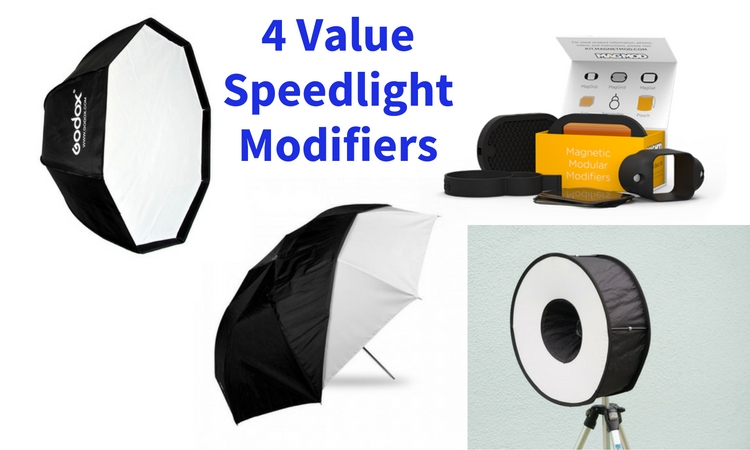
    Cheap generally means nasty. But in this article, we’re going to look at four different light modifiers that give you a range of looks that definitely fit in the value category.

    4 Value Speedlight Modifiers

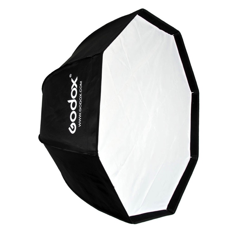
    #1 – The Godox 120cm Octagon Softbox

    This modifier is a 48″ Octagon Softbox that uses an umbrella shaft to mount to a speedlight. The flash aims into the silver backing, meaning that it’s an indirect source. This gives one layer of softening, and because the flash faces away from the subject, there’s less of a hotspot that with a direct flash Octabox.

    The single diffusion panel provides a second level of softness, making for a big beautiful light. There are plenty of similar looking Octaboxes on eBay or Amazon, but the Godox branded ones have one huge advantage: fibre glass rods. Usually the rods are u-shaped metal spines. These provide you with good strength while bending, but very little lateral strength. A blast of wind which knocks the softbox off or over will bend or break a metal rod. Fibre glass, on the other hand, has strength in all directions, making it more resilient.

    Godox 120CM Octabox speedlight modifier

    Bonus: You can bend the closed Octabox to make it fit into a suitcase. This is easily my most used location light modifier because I can vary the softness and coverage using distance. As the softness of the light depends on the relative size on the modifier to the subject, close means softer, and farther away, the light gets harder. Being four feet in size, it’s super soft in close.

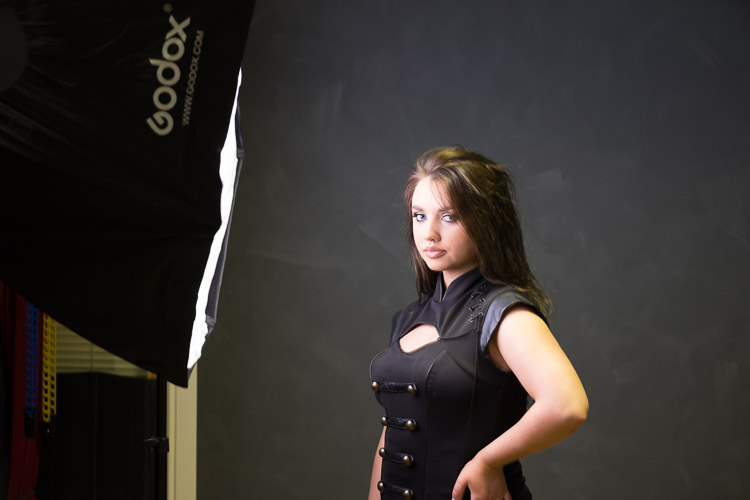
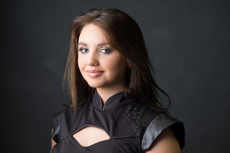
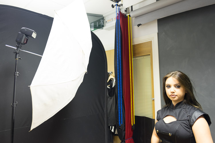
    Here’s a typical setup I use with this modifier and the resulting photo. Shot as an example in the studio.

    Value speedlight modifiers godox bts

    Value speedlight modifiers godox image

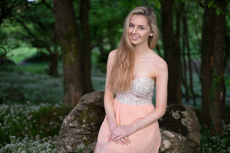
    Here’s a few more example shot on location:

    Value speedlight modifiers godox 2

    Value speedlight modifiers godox 3

    Depending on the Octabox model you order, you can get it with a grid. This helps make the light more directional. By blocking the light going out the sides, it pushes the light forward. You may have situations where you need to stop spill (on the ground or background), and a grid really helps with that.

    #2 – The Meking Ring Flash

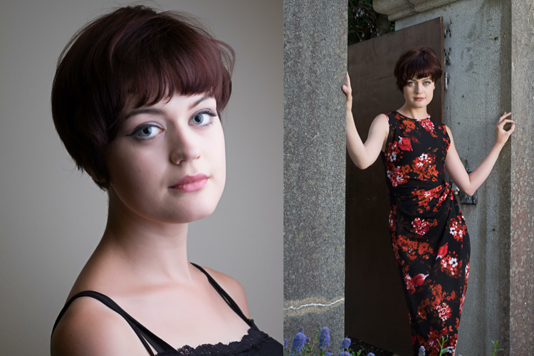
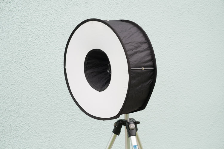
    There are a number of ring flash adapters for speedlights. None are perfect, but I really like this $ 30 modifier, the Meking Ring Flash. Firstly, it folds down really compact, so you can always have a modifier with you. Secondly, you get a really soft quality from this, providing a more flattering light. Thirdly, you’re not obliged to use it on camera, you can easily use it as an off camera light, either as a key light or as a fill.

    Value speedlight modifiers meking 1

    To use it, expand the ring, then push the magnetic separators together, pushing the two sides apart. Finally, mount the ring softbox to your flash using the retained velcro strap.

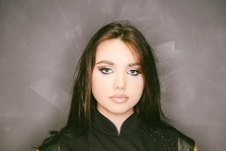
    Here are some examples of  the ring flash use. Notice the shadow that surrounds our model, as well as the classic donut cathchlights in the eyes.

    Value speedlight modifiers meking 2

    Below I’ve used the softbox off camera, in a hotel foyer. This is two separate photos combined into one image.

    Value speedlight modifiers meking 3

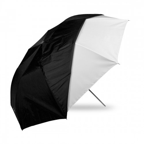
    #3 – Westcott Double Fold Umbrella

    Umbrellas are the staple diet of most speedlight beginners. The Westcott Double fold umbrella offers a little more than a basic one. For a start, it can be used as both a bounce  and shoot-through umbrella.

    Using it as a bounce umbrella allows the light to focus a little and is good when the scene is larger and you need the light to fill in but still be out of camera view. You’d use it as a shoot-thru to get really close to your subject for big, soft light. The black backing can stay half on (see image below) to prevent spill onto clothes, making this a really versatile, compact, light modifier.

    41G7gGhZ3YL

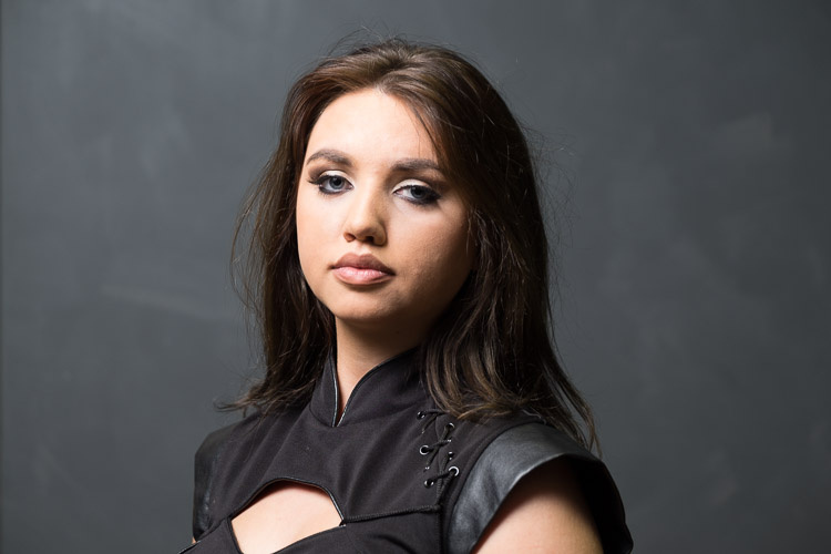
    Here’s the standard bounce look. It’s similar in setup to the Godox (which is effectively a silver bounce umbrella with a layer of diffusion).

    Value speedlight modifiers westcott 1

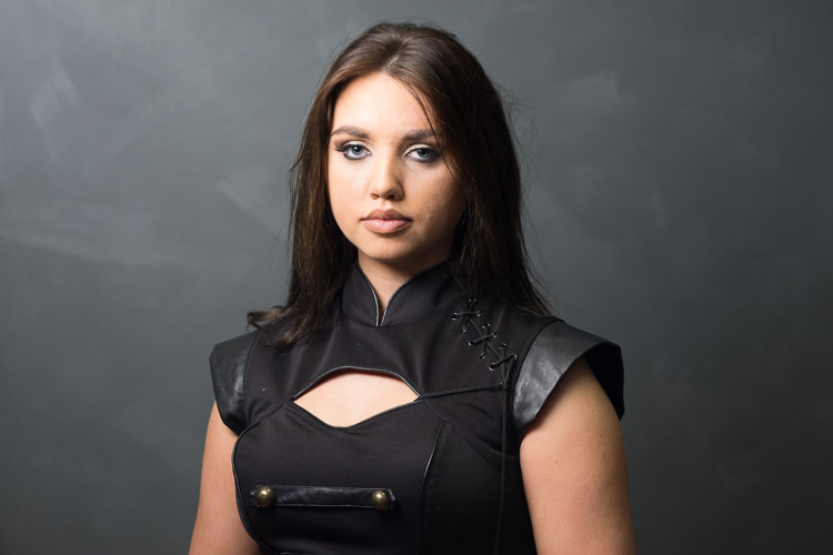
    Turning the umbrella around, and removing half the black covering creates this look (below):

    Value speedlight modifiers westcott 2

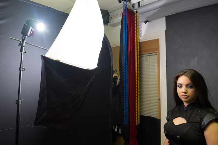
    It’s much softer, but notice that the bottom part of the photo is darker. This is because the black covering is blocking light going to her body and clothes. It’s a great tip which comes from the inspirational Joe McNally, for when then clothes are distracting in a portrait. If it’s not clear, here’s what the umbrella setup looks like.

    Value speedlight modifiers westcott 4

    The final look from the umbrella is using it as a shoot-through. This means removing the black covering altogether.

    Value speedlight modifiers westcott 3

    As you can see, it’s really soft, and floods everywhere (especially compared to the bounce umbrella). Here’s the setup for this.

    Value speedlight modifiers westcott 5

    Notice light spills everywhere with this setup which may work for light or high key portraits. If you want more light control use it as a bounce umbrella with the black cover on.

    #4 – MagMod Basic Kit

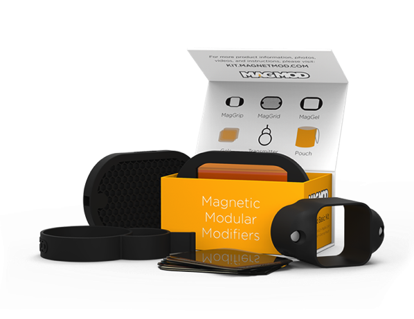
    MagMod is a Kickstarter based company whose products use strong rubber and even stronger magnets to make attaching speedlight modifiers a thing of ease. Rather than use annoying velcro, you stretch the MagGrip around your flash to hold the modifiers. You can see a MagGel on a MagGrip in my article How to use Lighting Gels to Change Your Background Color and in the image below.

    Changing-your-background-with-gels-magmod

    There’s a whole range of MagMod accessories, but the basic kit comes with a grid and a gel holder, along with rigid gels for the holder. These rigid gels are a blessing. A regular gel is essentially a coloured sheet of acetate, so it folds and crumples easily. The rigid nature of the MagGels makes them easy to swap in and out of the holders. There are a variety of colors available. You get a basic set of color correction and ND gels with the kit, but there’s also the Creative and Artistic sets for a larger range of options.

    The MagGrids are great for restricting light, letting you aim it with a huge degree of control.

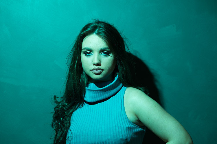
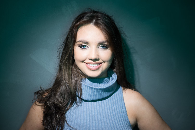
    Value speedlight modifiers magmod 0Here’s a shot done with a bare speedlight:

    Value speedlight modifiers magmod 1

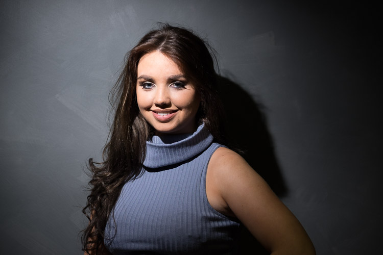
    Here’s the same speedlight with a MagGrid attached. Notice how tight the light is around the model, more like a spotlight.

    Value speedlight modifiers magmod 2

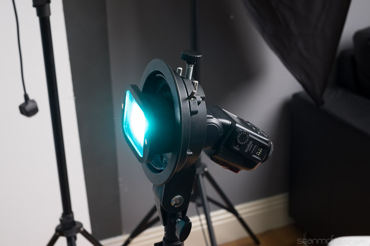
    Here’s the Aqua MagGel from the Artistic series gels. I’ve set the white balance to daylight to keep the colour correct.

    Value speedlight modifiers magmod 3

    Combining the modifiers

    The beauty of these light modifiers is you can mix and match them to make really creative light.

    To achieve the image below, place your on flash on camera, with the Aqua MagGel attached. Next, put the Meking Ring Flash over it to create a soft aqua-colored fill light. Then, place a MagGrid on a second flash and aim it tight on the model’s head. The grid light washes out the gel from her face, but in the shadow areas, the gels fills in for a cool look.

    It’s almost like the image has been post-processed for color, but it’s actually done in-camera.

    Value speedlight modifiers magmod 4

    Another look you can get is a high key portrait. First, set up the Westcott as a shoot-through umbrella on a boom, between you and the model. You’re shooting below the umbrella. For the background, set up the Godox Octabox facing the camera, behind your model. Use a reflector to bounce the light back up to the model for a perfect high key portrait.

    Value speedlight modifiers mixed

    All in all, this gear is under $ 200 (total if you buy them all) and will give you a good range of creative lighting setups. Even just one of them would make a great addition to your speedlight arsenal.

    Do you have any other good value light modifiers you’d like to share? Please do so in the comments below.

    googletag.cmd.push(function() {
    tablet_slots.push( googletag.defineSlot( “/1005424/_dPSv4_tab-all-article-bottom_(300×250)”, [300, 250], “pb-ad-78623” ).addService( googletag.pubads() ) ); } );

    googletag.cmd.push(function() {
    mobile_slots.push( googletag.defineSlot( “/1005424/_dPSv4_mob-all-article-bottom_(300×250)”, [300, 250], “pb-ad-78158” ).addService( googletag.pubads() ) ); } );

    The post 4 Value Speedlight Modifiers that Won’t Break the Bank by Sean McCormack appeared first on Digital Photography School.


    Digital Photography School

  • How to Prepare Your Images for Print and Display

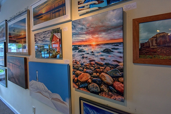
    If you’re into photography at some point you’ve probably had the desire to print and display your work. Whether it be for exhibition in a gallery or local community center, to hang on your own wall, or to give a print as a gift to a friend or loved one, you want to present your work in the best way possible. Treating it as the piece of art that it is. Displaying your printed work can sometimes result in a lot of angst, due to problems printing, decisions with regards to matting and framing, and finally, lighting.
    Displaying Your Images

    Many photographers believe an image isn’t fully realized until it has been printed and hung.

    “The negative is the equivalent of the composer’s score, and the print the performance.” – Ansel Adams

    While situations, intentions, and desires may vary from one photographer to the next, here are a few things to consider when preparing an image for print and display.
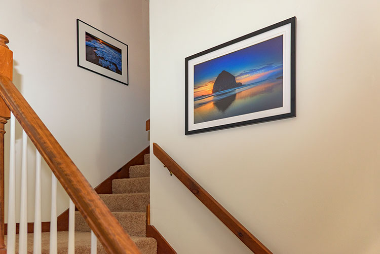
    home-display-of-prints

    Monitor Calibration

    Before you even choose which route to go with in terms of printing your images, you have to address the biggest issue facing photographers today – monitor calibration.

    The settings you have applied to your computer screen can drastically affect the way the image looks on screen. And while you may have edited the image to look fine onscreen, when you go to print it, there is a very good chance your printed output will look nothing like what you saw when editing. To solve that issue, you have to match your screen to a known standard. One that sets the color and brightness so that what you see on screen will translate to what comes back from the photo lab, or out of your printer.
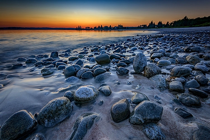
    Calibrating Your Monitor

    Unless your monitor is properly calibrated, you can’t be sure that the vibrant colors you see on screen will be the same as those seen in a print.

    There are several available options for monitor calibration, but they all do the same thing. They get your monitor set to a known state that the printing engine can translate to similar output. In other words, what you see onscreen is what you get out of the printer or lab! Finally, it’s important to realize that the lighting under which your print will be displayed will affect the way the image looks. Too cool lighting will make it look bluer, while fluorescent lighting will make it greener, and tungsten lighting will warm the tones.

    Finally, it’s important to realize that the lighting under which your print will be displayed will affect the way the image looks. Lighting that is too cool will make it look bluer, while fluorescent lighting will make it appear greener, and tungsten lighting will add warm the tones.

    Type of Print

    Obviously, if you plan to display one or many of your images, the first thing you need to do is have it printed. You have several options available, and while none are wrong, some are better than others. The simplest option, in terms of work for you, is to use a photo lab or print service. If you like more control, you can choose to print the images yourself on your own photo quality inkjet printer. Even then, there are things to consider.
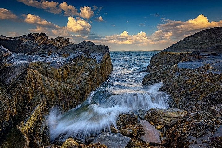
    Making Prints

    When you do decide to print an image, you have several choices to make, include what process to use, what media to print on, and how it should be finished.

    There are two main printing methods prevalent today, depending on where you go for your prints of digital images:

    Inkjet prints:

    Inkjet prints are produced by placing tiny drops of ink on paper or canvas to produce an image. Professional inkjet printers tend to have more colors than consumer models, with high-end printers now featuring up to 12 different color inks to create a richly colored image.

    Inkjet printers use inks that fall into one of two categories; pigment or dye-based inks. Pigment inks are made of tiny particles that sit on top of the paper, while dye-based inks are absorbed into the paper. Pigment inks are archival and can last up to 200 years or more in the proper conditions (under museum-quality lighting and framing). Pigment-based inks are more expensive but also suffer two main drawbacks. First, pigment based inks can suffer from metamerism, which appears as a shift in the color when viewing the print at an angle. The second drawback is that pigment-based inks are not as vibrant as dye-based ones. Dye-based inks tend to fade more quickly, though some are rated to last up to 75 years or more in proper conditions. Professional printers will usually use pigment-based inks.

    Digital C-Print (Lightjet):

    This method of printing involves using a laser to expose chromogenic paper, which is then processed in chemicals, similar to a traditional photographic print. It’s a continuous tone print, unlike inkjet which produces tiny dots of ink on the paper to create the image. The laser produces true photographic quality with continuous gradations and tones. Kodak Endura and Fuji Crystal Archive are the two most popular papers used in this process, and both produce archival prints that will last up to 200 years under proper conditions.
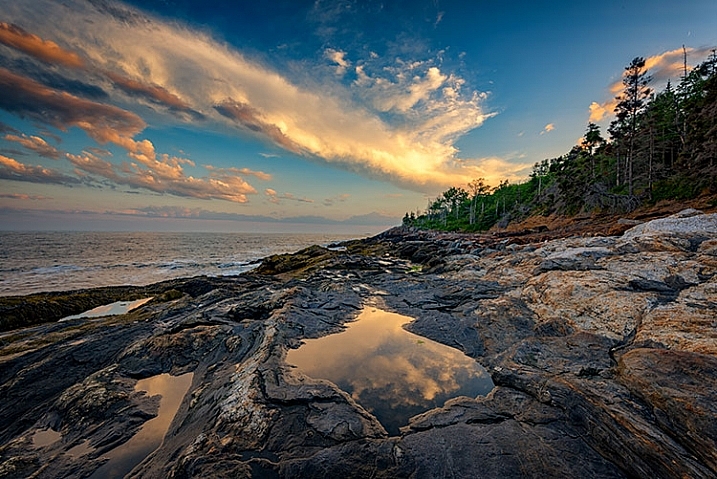
    Displaying Your Work

    While it’s fun to show off your images online, there is nothing quite like having one of your images printed and framed.

    Choosing a Lab

    Labs offer some decided advantages over printing images yourself. When choosing a lab, you want to find one with a reputation for good quality control and customer service. I’ve found getting recommendations from other photographers to be incredibly helpful when looking for a lab.

    Other things you’ll want to consider are their products. Do they print using the method you want? Do they offer the sizes you want? Do they print on media other than photo paper, such as canvas, acrylic, or metal? What kinds of finishing options do they offer? Is the canvas gallery wrapped? Do they offer mounting or framing? Do you want or need those services? Answer those questions, knowing what you want or need, and that should give you a good answer as to whether the lab will fulfill your needs.

    Answer those questions, knowing what you want or need, and that should give you a good answer as to whether the lab will fulfill your needs.

    Displaying the Print

    If you choose to go with a print on metal, acrylic, or canvas, once the print is made, you probably won’t have much else to do. These options are generally finished and require no framing, though a decorative frame can be added to canvas if desired. If you’ve printed on paper, you still have a little work to do.
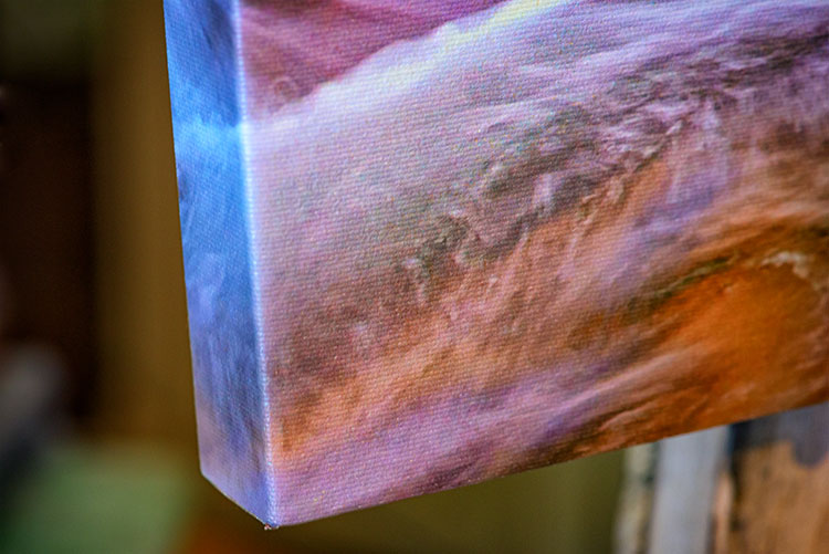
    canvas-wrap

    Matting

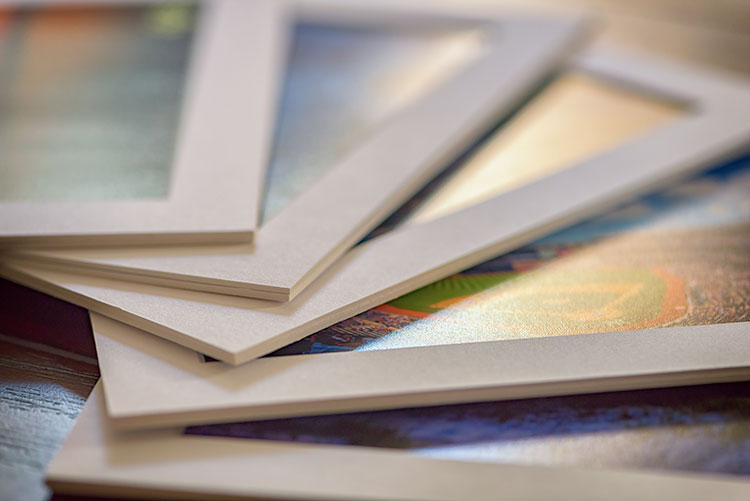
    Paper prints, to be properly displayed, need to be matted and framed. You can find various qualities of mat board, using terms such as “Buffered pH Neutral” or “Acid-Free”. These are basically the same thing, meaning the acid has been removed from the paper to avoid harming the prints. Acid-free mats have a protective lifespan of about 7-12 years.

    The next grade of mat board is known as “conservation grade acid-free” or sometimes “museum rag”, which is what you’d want to use for a serious art display in a gallery. In addition to removing the acid, another component harmful to paper, called lignin, is also removed from the mat board. Conservation mats that are acid and lignin free have a protective lifespan of 50 years or more. Conservation grade mats aremore expensive than simple acid-free ones.

    Which type of mat should you choose? It really depends on your purpose. If you’re planning to display the print as art in a gallery and possibly for sale, conservation grade mats are the best choice. This helps add value to the print by preserving it, and lets the buyer know you are serious about your work and their potential investment in it. If the use is something less important, such as a temporary display that won’t be for sale, you can certainly save some money and go with a simple acid-free mat.
    matted-prints

    Framing

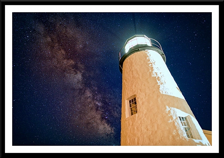
    Framing prints can present you with some difficult choices, depending on where the print will be hanging. Since you never know where someone may hang a print, for galleries and art shows I suggest a simple, understated black frame, that lets the image breathe and speak for itself.
    Framed Print

    A matt and frame finish off an image and complete the piece for hanging.

    One of the big mistakes I see new photographers and artists make when showing work in a gallery or exhibition is framing their work in overly ornate or colorful frames. When an art buyer purchases a new piece of art, if it is framed already, that frame becomes part of the consideration. By keeping the frame simple and understated, it allows the buyer to view the art neutrally without considering the frame. They won’t feel the frame has to be married to the image and can feel free to consider their own framing choices.

    If you want to get really serious about the frames you use, you’ll want to use museum quality framing. Like conservation mats, it is designed to preserve the print for as long as possible. Museum quality framing includes UV filtered glass to reduce the UV rays from the sun that are a print’s worst enemy and keep it from fading. It should include conservation matting as described above, and will have a final layer of archival backing to further protect the print.

    The Finishing Touch
    Signing Your Prints

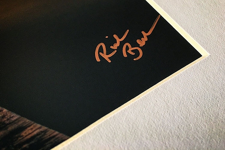
    An artist should always sign his or her work, on the print, in the corner.

    As with any artwork, you should always, without fail, sign your images. Signing your images signifies that you created the image, personally took responsibility for it from capture to print, and lets whoever is hanging the print on their wall know who created it. It adds value for art collectors.

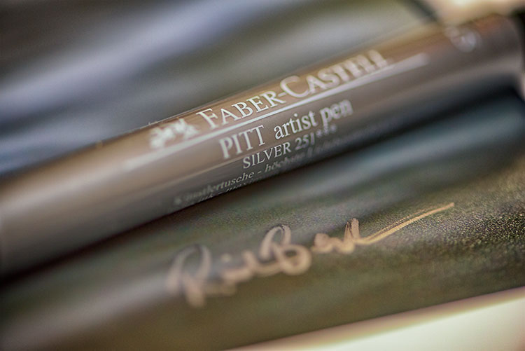
    There is always some debate, it seems, but I will go on the record as saying that it is always the print that should be signed, and never the mat. The mat can be removed, and thus, so can your signature. Choose either the bottom left or bottom right corner and sign your prints with a neat, clear signature that identifies the image as your own. Again, you’ll want to use archival ink that won’t harm the print, in a color that will stand out. For darker prints, silver or gold metallic works nicely, while for lighter colored prints, a black ink will suffice. I prefer the Deco Color Liquid Fine Paint Markers to sign my prints, canvases, metal prints, and acrylics. There are several thicknesses available so you may want to experiment to find what works best for you.
    artist-pen

    Your photos are meant to be seen, not just take up space on a hard drive! So take these tips and start showing your images off. What are your favorite tips for displaying photos?

    googletag.cmd.push(function() {
    tablet_slots.push( googletag.defineSlot( “/1005424/_dPSv4_tab-all-article-bottom_(300×250)”, [300, 250], “pb-ad-78623” ).addService( googletag.pubads() ) ); } );

    googletag.cmd.push(function() {
    mobile_slots.push( googletag.defineSlot( “/1005424/_dPSv4_mob-all-article-bottom_(300×250)”, [300, 250], “pb-ad-78158” ).addService( googletag.pubads() ) ); } );

    The post How to Prepare Your Images for Print and Display by Rick Berk appeared first on Digital Photography School.


    Digital Photography School
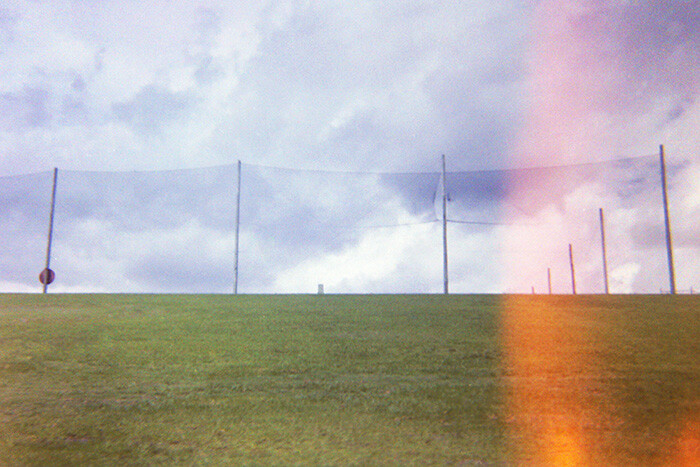
  • How to Choose Your Camera Angle to Take Better Portraits

    Taking portraits involves so many variables that it can feel overwhelming for a new photographer. What lenses do you use—zoom, prime, or a mix of both? Do you shoot full-frame or cropped sensor? Will you shoot indoors or outdoors. Even the subject matter can be tricky, with some portrait photographers working exclusively with families, others who only shoot high school seniors or newborn babies, and still more who do a mix of everything.

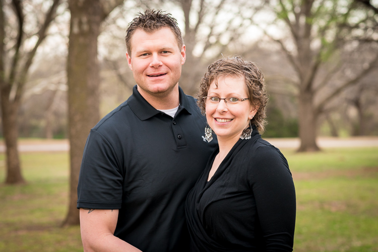
    all-about-angle-husband-wife-outdoors

    Nikon D750, 85mm, f/4, ISO 900, 1/250 second

    While you are pondering all these variables it can be easy to lose sight of the forest for the trees and forget about a few key basics such as posing and lighting, and no matter what style of portraits you choose to pursue there is one thing that always comes into play which may not seem obvious: the camera angle from which you shoot. This can make all the difference between happy clients and complaining customers. Understanding how you can use camera angles and points of view can greatly enhance any portrait session.

    Point of view – up high or down low

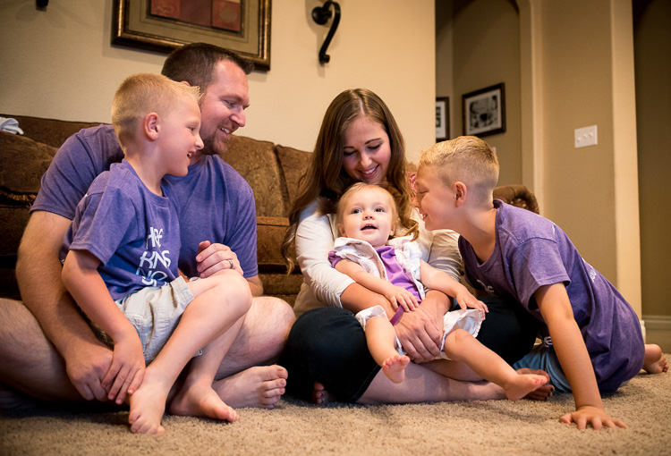
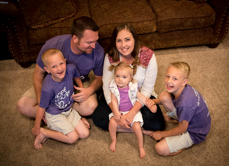
    Understanding how your camera angle, or point of view, can affect your shots will go a long way towards improving not just your portraits, but your photography in general. How you position yourself in relation to your subjects can have a dramatic effect on the resulting pictures. As an illustration of how this works, here are two pictures of a family from a recent home-based session I did. Both show a very similar scene, and yet the different angles from which I shot them results in two vastly different images.

    all-about-angle-family-indoors-low

    Nikon D750, 35mm, f/4, ISO 5600, 1/90 second

    As I shot the image above I was very low to the ground. Crouching down on my hands and knees, I got very close physically to the family while the mother and father watched the boys play with their sister. It feels like the viewer is part of the scene, right there with them as they all share a fun moment together. This is entirely due to the low angle from which the picture was shot. Now take a look at virtually the exact same scene but shot from high above.

    all-about-angle-family-indoors-high

    Nikon D750, 35mm, f/4, ISO 3600, 1/90 second

    To get this picture I grabbed a dining room chair and stood on it to get a shot from a much higher angle. The result is a picture that feels quite different from the first one. It doesn’t seem like you are a part of the scene, but an outside observer looking at the family as they gather together.

    While I like both images, each one creates a very different emotional response on the part of the viewer. Even though both were shot with the same camera and lens, at the same location, with the same subjects, the result is two pictures that are vastly different from one another all because of the angle from which they were taken.

    Even subtle changes make a difference

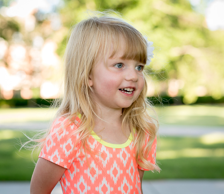
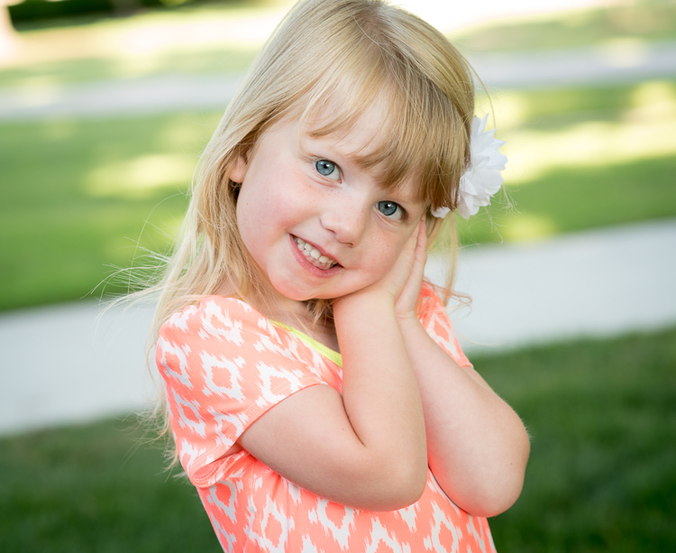
    You can see a similar, but more subtle, effect in this pair of portraits I took of a young girl near her birthday.

    Shot with a Nikon D750 and 85mm lens.

    Nikon D750, 85mm, f/4, ISO 800, 1/500 second

    The angle here isn’t as low as the first one of the family, but it’s low enough to be on the girl’s eye level. To get this I had to kneel down and stand a few meters back as her mother talked with her from my right-hand side. It gives a similar sense of intimacy as the first picture of the family and feels as though the viewer is near the girl and part of the scene.

    This changes a bit when the girl is shot from an adult’s eye level looking down (below).

    all-about-angle-child-playing-high

    Nikon D750, 85mm, f/4, ISO 560, 1/250 second

    While the effect here is not as dramatic as the example with the family, you will still note a similar result in terms of emotion and tone. Instead of getting down on eye level I shot this while standing up about the same distance away. It doesn’t feel like you, the viewer, are a part of the scene and instead it seems like you are merely an observer. Notice how the sidewalks in the background cut across the frame at odd angles whereas in the first one the sidewalks neatly cross in horizontal lines, adding a subtle touch without being too obvious or gaudy.

    Once again I don’t think either picture is necessarily better or worse, but both are quite different as a result of the camera angle.

    Kids – break the rules

    This is, incidentally, one of the most common issues I see with people who are taking casual snapshots of their kids, whether with a fancy DSLR or just their mobile phone. Taking a few seconds to crouch down and get on eye level with the children can make all the difference in the world between an intimate moment frozen in time, and a boring snapshot.

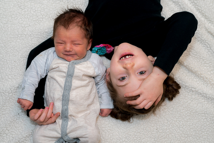
    However, I don’t want to give the mistaken impression that shooting from a high angle is necessarily a bad thing. It can be a very good thing indeed, and quite effective when used intentionally, such as this image of a girl with her two-week-old baby brother (below).

    Shot with a Nikon D750 and 50mm lens.

    Nikon D750, 50mm, f/4, ISO 400, 1/125 second

    This picture was a bit tricky, but the results were well worth it. I was doing this on location in the family’s home so I didn’t have a lot to work with, but I wanted to get something a bit unique. I put the two kids on a blanket on the floor, got a chair to stand on, and positioned myself directly above them while bouncing my flash off the ceiling.

    It resulted in an image that feels more fun and playful as if the viewer is peeking in on a fun moment between the two siblings. The equipment here was nothing all that special (I could have just as easily used my old D7100 and 35mm lens to get the same shot) but paying attention to the angle made for a picture that stood out quite a bit from the rest of the image I shot that day.

    Other camera angles to consider

    Sometimes finding the right angle involves something as simple as choosing where to put yourself in relation to your subject, not necessarily whether to shoot from high above or down low. You can see this in the example below. After an hour of taking a variety of traditional portrait-style

    After an hour of taking a variety of traditional portrait-style shots, I stood back while the family walked back to their car and took some pictures with the sunset casting a warm glow through the trees above.

    Shot with a Nikon D750 and 85mm lens.

    Nikon D750, 85mm, f/4, ISO 180, 1/400 second

    There are some elements that I could do without, such as the tree branches coming from the left-hand side. But overall the picture feels warm, cozy, and conveys a sense of comfortable intimacy as if I have captured the family in a quiet and sincere moment. It puts you, the viewer, as an outside observer to the scene and almost feels like you are watching from afar as the family shares a special time together.

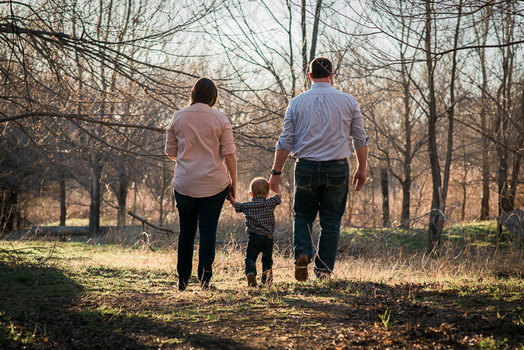
    This is in stark contrast to the next picture, which despite being at a different location is composed in almost exactly the same manner except for one variable: the angle.

    Shot with a Nikon D7100 and 85mm lens.

    Nikon D7100, 85mm, f/2.8, 1/250 second, ISO 100

    This picture feels like it’s full of energy, excitement, and enthusiasm as the family holds hands and walks towards me. I like both pictures quite well, but changing the angle resulted in two images that are vastly different from one another.

    Summary

    Hopefully, these examples give you an idea of how your camera angle and point of view can dramatically affect the types of portraits you take. If you are looking to try something new and kick your photography up a notch without spending any money on more gear, try doing something as simple as changing your angle and see what happens.

    In fact, this now makes me wonder about your favorite tips and tricks for shooting portraits at different angles. Leave your thoughts in the comments below, and feel free to share pictures as well!

    googletag.cmd.push(function() {
    tablet_slots.push( googletag.defineSlot( “/1005424/_dPSv4_tab-all-article-bottom_(300×250)”, [300, 250], “pb-ad-78623” ).addService( googletag.pubads() ) ); } );

    googletag.cmd.push(function() {
    mobile_slots.push( googletag.defineSlot( “/1005424/_dPSv4_mob-all-article-bottom_(300×250)”, [300, 250], “pb-ad-78158” ).addService( googletag.pubads() ) ); } );

    The post How to Choose Your Camera Angle to Take Better Portraits by Simon Ringsmuth appeared first on Digital Photography School.


    Digital Photography School
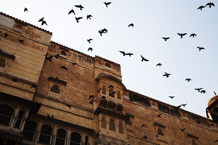
  • Weekly Photography Challenge – Fall Leaves

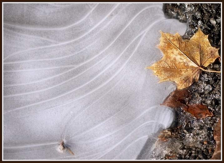
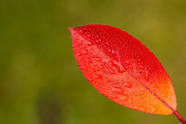
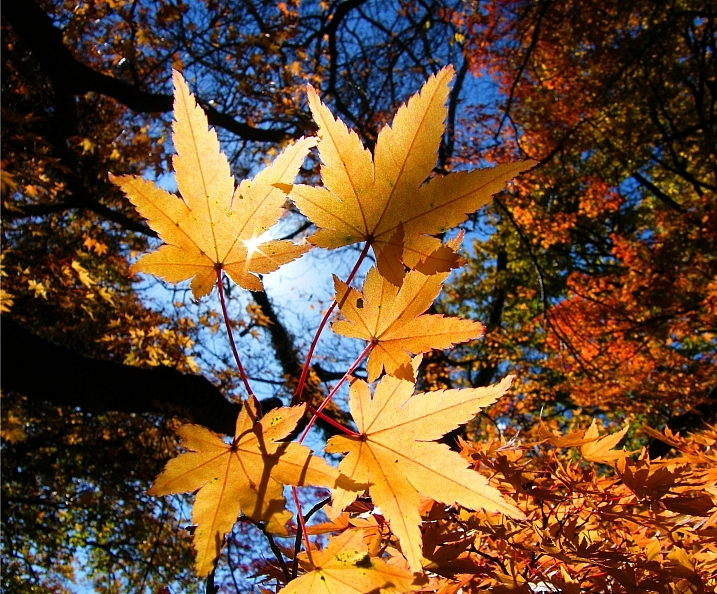
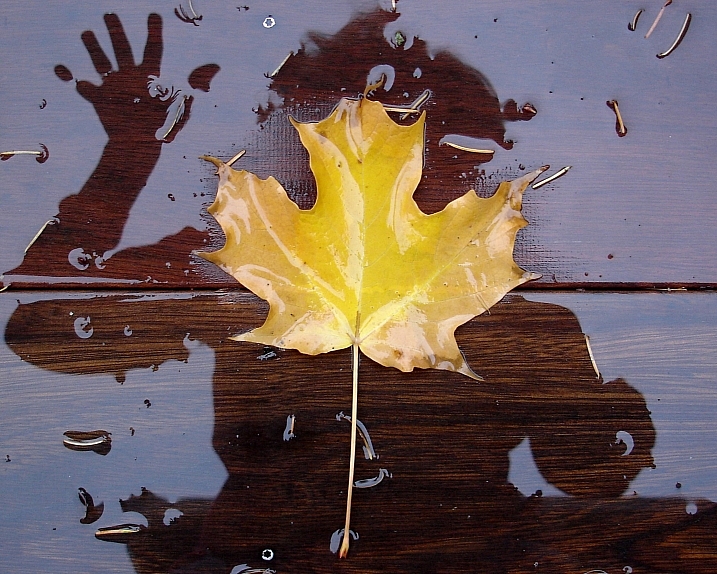
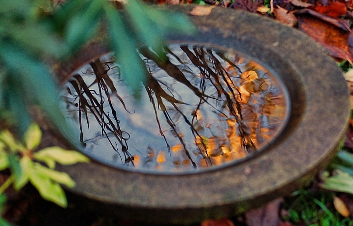
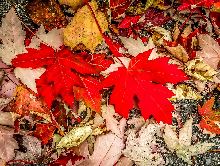
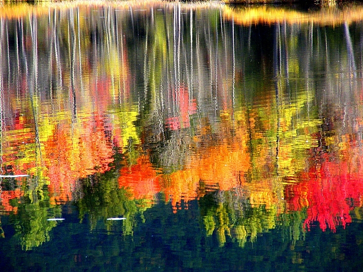
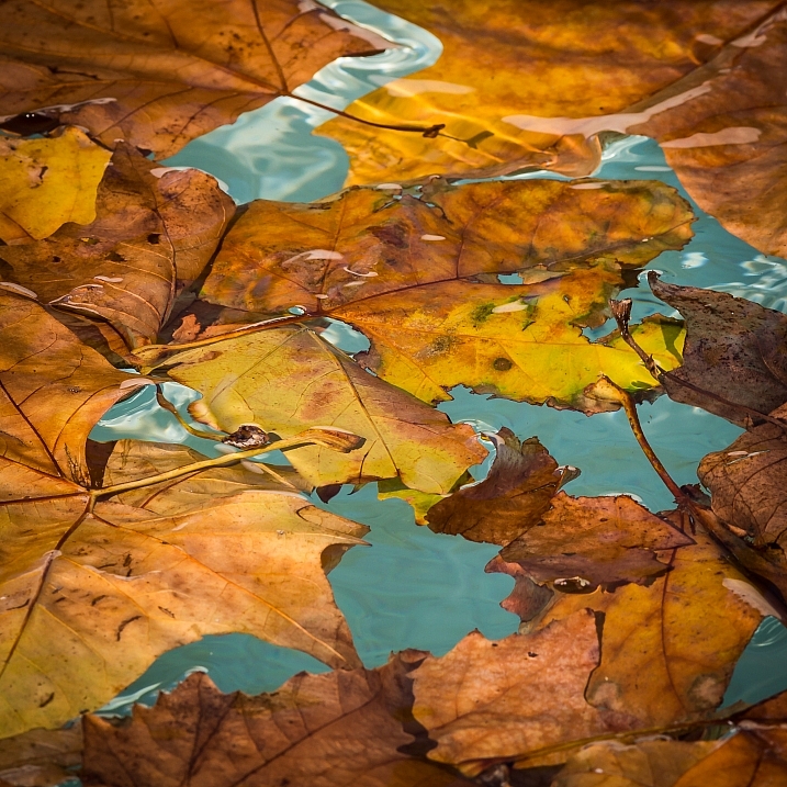
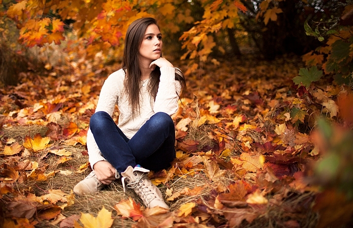
    Earlier I rounded up several images of fall leaves to get you thinking about shooting the autumn colors.

    Now it’s your turn to get shooting.

    Pedro Fernandes

    By Pedro Fernandes

    Randi Hausken

    By Randi Hausken

    Weekly Photography – Fall Leaves

    If it is autumn or fall in your area the leaves may be changing color soon. So now is the perfect time to go shoot some great colorful images of leaves, landscapes, or even fall portraits. Even if it is not autumn where you live (southern hemisphere) try finding some interesting leaves, do a macro shot, or get creative with processing or composition.

    Here are some articles that may give you ideas how to approach this subject:

    • Guide to Creative White Balance for Landscape Photography
    • Tips for Abstract Macro Photography; Using Texture and Light
    • 12 Tips to Help You Capture Stunning Landscape Photos
    • Backyard Macro Photography Safari
    • How to Create Strong Compositions Using Color Contrast
    • Add Contrast to Your Images by Using Complementary Colors
    David Ohmer

    By David Ohmer

    Umberto Nicoletti

    By Umberto Nicoletti

    Stuart Williams

    By Stuart Williams

    --IZA--

    By –IZA–

    Vincent Brassinne

    By Vincent Brassinne

    Share your images below:

    Simply upload your shot into the comment field (look for the little camera icon in the Disqus comments section) and they’ll get embedded for us all to see or if you’d prefer, upload them to your favourite photo sharing site and leave the link to them. Show me your best images in this week’s challenge. Sometimes it takes a while for an image to appear so be patient and try not to post the same image twice.

    Share in the dPS Facebook Group

    You can also share your images on the dPS Facebook group as the challenge is posted there each week as well.

    Michael Salvato

    By Michael Salvato

    Elisa Greco

    By elisa greco

    Olli Henze

    By Olli Henze

    googletag.cmd.push(function() {
    tablet_slots.push( googletag.defineSlot( “/1005424/_dPSv4_tab-all-article-bottom_(300×250)”, [300, 250], “pb-ad-78623” ).addService( googletag.pubads() ) ); } );

    googletag.cmd.push(function() {
    mobile_slots.push( googletag.defineSlot( “/1005424/_dPSv4_mob-all-article-bottom_(300×250)”, [300, 250], “pb-ad-78158” ).addService( googletag.pubads() ) ); } );

    The post Weekly Photography Challenge – Fall Leaves by Darlene Hildebrandt appeared first on Digital Photography School.


    Digital Photography School
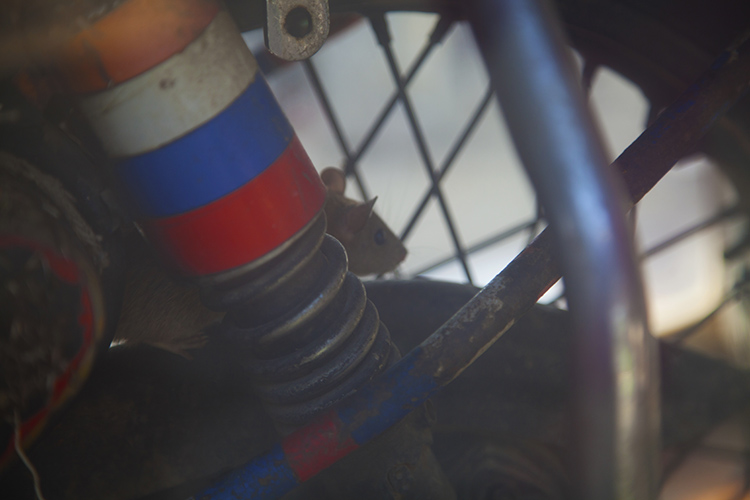
  • 21 Technicolor Images of Fall Leaves

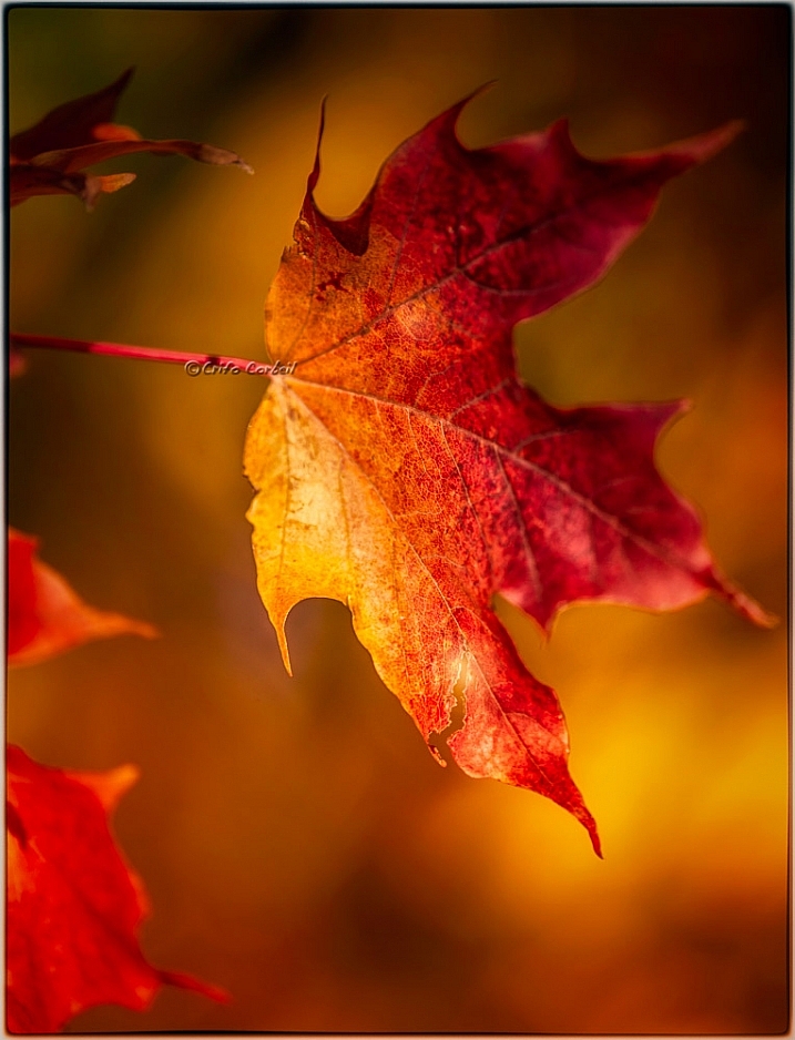
    Here in the Northern Hemisphere fall is upon us and the leaves are already changing color. What better time to get out and photograph them!

    Let’s see what these photographers captured in this colorful images of fall leaves:

    Louise Leclerc

    By Louise Leclerc

    Ram Yoga

    By Ram Yoga

    Darlene Hildebrandt

    By Darlene Hildebrandt

    Chechi Peinado

    By Chechi Peinado

    Stanley Zimny (Thank You For 19 Million Views)

    By Stanley Zimny (Thank You for 19 Million views)

    Jacki-dee

    By jacki-dee

    *Psyche Delia*

    By *Psyche Delia*

    Nicole Nicky

    By Nicole Nicky

    Greg Johnston

    By Greg Johnston

    Peaceful-jp-scenery

    By peaceful-jp-scenery

    Anne Worner

    By Anne Worner

    Susana Fernandez

    By Susana Fernandez

    Gisella Klein

    By Gisella Klein

    Stanley Zimny (Thank You For 19 Million Views)

    By Stanley Zimny (Thank You for 19 Million views)

    Paulo Valdivieso

    By Paulo Valdivieso

    Crifo

    By crifo

    Mike Monaghan

    By Mike Monaghan

    J J

    By J J

    Ms.Kimberly_B

    By Ms.Kimberly_B

    Susanne Nilsson

    By Susanne Nilsson

    Mirai Takahashi

    By Mirai Takahashi

    googletag.cmd.push(function() {
    tablet_slots.push( googletag.defineSlot( “/1005424/_dPSv4_tab-all-article-bottom_(300×250)”, [300, 250], “pb-ad-78623” ).addService( googletag.pubads() ) ); } );

    googletag.cmd.push(function() {
    mobile_slots.push( googletag.defineSlot( “/1005424/_dPSv4_mob-all-article-bottom_(300×250)”, [300, 250], “pb-ad-78158” ).addService( googletag.pubads() ) ); } );

    The post 21 Technicolor Images of Fall Leaves by Darlene Hildebrandt appeared first on Digital Photography School.


    Digital Photography School
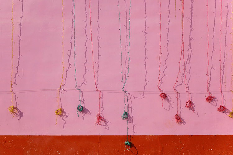
  • Use These Few Lightroom Sliders To Make Your Image Pop

    One of the most used tools in Lightroom to bring attention to the subject is the vignette tool. However, unless you are very subtle with the vignette tool it will be very obvious what you did to the image to make the subject pop. If you overdo it, the vignette tool will leave a distinct dark circular frame near the Continue Reading

    The post Use These Few Lightroom Sliders To Make Your Image Pop appeared first on Photodoto.


    Photodoto