RSS
 

Archive for the ‘Photography’ Category

Top Street and Travel Photography Tips of 2016

04 Jan

This week we have shared some other popular articles from 2016. Check those out here:

  • Top Gear Related Articles of 2016
  • 15 of the Most Popular Landscape Photography Articles of 2016
  • 18 of the Most Popular Portrait Articles on dPS in 2016
  • Some of the Best Beginner Photography Tips of 2016
  • Most-Read Post-Processing Articles of 2016

In this last annual round-up, I have gathered some of the top street, and travel photography articles of the year for you, and as a bonus some other miscellaneous topics as well. We will be back to our normal schedule of two articles per day tomorrow.

top-street-and-travel-photography-tips-of-2016

Street photography

  •  23 Quick Tips for Street Photography or Your Next Photo Walk
  • The Uncomfortable Truth About Street Photography
  • 13 Steps for Editing Street Photography in Lightroom from Start to Finish
  • An Introduction to Street Photography for New Photographers
  • How to Choose the Best Lens for Travel and Street Photography
  • 7 Common Mistakes That Newbie Street Photographers Make
  • How the Square Format Can Enhance Your Street Photography
  • 8 Advanced Street Photography Tips to Get You to the Next Level
  • Pros and Cons of a Telephoto Lens for Street Photography?
  • 9 Tips for Creating Great Street Portraitsultimate-street-photo-guide

Ultimate Guide to Street Photography – free PDF download

Remember you can also get the dPS The Ultimate Guide to Street Photography here. Download it as a free PDF to keep with you as a reference when you go out shooting.

Travel photography

  • 7 Travel Photography Mistakes to Avoid
  • Travel Photography Simplified: 4 Changes that Made me a Better Photographer
  • 7 Common Mistakes That Could be Ruining Your Travel Photos
  • How to Use a Travel Photography Shot List to Come Home with Better Photos
  • My Favourite Travel Lens; The Tamron 28-300mm
  • 10 Tips To Help You Capture Sellable Travel Stock Photos
  • Travel People Photography – Tips and Pitfalls
  • 10 Tips For Food Photography When Travelling
  • 6 Tips for How to be a Culturally Sensitive Travel Photographer
  • 7 Reasons Why a Tripod is a Travel Photographer’s Best Friend
  • How to Travel Safely with Your Camera Gear
  • 5 Lessons Learned While Using a Kit Lens for Travel Photography
snapntravel-1-1.jpg

Also available is our SnapnTravel ebook. Get it here.

Other topics

  • Behind the Scenes of Marvellous Macro Insect Imagery
  • Quick Overview of How to do Macro Photography
  • Macro Photography on a Budget: An introduction to Close-up Filters
  • How to Get Stunning Macro Photos with Your Mobile Phone
  • Tips for Abstract Macro Photography; Using Texture and Light
  • 5 Must-Have Lenses for Wedding Photographers and Why
  • 4 Easy and Unique Ways to Light and Photograph Wedding Rings
  • Wedding Photography; Just How Specialized is it?
  • 10 Fundamental Tips for Newbies in the Wedding Photography Business
  • 10 Tips for Photographing Great Headshots
  • How to Edit Corporate Headshots in Lightroom
  • The Secret to Finding the Hero Angle in Food Photography
  • 5 Tips for More Professional-Looking Food Photography
  • 8 Tips for Food Photography Newbies
  • How to Take Cool Food Photos in Your Refrigerator
  • 10 Ideas to Instantly Improve Your Photography Composition
  • 6 Advanced Composition Techniques to Improve Your Photos
  • 4 Steps to Creating Images With More Meaningful Composition

leannecole-exhibiting-your-artwork-31

googletag.cmd.push(function() {
tablet_slots.push( googletag.defineSlot( “/1005424/_dPSv4_tab-all-article-bottom_(300×250)”, [300, 250], “pb-ad-78623” ).addService( googletag.pubads() ) ); } );

googletag.cmd.push(function() {
mobile_slots.push( googletag.defineSlot( “/1005424/_dPSv4_mob-all-article-bottom_(300×250)”, [300, 250], “pb-ad-78158” ).addService( googletag.pubads() ) ); } );

The post Top Street and Travel Photography Tips of 2016 by Darlene Hildebrandt appeared first on Digital Photography School.


Digital Photography School

 
Comments Off on Top Street and Travel Photography Tips of 2016

Posted in Photography


Tips for How to Think and Use Lightroom More Artistically

04 Jan

Each time I process one of my images I do it in a totally different way. This might sound strange to you. I feel that often articles about image processing are riddled with ideas about formulas and essential steps. But for me, this totally goes against everything I believe about photography.

dps-how-to-be-artistic-lightrrom-9

If you want to make creative images there is no one formula that you can apply to all photographs, or all genres. There are no essential steps that you must follow for every single image.

Why there is no magic formula

To say there is one formula is like saying there is one for making great art, and if we followed it then we’d all be great artists. But that is looking at it from the wrong angle. That’s asking for something outside of you to make you perform well. In fact, the only chance (literally the only) any of us have of taking great photographs, is to allow the most unique parts of ourselves to flow out.

Now, that’s not to say I don’t have some great advice for you. I do! It is, though, based on my philosophy that every image is unique. This is not a paint by numbers experience – so processing must be approached in a fresh, new way every single time.

dps-artistic-lightroom-8-6

Before processing

Like a lot of photos there are a few different ways I could have gone about this. Processing, like the act of taking photos, is a totally subjective experience. That’s most of the fun!

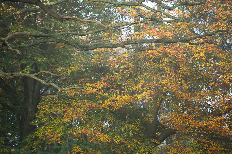
Unlike the other photos I’ve featured in this article, which were all taken on the same beautiful morning in Hampstead Heath in London, in this photo I didn’t want to have that misty fog in the photo. It didn’t work for me with the vibrant colours of the leaves. So instead I enhanced that deep colour and gave the leaves a strong contrast with the dark branches.

To me this is more of a natural look, what you would see when you are out in the woods. I used the HSL module to saturate the colour channels individually with a little Clarity in the basic module. It didn’t really take a big push to make a big change.
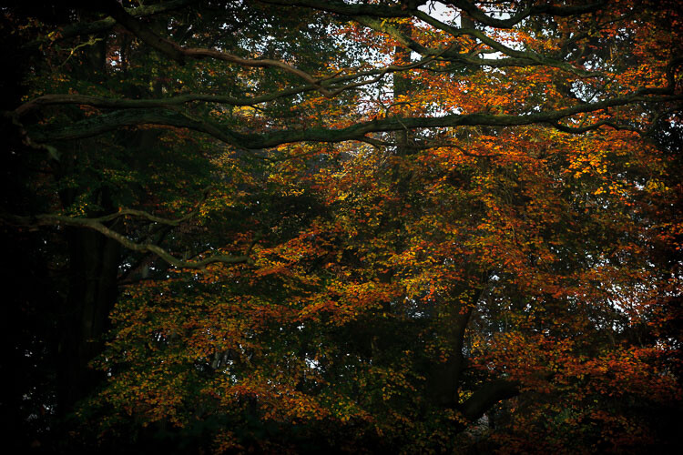
dps-artistic-lightroom-8-5

After processing.

“The reason that art (writing, engaging, and all of it) is valuable is precisely why I can’t tell you how to do it. If there were a map, there’d be no art, because art is the act of navigating without a map.” – Seth Godin

Take a unique approach for each image

You wouldn’t shoot all of your images at the same shutter speed would you? When you are out taking photos, even if you shoot on full auto, you respond to both the subject and the lighting conditions around you. You adjust and work with what is there. That’s the same approach you need to take when processing your images.

I like to think of processing an image like creating a painting. It’s an organic, subjective, unstructured process that finds me going back and forth between the tools, using a little of this, a little of that, until I am able see something that I want.
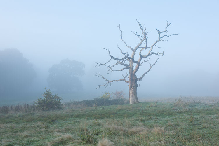
dps-artistic-lightroom-8-2

Before processing.

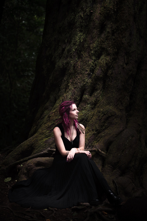
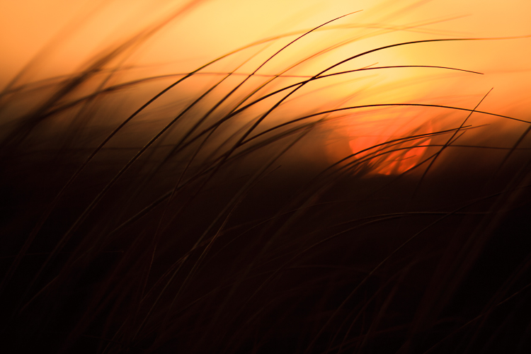
This image already has all of the elements for a good photo. There is atmospheric light that you can truly feel, and the composition of the bare wild tree on its own is strong. So what I focussed on in the processing was to bring out the colours and enhance the atmosphere ad feeling of cold, bleak and misty. Plus I thought a blue/orange split tone would look cool and topping it off with some grain would make it a have a feel of nostalgia…I’m very nostalgic about trees (childhood thing).

dps-artistic-lightroom-8

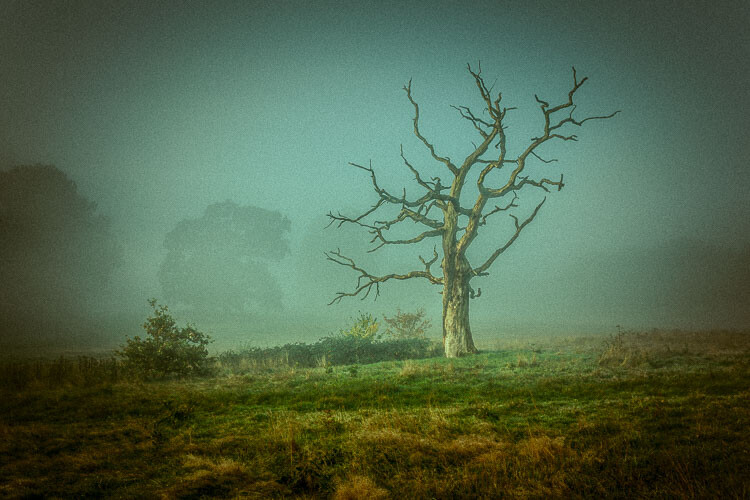
After processing in Lightroom.

“You must forget all your theories, all your ideas before the subject. What part of these is really your own will be expressed in your expression of the emotion awakened in you by the subject.” –  Henri Matisse

How can you apply this to your photography?

My approach might sound a tad unhelpful – I mean if I can’t tell you the formula, the five steps to success, the three keys everyone needs, how can you learn? Well, my approach may take longer to learn, but you will end up with much stronger images. You’ll create images that are powerful, impactful, and unique to you.

Even though Lightroom is about learning a software program, I recommend you do not use it with a technical mindset. Use it with a creative, artistic mindset. Use it as you would a paintbrush, a pen or your camera. Remember we are creating – not solving an algebra problem here!
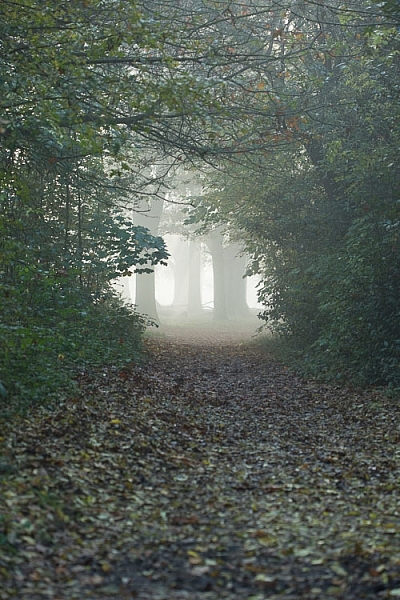
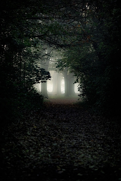
dps-artistic-lightroom-8-3

Before

dps-artistic-lightroom-8-4

After

What appealed to me here was the slightly mystical feel. It made me think that the path was leading to a circle of fairies. So my Lightroom work reflected that vision, and this is what I created (above right).I wanted a very surreal look. I used split toning in greens and blues, as well as a vignette, and brought out the blacks very intensely using the basic panel. What I ignored was the histogram, which was all squashed up to the right, but that doesn’t matter.

I wanted a very surreal look. I used split toning in greens and blues, as well as a dark edge vignette, and brought out the blacks very intensely using the basic panel. What I ignored was the histogram, which was all squashed up to the right, but that doesn’t matter. Art is always a bit chaotic, right?

Before and after step by step

This is a creative, organic, fun process. Once you’ve gone through all the Lightroom modules (if needed), don’t be afraid to go back and adjust and have a play.

So, I want to take you through the steps of how I processed an image in detail. I hope it sparks a lot of ideas for ways to help you process yours. I am going to take the photo from this, straight out of the camera:

dps-artistic-lightroom-1

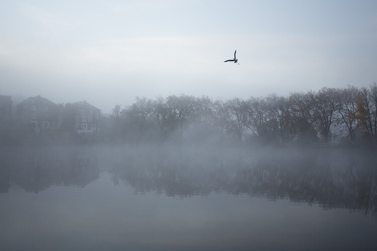
Before image, straight out of the camera.
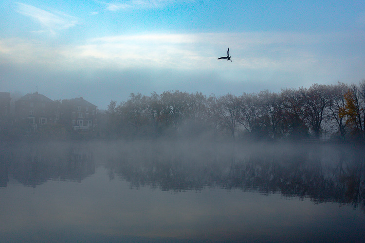
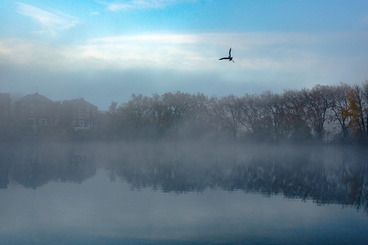
To this:

dps-artistic-lightroom-1-7

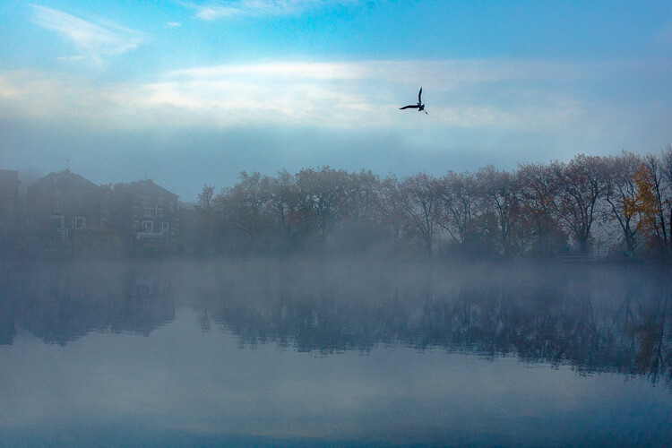
Finished image processed in Lightroom.

Connect to the image

Look at the image. What does it make you think of, feel or imagine? What qualities can you sense in the image that you can work with and draw out? The Lightroom tutorials you watch and read will tell you how to use sliders, etc., but they usually don’t tell you when to use them. This process of knowing when to use certain tools comes down to getting really involved in your image, and learning to use the inherent qualities of the photo to guide you.

This may sound obvious, but I think this is an essential step that most people miss. We are often so focused on getting it done, or getting the buttons ready to press, that we leave the artistic part of our mind and jump too quickly into the technical. So respond to the subject, the colors, and the mood of the photo. No blanket presets here, please!

Basic panel first

My next step with this image was with the Basic panel. Most images will start here because you may want to control the tones before starting on the color work. This image was really flat tonally so I wanted to boost the contrast by bringing down the shadows and raising the whites. You get much more specific control when you use the Highlights, Shadows, Whites and Blacks slider then you do with the Contrast slider above them. So here are the settings I applied:

  • Highlights -94
  • Shadows -50
  • Whites +50
  • Blacks -31
  • Saturation +50
  • Exposure -0.20
  • Contrast +19

Those changes produced the following result:

dps-artistic-lightroom-1-2

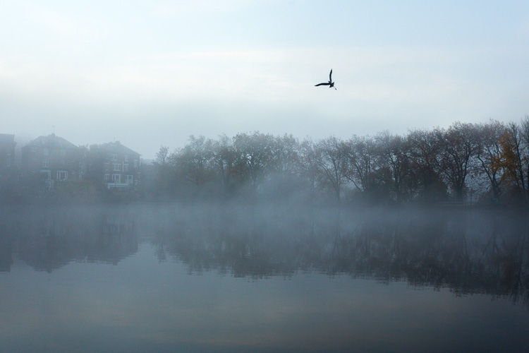
Now I have some good dark tones in the trees and some bright whites in the sky (all contained in the Histogram). Some Saturation gives me a good idea of what color the image would like to be (what direction it leans naturally). In this case, it’s blue.
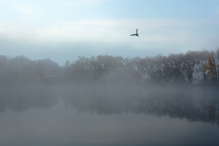
Apply a Tone Curve

Next I decided to use the Curve panel for a bit more tonal change; bringing up the shadows and bringing down the highlights. Now the sky is richer and the dark areas are less muddy looking.
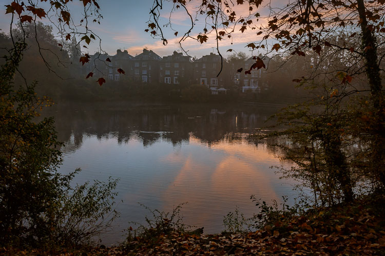
dps-artistic-lightroom-1-3

Dehaze

It was a really beautiful morning with the fog and trees, not to mention the fantastic bird (got lucky there!). That said, I was looking at this image and feeling that I wanted to bring out a lot more detail in the water and houses. The fog was great but I was pretty sure I could get more detail without a loss of atmosphere. My answer was Dehaze in the Effects module.

Dehaze is useful for images like this, but can be really super harsh if you are not careful. This image seemed to take a +44 without negative effects, like colour blocking and artefact creation so I left it there (see below).

dps-artistic-lightroom-1-4

Dehaze does tend to mess around with Saturation, which you can see here. But, eh, I liked it! What I was going for was removing some of the fog on the water and houses and that worked well. It also had the added effect of making the reflection of the trees in the water stand out.
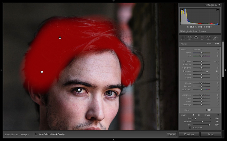
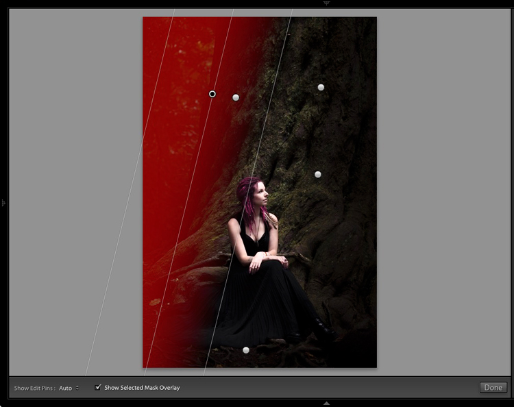
Local adjustments

At this point I usually start to toggle modules on and off to see what happens. I thought the shadows of the trees on the right hand side could use a bit of detail so I made a mask with the brush tool to lighten them a bit. This also brightened up the sky behind the trees and made it all look less muddy. Then, I did the same for the reflection.

dps-artistic-lightroom-1-5

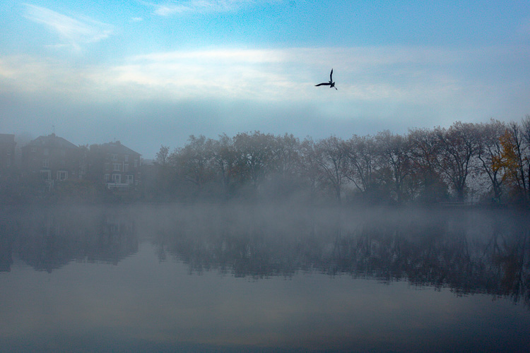
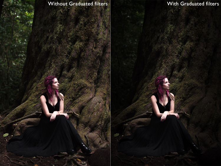
I really liked the fog on the water but I wanted the water to look crisp. So I used a graduated filter over it and put Clarity up to +74 and Exposure at +.60. I also changed the colour to match the blue sky. Now there is a lot more separation between the water and the reflection.

If I like my work up to a point I’ll make a snapshot so I can continue working on the image, but go back to that stage later if necessary. I’m pretty happy with it so far. Now is the time I would start toggling modules on and off again to see what needs adjusting.

dps-artistic-lightroom-1-6

Next, see below, I chose to use HSL (Hue/Saturation/Luminance) panel last just to boost specific colours, in this case the blues. (Not sure why now that I look at it…probably would do it all over again without the blue boost).

I did try lightening the tones in the trees, which look yellow but LR wasn’t having it and said that it was actually blue. Understandable, since there is such a blue cast over everything. The only yellow that could be targeted was that last tree on the far right. I end up with this:

dps-artistic-lightroom-1-7

Conclusion

Now – on the last note, Lightroom is never going to destroy your image or make permanent changes. Therefore you have endless opportunities to play and learn what is possible with this amazing world of processing. Processing is the second half of photography, taking the photo is just the first half. Now I encourage you to:

“Go and make interesting mistakes, make amazing mistakes, make glorious and fantastic mistakes. Break rules. Leave the world more interesting for your being here. Make. Good. Art.” – Neil Gaiman

I’d love to know what you think. Maybe you would have gone about processing this image totally differently? Maybe you like what I did, and maybe you don’t? Let me know, I would love to hear your thoughts.

googletag.cmd.push(function() {
tablet_slots.push( googletag.defineSlot( “/1005424/_dPSv4_tab-all-article-bottom_(300×250)”, [300, 250], “pb-ad-78623” ).addService( googletag.pubads() ) ); } );

googletag.cmd.push(function() {
mobile_slots.push( googletag.defineSlot( “/1005424/_dPSv4_mob-all-article-bottom_(300×250)”, [300, 250], “pb-ad-78158” ).addService( googletag.pubads() ) ); } );

The post Tips for How to Think and Use Lightroom More Artistically by Anthony Epes appeared first on Digital Photography School.


Digital Photography School

 
Comments Off on Tips for How to Think and Use Lightroom More Artistically

Posted in Photography


Household Items to Bring to Your Next Food Photography Shoot

03 Jan

One of the most common assumptions about food photography is that hardcore food styling techniques must be involved to make dishes more visually appealing. In fact, there are professional food stylists who will employ all sorts of techniques to transform a dish into an inedible, yet highly photo-worthy subject. However, food styling techniques can also be very simple and accessible. Below is a list of common household items that can also help you out on your next food photography shoot.

Tweezers Food Styling Tips for Photography

For Keeping Food Clean

Tweezers

It’s pretty much inevitable that a plate of food will have quite a few moving parts that can easily fall out of place. While the Spot Healing Brush in Photoshop can make crumbs or blemishes disappear in post-production, it’s best to remove those bits and pieces from the dish before your shot is taken. This is where a pair of tweezers comes in. Use them to rearrange food on a plate or reach down into a deep glass or bowl to make adjustments.

Tweezers Food Styling Tips for Photography

These crumbs could have been easily removed with tweezers, or removed in post production.

Cotton balls

Besides being used to soak up pools of excessive liquid that might gather on a dish, cotton balls are also great for propping up food. Stuff one or two behind a piece of food to give it some leverage and height. Since they’re small and absorbent, the cotton balls can easily hide and blend into a dish so it’s not obvious they’re being used.

Q-tips

Serving a similar purpose to tweezers and cotton balls, Q-tips (cotton swabs) are important for small touch ups. Use them dry or dipped into some rubbing alcohol to remove small blemishes from a dish and you’ll save yourself some valuable time in post-production. Which leads me to my next point…

Rubbing alcohol

Throughout a food photography shoot, your props and gear are bound to come into contact with some morsels of food. Bring a small bottle of rubbing alcohol to keep your gear clean, and even consider keeping some hand sanitizer nearby to clean your hands after rearranging plates of food.

Highly absorbent paper towels

If it’s not already obvious, all of the food styling tools listed thus far have to do with cleaning and touching up dishes before they’re photographed. This tool is the last of the cleaning sort and is useful not only for wiping dirty hands after styling, but also for absorbing liquid from juicy meats, iced drinks, or other plates of food that are a touch too wet.

For Keeping Food Fresh

Food Styling Tips for Photography

Using a spray bottle filled with water was essential for keeping the shine on these saucy chicken wings.

One of the biggest challenges for food photographers is to shoot dishes while they still look appetizing and edible. These tools will help restore shine and luster to dishes to imply freshness.

Nonstick cooking spray

Restore a bit of shininess to a dish and help it reflect light better by adding a bit of nonstick cooking spray. Be very careful, however, as a spray that is too strong might dishevel parts of your dish.

Spray bottle filled with water

This serves the same purpose as the nonstick cooking spray, but in a slightly more controllable manner as you can often shift the nozzle of a spray bottle to emit a smaller or larger stream of water.

Eye-dropper

When you need ultimate control over liquid application, it’s best to use an eye-dropper instead of a spray bottle or nonstick cooking spray.

For Applying Creative Touches

After using the above tools to perfect the details of your photo subject, it’s time to focus on two other factors that can take your photo to the next level; light control, and selecting a creative background.

Tin foil (or a large metal baking sheet)

Depending on your preferred camera tools, you may already have a reflector in your food photography kit. If you don’t have a reflector, you can use a sheet of tin foil or a metal baking sheet. If you use tin foil, you have the added bonus of being able to use smaller pieces and mold them.

Food Styling Tips for Photography

On the left: shot without a reflector; on the right: shot with a reflector to the right of the food.

Baking parchment paper

In photography, baking parchment paper can serve a couple of purposes.

First, it can be used as a cheap alternative to a diffuser (light modifier) to soften the light aimed at your subject. Simply tape a sheet of parchment paper to a window where sunlight is shining through. The resulting light will soften considerably, reducing the shadows and glare on your food subject.

Another way to utilize parchment paper is as a photography background or surface. Try plain parchment paper for a white surface, or the brown version for a different color option.

Food Styling Tips for Photography

Parchment paper can add a different texture and color to your photo subject.

Gift wrap

Since we’re on the subject of photography surfaces, gift wrap is another affordable option for shooting food against creative backdrops. Cutting boards, tabletops, and placemats are also popular options, but they can be pricey and take up lots of room to store. Gift wrap, on the other hand, is plentiful with a variety of colors and textures to choose from.

Tweezers Food Styling Tips for Photography

The same dish shot with different backgrounds. White gift wrap paper was used on the left and a wooden table surface on the right.

Over to You

Do you have any simple food styling tips or tricks to share? Let me know in the comments below!

googletag.cmd.push(function() {
tablet_slots.push( googletag.defineSlot( “/1005424/_dPSv4_tab-all-article-bottom_(300×250)”, [300, 250], “pb-ad-78623” ).addService( googletag.pubads() ) ); } );

googletag.cmd.push(function() {
mobile_slots.push( googletag.defineSlot( “/1005424/_dPSv4_mob-all-article-bottom_(300×250)”, [300, 250], “pb-ad-78158” ).addService( googletag.pubads() ) ); } );

The post Household Items to Bring to Your Next Food Photography Shoot by Suzi Pratt appeared first on Digital Photography School.


Digital Photography School

 
Comments Off on Household Items to Bring to Your Next Food Photography Shoot

Posted in Photography


How to Pose People for Group Portraits

03 Jan

As someone who does a lot of family and child photos, one of the most rewarding but also the most challenging scenarios I encounter, is that of classic group portraits. You know, the one where you’ve got the whole family together and the kids all dressed up and it’s the first time in three years that the everyone was able to get in one place for a picture. Someone is fussing over an un-tucked shirt, another is texting his buddy, the kids are crying, and grandma and grandpa are patiently smiling away because they’ve been down this road many times before.

It’s a tricky situation to be sure. While every family is unique and there is no one single method that will work for every situation, there are a few tips and tricks you can use to pose the whole gang. Get everyone to chill out long enough so you can get the type of frame-worthy shot that may end up as a giant print on the wall or above a fireplace mantle.

pose group portraits mom and dad and kids

Put the crowd at ease

As a photographer, it can be tempting to get right down to business at the beginning of a photo shoot. You want to show everyone how serious you are about your work, and start barking orders to all parties involved. “Okay Grandma, you sit down over there. Now uncle Jimmy, you go here. And you…what’s your name? Claudia? Can you do me a big favor and get your hands out of your pockets?”

The feeling of authority and power that can creep in when wielding your expensive gear and big lenses can be as intoxicating as it is nerve-wracking. But unfortunately, it’s not the best way to get the shots you want.

pose group portraits family

It’s easy to get so caught up in the idea of getting the perfect picture that you forget about the people whose photos you are taking. You don’t know what happened before they arrived at the session. They are probably a little trepidatious regarding what is about to take place with this photographer and all the fancy cameras and lenses.

The adults are likely on pins and needles because they have invested time, energy, and possibly a lot of money into the ensuing photo session and they just want things to go right. The last thing they need is more stress from a photographer (who can’t even remember their names) telling them where to sit, stand, and look.

pose group portraits bridge family

Take it slow – talk to them first

To solve this problem, I like to spend five or 10 minutes at the beginning of a family or group portrait session not shouting orders or even getting my camera out, but talking with everyone and getting to know them a bit. And for goodness sakes, learn their names!

Learn some other things too. Where do they work? What do they enjoy doing in their spare time? What movies do the kids like? Sure it will add some time to your shoot, and yes I realize the sun is going down soon and you need to get moving. But if you really want to up your game when it comes to family and group portraits try taking some time to get to know the family or group.

They will feel more at ease and want to work with you. Then when you need Claudia to get her hands out of her pockets you can call her by her correct name (Olivia, to be exact) and give her the Vulcan Salute with a wry grin because you just found out that she, like you, is really into Star Trek.

Focus on the kids

While not all group photos involve children, many of them do and in those situations, it’s vitally important to make sure you prioritize the little ones over the grownups. Not that you don’t care about the adults, but they are much more compliant when it comes to following directions and working with you. Kids are another matter entirely, which is why it’s so important to get them on your side early on and then pay extra attention to them during the photo shoot.

I usually make this clear to the grown-ups too, and blatantly tell them that I expect them to smile, hold a pose, etc., because all my attention is going to be aimed at the little ones. I often start by showing my camera to the children and letting them hold some of my gear. This can be especially useful if you are using longer lenses like a 70-200mm that might feel kind of intimidating to them. The process helps acclimatize them to you as a photographer, dispel some of the nervousness that often results during a session, and usually makes the kids more open to following instructions.

pose group portraits family

I also like to joke around with the kids, ask them about their favorite movies, toys, video games, and TV shows even if I have no idea what they’re talking about. (If someone can explain the difference between Peppa the Pig and Spongebob Squarepants I’d sure like to know. Cartoons these days make no sense at all to me.) This makes the kids let their guard down and smile while also putting the parents at ease, and believe me, if the kids are stressed the parents sure will be also. But if little Timmy and Alice are having fun, you can bet mom and dad are too.

Tips for posing

Astute readers will note that by this point I have said almost nothing that relates to the title of this article, which is ostensibly about posing people for group portraits. That’s because posing isn’t really the point here. If you show up with your Canon 5dMark III and 85mm f/1.2 lens and expect to take frame-worthy shots simply by going through a checklist of poses, you’re going to have a hard time.

Portrait photography is built on the foundation of a good professional relationship between you and your subjects. Taking the time to develop this at the outset is critical to getting good images when you start clicking away with your camera. However, when it is time to actually take pictures here are some tips to keep in mind.

pose group portraits large family

Do the must-have shots first

Get the must-have shots done first. These are the ones where you need the whole group in the picture, including the kids, and you need everyone to be at their best and brightest. If it’s a generational picture, put the eldest members (i.e. Grandma and Grandpa) in the middle, sitting down if possible. Surround them with kids. Put the little ones on their laps with any tweens and teens standing next to them. On the sides of the picture place the middle generation, or the children of the grandparents.

As you start taking pictures talk with the people, crack jokes, ask them to say odd things to get them laughing (e.g. “On the count of three everybody say Pepperoni and Pickles!”). In the process, you will not only get the little ones to produce genuine smiles, but the adults usually will too.

Keep it comfortable

Throughout the session, whether there are kids or not, you want your subjects to be comfortable with you and with each other so don’t make them do things that feel awkward or unusual. If you’re working with adults, have them stand up with their hands around their loved ones. (Position hands on backs, not wrapped around waists, or else you end up with floating fingers that look unflattering and unusual).

Use the scenery for seating or to stagger the heights of your subjects in order to get more interesting pictures. If women are on the edge of the frame (outer edge of the group) have them put one hand on their hip with the elbow out.

pose family group portraits

Another tip is to put the tallest person in the center and go down in height from there, but pay attention to relationships too. You’ll notice in the group photo above that the two men are on the edge instead of the middle, which creates a somewhat concave shape to the portrait.

That was an intentional choice on my part since the two young women are daughters of the couple sitting on the bench. I deliberately chose to break a posing rule because I wanted to emphasize the relationships present in the picture, which is something you need to keep in mind when posing for group photos.

pose-groups-for-photos-large-family-living-room

For this picture, I was more concerned with capturing a sense of emotion and family bonding than pixel-perfect posing.

Technical stuff

In terms of raw technical details, know that you need a decently fast shutter speed to freeze motion. So even if your group is standing relatively still I recommend using a shutter speed of 1/125th of a second to minimize blur that often happens due to moving hands or blowing breezes.

As a general rule, I like to shoot at f/4 or smaller (remember that larger f-numbers mean smaller apertures) to get a wider depth of field. Shooting at f/2.8 might give you a nice blurry background, but it could also mean someone in the group will be out of focus due to a shallow depth of field. Finally, off-camera speedlights can be a great way to compensate for harsh or dim lighting and help eliminate shadows on faces.

Finally

One final tip that comes in handy when doing group sessions is to have a shot list prepared with their actual names if possible instead of just placeholder pronouns like Mom, Grandpa, Little Sister, etc. You don’t want to get back to your computer and realize you forgot a crucial shot because you were too focused on getting the hand placements correct.

I hope some of these tips are useful for you, and I’m eager to know what techniques you have found to be helpful in your own shooting too. Leave your thoughts in the comment section below, and may you live long and prosper.

googletag.cmd.push(function() {
tablet_slots.push( googletag.defineSlot( “/1005424/_dPSv4_tab-all-article-bottom_(300×250)”, [300, 250], “pb-ad-78623” ).addService( googletag.pubads() ) ); } );

googletag.cmd.push(function() {
mobile_slots.push( googletag.defineSlot( “/1005424/_dPSv4_mob-all-article-bottom_(300×250)”, [300, 250], “pb-ad-78158” ).addService( googletag.pubads() ) ); } );

The post How to Pose People for Group Portraits by Simon Ringsmuth appeared first on Digital Photography School.


Digital Photography School

 
Comments Off on How to Pose People for Group Portraits

Posted in Photography


How to Create a Dark and Moody Rembrandt-Style Portrait In Lightroom

03 Jan

Dutch artist Rembrandt Harmenszoon van Rijn is known for his dark and moody portraits, characterized by a single lighting source falling across a subject placed in front of a dark background. It’s an interesting, evocative style that is easy enough to replicate in modern photography.

There are two steps to creating a Rembrandt-style portrait. The first is to get the lighting and composition right. The second is to use Lightroom to emphasize the dark and moody feel created by the lighting.

Rembrandt inspired lighting is easily achieved using natural light. The important thing is that the light is directional. Take a look at these portraits to see how it works.

Portrait #1Rembrandt style dark and moody portrait

This portrait was taken with the model standing under an archway that was part of a local building. We took the photo on a cloudy day, so the light was quite soft and even, perfect for portraiture.

The light comes from the model’s left, through the archway, casting a shadow across his face. The right side of his face is dark because no light is coming from that side. The background is also dark because less light is falling on it.

The photo looks like it could have been taken in a studio – but the light was shaped by the archway rather than a softbox.

Rembrandt style dark and moody portraitPortrait #2

I made this portrait in a forest. The light was coming through the trees from above. It was a cloudy day, but the narrow gaps between trees meant the light was very directional. I asked my model to lift her face up towards the light so that it didn’t cast shadows under her eyes.

I selected these portraits because they are interesting from a post-processing point of view. One of them was very easy to process, and the other took a lot more work. Can you guess which one was which?

Processing Portrait #1

The first portrait was the easiest to process. Here’s the Raw file as it came out of the camera.

Rembrandt style dark and moody portrait

Virtually all the work for this portrait was done in the Basic panel in Lightroom. These are the main adjustments.

Rembrandt style dark and moody portrait

  • Exposure +0.20. A slight tweak to brighten the photo.
  • Shadows -27. This makes the darkest tones in the photo darker without affecting the lightest tones.
  • Clarity + 41. A global adjustment to enhance texture and details and add a gritty feel to the male portrait (a much lighter touch is required with portraits of women).

You’ll note that I didn’t use the Contrast slider to make the background darker. The reason is that the Contrast slider affects both dark tones and light tones equally. It is better to use the Highlights and Shadows sliders to control highlights and shadows separately.

Taking control of dark tones with the Shadows slider gives you a lot of choice when it comes to setting the tonal values of the image. You can also move the Blacks slider left, although you may block up some shadow areas when you do so.

Remember, your aim is to create a dark and moody Rembrandt style portrait, so it’s up to you how dark you want to make the shadows. Here’s a comparison that shows what happens with this portrait when I push Shadows to -100 and Blacks to -22.

Rembrandt style dark and moody portrait

Local adjustments

Pushing Shadows and Highlights sliders left may also darken parts of the photo that you would prefer to remain as they are. In this portrait, the model’s hair became too dark, so I used the Adjustment Brush to lighten it. This screenshot shows the mask created by the Adjustment Brush in red. I set Shadows to +71 to make his hair lighter.

Rembrandt style dark and moody portrait

Processing Portrait #2

The next portrait required more work in Lightroom. You can see why when you look at the original image as it came out of the camera, below.

Rembrandt style dark and moody portrait

While the light is coming from above, it wasn’t as directional as the processed image suggests. An image like this needs a little more work in Lightroom in order to obtain the dark background that a Rembrandt style portrait requires.

Rembrandt style dark and moody portrait
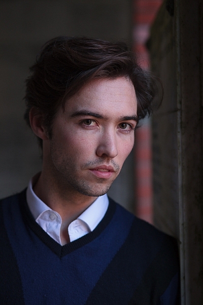
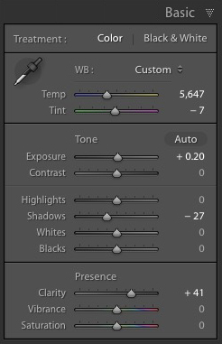
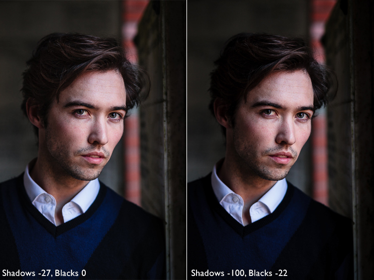
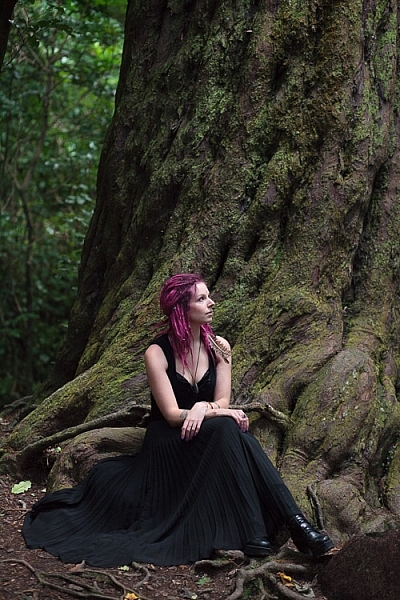
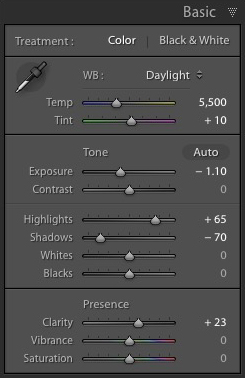
I made some subtle changes by setting the following:

  • Exposure to -1.10
  • Shadows to -70
  • Highlights to +65
  • Clarity to +23

Moving the Shadows and Exposure sliders left made the entire image darker, making the background look more how I wanted. Moving Highlights to +65 then made the highlights (in other words, the model’s skin) brighter. Once again this has increased contrast, but in a way that is much more controlled than using the Contrast slider.

Here’s the result so far.

Rembrandt style dark and moody portrait

Local adjustments

Once you have achieved all you can with global adjustments, it is time to work with local adjustments. Lightroom has three local adjustment tools – the Graduated filter, Radial filter and the Adjustment Brush. It is up to you to select the tool (or combination of tools) best suited to the task in hand.

For this portrait, I applied five Graduated filters, and moved the Exposure slider left (to darken) for each one. These screenshots show where the Graduated filters I applied to the image fall.

Rembrandt style dark and moody portrait

Rembrandt style dark and moody portrait

Rembrandt style dark and moody portrait

Rembrandt style dark and moody portrait

Rembrandt style dark and moody portrait

The best way when making local adjustments is to play it by eye. Don’t be afraid to jump around between your local adjustments and tweak the settings until you get the photo looking as you wish.

These comparisons show the difference that the Graduated filters made to the image.

Rembrandt style dark and moody portrait

Finally

The key to re-creating the style of a painter like Rembrandt in Lightroom is to analyze the type of lighting used in his portraits and think about how you can replicate that using the tools inside Lightroom. Bear in mind that the lighting is just as important as Lightroom technique. Get the lighting right and the rest should follow easily.

Do you have any questions about the Lightroom techniques used in this article? Let me know in the comments!


If you’d like to learn more about processing your photos in Lightroom then please check out my ebook Mastering Lightroom: Book Two – The Develop Module.

googletag.cmd.push(function() {
tablet_slots.push( googletag.defineSlot( “/1005424/_dPSv4_tab-all-article-bottom_(300×250)”, [300, 250], “pb-ad-78623” ).addService( googletag.pubads() ) ); } );

googletag.cmd.push(function() {
mobile_slots.push( googletag.defineSlot( “/1005424/_dPSv4_mob-all-article-bottom_(300×250)”, [300, 250], “pb-ad-78158” ).addService( googletag.pubads() ) ); } );

The post How to Create a Dark and Moody Rembrandt-Style Portrait In Lightroom by Andrew S. Gibson appeared first on Digital Photography School.


Digital Photography School

 
Comments Off on How to Create a Dark and Moody Rembrandt-Style Portrait In Lightroom

Posted in Photography


10 things I wish I knew when starting my photography business

30 Dec

The moment I bought my first DSLR I knew that photography was my true passion. I didn’t consider myself a professional back then, but I was sure I wanted to become one. Well, the road  turned out a lot longer than I expected. I have learned there’s much more than meets the eye when it comes to the photographer profession. Continue Reading

The post 10 things I wish I knew when starting my photography business appeared first on Photodoto.


Photodoto

 
Comments Off on 10 things I wish I knew when starting my photography business

Posted in Photography


7 Tips – How to Add Depth and Dimension into Your Photos

29 Dec

Photographers have the same dilemma that painters have faced for centuries – how to show a three-dimensional subject in a two-dimensional frame. When you add depth it helps create a sense of place and draw the viewer into your images. It also shows a deeper understanding of the principles of composition in photography.

The techniques and tips listed in this article will help you convey a stronger sense of depth in your photos.

1. Use leading lines

One of the easiest ways to convey depth in an image is to use a wide-angle lens and include lines that move from the bottom of the frame to the top. This technique is used mainly in landscape and architectural photos.

how to add depth and dimension in composition

The lines don’t have to be obvious. Take this photo as an example.

The rocks form natural lines that lead the eye from the foreground to the island on the horizon.

how to add depth and dimension in composition leading lines

In the image below, the waterways in the middle distance take the eye through the photo to the distant mountains. They are meandering, rather than straight, which helps give the image a more organic feel that fits well with the theme of landscape.

how to add depth and dimension in composition

2. Use perspective

This photo demonstrates how lines can add depth in a different way.

how to add depth and dimension in composition - perspective

The buildings form converging lines that disappear towards the horizon, creating a sense of depth very effectively. This technique is similar to an artist’s use of perspective. I’ve added lines so you can see how it works.

how to add depth and dimension in composition - perspective

3. Think foreground, middle ground, and background

Most photographers are familiar with the rule of thirds, but when it comes to conveying a sense of depth it is helpful to break the photo up into a different set of thirds – the foreground, middle ground, and background. What you’re looking for is a way of connecting the three that pulls the eye through the photo. Having three distinct zones in the image helps create a sense of depth, three dimensionality.

Leading lines are one way of doing this, but lines are not always present in a scene. When that happens you need to look for something else. Often, that simply means including something interesting in the foreground.

For example, in this photo, there are some buildings in the background, a concrete jetty in the middle, and the edge of another jetty in the foreground. I included the last one deliberately to help create a sense of depth.

how to add depth and dimension in composition

Here’s another example below. Including the rocks in the foreground creates a composition with three distinct zones (foreground, middle ground, and background) that the eye moves through, creating depth in the image. It helps that the wide-angle lens that was used makes the rocks seem quite large in comparison to the distant cliffs.

Depth and composition

4. Use aerial perspective

Another technique that helps convey a sense of depth is aerial (or atmospheric) perspective. This is where the atmospheric conditions make things in the distance appear hazy. When you see this occur, it is a good idea to see if you can find a way to include it in your composition. In this photo, taken in Beijing, you can see that the trees in the distance on the left side are obscured by atmospheric haze.

how to add depth and dimension in composition  - aerial perspective

This is reinforced by the converging lines formed by the walls. The two techniques are working together to show depth in the image.

how to add depth and dimension in composition  - aerial perspective and lines

5. Shoot through something

The techniques explored so far work best with wide-angle lenses. The nature of a telephoto lens is that it puts distance between you and the subject, which leads to a flatter perspective that doesn’t show depth as well as a wide-angle lens. But there are different techniques you can use with telephoto lenses to create a sensation of depth.

One method is to shoot through something that is between you and the subject. In the photo below, the subject is the setting sun. I shot through grass (and focused on the grass, throwing the sun slightly out of focus) to add a sense of depth to what otherwise could have been a very flat image.

how to add depth and dimension in composition  - telephoto

The photo also makes a good use of another technique, including shadows in the frame, to reinforce the depth.

You can also use this technique with portraits. I created the portrait below by shooting through the branches of a tree.

Depth and composition

6. Use selective focus

Both of the photos shown for the previous technique also use selective focus. That’s where you deliberately set a narrow aperture and focus on the subject, throwing the background out of focus. It’s especially effective with portraits, as the blurred background helps separate the model from the background, in turn creating a sense of depth. The following portrait was taken at f/2.0 with the lens focused on the model’s eyes.

Depth and composition

7. Convey depth through color

It’s also useful to think about what happens to colors in the background when you use a telephoto lens with a narrow aperture to make a portrait. When the background is out of focus, colors merge into each other. A good contrast between the colors in the background and those the model is wearing also helps convey depth.

For example, in the next portrait the use of color is very subtle. The background is nearly white, without any distracting colors. It is out of focus and doesn’t distract from the model’s face. His sweater is the most colorful part of the photo, and helps separate him from the background.

Depth and composition

You can take this idea to its extreme by using off-camera flash fitted with an orange gel. When you do this, the model is lit by orange light (from the gelled flash), but the background is lit by colder ambient light. This technique works well at dusk when the ambient light has a natural blue color.

In the example below, the model was lit by single Speedlite fitted with a 60cm softbox and a CTO (Color Temperature Orange) gel.

Depth and composition

Your turn

These seven tips should help you create stronger photos with more depth. What other ideas do you have for creating and adding depth into your photos? Please let us know in the comments below.


If you enjoyed this article and would like to learn more about composition then please check out my ebook Mastering Composition.

googletag.cmd.push(function() {
tablet_slots.push( googletag.defineSlot( “/1005424/_dPSv4_tab-all-article-bottom_(300×250)”, [300, 250], “pb-ad-78623” ).addService( googletag.pubads() ) ); } );

googletag.cmd.push(function() {
mobile_slots.push( googletag.defineSlot( “/1005424/_dPSv4_mob-all-article-bottom_(300×250)”, [300, 250], “pb-ad-78158” ).addService( googletag.pubads() ) ); } );

The post 7 Tips – How to Add Depth and Dimension into Your Photos by Andrew S. Gibson appeared first on Digital Photography School.


Digital Photography School

 
Comments Off on 7 Tips – How to Add Depth and Dimension into Your Photos

Posted in Photography


How to Create Glass Ball Landscapes – 6 Techniques

29 Dec

In photography, creative inspiration can often come from trying something new and photographing a scene with that technique. Creating glass ball landscapes is one example of this, as it allows you to capture a fish-eye like scene, using a telephoto lens. The glass ball creates a mystique, as many people associate looking into a crystal ball with seeing into the future. However, visions inside a glass ball are easy to achieve with a few simple steps!

How to take landscape photos with a glass ball

img_8070-copy

In order to get good landscape photos with the glass ball, you’ll need to apply some basic rules, an understanding of the science at work also helps. If you read my previous article on crystal ball photography you will already be familiar with the 7 steps you can follow to take this type of image. Here’s a quick recap:

  1. Choose a scene that you’d normally shoot with a wide angle lens.
  2. Photograph this scene with the sun behind you, lighting up the scene you wish to shoot.
  3. Place the ball somewhere it won’t fall.
  4. Compose your scene with the glass ball in it.
  5. Ensure the horizon lines inside the ball and in the background match.
  6. Focus the camera on the scene inside the ball, which is best achieved using live-view and manual focus.
  7. Use an aperture of around f/4 as this will keep the ball sharp and the background blurred.
  8. Take the photograph, and repeat if you’re not happy with the sharpness inside the ball.
  9. Rotate your image in post-processing so the scene in the ball isn’t upside down. In some cases, you can skip this step.

Alternative glass ball landscapes, and how to compose them

It’s easy to get it in your mind that every scene or situation needs a crystal ball photo. This is not the case and careful consideration needs to be taken when selecting the photograph you’ll take. The most important thing to do is find a compelling subject that shows prominently inside the glass ball. Once you have this basic parameter established below are some differing ways you can compose your glass ball landscape photograph.

1 – The classic composition

Glass ball landscapes use the rule of thirds. This classic composition shows the entire ball and was shot at 100mm.

Glass ball landscape using the rule of thirds. This classic composition shows the entire ball and was shot at 100mm.

In this type of composition the ball fills the majority of the frame, with the entire edge of the ball visible. This will lead to glass ball landscapes that have an immediate impact and areas to the side of the ball that are blurred out and minimalist in nature. This type of image is most easily taken with a macro or telephoto lens with an aperture of f/4 to create the nice bokeh around the ball.

2- Get in close

Getting closer to the glass ball will emphasize the scene within the ball, this also entails framing that cuts some of the edges of the ball away. A centered composition with both the top and bottom part of the ball can work here, this has the advantage that top and bottom parts of the scene cannot be easily deduced. The other composition follows the rule of thirds, with the edge of the ball showing in the left or right third of the image.

glass ball landscape photography

A closer crop focuses the eye more on the image in the ball.

3 – Give the ball a bit of space

There are many ways to photograph the glass ball, and using a wide-angle lens with this technique can be very effective. In this case, you want the background scene to be minimalist, with the ball becoming an accent in the scene. The scene will not likely be rotated during post-processing, so compose to the scene in the background. In this type of the photo, the ball and the landscape scene should form a balanced composition.

A wider angle of 20mm is used here. The ball is an accent within this frame.

A wider angle of 20mm is used here. The ball is an accent within this frame.

4 – Take it to the high life

Glass ball landscape photographs

Gaining access to the rooftop provided a great vantage point.

As with all landscape photos, a high vantage point for glass ball images works well. Gaining access to a high building overlooking a city, or climbing a hill are both good options. Once at your high vantage point find a good position to place the ball, so you can see the landscape inside it. You need to ensure the ball will not fall, be very careful with its positioning.

5 – Don’t forget the view from the floor

Apartment buildings in Busan, South Korea. This photo shows a glass ball being held by hand.

The view looking up can be just as good as the view looking down.

Deserts and canyons make for great locations to photograph with the ball. In this photo the ball is place on the ground, the stones in the foreground add a nice element to this photo.

In this photo the ball was placed on the ground, the stones in the foreground add a nice element to this photo.

Placing the ball at street level doesn’t always work, as half the scene will be taken up by the ground. That said there are several situations that really work well with the ball on the ground.

  • The ball is ever so slightly higher than the rest of the scene, so it might be at the top of an undulation.
  • There is a reflection in the scene from a marble surface or a puddle.
  • The ground is an appealing element of the photo because it’s a leaf bed for example.

6 – The human element

A friend holding the ball in position is an alternative to putting the ball on the ground.

A friend holding the ball in position is an alternative to putting the ball on the ground.

The glass ball landscapes are not always best suited to having people in them. The blurred background may look less appealing with a human shape included in it. There are a couple of ways to humanize your image, though, while still maintaining a minimal feel.

  • You eclipse the people inside the ball. Use a long telephoto lens, compression will cause people to appear inside the ball. The background will be clean without the shapes of people in it (as below).
  • You take the photo, and someone else is holding the ball. The hand is the human element of this photo, with the landscape still inside the ball (as above).
glass ball landscape photography

Photographing people inside the ball is tricky, but not impossible.

Where to try this technique

The places you’d visit for regular landscapes will also work for glass ball landscapes. The rooftops of tall buildings in cities work very well or a worm’s eye view from street level can be just as good. The beach or the desert are excellent options due to the minimalist nature of those locations.

Sunset photos at the beach with the glass ball are one of the classics in this genre of photography. Mountains and forests make for good locations as well. A lone tree can be a nice subject, as can lines of tree trunks inside the glass ball. Up in the mountains, you can easily fill the scene inside the ball with a large peak jutting up into the landscape.

The snow globe is a well known souvenir gift, which the glass ball can replicate.

The snow globe is a well-known souvenir gift, which the glass ball can replicate.

Getting out with the glass ball

In my last article on refraction I linked to a site selling an 80mm glass ball, this is a great option though it can be heavy to carry. You can also use a smaller ball for many situations, and when you are carrying a heavy bag of camera gear this is a good idea.

Once you have a glass ball it’s best to dive in and see what works best for you. I’d love to see more examples of your work, it was great to see so many pictures last time. One final tip, be careful in the sunlight with the ball. The glass ball acts as a magnifying glass with the sun’s rays and can burn you, or your property.

googletag.cmd.push(function() {
tablet_slots.push( googletag.defineSlot( “/1005424/_dPSv4_tab-all-article-bottom_(300×250)”, [300, 250], “pb-ad-78623” ).addService( googletag.pubads() ) ); } );

googletag.cmd.push(function() {
mobile_slots.push( googletag.defineSlot( “/1005424/_dPSv4_mob-all-article-bottom_(300×250)”, [300, 250], “pb-ad-78158” ).addService( googletag.pubads() ) ); } );

The post How to Create Glass Ball Landscapes – 6 Techniques by Simon Bond appeared first on Digital Photography School.


Digital Photography School

 
Comments Off on How to Create Glass Ball Landscapes – 6 Techniques

Posted in Photography


Deal 11: Black & White Photo Artistry Course – 60% OFF!

29 Dec

NewImage
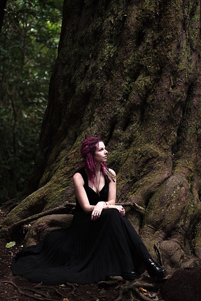
On the eleventh day of Christmas dPS gave to me …

Sebastian Michaels smashed every dPS record recently with his Fine Art Grunge Composition course. Now he’s back, with his bigger, better and brand freshly updated Black & White Photo Artistry course!

… and you can save 60% on the regular price right now.

This course brings together all the best photo artistry approaches and techniques from the original course and expands on them within the realm of creative black and white.

You’ll discover the pro secrets for producing stunning works of photo art. Awesome, intricate black and white compositions fit for print and canvas. All while honing your own photography skills!

Ready to create the most artistic photo works of your life? Grab this deal with a 60% saving today only!

Here’s the link to order – you won’t be disappointed.

This huge offer to this brilliant course not only comes with lifetime access, but also a heap of extra bonuses. You’ll get FREE software, bonus Lightroom presets and more.

We think it’s a stunning deal in the 12 dPS days of Christmas and well know you’ll cherish everything it will teach you about black and white photography artistry.

googletag.cmd.push(function() {
tablet_slots.push( googletag.defineSlot( “/1005424/_dPSv4_tab-all-article-bottom_(300×250)”, [300, 250], “pb-ad-78623” ).addService( googletag.pubads() ) ); } );

googletag.cmd.push(function() {
mobile_slots.push( googletag.defineSlot( “/1005424/_dPSv4_mob-all-article-bottom_(300×250)”, [300, 250], “pb-ad-78158” ).addService( googletag.pubads() ) ); } );

The post Deal 11: Black & White Photo Artistry Course – 60% OFF! by Darren Rowse appeared first on Digital Photography School.


Digital Photography School

 
Comments Off on Deal 11: Black & White Photo Artistry Course – 60% OFF!

Posted in Photography


24 Festive Holiday Images to Get You Into the Spirit

29 Dec

Christmas, Hanukkah, Fiesta of the Lady of Guadalupe, Day of the Virgin, and many other world holidays happen this month. Every religion and culture celebrate in their own unique way. Here in Nicaragua where I will be spending Christmas, they parade a statue of the Virgin Mary down a new street each night, complete with marching band and bombas (fireworks).

holidays-nicaragua-01

A festively decorated tree in Leon, Nicaragua.

holidays-nicaragua-02

The Virgin on display in Leon, Nicaragua.

Here are some more images of different holiday sights. Enjoy the season however you celebrate.

Michela

By Michela

Alan Cleaver

By Alan Cleaver

Mike Beales

By Mike Beales

David Bannister

By David Bannister

David Morris

By David Morris

Charlotte90T

By Charlotte90T

Nikos Koutoulas

By Nikos Koutoulas

J J

By J J

Stéphanie Kilgast

By Stéphanie Kilgast

Johnny Silvercloud

By Johnny Silvercloud

Denise Mattox

By Denise Mattox

Thomas Hawk

By Thomas Hawk

Theophilos Papadopoulos

By Theophilos Papadopoulos

Britt-knee

By Britt-knee

Cta Web

By cta web

Brett Kiger

By Brett Kiger

Scott Robinson

By Scott Robinson

Bunches And Bits {Karina}

By Bunches and Bits {Karina}

Robert Couse-Baker

By Robert Couse-Baker

Steve Snodgrass

By Steve Snodgrass

Messycupcakes

By messycupcakes

Thad Zajdowicz

By Thad Zajdowicz

googletag.cmd.push(function() {
tablet_slots.push( googletag.defineSlot( “/1005424/_dPSv4_tab-all-article-bottom_(300×250)”, [300, 250], “pb-ad-78623” ).addService( googletag.pubads() ) ); } );

googletag.cmd.push(function() {
mobile_slots.push( googletag.defineSlot( “/1005424/_dPSv4_mob-all-article-bottom_(300×250)”, [300, 250], “pb-ad-78158” ).addService( googletag.pubads() ) ); } );

The post 24 Festive Holiday Images to Get You Into the Spirit by Darlene Hildebrandt appeared first on Digital Photography School.


Digital Photography School

 
Comments Off on 24 Festive Holiday Images to Get You Into the Spirit

Posted in Photography