Category: Photography

  • Lighting 103: Learning From Your Couch

    Abstract: Don't just look to still photos for inspiration. Great inspiration also awaits you on your TV.

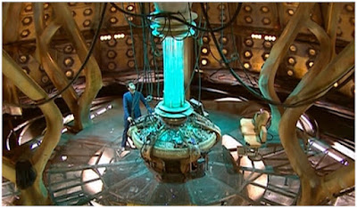
    We may think we are getting a good feel for color as photographers. But you know who kicks still photographers' butts every day? Cinematographers, that's who.

    Today, a look at some examples from 2010-era Dr. Who, which we have talked about on this blog before. These guys are near and dear to my heart, because they are unabashedly fearless when it comes to using color to manipulate light—and their viewers. Read more »
    Strobist

  • How to Make Your Photos Stand Out Using Color Contrast

    A great way to make your photograph look attractive is to make it pop! One of the best ways of making your photo pop is to use eye catching colors your image. Those colors will have even more impact when paired with a contrasting color, so in this article, we’ll look at how you can apply this idea. There is a simplicity to these kind of photos, and learning which colors pair well together will help a lot. Let’s take a look at contrast, and color contrast photography to see why this works.

    How to Make Your Photos Stand Out Using Color Contrast

    How to Make Your Photos Stand Out Using Color Contrast

    Red and blue, one of the strongest color contrasts, was used in this still life.

    Why does contrast work in photography?

    Opposites work well together in an artistic sense, concepts like old versus new are good photographic subject matter. One of the simplest forms of contrast is black and white, which is why photographs that were taken in this style look so effective. The best black and white photos often have strong contrast which makes them stand out.

    The aim of many photos is to isolate your subject, and by doing so, tell a story. The use of contrast is one way you can isolate a subject from the background, or bring out a strong repeating pattern in a texture photo. It’s also possible to have color contrast as well, but only certain color combinations work well together.

    How to Make Your Photos Stand Out Using Color Contrast

    The warm glow of street lights against the blue hour sky is a color contrast.

    What is color contrast photography?

    Getting color contrast is a bit more complex than it is with black and white photography. Color can be broadly split into two groups, cold colors, and warm colors. Color contrast happens when a cold color is paired with a warm color. You can also use complementary colors – that is when warm colors and cold colors (opposite on the color wheel) are in the same photo.

    An easy way to visualize this is by looking at a color wheel, which shows colors that are opposite each other. It’s not uncommon to see color contrast occurring naturally in nature with things like fruits and flowers often displaying this concept. The classic color contrasts are yellow/purple, red/green and orange/blue. Using the color wheel can you come up with some yourself and apply them to your images?

    How to Make Your Photos Stand Out Using Color Contrast

    Using this wheel you can see which colors are opposite each other. Image credit Todd Weed. Creative commons.

    How to take photos that have color contrast

    The world is full of color, but it’s often a mess of many different colors. So how do you go about taking photos that have color contrast, if there are so many other colors in the frame? The following are ideas you can use to do color contrast photography.

    How to Make Your Photos Stand Out Using Color Contrast

    Finding a good location

    Look for places with a solid color, walls often provide this. A red brick wall can contrast against green or blue colors. In some neighborhoods you might find a wall that has been painted blue or wood paneling that is a particular color. Artistic areas of town are often good hunting grounds. Once you have a strong color background you will need to find something or someone that has the contrasting color.

    How to Make Your Photos Stand Out Using Color Contrast

    The vendor knew to lay out their wares using color contrast to attract more customers.

    Create your own color contrast

    Color contrast photography is creative, so how about creating your own contrasts? This could mean asking a model to wear a particular color of clothes, or you can create still life photos that display color contrast. A quick trip to a local crafts store to buy colored paper will allow you to play with contrast.

    How to Make Your Photos Stand Out Using Color Contrast

    In this photo, the opposing colors of purple and green have been used.

    Finding color contrast in nature

    Flowers, especially orchids, have natural color contrast, meaning you don’t need to create it yourself! Another subject with strong colors are fruits, so head to the market and see if you can find contrasting colors with the food on display!

    How to Make Your Photos Stand Out Using Color Contrast

    The strong color contrast of red and blue gives this street scene more impact. Even the stalls are red and blue.

    Let’s see your examples of color contrast photography

    The world is much better in color, so let’s see examples of your photos! The chances are you already have some photos of this type in your archive. So which color combinations worked best for you? When you next challenge yourself to try something new with your photography how about using color contrast as a central theme? Go out and get some new photos, post them here, and share your experiences! This is a fun form of photography that anyone can try no matter what camera you’re using, so let’s see some color contrast photography!

    When you next challenge yourself to try something new with your photography how about using color contrast as a central theme? Go out and get some new photos, post them here, and share your experience in the comments section. This is a fun form of photography that anyone can try no matter what camera you’re using, so let’s see some color contrast photography!

    How to Make Your Photos Stand Out Using Color Contrast

    The yellow wall makes the women who are wearing blue stand out more.

    How to Make Your Photos Stand Out Using Color Contrast

    In this photo, the color contrast was created. I used a pixelstick to paint first in red, then in blue.

    The post How to Make Your Photos Stand Out Using Color Contrast by Simon Bond appeared first on Digital Photography School.


    Digital Photography School

  • How to Make Creative Lightroom Develop Presets for Portraits

    It’s natural for portrait photographers to take lots of photos during a shoot. Therefore, it’s also helpful to have a system in Lightroom that allows you to save time processing your portraits. The easiest way to do this is with Develop Presets.

    Lightroom Develop Presets for portraits

    A Develop Preset is a record of the processing work you have done on a photo in the Develop Module of Lightroom. The idea is to save the settings you used in a preset that you can then easily apply to other photos. The end result is that you save time and finish developing your portraits more quickly.

    Let’s take a more detailed look at how it works.

    1. Select a portrait to process

    First, select a portrait and adjust it in Lightroom. Alternatively, use a portrait you have already developed.

    Lightroom Develop Presets for portraits

    2. Create a Develop Preset

    Make a new Develop Preset by going to the Presets panel (on the left-hand side) in the Develop module and clicking the plus icon on the right (or, go to Develop > New Preset).

    Lightroom Develop Presets for portraits

    When you do this, the New Develop Preset window appears. There are three sections you need to pay attention to, see below.

    Lightroom Develop Presets for portraits

    A. Preset Name and Folder. Give your preset a name and select the folder you want to save it in. The default folder is User Presets but you can pick another or create a new one by going to the New Folder option at the top of the menu. It’s a good idea to create a new folder for your Preset as it helps you keep your Presets panel organized.

    B. Auto Settings. Lightroom gives you the option to tick the Auto Tone box. I recommend you leave it unticked. Otherwise your preset may behave unpredictably when you apply it to other portraits.

    C. Settings. This is where you tell Lightroom which Develop Module settings you want to include in the Preset.

    Some settings may be unique to your photo. For example, you may have used a Graduated or Radial filter to make the background darker. These won’t work when applied to another portrait with a different background, so you should leave those out.

    It’s also a good idea not to include Exposure or White Balance settings. These need to be adjusted individually for each portrait. For the same reason, you should leave the Sharpening, Noise Reduction, Lens Corrections and Transform boxes unticked.

    You can tick all the other boxes, as shown in the above screenshot.

    3. Apply the Develop Preset to other portraits

    The next step is to apply the Develop Preset you just made to another portrait. Open the new portrait in the Develop module. Click on the Preset you just created, which you can see in the Presets panel.

    In this case, I created a new Develop Preset, especially for this article.

    Lightroom Develop Presets for portraits

    You can also apply your new Develop Portrait to more than one portrait at a time. This is useful if you have several portraits that you would like to develop in the same style. Here’s an easy way to do it.

    1. Go to the Library Module and select the portraits to which you want to apply the preset. It helps if you have already organized your portraits in a Collection.

    Lightroom Develop Presets for portraits

    2. Go to the Quick Develop panel. You can access all your Develop presets under Saved Preset. Select the preset you just created from the menu. Lightroom will apply it to all of your selected portraits.

    Lightroom Develop Presets for portraits

    3. Open the portraits one by one in the Develop module and tweak the settings or retouch them if needed.

    The creative power of Develop Presets for portraits

    Now we’ve explored the mechanics of creating Develop Presets for portraits, let’s look at some of the creative things you can do in the Develop Module. All of these can be included in presets. Eventually, you will build a personal library of your own presets for portraits.

    There are four techniques that are useful for portraits.

    1. Apply a vignette

    There are two ways to apply a vignette in Lightroom.

    The first option is to go to the Effects panel and use Post-Crop Vignetting. Move the Amount slider left to apply a vignette. Use the Midpoint slider to change the area covered.

    Lightroom Develop Presets for portraits

    Here’s a before and after example.

    Lightroom Develop Presets for portraits

    The only drawback of Post-Crop Vignetting is that the effect is centered. That leads us to the second way of creating a vignette which is using a Radial Filter. The advantage of Radial filters is that you can put them wherever you like.

    Here you can see two screenshots of a Radial Filter I applied to a portrait. The first (left) shows the position of the Radial Filter. The second (right) shows the area affected by the Radial Filter in red.

    Lightroom Develop Presets for portraits

    I moved the Exposure slider left to make the area outside the Radial Filter darker.

    Lightroom Develop Presets for portraits

    This is the comparison so you can see the difference.

    Lightroom Develop Presets for portraits

    2. Adjust colors in the HSL / Color / B&W panel

    Lightroom also gives you the option of adjusting the saturation and luminance (brightness) of individual colors. You do this in the HSL / Color / B&W panel.

    In my portrait, there is some blue paint on the wall behind the model. You can adjust only that color by going to the Saturation tab and moving the Aqua and Blue sliders left.

    Lightroom Develop Presets for portraits

    These photos show you the effect.

    Lightroom Develop Presets for portraits

    3. Split Tone

    Split toning isn’t just for black and white, it’s very effective for color portraits as well. The effect is similar to color grading used in TV shows and movies.

    One option for split toning is to apply blue to the shadows and orange to the highlights. Another is to apply teal to the shadows and yellow to the highlights. Here are some settings you can try.

    Lightroom Develop Presets for portraits

    Here are the results.

    Lightroom Develop Presets for portraits

    4. Adjust the Tone Curve

    You can use the Tone Curve panel to create a matte look. That is where the blacks are dark gray rather than black as if the photo has been printed on matte paper.

    Lift up the left-side of the RGB curve, as shown in the screenshot below. You can also do the same with the blue curve for a similar effect that also adds blue to the shadows.

    Lightroom Develop Presets for portraits

    These are the results.

    Lightroom Develop Presets for portraits

    Adjustment Brush presets

    You can also create your own Adjustment Brush presets to make retouching portraits easier. A good example is Lightroom’s own Soften Skin preset, which sets Clarity to -100 and Sharpness to +25.

    I like to make the model’s eyes more defined by creating an Adjustment Brush and setting Exposure to around +0.30 and Clarity to +70.

    Lightroom Develop Presets for portraits

    You can make an Adjustment Brush Preset from those settings by going to Save Current Settings as New Preset at the bottom of the Effect menu. Give the preset a name and Lightroom saves it in the Effect menu. You can also use this preset with the Gradient and Radial filters.

    Conclusion

    Develop Presets are powerful tools that help you leverage Lightroom’s advanced developing options. With the techniques in this article you can use presets to speed up the developing process and apply creative effects to your portraits.

    Do you have any questions about using Lightroom Develop Presets? Please let us know in the comments below.


    Are you a fan of the natural / vintage look in portraits? Then check out my Vintage Portrait Presets for Lightroom. There are over 30 presets to help you create beautiful portraits in Lightroom.

    The post How to Make Creative Lightroom Develop Presets for Portraits by Andrew S. Gibson appeared first on Digital Photography School.


    Digital Photography School

  • Recommended Gear for Doing Long Exposure Photography at Twilight and Dusk

    Have you ever come across beautiful cityscape photos captured at twilight and dusk (the so-called “blue hour”) with silky smooth water, like this Marina Bay (Singapore) photo below, and wonder how you could do that yourself? Assuming that you’ve already got your camera (a body and lens), let me go through some of the other gear that is required to do stunning long exposure photography at twilight and dusk.

    Recommended Gear for Doing Long Exposure Photography at Twilight and Dusk

    Marina Bay (Singapore), shot at 35mm, f/11, for 194 seconds (just over a 3-minute exposure).

    Use a Tripod

    A tripod is the single-most important piece of gear for photographers shooting at twilight and dusk. Photos shot at these hours require long exposures sometimes lasting for many seconds or even minutes. Therefore, a sturdy tripod is absolutely essential for keeping photos blur-free.

    Unlike your camera body, a tripod isn’t something you will upgrade often. So, try to get the best possible tripod within your budget. A good tripod could last a lifetime! I own a Manfrotto MT190CXPRO3 Carbon Fibre Tripod (supports up to 7kg). If your tripod doesn’t come with a tripod head (like mine), get yourself a steady ball-head or 3-way style, whichever you prefer (I own Sirui K-20X Ballhead that supports 25kg).

    Tripod - Recommended Gear for Doing Long Exposure Photography at Twilight and Dusk

    Mini-Tripods

    Mini tripods come in handy at locations where a full-size tripod isn’t allowed inside (e.g. The observation deck of a tower). I own a Joby Gorillapod Focus for DSLRs which supports up to 5kg. It has a dedicated ball head (Joby GorillaPod Ballhead X for Focus) that you can buy as a bundle, but I’m using my own ball-head (aforementioned Sirui K-20X Ballhead) as I feel it’s redundant to have two.

    Mini tripod - Recommended Gear for Doing Long Exposure Photography at Twilight and Dusk

    Clamp Tripod

    A clamp tripod is another tool that comes in extremely handy when there is no appropriate space to set up a tripod. I own the Manfrotto 035 Super Clamp without Stud (supports up to 15kg). Into that, I plug the separately-sold Manfrotto 208HEX 3/8-Inch Camera Mounting Platform Adapter (or a cheaper alternative Manfrotto 037 Reversible Short Stud) into the socket in order to firmly mount a tripod head and camera on top of that. Then I clamp the whole setup onto handrails, etc. This setup is rock solid and is a game changer for us cityscape photographers aiming to take very sharp photos at twilight and dusk without using a full-sized tripod.

    Clamp infographic - Recommended Gear for Doing Long Exposure Photography at Twilight and Dusk

    This graphic shows how to mount a DSLR on Manfrotto Super Clamp by using a camera mounting platform adapter.

    Steps:

    1. Plug a camera mounting platform adapter into a Super Clamp socket and secure it with the double lock system.
    2. Mount a tripod head with DSLR on the mounting platform adapter, just like you do with your regular tripod.

    Clamp - Recommended Gear for Doing Long Exposure Photography at Twilight and Dusk

    Neutral Density Filters

    Neutral density (ND) filters help reduce the light that is coming through the lens, allowing your shutter speed to be extended much longer. This is a must have tool if you want to create the silky smooth water effect typically seen in long exposure photography.

    ND filters come in different strengths such as; 3-stop, 6-stop or 10-stop. The bigger the number, the darker the filter and the less light that is let through. My favorite is 6-stop ND filter (I own a B+W 6-Stop ND Filter). With this attached to my lens, a base exposure of 2 seconds (i.e. when no filter is attached) can be extended to 128 seconds. Each “stop” of the ND filter doubles the required exposure time (2 seconds > 4 seconds [1 stop] > 8 seconds [2 stops] > 16 seconds [3 stops] > 32 seconds [4 stops] > 64 seconds [5 stops] > 128 seconds [6 stops]), which is long enough to create silky smooth water effects.

    Filters come in two types, screw-on and square filters. If you’re getting screw-on filters, be careful with the size of filter you’re purchasing. It depends on the filter thread size of your lens (e.g. 77mm for Nikon 12-24mm, 67mm for Canon 10-18mm, etc. – look inside your lens cap for the filter size of that lens). If you have two or more lenses with different filter thread sizes that you’d like to use an ND filter on, get one that fits your largest lens (i.e. lens with the largest filter thread size). Then purchase a step-up adapter ring to make the single filter fit into other lenses with smaller thread sizes.

    Filters - Recommended Gear for Doing Long Exposure Photography at Twilight and Dusk

    Left: Screw-on ND filter. Right: Drop-in square filter (image courtesy of Tiffen).

    Or, you can get a square ND drop-in filter instead, along with a holder and adapters (check out at these options we’ve reviewed and featured here on dPS). The advantage of square filters is that you only need one filter to fit all of your lenses. That said, I still prefer screw-on filters because they take up less space in my camera bag and I only own one lens that takes front filters (my trusty Nikon 18-35mm with 77mm filter thread), anyway.

    Wireless Remote or Cable Shutter Release

    This is another essential tool, as it lets you take photos without touching the camera and helps keep your photos sharp. No need to get a pricey one, though. I’m still using a Phottix IR-Nikon (wireless remote) that I bought years ago for $ 20 (it is available for Canon as well).

    Wireless remote - Recommended Gear for Doing Long Exposure Photography at Twilight and Dusk

    Long Exposure Calculator App

    When you use a semi-manual mode (e.g. Aperture Priority), the shutter speed cannot exceed 30 seconds on most DSLRs. With a 6-stop ND filter used at twilight and dusk, much longer than a 30-second exposure is required. So this is where you’ll need to switch to Manual Mode and take the full control of the camera yourself.

    But, how will you know the correct exposure time (shutter speed) to use when your camera no longer assists you? Well, there are a number of free phone apps that help you determine a correct shutter speed. I’m using Long Exposure Calculator app by Junel Corales (get it here for iOS devices or here for Android).

    Long exposure calculator - Recommended Gear for Doing Long Exposure Photography at Twilight and Dusk

    By setting your filter density (e.g. 6-stop) and base shutter speed (e.g. 2-seconds), the Long Exposure Calculator app automatically calculates the required shutter speed you will need to use (2 minutes and 8 seconds [128 seconds] in this case).

    Lenskirt

    A lenskirt is a handy tool when shooting through the glass window of an observation deck, hotel room window, etc., as it helps eliminate reflections (such as yourself, room lights) off of the glass window. It might catch the unwanted attention of other visitors due to its odd shape but it has worked quite well for me and has found a permanent place in my camera bag when I’m traveling.

    Lenskirt - Recommended Gear for Doing Long Exposure Photography at Twilight and Dusk

    Lenskirt in use on the 100th-floor observation deck of the Shanghai World Financial Center. By attaching it to the lens and its pushing suction cups onto the window, it shades the front element of the lens and cuts reflections from the glass window, leaving no chance for any stray light to get into the camera.

    Conclusion

    That’s all about it. I hope this will get you started with long exposure photography at twilight and dusk. For me, dusk is the most beautiful moment of the day. It ends in the blink of an eye, and that’s what makes it even more special. Try to capture the beauty of long exposure photography at twilight and dusk with this gear.

    If you have any other pieces of gear you use for long exposures that you find indispensable, please share them in the comments below.

    The post Recommended Gear for Doing Long Exposure Photography at Twilight and Dusk by Joey J appeared first on Digital Photography School.


    Digital Photography School

  • How to Create Abstract Photos with Oil and Water and a Little Dish Soap

    Oil and water are like chalk and cheese. They just aren’t the same are they? But despite their seeming incompatibility, each brings out the qualities of the other. As photographers, we love a good juxtaposition. There’s nothing that creates balance better than imbalance – well, it’s definitely the case here, at least. So in this article we’re going to use that to create some abstract photos.

    For this project, we are going to create a body of images that look as if they come straight out of a chemistry class instructional… or a 60s liquid light show. With two philosophically opposed house hold items, several more amicable components, and a camera. The process is simple and the results are abstractedly beautiful and a little trippy too. Intrigued? Check it out below.

    How to Create Abstract Photos with Oil and Water and a Little Dish Soap

    How to Create Abstract Photos with Oil and Water and a Little Dish Soap

    Things you will need to do this:

    • Camera
    • Sheet of glass
    • Two objects to set your glass on (I used milk crates but chairs and even stacked books work too)
    • A macro lens or extension tubes (I used my Kenko extension tubes)
    • Tripod
    • Towel
    • Some colorful materials
    • Oil (it doesn’t really matter what type, I used vegetable oil)
    • Dishwashing liquid soap
    • Water
    • Eyedropper or spoon

    Find a background material

    First, you’ll need to gather a few materials for the background of your image. You are looking for colored cardboard, magazines, posters, cloth, scraps – anything with a bit of color that won’t be missed if it gets coated in a little oil or dish washing liquid. Duller toned materials like brown or black won’t reflect light as readily, so aim for brighter colors to begin with.

    Don’t worry too much about intricate patterns or details as they wont show in the final image. While you are scouting for materials, grab an old towel too, it’ll come in handy later.

    How to Create Abstract Photos with Oil and Water and a Little Dish Soap

    For my abstract oil project I selected a cardboard gift bag I had around the house and a reflective folder I flattened out. The bright color combinations of the bag will create smooth, vibrant gradients. The reflective sheen of the folder will guide a greater amount of light up through the image, but the holographic flowers can yield surprisingly subtle results.

    How to Create Abstract Photos with Oil and Water and a Little Dish Soap

    The reflective cardboard I used for this image directs small speckles of light up into the splotches of oil. The overall grey tone of the cardboard contrasts with the flecks of colors to create a surrealistic, rainy atmosphere.

    How to Create Abstract Photos with Oil and Water and a Little Dish Soap

    This is an image with the Happy Birthday bag as a backdrop. None of the details are discernible, but a soft gradient separates the image into soft hues

    Setting up

    One you’ve assembled a neat pile of colorful bits and pieces, it’s time to set up. The aim here is to construct a bridge of sorts for your sheet of glass to sit on. To reduce the impact of a potential oil-spill, I set my rig up outside. Wherever you choose to setup just make sure you work on flat, even ground. Grab your milk crates (or chairs, etc.), set them down a little distance apart and set the glass between the two. Now take a few of the colorful materials you’ve selected, and position them on the ground, directly under the sheet of glass.

    To set up your camera, I strongly recommend using a tripod. Because macro lenses and extension tubes can reduce the amount of light reaching your camera’s sensor, the tripod will steady the camera for longer exposures. A tripod will also cut down the handling of your camera with oily fingers. Once your camera is locked into the tripod, turn it on, select Live View Mode and focus the camera on an area directly in front of the lens. You’ll need to be able to watch what you are doing on the LCD screen in the next step.

    How to Create Abstract Photos with Oil and Water and a Little Dish Soap

    Positioning my pane of glass between two milk crates, I then set my cardboard birthday bag in the space underneath. Using a tripod is highly recommended as this project requires a fair bit of hands-on adjusting and fiddling both behind and in front of the camera. The lemon tree is not mandatory

    Time to start cooking

    Gather your water, dish washing soap, oil, spoon (or eyedropper), and towel and place them within reach. Begin by adding a small spot of oil to the glass. Keeping an eye on your LCD screen will help you position your drops within the camera’s field of view. To build up layers of liquid, add dots of water or dishwasher liquid to the center of the oil. As the liquids span out over the glass, add in new droplets of the different ingredients. Alternating between ingredients takes advantage of their natural resistance to each other, delineating shapes and patterns more readily. If you like, you can use the tip of your spoon or eyedropper to manipulate the shape of the growing bubble.

    That’s about it really! The rest is totally up to you. You can’t mess up, so don’t worry if you aren’t getting perfect circular bubbles or patterns. Allow the medium to take shape as you cycle through your three ingredients. Try running a spoon through the middle of the concoction to create smaller clusters of bubbles. Or use a greater ratio of dishwasher liquid to oil to enhance the spiderweb look of the cleaning chemicals. Even spritzing mists of water over the glass can make fascinating reflections.

    Experiment with the background and elements

    While you are watching the details unfurl beneath the camera lens, don’t forget to experiment with your background too! Add or remove materials, layer new colors, add materials which have a greater or lesser reflective surface. Use a flashlight (torch) to illuminate different areas in the image or shine the light up into the bubbles suspended on the glass.

    There are no hard and fast rules – the more you experiment the more you’ll discover. And, once all your liquids have inevitably pooled in a messy, semi-clear river of goo, grab your towel, wipe down the glass and start again! A word of caution, however, this project can become an addition in itself, not only because it looks good, but because each result is so illusive and unpredictable.

    Have fun and share your abstract photos made from oil, water and dish soap in the comments below.

    This smooth effect was created as the oil and dish washing liquid slowly spread over the surface of the glass

    The delicate strands in this image is a result of the dish washing liquid being spread across the glass surface with a spoon


    This image was photographed with a single color background. The consistent color illuminates the beads of oil and water in the light

    The post How to Create Abstract Photos with Oil and Water and a Little Dish Soap by Megan Kennedy appeared first on Digital Photography School.


    Digital Photography School

  • The One Good Reason to Choose Greyscale

    You have probably heard various reasons for converting a photograph to greyscale. I think that there is just one good reason.

    converted to sRGB profile and NO edits were done on the image – this caption is just for Richard’s information

    Small Point

    First though, a small point – the terms black and white versus greyscale.

    The One Good Reason to Choose Greyscale

    Is it black and white?

    It is a personal bugbear. We all do it. I do it. But we really should not say “black and white”. Maybe it is easy to say, and B&W does have a much wider catchment of understanding, however, it is a long way from the truth, and “greyscale” is much more accurate.

    Singular Reason for Choosing Greyscale

    The reason for choosing greyscale seems very clear to me. I could write one sentence, take a bow, then exit stage left. However, I think you, readers of dPS, deserve a little more explanation than that. Also, I admit, I have experienced that it is not necessarily an idea which others always greet with immediate enthusiasm. So I am very interested to see what you think.

    The One Good Reason to Choose Greyscale

    The pipe walk?

    You have probably heard some of the standard reasons given for choosing greyscale. For many people, at the top of the list is that it reveals form, shape, and line. Closely related to this is the capacity to emphasize texture. Also, the use of greyscale can help to set a mood, enhance an atmosphere. The luminance, the relative brightness of objects within the frame, often takes on more importance. All these are good reasons for choosing greyscale.

    First Example

    The One Good Reason to Choose Greyscale

    A good guy …

    Months after I had taken it, I came back to the image above and converted it to greyscale. I liked this guy when I met him. Rather, I liked his face, but I did not think the portrait offered much. Then:

    The One Good Reason to Choose Greyscale

    … shines out from the picture.

    In the context of writing for dPS, I find it difficult to comment on my own photographs, but surely the greyscale version is a great deal better, do you not agree?

    The reasons include many of the standard ones given above. For me, and we all see things differently, the prime thing is that the mood is much more dramatic. Surely the greyscale version emphasizes the shape of his face much more. The processing choices are quite extreme and show the texture and details of his face. Luminance is now also a much bigger factor. For me (please refer to my dPS articles on Photographer’s Metadata) it shows the man’s vibrant character more strongly. That is curious, isn’t it? When the color is removed the character is more evident.

    Zen

    For me, the preliminary point to grasp is that if something is not contributing to a picture in a positive way, it probably has a negative impact on the final result. If an element in the image is not contributing in a good way, it is very likely a distraction. All a bit Zen, aiming for clarity of vision, with all the unnecessary removed.

    The One Good Reason to Choose Greyscale

    A little Zen?

    Removing the Distractions

    Looking at the photograph of the watermelon store below, what do you think is the point, what is the subject, what is the story? I think it adds to the photograph that there is retail transaction taking place, and this tells part of the story. However, at least for me, I do not think that is the main subject of the photograph.

    The biggest feature is obviously the melons, and I do not think it is their color, I think it is their shape, and the repetition of that shape which is emphasized by the rim light. I am certain that the van at the back is not helpful, adds nothing to the story at all, and it is quite a big distraction.

    The One Good Reason to Choose Greyscale

    What is the subject here?

    The Zen of removing non-contributing factors, unnecessary distractions should be the reason why you choose to convert a picture to greyscale. The item at the top of that list of distractions is the most obvious thing. The biggest distraction is color itself. A tip that I heard a few years ago, which I have found very helpful, is that the reason for converting an image to greyscale is that it REMOVES THE DISTRACTION OF COLOR.

    Sorry, did I raise my voice for a moment there? I hope I did not offend you. But, at least for me, it is about as solid and certain as anything is in the compromise-filled world of photography. If color is not contributing to the photograph, it is a distraction.

    Whether you agree or not, as I’ve said, for me the photograph of the melon stall is about the repetitive shape of the melons. All of the items mentioned a couple of paragraphs above, the standard reasons, are improved by converting to greyscale, by removing the distraction of color.

    The One Good Reason to Choose Greyscale

    Shapes and light.

    More Examples

    Another street shot.

    The One Good Reason to Choose Greyscale

    Filipino street boys.

    In the greyscale version below, the luminance of the objects is improved. Just look at the plastic begging cup in the boy’s hand, it is much more of a feature. The texture is shown a great deal more clearly in the grime on the boys’ faces, shirts, and very much in the matted nature of their hair. The mood grimmer. All of these, probably more, are part of the standard list of reasons for choosing greyscale. However, all of them are subservient to the main overall reason. All the improvements are achieved because a conversion to greyscale has removed the distraction of color.

    The One Good Reason to Choose Greyscale

    With every detail clear to see.

    The next photograph is a typical Filipino sari sari store.

    The One Good Reason to Choose Greyscale

    Minding the store.

    Again, I acknowledge that we all see things differently. I can only say how I see it, but I would think that for most viewers, the removal of the distraction of color, has made the store owner much more prominent. Also, the clutter of all the sachets seems greater, their pattern, you might call it texture, seems more evident. It seems color was a distraction.

    The One Good Reason to Choose Greyscale

    It is clear to see.

    Greyscale for portraits

    I am very fond of using greyscale for portraits.

    The One Good Reason to Choose Greyscale

    This does not work.

    It would have been better to use a different chair, as that yellow is a huge draw away from the subject of the photograph, but I was chasing the light. The use of greyscale soon removes the distraction.

    The One Good Reason to Choose Greyscale

    This does work.

    As with the man at the top of this article, portraits can sometimes be greatly improved by using greyscale. The face, which is, after all, the subject of the photograph, is what your eye is drawn to.

    The One Good Reason to Choose Greyscale

    Incomparable.

    As I have said, the use of greyscale can help to show shapes and lines, make more of a feature of luminance. All of that is gained because – you may well have gotten the mantra by now – it removes the distraction of color.

    To my eyes, photographs of babies seem to work particularly well in greyscale.

    The One Good Reason to Choose Greyscale

    There are too many distractions here.

    Returning to the original Zen question, does the color add anything to the photograph above? Being a little absolutist about it, no it does not. It is, therefore, detracting from the end result.

    The One Good Reason to Choose Greyscale

    Fewer distractions.

    Removing the distraction of color, allows the texture to be emphasized. The skin of babies, and their young mother’s too, usually has a lack of texture, it is the beautiful smoothness which is emphasized.

    Sometimes it can be a matter of personal taste.

    The One Good Reason to Choose Greyscale

    Sweet dreams.

    But I much prefer the emphasis of lines and the calm mood of the greyscale version.

    The One Good Reason to Choose Greyscale

    Sweeter dreams.

    Finally, on the theme of portraits, and children in particular.

    The One Good Reason to Choose Greyscale

    The One Good Reason to Choose Greyscale

    Greyscale for other subjects

    If you even half accept what I am saying, mostly from the examples of portraits, what do you think about applying the same idea to other subjects?

    Below is a unique form of transport in the Philippines, a jeepney. What do you think the color adds to the version on the left?

    The One Good Reason to Choose Greyscale

    Converting to greyscale emphasizes the shiny parts, and the shapes and lines as well. Aren’t your eyes less drawn to the blue roof, and blue spare wheel cover?

    The One Good Reason to Choose Greyscale

    Though it is almost monochrome, does the color add anything to this image of buildings?

    The One Good Reason to Choose Greyscale

    A bit of a crop, a change to greyscale, and the subject, the bicycle, becomes much clearer.

    The One Good Reason to Choose Greyscale

    Then, with the photograph below, what do you think the subject is? Yes, of course, it is sand dunes. More specifically, isn’t it the lines of the sand dunes? It seems that this is a good time to ask the Zen question again. Is the color adding anything to that? The sand is not a color which appeals to me in this example, and the sky is a very insipid. To my eyes, the color adds nothing.

    The One Good Reason to Choose Greyscale

    The desert.

    The lines, light and shadow, the texture … the subjects of the photograph can sing their song when it is in greyscale.

    The One Good Reason to Choose Greyscale

    The shapes, lines, textures of the desert.

    The Counter Example

    Sometimes a point is made clearer with a counter-example. You might think the point of this photograph is the radiating lines.

    The One Good Reason to Choose Greyscale

    I think the color is at least an equal part of the subject of this photograph, not a distraction at all. The color version is much better to my eye.

    The One Good Reason to Choose Greyscale

    Then, I wonder what you think of this photograph.

    The One Good Reason to Choose Greyscale

    That girl!

    You may have different tastes than I do, and you are welcome to disagree. I would recommend that you question each individual shot, keep thinking, do not follow any formula. It may seem contrary to many of the decisions and comments I have made above, but I much prefer this shot in color.

    The One Good Reason to Choose Greyscale

    Closer, warmer.

    I’ve had to think about why I prefer the color version of this image. I think the really shallow depth of field is a factor, meaning that, with much of the image out of focus, the color is less present, distracts less from the subject of the photograph.

    Also, because the main subject is a fairly large portion of the photograph, it is quite an intimate photograph. The color is not only NOT a distraction, but enhances that intimacy, with a warm tone, and even the detail of the small pink tongue. The luminance is a factor in both versions, but the face seems to still shine through in the color version. Neither is the photograph as much about line, shape, or texture. Simply, it is a much better, more fully cohesive story when told in color.

    Processing

    One extra bonus to converting a photograph to greyscale is that it can allow quite a lot more flexibility in post-processing. My assertion is that this is also a result of removing the distraction of having to deal with color. If you do not have to worry about color when processing, you can certainly kick around all those greyscale pixels a lot harder. The distraction of color might be, as in the case of this photograph shot into the light, that the color was not very good in the original shot.

    The One Good Reason to Choose Greyscale

    I would never even start to think of publishing this.

    Or?

    The One Good Reason to Choose Greyscale

    This? Yes!

    The One Good Reason to Choose Greyscale

    This is not a great landscape photograph to start. I think it is very clear that the light, and the subsequently flat colour, does not help. It is too dull and flat.

    The One Good Reason to Choose Greyscale

    Remove the color, and the greyscale version is nowhere near to being a competition winner but, at least to my mind, it is better. It has a bit more depth, a bit more spark.

    As stated repeatedly, with color out of the equation, no longer needing to be considered, you do have a lot of choices.

    The One Good Reason to Choose Greyscale

    Soft, warm Arabian colors.

    The One Good Reason to Choose Greyscale

    Hard, lots of contrast, the structure of the pot and its holder are shown clearly.

    The One Good Reason to Choose Greyscale

    Texture, details, more balanced.

    The One Good Reason to Choose Greyscale

    The feel and the look that I had in my mind’s eye.

    For those who might remember the early Elton John album, Tumbleweed Connection, the album cover was my inspiration. I felt I got close. The point being that without color in the way, you can bend those pixels into all sorts of different moods.

    Simple Conclusion

    The first thing is an acceptance that if something in the frame is not adding to the photograph, it is detracting from it. Then, choosing greyscale removes the distraction of color! Simple!

    P.S. Yes, of course, I also call them black and white photos all the time too!

    The post The One Good Reason to Choose Greyscale by Richard Messsenger appeared first on Digital Photography School.


    Digital Photography School
  • 10 Macro Tips for Photographing Insects

    Photographing insects is a matter of good timing, patience and suitable equipment. Dismiss any one of these key factors and your photos won’t be satisfactory. If you’re fascinated by butterflies, spiders, dragonflies and any other bug in its minuscule environment, these macro tips will give you some techniques and approaches to achieve the perfect shot. Photo credit Pixabay.com   What Continue Reading

    The post 10 Macro Tips for Photographing Insects appeared first on Photodoto.


    Photodoto

  • 6 Helpful Tips for Doing Interior Architecture Photography

    Shooting interior architecture photography can be challenging to get just right. Here are six tips to help you have more success with this type of photography.

    Interior architecture tips 01

    21mm focal length, f/11, ISO 100, 1/200th. One off-camera flash used.

    1) Always use a tripod

    There are two main reasons why you always want to use a tripod for architecture photography.

    First, a tripod will perfectly stabilize your camera/lens setup, which fully mitigates any possibility of motion blur from hand-holding the camera. Additionally, if you’re on a tripod, it’s much easier to make sure your camera is level (I’ll discuss the importance of a level camera later in this article).

    Secondly, there’s no good reason NOT to use a tripod (I follow the general rule that, unless there’s a good reason not to have a tripod, I always use one). If you were tracking subjects which required quick movement and recomposition, then a tripod would be a hindrance. But, for architecture photography, your composition will always sit nice and still for you, giving you all the time in the world to set the shot up right. The ideal situation for a tripod.

    Interior architecture tips 02

    21mm focal length, f/11, ISO 100, 1/120th. One off-camera flash used.

    2) Whenever possible, use a flash

    If you shoot a room indoors without a flash, you will typically get shadows scattered around the room. Using a flash for interior architecture will help balance the exposure across the entire frame.

    This is how I typically use a flash. Put the flash on a tripod or a stand, and place it a few feet away from the camera (on each side of the camera if you use two flashes for larger rooms), and a foot or so behind the camera. Aim the flashes so they are pointing up at the ceiling, but also slightly away from the room you’re shooting. At this angle, the light from the flashes will illuminate the room indirectly (i.e. bouncing off the ceiling and walls), creating a soft, even, fill-in light for the room you’re shooting. Set the flashes manually at half power (one stop below full power) and fire away!

    Interior architecture tips 03

    This was a tricky shot because my flash was reflecting off the windows no matter where I positioned it. So I took two shots (one with flash and one without) and masked them together in Photoshop. The windows you see in this image are from the shot without a flash, while the rest of the room is from the shot with the flash.

    3) When shooting whole rooms, don’t get too wide

    When I first started taking practice photos of architectural photography, I used the widest angle lens I could get my hands on to shoot entire rooms. My thinking was that with an ultra-wide lens, I could get more of the room in the frame. But more isn’t always better. I quickly noticed the high level of distortion towards the edges of the frame, especially in smaller rooms where the edges of the frame were at wide angles to the camera.

    So, I experimented with different focal lengths and came to the conclusion that between 21mm and 28mm gives you the most practical balance between limited distortion and a wide enough frame to capture the character and presence of the scene. Ultra-wide lenses (i.e. 14 or 15mm) will make the sides of the frame look oddly stretched and off the horizontal plane, even when corrected in post-production.

    If you’re in a situation where 21mm won’t capture enough of the scene, a panorama is always an option – which segues nicely into the next tip:

    Interior architecture tips 04

    This was an extremely dark room, even with all the lights on. So, like the previous image, I stacked two shots: one exposed for the room, and one exposed for the windows, and combined them in Photoshop.

    4) Try panoramas for ultra-wide shots

    Set up your camera vertically on the tripod (which creates a taller pano). Then, making sure you adequately overlap the scene in each shot, do your best to make the camera rotate on a perfectly level, horizontal plane, with the pivot point being roughly where the lens meets the camera.

    If the pivot point is too far forward (i.e. somewhere on the lens), or too far backward (i.e. on the body of the camera), the panorama will appear distorted. For example, in the picture below, the pivot point was on the body of the camera (behind the ideal spot where the lens meets the camera). As a result, the panorama has a weird sort of convex distortion.

    Interior architecture tips 05

    This is a seven image panorama. See how artificially “rounded” the walls are? This will happen when shooting a panorama if your camera/lens are not properly situated on the tripod.

    5) Whenever possible, try to shoot only one or two walls

    Two wall shots typically give the viewer the most geometrically pleasant image to view. When three (or more) walls are introduced, the photograph can have a tendency to appear somewhat awkward-looking if you aren’t careful with the composition.

    Interior architecture tips 06

    21mm focal length, f/11, ISO 100, 1/120th. One off-camera flash used.

    The above shot is a generic two-wall scene, with the walls meeting at a standard 90 degree angle. The image below is the same room, except I backed up several feet to purposely include the third wall on the left edge of the frame.

    Interior architecture tips 07

    The “third wall” on the left side of this shot creates an unnatural and visually-displeasing scene.

    I don’t know about you, but to me, the photo above looks compositionally awkward and disorienting because of the third wall on the left. All of that said, just like the Rule of Thirds can occasionally be broken to make a photo work, sometimes getting three walls in the shot is okay – provided everything is geometrically aligned.

    Interior architecture tips 08

    A properly-aligned three-wall shot. 21mm focal length, f/11, ISO 100, 1/200th.

    6) Make sure your camera is perfectly level

    Last, but definitely not least, you will want to make sure your camera isn’t tilted up or down, or tilted to the left or right. Doing so, even slightly, will require post-production cleanup. Here’s an example of what I’m talking about:

    Interior architecture tips 09

    In this shot, the camera/lens were not level on the tripod. They were slightly slanted down towards the ground, creating the artificially slanted walls.

    See how slanted the windows are? Clearly, this is not an accurate depiction of the room, it’s the result of the camera being tilted ever-so-slightly down. Now, see what a difference makes if we get the camera nice and level.

    Interior architecture tips 10

    Camera/lens properly level on the tripod. 21mm focal length, f/8, ISO 100, 1/120th. No flash (this room had plenty of sunlight to illuminate it without artificial help).

    Being level makes a HUGE difference. There are several ways to help you get the camera perfectly level when you compose your shot. Most cameras these days have a built-in level, so when you look into the viewfinder, there are lines across the focusing screen that will tilt when the camera tilts. When these lines are level, you know the camera is level.

    You can also use a bubble level that slides onto the camera’s hot shoe. When the little bubble is centered, the camera is level. You can buy a hot shoe bubble level at any photography store for just a few bucks. I use a bubble level because they tend to be more accurate than the lines inside the viewfinder.


    Interior architecture tips 11

    In this shot, I used Photoshop to remove the camera, lens, and tripod, which were all reflected in the mirror. Sometimes shooting into a mirror is inevitable, and when you do, cloning in Photoshop is a requirement.

    Conclusion

    As is the case with any type of photography, the most important aspect of getting the shot right is to take your time, and make sure your composition and exposure are exactly what you want. One good thing about architectural photography is that the composition and subject will never move (unless you move it), so there’s no need to rush the photograph.

    The post 6 Helpful Tips for Doing Interior Architecture Photography by Jeb Buchman appeared first on Digital Photography School.


    Digital Photography School

  • Three Good Reasons To Learn More About Photography

    Photography has become so popular, mainly because of the inclusion of cameras on mobile phones, so it’s more difficult for your photos to be noticed. But, if you learn a little more about photography your photos will be more likely to stand out from the crowd.

    Your life is full of gadgets and equipment that can be challenging to learn to use really well. Learning to use your camera will make your photography so much more enjoyable. Photography is therapy. Picking up your camera, making time to take photos, can be a wonderful break from the busy pace of your daily life.

    Three Good Reasons To Learn More About Photography - Thai ladies

    Committing even a small amount of time regularly to learn more about photography will help you enjoy the creative process of image making. It will help overcome frustrations you may have because you don’t understand your camera well enough. As you study you will find that your creative ideas and expression will come more naturally. And, as you know and understand more and begin to relax when you have your camera in your hands, you will find a personal groove and means of expression that will be unique to you.

    So here are three really good reasons for you to learn more about photography.

    #1. Create outstanding photos

    Most of us love to share our photos and see the response or family and friends have to them. Even more exciting is when strangers begin to show appreciation for our photographs. The desire to have your photos seen and enjoyed by others can be a real motivation for you to enjoy photography. But getting your photographs noticed is not so easy.

    Three Good Reasons To Learn More About Photography - girl with elephant

    This has become more of a challenge in recent years because pretty much everybody has a some form of a camera these days. Social media has made it extremely easy to share photos and have them seen by a potentially global audience. But how do you get your photos noticed when everyone else is sharing their photos in the same way?

    Take some time to learn more. Learning about light, exposure, color, tone, composition and timing will help you produce more creative, more interesting, more noticeable photographs. And, if you think about it, you probably something about these things already, because you see them all the time, but are not necessarily thinking about them.

    You can’t see anything if there’s no light. Light is the essence of photography. With no light, you can have no photo. Learning to appreciate different types of light and when some light is better for making photos than others, will help you create more outstanding photographs. You see light all the time and if you can begin to understand it and appreciate how to expose your photographs well, you will create more compelling images. Knowing something of the limitations of your camera and how it captures tone and color will also help greatly in the creative process.

    Three Good Reasons To Learn More About Photography - flower

    Compose and time your photos better

    Learning composition rules and developing a real feel for them will also help your photographs be more impactful. Like with any creative expression, learning the rules will allow you to eventually implement them without really thinking about them. This is when I believe you will become most creative.

    Certainly timing your photographs well takes research and practice. Learning to anticipate action and choose precisely the best time to make a photograph, the decisive moment, is a skill that will certainly enhance your photography and make it stand out.

    2. Become intimate with your equipment

    Learning how to use your camera well and becoming confident will result in a more enjoyable and more creative photography experience. I have met (and taught) many people who own very nice cameras but are not confident in using them. If you don’t have a good understanding of your camera you will most likely become somewhat frustrated when you pick it up to use it, or later when you are looking at disappointing photos.

    Three Good Reasons To Learn More About Photography

    Becoming familiar with your camera and how to use it well takes time and commitment to study. Because each camera model is different, with the controls in different places, it means you need to do some research and hands on practice to know how to use your cameras with confidence.

    Essentially all cameras are the same. They function the same way, with light hitting the sensor (or film) to create photographs. Whether you use a camera in any of the automatic modes, or prefer to use it in Manual Mode, the process of creating photos is the same, but the amount of creative control differs greatly.

    Setting your exposure manually gives you far more control over the end result. Learning to do this takes a bit more dedication but will ultimately result in you making more unique, creative photographs. If your camera is always set to one of the automatic modes then the camera is making some (or all) of the most creative choices. Cameras are smart, but they are not creative – you are.

    Three Good Reasons To Learn More About Photography

    Learning to take control of the camera will help you enjoy the creative process of photography far more than if you have to stop and think about the basics of what to do each time you pick up your camera.

    3. Photography can be therapeutic

    Having creative drive, wanting to make good photos and have others enjoy them, will hopefully lead you to want to learn more about using your camera well. Doing that will free you up to enjoy your whole photography experience and you can then experience photography as a therapy.

    Three Good Reasons To Learn More About Photography

    Expressing your creativity with a camera you understand and love is very therapeutic. Taking time out from your busy day, even just for 10 or 15 minutes, to take a few photographs can be enjoyable and relaxing. Indulging in longer photography sessions on weekends or during vacations can be terrifically therapeutic.

    I find when I pick my camera up to shoot for pleasure, (it’s different shooting for work if I have a client to please,) I can easily become absorbed only in making photographs, and nothing else matters! Being able to really zone in on what I am doing helps me forget all the worries and stresses I may be experiencing in life and just enjoy the process of being creative.

    Narrowing the attention of your thoughts to the creative processes of photography, meditating on photography, brings a whole other dimension to the experience. Being aware of and intentionally seeking opportunities where you can use your camera creatively can help you relax differently than other activities you may enjoy. Watching the news on TV, checking social media, or going to a movie are all things that add a change of pace to your daily life. But a lot of what you do to relax does not involve being creative. Being creative with your camera adds a whole new dimension to life and can be most therapeutic.

    Three Good Reasons To Learn More About Photography

    Conclusion

    Having the desire and drive to want your photos to be noticed when you share them is a good reason to learn more about photography. Overcoming the frustration you may feel because you haven’t taken the time to learn how to use your camera is another good solid reason to invest some time, and maybe even some money, in learning how your camera functions and how you can control it better (preferably in manual mode.)

    Once you are on the path to learn more about your camera and about photography, knowing that it can be wonderfully therapeutic, should be most encouraging for you to follow some course of study to make the most of your camera – even your phone camera! Here’s a video for you to watch more on this topic as well.

    What other good reasons do you have for learning more about photography? Please share in the comments below.

    The post Three Good Reasons To Learn More About Photography by Kevin Landwer-Johan appeared first on Digital Photography School.


    Digital Photography School

  • How to do More Creative Wildlife Photography by using Rim Lighting

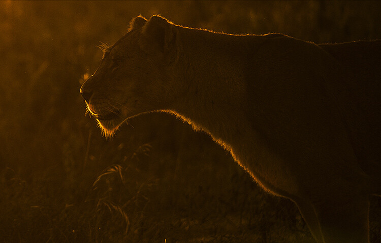
    Wildlife photography is one of the fastest growing hobbies today. With DSLR and lenses getting cheaper by the minute, it is only bound to grow faster. With more and more people taking to wildlife photography as a means to connect with nature and share its beauties, it’s become imperative that you start pushing the bar of your photography ever higher. One of the best and easiest ways to do that is to try out rim lighting shots. If you do not know what that means, you are on the right page – keep reading.

    How to do More Creative Wildlife Photography by using Rim Lighting

    There are many ways to get creative with your wildlife photography, but in this article I will teach you one of the most impactful. Let’s start with getting to know rim lighting a little better.

    What is rim lighting?

    By definition, rim lighting in photography means any image where the light at the edges of the subject seems more intense than the other areas. For example, take a look at the image below.

    How to do More Creative Wildlife Photography by using Rim Lighting

    Notice how the outline of the giraffes stands out? The rim of the subject looks well-lit. Quite simply, that’s what rim lighting is about.

    How do you achieve rim lighting?

    First and foremost, you need to position yourself such that the subject stands between your camera and the light source (more often than not, that will be the sun in nature photography). Rim lighting will happen in the natural world only if you can see the rim, lit up with your eyes. Some of the easiest subjects for this are animals that have a lot of fur and are not too smooth coated, for example, bears, giraffes, lions, or deer with antlers.

    Take a look at the visual below for a quick understanding on positioning yourself.

    750

    Guidelines

    There are a few guidelines that you need to adhere to while trying to obtain a rim-lit image:

    • Rim lighting happens best when the sun is low in the sky, so try to look for a subject around that time.
    • A dark background is necessary (check all the images in this article) so make sure that you try this in an area where your background is conducive to good results.

    Speaking about the camera now, composition aside, rim-lit photography can be done using one of two approaches.

    Approach #1 – Exposure Compensation

    Using exposure compensation is the easiest way to execute rim-lit shots. Once you have ensured that you are able to see a rim-lit subject just go ahead and try a test shot with a little underexposure. Take a look at the sequence of images below.

    How to do More Creative Wildlife Photography by using Rim Lighting

    Make note, by default when using the built-in metering system in your camera, more often than not the image in such scenarios (a lot of black and little bit of white) will turn out to be a bit washed out. It is just that the camera does not know what is the most important part of the image and makes an error in judgement (it tries to average the exposure).

    Knowing where to stop with regards to exposure compensation is a subjective call. You could be happy with the second or the third image above. Just know that the more you underexpose the darker the surroundings will get.

    This is a perfectly valid way of getting a rim-lit shot, but I generally recommend the second approach. The simple reason being that exposure compensation doesn’t reset itself. If you forget your camera is set at an EV of -2, it would mean disaster for the next few shots where you may not be trying to create a rim lighting shot.

    How to do More Creative Wildlife Photography by using Rim Lighting

    Approach #2 – Exposure Lock (AE-L)

    This approach is slightly more advanced in terms of understanding. Imagine yourself standing in front of a monkey with the sun setting behind him and the immediate background being dark trees. Now, do the following:

    • Point your camera toward the sky. Half press your shutter-release button to activate metering.
    • Next, press the Exposure Lock Button (AE-L or * button) which often resides right where your right-hand thumb would rest.
    • Now, recompose your image with the subject as needed and click.

    What happens is that when you point your camera towards the sky and ask it to meter from there, it takes a light reading from the bright sky and sets up a shutter/aperture combination accordingly. Let’s assume for a minute that the value came out to be 1/2000th at f/4.

    Now, if you press the Exposure Lock button, the camera will lock on to these readings and will not change them for your next set of clicks. So when you recompose and photograph the monkey, the camera uses the locked in settings thus rendering only the areas in the frame that are as bright as the sky correctly. In this recomposed image, the only area that is as bright as the sky is the outline of the monkey, giving you a nice, well exposed rim-lit image.

    How to do More Creative Wildlife Photography by using Rim Lighting

    Practice around home first

    Go ahead, practice the AE-L at home and then get out there and try a couple of rim-lit shots. Here is what you can do at home, before heading out to the wild.

    Catch hold of a friend or family member and make them stand in front of a car at night. They should be covering the headlight of the car completely. If you stand at the other end with your friend in between yourself and the light source, you should be able to see his entire body with rim lighting.

    Now that you know how to get a subject, go out there with your camera and start trying the exposure compensation trick to get some fabulous rim-lit images. Please share your rim-lit wildlife images below as well as any questions you may have about this technique.

    How to do More Creative Wildlife Photography by using Rim Lighting

    The post How to do More Creative Wildlife Photography by using Rim Lighting by Rahul Sachdev appeared first on Digital Photography School.


    Digital Photography School