Category: Photography

  • X-Pedition: Cuba

    Are you busy next January? I’ve been given the opportunity to lead a small-group photo trip to Havana, Cuba.

    I was last in Havana in 2013, teaching for Santa Fe Workshops. But that was someone else’s curriculum. This time the program is ours to design, and we are planning a week of exploring, learning and lots of time behind the camera.

    If that sounds like your thing, keep reading.

    An Immersive Week

    This is not the typical photo tour group, which invariably ends up as some version of a photo walk with everyone getting versions of the same pictures. I’m working with Focus On The Story, a D.C.-based organization for photographers. The trip leaders are myself and fellow journalist Joe Newman, whom I’ve known for over 30 years.

    Our trip will be more of a small-team experience, and very photo-centric. It will include instructional time as well as plenty of time to explore on your own—or with a teammate, if you prefer.

    We’ll always be out shooting at the edges of the day when the light is good, and at other times as dictated by the locations we have lined up. During the harsh light of midday, we’ll typically be in instructional mode. We’ll also be editing, comparing notes, evaluating what we can do better and preparing to go out and do it again.

    Please note that this is not a lighting seminar. I am traveling very light—an X100F and a similar backup body just in case—and probably won’t even bring a flash. We’ll be more in photojournalist mode than studio mode.

    In the evenings we’ll continue the conversation, perhaps over a mojito or a glass of Cuba’s famous dark rum. Nights in Havana are vibrant, with the sound of music filling the city. Its economic hardships may be well-known, but life and culture always find a way.

    Finding Your Balance

    We are traveling under a people-to-people license, which means you’ll get lots of interaction with locals throughout the week. You’ll also have time to absorb the city; to sit and watch the world go by. Whether along the Malecón or on the Paseo Prado, Cuban life is always on display.

    To always be in 100% photo mode is to miss one of the most important parts of the travel experience. Taking the time to observe the city both creates memories and informs your approach as a photographer when you pick the camera back up.

    The X-Factor

    The “X” in X-Pedition is a nod to Fuji’s X series cameras. Small, light, quiet and unobtrusive, Fuji X series bodies are ideal travel cameras. I took a leap of faith on my first trip to Havana, bringing only a Fuji X100s with its fixed 35mm equivalent lens. In retrospect, it was a great decision. And it has changed the way I approach travel photography ever since.

    So if you are also a Fuji shooter, you can expect tips and advice on how to get the most out of your cameras. Or to even borrow a lens if you like.

    Do you have to be a Fuji shooter to come along? No, you don’t. (And don’t worry, we promise not to try to convert you.) But we do strongly suggest that you travel very light with respect to photo gear. It’s good travel photo advice in general, but especially in a place like Cuba where the economic disparity is a factor.

    The Bigger Picture

    Havana is a unique opportunity for photographers. It goes without saying that it is not going to stay unique for very long. The island is already experiencing rapid change.

    Our goal with this trip is to help you grow as both travelers and photographers; to gain the skills and confidence to choose future destinations that are off the beaten path.

    __________

    This trip will sell out. So if you are interested in joining us, don’t sit on the fence too long. You can find full details and information on Focus On The Story’s X-Pedition Cuba page.

    Hope to see you there.
    Strobist

  • Good, Better, and Best Noise Reduction Techniques

    When it comes to noise reduction, you always have two goals. First, obviously, you want to get rid of any digital noise in your picture. But secondly, you want to preserve detail. These often work against each other because increasing noise reduction often leads to a loss of image detail, but if you focus on preserving the detail then you may end up with a noisy picture.

    Good, Better, and Best Noise Reduction Techniques

    So what can you do about it? Different people have different methods, but for me, there is a good, better, and best way to go about noise reduction. As you might imagine, my good way is simple, the better way involves a little more effort, and my best way requires a lot more effort (and can be rather complicated). In this article, I will walk through my favorite options so that you can decide if one of them is appropriate for your own noise reduction workflow.

    “Good” Noise Reduction

    Lightroom has very good noise reduction tools. They are powerful and really easy to use. They reduce noise and do a decent job of preserving detail. Further, the noise reduction in Lightroom seems to get a little better with each new iteration. If you want a good noise reduction tool that will take up almost none of your time, simply use Lightroom.

    Good, Better, and Best Noise Reduction Techniques

    Lightroom noise reduction sliders.

    The primary slider is the top one labeled Luminance. I think of that as the amount of noise reduction being adding to your photo. From there, you can fine-tune your noise reduction using the additional sliders below it. Frankly, however, if I am using Lightroom for noise reduction, it is because I want it to be quick and easy, so I usually just use the Luminance slider.

    Suggested starting points

    You may be wondering about a starting point for the amount of noise reduction to apply. Of course, that is hard to do, and it depends on a lot of things. First of all, it depends on the ISO value you used. It also depends on the low-light performance of your camera. However, I hate the “it depends” answer, so to give you an idea of a starting point taking into account those variables, here is a chart with some suggested values for the Luminance slider.

    Good, Better, and Best Noise Reduction Techniques

    Suggested starting points for noise reduction settings in Lightroom.

    Of course, there are other factors involved as well, which this chart does not take into consideration. For example, dark tones will show noise much more than lighter tones, so you may need to increase the amount where you have darker tones. Just use this chart as a starting point, and don’t take it as a definitive range that you must stay within.  Always do whatever the picture requires, even if it is drastically different than what is set forth here.

    Read more on noise reduction in Lightroom here: How to do Noise Reduction in Lightroom

    Selective Adjustments in Lightroom

    The noise reduction settings within Lightroom will apply to your entire picture. We are going to get into selective noise reduction later, but I should mention here that you can also use the Adjustment Brush in Lightroom to selectively add noise reduction.

    Select the Adjustment Brush and find the slider labeled Noise. That’s right – you only have one slider for this, so think of it as the equivalent of the Luminance slider you used above. From there, just set your brush size (you can use your left and right bracket keys for this) and paint in the effect where you want it. You’ll see better ways to selectively apply noise reduction in a minute, but if you aren’t too picky about the selection then the Adjustment Brush might be the tool for you.

    Good, Better, and Best Noise Reduction Techniques

    Noise reduction slider inside Lightroom’s Adjustment Brush.

    “Better” Noise Reduction

    Normally, when I want to bring out the heavy artillery in any aspect of post processing, I find that I need to head into Photoshop. That is sort of true here, in that we will be heading to Photoshop, but then again not true in that we won’t be using Photoshop’s noise reduction. I find that Photoshop’s noise reduction tools aren’t that great, and Lightroom actually works better (there are plenty of people that disagree with me though, so make up your own mind about that as you use them both).

    Instead, I merely use Photoshop to take advantage of third party noise reduction software that works within Photoshop. Yes, you could also use them from Lightroom, but using them within Photoshop will allow you to take advantage of Photoshop’s powerful masking techniques (which you will see in a minute).

    Noise reduction plugins

    What are these noise reduction applications that are available?  Let’s take a look.

    • Noiseware: First, we have Noiseware by Imaginomic. I mention this first because it is the application I have used for my own noise reduction for the past several years. It works really well, does a great job eliminating noise, is simple to use, and it preserves a lot of detail. There are several presets to choose from and then a few sliders to make adjustments from there.
    • Nik Define: A free option is Nik Define. It is part of the Google Nik Collection, which is now free. It does a nice job of reducing noise, and if you are looking for a free option this is a good one. The downside is that it appears this software is no longer being updated and its days are numbered.
    • Noise Ninja: This is part of the Photo Ninja Suite by Picture Code. The entire suite costs $ 129. I personally have not used it, but the reports I have heard from others and the reviews have always been positive. Read: How to Reduce Noise with Photo Ninja for more info.
    •  Topaz Denoise: Topaz makes a series of plug-ins that do a variety of functions really well. Their noise reduction software is called Denoise and it costs $ 79 (or you can get the whole suite of apps for $ 500).  I haven’t used this one either, but the reviews have been good and my experience with other Topaz apps has been very good.
    • Macphun’s Noiseless: Inside Macphun’s Creative Kit you will find the Noiseless plugin (you can also buy it alone). Read this for more info on this option: Macphun Noiseless Pro Software Review

    Any of these will do a nice job.

    Good, Better, and Best Noise Reduction Techniques

    Screenshot of Noiseware interface.

    “Best” Noise Reduction

    The best way I have found to apply noise reduction is exactly the same as the way you just saw, except that you apply it selectively. The reason is that noise reduction reduces detail in your image. It is often hard for noise reduction software to tell the difference between noise and important detail. That is particularly true in night sky photos, where the many stars can resemble the random flecks that constitute noise.

    Basic Masking

    To avoid having your noise reduction software reduce detail, you can use Photoshop to mask off the more important areas of the sky. To accomplish that, you just create a layer mask so that the noise reduction only applies to certain parts – which will be white in the mask – of your image.

    A simple, but admittedly imprecise, way to do this is with a brush. If you start with a “reveal all” (white) layer mask, you will then use the brush (color set to black), which will keep the noise reduction from reducing detail in the areas you choose. On the other hand, if you start with a “hide all” (black) layer mask, you will paint the entire mask with white except the part where you want to preserve detail. You can get as course or fine as you want (or time allows).

    An example of masking off noise reduction in an area where you want to preserve detail in the picture. This applies to the cliffs picture at the top of this article.

    How to do you do it? First create a new layer copy (Ctrl/Cmd+J if your picture only has one layer, or Ctrl/Cmd+Shift+Alt+E if you have multiple layers already), then apply your noise reduction as you normally would. After that, just click on the Add Layer Mask icon at the bottom, which will create a white (reveal all) layer mask (or press Alt while doing so to create a black layer mask to hide all). Then just use your Brush (B) to paint with the opposite color as your mask.

    You can get as involved as you want with masking. You likely have your own favorite ways already, so go ahead and use them. There is no right or wrong way to mask.

    Applying Noise Reduction

    So those are my three ways to apply noise reduction. You can add some quick noise reduction in Lightroom, which takes only a second. For slightly more involved but also more powerful noise reduction, add the addition application of your choice. For your most important pictures – or the ones with the biggest problems – add noise reduction and then use masking to limit the effect to the specific areas you want.

    These are just my ways though. Do you have your own special methods that are different?  If so, let us know about it in the comments below.


    If you found this article helpful it is just one of 31 tips you will get if you grab Jim’s new dPS course: 31 Days to Becoming a Better Photographer.  Enrollment for this course is only opened for a limited time and closes August 11th (5 more days) so get it now.

    The post Good, Better, and Best Noise Reduction Techniques by Jim Hamel appeared first on Digital Photography School.


    Digital Photography School

  • How to Find Your Photographic Zen – Tips to Recharge When You’re Feeling Stuck

    Lately, I have been feeling very burned out and unmotivated with my photography. Several months ago I was preparing for a summer away from my business. My days were spent photographing editorials, working on client images and writing photography articles to prepare for a three-month sabbatical. I was working non-stop for several weeks as well as managing other aspects of my life. All that hustle to be prepared seemed to have gotten the best of me. I was feeling completely unmotivated and stuck, almost to a point of being irritated to pick up my camera and take a few shots.

    I knew this was a phase, and that I just needed to ride it out. But at the same time, I was trying to understand how to effectively manage this so that my craft and my business wouldn’t suffer too much.

    How to Find Your Photographic Zen - Tips to Recharge When You're Feeling Stuck

    This was the scenery outside my bedroom window. I was so out of it that I did not even bother cleaning the window of raindrops before I took this shot (smudges seen in the bottom left of the frame) – I took the shot because I had to not because I wanted to!

    As I write this article, I have spent the past 10 days living in a mountain village with incredible views of the Nanda Ghunti mountain range of the Himalayans right outside my bedroom window. My days are spent completely cut-off from most of the outside world, having copious amounts of tea, belly laughs with family, and intimate conversations by the fireplace listening to the frogs and beetles chirping all night long. I have probably lost many followers on social media, and I have several hundred unanswered emails. But I have come to the realization that time away from the outside world is just the thing I needed to recharge and get back my mojo!

    So if you are like me and feeling a little deflated with your art, here are a few tips to help you overcome that lull and get back into it with renewed passion.

    #1 – Permission to take a step back

    Let me tell you something – burn out is very real and happens to everyone at some point in their lives, no matter what field of work you are in. For people in the creative arts, burn out tends to happen faster and more often because as a creative, all your senses are heightened and you are aware of everything around you 24/7. For photographers, burn out manifests either as a lack of interest in picking up the camera or disliking everything you create. If this sounds like you, acknowledge it and please give yourself permission to walk away from it all – even if it’s just for a day. If you can afford to take a longer break then do so.

    #2 – Capture heartfelt stories and frames

    As photographers, we have an incredible opportunity to document life stories – whether it is of people or for landscapes. The wrinkles and toothless smile of an elder speak volumes about his life’s journey. Don’t just take the shot and walk away. Spend a few minutes and listen with both your heart and your head. Then when you do take the shot, it will become so much more meaningful and special – even if it is just for you and your subject.

    How to Find Your Photographic Zen - Tips to Recharge When You're Feeling Stuck

    On the left – A young village girl gave me the sweetest of smiles when I handed her an extra piece of candy that I had purchased for my kids. She pointed to my camera and asked me to take her picture and was giggling with laughter when I showed her the back of the camera! On the right – the local temple priest was going to town and as we were waiting for a ride together he started chatting with us. Everything about him calmed me down and gave me a sense of peace!

    How to Find Your Photographic Zen - Tips to Recharge When You're Feeling Stuck

    These three generation of women were chatting up a storm as I passed them by during a photo walk. When they saw a camera in my hand, they called me back to come take their picture! – I happily obliged and was offered a hot cup of chai in exchange – Before I walked away, I had made a new set of friends!!

    #3 – Take a wabi-sabi approach to your images

    A wabi-sabi method requires a slower, quieter approach to life. The concept is very similar to Japanese Zen gardens that promote tranquility and calmness. Slow down and quiet your mind. Stop chasing that next award winning frame for just a few minutes and open your eyes to all that is around you. Stop – Look – Feel and then click. This will make each frame more meaningful and help you convey the story better once you yourself understand what is unfolding around you.

    How to Find Your Photographic Zen - Tips to Recharge When You're Feeling Stuck

    The fog was so thick that it covered the whole valley and only the tops of some of the trees were visible – this scene was so soothing and almost like a painting. It was the perfect zen for my troubled mind!

    #4 – Rule of Thirds and negative space

    Try and step away from rules and conformity. Resist the urge to put everything in the dead center of the frame. Instead embrace negative space, the rule of thirds and/or focus on singular elements in your frame. Not only will you create work that is different from the rest but you’ll also learn to approach life in a very different way – more relaxed and free flowing as opposed to stressful and rigid.

    How to Find Your Photographic Zen - Tips to Recharge When You're Feeling Stuck

    #5 – Free-range photography

    The best thing I can do for myself based on my personality is to practice free-range photography. For me, this means breaking free from my norm (leaving the status-quo and photographing something completely out of character). Not only does this clear your mind of preconceived photography habits and notions but also gives you a fresh perspective in the art of photography.

    Do not approach this exercise with the idea of perfecting it and getting award winning shots. Instead, approach it with the idea of doing something different, making mistakes, and yet having fun with it.

    How to Find Your Photographic Zen - Tips to Recharge When You're Feeling Stuck

    I am fascinated with the old doors, windows, and archways found in India. To me, their textures, colors and characteristics speak volumes about their history.

    Conclusion

    So if you are feeling stuck and burned out in your photography, know that it is absolutely normal and expected. Don’t fight that feeling. Instead, accept it and embrace it with open arms. Once you accept it, you will figure out a way to work around it and create a meaningful body of work because you have given yourself permission to recharge, renew and get reenergized with your craft.

    The post How to Find Your Photographic Zen – Tips to Recharge When You’re Feeling Stuck by Karthika Gupta appeared first on Digital Photography School.


    Digital Photography School

  • Flash Shopping Guide – 5 Things to Consider When Buying a Speedlight

    Lighting is one of the most challenging aspects of photography and is often the thing which makes or breaks a photograph. There are several problems when you shoot with the built-in flash on your camera. The images appear washed out (overexposed), have red-eye, and many other issues. Using the built-in flash also creates harsh shadows, and gives you a rather flat-looking image.

    External flashes, or speedlights, are photographic equipment which can be used to compensate for the pop-up flash. They allow far superior control over the lighting and exposure of an image, even in low-light shooting conditions.

    Use a speedlight or flash to create better lighting.

    For newbies in the field of photography, and even for people who have been shooting for quite a bit of time, choosing the correct external flash can be a huge challenge. There are countless brands on the market today offering a huge variety of flashes which makes it all even more confusing.

    Below are the five essential things that we felt must be considered, before investing your money on an external light source. Read this if you are about to buy a new flash or speedlight for the first time.

    Flash Shopping Guide - 5 Things to Consider When Buying a Speedlight

    #1 – The Brand

    Initially, buying a flash was really simple. If you wanted to buy a speedlight then you had to buy it from your camera manufacturer – usually Nikon or Canon. Today the situation is completely different, and the market is flooded with several other companies that sell speedlights such as; Yongnuo, Godox, Nissin, etc. So you can opt to buy the flashes by your camera manufacturer or purchase one sold by one of the third party companies.

    Although the flashes sold by Nikon, Canon, etc., are really expensive compared to the third party options, many photographers believe that they are still a better buy as they have a longer life, are more durable and are more compatible with their DSLRs.

    However, even the third party speedlights these days are increasingly giving competition to the big brand names in terms of performance, durability, and more. Another plus is that they are a lot cheaper. A flash by Godox is much easier on the pocket than one by Canon, which is a welcome point for many looking to buy their first flash.

    #2 – Flash Life and Longevity

    Speedlights are just like any other bulb, as in they too have a limited life before which they “burn out” and stop working. Thus, before purchasing any speedlight, be it of any company or any model, do some research about its longevity, and the amount of time it can be used effectively before it needs to be replaced.

    If a flash does not fire properly and at full power, then it would disturb the lighting of an image and give you an unusable photograph as well in many cases.

    #3 – Flexibility

    Flash light buying guide 4

    Light from a speedlight used off-camera with light modifiers.

    Apart from its many drawbacks, another major restriction with the pop-up flashes are that they are completely fixed and not movable at all. They only point in one direction, forward, and cannot be moved along with the camera. Thus, the light being fired cannot be controlled or bounced, as per the photographer’s wish.

    This is why it is important to check the flexibility of a flash unit before purchasing it. If the head of the flash you buy cannot be moved, tilted, or angled up-down, left-right, etc., then that defeats the very purpose of using it. A speedlight is used to bounce light around, reflect it off different surfaces, and so on, and if the flash doesn’t have that much control, then using it would virtually be a waste of time.

    #4 – Automatic (TTL) or Manual Control

    There are two types of flashes or speedlights – TTL and fully manual. TTL simply stands for Through The Lens, which is a type of automatic flash.

    Flash light buying guide 5

    Do you need TTL or will a Manual flash suffice for your needs?

    A manual flash has to be told and directed by you, as to how much light is to be emitted. Any change in the power of the light emitted by a manually controlled flash has to be done by you according to your requirements. These manual flashes are cheaper because their build is much simpler and more basic than a TTL flash.

    A TTL flash, on the other hand, is an automatic speedlight, which interacts and communicates with the camera to determine the optimal amount of light required to illuminate a particular scene properly. An additional advantage of TTL flashes is that they can also be used in full manual mode, if you wish, for greater control.

    TTL flashes have proven to be extremely accurate and reliable. Although there is a slight chance that they might not give the expected results. But that is a very minimal risk.

    #5 – Flash Recycle Time

    This is a point to consider especially by sports and action photographers, who often have to shoot multiple bursts of shots together. The recycle time or recycle rate is simply the time taken between two pops/firings of the flash for it to be ready to fire again. The recycling rates are usually always mentioned by the manufacturers in terms of seconds.

    The specs for a speedlight will usually have two different times mentioned (e.g. 0.3-5 seconds). The lower number denotes how soon another flash shot can be taken if the flash produces its lowest light output (lowest power setting) while the higher number indicates the time it will take before taking another flash shot when it has generated its maximum light output (full power).

    Flash light buying guide 6

    If you need a flash that recharges and is ready to go quickly, make sure to check the recycle rate before you make your purchase.

    The important recycling time to consider is the one at maximum output. Always aim to get a flash that has a shorter maximum light output time. However, even along with keeping this point in mind, remember that you also need to buy a proper battery for your flash to get the recycle rate mentioned by the manufacturer.

    Conclusion

    So, it all comes down to what you are comfortable with when buying a flash, depending on your usage needs and budget. To begin with, you can go with a basic manual flash and once you start understanding the application of a speedlight you can always upgrade. Nowadays, the third party flashes are almost on par with the brands such as Canon and Nikon, so nothing is stopping you from capturing creative frames irrespective of your budget.

    The post Flash Shopping Guide – 5 Things to Consider When Buying a Speedlight by Kunal Malhotra appeared first on Digital Photography School.


    Digital Photography School

  • How to Take Control of Contrast Using Curves and Levels in Photoshop

    Have you ever found your photos flat? The colors are muted and it just looks dull? That’s because it lacks contrast. Sometimes regardless of your best exposure skills, the conditions are not suited to get a wide range of tones. Not to worry though, it can be fixed in post-processing. I’ll show you my workflow for how you can take control of contrast in your images using Curves and Levels in Photoshop.

    Of course, there are many ways to adjust the contrast on Photoshop, there’s even a tool called Brightness and Contrast, however, it doesn’t give you much control. What I like to do is to manipulate Curves and Levels. In this article, I’ll explain to you why and how I use these tools to boost contrast.

    The issue of low contrast

    Low contrast can happen for many different reasons; bad weather for example or photographing through glass. In any case, the resulting image doesn’t show a wide range of tones, in other words, there’s not enough difference between the lights and the darks.

    I find this problem occurs especially while traveling, because you can’t go back to the location when the weather is better, or because you are seeing things through a pane of glass. For example, the image I will use for this tutorial was taken through the window while traveling on a tour bus.

    How to Take Control of Contrast Using Curves and Levels in Photoshop

    How do you know it’s low contrast?

    I chose an image where the contrast is clearly low so that you can easily see the effects of every step. However, in some cases, it won’t be as obvious, but you can always review the histogram to know the tonal range of your image.

    A typically correct exposure should have a histogram that reaches from black (left) to white (right) evenly spread, with the highest values in the middle. Please note that this can change if you are going for a different effect like low key or high key where you purposely choose a specific range to work with, so I am just talking about the average image here.

    As you can see, in this case, all the information is concentrated in the middle tones, but it doesn’t reach the black or the white side (see histogram below). This is why the image has no contrast.

    How to Take Control of Contrast Using Curves and Levels in Photoshop

    Using Curves

    First, we are going to manipulate the Curves tool. Remember to do it on an adjustment layer and not directly on your original (this is non-destructive editing), that way you won’t loose any information and you can always go back and start again if you don’t like the results. To do this go to the menu then: Layers > New Adjustment Layer > Curves and a new window will pop up.

    Curves

    You can also get to Curves on the Adjustment panel.

    Curves adjustment

    Inside that, you’ll find a graph with the histogram on it. The line that crosses the graph controls the contrast; the steeper it is, the greater the contrast.

    Curves- How to Take Control of Contrast Using Curves and Levels in Photoshop

    You can fix anchor points along the line that you can move up or down to adjust the contrast of the image. Add as many anchor points as you need. The higher right quadrant controls the highlights and on the lower left one, you have the dark tones.

    Curves Anchors - How to Take Control of Contrast Using Curves and Levels in Photoshop

    If you want to increase contrast, as we do in this case, add one anchor point in the lower left quadrant and slowly pull it down. Watch how it affects the dark areas of the image. Move it until you’re happy with the result. Then add another anchor point in the upper right quadrant and pull it up slowly until the highlights are bright enough for your preference. By making the straight line into more of an s-curve you will add contrast to the image.

    Note: if you have an image with too much contrast the opposite can work. Pull down the highlights, and push up the dark areas on the curve to get an inverted s-curve.

    After fixing the curves for the overall image, this tool allows you to fine-tune by channel. The step we did before was working on RGB, however, if you click on the drop down menu you can choose each channel to work with separately.

    In this case, let’s start with the Blue channel. If you pull up an anchor point from the highlights (the upper right quadrant) you are making the sky, which is the lighter part of the picture bluer. In the left lower quadrant (the shadows) pulling the anchor a little bit down allows you to remove some of the color cast.

    Next is green channel so that you can get a wider tonal range out of the forest and nature of the scene. The adjustments are very subtitle because when you are working in such detail the tools become very sensitive. Move around the graph until you are happy with the result.

    Remember different light sources have different colors;  a sunset has warmer colors than at noon, artificial light can be more yellow than natural light, etc. Apart from correcting any color bias, it works to add some special effects and get creative. In the next example, you can see what happens when the graph gets completely inverted in the red channel. You can also achieve this by playing with the different presets, in this case, color negative.


    Using Levels

    Next, you want to manipulate the Levels, also using an adjustment layer. You can do this by going to the menu > Layers > New Adjustment Layer > Levels (or you can find it on the Adjustments panel just to the left of Curves). Again a new window will appear with a different graph, this represents the darkest parts of the picture (0) to the lightest parts (255).

    Levels - How to Take Control of Contrast Using Curves and Levels in Photoshop

    You can manipulate contrast by dragging the sliders underneath the graph, however, you will have much more control if you use the eyedroppers. This is how to work with them:

    First, choose the white eyedropper (bottom one next to the graph) and click on the lightest part of the image that still has information or detail. You’ll notice how your entire image becomes lighter and brighter. Don’t worry about getting it right on the first try, you can click around on the image until you are satisfied with how it looks.

    Levels white eyedropper

    Levels White - How to Take Control of Contrast Using Curves and Levels in Photoshop

    Then pick the black eyedropper and click on the darkest part of the image with detail. Same as the white one, try it until you get it right. You can always do some final adjustments with the sliders as well.

    Levels Black - How to Take Control of Contrast Using Curves and Levels in Photoshop

    Finally use the gray (mid-tones) eyedropper to set the ambiance or mood of the scene, as it will change depending on where you click. Here some examples:


    In Levels, you can also do the selective adjustments by channel if you need.

    Before and after

    And there you go, when you are satisfied with your results, flatten the image by going to the menu Layers – Flatten Image. See how the histogram has a much wider range now, and the final image has more impact.

    How to Take Control of Contrast Using Curves and Levels in Photoshop

    Before image.

    Before - How to Take Control of Contrast Using Curves and Levels in Photoshop

    Before adjustments for reference.

    Histogram After - How to Take Control of Contrast Using Curves and Levels in Photoshop

    Histogram after Curves and Levels adjustments.

    after - How to Take Control of Contrast Using Curves and Levels in Photoshop

    After image.

    Handling reflections – example

    Remember that when you are photographing through glass there might be reflections, and when you boost the contrast these reflections will be much more noticeable. So think about that before shooting, when you are composing your image.

    In order to demonstrate this for you, I made a photo while enjoying a panoramic view from a skyscraper in Milan. It was a 360 degrees glass wall, so I was bound to have a reflection. In order to use it to my advantage, I decided to place my foot strategically so that its reflection would be in between two buildings and entitled the photo “Stepping into Milan”.

    Skyscraper Before - How to Take Control of Contrast Using Curves and Levels in Photoshop

    Before processing.

    Skyscraper After - How to Take Control of Contrast Using Curves and Levels in Photoshop

    After processing, notice my foot in the lower left corner?

    Dull weather – example

    As I mentioned before, it’s not only shooting through glass that can give you low contrast scenes. Here I have another example that had to do with the weather. It was a very cloudy day so there were no shadows, everything looked kind of gray and the light was very flat. This too can be fixed with Curves and Levels following the previous steps.

    Canal Before - How to Take Control of Contrast Using Curves and Levels in Photoshop Canal After - How to Take Control of Contrast Using Curves and Levels in Photoshop

    Conclusion

    Now you know that a low contrast photo doesn’t mean you’ll end up with a flat or dull image, so shoot away! I hope you found this helpful and if you have any doubts or tips about contrast, please share them with us in the comments section below.

    The post How to Take Control of Contrast Using Curves and Levels in Photoshop by Ana Mireles appeared first on Digital Photography School.


    Digital Photography School
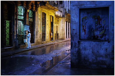
  • How to Use Auto Mask in Lightroom to Make Your Photos Shine

    Lightroom is a fantastic tool for organizing, editing, sharing, and even printing photos and is an essential tool in the workflow of many photographers today. Unfortunately, it sometimes gets a bad rap when compared to its big brother Photoshop since the latter can do far more in terms of altering, enhancing, changing, or otherwise editing pictures and images. That’s not to say it is a slouch by any means, and you might be surprised at what it can do when you start to learn to use more of its powerful, yet sometimes hidden, features like Auto Mask in Lightroom.

    How to Use Auto Mask in Lightroom to Make Your Photos Shine - rabbit photo

    You mean Lightroom has advanced image editing capabilities I don’t know about? Go on, tell me more…

    What is Auto Mask and how to find it?

    The best way to get started with the Auto Mask feature is to navigate to the Develop module in Lightroom and then click on the Adjustment Brush tool. This lets you change all sorts of parameters like exposure, contrast, clarity, sharpness, and more, but only on specific parts of a photo instead of altering the entire image at once. You can select from various brush presets or move the sliders to create your own adjustments, then click and drag on the image itself to implement those adjustments.

    You can even use multiple brush adjustments on the same photo and selectively erase your adjustments in case you want to undo anything. When you look at all the features the adjustment brush tool offers, you can start to see just how powerful and useful it really is. What’s more, at the very bottom of the adjustment brush panel is a little check box called Auto Mask that can dramatically increase both the usefulness and effectiveness of this tool in general.

    How does Auto Mask work?

    In a nutshell, the Auto Mask option constrains the edits of the Adjustment Brush to a narrow band of colors that are very close to where you originally started brushing in your adjustments. Because the Adjustment Brush is circular in nature it can be tricky to confine your adjustments to specific areas, especially when working with angles or hard edges.

    To show you just what the Auto Mask does, I’m going to make a few changes to this image of a water valve. It’s not the most stunning picture and won’t win any awards, but thanks to the Auto Mask feature it can at least be made to look a little more interesting.

    How to Use Auto Mask in Lightroom to Make Your Photos Shine - before photo

    Editing this is going to be tricky. Or, rather, it would be tricky without the Auto Mask feature.

    Using the Auto Mask

    In this picture I want the reds and greens to really stand out, and while this could be accomplished with the Color sliders and adjusting the overall saturation of the red and green color values, I want a little more granular control of exactly what parts of the image I’m going to edit. By using the Adjustment Brush Auto Mask feature, I can do exactly that.

    To do this process on your own, navigate to the Adjustment Brush panel, select a preset or move the sliders to your own liking, adjust the size of the brush, and then tick Auto Mask. Then click the “Show selected mask overlay” option at the bottom of the Develop window (or press O on your keyboard) so you can actually see where your adjustments are being applied. In the example below, I used this process to apply extra saturation to just the yellow circle. I only brushed on the top-left quadrant and left the Mask Overlay turned on so you can see how the adjustment brush was confined to just within the yellow circle.

    How to Use Auto Mask in Lightroom to Make Your Photos Shine

    The red portion is just an overlay showing where the adjustment brush was applied. Auto Mask is a great way to make sure you always color inside the lines, just like your kindergarten teacher told you to do.

    Auto Mask helps you work fast!

    To finish off this particular edit, I filled in the rest of the yellow circle with the same method and within about seven seconds I had a picture that was much improved over the original.

    How to Use Auto Mask in Lightroom to Make Your Photos Shine

    To finish off the image I applied an adjustment brush to the red portions of the water control valve, and because I used Auto Mask I was able to do it in 34 seconds. Literally. I even used a stopwatch to time it.

    How to Use Auto Mask in Lightroom to Make Your Photos Shine

    The finished picture has adjustments applied only to the red and yellow areas, without anything creeping over into the green background.

    The process can be even faster if you increase the size of your Adjustment Brush as far as it can go, making it easy to instantly apply an adjustment to virtually the whole picture at one time. As long as you have Auto Mask enabled, the brush adjustments will be limited to only the parts of the picture that are similar in color to where you actually click your pointer.

    Auto Mask with the Radial and Graduated Filters

    There’s another way to use the Auto Mask setting in combination with the Radial or Graduated filters, which can be extremely useful if you shoot landscapes, architecture, or other scenarios which often are enhanced by those two types of filters. Frequently there are objects in landscape or architecture shots that don’t necessarily benefit from having a radial filter applied, and yet unless you use the Brush tool with Auto Mask it can be very difficult to work around them.

    To illustrate how this works, here is a shot of a building that would be an ideal candidate for using the Graduated Filter as a way of enhancing the sky, except for the columns rising upwards from the structure.

    How to Use Auto Mask in Lightroom to Make Your Photos Shine

    This kind of image is ideal for a Graduated Filter, but the columns make it a little tricky unless you kick it up a notch with Auto Mask.

    Here’s the same shot, but edited with a Graduated Filter applied that increases saturation and slightly adjusts white balance.

    How to Use Auto Mask in Lightroom to Make Your Photos Shine

    Adding a Graduated Filter made the sky significantly improved, but also altered the color of the columns.

    The issue

    The image is much better, but when Show Selected Mask Overlay is selected, it’s clear that a few problems have cropped up.

    How to Use Auto Mask in Lightroom to Make Your Photos Shine

    Showing the Overlay lets you see exactly where the Graduated Filter has been applied. The same thing works for the Radial Filter as well.

    At issue here is the fact that applying the gradient to the sky has also changed the saturation and white balance of the building itself, particularly the columns. Normally, the solution to this would involve painstaking work in Photoshop to create and edit separate layers, but Lightroom has an easy solution thanks to the Adjustment Brush tool and Auto Mask.

    Auto Mask with the Graduated Filter

    With the Graduated Filter option still selected, click the “Brush” option at the top of the panel. Not the icon, but the text option that shows up just to the right of “Edit” (shown below).

    How to Use Auto Mask in Lightroom to Make Your Photos Shine

    You can now use the brush to apply the same edits in the Graduated Filter tool. But rather than applying more edits using this method I like to remove the effect from unwanted areas, especially with Auto Mask enabled. To fix the image of the building and sky so that the gradient is not applied to the columns or to any part of the building, press the [alt] (or [option] on a Mac) key which causes the brush tool to change from a plus (+) with a circle around it to a minus (-) with a circle around it. Then while still holding down your modifier key double-check that Auto Mask is enabled, and brush the parts of the image from where you wish to remove the gradient (see below).

    How to Use Auto Mask in Lightroom to Make Your Photos Shine

    You don’t have to worry about staying inside the lines. Auto Mask takes care of that for you.

    A few clicks of the mouse later and the image now has the Graduated Filter applied only to the parts where you want it, without altering the areas of the photo where it is not needed. All thanks to the power of Auto Mask.

    How to Use Auto Mask in Lightroom to Make Your Photos Shine

    The finished image, with only the sky affected by the Gradient Filter. I also brushed away any traces of the filter from the roof and side of the building.

    Notes:

    This particular example involved the Graduated Filter, but the same process can be used to modify any edits you make with the Radial Filter as well.

    Note: I also want to note that this is only available in current versions of Lightroom, so if you aren’t on Version 6 or the Creative Cloud plan you may not be able to use the Brush tool to edit the Graduated or Radial filters. But the Auto Mask will still work with your Adjustment Brush tool.

    Conclusion

    While this is clearly a long way from Photoshop’s powerful and meticulous editing capabilities, hopefully, it illustrates that Lightroom is not exactly a slacker in the editing department. I’m curious to hear your thoughts on this as well and also know if there is anything I might have missed. Please leave your responses in the comments section below.

    The post How to Use Auto Mask in Lightroom to Make Your Photos Shine by Simon Ringsmuth appeared first on Digital Photography School.


    Digital Photography School
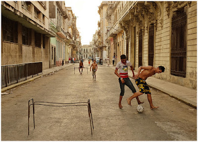
  • 5 Tips for Better Concert Photography in Low Light Conditions

    Concert photography is one of the hardest subjects to nail down for one main reason: the conditions almost always have low lighting and you aren’t allowed to use flash. With that said, there are some tips for optimizing your concert photography experience. Whether you’re equipped with a DSLR and a photo pass for a big arena show or simply shooting a local band in a pub or a school performance, use these tips to enhance your low lighting photography.

    1. Choose a Low Lighting Lens

    5 Tips for Better Concert Photography in Low Light Conditions - use a fast lens

    One of my first concert photos snapped with an old Nikon D90 and a 24-70mm f/2.8 lens.

    Generally speaking, the gear you shoot with doesn’t really matter, except when it comes to low lighting photography. In this case, you’ll want to have a fast lens with the lowest f-stop possible. For most concert photographers, this equates to a 24-70mm f/2.8 and/or a 70-200mm f/2.8. These are two of the most popular concert and event photography lenses thanks to their low f-stops and vast focal length coverage.

    However, fast lenses like these two can be very expensive. If you’re on a budget, consider an affordable prime lens such as the 50mm f/1.8 or 85mm f/1.8. While you sacrifice the ability to zoom, you gain an extra stop or two of light while also saving money.

    2. Adjust Your Aperture to Shoot Wide Open

    Now that you have a large aperture lens, switch your camera over to Aperture Priority or Manual mode and shoot “wide opened” at the lowest f-stop number your lens allows. This will let the most amount of light get to your camera’s sensor.

    As a tradeoff, the lower f-stop number means a smaller depth of field, meaning your images may not be as sharp as if you were shooting at a higher f-stop. So if you happen to be shooting in ultra bright lighting conditions, consider bumping your f-stop up to get more of the scene in focus.

    5 Tips for Better Concert Photography in Low Light Conditions

    Sometimes you are blessed with ample venue lighting that gives you more flexibility with your camera settings. Shot at f/4 at 1/125 at ISO 640.

    3. Watch Your Shutter Speed

    If you shoot in Aperture Priority mode like I do, then you won’t have to worry about setting your shutter speed. However, you should always take note of it while shooting and understand how it may affect your image.

    As a baseline, your shutter speed should be at least 1/250th to freeze motion while shooting concerts. But this is a luxury often reserved for shooting well-lit shows or outdoor concerts. In low lighting conditions, your shutter speed will probably be much lower than 1/250th. I can usually push my camera to go as low as 1/60th and still pull off decent concert photos, but it’s best to not go any slower than 1/100th.

    5 Tips for Better Concert Photography in Low Light Conditions

    4. Increase the ISO

    Increase the ISO until you are able to shoot at your desired aperture and shutter speed. For most conditions, this means cranking the ISO up to 3200 or even as high as 6400. The exact ISO limitations will vary according to your camera. And just because your camera can shoot at ISO 10,000 doesn’t mean that you should. Experiment with your camera until you find the highest ISO that you are comfortable using (based on the noise level, etc.).

    As a tradeoff, a higher ISO means you’ll have more noise or grain in your images. However, many digital cameras today produce very good quality images even at high ISOs. Also, there is noise reduction software available that will help you reduce noise in post-production. The bottom line is that more digital noise or grain in an image is better than having it be blurry due to a slow shutter speed. Don’t hesitate to increase the ISO.

    5 Tips for Better Concert Photography in Low Light Conditions

    Shot at f/2.8 at 1/100 at ISO 5000. Not the sharpest photo, but it captured a key moment in a venue with horrible lighting.

    5. Shoot in RAW

    If your camera allows for it, shoot your images in RAW format, rather than JPG. Concert photography is notorious for having inconsistent lighting with red or blue lights that can flicker or change throughout a concert, making it hard to adjust the in-camera white balance. If you shoot in RAW, you’ll have more flexibility to fix and edit those photos in post-production.

    concert photography tips
    concert photography tips

    Over to You

    What are some of your best tips for photographing concerts in low lighting without flash? Please share them in the comments below.

    The post 5 Tips for Better Concert Photography in Low Light Conditions by Suzi Pratt appeared first on Digital Photography School.


    Digital Photography School

  • 5 Tips for Better Travel Photography

    In this article, I will share with you some tips about travel photography.

    After spending a year doing travel photography in India, I discovered that it isn’t about traveling physically, it’s about making the viewer travel virtually to your images. Travel image need to have sense of place and time. You can achieve this by shooting in your own city, street, or neighborhood.

    Gurudwara Bangla Sahib Delhi - 5 Tips for Travel Photography

    If I were from Delhi and shot some images of the Taj Mahal in Agra, or if I were from Agra itself and I shot images of the Taj Mahal, both of those will be considered travel images if they have sense of place or time. Just try to compose an photo so the viewer visually travels to your image. Make him feel that he already went to this place through your image or that he wants to go there in real life.

    You don’t need to get an airline ticket to another country to make travel photography. You don’t need to take a train to another city to do, travel photography. But of course when you do travel to another country or city, your energy and passion increase because of the diverse culture and tradition and the fact that your eye is impressed by the new subjects.

    #1 Avoiding cliché shots

    Lake Pichola Udaipur Rajasthan - 5 Tips for Travel Photography

    It’s important to avoid cliché shots in travel photography. Before buying my flight ticket to India, I decided to avoid all popular cliché images of India which are pictures of the Taj Mahal, a train window, Holi Festival, camels of Pushkar, Rajasthani portraits, and portraits of people with wrinkles. I wanted to shoot something different, I wanted to come back to my country with new frames that aren’t common to viewers eyes.

    #2 Approaching people

    Being a foreign travel photographer means that half of the people you will meet will welcome you and be kind because they appreciate and like foreigners. The other half won’t allow you to photograph them because they won’t be sure about how you will use their images.

    Himalaya Nyingmapa Buddhist Temple Himachal Pradesh India - 5 Tips for Travel Photography

    There are several ways to approach people abroad:

    If you know the local language, it will be very easy for you to up go to your subject, introduce yourself, explain why you want to photograph them and how you will use the photos.

    If you only speak English, you can have a guide or translator with you. I don’t recommend this because it will attract attention of people and some may feel that there is something serious in taking their image and they may refuse.

    Jagdish Temple Udaipur Rajasthan - 5 Tips for Travel Photography

    You can shoot candids and never make direct eye contact with your subject. Do not give an alert that you are photographing, and hide yourself behind the camera.

    You can shoot without permission in a candid way with making direct eye contact, and smile to the subject and after taking the picture. Show them the image and tell them that they are beautiful and ask them to smile. Your eye contact and smile can be the permission. This is the best way!

    Gurudwara Bangla Sahib Delhi 2 - 5 Tips for Travel Photography

    When you take portraits, make sure you have some of your images printed to show to your subject to help explain what are you doing and how they will look in your photographs.

    Click one image and show them the pictures on your camera. They will be pleased because many people don’t know that their image can appear in camera.

    #3 Enter the culture

    Jagdish Temple Udaipur Rajasthan 2

    • Wear local clothes to seem local and attract less attention and to show appreciation for the culture of the country.
    • Learn the greeting gesture if they have one.
    • Learn basics words of the language like; hello, please and thank you. People will be happy that you appreciate their language.
    • If you will visit the place again, try to print their image and give it to them as souvenir, it will be a valuable gift.
    • Smaller cameras and lenses will be make you more invisible as a photographer and you will look more like an amateur.
    • Remember that when you photograph someone, you take part of his soul (many believe this), so you need to appreciate the people you photograph and be kind to them.

    Old Town Udaipur Rajasthan - travel photography

    #4 Researching

    I believe that the step of research is as important as the shooting itself.

    Research where are you going. For example, if you will travel to Delhi, you need to know everything about Delhi.

    • What are the most famous places for tourism in Delhi?
    • What are the most famous places for photography in Delhi?
    • Learn about the lesser known places for photography in Delhi by asking local photographers.

    Vishwa Shanti Stupa Delhi - travel photography

    This will help you explore new places because in every city you will discover places that have never been photographed before.

    You need to know about the famous iconic places before visiting your destination. Then you need to research how photographers normally shoot them, so you are able to compose a shot in a different way and be creative.

    Jal Mahal Jaipur Rajasthan

    #5 Manage your time

    Don’t waste any hour without shooting, even in the harsh sun, you can take good images using light and shadow!

    Wake up early during your journey, there are many scenes you will never catch except in the early morning.

    Old Town Udaipur Rajasthan 2

    Visit places twice if you have time because when you visit new place for the first time, you will be shocked and impressed as a tourist. Then when you visit again, your eyes will be adjusted to the scene so you will be able to capture images using your vision not using tourists’ eyes.

    Conclusion

    Hopefully these 5 travel photography tips will help you come home with great images from you next trip. Please share any others you have and your travel images in the comments below.

    The post 5 Tips for Better Travel Photography by Yasser Alaa Mobarak appeared first on Digital Photography School.


    Digital Photography School

  • The New Canon 6D Mark II – Hands-On Previews and Thoughts

    Recently Canon announced the release of their update to the 6D, its popular full frame camera body, with the Canon 6D Mark II. It’s getting some mixed reviews – let’s see what these reviewers thought:

    PhotoRec TV – too many deal breakers?

    Things many consider this camera to be lacking include:

    • No 4K video capability
    • No headphone jack (but there is one for a microphone)
    • Flash sync speed of only 1/180th of a second
    • Only one memory card slot

    Pros:

    • Finally a fully reticulating/tilting (touch) screen on a full frame camera
    • A full frame Canon body that includes WiFi and Bluetooth finally (and GPS)

    digiDIRECT – hands on first impressions

    Some points from this review:

    • Improved battery life
    • Body has improved weather sealing
    • New 26.2 megapixel sensor
    • Increased low light performance (native ISO up to 40,000)
    • 45 cross-type autofocus points (over 11 on the original 6D)
    • Dual pixel focus
    • A burst rate of 6.5 fps (compared to the 6D which does 4.5 fps)
    • This camera is aimed more towards still photographers, not those doing video because of some thing it lacks (no 4K video, no headphone jack)
    • It does, however, have a new time-lapse feature

    Thorough overview of the 6D Mark II by Tony Northrup

    In this video, Tony goes over most of the new features of the Canon 6D Mark II as compared to other camera bodies in the Canon line-up and other brands. See what he thinks are the pros and cons of this new Canon.

    Ready to buy the 6D Mark II?

    If you feel this is the camera for you – they are supposed to be available by the end of July, order yours on Amazon now.

    Have you tried it out, is it on your wish list? Share your thoughts on the Canon 6D Mark II below.

    The post The New Canon 6D Mark II – Hands-On Previews and Thoughts by Darlene Hildebrandt appeared first on Digital Photography School.


    Digital Photography School

  • How to Understand and Use Visual Weight in Composition

    Visual weight is the term given to compositional elements within an image and how much visual impact they have. Some things will feel heavier or more present within the image in comparison to other elements. As a photographer, it is your role to understand this and use it to your advantage when setting up your composition.

    How to Understand and Use Visual Weight in Composition

    How can visual weight affect an image?

    • Light colored elements = a light feel
    • Dark colored elements = a heavy feel
    • Eyes/faces = heavy
    • Text = heavy
    • Negative space = light
    • Focus = can be heavy or light depending on what you are focusing on
    • Image placement within the frame = can choose to make something heavier or lighter
    • Scale = can affect the weight of an element
    • Balance = can affect the weight of an element or the feel of the overall image
    • Color = a pop of unexpected color is heavier than its surroundings

    Examples and Discussion

    Light or even toned images and feel

    This macro shot of red clover is tonally quite similar over the entire image, with a shallow depth of field and a soft focus. The color tones are also soft so the overall feeling to this image visually is quite light – there isn’t really anywhere for the eye to settle and engage with the image.

    How to Understand and Use Visual Weight in Composition

    Compare it with another image that is tonally quite similar, color tones are muted with soft blurry cloud elements. However, in the image below there is a distinct contrast between the white and black points in this image. The black rocks have distinct visual weight and there is a definite point for the eye to rest on and travel around the image.

    How to Understand and Use Visual Weight in Composition

    Image with large dark areas

    In the case of dark moody shots with a lot of black background showing, you would think that the black would overpower the whole image. However, When the subject is well lit and positioned in a sculptural shape like the gerbera below, the subject carries the visual weight of the image and the black recedes into the background to support it.

    How to Understand and Use Visual Weight in Composition

    The landscape below is deliberately underexposed to add drama to the sky and show off the subtle light beams through the clouds. This meant the dark rocks are particularly underexposed and so they carry the visual weight of the image, almost slightly too heavy towards the bottom as a result.

    How to Understand and Use Visual Weight in Composition

    Color against a neutral background

    A bright pop of color in an otherwise neutral tone background carries all the visual weight in the following two images.

    How to Understand and Use Visual Weight in Composition

    How to Understand and Use Visual Weight in Composition

    Additionally, in the image of the New Zealand native wood pigeon below, the sharp eye holds the visual weight, with extra emphasis due to the bright red color of the eye and the beak. This is where your eye is drawn first.

    How to Understand and Use Visual Weight in Composition

    Balance and scale

    Balance and scale are also important factors. In the lighthouse image below, the bright white of the lighthouse holds the eye and the attention, but the horizon line of the sky against the sea gives the necessary scale to balance the overall compostion of the image.

    How to Understand and Use Visual Weight in Composition

    This floating swimming platform has the visual weight in this image, balancing the landscape on the left of the frame, which in turn provides the scale to understand the platform in the overall image context. Being closer to the camera also gives the platform more weight in this composition as well.

    Balance of light and dark

    In the horseshoe image below, it has been deliberately shot to enhance both the dark shadows, The white spiderwebs and add textural details, while the shadows add supporting visual weight to the shapes of the horseshoes.

    How to Understand and Use Visual Weight in Composition

    Below is a similar black and white image, with shadow detail supporting textural elements. But this image is more about the lighter areas, which take up most of the large central area within the image, so they carries more of the visual weight of the image.

    How to Understand and Use Visual Weight in Composition

    Color and balance

    Use of colour within an image can have significant impact. In the image of a sunset below, with the rich red clouds and the dark silhouetted tree line at the bottom, you might thing the dark trees carry the visual weight, but they instead balance out the large red cloud area nicely. The darkest or brightest element is not always the visually heaviest.

    How to Understand and Use Visual Weight in Composition

    Tonally the image below is very even, with the dark sea cliffs being balanced out by the bright sunrise of the sea haze. But the surprise in this image is that the visual weight is carried by the single seagull in flight across the ocean.

    Another sunrise, quite dark toned, but here the white froth of the waves taken as a long exposure to capture the movement has the visual weight within this image.

    How to Understand and Use Visual Weight in Composition

    Assessing visual weight within a composition

    The image of a leafy stream below has a nice balance of light and dark. The stream travels diagonally through the image, drawing the eye. While there is quite a heavy visual weight in the bottom left-hand corner, it still has enough light to have texture and detail and be part of the image. There are enough brighter areas above it and through the water as well so that the overall composition doesn’t feel overwhelmed by the darker areas. Our brains can accept that it is an image taken within a forest, so there will be light and dark areas.

    How to Understand and Use Visual Weight in Composition

    Visual weight working against the image

    Wild Kookaburra on a tree branch (below). In processing, this image has been deliberately overexposed as the original image was taken in shade and was quite dark. This has changed the tonal balance quite a lot, especially in the background. The branch closest to the camera has all the visual weight in this image, weighing it down and making it heavy on the right side. The bird’s dark eye and the feather detail on the wing do counteract the branch a bit, but not enough.

    How to Understand and Use Visual Weight in Composition

    Still life with a feather – an experiment shot while learning still life and food photography. An another example of how visual weight needs to be taken into account in your composition. Here the feather is too light in tone, too small in scale and too soft in structure to balance out the darkness of the basket of eggs in the background. Even though the feather is in sharp focus, the egg basket has all the visual weight in this image.

    How to Understand and Use Visual Weight in Composition

    Visual weight working for the image

    Negative space works really well here with the macro flower shot below. The flower only takes up a small part of the overall image, but because that one element is in sharp focus and the rest is very blurred and becomes part of the background, the flower has all the visual weight in this image. Notice how at the very bottom of the frame, the stem of flowers that is in partial focus also contributes to the weight of the image.

    How to Understand and Use Visual Weight in Composition

    Framing and placement of the gerbera flowers (below) relate directly to the visual weight of them within the image. The diagonal line bisects the image in half, but adds a dynamic angle that engages the eye. The selective focus at the front of the petals combined with the dark stem visually balance out the rest of the negative space in this image. The two other flowers are further away and out of focus so support the subject visually but due to their softness, do not overwhelm the image.

    How to Understand and Use Visual Weight in Composition

    Summary

    Visual weight is a more advanced composition concept, one that may be difficult to grasp initially. Understanding how it can impact your final image is important because thinking about it as part of the overall composition is necessary. Obviously with things like landscapes, macro, flowers, food photography and other staged or stationary situations you have more time to think and adjust your composition. With street, event, wedding, sport or other changeable situations, you may not get time to consider all your options.

    As can be seen from the examples above, both good and bad, visual weight can and does make a difference to the final image. Learning to see compositionally and frame your shot up with intent and forethought will improve your photography more than anything else, in my opinion.

    Because visual weight is affected by other elements of the composition – like tone, focus, light/dark, balance and scale – if you are thinking about those, then visual weight becomes part of the overall composition equation. It is still useful to think about it as a separate element, if you have time to do so, and of course, if you remember. Do you use visual weight as a compositional element for your images?

    The post How to Understand and Use Visual Weight in Composition by Stacey Hill appeared first on Digital Photography School.


    Digital Photography School