Category: Photography

  • Tips to Take Better Photos in Direct Sunlight [video]

    The post Tips to Take Better Photos in Direct Sunlight appeared first on Digital Photography School. It was authored by Caz Nowaczyk.

    Sometimes, as photographers, we don’t always have the luxury of shooting in the lovely early morning/late afternoon light. We just have to shoot in the middle of the day where the harshest light of the direct sun exists.

    In this video by Peter McKinnon, he shares his tricks on how to take better photos in direct sunlight so you don’t end up with a bunch of photos that are super-contrasty and leave your model with harsh shadows around their eyes etc.

    ?

    Tips to Take Better Photos in Direct Sunlight

    1. Bounce the light

    You could use a reflector or bounce card. Consider using natural reflectors such as light-colored concrete. Concrete acts as a natural reflector for the sun.

    2. Diffuse the light

    Have someone hold a diffuser in the line of the light source coming from the sun. This will defuse the harshness of the direct sun and soften it on your subject’s face.

    Find areas of shade and if

    3. Use the shadows to your advantage

    If you don’t have a diffuser or a friend to hold one for you and you just have to shoot in the direct sunlight, take advantage of the shadows.

    Find great spots (like a staircase) that have interesting patterned shadows to create interesting effects on your subject.

    4. Move your model around

    Keep in mind the direction your model is facing. Have them move around, and watch how the sunlight hits their face. Have them move until you get the most flattering/even light.


    You may also find the following helpful:

    • How to do Portrait Photography in Bright Midday Sun
    • How to Photograph in the Harsh Midday Sun
    • How to Beat the Midday Sun!
    • 5 Ways to Create Dramatic Landscape Photos at Midday
    • Review: Lastolite 6×4 Foot Panelite Collapsible Reflector with Translucent Diffuser
    • Side-by-side comparison between reflectors and diffusers for portraits

    The post Tips to Take Better Photos in Direct Sunlight appeared first on Digital Photography School. It was authored by Caz Nowaczyk.


    Digital Photography School

  • Learning to See Like an Artist – 7 Powerful Techniques to Help You See More Compelling Images

    The post Learning to See Like an Artist – 7 Powerful Techniques to Help You See More Compelling Images appeared first on Digital Photography School. It was authored by Anthony Epes.

    Being an artist has nothing to do with your camera, your kit or your photo knowledge.

    It has nothing to do with how long you’ve been taking photos or if you shoot on manual or automatic.

    Being an artist is totally and completely about the mindset you inhabit when you are out shooting, and what you create from this state.

    It’s about looking at the world in a way that is different from how we usually see it. It’s ridding ourselves of the habits to ‘get somewhere,’ to accomplish and tick things off our to-do lists.

    It’s all about immersing ourselves, our senses, our beings in this beautiful, wild, chaotic and amazing world.

    It’s diving deeper, seeing more and finding new and interesting ways to capture what we discover.

    What you get from bringing this artistic approach into your photography are unique images.

    Your photos become about expressing who you are, encompassing everything that you have seen and experienced in your life.

    This to me is the joy of photography. So I have some simple, but immensely powerful tips that will help you connect to your inner artist.

    “There is only you and your camera. The limitations in your photography are in yourself, for what we see is what we are.” – Ernst Haas

    7 Powerful Techniques to Help You See More Compelling Images

    First – ignore everyone

    We spend so much of our lives in contact with other people. At work, our efforts are analyzed by our colleagues, boss or clients.

    At home, our children, partner or family will comment on how we live, wash clothes, what we eat etc. We post something on Facebook and someone comments; everyone has an opinion.

    As we are in constant contact with other humans, we find ourselves playing a role, fitting into expectations or rules or ways of living. We probably don’t even think about how the constant stream of people in and out of our lives makes us adjust and alter our behavior.

    Creating art operates in a very different space – completely outside this interaction with other humans.

    Being in the space of creativity is about forgetting what other people might think of our work, what other people are doing, literally everything that connects us to other human beings.

    We need to release ourselves from our ‘normal lives’ and the way we live.

    Because art can never be created by a committee. And what is completely unique and interesting about you is what will make the most compelling photos.

    2. Know that we aren’t seeing the world as it really is

    “Vision is the art of seeing what is invisible to others.” – Jonathan Swift

    Did you know that your brain processes two billion pieces of visual data per second? And yet we only see about 50 bits of this information.

    Of course, our brains are doing us a massive favor. If it didn’t block out most of what was happening around us, we couldn’t focus.

    What’s interesting here is what 50 bits of information are you seeing, and what 50 bits am I seeing?

    If we are seeing such a small selection of what’s available, then it’s highly unlikely we are all seeing similar things.

    Which makes our personal world highly selective.

    I find this so exciting because it shows how we are always able to create something new if we only open up our awareness.

    This explains why we can all stand in front of the same scene and take different photos (this happens all the time on my workshops.)

    Let’s celebrate that there is so much more to discover in the world around us.

    3. Take your time to really observe the world around you

    One thing I constantly see in my workshops is when people find a subject they love, they shoot it, then move on way too quickly.

    I think it’s a natural response to how we live in this modern life. We are very driven by results. We shoot something, then we move on to the next thing. Almost like we are ticking a box.

    But the way to be more creative in your photography is to forget about where you want to go next.

    In fact, forget about everything that is not totally related to the present moment you are inhabiting, and the subject you are facing.

    Take your time. Watch the light. Maybe wait for the light to change to see what would happen to your subject.

    Look at the shadows. The people that are passing. What’s happening around your subject? Feel the atmosphere, and maybe how it is changing.

    Observe.

    As you see more and get to know your subject more, new angles will open up on how to shoot. Maybe the weather will change, making more dramatic images, or the light will soften creating a totally different feel to the mood of the shot.

    The more you observe your subject the more it will reveal different qualities to you. You will notice more subtleties.

    There is no rush. Allow yourself all the time you need to observe and shoot your subject.

    4. It’s all about the light

    “I am forever chasing light. Light turns the ordinary into the magical.” – Trent Parke

    When people ask me what I photograph, I always say the same thing – light.

    My biggest passion and main subject in photography is light. I love light in all of its forms.

    The joyful, effervescent light of a spring morning; the deep, brooding, metallic grey light before a storm; the deep, deep blues of twilight in the city; the misty, melancholic light of a winter’s afternoon.

    Light is always changing. Each day brings us something different and each part of the day has different qualities. And when you have interesting light it makes your subject so much more compelling.

    Your job is to play with light and your subject, seeing what happens when the light changes.

    What qualities are revealed in your subject in different light?

    “Embrace light. Admire it. Love it. But above all, know light. Know it for all you are worth, and you will know the key to photography.” – George Eastman

    5. Photography is all about feeling

    When we see a photo we really love it’s rarely only because it’s nice to look at.

    Beyond the composition, color, light and all of the things that we can organize, there is a more important element to a photograph that is more elusive and hard to capture.

    This element is emotion.

    “Photography’s a case of keeping all the pores of the skin open, as well as the eyes. A lot of photographers today think that by putting on the uniform, the fishing vest, and all the Nikons, that that makes them a photographer. But it doesn’t. It’s not just seeing. It’s feeling.” – Don McCullin

    When a subject stirs emotion in us – joy, love, fear – it will transfer into our photo. And when the viewer sees that image, we want that emotion to be evoked in them too.

    Capturing emotion is an art, and it’s not automatic. But it’s totally worth focusing on. Find subjects that stir your emotion, and try to capture that feeling in your images.

    The most iconic photos that we remember for years, or the ones that really speak to us personally, will be communicating a powerful feeling.

    6. Be in awe

    “Instructions for living a life. Pay attention. Be astonished. Tell about it.” – Mary Oliver

    If we think that photography is all about feeling then the most sensible option when deciding what to photograph is to find subjects that fill you with emotion.

    I like to ask myself – what fills me with such deep excitement I am in total awe when I see it?

    You can probably guess that light is what makes my heart burst with excitement and makes me want to get my camera out.

    But there are other things too.

    Exploring nature is always something that excites me. Spending days walking through the hills near where I live in Southern Spain, or through the pretty English countryside of my adopted homeland on a beautiful summer’s morning.

    Cities too, especially at sunrise when they are empty and beautiful. I like to explore, wander and see what I come across.

    It doesn’t matter though what your subject is, the most important part of your decision of what to photograph is that it has to be something that stirs your soul. It has to thrill you. It has to fill you with awe.

    Otherwise, what’s the point of taking the photo?

    7. Stop thinking

    Now, the last step is often the hardest. We are trained from an early age to be in our heads. To be thinking and doing all the time.

    However, if you want to hit that artistic mindset where you are present, connected to the world and in total creative flow, you will not be thinking or analyzing what’s happening around you.

    “Don’t think. Thinking is the enemy of creativity. It’s self-conscious, and anything self-conscious is lousy. You can’t try to do things. You simply must do things” – Ray Bradbury

    Once you have made the choices of when and what to shoot, then you can let yourself go.

    Being an artist is losing yourself and becoming part of this magical and amazing world.

    It’s daring to lose yourself to see what you can find. It’s being prepared to forget all the things that you have to do or worry about.

    For this we have to be a little courageous, we have to experiment and try, we have to make mistakes and trust that we will take good photos (eventually). But –

    “What would life be if we had no courage to attempt anything?” – Vincent Van Gogh

    I hope you enjoyed these ideas.

    I’d love to know if these sparked ideas or inspiration for you. Let me know in the comments below. Thanks!


    The post Learning to See Like an Artist – 7 Powerful Techniques to Help You See More Compelling Images appeared first on Digital Photography School. It was authored by Anthony Epes.


    Digital Photography School

  • How to Nurture and Build a Child’s Interest in Photography

    The post How to Nurture and Build a Child’s Interest in Photography appeared first on Digital Photography School. It was authored by Simon Ringsmuth.

    One of the most important things you can do as a photographer is to help guide, nurture, and inspire the next generation of artists. It’s a humbling experience to know that you might be the person who inspires the next Ansel Adams or Annie Leibovitz. It could come from something as simple as sharing some pictures with a young person or helping them figure out how to use their camera. You never know when you might have the opportunity to make an impression on a child, or anyone for that matter.

    But if you’re not careful, these moments of creative awakening can quickly die before even given a chance to blossom. With that in mind, here are a few ways you can help and build a child’s interest in photography instead of accidentally snuffing it out.

    It’s not about you

    Before I get into some specifics, I want to make it clear that the important thing here is to realize that it’s not about you.

    When you’re helping kids explore photography (especially this generation of digital natives), there’s going to be many times when you might be inclined to sigh, roll your eyes, or tell them that the latest filter, effect, or trend isn’t real photography. Or it’s not how you do things.

    I’ve got kids in elementary school, and I also help out with my church youth group. One of the things I’ve had to come to terms with is that kids today are not learning photography how I did. My first camera was a Kodak that shot 110 film. It cost money to buy and develop each roll.

    Today, like it or not, most young people get introduced to photography via mobile phones. They seem to snap away without any care for composition.

    They would rather use filters, effects, and apps instead of learning about aperture, shutter, and ISO.

    And that’s just wrong! It’s not real photography!

    If you’ve ever shown a child how to fix things, you know it’s not about the end result but about passing on something special to the next generation. The same holds true for photography.

    Or is it?

    Who am I to say that a child using Instagram filters is any less worthy of creating meaningful images than me with my big chunky DSLR?

    Just because mobile phones and photo apps aren’t my tools of choice it doesn’t mean other people, especially children, can’t find joy and creative outlets when using them.

    There are two choices when faced with the dilemma of what to do when working with kids who are interested in photography.

    You can make it about yourself and tell the kids what you think they should be doing. Show them the tools you think they should be using, and explain how to get pictures you think are interesting.

    Or you can help young people find what they like. Explore photography in a way that is meaningful to them, and even (gasp!) learn to use apps and filters to create images they think are beautiful.

    My wife and I were with a group of kids at the local botanic garden. One of them shot dozens of pictures of this outdoor train set.

    The former can easily lead to apathy or resentment, while the latter often gives way to a whole new creative outlet for the child. It’s about them, not you. If that means you have to leave your comfort zone and explore photography in a way that makes you uncomfortable, then do it for the sake of the child and his or her learning and growth. Who knows…you might just learn something new along the way!

    Give compliments instead of criticism

    When a youngster invites you to look at a stream of pictures from his or her phone, you might have an initial tendency to offer unsolicited advice or, worse yet, outright criticism.

    You might find yourself thinking things like:

    • The lighting in that shot is all wrong.
    • I don’t get it. What is this picture supposed to be about?
    • Your picture is way underexposed!
    • What’s with all the selfies?

    If this sounds familiar, you’re not alone.

    A lot of people may react similarly, but remember that children’s egos are fragile things. One word from an adult they admire or respect can be all the difference between sparking enthusiasm and causing depression.

    Most of the time, when a child wants to show you their photos, what they are seeking isn’t criticism but validation. They want to know that they are doing a good job. That their efforts are worthwhile, and that they are on the right track.

    The kid who took this photo thought it would be really cool to have the rope cut across the frame. I thought about telling him to shoot it differently, but instead, I just said “Nice job on those colors!” He was really really happy to hear that.

    As an adult, you might think you’re helping if you offer what you think is constructive criticism, but there will be a time for that later. The most helpful thing you can do is offer compliments and words of encouragement. Even if you don’t find their photos entirely compelling, find something nice to say.

    Try tactics such as:

    • That’s a really interesting lighting choice!
    • I like the colors in this photo.
    • Can you tell me how you got this shot?
    • Look at those fun selfie filters you’re using! Can you show me how to do that?

    Give children compliments instead of criticism, and ask questions to show them you are interested. It sends a strong message that you care about their creativity and value their work. This could help set them on a lifelong photography journey, and you might be just the person to do it!

    Shot by a seven-year-old who thought this dinosaur was really fun to look at. Fun enough to take over two dozen photos of it.

    Encourage experimentation

    As someone who grew up with analog cameras and physical rolls of film, there’s a lot about modern photography I don’t quite understand. This goes double when it comes to mobile phones. Especially with filters, effects, stickers, and other image-altering features found in a lot of photo apps.

    But for kids today, these types of alterations are just enjoyable ways to explore photography. Just because I, and others my age, didn’t grow up with all this technology doesn’t mean we should spoil it for the next generation!

    One of my young relatives loves playing with color-inversion filters. I think the results look awful, but he loves this picture that he shot and others like it. And if he likes it, then who am I to tell him otherwise?

    Instead of dwelling on what we might not comprehend, try the opposite approach when dealing with budding photographers. Don’t run away from filters if you’re with kids who are excited about them, and instead get them to try even more.

    Some might seem silly, and you might never choose to willingly give yourself cat’s ears or apply an over-saturated look to your nature shots, but there’s no harm in trying things like this when you’re with a child who wants to experiment for fun.

    My son took this picture of me sharpening a lawnmower blade. He used a night-time mode which, as he discovered, made the shutter stay open longer and capture some spark trails.

    You can also encourage kids to try new techniques like time-lapse photography, look at accessories like the OlloClip which lets you take macro shots with a mobile phone, and experiment with basic editing and image processing. Photography today, especially with mobile devices, allows creative possibilities light years beyond what we had when I was a youngster.

    Just imagine what kids can create with a few encouraging words from an adult photographer whom they admire and respect!

    Another one of my young relatives was really interested in shooting familiar objects from different perspectives. This was the result of one of his recent experiments, and while it won’t win any awards, he was thrilled to try something new. I happily encouraged his experimentation.

    Give advice, but only if they ask for it

    This is one of the hardest but most important parts of helping a young person nurture their interest in photography. To illustrate it, I’ll share an example from a visit with my out-of-town family.

    My 14-year-old niece is constantly snapping pictures with her phone of anything that she thinks is interesting: insects, flowers, fences, cars, and, of course, her friends. During their stay, she bombarded me with requests to look at her pictures. She couldn’t wait to show me the photos she took even just out in the backyard.

    While this happened, it was difficult for me to hold my tongue and just let my niece bask in the glow of her newfound love for photography. I wanted to give her advice about lighting, offer tips about composition, show her how to hold her phone at different angles to get better pictures, and so on. However, I held my tongue and just tried to be a voice of encouragement and validation, telling her I liked her pictures and asking if I could see more.

    My niece loves taking pictures such as this one using portrait mode on her phone. I wanted to tell her she could get better results with a real camera. But that kind of attitude is toxic and hurtful for a child who just wants to experiment with photography.

    What my niece (and most young people) aren’t looking for are instruction and advice. They’re seeking validation, often on a personal level, that their work is good and that they are pursuing worthwhile goals. When you, someone whom they respect and admire, can only tell them why their work isn’t good or instruct them on how to fix what they are doing, it sends the wrong message even if you have good intentions. You could inadvertently stifle the very sense of creativity you are hoping to inspire.

    What you should do instead is play the long game. Use opportunities like this to build a sense of trust and goodwill. That way, when young people do want you to help them with their photography, they will ask you.

    Later that same weekend, my niece asked if she could use one of my cameras. So I let her use my old Nikon D7100.

    We talked about lenses, apertures, and how to control the camera to make the background get all blurry. Then we went out to take pictures of flowers as the sun was setting. She was eager to learn all about how to control the camera settings to get photos she could never pull off with her cell phone and some filters.

    When she showed interest in some of my camera gear, I let her try it out and gave her some advice about composition, lighting and controlling the aperture. But only after she asked me for help.

    After putting her photos into Lightroom, I showed her how to do some basic cropping and adjustments. She told me repeatedly that these were some of her favorite shots she had ever taken. If I had started the weekend by chastising her for not using a real camera, or told her what I thought she should be doing differently with her photography, she would probably not have wanted to go out and get flower photos later on.

    This is the result of her efforts, and she was extremely pleased with the results. Hopefully, this is just the start of a lifelong photographic journey!

    Conclusion

    Young people are finicky, and their moods and tastes change as quickly as the wind. Today their interest may be in photography, and by next week they have moved on to archery, pottery, or guitar. You never know what’s going to stick with them in the long run.

    If you want to nurture an interest in photography and help make sure it’s not just a passing phase, you have to be careful what you say and do. Make it about them and not about you. Hopefully the photography seeds you help plant will take root in good soil to produce a lifelong appreciation for the art.


    The post How to Nurture and Build a Child’s Interest in Photography appeared first on Digital Photography School. It was authored by Simon Ringsmuth.


    Digital Photography School

  • Tips for Achieving Minimalism in Photography

    The post Tips for Achieving Minimalism in Photography appeared first on Digital Photography School. It was authored by Karthika Gupta.

    Minimalism seems to be a hot topic of discussion these days in almost every facet of life. It has made its way into a lifestyle that is often associated with a particular way of living, of creating and even a certain way of traveling. Even though the interpretation is subjective, the Webster dictionary defines it as a “style or technique that is characterized by extreme sparseness and simplicity.”

    Karthika Gupta CulturallyOurs Minimalism in photography Jaipur Fort India

    Many of us are drawn to the ‘less is more’ concept, with simple lines, geometric patterns, clear shadows, colors, and isolated subjects. Sometimes these elements occur automatically in our surroundings and at other times requires some manipulation in terms of decluttering and removing elements from the frame.

    The key is to train your eye to assess what is required to create a strong story. Here are a few tips and examples to get you started in your quest for minimalist imagery.

    Tips for achieving minimalist imagery

    1. Composition techniques

    One of the key elements of minimalism is the concept of less is more. Keep it simple, light – concise.

    However, keeping it simple does not mean keeping it boring.

    Contrary to popular belief, a minimalist approach requires a lot of creativity. Well-placed subjects and key elements that help communicate a story are all challenging to get right all the time. These concepts often require much practice until it becomes the way you see.

    Start asking yourself these questions even before you bring the camera to your face to take the shot. Take your time in composing and don’t be in a rush to click and move on. Put some thought into it. Sometimes if it is not obvious, look through the viewfinder and see the shot instead of cropping unwanted distractions in post-processing.

    Karthika Gupta CulturallyOurs Minimalism in photography Portugal

    I did not have room to move back and take a wide-angle shot. So in post, I just added a few layers and made the scene appear further than it actually was, and added negative space.

    In situations where it is not possible to remove distracting objects from the frame, use depth of field to isolate your subject from the background by shooting with an aperture as wide (smallest number) as your lens allows. This, in effect, blurs the background, distracting elements and gives a sense of minimalism. You will need a lens that can effectively give that bokeh effect.

    2. Colors and textures

    Bright colors or even contrasting colors help with the minimalistic approach by adding the right amount of contrast. The key is not to go extreme but to pick one or maybe two colors that work well with each other and use them prominently in the image. Sometimes even adding a little texture in the image can assist in improving the visual appeal like the lines of sand in the image below.

    Karthika Gupta CulturallyOurs Minimalism in photography

    Initially look at the color wheel and familiarize yourself with contrasting colors. But don’t just focus on that. Trust your eye to catch situations like this one to practice minimalism – even if its on your phone (like this shot).

    3. Leading Lines and Patterns

    Lines and patterns, if done correctly, can also assist in the minimalistic approach. However, aim to keep it simple. Leading lines and other geometric shapes can make great backdrops for minimalist pictures.

    But if there are too many elements in the frame, it can make the image appear chaotic and busy, which is not the minimalistic clean way.

    Sometimes all it takes is to find a creative angle to photograph. Experiment with different angles – straight on, high up, or low down until you get a shot that showcases your vision for the image.

    Karthika Gupta CulturallyOurs Minimalism in photography Portugal

    A typical leading line lead the eye and the camera to this lady drying her rugs (which add a pop of color in an otherwise monotone scene).

    4. Negative Space

    Learning to use negative space is a huge advantage when embracing the minimalistic movement. Negative space allows the main subject matter to breathe freely. It conveys a sense of lightness in both place and space. Negative space is a great way to isolate your subject so that the viewer can easily interpret the story you are trying to convey.

    Remember negative space does not always mean a single subject and nor does it mean always photographing in the rule of thirds. It means allowing less clutter in the frame. Negative space, along with the posing, can add a lot of drama to an otherwise simple portrait.

    Karthika Gupta CulturallyOurs Minimalism in photography

    Karthika Gupta CulturallyOurs Minimalism in photography Horses in shadow

    5. Concise Storytelling

    One of the best ways to practice and perfect minimalistic photography is to tell a story. Ask yourself if the elements in the frame help move the story forward or are hindering the story. Sometimes a human element is needed to tell the story, and other times, it is not needed. Symmetry, lines, patterns, and shadows take on the role of telling the story.

    Karthika Gupta CulturallyOurs Minimalism in photography Utah

    In the above image, the lack of a human subject is overcome by using the yellow median as well as the curve in the road to communicate the feeling of going off the beaten path. There really was not a single car for miles, and we had this magnificent landscape all to ourselves.

    Sometimes the story and the environment come together spontaneously, and it’s the photographer’s job to see it and respond quickly. Other times it requires a bit of patience for the right subject to walk through the frame.

    The good thing is that a minimalist approach to photography can be applied in nature as well as in an urban environment. You can practice anywhere, so get out there and open yourself to a different way of seeing with your camera – no matter the genre.

    6. Post-Processing

    Minimalistic photography doesn’t end once you take the shot. You can extend this concept into post-processing as well. The easiest way to approach minimalistic photography in post-processing is to keep the image treatment simple. Avoid highly saturated images, a lot of contrast, and intense color corrections.

    With portraits, don’t correct all the skin and tone imperfections. Let the subject’s natural beauty show without too much retouching.

    The image below uses grain and emulates a film look. This adds to the minamalism.

    Karthika Gupta CulturallyOurs Minimalism in photography Lifestyle Editorial

    A simple lifestyle editorial that focused on solitude and idleness was the epitome of minimalism. The post-processing here supported the story with a very light and airy look and feel.

    Conclusion

    In photography, minimalism is a visual statement where the story of the photograph is simplified, elements reduced, and clean space added. Not only has minimalist photography become its own genre, but photographers specializing in the discipline have come into their own. They have created an attractive space of art and creativity for us all to enjoy. As industry professionals, it behooves us to pay attention to this trend and see how we can apply this in our own body of work.

    Feel free to share some of your minimalist images with us in the comments below.


    The post Tips for Achieving Minimalism in Photography appeared first on Digital Photography School. It was authored by Karthika Gupta.


    Digital Photography School

  • Mastering Color Series – The Psychology and Evolution of the Color ORANGE and its Use in Photography

    The post Mastering Color Series – The Psychology and Evolution of the Color ORANGE and its Use in Photography appeared first on Digital Photography School. It was authored by Megan Kennedy.

    Situated between yellow and red on the visible spectrum, orange has a long history in visual culture. Dubbed the “happiest color” by Frank Sinatra, we’ll take a look at the color orange and its significance from antiquity to contemporary art.

    The psychology of orange

    Named after the citrus fruit, the word orange is derived from the old French phrase orenge. The earliest use of the word orange in English dates back to the 1300s. However, orange’s use as the name of a color didn’t occur until the early 1500s. Before that, orange was simply called yellow-red.

    The distinctive orange color of many fruits and vegetables comes from carotenes, a photosynthetic pigment. As a result, the orange pigmentation has fostered associations between orange and nourishment, refreshment and energy. Autumn leaves also get their orange color from carotenes, forging links between the color and Autumn, beauty, preparation, and change.

    Orange cultivates optimism, enthusiasm, cheerfulness, and warm-heartedness. Orange’s boldness denotes confidence and creativity. Manifested in fire, orange can be associated with heat and destruction. Eye-catching and vibrant, orange is often used to direct attention. Furthermore, as the complementary color to azure, orange has the greatest contrast against sky blue tones. This means orange (or safety orange as it’s known) is often used in marine safety devices like life rafts, life jackets, and buoys.

    In European and Western countries, orange is associated with harvest time, frivolity and extroversion. For Indian cultures, orange is considered to be lucky and sacred. In Japanese and Chinese cultures, orange denotes courage, happiness and good health. Buddhist monks’ of the Theravada tradition and Hindu swamis wear orange robes. Orange is the national color of the Netherlands, but in many Middle Eastern countries, orange can be associated with mourning.

    The evolution of the color orange

    Ocher

    The history of orange pigment begins with ocher. As a family of natural clay earth pigments, ocher ranges in color from yellow to red, sienna and umber. Orange ocher is composed predominantly of limonite. Thanks to the pigment’s excellent light fastness, some of the worlds best-preserved cave painting sites still feature orange ocher today. The pigment continues to see application within modern art, in both traditional and contemporary practice.

    Vermilion

    Made with ground cinnabar, the use of vermilion pigment dates back to 8000–7000 BC. Produced artificially from the 8th century, the orange-red pigment was used by painters up until the 1800s. However, the cost, poor light fastness, and toxicity of vermilion led to it being superseded by modern synthetic pigments like cadmium red.

    Realgar and orpiment

    An arsenic sulfide, realgar is an orange-red mineral that saw artistic use in ancient Egypt, China, India, and Central Asia. Prized for its richness in color, realgar most commonly occurs as a low-temperature hydrothermal vein mineral. Highly toxic, realgar was the only pure orange pigment available until modern chrome orange.

    Orpiment, also a sulphide of arsenic, was found in the same locations as realgar. Producing a golden yellow-orange pigment, orpiment was just as toxic as realgar and was also used as a fly killer and to taint arrows with poison. An important item of trade in the Roman Empire, orpiment was ground down and used in paintings up until the 19th century.

    Chrome and cadmium orange

    In 1797, French scientist Louis Vauquelin discovered the mineral crocoite. This led to the invention of the synthetic pigment chrome orange. Ranging from a light to deep orange, chrome orange was the first pure orange pigment since realgar. And while it’s no longer in production, chrome orange can be viewed in Renoir’s Boating on the Siene. 

    As a by-product of zinc production, cadmium, was discovered by Friedrich Stromeyer in 1817. While heating zinc in his laboratory, Stromeyer observed a sample of zinc carbonate that formed a bright yellow oxide. Stromeyer realized the results of his experiment could prove useful to artists, but it wasn’t until the 1840s that cadmium pigments entered production industrially.

    Quickly becoming popular among the Impressionists and post-Impressionists, the scarcity of cadmium meant that the availability of cadmium pigments was fairly limited up until the 1920s. Today, pigments like cadmium orange set the standard for coverage, tinting, and light-fastness.

    Orange in visual arts

    Prehistoric to pre-raphaelite

    From prehistoric periods to the present day, orange has had a continuing presence in visual arts. Figures sketched into rock by neolithic artists were often filled out in orange ocher. Orange was present in the elaborate art and hieroglyphics of the ancient Egyptians. In ancient Rome, the orange-red vermilion was used to paint frescoes, decorate statues and color the faces of victors in Roman triumphs. Vermilion was also used by North and South Americans to paint burial sites, ceramics, figurines and murals.

    In medieval art, shades of orange were used in the coloring of illuminated manuscripts. During the renaissance, orange was featured in lustrous drapery. Creating dramatic contrasts between brightness and shadow, Baroque artists used orange to illuminate detail and light. For instance, in The Abduction of Ganymede, Rembrandt centered on the boy Ganymede’s orange tassel as a visual pendulum, indicating momentum and resistance. Depicting lush landscapes and well-to-do inhabitants, rococo art featured light, airy oranges. And the red-orange hair of Elizabeth Siddal, model and wife of the painter Dante Gabriel Rossetti, became a symbol of the pre-raphaelite movement.

    Impressionism to abstraction

    In 1872, Claude Monet painted Impression, Sunrise. Featuring a luminous orange sun sprinkling light onto a hazy blue landscape, the painting lent its name to the impressionist movement. Post-impressionist Paul Gauguin used vivid oranges for backgrounds, clothing and skin color. And Vincent Van Gogh balanced rich blues and violets with bold oranges saying “there is no blue without yellow and without orange”.

    Fauvists believed color should operate free from physical reality. Mountains at Collioure by André Derain expresses a landscape made up of patchwork oranges, an active contrast against the blues, greens and deep pinks that complete the image. Expressionist Edvard Munch used the visual activity of orange to suffuse his paintings with density and crowded movement. Later, abstract artists like Wassily Kandinsky and Robert Motherwell took advantage of orange’s internal buzz, generating movement and emotion within their canvasses.

    Orange in contemporary art

    As the possibilities of art have evolved, so has the application of color. As a color of great visual density, orange continues to have a significant role in contemporary art. Aboriginal and Torres Strait Islanders, painting in both traditional and contemporary styles, continue to use orange ocher in their artworks today.

    Wilhelm Roseneder’s Orange Expansion uses orange to exaggerate a separation between art and setting. Roelof Louw’s Soul City (Pyramid of Oranges) invites viewers to take and eat one of the oranges that make up a pyramidic sculpture of citrus fruit. With each orange taken, the sculpture changes form and is eventually consumed in its entirety by the sculpture’s participants. Anish Kapoor’s Mirror (Pagan Gold to Orange to Pagan Gold) is a large concave dish that reflects the viewer within the orange haze of the artwork itself, re-expressing the self through materiality. And artist Alexander Knox chose orange as the prevailing color in his Moth Ascending the Capital, capturing the energy of a Bogong moth bursting into flight.

    Orange in photography

    Orange’s associations conveys a rich photographic landscape. Photojournalist Ozier Muhammad’s photograph Marines Move through Sandstorm is an insight into the nature of war. The density of orange, though natural, significantly dampens visibility, creating a palpable tension. Depicting humans and objects as things to be studied, Martin Parr’s ultra-saturated oranges pair with his inquisitive photography. And Uta Barth’s …and of time series documents the quality of light and the passage of time, an orange hue feeling out the dimensions of a room with ephemeral softness.

    On the bucket list of many a photographer, Antelope Canyon, located just outside of Page, Arizona, is a natural photographic wonder. The warm orange tones of the canyon are captured in countless images online. Nevertheless, photographers still flock to the spot to make their own photographs of the beautiful eroded Navajo Sandstone.

    Occurring during the golden hour, orange-to-yellow light floods the atmosphere, creating ideal opportunities for landscape and portrait photography. Often manifested in steel wool photography, photographers can create effervescent trails of burning orange light with a few kitchen items. Orange filters are also a popular general-purpose tool for black and white photography. Balancing out the extremes of red filters and the subtlety of yellow filters, orange filters add a moderate degree of contrast to an image, darkening skies and emphasizing clouds. Furthermore, orange filters deliver a warm, smooth skin tone, reducing the appearance of freckles and blemishes.

    Conclusion

    Wassily Kandinsky once said, “orange is red brought nearer to humanity by yellow.” Energizing the viewer, orange conveys optimism, enthusiasm, and cheerfulness. Capturing attention, orange imparts vibrant emotion and illuminates detail. Found in food, orange also communicates nourishment and health. And reflected in nature, orange can be a signal of seasonal change, fire, and heat. A color of tenacity, endurance, and impact, orange reflects bold emotions, its historic presence and versatility inspiring and energizing audiences at the same time.

    We’d love for you to share with us and the dPS community your photos that make use of the color orange in the comments below.

    See other articles in the Mastering Color Series here.


    The post Mastering Color Series – The Psychology and Evolution of the Color ORANGE and its Use in Photography appeared first on Digital Photography School. It was authored by Megan Kennedy.


    Digital Photography School

  • K&F Concept TC2335 Carbon Fiber Tripod Review

    The post K&F Concept TC2335 Carbon Fiber Tripod Review appeared first on Digital Photography School. It was authored by Adam Welch.

    I’ve worked with a quite a few products from the folks over at K&F Concept in the last couple of years. Quality has ranged from great to average to the not so spectacular. When I was asked to have a look at their TC-2335 carbon fiber travel tripod, my expectations were at most cautiously optimistic. That being said, I’m happy to report that this little carbon fiber tripod from K&F Concept offers a lot in terms of performance. So, lets talk about K&F Concept TC-2335 carbon fiber tripod; what I liked, what I didn’t like and what you need to know if you happen to be in the market for a lightweight travel tripod.

    First appearances

    When the box first arrived my immediate reaction was “this is tiny…really tiny.” Not only that, but the entire package was alarmingly lightweight. After opening up the box I realized the logical reason for this: the TC-2335 is really tiny and incredibly lightweight. In fact, it is the most feather-like, compact tripod I have ever evaluated. The tripod itself is housed in its own padded carrying bag.

    After removing the TC-2335 from its carrier, I was met with a surprisingly attractive carbon fiber tripod.

    In terms of aesthetics, the TC-2335 proves to be one of the better-looking tripods I’ve entertained from K&F Concept. The carbon fiber is well done and is a default matte gray. This particular model comes with a matching orange color scheme, which looks great, But it is also available in an unlikely “thunder” version which features blue lighting graphics on the leg’s of the tripod…yes, really.

    All leg locks are the twist type and are rubberized. I was honestly surprised with just how cleanly the leg locks are executed and would compare them to some higher-end tripod models I have handled.

    Overall, the appearance of this tripod looks fantastic. But how would it perform in the field? Let’s find out.

    In operation

    Before we get rolling with how the TC-2335 performs, let’s have a look at a few specifications that you will want to know.

    Practical technical specifications

    • Folded Height: 13.6 inches (34.54cm)
    • Maximum Height: 53.1 inches (134.9cm)
    • Minimum Height: 12.9 inches (32.8cm)
    • Weight: 1.85lbs (839g)
    • Maximum Weight Supported: 26.5lbs (12kg)

    Stability

    For such an admittedly small form factor, the TC-2335 is very stable. The terminating leg sections are quite small in diameter and this would lead one to assume that the legs are flimsy. But this is not the case. When locked down, this little tripod is reasonably stable even in high wind and awkward positions.

    Speaking of the legs, I’ve mentioned already how impressed I was with the leg lock mechanisms, but there’s more. I was concerned, given the slender legs, that the overall stability would be compromised. However, the leg locks do an excellent job of arresting almost all leg movement.

    The leg angle locks are something that I dislike about this tripod. They are not spring loaded; meaning that after you pull out on the locks, you must manually press them back into place to lock the legs. Again, I’m sure this is a weight saving measure, but the added convenience would have been worth the small amount of bulk, in my opinion.

    The ball head

    I used this tripod with three separate camera’s, ranging from lightweight crop-sensor mirrorless to full-frame DSLR. The ball head had no problems supporting the weight placed on it throughout my tests. K&F states that the tripod is capable of supporting virtually fourteen times its weight. While that may be extreme, I do not doubt that the ball head mechanism could support a camera system upwards of five to six pounds should the circumstances present themselves.

    The ball head itself sports only a single adjustment knob which controls both panning and the ball head articulation. I’m sure this is a weight saving measure but can lead to complications when adjusting your camera at times. While panning is silky smooth, the ball head seems to be somewhat rough and quite audible when moved. A small amount of lubrication may help in this area. I feel I should also note that the ball head features not only a bubble level – which is quite useful – but also a magnetic compass.

    Again, yes…really.

    What’s great

    In terms of packability, the TC-2335 from K&F Concept is superb. It’s extremely lightweight and doesn’t take up much room anywhere. It would be ideal for those who do a lot of flying or for anytime space comes at a premium. It looks great and is more than capable of supporting most camera systems that you’ll likely want to be carrying around. The twist locks on the legs also secure with extreme solidity. Overall, for a tripod of this size, the entire platform is oddly stable.

    What’s not so great

    I can’t get past the angle locks for the legs not being spring loaded, and this is the major gripe I have with this tripod. Granted, this is the first tripod I recall using which doesn’t have this feature. At the same time, I’m sure this would be something that could be a personal preference. Also, the quite serviceable ball head is not exactly smooth in operation, and I would have liked to have seen a secondary knob for panning.

    Final verdict

    For a tripod which is intended to be a travel companion for the highly mobile photographer, the K&F Concept TC-2335 is a wonderful low-cost option if you are in the market for a compact carbon fiber tripod. It’s good looks and solid stance will be completely adequate for most shooters who understand it’s uses and limitations.

    Don’t look for a workhorse tripod here. Rather, I would suggest you view the TC-2335 as a wholly capable shooting platform that will come in handy when weight, size, and portability take precedence over the subtle functionalities found in larger, more dedicated camera support systems.


    The post K&F Concept TC2335 Carbon Fiber Tripod Review appeared first on Digital Photography School. It was authored by Adam Welch.


    Digital Photography School

  • Image Resolution Explained – Seeing the Big Picture

    The post Image Resolution Explained – Seeing the Big Picture appeared first on Digital Photography School. It was authored by Herb Paynter.

    The very first thing you must understand about photography is that it is totally based on illusion; you choose to believe what you perceive. This concept didn’t originate with photography’s pixels and dots; it is the very basis for human sight. Your brain chooses to believe something to be true well beyond what your eyes can verify or recognize to be true. The very word “resolution” gives light to this concept. The resolving power of a lens is its ability to distinguish small elements of detail. This same issue is true concerning the human eye and its perception of images on a computer screen and the printed page. Each of these “interpretations” relies on a mechanism to carry out an illusion. The eye’s mechanism is rods and cones, cameras use photo receptors, computer screens use pixels, and printing machines use spots and halftone dots. The degree to which each device succeeds in their illusionary quest is dependent upon the resolution of the mechanism and the resolving power of the device.

    Each system requires two elements – a transmitter and a receiver. Just as a magic trick requires both a salesman (the magician) and a customer (the viewer), each “visual” process requires a good presenter and a willing observer. The common phrases, “seeing is believing,” and “perception is reality,” pretty much define the benchmark of success. Now let’s get image resolution explained and show you where it’s is most effectively used.

    Image resolution

    There comes a finite distance when viewing any image where your eye can no longer distinguish individual colors. Beyond that point, your brain must sell the idea that detail indeed exists beyond that point of distinction. The detail you see when viewing an object at close range continues to be perceived long after that object is too far away to verify that detail. There are limitations to the normal resolving power of the human eye with “normal” defined as 20-20 vision.

    In the image reproduction process, delivering an image with excess resolution becomes useless when the result of that extra resolution has no purpose. Thus, the gauge of all visual resolution must ultimately be framed by resolving capabilities of the human eye. Producing more image resolution than the eye can perceive doesn’t increase the detail or improve the definition, it just creates bigger files.

    While you feel more confident when you pass massive amounts of pixels on to your printer, your printer doesn’t appreciate the excess. It throws all those extra pixels away. More ain’t better; it’s just more.

    Dots, Pixels, Lines, and Spots

    Beware of the numbers game that is played by manufacturers in the imaging industry. There is ample misinformation and misused terminology floating around that causes significant confusion about imaging resolution. Allow me to clarify some very foggy air beginning with terminology.

    DPI (Dots per inch)

    The term DPI is probably the most misconstrued acronym in the digital imaging world as it is loosely cast about in digital imaging and applied to just about every device. DPI, or dots per inch, is a reference to printing device’s resolution and describes the dots and spots that each technology uses in various combinations to simulate “tones.” Dots are neither pixels nor halftone dots. We’d all be a bit better off not using this term as it has little practical application.

    PPI (pixels per inch)

    The basic structure of every digital image is the pixel. Pixels are the square blocks of tones and colors that you see when images are enlarged on computer screens (see the Eye illustration below). The measure of those pixels (typically in a linear inch) determines an image’s resolution and should always be addressed as PPI, or pixels per inch. This setting is affected by the Image Size dialog box in editing software. The higher the number of pixels in an inch, the higher the image resolution. Scanners, digital cameras, and paint programs all use the PPI terminology.

    Of all the resolution terms in the industry, this is one that deserves top billing. While the rest of the terms need to be recognized, rarely will they have to enter the conversation.

    When viewed in imaging software, these squares are referred to as pixels and should be defined in values of pixels per inch (PPI). This particular dialog defines the size of the “Eye” picture in this article. Internet images are defined by pixel count and concern the linear measurement of horizontal pixels in the image.

    LPI (lines per inch)

    LPI refers to the halftone dot structure used by laser printers and the offset printing process to simulate the continuous tones of photographic images. LPI refers to the number of “lines” of halftone dots used by various printing processes. “Lines” is a throwback reference to the days when actual lines were etched in glass plates to interpret photographic tones in early printing processes.

    This LPI number is specific to the printing industry. Lower numbers refer to larger, more visible halftone dots (newspapers) while higher numbers refer to much smaller and less visible dots (magazines and artwork). I’ll get into the numbers later.

    Spots and SPI (spots per inch)

    A spot is a rarely used term that refers to both inkjet and imagesetter processes. With inkjet, it is the measure of micro-droplets of ink sprayed during the inkjet printing process. SPI, or spots per inch is a User-Selectable issue concerning the resolution choices when using some inkjet printers. Higher SPI also affects the quality of the printing process by slowing the speed at which the paper is fed through the printer. The spot “marking” size of both plate and imagesetters determines the quality of the shape of halftone dots produced and only applies to high-end lithographers and service bureaus.

    Device real-world requirements for optimal resolution

    Now we’ll look at each device’s real-world requirements for optimal resolution. How much is too little and how much is too much? The answers require a bit of explanation because there are some variables involved in the projects and the printing devices. First I’ll clarify some misconceptions about digital camera files, then I’ll address three specific printing technologies and give you some concrete examples.

    Digital Cameras

    The most common reference to camera resolution relates to the camera’s image sensor. These sensors contain a grid of cells called photosites, each cell measuring the light value (in lumens) striking it during an exposure. The actual number of cells contained in an image sensor varies depending on the camera model. When the number of horizontal cells gets multiplied by the number of vertical cells on the sensor, the “size” of the sensor is defined. The Nikon D500 sensor measures 4,288 x 2,848, or 12,212,224 pixels, making it a 12.3 mega (million) pixel camera.

    The individual cells in the image sensor are covered by either a red, green, or blue filter called a Bayer array. Each cell records the filtered light, converting the combined values into individual pixel colors.

    These pixels can produce any number of different size pictures for various purposes. Each printing process requires a different number of pixels per inch (PPI) to deliver optimal quality prints at a given size. This is because the technology used for each type of printing is different. For example, high-quality inkjet printers spray liquid inks onto paper using very small nozzles (usually 1440 spots per inch).

    Laser printers

    Most laser printers are either 600 or 1200 dpi devices meaning that a solid line printed horizontally will be composed of either 600 or 1200 dots. Type is printed using all these dots while halftone images can be effectively reproduced from 220-300 pixel-per-inch (PPI) images.

    Inside these laser printers is a raster image processor (RIP) that generates halftone dots from square pixels. The value of each image pixel gets transposed into a halftone cell. The formula for exchanging this grid of square pixels into a diagonal pattern of variable-size dots goes way beyond explanation in this article, but it’s kind of like magic.

    Laser printers simulate gray tones using the halftoning process provided by the printer’s RIP.

    Inkjet printers

    Inkjet printers use totally different technology to translate color pixels into printed images. Tiny spray nozzles distribute ink to specific parts of the image to deliver their version of the imaging illusion. The resolution (PPI) required to deliver accurate inkjet images differs from laser printers. This is because they do not use the geometric mechanism of halftone cells but instead, spray microscopic amounts of each ink to precise locations as determined by the pixel values.

    Inkjet printers require significantly fewer pixels per inch (PPI) than laser printers to carry the illusion. Typically 150-200 PPI is quite sufficient.

    Lithographic printing

    Offset printing includes newspapers, magazines, and brochures. Each requires a slightly different lines-per-inch (LPI) pattern of dots. Newspapers are typically 85 LPI, magazines are 150 LPI, and high-end brochures and other collateral material require up to 200 LPI resolution.

    Each line screen value is produced by a different PPI formula. While all these types of printing can be produced from 300 PPI files, all that resolution is certainly not required and is technically overkill. Even those high-end brochures technically don’t require this much resolution, but the early-adopted myth of 2xLPI persists yet today. The actual requirement for all high-end printing is only 1.4xLPI. Any more resolution simply gets discarded by the platesetter’s RIP.

    In this calculation, newspapers (85LPI) need only 120 PPI, magazines require only 212 PPI, and even the best quality print is ideally produced with just 283 PPI.

    In case you’re thinking that this is splitting hairs and irrelevant, consider this… using the 1.4 rule totally meets the mathematical requirement and saves a whopping 50% of the file size in storage real estate and transfer time.

    I fully expect to hear some pushback about these numbers, but science and math don’t lie. Phobias about resolution are long entrenched, respected, and expected. However, in the end, it really doesn’t matter that much.

    No-nos

    There are two unforgivable sins in preparing your images for proper resolution. Low-res and up-res.

    Low-res

    The biggest sin of all is sending files to the printer/publisher with too little resolution.

    That is a certain formula for poor results and shows up in the form of soft detail and bitmapped edges caused by normal sharpening.

    Every form of print technology requires a minimum of pixels to produce fully-detailed and sharp images. So do not shortchange your project in this respect.

    Remember, size your images for the final appearance and assign the PPI at that final size. If you want to see an 8”x10” image appear in print, make sure you address the issue of PPI in the Image Size dialog and before you save the file.

    Monitor the Image Size dialog carefully when you make changes. Resample an image while watching the Image Size figure at the top of the dialog. Try to never let it increase. You can get away with a small increase but do so only when necessary.

    Up-res

    Make it a rule never to increase your image size as it is a sure-fire recipe for disaster. You can’t create detail; you can only destroy it. Whatever size file (pixel count) you begin with is the largest pixel count you should print unless you’re okay with soft images.

    Pixels are not rubber, and you cannot stretch them to a larger size without sacrificing the sharpness of the image. Your digital camera most likely provides you with ample original pixels to print most projects, try to stay within that original ratio.

    You can increase the image size, but you can’t increase its detail. Every time you enlarge an image, you distort the pixels. So if you want to print sharp images, don’t enlarge them!

    The major advantage to maintaining higher resolution files for an archive is that if an image ever needs to be cropped or enlarged, that extra resolution will undoubtedly come in handy.

    It remains standard operating procedure in the printing industry to send all files to the printer with 300 PPI resolution. Cloud services, backup systems, and storage media sales folks certainly want you to continue the 300 PPI trend and rent more parking space on their sites.

    Final thought

    Make it your goal to make the best of this visual illusion called photography. Your camera, your computer, and your printer provide all the tools you need to perform your magic with great success. Enjoy.


    The post Image Resolution Explained – Seeing the Big Picture appeared first on Digital Photography School. It was authored by Herb Paynter.


    Digital Photography School

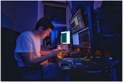
  • SLC-1L-08: Senior Photo

    This week, Ben, my youngest, graduates from high school. Which for any photographer dad also means senior photos. We obliged mom with a standard version, shot in the back yard with a soft box and underexposed foliage as a backdrop.

    But we also wanted to do something a little cooler, of the real Ben: at his desk, late at night, appropriately doing some kind of science/engineering.

    So this is what we came up with. Lit simply, the fill light was an on-camera flash. The key light was, well, a pencil.Read more »
    Strobist

  • How to Mix Lifestyle and Posed Photography Styles to Add Variety

    The post How to Mix Lifestyle and Posed Photography Styles to Add Variety appeared first on Digital Photography School. It was authored by Jackie Lamas.

    As photographers, we take time to hone in our craft and practice many hours getting it right. When it comes to photographing people, there are two main approaches in directing clients to get the photos you want. I’ll explain the difference between both, and how to apply the two during the same session to get the most variety in the final gallery that your clients will absolutely love!

    Mixing posed and lifestyle can add variety to your photos.

    What is lifestyle photography?

    Lifestyle photography is when you capture your clients a little more naturally than you would if you were posing them. It’s all about letting the session unfold naturally all while you photograph your couple, family, or individual being themselves.

    Lifestyle can mean going for a walk through a botanical garden with your clients.

    It’s also about showcasing the person in their daily life or routines too. For example, joining a family as they casually hang out at their home and bake together. Or joining a couple for coffee and a stroll through the park.

    Going for coffee while you photograph your clients can also be considered lifestyle.

    Lifestyle photography can be both natural or styled. Styled simply means curating the look so that even though the person is hanging out drinking coffee on their sofa, they are dressed and using items that make the photos have a cohesiveness.

    Using a styled home can also offer a great location for lifestyle photos of a couple hanging out in the living room.

    Much of what you see on Instagram can be considered lifestyle photography.

    What is posed photography?

    Posed photography is when you are directing your clients to sit, stand, and well, pose exactly how you would like them to. This gives you a more controlled and directive role in addition to being the photographer.

    Directing people to pose a certain way is posed photography.

    Posed photography can be really beautiful and usually lies in the editorial, fashion, or fine art styles of photography. However, posed photography can be used in every session where you want to control the final pose in your photo.

    How to mix both styles to get variety

    In a portrait session, it doesn’t matter if it’s family or just one person, mixing the two styles can really help add variety in the final images that you deliver to your client.

    Mixing styles

    When you’re starting the session, begin with posed photography because most clients are nervous at the beginning of a session. Getting them comfortable posing, and being more direct in how you want them to stand can help them to feel more comfortable in front of the camera.

    The photo on the left was lifestyle, and the right is posed. Same family, same session, two different styles that add variety to the final images.

    While you’re posing, show your client exactly how you want them to pose rather than merely instructing, which can get confusing.

    For example, instead of saying “put your left hand on your right elbow,” you would instead go over to where they are standing and show them how you want them to put the left hand on their right elbow.

    This is a quicker way to help your client visually see what you want them to do.

    After you’ve posed your client enough, and they seem a little more comfortable in front of the camera, go for the lifestyle approach.

    Tell your client to relax and walk around the area. If it’s a family, for example, ask them to walk and talk to each other while telling a funny joke. Make sure to keep your camera at the ready during these times. That way you can achieve photojournalistic style photos that make lifestyle so meaningful.

    With children, you can capture them playing with their toys and also get posed photos during the same session.

    As you go through the session, keep alternating between posed and lifestyle. You can also pose your clients, a couple, for example, so that they’re facing each other, take a few photos and then ask the couple to say one nice thing about the other.

    This is a great way to transition from posed to lifestyle. You will get authentic expressions from the couple because you are putting them in a particular pose then giving them something to do that will seem natural. It’s a perfect mix of the two styles at the same time.

    If you’re more comfortable with lifestyle and candid photography styles, don’t be afraid to stop your clients in mid-walk, hug, or whatever they are doing naturally to hold the pose. This is a transition from lifestyle to posed.

    Mixing the two styles offers your clients more variety as well as an overall great experience. They will feel more comfortable being in front of the camera because they were allowed to be themselves while you also stopped to make sure to get posed photos as well.

    Using both styles will give the session a more fluid flow and also allows your clients to have a good time during the session. This is especially important when photographing children. Letting them play and have a good time while mixing in posed photos will give them a fun experience.

    In conclusion

    lifestyle-and-posed-photography

    Mixing the two styles, lifestyle and posed photography, will add variety to your client’s photos and will also ensure that they have a great experience without feeling stiff or uncomfortable in front of the camera.


    The post How to Mix Lifestyle and Posed Photography Styles to Add Variety appeared first on Digital Photography School. It was authored by Jackie Lamas.


    Digital Photography School

  • How You Treat Your Subject in Photography Affects Your Photos

    The post How You Treat Your Subject in Photography Affects Your Photos appeared first on Digital Photography School. It was authored by Kevin Landwer-Johan.

    A great subject does not necessarily make a great photograph. The way you treat your subject will reflect in your photographs.

    © Kevin Landwer-Johan

    Don’t be a travel snapshooter. This is advice I frequently give people during our travel photography workshops in Chiang Mai, Thailand. There’s an abundance of interesting subject material here. As is often the case when you are outside your normal environment, it’s easy to think that grabbing a quick photo will suffice.

    Returning home with thousands of impulse photos will be a disappointment. If you don’t pay attention to creating an interesting photograph, the results will be lacking. Temples, monks, tuk-tuks and the likes are all interesting but can make rather boring pictures if you don’t treat them well.

    How to treat your subject well

    I watched this video about renowned Magnum photographer Elliot Erwitt recently. About halfway through he makes an interesting statement saying, “It’s not the subject, it’s how you treat the subject.” Unfortunately, he does not go on to expand this thought, but he certainly provoked curiosity in me.

    This idea is one I believe is very important to the development of your photography. The way you treat your subject influences the potential impact your photos will have.

    © Kevin Landwer-Johan

    Grabbing quick snapshots will typically produce lackluster results. Treating your subject with more attention and intent will compel you to make more interesting photographs.

    “Treat” is an intriguing word. Particularly in the context, Erwitt uses it in the video. It can be taken to mean the way you chose to artistically represent your subject. It could also mean the manner with which you:

    • Communicate with them
    • Act or behave towards them
    • Consider or regard them
    • Or, if you give them gifts

    Any of these will affect different responses from a living subject.

    Artistic treatment in photography

    Choices you make will influence the way your photos look and how your subject is represented.

    Photographing a beach on a sunny day when it’s full of activity, will look significantly different than on a winter’s afternoon with an overcast sky. Your choice of when you take a photograph is part of how you treat your subject.

    Timing when you photograph someone speaking can make them look attractive or not. Those open-mouthed, contorted faces we often see politicians with are used by news editors to portray them negatively. This treatment may seem unkind, but it is certainly intentional.

    © Kevin Landwer-Johan

    Lighting choice between soft or hard light alters the artistic treatment a subject is given. A wrinkled face will become more exaggerated using hard lighting at certain angles. The choice of a softer, more diffused light will be kinder to your subject.

    Composition is without a doubt influential on the way viewers will understand the main subject of any photograph.

    You can crop in tight, showing little or no context. This limits any relationship of your subject to its environment.

    A looser crop, made with careful intention, can include or exclude elements. This will influence the look and feel of your photographs.

    Contrast in color and tone within your photos helps a viewer determine the meaning of a photo. Pastels or soft tones provide a gentleness. High-contrast black and white or color combinations will induce a different look and feel.

    Your awareness of these aspects of photography allows you to make intentional use of them.

    © Kevin Landwer-Johan

    Relational treatment of your subjects

    This has more influence on subjects that can respond to you. The way you talk to a rock or flower will not have so much impact on the photos you make of it. Talking to your pet dog or goldfish will also elicit different responses.

    Doggie treats given during pet photo sessions can provide huge assistance to a photographer. Offering more food to your goldfish will not likely arouse a more favorable response from it.

    Speak politely to the person you want to photograph you’ll be more likely to receive a positive response. If you approach a stranger with uncertainty their response may not be so conducive to you getting a good portrait of them.

    Treating someone with a smile and an air of respect will provide you a more positive opportunity. Most people will respond well. Projecting a positive attitude during a portrait session will enable you to make more attractive photos. Your subjects will be more relaxed and assured.

    © Kevin Landwer-Johan

    Even when you’re traveling and may not be able to verbally communicate, a smile often does the trick. Approach someone with an open, happy look on your face with your camera in hand. This usually communicates your intention clearly enough. Add in a few appropriate hand gestures and watch for the person’s response.

    Take time to observe your subject

    When you’re not sure how to treat your subject, step back and observe for a while if you can. Don’t rush to capture your photo.

    Look at the environment and how your subject relates to it. Is it a prominent or a minor part of the location? Does it interact significantly with the surroundings? Can you find an angle that will suit the intention you have for your photo?

    © Kevin Landwer-Johan

    The more you understand about your subject, the better photos you will make of it. Understanding can affect the way you relate to any chosen subject.

    If you see someone who is shy and reserved, treat them in a similar manner. They’re more likely to appreciate it than if you boldly get in their face with your camera.

    A more extroverted person may require a different treatment. Be bolder. Be more effusive in your approach. Mirror back to them how you are experiencing them.

    Take some time to research. Engaging in longer-term projects, or even before heading away on holiday to somewhere new. Find out as much as you can about what you want to photograph.

    Do you want to photograph monks in Thailand? Is it okay to do so politely? Is this culturally fitting? Can you safely photograph beggars in San Francisco? Is street photography including people welcome in Paris? Knowing the answers to pertinent questions before you set out will enable you to treat your subject appropriately.

    © Kevin Landwer-Johan

    Conclusion

    The right treatment of your subject will result in more compelling photographs.

    Think about both aspects of treating your subjects. Considering the methods you use with your camera is one aspect. Communicating well with living subjects will influence the response you receive from them.

    Take your time to practice. Apply yourself well. You will see an improvement in your photographs.


    The post How You Treat Your Subject in Photography Affects Your Photos appeared first on Digital Photography School. It was authored by Kevin Landwer-Johan.


    Digital Photography School