Blog

  • Frame Within a Frame Photography: A Guide

    The post Frame Within a Frame Photography: A Guide appeared first on Digital Photography School. It was authored by Kevin Landwer-Johan.

    frame within a frame photography

    Frame within a frame photography is a creative technique that works in many genres of photography. But what is it, and how can you use it for amazing photos?

    In this article, we’re going to take a look at this composition “rule” – which you can apply very obviously or even very subtly in your photographs.

    So if you’re ready to create some unique images…

    …then let’s get started!

    woman framed by bus window
    © Kevin Landwer-Johan

    What is frame within a frame photography?

    Frame within a frame photography is all about positioning your main subject so it’s framed by something else within the scene. 

    You can use anything you like for this. For instance, you might use a full rectangular frame, like a door or a window. You could even use an actual picture frame.

    But frame within a frame photography is not limited to structures that completely surround your subject. 

    You can incorporate body parts and tree limbs as frames. Using rocks, plastic bags, or mannequins can be an effective way to add a frame within a frame. These things may occur naturally, or you can bring them in as props to include in your compositions.

    Two mannequins and a girl for frame within a frame photography
    © Kevin Landwer-Johan

    Frames in front and behind

    Typically, we think of a frame that surrounds a subject as being in front of it.

    But it doesn’t need to be.

    Because you can often effectively frame your subject with something that’s behind them.

    Here are three examples to illustrate what I mean:

    welder working in a round frame
    © Kevin Landwer-Johan

    In this first photo of the welder (above), I’ve used a hole cut in the steel to encircle the worker. There are also more holes in the panels behind him, though it’s the front hole that acts as the main frame.

    Monks walking through a gate in Thailand
    © Kevin Landwer-Johan

    In this second shot, however, while the gate pillars do frame the young monks, the contrast of the shadow on the wall also helps to frame the main subject.

    woman leaning on a window frame in a train for frame within a frame photography
    © Kevin Landwer-Johan

    Here’s a third example where I have used frames both in front of and behind my subject. By lining up the front and rear windows in the train carriage, I have managed to carefully frame the young woman.

    Depth in frame within a frame photography

    The woman on the train (above) is also an example of how using frames within a frame can help create an enhanced sense of depth in your compositions.

    This becomes even more exaggerated when you use a shallow depth of field. Blurring the frame shows that the frame and the subject are at different distances from the camera (and it also helps draw the viewer’s eye to your subject!).

    For instance, look at the photo below. The white pillars on either side of the dancer and the circular shape behind her head frame her well. And the shallow depth of field helps create actual depth in the image.

    Thai dancer for frame within a frame photography
    © Kevin Landwer-Johan

    Note, however, that you can use frame within a frame photography in circumstances where you convey no sense of depth.

    Sunset frames
    © Kevin Landwer-Johan

    Take a look at the photo above. Are the people walking in front of or behind the large palm trees? The trees create a nice frame, but because the key elements are silhouetted, there’s no visual information to reference depth.

    Composing with existing and created frames

    Some frames are more obvious than others. Unfortunately, more obvious frames tend to be a bit too common in photographic compositions – to the point that they become clichéd.

    So instead of using obvious frames, access your imagination. Look for unusual elements you can incorporate into your compositions. These can sometimes create interesting frames around your subjects.

    Frames don’t have to be physical; you can always use light and shadow as a frame. Look for areas of contrast that surround what you’re focusing on. Carefully position yourself and your subject to maximize the effect.

    Out-of-focus elements can also be used to create frames. When you have an object in the foreground that doesn’t form a complete frame around your subject, simply choose a wide aperture setting and make sure the foreground object is close enough to your camera. You’ll get a rather abstract form that can frame the subject and help lead the viewer’s eye into your picture.

    Take a look at the image below. Do you see how the blurred vegetation creates a frame around my subject?

    Thai dancer framed
    © Kevin Landwer-Johan

    Making use of what’s around you to create a frame can be very effective. Here, I have used the model herself to make a frame within a frame:

    woman making a frame with her fingers
    © Kevin Landwer-Johan

    Look for frames and you’ll find them

    Practice looking for frames, and you’ll begin to see them everywhere. Study the work of other photographers and see how they work with frames. Do a quick image search online for examples, and you’ll soon see how imaginative some photographers are with frames!

    Then go out with a camera. Like anything, the more you do frame within a frame photography, the easier it becomes. Set yourself the task of creating a frame within a frame every time you head out to shoot.

    That way, you’ll begin to train yourself to see situations where you can incorporate this compositional technique into your work.

    Frame within a frame photography: Final words

    Frame within a frame compositions are a great way to focus the viewer’s eye on your subject – and a great way to add depth to your photos.

    So make sure you get out and practice! As I explained, the more you practice, the sooner you’ll be creating stunning frame within a frame photos.

    Now over to you:

    Have you ever tried frame within a frame photography? Do you have any framing tips? What are your favorite frames? Share your thoughts in the comments below!

    The post Frame Within a Frame Photography: A Guide appeared first on Digital Photography School. It was authored by Kevin Landwer-Johan.


    Digital Photography School

  • Soft Proofing in Lightroom: The Essential Guide

    The post Soft Proofing in Lightroom: The Essential Guide appeared first on Digital Photography School. It was authored by Charlie Moss.

    soft proofing in Lightroom

    If you’ve ever printed without first soft proofing in Lightroom, you might have been surprised to find that your print didn’t match the image that you saw on your screen. Your print may have included inaccurate colors or incorrect tones.

    All because you didn’t soft proof!

    But don’t worry. It’s not a complicated process to soft proof your photos.

    And I guarantee:

    If you start soft proofing images before printing them, you won’t end up with prints that turn out different from how you expect them to look.

    So let’s discover all the key features of soft proofing, and how you can use it to get your prints looking beautiful.

    What is soft proofing in Lightroom?

    Soft proofing is the process of previewing an image prior to printing – in order to get a better idea of what that image might look like when actually printed. Soft proofing gives you the opportunity to make changes before sending along the digital file to be printed.

    The result, after soft proofing in Lightroom, is that your print will match the image you created on your computer.

    Taking this extra proofing step is the key to getting top-quality printed images.

    Why is soft proofing important?

    Without soft proofing, it’s almost impossible to tell what your printed photograph is going to look like.

    Why?

    Because every printer and printing surface will interact in a different way, meaning that your results will vary wildly from printer to printer and from printing medium to printing medium.

    Now, if you consistently order from the same print lab or you have your own printer at home, you may learn to predict the adjustments you need to get your images looking right. But this will only come from experience with particular printer and printing surface combinations.

    And as you can imagine, gaining this experience can be expensive, especially when you’re ordering premium prints and products!

    Why you need a calibrated display

    First things first:

    Before you do any soft proofing at all, you need a calibrated display.

    A calibrated display is essential if you want your prints to match the photographs you see on your computer monitor.

    By calibrating your display, you ensure that the colors are accurate. Most monitors will not have perfect color reproduction out of the box (not even the expensive ones!). Monitors are often too blue or too magenta, too light or too dark.

    Also, monitors don’t hold their color calibration for long periods of time – you need to keep calibrating them every three to four weeks.

    What is a printer profile?

    An ICC printer profile is a file that describes how a printing machine and paper will interact.

    A printer has to convert your image file into instructions for how to put ink on the paper, and each printer will do this slightly differently.

    Soft Proofing in Lightroom printer profiles

    But ICC printer profiles give you a way to predict how the printer will turn your digital file into a physical print.

    In fact, a good print lab will offer custom ICC printer profiles for you to download on your own computer. This lets you soft proof your digital photographs before sending them to be printed.

    How to load printer profiles into Lightroom

    Soft proofing begins with downloading printer profiles.

    Once you have downloaded the necessary printer profiles from your favorite print lab’s website, you’ll need to add them to your computer so that software such as Adobe Lightroom and Photoshop can find them.

    Fortunately, this is very simple. You just move the files to the correct operating system folder as follows:

    • Mac: Library/ColorSync/Profiles/
    • Windows: Windows\system32\spool\drivers\color

    Now the different profiles will be ready for use when you start soft proofing in Lightroom.

    How to soft proof in Lightroom

    Once a file is ready for printing (i.e., you’ve edited it to your heart’s content), head over to the Lightroom Develop module.

    There, in the bottom left-hand corner of the main window, you’ll find an option labeled Soft Proofing. Tick that box.

    the Lightroom soft proofing process

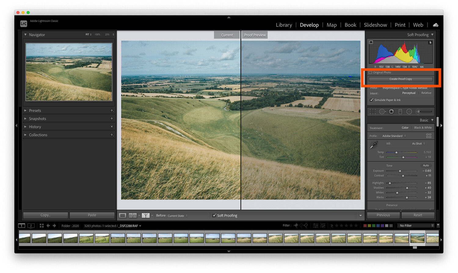
    Once you’ve activated the soft proofing option, you’ll find that your photograph moves onto a white background and some new options appear in the top right-hand corner of the screen (as indicated above).

    If you click the Profile option in the new Soft Proofing panel, you’ll find a list of profiles to choose from. If your new ICC printer profiles haven’t yet appeared on the list, then select Other at the bottom of the dropdown menu.

    A window will pop up, and you can select from the different ICC print profiles that are installed on your computer. Each option you pick will appear in Adobe Lightroom for soft proofing.

    choosing a profile when soft proofing

    Once you’ve selected your profiles and closed the window, pick the profile you want to use and make sure the Simulate Paper & Ink box is checked.

    Soft proofing challenges

    The challenge with soft proofing is that, as you can see below, the image won’t look the same as the original file once you’ve applied the soft proofing ICC print profile.

    In the example below, I’ve applied a profile for a metallic flex paper, and you can see that the image on the right is quite a bit darker than the original image. This means the print will likely be darker than we intended.

    To fix this problem, hit the button labeled Create Proof Copy:

    Soft Proofing in Lightroom proof preview

    This will create a duplicate image with your print profile embedded so you can make adjustments for printing. By creating a proof copy first, Lightroom will leave your finished image unchanged – even as you make adjustments to your file for printing.

    You see, on this new copy of the image, you can make adjustments while still in soft proofing mode. That way, you can ensure that what gets printed is exactly what you intended.

    So simply make adjustments to the proof preview using the Lightroom sliders until you like the result!

    Here’s one final technical check worth running:

    The gamut warning feature.

    In the left-hand corner of the histogram is a button that looks like a computer screen:

    clipping check when soft proofing

    If you toggle this setting on, your image may gain some striking blocks of color.

    The colors are simply warning you which areas of the image will not reproduce properly when you go to print. To get the best quality print, you should do your best to reduce (and ideally remove) all of these problem areas.

    To get rid of the warnings, try adjusting the saturation and exposure of your image.

    Soft proofing in Lightroom: Conclusion

    Many people see soft proofing for printing as unnecessary. They may get acceptable results already when printing, and they may have even learned to compensate while editing their photos to get the best prints.

    However, if your prints don’t match the images you’re seeing on the screen, it’s because you haven’t done any soft proofing. With enough experience, you’ll learn the adjustments to make for perfect print results. But this is a process, one where you have to learn by making mistakes – so don’t be discouraged if things don’t work out the first time.

    When you make your next print, give soft proofing in Lightroom a try. Calibrate your monitor, then soft proof your images with the correct ICC print profiles.

    I guarantee it will improve the quality of your print!

    Now over to you:

    Have you ever tried soft proofing your prints? How did it go? Do you think you’ll start soft proofing before printing, now that you’ve read this article? Share your thoughts in the comments below!

    The post Soft Proofing in Lightroom: The Essential Guide appeared first on Digital Photography School. It was authored by Charlie Moss.


    Digital Photography School

  • 8 Ideas for Awesome Abstract Photography

    The post 8 Ideas for Awesome Abstract Photography appeared first on Digital Photography School. It was authored by Anthony Epes.

    8 ideas for abstract photos

    In this article, I plan to share some inspiring abstract photography ideas.

    Now, I would never describe myself as an abstract photographer, yet I seem to have shot countless abstract photographs. In fact, I try not to assign myself to any genre. To me, that feels like the opposite of what photography should be – which is a place to have fun, to be curious, to explore, and most importantly, to give your imagination free rein.

    I start the article like this because I want to encourage you not to be intimidated by this genre. Don’t worry about getting it right. Abstract photography should be a place of complete freedom. 

    And this is why the most important quality for abstract photography is imagination

    broken down wall

    What is abstract photography?

    For me, abstraction is about removing what’s in the world around us from its familiar context. It involves playing with elements and subjects, moving them away from their usual settings and placing them into new situations – so that they become something else entirely.

    I find that doing abstract photography brings us into that childlike realm of imagination and makes us often think, “What is that?” Or, “That reminds me of…” Then our minds go off into dreamlike worlds.

    smashed vegetable abstract photography ideas

    “Abstraction demands more from me than realism. Instead of reproducing something outside of me, now I go inward and use everything I’ve learned thus far in my life.” – Susan Avishai

    Therefore, I like to approach this genre as a way for us to have fun with our photos, the world around us, and ourselves. I’ll share eight abstract photo ideas that I hope ignite your imagination, and get you excited about exploring abstract photography!

    Let’s get started.

    abstract photography ideas balloon

    1. Use your imagination as much as possible

    abstract photography ideas

    “Abstraction allows man to see with his mind what he cannot see physically with his eyes…Abstract art enables the artist to perceive beyond the tangible, to extract the infinite out of the finite. It is the emancipation of the mind. It is an exploration into unknown areas.” – Arshile Gorky

    Doing abstract photography feels like I am trying to detach myself from reality and delve into a space where everything around me is a new sight, a new sensation, or a new experience.

    I look around and see elements, colors, shapes, lines, textures – each is almost separate from the other. I am looking for things that are connected, but in a different way to how my mind usually puts things together.

    Then it’s my imagination that kicks in and starts creating all kinds of ideas about what things look like. To me, the photo above looks like something coming from the cosmos, the beginnings of a new world.

    (In reality, it’s some slime floating around in water, which I played with in Lightroom.)

    So use your imagination constantly. When doing abstract photography, don’t let “conventional” thinking get in the way!

    haunting idea for abstract photography

    2. Search for textures

    Textures are a fascinating subject to explore. When you focus on textures, you capture a tactile quality in your photos. You make people want to lean in and touch something.

    And you often give very ordinary things – water, brick, wires, or stone – an inviting feeling.

    Today, we are often so disconnected from the ordinary (i.e., what we perceive as the boring world around us). We are so often lost in thought that we’re only jolted out of it when we see spectacular things – like beautiful views, intense sunsets, etc.

    But all around us are terribly ordinary subjects that can be so very intriguing, if only we viewed them with our sense of wonder! So instead of capturing a snapshot of an intense sunset, try looking more closely at some “boring” subjects to see what textures you can find!

    abstract photography ideas

    3. Shoot the ordinary

    “The longer you look at an object, the more abstract it becomes, and, ironically, the more real.” – Lucian Freud

    I love to shoot random, day-to-day subjects that I find all around me. I challenge myself to make these subjects seem interesting.

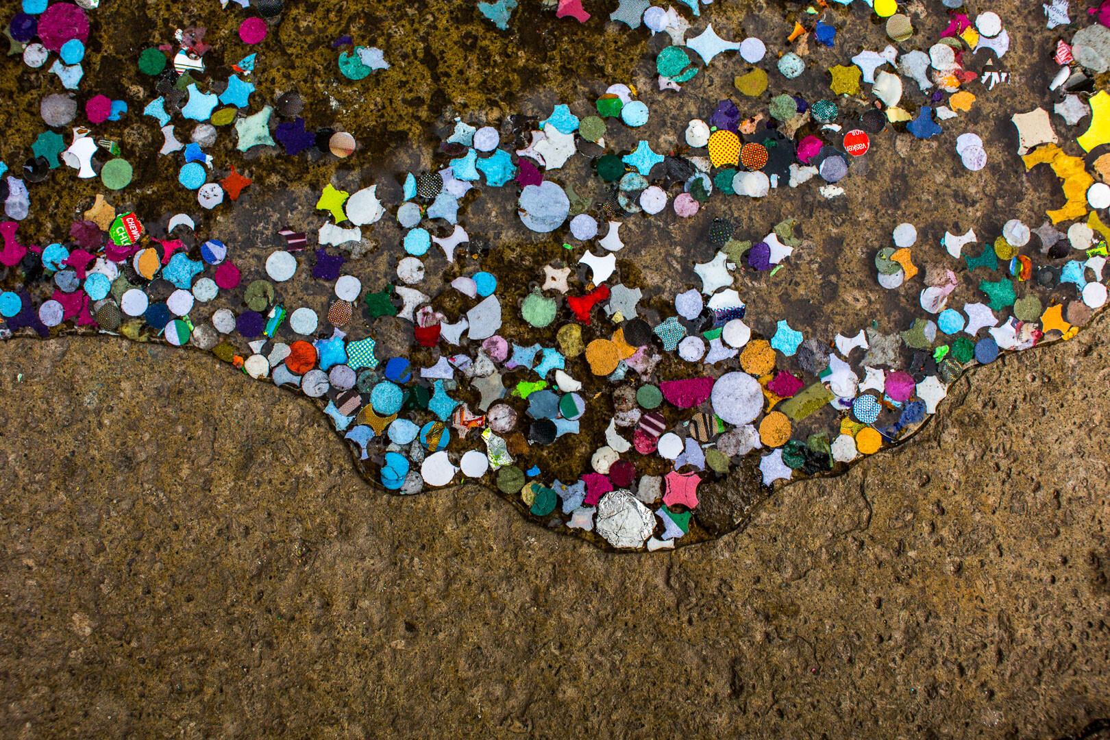
    For instance, I am always on the lookout for torn posters on a wall – especially when they are bathed in beautiful light – as well as weird things I find on the street at my feet.

    In fact, starting with what you find at your feet is a great way to do abstract photography! 

    abstract photography ideas

    Here’s why:

    Everything, when you pay attention to it, can reveal different qualities than what we first notice. And our challenge as photographers- as artists, no less – is to find the most interesting way to shoot whatever catches our attention.

    Maybe you need to take a different perspective – lying on the floor, getting up high, or changing angles. Or maybe, by using the quality of the light, you can turn the subject from ordinary to fascinating. 

    yellow on blue shapes

    Or perhaps you could even use color to give boring, unoriginal subjects interest and depth:

    tangled wires against a wall

    4. Include mystery in your abstract photos

    “Abstraction generally involves implication, suggestion and mystery, rather than obvious description.” – Robert Genn

    The appeal of abstract photos for me is very much about mystery. Creating something that doesn’t look as it should, displacing your subject, mixing up reflections, creating contrasts and jarring juxtapositions – it’s all a fun part of making the world less real and more mysterious. 

    You can combine shapes together to create something that makes no real sense, but still sparks ideas and thoughts in the mind of the viewer. 

    abstract photography ideas

    In the photo below, I captured this reflection of a man on what I like to think is a moon landscape inhabited by interesting-looking creatures.

    abstract photography ideas

    At least, that’s what I see when I look at the photo. What do you see? It might be completely different!

    5. Aim to capture the feeling of your subject 

    “Of all the arts, abstract painting is the most difficult. It demands that you know how to draw well, that you have a heightened sensitivity for composition and for colors, and that you be a true poet. This last is essential.” – Wassily Kandinsky

    In my photo teaching, I talk a lot about having a heightened awareness and sensitivity to the world.

    Because if you want to find incredible photos wherever you go, you must have the ability to see more of what’s around you than you can when you are lost in your thoughts.

    Now, with that heightened sensitivity comes increased feelings and impressions of what you see.

    And thinking about the feeling you have when you look at your subject is so important. If you aren’t feeling anything, you won’t be able to communicate anything in your photos.

    But if you do feel something when you look at your subject…

    …you can channel it into the photo for a beautiful result! 

    stones in water abstract

    I like the sensations I get when I look at the texture photos above. It’s perhaps a sense of awe at the water and the beautiful colored stones. I can almost feel the water, and that feeling is translated through the photo. 

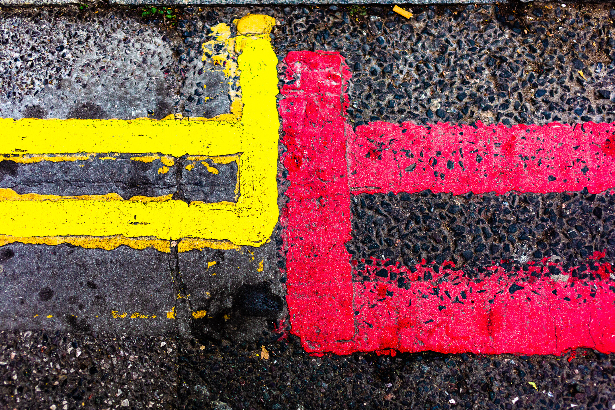
    In the photo below, perhaps I get a feeling of fun, thanks to some bright colors on what I remember to be a dull London day:

    red and yellow road labels

    6. Find subjects that stop you in your tracks 

    I strongly urge you to cultivate a sense of wonder.

    Why?

    I think we often get so jaded by the world around us – that is, we are so busy with our lives and worries and things to do – that we stop finding things awe-inspiring. It takes more and more to make us stop in our tracks and say “Wow!”

    But we photographers have a gift:

    We are visual people.

    We just have to make sure we’re always refreshing our vision and our sense of wonder at the world around us.

    And we must go seek subjects that makes us feel awe. 

    rocks on water with reflection

    I believe that we don’t always need new subjects and exotic locations. We can be impressed by things that are right on our doorstep. Therefore, going out with the intention of finding something that makes you go “Wow!” or “Cool” or “Interesting!” is a great thing to do.

    Work on always trying refresh your eyes, so that you can be impressed by mundane subjects (this also refreshes the spirit!).

    In the photo below, the faded street markings look like a sign in an unknown language. Maybe even a secret message.

    abstract photography ideas

    I find that the easiest way to refresh your eyes is to go out with the goal of having fun in your photography. Try to find something that makes you laugh. 

    In this shot of gnarly wood below, I might have photographed a frog, or maybe an alien! 

    tree trunk knots

    That, for me, is the essence of abstract photography:

    Creating a new world, a new vision, and a new experience from this very familiar (yet still awe-inspiring!) world around us. 

    7. Use perspective for an unusual take on your subject

    By changing perspective, you can create cool new images of otherwise dull subjects. 

    building with sky reflection

    By shooting upward and not focusing on the entire scene, I captured this image:

    lights on the ceiling with surrounding windows

    So make sure you don’t always shoot using the same boring, eye-level perspective.

    Instead, mix things up a bit! Experiment with changing your vantage point or your angle.

    Make sense?

    8. Break down the world into elements 

    In photography, you must learn how to see the world as a series of elements, and then learn to arrange these elements in pleasing and interesting ways.

    Ultimately, you should be looking at the world as a series of elements, and not as a vast, interconnected whole. 

    This is relevant to all genres of photography. Gaining a sense of control over the elements you place in your scene, what elements you use to support your subject, and what elements you remove from the composition is a great way to improve your abstract photos. 

    abstract photography ideas

    This idea of breaking the world down into elements is particularly useful when doing abstract shooting, because you are looking at the world afresh and trying to use your imagination to create something that is super interesting – and also super unique! 

    Abstract photography ideas: Conclusion

    Hopefully, you’ve found some exciting abstract photography ideas to try – and you’re ready to get out and start shooting!

    So grab your camera and take some photos.

    And make sure to have lots of fun while you’re at it!

    Now over to you:

    Have these abstract photography ideas helped you see what’s possible in your photography? Do you shoot abstracts, or will you now? Let me know in the comments below!

    The post 8 Ideas for Awesome Abstract Photography appeared first on Digital Photography School. It was authored by Anthony Epes.


    Digital Photography School

  • Canon unveils AI-powered automatic camera, the PowerShot PICK

    Canon has launched a campaign on the Japanese crowdfunding site Makuake for an AI-powered camera, the PowerShot PICK. The campaign has proven to be highly successful, attracting nearly ¥100,000,000 in support. The goal was ¥1,000,000.

    The experimental PowerShot PICK camera can analyze a scene, identify people, track their faces and then, using artificial intelligence, determine the ideal moment to capture a photo. In a rough translation, Canon refers to the PICK as an ‘automatic shooting camera.’ The PowerShot PICK combines Canon’s optical, video processing, and artificial intelligence technology.

    In terms of design, the PowerShot PICK is a compact, modern-looking device. It has been designed to blend in, while Canon has also considered ways to give the PICK some character. You can also take the PICK with you when you leave the house, such as when going to a family gathering or an event. You can place the PICK on a tripod as well, and Canon is offering special Velbon tripods as part of the campaign.

    The PowerShot PICK uses a 1/2.3-inch 12MP CMOS image sensor. The sensor is paired with a 19-57mm equivalent zoom lens with a maximum aperture of F2.8. The PICK includes built-in image stabilization. The PICK pans 170° in both directions and can tilt 110°. The PICK records to a microSD card and weighs a mere 170g. As you can see in the video above, the PICK is small, with a height of about 3.5″ (90mm) tall.

    The Canon PowerShot PICK is a compact device. It has a 360° field of view and incorporates a 12MP image sensor. Image credit: Canon on Masuake

    While the PICK is designed to take photos automatically in the background, which Canon believes will result in more authentic images and better mementos, the PowerShot PICK can also be manually controlled using keywords. A user says, ‘Hello PICK,’ followed by commands to take a photo, record video, change subjects and stop capturing.

    The PICK will launch alongside a dedicated smartphone app, allowing you to view and share photos and videos captured by PICK. The app automatically recommends the best photos, although you can view all images.

    The setup process promises to be easy. After pairing with your smartphone, which is required, you simply power on PICK and place it somewhere, depending on the situation. You could place it on a table at the center of a family meal, on a tripod near an event, on a bookshelf, etc. As mentioned, although PICK can operate automatically, it can be controlled using voice or by using the smartphone app.

    The Canon PowerShot PICK is currently available only to backers on Makuake. The price for the PICK works out to just under $ 400. Given the campaign’s success, the only remaining units are for the PICK and charging cable. The tripod bundle has sold out. Canon intends to ship the PICK to backers this July. Canon hasn’t announced global or public release plans, so it’s unclear if the PowerShot PICK will be available outside of Japan. You can learn more about the PowerShot PICK by visiting Makuake.

    Articles: Digital Photography Review (dpreview.com)

  • Beginner’s Guide to Light Painting

    The post Beginner’s Guide to Light Painting appeared first on Digital Photography School. It was authored by Bruce Wunderlich.

    a beginner's guide to light painting in photography

    Do you want to use light painting for stunning results? Do you want to discover all the ins-and-outs of light painting so you can create otherworldly images at night?

    You’ve come to the right place.

    In this article, I’m going to share everything you need to know about light-painting techniques.

    And by the time you’re done, you’ll be able to light-paint your images with ease!

    Let’s dive right in.

    light painting for beginners
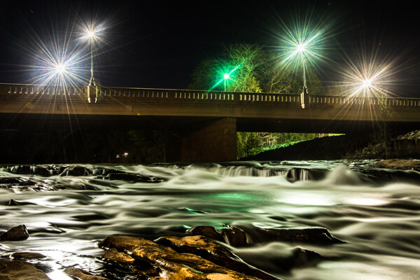
    Mill Falls in Logan, Ohio. The main source of light for this scene was the street lights on the bridge over the river. The bridge was light-painted with a high-powered spotlight. I also added light to the rocks in the foreground. The exposure was 69 seconds, and I set the aperture to f/14 to maximize the starburst on the street lights. This image won me a Photographer’s Choice award in the 2014 Shoot the Hills photo contest.

    What is light painting?

    Light painting is a photography technique that uses a moving light source (e.g., a flashlight) to add light to a subject while taking a long-exposure photograph. A scene or object can be brought to life by painting with a beam of light.

    When light painting, you, the photographer, become an entirely different kind of artist. Instead of just capturing an image as it’s presented, you create the image that the camera is capturing.

    Now, light painting may take lots of patience and practice to perfect, but the results can be very rewarding.

    And it’s important to recognize the simplicity of lighting painting – it’s a lot like any low-light photography, except you are putting an external light source in motion to enhance an image.

    Let’s take a look at some of the basics for beautiful light painting photography.

    school house in snow
    Schoolhouse in the snow. This was a long, 170-second exposure, shot at f/8 (for depth of field) and ISO 100. Notice the light coming from inside the schoolhouse, added from the outside by shining a flashlight through windows at the back of the building.

    Tools for light painting

    Before you start doing light painting, you’ll need to make sure you have the proper tools:

    • Camera – Any digital camera capable of manual settings (including Bulb mode).
    • Tripod – One of the most important tools to produce light paintings. In most cases, your shutter is going to be open for several minutes, and it is very important that your camera does not move during the exposure.
    • Shutter release – Either use a cable release or a remote shutter release to begin your exposure. If you don’t have either of these, use your camera’s self-timer function to initiate the shot. It is very important that you never touch your camera or tripod during the exposure.
    • Stopwatch – A stopwatch or some other way of timing your exposures is helpful, since most light-painting exposures will use Bulb mode.
    • Light source – Many different types of lights can be used for light painting. These light sources are your “brushes” and may include flashlights, torch lights, lasers, glow sticks, flashes, cell phones, and even candles. Just about anything that can produce light can be used for light painting. Note that different light sources will produce different colors of light. For example, an LED light source will produce a cooler (blue) colored light, while a halogen source will produce a much warmer (orange) colored light.
    • Color gels – Color gels can be used to alter the tint of your light and add color to your painting.
    light painting farmhouse
    30 seconds | f/8

    Camera settings

    Now let’s take a look at the best camera settings for light painting:

    • Mode – Shoot in Manual mode, which allows you to set your shutter speed and aperture.
    • Image quality – Set your image quality to RAW, which allows you to capture as much information as possible. (This is not a necessity, but it is an important recommendation.)
    • White balance – If you want to balance out your artificial light source, choose either the Incandescent or Tungsten white balance setting. However, sometimes experimenting with other white balance settings can produce some interesting light effects. Daylight white balance is a good starting point if you want to maintain the original colors of your artificial light sources. Auto White Balance is not recommended.
    • ISO – Use a low ISO, such as 100.
    • F-stop or aperture – Stop down to f/8 or f/10, which allows you to get more depth of field and enables you to use a longer shutter speed.
    • Shutter speed – Set your shutter speed to Bulb mode (your final shutter speed will be determined by the amount of ambient light in the scene).
    • LCD brightness – Lower the brightness of your LCD preview, because the normal setting is too bright at night and will make your image look bright when it’s actually underexposed.
    • Histogram – Use your histogram to check your exposure. If the histogram skews heavily to the left, your image is going to be too dark.
    • Blinkies – Turn on your blinkies (a highlight warning) to help you determine if your highlights are exposed properly. It is perfectly acceptable for your brightest highlights to be slightly clipped if the rest of your image is properly exposed.
    • Image stabilization – Set this to Off. With your camera on a tripod, having image stabilization turned on can actually fool your camera or lens and cause blurring in your image.
    • Long exposure noise reduction – The recommended setting is Off. This can be set to On, but it will cause your exposure time to double (because the camera takes a second black exposure to help remove noise). If your camera is set to a reasonable ISO, the noise level will be low enough in most cases that in-camera noise reduction is unnecessary. Still, it is a good idea to check your noise levels in advance, and some older cameras may require this setting to be On to get acceptable noise levels.
    still life flowers
    This vase was backlit with a candle and I painted the flowers with a small penlight.
    30 seconds | f/16 | ISO 100.

    Begin with ambient light

    The first step – before the actual light painting – is to determine the correct exposure for any ambient light in your scene.

    Unfortunately, determining base exposures can be time-consuming when you’re experimenting with three- to four-minute shutter speeds.

    Here’s a little trick that can help expedite this process:

    1. Set your ISO to six stops higher than the ISO you plan to ultimately use. For example, if you are planning to shoot at ISO 100, set your ISO to 6400.
    2. With your camera set to ISO 6400, experiment to find out how many seconds you will need for a nice exposure. Every second of exposure at ISO 6400 is equal to one minute at ISO 100.
    3. Once you’ve determined the proper shutter speed at ISO 6400, set your ISO back to 100 and prepare your exposure in minutes instead of seconds. (Many camera’s lowest ISO is 200, so 6 stops higher would be ISO 12800. And if your camera’s lowest ISO is 50, six stops higher would be ISO 3200.)
    person with arms raised to the sky
    A 30-second exposure at ISO 800. For this image, I increased the ISO to shorten the exposure to 30 seconds, because a longer exposure would cause a noticeable blur on the stars. Light painting was applied from the front of the subject, without letting the light shine directly back at the camera.

    Focusing

    Correctly focusing your camera is an important step – and in the dark, it can sometimes be difficult to pull off. The simplest way to get perfect focus is to shine a light source at a spot in your scene that you’ve determined must be in focus.

    Then, using autofocus, focus on the light.

    Finally, switch your lens from autofocus to manual focus (so that your focus point won’t change).

    But remember:

    If you move the camera, you must turn your autofocus back on and refocus. 

    (Back button focusing is another great way to achieve focus when light painting.)

    The exposure

    At this point, you should have determined your exposure time, and your camera should be focused on your subject.

    So now it’s time to begin your exposure and start painting! 

    Most cameras allow you to set exposures of up to 30 seconds. For exposures over 30 seconds, set your shutter speed to Bulb. Use your cable release or remote to trigger your shutter button. Your shutter will remain open until you press the release again. Use your stopwatch, or the timer on your phone, to time the exposure length.

    1971 VW bus light painting
    This vintage 1971 bus was painted using one LED flashlight on the outside, with a second light inside to illuminate the bus interior.

    Painting techniques

    Light painting is subjective, so you’re free to approach it however you like.

    But here is some advice for getting the most impressive results:

    • Paint from the sides – Don’t just stand behind your camera and wave the light across your image. Painting flat surfaces from the side will allow you to bring out textures.
    • Use lots of different angles – For instance, when painting the ground, hold the beam low and pan the light along the floor. This will keep the ground from appearing flat, and it’ll bring out all the details of the surface. Also, by adding light from many angles, the resulting image will have an interesting three-dimensional effect.
    • Don’t stand between the camera and your light source – If you do this, you will show up as a silhouetted ghost in the final photo!
    • Wear dark, non-reflective clothing and keep moving – Again, you do not want to appear as a ghost in your image!
    • Don’t shine the light source back at the camera – Otherwise, you’ll create a bright spot in the image.
    • Use a flashlight with a red filter when you check your camera to make adjustments. The red light will keep you from ruining your night vision.
    • Different surfaces are going to react to light differently – Wood surfaces may require more light than shiny surfaces such as metal or glass, because rougher surfaces absorb more light than smooth surfaces.
    • Keep your light moving – Move the beam in slow strokes to add lots of light and make faster strokes in areas where less light is needed.
    • Paint in up-and-down or side-to-side strokes, just like you’d work with real paint.
    • You probably won’t get the shot you want on the first try – It may take multiple attempts to get an image that you’re satisfied with. For this reason, try to keep track of how much light you add to each surface. Develop a plan so that you can make adjustments to each exposure until you get the image you’ve visualized.

    A beginner’s guide to light painting: Conclusion

    I’ve shared lots of tips and techniques to get you started with light painting, but there is so much more you can do with the medium! Be creative and fearless about trying new things.

    Once you start to get the hang of light painting, there is no limit to the images you can create – all you need is a camera and a few creative light sources. 

    Now over to you:

    Which of these light painting tips is your favorite? Have you tried light painting before? Do you have any additional tips or tricks for great light painted photos? Share your thoughts in the comments below!

    The post Beginner’s Guide to Light Painting appeared first on Digital Photography School. It was authored by Bruce Wunderlich.


    Digital Photography School

  • Fujifilm Announces the X-E4, With 26 MP and 20 FPS (for Just $850)

    The post Fujifilm Announces the X-E4, With 26 MP and 20 FPS (for Just $ 850) appeared first on Digital Photography School. It was authored by Jaymes Dempsey.

    Fujifilm announces the X-E4

    Earlier this week, Fujifilm announced a spate of new mirrorless gear, including the Fujifilm X-E4, a compact, rangefinder-style camera designed for enthusiasts, street photographers, and more.

    The X-E4 offers no handgrip and none of the standard Canon/Nikon/Sony mode dials. Instead, you get a minimalist, flat profile (though you can buy an attachable handgrip), plus a shutter speed dial and an exposure compensation dial, reminiscent of the film days. This makes for a tactile photographic experience, as you rotate thick dials to change your camera settings – and you even have the option of purchasing Fujifilm lenses with aperture rings, if you’re hoping to take the “old days” experience a step further.

    While the lack of a handgrip might annoy some photographers, it compresses and lightens an already-compact camera, making the X-E4 an excellent purchase for street photographers, travel photographers, and other walkaround shooters who don’t want the inconvenience of carrying a huge camera around their neck. 

    On the back of the X-E4, you’ll find a decently-specced electronic viewfinder (it offers 2.36M-dot resolution, which is neither especially low nor especially high but should get the job done). If you’ve spent time working with a DSLR’s optical viewfinder or a mirrorless camera’s EVF, you’ll know how important a viewfinder is for any type of action or low-light shooting. There’s also a nice flip-up LCD, perfect for capturing shots at tough angles, and essential for vloggers needing to monitor themselves while filming. 

    Then there’s the X-Trans sensor, which offers 26 MP of detail. Fujifilm APS-C images are consistently superb, and the X-E4 will doubtless continue the company’s dominance in this area; I could easily see the X-E4 creating top-notch files for street photography and portrait photography, as well as for more detail-demanding genres such as landscape photography.

    Of course, no Fujifilm camera is complete without a handful of Film Simulation modes. Here, the X-E4 is outfitted to include film looks such as Velvia, and if you’re anything like me, you’ll have a blast switching through all the different simulations and watching as the EVF previews the world in vivid color, black and white, and even sepia.

    As for action capabilities, the Fujifilm X-E4’s autofocus speed remains to be seen, but the press release claims “fast and accurate autofocus” that can nail subjects in “0.02 seconds.” You also get 8 frames per second when working with the mechanical shutter, and this leaps to 20 fps with the electronic shutter (higher still if you’re willing to accept a 1.25x crop!), which is more than enough for serious sports shooting.

    So for photography enthusiasts looking for a compact camera packed full of high-end specifications and capable of pro-level image quality, I highly recommend checking out the X-E4. While the camera won’t ship until March, you can currently preorder an X-E4 for just $ 850 USD.

    Now over to you:

    What do you think of the Fujifilm X-E4? Is it a camera you’d be interested in buying? What would you use it for? Share your thoughts in the comments below!

    The post Fujifilm Announces the X-E4, With 26 MP and 20 FPS (for Just $ 850) appeared first on Digital Photography School. It was authored by Jaymes Dempsey.


    Digital Photography School

  • Adobe Camera Raw vs. Sony Imaging Edge Desktop: Which is your best bet?

    For most photographers, the digital darkroom is based around payware or subscription software from the likes of Adobe, Capture One, DxO or one of their many rivals. But if you’re a Sony shooter, there’s an option which is available entirely free of charge along with your camera purchase: Sony Imaging Edge Desktop.*

    Sony Imaging Edge Desktop version 3.0’s user interface.

    In this article, we’ll take a look at how Imaging Edge Desktop compares with the 800-pound gorilla in the room, Adobe Camera Raw, whose algorithms also underpin the company’s popular Lightroom Classic application. As with previous articles in this series, I’m limiting myself only to still image editing in the interests of keeping things to a readable length, and won’t address features like image management, tethering or printing.

    *Sony does include a version of Capture One, called ‘Express,’ with camera purchases, which we’ll investigate in a future article.

    The ground rules

    This comparison is based upon the most recent versions of each application at the time of writing. For Adobe, that’s Camera Raw 13.0 and Bridge 11.0. For Sony, it’s Imaging Edge Desktop 3.0. My computer is a 2018 Dell XPS 15 9570 laptop running Windows 10 version 1909.

    To ensure neither Adobe nor Sony had any advantage out of the gate, I’ve aimed to reproduce, as closely as possible, the look of already-processed images from our galleries, without any prior knowledge as to the recipes behind them.

    Adobe Camera Raw version 13.0’s user interface.

    I’ve chosen images from the Sony A7 III (ILCE-7M3) for use in this comparison, as its been available for long enough for Adobe to fine-tune its rendering, while its price tag and resolution are broadly similar to those of the Canon EOS R and Nikon Z6 used in my previous manufacturer software comparisons.

    Sharpness and noise reduction were left at their default settings to avoid overcomplicating things, while lens corrections were enabled for both applications. Images processed in ACR were saved at JPEG quality 11, just as used in our galleries. For Imaging Edge Desktop, which offers a choice of just four different compression levels, I used the maximum quality.

    The main differences

    Of course, the most immediately obvious differences between ACR and Sony’s Imaging Edge are their camera support and price tag. You already paid for Imaging Edge when you bought your Sony camera, so it’s effectively free. While it only supports Raws shot by the company’s own cameras, you can expect full Raw support for every Sony camera to be available pretty much immediately upon release.

    Imaging Edge’s shadow and highlight sliders don’t give you as much latitude as the same sliders in Adobe Camera Raw, so shadows can only be lifted so far – even with D-Range Optimizer enabled.
    Download the full ACR image here; the full Imaging Edge image here.

    By contrast, ACR requires a recurring subscription fee. It supports a vast range of cameras from many manufacturers – including every single interchangeable-lens or large-sensor Sony camera made to date – but that support can sometimes take a while to arrive after the release of new models. It’s also sometimes more limited than that in first-party software, especially for older models.

    For example, while Adobe offers ‘camera matching’ profiles for most recent Sony cameras, it’s not yet available for the recently-launched A7C. Nor has it been provided for any Translucent Mirror model made before 2014, or any Sony DSLR model at all.

    A clean, modern interface with good multi-monitor support

    Imaging Edge Desktop offers a twist on a modal interface. The initial install is merely a launcher which in turn installs and then launches separate viewer, editor and tethering apps. These can run separately or simultaneously, and can span multiple monitors. The editor app can’t browse entire folders of images, but you can open individual shots directly from within and stay out of the viewer app entirely, should you choose. Web help is available through the menu system, but it’s quite abbreviated.

    We’ve found that Imaging Edge uses a bit stronger noise reduction by default, though in some cases its finer-radius sharpening will tease out the finest details a bit better; but ACR has a ‘punchier’ look.
    Download the full ACR image here; the full Imaging Edge image here.

    The user interface is really quite straightforward and very clean, although it does involve a lot of scrolling. Buttons in Imaging Edge and the individual apps launch the other apps, and the editor sports a single scrollable toolbar whose 14 sections can be rearranged or hidden. Thumbnails of currently-opened images line the bottom of the screen, but they’re tiny and not terribly useful even at Full HD resolution, and lots of space is wasted on the filenames. Nor can you move them to the side of the screen, unfortunately.

    Unlike most rivals, Imaging Edge doesn’t treat your Raw files as sacrosanct

    Sliders move smoothly, but some control names are a bit unintuitive like “overshoot” / “undershoot” for the sharpness control, or “magnification chromatic aberration correction”, neither of which are explained in help. There are also no automatic controls other than those for white balance, dynamic range and noise reduction.

    A risky data strategy and not the best standards compliance

    Sadly, while Imaging Edge plays nicely with pens and touch screens, it doesn’t support 4K monitors terribly well. Many user interface elements are too small for comfortable use, and Windows’ scaling setting is mostly ignored. Imaging Edge also doesn’t follow Windows keyboard conventions like tabbing between controls, and you can’t customize the keyboard shortcuts at all. And there are some occasional bugs; for example on canceling processing of a brief six-image batch, the program stopped functioning for multiple minutes and had to be force-closed.

    Overall, I did find it easier to get more pleasant foliage and sky color out of Imaging Edge than Adobe Camera Raw.
    Download the full ACR image here; the full Imaging Edge image here.

    That’s doubly worrisome because unlike most rivals, Imaging Edge doesn’t treat your Raw files as sacrosanct. Instead of using a database to store its edits, or putting them in sidecar files in the same folder, Sony instead saves them in the headers of the original raw file.

    The company has already been bitten by this approach once in the past with a separate application, PlayMemories Home, and in 2018 had to release a tool to correct that app’s corruption of Raw files. To avoid this issue, I recommend using Imaging Edge solely with copies of backed-up images.

    Curiously, batch processing is not available in Edit mode, even if you have multiple images open. It’s available only from the Viewer window, and provides fairly limited possibilities for renaming your output images. Imaging Edge also only has a choice of four compression levels, and there’s a huge gap in quality between the highest (~15MB/image) and second-highest (~5MB/image) levels.

    Reasonable if pedestrian performance

    Compared to ACR, Sony Imaging Edge’s performance is reasonable, but it’s not going to light any fires. Where ACR takes just 12 seconds to process six images, Imaging Edge takes around 21.5 seconds when saving highest-quality JPEGs. Admittedly, dropping the quality level one step reduces this to just a hair under 20 seconds, but it also slashes files sizes by two-thirds.

    You can see here how much more highlight detail Adobe Camera Raw is able to save in the windows, though the softer overall tonality of the Imaging Edge version isn’t unpleasant.
    Download the full ACR image here; the full Imaging Edge image here.

    While previews are two-pass, they update fairly quickly, usually within a second or two of releasing the control. This is still nowhere near as quick as Adobe’s near-real time previews, however. And they sometimes don’t update the whole screen at once, with a tile or two of the overall result occasionally needing a few additional seconds to finally fill in.

    Very similar controls to ACR, but not all as effective

    Sony Imaging Edge Desktop’s editing controls are broadly similar to those on offer in Adobe Camera Raw, including the highlight and shadow sliders that many other apps lack. It also allows display not just of clipped highlights and shadows, but out-of-gamut colors. It foregoes ACR’s texture and vibrance controls, but adds a D-Range Optimizer slider with auto mode.

    In many cases, it’s just hard to balance dynamic range and contrast in Imaging Edge.
    Download the full ACR image here; the full Imaging Edge image here.

    D-Range Optimizer does a pretty good job of lifting shadows, but the highlight and shadow sliders are nowhere near as effective as their Adobe equivalents, and the highlight slider in particular didn’t seem capable of recovering much detail at all from blown highlights, even when ACR could do so with ease. I found the best results with more difficult images tended to send me to the curves tool, whereas Adobe could get the results without needing to fiddle with curves.

    Sony’s noise reduction is rather more heavy-handed

    By default, Imaging Edge uses higher levels of noise reduction than Camera Raw, and Adobe produces crisper results out of the box. With that said, you likely won’t notice the difference unless you’re pixel peeping or making large prints, where Adobe’s NR has a finer-grained look.

    Noise reduction levels in both apps can be dialed back from that default. Imaging Edge also offers an “off” setting, but Sony’s app still applies more noise reduction than Adobe’s, even when that’s used. Setting NR to off definitely applies less noise reduction than simply zeroing out the sliders in manual mode, though, especially when it comes to chroma noise.

    I found ACR to do a better job with skin tones. Imaging Edge tended a bit towards the magenta, but in turn delivered more convincing skies and foliage than ACR. Of course, you can improve color in either app by fiddling with the sliders, but ACR has an auto mode to get you in the ballpark, whereas Imaging Edge requires you make corrections manually.

    Another example where Adobe Camera Raw is able to take advantage of remaining highlight information better than Imaging Edge.
    Download the full ACR image here; the full Imaging Edge image here.

    Final thoughts

    Sony Imaging Edge Desktop looks and feels more modern than some of its rivals from other camera manufacturers, but I still found Adobe Camera Raw more pleasant to use. And Adobe also wins in terms of performance, although Sony certainly doesn’t trail in this respect as badly as some of its rivals.

    In terms of image quality, things were rather closer, however. Imaging Edge is capable of delivering good results with most images, although Adobe clearly still has an edge when it comes to recovering blown highlights and blocked-up shadows. And Sony’s highlight slider, in particular, proved rather less effective than I’d hoped.

    But if you’re trying to slash your budget to a minimum, Imaging Edge Desktop delivers pretty decent image quality for most shots, and does so with reasonable performance and versatility. There’s definitely money to be saved by switching away from a monthly subscription, especially if you tend to stick with just the basic tweaks and don’t often make major edits to your photos.

    Sony Imaging Edge Desktop

    Pros Cons
    • Available free with a Sony camera
    • Excellent support for Sony’s cameras from launch day
    • Good foliage and sky color with minimal effort
    • Tames noise well
    • Good lens corrections
    • D-Range Optimizer makes it easy to lift shadows
    • Only supports Sony cameras
    • Doesn’t treat Raw files as sacrosanct
    • UI requires lots of scrolling
    • Doesn’t follow Windows standards
    • Doesn’t support 4K monitors well
    • Minimal help documentation available
    • Highlight / shadow sliders aren’t very effective
    • Skin tones tend towards magenta
    • Denoising robs some fine detail even if switched “off”

    Adobe Camera Raw

    Pros Cons
    • Clean, clear and modern interface
    • Supports a vast range of cameras from many brands
    • Great performance
    • Allows fine-grained adjustments with accurate real-time preview
    • Great image quality
    • Extracts more fine detail than Imaging Edge with minimal fuss
    • Does a great job with highlights/shadows
    • Recurring subscription fee with no perpetual license option
    • Camera support can take a while to arrive for more obscure features or even fairly big ones like camera matching profiles
    • One-click auto control produces overly contrasty, saturated results
    • Tends to leave more noise in images by default

    Articles: Digital Photography Review (dpreview.com)

  • 65 Films About Photography: Our Picks to Watch

    Photography and movies have a lot in common. While one is the art of capturing a frame, another is capturing moving frames. However, both are powerful creative mediums to tell a story. Apart from practicing photography yourself, one of the easiest ways to learn and improve your photography skills is to watch other people’s work and be inspired. And, what’s Continue Reading
    Photodoto

  • 10 Tips for Doing Your First Family Portrait Session

    The post 10 Tips for Doing Your First Family Portrait Session appeared first on Digital Photography School. It was authored by Louise Downham.

    family portrait tips

    Photographs from a good family portrait session will be treasured for many years to come. It’s an incredibly rewarding area of photography, but it can also be a little daunting for new photographers. You need to build a rapport with the family, keep the children on board, and meet the parents’ expectations with gorgeous photographs.

    Family portrait family group

    So where do you start? Which camera settings should you choose?

    Here are some important pointers to make your first session go smoothly, and to help you take great family portraits every time!

    1. Get down on their level

    If you’re photographing children, get down on their eye level. This will lead to far more engaging photographs, and will also help you interact better with the child.

    Family portrait girl with flowers

    2. Use the center AF point to focus

    Different focus settings suit different photographers, but using the center point to focus tends to be the most useful for family portraits. As you take more and more family images, you’ll get a feeling for whether this setting suits you.

    But it’s a great starting point for your first session.

    3. Choose an appropriate aperture

    Your aperture settings will be influenced by the style of photography you prefer.

    As a starting point, many lifestyle family photographers choose to shoot wide open for individual portraits (f/2.2 works really well if you’re after beautiful background bokeh), and around f/5.6 for group shots to ensure everyone is in focus.

    Here’s an example of the effect you get with a wide aperture:

    girl in the park family portrait
    This image was shot at f/2.2.

    And here’s what you get when shooting at f/5.6:

    Family portrait dad and son black and white
    This image was taken at f/5.6.

    4. Choose a fast shutter speed

    Children move fast, and sometimes unpredictably.

    That’s why you generally want a faster shutter speed, at least compared to your average portrait settings. A good place to start is 1/250s, which will still deliver sharp photos, even if children are rolling over or waving.

    If you have a situation where someone is moving very fast, such as a child jumping or racing off into the distance, choose a much faster shutter speed (such as 1/800s).

    family portrait baby held up high
    To capture a sharp shot of this child being tossed in the air, I shot at 1/800s.

    5. Use Auto ISO

    While you’re familiarizing yourself with the apertures and shutter speeds that work for family portrait sessions, consider setting your ISO to Auto. The results are usually satisfactory, and it’s one less thing to think about when shooting.

    As you gain experience and confidence, you can start to select the ISO manually.

    6. Experiment with metering modes

    Certain metering options suit some photographers better than others. As you take more family portraits, you’ll soon see which mode works best for you.

    To start with, try using Spot metering for individual portraits, and Evaluative metering (also known as Matrix metering) for group shots.

    family portrait mother and baby
    This photo was taken using Evaluative metering mode.

    7. Shoot in RAW format

    If you shoot in RAW, you’ll have a far greater range of colors and details in your images – which you can then use for stunning edits in Lightroom.

    8. Use Auto White Balance

    Set your white balance to Auto if you’re doing a location shoot.

    Why?

    Because you’ll be working with a variety of scenes with different lighting, and you won’t have much time to change the white balance as you go.

    Plus, correcting white balance is an easy edit in Lightroom, so you’d be better off spending the time engaging with the family you’re photographing.

    9. Choose your lenses carefully

    Carefully consider which lenses to take to the family portrait session.

    If you don’t have several lenses, consider renting some. This can be surprisingly economical, and it’ll give you the opportunity to try out different focal lengths to see which suit your style of shooting.

    Family portrait baby at 85mm
    This baby photo was taken with an 85mm lens.

    Using several lenses in a family portrait session will also help you vary your compositions, and it’ll ensure you can cope with most locations. A zoom lens like a 24-70mm will give you lots of flexibility, while a popular prime lens for family portraits is an 85mm lens (it creates very flattering photos!). A wide lens, such as a 35mm prime, will help you set the scene.

    As you gain experience photographing families, you’ll develop a sense of which lenses work best for your style. And once you know what you like, I recommend you invest in the highest-quality lenses you can afford.

    family portrait siblings at 35mm
    This sibling photo was taken with a 35mm lens.

    10. Set limits

    Limit yourself to capturing five versions of each scene. This will train your eye to look for the details and expressions you want to capture, and will teach you to include everything you need in a single photograph.

    Family portrait photography tips: Conclusion

    So there you have it – family portraits in a nutshell!

    Practice makes perfect, though, so be prepared to work hard and hone your camera skills. Above all, a friendly and professional attitude combined with careful preparation for each family portrait shoot should make for happy clients and repeat business.

    Do you have any family portrait photos you’re proud of? Share them in the comments below!

    The post 10 Tips for Doing Your First Family Portrait Session appeared first on Digital Photography School. It was authored by Louise Downham.


    Digital Photography School

  • Weekly Photo Challenge – Trees

    The post Weekly Photo Challenge – Trees appeared first on Digital Photography School. It was authored by Sime.

    Where would we be without them! I left the weekly challenge topic to my 11yo today, his first choice was “Piranhas” I’m thankful he got the idea from my facial expression that his first topic choice wouldn’t fly… ‘Trees’ he said, thoughtfully.

    Tag your photograph #dPSTrees if you share it on social media.

    Black and White Photo of a Tree

    Still trees, silhouetted trees, reflected trees, trees with lots of movement and a slow shutter… As ever, your options are endless and this is where your creativity must rear up and show itself! A tree is an easy thing to photograph, there it is, sitting there keeping you alive, click, job done right? No no no… take some time and show us something we haven’t seen before, detail, angles, the life of a tree.

    Missed a challenge? Catch up here!

    Tree Photograph

    The two trees above couldn’t be any more different, the first one on Coombe Hill, in London, this one just above in Tilba Tilba, Australia, an old Oak and an old Gum… Moody was what I was going for there! Below’s tree, in London again, for a spot of reflection. Well, don’t just stand there, make like a tree and leaf…. (yes, I know, that was terrible)

    Sports car reflecting a tree

    Great! Where do I upload my photos?

    Simply upload your shot into the comments field (look for the little camera icon in the Disqus comments section) and they’ll get embedded for us all to see. Or, if you’d prefer, upload them to your favourite photo-sharing site and leave the link to them.

    Weekly Photography Challenge – Looking Up

    The post Weekly Photo Challenge – Trees appeared first on Digital Photography School. It was authored by Sime.


    Digital Photography School