The post Understanding Imaging Techniques: the Difference Between Retouching, Manipulating, and Optimizing Images appeared first on Digital Photography School. It was authored by Herb Paynter.
![]()
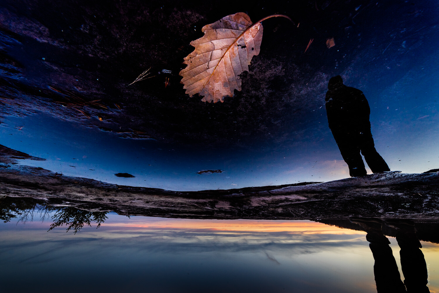
Understanding Imaging Techniques
Three distinct post-production processes alter the appearance of digital photographs: Retouching, Manipulating, and Optimizing. These terms may sound similar enough to be synonymous at first glance, but they are entirely different operations. Once you understand the difference between these three processes, your image editing will take on new meaning, and your images will deliver powerful results.
Image retouching
Photo retouching is image alteration that intends to correct elements of the photograph that the photographer doesn’t want to appear in the final product. This includes removing clutter from the foreground or background and correcting the color of specific areas or items (clothing, skies, etc.). Retouching operations make full use of cloning and “healing” tools in an attempt to idealize real life. Unfortunately, most retouching becomes necessary because we don’t have (or take) the time to plan out our shots.

Our brain tends to dismiss glare from our eyes, but the camera sees it all. A slight change of elevation and a little forethought can save a lot of editing time.
Planning a shot in advance will alleviate much of these damage control measures but involves a certain amount of pre-viewing; scouting out the area and cleaning up items before the camera captures them. This includes “policing” of the area… cleaning mirrors and windows of fingerprints, dusting off surfaces, and general housekeeping chores. This also includes putting things away (or in place), previewing and arranging the lighting available and supplementing the lighting with flash units and reflectors where required, checking for reflections, etc.
Benjamin Franklin coined the phrase “an ounce of prevention is worth a pound of cure,” which pretty much sums up the cleanup chores. We also use the phrase “preventative maintenance;” fixing things before they break and need repair.
Admittedly, we don’t often have the luxury of time required to primp and polish a scene before we capture it, and retouching is our only option. However, sometimes all we need to do is evaluate the scene, move around and see the scene from another angle, or wait for the distraction to move out of the scene.

Sometimes a small reposition can lessen the amount of touchup and repair needed.
We can’t always avoid chaos, but we could limit the retouching chore with a little forethought. It takes just a fraction of a second to capture an image, but it can take minutes-to-hours to correct problems captured.
Image manipulation
Manipulation is a bit different, though it occasionally is a compounded chore with retouching. When we manipulate a photo, we truly step out of reality and into fantasyland. When we manipulate an image we override reality and get creative; moving, adding elements to a scene or changing the size and dimension. When we manipulate an image, we become a “creator” rather than simply an observer of a scene. This is quite appropriate when creating “art” from a captured image, and is ideal for illustrations but perhaps shouldn’t be used as a regular post-capture routine.

Photo-illustration is an excellent use of serious manipulation, and can be quite effective for conveying abstract concepts and illustrations.
Earlier in my career, I worked as a photoengraver in a large trade shop in Nashville Tennessee during the early days of digital image manipulation. The shop handled the pre-press chores for many national accounts and international publications. On one occasion in 1979, we were producing a cover for one of these magazines. On the cover was a picture of Egypt’s President Anwar Sadat set against one of the great pyramids. Unfortunately, the pyramid was in a position that interfered with the titles on the magazine’s cover.

While this is not the exact picture used in the magazine, you see the challenge.
The Art Director for the magazine sent instructions for us to shift the pyramid in the picture so that the titles would not interfere with it. Moving that thing was an amazing feat back then. Normal airbrushing would have left obvious evidence of visual trickery, but digital manipulation opened a whole new potential for near-perfect deception. We were amazed at the potential but a bit nervous about the moral implications of using this power.
This venture was accomplished (over a decade before Photoshop) on an editing machine called a SciTex Response, a workstation supported by a very powerful minicomputer. Nobody outside that small building knew that from Nashville, we pushed an Egyptian pyramid across the desert floor until revealed years later. Shortly thereafter, digitally altered images were prohibited from use as evidence in a court of law by the Supreme Court of the United States. Today, this level of manipulation lets you routinely alter reality and play god on a laptop, sitting on a park bench.
Manipulation is powerful stuff and should be used with serious restraint; not so much for legal reasons, but because of diminishing regard for nature and reality. Fantasyland is fun, but reality is where we live. We quite regularly mask skies and replace boring clouds with blue skies and dramatic clouds, and even sunsets – all without hesitation. We can move people around a scene and clone them with ease using popular photo editing software. Reality has become anything but reality. Photo contests prohibit photo manipulation in certain categories, though a skillful operator can cover their digital tracks and fool the general public. However, savvy judges can always tell the difference.

Typical manipulation consisting of a clouded sky to replay lost detail.
Personal recommendation: keep the tricks and photo optics to a minimum. Incorporating someone else’s pre-set formulas and interpretation into your photos usually compromises your personal artistic abilities. Don’t define your style by filtering your image through someone else’s interpretation. Be the artist, not the template. Take your images off the assembly line and deal with them individually.
Image optimization
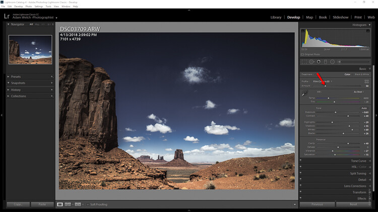
Photo optimization is an entirely different kind of editing altogether and the one that I use in my professional career. I optimize photos for several City Magazines in South Florida. Preparing images for the printed page isn’t the same as preparing them for inkjet printing. Printing technology uses totally different inks, transfer systems, papers, and production speeds than inkjet printers. Each process requires a different distribution of tones and colors.
Since my early days in photoengraving, I’ve sought to squeeze every pixel for all the clarity and definition it can deliver. The first rule (of my personal discipline) is to perform only global tonal and color adjustments. Rarely should you have to rely on pixel editing to reveal the beauty and dynamic of a scene. Digital photography is all about light. Think of light as your paintbrush and the camera as nothing more than the canvas that your image is painted on. Learn to control light during the capture and your post-production chores will diminish significantly. Dodging, burning and other local editing should be required rarely, if at all.

Both internal contrast and color intensity (saturation) were adjusted to uncover lost detail.
Even the very best digital camera image sensors cannot discern what is “important” information within each image’s tonal range. The camera’s sensors capture an amazing range of light from the lightest and the darkest areas of an image, but all cameras lack the critical element of artistic judgment concerning the internal contrast of that light range.
If you capture your images in RAW format, all that amazing range packed into each 12-bit image (68,000,000,000 shade values between the darkest pixel and the lightest) can be interpreted, articulated, and distributed to unveil the critical detail hiding between the shadows and the highlights. I’ve edited tens of thousands of images over my career, and very few cannot reveal additional detail with just a little investigation. There are five distinct tonal zones (highlight, quarter-tones, middle-tones, three-quarter-tones, and shadows) in every image, and each can be individually pushed, pulled, and contorted to reveal the detail contained therein. While a printed image is always distilled down to 256 tones per color, this editing process lets you, the artist, decide how the image is interpreted.

Shadow (dark) tones quite easily lose their detail and print too dark if not lightened selectively by internal contrast adjustment. The Shadows slider (Camera Raw and Lightroom) was lightened.
The real artistry of editing images is not accomplished by the imagination, but rather by investigation and discernment. No amount of image embellishment can come close to the beauty that is revealed by merely uncovering reality. The reason most photos don’t show the full dynamic of natural light is that the human eye can interpret detail in a scene while the camera can only record the overall dynamic range. Only when we (photographers/editors/image-optimizers) take the time to uncover the power and beauty woven into each image can we come close to producing what our eyes and our brain’s visual cortex experience all day, every day.
Personal Challenge
Strive to extract the existing detail in your images more than you paint over and repair the initial appearance. There is usually amazing detail hiding there just below the surface. After you capture all the potential range with your camera capture (balancing your camera’s exposure between the navigational beacons of your camera’s histogram), you must then go on an expedition to explore everything that your camera has captured. Your job is to discover the detail, distribute the detail, and display that detail to the rest of us.
Happy hunting.
The post Understanding Imaging Techniques: the Difference Between Retouching, Manipulating, and Optimizing Images appeared first on Digital Photography School. It was authored by Herb Paynter.


You must be logged in to post a comment.