I had tried Lightroom in the past, but always preferred using Apple’s Aperture photo editing program. But in the spring of 2014, when it was announced that Apple was no longer supporting Aperture, I decided to make the leap to Lightroom. At first I found it difficult to use and not really intuitive, but I soon found my way around and I was a Lightroom convert.

If you are new to Lightroom and don’t know where to start, or have thought about using it but feel overwhelmed, then please know I feel your pain, and know where you’re coming from. I wrote this Beginner’s Guide to Lightroom to help you, and I wish I would have had something like this when I first got started. It’s designed to help you through a few basic steps from opening up Lightroom for the first time, making two basic edits, and exporting (saving) a final version of your picture.
What is Lightroom and what does it do?
In a nutshell, Lightroom is a program that can manage and edit your images. The catch, though, is that it doesn’t really edit your images, or actually manage anything either. Instead, the program works by looking at pictures you have stored on your computer, and allows you to create instructions for how you want to change them.
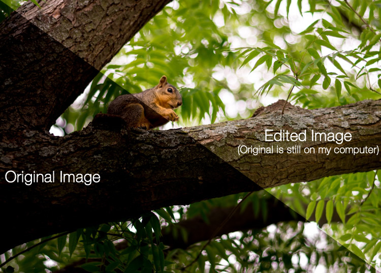
For example, let’s say you have a photo of a squirrel that’s a bit dark so you want to make it brighter. Lightroom doesn’t touch the original image! It doesn’t move it, copy it, rename it, or change it in any way. Instead Lightroom, is a non-destructive editing program, that allows you make changes to a preview or thumbnail version of the picture, which means you can see what the final image will look like after you make it brighter. When you are finished with your editing you export (or save as) a final image from Lightroom (again leaving the original file completely un-touched) and voilá, you now have a second, much brighter photo, to print or share with others.
The Lightroom catalog is like a recipe book
Lightroom stores a record of all the changes you want to make to your images in a separate file called the Catalog, which is stored independent from your pictures. The best analogy I can think of is that of a kitchen: your original pictures are kind of like the raw ingredients in your cupboards, and the Lightroom Catalog is like a recipe book. Lightroom doesn’t do anything to your ingredients (your original files), but instead saves the instructions for transforming your supplies into actual finished products (in this case output edited images), just like recipes for your photos. When you are finished, your original image files still remain, but you have a new creation (i.e. an edited picture) that you can share with others.
The Importance of Adobe Camera Raw
Before we get too deep into the weeds here, it’s important to back up a bit and look at another program called Adobe Camera Raw (ACR), which allows you to perform all sorts of edits and changes to your Raw images – from simply making them brighter or darker, to selectively editing colors, or working with curves. You may already have it on your computer and not even know it, and it’s actually the engine that powers everything Lightroom does in terms of editing your images. Every change, adjustment, and tweak you do to one of your photos in Lightroom, is actually being done by ACR. Understanding how this fits in might seem a bit extraneous to the overall Lightroom discussion, but it’s important to know how all it works together if you want to make sense of Lightroom itself.

You and Lightroom: best buds for life.
Opening Lightroom for the First Time
When I initially launched my copy of Lightroom four years ago, things started to go south within a matter of seconds. It asked me about making a Catalog, and wanted to know where to store it, and I started channeling my inner Gob Bluth while muttering to myself, “I’ve made a huge mistake.” If this sounds like you, don’t worry – there’s really not much going on here that you need to worry about, and everything will be fine. Remember the kitchen analogy I mentioned earlier? All your computer wants to know right now is where to store the Catalog, or recipe book, that it will use to keep track of the changes you want to make to your pictures. You will need to create a new Catalog, and specify its location on your hard drive. I just keep mine within my Pictures folder.
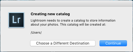
Lightroom wants to know where you would like to store its Catalog, or database of edits you want to make to pictures. If you’re not sure what to do here, just click the “Continue” button.
Some people are very specific about where they want this Catalog to be located, and professional photographers will often have multiple image collections and many catalogs as well. Honestly, if you just want to figure out how to use Lightroom you can just click the “Continue” button and go about your business. For casual photographers the exact location of the Catalog file is not all that important, so don’t sweat it.
Note: do not store your catalog on an external hard drive though, it will not run optimally or may not run at all. Keep it on your computer’s main drive. If in doubt just click Continue as noted above.
In terms of new-user-confusion, the next screen (the Library module) you see is not much better. Upon encountering it for the first time I felt like someone had quashed my photography enthusiasm with a scary dull grey veil. There are a few tutorial hints that pop up in the middle, which aren’t very helpful, and after you dismiss them you’re left staring at an empty dark wasteland, wondering why you didn’t just stick to using Instagram filters like everyone else.
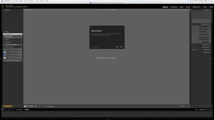
If this screen doesn’t make a new user run screaming from Lightroom, I don’t know what would.
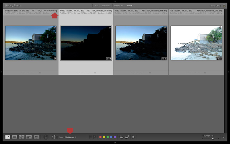
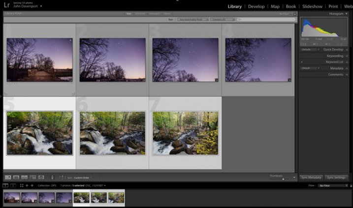
What you’re looking at here is your entire library of photos, but it’s empty because none have actually been imported yet. There’s plenty of other options and buttons here as well – enough to confuse even the most experienced user – so for now just ignore the Catalog/Folders/Collections stuff on the left side, and all those Quick Develop options on the right side. And for heaven’s sake, don’t give a second thought to those strange chessboard-like icons at the bottom. Just take a breath, grab your memory card and your favorite beverage, and get ready to import some photos. Plug your memory card into your computer, then click the “Import” button in the lower-left corner to start transferring your pictures over to your hard drive. You can also import photos that are already sitting on your computer, but for now I want to focus on the kind of workflow you might encounter, as a photographer who just wants to figure out this program.
Importing Photos
The first thing you see once you have your memory card connected is a grid with tiny thumbnail previews of all the pictures on your memory card.
Note: You can also connect to your camera directly – however, it’s a better idea to use a card reader then plug in your camera directly. If the camera battery dies during import you can crash the card and damage or lose your images.
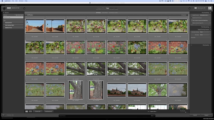
There are all sorts of options on this screen, but if you just want to get the basics down, here’s what you need to look at:
- At the top of your screen, select the option that says “Copy.” This will, as you may guess, copy the pictures over to your computer, and add them to the Lightroom catalog so you can make edits to them later.
- On the right-hand side you have to choose a Destination so the program knows where to put the original photos on your computer. You can select a specific destination or just let Lightroom figure this out for you. You can also do things like rename your pictures as they are imported, apply specific edits (called “Develop Settings”) to all of them, or give them keywords such as “Wedding” or “Camping.” For now don’t worry about any of this, and I promise everything will be just fine.
- Choose which pictures to import by making sure they have checkmarks in the top corner of each thumbnail preview. They should all be checked by default (if they aren’t just click Check All), but if there are any images you don’t want to import, you can just un-check the box next to them.
When you’re all set, click the Import button in the lower-right corner of your screen. Your computer will beep or chime when everything is done, and you’ll be ready to start editing your photos!
Organizing and Developing (Processing)
After your photos are imported things start to get really crazy, but once again just try to ignore all the new things that show up on the side of your screen, and focus on just a few of the essentials. First of all, don’t start making edits or changes to your pictures just yet.
Instead, look at the left side of your screen and find an area called “Collections.” 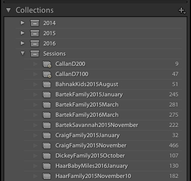 Remember that Lightroom doesn’t actually do anything with the original pictures. When you clicked Import, it copied them over to a folder on your hard drive where they will remain, intact and untouched, until the end of time. What you can do is organize the pictures into Collections within Lightroom itself, in order to keep track of them more easily. Collections function just like playlists in iTunes or Spotify, and allow you to sort photos manually or automatically, based on how you want them to fit together. Click the + button on the right side to make a new Collection (i.e. Playlist), Smart Collection (where sorts your photos automatically based on criteria you specify) or Collection Set (a folder containing multiple Collections). Once you have a Collection created you can populate it by dragging and dropping your photos over to it, just like in iTunes. During this process the original images stay exactly where they are on your hard drive, you are just using Collections to help manage them a little easier.
Read more on collections and organizing here: How to Organize Your Photos in Lightroom
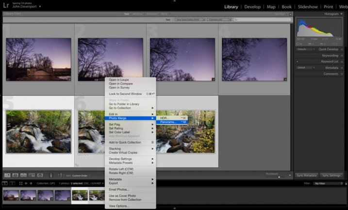
Once you have your images sorted into Collections it’s time to start editing them. (Or you can start editing without doing any sorting at all. It’s up to you.) Click the “Develop” option in the top-right corner of your screen to begin making changes (or click D on your keyboard). At first I was put off and confused by the term Develop, but Adobe used it to hearken back to the days of darkrooms and analog film photography. (which some photographers still use even today). Before digital cameras you had to actually get your film developed before you could see your pictures, and that’s essentially what Lightroom is trying to emulate here in the Develop module. If it doesn’t make sense to you yet, just pretend it says “Edit” instead of “Develop” and you’ll be fine.
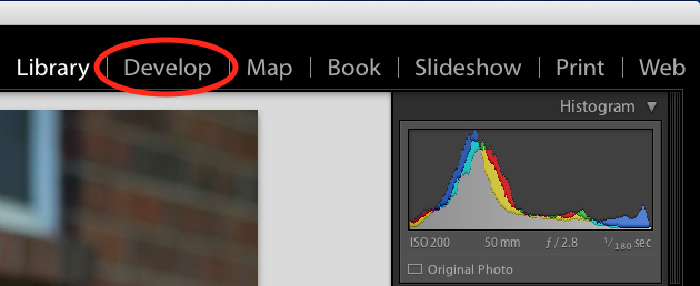
You are now in the Develop module, which is one of seven different working states available inside Lightroom, the rest being: Library (which you started in), Map, Book, Slideshow, Print, and Map. I ignore all the others, and spend about 98% of my time in either Library or Develop, and as a new user I would recommend the same for you.
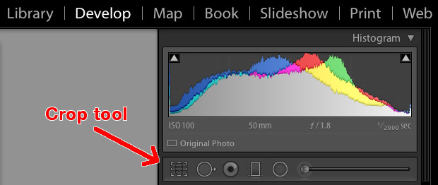
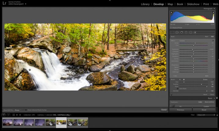
At first when you click on the Develop module it might not seem like anything is different, but look again and you will see that all the metadata information that was on the right-hand side of your screen has been replaced with a series of panels like Basic, Tone Curve, Lens Corrections, and more. Don’t start hyperventilating! I promise this is easier than it may seem at first. There are a metric ton of tutorials and web pages online devoted to helping you understand the Develop module, but right now I just want you to focus on two simple things: Cropping and Exposure.
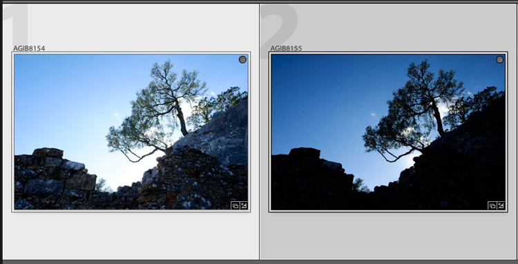
One of the most basic edits many people do, is to trim them down so just the important parts are in the frame, and get rid of things along the edge like trees, trash cans, bystanders, and the like. To do this click the square icon under the colorful graph called the Histogram, (or use the keyboard shortcut R) and you will see a nifty overlay appear on your image that you can use to crop it down how you want. Also read: How Cropping in Post-Production Can Improve Composition
Use the corners of the rectangle overlay to crop your picture down so it contains only what you want, then when you are done press the [enter] or [return] key to see the results. Remember what I said earlier about Lightroom being nondestructive? It might look like you have just removed part of your photo, but the original is entirely untouched, and remains fully intact on your computer. What you are actually editing here is a placeholder – a preview of what the final image will look like – not the actual image itself. None of your edits in Lightroom are permanent, and you can reverse or undo any editing decision you make, so don’t be afraid to play around with it, kick the tires, and just start trying things even if you’re not entirely sure what the result will be.
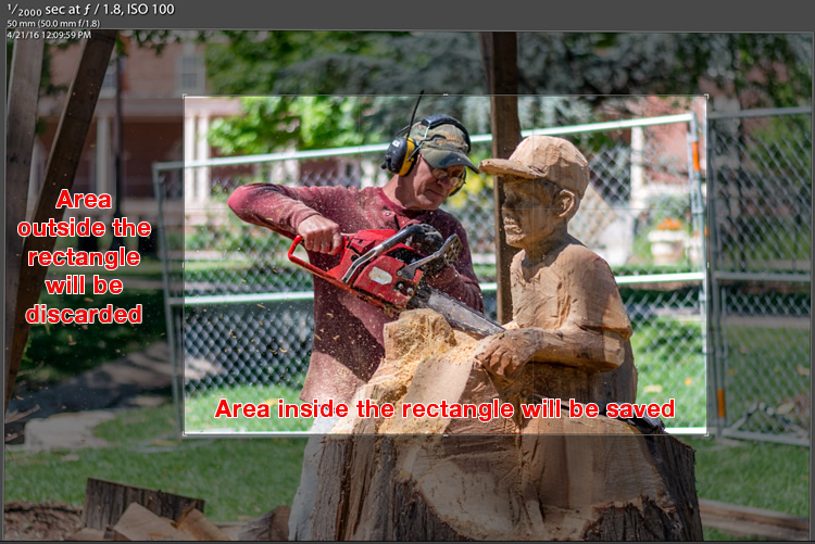
But your original file remains uncropped on your computer – Lightroom only shows how it will look if you apply this setting.
The other common edit that people make to their images is adjusting the brightness, often to fix an image that is too over or under-exposed. This can easily be done with the top panel on the right side of the Develop module, appropriately titled “Basic.” Look for the slider called “Exposure” and move it to the right or left in order to make your picture brighter or darker.
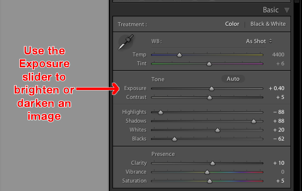
Once again you will notice the changes you make reflected on the picture you see, but keep in mind you are not actually editing the original photo. Your instructions to crop, brighten, or otherwise change the picture are being stored in the Catalog file, while the original remains untouched. At this point you can go ahead and experiment with all the other options, tools, and sliders you see in the Develop module and take note of how they alter your photo. Even if you are not at all sure of what is happening just remember that Lightroom is nondestructive so you may as well play around with things to your heart’s content, since your original pictures will never be altered, and are safe.
Read more on the basic editing tools and sliders here:
- Master These Five Lightroom Sliders and Your Photos Will Pop
- Understanding the Basic Sliders in Adobe Camera Raw
Exporting (Save As)
Once you have made all the changes to a picture that you want, it’s time to export the final photo. This is again where the cooking analogy may come in handy, since this step is similar to putting your cake, casserole, or quiche, in the oven so it can bake. You still have the original ingredients on your counter and in your pantry, but once your timer beeps you will have an entirely new creation based on the recipe you used.
In Lightroom you edit photos instead of making pastries or pies, and the Export step is when you put them in your virtual oven to be processed. You may also think of this as opening up a document or spreadsheet, making some changes, and then choosing “Save As” instead of “Save.” This leaves the original document intact while creating a new one with your changes, much like exporting a picture in Lightroom leaves your original image as it was, and gives you a new edited version, complete with all the edits you made.

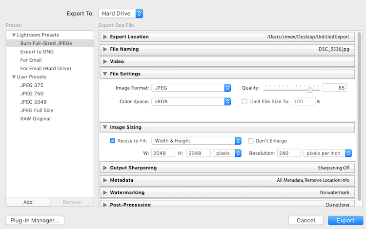
When you are ready to export a photo or multiple photos, select the ones you want while in the Library or Develop module and choose “File > Export”, which will bring up yet another confusing dialog box filled with head-spinning options and choices. Hopefully by now you are getting a little more used to this sort of thing when using Lightroom, but if not just focus on a few specific items on this screen.
On the left side you will see a few presets for exporting your photos, depending on whether you want to print them, email them, etc. You can also create your own presets for exporting, but for now don’t worry about that and just focus on a few specific settings.
Once you get the hang of the Export box you can create your own presets for saving pictures with specific parameters that you choose.
If you’re not sure which option to choose, start with “Full-Sized JPEGs” and then modify things just a bit by tweaking a couple settings (make sure Export To: is set to Hard Drive at the top of the box). Then find and adjust the following:
- File Settings – Choose “JPEG” as the Image Format, set the quality slider to 85, and Color Space to sRGB.
- Image Sizing – Tick off “Resize to Fit” then choose “Width & Height” and then enter 2048 in both the W (Width) and H (Height) boxes, (make sure it says “Pixels after Height, not In or Cm.). Leave the rest of the parameters alone.
- Post-Processing – make sure After Export is set to: Show in Finder (or Show in Windows Explorer if you use a PC).
These settings will give you pictures that are large enough to print up to about 5×7″ size, or share on social media sites, (for email use a slightly smaller size like 1200 or 800px). When you’re ready, click the “Export” button in the lower right corner and you’re all set. As long as you did the last part, Lightroom will open a Finder (or Windows Explorer) window showing you all your new images, and where they are on your harddrive. Lightroom will probably save the edited copies of your pictures to your Desktop (the default) but you can double check this using the “Export Location” option (at the top of the box) in the Export pop-up box if you want.
Read more here:
- Organizing Images in Lightroom 5 (still applies in 6 and LR CC)
- Photography Workflow Tips – From Memory Card to Computer and Beyond

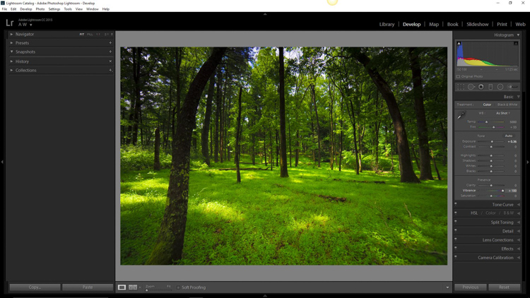
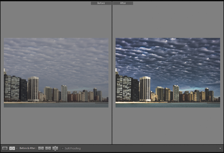
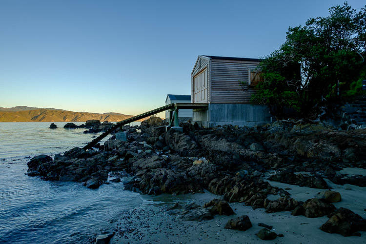
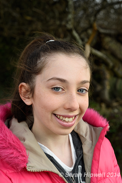
The original photo was okay, but Lightroom helped me coax much more detail, color, and vibrance out of it.
Let’s Review
This all seems like a lot, but hopefully if you have made it this far, you now have a good understanding of a very basic Lightroom workflow. If you take away nothing else from this tutorial, remember these few precious nuggets of wisdom:
- Lightroom does not edit your original images. They will always remain wherever you put them, and Lightroom does not change them in any way.
- You are looking at preview versions when you are editing your photos in Lightroom, and not the actual images themselves.
- A complete record of edits to your photos is kept in a database called the Catalog. Think of this like a recipe book, where you have instructions for how to cook your images, but you are not altering the original ingredients in the kitchen.
- The editing process is not complete until you Export your images, which saves a new copy of your photos, complete with the changes you made in Lightroom.
I hope this Beginner’s Guide to Lightroom was helpful. Please leave any thoughts or questions in the comments section below. Good luck, and feel free to share some of your favorite images that you have edited in Lightroom too!
googletag.cmd.push(function() {
tablet_slots.push( googletag.defineSlot( “/1005424/_dPSv4_tab-all-article-bottom_(300×250)”, [300, 250], “pb-ad-78623” ).addService( googletag.pubads() ) ); } );
googletag.cmd.push(function() {
mobile_slots.push( googletag.defineSlot( “/1005424/_dPSv4_mob-all-article-bottom_(300×250)”, [300, 250], “pb-ad-78158” ).addService( googletag.pubads() ) ); } );
The post Total Beginner’s Guide to Lightroom – Step by Step by Simon Ringsmuth appeared first on Digital Photography School.


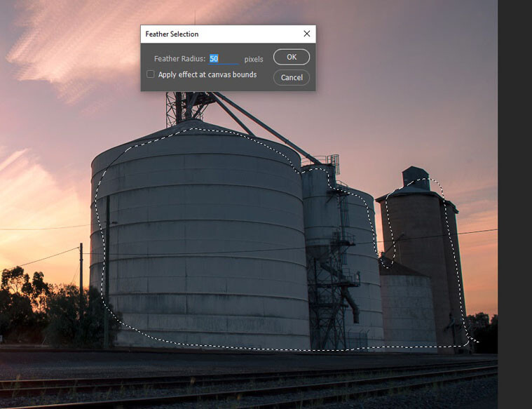
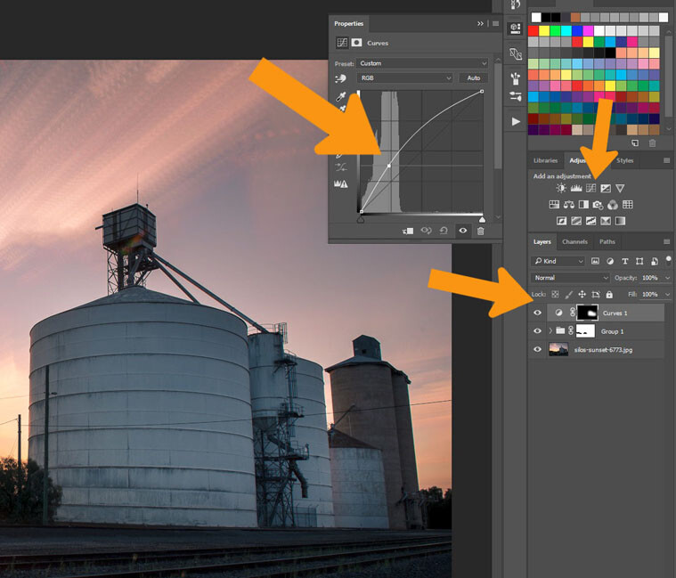
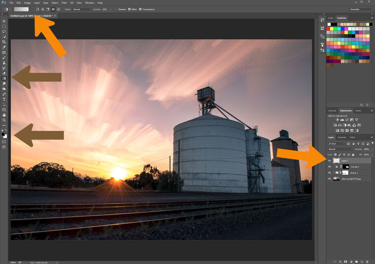
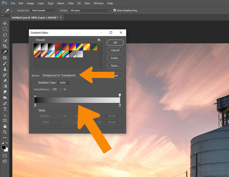
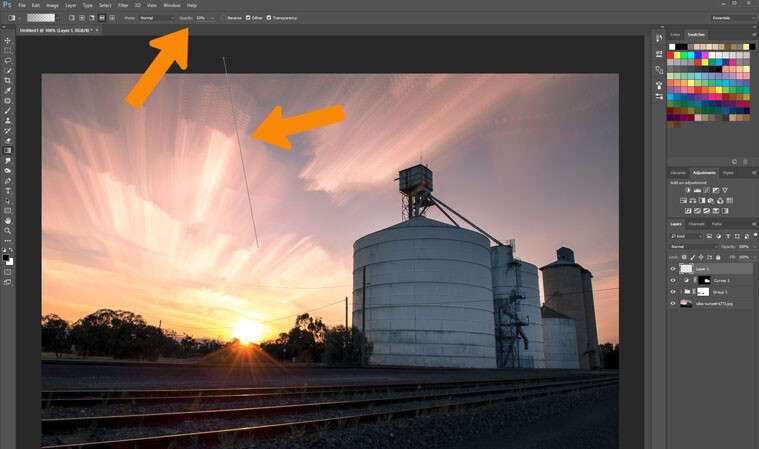


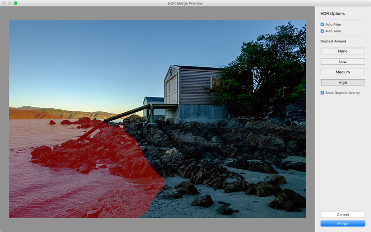


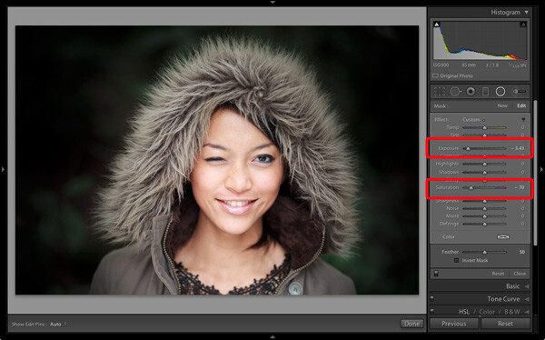
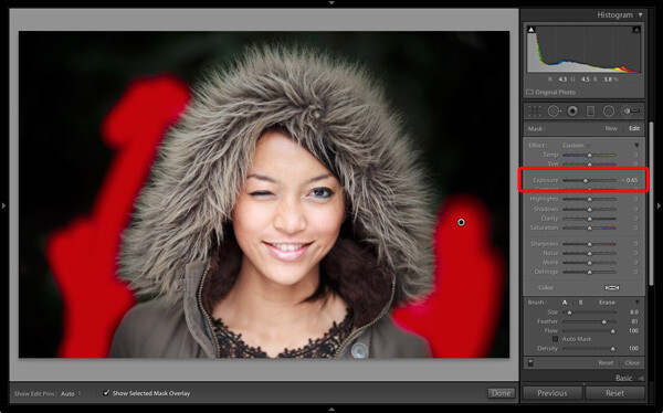
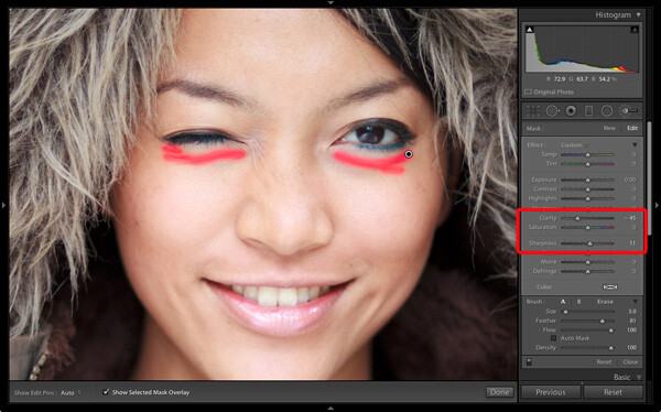
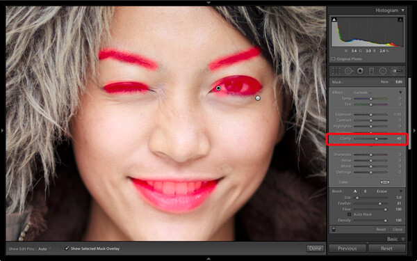
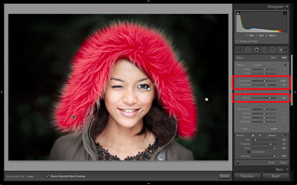
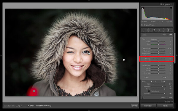
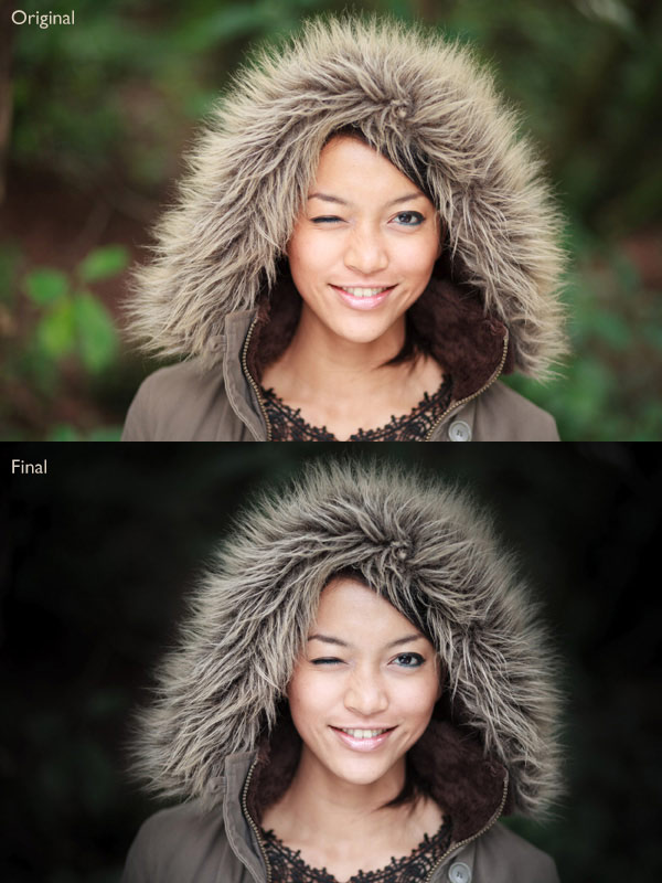
 Andrew’s ebook Mastering Lightroom: Book Four – The Photos is available now at a special price of 40% off for a limited time from Snapndeals. It’s an advanced guide to processing photos in Lightroom’s Develop module, explaining how to use Lightroom’s powerful processing engine plus Develop Presets and plug-ins to create beautiful images. This photo is one of ten case studies from the book.
You must be logged in to post a comment.