RSS
 

Posts Tagged ‘PostProcessing’

How to Create a Silky Water Effect in Post-Processing without Using Filters or a Tripod

17 Apr
Affiniy-photo-mean-stack-mode

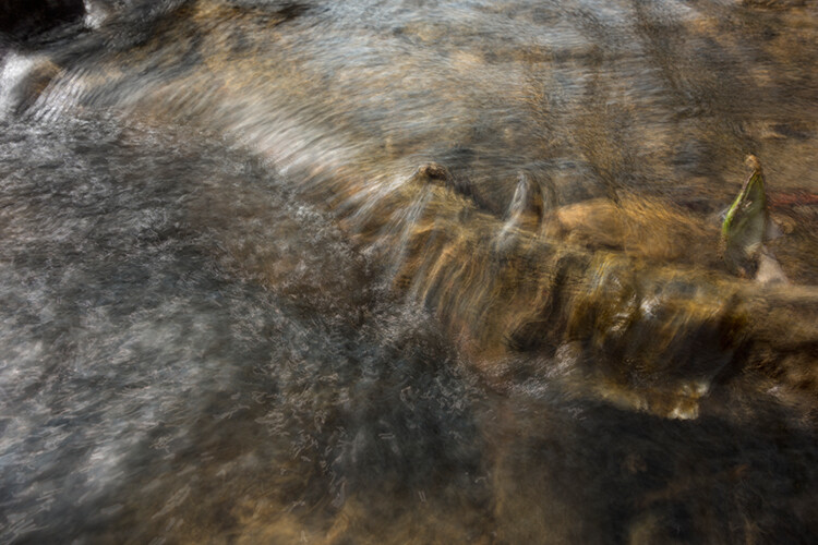
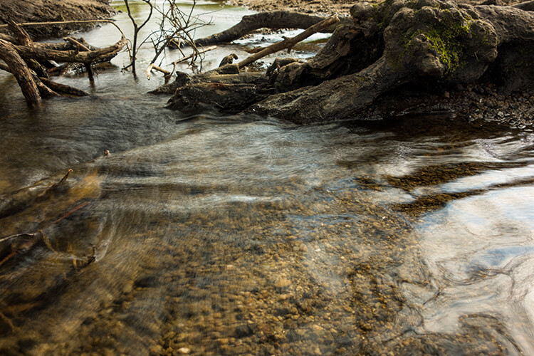
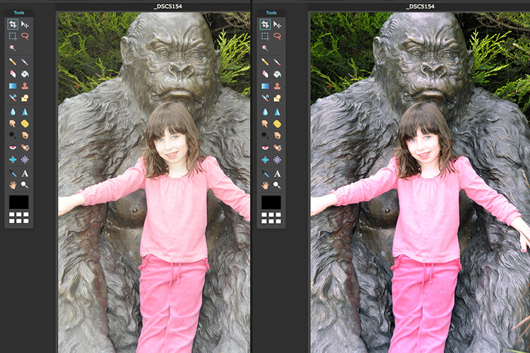
Smooth water effect edited in Affinity Photo using the Live Stacks feature.

Even if you don’t shoot landscape photography, photos of waterfalls with the smooth water and glassy appearance are awesome. The gist to achieving this, and I do stand corrected if I have this wrong, is as follows:

  • Slow shutter speeds – the need for a tripod
  • A remote shutter release or your camera’s timer
  • Wide angle lens and the camera settings using a small aperture of f/22, ISO 100
  • Neutral Density and/or polarizer filters, as you’ll be shooting long exposures during the day
  • Of course the scene and by all accounts patience too

However, I personally don’t own ND or polarizer filters. These type of filters are required for long exposures during the day, so that your shutter speeds are slow enough, possibly one minute or more to get that misty look. On top of which, you have to get the exposure right, which requires a bit of math and experimentation. ND filters block out the light in terms of stops.

So taking long exposures during the day is an involved process, especially if you want to create that smooth, silky water effect in-camera. But, is there a way to simulate this effect in Photoshop or other post-processing software? Yes there is! It does require that you take multiple shots. I’m not advocating that this technique in post editing is a replacement to going out and achieving long exposures out in the field, far from it. But, I hope this technique may serve as a stepping stone or inspiration to go out and capture silky waters, clouds etc., in-camera.

This article will demonstrate how you can achieve a similar result by taking a bunch of photos in continuous mode without using any filters or a tripod. Although, I would recommend you use a tripod.

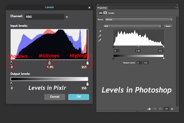
First, I’ll demonstrate this effect using a manual method in Photoshop CS6 (standard version). There is an automated way to do this with the Stack Mode feature, which I believe is in Photoshop CC. If you have previous versions of Photoshop, the Stack Mode feature is only available in extended versions, not standard, unfortunately. However, Gimp has this Stack Mode feature and it’s free. Then, I will compare the manual method in Photoshop with Affinity Photo, using Live Stacks. I was really impressed with this feature.

Photoshop manual method

Let’s begin. On the day I took these images, I was pressed for time. So I took a series of shots in continuous mode, and handheld the camera while I focused on this part of a small river. I would recommend that you use a tripod and give yourself some time. It will be easier to align the images later.

small-river-handheld

I took a bunch of images in continuous mode of this small river, close-up deliberately for this article.

You will need to load your images as layers into one document in Photoshop, as follows:

file-scripts-load-files-into-stack

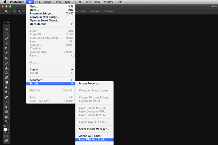
Loading multiple images into one document in Photoshop. File>Scripts>Load Files into Stack

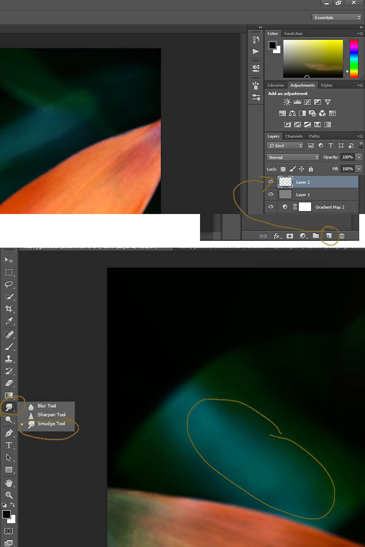
Go up to the Menu Bar > File > Scripts > Load Files into Stack. As I didn’t use a tripod, I selected all the layers to align them. Go to Auto-Align under Edit. As you can see, Photoshop had its work cut out trying to align the images.

images-after-auto-align-photoshop

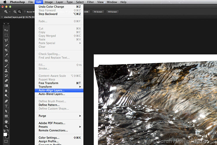
I handheld my camera when I took a bunch of shots in continuous mode. As you can see from this screenshot, I needed to use Auto-Align Layers in Photoshop. If you use a tripod the alignment will be much easier.

Now that the layers are stacked on top of each other. Start at the bottom and leave this layer at 100%, go to second layer above and reduce the opacity by 50%(100÷2=50). Continue with the next layer and reduce the opacity by 33%(100÷3=33).

percentages-opacity-reduced

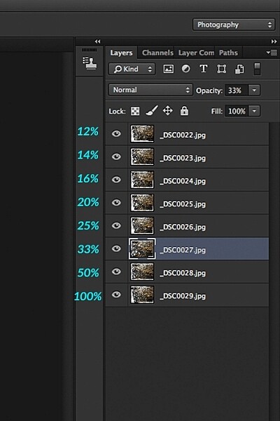
Reducing the opacity of each layer by dividing the number of the layer into 100%. The bottom layer remains at 100%. The second layer is 50% and so on.

Therefore, depending on the amount of layers you have, and where they come in the stack, divide this number into 100. So if you had 30 images, the opacity for the top layer in the stack will be 3% (100÷30=3). Remember the bottom layer is always 1=100%. What this is doing is averaging out the layers. This may sound complicated, but in practice, it’s more straightforward. Although it is a bit more tedious than the automated way.

This is the effect of averaging out the layers in Photoshop - reducing the stacked layer's opacity by X amount. I also had to crop this image, whereas the same image when edited in Affinity Photo kept more of the image. See below.

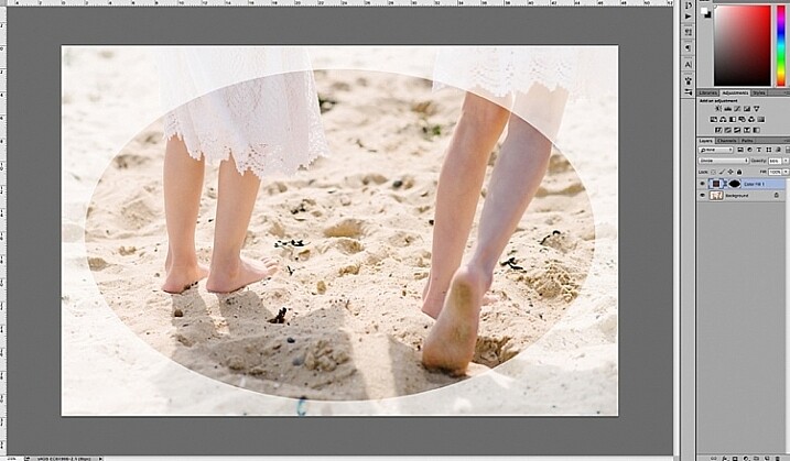
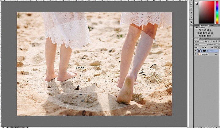
This is the effect of averaging out the layers in Photoshop – reducing the stacked layer’s opacity by X amount. I also had to crop this image, whereas the same image when edited in Affinity Photo kept more of the image. See below.

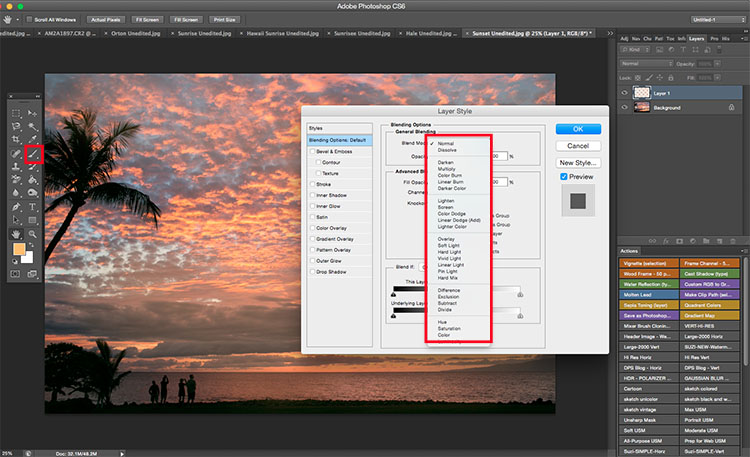
I have been keeping a close eye on Serif’s Affinity Photo. So I took the plunge and purchased it for (€39) $ 44 USD. That was a discounted offer. At such an affordable price, I was curious to see how this software performs and what it can do.

In Affinity Photo, there is a Live Stacks feature which is similar to Stack Mode in Photoshop. It was easy and simple to use, and the process was fast.

Affiniy-photo-mean-stack-mode

Affinity-photo-new-stack

The equivalent Stack Mode feature in Photoshop is called Live Stacks in Affinity Photo.

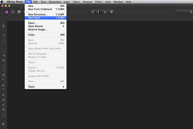
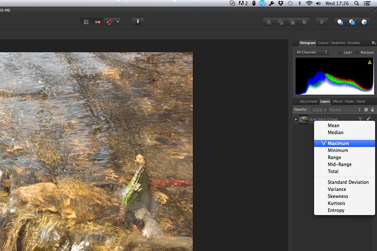
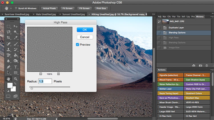
Go to File > New Stack. The pop up dialog box appears where you select your images. Make sure Automatically Align Images box is ticked. Click Ok. This takes a couple of seconds. It defaults to Median in the Live Stack Group, but scroll up to the next one and this is Mean. That’s the one you want.

Affinity-photo-auto-align-images

images-selected-after-new-stack

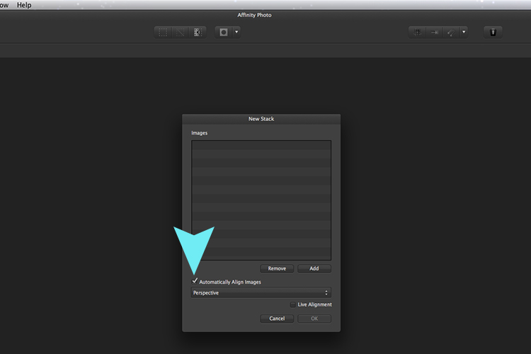
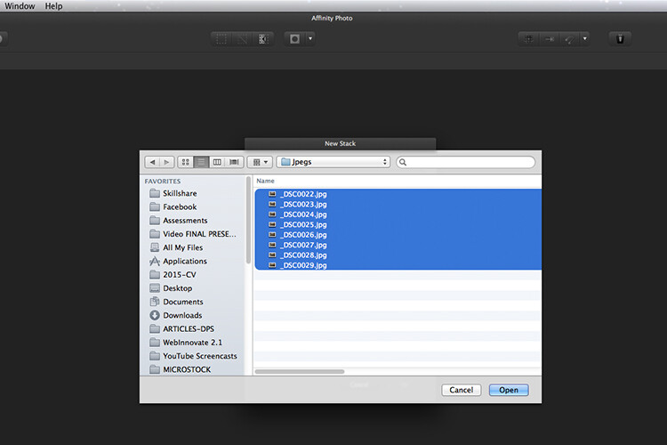
When you create a New Stack, the pop up dialog box appears. Select your images on your computer and click Open.

Affinity-photo-live-stacks-mean

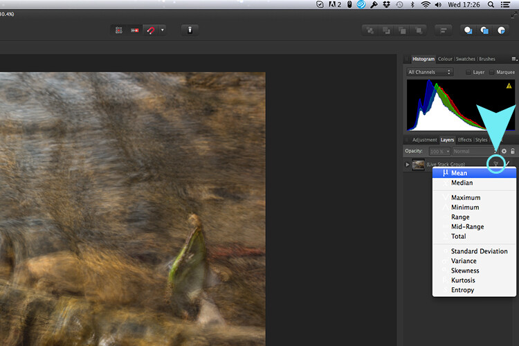
The stacked images are grouped into a folder called Live Stack Group. The different stack options are located by clicking on the small icon, circled in blue. It defaults to Median but I changed it to Mean.

The cool thing about this feature is when you scroll through each of the different stack modes, it shows the different results live.

Affinity-photo-live-stacks-maximum

Different stack options can be scrolled through one by one, and the results can be seen live, which is impressive.

When I compared the two results from Photoshop and Affinity Photo, I could see no obvious difference, with the exception that I had to crop the image of the river more in Photoshop, whereas the auto alignment in Affinity Photo meant I didn’t lose much of the image at all.

second-river-original

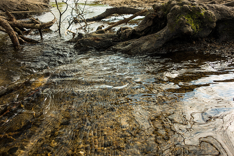
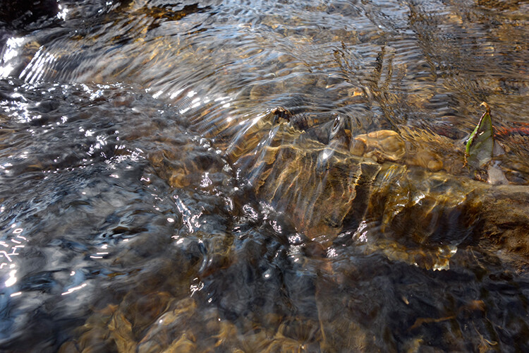
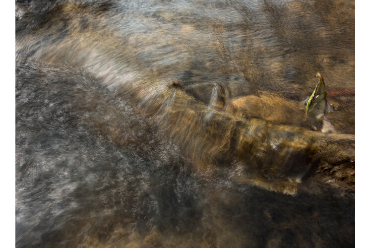
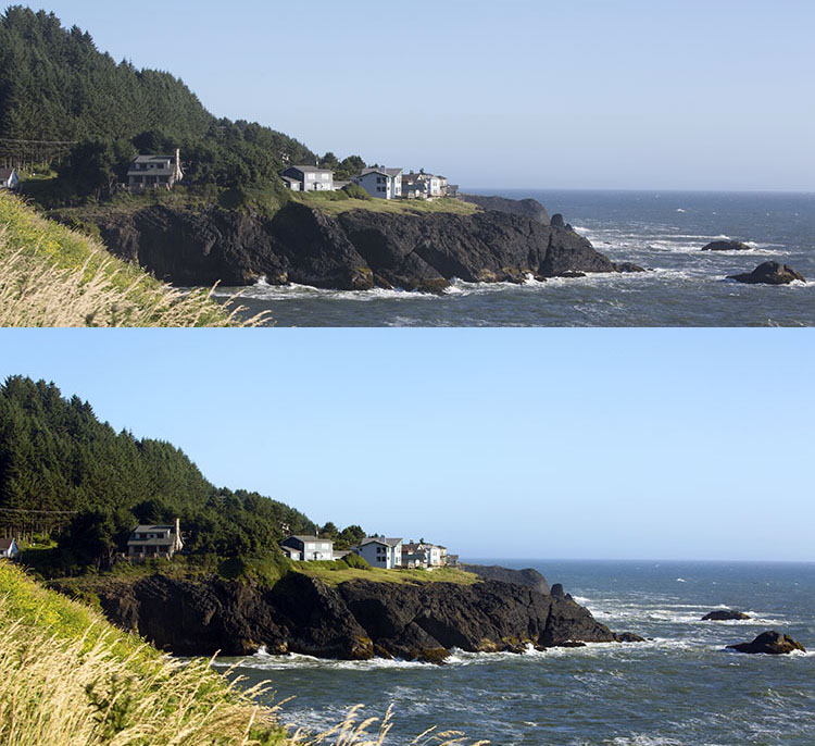
Here is another example of moving water.

The same image as above edited in Affinity Photo using Mean in Live Stacks. I got the same result using the manual method in Photoshop.

The same image as above edited in Affinity Photo using Mean in Live Stacks. I got the same result using the manual method in Photoshop.

Take away tip:

In my examples, I didn’t use a tripod. I would recommend using one. I also took only a series of 8-10 shots. I would recommend taking at least 15 or more.

I found this technique interesting and fun, and I am now inspired to go out and take images of waterfalls. The good thing about this technique is if you don’t have ND or polarizing filters, it doesn’t prevent you from going out and taking shots of waterfalls. Then when you get back to your computer, you can create your own silky, smooth effect.

Let’s see some of your examples below.

googletag.cmd.push(function() {
tablet_slots.push( googletag.defineSlot( “/1005424/_dPSv4_tab-all-article-bottom_(300×250)”, [300, 250], “pb-ad-78623” ).addService( googletag.pubads() ) ); } );

googletag.cmd.push(function() {
mobile_slots.push( googletag.defineSlot( “/1005424/_dPSv4_mob-all-article-bottom_(300×250)”, [300, 250], “pb-ad-78158” ).addService( googletag.pubads() ) ); } );

The post How to Create a Silky Water Effect in Post-Processing without Using Filters or a Tripod by Sarah Hipwell appeared first on Digital Photography School.


Digital Photography School

 
Comments Off on How to Create a Silky Water Effect in Post-Processing without Using Filters or a Tripod

Posted in Photography


Lightroom Quick Post-Processing Tips for Landscape Photography

30 Mar

Processing a good landscape image is a lot like getting a good haircut…it should look good, but people shouldn’t really be able to tell you’ve had anything done. Now while that may be a slightly funny (hopefully) analogy, it really is a good way to approach the editing of your landscape photos. Ideally, the image should be developed to its full potential in accordance to your vision, while stopping well short of over-processing. The key to pulling off a strong landscape image can sometimes be understanding when to stop.

Before and After Split

In this article, we will go from a straight out of the camera RAW file to a fully processed photograph using Adobe Lightroom CC. We will look at each step, and I will explain why each edit was made. By the end, you will see just how easy it is for you to take full control of your landscape photography with a few simple edits.

Shoot in RAW

Here we have the RAW file as it looked after importing into Lightroom.

RAW Screenshot

As always, the better the ingredients you have to begin with, the better the finished product will be. This means to always strive to make for best exposure, crop, and composition you can, before any processing is applied. Shooting in RAW format helps you immensely when working with landscapes. The greater dynamic range (exposure latitude) will allow you to bring up shadows, and manage highlights, much better than with smaller JPEG files. I know, I know – you’ve heard all of this before – but it doesn’t hurt to hear it again! RAW truly is the best friend of the landscape photographer.

Crop first

The image above is virtually level, but not perfectly so. The first thing we will do is open the crop panel and tweak the alignment before we begin any development. Having a grid overlay will really help you to get the lines of the image just right (with the crop tool activated, press the O key to cycle through all the grids available until you find the one you want). If you wanted to crop the image further, this would be done here as well.

Crop

Add Graduated Filters to adjust sky and foreground

Now that the image has been straightened, it’s time for the real fun to begin. The first thing to do is take control of the sky so that it isn’t quite so bright. To do this, we will use the Graduated filter tool. It’s located just above the Basic Panel in the develop module, in the same row as the crop tool.

GND Indicator

The filter simulates the effect of a graduated neutral density filter. It is an indispensable tool for adjusting landscape photos. Using the Graduated filter, you can decrease the exposure, add a little contrast, and then increase the clarity just to make the clouds more pronounced, which adds a little drama in the sky. In this example I also took town the highlights, and dehazed ever so slightly. The dehaze feature is a relatively new addition to the Lightroom tool box, is available in Lightroom 6 and Lightroom CC, and really helps when clearing skies.

GND Sky

Next, you want to process the foreground but not disturb the edits you’ve just made to the sky. To do this, click new to make a new Graduated filter.

New GND Indicator

To better understand where your edits will be applied with the ND filter, simply hover the pointer over the indicator dot for a second. Everything in red indicates where the filter is working (you can also just press the o key and it will show the mask overlay – it may also show in another color on your screen, press Shift+o to cycle through all the various colors).

GND Red

Using the Graduated filter, I increased the clarity of the foreground grass, as well as illuminated the shadows. This will help to draw the viewer’s eye into the image. I’m careful not to overdo the exposure here. The main subjects of the image are the horses, and the mountains in the background, so I want to keep those emphasized. Speaking of horses…

Do local edits using a Radial Filter

I wanted to really make the horses standout within the photo so let’s make use of another powerful tool in the Lightroom arsenal – the Radial filter. It works virtually the same way as the Graduated filter, except that it is applied in the form of a circle (fully adjustable). It can be set to apply edits either inside or outside of the circular outline.

Circular GND Indicator

With the Radial filter, I raised the shadows around the horses and increased clarify slightly. I also threw in a little extra sharpening there as well. When using the Radial filter, it’s important to remember that the border between what is, and what is not edited, is very controllable. Make use of the feathering slider in order to control the density of your adjustments as they radiate outward or inwards of the circle. Effective feathering will make make your adjustments with the Radial filter seamlessly blend in with the rest of the image. Here you can see exactly where the edits will be applied.

Circular GND Red

Makes global adjustments

So far, the image has been processed using only the Graduated and Radial filter tools for local adjustments (specific areas). Now we will make some final global (whole image) adjustments in the Basic Panel.

I brought up the overall contrast and shadows, and added in a little bit more clarity. Doing this made the highlights a little too harsh so I reduced the exposure by -10. This photograph was made in the waning golden hours of sunset, so I increased the total temperature (white balance) from 4400 to 5200, so that the tone better matched what I was feeling at the time of the exposure.

Global Adjustment

Add an edge vignette

As a final touch, I add in a small amount of vignetting.

Vignette

Vignetting is great because it serves to draw the viewer’s attention into the image. In the case of this photo it works well, but that is not always the case. Just as with any other effect used in post-processing, discretion is the name of the game. When using a vignette, make sure it fits the overall mood of the image. Experiment with the feathering slider (and others) until you achieve the desired effect. As a general guideline, very subtle vignetting usually works best.

See, that wasn’t difficult at all! We have went from a completely unprocessed RAW file to a fully developed image using relatively few edits in Adobe Lightroom.

Before and After

Processing a landscape image doesn’t have to be a massive undertaking. Everything you do to a landscape photograph should compliment the scene and add harmony. You have some incredible processing tools available today which can help you to achieve your creative vision. Be careful that you don’t go too far, though. Every photograph is as unique as a fingerprint, and should be approached individually. Use the techniques in this article as a guide to your processing, and have fun helping your photos reach their full potential.

Finished

If you have any additional landscape post-processing tips that work for you, please share in the comments below.

googletag.cmd.push(function() {
tablet_slots.push( googletag.defineSlot( “/1005424/_dPSv4_tab-all-article-bottom_(300×250)”, [300, 250], “pb-ad-78623” ).addService( googletag.pubads() ) ); } );

googletag.cmd.push(function() {
mobile_slots.push( googletag.defineSlot( “/1005424/_dPSv4_mob-all-article-bottom_(300×250)”, [300, 250], “pb-ad-78158” ).addService( googletag.pubads() ) ); } );

The post Lightroom Quick Post-Processing Tips for Landscape Photography by Adam Welch appeared first on Digital Photography School.


Digital Photography School

 
Comments Off on Lightroom Quick Post-Processing Tips for Landscape Photography

Posted in Photography


4 Quick Ways to Add a Vignette to Your Images in Post-Processing

21 Feb

What is a vignette?

way-to-add-vignette-tutorial
The word vignette comes from the root word vine, which originally was taken to mean a decorative border on a page. In photography, this translates to a border around the edge of the image. This border is caused by a reduction of light from the center of the image, or a light fall-off. Light fall-off can be due to a variety of reasons: the amount of light hitting the sensor, the type of lens used, or an intentional addition in post-production. This article will focus on the latter.

In adding vignettes in post-processing, you have two choices: darker or lighter, and soft-gradual or hard-edge.

Why add a vignette?

way-to-add-vignette-tutorial

The addition of a vignette in post-processing comes down to your personal taste. It would also largely depend on your photography style, and the type of image you are editing. Generally speaking, high-key images do not need a dark vignette. If you want to add a vignette to bright images, most often a lighter one looks better, but I would still be very careful about adding one.

A vignette helps draw the viewer’s eye to the center of the image. This is particularly useful if the image has plenty of clutter, or distracting elements around the edges. Similarly, if the edges are pretty bare which makes the image look flat, a vignette adds an illusion of foreground, or another layer to the image, giving it more depth.

Be gentle and sparing when adding a vignette, it can enhance or ruin an image. What works often, and best, is a gradual and very subtle vignette, especially for portraits. More exaggerated vignetting may be required on some artistic images – the choice is yours. If you want to add a spotlight effect to an image, then adding vignettes can be essential. A hard-edged vignette, if done unintentionally, makes your image look like a view through a periscope and can burn your image, like a moth to a flame.

Here are four quick ways to add a vignette

In Adobe Camera Raw

The quickest and easiest way to add a gradual and gentle vignette in your image is via Adobe Camera Raw (this works in both Photoshop and Lightroom).  My previous article on batch editing with Bridge and Adobe Camera Raw explains how you can open your file in Camera Raw and make your initial edits.

1. Using the lens correction tab

On the image below, you will see the lens vignetting slider under the lens correction tab. Move the sliders along to add, and remove vignettes to your image, according to taste.

way-to-add-vignette-tutorial

2. Using the radial filter tool

You can also add a dark or light vignette using the radial filter tool. On the adjustments panel, you need to specify where you want the vignette added – whether inside or outside the radius, then adjust the exposure to lighten or darken the vignette (with this method you can even add blur, lower highlight, or change the color of it if you like – anything on the sliders). This is a really handy feature in ACR because it acts like a layer mask, although you can’t easily do fine tuning with this tool like you can in Photoshop.

way-to-add-vignette-tutorial

Below is an image with a pretty dark and heavy vignette. In my opinion it’s too much, and takes away from the image, rather than enhancing it.

way-to-add-vignette-tutorial

Below is the same image with a bright vignette; this doesn’t look right to me at all.

way-to-add-vignette-tutorial

On this version below, I think the vignetting is just right, as it enhances the natural look of the photograph, which was my aim.

way-to-add-vignette-tutorial

In Adobe Photoshop

If you skip Adobe Camera Raw and open your file in Photoshop, there many ways to add a vignette. Below are the two quickest ways I have found. Before attempting to add a vignette in Photoshop, in order to perform non-destructive edits to your images, I recommend you learn to use layers and masks.

1. Using blend modes

The first quick way  of adding vignettes in Photoshop that I found is by duplicating the background layer using CMD/CNTRL + J. You need to make all your adjustments on the layers above your background layer, in this case the duplicated layer, so that your original file is safe and untouched.

way-to-add-vignette-tutorial

With your duplicate layer selected, change the mode to darken or multiply to add a dark vignette, or to screen or lighten to add a light vignette. Now add a layer mask to the duplicate layer. If you choose to paint the vignette on, make sure the mask is blacked out. Select a big soft brush, using the brush tool set to a very low opacity, and paint with white on the vignette around the edges.

Alternatively, you can choose to remove the vignette instead of painting it on, which in this case would be my preference. With your duplicate layer superimposed on the background layer, add a white layer mask. Choose a big soft brush set to a higher opacity and start painting the layer mask black, starting from the middle and ever so gently radiating outwards until all the vignette is removed from the center, and only a touch on the edges is left. Adjust the opacity of the layer to suit your taste.

Below are two examples of exaggerated vignetting added in Photoshop using this method.

way-to-add-vignette-tutorial

way-to-add-vignette-tutorial

Manually painting, or removing the vignette by hand, gives you flexibility as to where to apply the vignette, how far in, and to what degree, depending on what’s required for each image.

2. Using a solid color layer

Another quick way is to add a solid color. This method allows you to be more experimental, as it’s very easy to change the colors with a click of the eyedropper tool.

way-to-add-vignette-tutorial

The solid color will sit on top of your image, so all you will see is a flat rectangular block of color. You need to add a layer mask, and start removing some of the color beginning at the center and radiating outwards. Again, use a soft large black brush to remove the color. If you do this kind of vignetting, as in the two images below, it has to be intentional as these do not give you a natural look to the images at all. They may work for a scrapbook, or other specific purposes, but this is not the look I would give to my clients.

way-to-add-vignette-tutorial

On the image below, the vignette was added using the same solid color method as above. You can then play around with the blend modes to see what looks best.

biege - color-burn

This was done using the same solid color as above but Color Burn Blend Mode.

way-to-add-vignette-tutorial

This one is done with a black solid color added, masked, and Overlay Blend Mode with the layer at 80% opacity.

This one is done with a black solid color added, masked, and Overlay Blend Mode with the layer at 80% opacity.

You can also make shapes as vignettes, using the marquee tool.  The elliptical marquee tool was used for the image below, creating a hard-edged vignette. Make your shape by dragging this tool on your image, and you will see marching ants around the shape you have just created. You must immediately invert it using CMD/CNTRL + shift + I so the outside of the shape will be selected and would now be the area surrounded by the marching ants (as below).

elliptical marquee

Click on the solid color icon and select a color. A new layer with your shape filled with the solid color will automatically be created. Select this layer and play around the the blend modes and the layer opacity. You will see below what the Divide, Color Burn and Overlay modes look like.

Color Burn Blend Mode

Color Burn Blend Mode

Divide Blend Mode

Divide Blend Mode

Overlay Blend Mode

Overlay Blend Mode

You will want to feather the mask on your color layer, or blend the edges manually using the brush tool so that you do not see the edge of the vignette so well-defined. I’ve left it like this for demonstration purposes so you can see what the vignette layer is doing.

Below is the final image with only a hint of vignette on the edges, just to take the edge off the brightness of the scene.

way-to-add-vignette-tutorial

I hope this tutorial has given you some new ideas on how to enhance your images using vignettes. Do you have other quick ways of adding vignettes to your images? Share them here.

googletag.cmd.push(function() {
tablet_slots.push( googletag.defineSlot( “/1005424/_dPSv4_tab-all-article-bottom_(300×250)”, [300, 250], “pb-ad-78623” ).addService( googletag.pubads() ) ); } );

googletag.cmd.push(function() {
mobile_slots.push( googletag.defineSlot( “/1005424/_dPSv4_mob-all-article-bottom_(300×250)”, [300, 250], “pb-ad-78158” ).addService( googletag.pubads() ) ); } );

The post 4 Quick Ways to Add a Vignette to Your Images in Post-Processing by Lily Sawyer appeared first on Digital Photography School.


Digital Photography School

 
Comments Off on 4 Quick Ways to Add a Vignette to Your Images in Post-Processing

Posted in Photography


Post-Processing Tips of the Year 2015 on dPS

31 Dec
Shaheer Shahid

By Shaheer Shahid

Continuing on this holiday week with a list of some of our most popular articles here on dPS, this time on post-processing.

Whether you use Lightroom, Photoshop, or something else entirely you can find some hidden gems in this bunch. Get your editor ready to try these tips on post-processing out:

Lightroom tips

  • Understanding the Difference Between Photoshop and Lightroom
  • A Super Simple Way to Make Landscape Photos POP Using Lightroom
  • How to Watermark Your Images Using Lightroom and Photoshop CC
  • Natural Looking HDR in Photoshop and Lightroom in 5 Easy Steps
  • How to Isolate Your Subject in Lightroom
  • Understanding the Radial Filter in Lightroom
  • 5 Things You Should Know About Lightroom Before Starting
  • 3 Simple Steps to Make Your Skies Pop in Lightroom
  • 10 Quick Lightroom Tips and Shortcuts
  • How to Choose Which Version of Lightroom to Buy
  • Five Useful Lightroom Keyboard Shortcuts
  • How to Retouch a Portrait with the Adjustment Brush in Lightroom
  • How to do Basic Processing on a Portrait in 5 Minutes Using Lightroom

You can find many more articles on Lightroom here if you haven’t had enough, or if you want to pick up some Lightroom presets dPS offers a set of those as well.

Photoshop tips

  • How to Make a Photoshop Collage in 9 Simple Steps
  • 12 Tips for Mastering the Clone Stamp Tool in Photoshop
  • 10 Things Photoshop Beginners Want to Know How to Do
  • How to use Photoshop’s Quick Selection Tool to Change a Background
  • 4 Photoshop Tools Every Photographer Should Know
  • How to Process a Landscape Photo in 5 Minutes Using Photoshop
  • How to do Frequency Separation Portrait Retouching in Photoshop
  • 5 Photoshop Layer Mask Tricks – Video Tutorial
  • Cheat Sheet Photoshop CS6 Shortcuts
  • The First 3 Photoshop Blend Modes You Need to Understand
  • Understanding the Basic Sliders in Adobe Camera Raw

Find even more Photoshop tips here.

Dave Wilson Cumbria

By Dave Wilson Cumbria

Other programs and random tips

  1. Macphun Noiseless Pro Software Review
  2. Post-processing RAW Files – ACR Compared to Some Free Software Options
  3. 3 Tips for Getting Great Skin Tones Using Adobe Camera Raw
  4. How to Give Your Macro Photography a Fine Art Touch in Post-Processing
  5. 3 Simple Tips for Subtle Landscape Photography Post-Processing
  6. Post-Processing Tips for Overcoming Beginners Acts of Omission

googletag.cmd.push(function() {
tablet_slots.push( googletag.defineSlot( “/1005424/_dPSv4_tab-all-article-bottom_(300×250)”, [300, 250], “pb-ad-78623” ).addService( googletag.pubads() ) ); } );

googletag.cmd.push(function() {
mobile_slots.push( googletag.defineSlot( “/1005424/_dPSv4_mob-all-article-bottom_(300×250)”, [300, 250], “pb-ad-78158” ).addService( googletag.pubads() ) ); } );

The post Post-Processing Tips of the Year 2015 on dPS by Darlene Hildebrandt appeared first on Digital Photography School.


Digital Photography School

 
Comments Off on Post-Processing Tips of the Year 2015 on dPS

Posted in Photography


Post-Processing Tips for Beginners

10 Oct

They say photography is an art form, and I couldn’t agree more. There are so many elements that go into making a great piece of art. Not only do you need to know your gear and the environment you work in, but you also need to know how to put the finishing touches to your art, that takes it from good to great.

This can be quite challenging especially to a beginner. But like any great artist would say, all of this can be done with a lot of practice and patience. Great photos tend to have universal appeal. They are technically sound, and also have an editing style that appeals to the mass majority. While most photographers, including myself, advocate getting it right in camera, there are some basic steps that you may need to follow just to add the right amount of oomph to your images in the post-processing stage.

Choosing the right type of editing software

The type of editing you apply to your images does depend on the type of software you use. There are many different options for editing software on the market. Adobe Photoshop and Lightroom are two of the most popular ones for serious amateurs, and professional photographers. But if you are an absolute beginner they might be cost prohibitive for your needs. There are some good free editing software, like PicMonkey and Picasa, that work great at a basic level. If you are a cell phone photographer, then most smartphones have built-in editing software that does the job fairly well too. Apart from the basic editing steps they also have a ton of filters for adding some really cool effects to your images. But just be careful of the audience and the purpose for these cell phone images before applying funky filters.

For the purposes of this article, I will be using Lightroom. Most of the steps are common to all editing software, just choose the one that works for you and your photography needs.

Adjust the horizon

One of the first things I do to any image is to adjust the horizon, also known as straightening the image. I am not a fan of tilting my images. I find that when I look at tilted images, I don’t know which way is up. Am I supposed to turn my head to the right or the left? Crazy tilts make me dizzy. I don’t see images in tilts in my day-to-day, so why would I want to click images that are tilted. This is just my personal preference. I know some photographers who consider it very artsy to have tilted images. If that is your thing, then go for it and do what makes you happy. For images that have the horizon or leading lines in them, getting the horizon level is an absolute must.
Memorable Jaunts DPS Simple Processing Tips Before-01

This was taken from the passenger side of the car – I really loved the leading lines but knew the horizon was way off.

Memorable Jaunts DPS Simple Processing Tips After-01

In Lightroom, I adjusted the horizon, increased the contrast gently, and warmed up the image by adjusting the temperature slightly.

Adjust or crop out any unwanted elements

Nothing can be more distracting than an unwanted element in the frame. Before cropping or removing unwanted elements ask yourself whether the object is actually adding value to the image, or is it competing with the subject for attention. Removing unwanted elements can be done by using the clone/stamp tool in Photoshop, the spot healing brush Lightroom or a simple crop function in your photo editor of choice.
Memorable Jaunts DPS Simple Processing Tips Before-2

I loved the texture of the brick wall but hated the stains on the wall right near the chair.

Memorable Jaunts DPS Simple Processing Tips After-2

I chose a closer crop for the chair, and cloned out the stains using the spot removal tool in Lightroom. I also brightened the image a tad.

Remove any dust spots

This is something that is prominent if you are photographing against a light background, or when converting to black and white. If your sensor is dirty or has minute dust specks, they appear in your photographs. You can use the clone tool or even the patch tool (Photoshop) and clean out these dust spots in the image.

Adjust the exposure and contrast

After you have straightened the horizon and removed any unwanted or distracting elements from the frame, next adjust the exposure of the image. This adjusts the brightness. If the image is too dark, add light in and if the image is too bright, reduce light. Keep in mind that often times adjusting brightness will affect the contrast of the image as well. This can be fixed by adjusting the Contrast Slider in Lightroom. It makes the brightest parts of the image brighter and the darkest parts darker, and improves the overall look of the adjusted image.
Memorable Jaunts DPS Simple Processing Tips Before-3

While I adore this pose of my clients, the image is a little too dark (underexposed) as the light was changing very fast.

Memorable Jaunts DPS Simple Processing Tips After-3

As part of my edits to this image, I increased the exposure, warmed up the image by increasing the temperature and also adjusted the contrast a bit to add a little more umph (punch) to the image.

Adjust saturation

Typically if I have adjusted temperature and contrast in an image, I do not adjust the saturation slider. But this is a personal preference for most people. Adjusting the saturation value of an image can add a certain punch to an image, but use this tool with a light hand as you don’t want you image to look too processed.
Memorable Jaunts DPS Simple Processing Tips Before-4

I love this image of fresh snow on the blades of tall grass near my home. But, because everything was so dark and gloomy due to the snow, the image appears a bit flat and dull.

Memorable Jaunts DPS Simple Processing Tips After-4

I wanted to exaggerate the colors of the blades of grass to show that they were extremely dry and also pop-out the white snow on the grass. So I adjusted the saturation and vibrance sliders in Lightroom, and also warmed up the image by adjusting the temperature.

Export for web or print

Depending on what is the final treatment for your images, you can either save them as low resolution JPEGS or high resolution JPEGS. There are many other formats as well like TIFF, BMP, and GIF. JPEG are more universally accepted, and is the format that I use for all my images – the ones for print as well as for the web. Typically an image approximately 72PPI (pixels per inch) is considered as a low resolution image, ideal for the web. An image of 150DPI or 300DPI is considered a high resolution image ideal for print. DPI stands for Dots per inch. Per wikipedia, it is used to describe the resolution number of dots per inch in a digital print.

Ultimately how you process your images is an extremely personal decision. Choose the style and the tools that best describe your photography style. It is okay to experiment with the latest fads, filters, and looks but keep in mind that you may want your images to have a timeless look and feel so that years from now when you look at them, they still evoke an emotion.

googletag.cmd.push(function() {
tablet_slots.push( googletag.defineSlot( “/1005424/_dPSv4_tab-all-article-bottom_(300×250)”, [300, 250], “pb-ad-78623” ).addService( googletag.pubads() ) ); } );

googletag.cmd.push(function() {
mobile_slots.push( googletag.defineSlot( “/1005424/_dPSv4_mob-all-article-bottom_(300×250)”, [300, 250], “pb-ad-78158” ).addService( googletag.pubads() ) ); } );

The post Post-Processing Tips for Beginners by Karthika Gupta appeared first on Digital Photography School.


Digital Photography School

 
Comments Off on Post-Processing Tips for Beginners

Posted in Photography


A Guide to Newborn Photography – Preparation, Posing and Post-Processing

09 Oct

Newborn photography is, in my opinion, one of the most rewarding (and difficult) branches that a photographer can get into. I’ve shot numerous hectic weddings where I was physically exhausted afterwards, and had lifestyle sessions where nothing went right, but nothing has even come close to the process involved when taking photos of a precious newborn baby!

Over the years, I’ve learned some insightful tips from interacting with parents, to posing newborns safely, and also my philosophy when it comes to editing. I want to give all of these tips to you, to hopefully fast-forward your newborn photography aspirations and take you to the next level.

DPSimage 1

Before I dive right in, I want to give you some insight on my background and techniques, so that you can evaluate your style compared to mine, and make adjustments to my tips to suit your photography.

LIGHTING AND SHOOTING PACE

First, I’m a natural light newborn photographer. I will use a continuous lighting system in my studio on the darkest of days, but 99% of the time the only light in my photos is coming from that big fiery ball in the sky. Speaking of studio, I exclusively shoot newborn sessions at my in-home studio space. I’ve converted one of the bedrooms in my home to my shoot-space. You don’t need a huge studio for newborn photography – my small 10×10′ (3×3 meters)room with two windows gives me enough natural light and room to do everything I need to do.

DPSimage 2

SAFETY

Safety is my absolute number one priority for taking photos of newborns, which I’ll talk more about later in the article. It scares me how many pros and amateurs alike don’t make this step important. While on my soapbox, if you don’t make safety an absolute priority, then you have NO business photographing newborns. Whew – I feel better now.

PREPARATION

Whether you’re a photographer inviting newborns and their parents in, or you’re a parent yourself trying to capture beautiful images of your baby, the steps for preparation are virtually the same.

Here are some great tips to keep in mind when you prepare for the session:

  • Warm it up! I close the door to my studio and use a space heater in the corner to warm the room up to about 80-85 degrees F (26-29c). This is usually a great temperature to keep the baby happy, especially if they aren’t swaddled. Be sure to give any clients a heads up about the warmth, and suggest they bring light clothes for themsleves.
  • Wash your hands. Take every precaution not to spread germs, especially for a newborn with a weak and developing immune system.
  • Do NOT wear jewelry. I always take off my rings, bracelets, earrings, and necklaces. While the likelihood of your jewelry falling off is low, it’s not a zero chance. Keep it simple to keep the baby safe.
  • Avoid fragrances. While a newborn’s vision and hearing senses are not too keen, their sense of smell is very sensitive. Don’t wear perfume/cologne, fragrant lotions, or strong hand sanitizers. This can upset the baby quickly.
  • Try to create some white noise. Having some white noise can dull any thuds, shuffles, or the sound of the shutter on the camera that may otherwise wake a baby. My space heater serves to not only provide heat, but also gives me plenty of white noise. You may want to consider an app on your phone if the space heater is too far away, or too quiet.
  • Get all your props, backdrops, blankets, etc., ready before you take any photos. The less you have to move the baby to set up a new shot, the better.


DPSimage-3b

Another aspect of preparation for photographers working with clients, that isn’t talked about as much, is preparing for newborn parents. As a photographer myself, I have met hundreds of parents who are swelling with pride for bringing life into the world, but who are also completely exhausted. I offer my clients coffee when they arrive to let them know that this is a haven for comfort, and to trust me because I know what they are going through.

You’ll also run into two types of parents while photographing newborns: “hover” parents and “passive” parents. Hover parents may clutch and grab for their baby at the slightest sign of a whimper (which is natural human instinct, by the way), and it can impede your ability to take great photos for them. Passive parents are typically those that are the opposite of hover parents, and I’ve found are usually associated with parents who’ve had multiple children and are pretty laid back about the whole process.

The best solution for interacting with all parents is to make sure they’re properly informed before the session begins. Reassure them that their baby’s safety is your number one priority, go over your process with them, and make sure you openly communicate about their baby during the session. This will help ease any concerns a nervous new parent may have.

POSING

I LOVE natural newborn poses, and I try my best to capture the precious little miracle, and show how they are naturally. I do own a newborn posing beanbag (which I highly recommend purchasing) that has curves, allowing me prop the baby up, or lay them down. There are literally hundreds of guides on the internet about how to pose a newborn, so I won’t go into the different specific poses and setups here. However, I will go over the basics, and get into some more in-depth and technical aspects. If you have no idea how to start posing a baby, start with those guides before you ever (read: ever, ever, ever) actually take photos of a newborn!

Like I’ve stated numerous times already, MAKE SAFETY FIRST! Natural poses are also safe because there’s very little risk involved if the baby twitches or moves spontaneously. While the baby is posed naturally, I’ll also snag some macro feature shots of the baby’s unique features like their cute little noses, tiny feet and toes, and the adorable little lips they have. Posing the baby naked, or swaddled with blankets, is something that you’ll decide, hopefully after a conversation with the baby’s parents to see what they prefer, and what photo theme they want.

DPSimage 4

You WILL eventually run into a fussy baby at times while posing during the session. It’s pretty rare to have a newborn that gives you no issues at all. That being said, you can prep the baby beforehand to increase your chances of successful posing. I always ask the parents to plan a feeding right before the session begins. Full belly = a happy baby most of the time. However, this isn’t the be-all-end-all solution for some newborns. I’ve been affectionately called the “baby whisperer” by many of my clients because I can typically sense what the baby wants, but I do so by using cues that the baby provides.

A hungry newborn will cry and root, sometimes shaking their heads back and forth and opening their mouths (kind of like a fish) as they look for a food source, i.e. Mommy. Another symptom of being fussy can stem from being cold. Look for tiny goosebumps on their skin to see if they’re too cold. The newborn baby may also be gassy, which can be tough to detect many times, but usually happens in a delay after a feeding. Sometimes it feels impossible to detect what may be causing the baby to be upset. I’ve found that often this is due to the newborn being just slightly uncomfortable or restless. You can calm a a fussy little one by doing some very soft rubs on their forehead or back, or some very light taps on their bottoms. Every baby is different in what they like so it may take some trial and error.

DPSimage-5b

Photo one (left) holding the baby’s head for safety. Photo two (middle) holding the baby’s head from below for safety. Photo three (right) the two combined to make it appear that the baby’s head is resting on its hands.

While I prefer to naturally pose the baby, I will also do a few “risky” shots for variety, and that artistic touch. I put risky in quotes because these photos would be completely unsafe normally, but with composite editing in Photoshop, you can merge safe images together to create the artistic illusion you may be going for. Classic examples of this would be the head propped on hands photo (see above picture), hammock photos, or anything where the baby is perched on some object. By the way, you should never do these photos in one take – use the composite route! Just do a quick Google search for “composite newborn images” for step-by-step instructions on how to pull this off.

POST-PROCESSING

As a natural light photographer, I don’t typically manipulate the light in too many of my photos in Photoshop. I’ll make some tweaks here and there, but my biggest adjustments are typically associated with skin smoothing (although I also do some touching-up in post-processing). Slightly overexposing images helps with smoothing the baby’s skin, and shooting in RAW can help you correct any exposure or color issues along the way.

DPSimage 6

Here’s a tip – you don’t need a massive studio with a huge backdrop to create gorgeous images from far away. Take the example before/after photo above (sans newborn baby) – some minor editing and blending can create fabulous images you’ll be proud of. Just search for some floor/backdrop fading tutorials online for details and step-by-step instructions on how to do it.

Using the clone tool, the blend tool, and creating/manipulating layer masks in Photoshop, you can create exactly what you are after in a “look”. Digital Photography School has some basic Photoshop tips that are fabulous!


DPSimage-7b

In the end, you’ll need to decide what your style is, and what you want your photos to look like. My style includes editing out the skin imperfections on the newborns, but leaving certain features on macro shots (like skin flakes, birth marks, some baby acne, etc.), but there are others in my area that leave the images as they are, with very little touching up. It’s up to you. If someone has hired you, it’s because that person loves your images and the way you edit your photos – stick with it, or try to appeal to a different base.

googletag.cmd.push(function() {
tablet_slots.push( googletag.defineSlot( “/1005424/_dPSv4_tab-all-article-bottom_(300×250)”, [300, 250], “pb-ad-78623” ).addService( googletag.pubads() ) ); } );

googletag.cmd.push(function() {
mobile_slots.push( googletag.defineSlot( “/1005424/_dPSv4_mob-all-article-bottom_(300×250)”, [300, 250], “pb-ad-78158” ).addService( googletag.pubads() ) ); } );

The post A Guide to Newborn Photography – Preparation, Posing and Post-Processing by Elizabeth Moore appeared first on Digital Photography School.


Digital Photography School

 
Comments Off on A Guide to Newborn Photography – Preparation, Posing and Post-Processing

Posted in Photography


Tips on Choosing a Free Photo Editor for Post-Processing

08 Oct

A question I get asked a lot is, “What software for post processing would you recommend if you were starting out in photography today?”

Don’t know which photo editor to choose, here are some free options worth considering.

My go-to software for editing photos is Adobe Photoshop. This doesn’t mean I am advocating that Photoshop is the only photo editor worth considering – far from it. I will be using Photoshop as a frame of reference only, and not as a direct comparison to other software products mentioned in this article.

Title

Deciding which Photo Editor can be daunting for a beginner, especially as there are so many to choose from!

However, it is the industry’s number one software for professionals. Prior to the new subscription model, Photoshop was a standalone piece of software and was expensive. But even with the subscription model, it’s a recurrent expense, which over time will amount considerably for your buck.

After doing some research, I was quite amazed at the plethora of photo editing software applications, on the market that are relatively inexpensive to purchase. Most of which equip the beginner with more than enough features and tools to get your images looking great.

Also, most of the applications can be downloaded free, for a limited trial period. This gives you a better idea what it’s like, and you’re able to test the software and its capabilities.

Other products can be downloaded for entirely free and some are even web based, so you don’t have to download any software onto your computer. The disadvantage is that you do need a reliable internet connection. Also, I did find the annoying ads that pop up alongside the interface distracting. An alternative to get rid of these ads is to pay for an upgrade.

Let’s take a look at some of the free options:

Pixlr

Pixlr is a web based, online editing tool. You can create a new image, upload an image, or grab one directly from a URL location. I found this product very intuitive and easy to use. The images load up fast in the web browser. The interface is quite similar to Photoshop. It has all the tools like: layers, lasso tool, brush controls, cloning, and filters.

Pixlr-web-based-launch-screen

The Launch screen as it appears when you load Pixlr in your web browser.

Pilxr-web-based-image-editor-interface

You have four options to choose from when you go to open your file. It’s that easy.

Ok, so where do you start with your post-processing?

When you have your image open, duplicate it so that you keep the original intact. That way, if you completely mess up, don’t worry, you still have the original to begin again.

Post editing is a skill. It does take patience and time to master.

Color correction

I would consider color correction an important area to begin your post-processing.

The Levels setting exists in many image editors. It is a powerful tool for adjusting the tones (contrast) in your image, and for making color adjustments. In Photoshop, you select Layer> New Adjustment Layer > Levels. In Photoshop Elements choose Enhance > Adjust Lighting > Levels. Other image editors place it differently, but essentially it does the same job. The Levels setting is a bit daunting and complex to begin with, but I do feel it is worth the time to get to know.

The Levels dialog box has an image histogram which is similar to the display on the back of your camera. A simple explanation of the histogram is: the shadows (blacks) are on the far left, mid-tones (grays) are in the middle and the highlights (whites) are on the far right. So by adjusting any of the sliders on the bottom, you will affect the contrast of your image.

Levels-in-Pixlr-and-Photoshop

The Levels setting on the left belongs to Pixlr, and on the right is the Levels adjustment as it appears in Photoshop CS6.

Okay, but what about the color of the image?

An easy way to adjust color correction is by changing the color channels which are found in the Levels dialog box. The default setting is RGB in Pixlr.

Adjustment-Levels-Pixlr

Where you find the Levels setting in Pixlr.

Go to Adjustment Tab and select Levels. Click on the downward arrow next to RGB in Channel, this brings up a drop-down menu for the red, green and blue channels. Choose the first one, which is red. Look at the histogram graph and check for gaps in it.

Color-channels-in-Levels-pixlr

The colour channels appear in a drop down menu by clicking on the small arrow to the right of RGB.

For this image, as it is quite over-exposed a lot of the shadow detail is lost (overly gray and no black in the image), see left of the graph. Move the shadow slider to the right, in towards the middle, where the graph starts to go up.

You want your graph to represent a nice mountain shape starting from the shadows rising high in the midtones and back down to the highlights. See photo. Repeat this process for the other two channels. Click back to RGB.

To add some contrast, just move the middle slider (mid-tones) to the right, see photo below. There is a lot more to learn about the Levels adjustment, but this is just an easy way for beginners to start.

Before-and-after-color-correction-pixlr

Before and after colour correction on the RGB channels using Pixlr.

Some other alternative web based solutions are SumoPaint, which has a similar interface to Photoshop, and another called PicMonkey.

SumoPaint

Similar to Pixlr, SumoPaint was very easy to use. I was able to adjust the color correction on this image using the Levels adjustment and modifying the color channels, as I did using Pixlr.

Sumopaint-in-browser

Sumopaint-Levels

Sumopaint-Levels-channels

If you prefer to download software onto your computer. Again there is a wide choice of free products available.

  • Paint.net, which is Windows based.
  • Picasa is Google’s photo manager and editor. It plugs into Google+.

Photoscape

Here’s another one that you may or may not have come across, called Photoscape. This software is packed with excellent features for free. It has a built-in image viewer, which lets you see all your images quickly at a glance using thumbnails. It also has a Batch Editor, so if you apply an edit to one photo or resize it – using the Batch Editor will apply the same edit to multiple images. It even has a RAW Converter. For beginners, it offers image cropping, brightness and colour adjustment, red eye removal, and some great effects too. It does appear to more intuitive and offer a less steep learning curve for beginners.

Photoscape

Photoscape

Editor-tool-in-Photoscape

Main editor tools in Photoscape

Adding-frames-in-Photoscape

Adding frames in Photoscape

Edit-photo-edge-photoscape

Edit photo edge in Photoscape

Preview, which is Apple’s built-in image and document viewer for OS X, surprised me. It has the capability to crop, resize, and do color adjustment which was quite impressive.

Conclusion

In summing up, there is a vast range of post-processing image editors to choose from. In this article, I only hinted at a mere few. The list is endless!

As a guide for beginners, I would experiment with the free options and test them out for yourself. There is no financial investment only your time. The time invested will give you a better idea which application suits you best in the long run.

Post-processing does require time, no matter how skillful you become at it. Once you have established a certain level of skill at post editing, you can then graduate to purchasing a reasonable priced standalone image editor, if you prefer.

Example products are:

  • ACDsee19 for $ 59.99
  • Photoshop Elements 14 for $ 99.00
  • Adobe Lightroom 6 for $ 149.00
  • Affinity Photo for the Mac is only for $ 49.99
  • PhotoPlusx8 for $ 99.99

Or you could simply download GIMP, (some equate this software as being powerful to Photoshop) which is an open source image editor with versions available for Windows, OS X, and Linux. There are lots of tutorials and resources already on the web to help you further with this software.

In fact, if I was new to photography and I had to decide which photo editor to pick, I would feel spoilt for choice!

Disclaimer: I was not contacted or sponsored to test any of the above software applications. Opinions are purely by the author only.

googletag.cmd.push(function() {
tablet_slots.push( googletag.defineSlot( “/1005424/_dPSv4_tab-all-article-bottom_(300×250)”, [300, 250], “pb-ad-78623” ).addService( googletag.pubads() ) ); } );

googletag.cmd.push(function() {
mobile_slots.push( googletag.defineSlot( “/1005424/_dPSv4_mob-all-article-bottom_(300×250)”, [300, 250], “pb-ad-78158” ).addService( googletag.pubads() ) ); } );

The post Tips on Choosing a Free Photo Editor for Post-Processing by Sarah Hipwell appeared first on Digital Photography School.


Digital Photography School

 
Comments Off on Tips on Choosing a Free Photo Editor for Post-Processing

Posted in Photography


6 Easy Steps for Post-Processing a Low-Light Photo in Lightroom

16 Jul

The word photography comes from the ancient Greek words for “light” and “drawing”. With the presence of light being a rather important constituent in the making of a photograph, it is no wonder that low-light conditions are often a photographer’s nemesis.

While so many other lighting variables have an immense impact on your images – the quality, direction, color temperature, and intensity – but if you don’t have enough light to begin with, none of these really matter.

This article will walk you through my approach to post-processing an image taken in poorly lit conditions.

A poorly lit image after editing.

With a little Lightroom sorcery, poorly lit images can be brought back to life.


The key is to start with as strong a foundation as possible, which is to maximize the quality of the image captured in camera. For more detailed advice on how to accomplish this, have a read of:

  • How to Shoot in Low Light – 9 Commonly Asked Questions
  • A Guide to Shooting Outdoors in Low Light Conditions
  • Another great resource to bookmark is Cheat Sheet: What Gear and Settings to Use for Low Light Photography

It is also worth noting that, as far as I’m concerned, the debate over whether to shoot in RAW or JPEG does not apply here. If you are shooting in low-light conditions, shooting in RAW is imperative. You want to ensure that you have as much latitude as possible to maximize post-processing efforts.

I will also echo the sentiments of others when I say, you should not rely on editing software as a crutch. Don’t be lazy. Make every effort to use lower ISO settings, noise reduction (NR) features, use slower shutter speeds, etc., in camera first.

What is low-light?

So what do I mean by low-light anyway? I believe this is one factor which contributes to the confusing nature of this topic to begin with. When I think of shooting in low-light, I imagine a scenario where I have a hard time seeing well enough to frame the shot, the camera may struggle to find focus, and without some work, the final image will make it apparent that shooting conditions were challenging.

This is when having better quality equipment pays off. Those of you with camera bodies which can produce clean shots at high ISO settings (just take a look at the Sony A7s) have a distinct advantage from the get go. Throw in a wide aperture, fast, lens and the quality of images these device can capture in near pitch dark is absolutely incredible – especially compared to 10 years ago.

With experience, you will learn the limits of your equipment and editing software to achieve the results which you consider acceptable.

Example

I will work with this street photo I snapped in Santa Monica, California as an example. It was taken long past sunset, with only some dim illumination from distant store windows and street lights. Some hoodlums had dumped soap into a fountain which had then churned into a frothing mess when this passerby stopped, grabbed a handful and blew the suds into the air.

A night shot taken in poor lighting with a Nikon D700 at 70mm, f/2.8, ISO 4,000 and 1/60th of a second.

A night shot taken in poor lighting with a Nikon D700 at 70mm, f/2.8, ISO 4,000 and 1/60th of a second.

The combination of the image being a RAW file, and the less-than-ideal conditions it was taken in, has resulted in an image that is flat, has inaccurate color temperature, is low contrast, and has some noise. There is no exact process that can be replicated on every image, but I will walk you through the steps I toook to bring this photo back to life.

1. Check for clipped highlights, shadows

You can do this in two ways:

  1. Hold the Alt key while clicking on the highlights or shadows slider
  2. Hover the mouse over the small triangles in the upper corners of the histogram.

This will quickly and easily identify the areas of the photo which contain no information, and therefore no details to recover.

Clipped highlights are shown in red

Hovering the mouse over the triangle in the upper right corner of the histogram will illuminate all clipped highlights.

Alt + clicking on the Highlights slider shows clipped highlights

Alt + clicking on the Highlights slider shows clipped highlights

Alt + Shadows slider shows all clipped shadows.

Alt + Shadows slider shows all clipped shadows. This photo has no clipped shadows.

For shooting in low light, you will most often be concerned with clipped shadow areas. If details important to the image are clipped, it may not be salvageable – this is a judgment call to make on an individual basis.

Although it is underexposed, the image has no clipped shadows, and only a small bit of clipped highlights.

2. Adjust exposure correctly for the subject

For this image, the person is the subject so I want him to be properly exposed therefore I will zoom in on him and set the exposure. I want his face to be a bit brighter and clearer so I’ve increased exposure 9/10 of a stop (+0.90).

Before and after of exposure adjustment.

The exposure was increased to brighten the subject. Before and after of exposure adjustment.

3. Increase contrast

This is going to involve a process of trial and error, adjusting several sliders, and analyzing the effects they have on the image in combination with one another.

From what the histogram showed me, and what is obvious by looking at the image, there are significant portions of the image that are dark – the sky, the subjects jacket, etc. These dark areas have nothing to add to the image and after increasing the exposure, have become a lighter shade of gray and have created more noise.

Therefore, I am going to purposefully clip some of these shadowed areas by decreasing the Blacks slider value. I prefer to drag the slider all the way to -100, and start increasing it until the image looks good. At -70 the shadows obscure unimportant details which brings more attention to highlighted areas.

Contrast can be adjusted further in the Tone Curves panel. If this is uncharted territory for you, the article Lightroom’s Tone Curve Explained is a good place to start.

Image showing location of drag and adjust tool in Tone Curve panel

A shortcut for adjusting all similar tones in an image can be found in the Tone Curve panel.

TIP: Using the click and drag tool in the upper left hand corner of the Tone Curves panel is a quick and easy way to adjust tones in your image. Click the tool to activate it; place it over the tone in the image that you wish to adjust (shadows, highlights, etc.); click and drag the tool up or down and it will adjust all similar tones in your image automatically.

4. White balance

As exposure and contrast affect the colors in an image, I prefer to make those adjustments before dialing in the white balance. There are two ways to accomplish this:

  1. Click and drag the Temp slider
  2. Use the Eye Dropper (targeted adjustment) tool to let LR attempt to correct the white balance automatically
Image showing the location of the Eyedropper tool.

The Eyedropper tool is an automated feature that will approximate correct white balance for you.

The key to the Eye Dropper tool is to select an object in your image that should be pure white (or anything that you know is a neutral tone like black or gray). I find the tool can sometimes give you a starting point from which to work, but very rarely gives you an accurate result straight away.

As a result of the sodium vapour street lights, this image is far too warm, has turned the subject’s skin orange, and has made the greens too yellow. I’ve reduced the white balance color temperature from 3,750 degrees to 3,300.

TIP: In the Develop Module, the forward slash key toggles between before and after, so you can quickly see the adjustments you have made. You can also click the the box in lower left with two Y’s, which shows a before and after side-by-side comparison (if that tool bar is not showing, click T on your keyboard to show/hide it). Although this can help guide any changes you make to your image, I find it particularly useful to toggle back and forth when correcting white balance.

5. Clarity

The Clarity slider changes local contrast, especially in the midtone areas of your image. Increasing clarity can help define the edges of objects and add depth to an image, while decreasing clarity will soften details and add a dreamy glow.

Raising the Clarity slider to +25 adds a bit more pop to this image. Adding too much clarity can accentuate blemishes in portraits and dull colors, so use it sparingly.

6. Noise Reduction

Noise and color noise are the downfall of many lo- light photos, especially those taken on less capable cameras. Noise adds a general grainy haze, and color noise shows up as little little specks of random colors, which can look like big splotches on shadowed areas.

It’s often most noticeable in the dark areas of an image but can wreak havoc on skin tones as well. Luckily, it’s easy to fix in LR and doesn’t decrease image quality too much. It does have its limits so always shoot at the lowest ISO possible.

Since this photo was taken on a camera with legendary low-light capabilities (in its day), noise levels aren’t too bad even at ISO 4,000.

The Noise Reduction slider is found in the Details panel underneath the Sharpening sliders. For this image I increased the Luminance slider to +30 and the Color slider to +15.

Image showing before and after noise reduction.

The noise is this image was fairly minimal and Lightroom easily reduces it. Image showing before (right) and after (left) noise reduction.

A side effect of noise reduction is decreased detail so don’t be too heavy handed.

Image before edits.

The original image before any post-processing.

Image after edits.

The original image after post-processing.

That is a basic walk-through of my approach to a photo shot in low-light, or poor conditions. Although the editing process could go much further and get more technical, this is a good starting point to breathe some life back into poorly lit shots.

Do you have any other good post-processing tricks for low-light images to share?

googletag.cmd.push(function() {
tablet_slots.push( googletag.defineSlot( “/1005424/_dPSv4_tab-all-article-bottom_(300×250)”, [300, 250], “pb-ad-78623” ).addService( googletag.pubads() ) ); } );

googletag.cmd.push(function() {
mobile_slots.push( googletag.defineSlot( “/1005424/_dPSv4_mob-all-article-bottom_(300×250)”, [300, 250], “pb-ad-78158” ).addService( googletag.pubads() ) ); } );

The post 6 Easy Steps for Post-Processing a Low-Light Photo in Lightroom by Jeremie Schatz appeared first on Digital Photography School.


Digital Photography School

 
Comments Off on 6 Easy Steps for Post-Processing a Low-Light Photo in Lightroom

Posted in Photography


How to Give Your Macro Photography a Fine Art Touch in Post-Processing

21 May

Editor’s Note: This is part a series on macro photography this week. Look for a new one each day. The next newsletter will have them all if you miss any!

Macro photography is very popular and you will find lots of images, of all sorts of subjects on the internet. People spend a lot of time taking the photos, planning them, setting them up, and getting all the gear they need to get all the shots they want. Then the photos are loaded onto the computer and minimal processing is done to them.

With this tutorial we are going to look at how you can get your macro images from this:

1-fitzroy-gardens-succulent-marco-original

To this:

2-fitzroy-gardens-succulent-marco-fineart

There are many things you can do to your images; what I’m going to show you is only one way. You can try anything really as it’s up to you, it’s your image.

This image was first opened in Adobe Camera Raw and some processing was done to it, just to get the exposure right. From there the macro was opened in Photoshop CC (2014). To explain what some of the instructions are for Photoshop I am including an image below that has the various areas of the interface pointed out, especially the sections that we will be using for this tutorial.

Here is the screenshot of Photoshop with all the various places to find the tools, options, layers and adjustments that were used.

photoshop-setup-2

Step #1 – Curves

At this stage we are going to do several adjustment layers using Curves to change the lighting and bring the centre of the flower out more.

Work in adjustment layers so if you decide further down the track that you should have changed something you did earlier, then you still can go back and fix it, change it or delete the layer. The best way to do this is to use adjustment layers. The adjustment layers are often found above the layers panel on the right of your screen or in the layers menu at the top of the Photoshop window (if you don’t see them go to Window > Adjustments and place it above your layers panel). You will also need the brush tool for this, which is in the tool panel, usually found on the left of the window.

3-adjustment-layer-brush-tool

Once you know where each one of those are, you can start doing your layers for the image.

Click on the adjustment curves layer, as in the photo above. Then in the window that pops up, move the curve down to the dark area just a little, like the image above (just click on the straight line and hold the mouse button down while you drag to move it).

Grab your brush tool from the tool panel. Make it the size that you will need for your image. You can change the size by using the square bracket keys on your keyboard – [ or ] , or right click and in the pop-up window moving the slider for the size. The same changes can be made in the options bar for the tool at the top. Click on the second option from the left, the one that has the size of the brush, and you will get the same panel to change the size and hardness of the brush. For this tutorial a brush towards the soft end was chosen so the edges wouldn’t be too hard (Hardness set to 30% or lower).

You will need to click on the layer mask within the layer, it is the white rectangle in the curve layer. When the mask is white it means the adjustment is being applied to the image below, and when it is black it the change has been hidden. If you paint black onto the mask with the brush you are hiding the adjustment. Black on a mask conceals – white reveals. If you make a mistake and hide a bit you want, you can just paint it back in with the opposite color, white.

Start brushing the image, if nothing changes, then the foreground color (which the brush uses) is likely set to white. You will need to change that colour to black. You can also press X on your keyboard too, it will swap the foreground and background colours around.

For each different curves layer I took less and less of the adjustment from the image. The following image will show you what I did to each layer. The white areas are where the curves layer still applies, and the black shows where it was hidden.

4-macro-curves-layer

This image was done with curves layers. You don’t have to use the same number of layers, it is up to the image. Some of the background leaves were brought back in the last couple of layers as they were getting too dark. It is something you should be aware of, take notice of what is happening in the background as well.

The centre of the flower is now the same as the original but everything else is darker. The changes should be subtle.

Step #2 – Gradient Map Adjustment Layer

Once the curves were done a gradient adjustment layer was added. The gradient adjustment will change the highlights and shadows; you can decide what colours you want to use.

When you click on the gradient adjustment layer often the black and white gradient comes up and you will notice your image turns to monochrome. If you click on that bar in the window that comes up, you will get a lot more options for the gradient. For this tutorial I used the orange and purple gradient.

5-gradient-adjustment-layer-01

You will see all your highlights turn orange and the dark areas will go purple. You don’t want your image to remain like this, so now you need to blend it. In the image above you can see the blending modes that are above the layers, normal is the default. Click on that and go down to select Soft Light. You will notice the gradient layer is now blended and doesn’t look so horrible.

5-gradient-adjustment-layer-02

Just because that gradient has those colours, doesn’t mean you have to stick with them. They are easy to change them to give your highlights and shadows the tones you want.

In the bottom part of the gradient editor you can see the colour slider which is how the change goes from one colour to another, and directly underneath you can see little colours. If you click on one of those, the colour comes up at the bottom.

6-gradient-adjustment-layer-2b

Click on that, you will see the Colour Picker window open up. You can change the colour to whatever you want, and as you do so you should be able to see the effect on your image straight away. If you can’t, then it is likely because you forgot to blend the layer. See the following image.

6-gradient-adjustment-layer-2c

You can see from the images what I changed the colours to; you don’t have to use the same ones. I would recommend trying a few colours to see which ones you like. Purple is my favourite colour, so I use it a lot.

The next step is not always necessary, but often nice to do. All the work that has been done can mean losing the highlights, so to help bring them back you can use a Curves Adjustment Layer.

Step #3 – Adjusting the Highlights

Open a new Curves Adjustment Layer. In the Curves window go to the top right corner and move the line across the top. Watch as you do it and notice if you can see the highlights changing. Sometimes it is good to go too far and then bring it back, just to see what it does. Just be careful not to blow the the highlights out, making them solid white with no detail. Check out the image before to see what to change.

7-curves-highlights

Step #4 – Adding Another Gradient Map Adjustment

Next another gradient map adjustment layer was added, time time using a different one.

From the above image you should be able to see what colours I choose and follow along the same steps as previously. This time I chose a gradient that changed three areas.

8-gradient-adjustment-layer-3

Step #5 – Dodging the Highlights

One thing that I like to do on many of my images is to bring out the highlights, in small ways, with the dodging tool. The dodging tool is a touchy one, to be used carefully.

It is always best never to do anything straight onto your original image layer, so like with everything we have done so far it’s going to be on a separate layer. Go to the top menu and click layer, then new layer. When the window appears you can name the layer, if you want to, I called it “Dodging”.

Dodging

There are a couple of things you need to do so you can use this layer with the Dodge tool. First change the layer blend mode to Soft Light, then under the mode drop down menu you will see a box you can check to “Fill with Soft-Light Neutral Colour 50% Grey”, so check that, then press okay (see above)

Over in the layers panel you will see what looks like a grey box, this is what you will do the dodging on. Go over to the tool bar on the left and select the dodge tool.

At the top under the main window you will see Exposure, I have set mine at 26% for this image, but you can set it to anything, it depends on how patient you are. In the options bar there is also a setting for the highlights, midtones and shadows, I tend to use midtones. The more you move over an area the more it will go white. In the days of the darkroom they would using dodging to stop the light from getting to certain parts of the area. In Photoshop you can use it to put a little of the highlights back into the image, or to make the highlight pop. It should not be obvious, again subtle is the way to go.

I have changed the layer back to normal mode so you can see what I worked on. Dodging shows up as white on the layer.

10-dodge-layer-2

You can see that I haven’t done a lot, except bring up some of the highlights a little more.11-dodge-layer-3

Step #6 – Smudging

Finally I did a little smudging. Sometimes when you do a lot of work to images it can start to look pixelated, or you get some colour separation. I’ve found that the smudge tool can help get rid of that. You will find it in the tools panel.

I did this on a new transparent layer, again not working on the original image.

12-smudge-layer

Make sure you check the Sample all Layers in the options bar for the tool at the top, and for this tutorial I left the Strength at 50%. I went over the areas where I thought I had some colour separation to smudge them together. If it were a painting I would get my finger into it and smudge the colours together.

Here is the final image.

2-fitzroy-gardens-succulent-marco-fineart

It is all about personal taste, so you should do it to your own style. I like it like this, but other people might find it too much, and others may think it isn’t enough. I like the way the flower seems to be coming out of the darkness.

If you have any questions, please ask. I will do my best to answer them.


macro-coverWant to learn more about macro photography? Check out Ed Versosky’s
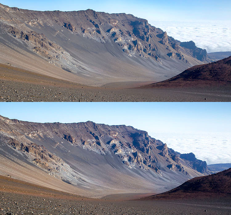
 Introduction to Close-Up & Macro Photography ebook – just $ 10 (over 30% off) this week with coupon code: DPS. You will need to enter the code to apply the discount.

googletag.cmd.push(function() {
tablet_slots.push( googletag.defineSlot( “/1005424/_dPSv4_tab-all-article-bottom_(300×250)”, [300, 250], “pb-ad-78623” ).addService( googletag.pubads() ) ); } );

googletag.cmd.push(function() {
mobile_slots.push( googletag.defineSlot( “/1005424/_dPSv4_mob-all-article-bottom_(300×250)”, [300, 250], “pb-ad-78158” ).addService( googletag.pubads() ) ); } );

The post How to Give Your Macro Photography a Fine Art Touch in Post-Processing by Leanne Cole appeared first on Digital Photography School.


Digital Photography School

 
Comments Off on How to Give Your Macro Photography a Fine Art Touch in Post-Processing

Posted in Photography


3 Simple Tips for Subtle Landscape Photography Post-Processing

23 Apr

Landscapes are one of the most popular photography subjects, and for good reason. Nature is enchanting to the human eye, and it’s only natural for people to want to capture that stunning natural scene with cameras. Some landscape pros and über-enthusiasts will plan ahead with tripods, shutter release cables, filters, and extra gear to make sure they really nail the shot they have in mind.

Then there are more casual photographers like myself who tend to shoot landscapes on a spur of the moment basis, usually during vacation. If you fall into the latter group, this article is more geared toward you. Maybe you have a single landscape shot that looks pretty good, but you’re looking for some light post-processing tips to top it off. If that’s you, read on!

In this article, I will present a few methods for enhancing natural scenes to keep them looking close to how you originally viewed them. All of these techniques have to do with enhancing a single shot, and the effects are not too dynamic or exaggerated, keeping you safe from overdoing it with say, HDR.

Tip #1: Enhance details

One of the quickest and easiest ways to polish any photo is to apply image sharpening. There are several ways to do this in Photoshop. For this article we’ll focus on applying the High Pass filter’s image sharpening effects to the landscape image below of Haleakala, a hiker-friendly dormant volcano in Maui, Hawaii. The before image is above and the after one is on the bottom. The effects may seem subtle from a zoomed-out perspective, but compare distinct areas such as the rock formations to see the sharpening in effect.

High pass sharpening filter landscape photography

Steps for sharpening using the High Pass filter

  1. Start by duplicating the Background layer, and changing the blend mode of the new layer to Overlay. The image will appear heavily contrasted, and with the Overlay blend mode applied, you’ll be able to get a preview of the High Pass filter effects.
  2. Next, apply the High Pass filter to the duplicate layer. It is located in the Filter menu at the top screen in the Other section.
  3. Adjust the filter settings: You’ll then see the High Pass filter dialogue box, which will allow you to use a simple slider to increase or decrease the intensity of the radius value (aka strength of the filter’s effect). The higher the value, the more intense the High Pass filter effect. Generally speaking, it’s best to keep the value on the lower side, between 1-5 pixels. In the case of this image, the radius was set to 1.2 to provide just enough sharpening around the edges of the image without exaggerating the effect.
  4. Tweak the layer settings: After the High Pass filter is applied, it can be fine-tuned by adjusting the blend mode of the duplicate background layer and/or lowering the layer’s opacity. The blend mode you choose can either intensify or reduce the amount of sharpening. For some examples, take a look at the image comparisons below. Hard Light and Vivid Light increase sharpening, whereas Soft Light keeps it subtle.

Landscape photography high pass sharpening filter

High Pass filter landscape photography

Tip #2: Remove image haze

It’s not uncommon for landscape images to appear hazy or foggy when the natural weather conditions are such. The image above was shot on the Oregon Coast a few summers ago using a Canon 70-200mm at f/11 with just a basic clear UV haze filter on the lens. The mist in the air give the photo a dull look in the unedited, straight-out-of-camera version (top image below) but luckily this can be easily fixed in Photoshop (bottom image below).

Landscape Haze before and after

Since the biggest problem with hazy images is soft contrast, the quickest fix is to simply select the Auto Contrast function, located in the top menu dropdown under Image. Poor image contrast is then instantly fixed based on pixel luminosity, resulting in overall finer image contrast. After Auto Contrast was applied, I also adjusted Levels, Saturation, and Vibrance, and the resulting image looks much more balanced and vibrant despite the hazy conditions of the scene. 

Landscape photography auto contrast

Tip #3: Enhance the colors in the sky

Most sunset photos are already quite spectacular when they’re captured with a camera, but sometimes it doesn’t hurt to enhance them a bit more, to fully convey an exceptionally surreal or beautiful scene you witnessed. The photo below is an unedited sunset shot taken at the Grand Wailea in Maui, Hawaii. It looks pretty fine on its own, but I wanted to paint a little more orange and pink into the sky. 

Landscape photography Sunset before after

To do so, we’ll follow these simple steps:

  1. Create a new layer by clicking on the layer icon to the left of the trash can in the layers panel.
  2. Then go to the toolbox and select the Paintbrush icon. To ensure a smooth transition, make sure the opacity is set to 100% and the brush hardness is set at zero.
  3. Set your color: With the Paintbrush still selected, click on the Foreground Color, which is at the bottom of the toolbar. A dialogue box will appear and your cursor will transform into an eyedropper tool. Left click on the desired color in your image that you wish to paint with, in my case a light pink-orange.
  4. Next, start painting over the areas of the sky that you wish to enhance. Be sure to limit the brush strokes to just your sky area; in my case, I wouldn’t want to paint over the darkened shadows on the left side of the photo since I want to keep them as dark as possible.
  5. Change the Layer Blend Mode: After you’re done painting, right-click on the layer you painted on and change the blend mode to something like Soft Light or Overlay to achieve the desired effect. If the effect is too strong, adjust the opacity of the layer to a lower percentage.
  6. Violá! You should now see much stronger, vibrant colors radiating from your sunset image.

Landscape photography sunset sky painting

How do you process your landscape images? Do you have any other tips or tricks? Please share in the comments below.

googletag.cmd.push(function() {
tablet_slots.push( googletag.defineSlot( “/1005424/_dPSv4_tab-all-article-bottom_(300×250)”, [300, 250], “pb-ad-78623” ).addService( googletag.pubads() ) ); } );

googletag.cmd.push(function() {
mobile_slots.push( googletag.defineSlot( “/1005424/_dPSv4_mob-all-article-bottom_(300×250)”, [300, 250], “pb-ad-78158” ).addService( googletag.pubads() ) ); } );

The post 3 Simple Tips for Subtle Landscape Photography Post-Processing by Suzi Pratt appeared first on Digital Photography School.


Digital Photography School

 
Comments Off on 3 Simple Tips for Subtle Landscape Photography Post-Processing

Posted in Photography