RSS
 

Posts Tagged ‘Photoshop’

How to Create Bokeh In-camera and Using Photoshop

26 Jan
Title-Emmet-with-Bokeh

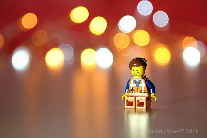
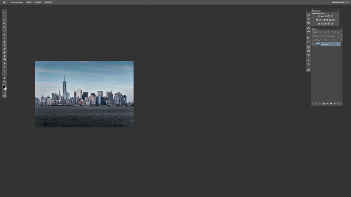
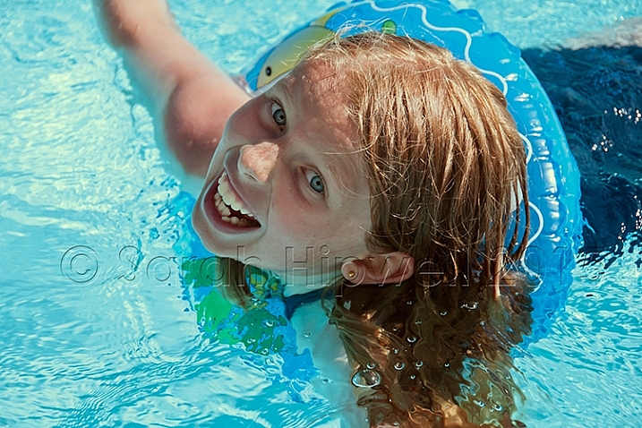
Emmet with background bokeh from small LED lights.

As the holidays are over, I couldn’t resist taking a classic bokeh shot before putting away the lights and decorations for another year.

In this article I’ll show you how you can create this effect in-camera in your own living room. Plus I’ll show you how easy it is to create a bokeh effect using Photoshop as well.

What is Bokeh?

Bokeh comes from the Japanese word boke, which means blur or haze, or the phrase boke-aji which is the blur quality. It isn’t just that any blur will do. It’s more to do with an aesthetic quality of the blur.

What does Bokeh look like?

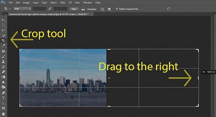
The easiest way to see the shape of the bokeh is by taking a photo with small lights in the background, thrown way out of focus (see second image below).

Small-LED-lights-with-window-in-background

Small LED Lights placed in front of a big window with red see through fabric.

Bokeh-effect-using-aperture-f4

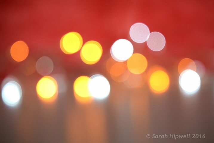
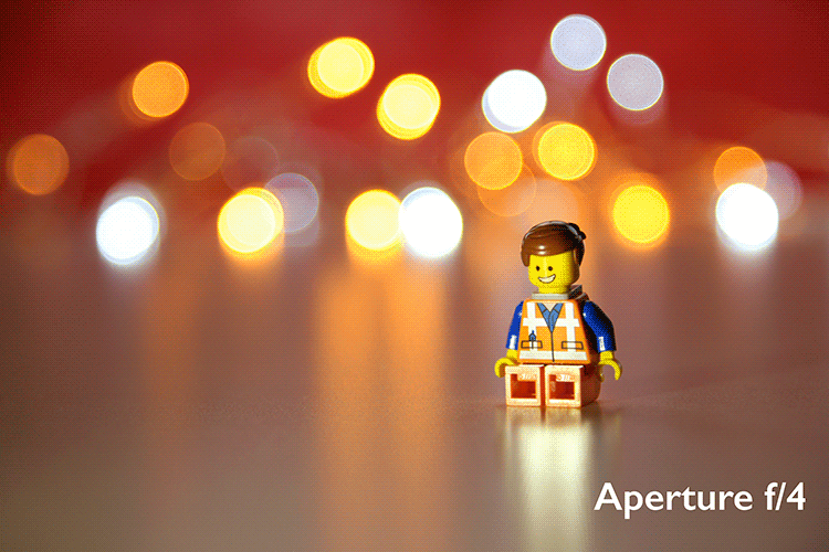
Bokeh effect created in-camera using an aperture of f/4, with a 120mm focal length lens.

Is shallow Depth of Field (DOF) the same as bokeh?

No, but it is important to understand DOF and how it can play an important aspect in creating a bokeh effect. Depth of field (DOF) is the area of your image that is in focus.

Shallow depth of field refers to the object or subject being in focus, but the areas in front, and especially in the background, are blurred. Whereas bokeh is the term that refers to the aspect of light sources that are blurred in the background or foreground.

When discussing DOF, we need to take into consideration three other factors:

  • Aperture size
  • Distance from the lens
  • Focal length of the lens

In practice, photographers who shoot portraits, will in general, use long focal lengths and a wide aperture setting (f/2.8-f/5.6). For example, when you are shooting outdoors with your model, and you don’t want the background in focus. Street lights, or interior building lights, can be used effectively for creating bokeh in the background of your subject.

Aperture

Bokeh is affected by the shape of the diaphragm blades (the aperture) of the lens. A lens with more circular shaped blades will have rounder, softer circles, of out-of-focus highlights. Whereas a lens with an aperture that is more hexagonal in shape, will reflect that shape in the highlights. Generally speaking, the faster the lens, the better the bokeh.

In the following animated gif, you can see that the wider the aperture (the lower the f-number), the shallower your depth of field. The lowest aperture setting on my lens is f/4 but I zoomed out to its maximum focal length of 120mm.

Aperture-animation

Animated gif illustrating the different apertures and how they deal with the lights in the background being thrown out-of-focus.

Create your own bokeh

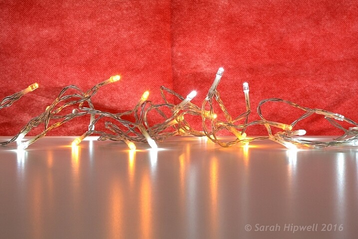
This setup is really easy to try at home. Use whatever lens you have. Set your DSLR camera to Aperture priority or Manual mode ,and use a tripod. I used small LED christmas lights that were battery operated.

Small-LED-lights

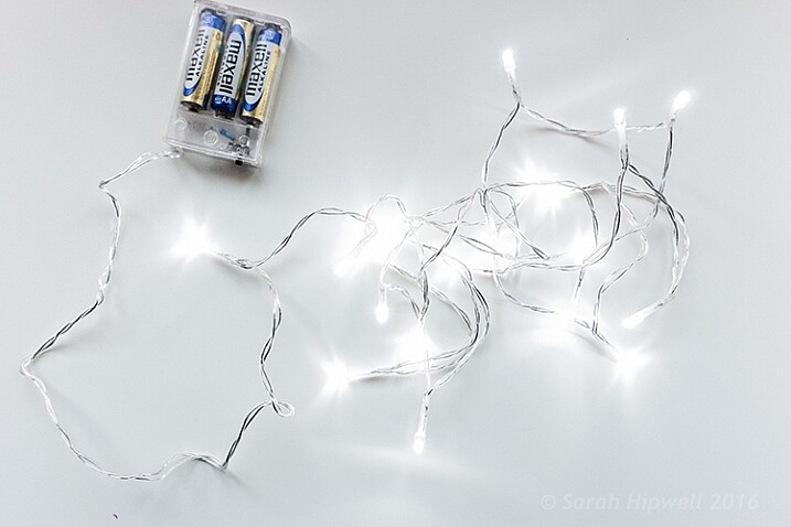
Small battery operated LED lights.

Place your object a good distance away from the camera, and in front of the lights. The distance will vary depending on the lens (focal length) that you are using, so it will be trial and error exercise. Your object must be as near as possible to the camera lens.

Begin with the widest aperture on your lens. The objective is to get the circles of light as round, and as smooth as you can. You may need to experiment by moving the object further away from the lights.
The lighting I used for this setup was a big window light and a small small LED light on Emmet.

Lighting-setup-to-create-Bokeh-in-your-own-home

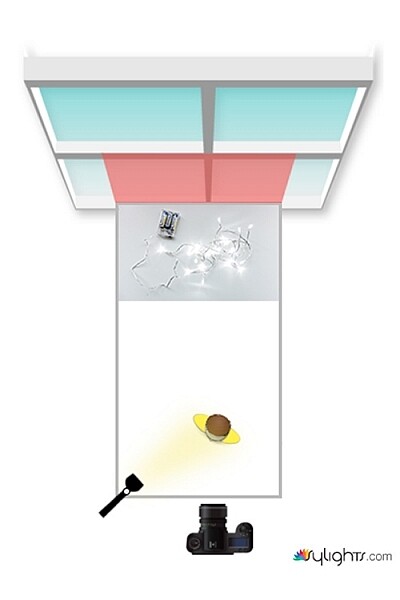
Lighting diagram to show the setup for doing bokeh shots in your own home.

Creating bokeh in Photoshop

Once I got my shot in-camera, I then decided to see if I could create a great bokeh effect in Photoshop.

In the Filter Gallery, under Blur is a fantastic option called Field Blur, which has a dedicated Bokeh feature. I took a few random close-up shots of my christmas tree. I focused only on the lights.

Christmas-tree-with-lights

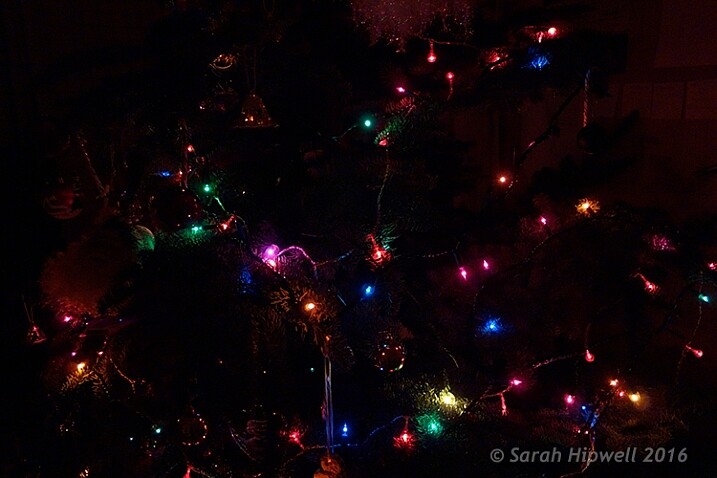
Random shot of a christmas tree with lights.

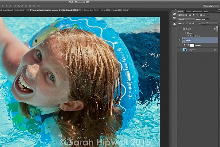
Next, I brought it into Photoshop (CS6). I used the image straight out of camera (SOOC), I didn’t do any other post-processing. Go to Filter > Blur > Field Blur.

Filter-Blur-Field-Blur

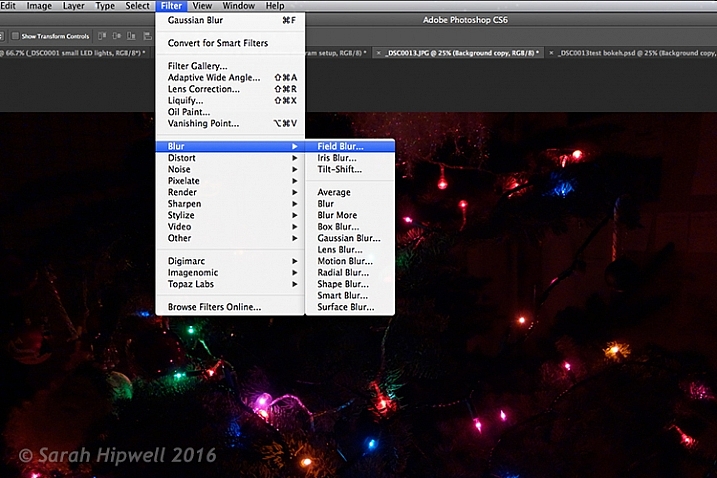
The Field Blur in the Filter Gallery in Photoshop has its own bokeh feature.

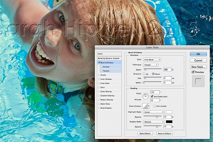
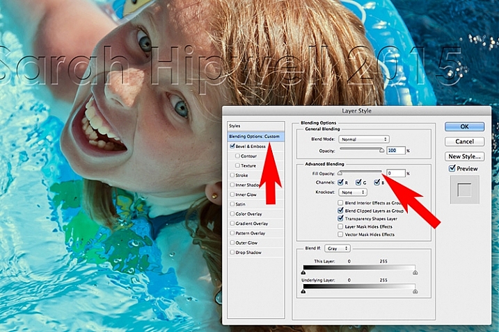
Two panels appear on the right: Blur Tools and Blur Effects. Under Blur Tools, enter 200 px in the Field Blur option. Under Blur Effects, move the Light Bokeh slider to 57%, and the Bokeh Color slider to 78%. Then press the OK button. It takes a few seconds for the blur to take place. Et voilà!

Field-Blur-dialog-options

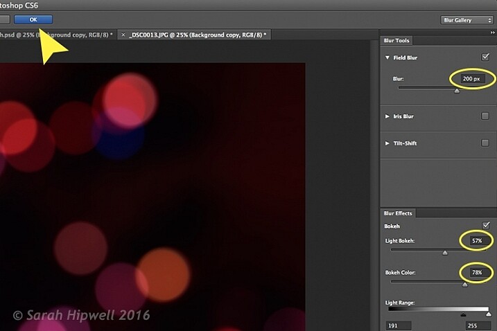
You can experiment with the input figures for the Blur and Blur Effects to get the desired bokeh. I chose these.

Bokeh-from-christmas-tree-lights

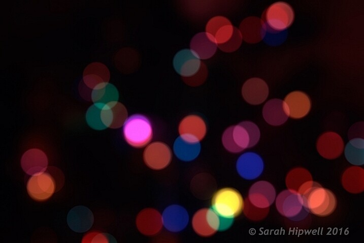
Bokeh effect created in Photoshop using the Field Blur.

Okay, so now what do you do with the image? Use it as a background. I shot a series of playing cards images against a black background.

Playing-cards

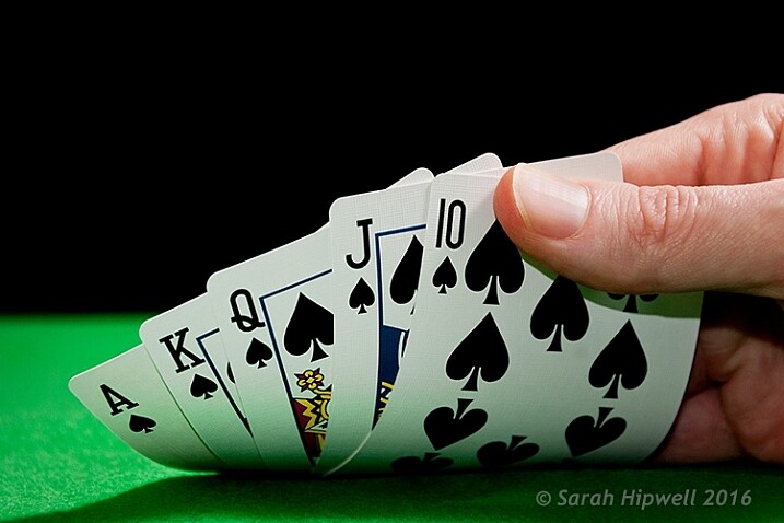
One of a series of images I shot against a plain black background.

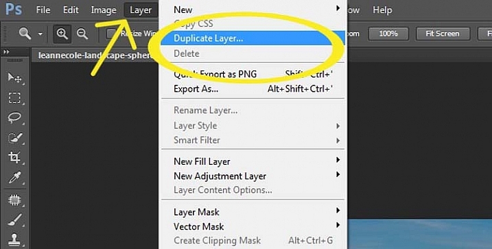
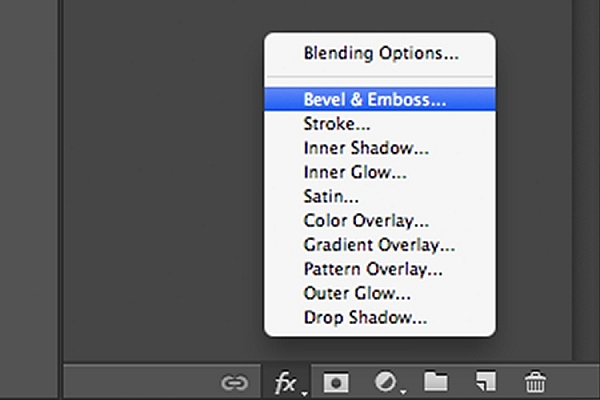
This is where the power of Blending Modes and Layer Masks comes into their own.

By placing the bokeh image on its own layer. I duplicated it to make another copy. Then I reduced the size of the original and moved this over to the left side of the image. I changed the Blend Mode to Screen and reduced the Opacity. I wanted the lights to appear further away from the playing cards, to give it a better depth of field. The screen blend option eliminates the dark areas and makes the light areas show through, making the bokeh appear.

For the copy layer, I left the size as it was and moved it over to the right. I increased the brightness by using a Levels Adjustment layer to match the light source. I also changed the Blend Mode of this layer to Screen. Lastly, I masked out any hard lines using Layer Masks.

Playing-cards-with-bokeh-background

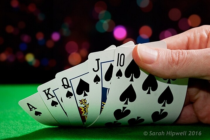
Bokeh effect created in Photoshop and then applied to a background in this image.

I was well pleased with the result.

Now it’s your turn. Let’s see your images with “Bokeh-licious” images posted below.

googletag.cmd.push(function() {
tablet_slots.push( googletag.defineSlot( “/1005424/_dPSv4_tab-all-article-bottom_(300×250)”, [300, 250], “pb-ad-78623” ).addService( googletag.pubads() ) ); } );

googletag.cmd.push(function() {
mobile_slots.push( googletag.defineSlot( “/1005424/_dPSv4_mob-all-article-bottom_(300×250)”, [300, 250], “pb-ad-78158” ).addService( googletag.pubads() ) ); } );

The post How to Create Bokeh In-camera and Using Photoshop by Sarah Hipwell appeared first on Digital Photography School.


Digital Photography School

 
Comments Off on How to Create Bokeh In-camera and Using Photoshop

Posted in Photography


MaxCurve curve editing tool for iOS connects with Photoshop on a desktop

19 Jan

MaxCurve is an app for iPhone and iPad that, as the name suggests, relies predominantly on curves for image editing. Overall, there are 20 curve adjustments available which are grouped into so-called kits. Another key feature of MaxCurve is its ability to connect, via Wi-Fi, to a desktop version of Photoshop that is running on a Windows PC or Mac. Read more

Articles: Digital Photography Review (dpreview.com)

 
Comments Off on MaxCurve curve editing tool for iOS connects with Photoshop on a desktop

Posted in Uncategorized


How to Create a Lightsaber in Photoshop Video Tutorial

10 Jan

With all the recent hype and talk about the newest installation in the Star Wars movie empire (The Force Awakens), I thought this might be a fun project to do.

If you’ve followed along with the saga you know about lightsabers, the weapon of choice for the Jedi knights. Even if you aren’t a fan, you’ve likely heard of it, or had your kids or grandchildren request a toy version for themselves. So how fun would it be to add one to your photos.

Here are two videos that take slightly different approaches to creating a lightsaber in Photoshop. You can learn some new techniques and see which method you prefer.

This one by Adam from Photoshop Tutorials:

And another with Andrew from Creative Edge Studios:

If you give this a try, please share your images in the comments below. See how creative you can be, and how realistic you can make your lightsaber look. Have fun!

googletag.cmd.push(function() {
tablet_slots.push( googletag.defineSlot( “/1005424/_dPSv4_tab-all-article-bottom_(300×250)”, [300, 250], “pb-ad-78623” ).addService( googletag.pubads() ) ); } );

googletag.cmd.push(function() {
mobile_slots.push( googletag.defineSlot( “/1005424/_dPSv4_mob-all-article-bottom_(300×250)”, [300, 250], “pb-ad-78158” ).addService( googletag.pubads() ) ); } );

The post How to Create a Lightsaber in Photoshop Video Tutorial by Darlene Hildebrandt appeared first on Digital Photography School.


Digital Photography School

 
Comments Off on How to Create a Lightsaber in Photoshop Video Tutorial

Posted in Photography


How to Make a Little Planet Using Photoshop

06 Jan

Photography doesn’t always have to be serious, sometimes it is nice to do something just for fun. Making a landscape look like it is a little planet is one of those things. There aren’t any uses for it, and you wouldn’t spend your photography career doing this. It is, however, one of those photography tricks that a lot of people like to try.

LeanneCole-landscape-sphere-done-0033-dps717px

A Landscape turned into a sphere or little planet.

Landscape images work best. The photo should have a foreground, a horizon, and a sky. If you have trees or buidings in the image that go out the top of the image it may not work as well. It is all experimental, so you should try images like that, but it does seem to work best with images that look like the one below.

LeanneCole-landscape-sphere-done-0035-dps717px

This image was chosen because it has all of those elements; the river is in the foreground, there are buildings along the horizon, and there is a sky. There is also nothing going out the top of the image. As the photo is going to connect from one end to another, it has to be an image that has similar ends.

How to create a Little Planet

Open the photo you want to use in Photoshop.

1-leannecole-tutoria-photo-sphere

Open photo in Photoshop.

The first thing to do is to duplicate the layer by pressing Ctrl+J (CMD+J on Mac). It can also be done by going up the main menu, clicking Layers > Duplicate Layer.

16-leannecole-tutoria-photo-sphere

Duplicate Layer

You may need to make the image smaller on the screen using the magnifying tool. Make it small enough to only fill part of your current view, like so:

Screen Shot 2015-12-21 at 1.18.59 PM (2)

Turn on your rulers (Cmd+R on Mac, or Control+R on PC). Once they appear, right click on one and select percent to display on the rulers.

Make sure you are on the Background Layer, and select the crop tool (keyboard shortcut is C). Click on the image to bring up the cropping frame. Grab the right edge marker, and drag it it to the right to enlarge the frame to twice the size of the image (watch the number as you drag, go until you get to 200%). Look at the following image.

17-leannecole-tutoria-photo-sphere

Extending the Image

Next, highlight the duplicated layer in the Layers panel, by clicking on that layer.

4-leannecole-tutoria-photo-sphere

Select the duplicate layer

This duplicated layer needs to be flipped horizontally. Go to: Edit > Transform > Flip Horizontal.

5-leannecole-tutoria-photo-sphere

Use Transform to flip the duplicate layer.

Select the move tool (keyboard shortcut is: V) and move the duplicated image over to the right side until you have the two images touching in the middle.

6-leannecole-tutoria-photo-sphere

Use the move tool to put the duplicated, flipped image, into place.

Figure out where you want the images to meet in the middle. Sometimes overlapping them can make it look a little better. You will need to crop the image to remove some of the extra area that you created earlier.

7-leannecole-tutoria-photo-sphere

Crop the image to the edges of the image.

To make the sphere, the image needs to be square, so go to the top menu and click Image > Image Size. When the window pops up, you need to unlock the part that automatically changes the height when you change the width (maintains the proportions). Click the lock (chain) icon to unlock it. Make the width the same as the height, and press okay.

8-leannecole-tutoria-photo-sphere

In the Image Size window the height and width are locked.

9-leannecole-tutoria-photo-sphere

Click on the lock to unlock image to make width the same as height.

Before you can make the sphere you should combine the layers. Go up to: Layers > Flatten Image. An easier way is to press Shift+Ctrl+E (Shift+Cmd+E on Mac), this will make them one layer (it merges all visible layers).

10-leannecole-tutoria-photo-sphere

Combine the layers.

You will also need to flip the image vertically. Go back to the main menu, select Image > Image Rotation > Flip Canvas Vertical.

12-leannecole-tutoria-photo-sphere

Flip image vertically.

Next, go to Filter >Distort > Polar Coordinates….

11-leannecole-tutoria-photo-sphere

Select Polar Coordinates in the Filter, Distort menu.

When the popup window appears, select the option: Rectangular to Polar. Press OK.

13-leannecole-tutoria-photo-sphere

Choose rectangular to polar.

Voila, your landscape sphere, which now looks like a little planet.

14-leannecole-tutoria-photo-sphere-dps717px

The world turned around.

But, there is a gap where the images meet. This can easily be fixed with the Spot Healing Brush Tool. It is in the toolbox on the left side of the windows panel. Run the tool along where the images don’t quite connect.

LeanneCole-landscape-sphere-done-0033-dps717px

Landscape turned into a sphere or little planet.

There you have your landscape sphere, or little planet image.

You may want to crop it a little to make the planet bigger in the image, and to remove any things that have happened in the corners. You may also want to rotate it to get the view you want.

You can do this with other types of images as well. You could try it with a panorama, then you don’t have to do the part where you copy the layer. However, you need to be aware that it may not come out as you expect, it can come out distorted.

If you don’t flip the image vertically before applying the filter it will do the image in reverse. The image that I used for this article would then have the river on the outside, and the sky in the center (see image below).

LeanneCole-landscape-sphere-done-0034-dps717px

Result done the other way.

As you can see there are no real uses for this except as a fun project. Try it and see what you can come up with, and please share your images in the comments below.

googletag.cmd.push(function() {
tablet_slots.push( googletag.defineSlot( “/1005424/_dPSv4_tab-all-article-bottom_(300×250)”, [300, 250], “pb-ad-78623” ).addService( googletag.pubads() ) ); } );

googletag.cmd.push(function() {
mobile_slots.push( googletag.defineSlot( “/1005424/_dPSv4_mob-all-article-bottom_(300×250)”, [300, 250], “pb-ad-78158” ).addService( googletag.pubads() ) ); } );

The post How to Make a Little Planet Using Photoshop by Leanne Cole appeared first on Digital Photography School.


Digital Photography School

 
Comments Off on How to Make a Little Planet Using Photoshop

Posted in Photography


50 Photoshop & Lightroom Photo Editing Tutorials to Enhance Your Images

04 Jan

Photoshop and Lightroom are awesome tools for photographers, professionals and amateurs alike. While Lightroom is considered the most comprehensive tool to do some basic image editing, such as fixing exposure, white balance, and contrast, Photoshop is often chosen by photographers for further creative processing. Without a doubt, Photoshop is a powerful program with huge possibilities. However, once you really dig Continue Reading

The post 50 Photoshop & Lightroom Photo Editing Tutorials to Enhance Your Images appeared first on Photodoto.


Photodoto

 
Comments Off on 50 Photoshop & Lightroom Photo Editing Tutorials to Enhance Your Images

Posted in Photography


How to Create a Vintage Look for Your Image Using Photoshop

23 Dec

Creating a vintage look for an image is now easy, without having to shoot with an old film camera. Although I would recommend any photo enthusiastic to try! I have a an Agfa camera ISOLA that I use every now and then. I love the contrasty, grainy black and white pictures it allows me to shoot. I usually ask advice regarding the film I can use depending on the sought-after result (contrast- grain – ISO).

With a few easy steps in Photoshop you can make a textured, desaturated vintage look for any of your pictures. I’m going to show you how I did it with a self-portrait, but you can really do it with any picture as this technique really creates a great feeling to any image, whether it is a portrait or a landscape.

Vintage images are usually not so sharp, so I chose an image with some motion blur. You can add some directly in camera playing with slow shutter speeds and creating some motion. To edit this image, we are going to change the color using a gradient map adjustment, add some textures, and finally add a vignette to get a vintage look image.

Setting the mood for creation before Setting the mood for creation after

Step one: Modifying the color tones using gradient map

There are many ways to desaturate an image. I love the gradient map adjustment because it allows me to desaturate the image, to add some color tones, and also to adjust its contrast. Hopefully, you will love this tool if you haven’t tried it yet.

Vintage images are usually desaturated – it could also be sepia. To get the desaturation you can go to Layer > New adjustment layer > Gradient Map (as shown below).

01

Or you can go to your layer tab and select new Gradient Map layer (as below).

02

In the properties tab (screenshot below) you can see what gradient has been applied. By default it will be a foreground to background color, so usually black and white (the color squares on the bottom of your tools bar). You can also set the gradient color by changing your background and foreground color.

03

Photoshop then offers you 2 different options:

  • The Reverse option will change the gradient and give you a negative of your image, as in this case I add white into the black and black into the white (below).04
  • The Dither option will mix in noise to help blend the gradient more smoothly. So you can check any of those options depending on the effect you want to achieve.

Edit your gradient by clicking on it (click on the gradient color bar); the gradient editor will then open.

05

The gradient editor window shows you on the left the color applied to your blacks, and on the right the color applied to your whites. To modify the gradient you have two options:

First option, you choose one of the available presets. You click on a preset to apply it to your image. Second option is to create a custom gradient. Simply double click on one of the color stops, and choose a new color among the color pop-up menu.

You can also create a new color stop/intermediate by clicking below the gradient bar to define another one wherever you want (remember on the left are your shadows/black tone – in the middle mid-tones, and on the right your highlights/white tones). Once the new color stop is set you can also move it so it affects more of your dark or light tones.

In case you want to save the created gradient as a preset, name it, then click New after you have finished. It will then appear in your presets.

This is a powerful tool to adjust any color tone in your images. In this case I will first use the black and white gradient. When using this option the image is then turned into a black and white picture.

06

As it is not what we intended to do, lower the opacity of the adjustment layer.

07

I set it to 68% in this case, but you can choose whatever number gives a nice look to your image – play with the opacity to decide which one best suits the image you are editing.

You can add also a touch of color. Keep it very soft to achieve a vintage look. To bring back some color, you can add a second Gradient Adjustment layer. After you add another layer, click on your gradient and choose a yellowish/brownish option to get a sepia tone, one in the presets or make a custom one.

08

Once again you can lower the opacity of the adjustment layer to have a softer effect.

09

You can also add a different color according to the mood you want to set in your image. In this case I decided not to add further color tones so I added only the black and white gradient.

Step two: Adding texture to give the image a vintage feel

Now that you have achieved the color you want, it is time to add some texture to your image.

Personally I always shoot my own textures, but you can also find great textures on the internet on stock image sites. Or shoot your own pictures: walls, old paintings, grounds, wood, leaves, etc., any textured surface you can find. It is very easy, and can help you find some inspiration.

10

You drag and drop using your move tool or copy and paste a textured photo on top of your main picture. Then mix it by using the layer Blending Mode, try Overlay or Soft Light. I really recommend you to go through all the blending options to see how they blend the texture with your image (each image is different, and each mode can create a different look).

11

I always add textures to my personal works to give a painterly effect to my images. To have a lighter effect you can lower the opacity of your layer. To have a stronger effect you can repeat this step and add several textured layers.

You can modify the effect by adjusting your texture image. Select the texture in your layer’s tab and go to: Image > Adjustment > Curves/Levels.

12

Playing with Curves or Levels will help you to bring back, or soften, some details in the texture. You also can add a Gaussian Blur filter if there are details that are too sharp in your texture image.

13

Select the area where you want to show or not show the texture. You can add a layer mask on the texture layer and by painting with black or white on the layer mask, you add (show) or remove (hide) areas where the texture appears.

Select your texture layer and click on add a layer mask. Lower the opacity of your brush tool, and keep its hardness to 0% to get very smooth edges. Now you can start painting in black over the areas where you want less or no texture.

14

Everything is in the details, and Photoshop allows you a full control over your images. Usually to still have a “clean” image, and not to lose some details, you can mask areas such as skin, eyes, lips, etc., when editing a portrait.

So take your time to play with your textures. Try different types of shapes and contrasts. You can desaturate your textured image, or keep it in color. I find it easier when the texture is desaturated so you can fully control the color tones of your image separately, but it is up to you, and to the image you have in mind. As with any creative exercise, it is a matter of taste and style.

Step three: Finishing your image by adding a vignette

Vignetting can be an unintended, and undesired effect, caused by camera settings or lens limitations. However, you can also introduce it for creative effect, such as to draw attention to the center of the frame. You can choose a lens which is known to produce a vignette, or a filter to obtain the same effect.

Obviously, as we are going to do now, you can also add a vignette by post-processing your image in Photoshop. You have many options in Photoshop to vignette your images. In this case we are doing something very uneven so the vignette also helps to create a strange atmosphere.

Grab your lasso tool and draw very random lines around the edges of your image. It looks weird, but it is quite effective.

15

Go to Layer > New adjustment layer > curves. Darken your mid-tones by pulling down your curves to about one third (or to any darker/lighter spot according to your taste).

16

Whenever you select an area of your image, and have this selection active when you create a new adjustment layer, Photoshop automatically creates a layer mask on the new layer from your active selection.

Remember – on your layer mask white is where the effect will be applied, and black where the effect will not be applied. Here you want to apply the effect on the edges of the image, not in the center- if need be invert your layer mask by selecting the layer mask and pressing: CMD/CTRL+I.

Then double click on your Curves layer mask and feather your selection (around 87 pixels here).

17

You can once again play with the opacity of your layer to lighten the vignette.

I hope you enjoyed this article. Feel free to share in the comments your usual steps to crete a vintage look to your images. Share your images as well using this technique if you give it a go.

googletag.cmd.push(function() {
tablet_slots.push( googletag.defineSlot( “/1005424/_dPSv4_tab-all-article-bottom_(300×250)”, [300, 250], “pb-ad-78623” ).addService( googletag.pubads() ) ); } );

googletag.cmd.push(function() {
mobile_slots.push( googletag.defineSlot( “/1005424/_dPSv4_mob-all-article-bottom_(300×250)”, [300, 250], “pb-ad-78158” ).addService( googletag.pubads() ) ); } );

The post How to Create a Vintage Look for Your Image Using Photoshop by Amélie Berton appeared first on Digital Photography School.


Digital Photography School

 
Comments Off on How to Create a Vintage Look for Your Image Using Photoshop

Posted in Photography


Using Smart Objects to Add Text With a Reflection in Photoshop

21 Dec

Photoshop is a massive program, with many ways to do things. To help you learn Photoshop it’s great to just pick one thing, one new tip, and try it out.

In this video from Phlearn Aaron Nace will show you how to add text with a reflection to an image, but with a neat little twist that allows you to edit the text any time and have it update your finished image automatically using Smart Objects. Have a look:

He even goes over the steps as a summary at the end of the video.

This is a fun project to try on a rainy day – give it a go.

If you want more Photoshop tutorials check out these:

  • Create Your Own Watermark using a Custom Shape in Photoshop
  • Photoshop Tip: Using the High Pass Filter to Sharpen Images
  • How to use Color Grading for Effect and Tone Control in Photoshop
  • 5 Tips for Using the Blend If Feature in Photoshop
  • 5 Photoshop Tips You Probably Didn’t Know

googletag.cmd.push(function() {
tablet_slots.push( googletag.defineSlot( “/1005424/_dPSv4_tab-all-article-bottom_(300×250)”, [300, 250], “pb-ad-78623” ).addService( googletag.pubads() ) ); } );

googletag.cmd.push(function() {
mobile_slots.push( googletag.defineSlot( “/1005424/_dPSv4_mob-all-article-bottom_(300×250)”, [300, 250], “pb-ad-78158” ).addService( googletag.pubads() ) ); } );

The post Using Smart Objects to Add Text With a Reflection in Photoshop by Darlene Hildebrandt appeared first on Digital Photography School.


Digital Photography School

 
Comments Off on Using Smart Objects to Add Text With a Reflection in Photoshop

Posted in Photography


6 Photoshop Tools Every Newbie Should Learn

13 Dec

In the days before digital imaging, if you truly wanted to elevate your photography to the level of art, you learned how to process your images in the darkroom. You learned dodging, burning, masking, sandwiching negatives, flashing and fogging – all designed to get the most out of your images, and deliver your artistic vision to your viewers.

Photoshop-tools

The finished image after Photoshop, using the tools discussed below.

With the advent of digital imaging, photographers have a new way to bring their artistic vision to life, known as the digital darkroom. While there are several different applications available for photographers, one has become synonymous with photo editing, and that is Adobe Photoshop.

Many of the tools in Photoshop can trace their origins to the wet darkroom of yesteryear. If you’re new to Photoshop, it can seem overwhelming the first time you open an image in the program. I’ve created this list of six must-know Photoshop tools to help you get started editing your images. These aren’t by any means the only tools needed, and there are of course tools within the tools to figure out, but this list should give you some idea of where to start. The great thing about most tools in Photoshop is that there are a lot of sliders, meaning you can experiment and see what each tool does, then undo it if you don’t like it.

1 – Adobe Camera Raw

Adobe Camera Raw is a series of sliders and tabs used for processing RAW files. The beauty of the RAW file is you can make changes to the file non-destructively and change them again later if you choose.

Adobe Camera Raw is a series of sliders and tabs used for processing RAW files. The beauty of the RAW file is you can make changes to the file non-destructively and change them again later if you choose.

It is my personal belief that if you aren’t photographing RAW images, you are doing yourself a disservice as a photographer. When you allow your camera to process your image into a JPEG, you are throwing out potentially critical information from your image. You are trusting your camera to make creative decisions for you about the color, contrast, tone, and more, with regards to your image.

To get the most out of your image, you’ll want to set your camera to capture the image as a RAW file. A RAW file contains unprocessed, uncompressed, grayscale data from your camera’s image sensor, as well as metadata about how the image was captured. Adobe Camera RAW is the plugin for Adobe PhotoShop that can take this information and process a color image.

When you open a RAW image in Adobe Camera RAW, you’ll be presented with a toolbar across the top, and a tool palette on the right side. The tool palette is divided into 10 tabs: Basic, Tone Curve, Detail, HSL/Grayscale, Split Toning, Lens Corrections, Effects, Camera Calibration, Presets, and Snapshots.  The tabs I use most in my workflow are Basic, Lens Corrections, Effects, and Camera Calibration.

The beauty of a RAW file is that you can change the settings using the sliders, and other tools, as often as you like. If you don’t like what you’ve done, or you want to try something different, you can always revert the image back to the original settings, and the file is the same as it was when you downloaded it from your camera. Don’t be afraid to play with the sliders and see what they do. You can’t ruin the RAW file, so you might as well see what everything does. For more on using Adobe Camera Raw, check out Understanding the Basic Sliders In Adobe Camera Raw.

2 – Layers and Layer Masks

I created a duplicate layer to warm up the sunrise a bit and look more like it appeared when I was there. But since I still wanted the cooler tones on the rocks, water, and the rest of the sky, I used a layer mask to show only the warmer tones where I wanted them.

I created a duplicate layer to warm up the sunrise a bit and make it look more like it appeared when I was there. But since I still wanted the cooler tones on the rocks, water, and the rest of the sky, I used a layer mask to show only the warmer tones where I wanted them. The white area of the mask for the layer called, “Warmer Tones” shows the area of that layer that is showing through.

I consider this number 2a and 2b. If you’re going to learn layers, you’re going to have to learn layer masks as well. In Photoshop, one of the first things you’ll notice when you open an image is the Layers Palette on the right side of the screen. Initially, it will likely only have one layer called “Background” which contains your image.  You can add new layers as needed. You can also add empty layers which will allow you paint, draw, or copy portions of the image below onto them, and you can use layers to create a composite from multiple images. Layers can be adjusted to different opacities using the opacity slider at the top of the palette, so they can be made partially translucent which allows the layers underneath to show through.

In addition, you can create layer masks, which allow you show or hide portions of a layer, and allow you to see the layer or layers beneath. You do this simply by painting with black on the layer mask to hide that part of the layer, or painting white to show that part of the layer.

Layers give you room for quite a bit of creativity, allowing you to edit areas of an image non-destructively. If you don’t like what you did, simply delete the layer and start over. You can sandwich together two separate images, much the way you’d sandwich negatives in a wet darkroom, and create photo composites. For more on using layers, read A Beginner’s Introduction to Using Layers.

3 – Blend Modes

This image shows two different blend modes. On the left, Normal is selected, so the white box with the black text appear as I drew it. In the center, the blend mode is set to Multiply, so the white disappears and the black remains. On the right, Screen is selected, which shows the white area and shows the black.

This image shows three different blend modes. On the left, Normal is selected, so the white box with the black text appear as I drew it. In the center, the blend mode is set to Multiply, so the white disappears and the black remains. On the right, Screen is selected, which shows the white area and hides the black.

As mentioned above, the Opacity Slider allows you to blend the active layer with the layers beneath. The Blend Modes, found in a drop-down menu to the left of the Opacity Slider, work in a similar fashion, but use different mathematical calculations to change the appearance of the layer being blended for different things. For instance, if you simply duplicate the image on a new layer and set the Blend Mode to: Multiply it will darken the image by about a stop, and Screen Blend Mode will lighten the image by a stop. If you create a layer on top of your image with black text inside a white box, using Multiply will eliminate the white box, and allow the layer below to show through. Screen will do the opposite (see image above).

As of Adobe Photoshop CC 2015, there are 27 Blend Modes. The two modes I noted above are ones I use often, usually adjusting the opacity slider as well to get to my final look. Knowing what each mode does will help in choosing which one to use for your particular purpose. Darren Rowse put together a great tutorial, An Introduction To Blend Modes In Photoshop to give you a more in depth look at Blend Modes. You can also check out The First 3 Blend Modes You Need to Understand.

4 – Adjustment Layers

I used an Adjustment Layer on the cooler layer to bump up the color saturation a bit.

I used an Adjustment Layer on the cooler layer to bump up the color saturation a bit.

Photoshop Adjustment Layers are a great way make changes to an image, without actually changing the original file. It’s an easy way to try things, such as adjusting contrast or saturation, so that you can go back and change it again later – as long as you’ve kept the layers in tact by saving as a PSD or a TIFF file, formats that both support layers.

There are 19 different adjustment layers, which can be combined to create different effects on your image. Some basic uses are color adjustment, contrast adjustment, saturation, and black and white conversion. In addition, you can use Layer Masks to apply the effects in specific areas only, rather than the entire image, if you so choose.  You can also adjust the Opacity of an adjustment layer to reduce the effect of the adjustment on your image.

Adjustment layers provide a ton of flexibility when editing an image, without forcing you into a change that can’t be undone easily. For more on Adjustment Layers, check out Photoshop: Applying Fixes using Adjustment Layers and Masks and Burning and Dodging with Adjustment Layers and Layer Masks.

5 – The Spot Healing Brush

There were a few stray star streaks in the sky that I wanted to eliminate, so I used the Spot Healing Brush to quickly remove them.

There were a few stray star streaks in the sky that I wanted to eliminate, so I used the Spot Healing Brush to quickly remove them.

The Spot Healing Brush is one of the primary retouching tools in Photoshop, allowing you to remove blemishes and errors, or other parts of your photos. In the digital age, the bane of all photographers’ existence is dust on the imaging sensor, and the Spot Healing Brush provides a quick and easy way of removing those fromyour images.  The Spot Healing brush works similarly to the Cloning Stamp tool, in that it samples from one area of the image to correct other areas.

The Spot Healing Brush automatically detects the content or texture of the surrounding area, and attempts to replicate it wherever you click in the image. There are several options to work with which appear at the top of the screen. These include brush size and hardness, Blending Mode, and the type of fix you want to use, such as Content Aware, Create Texture, or Proximity Match. Each image will have different needs, depending on the content, so it’s best to experiment with the various settings if you find you’re not happy with the results you’re getting.

The Clone Stamp Tool

I had a few dust spots on my sensor. This one in the water, circled in red, did not respond well to the Spot Healing Brush, so I used the Cloning Stamp to sample and area of the water and stamp it over the dust spot.

I had a few dust spots on my sensor. This one in the water, circled in red, did not respond well to the Spot Healing Brush, so I used the Cloning Stamp to sample an area of the water and stamp it over the dust spot.

As I mentioned above, the Clone Stamp Tool and the Spot Healing Brush are similar in that they are both used for retouching images, and both use sampled areas of the existing image. The Clone Stamp, however, allows you to select the area from which to sample by holding the Command key and clicking (on Mac) or CTRL and click (on Windows), and creates an exact copy of the area you sample. Then you simply click on the area you want clone out and a copy of the area you sampled appears.

Again you have some options at the top of your screen, including Blend Modes, Opacity, and whether or not to sample a specific layer, or use all layers. You can also change the edge hardness and size of the stamp. The clone stamp works well when you have a well-defined edge to maintain, such as the wall of a building. The Healing Brush tries to blend edges, which can cause a blurred mess when you really need a clean edge. For more on using the Clone Stamp, head over to 12 Tips for Mastering the Clone Stamp Tool in Photoshop

These six tools in Photoshop are my go-to tools for editing my images. I would estimate that about 90% of my image editing is done using these tools. What are some of your tried and true Photoshop tools?

googletag.cmd.push(function() {
tablet_slots.push( googletag.defineSlot( “/1005424/_dPSv4_tab-all-article-bottom_(300×250)”, [300, 250], “pb-ad-78623” ).addService( googletag.pubads() ) ); } );

googletag.cmd.push(function() {
mobile_slots.push( googletag.defineSlot( “/1005424/_dPSv4_mob-all-article-bottom_(300×250)”, [300, 250], “pb-ad-78158” ).addService( googletag.pubads() ) ); } );

The post 6 Photoshop Tools Every Newbie Should Learn by Rick Berk appeared first on Digital Photography School.


Digital Photography School

 
Comments Off on 6 Photoshop Tools Every Newbie Should Learn

Posted in Photography


Create Your Own Watermark using a Custom Shape in Photoshop

04 Dec
Transparent-watermark

Big transparent type copyright watermark that you would use send to clients for proofing.

I know there are many ways of creating a watermark. Using the Watermark Editor in Lightroom for example allows you to add your own text or graphic to your images. In general there is a lot of debate whether or not to add a watermark to images.

This article isn’t going to discuss the pros and cons of watermarking your images. Instead, I will demonstrate a step-by-step tutorial using the Custom Tool in Photoshop.

Whether you upload your images to the various social media platforms, or you want to send a client a high resolution image for proofing. This easy tutorial will show you how to create your own watermark using the custom tool in Photoshop.

For a while, my method was opening an image file where I had my own custom copyright information on a text layer. So that I could easily drag and drop this text layer onto a new image. This made more sense and took less time to add a watermark image rather than creating it every time. That is until one day, I couldn’t find the file!

Here are my four easy to follow steps to creating your own custom watermark using the Custom Tool in Photoshop. I prefer to use a custom shape over a custom brush. Shapes are vectors which means they scale up or down without losing quality.

Step 1 – Create a new document

Open Photoshop and create a new document. Make it 1000 pixels wide, by 300 pixels high.

Step 2 – Add text

Press the letter D on your keyboard, to make sure your foreground color is black. Choose whatever font you like, then press T to select the type tool. Hold down ALT key on a Mac and press G (Alt+0169 on a PC). This brings up the copyright symbol, add a space and type your name and year.

Alt+G-type-your-name-and-year

Holding down the ALT key on a Mac and press G brings up the copyright symbol (Alt+0169 on a PC).

Step 3 – Convert the layer to a shape

Go over to the layers panel. Right click on the text layer and go down to Convert to Shape.

Convert-text-layer-to-shape

When you have typed your watermark. Right click on the layer and select Convert to Shape.

This icon appears in the thumbnail to show that the layer is now a shape layer.

This-icon-shows-the-layer-is-a-shape

This icon in the thumbnail layer tells you that this is now a shape(vector) layer.

Step 4 – Save as a custom shape

Go up to Edit menu and select Define Custom Shape. A Shape Name dialog box appears – type in Watermark and click OK. This now adds your type as a custom option in your Shape Presets Library.

Define-custom-shape-under-edit

This is how you save your watermark custom shape in the presets library to use again and again.

Shape-name-dialog-box

Give your watermark a name so that you can find it easily. Plus you may decide to have a few.

That’s it. It took just four steps to create your own custom copyright watermark. Let me show now how to access, and add it to your images.

Apply your watermark to images for online viewing

Open an image that you want to share on Facebook, Flickr, etc. Create a new layer in the Layers Panel. Choose the Custom Shape tool in the toolbar (press Shift+U)

Custom-shape-tool-highlighted-in-toolbar

This is where you find the Custom Shape Tool in the Toolbar.

Go up to the Options Bar and click on the thumbnail next to the word Shape. This brings up the Shape Presets Library dialog box. At the very bottom, you will find the shape called Watermark.

Watermark-shape-at-the-bottom-in-presets-library

Custom shapes will always appear at the bottom in the presets library.

Now press and hold the Shift key, click and drag the watermark shape across your image. The Shift key ensures the shape remains in proportion. Don’t worry about the size just yet. Place it in position – in this case, I placed the watermark bottom right.

Now as the foreground color was set to black, I want to change the color to white. Go up to the Layers Panel and click on the Layer thumbnail and the color picker dialog box appears. You can choose whatever color you want here.

Changing-color-of-watermark-to-white

You can customise your watermark shape with any colour or style effect.

Go back up to the Layers Panel and reduce the opacity to your desired setting. I chose 40%.

Opacity-reduced-to-40-per-cent

Reducing the opacity allows for your watermark to be more discreet.

I now want to reduce the size of the watermark. Go up to the Edit menu and choose Free Transform Path (Cmd+T on a Mac). Holding down the Shift and Alt keys, drag any of the corners of the transform handles in towards the centre. This reduces the size while keeping the aspect in proportion. Press Enter or the Commit Transform button up in the Options Bar. Go up to File and Save for the Web.

Apply to high res images for proofing

Okay, so let’s say you want to send a higher resolution image to a client. Open up the image. Click on the Custom Shape Tool (Shift+U). The watermark shape is already selected, so hold the Shift key and click and drag right across the image. Leave the color as it is.

This watermark is going to be transparent. Click on the Add a Layer Style icon at the bottom of the Layers Panel and select Bevel and Emboss. The Layer Style dialog box appears. Increase the size to 8 pixels and change the direction to down.

Bevel-and-Emboss-layer-style

Layer styles can be found by clicking on this icon at the bottom of the layers Panel. Alternatively, go up to Layer menu and choose Layer Style.

Bevel-and-Emboss

The Bevel and Emboss is a good effect to add to your watermark if you want to make more transparent, while still protecting your image.

Next go over to the left and click on the Blending Options: Custom, which is directly above the Bevel and Emboss. Under Advance Blending bring the Fill Opacity slider down to zero and click OK. Go back up to Opacity in the Layers Panel and reduce to 68%.

Blending-Options-Custom-2

Reducing the Fill Opacity hides the colour and just leaves the effect.

Tip:

To place your Custom Watermark Shape at the top in the Presets Library, click on the thumbnail right of the word Shape in the Options Bar. The Shape Presets Library dialog box appears. Click on the gear icon and select Preset Manager, the Preset Manager dialog box appears with all the shapes. The Watermark shape is the very last one, click and drag it up to the top and click the Done button.

Location-of-Presets-Manager

By clicking on the gear icon, the pop-out menu where the Preset Manger is located appears.

Moving-watermark-shape-to-top-Presets-Manager

Here in the Preset Manager, you can rearrange the shapes inside of the dialog box. Just click on any shape and drag it where you want it. I moved the watermark shape to the top for easy access.

Do you use watermarks on your images? Why or why not?

What techniques do you use? Please share in the comments below.

googletag.cmd.push(function() {
tablet_slots.push( googletag.defineSlot( “/1005424/_dPSv4_tab-all-article-bottom_(300×250)”, [300, 250], “pb-ad-78623” ).addService( googletag.pubads() ) ); } );

googletag.cmd.push(function() {
mobile_slots.push( googletag.defineSlot( “/1005424/_dPSv4_mob-all-article-bottom_(300×250)”, [300, 250], “pb-ad-78158” ).addService( googletag.pubads() ) ); } );

The post Create Your Own Watermark using a Custom Shape in Photoshop by Sarah Hipwell appeared first on Digital Photography School.


Digital Photography School

 
Comments Off on Create Your Own Watermark using a Custom Shape in Photoshop

Posted in Photography


Photoshop CC 2015 update and Fuse CC (Preview) now available

02 Dec

Adobe has updated Photoshop CC 2015 with the new features it detailed a few weeks ago as its MAX conference. Among the new, mostly designer-oriented features is a high-contrast touch-enabled interface, the ability to customize your Photoshop CC toolbar, direct SVG importing, Artboard improvements and support for Fuse CC, a 3D design application.

Joining the Photoshop CC update is the release of Fuse CC (Preview), which can be connected with Photoshop for ‘significantly greater design flexibility and creative options.’ At this point, Fuse CC is only available in English.

Articles: Digital Photography Review (dpreview.com)

 
Comments Off on Photoshop CC 2015 update and Fuse CC (Preview) now available

Posted in Uncategorized