Digital cameras have made the process of infrared photography relatively simple and very accessible, compared to the days of shooting with infrared film. No darkroom is required and all you need to get started is an infrared filter on your lens (click through to read my article on How to do Surreal Digital Infrared Photography Without Expensive Gear or Camera Conversions) and to mount your camera on a tripod. Maybe you’ve tried digital infrared photography already. You’ve learned all the correct infrared shooting and compositional techniques so you know you have great images in your camera, but how do you transform those strange looking red or violet frames into stunning infrared photographs?
Here are 5 creative ways to process your digital infrared images in Photoshop to create arresting photos in color, and Black and White.
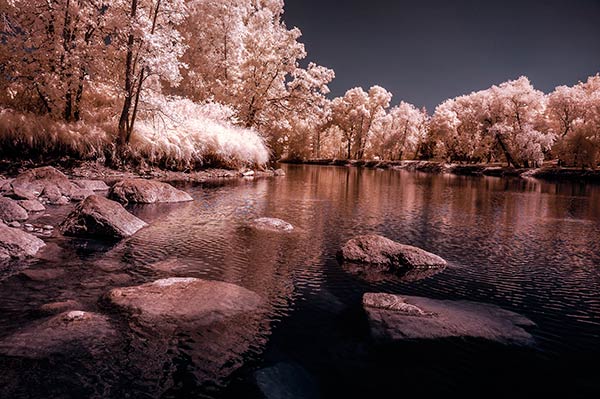
1) Color infrared one-click post-processing method
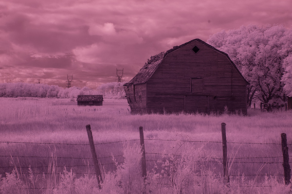
As shot, before Auto Tone
This is the quick and instant method. Open your image in Photoshop and go to Image> Auto Tone. Look at the difference this one click makes! In fact Auto Tone should be the first thing you do to all your infrared images.
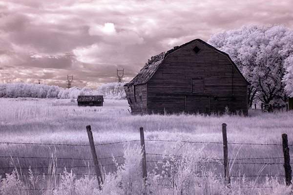
Same image after Auto Tone has been applied
This has become a perfectly delightful infrared image. It has a variety of textures and colors for interest. However you may want to further process it to add more WOW and impact. The next step adds a few more tweaks that will help you do this.
2) Color infrared gradient method
After you apply Auto Tone, you can also apply a Gradient Layer and set the blending mode to Soft Light, or Hard Light – you’ll need to experiment a bit depending on the tonal qualities of your original image. You can also adjust the opacity of this gradient layer. If you are familiar with layer masks, you may want to mask out any areas where the gradient might be too strong.
Here is the same image with the Gradient Layer added. Can you see how it adds a little more depth and drama?
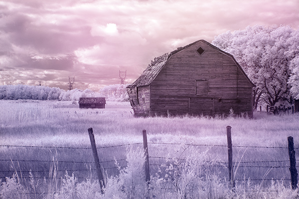
Infrared Image with a Gradient Layer Added
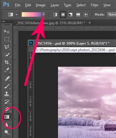 To add a Gradient Layer, go to your Layers palette, and click on the new layer icon at the bottom (it’s the one that looks like a sheet of paper with the corner turned up) or you can use the keyboard shortcut Shift+Ctrl+Alt+N. I find it quicker to use the icon in this case. While this new layer is active, go to the Tools palette and select the Gradient tool. On the context menu on top of the window you’ll see the Gradient library and you can select your pre-set gradient from there.
Now, back on your layer, drag your mouse to get the gradient on your image. Select the blending mode to soft light or hard light and then adjust the opacity. This is where your artistic eye comes into the picture. Play around with these settings until you have something you like.
Here is another infrared image processed the same way. You don’t have to use the same gradient each time – experiment a bit and see how things turn out. It’s art after all!
3) Using the Camera Raw filters and the Channel Mixer
One of the key concepts in infrared photography is to have a very distinct separation of color tones between the sky, and your high infrared reflecting subjects. This is usually the grass and foliage in your scene, or it could be buildings or other subjects that reflect infrared light because of their paint or construction materials. But it’s important to have this separation because you need the sky to be dark, and you’ll want the foliage to be light, if not pure white.
Happily, in Photoshop you can give a tonal boost to your images in a couple of way,s in addition to the Auto Tone setting. After you’ve applied Auto Tone, look for the Camera Raw Filter under Filters. If your image is not a RAW file you can still use these adjustments, although it is best to shoot RAW when capturing infrared photos.
In the Camera Raw Filter, to get this color separation between the light and dark areas of your image, use the the Basics filters and HSL/ Greyscale Slider to adjust the colors until you get a clear difference between the cyan and red shades.
Original image as shot:
After applying Auto Tone and Using the Camera Raw Filters:
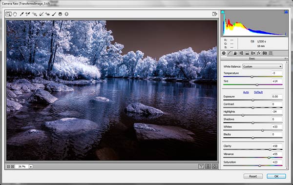
Notice how these adjustments bring out the red in the sky and the blue in the leaves.
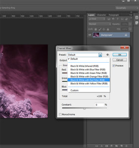
Now to the Channel Mixer
Go to Image>Adjustments>Channel Mixer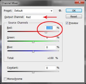
Here we will “swap” the channels to get a nice blue sky and red or purple, and in a few quick steps, white foliage. Your Channel Mixer will look like this:
In the Red Output Channel, change the Red slider from +100 to 0, and the Blue slider from 0 to +100. Change the Output Channel drop-down to Blue, and make the Blue slider +100 and the red slider 0. Your image will look something like this:
There is a clear color difference now between the blue sky and the red foliage. It doesn’t matter if the foliage of your image is purple and the sky blue, as long as you can see a clear difference in colors with the sky having some shade of blue.
Now the last part. Go back into your Raw Filters, and in the Basic panel, move the White Balance Color Temperature slider to the left to get a nice blue sky. In the HSL/ Greyscale tab, use the sliders in the Saturation tab to desaturate the colors of your foliage. Your image should have a blue sky and white leaves and grass. Gorgeous!
The final image

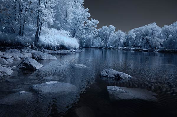
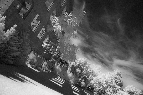
4) Instant Black and White infrared processing
This is a “quick and dirty” method for getting the classic infrared look from your captures. You’ll get the tell-tale light colored foliage, and dark skies. For best results your image should have a clear sky with some clouds for effect. Overcast skies detract from the image, leave things without enough contrast, and very flat. No clouds make the sky seem like a vast black void – not too interesting.
 Classic black and white infrared images tend to be non-contrasty, so from an artistic perspective a blue sky with wispy or puffy clouds can really add interest to your image, create a powerful story, and keep that soft contrast intact.
- Open your image in Photoshop
- Go to Image>Auto Tone
- Next go to Image>Adjustments>Channel Mixer>Black and White with Red Filter (From there you can adjust the sliders to get the effect you want)
- To get the classic infrared glow, check to make sure that in the Tools palette the colors are set to the default – black foreground and white background. To be sure, a simple way to set this is to hit the letter D to reset the colors to the default state.
- Then duplicate your layer (Ctrl J), and go to
- Filters>Filter Gallery>Artistic>Diffuse Glow
- In the Diffuse Glow filter, set the sliders so you can see some halo glows around the white areas of your image. You will have to adjust these to suit your image but it will create the classic graininess and glow of film infrared photos.
If the glow amount is too strong and you’re getting blown out highlights, you can decrease the opacity of your glow layer in the Layers Palette. A little experimentation goes a long way. Remember your History palette in case you want to go back a few steps.
5) Advanced Black and White infrared processing
This is the method I use most for processing Black and White infrared images. It’s easy and it gives you far more control of your final result.
- Open your image in Photoshop
- Go to Image>Auto Tone
- Now create an adjustment layer for Color Balance.
- Layer> New Adjustment Layer> Color Balance
Again, the idea is to get as much color distinction between the sky and any foliage. Color Balance provides an addition method of doing this – in Black and White processing, as well as for color.
- Move the sliders for Midtones, Shadows and Highlights until you have a nice, distinct separation of your color tones betweeb your foliage and your sky.
- Finally add a new adjustment layer for Black & White
- Layer> New Adjustment Layer> Black & White
- Now use the sliders to get the full range of Black and White tones, paying special attention to maintaining detail in the white highlights in the trees, while making sure that the dark areas also have some detail
- To apply the infrared glow, follow from Step 5 in the first method.
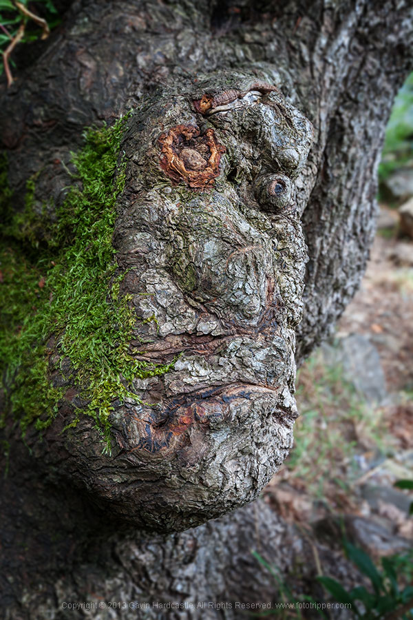
This image is called CREEP. Can you see why?
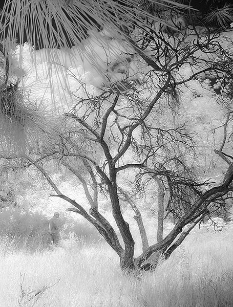
I love the softness and translucency of Black and White, infrared photography. Post-processing really brings out all the infrared characteristics that draw viewers in, and gets the emotions flowing. Using these five processing techniques will get you off to a fine start, but these are only five of many ways you can process your digital infrared images in Photoshop. If you have a favorite post processing formula I’d love to see how you do it. Post your infrared shots too.
The post 5 Creative Ways to Process Infrared Photographs in Photoshop by Alex Morrison appeared first on Digital Photography School.

Digital Photography School


 Photographs evoke emotions, memories or feelings based on what the person sees in the image. In many ways, the viewer’s perception is their reality. So, if the image is of a loved one, the person looking at the photograph will immediately be transported to a memory of that person, good or bad. That memory could cause them to be quite emotional. The reaction to the image could be utterly visceral depending on what emotion is recalled. The same is true in a landscape scene or a seascape scene. The goal of every photographer should be to visually translate the scene in such a way that the viewer can either relate to the scene or would like to be in that scene.


 stille wasser by Ralf Thomas on 500px
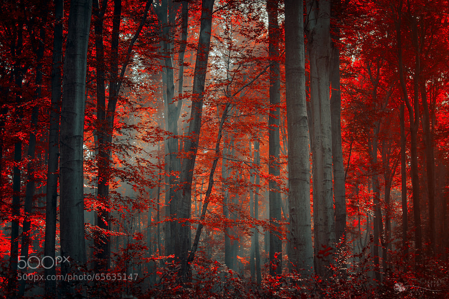 Firewood by Ildiko Neer on 500px
 blue dreams by dpicture on 500px
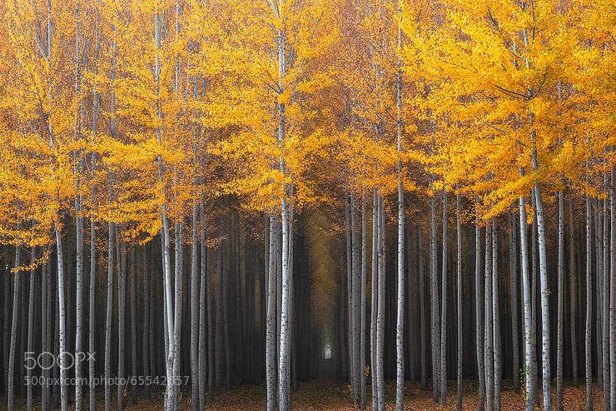 Mysterious Hallway by David Thompson on 500px
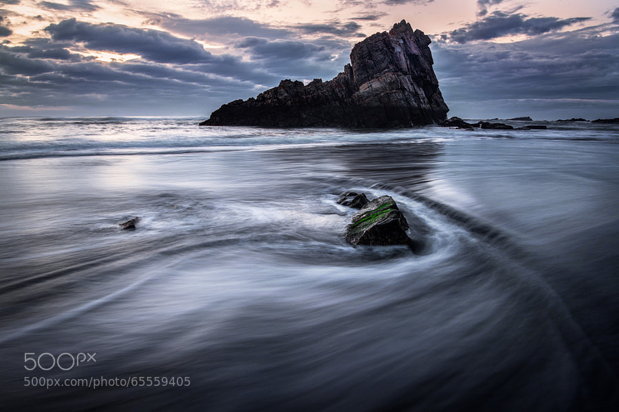 Time Lapse by Danny Velasco on 500px
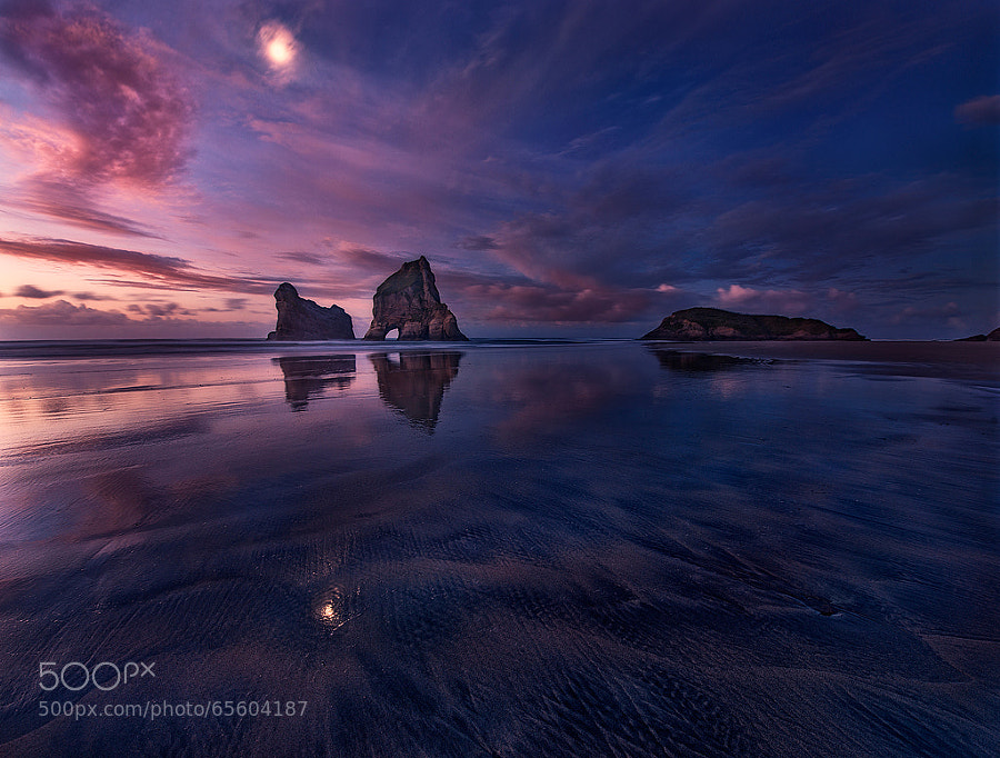 Golden Bay: When Night Falls by Yan Zhang on 500px
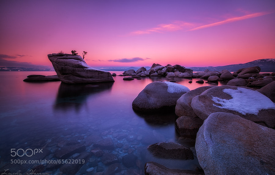 Tahoe by Lincoln Harrison on 500px
 Sweet Tuscany by Marcello Spiazzi on 500px
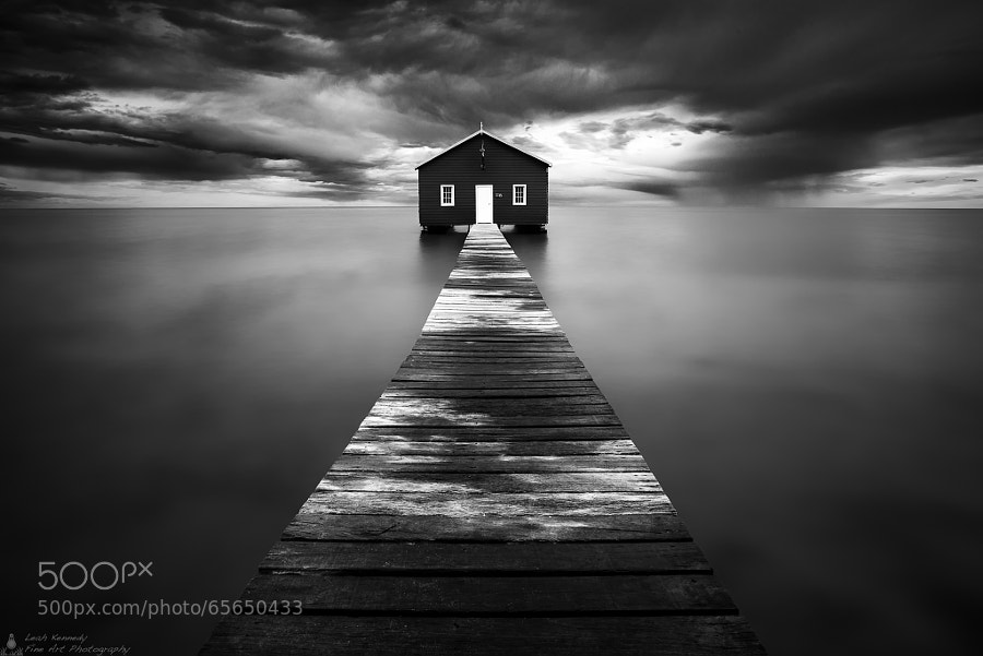 The Boatshed by Leah Kennedy on 500px
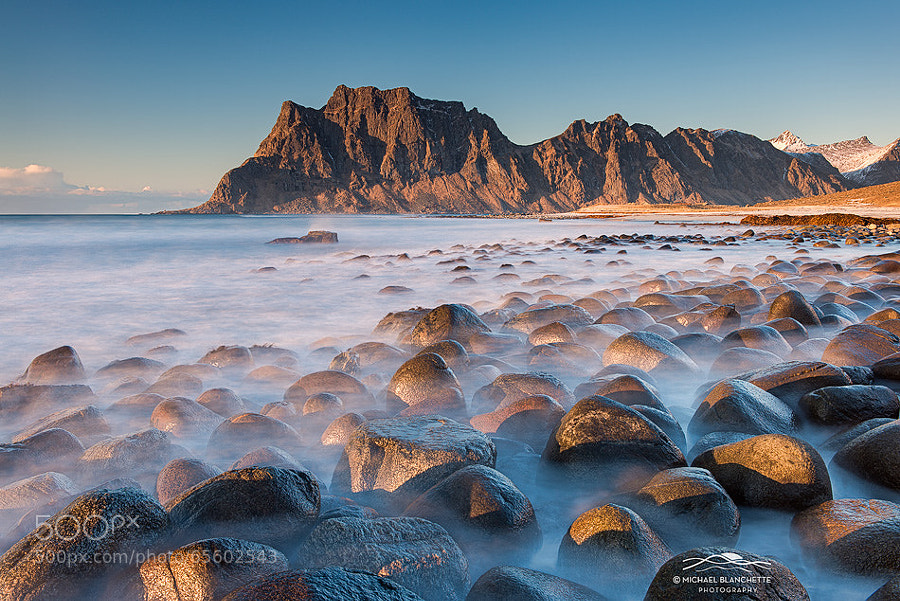 Ghostly Rocks by Michael Blanchette on 500px
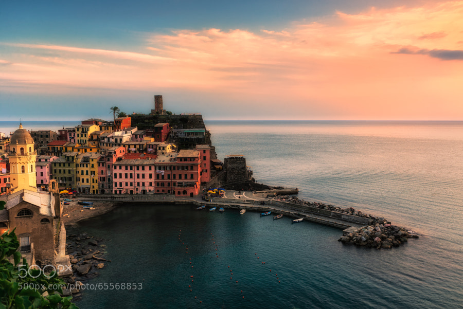 Vernazza at sunset by Fabrizio Lunardi on 500px
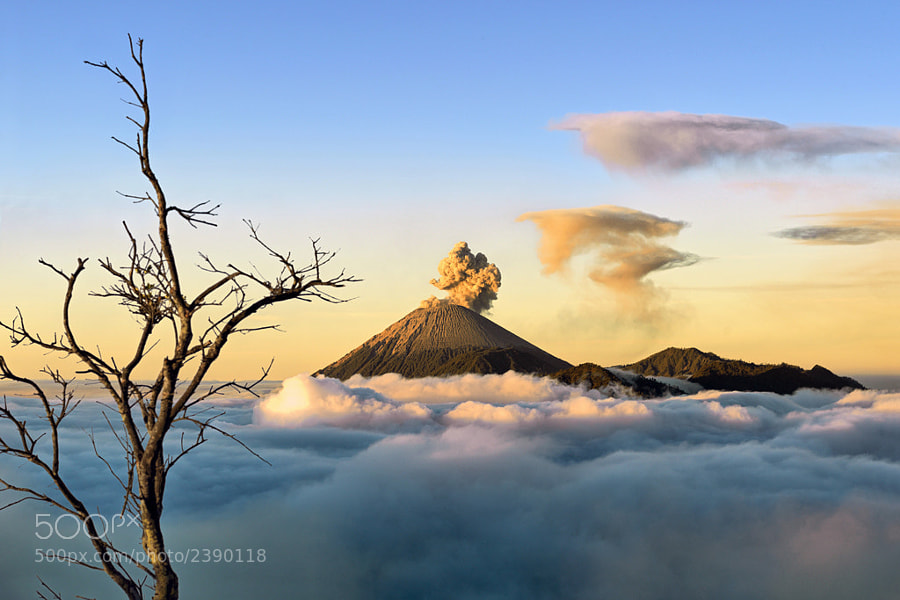 Heaven on Earth by Hartono Hosea on 500px
 Breaking Through by Michael Woloszynowicz on 500px
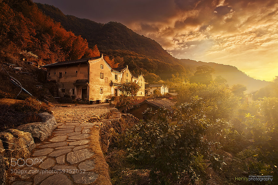 Sunset in Old Village by Henry Wang on 500px
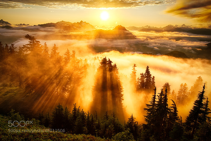 Golden Hour at its Finest by Michael Matti on 500px
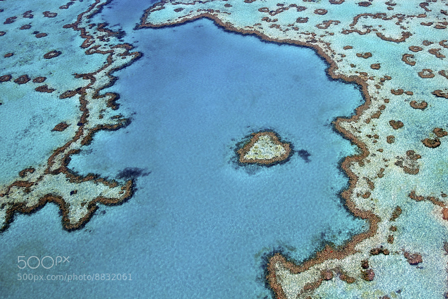 Heart Reef by Tanya Puntti on 500px
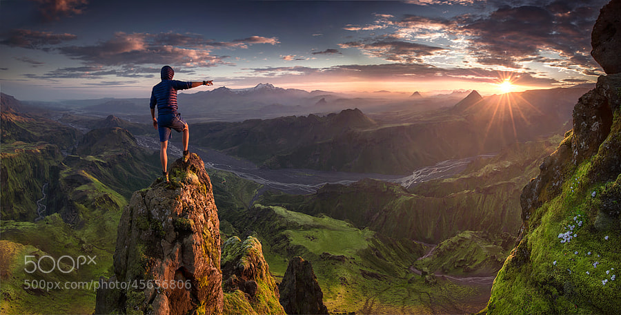 First Contact by Max Rive on 500px
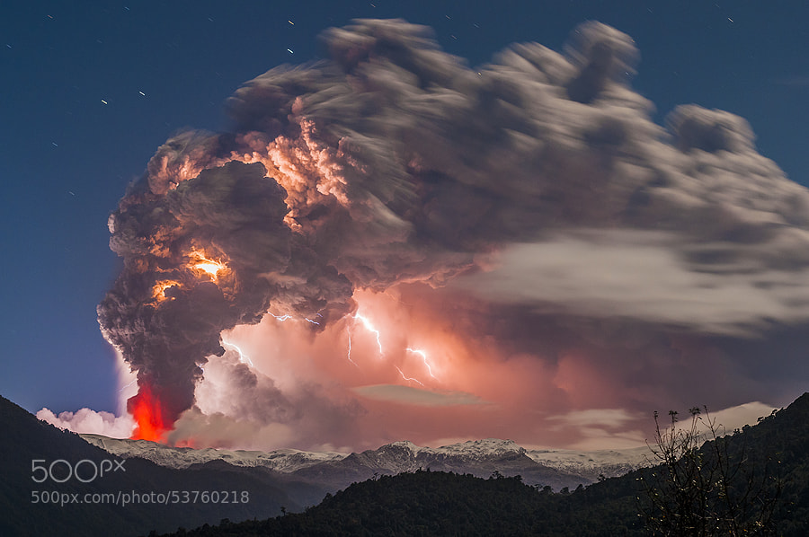 Postcard from hell by Francisco Negroni on 500px
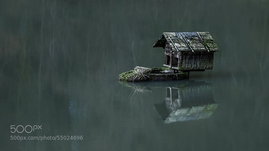 house of the duck by Ronny Engelmann on 500px
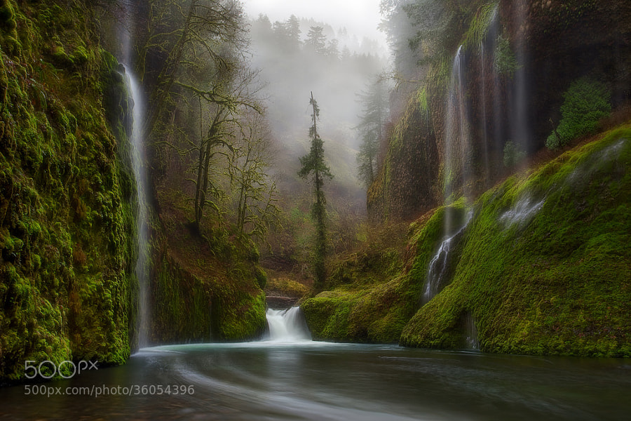 Curtains in the Fog by Miles Morgan on 500px
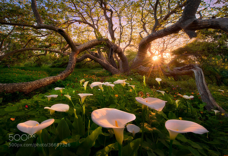 Heaven on Earth by Marc Adamus on 500px
 To Hogwarts! by Daniel Korzhonov on 500px
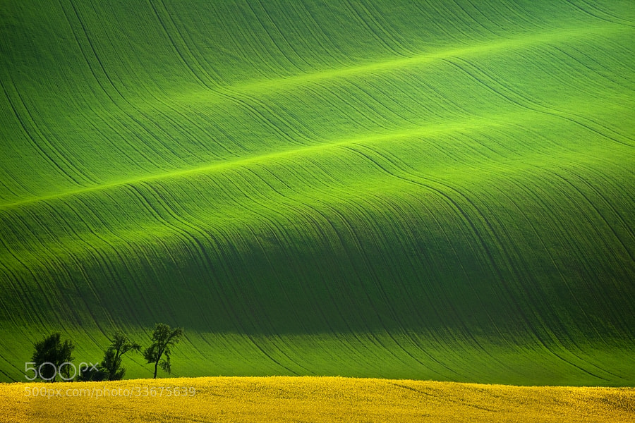 South Moravia II by Daniel ?e?icha on 500px
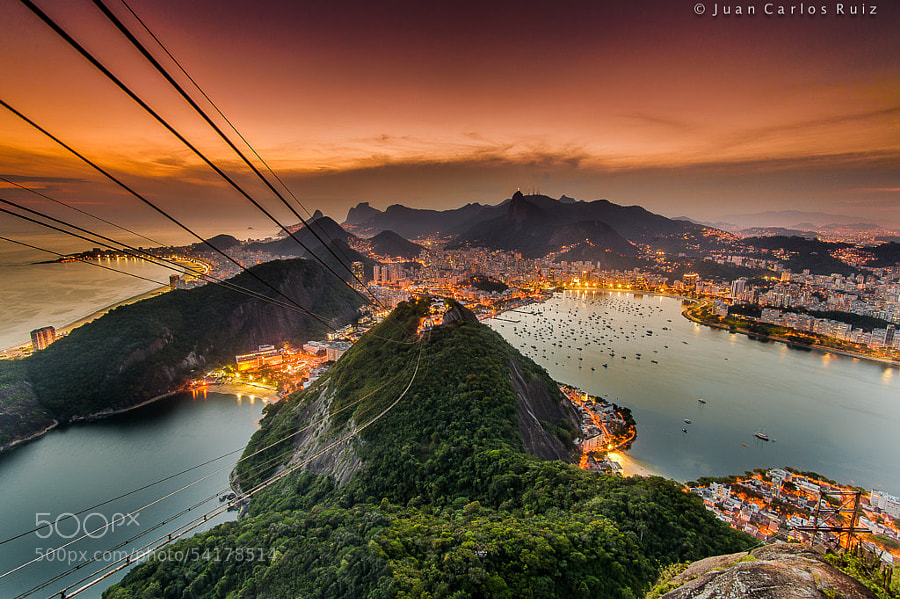 Amazing Rio by Juan Carlos Ruiz on 500px
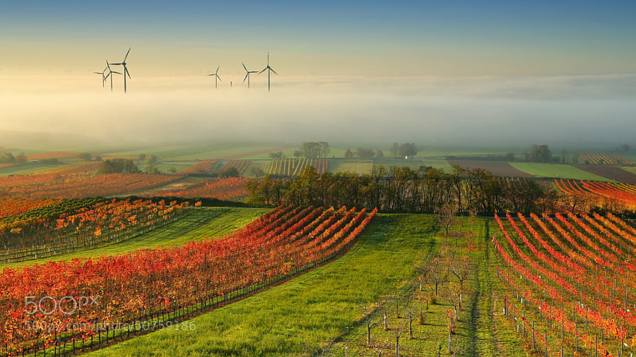 Wine Country in the mist by Matej Kovac on 500px
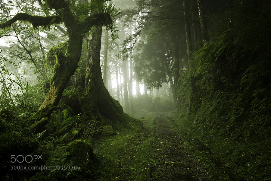 Wood Cart Rail #1 by Justin Jones on 500px
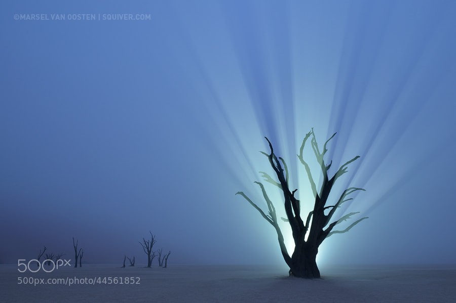 Resurrection by Marsel van Oosten on 500px
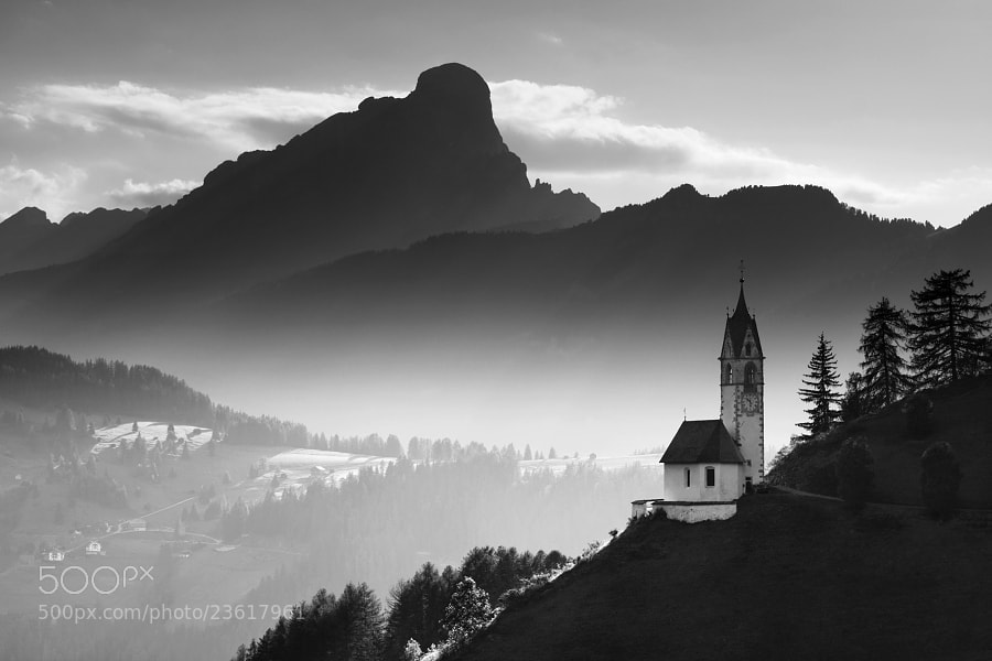 Alpine Church by Daniel ?e?icha on 500px
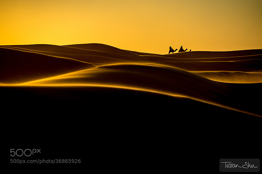 The Desert Life by Tristan Shu on 500px
 Zaanse Schans by Iván Maigua on 500px
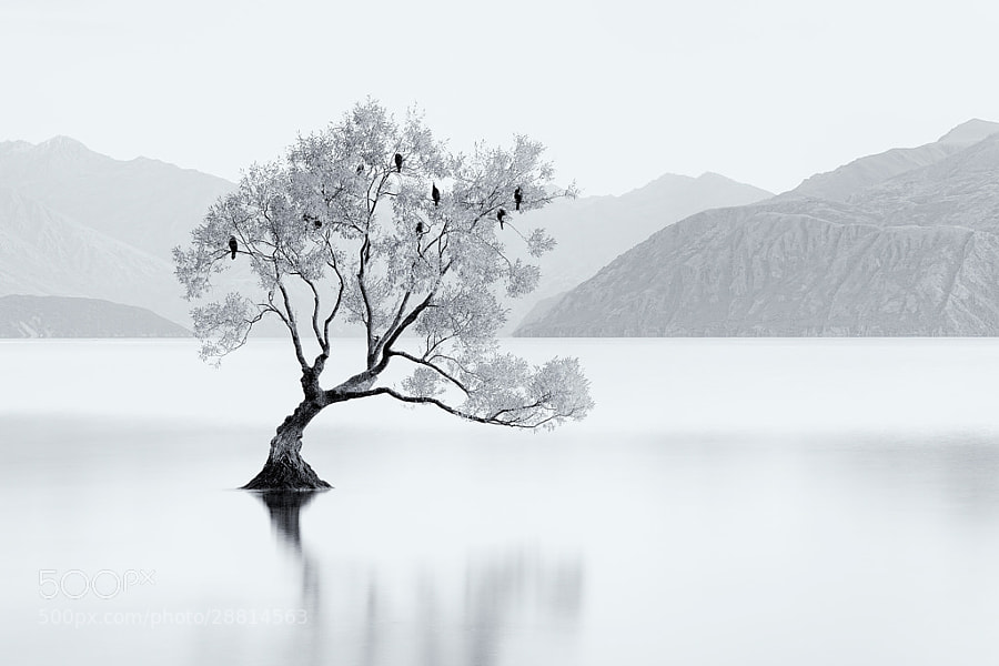 Bird Tree by Jordan Ek on 500px
You must be logged in to post a comment.