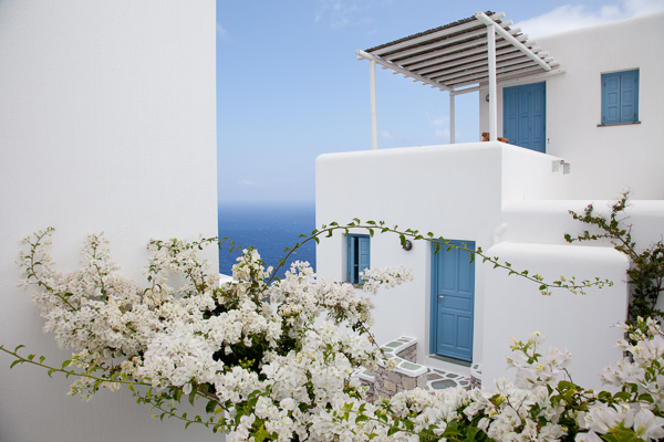
Folegandros, Greece – 24mm focal length at f/11
Without experience, looking at the endless functions and dials on a camera can seem daunting, and it is at first, especially with many of the newer digital cameras that have about 5,000 functions (I’m looking at you Nikon).
Luckily, you only have to learn the major functions at first to significantly improve your photography. It might take a few reads through the content below, but it does not take long to learn the most important abilities of your camera to significantly improve your photography.
Depth of Field
Before we delve into the settings, you first need to understand depth of field. The term refers to the area in front of, and behind the subject, that the camera is focused on that is acceptably sharp. We use the term acceptably sharp because as you get further from the object you are focusing on, the sharpness gradually declines.
Another way to think of depth of field is as a range of sharpness. A shallow depth of field refers to a small range of acceptable sharpness, while a deep depth of field refers to a large range of acceptable sharpness in an image.

Venice, Italy – 70mm focal length at f/5.6. This image has a fairly shallow Depth of Field; the oar and wave are sharp, while the rest is out of focus.
When standing at the same distance away from your scene, there are three ways to alter the depth of field:
- Changing your aperture setting
- Changing the focal length on your camera (i.e. 24mm versus 200mm lens) will give you the appearance of more depth of field. Technically, this is an optical effect due to the magnification, but it will create the appearance of more depth of field.
- Changing the focus distance. Focusing on a closer subject will give you less depth of field than focusing on a subject at a distance.
Focal Length (wide-angle versus telephoto)
Changing your focal length alters the relationship in size between the foreground objects and the background objects. It also affects the appearance of depth of field due to the change in magnification.
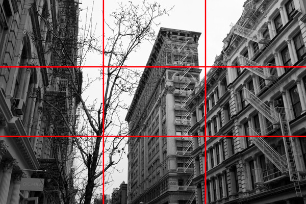
Wide angle: a wide angle lens (i.e., 28mm) will make foreground subjects larger in comparison to the background. This allows you to have a main subject that is prominent in the foreground while simultaneously fitting in more of the background, since it is proportionally smaller. When standing at the same distance from your subject, there is the appearance of more depth of field throughout the frame with a wide angle lens than with a telephoto lens when the same aperture is used.

Folegandros, Greece – 24mm focal length at f/11. Notice the size of the foreground stones in relation to the middleground stones.
Telephoto: a telephoto lens will compress and tighten the view. The longer the focal length, the larger the background objects will appear in comparison to the foreground objects. This makes the background objects look closer to the foreground objects than with a wide-angle view.
While not a steadfast rule, portraits are often thought to be more flattering when a slightly telephoto lens is used (around 80mm to 120mm), which will compress a person’s features. If you photograph someone with a large nose at close distance with a 17mm lens, that nose will look gigantic when compared to the subject’s ears.
Florence, Italy – 170mm focal length at f/6.3
ISO
Before you learn about the Aperture and Shutter Priority modes, you need to understand ISO. The ISO setting is a way to change the sensitivity of your camera’s sensor to light.
ISO is the first setting you should set when you walk out the door and you should always be aware of what it is set at. Practice altering it, because once you get familiar with ISO you will change it constantly.
A lower ISO number (100, 200, or 400) means that the camera sensor will not be as sensitive to light but the quality of the image will be to the best of the camera’s ability. Low ISO images will have little to no digital noise. The best times to shoot with a low ISO are in strong daylight, when using a tripod, or when using studio lights.
A high ISO number (800, 1600 or 3200) means that the camera sensor will read more of the light, but the tradeoff is that the images will have digital noise. Higher ISOs are generally used when the light is not ideal and one does not have a tripod. You should review your camera’s ISO abilities to find the upper limit that you are comfortable using. Higher end cameras typically have a stop or two more ISO ability than entry level cameras.
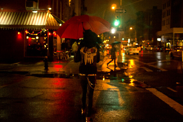
East Village, NYC ISO 3200. – grainy, but beautiful
The key here is to not be afraid to raise your ISO. Its capability has improved so much that many cameras can shoot at ISO 800, 1600, and 3200 or even higher for some. It is much better to have the ideal shutter and aperture settings when creating an image than having the ideal ISO setting. Grain is beautiful, while bad aperture and shutter settings are not.
Once your ISO is set, you will then have to figure out whether you want to shoot in Aperture Priority or Shutter Priority mode.
Aperture Priority (A/Av)
The aperture is the hole in the lens that allows light to enter the camera. The term f-stop (i.e. f/2.8, f/3.5 … f/16) is a number that refers to the size of the aperture opening, where f/2.8 is a much larger opening than f/16. Using Aperture Priority Mode will allow you to alter your f-stop and the camera will then use its internal light meter to choose a corresponding shutter speed to expose the scene correctly.
A “smaller” aperture (which refers to a larger number, such as f/16) will allow for a deeper depth of field in a scene but will allow less light to enter the camera.
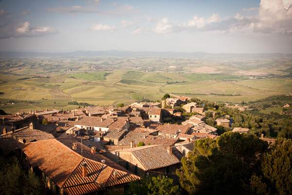
Montalcino, Italy 28mm focal length at f/14. The small aperture yields a deep depth of field.
The photo above is an example of this type of deep depth of field, which occurs with a small aperture. The chimney in the foreground is perfectly sharp and both the mid-ground and background are very sharp.
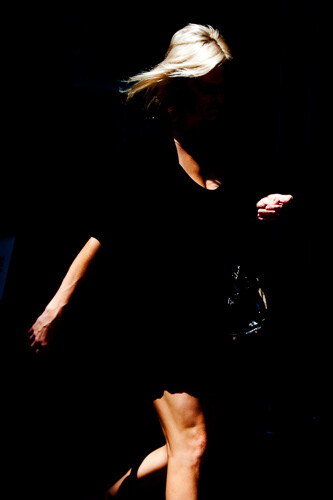
A “larger” aperture (which refers to a smaller number, such as f/2.8) will create a shallow depth of field (with more bokeh, or out of focus blur) and will allow more light to enter the camera.

63mm focal length at f/2.8 in a dark setting. The large aperture yields a very shallow depth of field.
The primary reason to shoot in Aperture Priority mode is to control your depth of field and it is a common way of shooting for portraiture and for event and wedding photography, especially in situations where the events are held in venues with low levels of light.
While the above photograph looks bright, it was taken in a fairly dark room. Because it is shot at f/2.8, only the bride’s eyes are perfectly sharp. When photographing with a shallow depth of field, always make sure the most important element is in focus.
Shutter Priority (T/Tv)
Shutter speed is the speed at which the camera’s shutter opens and closes to allow light to reach the sensor or film. Using the Shutter Priority mode will allow you to set your ideal shutter speed, while the camera will pick a corresponding aperture to expose the scene correctly.
A faster shutter speed (a smaller fraction, such as 1/320th of a second) will allow less light to reach the sensor but will freeze your subject’s motion or offset the camera shake when your camera is handheld. 1/320th and faster is an ideal setting to freeze motion in people.
SoHo, NYC 1/320th of a second with an 80mm focal length
A slower shutter speed (a larger fraction, such as 1/8th of a second) will allow more light to reach your sensor and, if slow enough, will create blur in an image. Depending on the rate of motion of your subject, anywhere from approximately 1/30th to 30 seconds and more will introduce noticeable motion blur. A tripod is recommended when introducing blur into your scene, although it is possible to handhold the camera and achieve a sharp background and blurred subject if the subject is moving fast enough.
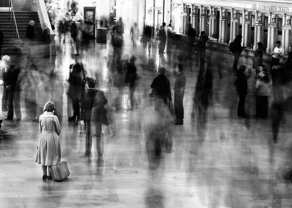
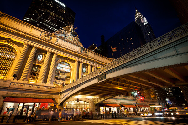
Grand Central, NYC 6 seconds at f/8. The woman is sharp because she remained motionless.
*Important: to offset blur caused by handheld camera shake, the shutter speed must be at least 1 over the focal length. So if your focal length is 100mm, your shutter speed should be at least at 1/100th of a second. Add some leeway into that rule when you can, so 1/125th or 1/160th at 100mm will be safer. When using cropped sensors (such as APS-C or micro-4/3rds), the real focal length is the important number. If your APS-C camera sensor has a 1.6x crop, a 100mm lens will have the equivalent of 160mm view, leading you to need at least 1/160th of a second to achieve sharpness.
The main reason to shoot in Shutter Priority is to freeze or introduce motion into your scene. I use this mode primarily when traveling, exploring, at dusk when I’m handheld and the light is low, or shooting street photography.
Manual Mode (M)
Manual mode allows you to set the shutter, aperture, and ISO settings without the camera’s interference. This is a difficult way to shoot because you need to know the strength of the light to set your camera accordingly, but even if you do not want to photograph this way it can be worth practicing in manual mode to help you better understand light.
Manual mode is ideal when you use a tripod and have the time to fine tune the exposure. It is also good in situations where the lighting is consistent, such as on overcast days, photographing indoors, or when using strobe lights or flashes.
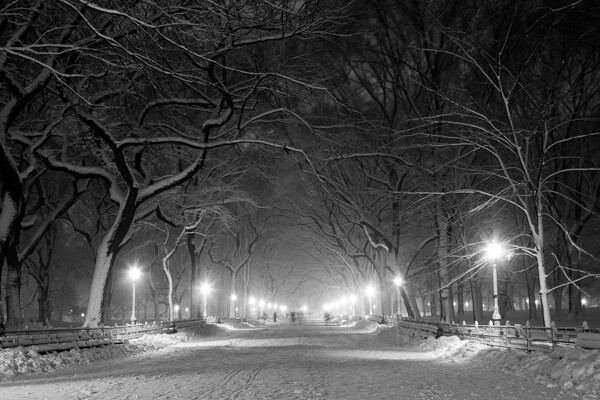
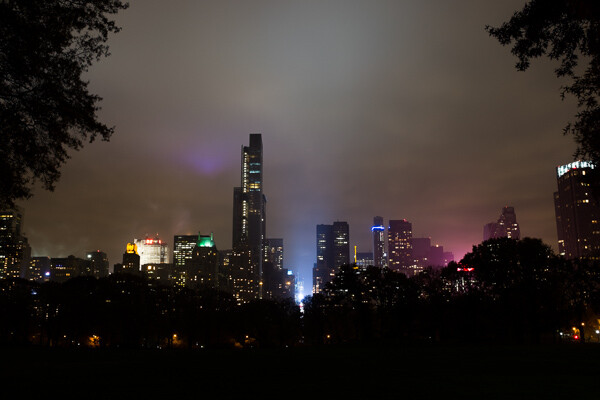
Poets’ Walk, Central Park, NYC 15 seconds at f/11, ISO 100. 28mm focal length on tripod.
However, the Shutter Priority and Aperture Priority modes are very important to use, particularly in situations where the lighting is variable. On a sunny day where you are shooting both into and away from the sun, it is beneficial to use these modes because it is usually not practical to continually change your manual settings every time you alter your direction. Let the camera do some of the work.
Exposure Compensation (+/-)
Exposure compensation is the +/- mode on your camera that is used when you are in the Aperture or Shutter Priority modes. Increasing the exposure to the plus side will brighten a photo and decreasing it towards the minus side will darken a photo.
This is especially helpful when you are in an overly bright or dark situation that can fool the camera’s light meter, such as a scene with a lot of bright sky or a scene in a dark alleyway. The camera will read these levels and try to turn these overly bright or dark situations into gray. We typically do not want that.
When capturing a bright scene, cameras will read all the bright areas and calculate that it needs to darken the photo to achieve the correct exposure. You would need to raise the exposure compensation to offset this. When photographing in a dark alleyway, cameras will try to brighten the blacks to gray, leading you to need to offset this by lowering the exposure compensation.
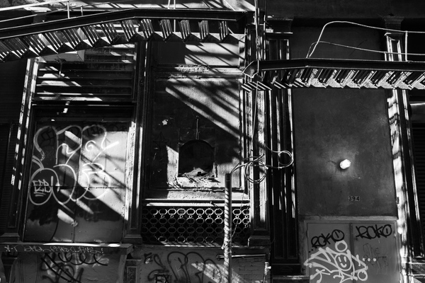
Cortlandt Alley, NYC – The camera’s light meter slightly overexposed the image
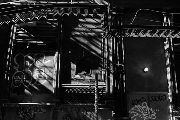
Cortlandt Alley, NYC – Correctly exposed
Bonus – White Balance
Focus on the above settings first, but once you feel comfortable with them, the next step is to study up on white balance.
The post A New Photographer’s Guide to Camera Settings by James Maher appeared first on Digital Photography School.

Digital Photography School


You must be logged in to post a comment.