RSS
 

Posts Tagged ‘Perfect’

Designing the Perfect Camera – What Features are on Your Wish List?

18 Feb

The perfect camera doesn’t exist, but if I were a camera designer, I know exactly what sort of camera I would make for myself, and how I’d improve on the one that I’ve already got. I’m not asking for the impossible either – all these ideas could be implemented using current technology. Really, what I would do is take the camera I already own – the Fujifilm X-T1 – and add the best bits from other cameras, to make a kind of super-camera, or at least one that is better tailored to my own needs.

1 – Sensor size

Let’s start with the sensor. The X-T1’s sensor uses the same 3:2 aspect ratio as other APS-C and medium format cameras. This often works well when taking photos in the landscape orientation. But it doesn’t work nearly so well when taking photos in the portrait orientation (with the camera turned on its side).

Aspect ratio

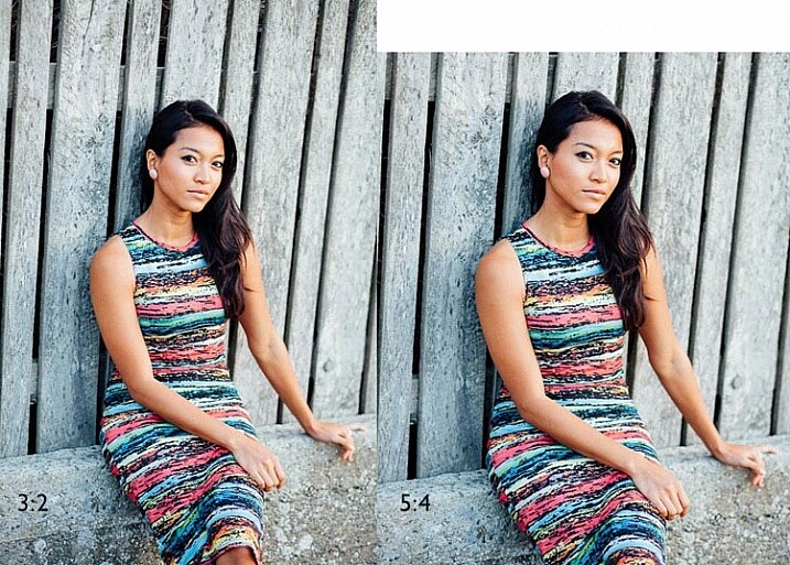
The portrait on the left has an aspect ratio of 2:3 (width always comes first), the same as the sensor on the X-T1. The portrait on the right shows how it would look if the sensor had a 4:5 aspect ratio. The area is the same, but the width and height are different.

It’s surprisingly hard to create a good composition that utilizes all the space in the frame well, especially for landscapes and portraits. It’s much easier with a shorter rectangle, such as those found in large format cameras (aspect ratio 5:4), some medium format film cameras (7:6) and Micro four-thirds cameras (4:3).

For example, check out the landscapes of Joe Cornish. He uses a large format camera for a lot of his work, and he uses the portrait orientation a lot. It works really well with the short rectangle.


My proposal is this. Ditch the 3:2 aspect ratio sensor and place it with one that uses the 5:4 aspect ratio. But keep the area of the sensor – don’t make it bigger or smaller. This would give you several benefits:

  • It’s easy to compose images within the 5:4 aspect ratio.
  • If you crop to a square (as I often do because I love the square format) you use more of the sensor than when you crop the current APS-C sensor.
  • You get a slight improvement in image quality, especially at wide apertures, because you are using the centre part of the lens to create the image.
Aspect ratio

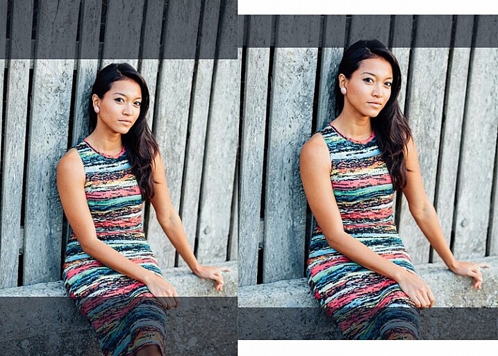
The above two photos, cropped to a square. The dark grey area shows the unused part of the sensor. You lose less information captured from the 5:4 sensor than you do from the 3:2 one.

What I don’t want to see, is a full-frame camera introduced into the Fujifilm range. The problem with having two sensor sizes in the same range, is that it greatly complicates the process of making, and buying lenses. It’s far better, as Fujifilm has done so far, to use a single sensor size throughout the range (in my opinion).

2 – In-Camera Image Stabilization

I think this is a fantastic idea, and I’d like to see it in Fujifilm cameras. The advantage of having Image Stabilization in the camera is that you can use it with any lens. That includes wide-angles, which you can then potentially hand-hold at shutter speeds like 1/4 or 1/8 second, giving all sorts of interesting creative possibilities when it comes to recording movement. Sony and Olympus have got this one right.

Fast shutter speed

I took this photo with a 35mm lens at 1/180 second to freeze movement. This lens doesn’t have Image Stabilization, but if it were built into my camera, I could try taking the photo at a shutter speed as slow as 1/15 or 1/8 second. The man would be a blur, creating a different image entirely. Image Stabilization lets you try this with a hand-held camera, so you don’t have to use a tripod.

3 – Quick control dial

Mid-range and high-end Canon cameras have a quick control dial – a thumbwheel on the back of the camera, that you can move while looking through the viewfinder. The big advantage of the quick control dial is that you can adjust exposure compensation without removing your eye from the viewfinder.

Quick control dial

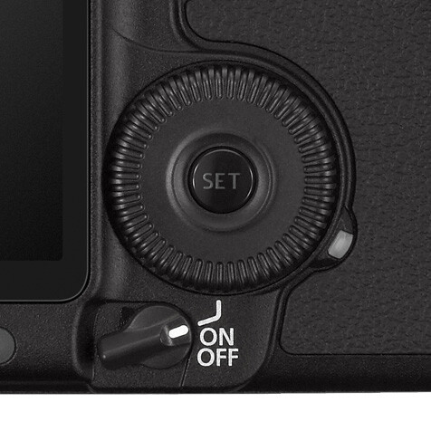
The quick control dial on the EOS 5D Mark II. Its position means that it’s easy to move with your thumb, while looking through the viewfinder.

The X-T1 can already display a histogram in the viewfinder. With a quick control dial you can adjust exposure compensation (when in an automatic mode like aperture priority, shutter priority or program) as you go, to get the histogram where you want it. All guesswork regarding exposure is gone. The current exposure compensation dial is too hard to move while looking through the viewfinder, and reduces the usability of the camera.

The joystick added to the X-Pro 2 for quick movement through the autofocus points would also be a welcome addition.

4 – Dual card slots

Probably coming in the XT-2, but essential for backing up photos. Good quality memory cards are virtually indestructible. If your camera saves a copy of each photo on two different cards this makes backing up photos much easier, especially while travelling.

So Fujifilm, if you’re listening, I know I’m only one user among many, but I’d love it if you could give some consideration to these ideas. Especially the one about sensor size, which I think could revolutionize the way we use cameras.

Your turn

If I could add just one feature to my X-T1 it would be the 5:4 aspect ratio sensor. So here’s a question for you – if you could add just one feature to your camera, which would it be and why? I’m looking forward to reading your answers, this should be interesting.


Mastering Lenses photography ebookMastering Lenses

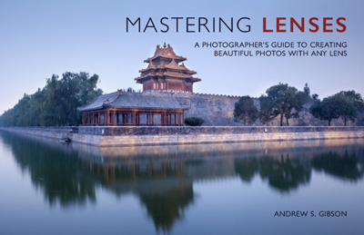
My new ebook Mastering Lenses: A Photographer’s Guide to Creating Beautiful Photos With Any Lens shows you how to get the best from the lenses you own already. A comprehensive guide to exploring the creative potential potential of wide-angle, normal and telephoto lenses, it’s also the ultimate buying guide for readers thinking about purchasing a new lens for their camera. Please click the link to learn more or buy.


googletag.cmd.push(function() {
tablet_slots.push( googletag.defineSlot( “/1005424/_dPSv4_tab-all-article-bottom_(300×250)”, [300, 250], “pb-ad-78623” ).addService( googletag.pubads() ) ); } );

googletag.cmd.push(function() {
mobile_slots.push( googletag.defineSlot( “/1005424/_dPSv4_mob-all-article-bottom_(300×250)”, [300, 250], “pb-ad-78158” ).addService( googletag.pubads() ) ); } );

The post Designing the Perfect Camera – What Features are on Your Wish List? by Andrew S. Gibson appeared first on Digital Photography School.


Digital Photography School

 
Comments Off on Designing the Perfect Camera – What Features are on Your Wish List?

Posted in Photography


How to Use the X-Rite ColorChecker Passport to Obtain Perfect Color

11 Feb

There are two ways you can approach color reproduction in photography. The first is to try and reproduce the colors of the subject as accurately as you can. If you take a photo of someone wearing a red sweater, then you want the photo of that sweater to have exactly the same shade of red as the real thing. The other way is to produce colors that are pleasing to the eye, rather than accurate.

The key point to understand here is that your camera isn’t designed to produce accurate colors, it is biased towards the second approach. The reason behind this is probably quite simple. Camera manufacturers want you to be happy with the photos that your camera produces, and that means tweaking colors so that they look more attractive.

ColorChecker Passport & Lightroom

The way your camera records color is determined by the color and white balance settings selected when you take the photo. This is especially true for JPEG files – if you use the Raw format you have the freedom to change those color settings when you process the file.

Each manufacturer has a different name for the setting used to control color. Canon calls it Picture Styles, Nikon – Picture Control, Sony – Creative Style, Pentax – Custom Image, Olympus – Picture Mode and Fujifilm – Film Simulation.

Let’s look at Canon’s Picture Styles as an example (I’m familiar with these as a long time Canon user). Their neutral and faithful Picture Styles are designed to give reasonably accurate colors, but the others aren’t. Portrait is designed to give good skin tones, landscape for strong greens and blues, and standard to make good reds. You will not achieve accurate color with the portrait, landscape or standard Picture Styles, but you may well end up with pleasing colors.

But what if you simply want accurate color? There are a number of reasons why you might want to do this.

  • When photographing something that needs to be recorded accurately, such as product shots for a commercial client.
  • When photographing flowers, where it is very difficult to tell if the colors are accurate.
  • To make sure that photos taken with two different cameras match as closely as possible.
  • To simply start with a photo that has accurate colors as the first step in post-processing, so you can decide in which direction to go, from a neutral starting point.

The X-Rite ColorChecker Passport

The truth is that if you want accurate color, then for the reasons mentioned above, you can’t rely on your camera’s settings – you need some outside assistance. That’s where the X-Rite ColorChecker Passport comes in. This relatively inexpensive device is simple to use, and just as importantly from the point of view of a Lightroom user, integrates neatly with Lightroom.

The X-Rite ColorChecker Passport itself is made of grey plastic, and opens up to display the color patches shown here.

ColorChecker Passport & Lightroom

The ColorChecker Passport is easy to use. Simply take a photo of the Passport in daylight (using the Raw format), convert it to DNG (use the Export option in Lightroom to do so) and drag the DNG file to the ColorChecker Passport software.

ColorChecker Passport & Lightroom

The software creates a profile, calibrated for your camera, and stores it along with the other profiles found in Lightroom’s Camera Calibration panel. You’ll need to restart Lightroom to see it, but once you have done so, you can apply that profile to any photo taken in daylight with that camera. The profile is also available in Photoshop’s ACR if you need it.

Note: The software also installs a Lightroom plug-in that you can use to create the profile by selecting the photo containing the ColorChecker Passport, going to File > Export and selecting the ColorChecker Passport preset.

ColorChecker Passport & Lightroom

The next two photos show the difference that using the calibrated profile can make. Both were created from the same Raw file. The first uses the Velvia camera profile specific to Fujifilm cameras. The second uses the Camera profile that I created using the ColorChecker Passport. This photo has the most accurate color, although it may not be as pleasing to the eye as the first, which uses a profile designed to make the photo look good.

ColorChecker Passport & Lightroom

ColorChecker Passport & Lightroom

Dual Illuminant Profile

You can also create a different type of profile called a Dual Illuminant Profile. To do so, you need two photos of the ColorChecker Passport taken with the same camera at the same ISO setting, but under different light sources. One should be daylight, and the best light source for the second one is probably tungsten. A Dual Illuminant Profile is more accurate as it takes into account the way sensors record light differently, under different light sources.

Using the ColorChecker Passport for White Balance

The final part of the color accuracy equation is white balance. You really shouldn’t rely on your camera’s auto white balance setting, as it can be misled by scenes that have more than average amounts of colors like red or blue in them.

The ColorChecker Passport is small enough to carry around with you just about everywhere. That means you can use it on location, to record colors accurately, and set white balance. The Passport also has another panel that you can use to take a white balance reading, and create a custom white balance setting on location.

ColorChecker Passport & Lightroom

Alternatively, you can take a photo of the Passport’s color swatches in the same light as the subject, and use it to create a new profile. Then, in Lightroom’s Develop module, you can use the White Balance Selector to click on the 18% grey swatch second from left on the bottom row (indicated below). This method ensures both accurate color (from the profile) and accurate white balance (from the 18% grey swatch).

ColorChecker Passport & Lightroom

Have you use a Coler Checker before? Please share your experiences and comments below.


The Mastering Lightroom CollectionMastering Lightroom ebook bundle

My Mastering Lightroom ebooks are a complete guide to using Lightroom’s Library and Develop modules. Written for Lightroom 4, 5, 6 and CC  they  show you how to import and organise your images, use Collections, creatively edit your photos and how to work in black and white. Grab this book on sale now at 40% off over at Snapndeals, for a limited time only.

googletag.cmd.push(function() {
tablet_slots.push( googletag.defineSlot( “/1005424/_dPSv4_tab-all-article-bottom_(300×250)”, [300, 250], “pb-ad-78623” ).addService( googletag.pubads() ) ); } );

googletag.cmd.push(function() {
mobile_slots.push( googletag.defineSlot( “/1005424/_dPSv4_mob-all-article-bottom_(300×250)”, [300, 250], “pb-ad-78158” ).addService( googletag.pubads() ) ); } );

The post How to Use the X-Rite ColorChecker Passport to Obtain Perfect Color by Andrew S. Gibson appeared first on Digital Photography School.


Digital Photography School

 
Comments Off on How to Use the X-Rite ColorChecker Passport to Obtain Perfect Color

Posted in Photography


Our Perfect Portrait Pack of eBooks – 73% Off Today Only

21 Dec

It is day 9 of our 12 deals of Christmas and it is one we know many of you have been waiting for – crazy deals on our Portrait Photography eBooks by Gina Milicia.

We’ve got a brilliant bundle option for those new to Gina’s teaching or deals on each individual eBook for those who just want to complete the set.

Portraits bundle gina

Either way we’re so confident you’ll love them we’re offering a satisfaction guarantee.

We do this because they’ve already helped 10s of thousands of people improve their portrait photography.

It’s your turn today.

Any of our portrait ebooks just $ 7 (normally $ 19.95)

  • Portraits: Making the Shot $ 7 – Practical tips for bringing your portraits to life
  • Portraits: Lighting the Shot $ 7 – Discover the secrets of beautiful portrait lighting
  • Portraits: Striking the Pose $ 7 – Your go-to guide of natural posing positions
  • Portraits: After the Shot $ 7 – Master portrait post production and workflow

Learn more about each eBook and grab yours here.

Save Even More and Get a Bonus eBook When You Bundle Them

Pick up the whole set for just $ 21 and get our 14 Recipes for Amazing Portraits ebook as a special bonus. That’s 5 books at 73% off.

I think this deal speaks for itself and I know you’ll love these eBooks for years to come.

But don’t hesitate – this deal lasts just 24 hours and the clock is already counting down.

googletag.cmd.push(function() {
tablet_slots.push( googletag.defineSlot( “/1005424/_dPSv4_tab-all-article-bottom_(300×250)”, [300, 250], “pb-ad-78623” ).addService( googletag.pubads() ) ); } );

googletag.cmd.push(function() {
mobile_slots.push( googletag.defineSlot( “/1005424/_dPSv4_mob-all-article-bottom_(300×250)”, [300, 250], “pb-ad-78158” ).addService( googletag.pubads() ) ); } );

The post Our Perfect Portrait Pack of eBooks – 73% Off Today Only by Darren Rowse appeared first on Digital Photography School.


Digital Photography School

 
Comments Off on Our Perfect Portrait Pack of eBooks – 73% Off Today Only

Posted in Photography


Processing Black and White Photos with OnOne Perfect B&W

18 Aug

Black and white photography is classy and powerful. When properly done, it can be enticing and dramatic. In fact, a great portion of fine art photography hanging in galleries is monochromatic. In the age of film, all it took was to load black and white film into your camera, but nowadays most digital camera sensors are recording images in color and with that, if you want to explore the black and white world, you’ll have to convert your images in the post-processing stage.

Close up of iron fence around Jackson Square in New Orleans with the St. Louis Cathedral behind.

When it comes to converting and processing photos to black and white, there are a number of options. If you are a Lightroom user, there is a black and white option within the Basic Develop panel as well as some presets that come preloaded. All you need to do is click on them, and tweak the sliders until you get the desired effect.

Processing-black-white-photos-onone-perfect-bw-2

There are also, of course, more sophisticated alternatives that could help make your work easier. Among those, Perfect B&W from OnOne Software is one of my favorite options. This application can be used as a plug-in with Adobe Photoshop, Lightroom, Photoshop Elements, Apple Aperture, or as a standalone app. OnOne offers a full set of applications called Perfect Photo Suite, Perfect B&W is included in it, but it can be also purchased separately as a standalone application.

The idea behind this product is to help you to easily enhance your photos. There are controls to adjust tone, curves, color response via filters, and borders – and of course, it also comes with different types of presets. You’ll also be able to create your own presets and save them as well.

As I am an Adobe Lightroom user, I’ll demonstrate some of the features of the product by opening it from there. To launch the application, you need to select an image from the Library or Develop Module and go to the File Menu, then select Plug-In Extras and navigate to Perfect B&W 9.

Processing-black-white-photos-onone-perfect-bw-3

One of features that you’ll probably like is the possibility to save all your changes as a Smart Photo. It means that even after your edits are done, you’ll be able to come later and redo your settings. This way, you are working in a nondestructive way. The application will pop up a dialog box when you launch it, asking if you want to edit in this work mode.

Processing-black-white-photos-onone-perfect-bw-4

Once the applications opens, the layout is similar to what you find inside Lightroom. The preset panel is on the left and the develop options are on the right. There is also a set of tools that let you selectively add more contrast, brightness, or even mask entire areas in case you want to do a selective color treatment.

Processing-black-white-photos-onone-perfect-bw-5

Once you are ready to work, you have the option to start by selecting the different presets, or just working with the sliders in the development panel. You need to be sure that you have selected the preview option at the bottom to see the effect on the image; you can toggle back and forth to show the before and after.

My preferred way of working is to use one of the presets as a base or staring point, then modify it to my liking with the sliders. The presets are divided into eight categories, as follows:

  • 19th Century Processes
  • 20th Century Classic Silver
  • 21st Century Modern Digital
  • Basic Fundamentals
  • High Speed Documentary
  • Hint of Color
  • Hollywood Portrait
  • True Film

The names are pretty much self-descriptive, and if you click on them, you’ll see all the presets within that category with previews on the side panel itself.

Processing-black-white-photos-onone-perfect-bw-6

As you can see in the image above, the application also allows for duotone images by combining the use of color filters, so you are totally flexible on the type of look you can create. For example, if I click the Pinhole Blue preset from the 19th Century Process, the software will create that effect, and you’ll see how some the sliders from the Develop Panel changed to create it.

From there you can pretty much tweak the image any way you want, and there is also an option where you can select the blending mode, exactly the same way layers work in Photoshop. You can also drop the opacity for a more subtle effect. In the example below I reduced the opacity to 34 percent.

Processing-black-white-photos-onone-perfect-bw-7

The different old century presets are great to create all the vintage looks that are so popular today, with just a few clicks and without the need to know more complicated software.

For my final image, I selected Automatic from the Basic Fundamentals, then added contrast by adjusting the Tone Curve. I also moved the Detail slider to 15 so the ripple effect on the water was more noticeable; it also helped to add some drama to the sky.

Processing-black-white-photos-onone-perfect-bw-8

As I knew I wanted to re-crop the image, I didn’t add any other effect here, so I went back to Lightroom cropped the image, then added a vignette.

Processing-black-white-photos-onone-perfect-bw-9

OnOne Perfect B&W is a well-rounded application and a powerful tool for black and white conversions. I believe the best way to judge it is to give it a try. The good thing is that the company is offering a thirty-day trial, so it won’t cost you to play with it; moreover, you can download and test the full suite if you want. The regular price for the standalone application is $ 59.95 and the complete suite is $ 149.95. They can be downloaded straight from the OnOne website.

Editor’s Note: This is second last of a series of articles this week featuring black and white photography tips. Look for earlier ones below and the last one later today.

  • 5 Simple Ways to Create Expressive Photos in Black and White
  • Tips for Black and White Wildlife Photography
  • 7 Tips for Black and White Portrait Photography
  • 28 Images with Strong Black and White Compositions
  • Weekly Photography Challenge – Black and White Techniques
  • Tips for Black and White Wildlife Photography
  • How to Convert Images to Black and White and Add a Color Tint in Photoshop
  • Shooting all Black and White for a Day to Improve Your Photographic Eye
  • Split Toning Black and White Images in Lightroom

googletag.cmd.push(function() {
tablet_slots.push( googletag.defineSlot( “/1005424/_dPSv4_tab-all-article-bottom_(300×250)”, [300, 250], “pb-ad-78623” ).addService( googletag.pubads() ) ); } );

googletag.cmd.push(function() {
mobile_slots.push( googletag.defineSlot( “/1005424/_dPSv4_mob-all-article-bottom_(300×250)”, [300, 250], “pb-ad-78158” ).addService( googletag.pubads() ) ); } );

The post Processing Black and White Photos with OnOne Perfect B&W by Daniel Korzeniewski appeared first on Digital Photography School.


Digital Photography School

 
Comments Off on Processing Black and White Photos with OnOne Perfect B&W

Posted in Photography


Dashing Duos, Perfect for Dad

21 Jun

We’ve joined forces with a couple of our fave companies to bring you incredible gift bundles for Dear Ol’ Dad this year.

Check out our collab gift bundles – socks, mug, mats and Gorillas. Oh my! Not to mention a refined PJ-only bundle made of leather, wood and sophistication.

You’ve still got time to order in time for the big day, and we’ll even gift wrap the bundles for free! It’ll be the second best bundle of joy Dad’s ever received.

Gift Bundle-Up For Dad
(…)
Read the rest of Dashing Duos,
Perfect for Dad (0 words)


© Erin for Photojojo, 2015. |
Permalink |
No comment |
Add to
Perfect for Dad”>del.icio.us

Post tags:


Photojojo

 
Comments Off on Dashing Duos, Perfect for Dad

Posted in Equipment


Dashing Duos, Perfect for Dad

15 Jun

We’ve joined forces with a couple of our fave companies to bring you incredible gift bundles for Dear Ol’ Dad this year.

Check out our collab gift bundles – socks, mug, mats and Gorillas. Oh my! Not to mention a refined PJ-only bundle made of leather, wood and sophistication.

You’ve still got time to order in time for the big day, and we’ll even gift wrap the bundles for free! It’ll be the second best bundle of joy Dad’s ever received.

Gift Bundle-Up For Dad
(…)
Read the rest of Dashing Duos,
Perfect for Dad (0 words)


© Erin for Photojojo, 2015. |
Permalink |
No comment |
Add to
Perfect for Dad”>del.icio.us

Post tags:


Photojojo

 
Comments Off on Dashing Duos, Perfect for Dad

Posted in Equipment


5 Secrets to Create a Perfect Silhouette Portrait Outdoors

22 May

DPS Silhouette 1

1) SHOOT LOW AND HEAD TO TOE

Place the subject’s entire body, from head to toe, against the sky. In order to do this, you will need to be lower than the subject. You can do this by laying on your back, or stomach, while taking the shot.

If you are unable to get low enough, you may need to have your subjects get higher, such as on the very top of a rock, small hill or sand dune. This will hopefully allow you, in most circumstances, to get an angle that places the subject’s entire outline against the sky. You can see a variety of landscapes utilized in the examples below.

DPS Silhouette 2

Hint: It’s so, so, SO important that their feet are against the sky! Legs in a silhouette portrait that are cut off above the feet look like weird, short stumps. If you can’t find a suitably spot at a location, you can play with silhouettes of a closer composition.

DPS Silhouette 3

2) IT’S ALL IN THE TIMING

Silhouettes work best around 20-30 minutes before sunset. However, it does vary with the angle you are able to achieve – the greater the height difference between you and the subject(s), the earlier you will need to take the shot.

If you wait any longer, the sun will be hidden behind whatever your subjects are standing on, and the sky might not be bright enough to make a silhouette. If you do it too early, the sky’s colours can be a bit boring and you will be dealing with other issues, such as sun flare.

DPS Silhouette 4

Tip: Silhouettes can be taken earlier before sunset if the sun is partially blocked or filtered through strong clouds.

3) SILHOUETTE SETTINGS ARE SIMPLE

Set your camera to Aperture Priority (AV) mode, with an aperture of f/2.8, and ISO of 400. Have Evaluative Metering selected, which means that the camera will take into account the whole scene when deciding how to find a balanced exposure.

If you fill the frame with your subjects’ faces or bodies, then the camera will expose for their skin, even with a bright background (see example below).

If you fill the frame mostly with a very bright sky, than the camera will expose for the bright sky, brining out the natural sunset colors and making everything else in the photograph dark.

So, if you place your subject directly against the sky (bright), than the subject (which is darker) will be heavily underexposed. The result – a silhouette!

DPS Silhouette 5 DPS Silhouette 6

Both photographs were taken on the exact same setting mentioned above, only seconds apart. The difference? Composition, and what is filling the frame – subject or sky.

4) SILHOUETTE PORTRAIT POSING IS SPECIFIC

Silhouettes are very forgiving of poor facial expressions (simply because you cannot see them), but very harsh when it comes to outlines. After taking each shot, check to make sure that nothing looks odd in the photograph.

Here are a few things to keep in mind when posing subjects in a silhouette:

  1. Hugging poses do not work – A hug silhouette looks like a great big blob monster. All subjects need to be clearly defined, which means they need to be at least a couple of inches apart from each other. It’s nice for subjects to still be connected, through holding hands, or kissing, but their bodies should still be defined.
  2. Have your clients look away from camera – It’s much nicer and more natural to have poses where the faces are profiled.
  3. Watch the clothing – Very baggy clothing will not work as well for a silhouette, as the shape can become unflattering. It is best for females to wear dresses or skirts in silhouettes, as it brings a feminine shape and helps clearly define them against the male’s figure. – Very baggy clothing will not work as well for a silhouette, as the shape can become unflattering. It is best for females to wear dresses or skirts in silhouettes, as it brings a feminine shape and helps clearly define them against the male’s figure.

DPS Silhouette 7

5) SILHOUETTES SELL

Try to capture at least one silhouette at every photo shoot, whether it is a family portrait, maternity, engagement or wedding. Why? Because they sell!

Here are some reasons why clients love to purchase silhouettes:

  • Silhouettes add variety to your shoot. Silhouettes are so different in nature, in their colouring and style, that the variety they give instantly makes any shoot more interesting and saleable. As the silhouette is quite unique from all other photographs, it also makes it easy to sell individually as a unique piece of artwork.
  • Silhouettes are perfect for shy clients. Some clients hate the idea of their faces hanging up on their walls, making silhouettes the perfect objection handler. As the focus of the photograph is not on the subjects’ faces at all, it can be marketed to them as the perfect piece of personalized artwork, without battling their self-conscious nature.
  • Silhouettes look better bigger! If you capture silhouettes on a wide composition, it’s all too easy to sell them as very large piece of artwork. Because the subjects are relatively small within the frame, silhouettes can encourage a larger, more impressive piece of artwork for the client and a more profitable sale for you.

DPS Silhouette 8

We hope this guide gives you the confidence to go out and try your own silhouettes.

googletag.cmd.push(function() {
tablet_slots.push( googletag.defineSlot( “/1005424/_dPSv4_tab-all-article-bottom_(300×250)”, [300, 250], “pb-ad-78623” ).addService( googletag.pubads() ) ); } );

googletag.cmd.push(function() {
mobile_slots.push( googletag.defineSlot( “/1005424/_dPSv4_mob-all-article-bottom_(300×250)”, [300, 250], “pb-ad-78158” ).addService( googletag.pubads() ) ); } );

The post 5 Secrets to Create a Perfect Silhouette Portrait Outdoors by Alana Orth appeared first on Digital Photography School.


Digital Photography School

 
Comments Off on 5 Secrets to Create a Perfect Silhouette Portrait Outdoors

Posted in Photography


Five Places for Perfect Natural Portrait Lighting

10 Mar

1 portrait lighting

Wouldn’t it be great if you could get beautiful, natural-looking portraits without ever having to use flash?

Well, perhaps you can. There are many different locations, often closer than you think, where you can find the right lighting for great looking portraits. Often they’re missed because we might not know where to look.

Generally, your best strategy is to look for what is called Open Shade. Ideally, you are looking for a situation where the stronger overhead light is being blocked by a structure, either man-made or natural.

2 open shade diagram

There are a lot of variables to pay attention to, but with a little practice you begin to recognize good natural lighting situations that are right in front of you.

1. Find a gazebo or front porch with a roof

This is a particularly good technique for you to use when it’s sunny outside in the middle of the day, but it can work on overcast and rainy days as well.

It’s often a bad idea to pose your subject out in the direct sun, particularly when it is up high in the ske. That kind of lighting can produce harsh shadows, as well as cause your subject to squint their eyes.

I use the front porch location quite a bit when photographing high school seniors in the middle of the day. An overhang of any sort can block strong overhead light and allows your subject to be lit with the softer surrounding bounce lighting.

3 front porch lighting

In the case above, I also used a large white collapsible reflector, off to the right side, to provide additional fill-light with this handsome young man. A large aperture was used to help create an out of focus background.

If you have no porch available you can get your model to help create a good lighting situation by using a prop like a wide-brimmed hat for a close-up head shot.

2. Under an umbrella

Andrew Menage

By Andrew Menage

Using an umbrella can work well to protect your subject from both the rain, and overhead lighting. Note that the color of the umbrella will have a significant effect on the color of the light that is illuminating your subject. A black umbrella is neutral in color and will block almost all of the light from above.

3. Near a window

Just because you may not be able to shoot outside doesn’t mean you still can’t use the outdoor light to create a natural looking portrait. There is a right way and a wrong way to do this.

5 window lighting

6 window lighting diagam

Make sure that most of the window is forward of your subject. The larger the window, the softer the lighting. The reflector can be any light colored object that is fairly neutral in color. The closer it is to your subject, the more fill light it supplies.

4. Find a bridge or an overpass

If you shoot in a more urban setting, you’ll likely have bridges or overpasses in your area. The photo below was taken at the entrance to a pedestrian underpass. Not only did we get good portrait lighting, we also got the model out of the wind and snow.

7 under bridge lighting

One important thing to remember is to watch your background. Although I was generally happy with the pose and the lighting, I could have done a better job controlling the background in this portrait.

5. Anywhere at sunset

This is one time when you do want the sun in the face of your subject. You only have a few minutes of this sweet light when most, or all, of the sun has disappeared below the horizon.

8 diffused portrait lighting sunset

Direct sun can be too bright at the beginning of sunset. You may have to wait until just after sunset to get a softer look. In the beach photo above, the light was nicely diffused by a few clouds on the horizon between my subjects and the setting sun.

More ways to find places with great natural portrait lighting

Similar to the way you use an umbrella, you can create your own overhead roof by having an assistant hold a light blocker above your subject. This could be anything lightweight, a large piece of cardboard, or even one of the a collapsible, panels like the ones shown below.

9 Photodiox diffusion panels

There are two factors that dramatically effect how well this technique works.

The first is how far back your subject is posed underneath the covering object. If you pose her too far back, you may not have enough light to get a nice photograph. If she is too far forward, you may get too much overhead lighting.

Secondly, how high the shading object is above your subject’s head affects how the light will illuminate their features. The best way to master this technique is to play around and experiment.

It’s always a great idea to shoot a few variations in several locations, and adjust exact placement of your subject. You’ll be able to learn a lot from your mistakes and your successes.

googletag.cmd.push(function() {
tablet_slots.push( googletag.defineSlot( “/1005424/_dPSv4_tab-all-article-bottom_(300×250)”, [300, 250], “pb-ad-78623” ).addService( googletag.pubads() ) ); } );

googletag.cmd.push(function() {
mobile_slots.push( googletag.defineSlot( “/1005424/_dPSv4_mob-all-article-bottom_(300×250)”, [300, 250], “pb-ad-78158” ).addService( googletag.pubads() ) ); } );

The post Five Places for Perfect Natural Portrait Lighting by Bruce Lovelace appeared first on Digital Photography School.


Digital Photography School

 
Comments Off on Five Places for Perfect Natural Portrait Lighting

Posted in Photography


The photographer’s perfect pick? Panasonic Lumix DMC-LX100 review

19 Nov

Panasonic’s Lumix DMC-LX100 turned a lot of heads when it was introduced at Photokina 2014. That might be because its spec sheet reads like an enthusiast’s wish list of compact camera features – a 16MP Four Thirds sensor (albeit a multi-aspect design using 12.7MP), fast 24-75mm equiv. F1.7-2.8 lens, built-in EVF, 4K video recording and Wi-Fi with NFC. The large sensor zoom compact has become an intensely competitive field in recent year, read the review to see how the LX100 compares.

Articles: Digital Photography Review (dpreview.com)

 
Comments Off on The photographer’s perfect pick? Panasonic Lumix DMC-LX100 review

Posted in Uncategorized


Fake Perfect Fall Colors Using the HSL Tab in Lightroom

08 Nov

It can be extremely hard to predict when and where the peak colors of falls will hit. If you’ve ever been a week or two early you’ll know the frustration of seeing little splattering of color when you were hoping for full on peak color. Well, using a little bit of post-production magic, you can add some life to those early fall shots and get it closer to the vision you’d hoped mother nature would’ve given you in the first place. Let’s see how we can fake fall color using the HSL tab in Lightroom!

before&after

As a side note: I do want to mention that while this article is about faking the colors to create a vision that didn’t exist in the first place, a lot of these techniques can be applied to enhancing fall colors that do exist. Even if you’re completely against the idea of changing the world in post-production it might be worth reading through it to see how you might be able to use these techniques in a way that retains a more true to life look in your image.

What is the HSL tab

HSL
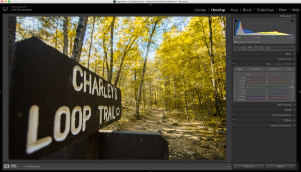
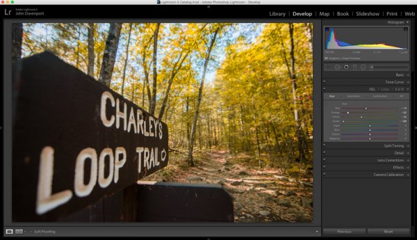
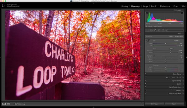
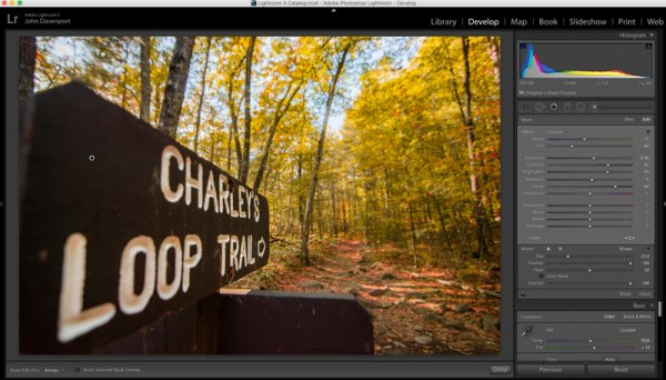
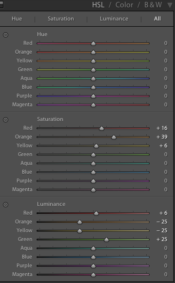
The workhorse of the manipulations you will see today is the HSL tab in Lightroom. It allows you to control the Hue, Saturation, and Luminance of your photograph on a color by color level. This gives you the ability to modify reds separately from oranges, blues from greens and so forth.

Each of the HSL controls have a unique slider for the eight different color tones that make up an image and as you’d expect, each of the HSL controls allow you to modify different aspects of that color.

  • Hue – Controls the tonal range of the color that you’re modifying. For example greens can be anywhere from yellow to aqua.
  • Saturation – Controls the intensity of the color that you’re modify. More saturated means deeper and more intense color, less saturated and you’ll have muted or even no color for the selected color.
  • Luminance – Controls the brightness of the color you select. Moving a slider to the right will brighten the selected color, while moving to the left will darken it.

As you can see there is a wealth of specialized controls built into the HSL tab. I hope the walkthrough below gives you some ideas on what you can do with it. Remember it’s not just limited to faking the colors of the fall season.

Fake perfect fall colors with Lightroom

To get started you’ll need a photograph to work with. It is going to be important that you choose your images carefully here as not every photograph will work for this kind of post-production.

For example – you’ll want to make sure that the trees you’re featuring do in fact change color in fall (evergreens do not), and, that the other surrounding features of your photograph are outside of the green/yellow spectrum that you’ll most-likely be changing, or you’ll be altering them as well as your trees.

fall

Once you have a great shot and you’ve completed some of the basic post production steps then you’ll want to hop over to the HSL tab in your Lightroom develop module.

As you’ll be working with trees that have yet to change color you’ll mostly be working with greens and maybe some yellows or reds. Again, this is why it’s important that the photograph you’re modify doesn’t contain any non-leaf items in these color ranges – or you’ll change them too – and that might looking more unnatural than the fake fall colors you’re creating.

fakingfallcolor-green

As you saw above, the shot I’ve chosen for this article contains mostly green leaves with just a few hints of fall color. The first step is to remove the greens from the image by moving the green’s hue slider all the way to the left. This effectively changes the green colors in the image to yellow giving a more fall like look the the photograph, but we’re not done just yet!

Next you can experiment with moving the reds and yellows sliders around to try and see how they effect the image. Different color tones will come to life that you may not even realize were there in this step so it’s important to take it slow and look at the entire photograph as you make the changes. In this image the leaves on the ground took on a rusted red look while the trees themselves got a deeper orange look.

fakingfallcolor-hue

Once you’ve got the Hue the way you like it you may want to move into the Luminance and Saturation tabs of the HSL tool. This will allow for further modifications of the colors tones by effecting the richness and brightness of the colors you’re presenting.

fakingfallcolor-luminance

Remember the color tones are still the same as they were in the Hue slider, so even though the greens appear as yellow, moving the green Luminance slider to the right brightens the trees a bit, while the orange and yellows sliders effect their respective color tones.

Another idea that you might want to toy around with is modifications of the white balance. Adding more yellows with the Temp slider or more magenta with the Tint slider can add even more dimension to the shot giving the colors a more dynamic feel.

fakingfallcolor-wb

However, it is extremely important to be careful with the white balance sliders when you’re doing these manipulations as bad things can happen very quickly if you’re too aggressive with the changes!

fakingfallcolor-toomuch

After you’ve set your color tones and adjusted the white balance of the image it’s time to give the entire photograph a good, close, once over.

For this demonstration image the lettering on the sign started to take on a reddish/yellow tint after the white balance tweaks were performed. To fix this an adjustment brush was added to the sign which reduced both the Temp slider (to remove yellows) and the Tint slider (to remove the magenta colors). Also at this point the sign was given a little more definition with the adjustment brush by increasing the clarity and fine tuning the exposure.

fakingfallcolor-adjustment

All in all using the HSL tab in Lightroom can be a fun way to create that fall color when it might have been just out of reach. Of course, this doesn’t compare to the real thing so, the best way to get fall color is to go find it in person. Therefore don’t let this stop you from getting out and planning your next hiking trip – the unpredictable nature of the fall season is one of my favorite parts about it!

fall-2

Watch this technique in action

Do you have any other fall photography or post-processing tips to bring out those great colors? Please share in the comments below.

The post Fake Perfect Fall Colors Using the HSL Tab in Lightroom by John Davenport appeared first on Digital Photography School.


Digital Photography School

 
Comments Off on Fake Perfect Fall Colors Using the HSL Tab in Lightroom

Posted in Photography