RSS
 

Posts Tagged ‘Looking’

5 Tips to Help You Take More Natural Looking Portraits

05 Dec

Writing for dPS has afforded me several opportunities, the best one being getting to converse with photographers – hobbyists to professionals and everything in between – from all over the world.

lynseymattingly3

Each time an article I write is published, I get the loveliest emails and comments, and I do my very best to respond to each of them. The question I get most often is one I ask other photographers all the time: How do you make your pictures look like……..that? The question may be worded differently, but ultimately it is the same:

  • How do you get your colors to pop?
  • What lens do you use?
  • How come the people all look so happy/comfortable/natural in your pictures?
  • What’s your editing process?

When we ask another photographer these questions, we are all asking the same thing: How do you make your pictures look like that?

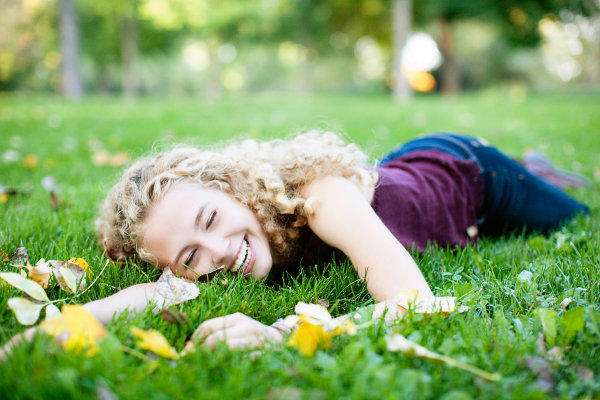
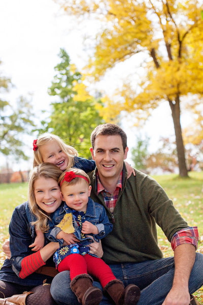
When an image grabs you – makes you take an extra second to look at, to admire it, or to wonder if your own images look that great, (or throws you into a jealous rage over picture envy (please tell me I’m not the only one) – it’s as though the photographer has such a defined style, their entire message comes across in that one photo staring back at you. Since my style is candid portraiture, or lifestyle photography, or whatever the latest buzzword is we are calling it now, my subjects’ expressions and poses are what I typically get asked about most. Or maybe that’s just the only part I can explain very well, as the science and equipment piece of it is just not my cup of tea.

lynseymattingly8

So here are the five things I say and do during a portrait shoot that I feel make the biggest difference in the comfort level of my clients, and ultimately is the reason I occasionally strike gold. It’s these things that are the answer to how I make my pictures look like that.

#1 Explain the process

Before I take a single picture – whether my subjects are nine or 90 years old – I tell them exactly what to expect from the session, and what I expect from them. It nearly always goes like this: “I’m going to take some pictures. I’m going to take some pictures of just the kids, some pictures of just Mom and Dad, and some pictures of everybody. You can smile if you want to smile, but you don’t have to if you don’t want to, and at the end I’m going to give you a little prize.” This short little introduction often immediately puts my clients at ease and I am able to set the tone of the whole shoot based on their response.

lynseymattingly6

If I am photographing kids, I always sit down on the ground so I am closer to their level, but I say this exact thing to children and adults alike. Yes, I carry around lollipops. My gear bag has an entire area just for that, and people I have photographed before know it. A lollipop is a tiny treat and while it’s fun and funny, though not usually a huge motivator for teenagers and certain adults, you’d be surprised how far it gets me. Obviously for most, it’s not the prize itself, but rather that I am acknowledging that this is going to be a bit of work, and it’s going to have an end point. It’s an offering to them, silently asking for them to go all-in for photos and perhaps have a little patience with me.

Also important is that I tell them they don’t have to smile. I don’t want anyone smiling because they think they have to – smiles out of obligation makes for terrible pictures. I want them to smile because we are having so much fun, they do it instinctively.

lynseymattingly1

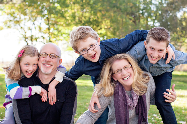
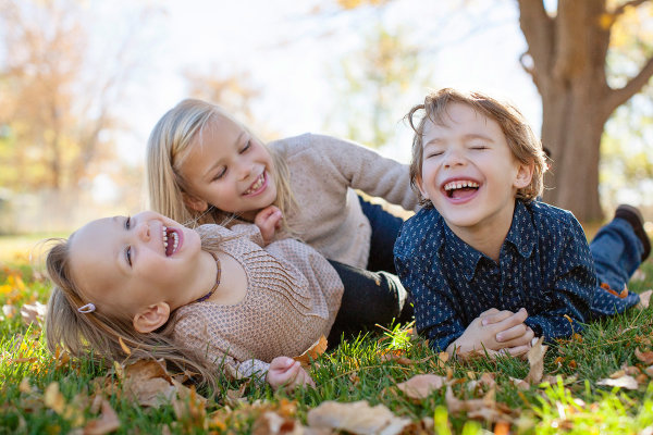
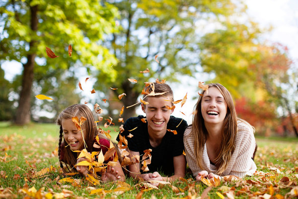
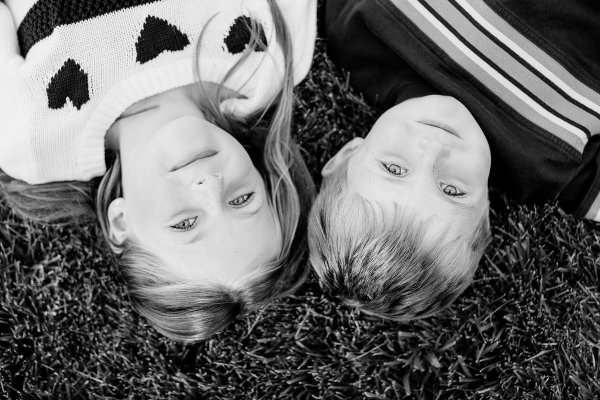
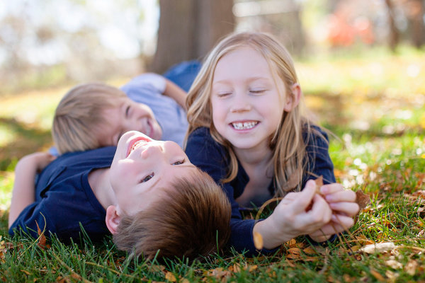
#2 Strive for interaction and reactions, not poses and smiles

If I have to choose between a picture of every face looking at me, smiling, or one of a family looking and laughing at each other, I will chose the latter every day and twice on Sunday. It is my personal and professional belief that 50 years from now, those images of people being themselves with their loved ones will be much more treasured than portrait studio shots that only show everyone together. I do my best to set-up a moment and let my subjects take it where they want. I can’t declare their reaction to something, so therefore I set the tone for funny or serious, or as I would say to a child: a loud picture or a quiet picture. I see myself as a third wheel on a great date – I’m along for the ride, I just happen to be photographing it.

lynseymattingly5

#3 Shoot everything

I am a massive over-shooter. I carry more memory to a quick portrait shoot than some photographers would pack for a day-long wedding. Changing a card mid-shoot is completely normal for me. This no doubt adds to the backend of my process, as I have so much more to sort through, but this means I can feel confident enough to guarantee my clients a minimum number of images. This also means, I very rarely have a client ask: “Did you get it?”.

I shoot looking through the viewfinder, and not. I line up the shot and then peek my head out so my subjects aren’t just staring at a black box. I make funny faces. I have a fake sneeze that can get even the most serious of baby giggling and that requires several sneezes, shots, and me not having a camera affixed to my face. I shoot an average ratio of one to 30. Meaning for every 30 images I shoot, one of them will get edited and delivered to the clients.

This would be terrible if I shot film. To be honest sometimes it’s a little overwhelming the first time I upload all of the images from a shoot. Often it’s even a lesson in self-loathing, wondering how on earth I will ever get through them, and why do I do this to myself every – single – time. In the end, it always works out. Plus, I always have the images I was hoping I caught.

lynseymattingly9

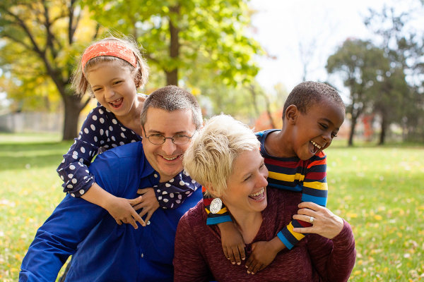
#4 Be a giant cheerleader during a shoot

I am a giant cheerleader during a shoot, to the point that it’s a bit eye-roll-inducing. If it’s dark and gloomy out, I show-up saying this is what we call perfect, even, light! If it’s bright and sunny, and miserably hot? What a perfect day for photos!

Every single thing my clients do during a photo session is perfect and if it’s not, I tell them I’m going to fix it. I want my clients on the other side of that lens to feel beautiful, and like they are doing a perfect job. Having them feel awkward, or be in poses or positions that feel unflattering, will make for bad pictures. Being told that they are doing a great job and that the pictures are coming out perfectly, gives clients the confidence to be themselves. I’m their friend during a shoot – kids and adults alike. And if I’m not behaving in a way that people would want to hang-out with me when I am not taking photos, why would they want to hang-out with me when I am?

lynseymattingly7

#5 Know you are just a piece of the process

I don’t want to get all cheesy on you or anything, but I don’t feel like any picture I have taken of someone is mine. The photo belongs to the person in it, and whomever they chose to share it with. I don’t do any printing. When someone pays for a photography session with me, they get the high resolution images as jpg files, and a release to print and use them as they would like. I honestly feel like this creates a comfort level that I didn’t see when I used to offer prints only. They know they are going to get the best of what I shoot and they aren’t going to have to pick a favorite for an expensive enlargement. They know there isn’t going to be a hard sale in a few weeks where we look at everything together. I don’t put watermarks on my images ever and I encourage them to share their pictures on social media. In fact, I often share their pictures on social media.

lynseymattingly2

Here’s why: if they didn’t hire me, show-up, look great, have fun, etc., I wouldn’t have the pictures to show in the first place. I’m only a piece of any picture I’ve ever taken. You may argue, what if someone steals your images? To do what? Claim them as their own? I have never run into a situation where that would truly hurt me. If there is a wild rampage of stealing other photographer’s images out there and mine are being stolen, I would honestly be a little flattered. That means they’re good! I’ve already been paid for my work. Though I would never use an image where my client hasn’t signed a release allowing my use, I don’t see how getting my images out there is anything but free advertising. I want my clients to love their photos so much they print them all in large sizes to hang up for their friends to see. I want them to talk about how fun the shoot was, how happy they are to get all of the images, and how they will hire me again and again. Those people know who took the pictures, and that’s all that really matters.

How do you help clients feel comfortable during a photo shoot? Share your comments and suggestions with us below.

googletag.cmd.push(function() {
mobile_slots.push( googletag.defineSlot( “/1005424/_dPSv4_mob-all-article-bottom_(300×250)”, [300, 250], “pb-ad-78158” ).addService( googletag.pubads() ) );
} );

The post 5 Tips to Help You Take More Natural Looking Portraits by Lynsey Mattingly appeared first on Digital Photography School.


Digital Photography School

 
Comments Off on 5 Tips to Help You Take More Natural Looking Portraits

Posted in Photography


Looking Grave: 12 Spooky & Scary Abandoned Funeral Homes

26 Oct

[ By Steve in Abandoned Places & Architecture. ]

abandoned Ward's Funeral Home Opelika 1
Funeral homes are mortal, much like their clients. When funeral homes are abandoned, however, they’re left to decay, deteriorate and decompose in public.

Built in 1870 during the difficult era of post-Civil War Reconstruction, Ward’s Funeral Home in Opelika, Alabama has long since surrendered to the inexorable march of time. Flickr user Jessica Williams (JessicaNicholex) brings us these images of the former funeral home that, like the neighborhood it still resides in, has seen better days.

abandoned Ward's Funeral Home Opelika 2

abandoned Ward's Funeral Home Opelika 3

It’s not known exactly how long Ward’s Funeral Home has been abandoned; long enough for it to become an eerie urban legend at least. Some Opelika residents claim to have seen haints (haunts, or ghosts in the local parlance) peering through the windows at night. Those brave enough to enter the building itself will find a few caskets in what may have been the business’s showroom. Opening them isn’t recommended… especially to anyone who’s seen a certain scene from Raiders Of The Lost Ark.

Dark Undertakings

abandoned funeral home undertaker Aquasco Maryland

This abandoned “undertakers” establishment can be found in beautiful suburban Aquasco, Maryland – or at least it could be back in mid-March of 2009 when Flickr user ZOOPMON captured it for posterity. Check out the window on the upper left (embiggened view here)… if you weren’t planning on enjoying a sound sleep tonight.

Bodie’s Bodies

Bodie ghost town funeral parlor 1

Bodie ghost town funeral parlor 2

Bodie ghost town funeral parlor 3

Bodie, a California desert ghost town founded in 1876 and designated a National Historic Landmark in 1961, had a working funeral parlor for much of its history – and like most Wild West mining towns, the resident undertaker had plenty of regular business. The funeral home has deteriorated somewhat since the last few Bodieans abandoned the town but enough remains (pardon the pun) to distinguish it as such.

Little Rock Of Ages

OLYMPUS DIGITAL CAMERA

abandoned Miller's Funeral Home Little Rock Arkansas 1

Abandoned funeral homes don’t need to be photographed on gloomy overcast days to bring out their essential creepiness. Just check out these photos of the abandoned Miller’s Funeral Home in Little Rock, Arkansas, snapped by Flickr user Terry Williams (IM2_OCD) on July 25th of 2010. The images cast the business’s decay in gritty focus while bringing out the essential beauty of the sun-washed subject. Especially poignant is the top photo, contrasting the timeless dereliction indoors with the soulless flyover banality glimpsed through the window.

Next Page – Click Below to Read More:
Looking Grave 12 Spooky Scary Abandoned Funeral Homes

Share on Facebook


[ By Steve in Abandoned Places & Architecture. ]

[ WebUrbanist | Archives | Galleries | Privacy | TOS ]


WebUrbanist

 
Comments Off on Looking Grave: 12 Spooky & Scary Abandoned Funeral Homes

Posted in Creativity


Looking Sharp: Blade-Like Bridge Slices Through the Air

09 Oct

[ By Steph in Destinations & Sights & Travel. ]

blade bridge 1

Five blade-like beams slice into the sky when this cantilevered footbridge in London’s Merchant Square rises to make way for boats moving along the Grand Union Canal. The movement of its dynamic design is inspired by the opening and closing of a traditional hand-held fan, the steel elements separating as they’re lifted into the air by hydraulic jacks.

blade bridge

blade bridge 2

Designed by Knight Architects and AKT II, the bridge spans a 20-meter (65-foot) section of the canal. The beams weigh six to seven tons each, and are balanced by a 40-ton counterweight. When fully open, the bottom blade hovers about 8 feet over the surface of the water. When closed, the bridge offers a flat and comparatively unremarkable surface that pedestrians can cross three-abreast.

blade bridge 3 blade bridge 4

Envisioned as a kinetic sculpture, the design beat out dozens of others in a 2012 contest. Like Thomas Heatherwick’s nearby Rolling Bridge, which curls into a ball as it opens, the new bridge rises every Friday and is considered a landmark for the area.

Share on Facebook


[ By Steph in Destinations & Sights & Travel. ]

[ WebUrbanist | Archives | Galleries | Privacy | TOS ]


WebUrbanist

 
Comments Off on Looking Sharp: Blade-Like Bridge Slices Through the Air

Posted in Creativity


Luminosity Masks Versus HDR Software For Creating Natural Looking HDR Images

27 Aug

Jimmy’s Luminosity Masks Tutorials – Art of Digital Blending Course For Photoshop is on sale now at 15% off over at SnapnDeals. Only until September 6th, grab it now!

If you type the term ‘HDR’ into google images you’ll very quickly see why HDR photography has a bad reputation. While we all differ in our tastes, in recent years, those strongly saturated, blurry and noisy HDRs have fallen out of fashion, even amongst HDR photographers.

Pink seascape

Luminosity Masks Versus HDR Software For Creating Natural Looking HDR Images

The goal, among many, is now a clean HDR look. HDR programs are attempting to tidy up their processes to meet the needs of the demanding HDR photographer. However, a large number of photographers are beginning to take the blending process into their own hands, and produced beautifully balanced HDRs using luminosity masks, probably the cleanest alternative to HDR software.

In fact, luminosity masking has become an exciting buzz-term in the world of digital photography, and there’s good reason for that.

If you’re new to luminosity mask exposure blending, you can see a beginner’s tutorial on dPS in my previous article: Exposure Blending Using Luminosity Masks Tutorial

In this article we’ll take a look at the benefits and challenges of luminosity masks versus HDR software.

Benefits of Luminosity Masks

1. Image quality

We’ve all seen over-saturated, noisy, messy, HDR images. One guaranteed way to avoid the poor image quality we normally associate with HDR is to manually blend your exposures in Photoshop using luminosity masks.

When exposure blending with luminosity masks, you’re working only with the RAW files to restore highlights and shadows. You do not affect any other part of the image. In other words, your final blended image will be, more or less, exactly the same image quality as your RAW files.

You do not affect any colour changes, you retain absolute sharpness, you don’t flare up noise (which means you can shoot at a much higher ISO), and you will not exaggerate chromatic aberration.

This is the major reason why so many are turning to luminosity masking to create natural, balanced HDRs.

Chilean sunset

Sunset at Puerto Natales, Chile

2. Complete control over what we blend

Artists of any genre fight for complete control over their ability to express themselves. And so it is in photography. One of the problems with using HDR software is that we have very little control over the blending process.

We rely on an algorithm to choose which areas to blend with which exposures. Then we’re given some sliders to adjust. Although this gives us greater control over the process, it isn’t giving us 100% control.

Through luminosity masking, we begin with a base exposure, and we then decide for ourselves which exposures we wish to use in the blending process, and which areas we wish to adjust, and at what opacity.

The image below is a good example of how you can make very precise changes with luminosity masks.

Hong Kong Light Trails

Hong Kong Light Trails

This image is made up of 11 exposures; six of which were used for the light trails, four were used for exposure blending, and one was used as the base exposure. You can learn how to create light trails like this here: How To Add Dramatic Car Trails To Your Photos In Photoshop

Below you’ll see the RAW file used for the base exposure.

HK Light Trails

Base Exposure

The only highlights I wanted to control in the image were the street lights, and even then I still wanted them to be bright. Through bright lights like this night cityscapes are able to give off a lot of energy and dynamism.

I very gently blended in three darker exposures to gain a little bit of control in those areas, without darkening them too much. If I ran my exposures through an HDR program, all of the highlights in the image would have been affected to some degree, which is exactly what I didn’t want.

For the darker areas, I only wanted to bring back information in one area, the side building to the right, which is noticeably dark. I used an exposure two stops brighter and, with luminosity masks, I easily painted details back into this area.

#3. No more halos and fewer ghosts

Halos simply don’t exist in luminosity mask exposure blending if you’ve done it correctly.

As for ghosts, you will rarely encounter a moving object that is difficult to blend. Since you use a base exposure, which will be done for most of your images, and simply reduce specific highlights and shadows, there shouldn’t be any ghosting.

The only challenge you may have, which is also a challenge when using HDR software, is if you have moving leaves on trees, for example, between exposures. Then the blending process is a little bit trickier.

#4. Become a better photographer

Mesa arch

Mesa Arch, Before and After Exposure Blending With Luminosity Masks

In my early days I was a die hard tone mapper. I’d approach a scene and think, “this would be a cool HDR subject”. I’d fire off some brackets and take them into Photomatix when I got home. I had a predefined routine of what to do, what result I wanted, and how to get there. I had tunnel vision.

When I began exploring luminosity masks, everything changed. I began to read a scene, not as an HDR subject, but in terms of its unique beauty and mood. I started to grasp more fully the use of light in controlling mood, whereas previously I was simply relying on getting the ‘HDR effect’ each time.

Rather than shooting off a set of automatic brackets, for a complex scene I will often bracket manually, changing the aperture, ISO and shutter speed to capture different elements of the scene. Then I’ll blend in each of the elements to hopefully get the best out of that scene.

In the Hong Kong Light Trails image above, the base exposures and brighter exposures, the light trails, and the darker exposures were all shot manually with different settings to achieve different effects.

It is through using luminosity masks, and taking my imagery into my own hands, that I have pushed myself in the field to achieve more.

#5. Combine with other HDR processes

One of the beautiful things about luminosity masks is that you can combine them with other exposure blending methods to complete the blending process. 32-bit processing is becoming an interesting way of blending exposures cleanly, but we are a long way off before the process is good enough and our monitors can handle true 32-bit files.

However, we can overcome the limitations of 32-bit processing by combining it with luminosity mask exposure blending. The tutorial below will show you exactly what I mean. The video is taken directly from the Art of Digital Blending course:

Challenges with Luminosity Masks

HDR software is simpler

Luminosity masks require more patience and a steeper learning curve than HDR software. The concept takes a little bit of time to get used to, and it will certainly challenge you to re-learn a few things.

While HDR software will take all of the leg-work out of it for you, luminosity masks require you to really think about your exposures and deepen your workflow.

Luminosity Masks don’t work on every occasion

Every now and then you’ll come across an image where luminosity masks won’t create a smooth blend between exposures. This happens because there isn’t enough contrast between the areas you wish to blend and the areas you don’t wish to affect.

In which case, using 32-bit processing or HDR software would be a good alternative.

Luminosity masks work in 8-bit mode

Like all live selections in Photoshop, luminosity masks work in 8-bit mode. They don’t affect the bit depth of your image, so if you’re working at 16 bits that won’t change. But there may be a chance of posterization in some cases.

A quote from Photoshop staff on the Adobe forum claims:

“The selection mask is 8 bits, regardless of the document precision. That fact has no affect on the precision of the image.

No, it won’t change the image or cause future posterization — the image data is still the same precision as it always was.”

So while this shouldn’t be an issue, it is something to be aware of.

Hong kong the peak view

Conclusion

HDR images don’t have to be messy, garish and overdone. There are many ways to cleanly blend exposures to create a beautifully natural and balanced HDR. Having luminosity masks in your arsenal, will give your workflow a superb cutting edge, that can quite literally change your imagery over night.

It will require a little bit of extra work on your part, but often the best things in life do.

Jimmy’s Luminosity Masks Tutorials – Art of Digital Blending Course For Photoshop is on sale now at 15% off over at SnapnDeals. Only until September 6th, grab it now!

  • Getting Real with HDR – a Step by Step Tutorial for Realistic Looking HDR
  • Is the Death of HDR Photography Coming?

The post Luminosity Masks Versus HDR Software For Creating Natural Looking HDR Images by Jimmy McIntyre appeared first on Digital Photography School.


Digital Photography School

 
Comments Off on Luminosity Masks Versus HDR Software For Creating Natural Looking HDR Images

Posted in Photography


Getting Real with HDR – a Step by Step Tutorial for Realistic Looking HDR

11 May
Try to make your HDR images look as realistic as possible

Try to make your HDR images look as realistic as possible

If you have been photographing for more than a year or two, you will have heard about HDR (which stands for High Dynamic Range). We have probably seen them, the “overcooked”, over processed HDR images that float around the photo websites. For some photographers, the process seems to force them to overdo their images and after a while that seems to be the only result they are trying to achieve. Do a Google search on “bad HDR” and you will see what I mean. The images have halos,  the colours are surreal and look metallic, the contrast is off and in short, the image is really messy.

When I first shot HDR, I fell into this trap too. These results caused many photographers to say that HDR is not a useful technique and is really gimmicky. That perception is partly true. HDR in the hands of someone who cannot use it effectively can result in some weird looking images, however, HDR done properly can produce some incredible results. To see some good examples of HDR done properly, visit the website HDR Spotting and take a look at the editors picks. There are some astounding images there. The colours are amazing, the contrast is perfect and the detail in the shadows and highlights, sublime. That is what HDR should be. It should be the best combination of the highlights and the shadows properly exposed, the image should look as real as it can. So, how do you get this right you might be asking, read on to find out.

What is HDR?

As I said earlier, HDR stands for High Dynamic Range. Your cameras sensor has the ability to capture light and colour. The extent to which your camera can do this is called the dynamic range. More specifically, if your camera can render lots of details in the shadows and the highlights in the same shot, then it has a high dynamic range. Over the past few years, digital sensors have become so much better at capturing more detail. This is a huge benefit for photographers and of course for HDR photography. This means that we can get more details out of every image and as a result, the HDR images will be that much more detailed.

Lions Gate Bridge Vancouver - HDR image

Lions Gate Bridge Vancouver – HDR image

How do I shoot HDR?

Making an HDR image involves 3 distinct and separate processes. I will go into detail on each one, but at a high level, they are as follows:

  1. Image Capture
  2. HDR Processing
  3. Image editing in Photoshop

Lets start with image capture first. This is the photography part of this process. It’s pretty simple really. Set up for your shot as you normally would. Make sure you have your subject well composed and you are ready to go. The difference between HDR and normal photography, is that with HDR you will take either three to five bracketed images of the same scene. The reason for the number of images is that you will blend these images together in a dedicated HDR product.

My recommendation for HDR software is Photomatix Pro. It is a programme that has been around for many years now and has some really good editing functions. It’s probably the most widely used software when it comes to HDR. Photoshop also has an HDR function, but in my opinion, its not as refined as the Photomatix Pro yet. Don’t get me wrong, I am a huge Photoshop fan, it is an incredible tool, I am sure that Photoshop will have something within their functions that will be competitive in time, but for now, I still use Photomatix.

Step #1 –  Image capture

These are the steps I follow when I intend to do an HDR shot. They are not rules, nor are they inflexible, they just work for me. You need to find what works for you and gives you the best results, this method has helped me get my best results, so try it out. Tweak it and change it as you need.

  1. Use a tripod – it is a good idea to put your camera on a tripod for HDR, especially if you are shooting in low light. I have done some handheld HDR but only in bright conditions. The tripod will also help you get your composition right.
  2. Put your camera into Manual mode “M”
  3. ISO Settings – it is a good idea to keep your ISO settings at 100 or as low as your camera will go. That way you will avoid introducing unnecessary noise into your images. The process of HDR allows you to capture the dynamic range of light and colour in the scene. Using high ISO settings is great when you are trying to shoot a low light scene and capture it in one shot, but for HDR you will want to keep it as low as possible.
  4. Set your aperture to anywhere between F/8 and F/ 11 and don’t adjust your aperture between shots.
  5. Adjust your shutter speed so that you are exposing the scene perfectly according to your cameras light meter.
  6. Capture one image at this reading
  7. Underexpose by one or two stops (depending on the scene) and capture another image by adjusting your shutter speed.
  8. Do this twice on either side of the perfectly exposed image.

This will result in five images being captured.

Below are the three images I used in making the HDR image you see above. Take a look at how the colours and exposure don’t look good at all.

3 Different exposures for the HDR image above

3 Different exposures for the HDR image above

Some photographers use five shots for their HDR shots, some use seven or up to nine. I have found that three to five shots seem to work best for most scenes. I have only used nice shots on a few occasions, but have not been happy with the results. The colours seem to be “muddy” and unclear once processed. If necessary, shoot seven images and see how that works.

Once you have completed the shoot, download the images to your computer. It is important NOT to edit the images before blending them into an HDR image. Some of the shots might look over exposed or under exposed, thats OK, in fact they must look like that. The software will deal with these issues, so don’t be concerned that the images look bad out of camera, they need to be processed and then the magic begins.

Click on - Load Bracketed Photos

Click “Load Bracketed Photos”

Step #2 – HDR processing

I will be explaining the Photomatix software in this article. I have tried HDR with each new version of Photoshop and I am still happier with the results I get from Photomatix Pro. You can download a trial version of Photomatix from their website. It is fully functional, the only thing is that the trial version puts a watermark on the image. This is OK for trying it out, you will see exactly what the software can do, if you think it is worth it, then you can buy it. Ok, so here is how you take your images into Photomatix Pro

  1. Open Photomatix Pro (or if you’ve set it up as a Lightroom plugin, select your bracketed images, right click and choose “edit in” and Phototix Pro)
  2. Click  ”Load Bracketed Photos” and then click on “Browse” and select the images you have taken (you can also drag and drop them into the box)
  3. Click OK once the images appear in the box
Select the options displayed on the screen above

Select the options displayed on the screen above

Preprocessing options are available.  Make selections on the box as shown in the screenshot above. Then click preprocess and Photomatix Pro will begin to tone map the images into a composite 32-bit image. This process is generally quite quick, between 30 seconds and a minute.  Once complete, click on the Tone Mapping button.

Use the “Remove ghosts” function if you have people or moving objects in your images. If you don’t have this, then you wont need to use this function.

The HDR editing screen

On this screen, you are able to select a variety adjustments that will create an overall change to the image. There are no absolutes here. Each adjustment makes minor or major differences to the image and the combination of the adjustments provides diverse options.

HDR-Screen-600

At the bottom of the screen you will see different “treatments” (or presets) which you can use as a starting point to your image editing process. I would avoid using these as they are generally overdone. Try and use the functions on the left hand side to edit your image.

Below are the details about each function on the left hand side of the screen and what each does. One of the best ways to see what a function does is to slide it all the way over to the left and then to the right and see how it affects your image, but here are the details:

General Settings

  • Strength – affects the degree to which contrast and detail are enhanced in the image. A value of 100 gives the maximum amount of enhancement. To get a more natural effect, move the slider to the left. The default value is 70.
  • Color Saturation – controls the saturation of the RGB color channels. The greater the saturation, the more intense the color. Move the slider right or left to change the setting. A value of zero produces a grayscale image. The value affects each color channel equally. The default value is 46.
  • Luminosity – controls the compression of the tonal range, which has the effect of adjusting the global luminosity level. Move the slider to the right to boost shadow details and brighten the image. Move it to the left to give a more “natural” look to the resulting image. The default value is zero.
  • Detail Contrast – controls the amount of contrast applied to detail in the image. Move the slider to the right to increase the contrast of the details and give a sharper look to the image. Note that increasing the contrast also has a darkening effect. Move the slider to the left to decrease the contrast of details and brighten the image.
  • Lighting Adjustments – affects the overall ‘look’, controlling the extent to which the image looks natural or surreal. When the Lighting Effects Mode box is unchecked, move the slider to the right to make the image look more natural and to the left to make it look more ‘painterly’ or ‘surreal’. Use this carefully as it can have an unpredictable effect on your image.
  • Lighting Effects Mode – the checkbox lets you switch between two modes for the Lighting Adjustments setting,where each mode produces slightly different results. Checking the box tends to produce results with a type of ‘Magic Light’ effect.

More Options

  • Smooth Highlights – reduces the contrast enhancements in the highlights. The value of the slider sets how much of the highlights range is affected. This control is useful for preventing white highlights from turning grey or uniform light blue skies becoming dark blue-grey. It is also useful for reducing halos around objects placed against bright backgrounds. The default value is zero.
  • White Point and Black Point – these sliders control how the minimum and maximum values of the tone mapped image are set. Moving the sliders to the right increases global contrast. Moving them to the left reduces clipping at the extremes. The White Point slider sets the value for the maximum of the tone mapped. The Black Point slider sets the value for the minimum of the tone mapped image.
  • Gamma – adjusts the mid-tone of the tone mapped image, brightening or darkening the image globally. The default value is 1.0.
  • Temperature – adjusts the color temperature of the tone mapped image relative to the temperature of the HDR source image. Move the slider to the right to give a warmer, more yellow-orange colored look. Move the slider to the left for a colder, more bluish look. A value of zero (default) preserves the original color temperature of the HDR source image.

Advanced Options

  • Micro-smoothing – smoothes local detail enhancements. This has the effect of reducing noise in the sky, for instance, and tends to give a “cleaner” look to the resulting image. The default value is 2. Important note: The Loupe may not properly show the effect of the Micro-smoothing setting when the area magnified is uniform. If you want to see the effect of the Micro-smoothing setting at 100% resolution on a uniform area such as the sky, you will have to select an area that contains an object in the scene in addition to the sky.
  • Saturation Highlights – adjusts the color saturation of the highlights relative to the color saturation set with the Color Saturation slider. Values higher than zero increase the color saturation in the highlights. Values lower than zero decrease it. The default value is zero.
  • Saturation Shadows – adjusts the color saturation of the shadows relative to the color saturation set with the Color Saturation slider. Values higher than zero increase the color saturation in the shadows. Values lower than zero decrease it. The default value is zero.
  • Shadows Smoothness – reduces the contrast enhancements in the shadows. The value of the slider sets how much of the shadows range is affected. The default value is zero.
  • Shadows Clipping – the value of the slider sets how much of the shadows range is clipped. This control may be useful to cut out noise in the dark area of a photo taken in a low-light situation. The default value is zero.

Once this part of the process is finished, then it is time to take the image into Photoshop. Save the tone mapped image and then re-open it in Photoshop.

Step #3 Image Editing in Photoshop

This is a very basic workflow. It will enhance the lighting and tonality in your images. These techniques are discussed here at high level.

Shadows and Highlights

Photoshop has a function called Shadows and Highlights. Use this tool to bring out detail in the shadows of your image. Use it carefully, if you overdo the treatment on the shadows, there may be some unsightly image degradation or “noise”. This function is not great for adjusting highlights, so use it for the shadows only. This tool is found in Photoshop as follows: IMAGE > ADJUSTMENTS > SHADOWS AND HIGHLIGHTS. The adjustments of AMOUNT, TONAL WIDTH and RADIUS should all be kept aligned close to one another to ensure that the adjustment looks realistic.

Shadow and Highlights function in Photoshop

Shadow and Highlights function in Photoshop

Levels Function

The levels function in Photoshop is for adjusting the lighting in an image. This means that if your image is a little dark you can push up the exposure slightly and see more details in the image. The levels function shows a representation of a histogram. Move the sliders in to touch the edge of the histogram as a general rule. This will ensure that your image has a good representation of highlights and shadows.

The Levels functioning Photoshop

The Levels functioning Photoshop

Hue and Saturation

Once the exposure and lighting has been adjusted and looks correct, then you may begin adjusting the colour in the image. The tool to use will be the Hue and Saturation tool. The important tip here is not to adjust the master channel but rather to adjust by each channel independently. To do this, click on the top toggle button that says “default”. A drop down menu will appear and each colour channel will be available from there. Slide the Saturation Slider to the left to desaturate (remove colour) or to the right to saturate. That way you have the best control of the colour in your image.

Hue and Saturation Function in Photoshop

Hue and Saturation Function in Photoshop

Dodging and Burning

These functions are localized adjustments. By using a brush tool, you are able to make certain areas of the image darker and other areas of the image lighter. This is useful for adding the finishing touches to your image. There is also the sponge function which is a saturation tool which can saturate colours at a local level.

Sharpening

Almost every image that comes out of a digital camera requires sharpening of some sort. The easiest and quickest tool to use is the Unsharp Mask tool and it works effectively.

Unsharp Mask Tool in Photoshop

Unsharp Mask Tool in Photoshop

The Unsharp Mask has three separate sliders: Amount, Radius and Threshold. As a general rule you can keep the Amount anywhere between 80 and 120%, Radius can be set between 1.0 and 3.0 pixels and Threshold is generally at zero. Adjust the sharpness of the image according to each image requirement and beware of degrading the image by over sharpening. You will easily notice if an image is over sharpened by the appearance of a “halo” around certain edges in the image. The idea is to sharpen the image but not make it overly sharp and lose image quality.

Once you are done, save your image and thats it! Have a go, try different settings in different light, let me know what you think and how your images turn out. If you have any questions, drop them into the comments box below.

Please leave your comments and questions below. If you want more HDR tips, try some of these articles:

  • HDR Vertorama Photography – How to Create Mind-bending Images
  • Five Minutes to Realistic HDR using Lightroom and a 32-Bit Plugin
  • The 10 Steps Every HDR Photographer Goes Through
  • Exposure Blending Using Luminosity Masks Tutorial

The post Getting Real with HDR – a Step by Step Tutorial for Realistic Looking HDR by Barry J Brady appeared first on Digital Photography School.


Digital Photography School

 
Comments Off on Getting Real with HDR – a Step by Step Tutorial for Realistic Looking HDR

Posted in Photography


8 Reasons We’re Looking Forward to Springtime Photography

26 Feb

Ah, the changing of the seasons. For us photographers, most seasonal changes bring about opportunities to take great photos under differing conditions, and usually no change is more dramatic than the transition from winter to spring.  The world thaws into a new and color-dripped landscape, ripe for capturing its natural beauty through springtime photography. There is always an influx of Continue Reading

The post 8 Reasons We’re Looking Forward to Springtime Photography appeared first on Photodoto.


Photodoto

 
Comments Off on 8 Reasons We’re Looking Forward to Springtime Photography

Posted in Photography


Looking to Buy a New Camera or Gear? Check Out Our Brand New Guide

13 Nov

dps_covers_gear2

Are you looking to buy a new digital camera, lens, flash or other gear in the next 12 months?

If so – you’re not alone.

Check out these stats:

In a recent survey of dPS readers we found out over the next 12 months:

  • 31% of you were planning on purchasing a new camera body
  • 71% of you were looking to buy a new lens
  • 26% of readers were in the market for a new flash unit
  • 14% of you were looking to buy studio lighting
  • 24% of you were looking for a new camera bag

In fact over 85% of our readers are currently looking to make a significant addition to their gear in the next year.

If you’re one of them – you really need to check out our brand new Guide to Buying and Looking after your photography gear.

It’s the latest edition in our ‘Photo Nuts’ series and is called Photo Nuts and Gear: Know Your Gear and Take Better Photos.

Add to Cart

Why We Published This eBook

Since starting dPS back in 2006 a question that we see on a daily basis is:

“What Gear Should I Buy?”

It’s a tricky question to answer because each photographer has their own unique needs and there are constantly new cameras and accessories on the market.

One of the other common things we’ve heard from readers repeatedly over the year are stories of frustration and remorse over buying the wrong gear – something that can be a costly mistake.

The camera equipment market is a complicated and ever changing thing. There are some great pieces of gear out there but among them are also a lot of poorly constructed, overpriced or unnecessary things that will waste your time and money.

As a result we’ve long wanted to produce a simple yet helpful guide on the topic of choosing the right gear for your needs.

Our Guide: Neil Creek

creek-130510-055-sqThe author of this guide is Neil Creek, a photographer that will be familiar to many dPS readers as he is someone who has authored 4 previous dPS eBooks (including the 3 best selling Photo Nuts eBooks already in our library).

We chose Neil for this topic for a number of readers.

Firstly, Neil is an experienced photographer who knows his stuff and has an ability to explain it clearly (as readers of his previous eBooks will attest to).

Secondly, Neil knows that it’s not ONLY about the Gear. As he says in his introduction – “Vision, passion, creativity, practice, experience and other qualities are far more important than the gear used to create an image.” This is why we’ve put this eBook in our ‘Photo Nuts’ series – because it is just one element in taking great photos.

Lastly, Neil knows and loves gear. He has his eye on all the latest and greatest equipment on the market – but he’s also a discerning fellow and is committed to helping readers of this guide to not only choose great gear, but to decide if they really need it at all.

The aim of Photo Nuts and Gear is to help you understand what camera equipment can do for you, to hope you decide if you need it and to assist you in finding the best of the many options available. Neil’s the perfect author to help you through that process.

What You’ll Discover in Photo Nuts and Gear

This eBook teaches you how to research and buy camera bodies, lenses, tripods, flashes, light modifiers, camera bags and accessories. You’ll be led through clear and practical teaching on:

Do you really need new gear?

  • A reality check: do you really need to buy more equipment?
  • Can you DIY instead?
  • Reasons for buying new gear and justifying your decision.

Finding the right gear for you

  • How to fully unleash the power of the internet.
  • Community support and the wisdom of the crowd.
  • How to read reviews, read between the lines and know which reviews are garbage.
  • Lists of valuable resources for research.
Camera Gear Explained
  • Extensive in-depth look at a wide variety of camera equipment.
  • Many important features explained, in the context of researching your purchase.
  • Advice and help with determining what’s important and what’s not.
  • Covers core and obscure features you might otherwise overlook.
  • Covers the most equipment including camera bodies, lenses, flashes, tripods and more.

Case studies:

  • Examples of real world gear purchasing decisions.
  • Advice on how to choose and buy a telephoto, flash and more.

A Peak inside Photo Nuts and Gear

gearpagefan

An eBook Designed to Save You Money

As we planned this eBook one of the wonderful realisations that our team had was that it was something that was going to save those who read it money.

Camera gear is a costly investment and by learning what you really need and buying the right camera, lens, flash or accessory you you’re more than likely to save much more than the purchase price of this guide.

Best of all – coupled with the photographic knowledge that you’re gaining here from dPS and some practice, this eBook will help you to take better photos with gear that is suited to your needs.

Learn more about this eBook or grab a copy by clicking the download button below.

Add to Cart

Post originally from: Digital Photography Tips.

Check out our more Photography Tips at Photography Tips for Beginners, Portrait Photography Tips and Wedding Photography Tips.

Looking to Buy a New Camera or Gear? Check Out Our Brand New Guide

The post Looking to Buy a New Camera or Gear? Check Out Our Brand New Guide by Darren Rowse appeared first on Digital Photography School.


Digital Photography School

 
Comments Off on Looking to Buy a New Camera or Gear? Check Out Our Brand New Guide

Posted in Photography


What just happened?! Looking back on last week

21 Oct

tenthings.jpg

Last week was incredibly busy here at dpreview, with major new cameras from Sony, Nikon, Fujifilm and Panasonic as well as new lenses from Samyang, Sony and Sigma. It was a week of late nights and early mornings, and now that the dust has settled and we’ve had some time to breathe, we’ve prepared a quick look back to last week for some highlights of what what you might have missed. Click through for a recap. 

News: Digital Photography Review (dpreview.com)

 
Comments Off on What just happened?! Looking back on last week

Posted in Uncategorized


How to Create Realistic Looking HDR Photographs

11 Jul

By Sean Ogle.

HDR photography has gotten a bit of a bad reputation, simply because so many people don’t know how or when to use it.

It kind of reminds me of my first experiences using Photoshop in high school. The only thing I knew how to do was open a photo, head to the filters, and create surreal, barely recognizable images.

That’s what I see many photographers doing with HDR today. They open up Photomatix or HDR Efex Pro and start making photos that look overly processed, overly saturated, and basically just all around over done.

Sure, there are people that like this look, but those photos overshadow the true benefits that HDR can bring to the table.

My favorite photos are the ones that look almost too real. You can tell they’ve been edited, but you aren’t exactly sure how.

With that said, the most practical use of HDR is when you’re trying to create a more realistic depiction of what your eye is actually seeing in any given scene.

This could be a landscape photographer trying to capture the perfect sunset over an ocean, or perhaps a real estate agent that’s trying to accurately show the interior of a home.

This shot of from the Jersey Shore is a good example of that:

NewImage

Without HDR there’s no way I’d be able to get the detail in the foreground, while also bringing out the colors of the sky.

What’s important here is the average person wouldn’t be able to tell this was an HDR image.

So what are some of the key components to making a realistic looking HDR shot?

Let’s take a look.

Take it Easy on the Saturation

This is one of the easiest mistakes to make with HDR. We tend to be drawn towards bright and vibrant colors, but when editing, even slight adjustments can have very significant effects.

Had I not touched the saturation with the photo above, this would look like a big orange mess after the initial HDR processing.

This is particularly important to keep in mind if you’re shooting outdoors in grassy park or forested areas. Green and yellows are the hardest colors to accurately reproduce when doing HDR, and the secret to getting them correct is to significantly reduce the saturation.

NewImage

HDR was used in this case in order to bring out the detail of the clouds, which were extremely dramatic in person. However, the saturation was turned down to -35% in HDR Efex Pro to create this image. Without doing that, the green looked completely unrealistic, and the foreground didn’t accurately capture the high desert surroundings.

Use a Tripod

Yes, this is an HDR 101 tip, but it’s extremely important. When going for realism, you want things to look as crisp and clean as possible. While the latest software actually does a surprisingly good job at correcting for minor shifts in images due to camera shake or a handheld series of brackets, it still isn’t perfect, and can leave things looking slightly fuzzy.

The biggest selling point for a realistic image is it’s clarity and this will work against you if you aren’t careful.

Consciously Make Adjustments to “Structure”

This is perhaps the biggest secret towards getting realistic HDR shots. Your eyes can see a lot more detail than a photo can capture. By very sparingly adjusting the structure setting (or the balance between HDR “strength” and “smoothing” in Photomatix), you can bring out just enough “pop” to make what might otherwise be a dull image seem much more lifelike.

Never use any settings or presets that are labeled “strong”, “grungy”, “accentuated”, “grainy” or anything similar. These are pretty much a dead giveaway that your photo is going to look fake. For many amateur photographers, it’s these effects that make a photo look “cool”, but if you’re going for realism, these are deal breakers.

However, like most aspects of HDR, structure can very easily be overdone.

Pay Attention to Your Histogram

The natural eye has a much higher dynamic range than a camera sensor, and because of this, if your brackets don’t capture the full range of light, you could find yourself with an image that isn’t quite the way you remember a scene looking.

As much as possible you want your underexposed shots all the way to the left, and your overexposed shots all the way to the right on your histogram. You may need to take more than 3 shots in order to capture the full range.

When shooting interiors with windows this is especially important. You don’t want whatever is outside to get blown out, so by making sure you’ve captured the full dynamic range you’ll be able to create a more realistic representation of the room and not lose any detail in the windows.

NewImage

One Final Thing to Keep in Mind

Every shot you take should have a purpose, and when you’re shooting, you should be very deliberate about that.

When you don’t have an idea of what you want the final result to be, it can be really easy to go overboard, and end with something that’s much more surreal than you were expecting.

If you’re shooting interior real estate, make sure you’re not losing detail outside. If you’re shooting landscapes, spend extra time adjusting for structure and saturation.

HDR is one of the very best ways to create stunning, realistic images, but only if you have the discipline to properly edit them.

Sean Ogle is an HDR photographer and entrepreneur. He specializes in helping people build small businesses that allow them to do more of the stuff they like to do. He also golfs way more than the average person probably should. DPS readers can grab his book 50 Tips to Improve Your HDR Photography for free here.

Post originally from: Digital Photography Tips.

Check out our more Photography Tips at Photography Tips for Beginners, Portrait Photography Tips and Wedding Photography Tips.

How to Create Realistic Looking HDR Photographs


Digital Photography School

 
Comments Off on How to Create Realistic Looking HDR Photographs

Posted in Photography


Google Unveils Cutting Edge Photography Tools to Make Your Photos Look Better and the World A More Beautiful Looking Place

16 May

Through Glass

Google unveiled significant new innovation in the world of online photography this morning, continuing their rapid development pace on Google+. All in, Google+ pushed out 41 new features today.

Much of the new work is focused on post production photography to make people’s photographs look better than they can straight out of the camera.

Some have suggested that part of Instagram’s success has been their ability to enhance users’ photos with very simple, one touch filters. Instagram has focused on a faux film aesthetic which actually highlights the flaws in many photos to give them more of an artistic, old school feel. By contrast, Google’s easily and automatically applied post production tools, released today, work to make photos look more vivid, life like and realistic.

By using simple techniques like skin softening, clarity adjustment, smart vignetting, HDR and other enhancements, Google, by default, now offers an enhanced photo for every photo uploaded by users to Google+. Also, with this new tech, Google will give you the ability to view the before and after results and decide which you prefer to use. For photographers who do not want their photos altered in any way, these users can turn this default functionality off.

Google Releases New Tools for Photographers Using Google+

As a photographer, I have long been a believer of photo manipulation and post processing technology. Ansel Adams said “you don’t take a photograph, you make it,” as highlighted in Google Social Chief Vic Gundotra’s keynote this morning. Much of Ansel Adams’ genius has been attributed to the work that he did in the darkroom with his photos, his zone system, his post production technology of his time.

I post process all of my photos. The photo at the top of this post is the very first photo that I made with my new Google Glass that I bought yesterday. While I was able to get the composition to a point where I wanted in camera, much of the pop of that image is done with my own post production technique and style.

Many of my photographer friends also spend a great deal of time post processing their images — but the vast majority of the people out there really don’t post process at all. These people don’t own Lightroom and Photoshop or Nik Suite or Aperture or whatever else they might use to improve their photos. These are every day non-photographers who are still enamored with photography and imagery.

By applying some very basic algorithmic based enhancements, Google can make photos for the masses look much better than straight out of the camera. This is a very smart move on Google’s part. Where Instagram makes your bad photos look purposefully worse, Google now makes your bad photos look purposefully better! I stole that line from an unnamed source, btw. ;)

Where this new tech is especially powerful is in photos of people. By using basic skin softening post production tech, photos of people will look better on Google+ than on other social networks. By appealing to our vanity, this gives Google a big advantage. If people can post photos of themselves on Google+ that make them look BETTER than on other networks, many more people will choose to post their photos on G+. Just watch as people post photos of themselves on G+ for auto beautification and even download and post them to other networks I bet.

All of this sort of fancy post production *can* be done today by skilled post production photographers who spend hours and hours behind Photoshop. Now much of it will be automated and released to the masses.

There will undoubtedly be some naysayers about this tech. The same folks who moaned about the Instagramification of mobile photography will probably also complain about this new tech too. Google was smart here by giving users a very simple way to deal with this, by simply turning off this feature.

While the photo enhancements were the sizzle of Google’s announcements today, there were many other significant enhancements added to Google Photos.

Google will now begin to analyze your images and auto tag them. This is no trick where low paid overseas workers are manually reviewing your images; Googles’ algorithms now can look at the context of your photo and the actual subjects in your photos to identify possible tags for the images. If you post a photo of the Eiffel Tower, Google can detect the Eiffel Tower in your photo and add that tag for you. If Google gets the tag wrong, for whatever reason, it’s simple for you to just remove it.

What this means is that more of your photos will be seen in search by people using Google products. Many photographers are looking for more traffic and views on their photos. Who better to provide this traffic than Google Search, yes, using Google auto applied tags. This is the future of image search. If you are a photographer, especially one who depends on photography for your living, you cannot afford to ignore the significance of Google Search. Many of my own photo sales are made by people finding my photos while searching on Google. By uploading your photos to Google+, your photos will rank better in search and now even moreso with this new auto-keywording functionality.

Google Releases New Tools for Photographers Using Google+

Google also introduced a new smart algorithm that can analyze your photos and show you which ones Google thinks are the best of the batch, offering you highlights. Oftentimes we will “spray and pray,” taking 20 images of one person or subject. Google will analyze all of the images and suggest the best one for you. Google uses not just technical information about a photo (is it blurry or underexposed?) but they are using human tested aesthetics to look for what is most appealing.

But there’s more! In addition to the tech released above, Google has also added some very easy tools which will auto generate gifs for you of your photos, auto HDR bracketed shots, and suggest other compelling ways for you to present your photography to the world. Almost miraculously, Google can even look at photos of multiple people and merge the photos into a single photo that takes the best expression of each individual from *different* photos.

All of this also comes with an awesome new look and layout of Google+ which better highlights photography on the network. Popular photos will now be featured in jumbo new oversized form across a three column layout. For non highlighted photos, Google also made portrait oriented photos, especially, look better and bigger. In the past, the portrait format was the worst looking photo format on Google+, now it’s the best — that’s worth noting. ;) For folks who don’t like the three column layout, they can switch back to a single column if they’d like.

A couple of other notes: all of this work that Google does with your photos is done behind the scenes for your eyes only. You can use the tech or not use the tech. If you use the tech and like it, *you* then choose to share the image to Google+. Nothing is shared until you choose to share it.

The new technology will only work with the JPG format (hopefully Google comes out with RAW support down the road). Google increased everyone’s storage to 15GB of online storage, but note that any photo sized 2048 px or smaller does not count towards your 15GB storage limit (you can also buy more storage if you want to). Google allows unlimited uploading of photos that you either manually resize or allow Google to resize to 2048 px. There is an option on Google where you can set whether or not you want to upload full high res photos or resized 2048 sized images.

I upload some of my photos full res, and many of them I resize manually myself to 2048 px.

Google also introduced a free, stand alone hangout app that you can now use with your mobile phone or desktop device bridging text, photos and real time group video into a single app that preserves conversations (at your choice) over long periods of time. Hangouts have been one of the most popular Google+ feature and several photography related shows have been built around them.

More detail on these changes at Google here. More from Matthew Hanley here. Trey Ratcliff wrote insightful commentary here.


Thomas Hawk Digital Connection

 
Comments Off on Google Unveils Cutting Edge Photography Tools to Make Your Photos Look Better and the World A More Beautiful Looking Place

Posted in Photography