Before you create a vintage look using Lightroom, you have to decide what characteristics you think that look should have. It may mean different things to other people, but here’s my version. Photos with the vintage look are nostalgic, evoking the look of faded photos taken decades ago. There may be a colour cast or faded blacks, and they should look as if they may have been taken with film.
What is your definition of the vintage look? Whatever it is, once you have arrived at it, you can think about how you can achieve that look in Lightroom.
Using Lightroom Develop Presets
The easiest way to create a vintage look is to buy Develop Presets or download free ones. Don’t worry, I will explain how you can create the vintage look yourself, without buying somebody else’s presets, in the second part of this article. But I think it’s wise to acknowledge that sometimes the easiest path is to let someone else do the hard work of figuring out the mechanics, and buy into their expertise.
By the way, if you are new to presets, my article A Concise Guide to Lightroom Develop Presets will give you an introduction to the subject.
Free Vintage Develop Presets
An easy place to start is with onOne Software’s free Develop Presets for Lightroom. I recommend Nicolesy’s Matte Presets for Adobe Lightroom 5 and the onOne Signature Collection Presets (available for Lightroom 4 and 5). There are also some presets for Lightroom 2 and 3 if you are using those versions.
You can also try these free vintage presets from Presets Heaven.
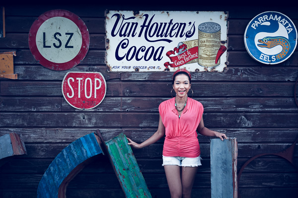
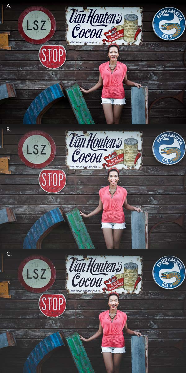
This comparison shows you some of the effects you can create with these presets. Please remember that the best way to use Develop Presets is as a starting point. Once you have applied the preset you can then go to the right-hand panels and tweak the settings to get the most out of your photo (something I haven’t done with these examples as I wanted to show you how they work straight out of the box).
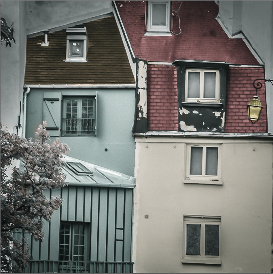
A. Original photo B. onOne Signature Collection: Vintage – Grandma’s Lemonade preset C. Nicolesy Matte Lightroom Presets: Nicolesy Matte 2 preset D. Presets Heaven: PH Vintage IV preset
Best Paid Vintage Develop Presets
Not everybody wants to pay for Lightroom Develop Presets (my article Are Lightroom Develop Presets Worth the Money? asked that question) but there are certainly some great preset collections out there if you don’t mind doing so. I recommend (and have personally bought and used) the following:
Nicole S. Young’s Vintage Fade presets. These are the least expensive out of all these preset packs. The set includes Photoshop Actions and ACR presets as well as Lightroom Develop Presets.
Lightgram Instafade presets. These presets emulate the beauty and nostalgia of film. I like Lightgram’s presets a lot. They also have some free presets you can try out.
Really Nice Images Faded Films presets. These are the more expensive than the others, but you get nearly twice as many presets plus a toolkit to help you tweak the settings. But most importantly they are really good.
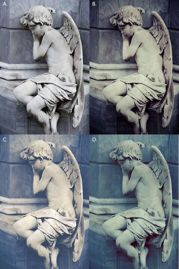
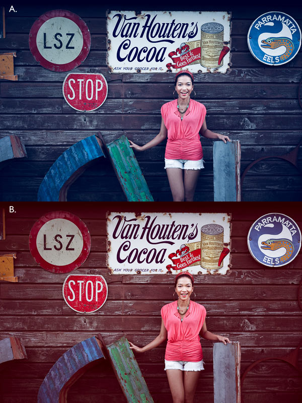
A. Original photo B. Nicolesy Vintage Fade: Rainfall preset C. Lightgram Instafade: Lightgram Faded 12 preset D: Really Nice Images: Faded Films – Utah Monochrome preset
How to create the vintage look yourself
Now it’s time to take a look at a few of the techniques you can use to create the vintage look yourself in Lightroom.
1. Fade out with the Tone Curve
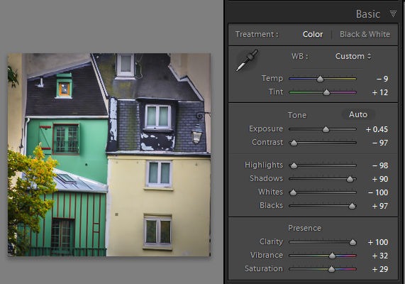
Go to the Tone Curve panel and raise the left side of the RGB curve upwards. Doing so removes true black from the photo, making the darkest tones lighter. How far you move it is up to you – the best way is to judge the effect by eye.
You’ll get the best results when the RGB curve starts from its linear position (a straight line from bottom-left to top-right). If you are planning to use the Tone Curve to create a matte effect, it is best to carry out tonal adjustments such as increasing contrast in the Basic panel. You may also wish to reduce Saturation or Vibrance to weaken the colours in the photo, emphasizing the vintage look created by the matte effect.
Alternatively, click on the RGB curve three times (where the lines intersect it on the grid) before lifting the left-hand corner. This gives a slightly different look. Experiment with both techniques to see which one suits your particular photo best. This is what the curves look like.
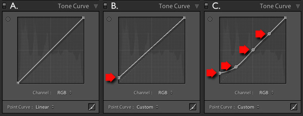
A. Linear curve B. Entire curve raised. C. Left-hand side of curve raised only.
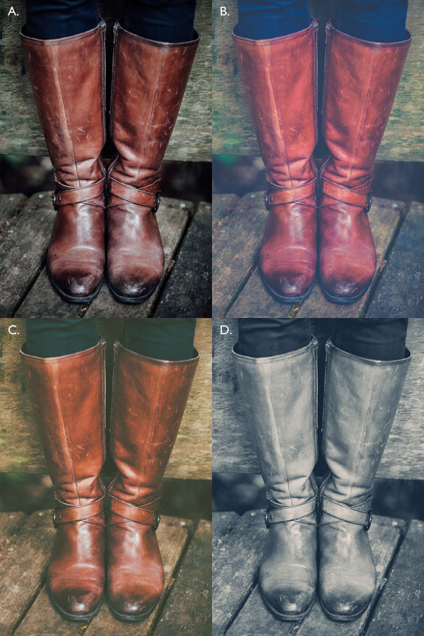
This is how those curve adjustments affect the photo.
A. Linear curve B. Entire curve raised. C. Left-hand side of curve raised only.
Using the RGB Tone Curve applies a matte effect without affecting the colour. However, you can play with the colour curves as well. If you use the same technique on a colour curve, it affects the colour of the photo as well as the contrast. Here are a couple of examples.
A. Blue curve raised. B. Red curve raised.
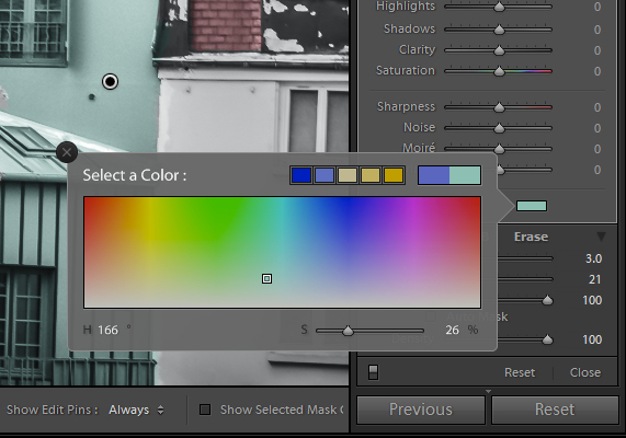
2. Split toning
Another way to add colour is with split toning. The basic concept is simple. Apply a warm colour to the highlights (such as orange, red or yellow) and a cool one to the shadows (for example blue, dark green or teal). You may be aware that warm colours appear to move towards the viewer, and cooler ones away. Split toning builds on that principle.
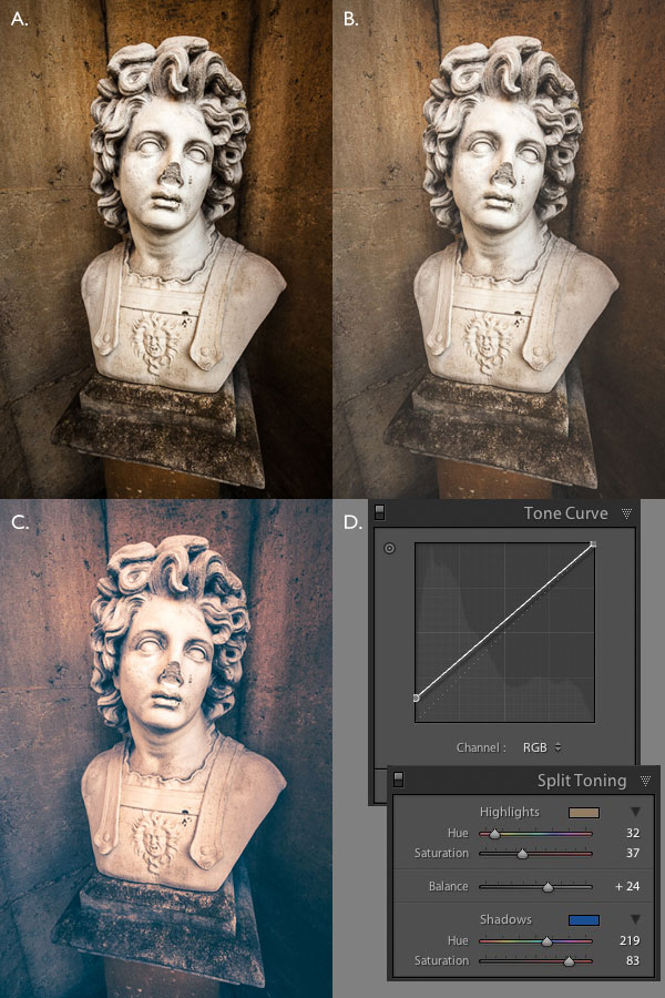
A. Original photo. B. RGB Tone Curve raised (neutral colour). C. Split tone applied. D. The Tone Curve and Split Toning settings used for these photos.
Conclusion
Now you know how to create a vintage effect in Lightroom. If you have any other tips for creating a vintage effect, please leave them in the comments below.
 Mastering Lightroom: Book Four – The Photos
My new ebook Mastering Lightroom: Book Four – The Photos takes you through ten beautiful examples of photography and shows you how I processed them step-by-step in Lightroom. It explores some of my favourite Develop Presets and plug-ins as well as the techniques I use in Lightroom itself. Click the link to learn more.
The post How to Create a Vintage Look using Lightroom by Andrew S. Gibson appeared first on Digital Photography School.

Digital Photography School


You must be logged in to post a comment.