RSS
 

Posts Tagged ‘improve’

How to Improve Composition by Placing your Subject Off-Center

29 Jun

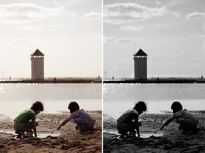
You may be wondering – shouldn’t you always place your subject or main point of interest off-center? Isn’t that what the rule of thirds is about? If so, I suggest you refer back to my earlier article about creating strong compositions with a centrally placed subject. It makes the point that it’s perfectly possible to create a well composed image with the subject placed centrally.

Central composition

Equally, there are times when you should place the main point of interest away from the center of the frame. Not necessarily on a third, but anywhere between the centre of the frame and the edge, centered neither vertically nor horizontally.

I firmly believe that you should never ask yourself whether you should place the main subject or focal point on a third when you take a photo. There are much better questions to ask, such as:

  • Is there enough space around the subject to give it room to breathe?
  • Are there any highlights near the edge of the frame that take the viewer’s eye out of the photo?
  • How does the viewer’s eye move through the photo? This question may be partly answered during post-processing, where you can darken or lighten parts of the image to guide the viewer’s eye.
  • How do I make this photo as interesting as possible?

The answers to these questions influence the decisions you make in composition, and help you decide where to place the main point of interest. Let’s look at some examples.

Examples of off-centered compositions

I took the following photo in a historical building in Beijing called Prince Gong’s mansion. There was a courtyard inside, with Tibetan prayer wheels down one side. As people walked into the courtyard, most of them walked down past the prayer wheels, spinning them as they went. This boy decided to join in the fun.

Composition and placement

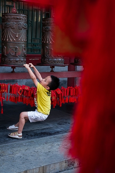
I placed him off-center because was shooting through some red tags (like the ones you see behind the boy) hanging from another structure. I used an aperture of f/5 to make sure the tags were out of focus. They create a frame that adds a sense of depth, and also pushes the eye towards the boy. It helps that his yellow T-shirt contrasts with the surrounding red hues.

The next image was taken in New Zealand. I found these beautiful stones by the sea, and asked my model Ashley to lay down on them.

Composition and placement

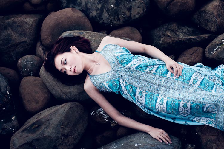
I liked the way the blue dress contrasted against the more subdued colors of the rocks. I framed the photo so that Ashley’s body formed a diagonal that takes the viewer’s eye from the right side of the photo, to the left. Her face, which is the main focal point of the image, had to be placed off-centre. If it was central there would be lots of empty space on the left-hand side of the image, and it would be unbalanced.

Incidentally, there is an idea that it is better to compose photos to work with the natural tendency to read a page from left to right. As this photo does the opposite and takes the eye from the right of the frame to the left, I flipped it so that you can see the difference.

Composition and placement

Which version of the photo do you think works best? If you have an opinion please let me know in the comments below. I know which version I think is better, but I’d be interested to hear it from people seeing the photo with fresh eyes.

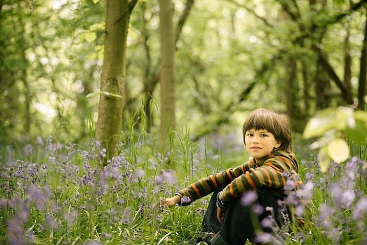
The next photo was taken in the Great Mosque in Xi’an, China. The boy was trying to catch the cat, and I took a photo as he ran after it.

Composition and placement

The boy is the focal point of the image, and because he is moving from left to right in the frame he needs some space to move into – the empty space on the right of the frame provides this. If the boy was centered in the frame there would be too much space on his left.

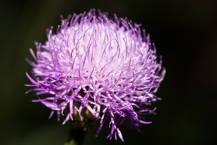
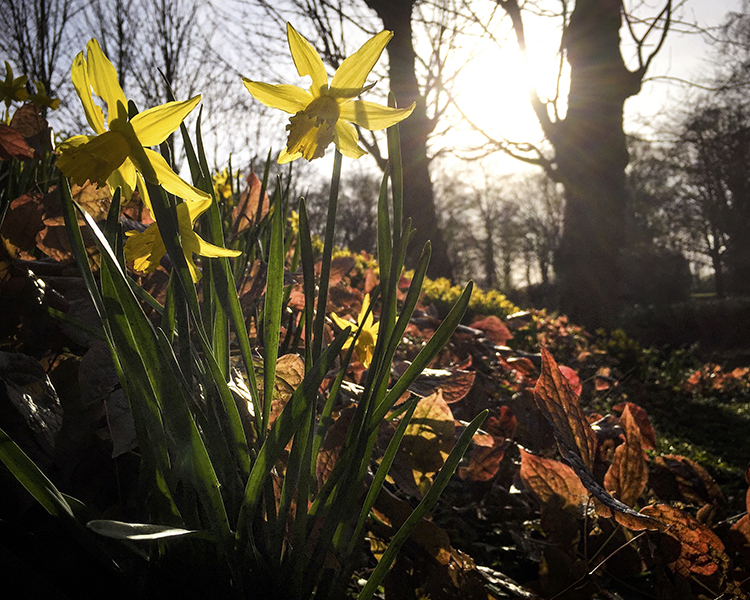
The next photo, a close-up of a flower, is interesting because it has two focal points.

Composition and placement

The main focal point is provided by the open flower on the left. But the closed flower on the right is a second focal point that also pulls the eye. The result is that the viewer’s eye moves back and forth between the two points. When you have two focal points in a photo like this, it makes sense for them to be on opposite sides of the frame, and therefore off-centre, so that they fill the frame adequately.

I took the next photo at a concert in Auckland, New Zealand.

Composition and placement

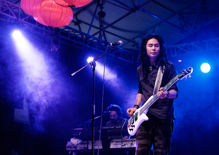
I placed the guitarist off-centre so that I could show him in context. Behind him you have another band member on the keyboard, and three spotlights. You can also see some Chinese lanterns (this photo was taken at the Chinese Lantern Festival in Auckland). The lights also provide leading lines to draw the viewer’s eye to the guitarist.

For the next photo we return to Beijing, this time to the Forbidden City.

Composition and placement

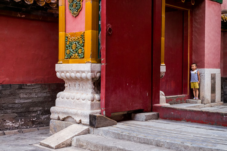
I was sitting on a bench resting, when I realized that the doors and pillars you see in the photo lined up nicely when viewed through my 35mm lens. I waited, and took photos as people passed through, hoping to get a good image. Until finally the little boy you see in this image walked through the doorway and hid. A few seconds later he jumped out to surprise someone – as a man, presumably his father, walked through the doorway.

The boy is so small in the frame that you may not have noticed him right away. It is good for photos to contain surprises like this, as a kind of reward for the viewer when they finally spot it.

The colors in this photo also harmonize well. The yellow of the boys’ shorts echoes the yellow around the door frame, and the yellow tiles on the pillars. This is purely luck, but it’s the kind of luck that presents itself when you are present with your camera.

What do you think? What factors do you consider when deciding where to place the main focal points? Let me know in the comments.


Mastering Composition

If you’d like to learn more about composition then please check out my ebook Mastering Composition: A Photographer’s Guide to Seeing.

googletag.cmd.push(function() {
tablet_slots.push( googletag.defineSlot( “/1005424/_dPSv4_tab-all-article-bottom_(300×250)”, [300, 250], “pb-ad-78623” ).addService( googletag.pubads() ) ); } );

googletag.cmd.push(function() {
mobile_slots.push( googletag.defineSlot( “/1005424/_dPSv4_mob-all-article-bottom_(300×250)”, [300, 250], “pb-ad-78158” ).addService( googletag.pubads() ) ); } );

The post How to Improve Composition by Placing your Subject Off-Center by Andrew S. Gibson appeared first on Digital Photography School.


Digital Photography School

 
Comments Off on How to Improve Composition by Placing your Subject Off-Center

Posted in Photography


Improve Your Photography by Getting the Right Feedback on Your Images

28 Jun

Have you ever felt that your photography isn’t improving as much as it once was? Do you feel that the level of your work is stagnating and not progressing much more?

Improve Your Photography

Yet you keep reading article after article, either on the web or in magazines. You hope that one of them will provide the next breakthrough for your work and help you rip through the barrier that will bring your photography to the next level. You show off your work to friends and family, and you hear the resounding praises of, “That’s a beautiful photograph” or, “You nailed it”, or any other form of overly positive, loving feedback. The people that you show your work to love it, but you feel that it’s just becoming a little boring, and the next image isn’t really any different from the last.

Justin

By Justin

Do this one thing to improve your photography

If this sounds like you, don’t panic; you’re very likely not alone! Even better, there is a very simple remedy for this. This remedy will not only help you now, but also continue to help you well into the future, and at all stages of your photographic journey. You won’t need to read anything extra for it, nor will you have to buy any equipment. To break through this barrier you need to do one thing: be more selective with the feedback you listen to.

The trouble with feedback from people like friends and family is that, unless they are photographers themselves, they won’t tell you want you need to hear. Rather, they will tell you what you want to hear – which is generally positive reinforcements – however, when you come to think of it, no one really wants to hear that their latest photo is rubbish!

But it’s this honest, yet brutal truth, that will ultimately help you take better photos. Sure, I’ll be the first to admit that it wasn’t the best feeling in the world when I was once told a collection of my photos weren’t that great. To make things worse, this came from a photographer whom I greatly admired and respected. It shook me up a little. It made me feel a little inadequate. It made me question if this was indeed the career for me, and if I actually had what it took to succeed.

Arileu

By arileu

But I needed to hear it. I needed to know what my work was actually like. Being continually told that my work was great and amazing wasn’t really helping with anything other than inflating my ego. I needed to hear exactly how a seasoned photographer viewed my work, and I needed to hear it honestly and clearly. This feedback set me on the direction that I needed to take to improve my game, and because it wasn’t sugar coated, I had no ambiguity about any of the feedback I had received.

Finding good feedback

This kind of feedback is not something that you will get from friends and family. You have to go out there and find a third party. A person that not only has no emotional connection with you, but also who knows one or two things about photography. By removing the emotional connection, you open the door for truth and honesty.

Quinn Dombrowski

By Quinn Dombrowski

How it’s delivered, however, is a variable you cannot control. This means you also need to bring something to the table; a thick skin. Some photographers, just like doctors, are fantastic at delivering bad news in a nice subtle, even positive, way. Others will tell you how it is, warts and all, without the sugar coatings. But where do you find this third party?

There are many avenues you can take to find the right third party for getting feedback on your work. Social media, such as Instagram and Facebook, can be great. Facebook in particular has many useful groups where you can seek feedback and critique on your work. But if keeping it in person and face-to-face is more your thing, looking around at camera clubs is another option. The feedback you get at camera clubs may not always be accurate, but it is a useful tool to network with other photographers.

S3aphotography

By s3aphotography

Just keep in mind exactly who your third party will be. You ideally would like your mentor to be involved in the genres you’re most interested in – there’s no point showing a wedding photographer, for example, a body of sport or landscape images. Also keep an open mind to having multiple people. This will help you smooth out any personal preferences each photographer may have, and find a more common denominator to look out for.

Being more selective with who you seek for feedback will help improve your photography immeasurably. It won’t always be easy to hear your work being torn apart, but if you keep at it and keep your chin up, you will come out the other side a stronger photographer and perhaps even a stronger person.

googletag.cmd.push(function() {
tablet_slots.push( googletag.defineSlot( “/1005424/_dPSv4_tab-all-article-bottom_(300×250)”, [300, 250], “pb-ad-78623” ).addService( googletag.pubads() ) ); } );

googletag.cmd.push(function() {
mobile_slots.push( googletag.defineSlot( “/1005424/_dPSv4_mob-all-article-bottom_(300×250)”, [300, 250], “pb-ad-78158” ).addService( googletag.pubads() ) ); } );

The post Improve Your Photography by Getting the Right Feedback on Your Images by Daniel Smith appeared first on Digital Photography School.


Digital Photography School

 
Comments Off on Improve Your Photography by Getting the Right Feedback on Your Images

Posted in Photography


10 Quick Photoshop Tips to Improve Your Workflow

27 Jun

Whether you are a Photoshop newbie or a guru, there is always something new to learn or discover in this extensive image editing software. One of the joys of using it,  is that there are many ways to do the same thing in Photoshop. Here are a few tips that are useful to improve your workflow, either by speeding it up or adding a few tweaks to your process.

1. Copyright Metadata Tip

Many people use the terms watermarking and copyrighting interchangeably, but these are two different things. While arguments continue for and against watermarking images, in this digital age copyrighting your photos is still highly recommended. One of the best ways of doing this, is to embedding the copyright information right into the metadata of your image.

Follow these steps:

  1. Click Ctrl + Alt + Shift + I (Mac: Command + Option + Shift + I), or go to File > File Info to bring up the Metadata panel
  2. Click on the Description tab (left one) and enter your copyright information in the relevant fields

Copyright

2. Color Correcting with Curves Tip

As you may know, there are many way to correct color in Photoshop, and you may have even experimented with using a Curves Adjustment layer to achieve this. Sometimes, while working on this layer to color correct an image, you may inadvertently make the image lighter (or darker).

An easy fix that allows you to apply your color correction, without affecting the tonal values of the image, is to set the Curves Adjustment layer’s Blending Mode to Color.

3. Double Windows Tip

ComparativeForEdit

Zooming into your images can be helpful when editing details, but it can feel like a chore if you constantly have to zoom in and out to see how your changes affect the overall image. A simple solution to your problem is to open the same image in two windows. Now you will be able to put them side by side, at different zoom levels for your comparative purpose.

  1. With your image open, go to Window > Arrange > New Window for [file name of your image].  This this will open up a second window for the original image.
  2. Then, go to Window > Arrange > 2-Up Vertical and this will put your windows adjacent to each other. Now you have one zoomed out for an overall picture, and you can zoom in to edit the other.

The coolest part is that all the adjustments you make to one window, will be reflected in the other.

4. Contrast with Channel Mixer Tip

The Channel Mixer is an easy way to add great contrast to an image.

  1. Create a new Channel Mixer adjustment layer.
  2. Choose Black and White With Red Filter from the preset drop-down (in the Properties Panel).
  3. Change your blending mode for the adjustment layer to Soft Light.
  4. Play around with the opacity of the layer until you get the desired level of contrast.
Before_ChannelMixerContrast

Original Image

After_ChannelMixerContrast

Image Contrast changed using Channel Mixer

5. Content Awareness Tip

Several tools use Content-Aware, which is Photoshop’s method of examining your image, and calculating which pixels are needed to repair the selected area. At times though, even awesome tools such as the Healing tool or the Content Aware fill, do not return the best results when applied

If you are not happy with what the tool has returned, simply apply the adjustment again. Yes you read that correctly, you can apply content aware a few times and get a more desirable result the second or third time around.

6. Better Black & White Image Tip

Making a black and white photo can be as easy (and boring) as desaturating your images (using Image > adjustment > desaturate). If you want to take it up a notch, try using a Black and White adjustment layer (from the Layers panel), where you can use up to six color sliders to control the main colors in your imag,e and adjust the relative brightness of each color.

While you’re there, check out the very useful click and drag (targeted adjustment tool) icon. Click it, then click and drag (hold the button in while you drag) on any area of the image that you wish to make darker or lighter— to the left for darker, right to make it lighter

BWAdjLayer

7. Getting Historical Tip

Have you ever wanted to repeat your timely editing on another image and found your memory unreliable? Photoshop’s History Log is a great feature to turn on if you want to keep a text record of every single step you have done to your image.

  • Click Ctrl + K (Mac: Command + K) to bring up the Preferences panel.
  • In the General tab check the History Log and the Text File box, and choose a location to save the file (name it for easy reference later on).

Now when you work on your image, and Photoshop will record every step you take. If you ever want apply the same steps to another image, just locate the text file and review.

HistoryLog

8. Check Spelling With Photoshop Tip

Spell check is not something that would come to mind when you think of Photoshop, but yes it can do that too. All you have to do is click on Edit > Check Spelling and your visible text layers will benefit from more accuracy.

9. Revealing Hidden Detail Tip

To bring out hidden detail in the shadows and highlights of your image, one of the best tools is the (you guessed it) Shadow/Highlight Adjustment. Sadly though, it is not available for application via an Adjustment Layer, so for non-destructive use, first convert your layer to a Smart Object.

Then go to Image > Adjustments > Shadows/Highlights and apply to recover those details.

HighlightsShadows

10.  Close Everything Tip

Did you know you can close all your open images at once? Simply hold down the Shift key and click the close icon on any of your image windows.

Conclusion

While there are several ways to accomplish a task in Photoshop, hopefully there was something new hidden in these quick tips. Were any of these new to you or did you discover a new way to execute an old favorite? Maybe you can share some other must-know, or time saving tip,s that you use to be more efficient at post-processing in Photoshop.

googletag.cmd.push(function() {
tablet_slots.push( googletag.defineSlot( “/1005424/_dPSv4_tab-all-article-bottom_(300×250)”, [300, 250], “pb-ad-78623” ).addService( googletag.pubads() ) ); } );

googletag.cmd.push(function() {
mobile_slots.push( googletag.defineSlot( “/1005424/_dPSv4_mob-all-article-bottom_(300×250)”, [300, 250], “pb-ad-78158” ).addService( googletag.pubads() ) ); } );

The post 10 Quick Photoshop Tips to Improve Your Workflow by Nisha Ramroop appeared first on Digital Photography School.


Digital Photography School

 
Comments Off on 10 Quick Photoshop Tips to Improve Your Workflow

Posted in Photography


5 Tips to Improve Your Background and Make the Subject Stand Out More

30 May

If you are looking for a quick, simple, hassle-free way to make your images pop more and stand out, this is the article for you!

You don’t have to be a Photoshop genius – in fact, this may help you spend less time in Photoshop. These simple tips can elevate the photos you take. If there was one element in many images I see that could greatly improve it, it would have to be this: backgrounds. An ugly or distracting background can easily reduce the impact of even the best subjects. A clean, un-distracting background will help improve your images and make your subjects stand out even more. The best past is, you wont even have to spend a cent to do this.

Even though the background here works quite well with the subjects, using a wider aperture has ensured that the subjects do not get lost, but stand out. © Daniel Smith / Getty Images.

Even though the background here works quite well with the subjects, using a wider aperture has ensured that the subjects do not get lost, but stand out. © Daniel Smith / Getty Images.

All too often we overlook the background and what is in it. You swear that those power lines weren’t in the viewfinder when you took that picture, and that post, where did that post come from?! That surely wasn’t protruding from your partner’s head when you clicked the shutter button. This occurs for a number of reasons:

  • You’re too focussed on the subject alone that it’s almost like you have blinders on and the subject is all you can see.
  • You may get too obsessed with the camera settings and making sure you nail the photo that you miss all those little annoying things that pop in to the frame.
  • Or you are simply unaware of the importance that a good background can make.

So how can you improve your backgrounds, or at the very least, reduce the negative impact they can have on your images? By following these simple strategies, you’ll be well on your way to a better background and improving your images.

#1 – Location, Location, Location

If you have the option, do try and choose a location that has a nice background – that will make it as easy as it can get. What defines a nice background will depend on your subject, but as a very general guide, look for a spot that has a uniform look to it. Brick walls, corrugated iron roller doors, metal cladding on walls, or even something as simple as a painted white wall, can all make for a nice clean background. Ultimately, what you are not looking for is something that has a lot of other elements in the frame, that do not add to your subject.

If you cannot find a location that has a clean background, looking for somewhere where the background complements – or works with – your subject will also work, too. An example of this would be with sport photography. You simply cannot decide where the game will be played, so you have to work with what you have. In this situation, think about what would look good as a background. Would a stand full of supporters look better than a car park full of cars or a building site? I think it would. The stand full of supports, while not clean, works with your subjects and in fact, has more impact as the supporters add a nice element of atmosphere to the image.

Cluttered BG 1

Even though this image has the stadium in the background, it is a little cluttered. The seats are mostly empty, so it’s not really portraying any sense of atmosphere in the sport.

Clean BG 5

By changing my position, I was able to use a the large black cloth in the background to make the athlete stand out much more. Nothing more than moving was required; much easier.

Here, the backgrounds in these two images are quite plane. They help make the subjects the heroes of the images, as there is nothing else to compete with them.

With this image, the stands in the background have much more people in them. This works nicely to complement the subjects which, in this case, are the players. © Daniel Smith / Getty Images.

While this is a nice action frame, the background is not that fantastic. It’s in between areas of the different stands at this venue. It would look much better if it were against the full stadium, as in the previous image. © Daniel Smith / Getty Images.

You’ve found your location, but a clean background just cannot be had. What do you do?

#2 – It’s All About Perspective

A good backgrounds can be anywhere, and it can change quite a lot depending on the angle at which you photograph your subject. You may be in a very busy space, but within that space will exist areas of calm and peace. By this I mean that your backgrounds can be clean; even when it just looks cluttered in all directions.

When this happens, consider photographing from a different perspective. Photographing your subject from down low will make the sky your background. Conversely, if you’re looking down on your subject, whatever is below them will be the background. So if you cannot find an ideal background, don’t forget to look up and down – that’s where the best one may be hiding.

Relevant BG 1

This rower was photographed from a bridge, making the water the background. in this case, the background works quite well with the subject.

Clean BG 7

This time, I was photographing this plane landing. This meant that I would be looking up, and the sky became the background here. The complementary colour set of the blue sky and yellow light on the plane also help to make the subject stand out more.

You may have the best background sorted. But it’s not always possible to be lucky enough to have that perfect background all the time. So what else can you do to help your subject?

#3 – Camera Craft

There will be times – more often than not – where you simply cannot win with your background. No matter which way you stand, you just can’t seem to find a nice clean backdrop. What now? Here’s where a little camera craft comes in to play and you have a couple of tricks up your sleeve with this.

First point of call is aperture. You know that you can simply open your aperture up a little more, and give that background some nice bokeh (or blur) to reduce its impact. Even when you do have a nice complementary background, it’s still a good idea to use a wider aperture to blur it out a bit and make your subject stand out against it more.

What if you can’t open your aperture any further, though? There’s still hope. Our next strategy is to play with shutter speed and use a panning technique. This can help greatly in rendering a busy background into a nice blurry mess. It also helps to add a great sense of movement and action, as well as give a sense of excitement to an image. If you’re unsure about how to do panning, have a read of this article – it will help greatly. But in a nutshell, panning is the technique of using a slower shutter speed (usually around 1/60th or slower) while tracking a moving subject. The combination of a slow shutter speed, coupled with the panning action, will result in a nice motion blur affecting the background, and if done correctly, the subject will remain sharp.

Cluttered BG 2

This background is clean; there are no real distractions in it, but it could be improved upon.

Clean BG 6

Here’s a different frame but this time, a panning technique has been used to remove all the creases in the blue backdrop. This has made the background cleaner again, and the added motion blur gives a sense of speed which works well with the subject.

Clean BG 8

The use of a wide aperture here has dramatically blurred out the background making it much cleaner. The result is that the subject stands out much more. © Daniel Smith / Getty Images.

#4 – Can You See the Light?

Something that seems to always be overlooked in photography is light. This seems to me like quite a remarkable thing since without light, we don’t have much of a photo. But using light, and the contrast it can provide, is another way to reduce the appearance of a distracting background. With this strategy you need to look for a higher amount of contrast between your subject and the background; that is, you’re subject is (ideally) brighter than the background. By exposing for your subject (the brightest area) you effectively make shadowed areas in the frame darker, thereby affecting your background. This can be achieved with both natural light and flash.

Contrast1

In this image, the flower was in the daylight; whereas the background was in the shade. I exposed for the flower and this made the background darker.

Again, the background here is much darker than the subject; helping to isolate the subject more. © Daniel Smith / Getty Images.

Again, the background here is much darker than the subject; helping to isolate the subject more. © Daniel Smith / Getty Images.

Clean BG 2 Clean BG 1

These photographs were taken in an undercover car park. I used two flashes (both off-camera) as my only light source. This removed any ambient light affecting the image.

#5 – The Final Stop

You’ve done what you can with the background. You’ve tried everything, but your background still doesn’t want to play ball. There will be times when you simply cannot control any of the aspects that have been mentioned. Don’t worry – it isn’t uncommon. Now all you can do is hope that there is something that can be done later, and there is!

If you’ve done everything you can to help improve your background and you’re still not winning, the last port of call is post-processing. You may be thinking, “Hold on, I’m not that great with selecting and masking in Photoshop yet.” but you needn’t worry. There is no selecting or masking with this one. (As a side note, if you intend on making a selection around your subject and replacing the background, you will need to photograph your subject accordingly to make this much easier and more natural).

All you need do is crop your image. That’s it. Cropping is about all you can do now. By cropping, you are effectively removing as much of the background as possible without cropping into your subject. Don’t worry about how much you are cropping out – unless of course you intend on doing a large print. You’d be surprised at how much many photographers are willing to crop.

Do you have any other tips for making the subject stand out, or improving the background? Please share your thoughts and images in the comments below.

googletag.cmd.push(function() {
tablet_slots.push( googletag.defineSlot( “/1005424/_dPSv4_tab-all-article-bottom_(300×250)”, [300, 250], “pb-ad-78623” ).addService( googletag.pubads() ) ); } );

googletag.cmd.push(function() {
mobile_slots.push( googletag.defineSlot( “/1005424/_dPSv4_mob-all-article-bottom_(300×250)”, [300, 250], “pb-ad-78158” ).addService( googletag.pubads() ) ); } );

The post 5 Tips to Improve Your Background and Make the Subject Stand Out More by Daniel Smith appeared first on Digital Photography School.


Digital Photography School

 
Comments Off on 5 Tips to Improve Your Background and Make the Subject Stand Out More

Posted in Photography


How to Improve the Impact of Your Urban Images Using Lines

27 May

If you are struggling with getting your photos of cities and architecture to pop out, chances are that you are underestimating the power of lines in your images. Lines help you structure your images in ways that lead your viewers to look at different parts of the picture, and create interest in both your main objects and the surroundings.

using lines for more impact in your images

The image above shows an example of how you can use lines to create a visual guidance within your city and architecture images, that will help your viewers find multiple points of interest and take a closer look.

using lines for more impact in your images

To help you understand how the lines work in a rather complex image like this, reducing the image to a black and white version with high contrast, can help visualize the structures of the image without getting distracted by the color elements.

Why lines are important especially for urban images

While in many areas of photography, using depth of field and blurred backgrounds is a good way to lead the viewers’ eyes to the most important element, and add a sense of perspective, as city photographers we rarely have this choice. In architecture images, you want most elements to be in focus.

When taking pictures of city scenes, you need to structure your images in different ways to provide perspective and a feel of scale. The conscious use of lines in your images can divide a photo into smaller pieces, separate elements from each other, provide a sense of perspective and lead your viewers’ eyes to where you want them to focus.

using lines for more impact in your images

The image above shows an example of a random shot without considerations for the use of lines. With its grey stones, the National Museum of Ireland in Dublin on a cloudy day, doesn’t offer much to work with when trying to create an interesting image. This is merely a documentation of the place, but probably wouldn’t make it as a header image.

using lines for more impact in your images

However, beyond the documentary aspect, the use of lines to create perspective, orientation and symmetry can increase the impact, even of an otherwise dull looking image.

Which lines can you use to increase impact?

You can separate the lines in three categories which I call:

  • Dividing lines
  • Leading lines
  • Symmetrical lines

A dividing line structures your images into separate areas of interest. It can be horizontal, vertical, or diagonal. You can use it to make a clear difference between bottom and top of an image, but also make sure to use dividing lines to show near and far. In many outdoor images, the horizon line is a natural dividing line.

using lines for more impact in your images

In this image, I am using a major dividing line to clearly separate the floor and the wall. Less noticeable, the additional line in the wall serves as another separation in the photo. Without the addition of this line, the right half of the image would be rather boring. By adding a simple line into the frame, it helps dividing the image into a left and right.

Make sure that your dividing lines are in the right place. With very few exceptions, make sure to place your lines outside of the center of the image (both horizontally or vertically) but also not too close to the borders. The well known Rule of Thirds is good guidance, in many cases dividing images into a two-thirds and a one-third part works best.

Leading lines are an important way to provide your viewers with an idea of perspective. They will lead the eyes into, and around the image. Leading lines often come in pairs, slowly merging into the distant part of the picture. But in fact, you can use multiple leading lines, even one can help the viewer find orientation. Leading lines don’t even have to be straight, you can use curves and angles just as well.

using lines for more impact in your images

The main street in this image serves as a single leading line, it helps the eye find orientation from the interesting space in the foreground, and puts it into the context of the big city.

The third way of using lines to increase impact, is the use of symmetries. When looking for interesting images to capture in a city, try to find symmetrical lines in the architecture around you. Thankfully, architects also know the visual impacts of symmetries, and use them to create the buildings around us.


Bürogebäude des Deutschen Bundestages in Berlin,, Deutschland.

Buildings like this lend themselves to be taken in symmetries. While the content is not perfectly symmetrical due to the individual office decorations on the inside, the structure of the building makes an interesting frame for these individual elements. The symmetry helps to create interest, as you subconsciously start looking for the differences between the halves.

Learn to focus on lines

If you are shooting with a camera capable of RAW images, there is an easy way to train yourself to look out for lines: Use your camera settings, and change your camera to shoot in black and white!

When shooting RAW, the camera will still capture and store all the data from the sensor, including the color information. So when you are back at your computer to edit images, you will find all the options to create color images as well. But while shooting, you can look at your images at the screen in black and white, which will eliminate distractions from the forms in your image.

using lines for more impact in your images

Going a step further, in most cameras you can set up your own image processing profile in camera: Increase the contrast and sharpness of the image as far as possible, and you will end up with a preview image on the camera screen that is mostly reduced to the lines.

Additional ways to use lines

using lines for more impact in your images

Probably one of the most photographed objects in the world, the houses of parliament and the tower with Big Ben in London, UK, it is hard to come up with a unique version. In this image above, I added the light trails created by the passing traffic to add an interesting element. The light trails serve both a dividing lines between the other photographers in the foreground and the architecture in the background, as well as leading lines providing perspective from the left to the right part of the picture.

using lines for more impact in your images

When taking images of tall buildings, like in this case the tower of Westminster, the borders of the building will typically provide leading lines from the bottom (near) to the top (far). To generate an additional element of interest, I used a long exposure image to create another set of lines, through the moving clouds in the sky above the building. This helps add a dynamic element and interest, to an otherwise static and often boring background.

curved leading lines

Do not limit yourself to using only straight lines. While a horizon should always be straight and strictly horizontal, others, especially leading lines, can also be curved. In this image above, the cable car tracks take two turns that lead the viewer’s eyes from the bottom (near) to the center (far) part of the image.

Even complex scenes win from the use of lines

Once you become aware of the lines in your images, you can use them to structure even more complex scenes.

using lines for more impact in your images

While the above example might show the lines all that obvious, you will most likely see the curb of the street easily as a (curved) leading line into the image.

using lines for more impact in your images

However, upon a closer look, you can also note the use of a dividing line separating the photo into a top and bottom part to provide additional perspective and scale. Finally, a use of lines as a frame puts more emphasis on the silhouetted person crossing the scene, adding further scale to the size of the elements contained.

These lines help the viewers structure the image into separate parts and make it easier for the brain to digest all the elements contained.

How do you use lines in your compositions? Please share in the comments below.

googletag.cmd.push(function() {
tablet_slots.push( googletag.defineSlot( “/1005424/_dPSv4_tab-all-article-bottom_(300×250)”, [300, 250], “pb-ad-78623” ).addService( googletag.pubads() ) ); } );

googletag.cmd.push(function() {
mobile_slots.push( googletag.defineSlot( “/1005424/_dPSv4_mob-all-article-bottom_(300×250)”, [300, 250], “pb-ad-78158” ).addService( googletag.pubads() ) ); } );

The post How to Improve the Impact of Your Urban Images Using Lines by Michael Zwahlen appeared first on Digital Photography School.


Digital Photography School

 
Comments Off on How to Improve the Impact of Your Urban Images Using Lines

Posted in Photography


How to Improve Your Night Photos – Add Reflections

24 May

Reflections can be great things to add to your photographs at any time, but they are particularly cool at night. Adding reflections can solve compositional problems you face at night. Further, the steps you have to take to capture photos at night – such as having your camera on a tripod and using a slow shutter speed – actually make it easier to capture reflections.

How so? I’m glad you asked. Let’s take a look at the use of reflections in night photography.

Lakehouse2

Why use reflections in your night photography?

Why would you want to use reflections in your nighttime photos? There are many reasons, but in this article I want to concentrate on two.

1 – Adding a reflection adds interest to the composition

First adding a reflection allows you to turn a straight-ahead photo of a single thing, into an interesting composition. For example, common subjects of nighttime photos are things like well-lit buildings, bridges, and fountains. If you take a picture of just a building, it might not be terribly interesting. It’s just a building. The same goes for pictures of bridges and fountains.

Adding other items to the picture can be a challenge. Everything around the subject is likely to be very dark. Adding more space just results in a sea of blackness around your subject that doesn’t add anything to your photo, it just detracts from your subject. If you add a reflection, however, it adds a compositional element to your picture. Now your picture isn’t just a single thing (like a building, bridge, or fountain). The reflection adds interest to the photo.

2 – Adding a reflection gives you a good foreground element

Secondly, adding a reflection to your picture also solves a common problem for all pictures. That problem is what to do with the foreground. Often the subject and background are clear, but the foreground can be difficult to ascertain. However, particularly when you are using water to create the reflection, the reflection will be on the bottom portion of the picture. Therefore it provide you with a ready-made foreground. Problem solved.

Dallas

When to use reflections

You could use reflections in your nighttime photos whenever possible. The limitation on their use is typically not lack of desire, but lack of opportunity. There isn’t always a large shiny surface for you to use to capture a reflection.

Note: if that is the case, you can always create one in Photoshop!

So what circumstances create the opportunity to use reflections? Obviously, water works great. It is available for you to use in a lot of different contexts. Here are some of them:

  • Skylines: Most cities are built on a bay or a river that you can use to create a reflection. (By the way, don’t worry about making it a sharp reflection – just a blurry set of lights in the water can provide what you need.)
  • Bridges: A common nighttime photographic subject are bridges, which are almost always over water.
  • Lakes: There are lakes everywhere. You can capture reflections of nearby objects. On clear nights you can also capture the reflections of the stars.
  • Puddles: They provide a great opportunity for using reflections where you might not otherwise expect them. Keep in mind there doesn’t actually need to be a puddle but often a wet surface will reflect light from nearby sources. See Using Rain Puddles to Create Unique Reflection Photos.
  • Fountains: Since fountains are filled with water, they also provide great opportunities for making reflections.

Besides water, any shiny surface will do. Most cities have many modern office buildings built of steel and glass. While not generally sought out as photographic subjects in and of themselves, they do provide great opportunities for capturing reflections of anything nearby.

StPaulMirror

How to capture reflections

Here is some good news: you probably don’t need to do anything different in terms of exposure to capture reflections in your picture. For reflections of most shiny surfaces, you simply set the exposure as you normally would, and take the picture. While using water to create the reflection does require that you smooth the water out, this is probably already happening because of the inherent challenges of exposure in night photography.

Night photography requires slow shutter speeds. Because it is dark, your camera needs to hold the shutter open a long time in order to gather sufficient light for the exposure. This is true even if you are using a wide aperture and high ISO. This long shutter speed is what smooths out the water. Therefore, the mere fact that you are taking the photo at night, probably means you are already creating a picture with smooth water. If not, just be sure to slow down your shutter speed.

Riverwalk

Enhancing the effect

The most common problem when using reflections in your nighttime photos, is that the reflection does not show up as much as you would like. The way to fix that is to brighten the reflection. If you apply a global brightening to the picture, however, you risk blowing out the highlights of other parts of your picture. In any case, you will probably end up brightening other parts of the picture more than you want. Therefore, you will need to apply selective brightening to the photo. Here is how to do that, depending on the software you are using:

  • Lightroom: In Lightroom, use the Adjustment Brush (keyboard shortcut K) to apply selective brightening to the reflection. Select the brush, and using the controls that appear, increase either the Exposure or the Whites slider (or both) to make the reflection stand out. At the same time, you will need to maintain contrast in your picture. Do that by decreasing the blacks in the picture (pull the Black slider to the left). Just paint it in and you are all set. You can also adjust the effect after you have painted it in.
  • Photoshop: In Photoshop or Photoshop Elements you can use the same process as described above in the Adobe Camera Raw (ACR) screen that pops up when you open the picture. Once you are in Photoshop, the best way is to use Curves adjustment layers and then mask out the effect everywhere except in the reflection. To do that, just create a Curves adjustment layer, then pull up the line on the right side of the curve (or pull in the white point) to increase the brightness of the reflection. To maintain contrast, pull down the left side of the line (or pull your black point to the right). If you’re not familiar with Curves adjustment layers or masking check out this or this tutorial to get you started with the process.

Destin2

The other common problem when using reflections in your night photography, is enhancing the clarity or sharpness of the reflection. Much of the work here is done in the capture phase, and keep in mind that you cannot fix a blurry picture. But you can enhance the effects a bit. Here are some ways to go about that:

  • Lightroom: As with the selective brightening above, use the Adjustment Brush (either in the same step or as a separate step as the brightening). Within the controls of the brush, increase the Clarity slider. Brush in the area of the reflection to add the clarity. You can also increase the Sharpness slider, but beware of doing this too much as it tends to increase digital noise.
  • Photoshop: Within Photoshop or Photoshop Elements, you can use the ACR screens to increase the clarity of the reflection. Once the image is opened in Photoshop though, there is no Clarity slider. The best way to increase clarity is to use the High Pass filter. This article explains how to increase clarity and walks you through the use of the High Pass filter.
  • Plug-Ins: There is also third-party software available that allows you to increase the clarity of your photos. One such program is Topaz Clarity, which works really well. For the best results, apply this effect on a new layer within Photoshop so that you can use masking to apply the effect exactly where and how you want.

Of course, there will probably be other edits you want to make to the photo in addition to these. You can, and should apply your standard workflow to your pictures. These are just the common issues you will experience when you add reflections to your photos.

Conclusion

Reflections can add great compositional interest to your pictures. They also allow you to add context to your nighttime photos, which is not always easy since much of the surrounding area will be dark. They are readily available once you start looking for them. In addition, they are easy to apply. Once you start adding reflections, I think you will find they will help add interest to your night photos, and might even take them to the next level.

googletag.cmd.push(function() {
tablet_slots.push( googletag.defineSlot( “/1005424/_dPSv4_tab-all-article-bottom_(300×250)”, [300, 250], “pb-ad-78623” ).addService( googletag.pubads() ) ); } );

googletag.cmd.push(function() {
mobile_slots.push( googletag.defineSlot( “/1005424/_dPSv4_mob-all-article-bottom_(300×250)”, [300, 250], “pb-ad-78158” ).addService( googletag.pubads() ) ); } );

The post How to Improve Your Night Photos – Add Reflections by Jim Hamel appeared first on Digital Photography School.


Digital Photography School

 
Comments Off on How to Improve Your Night Photos – Add Reflections

Posted in Photography


8 Quick Tips to Improve Your Photos of Architectural Details

19 May

When you’re photographing architecture, it’s easy to get lost in the grandeur of some buildings. That’s not a bad thing. That’s how they were designed, to be a spectacle. Cathedrals, palaces, opera houses, and state buildings are all examples of architecture that’s meant to impress.

That’s the bigger picture. In terms of photography, however, it can be better to pull away from the grand, and look for opportunities in the details. All buildings and structures are sums of smaller parts, and it’s these parts that can often lead to visually interesting photos. Photographing these details comes with its own set of considerations. This article will point out a few things to look out for while you are out and about looking for the smaller picture, and 8 tip on how to improve your photos of architectural details.

#1 – Low contrast lighting

If the weather is poor and the sky is a drab, colorless grey, it may seem like a less than worthwhile opportunity for photography. That may be the case for some subjects, however, overcast days provide incredibly soft light that is quite suited for architectural details. This softness allows you to capture subjects with a lot of fine detail, that would normally be lost in the contrast.

8-tips-architectural-details-2448

Overcast days will help to bring out details that would have been lost in contrast.

Likewise, keep an eye out for photo opportunities in areas of shade. You may need a tripod to take advantage here, but the extra effort is worth it.

8-tips-architectural-details-1927

Photographing subjects in the shade provides soft, even lighting.

#2 – Side lighting

For bold images, look for scenes with strong light coming from the side. This type of lighting will increase contrast, especially in texture, and it will help to emphasize the shape of your subject.

8-tips-architectural-details-9763

Side lighting helps to emphasise texture and shape.

#3 – Patterns in light and shadow

Pay close attention to how light falls on various subjects. When you’re photographing details, shadows and highlights can, themselves, become an important compositional element.

8-tips-architectural-details-9709

Shadows and highlight can become graphic elements in their own right.

#4 – Patterns

8-tips-architectural-details-1864

Repeating patterns can make for bold imagery.

To me, the best part of photographing architectural details is the wealth of compositional possibilities. Man-made structures are full of patterns and shapes that can be exploited for photos. Take advantage of them by filling the frame for an abstract feel.

8-tips-architectural-details-9717

The curve in these stairs made for natural leading lines.

#5 – Reflections

For all of the wonderful architecture in the world, there’s at least as many drab and ugly buildings that appear to have little to offer photographers. They often do have something worth captuing, but it takes work to figure it out. One way to add interest to these subjects is to look for reflections. Reflections can add visual interest and color, to an otherwise lifeless and boring subject.

8-tips-architectural-details-9752

Reflections can add a boost to an otherwise lifeless scene.

#6 – Fixtures

It’s not always about the buildings, and only the buildings. Fixtures can often be overlooked, yet they can prove to be as compelling a subject as the architecture. When you’re considering a location, do look out for interesting fixtures like signs, light fittings, and security cameras.

8-tips-architectural-details-1903

Keep an eye out for interesting fixtures that other may overlook.

#7 – Statuary and monuments

When you think of architecture, statues are probably the last thing on your mind. However, they are a key element to a lot of buildings and monuments. For example, the Charles Bridge in Prague has 30 large, and very detailed, statues that beg to be photographed.

8-tips-architectural-details-2250

Statues are a common architectural features. Don’t neglect them with your camera.

8-tips-architectural-details-2470

#8 – Black and white

This last tip is for when you’re back at home. If your images are full of texture or strong patterns, consider a black and conversion. Stripping the color element out of those images will help to emphasize your compositional elements, and can lead to much stronger photos.

8-tips-architectural-details-2595

Black and white processing can help to emphasise texture in a scene.

Experiment

These tips are hardly exhaustive, and only scratch the surface of the possibilities available to you when photographing architectural details. If there’s something man-made, there’s a photograph to be had somewhere. Just keep going until you find it.

Do you have a tip of your own? Please share it below!

googletag.cmd.push(function() {
tablet_slots.push( googletag.defineSlot( “/1005424/_dPSv4_tab-all-article-bottom_(300×250)”, [300, 250], “pb-ad-78623” ).addService( googletag.pubads() ) ); } );

googletag.cmd.push(function() {
mobile_slots.push( googletag.defineSlot( “/1005424/_dPSv4_mob-all-article-bottom_(300×250)”, [300, 250], “pb-ad-78158” ).addService( googletag.pubads() ) ); } );

The post 8 Quick Tips to Improve Your Photos of Architectural Details by John McIntire appeared first on Digital Photography School.


Digital Photography School

 
Comments Off on 8 Quick Tips to Improve Your Photos of Architectural Details

Posted in Photography


Improve Your Middle of the Day Photos By Doing Black and White

16 May

Crystal-Palace

Sometimes beginning photographers ask me to look at their photos and tell them how they can make the photos better. Nearly every time this happens I end up saying the same thing, “You need to stop taking your pictures in the middle of the day.”

I have previously written about how and why photos taken at dawn and dusk are vastly superior to those taken at midday, so I won’t do so again here. I have also talked about a few things you can do to mitigate the damage of the midday sun. But that’s all you are doing – mitigating the problem – not solving it.

At the same time, I understand that you cannot always photograph at dusk or dawn. Family and work commitments limit us all. We cannot always get up so early or stay out so late.  Some places aren’t even open or accessible at dawn. Is there anything else that can be done if you have to shoot in the middle of the day?

There is one way that you can still take great photos in the middle of the day. That way is to convert them to black and white. Black and white photos frequently work much better than color photos in this regard.

Dallas-1

Look to the old masters

If you don’t believe me, just to check out the work of photography masters. I initially noticed this when looking at the work of Ansel Adams, who many – myself included – consider the greatest photographer ever. A large number of his photos are obviously taken at midday. For example, check out Monolith, the Face of Half Dome (1927). Yosemite Winter Valley (1940), Canyon de Chelly National Monument (1942), Mount Williamson (1944). and Half Moon and Clouds (1968).

All of these photos were obviously taken at midday. You can tell by the bright light and shadows. But they are all still great pictures. In fact, some of them are among his best. Why is that?

Reason #1: High contrast works well in black and white

Why does the same picture taken at midday look horrible in color, but pretty good as a black and white? One reason is that black and white pictures handle high contrast really well. That is not to say their dynamic range is any different, but that these pictures look great when there is high contrast within them. In fact, black and white pictures crave high contrast. Color pictures, on the other hand, don’t always do well with stark contrasts. Therefore photographing at midday – with all of its bright areas and dark shadows creating high contrast – can look really nice as a black and white photo.

Mountain-1

Reason #2: Pushing the processing

The other reason why black and white photos taken at midday can still look great, is that they seem to handle processing better than color photos. In other words, you can push the processing further with a black and white photo and get away with it. This was true in the darkroom, and it is also true today with digital tools.

Why is that? I think it is because black and white photos are already unnatural; obviously, the world is not black and white. When you look at a black and white photo, your mind knows that it is not an accurate representation of reality. If the processing is pushed a little further, your mind accepts it more readily.

That is not to say that you cannot over do processing in black and white, you can. But it does offer you a little more flexibility.

Longhorn

A reason for HDR?

Perhaps, for this reason, this is one area where HDR can still be a really useful technique. There is much discussion these days about HDR being dead. To be sure, almost no one in photography likes the HDR look (oddly, 100% of non-photographers do like that look). In addition, there are a lot of great tools these days for dealing with dynamic range problems without resorting to HDR. Nevertheless, black and white photos are one area where HDR is still very useful. Since there is no color, part of the surreal nature of HDR is avoided. In addition, the same phenomena mentioned above about being able to push the processing further in black and white is at work.

Barn-2

Break out the Neutral Density filter

Another way to improve your black-and-white photos taken at midday is to break out your 10-stop neutral density filter. If there are clouds in the picture, it will give them a sense of movement. If there is water in the picture, it will smooth it out. You can see and example of this in the top picture in this article, which has both clouds and water. Of course, this works for color pictures as well, but it seems to work particularly well with black and white images.

Conclusion

I still maintain that the number one thing you can do to improve your photographs is to start shooting at dawn or dusk. It costs nothing, and you don’t even have to increase your skills to make vast improvements. You just have to get up earlier, or stay out a little later. But for those occasions when that is just not possible, try converting some of your photos to black and white. The high contrast might look good on your photo. In any case, you’ll be able to push the processing a little further. It might prove an easy way to make your photos better.

Please share your black and white midday photos in the comment below.

googletag.cmd.push(function() {
tablet_slots.push( googletag.defineSlot( “/1005424/_dPSv4_tab-all-article-bottom_(300×250)”, [300, 250], “pb-ad-78623” ).addService( googletag.pubads() ) ); } );

googletag.cmd.push(function() {
mobile_slots.push( googletag.defineSlot( “/1005424/_dPSv4_mob-all-article-bottom_(300×250)”, [300, 250], “pb-ad-78158” ).addService( googletag.pubads() ) ); } );

The post Improve Your Middle of the Day Photos By Doing Black and White by Jim Hamel appeared first on Digital Photography School.


Digital Photography School

 
Comments Off on Improve Your Middle of the Day Photos By Doing Black and White

Posted in Photography


How Using Your Smartphone Camera Can Help Improve Your Photography

12 May

One of the triumphs of digital photography is that it has become accessible to more people, across more and more devices. Cameras are no longer standalone devices; as the technology allows the camera to be smaller and smaller, it can be built in to other devices that you may have on you more often than a dedicated camera, such as a smartphone. Cameras in smartphones, and other devices like tablets for example, are producing images of an increasingly higher standard. Their low-light performance is improving, and manufacturers are constantly improving upon the dynamic range, autofocus, and lens quality.

Photographer Chase Jarvis said that, “The best camera is the one that’s with you” – so why not use your smartphone or tablet camera more often? There are restrictions on smartphone cameras over their DSLR or mirrorless camera brethren – their low light and AF performance still have quite a lot of catching up to do, the lenses cannot be changed, and you also have far less control over what settings (ISO, shutter speed, aperture) are used. But it is also these very restrictions that can help you improve your photography when you are using your DSLR, mirrorless, and even compact cameras.

Puddles, and other reflections, can make for interesting subjects.

Puddles, and other reflections, can make for interesting subjects.

So how can these restrictions help your photography? Simple, you have less to think about! You no longer have to worry if you have the correct settings dialled into get the exposure you want – you’re phone will work that out. You do have some say in the overall exposure; you can control how bright/dark the image turns out, but that’s it! Worried you don’t have the right lens for the photo you want? Too bad. With your phone you can’t change it, even if you wanted to. There’s another thing you don’t have to worry about.

You can’t control the camera settings. You can’t change your lens, and you generally have poor Autofocus (at least, poor continuous AF). So how can you take great photos with a smartphone? You need to think less about what you cannot control and more about what you can control. For example, no matter what camera you have, you can always control the composition. You can decide from which angle you take a photograph – will you take it down low, looking up or up high, looking down – and which direction you stand in relation to the light. Photographing toward the light can create stunning silhouettes, so looking for striking shapes will help here. You have full control over how close, or how far, from the subject you stand. You dictate what you include in the frame, and what you omit. All of these elements work to make images more interesting, and by removing the control over some of the more technical features as mentioned earlier, you now have more time to consider the compositional elements.

Controlling Focus and Exposure

Focussing and exposing on the candle has made the background go very dark. This works well to isolate the subject more.

Focussing and exposing on the candle has made the background go very dark. This works well to isolate the subject more.

Across most smartphones, touching the screen on the area you want in focus, will make the phone focus on that area. In addition, this is also where the phone will take its exposure reading. There are some camera apps available that will allow you to focus on one area and have the phone take its exposure reading elsewhere. You may also be able to increase or decrease the exposure of the image. How to do this will depend on the phone you are using, but for iPhone users, after tapping the screen to focus, sliding your finger up/down will alter the exposure compensation.

Another image taken with the sun behind. This time, the light makes the bottle glow.

Another image taken with the sun behind the subject. This time, the light makes the bottle glow.

Creating Shallow Depth of Field

Despite many newer smartphones having fast apertures (the iPhone 6 and 6s use an f/2.2 lens), their tiny sensor sizes make getting that nice creamy background bokeh a little more challenging, than with other cameras. If you’re unaware, generally the larger the sensor, the easier it is to create stunning bokeh. However, if you have a little understanding of depth of field, then you can create images from your smartphone with a blurry background. You can achieve this by reducing the distance between your subject and the phone, and increasing the distance from your subject to the background.

Make Your Images Pop

Post-processing is another tool that we have in our arsenal as photographers to make an image more striking. Introduce that to your phone photos. There is a plethora of apps available that give you varying levels of control with the post-processing phase.

Some apps, like VSCO, have a vast range of filters that you can apply to images, and allow you to tweak areas, such as highlights and shadows, to get a different look. Other apps like Adobe’s Lightroom works much like the desktop variant, allowing to develop your images with a more natural touch. Photoshop and Photoshop fix (Note: it is called Photoshop Mix for Android) are both from Adobe and offer varied editing options that are fantastic at polishing up images in the final stages. Personally, I use Lightroom and Photoshop fix on my content now. However, in the past I used SnapSeed and found that to be great fun to use, too. It’s up to you which editing app you decide to employ, and how involved with it you become.

Smartphone-17

Again, looking for clean shapes to create a striking silhouette in an airport.

Looking for clean shapes to create a striking silhouette in an airport.

Other Tips to Consider

  • Take a lot of photos: Sometimes things happen fast. Don’t be afraid of taking a lot of photos. The perfect shot isn’t going to come with every single click. The trick is to take more photos than what you really need, then pick the best one from the bunch. If you do this, then you will have more to choose from, and a higher chance of getting one that stands out.
  • Learn how to see light and how it interacts with its environment: Light is the most important object in a photograph. It doesn’t matter what camera you’re using, how well you know how to use it, or how amazing your subject is; it all counts for nothing without light. You’ll often hear photographers talking about the Golden Hour, which is early in the morning and again in the evening when sun is lower, softer and the light is more directional.
  • If you’re photographing with the sun behind you, know how that will make your subject look. Do you want to light up their entire face, for example? Or do you want to shoot from the side? If you move so the sun is behind the subject, then consider photographing them silhouetted. If the light source is behind the subject, the foreground will always be darker than the background. The way you position your subject – or wait until the light is right for your subject – is how you make an image more creative and stand out.
  • Watch your background: Something that is often overlooked in an image is the background. A bad background can bring a great subject down. You need to think about your photo and what makes it interesting. If the subject you’re photographing is to be the only thing in the photo, then you should use a nice clean background, that isn’t going to draw away people’s attention from the main subject. However, backgrounds can also add to an image, and are great for environmental portraits.
I loved the peacefulness of the light here and the silhouette of the palm tree.

I loved the peacefulness of the light here and the silhouette of the palm tree.

Here, I photographed toward the light and decided to include the flag on the right to add a little more interest.

Here, I photographed toward the light and decided to include the flag on the right to add a little more interest.

Conclusion

Whilst there are many limitations to using the camera in your smartphone, or indeed a tablet, it can help teach you how to work around limitations, and still create striking images. Their quality is clearly not going to be as high as a dedicated camera’s quality will be, however, it’s still a lot of fun to be able to capture a great image on a device with such limitations.

Below are some more images that I have taken with my iPhone. Feel free to share some images you’ve taken on your smartphone or tablet in the comments below, as well as your favorite camera and processing apps.

Smartphone-2

I found the leaves of this plant to be quite striking. By photographing from a very low perspective, I was able to make my subject pop out more against a plain blue sky. The position of the sun also creates interest as the light kicks off edges.

Smartphone-5

The in-built panorama feature of my phone worked well to create this image.

Smartphone-8

Another image where the panorama mode worked quite well.

Smartphone-9

Don’t be afraid to look up! In this image, the floor above me was frosted glass and made for some interesting shapes.

Smartphone-10

Converting this image to black and white has given it an almost unearthly feel to it.

Smartphone-12

Photographed looking straight down. Simple images often work best not just with smartphones, but in photography in general.

Smartphone-13

The clean lines of these buildings create some interest.

Smartphone-14

Again, photographing down low I was able to show an every day scene from a different perspective.

Smartphone-19

The same principles used in this image will work very well on any camera. The road in this image creates a sense of depth.

Smartphone-20

The quality and direction of light help make this image. These are qualities you should always look for; no matter what camera you are using.

Smartphone-18

googletag.cmd.push(function() {
tablet_slots.push( googletag.defineSlot( “/1005424/_dPSv4_tab-all-article-bottom_(300×250)”, [300, 250], “pb-ad-78623” ).addService( googletag.pubads() ) ); } );

googletag.cmd.push(function() {
mobile_slots.push( googletag.defineSlot( “/1005424/_dPSv4_mob-all-article-bottom_(300×250)”, [300, 250], “pb-ad-78158” ).addService( googletag.pubads() ) ); } );

The post How Using Your Smartphone Camera Can Help Improve Your Photography by Daniel Smith appeared first on Digital Photography School.


Digital Photography School

 
Comments Off on How Using Your Smartphone Camera Can Help Improve Your Photography

Posted in Photography


5 Reasons Why Converting to Black and White May Improve Your Image

09 May

Photography styles are always down to personal taste, in my opinion. I respect that; people have different preferences, and in the same vein photographers can’t please everybody. This also applies to black and white photos, which will be the focus of this article. I have clients who absolutely do not like black and white images, and clients who want a full set of black and white conversions. Personally I give my clients at least 95% color photos and the rest are in black and white.

reasons-to-convert-to-black-white-tips-photography

But why convert to black and white? Is it ever necessary? When do I convert color images to black and white? Here are five reasons why I do black and white conversions on selected photos.

#1 When the background is colorful and distracting

When there are too many colorful things cluttering in the background and taking the focus away from the subject, if they are not intended to be there, they are more likely to be a distraction rather than an enhancement to the image. It may also be that you have no control over the location and cannot move things away to de-clutter. In the photo below, my intention was to shoot backlit, and this was the only possible spot in a small patio. Light was my priority, and I had no control over the neighbor’s garden. This was a personal snap of my kids and I was not going to spend ages photoshopping the clutter away. Black and white was the way to go.

reasons-to-convert-to-black-white-tips-photography

reasons-to-convert-to-black-white-tips-photography

#2 When colors in the photo or the subject’s clothing do not enhance the image

Sometimes you just have to go with the flow. When you have children, you choose your battles. This photo was taken during a family walk looking at the bluebells. It was hard enough getting the kids out of the house in good time, let alone fighting over which outfits they want to wear. Clearly my son’s outfit does not remotely fit in with the tone of this image. Another hooray for black and white.

If clients turn up during a photoshoot with outfits that are too bold or distracting, then you have the option of offering them a choice of color or black and white. Explain your reasons why you felt it was necessary to convert it, and show them the difference it makes on the impact of the image.

reasons-to-convert-to-black-white-tips-photography

reasons-to-convert-to-black-white-tips-photography

#3 For artistic purposes like exaggerating contrasts and silhouettes

There are no rules in photography when it comes to creative style. It’s all down to your personal taste and vision. Artistic license is a great thing. You can photograph with motion blur and activity blur in mind, or add grain for more creative effect or a film look. Converting to black and white is just one more creative tool at your disposal.

reasons-to-convert-to-black-white-tips-photography

reasons-to-convert-to-black-white-tips-photography

#4 When black and white has more impact than color

Sometimes a scene just looks blah. It’s muddy and the colors seems non-committal; they are neither here nor there, not standing out, nor serving a purpose. Trust your gut. When I see “muddy” I run to black and white. An example would be a photoshoot in a living room with cream walls, a cream settee, and the subjects are also wearing cream. You can bring out more contrast in a black and white image.

At the other end of the spectrum, if the subject are wearing clashing colors that are too much, then converting to black and white turns the colors into varying values of gray, thus giving more cohesion to the overall look of the image.

In this snapshot of my kids below, I blew out the sky and wanted to bring some of the faint clouds back in. Apart from the muddy colors, it was easier to recover the blown out sky which would have looked very gray in a color image anyway.

reasons-to-convert-to-black-white-tips-photography

reasons-to-convert-to-black-white-tips-photography

#5 When the image is too noisy in color

Sometimes there are moments when your camera is not set correctly, and yet you see something you just have to capture in a split second, without having the chance to change your settings. The result would predictably be an underexposed image with unacceptable noise levels, or an overexposed image with plenty of highlights clipped. But the moment was priceless nonetheless. Black and white lessens the impact of the imperfection and makes the photo acceptable.

Perhaps this is because we are used to seeing grain in old black and white photos, and accepting the nostalgia associated with such a photo could forgive such an error in today’s digital image. However, beware of making this as an excuse. It should be a last resort to save a photo that is priceless, but never as part of your normal workflow.

reasons-to-convert-to-black-white-tips-photography

The kids in the photo above were never still, always running in different directions. I looked back and suddenly saw them walking in a row down a shaded path. I took a few successive shots knowing full well it would be underexposed based on the settings of my previous shots. I anticipated they would suddenly disperse, which they did in a few seconds, so I fired away. From the shots I took within seconds of this happening, I chose the one where they had just walked through a sunlit part of the path. There was still visible noise even after editing, but it becomes a non-issue in black and white.

How about you? Do you like black and white images? What reasons do you convert to black and white? Please share your thoughts in the comments below.

googletag.cmd.push(function() {
tablet_slots.push( googletag.defineSlot( “/1005424/_dPSv4_tab-all-article-bottom_(300×250)”, [300, 250], “pb-ad-78623” ).addService( googletag.pubads() ) ); } );

googletag.cmd.push(function() {
mobile_slots.push( googletag.defineSlot( “/1005424/_dPSv4_mob-all-article-bottom_(300×250)”, [300, 250], “pb-ad-78158” ).addService( googletag.pubads() ) ); } );

The post 5 Reasons Why Converting to Black and White May Improve Your Image by Lily Sawyer appeared first on Digital Photography School.


Digital Photography School

 
Comments Off on 5 Reasons Why Converting to Black and White May Improve Your Image

Posted in Photography