RSS
 

Posts Tagged ‘Histograms’

How to Read and Use Histograms

17 Nov

The post How to Read and Use Histograms appeared first on Digital Photography School. It was authored by Darlene Hildebrandt.

The histogram is a useful but often misunderstood tool that your camera provides to help you get the correct exposure in your images.

In this article, we’re going to look at how to read a histogram, and how to use it to your advantage. Getting the best exposure (there is no such thing as the “correct” exposure, as it’s all subjective) in-camera should be your goal every time you click the shutter.

Using these tips should help you increase your photographic success rate!

What is a histogram?

Here’s the dictionary definition: 

A histogram is a bar graph of a frequency distribution in which the widths of the bars are proportional to the classes into which the variable has been divided and the heights of the bars are proportional to the class frequencies.

Huh? Anyone else confused? So what does a histogram really do? And how do you read it?

Let’s have a look!

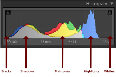
How to read the histogram

A histogram is a graphical representation of the pixels in your image. The left side of the graph represents the blacks or shadows, the right side represents the highlights or bright areas, and the middle section represents the midtones (middle or 18% gray). 

The heights of the peaks represent the number of pixels of a particular tone (with each peak corresponding to a different tone). Each tone from 0-255 (0 being black and 255 being white) is one pixel wide on the graph, so imagine the histogram as a bar graph all squished together with no spaces between each bar.

Have a look at the diagrams below:

how to use the histogram

What can we learn from a histogram?

There are many things we can learn about an image just by looking at its histogram.

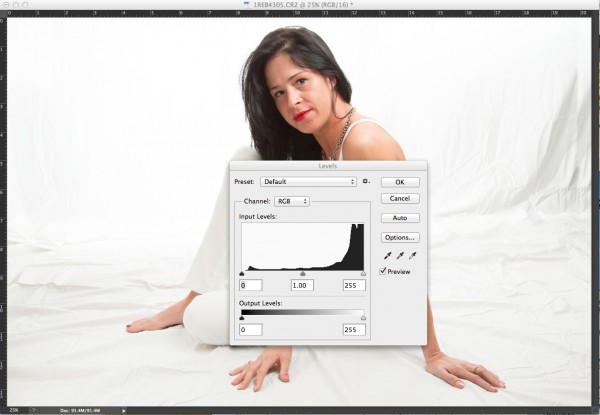
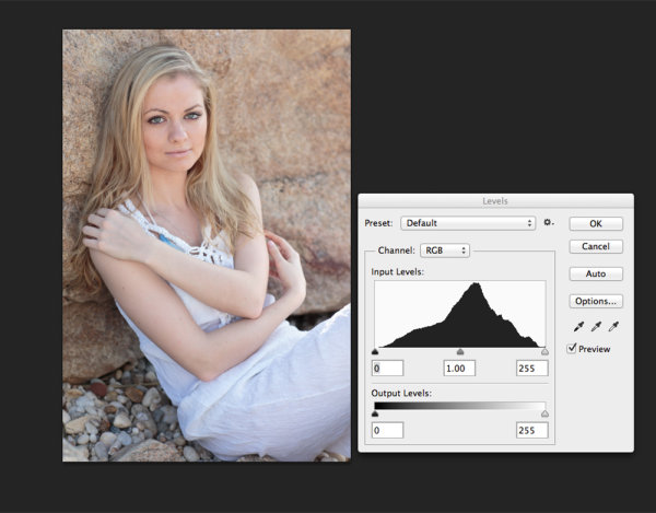
We can tell that an image is well-exposed if it reaches fully from edge to edge without a gap on one side of the graph, and it isn’t heavily going up one side or the other. In an ideal world, the graph should just touch the left and right edges of the histogram, and not spill up the sides. The graph should also have a nice arch in the center. 

However, this “ideal histogram” doesn’t always apply in every situation for every scene. Here are a few examples:

an ideal histogram
This is how an ideal histogram might look, evenly distributed, edge to edge, not up the sides.
a darker histogram
This is a histogram for a dark subject. It is not wrong; it is just more shifted to the left to represent the tones of the subject. This might be a black cat on dark pavement.
a brighter histogram
This is a histogram for a light subject (e.g., a white cat) with mostly light tones in the scene and few dark areas. See how it is shifted to the right compared to the dark subject? This is what you want, assuming your scene is mostly light-toned. If you change your exposure to keep the graph centered, you will end up with a gray cat, not a white one.

When the histogram tells you to adjust your exposure

Gaps on either end indicate you are missing information and your exposure can be shifted safely without losing detail. When your graph is shifted too far in one direction or the other direction, so that it does not even touch the other edge, you can safely shift your exposure to cover more of the range of tones. Let’s look!

an overexposed histogram
This graph shows an overexposed image; notice the gap on the left side indicating a lack of any blacks in the image. It also means you will lose lots of detail in the white areas that may not be recoverable. In this case, shift to give your image less exposure and shoot the scene again.
an underexposed histogram
This histogram shows the opposite. Now we see a gap on the right side of the graph indicating there are no whites represented, so the image will be dark – too dark. You can safely give the image more exposure until you see the tones just touch the right edge of the histogram.

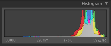
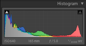
What do the spikes up the sides mean?

Spikes up the left or right edge of the histogram indicate “clipping” of that tone and a loss of detail in that area. Clipped areas are often unrecoverable, especially in the highlights.

It is generally advised to expose so that your graph just touches the right edge (which indicates that you’ve kept your highlight details). It is usually easier to recover some shadow detail and retain a decent image than to try and create highlight detail that isn’t in the file.

In some scenes, however, it may not be possible to keep the graph within an acceptable range. For example, you’ll struggle to get great results if you are photographing a scene with extreme contrast, such as:

  • Sunset
  • Bright sunlight and deep shadows
  • A building interior where you also show the area outside the windows

In all of those cases, you will not be able to keep from clipping either your blacks, your whites, or both.

a high-contrast histogram
High contrast graph

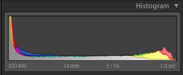
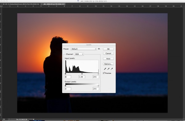
The graph above shows an image with extreme contrast, lots of blacks, a spike of white, and not much in the middle.

Is this wrong? Can you correct for it?

No, it’s not wrong.

And you can’t really “correct” for it, but you do have a decision to make when you see something like this. Do you shift the graph left and maintain highlight detail, or shift it right and keep shadow detail?

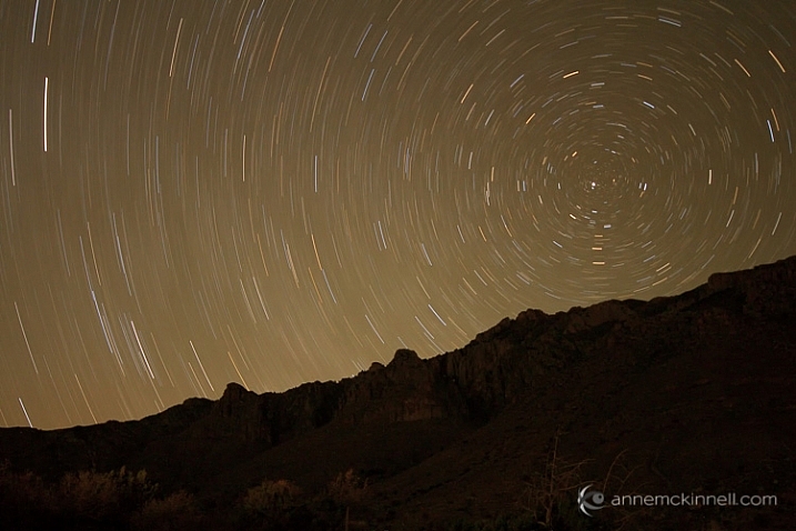
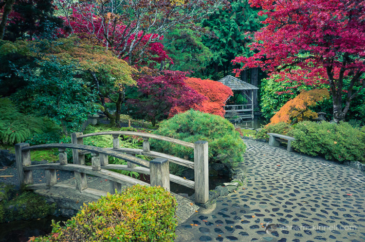
There is no right or wrong here. It’s all how you interpret the scene before you. If in doubt, shoot both and decide later. The graph above comes from the image below, so as you can see it is not the incorrect exposure at all. There are simply no midtones in the scene:

neon star sign

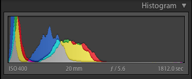
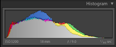
Here’s another example of a scene that will potentially go off the graph on both ends:

wide-angle cathedral with a blown-out ceiling and deep shadows
Notice the skylight at the top of the roof is blown out, and the deep shadows have little detail.
cathedral with better detail
Notice how, in this image, the details have been retained in both the highlights and the shadows.

Using advanced techniques like image merging and blending, HDR, or careful post-processing, you can compress the tonal range of a scene to fit within the histogram and therefore have details in all areas.

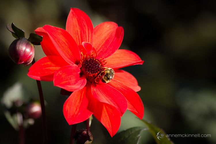
For the image above, I’ve used four bracketed images (taken two stops apart) and the HDR tone mapping process to bring the dynamic range of the scene down within a printable range.

One more handy thing on your camera: the “blinkies”

To help you establish how far you can go when exposing, most cameras have a setting called “highlight warnings.” It will make any overexposed highlights flash or blink when you preview your images on the camera LCD. Many people affectionately call these “the blinkies.”

histogram blinkies flashing
Notice the flashing areas; that means the highlights are being clipped in those parts of the image.

To do this on a Nikon camera, preview an image and press the Up or Down button (near the OK button) until you see the highlights flashing or outlined. This is the “highlight mode.” If you choose this setting, your camera will remember to use it for the next image you preview. You may need to activate the “highlight warnings” feature in your settings menu first, however.

To do this with a Canon camera, press the Display or Info button (depending on your model) until the blinking highlights show up on the screen when previewing images. You may also need to turn on this feature in the menu settings. Check your camera manual if you aren’t sure how to do this.

Summary

By using the tools your camera provides you, it’s easier to understand how to adjust your image exposure. There is a lot more to know about the histogram, and you can use it when you process your images in Photoshop or Lightroom, as well. 

Just keep in mind that, if you shoot in JPEG format, nailing the exposure in-camera is even more critical. If you shoot in RAW format, you have some leeway to make adjustments later, but it’s still a better idea to get it right in the first place.

The post How to Read and Use Histograms appeared first on Digital Photography School. It was authored by Darlene Hildebrandt.


Digital Photography School

 
Comments Off on How to Read and Use Histograms

Posted in Photography


DPReview TV: Why waveforms are better than histograms

09 Mar

Most serious photographers are familiar with histograms, but what about waveforms? Chris and Jordan explain why this tool from the video world may just be the best way to judge exposure for still photos too – and why all cameras should have them.

Get new episodes of DPReview TV every week by subscribing to our YouTube channel!

  • Introduction
  • Histogram limitations
  • How waveforms work
  • Waveform advantages
  • Why don't stills cameras offer waveforms?
  • Waveforms for photo editing
  • Wrap-up

Articles: Digital Photography Review (dpreview.com)

 
Comments Off on DPReview TV: Why waveforms are better than histograms

Posted in Uncategorized


Histograms for Beginners

09 Jan

When the digital revolution came to photography it brought with it a plethora of advantages for photographers: making vast quantities of images with no increase in cost; seeing the photo immediately after you make it; changing ISO with each shot; and the advent of the digital darkroom; to name a few.

One of the most important benefits of digital photography is one that can be a little intimidating for new photographers – the histogram. But there’s no reason to shy away from it – it’s actually pretty easy to use once you understand how it works. The histogram is simply a graphical representation of the tonal range of your photo that helps you evaluate the exposure.

Before digital photography, we had to wait until we developed the film to know for sure whether we got a good exposure when we made an image. Now, by using the histogram, this information is at your fingertips before you take the shot (in cameras with Electronic Viewfinders), after you take the shot, and during post-processing as well.

How to Read Your Histogram

It’s easy: the blacks are on the left, the whites are on the right, all the mid-tones are in between.

histogram-info

The most important thing to know about the histogram is that a spike on the right, that touches the edge of the graph, is a problem. That means that there is a portion of your image where the highlights are “blown out”, or completely white with no detail. The reason this is such a big problem is that an area that is blown out contains no data at all, so you will not be able to do anything in post-processing to adjust it. This only applies if the spike touches the edge of the graph. If it spikes before the edge, that’s okay.

If there is a spike on the left edge, it means part of your image is completely black. You may want to use your exposure compensation to adjust the exposure to the right to make it brighter. But remember that having part of your image completely black, especially for a night shot, is okay.

There is no such thing as a perfect histogram. It’s just a graphical representation of the tonal range in your image. It’s up to you, as the artist, to decide what to do with this information. Having solid blacks and bright tones (provided they are not blown out) is not necessarily a bad thing.

Let’s take a look at some examples of how histograms will look for different types of images.

Histogram Examples

High Key Scene

When you have a scene that is high key, it has a lot of bright tones, and not so many mid-tones or blacks. When you are photographing a scene that you want to be high key, your histogram should be stacked up on the right side – but not going up the right edge. If you want your scene to be high key, but your histogram is showing a lot of mid-tones, your whites are probably going to come out looking more gray than you would like.

Pelicans at the Salton Sea, California

A high key or light toned scene

histogram-swans

Histogram for the image above showing mostly light tones

Low Key Scene

A low key scene is one that is dark, which you would expect when photographing at night. In this case, your histogram will be stacked up on the left side. You may have a spike on the left edge, which indicates solid blacks.

Star Trails in Guadalupe National Park

A low key or dark scene will have mostly tones on the left side of the histogram.

histogram-stars

Histogram for the image above showing a dark scene.

High Contrast Scene

A high contrast scene is one where there are lots of very dark, and very bright tones, and perhaps not so many tones in between. In this case, your histogram will show data on the left and right, and not so much in the middle.

Fountains of Bellagio

High contrast scene. Extreme brights and extreme darks with little in the middle.

histogram-fountain

Histogram of high contrast scene above.

Low Contrast Scene

A low contrast scene has a lot of mid-tones, and few and bright tones. Your histogram will have a bell shape.

Butchart Gardens

histogram-garden

Again, it’s up to you as the artist to choose what to do with this information. You have to decide whether the information in the graph is what you want or not. It’s just another tool in your arsenal, to help you transform your artistic vision into a photograph.

If you’re not happy with your histogram, use your exposure compensation to adjust the exposure by making the image darker or lighter. Or, you may choose to affect the light on the scene instead by using a flash, a reflector, or a diffuser. The choice is yours.

Understanding the Colour Histogram

You’ve probably noticed in the examples above that the histogram not only shows the tones in grayscale, but it also shows you colours. Yes, it’s possible to blow out a colour! If there is one particular colour that is very bright in the scene, sometimes that colour will become so saturated that you loose detail. This commonly happens with red flowers for example.

Red Flower with Bee

histogram-flower

To combat this, you can slightly desaturate the colour in post processing to bring back some of the detail in the flower petals. The histogram above shows the increase in red tones towards the brighter end of the scale.

When to use the Histogram

In the field, you can use the histogram in conjunction with Live View to see it before you make an image (or turn it on if you have a camera with an Electronic Viewfinder like many mirrorless models offer). You can also see it afterwards when you review the photo on your LCD screen. Either way, it’s critical that you use the histogram to check your exposure while you’re in the field. That way you have an opportunity to make another exposure while you are still on scene.

Don’t rely on your LCD to give you feedback about exposure. It’s great for checking composition and focus, but not exposure. That’s because the brightness of your LCD has nothing to do with the brightness of your image, since you can adjust the brightness of your LCD. For example, you can brighten it so you can see it more easily outside on a sunny day. But then if you don’t change the brightness back again and you look at it at night your images are going to appear super bright, when they actually are not.

The histogram is also available to you while post-processing your image. Use it to see where adjustments need to be made and to ensure that you don’t create areas that are too bright or too dark while processing your images.

I hope that gives you a better understanding of how to use this handy tool. If you have any questions about histograms please put them in the comments below.

googletag.cmd.push(function() {
tablet_slots.push( googletag.defineSlot( “/1005424/_dPSv4_tab-all-article-bottom_(300×250)”, [300, 250], “pb-ad-78623” ).addService( googletag.pubads() ) ); } );

googletag.cmd.push(function() {
mobile_slots.push( googletag.defineSlot( “/1005424/_dPSv4_mob-all-article-bottom_(300×250)”, [300, 250], “pb-ad-78158” ).addService( googletag.pubads() ) ); } );

The post Histograms for Beginners by Anne McKinnell appeared first on Digital Photography School.


Digital Photography School

 
Comments Off on Histograms for Beginners

Posted in Photography


Histograms: Your Guide To Proper Exposure

30 Apr
The finished image was a nice, high key portrait. See below for details on the histogram.

The finished image was a nice, high key portrait. See below for details on the histogram.

To many newbie photographers, getting the proper exposure in camera is the biggest challenge they face. While letting the camera do the work for them turns out fine most of the time, there are many times where the camera can require some help.  Knowing just how to give your camera that help is key to getting an image you’ll want to keep.  The best way to judge an exposure (or a potential exposure, when using Live View) is to use your camera’s histogram.

In this high key portrait, the histogram shows a majority of pixels on the right side, representing brighter pixels. This is to be expected due to the white background and outfit worn.

In this high key portrait, the histogram shows a majority of pixels on the right side, representing brighter pixels. This is to be expected due to the white background and outfit worn. The pixels in the middle of the histogram represent the subject’s skin tones, while the small dark peak on the left represents her hair. Notice also, that this histogram does show some highlight clipping. In some images, this may be a problem, but since this is a high key portrait and the background is the bright white area, and the skin tones are good, this is not a problem for this image.

A histogram, in it’s simplest terms, is simply a graph showing the brightness levels of pixels in the image. The right side of the graph represents bright pixels, while darker pixels are shown on the left side.  Pixels representing midtones are in the middle, of course. A histogram runs, from left to right, showing values from 0- black, to 255- white.  The height of the histogram represents how many pixels are recorded at a given brightness level. The primary aspects of the histogram that one should be concerned with are the left and right edges.  Any pixels that recorded as bright white (255) or as pure black (0), would be pushed up against the edge of the graph.

Since a histogram is simply a representation of the tonal range of a given image, there really is no right or wrong histogram. The histogram will change based on the tones in an image. A high-key portrait, for example, would show pixels mainly to the right side of the histogram. A low-key image would show pixels mainly to the left side of the histogram. An image with a wide tonal range would show pixels across the entire histogram.

As I mentioned, when judging exposure, the primary areas of the histogram to be concerned with are the right and left edges. Pixels in these areas are rendering as bright white, or dark black.  Generally speaking, unless an image is intended to show bright white or pure black areas, pixels pushed up to the very edge of the histogram could indicate an exposure problem.  This is also known as “clipping”. For instance, when a large number of pixels are pushed against the right side of the histogram, in essence, being cut off by the edge of the histogram, it is said that the highlights are clipped.

In this image, since the subject is in silhouette, and there are lots of dark tones, we expect to see most pixels on the left side of the histogram.

In this image, since the subject is in silhouette, and there are lots of dark tones, we expect to see most pixels on the left side of the histogram.

When judging the histogram, one must take into account the subject matter of the image. If the image should show bright white areas, yet the histogram shows the pixels as rendering more middle grey, due to the way the camera’s meter sets the exposure, you can then use exposure compensation or adjust your exposure manually to increase exposure and achieve the desired result.  The same is true for darker images that the camera overexposes because the meter is trying to achieve middle grey.  By reducing exposure, either manually by changing your shutter speed, aperture, or ISO, or by using exposure compensation, you can darken the image to achieve the desired image. The histogram of this new image will reflect the change to exposure.

Now, here’s the big secret. If you use Live View on your camera, you can view a live histogram, that will update and reflect changes in exposure when your exposure changes. This means you can judge what your current exposure is, and watch in real time how changes to that exposure will affect your image. It’s a great way to get a feel for how even a slight adjustment in shutter speed, aperture, or ISO can affect your exposure.

This portrait shows more midtones than anything else, so we see more of a classic peak near the center of the histogram, with the pixels falling off as they get to the edges of the histogram. You can see that neither the highlights or shadows are clipped .

This portrait shows more midtones than anything else, so we see more of a classic peak near the center of the histogram, with the pixels falling off as they get to the edges of the histogram. You can see that neither the highlights or shadows are clipped .

Post originally from: Digital Photography Tips.

Check out our more Photography Tips at Photography Tips for Beginners, Portrait Photography Tips and Wedding Photography Tips.

Histograms: Your Guide To Proper Exposure


Digital Photography School

 
Comments Off on Histograms: Your Guide To Proper Exposure

Posted in Photography


Photography Histograms Explained

06 Nov

cazillo.com Histograms are the only way when shooting to get an accurate representation of your exposure. Without it, you could look at your screen and think your photo is exposed properly but then look at them on your computer later and realize everything was underexposed or overexposed.
Video Rating: 4 / 5

 
Comments Off on Photography Histograms Explained

Posted in Nikon Videos


Histograms | Histogram | Digital Photography | Camera

08 Sep

This is a quick and simple description of what a histogram is, what it measures, and how it can be used as a tool in photography. Enjoy! For more information about my photography, school or blog- just visit www.michaelthemaven.com