RSS
 

Posts Tagged ‘Histogram’

Obscura 2 app updates interface, adds new histogram visualizer and keyboard shortcuts

08 Feb

Obscura 2, an iOS camera app developed by Ben McCarthy, has released an update that adds a histogram visualizer, iPad keyboard shortcuts, a redesigned image viewer and more.

The most obvious change in the updated is the new image viewer interface. Now, the various settings, controls and filters are organized into card-style dialogs within the interface. While this does take up more real estate for each setting, it provides a cleaner look and helps to compartmentalize the various settings.

The new histogram integration provides real-time exposure data by overlaying bars on the bottom of the the the app, behind the buttons. It’s nice the histogram is subtle, but it’d be nice to have an option to change the color/opacity on the bars, because the dark grey on black can sometimes be difficult to see.

On iPads, the update adds keyboard shortcuts for taking photos, switching between camera and library modes, applying filters, and navigating through photos that have been captured. Sure, the iPad isn’t a camera-first device in any sense, but it’s nice to see McCarthy add this sort of functionality.

Overall, it’s a solid update with a cleaner UI and a number of functional improvements. Obscura 2 is available on the iOS App Store for $ 4.99.

Articles: Digital Photography Review (dpreview.com)

 
Comments Off on Obscura 2 app updates interface, adds new histogram visualizer and keyboard shortcuts

Posted in Uncategorized


Shedding Light on the Histogram – 8 Rumors and the Real Facts About this Graph

05 Apr

There have been dozens of articles and many videos published about the purpose and interpretation of the histogram in post-production. It serves a purpose in both the camera capture and post-production processes.

Tons of pulp has been generated about this tiny graph clarifying the general purpose of the histogram. But there is still much to be learned about this graph. This article will clarify some issues while focusing mainly on post-production concerns.

Shedding Light on the Histogram - How to Use it in Post-Production

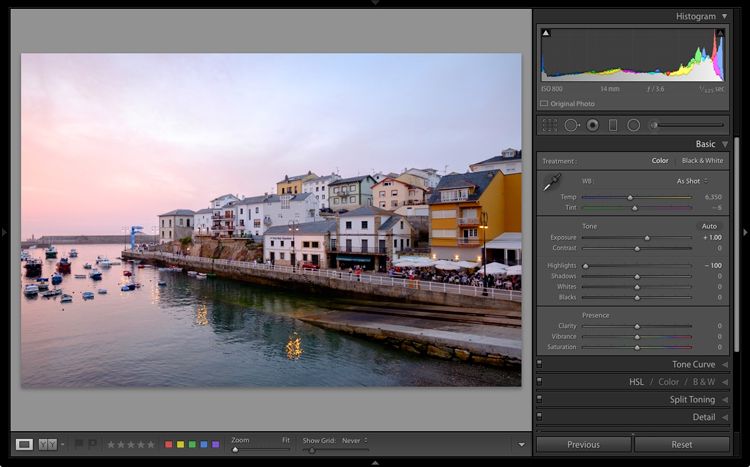
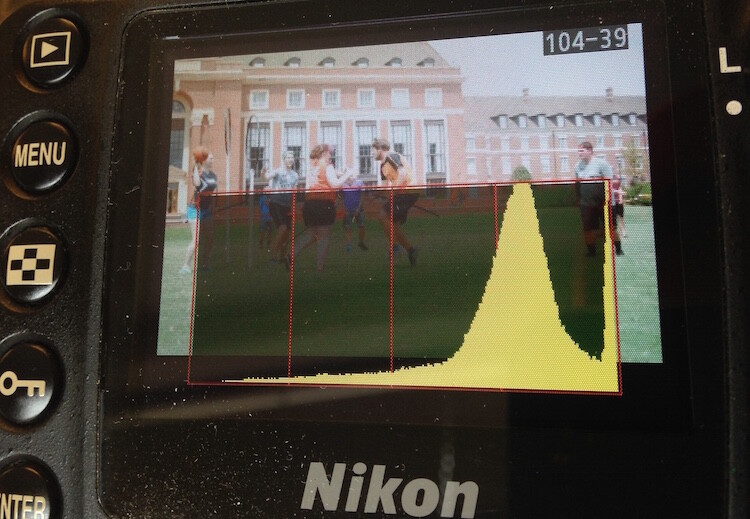
The individual RGB values are dominant in this image. Only the cracks in the sidewalk and spots of white in the cement cause the spikes on the outside edges of the graph.

Some articles I’ve read portray the histogram as the Holy Grail of digital photography and even describe an ideal histogram shape. Others describe the histogram as an accurate revelation of image health, sort of like a digital EKG. Still, others downplay the value of the statistical feedback completely and totally miss its primary purpose. Listed below are actual quotes from tutorials and articles about the histogram.

Colored Fence - Shedding Light on the Histogram - How to Use it in Post-Production

The two histograms reveal more information than you might think. The RGB graph reveals the same solid yellow and blue colors while the Luminosity graph represents the combined RGB luminosity (effectively, the grayscale equivalent values).

I’ve been adjusting images for decades; long before the graph was publicly introduced and I’ve worked with it every day since so I’d like to weigh-in on rumors and clarify some facts. Once you understand the histogram’s primary function and limitations, you’ll find it to be a solid feedback resource.

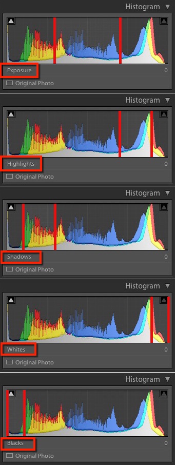
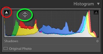
The Histogram’s Vertical Lines Defined

RUMOR #1: The histogram is a graphic blueprint of a digital image. The horizontal span represents the image’s tonal range and the vertical lines reflect the contrast of the image; the higher the vertical lines, the more contrast the picture contains.

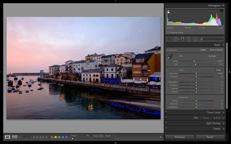
FACT: The horizontal axis does reflect the image’s tonal range (from the darkest tones to the lightest), though the vertical lines reveal little about its contrast. Actually, the horizontal distribution is what reveals the overall contrast. Tones located mostly on the right reveal very light (or high-key) images while tones favoring the left side are darker (low-key) images.

The extreme right side wall represents white and the extreme left wall of the graph represents solid black. The highest (vertical) peak of the graph merely indicates the highest ratio of pixels containing that particular color tone as it relates to the others. The lowest vertical level on the graph indicates the tone color with the least number of pixels in the image.

Hi Key Low Key Histogram

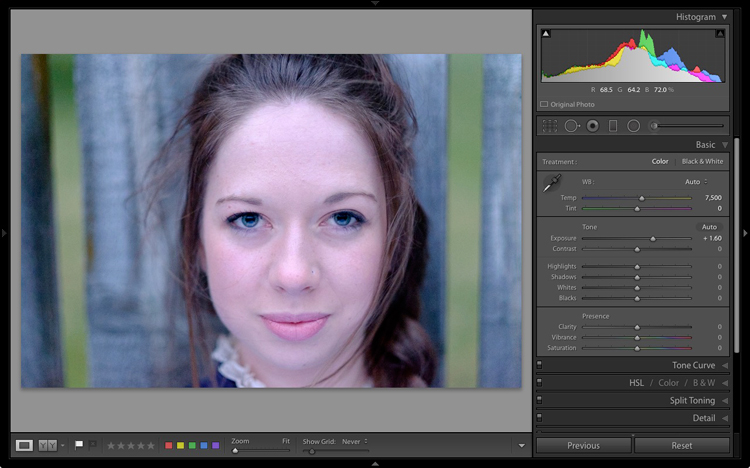
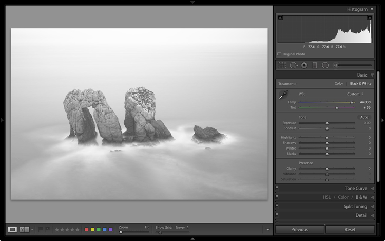
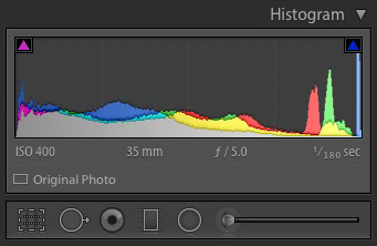
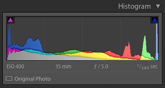
The left graph represents a high-key or light toned image. The histogram on the right represents a low-key or dark toned image.

Histogram Shape

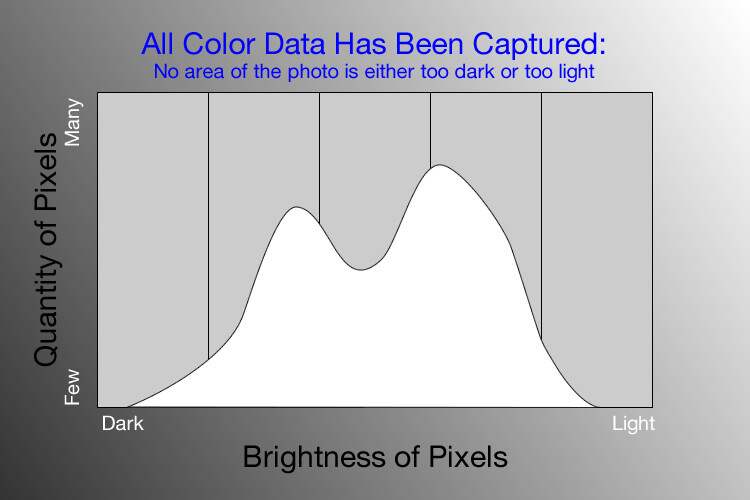
RUMOR #2: There is a preferred “mountain” shape for a histogram. The ideal shape displays a single peak beginning at the “ground” on one side, reaching upward into a bell shape near the middle, and tapering down to the ground on the other side. An ideal histogram contains information from all channels everywhere, from the left to the right in the graph.

FACT: There are as many histogram shapes as there are images. There is no such thing as a good or bad histogram and there is no such thing as an ideal histogram. Because these graphs reflect each image’s distribution of tones, you’ll be hard-pressed to find any two alike.

Histogram Shapes

Only images containing mostly middle tones will actually display a true bell (mountain) shape on the histogram as in the one top left.

Clipping

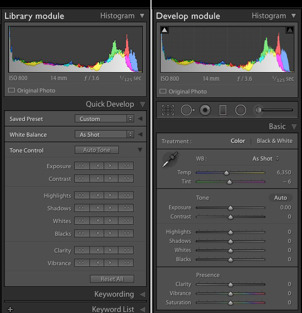
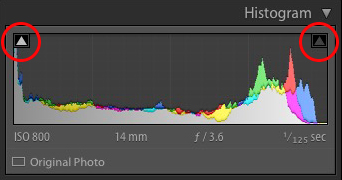
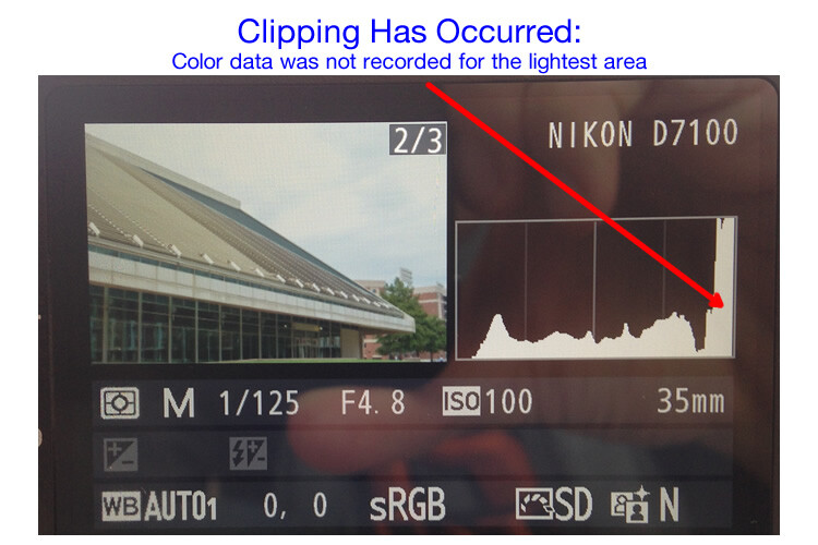
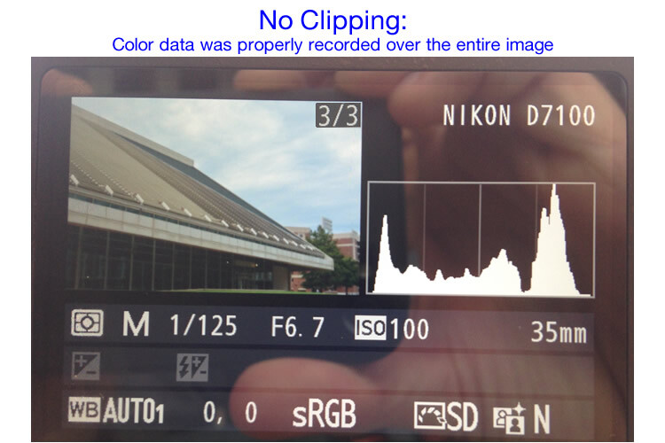
RUMOR #3: The extreme left and extreme right sides of the histogram should never hit the “sidewalls” of the graph. If the left or right side hits and travels vertically up the wall, an undesirable effect called “clipping” will occur, indicating that either solid black or solid white “no-detail” areas will be visible in the image. Utilize the warning signs (The Blinkies and triangles) and avoid clipping on either tonal extremes of the graph.

FACT: Depending on whether the image is high-key (medium contrast on a pure white background) or low-key (dramatic lighting with a black background), either side of the mountain may actually resemble a tonal cliff. Real-life lighting dynamics make these wall-climbing graphs quite acceptable. Photos captured against white seamless backdrops are purposely exposed to produce dropout white backgrounds.

Jupiter Air Show - Shedding Light on the Histogram - How to Use it in Post-Production

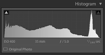
The U.S. Air Force Thunderbirds screaming across a very bright mid-summer South Florida sky were captured against totally white clouds. The apparent clipping shown in the histogram accurately reports the totally white clouds.

Tone Distribution

RUMOR #4: Histograms that display significant gaps on either side of the graph should be adjusted to distribute the tones more evenly. A well-shaped histogram is a happy histogram.

FACT: Real life lighting doesn’t demand that every scene contain both deep shadows and bright highlights. Images are sometimes brightened or darkened unnecessarily revealing a typical rookie editing mistake. Many times these bookend extremes establish an emotional mood that would be lost if the images were over-corrected in this manner.

Dark Green Leaves2 - Shedding Light on the Histogram - How to Use it in Post-Production

This low-key shaded scene contains very little highlight shades at all.

Corrected Dark Green Leaves2 - Shedding Light on the Histogram - How to Use it in Post-Production

Adjusting the image destroys the rich colors of the low-key scene.

Histogram Gaps

RUMOR #5: The silhouette of the histogram mountain should remain smooth, displaying no gaps or fissures in the mountain shape. These smooth tone transitions are necessary to maintain the photo’s full visual range. Gaps in the histogram’s silhouette indicate an interruption in the gradual tones and will result in banded or posterized stages. These gaps appear because the JPEG image is only 8-bit.

FACT: There are only 256 vertical bars presented in the Histogram. Each horizontal bar represents less than one-half of one percent (0.4%) of the total tonal range (100% / 256 = 0.390625%). Even if a photo contains a very gradual change in tones across a wide area (like an unclouded sky), your eyes will only perceive “banding” if the JPEG image has been degraded by repeated Save functions.

JPEG images contain a maximum of 256 levels (8-bits) of tone between black (solid color) and white (no color). Once JPEG files have been opened and saved a number of times, the number of tone levels can become significantly reduced and tone-banding may occur.

News Journal - Shedding Light on the Histogram - How to Use it in Post-Production

News Journal Gappy - Shedding Light on the Histogram - How to Use it in Post-Production

These two histograms appear quite different though the images are very similar. As you can see, “gappy” pictures rarely interrupt the flowing tones in a photo and often clarify more detail.

Full Range Images

RUMOR #6: 8-bit images (256 levels of tone/color per Grayscale/RGB channel) are required for an image to display the full range of detail contained in a high-resolution digital image.

FACT: The human eye is designed to focus on detail in a scene or image. Detail is a product of contrast, and contrast is only noticeable when adjacent colors display significant differences. For the most part, the fewer colors that are displayed, the more obvious are the differences in those colors. This sounds bad but it is actually quite beneficial. It may fly in the face of popular logic but there is a fundamental truth to be recognized. The picture with the least colors (also known as bit depth) is many times the most detailed picture.

Daytona Beach Bandshell 750px - Shedding Light on the Histogram - How to Use it in Post-Production

Daytona Beach Bandshell 15 Post 750px

The top image contains 256 levels of color per RGB channel; or up to 16,800,000,000 colors. The bottom image contains only 15 levels of color per RGB channel; only 3375 possible colors. This image uses less than 5% of the tones that are used in the top image. Don’t live or die on the issue of bit depth. It is important, but like other issues in life, more isn’t necessarily better.

There is, of course, a reasonable limit to this reduced color observation. Too few levels of color will lose the smooth transitions between colors and thus will also lose detail.

Try this exercise: open a full-range photo in Photoshop and duplicate the image on another layer. Open the Histogram (Window/Histogram). Now select Image > Adjustments > Posterize, enter the number 15 and view the image as a Preview. Watch the Histogram window as you preview the image. The graph will display only 15 vertical columns instead of 256 but the image will look pretty much the same.

The point I’m making is that “gaps” in a normally smooth histogram doesn’t necessarily indicate a visual disaster. Instead, a few gaps might just inject a little more drama in your images.

Smooth Flowing Tones

RUMOR #7: Digital captures should display the highest number of tones possible in order to preserve the smooth continuous tones.

FACT: While nature provides an extreme level of dynamic range and true continuous tone gradation, there is no such thing as “continuous tone” digital images. The word “digital” affirms this statement. Virtually all digital images are comprised of square pixels displaying individual tone values. The perception of continuous tone is an illusion.

Pixel Patch - Shedding Light on the Histogram - How to Use it in Post-Production

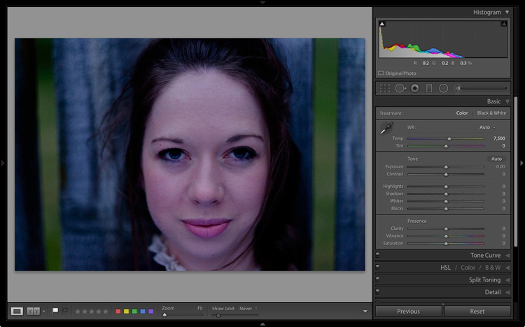
These blue pixels were captured from the sky of the Thunderbirds image above. The patch of sky appears as continuous tone in the original picture although the enlarged individual pixels vary quite a bit in value. The top histogram shows the combined channel luminance while the bottom shows individual RGB channel values. It’s complicated.

Exhaustive Reference

RUMOR #8: A Histogram is an exhaustive systematic and statistical accounting of all the internal colors and tones of an image, from dark to light (100% – 0%).

FACT: Each histogram does reveal the relative placement and distribution of all tones and colors, but due to its size, there is a serious limitation to its accuracy. Since editing software histograms are based on a horizontal graph only 256 pixels wide, each representation is a basic overview at best. If the full range of possible colors were truly represented by a single graph, the chart would occupy the wall of a good size room!

HistoMeasurements

Both the top and bottom tonal adjustments were severe enough to create significant gaps in the histogram and to alter the shift of tones in each range, though there are no visible interruptions in the smoothness of each gradation.

Let me break down the numbers. This 256 pixel-wide graph portrays each image’s potential color range using an 8-bit (256 level) interpolation. This means that all 16.8 million possible colors are represented in a mere 256 horizontal point histogram. Tones change levels in 0.4% increments. The graph significantly exaggerates the difference between minor shifts in tonal value.

256 Pixel Histogram2

Human eyes barely perceive a half-percent (0.5%) difference between tones, which is why 256 levels in a JPEG image provides the illusion of continuous tone. This means the histogram uses less than two vertical columns to represent a single percent of change in value.

57 58 percent

The two bottom patches are separated by only 1% in tone, though your eyes may have trouble seeing the difference. The top band shows a gradual change between the two values.

What does all this mean? Quite simply, the histogram delivers a good estimation of overall tone distribution but cannot be relied on for accurate measurement. A few gaps in the graph will rarely be visible to the human eye.

Wrap Up

The histogram is a valuable instrument intended to deliver a quick overview of the makeup and tonal shape of digital images. It was never intended to be a scary reference tool.

Learn to use the histogram to deliver interactive feedback as you work through your editing steps but appreciate the graph for the information it provides; mostly defining the distribution of tones, highlights, and shadows.

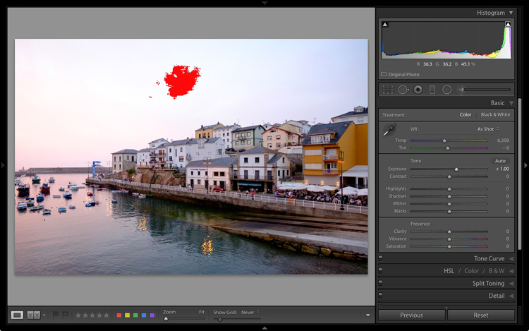
What the histogram does not show is whether the image requires internal adjustments to reveal hidden detail. That’s another topic altogether.

Push pixels around and stay focused.

The post Shedding Light on the Histogram – 8 Rumors and the Real Facts About this Graph appeared first on Digital Photography School.


Digital Photography School

 
Comments Off on Shedding Light on the Histogram – 8 Rumors and the Real Facts About this Graph

Posted in Photography


How to Understand and Use the Lightroom Histogram

21 Dec

The histogram in Lightroom is a useful tool that is easily overlooked. Its main purpose is to help you understand the relationship between the sliders in the Basic panel and the tones in your photos. It helps you get brightness levels spot on and edit images without losing highlight detail.

Where is the Lightroom histogram?

The histogram is found in two places, at the top of the right-hand panels in both the Library and Develop modules. In the Library module, it helps you see what is happening to your image when you make adjustments in the Quick Develop panel. You also need it in the Develop module so you can see how any adjustments you make during post-processing affect the histogram.

The Lightroom histogram

What does the LR histogram tell you?

The histogram tells you whether you have any clipped highlights or shadows. It also tells you how much contrast the photo has. This information lets you decide whether you need to adjust exposure and contrast. It also tells you whether the original photo was over or underexposed. The histogram changes as you move sliders around in the Basic panel, so you can immediately see the effect.

Important: Please note that the following features work with the Develop module histogram, but not the Library module histogram.

How to check for clipping

Clipping is indicated by the Show Shadow Clipping and Show Highlight Clipping triangular icons in the top left and right (circled below). Use the keyboard shortcut key J to show and hide clipping.

The Lightroom histogram clipping

In this histogram, the Show Shadow Clipping icon is colored white to show that the image contains clipped shadows (this is perfectly normal in many images and nothing to worry about).

If you click on (or hover over) the Show Shadow Clipping icon, those clipped shadows are shown in blue in the photo.

The Lightroom histogram clipped shadows

The Show Highlight Clipping icon on the right is colored gray to indicate that there are no highlights clipping. This is a good sign, as most photographers expose to preserve highlight detail.

The Clipping icons also come in useful to indicate if you are losing detail in the highlights or shadows as a result of making adjustments in the Basic panel.

If I set Exposure to +1.00 for this particular image, the histogram tells me that I have lost detail in the sky. The Show Highlight Clipping icon is colored white to indicate this. If you click the icon, clipped highlights are displayed in red in the image. You can see from the screenshot that only a small part of the sky is clipped. This may not be important, but it indicates that perhaps I increased the Exposure too much.

The Lightroom histogram clipped highlights

If I set Highlights to -100 the detail comes back in the sky and there is no clipping. Notice how the histogram has changed from above to the one below.

The Lightroom histogram

This simple example shows you how you can push sliders around, using the histogram to make sure that you don’t lose highlight or shadow detail.

The histogram and underexposure

If there is a gap on the right side of the histogram it probably indicates that the image was underexposed (an exception would be if the photo has lots of dark tones but few light ones – like a photo of a black cat sitting on a black rug).

Here’s an extreme example. The photo generating this histogram was underexposed by over a stop.

The Lightroom histogram underexposed image

A look at the photo confirms the histogram is correct and that it is underexposed (too dark).

The Lightroom histogram

While it is best to get the exposure right in the first place, you can fix this by moving the Exposure slider to the right. As you do so, the histogram also moves to the right. The Exposure slider is quite clever and increases brightness mostly in the mid-tones to prevent highlight clipping. You may be able to push it a long way to the right without losing any highlight detail.

Here, I set Exposure to +1.6, and the histogram looks much better.

The Lightroom histogram

This is what the photo itself looks like after that simple adjustment. Now it is ready for further refinement.

The Lightroom histogram

If you see a gap on the right side of the histogram yet the brightness of the photo looks okay to your eye, it could be a sign that the brightness of your monitor is set too high. If this is the case, you will find your photos look dark when printed or viewed on other people’s monitors. Ideally, you want to calibrate your monitor to be the correct brightness.

The histogram and contrast

If the histogram is bunched together and doesn’t cover the entire range of the graph this indicates that the photo has low contrast. This is most likely to happen when shooting in flat light.

Here’s a histogram that demonstrates this.

The Lightroom histogram low contrast

The histogram belongs to a black and white photo taken on a cloudy day in warm and humid conditions. The spray coming from the sea reduced the contrast of the scene, resulting in a very flat image.

The Lightroom histogram

I used the Tone sliders to increase contrast and stretch the histogram so that it filled the space available. The histogram acted as a guide that told me exactly what was wrong with the image and helped me add the contrast back into the photo that it lacked.

The Lightroom histogram contrast adjusted

The histogram and the Tone sliders

There are five zones in the Lightroom histogram.

When you move the mouse over the Exposure, Highlights, Shadows, Whites or Blacks sliders in the Basic panel the zone that is affected by that slider is shown in light gray in the histogram. I’ve added red lines to make it clear where each zone falls.

lightroom-histogram-zones

The same zones are shown when you move the mouse over the histogram itself. The name of the slider that controls the tones in that part of the histogram is displayed underneath.

This diagram (right) shows the zone that corresponds to the Shadows slider.lightroom-histogram-sliders


When you see the icon with the two arrows (circled in green), hold the left mouse button down and move side to side to adjust move the Shadows slider left or right. The histogram will change as you do so. This technique gives you control over the Tone sliders from the histogram itself.

Each slider controls a particular zone, but bear in mind that those adjustments also make changes in the other zones. Don’t worry if this sounds complicated – it will make perfect sense once you try it out for yourself. The key is to practice, and you will soon understand the relationship between the Tone sliders and the histogram.

Luminance and color histograms

If you’re processing a color photo you’ll notice part of the histogram is colored. Lightroom is actually showing you four histograms in one. On top is the luminance histogram, shown in gray. This shows brightness values only and has nothing to do with color. This is similar to the luminance histogram on your camera. The other three histograms are colored red, green and blue and correspond to the color channels in the image (some cameras also show these histograms).

You’ll also see some additional colors (like yellow) where the red, green and blue histograms overlap.

Saturation and the histogram

The color controls in the Basic panel affect the color histograms. The easiest way to show you is by demonstrating how the Saturation slider affects the color histograms. Here is a histogram belonging to a color photo, with Saturation set to zero.

The Lightroom histogram

This is what happened when I set Saturation to +100. Increasing Saturation means that the colors are stronger. The result is that the peaks of the color histograms are higher.

The Lightroom histogram

You’ll also notice that the Shadow Clipping icon (on the left) has turned magenta, and that the Highlight Clipping icon (on the right) has turned blue. These indicate that there is clipping in the shadows, but only in magenta hues, and that there is clipping in the highlights, but only in the blue channel.

This is an extreme example because in real life you will never increase Saturation to +100. But there may be times when you make adjustments that clip colors rather than brightness values. It probably doesn’t matter in images viewed on a computer screen, but it may do with images that are printed on paper or reproduced in a book or magazine.

Finally, when I move the Saturation slider to -100, which removes all color from the photo, the color histograms disappear and we are just left with the luminance histogram. This is a useful tip if you would ever like to see the luminance histogram by itself.

The Lightroom histogram

Conclusion

That concludes our overview of the histogram in Lightroom. Hopefully, you can see what a useful tool it is for processing photos in Lightroom. If you have any questions about the histogram, please let me know in the comments below.


If you enjoyed this article and woudl like to learn more about Lightroom then please check out my Mastering Lightroom ebooks.

googletag.cmd.push(function() {
tablet_slots.push( googletag.defineSlot( “/1005424/_dPSv4_tab-all-article-bottom_(300×250)”, [300, 250], “pb-ad-78623” ).addService( googletag.pubads() ) ); } );

googletag.cmd.push(function() {
mobile_slots.push( googletag.defineSlot( “/1005424/_dPSv4_mob-all-article-bottom_(300×250)”, [300, 250], “pb-ad-78158” ).addService( googletag.pubads() ) ); } );

The post How to Understand and Use the Lightroom Histogram by Andrew S. Gibson appeared first on Digital Photography School.


Digital Photography School

 
Comments Off on How to Understand and Use the Lightroom Histogram

Posted in Photography


Using the Histogram to Take Better Pictures

20 Sep

You might have seen some articles here on Digital Photography School about using the histogram when editing pictures in Lightroom and Photoshop, but it can also be a very handy tool when you are out shooting images as well. Most cameras have the ability to show you the histogram when you review your photos on the rear LCD screen, and some even allow you to see a real-time histogram in Live View. While this might seem a bit intimidating at first, learning to use the histogram when out shooting pictures can have a dramatic impact on your photography and help you understand how to get the right exposure for the photos you are taking.

histogram-sorority-bid-day

Sorority Bid Day brought to you by the magical properties of the histogram.

In a nutshell, the histogram shows how much data is recorded for various Red, Green, and Blue color values in a picture. While you can usually see data for all three colors separated into discrete graphs, the one I find most useful for general shooting is the histogram that combines all three RGB values into one visual representation. A histogram shows how much data has been recorded across the tonal range of a photograph from very dark to very light. A spike in the graph means a lot more data has been recorded for those particular values of darkness or lightness, and a dip means that not much data has been saved. In general, a properly-exposed picture should have a histogram that looks something like this:

histogram-example

An example of a hypothetical histogram for a properly exposed photo.

A histogram similar to this example would mean that most of the color data is concentrated in the middle: the greatest quantity of pixels is neither too dark nor too light. Most photos will have some darker pixels and some brighter pixels, but in general all the information captured by a camera’s image sensor should fall somewhere between the darkest of darks (i.e. very black) and the lightest of lights (i.e. very white). A histogram that is skewed to the right would indicate a picture that is a bit overexposed because most of the color data is on the lighter side, while a histogram with the curve on the left shows a picture that is underexposed. This is good information to have when using post-processing software because it shows you not only where the color data exists for a given picture, but also where any data has been clipped: that is, it does not exist and, therefore, cannot be edited. It’s also good information to have out in the field, such as in the following example:

histogram-quidditch-overexposed

Most cameras allow you to overlay the histogram on top of a given photo during playback, or as you shoot the photo when using Live View.

I could tell right away that this picture of some college students playing Quidditch was a little overexposed, but looking at the histogram data right on my camera gave me additional information that helped me adjust my shooting on the spot. The large curve on the right-hand side tells me that most of the color information is concentrated on the lighter side, which is actually a good thing because more data is actually collected in the highlight portions of the image which can then be brought down later in a program like Lightroom. (This is a technique called expose to the right, which is a fantastic way to get a little more out of your photography if you are willing to put in a bit of time editing pictures on your computer.)

The problem with this image, as you can see in the above histogram, is that the graph literally goes off the chart on the right-hand side. This means that some of the highlights have been clipped: there is no longer any data that can be recovered, and no matter what I do in Photoshop or Lightroom there are some portions of my image that show up as pure white and can’t be edited. An example histogram from a photo that is clipped on both the darkest and lightest areas would look like this:

histogram-example

After taking the first photo and realizing that some of the data would be lost due to clipping, I was able to adjust my exposure settings and get a much better image:

histogram-quidditch-properly-exposed

Quidditch isn’t only played at Hogwarts.

The histogram for this picture was also concentrated a bit more to the right-hand side, but right after I shot it I was able to see that no data had been lost due to clipping. This didn’t help much in the immediate moment, but it meant that I had plenty of information to work with later when editing the picture in Lightroom. As another example, here’s a picture of a unique building on the Oklahoma State University campus:

histogram-example-building-exterior

The Noble Research Center on the campus of Oklahoma State University.

When I looked at the back of my camera it seemed as though the photo was pretty good. The sky was a bit bright, but I thought everything would be just fine overall. This is similar to many situations I have been in when I thought I could tell simply by looking at the photo on my camera’s LCD screen if it was exposed properly, but a quick check of the histogram can yield much more information. Even though the above image seemed decent at first, the camera histogram told another story:

histogram-example-noble-center-D7100

The histogram for the above photo indicated severe clipping on the highlights, meaning some parts of the photo were so bright that I wouldn’t be able to fix it in Lightroom.

Had I not looked at the histogram I would have never seen that a good chunk of the sky was clipped which meant there was no color data at all for the brightest portions of the photo. This would be a serious problem for my post-processing when I bring my pictures into Lightroom and adjust various parameters to get the image to look like I want. After looking at the histogram I re-adjusted my exposure settings and took another photo which had an improved balance of color data across the spectrum:

histogram-example-noble-center-D7100-proper

The same composition, but with different exposure settings that resulted in a better exposure with no clipped data.

One curious aspect of this image is that while the sky is now properly exposed, the glass panels on the building appear to be too dark. Looking at the histogram you can see that while there is certainly a lot of data on the darker portions of the image (hence the spike on the left-hand side of the graph), no data has been lost due to clipping. This means I had a lot of flexibility to improve the image in Lightroom, which resulted in the following finished photograph:

histogram-example-building-exterior-proper

One nice thing about most mirrorless cameras, as well as some DSLRs when shooting in Live View, is their ability to give you a real-time indication of any areas of the image that will be over – or under – exposed. This is normally referred to as a zebra pattern and it essentially overlays a series of stripes over any portion of your image where data is going to be clipped. And remember, as I stated earlier, many cameras today have the ability to show you a live histogram that updates in real-time so you can see not only where the color data on your image is concentrated across the light/dark spectrum, but also alert you to any clipping that will happen when you take the photo.

These are just a few examples of how the histogram can be useful when you’re out shooting photos, not just when you’re editing them on your computer. How do you use the histogram, and what other tips and tricks do you have to share about using it to enhance your photography? Leave your thoughts in the comments below.

googletag.cmd.push(function() {
tablet_slots.push( googletag.defineSlot( “/1005424/_dPSv4_tab-all-article-bottom_(300×250)”, [300, 250], “pb-ad-78623” ).addService( googletag.pubads() ) ); } );

googletag.cmd.push(function() {
mobile_slots.push( googletag.defineSlot( “/1005424/_dPSv4_mob-all-article-bottom_(300×250)”, [300, 250], “pb-ad-78158” ).addService( googletag.pubads() ) ); } );

The post Using the Histogram to Take Better Pictures by Simon Ringsmuth appeared first on Digital Photography School.


Digital Photography School

 
Comments Off on Using the Histogram to Take Better Pictures

Posted in Photography


The Camera Histogram Explained

13 Jul

This video does a great job of explaining how the histogram on your camera works and how to read it.

I do slightly disagree with his tip on having a mountain in the center is the best option, as it does depend on the subject. If you are photographing a black cat on a black sofa that would be an incorrect overexposed image.

For more info on histograms check these dPS articles:

  • Histograms: Your Guide To Proper Exposure
  • How to Read and Use Histograms
  • Understanding Histograms

The post The Camera Histogram Explained by Darlene Hildebrandt appeared first on Digital Photography School.


Digital Photography School

 
Comments Off on The Camera Histogram Explained

Posted in Photography


Photography Tutorial 6 ( Light Meter and Histogram)

01 Feb

An abbreviated version the Light Meter and Histogram chapter from the Mastery of Photographic Essentials DVD by me. Check it out and learn to kick some serious booty at photography. Enjoy
Video Rating: 4 / 5


Histograms | Histogram | Digital Photography | Camera

08 Sep

This is a quick and simple description of what a histogram is, what it measures, and how it can be used as a tool in photography. Enjoy! For more information about my photography, school or blog- just visit www.michaelthemaven.com