RSS
 

Posts Tagged ‘Fine’

4 Steps to Photoshop Artistry Using Fine Art Grunge Techniques

02 Jun
PhotoshopGrunge600x600

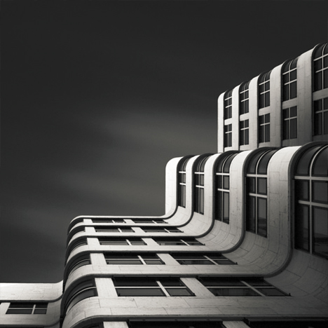
Image by Sebastian Michaels

Sebastian Michaels has the course Photoshop Artistry: Fine Art Grunge Composition which is current on sale for 67% off at SnapnDeals.com for a limited time only. Grab it now before the deal is over.

One question. Do you sharpen just about all your images? If so … you should stop. As photographers we tend to want our images to be perfect: perfect exposure, perfect white balance, perfect sharpness. But aren’t you a little tired of being so perfect all the time? Let me clue you in. Art doesn’t always have to be so darn pretty. What if instead you let yourself RELAX a bit, lighten up, and have some fun? What if you let yourself get a little messy? Maybe not full-blown grunge. But how about “fine art grunge”?

Start here: a little more blur, a little more noise, an unexpected angle or crop, perhaps some striking effect of light combined with a subject you never would normally have thought to consider.

BellyDance

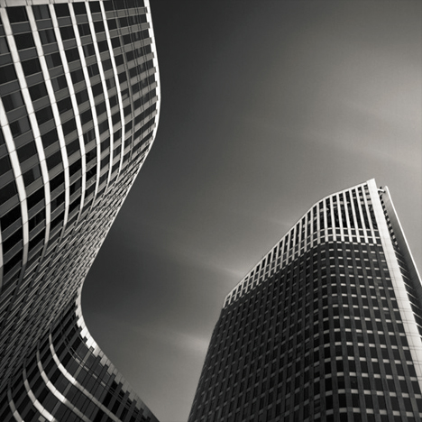
Photo credit: Catherine King (course student)

Sometimes we forget that at our core we are ARTISTS. Owning a Canon 5D Mark III rig and enough lighting gear to stage a Pink Floyd reunion tour doesn’t change that. Just because we spend so much time trying to capture the perfect shot doesn’t mean that we can’t switch it up now and then and treat our images (even our mistakes, even our botched shots) as nothing more than the starting point in more elaborate artistic compositions.

Here’s a mental trick to get you started. Think of some of your favorite shots. But instead of imagining your photos all printed pretty and perfect, imagine them layered-in and composited with other images and rendered as a painted canvas.

Think paint on canvas. Not that you need to simply run a paint filter on your photos. That’s not going to cut it here. Think instead of paint on a canvas in the sense of a wild-eyed painter with oil paint in his hair, brushes sticking out of his pockets and one clenched between his teeth – attacking a canvas in a frenzy of creativity and passion. When was the last time you approached your photography with that kind of intensity? When was the last time you let yourself step outside of your serious photographer role and actually felt like an ARTIST creating a great canvas?

EnjoyYourLife

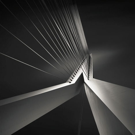
Photo credit: Li Li Wee (course student)

That kind of artistry is in you. Let’s look at how you might begin tapping into it.

STEP ONE: Take More Chances With Your Photography

I mentioned a little of this earlier. You might already have some shots that you would otherwise delete out of hand just because they are blurred or the contrast is screwy. Give those a second look. Maybe there’s something artistic you could do with them. Maybe you could crop them in a creative way.

When you are shooting, try some angles you normally wouldn’t even attempt. For that matter, try shooting some subjects outside of your usual comfort zone. Take a walk down a dark alley (or a woodland trail) and see what you come out with.

Maybe enlist some models you normally wouldn’t have chosen, or stockpile some odd objects and lug them out to quirky locations. In other words: experiment more. Get out of your comfort zone and try something new. Take some chances for your art.

STEP TWO: Throw In Some Blend Modes (and Maybe Some Textures)

It’s surprising how much more interesting an image can become simply by slapping a Curves layer on it (or even simply duplicating the background layer) and assigning that layer a Blend Mode. Give it a try and see.

BlendModes1

BlendModes2

Your best bet is almost always with Multiply or Screen blend modes, or alternately with Overlay, Hard Light, or Soft Light. I recommend memorizing the keyboard short cuts for those so you can toggle through them quickly and pick the best. You might also want to lower the opacity of the layer (or you might want to duplicate that layer with Cmd/Ctrl+J, doubling up the effect, or giving that duplicate layer a different Blend Mode of its own).

You might also want to stick a Layer Mask on there and paint in precisely where you want that effect to show. Every image is different, and layer Blend Modes can create rich results.

I recommend also trying out some textures combined with Blend Modes and Layer Masks. A texture or overlay might be as simple as a photo of a grungy patch of concrete, or it might be a scanned watercolor wash. It could also be an intricately layered piece in and of itself, comprised of scanned swatches of paint, scratched up paper with coffee stains on it, colorized with a Hue/Saturation layer and given a dark vignette. When you decide to explore photo-artistry, you begin collecting a lot of these kinds of textures and overlays.

Texture

But whatever you use, you drop it in over the image and give it a Blend Mode; again, you might tweak the opacity or employ a Layer Mask. Already your image is likely looking more dramatic and artistic. It’s probably a bit “grungy” at this point, and that’s okay. Embrace it. You might already find yourself astonished; discovering something in the image you never quite knew was there until this moment.

STEP THREE: Get More Dramatic With Your Lighting or Experiment With Some Filters

You never know where an image is going to take you. All you can do is try a few things and see if one of them looks especially cool. One approach you may want to try is to slap another Curves layer on top of the image (or Brightness/Contrast if you’re working with Elements) and deliberately darken the entire image. Go back in with the Brush Tool to paint over the Layer Mask at a low opacity and, in essence, paint in the lighting where you want it. Be sure to use a soft-edged round brush at only about 20% opacity, layering your strokes while using black and white and toggling between the two by pressing the “x” key.

Here you are painting in where you want light. But you can do something very similar with any of the effects in the Filter Gallery. Here’s how:

  1. Go to the top layer of your layer stack and execute what has come to be known as “The Move”: Cmd-Option-Shift-E on a Mac (or Ctrl-Alt-Shift-E on a PC) to “merge everything visible” onto its own new layer.
  2. Select the new layer you just created and press Cmd/Ctrl+J to duplicate it.
  3. Run a filter from the Filter Gallery on that layer. Go ahead and try out one or more of the painting filters, but experiment with the others as well, and how they interact. LayerMaskShortcuts
  4. After you apply the filter to your duplicate layer, stick a Layer Mask on it and again use a black or white soft-edge brush at low opacity to paint the effect in or out as you like. Try masking out the effect a bit in the areas of greatest focus, leaving everything on the edges more enhanced. Experiment and see where the image takes you.

STEP FOUR: Go Ahead and Add an Edge Effect and a Signature

Now that you have an interesting artistic image, it’s nice to give it some kind of artsy edge treatment. There are half a dozen ways to do this (you can even pick up OnOne Software specifically built for the task of creating edge effects), but we can leave the pure Photoshop methods for the next tutorial.

You might even want to stick a more artistic signature on the corner of the piece, because you’re likely excited at this point, since you are now looking at a work fit for canvas.

Cat

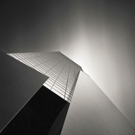
Photo credit: Irene Hofmann (course student)

You took some chances and it paid off. Next time maybe you’ll get even grungier, because by now you’re seeing that “grunge” is just another way of saying “artistic.” Above all else, whatever your tools, and whatever your approach, you are first and foremost, an artist.

For walk through of this process and a better idea of what the course is like, check out this video:

// < ![CDATA[ _evpInit('dHV0b3JpYWwxMjgweDY5MndlYi0xLm1wNA==[evp-f593aa84764ec0c7dba0fa770e9114bc]'); // ]]>

Sebastian Michaels has the course Photoshop Artistry: Fine Art Grunge Composition which is current on sale for 67% off at SnapnDeals.com for a limited time only. Grab it now before the deal is over.

The post 4 Steps to Photoshop Artistry Using Fine Art Grunge Techniques by Sebastian Michaels appeared first on Digital Photography School.


Digital Photography School

 
Comments Off on 4 Steps to Photoshop Artistry Using Fine Art Grunge Techniques

Posted in Photography


Judge strikes down fine against drone photographer

14 Mar

Drone.jpeg

In a court case bound to have far-reaching implications for U.S.-based photographers looking to use drones or other model aircraft for commercial shoots, National Transportation Safety Board Judge Patrick G. Geraghty has stuck down an FAA suit against a photographer for his ‘reckless’ use of a drone. Model aircraft aficionados and photographers alike have reason to celebrate this ruling, though naturally the FAA has announced a decision to appeal. Learn more

News: Digital Photography Review (dpreview.com)

 
Comments Off on Judge strikes down fine against drone photographer

Posted in Uncategorized


6 December 2013 – The Fine Art Photography Business

06 Dec

 The LuLa team has been quite busy on a number of fronts.  Michael as you have seen in our recent video has made his annual trek to Mexico with Chris.  Seems though that Mexico has lost their internet somehwere.  Based on headlines they have been loosing a number of things lately  So, Michael and Chris have very spotty internet and hopefully will be back on line 100% very soon.

It’s always good to switch gears and today our regular contributor Alain Briot has done just that.  We share his essay The Fine Art Photography Business.


The Luminous Landscape – What’s New

 
Comments Off on 6 December 2013 – The Fine Art Photography Business

Posted in News


Fine Art of Architecture: B&W Photography by Joel Tjintjelaar

15 Oct

[ By WebUrbanist in Art & Photography & Video. ]

black white curved facade

Highly refined yet ever-evolving, the work of this photographer started with portraiture, moved through landscapes and seascapes, and has for a time now focused on architecture, capturing even conventional structures in amazing ways.

black white curved buildings

black white tension bridge

WebUrbanist recently asked Joel Tjintjelaar of BWVision more about his history, process and transition from taking photographs to also teaching photography and post-processing techniques. The resulting interview follows below.

black white up angle

black white abstract view

While the results of his recent work may look like a fine stylistic stopping point to some, Joel states: “My workflow has changed gradually over time and will continue to change. It will never stop changing and it should never stop changing. The day I stop evolving is the day I should quit creating images.”

black white vertical

black white historic skyscraper

black white ledge

In part, the evolution of that work is tied to the teaching he does in at workshops in real life and also online via master classes and videos like this one on long exposure workflow.  Teaching, he notes, “forces me to be critical at my own work as well and to try to understand my own photography better, and more importantly: what drives me to create the pictures I [take] …. I teach them that fine art photography is not so much about technical qualities and skills but more about being able to express who you really are in a way that offers a completely new point of view for the viewer and leaves him changed.”

Next Page:
Fine Art Of Architecture Bw Photography By Joel Tjintjelaar

Share on Facebook


[ By WebUrbanist in Art & Photography & Video. ]

[ WebUrbanist | Archives | Galleries | Privacy | TOS ]


WebUrbanist

 
Comments Off on Fine Art of Architecture: B&W Photography by Joel Tjintjelaar

Posted in Creativity


Fine Art Painterly Images From Your Photos

01 Jul

A Guest Post by Alex Morrison

So, you’re thinking about unleashing your inner artist? Good for you! Old school photography can seem a bit limiting sometimes, with all those pesky rules – the rule of thirds, the rules of thumb, sunny 16 rule. Who needs rules! Your creative after all and we creatives are born to break the rules!

Fine art photography is one of those photographic genres that defies rules, bends and breaks them and in the process of doing so the photographer creates art. A bad out of focus image of a flower could become your masterpiece; a mediocre landscape can hang in a gallery! With a little know how, and a creative eye, fine art images are pretty easy to create.

In this article we’ll discover what fine art photographs are, how to develop your own artistic style, and a simple way to process your photos into art images.

But Is It Art?

So what’s the difference exactly, between a fine art image and any other kind of photography? Well, this is where a clear definition gets a little murky.

Here are some general parameters, so we can talk about fine art photography from a common perspective (excuse the pun). Art photography is printed, and hung. (Hopefully in a prominent place!). It can be used in decor, in homes and offices; or “art for art sake” in galleries and exhibitions. Fine art photos are usually presented and sold as limited editions.

Here’s a pretty clear definition I really like, from the Professional Photographers of Canada that covers most of the generally accepted requirements of a fine art image:

Fine art images may consist of unusual images, individual images or a series of images. The range of styles and treatments varies greatly, from the classic black and white scenes to more non-conventional images. In fact, conventional beauty, formal design and familiar subjects are often not components of fine art images and can include painterly effects, soft-focus, journalistic, snapshot type images, bizarre and erotic images and other unconventional approaches.

Fine art images are usually sold to individual collectors, museums and business clients. Photo Decor is usually the term used to designate a print hung to decorate a room, whether in a private home, an institution, a corporate boardroom, a gallery, etc.

All right, now that we know what we are talking about let’s find out about how to create these wondrous and unconventional images. For this discussion we’ll be devoting our exploration to painterly styles and effects – the coolest and easiest techniques to learn! Other fine art photography techniques will be discussed in future articles. So hang tough if your favourite style isn’t included here yet :-) And if you don’t like photographs that look like paintings don’t despair – this is only one way of so many ways you can create fine art photographs.

Finding Your Artistic Style

First, let’s look at classic fine art. I know this seems counter intuitive – how can we break the rules if we’re studying classics – didn’t they define the rules?! Well, yes, but…these historical styles and techniques give us powerful insight into the range of artistic expression that you can build on when considering painterly looks.

449px Flowers in a Crystal Vase Edouard Manet c1882Since I’m a big fan of Sir Isaac Newton’s “..on the shoulders of giants…1″ school of greatness, I believe you achieve success in anything by building on and learning from the achievements of others.

A great place to begin absorbing a fine art point of view is with the old classic paintings, from Goya to the Post-Impressionists, and all schools in between!

I adore works by Claude Monet, and much of my art photography style is of his influence (his picture to the right).

Not to be confused with Claude is Édouard Manet, whose use of colour in his still lifes also moves me deeply.

The great thing is you don’t even have to “study” these works, just look at them and notice the colours, the brush strokes, the compositions, the subject matter.

Are you inspired yet? Ok, here’s another artist for you to investigate, in case you want more examples than just flowers in vases! Look for works JMW Turner an 18th century water colour artist who changed landscape art forever.

He inspired this image of a reflection in a lake.

Rainforesttapestry

The Subject of Your Desires

If your aim is to sell your fine art images as decor, be sure that your subject matter is something most people would want in their homes or offices. Think about the context. Ugly doesn’t sell – no matter how artistically it is portrayed. But beauty generally does. Artistic treatments of flowers, landscapes, still lifes, abstracts and impressionistic figure studies are safe bets as subject matter. They seem to be almost universally accepted.

One of my most acclaimed art images – won several major awards – and one that everyone absolutely loves is “the Devils’ in the Details.” Someone loved it so much they bought it, but returned it to the gallery a week later because once they got it on the wall – it was just too freaky and disturbing!

Devilsinthedetails
?
If you plan on selling to collectors then usually any subject is fair game – some lesser known van Gogh paintings were of old shoes. Who knew!

But it’s YOUR creative interpretation and treatment of these subjects, whatever they may be, that creates the WOW factor. And it is here in your treatment and interpretation that you can break all the rules!

Viewing the works of artists who have gone before will expand your imagination and get your creative consciousness flowing for styles, subjects and different and unique ways to portray them. Once you have your image captured, you can then create a wild assortment of artistic and painterly effects in your post production processing…which is coming right up!

Creating Painterly Techniques in Post Production

One of the most flexible and fun ways to give your images a painterly fine art quality is to use overlays, underlays and textures, which you add in post production. As long as your favourite image editor supports layers and blending modes you’re good to go. If you get really expert you may even want to make your own textures and under/overlays to take full control of your final image. You’ll be rocking epic fine art photography.

Back in 2006 I was playing with a program called Corel Painter – it is a painting program where you can create all sorts of paint effects in a digital way. I had created an image in Painter using an oil paint “brush” and the texture and some subtle colours. Just our of curiosity I layered this image on top of a landscape and wow! the brush strokes came through in a most enchanting way – and so my own form of painterly fine art overlays were born! I use these a lot and make new ones as needed. But you don’t have to go to all that work – often using random images you have in your folders can be just as useful, as we will soon see.

Achieving a painterly affect in a photograph requires two main components in post production, usually a texture to emulate canvas, cloth, or some other base media; and at least one other texture or overlay to give it the image the look of something other than a straight-up photo – something like a painting! Depending on your initial image you may not have to use both these types of textures. In fact because there are no rules here you can stack multiple layers in a variety of combinations to achieve stunning images.

“Winter Garden” started out as this. A fine mess of dead and withered grasses in my garden in January!
?
Wintergardenbefore

And it was transformed to this, and went on to win several national and provincial awards for Fine Art photography:

Wintergardenafter
?

And now finally – How do I do this?

First, take a stroll around the Internet and look for free textures. Not textures of wooden boards and bricks though – look for cloth and fabric textures. Also look for textures of brush strokes or that have a very fine pattern like rust, old concrete. Other photos that are out of focus, or that have primarily one colour or pattern such as frost or rain drops on a window also work particularly well.

If you’re not inclined to go on a treasure hunt right now, I’ve created source files for you! Here are the files I used for Winter Garden, to get you started!

(downloads) (warning: this is an 18MB download and will give you a zip file with a PSD file and some JPGs).

The idea is to underlay and overlay these textures and images with your base image using blending modes and opacity to alter the way the textures interact with the base image. Ready to get started?

The Process of Post Processing

In Photoshop or your image editor, open your main photograph – your base image – in this case if you’re using my source files, Image 0852. Double click on the Background layer in the layers panel to make your Background layer editable. It will be called Layer 0. Set its blending mode to Soft light.

Then go to File>Place and select the image 0853.jpg. Stretch it to fit if needed. This will become Layer 1 Change the blending mode to Hard Light.

Duplicate this layer, and set the blending mode to Luminosity, and change the opacity to 20%. Flip the layer horizontally by going to Edit>Transform> Flip horizontal.

Almost there! Now place Image 0775, this is a photo of frost that I am using as a texture and colour overlay – stretch to fit if needed, and then set the blending mode to color, and opacity to 49%.

Now we’re going to create the UNDERLAYS! These are layers that we will add UNDER Layer 0. How exciting!

So… place image 0870, and drag the layer to be immediately under Layer 0. Set Layer 0 to Soft Light.

Set your underlay layer to 53% opacity.

And finally we will add our last underlay layer by placing the texture, Image 0809. Well add this in 2 places, but first place it as we have done with the others, and move it to be the bottom-most layer in your stack. It will be Normal and 100%.

Now duplicate this layer (CTRL J) and drag the copy to be the top-most layer in your stack. Set it to soft light and 42%.

At this point you should save your file as a layered image. What do you think? Quite painterly, no?

Want to adjust some more? Awesome! You can now play with these layers, the order, the opacities, the blending modes and even adjusting hue and saturation of individual layers to suit your own style and your interpretation of withered grasses in the winter. You can add other textures you may have on hand or that you’ve found online.

With a few simple images, some inspiration from the Masters, and your own imagination, free from rules and constraints, you’ll be making fine art images in no time!

Screenshot

Alex is a professional fine art and nature photographer, accredited by The Professional Photographers of Canada, and was Canadian Photographic Artist of the Year in 2009. In 2012 and 2011 she was selected Manitoba Photographic Artist of the Year. She teaches photography, runs workshops and online classes on fine art and nature photography, infrared photography and iphone photography. Her educational website with photography tips and tricks is at www.nature-photography-central.com. Her art photography portfolio is www.alexandra-morrison.com. Connect with Alex on Facebook, Pinterest and Google+.

Post originally from: Digital Photography Tips.

Check out our more Photography Tips at Photography Tips for Beginners, Portrait Photography Tips and Wedding Photography Tips.

Fine Art Painterly Images From Your Photos


Digital Photography School

 
Comments Off on Fine Art Painterly Images From Your Photos

Posted in Photography


Unauthorized Installations: The Fine Art of Urban Subversion

19 Jun

[ By WebUrbanist in Art & Street Art & Graffiti. ]

street art brad downey

Brad Downey is familiar with both sides of the art world, with a fine arts degree and gallery exhibitions, on the one hand, and run-ins with the authorities about his sometimes-unsanctioned street art on the other.

street sidewalk ripped up

His work is harder to describe that it is to simply see, since it is often in the most public places you could imagine (or documented via extensive photography) – erupting from sidewalks, disrupting bicycle lanes or literally ripping up cobbled streets

street art object manipulations

Per the pictures, sometimes these installations transpose ideas and objects from other contexts, but they also frequently warp existing everyday objects like bicycles, cars, signs, benches, shopping carts and garbage cans.

street alley art wedging

Sometimes he works alone – sometimes collaboratively. Some of his pieces are stand-alones and one-offs while others form sets, like Wedging (shown above), which is a series of experiments of balance and obstruction in alleys with ordinary household items.

street art impossible bicycles

He has had run-ins with police while working in cities ranging from London to Amsterdam, on both art and guerrilla marketing projects performed in that gray area of public and possible vandalism.

Share on Facebook


[ By WebUrbanist in Art & Street Art & Graffiti. ]

[ WebUrbanist | Archives | Galleries | Privacy | TOS ]


WebUrbanist

 
Comments Off on Unauthorized Installations: The Fine Art of Urban Subversion

Posted in Creativity


11 Core Principles To Help You Win An International Fine Art Photography Award

11 Apr

Have you ever won a photography competition? The answer, for most of us, is no. As with the lottery, we always enter with hope, but the reality is that the winners’ circle is a pretty exclusive club. Why do we enter? Because we want to have our work seen by a wider audience. (Cash prizes and opportunities for exhibition are Continue Reading

The post 11 Core Principles To Help You Win An International Fine Art Photography Award appeared first on Photodoto.


Photodoto

 
Comments Off on 11 Core Principles To Help You Win An International Fine Art Photography Award

Posted in Photography


Fine Tune Your Exposures With Spot Metering

09 Apr

The metering systems of today’s digital cameras are light years beyond cameras of just 10 to 15 years ago. What this means is that in many situations, the camera’s meter, left to its own devices, is going to do an excellent job at getting a good exposure. While evaluative (or matrix) metering and center-weighted average metering take into account the entire scene, albeit in different ways, spot metering mode provides a tool for metering only the part of the scene you as the photographer consider most important.

I used spot metering on this image  due to the sun setting over her shoulder, making the sun and sand exceptionally bright behind her. By metering on the model's shoulder, I was able to maintain detail in the shadow areas, without hurting the drama of the lighting.

I used spot metering on this image due to the sun setting over her shoulder, making the sun and sand exceptionally bright behind her. By metering on the model’s shoulder, I was able to maintain detail in the shadow areas, without hurting the drama of the lighting.

Spot metering is especially helpful when the subject is much brighter or darker than the background, and the subject does not make up a majority of the image.   Most cameras, when set to spot metering, are set to measure an area of the image as small as 1.5% of the total image area.  This varies from camera to camera, so check your manual for the exact specification.  In addition, while most consumer cameras use the center of the image for spot metering, usually defined by a circle in the viewfinder, others allow for tying spot metering to the active AF point, which then ties your choice of focus point to the meter.

When I saw this shot I immediately knew what I wanted.  I did not want to completely lose the detail in the dress, but I did want a near-silhouette effect to add to the mood of the image.  Using the spot meter, I metered off the sky, and then dialed in +1/3 of exposure compensation to bring back some dress detail.

When I saw this shot I immediately knew what I wanted. I did not want to completely lose the detail in the dress, but I did want a near-silhouette effect to add to the mood of the image. Using the spot meter, I metered off the sky, and then dialed in +1/3 of exposure compensation to bring back some dress detail.

Generally, if you’re spot metering, and your camera’s spot meter is at the center of the image area, you will have to use Exposure Lock as well. This is because if the meter only works at the center of the image, and the area you’re metering is NOT the center of the image, you will need to recompose after metering.  Exposure Lock ensures that your exposure is locked in once you have metered the scene, before you recompose the shot. Exposure lock is generally activated by pressing a button on your camera while metering.  It will then hold the exposure you locked in, at least until you release the shutter button.  Some cameras will hold the metered reading until you deactivate Exposure Lock. On Canon cameras, Exposure Lock is achieved by pressing the (*) button.  On Nikons, exposure can be locked by pressing AE-L.

When you’re dealing with a high contrast situation, such as a bright background with a dimly lit subject, or a dark background with a brightly lit subject, switching your metering mode to Spot Metering can be an easy way of ensuring that your exposure is exactly where you want it.

I was shooting the sunrise on Cadillac Mountain in Acadia National Park when I spied this couple sitting on a rock.  I moved around behind them, and spot-metered on the sky. Because the meter tries to make the metered area a mid-tone, I knew it would silhouette my subjects perfectly.

I was shooting the sunrise on Cadillac Mountain in Acadia National Park when I spied this couple sitting on a rock. I moved around behind them, and spot-metered on the sky. Because the meter tries to make the metered area a mid-tone, I knew it would silhouette my subjects perfectly.

Post originally from: Digital Photography Tips.

Check out our more Photography Tips at Photography Tips for Beginners, Portrait Photography Tips and Wedding Photography Tips.

Fine Tune Your Exposures With Spot Metering


Digital Photography School

 
Comments Off on Fine Tune Your Exposures With Spot Metering

Posted in Photography


How To: Easily Fine Tune Your Flash Right From the Camera

18 Feb

Strobist reader (and relative lighting newb) Ron Ibarra of New York City asks, via Twitter:

"I can't control the flash through the PC cord. Am I doing something wrong?"

Nope, Ron, you are not. A PC cord is what we call a "dumb sync," meaning it only triggers the flash but does not otherwise control it. And if you are a smart photographer, all you really need is a dumb sync.

That's because you can control everything right from the camera itself. And today's follow-the-bouncing-ball post will show you the super-easy way to do just that.

Read more »
Strobist

 
Comments Off on How To: Easily Fine Tune Your Flash Right From the Camera

Posted in Photography


The Barber Institute of Fine Arts – coat of arms

01 Jan

Check out these visual art images:

The Barber Institute of Fine Arts – coat of arms
visual art
Image by ell brown
This is the The Barber Institute of Fine Arts building on the University of Birmingham main campus.

It is listed currently as being on University Road, and no longer Edgbaston Park Road (I would assume that University Road is the road that goes from Edgbaston Park Road into the University grounds proper).

It is a Grade II listed building built between 1935 and 1939, designed by architect Robert Atkinson.

It is an art gallery and concert hall, and is an Art Deco building. It was opened by Queen Mary.

1935 completed 1939, architect Robert Atkinson. Sophisticated design marrying
elements of traditional institutional classicism with Dudok inspired stone
dressed brick modern. A 2 storey compact block with shallow full height portal
wing to right hand of front. Ashlar faced ground floor and blind lst floor of
brick with flat coped roofline. The horizontal emphasis of the strip
fenestration of the ground floor is suavely combined with the vertical accent of
the slightly battered portal. The latter is complemented in small scale by
ashlar panels carved with symbols of the Arts on the first floor and reflected
by the visual stop of the larger panel at the end of return east elevation.
The banding and strip fenestration of the front follows round on to the side and
rear elevations giving a crisp linear definition to the design.

The Barber Institute of Fine Arts – Heritage Gateway

Coat of arms on the Barber Institute.

|FAT| 2012 – Fashion Art Toronto – Pictures from the Launch Party Art Show
visual art
Image by Jason Hargrove
Members of the Internet Media may use these photos with attribution to Jason Hargrove. Commercial licenses are available for purchase ? contact@jasonhargrove.com

+

|FAT| Arts & Fashion Week is a platform for inventive, pioneering and contemporary expression. This annual multi-arts event features 200 national and international fashion designers, visual artists, bands and performers each year. The festival delivers a packed schedule of runway shows, live performances, music, photography exhibits, video screenings and installation exhibits, to celebrate leaders in a wide range of art forms. Held every April, the event welcomes 5,000 people including stylists, buyers, curators, critics, members of the media, the arts, music and fashion related industry as well as the general public.

| FAT | Arts & Fashion Week has a mandate of showcasing artistic disciplines rooted in fashion and their exploration of clothing and the body in today’s time. The festival emphasizes this mandate through the showcase of fashion design, photography, installation, film, video, performance, music and dance, in an effort to push forward and redefine our perception of the fashion phenomenon.

fashionarttoronto.ca
twitter.com/FAToronto

+

Photography by Jason Hargrove

jasonhargrove.com
twitter.com/jasonhargrove

 
Comments Off on The Barber Institute of Fine Arts – coat of arms

Posted in Photographs