RSS
 

Posts Tagged ‘Explained’

Image Size and Resolution Explained for Print and Onscreen

17 Sep

One of the most confusing things for a new photographer is understanding image size, resolution, and printing. I’ll try and explain what these things mean, and how to make the best choices depending on what you want to do with your photos.

Megapixels and photo size

Find information about a photo using File > File Info

As a photographer you will already have confronted the term megapixel when you first purchased your camera. While technically a megapixel is equal to 1,048,576 pixels, in reality, camera manufacturers round this number to 1,000,000 when stating how large an image the camera will capture.

So, my camera, for example, is stated to capture 14.6 megapixel images which is around 14,600,000 pixels per image (14.6 x 1,000,000). This information tells you nothing about the actual pixel dimensions of the image – it only tells you the total number of pixels that comprise the image.

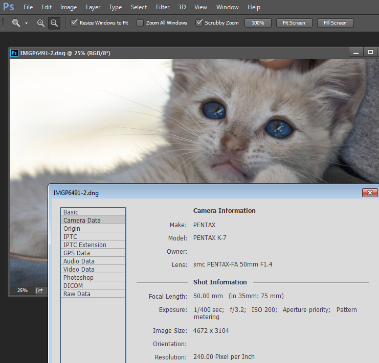
My camera, like most dSLRs, captures images with an aspect ratio of 1.5. So the ratio comparing the number of pixels along the long edge of the image, to the short edge is 3:2. Each full size raw image is 4672 x 3104 pixels in dimension. So, by multiplying the number of pixels along the width by those of the height (4672 x 3104 = 14,501,888) we get the actual number of pixels in the image. You and I might call this 14.5 MP but the camera manufacturer rounds this up and calls it a 14.6 MP camera.

You can check the width and height of an image using your photo editing software. In Photoshop, with the image open, choose File > File Info > Camera Data. The image above shows this information dialogue box.

A pixel itself is a single picture element, and for our purposes it’s the smallest element that your photo can be divided into. A pixel can be only one color, and a photograph is made up of a grid of thousands of pixels, each of varying colors that together make up your image. You can see these pixels if you open a photo inside a photo editing program and zoom in until you see single blocks of color (like below). Each of these is a pixel.

An image of pixels in a photo

Why size is important when printing

When you’re printing an image you may encounter the term ppi or pixels per inch. Most printing services, and indeed your own printer, will require a certain density of pixels in the image (ppi) to be able to render an print that looks good, with smooth color transitions so you can’t see each individual pixel. Typical printing ppi values range from 150 to 300 ppi, although some high-end magazines may require images which are 1200 ppi.

So, for example, if you want to print an image 4 x 6 inches at 300 ppi, then you need a file that has at least 4 x 300 (1200) pixels along its short side and 6 x 300 (1800) pixels on the long side. So, it needs to be at least 1200 x 1800 pixels in size.

To print an 8 x 10 inches at 300 ppi use the same math – multiply the printed image width and height in inches each by 300 pixels. The result is 2,400 x 3,000 pixels, which is the size image you need to print an 8 x 10 at 300 ppi.

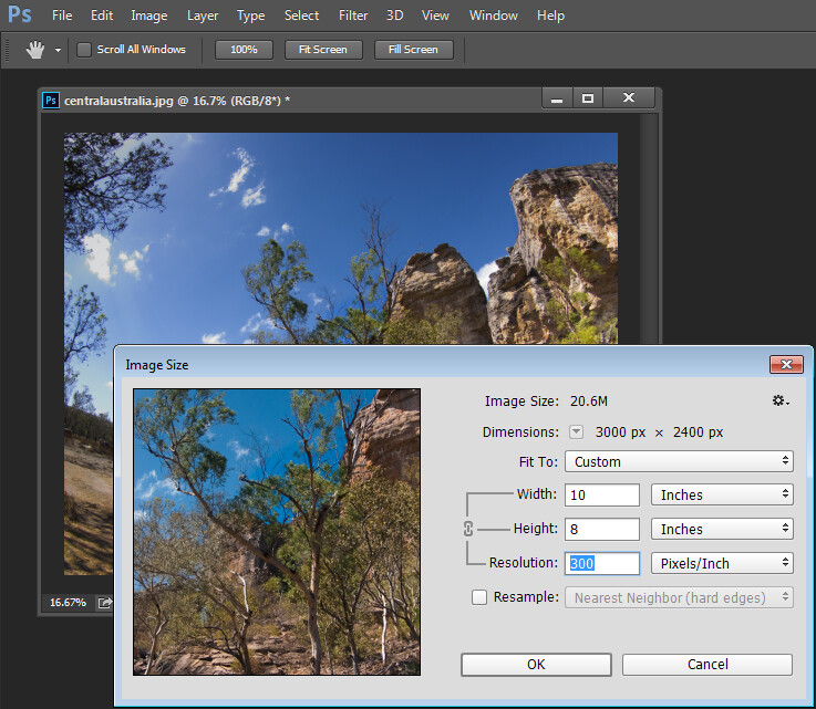
When cropping and sizing an image for printing, you’ll need to know what ppi the image should be – your printer manual or the printing service should be able to tell you this. This is a screenshot from the MpixPro.com website showing their Optimal and Minimum image sizes for standard print sizes. Their printer outputs at 250 ppi (but can handle 100 ppi images) – other services may differ – so always check before preparing your images:

Print size required for MpixPro printing

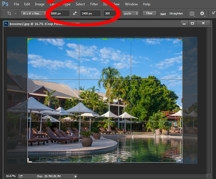
Use the crop or resize feature in your software to size the image to the desired width and height, and the ppi resolution. Here an image cropped to a size of 3000 x 2400 pixels is being adjusted from 72 ppi to 300 ppi in preparation for printing at 300 ppi. There is no resampling required as the image is already the correct dimension and only the resolution requires adjusting.

Adjusting resolution in a photo without resampling it

Photoshop, like other applications, will also crop an image to a fixed size and resolution if you type these value into the tool options bar when you have the Crop tool selected (see below). If your image is smaller than the typed dimensions then the image will be enlarged using the default resampling method as it is cropped. While it isn’t generally advisable to enlarge images – provided the image is already close in size to the desired size, enlarging it a little bit generally won’t cause a noticeable loss of quality.

Crop an image in Photoshop setting size and resolution

Sizing for screen

When it comes to displaying images on the screen you need far less pixels than you do for printing. This is because the density of pixels on the screen is far less than what is required for printing. So, for example a typical monitor is 1920 by 1080 pixels in size so, to fill the monitor you only need an image that is 1920 by 1080 pixels in size. That’s about the same size image you need for a 4 x 6 print at 300 ppi, yet this size image displays perfectly on a 23 inch diagonal monitor.

googletag.cmd.push(function() {
tablet_slots.push( googletag.defineSlot( “/1005424/_dPSv4_tab-all-article-bottom_(300×250)”, [300, 250], “pb-ad-78623” ).addService( googletag.pubads() ) ); } );

googletag.cmd.push(function() {
mobile_slots.push( googletag.defineSlot( “/1005424/_dPSv4_mob-all-article-bottom_(300×250)”, [300, 250], “pb-ad-78158” ).addService( googletag.pubads() ) ); } );

The post Image Size and Resolution Explained for Print and Onscreen by Helen Bradley appeared first on Digital Photography School.


Digital Photography School

 
Comments Off on Image Size and Resolution Explained for Print and Onscreen

Posted in Photography


6 Commonly Used and Confused Tools in Photoshop Explained

11 Aug

There are lots of tools in Photoshop that are sometimes a bit confusing due to the similar nature of their functionality. With subtle differences, these tools have been a topic of confusion between a lot of Photoshop enthusiasts. In this article I am going to share a distinction between Fill and Opacity, the Healing brush and Stamp tool, and “Merge Visible” and “Flatten image”. I hope it will help you one understand these tool a little better.

Distinction

Fill versus Opacity

Both Fill and Opacity control the transparency of a layer. They work exactly same except for the layer styles. When you reduce the percentage of opacity the layer starts to get transparent and at 0 % the layer is completely invisible, even if layer styles likes drop shadow, stroke, inner glow etc., are applied. Where as, if you reduce the fill, the layer starts to get transparent, but layer style stay the same. Keeping it simpler:

Opacity = Takes away both layer content + layer style

Fill= Takes away only layer content – but leaves the layer style as it is

Additionally there are eight blending modes that react differently with Fill and Opacity. These are called special eight groups. These 8 blending modes are Color Burn, Linear Burn, Color Dodge, Linear Dodge, Vivid Light, Linear Light, Hard Mix, and Difference. When these blending modes are applied, the 50% Fill will have different effect than 50% Opacity.

The below images should help you understand the concept better.

Opactiy 100 fill 100

I added text and then applied two layer effects, outer glow and a drop shadow. Opacity and Fill both are both at 100%

Opacity 3 fill 100

Now I have reduced the opacity to 3 percent, you can see the layer is almost invisible. If I reduce the percent to 0%, the layer would be completely invisible.

Fill 0 opacity 100

Now, I have changed the Opacity back to 100% and reduced the Fill to 0%. You will see, the layer content became transparent, but the layer style remains the same.

Healing Brush versus the Stamp Tool

Healing brush captures the texture of the area you sampled and blends with the color tone of the area you are painting. Another option: Spot-healing brush is more like content aware. It analyzes the texture around the brush and fills in the center, blending with the color tone.

Stamp tool is more like a copy and paste. It copies the area you sampled and pastes over the area you are healing.

So when is each tool will be most appropriate to use?

I mostly use the Healing Brush whenever I have to remove the blemishes of the skin, remove the mark or any texture (pimples, wrinkles) but like to have the same natural skin color tone. This helps my image remain evenly colored.

I use Stamp tool, when I want to remove something from image. For example, if I want to remove the hanging clock on the wall, light bulb or anything whose both texture and color both need to be removed.

Below is an immage of skin with blemishes. I used Healing Brush to remove the pimple by sampling a clean area and painting over the blemish.

Pimple2 copy

Here in the image below I have used the Stamp Tool to remove the helicopter. This is the after and before version of an image.

Compositional balance

Merge Visible versus Flatten Image

This is a very simple technique we regularly use whenever we work in layers, but a lot of photographers are still confused about the distinction between these two options. If you are working with multiples layers and apply Merge Visible, only layers will be merged which are visible or with eye icon turned onon. Where as Flatten Image merges all layers together, discarding the invisible layers.

The images below should help you understand better:

3 layer with one hidden

I created three layers with only two currently visible (blue and red)

Merge visible

Apply Merge Visible by going to: Layer> Merge Visible

Merge visible applied

You can see that only the visible layers have been merged, leaving the hidden layer alone. Now we will apply Flatten Image.

Flatten image

If there are any hidden layers when you apply Flatten Image, you will get this dialog box:

Discard hidden image

Now if I click OK in the dialog box, the hidden layer will be deleted and all visible layers will be merged like this:

Flattened image applied

Have you used these tools before? If you’ve had some confusion over the subtle differences I hope that has helped clear that up. Please share if have any questions or comments on these tools.

For more Photoshop tips and tutorials see here.

The post 6 Commonly Used and Confused Tools in Photoshop Explained by Anup Ghimire appeared first on Digital Photography School.


Digital Photography School

 
Comments Off on 6 Commonly Used and Confused Tools in Photoshop Explained

Posted in Photography


The Camera Histogram Explained

13 Jul

This video does a great job of explaining how the histogram on your camera works and how to read it.

I do slightly disagree with his tip on having a mountain in the center is the best option, as it does depend on the subject. If you are photographing a black cat on a black sofa that would be an incorrect overexposed image.

For more info on histograms check these dPS articles:

  • Histograms: Your Guide To Proper Exposure
  • How to Read and Use Histograms
  • Understanding Histograms

The post The Camera Histogram Explained by Darlene Hildebrandt appeared first on Digital Photography School.


Digital Photography School

 
Comments Off on The Camera Histogram Explained

Posted in Photography


Lightroom’s Tone Curve Explained

12 Sep

It’s no secret that there are many ways to enhance our photographs with Lightroom. By using just a handful of sliders we can get some great results in a matter of minutes and by learning how to use tools like the gradient filter tool we can create some more specialized effects with just a little extra effort.

So with all these great tools is there still a need for the Tone Curve tool in Lightroom 4 and beyond? Or is it just another way of creating the same effects?

What is Lightroom’s Tone Curve Tool?

tonecurve

Well the answer to that question really lies in the details of what you are trying to accomplish with your post production. The Tone Curve tool is designed to allow you to modify the various light levels found within an image in a way that will give you greater control over the tonal range and contrast of your photograph.

As we capture our images we are capturing an array of light from the scene. From the darkest of the shadows to the whitest of the highlights the Tone Curve gives us a way of visually modifying how these levels of lights appear in the final image.

With the changes made to the basic tab back in Lightroom 4 the Tone Curve tool certainly doesn’t boast the power that it once did in comparison, but that doesn’t mean it’s useless. Today I’m going to show you how you can use the tool to modify your images and squeeze every little bit you can out of the tonal range that you’ve captured. As I’ve numbered above there are five ways that we can modify our images using the tool – let’s break them down now.

Number 1 – Make Tone Curve Adjustments by Dragging In Your Photo

I honestly didn’t even notice this button until I started doing research for this article, but it does add a cool little function to the Tone Curve. By clicking on this button your mouse cursor will change allowing you to click and drag within your photo to make adjustments.

As you hover over your image you will notice that a point appears on the Tone Curve in the box to the right. As you move your mouse this point will move according to the light level of the area you are hovering over which makes it easy for you to determine what levels of light need adjustment in your image.

To use this tool simply click and drag up for more or down for less effect of the selected light level. It is important to note that this is a global change so it doesn’t just effect the area where you’re hovering, but all like pixels within the image.

You’ll notice in the image below I dragged down on an area in the green algae and up on a highlight on the frog’s face. The result is more contrast in the final image. Please keep in mind that the examples in this article are extremes done to demonstrate the tool and not necessarily how you would use it in practice.

image1

Number 2 – Adjust Tone Curve by adjusting the curve itself

The Tone Curve itself is something that you can modify simply by clicking and dragging on the areas you wish to change. As you hover over the curve you’ll notice different pieces of the curve will be highlighted to show you what levels of light you are going to effect with your changes and how much room you have to make these changes.

In this photo I added a little more contrast by dropping a point towards the shadows end of the curve and raising a point towards the highlights end of the curve. This can be done in a similar manner with the sliders below the curve (see number 4 for that example).

image2

Number 3 – Adjust the strength of each light level’s region

With this area of the tool we’re controlling the amount that each ‘region’ of light (highlights, lights, darks and shadows) effects the image.

The default settings (which are set in the modified image of #2 on this list) are set at 25, 50, 75 for the three sliders. In the first image below I’ve slid all three sliders to the right (an extreme example I know) which gives the shadow tones a greater impact over the overall photo. In contrast to this, the second image I’ve slid the sliders to the left which as you might expect gives the highlights within the image  more impact. In most cases I never touch the default settings, but they are good to be made aware of and might be useful one day when processing a specific image.

image3

Number 4 – Adjust using the familiar slider set up

Much like the sliders from the basic panel the sliders in the Tone Curve work in a similar manner. Slide left to lower a setting, slide right to raise a setting, double click to reset to zero.

It’s very straight forward and is important to note that it doesn’t do anything different than the other two methods I mentioned above. In fact you’ll notice that when you make any adjustments whether using #1, #2 or #4 the sliders and the tone curve will move to their respective positions regardless of which method you use to make your adjustments.

image4

Number 5 – The Point Curve Presets

Today we are going to only be talking about the three presets of the point curve and save the button in the lower right corner for another day – the presets are as follows – Linear, Medium Contrast and Strong Contrast and as you might expect the names pretty much say it all.

Linear contrast is a default and fairly flat setting and when using this setting you’ll notice that the curve is a straight line from the lower left corner to the top right corner. Medium and Strong contrast presets effect the ends of the curve in either a subtle way or a less subtle way changing the amount of contrast that is applied to the image simply by expanding the ranges of light at the ends of the curve.

In the example below I’ve simply switched from a Linear Curve to a Strong Contrast Curve to show the differences.

image5

When Would You Use the Tone Curve?

So now that we know how to use the tool, the question remains, when would you use it? I find that in my typical workflow I rarely touch the Tone Curve except for a small tweak here or a slight adjustment there. In my eyes the tool is designed to be a final adjustment to your images. Need a little extra shadow detail? Pull them down just a hair. Need some stronger highlights? Pull up on the highlights slider just a bit.

Of course you can get really creative with the Tone Curve to create some very unique and interesting effects and you can even click on the button that I didn’t cover above in the lower right hand corner and have access to the RGB scale and not only modify the overall tonal range, but the range specific to each color level in your photograph – but that’s an entirely different article.

Do You Use The Tone Curve?

With all the power that Lightroom offers in the other areas of it’s program it’s very easy to overlook the tone curve, I know I did for years, and even today I don’t go much further than applying one of the preset point curves to a photo, but I’d love to hear if you use it in your regular workflow and if so which one of the region adjustments do you use most often?

Post originally from: Digital Photography Tips.

Check out our more Photography Tips at Photography Tips for Beginners, Portrait Photography Tips and Wedding Photography Tips.

Lightroom’s Tone Curve Explained


Digital Photography School

 
Comments Off on Lightroom’s Tone Curve Explained

Posted in Photography


Getting off Auto – Manual, Aperture and Shutter Priority modes explained

04 Apr

Macro image of a digital camera's controls set on autoYou may have heard that once you get a DSLR you need to learn to shoot in manual and only ever use that mode. That if you are using the Aperture or Shutter Priority you’re cheating and if you want to be more like a pro you have to shoot in Manual only, all the time. To that I say “horse pucky”! (if you’re old enough to remember M.A.S.H. you’ll get that reference).

What you’ll learn from this article:

  • what each of the A (Av), S (Tv) and M modes are, a definition of each
  • what types of situations I would choose each of them and why
  • some advantages of A (Av) and S (Tv) over manual
  • some advantages of Manual and when it’s the only choice
  • some things to look out for

The three manual shooting modes what are they?

  1. Manual mode: this mode puts you in full control of the three settings on your camera that control the exposure (commonly known as the exposure triangle).  ISO, aperture and shutter speed. In manual you will be making all of those choices.
  2. Aperture priority:  (A on Nikon, Av on Canon) this mode has you in control of two of the three exposure controls:  ISO and aperture.  The camera will select an appropriate shutter speed to give you a correct exposure.
  3. Shutter priority: (S on Nikon, Tv on Canon) this mode once again puts you in control of two of the three exposure settings, this time it is ISO and shutter speed.  The camera will select the aperture for a correct exposure.

There are of course other factors involved that will affect the exposure such as what Metering Mode you’re using and Exposure Compensation. More on the latter later.

Shot in Aperture mode to control Depth of Field

Shot in Aperture mode to control Depth of Field

How do you decide which mode to use?

I actually use the Aperture and Shutter priority modes more often than I use Manual. How I decide which mode to use is based on my subject matter and what is my goal of the image as follows:

  • I choose Aperture Mode when I want to control depth of field (DoF) as my top priority.  Such as to create shallow DoF for a portrait, people photos, or any time I want a blurred background (choose a large aperture like f2.8 or f1.8). That also applies if I want a larger DoF as well such as for a landscape photo, group portraits, or shots where I want maximum detail and sharpness (choose a smaller aperture like f11 or smaller)
  • I choose Shutter Mode when my top priority is controlling motion, either freezing or blurry it. So freezing for subjects like sports or action and I will choose a faster shutter speed such as 1/500th or faster depending on the subject. Subjects like flowing water, waterfalls, or panning a moving subject I will select a slower shutter speed like 1/15th for panning and 2-5 seconds for flowing water. (for more on this topic read my article Using Shutter Speed to Freeze or Blur Motion)
  • I switch to Manual Mode in a few specific instances: doing a portrait where the subject is not moving; night photography; pretty much any time I’m using a tripod; doing HDR bracketed exposures (even though my camera does 7 on AEB I still use Manual when on tripod); when using studio lighting; certain times when using a speedlight (such as working in a dark room and I want to maintain some ambient light levels)

Here’s some example images taken with each of the modes as explained above.

Shot in Aperture mode to control Depth of Field

Shot in Aperture mode to control Depth of Field

Shot using Shutter Priority to use a panning technique and slow shutter speed

Shot using Shutter Priority to use a panning technique and slow shutter speed

Shot in manual mode for night photography challenges

Shot in manual mode for night photography challenges

Things to watch out for and keep in mind

ISO: remember that when you select either A or S mode you are still choosing the ISO
I usually select my ISO first, based on the lighting conditions I’m shooting in.  If it’s bright sunlight I go to 100 or 200.  If it’s subdued light, shade or overcast I might bump it up to 400. For indoors or dimly lit rooms I may go to 800 or higher up to 3200 if necessary (you need to test to know the upper limits of your ISO and where you’re comfortable shooting with your camera, mine will yield pretty decent results even at 6400 and beyond).How I know I’ve gone high enough with the ISO, is if I have a fast enough shutter speed to eliminate camera shake when hand holding.  If I’m on a tripod, I’m usually shooting a ISO 100 or 200 because I can use any shutter speed safely.

Check your shutter speed when in A mode
Just because the camera is picking the shutter speed does not mean it will give you a nice sharp image. Yes it will choose a shutter speed to give you the correct exposure, but if you set up your camera for ISO 100 at f16 in dark room you’ll wind up with a pretty slow shutter speed like 1/2 of a second perhaps, and without a tripod you’ll get blur from camera shake.So keep your eye on the shutter speed the camera is picking and if it is too slow (I suggest you follow the 1/focal length rule for minimum shutter speed – for more on getting sharp images read my article 5 tips for Getting Sharper Images) readjust the ISO, the aperture or both – picking a higher ISO will help, so will choosing a larger aperture like f4 as that will let the camera pick a faster corresponding shutter speed.

Multiple bracketed exposures using Manual for HDR processing

Multiple bracketed exposures using Manual for HDR processing taken during my Drumheller Workshop

Watch for exposure warning notices in A or S modes
Your camera is pretty smart but it can only work within its own limitations. So it will tell you if you’ve gone outside that boundaries of what it can adjust for you.  This will show up as a flashing warning in your viewfinder. I’ll give you an example for both Aperture and Shutter modes.

Scenario #1 in Aperture mode if you choose say ISO 800, F1.8 on a bright sunny day the camera will tell you there is simply too much light and give you a flashing shutter speed (your fastest) like 1/4000th of a second.  If you take the photo it will be overexposed which is what the camera is warning you above.  Choose a lower ISO or smaller aperture and try again until the warning is gone.

Scenario #2 in shutter mode in a darkened room with settings of ISO 400 and 1/1000th of a second you will likely get a flashing aperture shown in your viewfinder (the largest your lens goes to such as f3.5 or f5.6).  To correct this you need to choose a slower shutter speed and likely a larger ISO as well until that warning disappears.Side note: this is why kit lenses with a maximum aperture zoomed in of f5.6 become somewhat limiting. Grab yourself a simple 50mm f1.8 for low light conditions, it’s an inexpensive great lens to have in your bag

Painting with Light during night photography on my Drumheller workshop

Painting with Light during night photography on my Drumheller workshop

Exposure compensation in Manual
There is often confusion among students about using Exposure Compensation when in Manual mode.  This behaves differently depending in the camera you have, in Canons for example it just doesn’t apply, as it is has no affect. When using a Nikon if you shift the Exposure Compensation to say +2 what it does it adjusts the scale you see in your viewfinder to reflect that so if you then set the exposure to match the “0″ mark it will give you a +2 exposure. I’d personally find that even more confusing, so if you want +2 just set your exposure in Manual so that it shows +2 on the scale.

Summary

Steps I use are these:  

  1. choose ISO first
  2. decide whether motion or depth of field are most important and choose my shooting mode
  3. set my shutter speed or aperture for the results I want
  4. check for warnings and slow shutter speeds
  5. review image and correct as necessary

Tell me what you do and if you find this information helpful.

Post originally from: Digital Photography Tips.

Check out our more Photography Tips at Photography Tips for Beginners, Portrait Photography Tips and Wedding Photography Tips.

Getting off Auto – Manual, Aperture and Shutter Priority modes explained


Digital Photography School

 
Comments Off on Getting off Auto – Manual, Aperture and Shutter Priority modes explained

Posted in Photography


Diablo 3 Beta – Wizard – Follower Explained in Danish

20 Jan

Diablo 3 Beta – Wizard – Follower Explained in Danish. Have a look at our site at www.diablo3x.dk


15 December, 2012 – DxOMark Camera Sensor Explained

15 Dec

One of the most quoted camera metrics these days is DxOMark Camera Sensor, a number and indeed a series of numbers for quantifying camera sensor performance. But many people don’t really understand what the numbers signify.

With his second essay on the subject to appear on this site Peter van den Hammer gives us an in-depth look at how to interpret what DxOMark Camera Sensor means.


Happy Holidays! 


The Luminous Landscape – What’s New

 
Comments Off on 15 December, 2012 – DxOMark Camera Sensor Explained

Posted in News


Canon E-TTL and Nikon CLS System explained using Nikon D7000 and Nikon SB700. Beginner Lesson

08 Nov

razzi.me www.facebook.com www.PhotographersOnUTube.com This video explains how Canon E-TTl and Nikon CLS ( Creative Lighting System ) work.

 
Comments Off on Canon E-TTL and Nikon CLS System explained using Nikon D7000 and Nikon SB700. Beginner Lesson

Posted in Nikon Videos


Photography Histograms Explained

06 Nov

cazillo.com Histograms are the only way when shooting to get an accurate representation of your exposure. Without it, you could look at your screen and think your photo is exposed properly but then look at them on your computer later and realize everything was underexposed or overexposed.
Video Rating: 4 / 5

 
Comments Off on Photography Histograms Explained

Posted in Nikon Videos


Lens reviews return: results and methodology explained

31 Oct

lensreviews.png

We’re delighted to be able to announce the re-introduction of lens reviews. In partnership with DxO Labs, we’ve re-developed the way the data is collected and how it’s presented, so we’ve prepared an extensive guide to our testing methodology and the revised lens widget. The collaboration with DxO means we’ll be able to provide data for more lenses than previously possible, so have a read to see what those results mean and how they were achieved.

News: Digital Photography Review (dpreview.com)

 
Comments Off on Lens reviews return: results and methodology explained

Posted in Uncategorized