What is dodging and burning?
The techniques of dodging and burning are hand-me-downs from the days of the darkroom. The idea was to manipulate parts of an image while the paper was being exposed to light from the enlarger, where the negative was fitted. In order to decrease the exposure (lighten) on parts of an image, the paper had to be exposed for less time, which was dodging. To increase exposure (darken) it needed to be exposed for more time, which was burning.
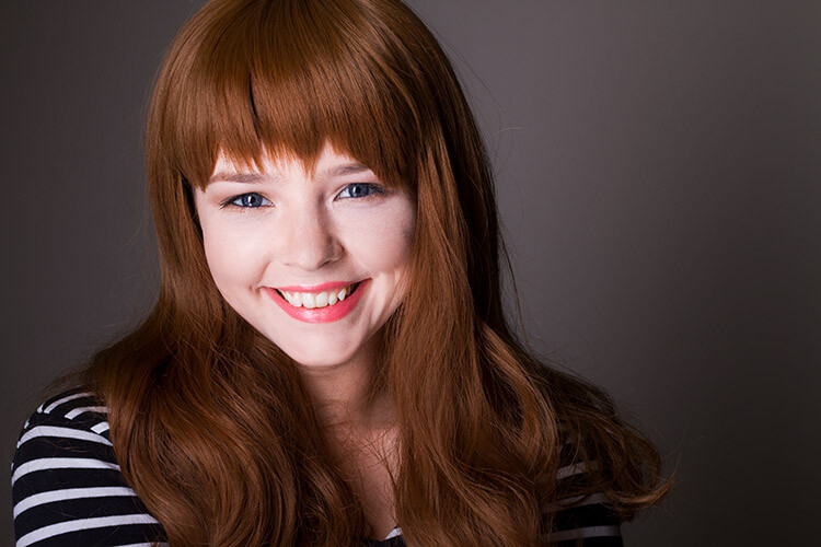
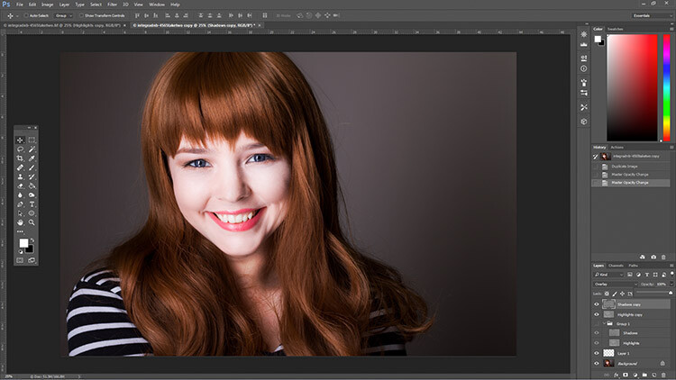
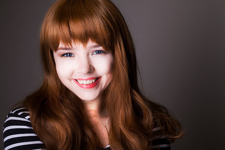
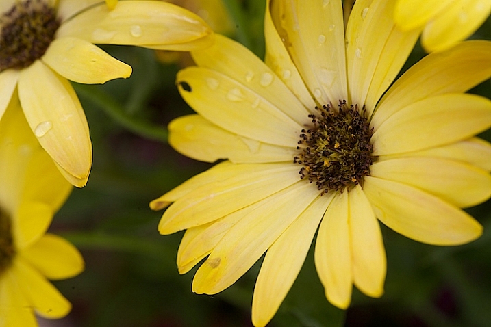
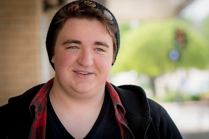
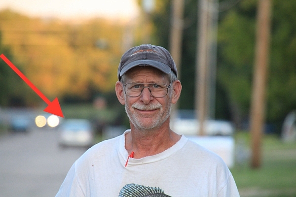
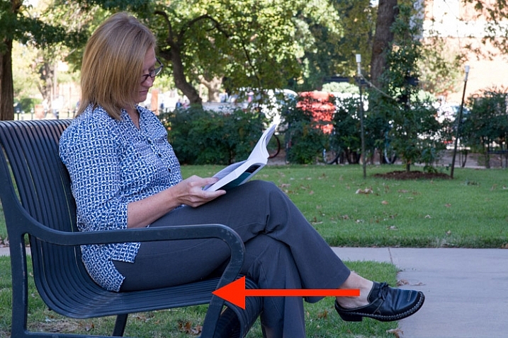
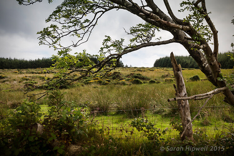
Before dodging and burning
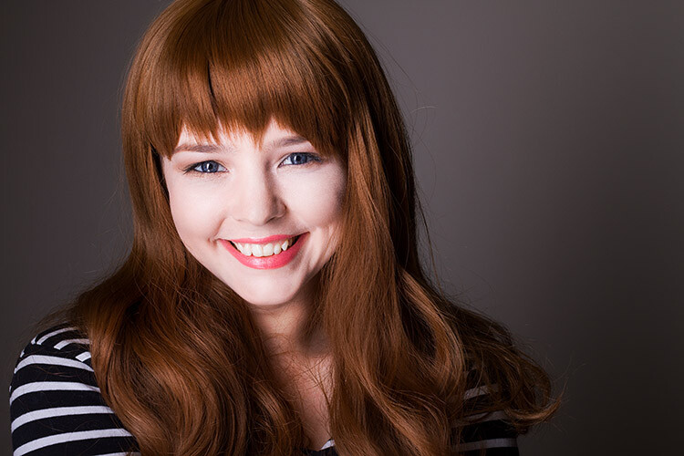
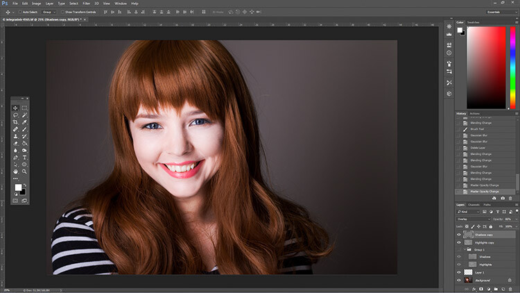
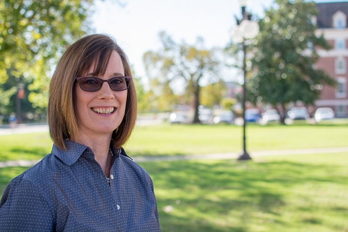
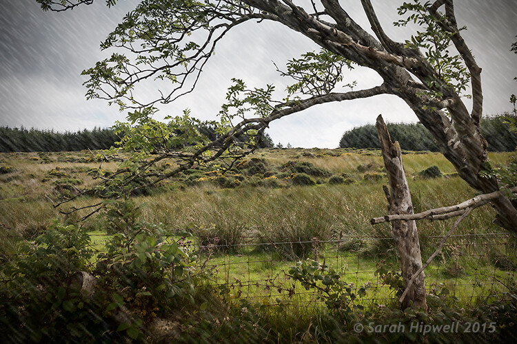
After dodging and burning (it’s subtle, look at her hair and cheeks – don’t overdo it with this technique)
One way of doing this, was by holding bits of paper or card over the parts of the image that didn’t require manipulation. Because these adjustments only applied to certain parts of an image, it required a certain amount of dexterity (as well as a lot of paper) to get right. Because of this complexity and precariousness, dodging was used primarily to lighten dark areas. Burning was then used to darken highlight areas.
The Photoshop version of the technique; however, is far more forgiving. Photoshop allows very fine control over an image and even allows pixel by pixel retouching. The versatility this provides turns the traditional darkroom method on its head. It allows you to use small brush strokes to brighten and exaggerate small areas of highlights, or darken shadows, instead of applying to only broad areas.
This technique is very easy to learn, but it does require some practice to get down, as it’s very easy to go overboard with it, and overcook your images.
Why dodge and burn?
Tools like curves and levels give you control over the tonality and contrast of an entire image (excluding the use of layer masks). This is called a global adjustment, but they aren’t always effective for most images.
Dodging and burning allows you fine control over the tonality of your images in small, concentrated areas. These are called local adjustments. This allows you to pick out small parts of an image to work on, while leaving areas that need no work untouched.
While useful in all genres of photography, the use of local adjustments comes into its own in portraiture. If you think in terms of contrast alone; hair, eyes, skin, and clothes all require very different treatments in order to look their best. For example, if you pump up the contrast in an image to make a pair of jeans look punchy, that will wind up destroying the skin tones in your portrait. One of the easiest ways to overcome this is using a local adjustment technique like dodging and burning.
This tutorial will get you started with a two layer dodging and burning technique, that will give you far more control over your images than you would have with global adjustment tools alone. This is an intermediate technique and you need to have a basic understanding of how to use layers in Photoshop.
For this demonstration, I am going to go beyond what I would normally consider acceptable and overcook the image, to ensure that it is visibly clear what is happening at various stages of the process.
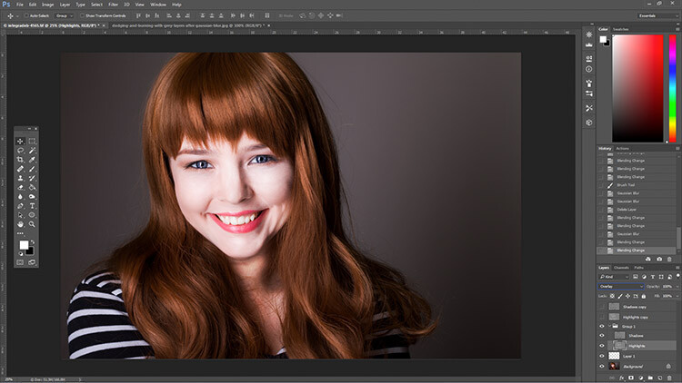
Setting up the layers
Before you start this technique, I suggest that you first finish any blemish removal in your image.
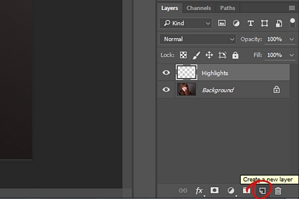
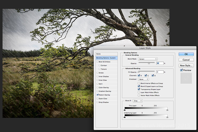
That said, the first step in Photoshop is to create a new layer by going to Layer>New Layer or by pressing ctrl+shift-n. Rename this layer, “Highlights”.
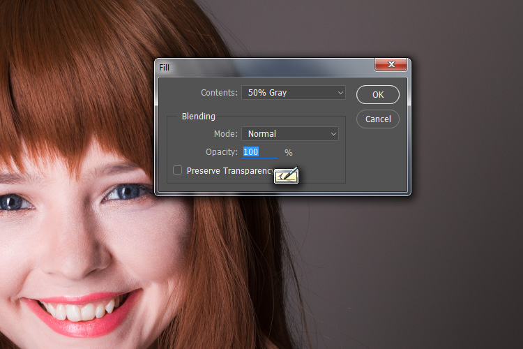
With this new layer selected, go to Edit>Fill or shift+f5 and choose 50% gray from the menu. Press OK. Your image should now be entirely gray.
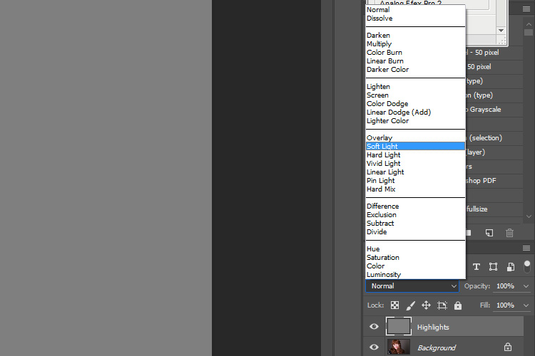
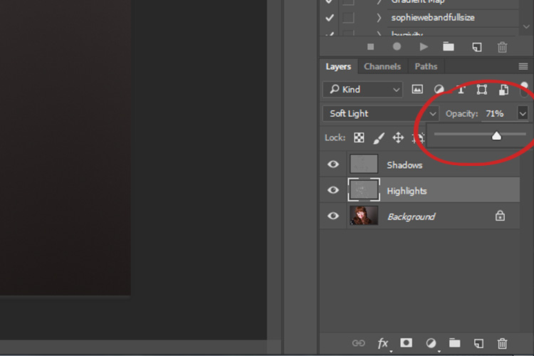
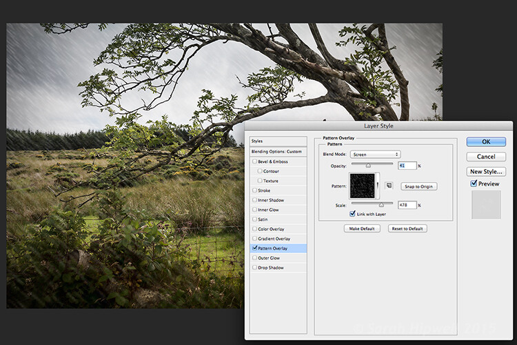
The next step is to change the blending mode of your gray layer. From the drop down menu in the layers palette, choose Overlay or Soft Light. Either choice is fine, but using Overlay will result in a far more pronounced effect than Soft Light. Experiment with both, see how it works for you, and which you prefer. Once the blending mode is changed, you should be able to see your image again.
Next, create another new layer. Layer>New Layer or ctrl+shift+n and rename it to “Shadows”. Again, fill it with 50% gray. Edit>Fill>50% Gray or shift+f5
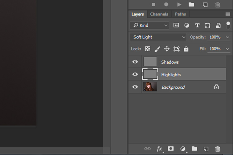
Set this layer’s blending mode to the same as the one you chose for your Highlight layer.
That’s the preparation work done. Once you’re used to it, this whole process only takes a few seconds. It’s also possible to set it up as an action, so Photoshop will do it for you at the press of a button.
Dodging
To start, select your Highlight layer and choose the brush tool. Pick a large, soft brush (Hardness number is low and edges are fuzzy). You can change the brush settings by right clicking within your image.
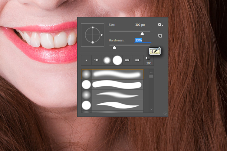
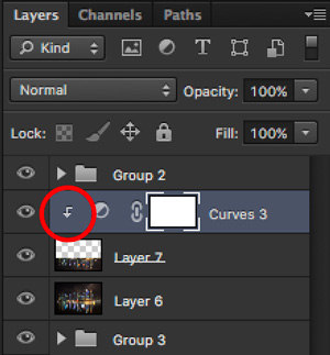
With the brush selected, look for the tool settings at the top of your screen. You’re looking for a pair of sliders labeled opacity and flow. Set your brush’s opacity to 15% and the flow to 10% (see below circled in red). You can change them later, but this is a good starting point.
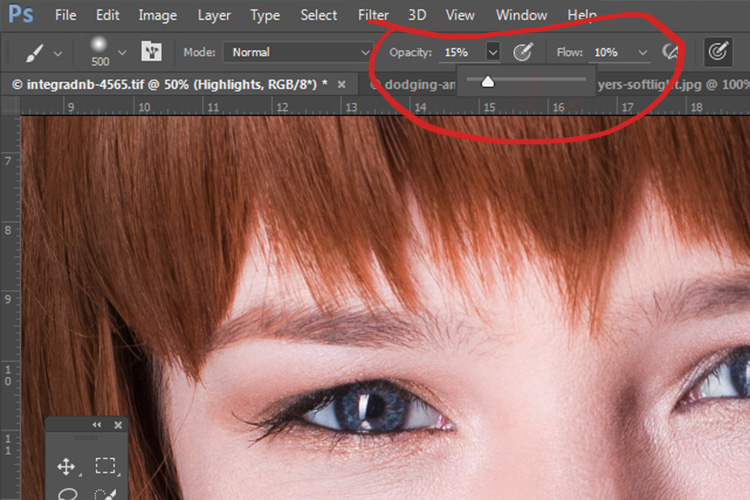
Make sure that your brush colors are set to white and black. You can press D (default) on your keyboard to do this. Also, you can press X to swap between them. Knowing these shortcuts will save you an incredible amount of time.
Now you’re ready to dodge.
Assuming you’re working on a portrait, find a highlight area on your subject’s skin that you would like to emphasize. With white set as your foreground color, paint into that area (make sure you are on the Highlight layer not your image). Because the brush’s opacity is so low, you may not notice a difference at first. Just keep brushing into it, and build up strokes until you have the desired effect. Do this for all of your highlight areas.
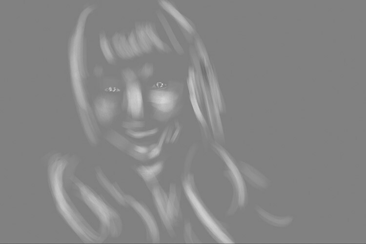
With the blending mode set to normal, your highlight layer may look something like this.
Note: If you decide that you’ve gone too far, just fill the layer with 50% gray again and start over.
Burning
With your highlights done, select your Shadow layer by clicking on it in the layer palette. Select black as your foreground color and paint into the shadows in the same manner you did for your highlights (make sure you are painting on the Shadow layer not your image).
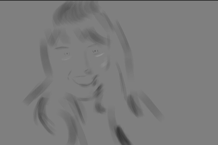
With the blending mode set to normal, your shadow layer may look something like this.
After dodging and burning is complete, you may have something that looks like this.
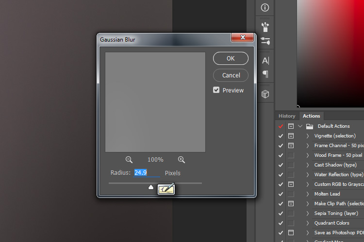
Add Gaussian Blur
The next step is to smooth out your brush strokes. Select your Highlight layer and select Filter>Blur>Gaussian Blur. Choose an amount between 20 and 40 pixels, and press okay.
After the Gaussian Blur filter is applied.
Do the same for your shadow layer.
Final Steps
The last thing to do is is change the opacity of your layers. It may not seem like it, but at this point the effect is probably way too strong.
Select one of your painted layers. Find the opacity slider in the layer palette, and drag it to the left. Watch your image as you move the slider and stop once you’ve reached the desired effect.
Do this for the second layer, and that’s it! You have dodged and burned.
The final image after the opacity of the dodge and burn layers has been reduced.
It’s really easy to overcook an image with this technique. Use low opacity brush strokes and take your time to avoid having your images look like this one.
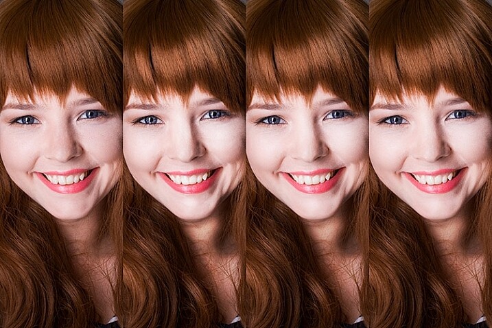
From Left to right: 1) Before 2) Dodge and burn with no blur. 3) Gaussian Blur filter applied. 4) Opacity of dodge and burn layers reduced.
Tips and Notes
- Like most retouching techniques, subtlety is key. At first, overcooking your images with this technique is inevitable. Keep practicing and you’ll figure it out in no time.
- Always zoom in to 100% or closer when working on small areas like eyes.
- A graphics tablet will help with smooth, natural brush strokes. If you can only use a mouse or trackpad, experiment with more liberal use of Gaussian Blur to mask the brush strokes.
- When painting shadows or highlights, try to match the light in the image. You can paint white (dodge) into your shadows, but this will probably look very strange in the end.
- Change the brush size often, and appropriately, to the area you are working on. Keyboard shortcuts make this a breeze (use [ and ] to increase and decrease brush size).
- Experiment with different brushes until you find one that suits your taste.
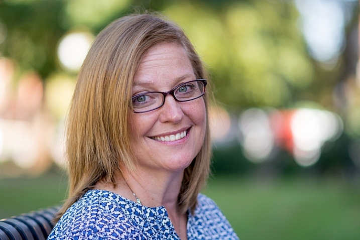
Before dodging and burning

After dodging and burning
More Tips and Notes
- It’s all too easy to concentrate on the face, but try not to forget other parts of the image like your subject’s hair, clothes, and the rest of their body.
- Both dodging and burning can be done on a single gray layer. Feel free to do this, but the two layer technique grants you even more control, without much extra effort.
- Consider setting up a keyboard shortcut for Gaussian Blur. This saves a lot of time.
- You can create as many sets of gray layers as you want. For example, if you want to use very small brushes to dodge and burn the eyes, you might choose to do this on a separate set of layers in order to use less blur at the end. If you use a lot of layers sets like this, consider using layer groups to keep them organized and don’t forget to name your layers.
- If the shadows and highlights you are working with have very hard edges, try using a harder brush and a lower amount of Gaussian Blur.
- Consider watching and trying some digital painting and sketching tutorials for Photoshop. These can really help to increase your brush control and lend to more natural results.
googletag.cmd.push(function() {
tablet_slots.push( googletag.defineSlot( “/1005424/_dPSv4_tab-all-article-bottom_(300×250)”, [300, 250], “pb-ad-78623” ).addService( googletag.pubads() ) ); } );
googletag.cmd.push(function() {
mobile_slots.push( googletag.defineSlot( “/1005424/_dPSv4_mob-all-article-bottom_(300×250)”, [300, 250], “pb-ad-78158” ).addService( googletag.pubads() ) ); } );
The post How to Enhance Portraits Using Gray Layers to Dodge and Burn in Photoshop by John McIntire appeared first on Digital Photography School.


 Mastering Composition


You must be logged in to post a comment.