RSS
 

Posts Tagged ‘Create’

How to Create a Center of Attention for Better Storytelling Images

08 Jan

Drawing the viewer’s attention to the main subject in your photographs will help them understand your story more clearly. If you have a busy scene with no clear focus point it will possibly give your viewers an overall idea of what you were photographing, but they may not scrutinize it for long. Adding a clear center of attention will help you create better storytelling images.

How to Create a Center of Attention for Better Storytelling Images

Particularly when you are photographing a locality with a lot going on you can seek to isolate or draw the viewer’s eye to one main subject within your composition. By using this technique, you can develop a style which may become easily recognizable in your photographs.

Lessons from documentary photography

I first learned to make photographs like this while working as a newspaper photographer. My task was to illustrate and support the journalist’s story with my pictures. Making photos that compelled people to stop and look was always my priority. We wanted people to take notice, look at the photo, and read the story.

Photos of broad, general scenes will not achieve this so well as people will typically just flick past them.

How to Create a Center of Attention for Better Storytelling Images

Creating a photo essay to tell of your travel experience, an event you attended, a parade, etc., you will be aiming to convey what you saw and how you felt to best engage your audience. By creating a series of images where you have focused in on one main subject in each image you can build an overall illustration communicating to the viewer what it was like to be there. That is storytelling at its best.

How to Create a Center of Attention for Better Storytelling Images

Techniques

There are various techniques you can use to draw attention to one part of your composition. Using a shallow depth of field to isolate is one method. Using the contrast in light between your subject and the background, and various composition methods you can obtain pleasing results.

Play with the background

All of the photos I am using to illustrate this article are from a street parade in Chiang Mai, Thailand. With a lot of people, often cluttered backgrounds, and no real control or means of setting up photos, it’s a challenging situation in which to shoot.

How to Create a Center of Attention for Better Storytelling Images

Finding a dark background to help isolate your subject is not always so easy, but when you can it will produce some great photos. In this photo of the boy playing a large drum, I positioned myself so the background was totally in shadow and therefore underexposed.

This has achieved isolation of my main subject and you easily focus your attention on him. My timing to capture a smile and interesting positioning of his drumstick also helped. On its own though, this photograph does not do much to illustrate the parade and environment.

How to Create a Center of Attention for Better Storytelling Images

Coming in close to the French horn player (with a 35mm lens on a full frame camera and a wide aperture) I was able to isolate him and at the same time convey more information about his activity and location. Making him the center of attention and at the same time leaving him in context helps tell the story.

Had I used a longer lens it would have included less background and it may have been even more blurred, further distorting the detail and therefore the context of the story would be lost.

Using compositional elements

How to Create a Center of Attention for Better Storytelling Images

Using different composition methods such as framing or converging lines you can help draw your viewer’s attention to your chosen subject.

Often during our workshops, I find people want to include too much in their photos. I encourage them to include less and take more photos build up a story that way.

While it is good practice to create a photo essay which has a varied selection of wide, medium and close-up photos, trying to capture too much of what’s in front of you can often produce rather uninteresting photographs. Bringing one part of your composition to the foreground as the center of attention is a more effective means of holding a viewer’s focus.

How to Create a Center of Attention for Better Storytelling Images

Single or multiple photos

At the newspaper most often each story was accompanied by a single photograph. So the challenge was to produce one image supporting the narrative of the story. Not always so easy, especially with an event like a parade.

I often encourage people to photograph as if they are shooting to cover a story for a magazine. The aim being to come away with a series of photographs that together will tell the story of their experience. To finish up with 6-10 photos having a clear center of interest in each one and conveying the overall experience of the day.

How to Create a Center of Attention for Better Storytelling Images

If you produce a small collection of photos most social media and photo sharing sites have means to display them together in an album or gallery so it’s a great way for you to share your stories and your experiences.

Your turn

You can see some of these tips in action in the video below. Please share your tips and thoughs on creating more storytelling images by having a center of attention in the comments below.

The post How to Create a Center of Attention for Better Storytelling Images by Kevin Landwer-Johan appeared first on Digital Photography School.


Digital Photography School

 
Comments Off on How to Create a Center of Attention for Better Storytelling Images

Posted in Photography


How to Create Realistic Bokeh and Blur Effects using Photoshop

07 Jan

Perhaps you want to creatively improve your image, already taken with a depth of field and bokeh or create this effect from scratch for a specific composition. In this article, you will learn how to work with new and old filters and their features, creatively apply textures, even create a bokeh texture from scratch.

Also, you’ll learn some small secrets and useful features of digital artists. Described techniques and features will be available depending on Photoshop versions, which I will mention in the process. You can use these techniques on any image and get surprising results, I just want to show you the principles and workflow.

Everything is about the creative approach, so do not hesitate and experiment!

How to Create Realistic Bokeh and Blur Effects using Photoshop

Shallow Depth of Field and Bokeh

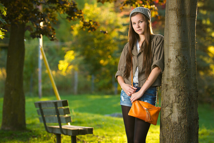
A shallow depth of field (DOF) is when the desired object (focus point) appears sharp and everything else is blurred. Under certain shooting conditions on a blurry background, there may appear some beautiful circles or blurred highlights – that is called bokeh.

This effect can be done during the shooting process or synthetically added in post-processing. You can use this as an artistic style, to pay attention to a certain object or interesting composition. It’s very handy to use such effects if you want to hide some flaws or unsuccessful or empty parts of the composition.

Also, it is often used to create lighting and foreground effects, additional details that help to immerse the viewer in the atmosphere of the scene much more. Areas for using this technique and the creative possibilities are huge, so I suggest that you start with a practice.

How to Create Realistic Bokeh and Blur Effects using Photoshop

Blur Gallery – Field Blur

So, let’s start with the most interesting and powerful features of Photoshop CC – the Blur Gallery and Field Blur filter. Blur Gallery is available in the filter menu, starting with Photoshop CC 2014, and has five blur effects with additional features, such as Motion Effects, Noise, and Bokeh. Note that this does not work in older versions of Photoshop!

Open the image, to which you want to apply the effect in Photoshop via File > Open or use Cmd/Ctrl+O shortcut or just drag and drop the image from your file explorer into Photoshop.

Next, on the Layers panel, right-click on a layer and choose “Convert to Smart Object” (Layer > Smart Object > Convert to Smart Object). Go to Filter > Blur Gallery > Field Blur. Your workspace has been changed to the Blur Gallery dialog box and you are shown a control pin in the center of the image (if there are no pins visible, try Cmd/Ctrl+H or go to View > Extras, to hides/shows guides, controls, etc.).

How to Create Realistic Bokeh and Blur Effects using Photoshop

Setting Your Blur Effects

So, for a pin in the center, set the Blur value to 0px and move it to the place in your image that should stay in sharp focus. Begin to apply a blur from the edges of the image and in problem areas that you want to hide by clicking on the place where you want to add pins or drag and drop existing pins to the desired place.

Adjust the blur intensity or remove it on the Blur Tools panel or use the blur handle around the pin itself. For the edges of the image, start with larger Blur values, and then reduce it, if necessary. Also, I used several pins with a smaller Blur values near the area in focus in order to create a softer transition from blurred to sharp areas. If you want to remove any of the pins, select it and press Delete on the keyboard.

How to Create Realistic Bokeh and Blur Effects using Photoshop

Creating Bokeh

Now let’s set the settings for the bokeh. Start adding a bokeh by setting Light Bokeh to 100. Next work with the Light Range sliders and start moving white, then black, until finding the optimal ratio of values.

You can slightly reduce Light Bokeh values so you do not get large overexposed areas. At this stage, you need to be careful and change the blur settings along with others to get the best possible, most realistic result.

Adjust Color Bokeh values to vary the texture with a color and add unexpected shades. Just do not make this value too big, otherwise, it will increase saturation or a lot of additional shades will reveal themselves.

How to Create Realistic Bokeh and Blur Effects using Photoshop

Iris Blur and Tilt-Shift

The following filter, which we will consider is Iris Blur. The principle of this filter is the same, but now you are working with the focus field. You see the white circle frame, that you can deform and rotate, four small points around it to control blur distribution (shape), pulling by a square you can specify the focus area. You can still use several pins but blur values are the same for all of them.

This filter is very convenient if you want to highlight a specific area. In the previous example, you could specify exactly which areas of the image stayed in sharp focus and had more flexibility to work with the form, here you have less control over the details.

How to Create Realistic Bokeh and Blur Effects using Photoshop

Top image – Iris Blur. Bottom image – Tilt-Shift.

Tilt-Shift is very popular for the fact that it creates the impression of a miniature scene. It is especially good for photos of architecture and everything that is at a distance.

As an artist, I use it when I want to emphasize dynamism and distortion (especially, in abstract artworks) or to create a background when I work with portraits.

Path and Spin Blur

Path Blur is very useful if you decide to add motion to your composition or emphasize it. Unlike the Motion Blur filter, you can control the effect and set the most unusual directions for blur. Unfortunately, this filter does not have the ability to add a bokeh to the blur, but Motion Effects are available.

How to Create Realistic Bokeh and Blur Effects using Photoshop

Top image – Path Blur. Bottom image – Spin Blur.

Spin Blur, also a motion blur, but in a radial form. With it, you can turn your photos into a painterly image and if you add color effects, it will turn out very well. I use this filter for various artistic techniques, mostly when I work with very abstract creations. With this filter, you can create a very simple simulation of long exposure photography.

The Blur Gallery

You can apply several filters from the Blur Gallery at once. Just checkmark desired filters, adjust their settings and click Ok to apply. Depending on the image size and performance of your computer, it may take time to render a preview of the effect and after once you apply the desired settings, so be patient.

Also, you can edit the settings of the applied filter if you convert the layer into a Smart Object and add the filter on it. It’s automatically a Smart Filter, so just double-click on the name of the filter and edit the settings. This is a non-destructive way of editing photos and creating artworks.

The advantage of a Smart Object is that you can go back and make changes to the filter or adjustment, apply it several times, even delete it if something went wrong and keep the original image intact.

How to Create Realistic Bokeh and Blur Effects using Photoshop

Lens Blur Filter

Now let’s look at another powerful and fast solution for adding blur effects. The Lens Blur filter first appeared in Photoshop CS. So whatever version you use, CS or CC, this filter will be available for you. Take into account that this filter will not work on Smart Objects, so you can’t edit and apply this filter as a Smart Filter.

Again, open the desired image. Duplicate the original image layer (Layer > Duplicate layer or use the shortcut Cmd/Ctrl+J) to work non-destructively. In order to only apply an effect to a specific object or area, I made a selection with Quick Selection Tool (W) and added a layer mask to it (Layer > Layer Mask > Reveal Selection or use “Add layer mask” icon at the bottom of Layers panel).

How to Create Realistic Bokeh and Blur Effects using Photoshop

To achieve a more realistic effect, blur the layer mask or its edge a bit because the hard edges of the mask can spoil everything. You can use Gaussian Blur filter (Filter > Blur > Gaussian Blur) or Feather option on Properties panel (Window > Properties) with the settings to your taste.

Lens Blur Settings

Highlight the layer thumbnail and go to Filter > Blur > Lens Blur… In the window that appears, first set Preview to Faster because this filter sometimes takes a long time to process changes. Next, in the Depth Map section, you can set Source to a Layer Mask to not apply a blur to a masked area, or leave this parameter at None to blur an entire image.

Checkmark Invert if only the selection from a layer mask is blurred and adjust Blur Focal Distance for more accurate blur distribution. If Lens Blur effect does not appear on a layer, just delete a layer mask (right click on a layer mask > Delete Layer Mask).

How to Create Realistic Bokeh and Blur Effects using Photoshop

In the Shape drop-down menu, you can choose a form of bokeh. In this example, I will use a triangle because this is a rather unusual form, but shapes like Octagon produce more normal blurred results. Radius value controls the size of that shape and the amount of blur that is applied. Blade Curvature quite creatively changes the form and makes the shape more circular. Rotation sets the angle (direction) of the bokeh shape.

How to Create Realistic Bokeh and Blur Effects using Photoshop

To control where the bokeh will appear, change the settings in the Specular Highlights section. Brightness increases the strength of the highlights within the blurred area.

Threshold controls which tonal range (pixels) need to be affected to create bokeh. This means that pixels brighter than a Threshold value can be used for creating a bokeh effect. Do not overdo with these two values, otherwise, bokeh shapes can merge into a single mass or even fill a part with white.

Adding Texture or Bokeh Overlays

You can always use additional textures in your artwork, created digitally or by using a camera. Open your image in Photoshop and go to File > Place Embedded (File > Place in older versions), then choose the desired texture. In my case, I made some photos with bokeh on a black background (to separate the bokeh).

How to Create Realistic Bokeh and Blur Effects using Photoshop

Next start to experiment with the different layer Blending Modes, such as Screen, Linear Dodge (Add), Color Dodge, etc. You can always reduce the effect of the texture by reducing the layer Fill or adding a contrast to the texture with a Levels adjustment or adjustment layer to add more Blacks and greys, to make it more like “transparent”.

Or if you like texture but don’t like a color in it, then use a Hue/Saturation or Color Balance adjustment to change the hue or remove the color completely. Sometimes in different artworks, I use a bokeh layer with some blurred objects (mostly invisible).

How to Create Realistic Bokeh and Blur Effects using Photoshop

Create Your Own Bokeh

This makes artwork more interesting and adds texture and details. There are a lot of opportunities for creativity with layers, and it’s simply impossible to describe them all in this article. But now I will show you one more interesting trick for creating bokeh texture from scratch using only Photoshop filters. If you like to experiment with filters and settings, then this is a very interesting direction, with a lot of options and discoveries in the process.

Create a new layer at the top of all layers by using the shortcut Cmd/Ctrl+Shift+N or going to Layer > New > Layer. In the dialog box that appears set Mode to Screen and checkmark “Fill with Screen-neutral color (black)”. Next, go to Filter > Noise > Add Noise and set following settings – Amount: 15%, Distribution: Gaussian and click Ok. If you want black and white texture, checkmark the Monochromatic option.

How to Create Realistic Bokeh and Blur Effects using Photoshop

Next apply Mezzotint filter from Filter > Pixelate > Mezzotint with Type: Coarse Dots. This filter is needed to make noise texture sharper and add highlights to it. Now you need to soften the texture and blend colors. Apply Gaussian Blur filter (Filter > Blur > Gaussian Blur) with a radius 2.0 pixels.

How to Create Realistic Bokeh and Blur Effects using Photoshop

Go to Filter > Other > Maximum and set Radius: 20pixels, Preserve: Roundness. Depending on Radius value and size of your working document, the texture becomes larger or smaller. Apply a Levels adjustment (Image > Adjustments > Levels or use Cmd/Ctrl+L) and move the Blacks until you are satisfied with the result.

Play around and experiment with values of each of these filters and you can find a lot of interesting options.

How to Create Realistic Bokeh and Blur Effects using Photoshop

You can add more details to bokeh texture if you want, by using the Unsharp Mask or Find Edge filters. And if you repeat this technique again, but instead of using Mezzotint and Gaussian Blur, apply a Pointillize filter (Filter > Pixelate > Pointillize) with Cell Size: 35 you will get a completely different kind of bokeh texture. So do not hesitate to experiment!

On the internet, there are a lot of paid and free plugins available for Photoshop to create similar effects, for example, the Nik Collection. It’s a free and powerful addition to Photoshop CS4 through CC 2015 with a lot of interesting tools for photographers and artists. There also is the blur, depth of field and bokeh effects produced by Analog Efex Pro 2. In the image below you can see the work of this filter.

How to Create Realistic Bokeh and Blur Effects using Photoshop

Conclusion

And at the end some pieces of advice for you.

More is not always better! Sometimes too many effects (unfortunately any) can give the opposite effect and hide the beauty of the original image or idea. Therefore, try to achieve harmony in color, composition and use these techniques with an intention. If you decided to experiment, then embody the idea entirely, do not hesitate! Do so as you like it.

Bokeh is a lighting effect, use it carefully, so as not to overexpose the overall image. This effect can add excessive brightness to highlights (the right part of the histogram), unwanted light peaks, or increase the overall brightness of the image. It’s important, for example, if you decide to share the picture on the internet or print your image.

The more contrast that is applied with a clear, not overexposed bokeh, the better it looks. So keep your eye on the histogram (you can find it in Window > Histogram).

How to Create Realistic Bokeh and Blur Effects using Photoshop

Also, your bokeh should not be underexposed as well. This is important, by the fact that very often people try to remove unnecessary brightness incorrectly, so get a pale, not realistic bokeh. In exceptional artistic cases, this is permissible, but it is better not to do this.

Pay attention to where you have located or placed bokeh textures and where are the focus and blurred areas in your image, in order to express it more realistically and logically, through a visual image (in photo or artwork).

I will be glad to see your creative inventions, discoveries, and final results. If you have questions, please use the comments section below.

The post How to Create Realistic Bokeh and Blur Effects using Photoshop by Maria Semelevich appeared first on Digital Photography School.


Digital Photography School

 
Comments Off on How to Create Realistic Bokeh and Blur Effects using Photoshop

Posted in Photography


Re.photos: This website lets anyone create and share then-and-now photos

04 Jan

If you’re both a photography fan and history buff, then you might want to check out a platform called re.photos. The website/social network, which launched a couple of months ago, allows anyone to share interactive then-and-now images—so-called “rephotography”—that compare a modern version of a location or subject with an older image of the same spot.

Re.photos is the brainchild of retired computer science professor Oliver Vornberger, and it’s extremely easy to use. Users simply upload both a before and an after photo, then place markers on a few points on the images so that the system knows how to align them.

Speaking to PetaPixel in November, Vornberger said that a student of his is working on improving the platform’s algorithm so that manually placing markers isn’t necessary. Eventually, the whole system should be as easy as uploading a before and after picture, and letting the website do the rest of the work.

In addition to automatically aligning images—taking the hard work out of creating these comparisons manually—re.photos serves as an exploration platform for finding rephotography from other users. Rephotography created by users can be searched using descriptions, username, titles, tags such as date or location, and category such as interior, nature, and people.

To check out the platform for yourself, or upload a few before and afters of your own, click here.

Articles: Digital Photography Review (dpreview.com)

 
Comments Off on Re.photos: This website lets anyone create and share then-and-now photos

Posted in Uncategorized


How to Photograph Fireworks to Create Impressionistic Images

23 Dec

I love experimenting with different techniques and ideas. So when our editor here at dPS, Darlene, asked if someone was willing to try out a technique and experiment with fireworks. I jumped at the chance. I love being creative and pushing the limits of new ideas. Her idea for an article about creating artistic images of fireworks came from this article – Bloom or boom? Photographer captures the moment fireworks erupt into life – creating amazing images that look like flowers.

How to Photograph Fireworks to Create Impressionistic Images

Here’s a fairly typical image of fireworks.

Successful recreation

I loved the look of the images and this type of artistic experimentation is right up my alley. I try this type of stuff all the time. Sometimes it works. Other times it’s not such a success, but the point is to learn and grow as an artist and photographer.

These first set of shots were taken using the technique described by the photographer in the article. Yes, it is copying someone else’s technique, but there’s nothing wrong with that. Imitation can lead to ingenuity. I used a long exposure and then tried to time my movements of the focus ring with the explosion of the fireworks. Timing is everything with this technique, and it’s hard to master. It took me almost the entire fireworks display to get some images that copied his technique.

Note: you don’t need to crank the focus ring. A small movement out of focus will create the desired effect.

How to Photograph Fireworks to Create Impressionistic Images

I like the look of these fireworks. The explosions remind me of flower petals.

How to Photograph Fireworks to Create Impressionistic Images

These blurred images of the firework create a more artistic and impressionistic image.

It’s okay to fail!

I’m quite satisfied with the look of these images. I used a 70-200mm lens and set the exposure at 0.6 seconds, with an aperture of f/2.8 and ISO 250. It worked fairly well. The timing was by far the hardest part of this whole endeavor.

I had an awful lot of failed images. There were times when the shot was too far out of focus. The result was some really nice bokeh lights that I’ve since used as image overlays. Usually, black and white art shots and blended them in to create light and interest. Every shot can have a use, so don’t always delete your “failures”.

How to Photograph Fireworks to Create Impressionistic Images

In this case, I turned to focus ring too far and created some pretty bokeh.

How to Photograph Fireworks to Create Impressionistic Images

While the colors are pretty, this one is a fail too.

The images that were never planned

Other images didn’t turn out exactly as the other photographer’s work but I think the results are still successful. The images are pretty and have turned out to be successful images for birthday cards.

I still used the same technique he did, but I didn’t get the timing correct so these images don’t have the same look as the first ones. They are still appealing though and there is nothing wrong with these unexpected surprises.

How to Photograph Fireworks to Create Impressionistic Images

I accidentally moved the camera while turning the focus ring. It’s a mistake but I still like the effect.

How to Photograph Fireworks to Create Impressionistic Images

I love this shot. The lights remind me of popcorn for some reason.

How to Photograph Fireworks to Create Impressionistic Images

These lights remind me of rain or comets.

Using fireworks was tough. The timing was very difficult to master. I was only able to capture a handful of shots during the 30-minute firework display. This fact led to another experiment. This time sparklers were used. The night was fairly windy so I used my garage as a studio.

Pushing the experiment further

NOTE: Lesson learned – wait for a night when there is no wind to shoot with sparklers. The fumes from the sparklers filled the garage, and I had a headache after shooting. Of course, I should have thought of this before attempting, but when in the moment…

For the following shots, I used the same premise as I did shooting the fireworks. The one difference was my f-stop. This was my mistake. I set my camera to f/16. This was a huge mistake on my part. I couldn’t replicate the out of focus look for my photos. You need to use a wide open aperture for the experiment to be successful. As a result, the images I created are considerably different from the impressionistic flowers created at the fireworks. There are still a lot of interesting images in this collection, but it wasn’t the look I was hoping to capture.

How to Photograph Fireworks to Create Impressionistic Images

I used a longer lens for this shot but didn’t use the focus ring.

How to Photograph Fireworks to Create Impressionistic Images

I love how this seems to look like exploding rain.

Making mistakes

The settings for these shots used a range in aperture from f/16 to f/32. They are still pretty I think, and I will find a use for them for sure.

The next step in the experiment involved getting closer to the sparklers and capturing something different. I attached an extension tube to my lens and got very close to the sparkler. Perhaps a little too close, it is possible to damage your sensor by shooting something too bright. The aperture was small however so this may have saved my camera.

How to Photograph Fireworks to Create Impressionistic Images

This quick phone shot my son took shows the distance between the camera and sparkler with the extension tube in place.

Using an extension tube

Here are the results of the experiment. The images allow us to see how the base of the sparkler ignites. These are also interesting images and worth the time it took to create them.

How to Photograph Fireworks to Create Impressionistic Images

I used my 12mm extension tube on my 50mm prime lens for this shot.

How to Photograph Fireworks to Create Impressionistic Images

Here’s a shot where I captured the sparks as they fell from the sparkler.

Being creative in post-processing

It was also fun to play with color during the post-processing stage. An adjustment to the color temperature slider changed the sparkler lights from a warm yellow to an intense orange.

Again this is all experimentation. The process may not result in a finished image, but it’s all about playing with settings and trying to create different effects in your photography.

How to Photograph Fireworks to Create Impressionistic Images

I simply moved the slider to adjust the color of the light.

How to Photograph Fireworks to Create Impressionistic Images

I adjusted this shot using the split-tone sliders in Lightroom.

Trying one more time

Naturally, the experiment continued with a second try at the sparkler images. This time I set a much wider aperture. Here are the results using the same method as I used to create the firework images.

How to Photograph Fireworks to Create Impressionistic Images

I like the effect of the wide open aperture. Only a few of the sparks remained in focus.

While the sparklers did not recreate the blooming flower impressionistic type effect, I still like the look of these shots. The sparkler allowed me to focus more easily on the task at hand. While I still had to move quickly it wasn’t as rushed as shooting the fireworks. Both activities were enjoyable and challenging in their own way.

How to Photograph Fireworks to Create Impressionistic Images

The focus here is more exact.

How to Photograph Fireworks to Create Impressionistic Images

There are some unique lines created by the flares in this image.

Give it a shot!

It’s almost New Years and time for fireworks once again. Share with us some of your experiments and results. It doesn’t have to be fireworks. You could use lights or flashlights. Be creative! Show us what you’ve created!

My next experiment will involve spinning the sparkler while I shoot. What kind of effect will that create?

How to Photograph Fireworks to Create Impressionistic Images

Just one more shot.

If you want some tips on shooting fireworks with a more traditional approach try these articles: 

  • 15 Tips for Successful Fireworks Photography
  • How to Photograph Fireworks

The post How to Photograph Fireworks to Create Impressionistic Images by Erin Fitzgibbon appeared first on Digital Photography School.


Digital Photography School

 
Comments Off on How to Photograph Fireworks to Create Impressionistic Images

Posted in Photography


How to Create Powerful Travel Photos that Will WOW Your Friends [2 Days Only]

19 Dec

Have you ever said ‘This is nothing like what I saw!’ when looking at the images you took of a trip?

Travel Photographer of the Year (and dPS Book Author) Mitchell Kanashkevich has created an amazing “Behind the Scenes” photography course that’s a blueprint for creating power photographs. 

It’s all about helping you to capture the magic of the experiences you have when travelling and come home with images that will wow your family and friends.

For the next 48 hours, as an exclusive offer to dPS readers, he’s offering his course at 70% off the normal price. 

That means for the next 2 days you can get his beautifully crafted travel photography course for $ 39.95 instead of $ 129.97.

In this online Course you’ll Learn: 

  • How to search for that amazing photo (includes the first obvious question that’s rarely asked)
  • The truth about compositional rules and more organic and fluid ways of looking at composition 
  • Why being a photo sniper makes no sense in the digital age
  • The crucial factors that make the difference between a great photo and one that falls short
  • Can a great image be the result of an accident? (Confession time, but it’s not what you might think)
  • The practical approach to capturing the moment
  • … and much more

Mitchell provides an over the shoulder editing experience as well as providing RAW files, so you can practice the same techniques on them in post-processing.

Check out the full course outline here.

… you only have 48 hours (and counting) though, so be quick.

Bonus Offer from our Partners

Anyone who picks up any of the great deals this week also unlocks some great bonus deals from our partners.

For example if you pick up Mitchell’s course today you’ll get access to KelbyOne annual membership at 20% off the normal price. Access our exclusive Partner Bonus Offers here.

Christmas Deals:
Bonus Offers

Bonus Offers

Brought to you by

ON1
Athentec Perfectly Clear
KelbyOne
New York Institute of Photography

The post How to Create Powerful Travel Photos that Will WOW Your Friends [2 Days Only] by Darren Rowse appeared first on Digital Photography School.


Digital Photography School

 
Comments Off on How to Create Powerful Travel Photos that Will WOW Your Friends [2 Days Only]

Posted in Photography


How to Capture the Feeling of Color and Create More Compelling Images

14 Dec

How to Capture the Feeling of Color and Create More Compelling Images

I am an unashamed lover of color. I say this because when I first started out as a photographer, color photography was considered inferior to black and white. This attitude was especially prevalent in the photo-art world.

I found that confusing because to me, color can bring so much expression, feeling, excitement and vitality to an image. Don’t we want that? As my very favorite photographer, Ernst Haas said:

“Color is joy. One does not think joy. One is carried by it.”

I totally agree!

How to Capture the Feeling of Color and Create More Compelling Images

In this article, I’d like to talk to you about how to use color to create more feeling, more depth, and more energy in your images.

After all, if your images are not provoking an impact, a feeling for your viewer, then they will be easy to forget. And don’t we all wish to create memorable and unique images?

“Photography for me is not looking, it’s feeling. If you can’t feel what you’re looking at, then you’re never going to get others to feel anything when they look at your pictures.” – Don McCullin

How to Capture the Feeling of Color and Create More Compelling Images

Colour is a form of expression

“I found I could say things with color and shapes that I couldn’t say any other way – things I had no words for.”  – Georgia O’Keeffe

I agree with her! As a really visual person, I find it hard to express the feelings I have about the world with words. I’ve learned how, but it comes much more naturally to me to express my curiosity about the world through taking photographs.

Color evokes a spectrum of feeling, and it that is what we really want to capture in our photography.

How to Capture the Feeling of Color and Create More Compelling Images

Think about how you feel when you see the intense red of a flower, the soft azure blue of the sea, the warm yellows of morning sun in summer, the dark muddy browns of the earth in fall.

That is what I want you to think about today. Not only the photographing of color itself, as an element almost, but how you can use color to bring intense feeling into your photograph. Show the viewer more about how it felt to stand in the place where you were. To infuse your photographs with a feeling of atmosphere.

In this article, I will give you three techniques for using color in your images. They go from simple to pretty hard – but I hope you will try all three.

How to Capture the Feeling of Color and Create More Compelling Images - flowers

1. Using color as an element

The simplest way to start working with color in your photography is to use it as a key element within your image. Color can be used to provide contrast, shape, form, and texture.

The simple shape and form of color can be the subject of your photo. It can help you build elements within the photo.

I love to get inspiration for my photography from all kinds of sources. It’s important to me that I am not just stuck in the world of photography and image-making – because there is a stunning and unbelievable world out there for us to draw interesting and exciting ideas from. From philosophers to writers, musicians to scientists – I get ideas for photos from all kinds of places.

How to Capture the Feeling of Color and Create More Compelling Images

I love very simple, bold background for portraits. I’m always keeping my eye out for backgrounds like these.

I love how so many painters use color in big, bold ways to create powerful elements in their work. Painters such as Henri Matisse with his simple shapes and beautiful colors, Mark Rothko with his thick banks of color that seem to suck you into his paintings and Van Gogh with his heavy brush strokes of rich color.

Here is another quote from the painter Georgia O’Keeffe that explains a lot of what I am doing with my photography: drawing attention to things that most people miss

“When you take a flower in your hand and really look at it, it’s your world for the moment. I want to give that world to someone else. Most people in the city rush around so, they have no time to look at a flower. I want them to see it whether they want to or not.” – Georgia O’Keeffe

How to Capture the Feeling of Color and Create More Compelling Images

In this photo, I used the contrasting colors to make a simple and interesting composition with some abandoned chairs. For me turning simple things I find on the street, peeling off walls, at my feet, into something interesting is a favorite thing for me to do in my photography.

2. Using color to evoke a feeling

A more interesting way to use color – and one that takes more practice – is to use it purposely to create a feeling in your image. Color evokes all kinds of different feelings for people.

Painter Wassily Kandinsky developed many theories about art, one being that color created different feelings and states within the viewer.

How to Capture the Feeling of Color and Create More Compelling Images

“The deeper the blue becomes, the more strongly it calls man towards the infinite, awakening in him a desire for the pure and, finally, for the supernatural… The brighter it becomes, the more it loses its sound, until it turns into silent stillness and becomes white.” – Wassily Kandinsky

Kandinsky felt that colors evoked these feelings and states:

  • Yellow – warm, exciting, happy
  • Blue – deep, peaceful, supernatural
  • Green – peace, stillness, nature
  • White – harmony, silence, cleanliness
  • Black – grief, dark, unknown
  • Red – glowing, confidence, alive
  • Orange – radiant, healthy, serious

How to Capture the Feeling of Color and Create More Compelling Images

To use color to evoke feeling is a more sophisticated way to incorporate it into your images.

Now, where is a good place to start with this process?

Look at how the color you are seeing affects how you feel. Explore and examine color – almost in that state that toddlers do – with a sense of wonder and freshness. Then you can bring that into your images.

Of course, it doesn’t have to be big bold colors, it can be about the subtle, the evocative colors. I love playing with greys, browns, and blacks – and drawing out the subtlety in their range.

How to Capture the Feeling of Color and Create More Compelling Images

3. Capturing the inherent qualities of your subject using color

This has to be the hardest, most sophisticated technique of the three presented here – but it’s so worth trying it as you will create images with more complexity.

What I mean by capturing the inherent qualities of your subject using color, is to reveal the qualities of your subject using color. Pablo Picasso explained it even better than me when he is said:

“Some painters transform the sun into a yellow spot, others transform a yellow spot into the sun.”

How to Capture the Feeling of Color and Create More Compelling Images

So you are using the color to tell the viewer something of what that subject is. What it feels or looks like, what it is or how it is.

I love this photo below because to me it captures perfectly the browns, yellows, and oranges of autumn. I can feel autumn in this photo.

autumn image - How to Capture the Feeling of Color and Create More Compelling Images

The colors I am capturing here are not a compositional tool, but about revealing more about the subject itself.

I hope those were some interesting ideas to you. I love to know how you use color in your photography – and if you found some useful tips here that you can apply to your images.

Please let me know by commenting below.


The post How to Capture the Feeling of Color and Create More Compelling Images by Anthony Epes appeared first on Digital Photography School.


Digital Photography School

 
Comments Off on How to Capture the Feeling of Color and Create More Compelling Images

Posted in Photography


Tips for Photographing Reflections to Create Stunning Images

10 Dec

It can’t be denied. There’s something special about reflections that makes them a unique aspect of photography. Maybe it’s because a reflection just like a photograph is a gateway to another world, parallel but restricted. Also just like photography, reflections are a simplification of our world; they turn a 3D reality into a 2D representation.

In a way, photography can make ”reality” and reflections more equal, by cramming the former into 2D while retaining the natural, 2D state of the latter.

01 reflections photography tips

Before we get into the exciting art of photographing reflections, let’s think a bit more about why they’re so attractive, and how we can find new ways to photograph them. Since you’re definitely going to have your own ideas about this mystery, I’d love it if you shared them in the comments below at the end of the article.

02 reflections photography tips

Why photograph reflections?

Reflections have always had an immediate attraction to me, and I don’t think I’m the only one. They’re like visual illusions dropped into everyday life. They turn the world upside down, add a hint of confusion to a scene, and show us things we can’t immediately see the source of.


For you as a photographer, reflections offer a way to create a certain atmosphere. It can be mystery and confusion, but also vastness, such as sky reflected in a lake, or calmness, as a reflection requires a relatively still surface.

Tips for How to Photograph Reflections

Thanks to their mirroring effect and the interaction with the (unreflected) surroundings, reflections are useful tools if you’re trying to tell a story with your photograph — as you always should!

Tips for How to Photograph Reflections

Where to find reflections

What is your first thought when you think about reflections? Is it a mirror, perhaps, or a beautiful lake on a wind still evening?

One great aspect about photographing reflections is that they can be found in so many places and created by a variety of surfaces. Whether you’re into photographing landscapes, portraits, products, flowers, or street scenes, you can utilize reflections to add something special to your photos.

Tips for How to Photograph Reflections

The most obvious place to find photogenic reflections in nature is in connection with water. And wherever there is life, there is water, so the opportunities are basically endless. It can be anything from large bodies of water and wet sand on a beach to a raindrop on a frog’s head.

Tips for How to Photograph Reflections

For more urban photographers, water is of course still an option (puddles are sometimes great for other things than jumping into), but buildings provide another world of options. Start with shop windows and glass buildings, and go on from there. Reflections are fun and beautiful, and we don’t hesitate to incorporate them into our cityscapes.

Tips for How to Photograph Reflections

If you don’t feel like leaving the house or find yourself at a party, do not despair, you can still exercise your photography skills. Mirrors are the obvious surface to use to add another dimension or an interesting twist to your photograph. But windows and polished tables or counters are also great. And don’t forget the opportunities of a well-placed wine glass!

Tips for How to Photograph Reflections

How to capture reflections

Photographing reflections is pretty easy, but there are a few things to think about before and while you’re doing it. These are just a few tips:

  • Unless intended, make sure you don’t show up in the reflection. Change your angle and move around to find the best place from which to take your photograph so you don’t appear in the image.
  • Framing is essential! Use the elements of the space you’re in to create an interesting composition and experiment to discover what creates the greatest effect.
  • Lighting might be a bit tricky. For instance, in a picture of a natural scene reflected in a lake, the reflection is often quite a lot darker than the reflected scene. Use that to create an effect in your image or use filters to even out the lighting difference. It’s up to you!

Tips for How to Photograph Reflections

Conclusion

Those are some of the basics of one of my favorite types of photography. Do you like photographing reflections, and if so, why? What is it about them you find attractive?

If you have photographs to show or tips to share, I’d love to see them in the comments below!

The post Tips for Photographing Reflections to Create Stunning Images by Hannele Luhtasela-el Showk appeared first on Digital Photography School.


Digital Photography School

 
Comments Off on Tips for Photographing Reflections to Create Stunning Images

Posted in Photography


How to Create a Minimal Desktop Background Using Photoshop

03 Dec

Ever seen those flowy, innocuous desktop backgrounds that to show up on default computer screens? That’s the exact image I thought of when I messing around with Photoshop for this tutorial. Though they aren’t exact, these simple gradients and shapes come together to spur on a little nostalgia.

This project is pretty straightforward – but it introduced me to a couple techniques I had never come across before. Photoshop has opened up worlds of image-making technology. But when you boil it all down, the culmination of a photographer’s work is in shades of light dispersed within shapes.

I had a good time putting together this tutorial  – I even tried out a few on my own desktop. It’s a great way to get familiar with Photoshop operations. But it’s just as fun for a pro, with a bit of photographic downtime on their hands. So let’s dig in.

Getting Started

First, open a new document in Photoshop. Change the dimensions of the canvas to the average desktop background size – 1920 pixels by 1080 pixels, as shown below.How to Create Minimal Desktop Background Using Photoshop

Add a Gradient

Select Layer via the Layers tab on the top toolbar and click on New Fill Layer and then Gradient.

How to Create Minimal Desktop Background Using Photoshop

In the pop-up Gradient panel, click on the drop-down arrow and select Simple Gradients.

How to Create Minimal Desktop Background Using Photoshop

Select a color from the swatches in the Simple tab.

How to Create Minimal Desktop Background Using Photoshop

Choose a color that appeals to you most – whichever one you like best!

Click directly on the panel for the gradient color and a new panel will pop up. This will allow you to further customize your color scheme.  Click on the white node below the gradient bar. A color picker will pop up, allowing you to change the white parts of our original gradient to another shade.

At this stage, I would recommend a color similar in shade to your original color. I’m a big fan of pink, so I went with subtle, light shade of pink to complement my overall color scheme. But It’s totally up to you!

How to Create Minimal Desktop Background Using Photoshop

Accept the color of the gradient. Select Radial as the style and the scale as 150.

How to Create Minimal Desktop Background Using Photoshop

How to Create Minimal Desktop Background Using Photoshop

Clicking the Radial setting makes the lighter shade emanate from the center of your image.

Add Another Layer

Next, create a new layer via the layers tab at the top of the screen. Select New in the drop-down menu and select Layer… Click OK at the prompt.

How to Create Minimal Desktop Background Using Photoshop

Add a Shape

Click on the Elliptical Marquee Tool. This may be obscured by the Rectangular Marquee Tool, so click and hold the mouse over the tool for a moment to reveal the other options.

How to Create Minimal Desktop Background Using Photoshop

With the Elliptical Marquee Tool selected, draw a circle that intersects with the top corner of your image. To keep the elliptical tool even on all sides (in other words, a circle), hold down the Shift key as you drag part of the shape over the top corner.

How to Create Minimal Desktop Background Using Photoshop

Open the paintbrush tool and select a nice, soft-edged brush. Set the brush size between 200 to 400 pixels and the hardness level to zero. Select a color in a slightly darker shade. I selected a peachy color.

With the Elliptical Tool still selected, brush around the very outer rim of the quarter-circle with the paintbrush, relying on the softness of the brush to dust the inner rim.

paintbrush - How to Create Minimal Desktop Background Using Photoshop

How to Create Minimal Desktop Background Using Photoshop

Use a slightly different shade to emphasize the edge of the circle you created.

How to Create Minimal Desktop Background Using Photoshop

Duplicate the shape layer as many times as you would like to create an interesting pattern.

Add Dimension

Next, we’ll add a new dimension to the image by using the Rectangular Marquee Tool rather than the Ellipse Tool.

How to Create Minimal Desktop Background Using Photoshop

Create a New Layer and then select the Rectangular Marquee tool from the panel. Stretch the Rectangular Marquee Tool across your image so that about half of it is selected, as shown below.

How to Create Minimal Desktop Background Using Photoshop

Rectangular selection.

With the same technique and color you used on the ellipse, brush along the perimeter of the shape, leaving only the slightest shadow.

How to Create Minimal Desktop Background Using Photoshop

With the rectangle still selected, click on Edit > Transform > Warp.  Slowly drag the different points of the rectangular selection to adjust the whole shape of the layer. Try to make gradual edits at first, to keep the line free of sharp angles.

How to Create Minimal Desktop Background Using Photoshop

Transform the rectangle.

How to Create Minimal Desktop Background Using Photoshop

How to Create Minimal Desktop Backgrounds Using Photoshop

The edge of the rectangle after transforming.

Blend Modes

Now to add a little more depth to the image, you can apply blending modes to bring out highlights in the background. Select a layer and click on Blending Modes usually located above the Layers panel. Select a setting from the list of Blending Modes available. I usually use the Color Burn option, but feel free to experiment!

How to Create Minimal Desktop Backgrounds Using Photoshop

Blend modes.

How to Create Minimal Desktop Backgrounds Using Photoshop

And there you have it! Not bad huh? Amazing what you can do with a few circles and shadows.

Liquify

If you like, try experimenting with the Liquefy tool. It’s found in the Filter tab on the top tools panel.

How to Create Minimal Desktop Backgrounds Using Photoshop

How to Create Minimal Desktop Backgrounds Using Photoshop

Before using the liquify tool on an image I constructed using the steps above.

How to Create Minimal Desktop Backgrounds Using Photoshop

After using the Liquefy tool. You can see that the shapes are now a little more organic.

Over to you!

Here are a few more of my creations. I’d love you see how your desktop background has turned out, please share in the comments below.

How to Create Minimal Desktop Backgrounds Using Photoshop

How to Create Minimal Desktop Backgrounds Using Photoshop

How to Create Minimal Desktop Backgrounds Using Photoshop

How to Create Minimal Desktop Backgrounds Using Photoshop

A minimalist approach created by twisting a rectangular edge with the Warp Tool.

Now it’s your turn! Show me how it went in the comments.

The post How to Create a Minimal Desktop Background Using Photoshop by Megan Kennedy appeared first on Digital Photography School.


Digital Photography School

 
Comments Off on How to Create a Minimal Desktop Background Using Photoshop

Posted in Photography


How to use Off-Camera Flash to Create Dramatic Images with Cross Lighting

01 Dec

Learning to use off-camera flash allows you to create and shape light, giving you plenty of new opportunities for dramatic photography.

But for many photographers, starting up with flash can be intimidating. It’s not just a matter of aiming a flash at your subject and hoping for the best. Choosing the wrong angle or positioning for your flash can have a negative effect, casting unflattering or irregular shadows.

A tennis player lit by off-camera flash cross lighting

A tennis player lit by off-camera flash cross lighting

I remember when I was starting out with off-camera flash I would sometimes get images where the light simply didn’t look right. But when it’s used effectively, flash adds to an image – it shouldn’t make the lighting seem unnatural or otherworldly (unless, of course, that’s the effect you’re going for – to each their own!).

But where’s a good place to start? Where should you put your flash in order to get good light? This article will show you one method you can use called cross lighting that you can use to create dramatic images with off-camera flash.

What is cross lighting?

For both beginners and pros alike, cross lighting is a very quick and simple setup that results in a dramatic, well-lit shot.

Like the name implies, this setup features two light sources on opposite sides of the subject. Hitting your subject from both sides adds a sense of depth to the image, while still producing natural-looking light.

An example showing an off-camera flash cross lighting setup for a portrait of a tennis player.

An example showing an off-camera flash cross lighting setup for a portrait of a tennis player.

The key or main light

Typically you want your light that will provide the most illumination, also know as the key light, placed in front of the subject and a bit to one side. For portraits, you will typically want to use a modifier on your light, such as a softbox or umbrella. This isn’t a requirement – but it will help soften the shadows and create more flattering light on the subject.

The purpose of this key flash is to light up the subject’s features and put a sparkle of catch light in their eyes.

A demonstration of the key light only in a cross lighting setup - How to do Cross Lighting to Create Dramatic Off-Camera Flash Images

We convinced this model to act as our stand-in for a few quick portrait shots. Here is an image with only the key light, an off-camera flash positioned to the right of the camera.

Add a second flash as a rim or separation light

The second light is placed behind the subject on the opposite side as the first one. The purpose of this light is to create an “edge” of light around your subject. This is traditionally called a “rim light” or a “separation light” since it helps to separate the subject from the background.

Demonstration of cross lighting on a subject

By adding a second light to the left of the camera and behind our model, we’ve created a rim of light that separates him from the background for a much more pleasing and dynamic image. Notice the highlight on his hat and hand on the left side.

Voila! This quick setup is an easy way to get started and start exploring the creative potential of a shoot. As you begin to snap pictures, you may find something about your setup that you want to change, but the cross lighting gives you a solid foundation from which to build.

An alternate setup of the previous cross lighting example with the off- camera flash locations reversed

We’ve flipped the orientation of the lights for this shot – while keeping the same cross-lighting style. Now our key light is on the left, and the rim light is provided from the right.

Quick to set up

One of the reasons I love using this setup for off-camera flash is that it takes away the guesswork and provides a solid foundation of light that you can then begin to work with and modify.

And also that it takes only moments to set up! When you start lugging around multiple flash units, light stands, and modifiers, it’s nice to have a consistent starting position that provides even lighting.

An example image showing the setup of flash units for cross lighting - How to do Cross Lighting to Create Dramatic Off-Camera Flash Images

An overview of our setup, with the flashes oriented for cross-lighting and our subject right in between.

The final image of a carpenter, photographed using cross lighting - How to do Cross Lighting to Create Dramatic Off-Camera Flash Images

The final shot, where the light has given a sense of depth to make the subject stand out from the clutter behind him.

It’s a good idea to get the correct flash power for your key light dialed in before adding your second flash. Trying to figure out the correct outputs for two lights at the same time and adjusting in your camera on the fly is a recipe for a headache.

Cross lighting with a single flash

One of the reasons this setup is so easy and versatile is because you don’t necessarily need to use two flash units – the sun can step in as either your key or secondary light.

This approach is particularly effective at golden hour. As evening falls and soft, warm light floods across the fields, you have a ready-made separation light. Many natural light photographers are already familiar with this and use this rim light in their shots.

Example of a portrait shot with cross lighting using a single off-camera flash as a key light and the sun as a secondary light

The key light here is an off-camera flash fired into an umbrella just outside the left edge of the image. The sun, coming from the right, acts as the secondary light. The key here is in balancing the flash with the natural light.

The benefit of adding an off-camera flash as a key light is that you can create a much more dramatic image with dark, rich colors. Colors lose their vibrancy as they get brighter. By keeping the exposure low and using your off-camera flash to light up your subject, your background can be full of vivid contrast and color.

Using the sun as your key light

The sun doesn’t always have to play second fiddle to your flash. You can create the same effect by using the sun as your key light – coming in at your subject from a slight angle – and then using your off-camera flash as the rim or separation light.

The biggest drawback here is that you can’t adjust the power of the sun quite as easily as you can on the back of your flash! However, taking the time to learn how your camera settings can make a picture darker or lighter, and how you can use this skills in conjunction with your off-camera flash, will give you allow you to build the shot you want.

Cross lighting with a flash and a reflector

Here’s the last variation of this setup. By setting up your off-camera flash on one side of the subject and angling a reflector just right on the other, you can mimic the effect of two light sources. This approach might take a bit of practice and a steady hand, but it’s a fun way to learn what you can accomplish as you learn how to control light.

An example of a portrait using a reflector and sunlight to create cross light

Here we used a reflector to provide the key light from the left side of the shot, while the sun comes from the back right.

Give it a shot

Learning to maneuver and shape light is a fun challenge. Being able to quickly and reliably get top-notch results with flash is an important aspect of photography – especially if your model or clients are waiting impatiently for you to get your lighting figured out.

By starting with cross lighting and working from there, you have a reliable method for nailing some great shots. Please share your comments, questions and cross lighting images in the comments section below.

The post How to use Off-Camera Flash to Create Dramatic Images with Cross Lighting by Frank Myrland appeared first on Digital Photography School.


Digital Photography School

 
Comments Off on How to use Off-Camera Flash to Create Dramatic Images with Cross Lighting

Posted in Photography


How to Use the Background to Create More Storytelling Images

24 Nov

Sometimes you’re so focused on capturing the moment that you forget to pay attention to what’s in the background of your photo. When you look at your photos later, you realize that there are all sorts of distractions in the background. One way to overcome these distractions is to use the background to help with storytelling in your photo.

Even though “the moment” is likely the most important part of your photo, good moments always happen in a place. Use the background to show where your moment or story takes place.

Think of People as Characters

The first thing I recommend is thinking of the people in your photo as characters. When you’re going to take a picture of somebody ask, “Who is this character and what are they doing?” When you answer these questions you’ll be able to choose a good background to help tell that story.

Storytelling background 15

This is a photo of my son. I wasn’t thinking of him merely as my son, but rather as a “hiker.” Thinking of him as a hiker helped me choose a background that portrayed the story of a hiker.

Two Ways to Choose a Background

There are two ways to choose a background for your photo.

  1. You can begin with your character and then choose the right background for them.
  2. Or, you can begin with a good background and then look for a character to put into the scene.

Finding a Background that Matches Your Character

Keep in mind the two questions to ask yourself; “Who is this character and what are they doing?”

In this photo, the character is my infant son and he is sleeping in a carrier on my wife’s back. It’s a cute picture, but there is no way to tell from the background where we were when this took place.

Storytelling background 01

This is a nice photo, but the background doesn’t add to the story.

We were on a camping trip and I knew I wanted a collection of photos that would show that. So I repositioned myself to find a better perspective and show the camp trailer in the background. This added a sense of place to the photo.

Storytelling background 02

The camp trailer in the background adds context to the photo of the sleeping infant.

Later on that summer it came time to chop wood for the winter. My little guy wanted to help daddy!

Naturally, I wanted a photo of him trying to chop wood. Depending on the perspective I chose there could have been trees, water, or a wood pile in the background. Since this is a photo about chopping wood, I chose to have the woodpile in the background.

There is even some wood in the foreground, reminding me of what a big job we had that summer!

Storytelling background 03

The huge pile of wood is a natural background for the little wood chopper. Plus it emphasizes how small he is comparatively.

Next time you’re about to snap a photo of somebody, stop and consider your background. Can you move around in order to get a good background to help with storytelling?

Finding a Character to Fit the Background

There may be times when you want to photograph an interesting scene but feel that there is something missing. Perhaps it is the character that is missing. When you come across an interesting scene, go ahead and photograph it. But also wait and allow that scene to become a background for some interesting characters.

When we visited Halls Harbour in Nova Scotia, the rugged shoreline was an obvious feature to photograph. I experimented with different angles and perspectives, but I knew I needed some good characters in the scene. Finally, a couple with their dog came walking down the shoreline. When the man began skipping stones out into the water I knew that these were the characters I was awaiting.

Storytelling background 04

These people and their dog were the perfect additions to the rugged shoreline.

Instead of just a photo of a beautiful landscape, this has become a story about a family on an adventure. To me, skipping stones into the water is a nostalgic sort of moment, so I decided this story looked best in black and white.

Make a story

When the tide was low we could walk out into the harbor amongst the ships that were now resting on the ground. Again, this was an interesting scene that just seemed to be missing a character. Then my son came tip-toeing through the mud and became the perfect character to fit the scene.

Storytelling background 05

When I let my imagination carry me away, I pretend that my son has pulled the plug in the harbor and all the water has drained out. He better sneak away before he gets caught!

Using framing

On a trip to Niagara Falls, we ducked into a building to get some relief from the cold wind and mist from the falls. Through the windows, we could see the falls and a rainbow that was produced through the mist. I wanted to take a photo but waited until my kids went and stood in the window. This allows the falls and rainbow to make up the background while my kids are the characters in the scene.

Storytelling background 06

The characters in the foreground allow the viewer’s attention to be drawn to the falls and rainbow in the background.

Plan ahead

In these next two examples, I used our house as a background for the photo. We were getting ready to move in the spring and I knew we needed a few more photos, by which to remember this old house. So I was determined to use our house as a setting and photograph more scenes with it in the background.

That winter, we built a snow hill nearly as tall as the house itself. That was a perfect opportunity to photograph an exciting event with our home in the background.

Storytelling background 07

A low angle helped to capture this epic moment right in our front yard. The snow hill towers in front of the house in the background.

Storytelling background 08

Our kids will always remember their first childhood home (and the fun they had there) when they look back on these photos.

Next time you come across a nice scene, go ahead and photograph the scene by itself. Once you have done this, you can look for a character to add to the scene, allowing it to become a background for their story. This is a perfect approach for both landscape and street photography. Choose the background and then wait for the character to come along.

Symbolic Backgrounds

So far, all of the backgrounds in these photos have been literal scenes. But you can use a background to give your story some symbolic meaning as well. You do this by finding a background that makes you think deeper than the literal object itself. For example, a sunset in the background isn’t just about the sun, perhaps it’s about “romance” or “a happy ending.”

In this example, my wife is tying up vines in a vineyard. This is a job that needs to be done in the spring before any green actually appears on the vines. There really wasn’t anything nice near her to use as a background, except golden light from the setting sun.

To me, vineyards are about long days of outdoor work, and the romance of shared wine. The warm setting sun was the perfect symbolic background to express these feelings.

Storytelling background 09

The golden sun in the background of this photo is symbolic of the day’s end, and the romance of wine and vineyards.

When you’re photographing a character doing something interesting, ask yourself if there is anything in the background that adds symbolic meaning to what they’re doing.

I have lots of photos of my kids reading books. The following photo is an example of a very boring background that does not help to tell a story.

Storytelling background 10

This background is distracting. The bed leg is growing out of their shoulders and pulls our attention away from what the kids are doing.

You can come up with some great backgrounds for people reading books. A library or a coffee shop would be two good choices for your background. But these are obvious choices and perhaps you could choose a symbolic background instead. Think about the nature of reading and how a person grows as they learn.

Storytelling background 11

This is exactly the sort of place that many people would sit and read a book. There is something about old leather chairs that invite you to nestle in and read. Behind the chair is a wood grain wall. Wood is something that grows. Wood is symbolic of the “growth” that happens when a child learns and reads.

Keep your eye open for backgrounds that are symbolic of the story you want to tell.

Using the Background to Tell a Story in Multiple Photos

When you find a good background, go ahead and use it in different ways to expand on your story.

The following photos are all from Hopewell Rocks in New Brunswick. Every tourist who has ever been there, walks away with the same photos from the same perspectives, so I challenged myself to come away with something different. I wanted photos of the rocks, so I used them as the background for the scene and then waited for interesting characters to come along.

The first thing I noticed was lots of tourists rushing around snapping pictures of the rocks. They were always getting in the way of the photo I was taking, so I gave up and took pictures of them instead.

Storytelling background 12

I like how this tourist blends into the rocks. As they reached out their arms to take a photo, their arms mimicked the circle shapes in the rocks.

Two-year-olds are notoriously difficult to photograph. I wanted to take a photo of my daughter with the rocks in the background. But all she wanted to do was chew on saltwater stones. She had been doing this on our entire trip. We were constantly telling her to get the rocks out of her mouth.

Storytelling background 13

If you’re going to photograph a two-year-old, you might just as well photograph her doing what she loves. And what better background for her photo than the massive rocks?

The tide was rising quickly and would soon cover the massive rock formations. In our last moments there something spectacular happened. A park ranger made his own rock formation by balancing several odd shaped rocks on each other.

Storytelling background 14

What a contrast between the massive Hopewell Rocks and the man-made formation. The force of the tide eroded one set of rocks over a long period of time and will quickly topple the rocks that have been so carefully balanced by the ranger.

When you stick with a scene long enough wonderful things happen and your mind will find symbolic meaning that you otherwise might have missed.

You’ll Enjoy Your Photos More When Your Background Adds to the Story

Don’t let your backgrounds be a disappointing afterthought. Instead, consider how the background in your photo can add storytelling elements to your character.

Remember the steps:

  • When you’re going to take a picture of somebody, first ask yourself, “Who is this character and what are they doing?” When you answer these questions you’ll be able to choose a good background for storytelling.
  • You can choose a background for your character, or find a good background and wait for the perfect character to come along.
  • Try using backgrounds to give symbolic meaning to your photos.
  • Use the background in different ways over several photos.

When you pay attention to the background your photos will become less sloppy and more meaningful. Please share some of your images with storytelling backgrounds in the comments below.

The post How to Use the Background to Create More Storytelling Images by Mat Coker appeared first on Digital Photography School.


Digital Photography School

 
Comments Off on How to Use the Background to Create More Storytelling Images

Posted in Photography