RSS
 

Posts Tagged ‘Composition’

Improving Composition with Tonal Contrast

18 Jun

A contribution by Andrew S. Gibson author of Understanding EOS: A Beginner’s Guide to Canon EOS Cameras.

Tonal contrast 1

If you were to ask me for two ways that you could improve the composition of your photos, the first piece of advice I would give you is to keep the composition as simple as possible. Eliminate anything that isn’t part of the story from the frame.

The second part of the answer is to focus on tonal contrast. Now, many discussions of composition tend to concentrate on the basics, such as the rule-of-thirds, leading lines, use of colour and so on. Not many people seem to be talking about tonal contrast. That’s a shame, because it’s an element that can really improve your composition.

What is Tonal Contrast?

Tonal contrast is created when light tones and dark tones lie alongside each other. Here’s an example:

Tonal contrast 2

The tonal contrast in this photo is created by the difference in brightness between the white flower and the dark green background.

In any photo it is natural for the eye to go straight to the highlights. That is what is happening here – the viewer’s eye is pulled by the lightest tones in the image, the flower, and then travels slowly around the rest of the image, taking in the detail. It sets up a kind of visual dynamism between the light and dark tones.

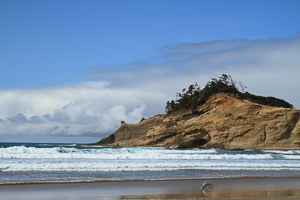
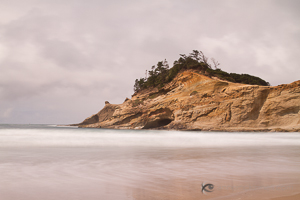
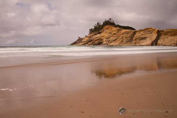
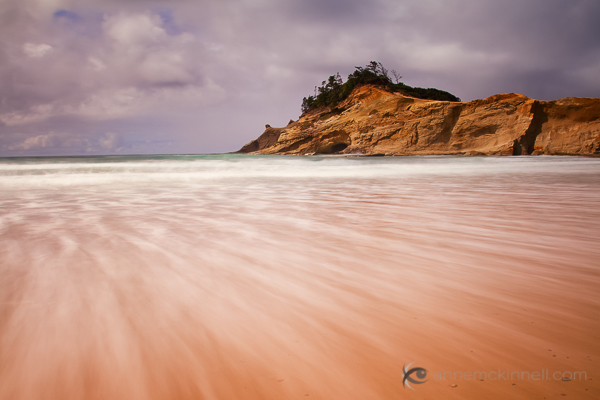
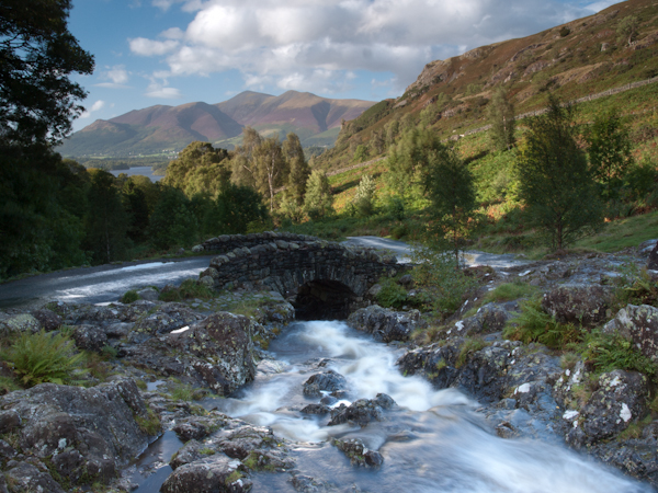
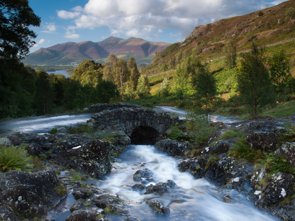
Here’s another example of tonal contrast in action:

Tonal contrast 3

Here, the tonal contrast is provided by the difference in brightness between the white parts of the waterfall and my model’s clothing, and the dark tones of the water and the rocks.

Working in Black and White

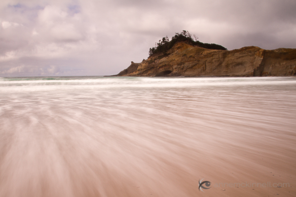
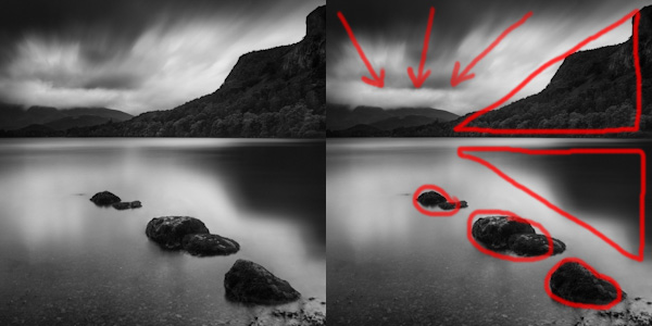
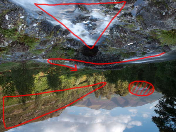
Tonal contrast is the basis of many successful black and white images. Indeed, if you need help to see the tones in your colour photos an easy way to do so is to open them in Photoshop and reduce the colour saturation to zero. This is what happens to the two photos above when we do that:

Tonal contrast 4

Tonal contrast 5

It is easier to see tonal contrast in black and white images because there is no colour to distract your eye from the brightness values within the photo.

You will also notice that the composition of these images is very simple. Simplicity helps improve composition by eliminating distractions.

Let’s look at another example:

Tonal contrast 6

This is a photo that I took in an antiques market in Shanghai. You can see my two principles of composition in action here:

Simplicity: I moved in close to concentrate on the dominoes.

Tonal contrast: The ivory coloured dominoes are offset by the dark tones of the box they are in.

Tonal contrast 7

Here is the desaturated version. The tonal contrast is even clearer in this image.

There are a few more points I’d like to make here:

  1. Tonal contrast is a great basis for a successful black and white image. The desaturated versions of the above photos all work fairly well. It won’t take much more work to turn them into striking monochrome images.
  2. Images with strong tonal contrast tend to work well in both black and white and colour. An interesting exercise you could try is to go back through photos that you have already taken and select some that feature strong tonal contrast. Then convert them to black and white. I think you will be able to create some strong monochrome images if you do this.
  3. Keeping your compositions simple helps make the most out of tonal contrast. If you include too much within the frame, the impact of any tonal contrast is lessened.

Finally, please note that reducing the colour saturation to zero is usually not the best way to convert a colour image to monochrome. The aim here is purely to make the tones easier to recognise by eliminating the distraction of colour.

Does that mean that every image requires tonal contrast to be successful? No, it doesn’t. It is merely one tool of many at your disposal. The key concept to understand is that learning to recognise and utilise tonal contrast helps you create stronger photos.

For example, if you have arranged a photo shoot with a model in a location with a dark background, you could ask her to wear something light in order to set up tonal contrast between her clothes and the background.

Lack of tonal Contrast

There are times when tonal contrast is not evident in a photo, yet the composition is still successful. Here’s an example:

Tonal contrast 8

Now let’s look at the desaturated version:

Tonal contrast 9

You can see that there isn’t much tonal contrast. Yet the photo works because the purple flower is complemented nicely by the green background. This is called colour contrast and in this image more than compensates for the lack of tonal contrast.

Andrew S. Gibson is the author of Understanding EOS: A Beginner’s Guide to Canon EOS Cameras. He is a professional writer and photographer based in Wellington, New Zealand.

Post originally from: Digital Photography Tips.

Check out our more Photography Tips at Photography Tips for Beginners, Portrait Photography Tips and Wedding Photography Tips.

Improving Composition with Tonal Contrast


Digital Photography School

 
Comments Off on Improving Composition with Tonal Contrast

Posted in Photography


How to Blend Exposures to Enhance Your Composition

07 Jun

Exposure blending is a popular technique often used to create high dynamic range photography.

This article is about using the same technique but for the purposes of creating an image that contains all of the elements of a scene that you might not have been able to capture in one exposure.

Of course, we would all like to capture what is in our mind’s eye in one exposure and we strive to do so to reduce the amount of time we spend post-processing. But that doesn’t always work out and blending exposures can be a quick and easy way of creating the image you want.

Here’s an example. I was recently visiting Cape Kiwanda on the Oregon coast and I wanted to make a long exposure image that would show the motion of the water rushing back out into the sea before each incoming wave.

Cape Kiwanda, Oregon, by Anne McKinnell
I started out by taking some fast exposures to discover the composition I would ultimately use. This is what the scene looked like when I first got to the location — in fact, this is my first frame.

I quickly decided on the long exposure technique so I put on my 10 stop neutral density filter which would allow me to make a 4 second exposure in the middle of a sunny afternoon.

The difficulty was that the wave had to be just right and I had to open the shutter at exactly the right moment to get the effect I was after.

Cape Kiwanda, Oregon, by Anne McKinnell
This attempt turned out okay but it wasn’t as dramatic as what I hoped for.

After making this image, I decided that I wanted more foreground in my composition so I used a wider focal length and tilted my camera down a bit.

I made a number of images that were close to what I wanted but the foreground was not exactly as I had hoped.

Then, I finally got the big wave I was waiting for!

Unfortunately the wave was too big and even though I had pushed my tripod down in the sand the amount of water caused my tripod to sink a little while the shutter was open. That wasn’t a problem for the foreground, since it was blurred anyway, but the background was blurred in that image as well.

I spent half an hour making images at this location trying to get exactly what I wanted in camera. That is not a particularly long period of time — often I spend much longer in one location. But since I had the components I needed to make my final image, I decided to move on to other subjects.

These are the two images I ended up combining for the final product.

Cape Kiwanda, Oregon, by Anne McKinnell

Cape Kiwanda, Oregon, by Anne McKinnell

You can see how the rock in the image above is out of focus due to my tripod sinking in the sand.

In post processing, I took both of the above images and opened them in Photoshop Elements. I selected the one with the foreground I wanted, copied it, and pasted it on top of the other image so each image was on it’s own layer. Then I created a layer mask and used the gradient tool to blend the two images together.

Watch this video to see me blend these two images together in Photoshop Elements.

After blending the exposures, I made some final adjustments to contrast and colour to create the final image:

Cape Kiwanda, Oregon, by Anne McKinnell

Remember, photography is an art and you have the artistic license to do whatever you want whether that is documenting a scene exactly as you see it in front of you, or creating something that is different than what you saw with your own eyes using any technique you see fit.

Post originally from: Digital Photography Tips.

Check out our more Photography Tips at Photography Tips for Beginners, Portrait Photography Tips and Wedding Photography Tips.

How to Blend Exposures to Enhance Your Composition


Digital Photography School

 
Comments Off on How to Blend Exposures to Enhance Your Composition

Posted in Photography


20 May, 2013 – Composition by Heart

20 May

Was there a moment when the desire to take up photography struck you in a flash? Bors Vesterby shares with us one such moment in Composition by Heart. 


The Luminous Landscape – What’s New

 
Comments Off on 20 May, 2013 – Composition by Heart

Posted in News


Tips for Objective Evaluation of Composition

12 Mar

Composition is one skill within photography that we can probably never master, but just continually develop.  The composition we choose when taking a photograph, i.e. where we choose to place the boundaries of the frame, the perspective we choose to employ from the chosen focal length, how we choose to arrange objects within a scene etc, all influence the way a viewer interacts with the image, and so are all crucial to the success of any given image.

When a composition of an image is broken down to the most basic level, it can almost always be considered as the balance and interaction between different shapes, patterns and light within the scene.  It is very easy to critically assess the photographs of others in this way within a couple of seconds of laying eyes on them, however, how often do we apply that objective critique to our own images?

Here I've outlined the major components that contribute to the composition of this image, namely the three stones leading in from the foregound, the two blocks of dark tone acting as triangles drawing in from the right, and the movement in the clouds leading the eye in from the top of the image

Here I’ve outlined the major components that contribute to the composition of this image, namely: the three groups of stones leading in from the foregound, the two blocks of dark tone acting as triangles drawing in from the right, and the movement in the clouds leading the eye in from the top of the image.

Personally, there are times when I find it very difficult to ‘see’ my own images in this way as I can have a strong emotional attachment to the image that can cloud my judgement.  What do I mean by emotional attachment?  One of the big draws of photography for me is to be outside, amongst nature, seeing scenes unfold in front of me that no-one else is witnessing at that point in time.  Therefore, after photographing an awe-inspiring sunrise across a landscape, it can be difficult for me to separate the resulting image from the experience of being there whilst taking the image – I can end up seeing my images through ‘rose tinted’ glasses and not judging them with the objectivity that others will.

One effective way to overcome this is to not process images immediately, but to leave them for a few days or weeks until the memory of that moment of taking the photographs isn’t quite so fresh in your mind.  That way, you will see the image with fresh eyes, as others will.

Another method I find very useful is to rotate the image by 180°, i.e. turn it upside down, during post processing.  When you do that, the image in front of you no longer resembles the landscape that you captured, but instead resembles the series of shapes and patterns the make up the composition of the landscape.  When the image is upside down, it becomes very easy to be objective about how well balanced elements within the landscape are and to see the distribution of positive/negative space; therefore it becomes easier to decide where to crop an image or to see where you may need to dodge/burn to help direct the eye to the points of interest.

An image from the Lake District, UK, straight out of the camera.  It is a very busy landscape, with a lot going on

An image from the Lake District, UK, straight out of the camera. It is a very busy landscape, with a lot going on, so I needed to whether the composition works as is, or if any additional processing could help lead the eye of the viewer.

By turning the image upside down, it is easier to distill the key components of the composition, namely: the cascade of water running towards the bridge, the road over the bridge to lead the eye further into the scene, and the hatched circle of interest in the background, being pointed towards by the triangle of well lit trees

By turning the image upside down, it is easier to distill the key components of the composition, namely: the cascade of water running towards the bridge, the road over the bridge to lead the eye further into the scene, and the hatched circle of interest in the background, being pointed towards by the triangle of well lit hill side.

The final image, with processing influenced by the upside-down evaluaiton

The final image, with processing influenced by the upside down evaluation.

So, if you haven’t tried this before, give it a try the next time you’re processing images and I think you’ll be surprised how useful it can be, and not just with landscapes either.  Do you have any other tips for ensuring you are evaluating the composition of your images objectively?  If so, please share them in the comments.

Post originally from: Digital Photography Tips.

Check out our more Photography Tips at Photography Tips for Beginners, Portrait Photography Tips and Wedding Photography Tips.

Tips for Objective Evaluation of Composition


Digital Photography School

 
Comments Off on Tips for Objective Evaluation of Composition

Posted in Photography


Combining Rules of Composition to Improve Your Landscape Images

04 Jan

One of the most elusive and frustrating elements of photography is finding the right composition. Many otherwise good images are often derailed by poor compositional choices. There are several primary rules of composition to be aware of, and by being aware of them, and then combining them, you can give your landscape photos a real boost in terms of interest.

In this image, I had a flat gray mist killing any interest in the sky. But when this lone sailboat began sailing right at the edge of the mist, I began to see possibilities. By placing the sailboat at the intersection of the rule of thirds, and placing the horizon line at the bottom third of the image, I allowed the negative space to take up a lot of room. That negative space gives the boat a place to go, and keeps the interest squarely on the sailboat.

The first and most basic rule is the Rule of Thirds.  This rule states simply that elements of interest in your photos should be positioned one third of the way in from top, bottom, left or right of the image.  Elements of primary importance should be positioned at the intersection of those thirds.  The rule of thirds tends to be the first rule I look to when composing my images.  But I find my strongest images happen when I am able to combine the rule of thirds with other rules.  These rules include using leading lines, using negative space, and using framing.  Of course, there are always times to break these “rules”- they are actually more guidelines than rules. But that’s another article altogether.

Use negative space to help your subject stand out. Too often photographers try to eliminate negative space, simply because there’s nothing of interest in that space. Negative space is simply an area of the image with nothing in it- a blank sky, a dark shadow area, a flat expanse of land.  However, that negative space can be used to contrast against your subject, ensuring the viewer’s eye goes right where you want it to.  Ideally, your subject should be heading or pointing IN to the negative space, to lead your eye into the composition.

The shoreline in this image leads the viewer's eye right to the lighthouse. The lighthouse is positioned right at the intersection of the rule of thirds, with the water on the right creating some nice negative space in contrast with the rocky shore. The horizon line is roughly at the top third of the image.

Leading lines are another excellent tool to use to help draw attention to your subject. Ideally these lines are created by other elements in your composition and help lead the viewer’s eye right to your subject.  Leading lines help create depth when used to lead the eye into the frame, giving a more three dimensional feel to the image.

A very effective way to draw attention to your subject is to use other elements to frame it within the image. Framing can be used to help keep interest where it belongs, and keep the eye from wandering aimlessly through the image.  Framing can add context to an image.  For instance, trees at the edges of an image, framing off a lake, or mountain peak, give a sense of where the photographer is when taking the image.  Eliminating those elements removes the context. This is not necessarily bad, but another variation to consider when photographing at a location. I’ve often found myself frustrated that a tree was in the way, or I couldn’t get the view I wanted because a building was in the way. Then I realize that I can use the trees, or use the building (by shooting through an open window), to add that context that gives an added layer of interest to a photo.

By keeping these four simple compositional guidelines in mind when shooting, you can create a variety of images from the same subject, increasing your keeper ratio finding images you may not have found otherwise.

In this image of Half Dome, foreground trees are used to set apart Half Dome and make it stand out, while providing a context. In addition, note that the trees are roughly at one third on each side of the image. This need not be exact, but it helps create a space within the image that the eye finds pleasing.

Post originally from: Digital Photography Tips.

Check out our more Photography Tips at Photography Tips for Beginners, Portrait Photography Tips and Wedding Photography Tips.

Combining Rules of Composition to Improve Your Landscape Images


Digital Photography School

 
Comments Off on Combining Rules of Composition to Improve Your Landscape Images

Posted in Photography


Photography Tutorial: Unique Composition 3 (landscape photography)

17 Nov

See my photos at: www.momentsofnaturephotography.com In this tutorial I talk about how I took one of my more unique shots. Use the tips and techniques that you see in this video to make your own more unique photographs. A nikon D300 and nikon 12-24mm lens were used to capture the photo in the video. DONT TRY TO COPY THE IMAGE IN THE VIDEO, IT IS COPYRIGHTED.
Video Rating: 4 / 5

 
Comments Off on Photography Tutorial: Unique Composition 3 (landscape photography)

Posted in Nikon Videos


Landscape Photography Composition Tips from Joseph Holmes

30 Oct

www.silberstudios.tv Joseph Holmes, a Berkeley-born landscape photographer who’s been publishing fine art prints since the late 1960’s, joins us today on Advancing Your Photography to share his photo composition tips! Joseph’s goal is to take pictures that change people’s outlook on the world, and composition is the most important tool a photographer has, especially in landscape photography as it is one of the few factors you can control. So how does one take a life-changing photo? Holmes says that you need to work very hard and explore every photography technique so you can recognize “the shot” when you see it. His composition tip is one that many beginners forget don’t ignore the edges of your photos! Watch the full interview for these tips and more on taking landscape photos!
Video Rating: 4 / 5

 
Comments Off on Landscape Photography Composition Tips from Joseph Holmes

Posted in Photography Videos


Photography Tutorial: Unique Composition 2 (landscape photography)

30 Oct

See my photos at: www.momentsofnaturephotography.com In this tutorial I talk about how I took one of my more unique shots. Use the tips and techniques that you see in this video to make your own more unique photographs. A nikon D300 and nikon 12-24mm lens were used to capture the photo in the video. DONT TRY TO COPY THE IMAGE IN THE VIDEO, IT IS COPYRIGHTED.

To order, go to — www.FotoSharp.com
Video Rating: 4 / 5

 
Comments Off on Photography Tutorial: Unique Composition 2 (landscape photography)

Posted in Nikon Videos


Photography Composition: Framing

22 Oct

Framing is an element to photo composition that is simple to understand but it may take some practice to execute successfully in your pictures. Watch this About.com video on photography to learn more about framing.

 
Comments Off on Photography Composition: Framing

Posted in Photography Videos


Better Photographic Composition – Beyond the Rule of Thirds

21 Oct

In this Event Space seminar, David Brommer covers the basic concepts of composition as established by the masters of the Renaissance. Commencing with the classic rule of thirds and leaping into theories of color and balance, David touches upon a range of topics, including image construction, positive and negative space, as well as other advanced composition. David Brommer’s Seattle Suspects www.seattlesuspects.com As Seen Through the Lens http This presentation is designed for anyone wishing to take their photography to the next level by learning how to frame and compose their image according to simple visual rules.
Video Rating: 4 / 5

youtu.be St George Photographic society has a yearly portfolio assignment for its members who are wanting to push their creative photographic skills.A group is developed and meets once a month to discuss individuals progress.I believe it is important to choose a subject which the photographer can relate to personally as it opens up inner feelings,emotions and serves to drive the finished portfolio. My subject which I named “Keeping the Faith” came to me due to a year long struggle of personal issues which made me question the role of religion and its meaning to me.The images I created came from a strong catholic upbringing with learnt and perceived ideas about Jesus and God and depict the concept of Sin and Forgiveness .The idea of a members portfolio group came from our club’s creative mentor Professor Des Crawley and has been growing with more and more members participating yearly.

 
Comments Off on Better Photographic Composition – Beyond the Rule of Thirds

Posted in Photography Videos