RSS
 

Posts Tagged ‘Building’

Ruin Academy: Urban Lab in an Abandoned Building

04 Apr

[ By Steph in Abandoned Places & Architecture. ]

Ruin Academy 1

Occupying an abandoned five-story apartment building in central Taipei, Ruin Academy is a living architectural laboratory where holes drilled in the walls let rain inside, plants grow from the floors and the bones of the structure serve as ‘compost’ for the future of the city. A collaboration between Finland-based Casagrande Laboratory and the Taiwanese JUT Foundation for Arts & Architecture, this project aims to “re-think the industrial city and the modern man in a box.”

Ruin Academy 3

Ruin Academy 2

Ruin Academy serves as a setting for workshops and courses for various Taiwanese and international universities in subjects like architecture, urban design and environmental art. The lines between the city and the building have been blurred with the removal of windows and interior walls, so bamboo and vegetables can be grown indoors. Students and professors sleep in ad-hoc dormitories. The mahogany elements of the interiors, like walkways and steps, are made to be rearranged as the inhabitants’ needs change.

Ruin Academy 5

Ruin Academy 4

“The Ruin Academy is looking at the ruining processes of Taipei that keep the city alive,” says Marco Casagrande on the Ruin Academy blog. The idea is that static urban structures aren’t a natural way of life, and that the ‘Third Generation City’ would mix nature with human construction in an ever-changing symbiosis. Restoring nature within cities, growing food indoors, and living in structures that constantly adapt and change is seen as a more organic way for humans to interact with our environment.

Ruin Academy 6

The Ruin Academy is just one of the many illegal, unsanctioned ‘parasite’ structures that have popped up on top of and around Taipei’s conventional modern buildings. Organic and often transient structures made of materials like bamboo or plastic sheeting sprout on the roofs of concrete skyscrapers and in abandoned lots, used as artist housing, urban farms, night markets and other social gathering places.

Share on Facebook


[ By Steph in Abandoned Places & Architecture. ]

[ WebUrbanist | Archives | Galleries | Privacy | TOS ]


WebUrbanist

 
Comments Off on Ruin Academy: Urban Lab in an Abandoned Building

Posted in Creativity


Incredible Shrinking Building: Top-Down Demolition in Style

31 Jan

[ By WebUrbanist in Architecture & Cities & Urbanism. ]

demolition top down

Japanese culture is commonly thought of as being centered around quiet politeness and public respect. If so, this may be a physical representation of that interpretation -a  remarkably subtle and deferential structure-destroying process with many levels of conscientious thought behind it (not to mention a brilliant visual effect, per the video below).

demolition process deconstruction phases

This elegant form of razing is “reverse engineering” in a much more literal sense – taking apart what has been put together with equal care. The strange structure that seems to move down the building does just that: at each stage, it is held up, then strategically lowered as the process unfolds, making it appear as if the building is shrinking (perhaps imperceptibly to pedestrians, but noticeable as time lapses).

Demolition might be too strong a word: Taisei’s Ecological Reproduction System (aka Tecorep) caps buildings and proceeds to disassemble them piece by piece and level by level in order to reuse intact components and materials.

building deconstruction by floor

The process does more than just aid in reuse – it lower environmental impact, from dust and debris to sound, all of which are buffered. And as elements are dropped down by crane, the power generated by that release of potential energy serves to generate electricity for the deconstruction efforts. The entire system is, in short, incredibly considerate and extremely well thought-out.

Share on Facebook


[ By WebUrbanist in Architecture & Cities & Urbanism. ]

[ WebUrbanist | Archives | Galleries | Privacy | TOS ]


WebUrbanist

 
Comments Off on Incredible Shrinking Building: Top-Down Demolition in Style

Posted in Creativity


Passive house time lapse building in Wicklow

09 Jan

22564 pictures, 15 minutes full animation edited down to 5 minutes. Camera Nikon D5000 time lapse function integrated, one picture every minutes. Enjoy ! House is a Hibernia 164 provided by : www.scanhome.ie Scandinavian Homes Ltd. Lars Pettersson Erected by Flaherty & Goaley Contracts Ltd www.constructiongalway.com Music : “Republic” by Good Old Neon (www.goodoldneon.com)
Video Rating: 4 / 5


Building a Nikon DX Lens System – For Recreation

01 Jan

www.snapchick.com SnapChick talks about which lenses to add to your Nikon DX DSLR body for fun!
Video Rating: 4 / 5


Beyond Domes: 36 Photos of Burning Man Building Types

11 Dec

[ By WebUrbanist in Architecture & Cities & Urbanism. ]

It would be a mistake to characterize Burning Man as merely a festival in the desert. For one week a year, an entire built environment (dubbed Black Rock City) for tens of thousands of residents emerges out of the flat cracked-sand landscape, only to disappear again at the end.

Photographer and author Philippe Glade has catalogued this temporary architecture in rural Nevada extensively on his blog and in a book covering fifteen years of structural ingenuity in one of the most challenging environments on the planet.

By now you have no doubt seen images of outrageous costumes and crazy art cars, but again: there is more to Black Rock City than those sensational elements – there are equally eye-catching and physically-compelling structures made to house and entertain small groups and massive camps.

Consider this deceptively-simple tension structure, for instance, which provides shade but also allows for breezes to pass through, and culminates in a viewing tower at the top – all lightweight, easy to transport and assemble, but robust enough to withstand high-speed desert winds.


Want More? Click for Great Related Content on WebUrbanist:

Burning Man 2007: Can the World’s Largest Temporary City Go Green?

Burning Man is an amazing annual event that takes places for one week a year in the remote Black Rock Desert.
18 Comments – Click Here to Read More »»


Burning Man 2007 Year in Images: Tragedy, Controversy and Sustainability

The dust has finally settled in the Black Rock Desert, both literally and otherwise.
10 Comments – Click Here to Read More »»


Share on Facebook


[ By WebUrbanist in Architecture & Cities & Urbanism. ]

[ WebUrbanist | Archives | Galleries | Privacy | TOS ]


WebUrbanist

 
Comments Off on Beyond Domes: 36 Photos of Burning Man Building Types

Posted in Creativity


Photography SEO And The Power Of Local Relationship Building

11 Dec

Previously we talked about Photography SEO and link building. Today we’re going to talk about the relationships you have to make to get the ball rolling for links. I am going to use a bakery as an example.

Photography SEO  local relationship building

Photography SEO & Local Relationship Building

There are three steps to local relationship building. Below I will discuss each one.

Identify

Identifying your local relationships is step one. If you know that a local bakery is preparing food for many local events, then they are a the perfect place to start.

Outreach

Once you have identified that the bakery is your first relationship to build, it is time to reach out Stop in to the bakery and talk with the employees, meet the owner and bakers. Become friendly and spend some money buying some food if you can afford it or have it in the budget. Visit the bakery’s website and comment on their blog articles. Visit their social media channels and interact with more comments, Likes, Tweets, +1s, etc.

Build

After the engagement becomes a two-way street, it is time to send your letter. Here is a template to get you started:

Hi Tom,

I have really enjoyed the food that your bakery has prepared and the kindness from your employees. I honestly feel your bakery is the best around.

I was thinking that I could start a partner section on my photography website where I refer clients vendors I believe it, like you.

Would you consider having a similar page and exchanging links? I think it can benefits both of us and it would be fun to work together at events.

Let me know your thoughts.

See you Monday morning,

Scott

You might even offer for them to guest post on your blog.

There you have it. A simple three-step approach to photography seo relationship building.

Feel free to comment with questions,

Scott

dslrBlog

 
Comments Off on Photography SEO And The Power Of Local Relationship Building

Posted in Photography


Stripped to Skeleton, Old Building Becomes Bright Art Lab

06 Dec

[ By Steph in Architecture & Public & Institutional. ]

An unused building at the Monterrey Institute of Technology’s León Campus in Mexico was stripped to its frame and re-imagined as a dynamic ‘creative laboratory’ with transparent walls and an undulating wooden facade. Shine Architecture and TA Arquitectura removed exterior walls, interior partitions, windows and staircases to reconstruct all but the building’s most basic footprint.

The intent of the architects was to create a ‘blank page’ for the students, a 24/7 studio for art, design, model-making and photography. All of the natural daylight that floods the building during the day is ideal for these activities; of course, darkened interior spaces are available for photo processing and similar activities.

The ‘shield’ of jagged timber and steel offers shade and privacy on one side of the building, as well as space for a ramp leading to the second floor. The glass walls let both light and air into the structure.

“Morphologically its inner industrial look like tectonic embracing 3 main parts; a large glazed box in conjunction with a smaller solid volume and external circulation appendix,” say the architects. “In terms of general aesthetic, the purpose was to look as part of a context, respecting existing materials, but be different and recognizable as an experimental-design building.”


Want More? Click for Great Related Content on WebUrbanist:

Alphabet Building Spells Out New Approach to Creative Offices

An old port in Amsterdam will be transformed into the Alphabet Building, an unusual collection of offices for creative companies with letter-shaped windows.
3 Comments – Click Here to Read More »»


Architecture Gets Graphic: 13 Ornamental Building Designs

While most modern architecture cuts out unnecessary details, ornamental elements like gates inspired by graffiti and bold graphic images are creeping in.
2 Comments – Click Here to Read More »»


Share on Facebook


[ By Steph in Architecture & Public & Institutional. ]

[ WebUrbanist | Archives | Galleries | Privacy | TOS ]


WebUrbanist

 
Comments Off on Stripped to Skeleton, Old Building Becomes Bright Art Lab

Posted in Creativity


Photography SEO And The Power Of Local Link Building

04 Dec

For photography SEO, there is one extremely effective tactic that can get your website to the top of search engines. Link building is the process of generating links on external websites, facing your yours.

For instance, a link from DSLRBlog to your photography website, would be link building.

photography seo local link building

The best way to go about link building is by guest posting on photography websites. However, I want to talk about local link building.

Now being in such a niche category, link building for photography SEO is tricky. Commenting for links doesn’t work anymore, so what is there to do?

Photography SEO & Local Link Building

If your photography business is local based, and not a full-time traveler, then there is a really good method to try. Create a section on your website where you discuss partners, venues, etc. Reach out to venues that often host events where you are photographing. Write a very personal email explaining that you would like to partner by recommending each other to potential customers. The partnership requires an exchange in links. No money is to change hands, as it is an agreement between companies to increase business.

You can also exchange links with other photographers. If you are a New York City wedding photographer and never photograph an event in Las Vegas, then partner with a Nevada wedding photographer in the Las Vegas area and recommend him/her for potential clients.

Other local businesses you can partner with:

  • Bands
  • DJs
  • Florists
  • Bakers
  • Caterers

Local link building is not only great for photography SEO, but also for relationship building, business and it is also a lot of fun.

Do you have additional local partners you would like to see added to the list? Comment below and we will add them.

Thanks for reading,

Scott

dslrBlog

 
Comments Off on Photography SEO And The Power Of Local Link Building

Posted in Photography


Studio Lighting: Building a Light Set-up

28 Nov

Studio flash photography often appears to be complicated and confusing for the new photographer.  The tangled, twisted mess of light size, power, angle, position, direction, etc… can be daunting to say the least.  Not to mention the need for extra equipment such as backdrops, light stands, modifiers, reflectors and the lights themselves. Wow! Already seems like too much huh? You might find yourself thinking, “I can just use the giant light source in the sky that is available everyday and be done with all this other mangled mess of an armamentarium.”  At times I would not disagree with you, as the natural light from the sun is hard to beat and is in great abundance, however, when I look at how much my understanding of light and shadow has improved from my many unsuccessful studio lighting shoots, the value of learning this sort of lighting is tremendous. And yes I did say “unsuccessful shoots!”

Strangely enough, when I got started with photography, studio lighting was one of the areas in which I was most interested. Not the easiest place to start I can assure you, but  it definitely does not need to be as awkwardly bemusing as it first appears. Now this article is not meant to be a full on detailed description of what lights or modifiers to buy or an in depth scientific analysis of the inverse square law complete with physics equations and Einstein like theorems.  It is more of a reason of why to get started with studio lighting and to break through any mental barriers that might be in your way.  I promise you, once you get your feet a little wet and wild in the studio, you will not only love it, but also find that you have a better eye for light even when you are out at the wee hours of the morning trying to capture that perfectly beautiful sunrise.

To shoot my studio work, I use simple, durable yet economically feasible equipment.  I currently use a set of Alien Bees strobes from Paul C. Buff. There are a lot of other brands of strobes out there, but these have worked well for me and fit within my budget.  Now, you do not necessarily need to use strobes. Westcott has their Spiderlite TD continuous lighting system that also could suffice. Basically any system of lighting can work fine. You could use a couple of lamps with a shower curtain liner to diffuse the light if you want. Don’t get too hung up on the equipment at first, but try to understand how to position and control the lighting to get the desired results.  I am trying not to get pulled into a discussion about equipment, but admittedly some equipment is required. In order to move on, I would recommend getting a good book or two on studio lighting to give you a thorough description of some lighting basics. Two that I have personally found useful are Master Lighting Guide for Portrait Photographers, by Christopher Grey or Basic Studio Lighting: The Photographer’s Complete Guide to Professional Techniques, by Tony Corbell. There was also a nice post here on DPS recently called One Light Portraits: Simple Elegance, by Rick Berk.

Whew! Let’s move on and get into some of the nitty gritty of setting up a studio portrait shoot. Lately, I have been working on some creatively themed portrait shoots as a personal project.  The basics of what you need for a shoot are simple. You need a background and a willing model or subject. This can be a plain wall in your house and a close friend or even some fabric taped to the wall with a bowl of fruit on a table in front of it. My theme was fire, so first I went to the fabric store and found an interesting black/grey charred looking swath. A quick aside, if you want to find some really cool backgrounds in the U.S. go to a fabric store around Halloween and they will have some really great stuff.  Next, I got a hold of a local model, the fabulous Brittney and set-up a time for the shoot. I also hired the amazing Dina Bree Nast a local make-up artist here in Denver, Colorado. I must say, and this is just my own opinion, but if you have never hired a make-up artist for a shoot, you have to try it as the results are spectacular and it will reduce your post-processing time tremendously.

Okay, the date, model, MUA and backdrop were set. Next and most importantly, how do I design the lighting set-up.  A little planning goes a long way with a studio shoot. When you are just getting started you do not want to have to deal with moving a lot of lights around or having your subject face the wrong way and have shadows in places where you do not want them. A sure fire way to avoid this is to first give your subject a stool or a chair to sit on. This will keep them in one place at the same distance and proximity from your lighting set-up and your background. Secondly, stick to one lighting set-up and limit the shoot to it. You want to focus on getting the shot that you want and not be constantly worried about fumbling with the lights. If you are more focused on the lights and everything else going on with the equipment, you will not pay attention to getting a great pose and expression and let’s be honest, the lighting can be less then perfect if you capture the right moment.  Finally, you would like to have an idea of what sort of depth of field at which you would like to shoot. If you want the background slightly blurred go with a wide open aperture of f/2.8-f/4. In my plan for this shot, I chose f/8 as I wanted to capture a bit of the look and texture in the background as I felt it complimented the shot. Additionally, I keep my ISO low which for my Nikon is 200 and my shutter speed I usually leave at 1/125 of a second. Thus, my camera settings are set already and I have not even taken a shot yet.

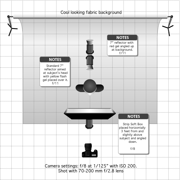
I always start my lighting set-up with the position and exposure setting of the main light or the one that will be responsible for lighting the subject.  In this shot, I already know I want my aperture around f/8 so that I can capture that background detail. This already let’s me know where I want my main lights exposure to be set. Now, there are two ways to set the main light’s exposure. You can use a light meter or you can wing it by taking some practice shots and checking your histogram and adjusting accordingly. Either way works well even though many people have opinions about one way or the other. Personally, I use a combination of both. So what about position of the light?

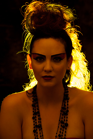
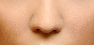
To start out with, I think using a glamour or butterfly lighting set-up (named for the shadow pattern created beneath the subjects nose) is very easy and is incredibly flattering for the subject. To achieve butterfly lighting the main light is set directly in front and slightly above the subject with the light angled down toward the subject. As a beginner, having the light directly in front of the subject is useful cause if the subject turns their head one way or the other they will still always be within the range of the main light. I used a 36-inch strip softbox in this set-up placed about 2-3 ft from the subject in the horizontal position to achieve a narrow, soft beam of light that would not spill onto the background very much. Then I took a few shots to see what it looks like.


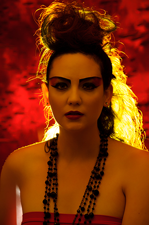
As you can see with just the main light, the subject is adequately exposed, however, I cannot see the background and the subjects dark hair blends in so much with the background that you cannot see the outline of her hair. What does this tell me? I need to light the background as well as the hair to separate her from the background and gain some depth to the image. Since my theme was fire, I wanted to incorporate some colors that would support the theme. This made me think of reds, oranges and yellows. So to light the background I set a strobe just up off the floor angled up at the background with a standard reflector attached, however, I decided to place a red acetate gel over the light to give a little color to the background and support my theme. To set the power of this light I turned off my main light and took a few practice shots with only the background light on to see how it looked and adjusted the power of the light until I liked the look.


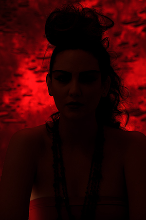
Here you can see with only the background light, I have a nice subtle red glow to the background that also brings out the interesting texture to compliment the fire theme of the shoot. The background light also wrapped around the subject just a little bit, likely bouncing a touch off the white surface of the softbox in front of her, giving a red tinge to the shadows. If I did not want this extra red in the image I could have moved my subject farther form the background, but I liked the effect so I left it alone.

Next, I needed to separate the subject’s  hair from the blending into the background.  I set up an additional light right behind the subject just below her shoulders and directed it with a standard reflector at the back of her head. I decided to add a yellow acetate gel over this light to hopefully give a bit of a fiery glow to the hair. Again I turned out the other lights and I took a few shots to see how it looked and adjusted it as needed.


As you can see, I now have a nice burning glow that highlights the outline of the hair and separates the subject form the background adding some depth to the image. I also get a little more of the yellow light reflecting of the strip softbox and filling in the shadows of the face with a bit of a golden tinge. When I looked back at the photo of the main light by itself I decided that this slight tinge would add some warmth into the shadow area and really compliment the photo. I have to admit this was a happy accident as a result of the light set-up.


Next, I took a few shots of just the background and hair light together to check how the two looked combined.

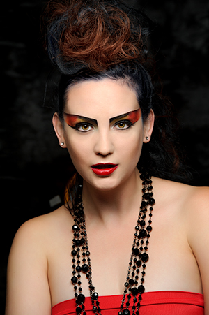
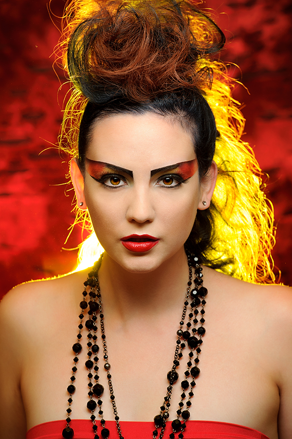
What do you think? A pretty nice combination that provided the shot with the fiery look I wanted, while also serving to bring out the background and help the subject stand out. To be critical, I was not pleased with the illumination of the subjects right ear, but I figured I could work with angles possibly to make it more subtle. Finally, I turned the main light back on and took a few more shots to see how all three lights looked together. I was very pleased with the result and felt that the little bit of red and yellow that spilled over into the shadows of the subjects face really helped to compliment the look and bring it all together.  At this point the light and camera settings were never touched and all I had to do was shoot and make sure I got the pose and expression I wanted, which when working with someone like the experienced Brittney was super easy. Is the light perfect? Definitely not, but it all comes together to produce a nice unique portrait.

I hope by going through my thought process step-by-step for this shot and by showing the effects of each light separately that it gives you a little insight into working with studio lighting and how you can construct an image one light at a time. Having total control of the lights is a bit scary, but once you start taking some baby steps with it, I promise you it will make all aspects of your photography better. Studio lighting is all about the direction and intensity of light and how it transitions and compliments into shadow. Wait, isn’t that what all photography is about? So go ahead and jump in head first. Inevitably, you will make a lot of mistakes, have many over and underexposed images, and end up with plenty of shots of which you are not proud, however, you will also absolutely get some fantastically, fascinating photos and learn a lot about the the interplay and visualization of light and shadows.  Plus, let’s be honest, don’t we have these same problems with any shoot? Any shot involves the light, background and subject and how we decide to capture and expose the image. Being able to control the light should actually make getting a great capture easier.

Post originally from: Digital Photography Tips.

Check out our more Photography Tips at Photography Tips for Beginners, Portrait Photography Tips and Wedding Photography Tips.

Studio Lighting: Building a Light Set-up


Digital Photography School

 
Comments Off on Studio Lighting: Building a Light Set-up

Posted in Photography


Architecture Gets Graphic: 13 Ornamental Building Designs

22 Oct

[ By Steph in Architecture & Public & Institutional. ]

Modern architecture is not exactly known for being ornamental, but some architecture firms are beginning to pick away at the close association of modernism and minimalism. Led by Herzog & De Meuron, many practices have begun pulling bold, graphic and sometimes typographic elements into their building designs. Here are 13 examples of ornamental modern architecture.

Elbe Philharmonic Hall by Herzog & De Meuron

(images via: design boom)

Architecture firm Herzog & De Meuron is one of the main forces bringing some ornamentation back into modern architecture, and the Elbe Philarmonic Hall is a prime example. This concert hall, hotel and apartment complex in Hamburg, Germany looks like a wave shooting up out of the river, blending with its surroundings yet at the same time, standing out as a dramatic glassy pinnacle in the landscape. The building is currently under construction and expected to be completed soon.

John Lewis Department Store and Cineplex, UK

(images via: archinect)

A shimmering geometric silver facade meets glass printed with a beautiful abstracted vine print at the John Lewis Department Store and Cineplex by Foreign Office Architects. The glass allows light to stream into the store section of the building, while the monolithic back end keeps the theaters dark. The design on the glass pays tribute to Leicester’s textile heritage as well as that of the department store.

Lycee Louis Bleriot Extension, France

(images via: archdaily)

What could be an extraordinarily harsh, brutalist concrete rectangle is livened up considerably by a perforation of small diamond-shaped windows. The Lycee Louis Bleriot Extension by Christphe Gulizzi is a gymnasium that had to fit into a very limiting plot.

Scottish Parliament Building by Miralles Tagliabue EMBT, UK

(images via: galinksy)

Divisive and eclectic, the Scottish Parliament Building certainly doesn’t shy away from complexity. Designed by EMBT (Enric Miralles and Benedetta Tagliabue), the building cost an astonishing $ 750 million to construct and is ‘metaphorical’ in design. Explains Miralles, “The Parliament sits in the land. We have the feeling that the building should be land, built out of land. To carve in the land the form of gathering people together… Scotland is a land… The land itself will be a material, a physical building material…”

Tate Modern Expansion by Herzog & De Meuron, UK

(images via: dezeen)

Herzog & De Meuron’s extension to the Tate Modern art museum in London will add a new wing, as well as converting underground tanks previously used to store oil for a former power station into new gallery space. The main volume of the extension resembles a conventional rectangular building shape that has been twisted and skewed.

Art’otel Hoxton by Squire and Partners, UK

(images via: archiscene)

Squire and Partners designed the flagship hotel of Art’otel in London as a gold column covered in a perforated facade full of abstract patterns and rounded cut-outs that make the whole structure shimmer at night.

Forum by Herzog & De Meuron, Spain

(images via: arcspace)

Jutting above a public square like the bow of a massive ship, ‘Forum’ is an elevated triangular structure in Barcelona that invites the public into its reflective silver underbelly. Though the building looks darka nd intimidating approach, it holds a series of courtyards open to the sky that bring in light.

Bella Sky Hotel by 3XN Architects, Denmark

(images via: design boom)

In both its shape and in the complimentary pattern of windows on its exterior, the Bella Sky Hotel by 3XN Architects looks almost typographic. Newly open in Copenhagen, the hotel consists of two asymmetrical towers and looks entirely different depending on your vantage point.

40 Bond by Herzog & De Meuron, NYC

(images via: archdaily)

The standout feature on Herzog & De Meuron’s 40 Bond luxury residence in New York City is unquestionably this graffiti-inspired gate. A one-bedroom apartment in this building reportedly costs $ 18,000 a month.

C42 Citroen Flagship Showroom by Manuelle Gautrand Architecture, France

(images via: openbuildings)

Diamond-shaped glass in soft shades of pastel pink that compliment the golden light streaming out of the interior characterize the new Citroën showroom on Champs Elysées in Paris. Once inside, that pink turns to red. Say the architects, “We originally conceived the use of red, the brand’s signature colour, in the glass panels but we decided it would be too bright from the outside. There were some concerns about the building not harmonising with its neighbours on the Champs Elysées, so we’ve created a filter that on first sight, masks the red colour from the exterior. This totally original filter, which is cleverly constructed inside the finished glass, also minimises the heat of the sun passing through, and will also create a diaphanous pearly white atmosphere inside the building.”

Sint Lucas Art Academy by Fashion Architecture Taste, Netherlands

(images via: dezeen)

A 1960s building was given a dramatic makeover with a decorative facade inspired by both Dutch gables and the Doge’s palace in Venice, Italy. Architecture firm ‘Fashion Architecture Taste’ gave the Sint Lucas Art Academy an entirely new visual identity.

McCormick Tribune Campus Center by OMA, U.S.

(images via: arcspace)

Working around a pre-existing elevated railway, OMA/Rem Koolhaas created a sound-isolating stainless steel tube that would form the basis of the McCormick Tribune Campus Center expansion at the Illinois Institute of Technology. The campus was originally designed by Mies Van der Rohe, whose portrait is emblazoned large on exterior and interior walls.

Midrash by Isay Weinfeld, Brazil

(images via: openbuildings)

Designed to house the Jewish Congregation of Brazil, the Midrash Building by Isay Weinfeld in Rio de Janeiro has a fiberglass mesh facade made up of Hebrew words.

Placebo Pharmacy by Klab Architects, Greece

(images via: archdaily)

The shape and decorative elements of Placebo Pharmacy by KLab is about as far from Walgreens as you can get. In this case, the perforated mesh facade on the exterior is covered in braille.


Want More? Click for Great Related Content on WebUrbanist:

15 Cool High School, College and University Building Designs

If only more school buildings were as creatively designed as these 15, perhaps attendance rates would be higher.
32 Comments – Click Here to Read More »»


Black Buildings: 15 Examples of Monochromatic Architecture

These 15 buildings are brave and bold in solid black, from modern private residences to museums and offices.
Click Here to Read More »»


Share on Facebook


[ By Steph in Architecture & Public & Institutional. ]

[ WebUrbanist | Archives | Galleries | Privacy | TOS ]


WebUrbanist

 
Comments Off on Architecture Gets Graphic: 13 Ornamental Building Designs

Posted in Creativity