RSS
 

Posts Tagged ‘Black’

Rekindling the Romance of Black and White Photography

18 Jun

There is a renewed interest in the romance of black and white photography for several good reasons. First, hyped color is becoming boringly predictable. Second, automated software presets and templates deliver a predictable variety of pre-digested looks that can be applied to any image and deliver similar results.

Just as Hollywood movies have fallen into the same predictable themes and plots, color digital photography has lost some of its originality to over-processing. As you noticed, the common theme here is predictability. Serious photographers want to do unique and serious work and that all points to a resurgence of black and white images.

In the Beginning

Heidelberg Pipes - Rekindling the Romance of Black and White

There was a certain warmth and personality to black and white prints in the days of film and darkrooms. Photographers got involved with this medium for more than a technical exercise, it became a conduit for personal expression and emotional input. It was a way for the photographer to be involved in every aspect of the process.

Black and white prints were produced in a more personal way than color prints. While color prints were cranked-out mechanically by drugstore photo labs, black and white prints were produced one at a time by photo-artisans, many times in makeshift darkrooms.

These darkrooms didn’t have to be state-of-the-art facilities; any room large enough to house a small enlarger, four 8×10 trays, and a clothesline would do. Many times bathrooms were taken over for the evening simply because they had running water, a countertop, and electricity; the three necessities of a well-equipped darkroom.

Taping off the small window with a bath towel and duct tape was simple, and a hand towel stuffed under the door sealed the deal. A nightlight wrapped in Rubylith made a perfect safelight.

Tybee Window - Rekindling the Romance of Black and White

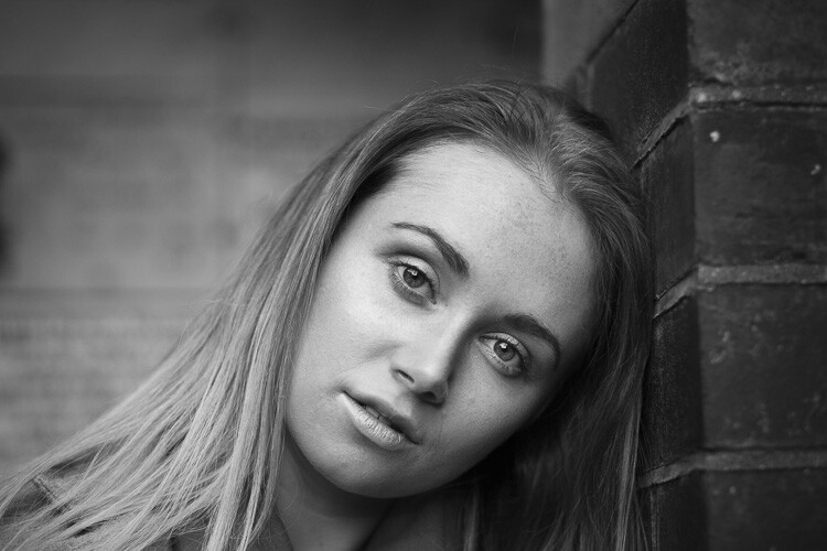
You can make a stronger statement with black and white than you can with color. Nothing “pops” like good black and white.

Black and white was a labor of love

The lure of black and white was personal expression more than technical achievement. The drugstore produced stacks of little glossy snapshots in an envelope, but YOU were creating one-of-a-kind masterpieces worthy of wall placement. The wannabe artists weren’t really in a bathroom, they were in a custom photo lab.

Creativity was the mystical elixir that compelled us all to work in hot, cramped little rooms without proper ventilation, dipping and dripping various chemicals on clothing, tables, and floors. The acidic smell of stop bath and fixer lingered in the air and on hands and clothing for hours.

Hawaii Lava Rocks CR750 - Rekindling the Romance of Black and White

The RGB image above provided over 4 billion colors that could be pushed and shaped. This monochrome shot provided only 256 tones to do the same job. With film, this would be nearly impossible but with digital…

Sometimes entire 25-sheet packs of photo paper were needed to produce a single perfect print. But all the expense and inconvenience was willingly paid for the sake of the prize and the pride of the print. In the end, the masterpiece was paraded around for all to appreciate.

Hawaii Lava Rocks CR750 Toned - Rekindling the Romance of Black and White

This original RGB capture of the lava pools in Hawaii presented a challenge. How to capture and delineate detail in the extreme shadows and highlights. Tough enough for color but almost impossible for monochrome.

Those were indeed magical escapades, but ones that can still be replicated (to some extent) today in the digital world. The stifling air, low light, and acrid aroma may be a thing of the past, but the personal expression and purity of purpose are all waiting to be relived.

The Romance

Black and white photography quietly transports your mind into a playground of creative thought; a semi-guided tour into your imagination. Black and white photography doesn’t enclose your mind inside the bookends of a specific color scheme. It sets your imagination free to discover a place filled with emotion and open to interpretation. Black and white photos deliver moods, not just pictures.

Color can totally capture your mind, but not always in a good way. Here’s what I mean. Once you see a color picture, mental blinders close the deal. You can no longer imagine the scene your way. Before you know it, you find yourself subconsciously critiquing the color rather than interpreting the subject. Color captivates your mind but black and white enables you to dream.

The Reality

Both film and digital cameras capture color information and transpose that color into black and white images. But there’s a significant difference in the way it’s done. Black and white film in the hands of an old-school darkroom artist can produce a print that captures the imagination, though a straight RGB-to-B/W conversion from even a good color photo can deliver ho-hum results. Here’s why.

Black and white film is composed of silver-halide particles that are uniquely sensitive to specific colors but this spectral fingerprint doesn’t automatically carry over to digital image sensors. A scene’s colors captured with panchromatic film will produce different values than the same scene captured by digital sensors.

This means that YOU must get involved shaping the luminance (brightness/contrast) values, and adjusting the chrominance (spectral / color) values of the RGB image. Color frequencies influence the tonal values when converted from color to black and white. Fortunately, both the chrominance and the luminance are controlled in virtually all RAW Interpreter software.

Digital cameras follow a purely statistical recording process and thus, don’t emphasize the strength of one color over another. Different film manufacturers (Agfa, Kodak, Ilford, and others) parsed these color values slightly differently. The photosites in your digital camera’s image sensor simply count photons (the atomic level of light measurement) and use electrical current to set the gray levels.

These values vary based on the camera’s current ISO, white balance, and color mode settings. Just as both black and white and color images captured with film cameras were influenced by various colored filters, these color settings affect both color and tonality values in digital captures.

BountyRGB - Rekindling the Romance of Black and White

This is the original RGB image shot in San Juan Puerto Rico.

The Problem

When a digital image is captured in monochrome (Black and White) mode in JPEG format, the camera discards all RGB information and retains only a very sparse number of gray tones. While this sounds like a logical way to arrive at black and white values, it’s not!

Monochrome negates the nuances of spectrally-weighted color transformation. Quite simply, the process removes the emotion and personality of the image. Each camera’s engineering team determines the way each color is parsed as a gray value, and we know how emotional engineers are. There’s a reason we tend to avoid guys with pocket protectors at parties.

Bounty BW in-Camera Rekindling the Romance of Black and White

This is a simple conversion from RGB to B/W with no adjustments, as your camera would do.

When you capture images in black and white (Monochrome) mode, you are literally at the mercy of the engineers who wrote your camera’s algorithms. But while some very interesting color/monochrome translations are provided by camera manufacturers, you are still locked into someone else’s interpretation. So what to do?

Bounty CR BW750 - Rekindling the Romance of Black and White

This is the conversion from RGB to Grayscale using Camera Raw’s HSL Grayscale tools. The intensity and saturation of eight different colors determine the internal contrast of the gray tones.

The Solution

There are several ways to address this problem.

  1. Record all images in both B/W JPEG and RAW formats.
  2. Investigate the interesting results that can be achieved when monochrome images are captured in one of your camera’s “scene” presets. Experiment with your camera’s settings to get a fair sampling.
  3. When digital images are captured in RAW format, all spectral (color) information can be accessed (see below) and used to influence the tonal values.
BountyColorize - Rekindling the Romance of Black and White

To add a little sparkle to your monochrome, try the Colorize option in Photoshop’s Hue/Saturation dialog box.

The Two-Stage RAW Approach

When these controls (provided by Camera Raw and a number of other RAW Interpreter software apps) are involved in shaping the spectral information into B/W, some absolutely magical results take place.

Remember, both the luminance and the chrominance need to be optimized for the best results in RGB-to-Monochrome conversions. I suggest that the chrominance be addressed first and the luminance second. This combination of controls provides all the tools you’ll need to take total control of your black and white images.

BowersBWMix - Rekindling the Romance of Black and White

The chrominance settings reside in the Black & White Mix panel.

Bowers Basic BW Panel - Rekindling the Romance of Black and White

The luminance is adjusted in the Basic – Black & White panel.

In Camera Raw, toggle back and forth between the original RGB image and the current settings using the P-key, noting the colors in the original and the influence that each color slider has on the final product.

Bowers SBS - Rekindling the Romance of Black and White

When either of these processes is put to work, you become creatively involved in converting colors into gray tones and the magic of silver halide interpretation gets replicated in the digital process. And here’s the kicker… using digital controls, you can surpass the mile markers established by the black and white masters of the past.

This is scary good stuff, and Ansel would have loved it.

The post Rekindling the Romance of Black and White Photography appeared first on Digital Photography School.


Digital Photography School

 
Comments Off on Rekindling the Romance of Black and White Photography

Posted in Photography


How to Create Silky Split Toned Black and White Photos Using Luminosity Masks

22 Mar

Have you ever found it hard to choose between processing an image in color or black and white? It can be a tough decision. Enriching colors that instantly captivate your attention versus a timeless black and white photograph full of texture and complex shadows.

There’s every chance you’ll process both versions because you can’t have the best of both worlds, right? Well, with split toning, maybe you can – sort of.

1 How to split tone black and white images using luminosity masks

Split Toning 101

At its core, split toning is a pretty simple editing technique. You can create a split tone effect by simply introducing color into the highlights and/or shadows of your photograph.

It’s often used by photographers (and extensively by film makers) to recreate a film look and to create a consistent style across a series of images. In recent years, it’s become renowned for creating the ever so popular “orange and teal” look.

These days, the mere thought of split toning your photograph is greeted with groans of “not another Insta-image”. But for all of its popularity on social media platforms, perhaps split toning is most effective when applied to black and white photographs. This is where its subtle tones combine with texture and luminance to create sumptuous results.

2 How to split tone black and white images using luminosity masks

Black and White Versus Color

Colors are powerful. Not only do they add excitement and interest, but they also set the tone for your images. By default, colors come with a little extra baggage – they’re moody, symbolic and represent a preconceived tone.

3 How to split tone black and white images using luminosity masks

Tones such as reds, yellows, and oranges are usually associated with warm, gooey feelings of love and comfort.

4 How to split tone black and white images using luminosity masks

Whereas the cooler tones such as blue, cyan and magenta are typically associated with melancholic feelings of calmness and reflection.

You could almost think of color as a way of spoon-feeding the viewer with the tone, style, and mood of your images. Essentially, colors can make your job of storytelling a lot easier.

With this in mind, you’d be forgiven for wanting to enhance the emotion of your photographs by pumping up the saturation of your colors. But there’s a consequence. They’re too powerful.

Color Can be a Distraction

For all of their excitement and emotional qualities, colors have the potential to be overly dominant and cause major distractions. I’m not going to pretend I know the science behind why this is, but have you ever noticed that black and white photographs appear to offer a little more oomph? A particular grittiness.

It’s almost like they have a 3-dimensional quality that seduces your eyes and encourages them to roll around in the graduating tones. Okay, maybe it’s just me.

The theory goes that the presence of strong color can make it more difficult for your eyes to detect luminance, perceive depth, and absorb the finer detail in your images. A problem black and white photographs need not worry about.

5 How to split tone black and white images using luminosity masks

You may notice that your primary focus flickers from color to color instead of exploring the shapes and textures of the building in this image.

6 How to split tone black and white images using luminosity masks

Removing the color helps your eyes to journey through the maze-like building to explore the textures, lines, and shapes.

Enter Split Toning

Without color, your eyes turn into luminance seeking missiles as they journey deep into your image to revel in silky graduating tones, land on interesting shapes, and explore complex textures.

So how do you combine the moody nature of color with the textural qualities of a black and white image?

This is where split toning makes its grand entrance. Applying a subtle color to the highlights and shadows of your black and white photographs gives you a slice of the emotional qualities that color can offer, without disguising the depth and texture of your black and white photograph.
Who said you can’t have the best of both worlds?

7 How to split tone black and white images using luminosity masks

Basic Color Theory 101

Before you dive in and start splashing color around as if you’re celebrating the Holi festival, it’s a good idea to have a basic understanding of color theory. Then you’ll know exactly what colors to combine when you split tone your black and white photographs.

The Adobe color wheel is a great tool that represents the relationship between primary, secondary, and tertiary colors. Photographers, designers, and artists often apply basic color theory to the color wheel to create visually appealing color palettes for their work.

8 How to split tone black and white images using luminosity masks

Here are three common color schemes you can use to develop a subtle, harmonious, or contrasting color palette for your split toned black and white photographs.

Analogous Color Scheme

An easy way to understand the analogous color scheme, which also avoids you having to pronounce it, is to think of it as a really good set of next-door neighbors.

9 How to split tone black and white images using luminosity masks

Analogous color schemes use colors that are directly next to one another on the color wheel. They are naturally harmonious and can often be found in nature.

Triadic Color Scheme

10 How to split tone black and white images using luminosity masks

Triadic color schemes use colors that are evenly distributed around the color wheel. This type of color scheme is typically more vibrant and interesting than an analogous one.

Complementary Color Scheme

11 How to split tone black and white images using luminosity masks

Colors that are directly opposite one another on the color wheel are known as complementary colors.

If you have watched almost any movie in the last 10 years or scrolled through your Instagram feed in the last 10 minutes, it’s highly likely you would have noticed a strong presence of orange and teal colors. This is a perfect example of a complementary color scheme.

Brief Recap

So far I have briefly covered the advantages of color and black and white photographs and how, in theory, it’s somewhat possible to combine their qualities to get the best of both worlds using a split toning technique. I’ve also introduced a basic level of color theory, so you will know how to create visually attractive color combinations in your split toned images.

At this point, you might be wondering how to apply all this wonderful information and actually split tone your photographs. So, let’s dive in and bring it all together.

How to Create a Silky Split Tone Effect

A common and very easy way to split tone your images would be to use the Lightroom Split Toning tab in the Develop Module.

12 How to split tone black and white images using luminosity masks

This allows you to select a specific hue for the highlights and shadows, adjust the saturation, and the balance of the effect.

13 How to split tone black and white images using luminosity masks

While this method is extremely fast and produces acceptable results, it lacks the ability to infuse your images with a triadic or analogous color scheme. More importantly, it doesn’t allow you to control how the split toning effect is applied to the different tones in your image.

Using Luminosity Masks in Photoshop

Having more control can help you to create a silky split toned black and white photograph that makes you want to instantly hit print and proudly publish it for all to see. To gain this level of control you’ll need to take a deep breath and join me as we take a big brave step into Photoshop.

Step 1: Creating Luminosity Masks

To get started you’ll need to open up Photoshop and load a series of luminosity masks.

If you’ve just exhaled that deep breath with a, “Huh!? What is that!?” there’s no need to run a “What’s a luminosity mask?” Google search. All the basic information you need (and a free action that does all the work for you) is available right here.

Originally developed and thoroughly documented by Tony Kuyper, luminosity masking is regarded as one of the most effective techniques to control your images in Photoshop.

Despite its complex sounding name, luminosity masking is a relatively easy technique you can use to apply subtle adjustments to your images in a clean and effective way.

14 How to split tone black and white images using luminosity masks

Several tonal adjustments were applied to this image using luminosity masks to gradually build contrast and depth in this image.

Luminosity masks are commonly used among landscape and architecture photographers to seamlessly blend bracketed exposures, gradually build contrast, and create silky black and white photographs. They work by creating a series of selections that isolate the highlights, mid-tones, and shadows on a granular level, which allows you to target specific tones based on their luminance (brightness) value.

Sadly, the process of creating luminosity masks is nowhere near as fun as using them. So, to save you (and me) from:

  • Death by 100 confusing screenshots detailing how they are created
  • Spending 15 minutes creating luminosity masks every time you want to split tone an image in Photoshop

Here’s a link to download a Photoshop Action that includes all the information you need to install and create luminosity masks in a just a few clicks.

15 How to split tone black and white images using luminosity masks

Luminosity masks in Photoshop.

Essentially, having a selection of luminosity masks at your disposal gives you ultimate control over your photographs. It means you’re able to work with the highlights, mid-tones, and shadows independently of one another. Which, if you’re partial to the odd black and white photograph, provides you with the perfect system to create a beautiful split toning effect.

Step 2: Create a Color Palette

With your luminosity masks created, head over to the Adobe color wheel to create a visually attractive color palette. Note down the hex value of your desired colors, as you will need these in the next step. For this example, we’ll create a complementary color scheme.

16 How to split tone black and white images using luminosity masks

Step 3: Apply your Shadow Color

Create a Solid Color Adjustment Layer and enter the hex code of the color you’d like to introduce into your shadows.

17 How to split tone black and white images using luminosity masks

Step 4: Color Blending

Change the blend mode of the Solid Color Adjustment Layer to “Color”. As you do so, you’ll notice that your entire image will be colorized with the hue you selected. Now select the default white layer mask and delete it by dragging it to the trash can icon.

18 How to split tone black and white images using luminosity masks

Step 5: Select a Luminosity Mask

Navigate to the Channels tab and locate the luminosity masks you created using the Photoshop action in step one. You’ll notice that seven luminosity masks with varying degrees of intensity have been created for your highlights, likewise for your shadows, and two luminosity masks will target the mid-tones of your image.

15 How to split tone black and white images using luminosity masks

Luminosity masks are stored in the Channels tab.

The aim here is to apply one of these luminosity masks to the Solid Color Adjustment Layer you just created. This will restrict the effect of the adjustment layer to only appear in specific areas of your image.

Clicking on each of the luminosity masks allows you to preview the target areas of your image.

Luminosity masks work much in the same way as regular masks. The white areas of the mask will reveal the effect and the black areas of the mask will conceal it. The grey areas of a luminosity mask will partially reveal the effect which helps to create a subtle and clean finish.

19 1 How to split tone black and white images using luminosity masks

Clicking on a luminosity mask allow you to preview what areas of your image it targets.

The general aim is to select a luminosity mask with just enough white (and gray) in the areas where you’d like the color to be visible. As a rule of thumb, when choosing a luminosity mask to add color into your highlights, selecting the “Lights 2” or “Lights 3” mask usually works well.

If you intend to introduce a color into the shadows of your image (like in this example), then you may find that using the “Darks 2”, “Darks 3” or “Darks 4” luminosity masks will provide you with a silky-smooth finish.

19 2 How to split tone black and white images using luminosity masks

The white areas represent where the blue tone will be revealed.

Step 6: Load Luminosity Selection

With your chosen Luminosity Mask selected click on the “Load mask as selection” button at the bottom of the Channels panel. Upon doing so, you’ll notice that the marching ants appear to indicate the selection.

20 How to split tone black and white images using luminosity masks

Step 7: Create a Layer Mask

Navigate back to your layers tab, select your solid color layer and click the “Add Layer Mask” button. This will create a layer mask using the luminosity selection which will restrict the Solid Color Adjustment Layer to only be visible in the white areas of the mask.

In the example, you can see that the blue color tone is now only visible in the darker areas of the image.

21 How to split tone black and white images using luminosity masks

Loading the “Darks 4” luminosity mask helps to restrict the effect to the shadow areas only.

Step 8: Refine Your Color

At this stage, there’s every chance the effect will look a little too strong and not very subtle. This is where working with adjustment layers and masks gives you complete control.

To refine the effect, double-click on the Solid Color Adjustment Layer to reduce the saturation and brightness. If need be, you can also adjust the overall opacity of the Solid Color Adjustment Layer to soften the effect.

22 How to split tone black and white images using luminosity masks

Reducing the saturation and brightness helps to create silky smooth shadows.

If your effect is still too strong then you may want to consider deleting the layer mask and repeating steps 5 and 6 to select a luminosity mask with a softer selection.

Step 9: Housekeeping

To help keep your layers neat and tidy, you can rename the Solid Color Adjustment Layer to “Shadows”.

23 How to split tone black and white images using luminosity masks

Step 10: Mid-tones

Repeat steps 3-8 to apply your desired color to the mid-tones. Only this time, when you get to step 5, you’ll need to select the “Midtones 1” luminosity mask.

25 How to split tone black and white images using luminosity masks

Note: When you load the “Midtones 1” luminosity mask as a selection, Photoshop will display a warning which states “No pixels are more than 50% selected. The selection edges will not be visible.”

24 How to split tone black and white images using luminosity masks

You can safely ignore this warning. Your mid-tones will still be selected, this message is just Photoshop’s way of saying, “Woah there! You are making a selection so subtle that the marching ants can’t show you where it will apply.”

Step 11: Highlights

Finally, you can now introduce a color into your highlights.

26 How to split tone black and white images using luminosity masks

To do this, you’ll need to repeat steps 3-8, modifying step 5 to select a “Light” luminosity mask. Often the “Lights 2” or “Lights 3” masks will create subtle results.

27 How to split tone black and white images using luminosity masks

Here’s an example of the shadow, mid-tone, and highlight layers combining to split tone the image.

28 How to split tone black and white images using luminosity masks

Before and After

14 How to split tone black and white images using luminosity masks

Here is the image prior to applying the split toned effect.

1 How to split tone black and white images using luminosity masks

Here is the image after applying a complementary split toned effect.

As you can see, the subtle toning helps to add a little emotion to the cityscape without losing the sense of depth of the original black and white image. And because the toning has been applied with luminosity masks and layers, you’re able to tweak and control the precise tone until it has a silky quality that makes you want to jump inside the image and roll around in its graduating tones.

Examples

Here are a few examples of different color schemes applied to the cityscape using the exact same process.

Warm Analogous Color Scheme

29 How to split tone black and white images using luminosity masks

Warm analogous color palette created with the Adobe color wheel.

30 How to split tone black and white images using luminosity masks

A Cool Analogous color scheme

31 How to split tone black and white images using luminosity masks

Cool analogous color palette created with the Adobe color wheel.

32 How to split tone black and white images using luminosity masks

Triadic color scheme

33 How to split tone black and white images using luminosity masks

A vibrant Triadic color palette created with the Adobe color wheel.

34 How to split tone black and white images using luminosity masks

Conclusion

Whether you are looking for a way to add a little more emotion into your black and white photographs or simply trying to work out if you prefer an image in color or monochrome, you may find that split toning a black and white image can often give you the best of both worlds.

35 How to split tone black and white images using luminosity masks

And besides, in a world full of heavy saturation, smartphone filters, and HDR, it can be refreshing to strip away excess color and produce a sumptuous split toned black and white photograph.

I hope this encourages you to play with the color wheel and experiment with split toning effects. If you decide to give it a try, I’d be delighted to see your photographs in the comments below.

The post How to Create Silky Split Toned Black and White Photos Using Luminosity Masks by William Palfrey appeared first on Digital Photography School.


Digital Photography School

 
Comments Off on How to Create Silky Split Toned Black and White Photos Using Luminosity Masks

Posted in Photography


Leica reveals matte black M Monochrom ‘Stealth Edition’ with glow-in-the-dark markings

09 Mar

$ (document).ready(function() { SampleGalleryV2({“containerId”:”embeddedSampleGallery_6653943597″,”galleryId”:”6653943597″,”isEmbeddedWidget”:true,”selectedImageIndex”:0,”isMobile”:false}) });

Leica today unveiled a new “unprecedented” special edition version of its black-and-white sensor camera. Meet the Leica M Monochrom (Typ 246) ‘Stealth Edition’: an even more understated version of Leica’s monochrome digital rangefinder that features all matte black styling, jet-black cowhide leather trim, and glow-in-the-dark engravings “for optimal use in low-light situations.”

The Stealth Edition is a product of the collaboration between Leica Camera and Marcus Wainwright, the Founder, CEO, and Creative Director of fashion brand rag & bone.

“For me the Leica M system personifies the pursuit of perfection in an object designed for a singular purpose,” says Wainwright. “Inspired by that, I was aiming to try and further refine and perfect the M Monochrom—an almost impossible task—by distilling it to its purest form and highlighting the stealth nature of the camera and lens.”

Only 125 sets of the matte black ‘Stealth Edition’ will be made, each with its own matching Summicron-M 35 mm F2 ASPH lens, a black fabric carrying strap, a metal front cap for the lens and, of course, a certificate of authenticity. According to our Leica press contact, the price for the camera and lens is $ 15,750, and will begin shipping March 20th.

To learn more about this camera, head over to the Leica website. And if you want to see what this black-and-white camera is made of, check out our studio scene and real-world sample galleries below:

Leica M Monochrom Typ 246 Real-World and Studio Samples

Press Release

Leica Camera and Marcus Wainwright of rag & bone Collaborate for Special Edition M Monochrom (Typ 246)

The new ‘Stealth Edition’ set underscores Wainwright’s quest for purity and perfection with a sleek, matte black version of the distinctive Leica M Monochrom

March 8, 2018 – Today, Leica announced an unprecedented special edition of its unique digital rangefinder camera with a black-and-white sensor: the Leica M Monochrom (Typ 246) ‘Stealth Edition.’ Limited to just 125 sets worldwide and designed by Marcus Wainwright, CEO, Founder and Creative Director of the New York-based fashion brand rag & bone, the special edition camera and accompanying Summicron-M 35 mm f/2 ASPH. lens matches Leica’s high standard for quality and craftsmanship, with a new twist. With the M Monochrom camera, Wainwright, a longtime Leica photographer and enthusiast of black-and-white photography, has intensified the highly coveted unobtrusive nature of the camera with a unique matte black look and glow-in-the-dark accents for added functionality.

“For me the Leica M system personifies the pursuit of perfection in an object designed for a singular purpose. Inspired by that, I was aiming to try and further refine and perfect the M Monochrom – an almost impossible task – by distilling it to its purest form and highlighting the stealth nature of the camera and lens,” Wainwright said.

Staying true to Leica’s integrity and his focus on the essentials, Wainwright sought to perfect the iconic design of the Leica M camera with an aesthetic that marries purity with function. The ‘Stealth Edition’ of the Leica M Monochrom is quite possibly the most discreet camera on the market today, with both camera and lens dressed in an unassuming black matte finish and minimal branding to eliminate any distractions from the purity and integrity of the design. Only the most important engravings for photographic settings are highlighted on both the camera and lens, each crafted with a with a striking glow in dark fluorescent paint for optimal use in low-light situations. A jet-black, extremely smooth cowhide leather trim adds a layer of texture to the camera and excellent grip for the on-the-go photographer.

The ‘Stealth Edition’ set maintains all the hallmark features of the original M Monochrom (Typ 246) and Summicron-M 35 mm f/2 ASPH. lens. The sensor of the Leica M Monochrom is liberated from color filters, recording only luminance values to capture light with unparalleled sharpness and integrity, even at high ISO ranges. Along with its low susceptibility to image noise, bright viewfinder and rangefinder, ultra-quiet shutter release, and unique design, the ‘Stealth Edition’ set enhances the pursuit to “see in the dark” by broadening horizons for available-light photography and the creation of dynamic atmospheric images.

Meanwhile, the lens has the classic street photographer’s focal length of 35 mm and impresses with high imaging performance and uniquely pleasing bokeh. Despite its high speed and exceptional image quality, its dimensions are astoundingly compact. Paired with this lens, the Leica M cameras become extremely compact, versatile and elegant photographic tools.

The Leica M Monochrom (Typ 246) ‘Stealth Edition’ will be on sale from March 20, 2018. The edition is strictly limited to only 125 camera sets worldwide, each of which bears a distinctive serial number. The set also includes a comfortable, black fabric carrying strap, a metal front cap for the lens and a certificate of authenticity.

Articles: Digital Photography Review (dpreview.com)

 
Comments Off on Leica reveals matte black M Monochrom ‘Stealth Edition’ with glow-in-the-dark markings

Posted in Uncategorized


How to Make Brilliant Black and White Photos with Dramatic Composition

27 Feb

It’s hard to beat the power and drama of good black and white photography. There’s a reason that monochrome has survived and prospered as an artistic medium despite the arrival of color photos. But how do you harness the power of black and white for yourself? The key is in your composition.

The problem with composition is that it’s such a vast topic it’s easy to lose track of the various principles and the ways you can put them into the practice. So let’s keep it simple – I’m going to give you three things you can concentrate on. Put these into practice and you’ll see a dramatic improvement in the composition of your black and white photos!

#1 – Simplicity

Simplified composition helps give your black and white photos more power by focusing attention on the main subject.

How to Make Brilliant Black and White Photos with Dramatic Composition

The above landscape photo is a great example. The composition is about as simple as you can get. It works because I used a neutral density filter and a long shutter speed of 90 seconds to blur the water and clouds. The result is a black and white landscape photo with a minimalist style composition.

This principle also applies to portraiture. Keep the composition simple to focus attention on your model. An easy way to do this is to use a short telephoto lens with an aperture of around f/2.8. Get in close and make sure there are no distractions in the background to pull attention away from the person you’re photographing.

How to Make Brilliant Black and White Photos with Dramatic Composition

#2 – Texture

One of the interesting things about black and white is that it brings out the interesting textures in your subject. You can use this characteristic to make your black and white photos more interesting.

This photo of some old wooden boxes is a good example.

How to Make Brilliant Black and White Photos with Dramatic Composition

There are two interesting things about the composition of this image. First is the pattern created by the repeating shapes of the boxes. Second is the texture of the wood.

The absence of color in black and white helps emphasize texture. You can take it further in post-processing by applying Clarity or other tools designed to bring out texture (such as the Structure sliders in Silver Efex Pro 2).

Texture and contrast

You can take this idea further by using the contrast between smooth and rough surfaces. Some objects are more tactile than others and have lots of texture. Others have very little.

You’ll see this technique used a lot in long exposure photography, where you can take advantage of the juxtaposition between a subject with lots of texture, such as a concrete jetty, and one that has very little, like water blurred by using a neutral density filter and a long exposure. The earlier photo of two rocks is a good example.

Here’s another. I used a shutter speed of 3-minutes to blur the clouds and the water. As a result, there’s a strong contrast between the concrete in the foreground, the jetty in the distance, and the surrounding water and clouds.

How to Make Brilliant Black and White Photos with Dramatic Composition

#3 – Tonal Contrast

Tonal contrast is where you have light tones and dark tones next to each other. Now we’re getting to the heart of black and white photography! This technique is not nearly as effective in color because of the way that colors that are similar in tone, such as red and green, still create a powerful contrast. Tonal contrast is the main factor that separates black and white photography from color.

The easiest way to explain how tonal contrast works is with some examples.

In the first (below) there’s a strong tonal contrast between the white and black stones. Your eyes go to the white stones because they are in the center of the frame and because they provide a strong contrast against the black stones underneath them.

How to Make Brilliant Black and White Photos with Dramatic Composition

Another subject where tonal contrast is used to good effect is portraiture. In the portrait below the model’s light-toned skin contrasts with the dark background. The key to making this technique work is to make sure the background is in shade and that it contains no distracting highlights.

How to Make Brilliant Black and White Photos with Dramatic Composition

So far both examples have shown a light toned subject against a dark background. But you can turn it around by placing a dark subject against a white background.

That’s the technique I used in the following portrait. I photographed the man during carnival in Spain. He was dressed for the occasion and had even painted his face. I placed him against a bright, sunlit building to take advantage of the tonal contrast between his dark skin and the white wall.

How to Make Brilliant Black and White Photos with Dramatic Composition

Conclusion

There are many factors that make up a good black and white photo, but the composition is one of the most important. If you want to make a strong black and white photo, then focusing on these three key factors – simplicity, texture, and tonal contrast – is a great place to start.


Mastering Composition Book Two

Want to learn more about composition? Then check out my wildly popular ebook Mastering Composition Book Two. It contains 20 lessons that will help you get better at composition, no matter what your skill level!

The post How to Make Brilliant Black and White Photos with Dramatic Composition by Andrew S. Gibson appeared first on Digital Photography School.


Digital Photography School

 
Comments Off on How to Make Brilliant Black and White Photos with Dramatic Composition

Posted in Photography


5 Reasons Why You Might Want to Try Black and White Photography

13 Feb

5 Reasons Why You Might Want to Try Black and White Photography

There are different schools of thought when it comes to black and white photography. Some believe it was a technical limitation of the past that you need to get over and move on. While others see it as a creative choice, that needs to be explored in great depths.

As camera technology gets better, with more emphasis on improved color ranges, why would you choose to shoot or process your images in black and white? In this article, we’ll look at five reasons why you might want to shoot or convert your images to black and white.

5 Reasons Why You Might Want to Try Black and White Photography

1. B&W Helps you see differently

The old “Masters” of photography shot in black and white initially, because they had no choice. Even with the advent of Kodachrome, which introduced the world to color photography, there was still a pursuance of black and white. This was because black and white was (and still is by some people) seen as photography in its the purest form.

5 Reasons Why You Might Want to Try Black and White Photography

When you remove color the emphasis shifts to the other compositional elements of the image. These include lines, shape and texture, contrasts and tones.

With this in mind, it is obvious that not all images will translate well to black and white. So, look at all the elements and deduce what else you have to work with, besides color.

5 Reasons Why You Might Want to Try Black and White Photography

Many times black and white helps you develop a different perspective from what you are used to seeing, which nurtures your photographic eye.

2. B&W Eliminates distractions

You are used to seeing the world in color and there nothing is wrong with that view. Sometimes this contributes to other elements or details being lost or taken for granted. Some of the elements (highlighted before) required for a great photo include contrast, texture, lighting, shape, and form.

When you shoot for black and white, you challenge yourself to remove the distraction of color. These include color casts and differences in color temperature (ambient light sources), as well as specific colorful elements that are strong, which may reside in the background or take away from your story.

5 Reasons Why You Might Want to Try Black and White Photography

Monochromatic imagery forces you to focus on form, shape, and texture while composing. If your emphasis is on making colors work together, these elements are sometimes overlooked. With black and white, distracting colors are now translated into shades of gray that add to your image.

3. B&W Offers creative choice

Since your world is in color, it is safe to say that color photography depicts reality and is more realistic. Thus, black and white photography is viewed as a rendition of reality – or how you interpret what you see.

When you remove color, you not only isolate the different elements, you are compelled to find how they relate to each other. This helps you explore and create different ways to tell your story.

When you take away color, you remove what your viewer is used to seeing. Now you are charged with finding the stronger elements in the scene and figuring out how to use them to convey what you want to depict.

5 Reasons Why You Might Want to Try Black and White Photography

4. Adds emotion or mood

Something about the variance of tonal ranges, rich blacks, and deep contrasts appeal to us psychologically. It creates a connection that makes you stop and pay attention to what is being presented.

5 Reasons Why You Might Want to Try Black and White Photography

Many photographers use black and white for storytelling in travel and street photography, as well as when portraying religious or cultural activities. Monochrome in some genres connects, enhances and strengthens emotions and mood.

5. Timelessness

Even though this is lower on the list, it is one of the more common reasons why some photographers shoot in black and white. Monochromatic photography adds what is seen as a timeless quality to your images.

Black and white photos seem to transcend reality and take you back to a time gone by. Historically there were color schemes that were specific to types of film or trends in digital photography that can date your image. The removal of color makes it tougher to figure out when the image was taken/produced.

5 Reasons Why You Might Want to Try Black and White Photography

Bonus

You no longer have to imagine what your scene will look like in black and white, as current camera technology allows you to try this on the spot and see if it works. While some photographers prefer to shoot in black and white, others prefer to shoot in color and then process or convert their images to black and white to get a different or better tonal range.

Note: If you shoot RAW format and set your camera to its version of the monochrome setting, you will see a black and white preview on the LCD when you review your images. But you will still have all the color data available in the RAW file at the post-processing stage. This gives you the best of both worlds – a quick b/w preview and ability to convert later.

5 Reasons Why You Might Want to Try Black and White Photography

This image was shot in black and white using the camera’s monochrome settting.

5 Reasons Why You Might Want to Try Black and White Photography

This image was shot in color and then converted to black and white in the processing stage.

Conclusion

While black and white photography still has an important role in photography, please note that not all subjects translate well to this mode. Even though a strong composition is not color dependent, sometimes the power of the photo is its color. This is why it is good to know when to use black and white.

5 Reasons Why You Might Want to Try Black and White Photography
If you are interested in pursuing the monochromatic, look for the other elements of composition like texture, shape, form, lines, and contrast. Experiment with shooting and processing black and white images and figure out which resonates with you more.

The post 5 Reasons Why You Might Want to Try Black and White Photography by Nisha Ramroop appeared first on Digital Photography School.


Digital Photography School

 
Comments Off on 5 Reasons Why You Might Want to Try Black and White Photography

Posted in Photography


How to do Black and White Conversion with ACDSee Photo Studio Ultimate

22 Jan

Now that we’ve poked around ACD System’s most capable software – having worked out a decent Photo Studio Ultimate workflow, as well as ways to make migration as easy as it can be – I think it may be time to actually use it.

After all, photography is the whole point, right? And, as much as we may sometimes dislike this fact, post-processing is very much part of it. So, this time, no ratings, no color labels, keywords, or metadata. No presets, either. In fact, we’ll only be touching on a small part of the Photo Studio package. Mainly the Develop mode, or however much of it we might need for a black and white portrait of an immensely charming lady. This is refreshing.

An important disclaimer: As has been stated on numerous occasions (so many times, in fact, that you may have learned this paragraph by heart) the license for this copy of ACDSee Photo Studio Ultimate has been provided by ACD Systems. Having said that, the article has not been dictated by the company in the slightest, not even the task itself. My words are always my own, so take that for what it’s worth.

About the Portrait

The curious and geeky among you may wonder about the context behind this unusually-composed photograph, and I will gladly satisfy said curiosity and geekiness. The lady’s name is Ona (or Anna, if you will). She is a 94-year-old ex-partisan and exile survivor from my hometown, known better here by her codename, Acacia. Along with that, she is an immensely lovely old woman with a brilliantly sharp mind and memory.

I find her beautiful, most of all because, after being betrayed by her loved one, stabbed, shot, imprisoned and tortured, there is little bitterness to be found in her words. This portrait was taken as we met for the second time when I took her on a promised trip to a nearby forest.

The best part of this process we call taking portraits is everything that happens before the click and after the camera is cozy in its bag again. This is the part to savor, not the visual proof, the byproduct of simple human interaction. Whether you like the given portrait or find it exceedingly average, the experience is beyond all that. It was a lovely evening, and lovely company to be in.

The data

Unlike a different portrait of Acacia keen-eyed readers may have noticed in one of my previous articles, this one’s not an already-perfectly-black-and-white Ilford HP5 Plus negative. Instead, it’s a Fujifilm X-Pro2 RAW file, taken with the XF 23mm f/1.4 R lens, then converted to DNG. And, upon close examination, this is a lovely, natural-looking image. ACDSee Photo Studio is handling it very well.

But none of it matters. Not the camera, or the lens, or the aperture (f/2) and ISO (that’s at base 200). Not the image sensor, the size of it, or the resolution. Before we even start talking about tones and their curves, here’s a secret about portraits, whether black and white or of gentle color – it’s about the light. Really, if there was one thing for you to take from this article, repeat after me— it is all about the light.

Even when it’s as unassuming, as undramatic and soft as it was on that warm May evening, this is where you start your post-processing. Beforehand. It’s the crucial first step.

Get the light right, and you’ll have the most fun, and the simplest time at the computer bringing about the final touches. Photo Studio will help you here and make the task easy. Get the light wrong, and no effects, no HDRs, clarity sliders, and dynamic ranges will save the image.

With the romantic bit out of the way, let’s get to it.

Black and White Conversion with ACDSee Photo Studio Ultimate

Bump the Contrast to high. Using the Tone Curves, deepen the shadows further, and bring out the highlights until they are almost white. Use the Sharpness slider liberally to emphasize the wrinkles. Something missing? Finish up with a dash of vignetting. Skin as bright as the sky, shadows as deep as … something else vaguely poetic. All the experience reflecting in the now-shocking creases on her face.

This is everything we are not going to do.

Not to say that there is something wrong with high-contrast black and white photography, but thinking every portrait of an older person needs to be accompanied by a healthy (read – senseless) dose of clarity/contrast is a cliché I will gladly call out. Acacia is soft in her expression. The light is soft. Her feather-light hair is soft. Let’s keep it that way. Let’s not bring drama where there is only calm. Let’s not try to change what seems to come naturally from all this softness. Let’s, instead, start with color.

Strange as it may sound, converting a digital image file to black and white means working with color. In fact, from a certain point, it’s almost no different than working with a color image. Especially when post-processing with portraits, understanding skin tones and what colors lie there is extremely important (a lot of red), because that, along with the light, will dictate a large part of the adjustments to be made. And, as ever is the case when working with color…

1. White Balance

Setting the White Balance (to taste) is mandatory, and is the natural first step. Now, Fujifilm is usually so very, very accurate when it comes to color temperature. It doesn’t really do the “warm glow” thing and sticks to a more neutral tone overall. Some might even call it cool (in both a color temperature and the “it rocks” sense of the word)

How to do Black and White Conversion with ACDSee Photo Studio Ultimate

My White Balance adjustment is subtle and verging on unnecessary. A bump of just around 500 degrees towards the warm side (from 5000K to 5500K). I may come back to this setting at some point, but before diving into gray tones, I tend to give myself a technically good starting point, a decently-exposed, decently-toned image. This small adjustment seems to have done the trick for now.

Speaking of technical things, I also tend to fix any visibly-irritating distortion, vignetting, and image straightness at the very start, when necessary.

Black and White Portraits with ACDSee Photo Studio Ultimate

NOTE: Jumping ahead a bit, I will show you what I mean about white balance and black and white photography. Notice how adjusting this one setting that is seemingly unrelated to black and white conversion (from around 2450K degrees to our chosen 5500K) changes the overall look of the image.

The impact of warmer or cooler color introduced with WB adjustment depends on how dark/light and prevalent certain color ranges are. As you tweak Tone Curves and lightness/darkness of individual color ranges using Color EQ/Advanced Black & White tools, the effect of the WB adjustment will become more noticeable. But it’s a complex process and quite difficult to accurately predict.

2. Convert to Black and White

There are three ways to do black and white conversions with ACDSee Photo Studio Develop mode.

The first one involves adjusting the Saturation slider (General tab) to -100. The second involves desaturating each individual color range using the Color EQ tool. Obviously, neither way is particularly practical. Unsurprisingly, the third option proves to make the most sense – simply change the Treatment setting from Color to Black & White at the very top of the General tab, above the Exposure slider.

All three options render the exact same initial conversion, so using the most convenient (and most easily reversed) method is, well – you get the idea. Using the Treatment method will disable the Saturation adjustment slider and replace the Color EQ tool with the Advanced Black & White tool.

How to do Black and White Conversion with ACDSee Photo Studio Ultimate

Change the Treatment setting from Color to Black & White on the General tab.

3. Overall Contrast

I have likely noticed that the initial conversion is fairly low-contrast. For me, that’s good. I like to start off with a flat look and work from there (and I already love how soft and beautifully toned the hair is). For the general contrast of the image, I tend to use the Tone Curves. The contrast slider is fine for adjusting general contrast by just a smidge but is too imprecise when a more pronounced or more controlled adjustment is needed.

Tone Curves is an exceedingly powerful tool, of course, and I keep coming back to it again and again during post-processing, just to make tiny adjustments. When using the Tone Curve, I don’t pay too much attention to areas that I know are of mostly one specific color, like trees and grass. Even if these areas are a little off, I’ll be adjusting them later on using the color tools.

What matters to me is the general look, the shadows, and the highlights. Here, a mild adjustment of the shadows is enough.

Black and White Portraits with ACDSee Photo Studio Ultimate

Before Tone Curves

Black and White Portraits with ACDSee Photo Studio Ultimate

After Tone Curves has been tweaked.

To keep the image subtle and calm, I’ve left the highlights as they were and only really pulled the shadows down a touch. Nothing too drastic, just enough to emphasize that soft light. Note how the bright tones of Acacia’s face and hair remain almost identical, but the deeper shadows have corrected the sense of flatness to a degree.

We are not quite done yet, but this is now closer to what I envisioned.

4. Back to Color

I think it’s possible to do a decent black and white conversion using just the Tone Curves, or alternatively just the color adjustments. At least if the first step is done well – remember my point about the light? But, when used together, these tools work at their best.

Switching to the Luminance tab of the Color EQ tool allows us to adjust the brightness of each individual color channel. In other words, I can adjust how dark or bright my reds, blues, greens, and other colors, each separately. This means two things; you have a very high degree of control, and also unlimited ways to mess something up. I’d say we should avoid the latter.

My issue with this image lies mostly in the grassy area. You see, there are at least two things that I can do to emphasize Acacia’s face. I can go down the “clarity and contrast everything” route and just keep working those Tone Curves further. Alternatively, (this is clearly my preferred choice) I can de-emphasize the area that surrounds the main visual element, to make her stand out a bit more.

In other words, I’ll just pull down the grass tones to make them slightly darker using the Advanced Black & White adjustments. As I’ve mentioned before, this tool allows control over the luminance of individual color ranges. The Advanced Black & White tab allows grab-and-pull action on the image itself if you’re ever unsure what colors are in that area. In this particular case, I know it’s mostly green and yellow.

Black and White Portraits with ACDSee Photo Studio Ultimate

Again, this is a subtle adjustment, but it has helped make Acacia’s face stand out more. As ever, there’s plenty of room to push further. But, knowing I’d be making some more adjustments afterward, I didn’t. Keep in mind I’m doing this all to personal taste.

One might proceed to adjust the tonality of skin, for example. But I’ve found it to be to my liking already, so why tweak something just for the sake of it? And if you’re curious about the Purple and Magenta colors, that’s for the hair and sweater. We are now nearly done!

5. Final Critical Touches

The last adjustments (not counting any going back and forth with the tools that have already been used) are made using the Light EQ tool. What this tool does is give you precise control over shadows and highlights, the same way Color EQ/Advanced Black & White allows precise control over colors.

Light EQ is actually not that different from Tone Curves but can be a little easier to use and it doesn’t seem like such a global adjustment. I use it when I only need to make small changes like save a highlight here and there, or bring out a shadow or two. A subtler operation is easier with Light EQ than with Tone Curves.

My goal here was to make sure all the shadows and highlights of Acacia’s face were in order and not too harsh. But because I knew I’d be printing this on a fairly textured paper (PermaJet Portfolio Rag), I also knew I had to bring it all up a notch.

Black and White Portraits with ACDSee Photo Studio Ultimate

Black and White Portraits with ACDSee Photo Studio Ultimate

Notice how the last step, the Light EQ tool, is also perhaps the most prominent. I could have done pretty much the same with the Tone Curves, but Light EQ has made it easier. I also find the Standard mode the most user-friendly, while still offering plenty of control.

After setting the Tone Bands to 9 from the default 5, I could make the adjustments with enough precision. The image is nowhere near as flat as it was when we started off, but the fundamentals are very much the same.

6. Final Less Critical Touches

Once the overall look of the portraits is as I envisioned, it’s time to take care of the little things, like sharpness, noise reduction, and such.

That’s It!

Over the years, I’ve found that when it comes to photography the less you tweak the better. The simpler tools you use, the more you learn to focus on the image itself rather than effects and wow-factors. I believe this article is a supporting example of such a point of view and I hope you’ve picked up some tips for black and white conversion using ACDSee’s Photo Studio Ultimate.


Disclaimer: ACD Systems is a paid partner of dPS

The post How to do Black and White Conversion with ACDSee Photo Studio Ultimate by Romanas Naryškin appeared first on Digital Photography School.


Digital Photography School

 
Comments Off on How to do Black and White Conversion with ACDSee Photo Studio Ultimate

Posted in Photography


4 Tips For Better Black and White Photos In Lightroom

20 Jan

Some photographers use Photoshop for converting photos to black and white, others use plugins. But what you might not know is that you can create beautiful black and white images with Lightroom. The benefit of keeping your workflow within Lightroom is that it saves you a lot of hard drive space (as the only way to send a full-quality photo file to a plugin or to Photoshop is to convert it to a 16 bit TIFF).

The tips in this article will help you create beautiful black and white photos in Lightroom without Photoshop or an extra plugin!

4 Tips For Better Black and White Photos In Lightroom

1. Shoot Raw

The first tip is quick and simple. You need to use the Raw format to make the most out of your camera and for Lightroom to get the best out of your photo files. JPEG files have already been developed and compressed by the camera and don’t contain the information that Lightroom needs to make a good black and white conversion.

2. Learn to use the B&W tab

4 Tips For Better Black and White Photos In Lightroom - B&W panel

The B&W tab is part of the HSL / Color / B&W panel. When you click on the B&W tab, Lightroom converts your photo to black and white. At the same time, it automatically adjusts the Black & White Mix sliders (see below) to the settings it thinks will give you the best black and white conversion.

As this is an automated process, it is quite likely that you’d like to take control and override the settings. But first, you need to know what the Black & White Mix sliders actually do. They work very simply and make the tones in your photo lighter or darker according to the underlying color.

The easiest way to explain this is with examples. The color photo below has a deep blue sky which would look great in black in white.

4 Tips For Better Black and White Photos In Lightroom

When you click on the B&W tab Lightroom carries out an automatic conversion. This is what the photo looks like.

4 Tips For Better Black and White Photos In Lightroom

And these are the Black & White Mix sliders as set by Lightroom.

4 Tips For Better Black and White Photos In Lightroom

Tweak it a bit

The conversion looks good, but you can take control by moving the sliders yourself to see what happens. In this example, you could move the Blue slider left to make the sky darker, which would make the conversion even more dramatic. Or you could move it right to make the sky lighter and give a softer, more subtle conversion. It’s up to you.

You can see the difference when I move the Blue slider more to the left.


Here the blue sider is at -30.

Or move it to the right and the sky gets lighter: Blue + 25

Skin tones

The next example shows how the Orange slider makes a big difference to Caucasian skin tones. Here’s a portrait converted to black and white in Lightroom, with the Black & White Mix settings as chosen automatically by Lightroom.

4 Tips For Better Black and White Photos In Lightroom

This is what happens when you move the Orange slider. To the left makes skin darker – to the right makes it lighter.

4 Tips For Better Black and White Photos In Lightroom

Orange at -31. It makes the model’s skin darker and brings out its texture. If that is not desired – move the Orange slider to the right. 

Orange at 0.

Orange at +20

Experiment with the B&W Mix sliders to see the effect they have on your photos. Keep these points in mind as you do so:

  • The sliders always affect the underlying colors in the photo. If it helps to see the colors in your photo so you can understand which tones are affected by which sliders, click on the Color tab in the HSL / Color / B&W panel. Click the B&W tab again to return to black and white and your settings will not be lost.
  • The B&W panel is for subtle adjustments. If you move the sliders too far you’ll get strange effects like pixelation. Try not to go past +35 or -35.
  • If there are people in your photos pay attention to skin tones when adjusting the Red, Orange, or Yellow sliders. Zoom into 100% to double check your adjustments haven’t done anything odd to their skin tones.

3. Apply Clarity wisely

Clarity is a powerful adjustment that increases contrast, emphasizes texture, and adds punch to your black and white photos. But it needs to be used wisely in order to avoid an overcooked look. If you are new to Lightroom this can be hard to judge at first, but a good rule of thumb is to always add a little less Clarity than you think you need.

Another tip is that Clarity may be more effective when it’s applied locally. A good example of this is a photo taken with a prime lens at a wide aperture, with the subject in sharp focus and a blurred background. In this situation, it’s best to apply Clarity to the sharp areas using a local adjustment.

Let’s look at some examples. In the first, the entire scene is sharp. You can apply Clarity globally (using the slider in the Basic panel) to photos like these. Here, I set Clarity to +80 to emphasize the texture of the metal.

4 Tips For Better Black and White Photos In Lightroom

In the second, I applied Clarity only to the cow’s head, but not to the blurred part of the photo, using the Adjustment Brush.

4 Tips For Better Black and White Photos In Lightroom

This screenshot shows the mask created by the Adjustment Brush.

4 Tips For Better Black and White Photos In Lightroom

4. Learn from Lightroom develop presets

Follow the tips in this article and you’ll have a good foundation for working in black and white in Lightroom. Now it’s time to get even more creative. There are lots of techniques you can use, from Tone Curve adjustments to Split Toning and manipulating contrast.

One of the best ways to learn these techniques is to download Develop Presets made by other photographers. These are helpful if you are new to black and white photography by giving you a quick and easy way to convert your photos to black and white without paying too much attention to the details.

But you can also learn a great deal from those presets by analyzing the settings used. Go into all the Develop module panels and see what the photographer has done. For example, I developed the photo below using a preset.

Black & white in Lightroom

One of its characteristics is that there are no true black tones in the photo. This is confirmed by the gap on the left side of the histogram.

4 Tips For Better Black and White Photos In Lightroom

How has this been achieved? The answer is in the Tone Curve panel. The creator of the preset lifted the left-side of the Tone Curve up, which gives the effect seen in the photo.

Black & white in Lightroom

Conclusion

Lightroom is a powerful tool for black and white conversions and you’ll be amazed at what it can do when you learn how to use it properly. The tips and techniques in this article will get you started. If you have any questions about this then please let us know in the comments!


SuperBlack Presets for Lightroom

Want to get a head start with black and white? Take a look at my SuperBlack Presets for Lightroom, developed to help photographers like you create powerful black and white photos in Lightroom.

The post 4 Tips For Better Black and White Photos In Lightroom by Andrew S. Gibson appeared first on Digital Photography School.


Digital Photography School

 
Comments Off on 4 Tips For Better Black and White Photos In Lightroom

Posted in Photography


Weekly Photography Challenge – Black Background

20 Jan

This week I have something a little different for you for the challenge – shooting on a black or dark background.

Photo by Daniele Levis Pelusi on Unsplash

Weekly Photography Challenge – Black Background

The idea here is to create something dramatic. Make sure you choose lighting that will help separate the subject from the dark background. That could be backlight, rim light, or side lighting – choose the direction of light carefully.

If you need some help try these dPS articles:

  • How to Create Dark Moody Low-Key Portraits with Minimal Gear
  • Low-Key Photography – Highlighting Darkness
  • How to do Accent Lighting for Portraits
  • How to Make a Low Key Portrait Step by Step
KAren Woman Smoking Her Pipe against a black background

Image by dPS writer Kevin Landwer-Johan

Simply upload your shot into the comment field (look for the little camera icon in the Disqus comments section) and they’ll get embedded for us all to see or if you’d prefer, upload them to your favorite photo-sharing site and leave the link to them. Show me your best images in this week’s challenge. Sometimes it takes a while for an image to appear so be patient and try not to post the same image twice.

Share in the dPS Facebook Group

You can also share your images in the dPS Facebook group as the challenge is posted there each week as well.

The post Weekly Photography Challenge – Black Background by Darlene Hildebrandt appeared first on Digital Photography School.


Digital Photography School

 
Comments Off on Weekly Photography Challenge – Black Background

Posted in Photography


Weekly Photography Challenge – Black and White Portraits

16 Dec

There is something very appealing about the simplicity of a portrait in black in white. It becomes less about the setting, background and environment and more about the person being photographed.

This week we want to see what you can do to create your best black and white portraits. Here are some articles to help if you need assistance:

  • How to Create Good Black and White Portraits
  • 5 More Tips for Making Better Black and White Portraits
  • 3 Simple Steps to Craft Better Black and White Photos
  • Avoid These 5 Common Mistakes in Black and White Photography
  • A Guide to Black and White Conversion in Photoshop
  • A Guide to Black and White Conversion in Lightroom

Weekly Photography Challenge – Black and White Portrait

Simply upload your shot into the comment field (look for the little camera icon in the Disqus comments section) and they’ll get embedded for us all to see or if you’d prefer, upload them to your favorite photo-sharing site and leave the link to them. Show me your best images in this week’s challenge. Sometimes it takes a while for an image to appear so be patient and try not to post the same image twice.

Share in the dPS Facebook Group

You can also share your images in the dPS Facebook group as the challenge is posted there each week as well.

The post Weekly Photography Challenge – Black and White Portraits by Darlene Hildebrandt appeared first on Digital Photography School.


Digital Photography School

 
Comments Off on Weekly Photography Challenge – Black and White Portraits

Posted in Photography


Sigma’s high-end Art lenses get $100 Black Friday discount

21 Nov

Sigma has announced its Black Friday sale, and fans of the company’s high-end Art line will want to pay attention. This ‘unprecedented’ Art sale takes up to $ 100 off both prime and zoom Art models, and runs from now until November 30th.

Buyers will need to order the lenses through Sigma’s website or shop through a Sigma authorized dealer in the US to get the discounted pricing.

The Black Friday sale covers eight prime and five zoom Art lenses (below), plus the MC-11 mount converter. All of the lenses are discounted by $ 100, with the exception of the 30mm F1.4 | Art lens, which is only discounted by $ 50. The lens converter is also discounted by $ 100.

Here’s the list of all 13 lenses on discount starting today:

High-Performance Art Prime lenses

  • 14mm F1.8 DG HSM Art ($ 1,599 Retail Price) World’s First F1.8 Ultra-Wide Angle – $ 100.00 off
  • 20mm F1.4 DG HSM Art ($ 899 Retail Price) Bright & Sharp Wide-Angle – $ 100.00 off
  • 24mm F1.4 DG HSM Art ($ 849 Retail Price) Front Filter Compatible, Fast-Aperture Wide Angle – $ 100.00 off
  • 30mm F1.4 DC HSM Art ($ 499 Retail Price) A Low-Light Pro for APS-C – $ 50.00 off
  • 35mm F1.4 DG HSM Art ($ 899 Retail Price) A Groundbreaking Flagship Wide-Angle – $ 100.00 off
  • 50mm F1.4 DG HSM Art ($ 949 Retail Price) Redesigned for High Megapixel DSLRs – $ 100.00 off
  • 85mm F1.4 DG HSM Art ($ 1,199 Retail Price) Award-Winning Ultimate Portrait Lens – $ 100.00 off
  • 135mm F1.8 DG HSM Art ($ 1,399 Retail Price) Award-Winning Prime with Reach – $ 100.00 off

Versatile Premium Art Zooms Lenses

  • 12-24mm F4 DG HSM Art ($ 1,599 Retail Price) Ultra-Wide Zoom Excellence – $ 100.00 off
    18-35mm F1.8 DC HSM Art ($ 799 Retail Price) The First and Fastest of its Kind – $ 100.00 off
  • 24-35mm F2 DG HSM Art ($ 999 Retail Price) Prime Performance, Zoom Versatility – $ 100.00 off
  • 24-105mm F4 DG OS HSM Art ($ 899 Retail Price) Exceptional Usability for High-Resolution Cameras – $ 100.00 off
  • 50-100mm F1.8 DC HSM Art ($ 1,099 Retail Price) Larger Aperture and Long Reach for your APS-C Sensor – $ 100.00 off

Articles: Digital Photography Review (dpreview.com)

 
Comments Off on Sigma’s high-end Art lenses get $100 Black Friday discount

Posted in Uncategorized