RSS
 

Posts Tagged ‘Background’

How to Create a Beautiful Bokeh Background

22 May

Have you ever thought that a sheet of aluminium foil can be used as a backdrop in order to create stunning bokeh effect? Before we start talking about El Bokeh Wall and how it can be achieved, let us first get to know what exactly the term bokeh means.

Assuming that you may not be aware, bokeh is a term which comes from a Japanese word “boke”, which means blur. You can capture a photo with the blur effect, which makes the background out of focus by shooting at smaller aperture values (larger openings) such as f/1.8 or f/1.4.

Bokeh background or El Bokeh Wall

El Bokeh Wall is basically a technique in which you can capture a photo with the backdrop full of bokeh, which makes your photo eye-catching.

El bokeh background wall 01

Things required to prepare El Bokeh Wall:

  • An sheet of aluminium foil
  • A fast lens, an a maximum aperture of at least f/2.8 or larger
  • At least two speedlights or studio lights
  • A sheet of colored gel

Step 1

El bokeh wall - bokeh background

Take a sheet of aluminium foil long enough to fully cover the background in your frame. Now crumple the foil sheet gently and make a ball out of it, but do not press it too hard.

El bokeh wall - bokeh background

Step 2

Now open the foil ball that you just made and in doing so, make sure that you do not remove the crumples. These crumples on the aluminium foil sheet will be used to create the bokeh effect.

Simply lay the sheet on a flat surface and move your hand gently over it, without removing the wrinkles formed on the foil sheet.

El bokeh wall - bokeh background

Step 3

Once you have flattened the aluminium foil sheet, put it on the wall or hang it in such a manner that it fills the frame. Make sure that the crumples are evenly distributed and the sheet fills your entire frame in order to capture perfect results.

Step 4

Now place your subject in such a position that there is a gap of at least 2-3 feet between the foil sheet and the subject. This will allow you to capture shallow depth of field and make the background out of focus. In order to create a bokeh effect you need to allow some distance between the subject and the background.

Step 5

The last step is where you light up your subject and the foil sheet in order to create a well-lit photo. Start with lighting the aluminium foil sheet, you can either use a flash, studio light or even a table lamp. In order to make the bokeh appear colorful, you can place a colored gel in front of the light source.

El bokeh wall - bokeh background

Now light up the subject as per your desire. Make sure that the light source being used on the subject does not spill too much on the background which can make your background appear overexposed. This is another reason why you should maintain some distance from the background.

Some tips before you start clicking

Once you have positioned your subject and set up the lighting, take out your camera and start clicking. But before that, keep these tips in mind in order to capture a photo full of beautiful bokeh.

El bokeh wall - bokeh background

Try using a lens which allows you to shoot at low aperture value such as f/2.8 or f/1.8. The smaller the aperture value, the more bokeh effect you can achieve.

Use a telephoto lens with focal length of 50mm or more in order to get shallow depth of field and you will need a smaller foil sheet as well.

Using flash or studio lights will give you better control over the light and you can capture much better-quality results. On the other hand, if you are using a table lamp or a bulb, you might have to bump up the ISO sensitivity which will introduce noise.

Conclusion

This is an easy technique to create some stunning bokeh-licious images. Please share your questions, comments and bokeh background images in the section below.

The post How to Create a Beautiful Bokeh Background by Kunal Malhotra appeared first on Digital Photography School.


Digital Photography School

 
Comments Off on How to Create a Beautiful Bokeh Background

Posted in Photography


How to Create Portraits with a Black Background

07 Apr

Who does not love a crisp, deep black background for a portrait? You can achieve this with the application of just two ideas, and just a little post-processing too.

black background

We are talking about a couple of techy things in hopefully, a non-techy way. These two ideas will give you tips for how to make black backgrounds for your portraits.

No calculations necessary

As an erstwhile teacher of Mathematics, I should not apologize for numbers, should I? There is quite a lot of Mathematics in photography. However, you may be pleased to know that I think you can achieve everything, without thinking much beyond the basics. If you have a broad understanding of the concepts you will be absolutely fine.

These techniques are not just applicable to portraits.
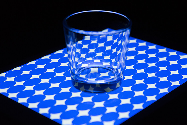
Two Tips for Making Portraits with a Black Background

Banana palm leaf

Firstly, please think of stops of light as units. Using the term stop is like saying that something weighs 12 kilograms or that it is 10 miles away. As photographers, we tend to talk about stops and stopping down, but it is just as valid to say units. The thing is not to get bogged down in technicalities, the term stop is only a unit of measure.

The falling off of the light

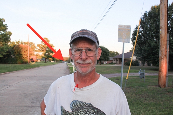
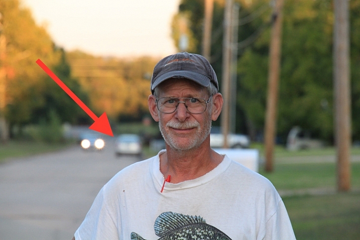
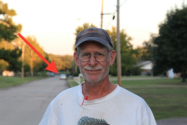
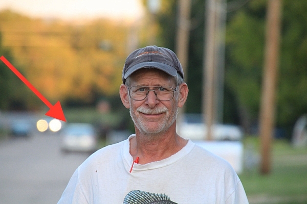
The first concept might be stated simply as light falls off rapidly. Fleshing that out just a little, the amount of light available decreases greatly as you move away from the source of the light. But we are photographers and we do tend to think that a picture is worth a thousand words, so look at the diagram below:

In the example above, one unit of light arrives at our subject, one meter away from the window. If she moves two meters away, just one-quarter of a unit of light will now be arriving at her. Then, if she moves three meters away from the window, which is the source of light, there will be only one-ninth of a unit of light. The available light disappears very quickly.

It might suit some if I illustrate the same point with a graph (which, in the past, I have tended to introduce to students as a Mathematical picture).

Two Tips for Making Portraits with a Black Background

A mathematical picture tells a story?

How does that affect the background?

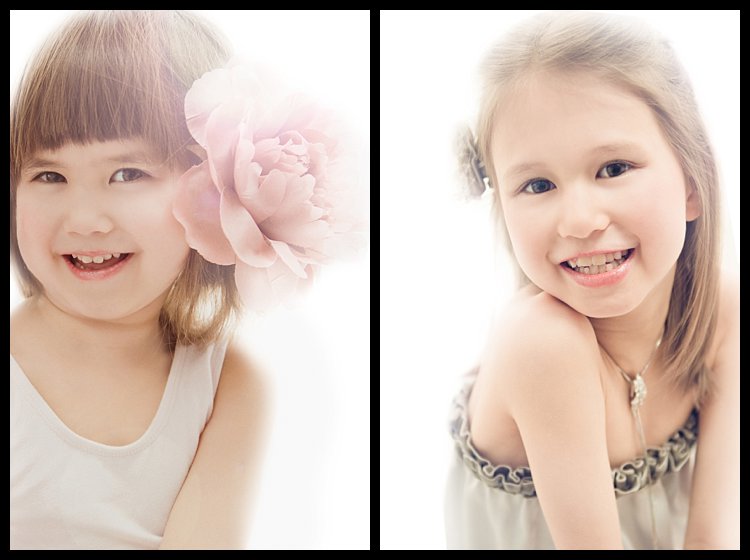
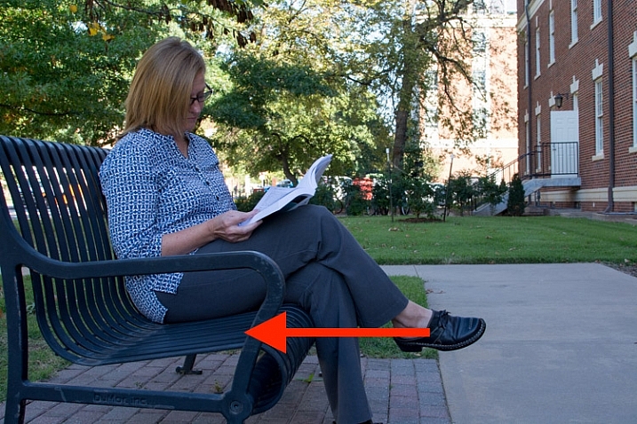
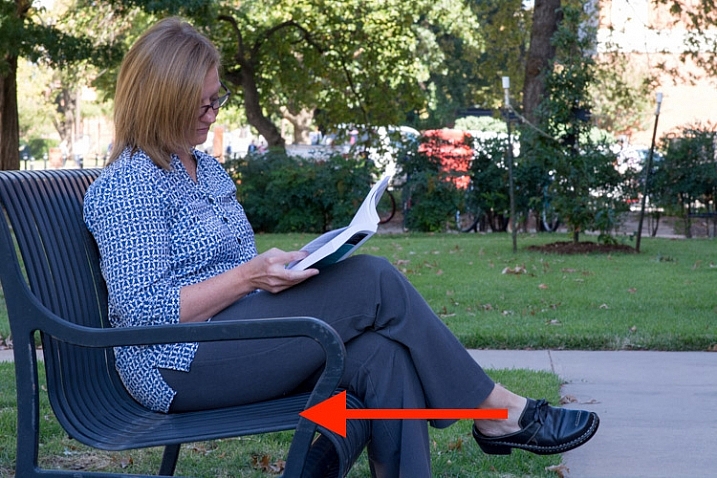
When trying to achieve a black background, you are interested in the amount of light hitting it. Again, pictures tell the story best. Both these photos had only white balance and very small adjustments to balance exposure done in post-processing.

Two Tips for Making Portraits with a Black Background

Not happy

The image on the left has the background close to the subject, about three feet (one meter) behind her. Then, on the right, the white background is about thirteen feet (four meters) back. You do not need me to do calculations, quote some nice formulae, to prove what is happening above. It is obvious, isn’t it?

In these photographs, the subject hasn’t moved and the exposure does not change. The background moves farther away, and the amount of light reaching it reduces rapidly. Even when the background is white, rather than the desired black, it gets much darker the greater the distance it is positioned from the light source.

In the practical world, there may be limits to what you can do, perhaps by the shooting space you have available. However, the message is simple, push the background as far away as possible, and even a seemingly small distance will help make it appear darker.

Two Tips for Making Portraits with a Black Background

Young Filipino.

The background for this photograph was the inside of a room. The teenage Filipino boy was standing in a doorway, getting full benefit from the light source. The background, the far wall of the room, might be only eight feet (just over two meters) away, but it is getting very close to the blackest of blacks, isn’t it?

Combine this reasonably straightforward science, the way light falls away, with the science of the dynamic range of camera sensors and you will be a long way towards achieving black backgrounds for your portraits.

Dynamic Range

Please understand that the numbers I am using here are approximate. They do vary from camera to camera, and from the conclusion given by one source to another. But I am going for using what is easy, what is really needed to make the point so you understand.

Dynamic range is the measurement from the darkest to the lightest item which can be seen. Your camera has a great deal less dynamic range than the human eye. It is much less capable of seeing into dark and light areas at the same time. That is why, when your camera produces an image with blown out highlights, and blocked up shadows. But your eye can still see the detail of a bird, which sat in bright sunlight, and you can also see the black dog which sat in the darkest shadows. Your camera simply cannot see both at the same time.

Two Tips for Making Portraits with a Black Background

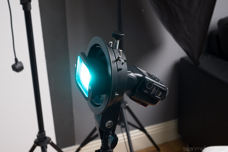
Light the subject, not the background

It might be stating the obvious, but it needs to be said – the first step to getting a black background is to use a black backdrop. Then, if you can get the subject lit more brightly than the background, that will push the background into the underexposed, dark areas, outside the camera’s more limited dynamic range.
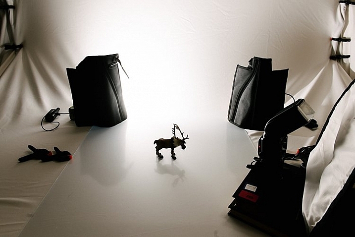
Portrait setup

If you can throw some extra light onto the subject and have them exposed correctly, in the brighter end of the dynamic range, that will help to send the rest of the image into darkness. The brightly lit subject should be properly exposed. Then there is a good chance that the background will be outside of the part of the dynamic range for which you are exposing. It will, at the very least, be heading towards black.
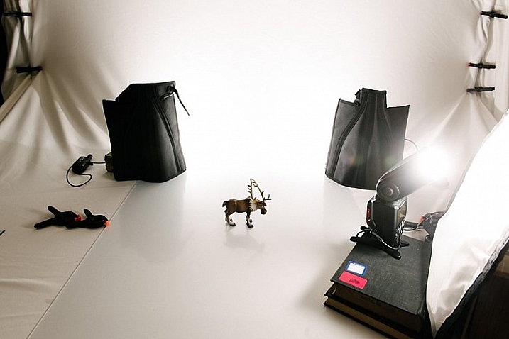
Portrait setup

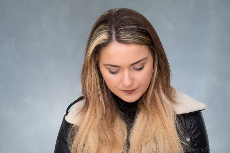
Here is the setup for a portrait, with only natural light hitting the subject. It is not as obvious in this reduced jpeg as in the original RAW file, but the background is rather muddy, certainly getting towards black, but not the pure black you are looking for. In the original, you can clearly see folds in the cloth.

Two Tips for Making Portraits with a Black Background

Still not happy – most people would describe the background as black, but it is not the blackest of blacks, is it?

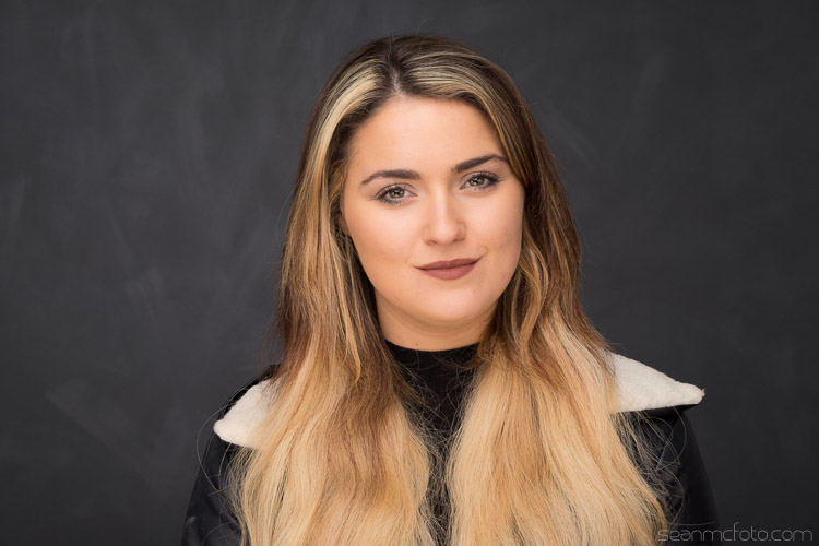
Here is the same set up again, with some extra light on the subject.

black background

I think the point is illustrated. Is it clear that the background is worthy of the classic description “inky”? Other things could be improved with a few post-processing tweaks. They are presented to show the backgrounds, not as finished portraits, and I’ve only changed color balance and tried to balance the exposures.

Use the natural law (it is called the Inverse Square Law) which dictates that light falls away rapidly from the source, and the limited dynamic range of your camera and you are a long way to getting a good, deep black, background. Next, you can help complete it further in post-processing.

Post-processing

I am referring to Lightroom here, but there are equivalent tools in other software.

Two Tips for Making Portraits with a Black Background

A bit of a muddy RAW file.

This is the photograph from the top of the article, as it first appeared out of the camera. You do not want to hear my excuses, but I did not get it as completely right in-camera as I would normally like to do. However, it turns out that is lucky, as it makes a good example for a post-processing in this case. Because the file was produced with the application of the ideas talked about above, it is very workable.

Most of the way to being processed in just a very few steps.

Edit intuitively

One of the best bits of advice I ever received, which I sometimes manage to apply, is to ignore the numbers. You should move those sliders till they give the look which you think suits the picture. Look at the photo and see what happens, take a breath, pause for a moment, and make some judgment as to whether it gives you what you’re looking for. Often this involves going a bit too far (whether it be with sharpening, or exposure, shadows, or whatever) and then dialing back a little.

I managed to do just that with this image. It makes me smile when I look at it now, a few weeks later, as I am slightly surprised at how far I went. I adjusted the color balance, brushed some negative clarity onto mom’s face, rotated the image counter-clockwise a little, but the exposure was not adjusted at all as the faces looked fine to me. Then I started pushing the sliders around.

Push the limits

It was a bit of a surprise to see just how far towards the negative I had moved the contrast slider. This may be counter-intuitive when you are trying to make parts of the image darker, but because we have got a reasonably well-produced file, we can get away with reducing the contrast, and this has the pleasing effect of lightening the hair and separating it from the background.

Of most significance to this exercise is the shadows slider which was moved in the opposite direction to usual. It was moved to the negative, to block up the shadows, rather than to the right, to try to pull out some detail.

I was also a bit surprised at how far I moved the black point. It seemed to work, though. As I say, I think it often works best if you move the sliders, without too much concern for the numbers they represent. Try to look at each photograph individually, rather than apply some sort of formula.

The final image had only a couple more, tiny, detailed tweaks.

black background

Extra Tips

A couple of other things.

How you decide to throw some light onto the subject of the photograph is for other articles. There are many other great Digital Photography School articles, which offer a huge number of suggestions for illuminating subjects. I thought you should know that I do very much like my LEDs, as I like being able to see the light. I also use reflectors. However, the first source of light in all the photographs above is natural light. You do not necessarily need a fancy kit.

In respect of the black cloth, most advice will suggest that you buy black velvet. I am sure it does an excellent job of absorbing light from all directions. But it is expensive, and with careful technique, it seems to me that another dark, non-shiny cloth can do the job too. One thing to pay a little attention to is making sure that you stretch the background cloth out a little. Try to get it as smooth and even as possible, with no creases, as any imperfections are liable to catch the light.

black background

Conclusion

The power of photography! 25 years after the event, I paid a bit of homage to Annie Leibowitz’s photograph of Demi Moore. I was not trying to replicate it as such, just nod in the photograph’s direction. But I did manage to get a really black background, didn’t I? Please give it a go yourself.

Share your images and questions in the comments below. I’m happy to try to help further if I can.

The post How to Create Portraits with a Black Background by Richard Messsenger appeared first on Digital Photography School.


Digital Photography School

 
Comments Off on How to Create Portraits with a Black Background

Posted in Photography


How to Use an iPad as a Softbox or Custom Background

30 Aug

What I really like about the iPad is the retina display screen; the quality of the images displayed on it is simply stunning. The brightness emitted from the screen is also quite powerful, so I was curious to see what apps are available in harnessing the light to aid photographers and see if the iPad can be used as a small softbox.

A glass tumbler shot on an iPad. I created the custom pattern using Photoshop.

For this article, I wanted to see how useful some of these apps on the iPad are for photographers. In particular, if you are only starting out in photography and you need to understand more about lighting. Or you are stuck in a hotel room, and you want to have a bit of fun experimenting with a light source.

Can an iPad be used as a Softbox? Or is it just an interesting alternative light source to explore your photography skills?

I will also demonstrate a simple step-by-step Photoshop tutorial on how to create simple pattern preset images for your iPad or tablet, that you can use as creative backgrounds for your shots.

If you are not interested in creating your own, you can simply download the free ones I’ve created specially for this article. Please click on the download button at the bottom.

What is a softbox?

A softbox is really only a light modifier, similar to an umbrella. However, a softbox controls the shape and direction of light more so than an umbrella does. A softbox has the flash (strobe) enclosed behind a diffuser, which prevents light-spill from occurring. They come in different shapes and sizes. The more common ones are square, rectangular and octagonal.

Softboxes also have the advantage of being able to produce natural-looking light by mimicking the shape of a window. As the name suggests, they produce a soft light for all types of shooting, be it food, product, portraiture, and so forth.

The regular size iPad has 9.7 inch (1536x2048px) display, and most softboxes range from small (12″) to quite large (four by six feet). This makes the iPad a very small softbox. A good rule of thumb is the bigger the light source relative to distance to the subject, the softer the light.

How to use a soft box?

A quick on search on iTunes and I came up with the following apps:

  • Photo Soft Box Pro HD – $ 2.99
  • Soft Box Color – FREE
  • SoftBox Pro for iPad – $ 2.99
  • Photo Light HD (SoftBox) – $ 1.99
  • Refboard – FREE (This app acts more like a board reflector)

As I can’t make the iPad bigger, I’m going to use the iPad as a softbox in four different ways:

Head shot using an iPad as a soft box

My daughter shot with an iPad I used the Photo Light HD (Softbox) app

As a main light source

The first method is using the iPad as my main light source. I had the iPad on a tripod, close to my daughter’s face. You do need to turn off all other light sources. Having the iPad on a tripod made it easier for me to direct my subject. I downloaded the Photo Light HD app to test it out.

photo-light-HD-app

The Photo Light HD (SoftBox) app comes with 24 preset pattern images.

preset-image-photo-light-HD-app

One of the preset images that comes with the Photo Light HD (Softbox) app

It comes with 24 preset images. I used the second one here (see above photo). I was also able to use my iPhone as a remote with this app. I wanted a more dramatic portrait, where half of her face is illuminated, and the other half falls off to darkness. I did bump up the ISO quite high, as I handheld my camera.

Tip: You can mount your camera on a tripod and reduce the ISO, which will also help reduce noise in your photos.

Of course you don’t have to download this app. You could try out the Refboard or Soft Box Color apps instead, which are both free.

color-softbox-app

The Soft Box Color app is free to download.

Set the background color to white. Use a willing subject or object, and experiment by moving the iPad nearer or closer. You will see how the light wraps around the subject. Pay attention to how the shadows appear and drop off. See animated gif below.

meridian-man

By moving the iPad nearer or further away from your subject. You can determine how soft or hard the light will be.

Monster lighting

The second method is called Monster Lighting. This is done by placing the main light directly underneath the subject. So I positioned a toy gorilla on the iPad, and displayed a patterned image that I created to add more drama to the photo.

toy-gorilla

Monster Lighting – where the light source is directly underneath the subject.

lego-figure-blue-stars-background

Another example of the Monster Light effect. The reflection of the pattern image highlighted just under the mouth of the Lego figure adds to the drama. I wish I could say that this was intentional but it was purely experimental.

In the photo of the Lego figure above, I used a different pattern. You can download this one for free along with two others. See the link at the bottom.

Colored patterns as a backdrop

For the third method, I used colored patterns on the iPad as an illuminated backdrop. I created my own in Photoshop, see the step-by-step tutorial below demonstrating how I created them. This is where you can get really creative, and have fun taking these types of shots.

By placing an ordinary tumbler on the iPad with a preset pattern image, you can get really interesting refractions in the glass. Experiment by moving your camera position slightly up or down, to find the angle that best suits your shot.

glass-tumbler-on-blue-circles-background

I love the way the pattern image is distorted by the glass.

I also shot this small plastic yellow ball, placed on another preset pattern of green circles, to create an abstract composition.

yellow-ball-on-green-circles-background

A small yellow plastic practice golf ball, shot on another custom pattern image on the iPad.

Create a silhouette

Creating a silhouette is simple to do. Use the Soft Box Color or the Refboard app, set to white. They are both free to download. Just make sure your brightness level on your iPad is set all the way to the right (brightest) in Settings. In the example below, I used a toy ostrich to create a silhouette.

ostrich

A toy Ostrich silhouetted against an iPad, using the Soft Box Color app, set to white.

Creating your own patterned images in Photoshop

In this quick Photoshop tutorial I will show how easy it is to make these patterned image,s by using the Step and Repeat technique in Photoshop.

Start by opening a new document 2048px by 1536px. You can ignore the DPI setting. This only matters when you want to print your images. You will be saving this file as a PNG format which discard pixel density. Our concern here is pixel dimensions. I’m going to leave the background as white. You can choose any color you want.

resolution-72dpi

In this example, I’m going to name the document “Circle Pattern” and click OK.

Make a shape

Click-and-hold on the Rectangle tool in the Toolbox and choose the Ellipse Tool from the menu. If you want a different shape, for example a star or diamond shape, you can select the Custom Shape Tool. There are many preset shapes to choose from.

ellispe-tool

Ellipse tool

Custom shapes

Custom shapes

Then, up in the Options Bar, make sure the Shape Layers icon is selected. Choose whatever fill color you want. For this tutorial, I chose Black (with no stroke).

Hold down the Shift key and draw out a circle. The Shift key keeps the aspect ratio 1:1. I chose 154px, but again choose whatever size circle you want. With the Move tool (shortcut V on the keyboard) place the circle in the very top left corner of the new document file. Have the Info Panel open. Go to Window>Info.

Duplicating your shape

Pressing CMD/CNTL+T on your keyboard brings up the Free Transform Tool. But instead, hold down the Alt key as well so: CMD/CNTL+Alt+T. This is the important step, move the cursor over the circle shape. The cursor becomes a black arrow head. Hold down the Shift key and move the duplicated circle shape over by 154px, or equal to the width of your circle or shape. Look at your info panel when moving the circle shape. Release and click on the commit transform button or press Enter. That is the “Step” part of this technique.

To repeat this shape, hold down CMD/CNTL+Alt+Shift+T again. Keep holding down CMD/CNTL+Alt+Shift while pressing T multiple times, to create a line of circles across the document. Make sure the last circle goes beyond the document boundary (off the edge).

In your layers panel, you’ll notice that we have only the one layer and not duplicated layers for each circle. To create a new line of circles. Hold down the Shift+Alt keys and drag down by 154px. Continue all the way down the document until you have a document full of circles. Now go over to the Layers panel and select all the layers and put them into a group folder.

Creating a custom pattern image using the Step and Repeat technique in Photoshop.

Creating a custom pattern image using the Step and Repeat technique in Photoshop.

select-layers

Select all your shape layers

select-layers-into-group

Make a group of all the shape layers

You can now use the Free Transform tool to hold to scale the shapes (CMD/CNTL+T ), so that they are all contained within the document boundaries to create a seamless pattern effect.

Go to File>Save for the Web. Choose PNG-8 for the file format and click Save. Another pop dialog box appears. Name your file and select the location on your computer and click Save.

save-as-a-png-8

You now have a pattern preset image to transfer to your iPad or tablet.

If you haven’t got Photoshop, feel free to download the preset images by downloading the ones I made below, enjoy (just right-click and choose “open link in new tab”, then right click and choose “Save Image As”).

green-circles

diamonds

blue-stars

Summary

Can an iPad be used for photography? Well not in the professional world. If you a beginner to photography and experimenting with artificial light for the first time, give it a try if you have an iPad or tablet. But I wouldn’t suggest going out to purchase an iPad for this reason only.

I am great believer in using whatever light source(s) are available, to explore different shooting techniques and styles. So if you don’t have an iPad/tablet or photography lights, why not experiment with just a flashlight or LED light!

Do you have an iPad/tablet? If so what photography apps have you used? Please leave your comments below.

googletag.cmd.push(function() {
tablet_slots.push( googletag.defineSlot( “/1005424/_dPSv4_tab-all-article-bottom_(300×250)”, [300, 250], “pb-ad-78623” ).addService( googletag.pubads() ) ); } );

googletag.cmd.push(function() {
mobile_slots.push( googletag.defineSlot( “/1005424/_dPSv4_mob-all-article-bottom_(300×250)”, [300, 250], “pb-ad-78158” ).addService( googletag.pubads() ) ); } );

The post How to Use an iPad as a Softbox or Custom Background by Sarah Hipwell appeared first on Digital Photography School.


Digital Photography School

 
Comments Off on How to Use an iPad as a Softbox or Custom Background

Posted in Photography


How to Achieve Background Blur or Bokeh

31 Jul

If I show you two different portraits, one with a blurred background and one with a sharp background, you will automatically prefer the one with the creamy bokeh. Why? Because that’s just how it is. No, the bokeh effect is very flattering because it isolates the main subject by separating it from the background.

If you did not know, bokeh means blur in Japanese, and it is purely aesthetic.

Most portrait photographers blur their backgrounds, and I certainly do it because when I take a picture of someone, I want the viewer to focus on the person’s face and not what’s going on behind them.

IMAGE 1

Portrait with nice bokeh in the background.

I always want good background blur when I shoot portraits, that’s one of the main reasons why I shoot on Aperture Priority and let the camera do all the rest of the work. My minimum shutter speed has to be 1/100th, so I increase my ISO to 400 to compensate – this is for portraits with natural light.

Bokeh basically depends on how shallow your depth of field is (note that the further the background is from your subject, the smoother the bokeh). Depth of field depends on three main things

IMAGE 2

In this image, the bokeh looks really good because the background was really far from the subject (the bird).

The Aperture Matters!

The bigger your aperture (smaller the f-number), the shallower your depth of field (e.g., f/2.8 is a large aperture opening, and it creates shallow depth of field).

The first thing I did not understand when I first started photography is that I used the biggest aperture on my lens but the background was not completely blurred.

At that time I used the 18-55mm canon kit lens with its maximum aperture of f/3.5. The user’s manual on my camera told me to just use the smallest f/stop on my lens and I would automatically blur the background. However, they did not mention a lot of other factors to get this result, like how big should my aperture be. After hours of trying to get a background blur with my aperture of f/3.5, I was left very frustrated because I did not get the results that I saw on the internet.

I later understood that bokeh depended a lot on how big my aperture was – I wanted to get bokeh for portraits with a focal length of 50mm. I had to buy a lens with a bigger aperture to get a completely blurred background, and the Canon 50mm f/1.8 was the answer. It is a relatively cheap lens to get started with portraits. You can find other lenses with an aperture of f/1.4 or f/1.2 but the bigger the aperture, the more expensive the lens.

IMAGE 3

Portrait with an aperture of f/1.8

With a regular lens like 50mm, you will start getting nice bokeh starting from f/2.8. So lesson number one is to buy a lens with a really big aperture – this is the first way to achieve flattering background blur. You probably know this already, but this is important to mention before giving the two other points.

With a big aperture, you will be sure to get a nice background blur. But, there are other ways you can blur your background without having a wide aperture.

The camera to subject distance controls the depth of field

Let me show you my point: lift your right thumb (or left thumb -it doesn’t really matter) in front of your right eye and stare at it while closing your left eye. While focusing on your thumb, notice that you cannot clearly see the background. Now move your thumb farther away from your eye, keeping your thumb in focus. You will notice that the background won’t be blurred anymore. This works with your camera the same as it down with you eyes. The closer you get to your subject, the more blurred the background will be.

IMAGE 4

At 40mm, f/5.6 you can see that I’m not getting any bokeh in the background.

IMAGE 5

At 40mm, f/5.6 you can see that with the same focal length and aperture I can get a nice bokeh by getting closer to the tree.

IMAGE 6

At f/1.8 I get a nice bokeh with the 50mm lens.

IMAGE 7

Still at f/1.8 with the 50mm, if I get closer the effect gets more intense.

I understood this when I finally managed to get nice bokeh with my kit lens (I still did not have my beloved 50mm f/1.8). I used to practice my photography, and background blur on a tree. The f/3.5 aperture was not good enough for me so I tried different things. The first satisfying bokeh I got was when I focused my camera really close to the tree.

If you take a second and think, you will realize that all the macro photography images have a shallow depth of field, therefore a smooth bokeh. This is because macro photographers get really close to their subjects.

IMAGE 8

By getting close to your subject you will blur the background.

IMAGE 9

Here I used a zoom macro lens (at 300mm) and got as close as possible to the leaf.

IMAGE 10

Here I used an aperture of f/1.8 with the 50mm, and got as close as possible.

Even if you have an aperture of, let’s say f/5.6, if you get your camera really close to your subject, you will have a blurry background.

Note that macro photographers use special lenses that enables them to take images really close to their subjects. Standard lenses have a limit regarding their focussing distance. If you cannot afford a lens with a big aperture nor a macro lens, extension tubes are a good solution to extend your focusing distance.

The shorter the distance between your subject and the camera, the shallower the depth of field will be. The bokeh really depends on that distance, because I can shoot a landscape scene with an aperture of f/1.8, and there will be no background blur. That is because there is a huge distance between my camera and the subject I’m trying to photograph.

The lens focal length changes the perceived depth of field

If you cannot get close to your subject, but still want to isolate it with a background blur, then use a long focal length lens.

IMAGE 11
Image taken with a long telephoto lens.

The cool thing with longer focal length lenses, is that you can photograph portraits, wildlife, macro, and isolate anything you can’t get close to. The other advantage is that you don’t need a large aperture, an aperture of f/6.3, for example, will give you creamy backgrounds.

A longer focal length will appear to give you a shallower depth of field, because the subject is compressed, and the isolation between your subject and the background is more important.

IMAGE 12

A shorter focal length will appear to give you a larger depth of field. Let’s go back to the example of the tree. If I put my aperture at f/4 on a 16mm lens in front of the tree, the background will appear quite sharp. Whereas if I focus on the tree from the same distance, with the same aperture, but with a focal length of 50mm, I will notice that I get a background blur and a shallow depth of field.

IMAGE 13

Taken at f/5.6 and 70mm.

IMAGE 14

Taken at f/5.6 and 300mm without moving.

Conclusion

So you must be thinking: the best bokeh you can get is to have a long telephoto lens, focused really close to your subject, with a really wide aperture. That’s pretty much it!

The sad part is that these lenses are very expensive. But, I have two portrait lenses, and together they cost less than $ 400 – and, I am still able to take good looking portraits with nice bokeh. So it’s about combining these things, the best you can with the tools you have.

IMAGE 15

Using a telephoto lens and getting really close.

googletag.cmd.push(function() {
tablet_slots.push( googletag.defineSlot( “/1005424/_dPSv4_tab-all-article-bottom_(300×250)”, [300, 250], “pb-ad-78623” ).addService( googletag.pubads() ) ); } );

googletag.cmd.push(function() {
mobile_slots.push( googletag.defineSlot( “/1005424/_dPSv4_mob-all-article-bottom_(300×250)”, [300, 250], “pb-ad-78158” ).addService( googletag.pubads() ) ); } );

The post How to Achieve Background Blur or Bokeh by Yacine Bessekhouad appeared first on Digital Photography School.


Digital Photography School

 
Comments Off on How to Achieve Background Blur or Bokeh

Posted in Photography


3 Rookie Mistakes to Avoid When Shooting on a White Background

05 Jul

Because the ubiquitous white background portrait is so commonplace, many people think it’s easy to achieve. Simply put your subject in front of the camera against a white background, preferably with a flash or strobe, and take the picture.

how-to-shoot-white-seamless-tutorial

Unfortunately it’s not as simple as that. Doing just that would result in a photo with either a gray, dull, muddy toned background. The best possible result would be an off-white background after you have done some edits. That’s not the only issue though, you’d be dismayed to see unwanted shadows everywhere too.

I have replicated the setup with my little model Sven – Kristoff’s beloved reindeer in the movie Frozen. It is easier doing this on small scale subject as the lights are oversized in comparison. With people, to do this to scale, you need to have massive size octoboxes and flags. But this tutorial will show you the process clearly.

Here are 3 rookie mistakes to avoid when trying to achieve a 100% pure white background:

Mistake #1 The background is not lit properly

The background must be lit with approximately two stops more light, than the amount of falling on the subject. For example, if you want to photograph your subject at f/8, set your background lights to two stops brighter, so the meter would read f/16 on the background.

Note: You need to meter both background lights separately, so that when metering for the main light (on the subject) you would turn the background lights off, and vice versa. When both the background and main lights are on, your meter should still give you f/8 on the subject, because you are metering the light that falls on your subject and not on the background.

The photo below (right) shows what it looks like when you don’t light the background at all. You get a tone and color other than the intended white. In the photo on the left the background was lit, but there was no main light illuminating the subject; thus the resulting image is almost a silhouette of the subject.

how-to-shoot-white-seamless-tutorial

My camera settings for all the shots in this setup were: ISO 250, 1/160th of a second, shot at f/8 for Sven, (the background read f/16). The speedlights were set to 1/16th power. I rarely use them at full power because the batteries run out very quickly that way. If you are using the SB900 Nikon, firing at 1/1 power, not only does it drain the batteries very quickly, but also makes the flash overheat. Nikon has solved this problem with the SB910. These are some reasons why I did not shoot this at ISO 100. The camera used was a Nikon D750, which handles noise superbly, so that ISO is not an issue. Two SB910s and one SB900 were used for this setup.

The photo below shows a pull back of the setup with only the left background light firing.

how-to-shoot-white-seamless-tutorial

You will notice in the two images below that only the right background light fired on the left photo, and only the left background light fired on the right photo. This lighting is acceptable of course if that were your intention. The main light was positioned at a 45 degree angle on camera right. I wanted to bounce my flash onto the white rogue bender to modify it.

how-to-shoot-white-seamless-tutorial

You may also notice that on the left photo (above) there is a pleasing shadow of Sven behind him on the background – because the left background light didn’t fire. Where the background light did fire on the left, this shadow was eliminated (right photo above).

Below is the setup with all three lights firing correctly.

how-to-shoot-white-seamless-tutorial

Now that you have your background and main lights set up, you need to make sure these lights only hit the intended subject. This leads us to the next rookie mistake… separation.

Mistake #2 Not enough subject background separation

Because the background lights are so much brighter, you need to separate them from the main subject. There are two key ways of doing this:

  1. Flagging
  2. Distance

Flagging

You can use anything block to flag your lights; the black side of a reflector, black cardboard sheets, black foam core. Black does not let light in, instead it absorbs light rather than bounces it. It also blocks light from seeping through to places where you do not want it. If you don’t flag (block) your background lights, your subject will get a halo effect and look very backlit.

Distance

Once you have flagged your lights, you need to distance your subject far enough away the background (and background light) so that any spills won’t touch your subject. This depends on your personal preference and intention of course – you may want some spill on your subject for a certain look or effect, or you may not.

If you do want some spill on your subject, make sure to run a few tests with various lenses, as chromatic aberration tends to occur around the edges due to the abundance of light. Some lenses are prone to chromatic aberration irrespective of aperture, while others can handle it very well even at wide apertures, where it is most commonly observed. Also, be careful with the amount of spill you allow so as not to chop off parts of your subject from the spill overexposure.

how-to-shoot-white-seamless-tutorial

The photos above show a properly lit Sven. The two background lights firing at f/16 and the main light firing at f/8. There are no unwanted shadows on the background, as was my intention. However, I wanted to have a reflection and shadow in the foreground. This leads nicely to the third rookie mistake to avoid…a floating subject.

Mistake #3 The subject is floating

If you do not include some floor shadows, your subjects will look like they are floating on white air, or cut out and pasted on a white sheet of paper.

The best tip for avoiding floating subjects is to use a reflective surface like translucent white plexiglass, or white tile sheet, as a base for your subject to stand on. You can adjust the opacity of this reflection in Photoshop during post-processing, but having the reflection shows that your subject is planted firmly on solid ground.

how-to-shoot-white-seamless-tutorial

The left image shows Sven floating, and on the right you see the reflection showing Sven standing on solid ground. The latter looks more pleasing and natural, and not like a cut-and-paste job.

Bonus Mistake #4 Overexposed background

Be careful not to add too much light to the background. If you go past pure white and really overexpose it, the white will start almost glowing around the subject just like if you had sun flare outdoors. It lowers contrast and your subject looks like that have a bit of a halo, as you can see in the images below.

white-seamless-overexposed-background_0000

For more tips on a white or high key background see: 4 Tips for a Perfect White Background in High Key Photography

Conclusion

I hope this little tutorial has shed some light on basic techniques for shooting a white background, where you want the background to be 100% white, and that it has dispelled any mystery over how to achieve this look. If you have other more advanced techniques, do share them here!

googletag.cmd.push(function() {
tablet_slots.push( googletag.defineSlot( “/1005424/_dPSv4_tab-all-article-bottom_(300×250)”, [300, 250], “pb-ad-78623” ).addService( googletag.pubads() ) ); } );

googletag.cmd.push(function() {
mobile_slots.push( googletag.defineSlot( “/1005424/_dPSv4_mob-all-article-bottom_(300×250)”, [300, 250], “pb-ad-78158” ).addService( googletag.pubads() ) ); } );

The post 3 Rookie Mistakes to Avoid When Shooting on a White Background by Lily Sawyer appeared first on Digital Photography School.


Digital Photography School

 
Comments Off on 3 Rookie Mistakes to Avoid When Shooting on a White Background

Posted in Photography


5 Tips to Improve Your Background and Make the Subject Stand Out More

30 May

If you are looking for a quick, simple, hassle-free way to make your images pop more and stand out, this is the article for you!

You don’t have to be a Photoshop genius – in fact, this may help you spend less time in Photoshop. These simple tips can elevate the photos you take. If there was one element in many images I see that could greatly improve it, it would have to be this: backgrounds. An ugly or distracting background can easily reduce the impact of even the best subjects. A clean, un-distracting background will help improve your images and make your subjects stand out even more. The best past is, you wont even have to spend a cent to do this.

Even though the background here works quite well with the subjects, using a wider aperture has ensured that the subjects do not get lost, but stand out. © Daniel Smith / Getty Images.

Even though the background here works quite well with the subjects, using a wider aperture has ensured that the subjects do not get lost, but stand out. © Daniel Smith / Getty Images.

All too often we overlook the background and what is in it. You swear that those power lines weren’t in the viewfinder when you took that picture, and that post, where did that post come from?! That surely wasn’t protruding from your partner’s head when you clicked the shutter button. This occurs for a number of reasons:

  • You’re too focussed on the subject alone that it’s almost like you have blinders on and the subject is all you can see.
  • You may get too obsessed with the camera settings and making sure you nail the photo that you miss all those little annoying things that pop in to the frame.
  • Or you are simply unaware of the importance that a good background can make.

So how can you improve your backgrounds, or at the very least, reduce the negative impact they can have on your images? By following these simple strategies, you’ll be well on your way to a better background and improving your images.

#1 – Location, Location, Location

If you have the option, do try and choose a location that has a nice background – that will make it as easy as it can get. What defines a nice background will depend on your subject, but as a very general guide, look for a spot that has a uniform look to it. Brick walls, corrugated iron roller doors, metal cladding on walls, or even something as simple as a painted white wall, can all make for a nice clean background. Ultimately, what you are not looking for is something that has a lot of other elements in the frame, that do not add to your subject.

If you cannot find a location that has a clean background, looking for somewhere where the background complements – or works with – your subject will also work, too. An example of this would be with sport photography. You simply cannot decide where the game will be played, so you have to work with what you have. In this situation, think about what would look good as a background. Would a stand full of supporters look better than a car park full of cars or a building site? I think it would. The stand full of supports, while not clean, works with your subjects and in fact, has more impact as the supporters add a nice element of atmosphere to the image.

Cluttered BG 1

Even though this image has the stadium in the background, it is a little cluttered. The seats are mostly empty, so it’s not really portraying any sense of atmosphere in the sport.

Clean BG 5

By changing my position, I was able to use a the large black cloth in the background to make the athlete stand out much more. Nothing more than moving was required; much easier.

Here, the backgrounds in these two images are quite plane. They help make the subjects the heroes of the images, as there is nothing else to compete with them.

With this image, the stands in the background have much more people in them. This works nicely to complement the subjects which, in this case, are the players. © Daniel Smith / Getty Images.

While this is a nice action frame, the background is not that fantastic. It’s in between areas of the different stands at this venue. It would look much better if it were against the full stadium, as in the previous image. © Daniel Smith / Getty Images.

You’ve found your location, but a clean background just cannot be had. What do you do?

#2 – It’s All About Perspective

A good backgrounds can be anywhere, and it can change quite a lot depending on the angle at which you photograph your subject. You may be in a very busy space, but within that space will exist areas of calm and peace. By this I mean that your backgrounds can be clean; even when it just looks cluttered in all directions.

When this happens, consider photographing from a different perspective. Photographing your subject from down low will make the sky your background. Conversely, if you’re looking down on your subject, whatever is below them will be the background. So if you cannot find an ideal background, don’t forget to look up and down – that’s where the best one may be hiding.

Relevant BG 1

This rower was photographed from a bridge, making the water the background. in this case, the background works quite well with the subject.

Clean BG 7

This time, I was photographing this plane landing. This meant that I would be looking up, and the sky became the background here. The complementary colour set of the blue sky and yellow light on the plane also help to make the subject stand out more.

You may have the best background sorted. But it’s not always possible to be lucky enough to have that perfect background all the time. So what else can you do to help your subject?

#3 – Camera Craft

There will be times – more often than not – where you simply cannot win with your background. No matter which way you stand, you just can’t seem to find a nice clean backdrop. What now? Here’s where a little camera craft comes in to play and you have a couple of tricks up your sleeve with this.

First point of call is aperture. You know that you can simply open your aperture up a little more, and give that background some nice bokeh (or blur) to reduce its impact. Even when you do have a nice complementary background, it’s still a good idea to use a wider aperture to blur it out a bit and make your subject stand out against it more.

What if you can’t open your aperture any further, though? There’s still hope. Our next strategy is to play with shutter speed and use a panning technique. This can help greatly in rendering a busy background into a nice blurry mess. It also helps to add a great sense of movement and action, as well as give a sense of excitement to an image. If you’re unsure about how to do panning, have a read of this article – it will help greatly. But in a nutshell, panning is the technique of using a slower shutter speed (usually around 1/60th or slower) while tracking a moving subject. The combination of a slow shutter speed, coupled with the panning action, will result in a nice motion blur affecting the background, and if done correctly, the subject will remain sharp.

Cluttered BG 2

This background is clean; there are no real distractions in it, but it could be improved upon.

Clean BG 6

Here’s a different frame but this time, a panning technique has been used to remove all the creases in the blue backdrop. This has made the background cleaner again, and the added motion blur gives a sense of speed which works well with the subject.

Clean BG 8

The use of a wide aperture here has dramatically blurred out the background making it much cleaner. The result is that the subject stands out much more. © Daniel Smith / Getty Images.

#4 – Can You See the Light?

Something that seems to always be overlooked in photography is light. This seems to me like quite a remarkable thing since without light, we don’t have much of a photo. But using light, and the contrast it can provide, is another way to reduce the appearance of a distracting background. With this strategy you need to look for a higher amount of contrast between your subject and the background; that is, you’re subject is (ideally) brighter than the background. By exposing for your subject (the brightest area) you effectively make shadowed areas in the frame darker, thereby affecting your background. This can be achieved with both natural light and flash.

Contrast1

In this image, the flower was in the daylight; whereas the background was in the shade. I exposed for the flower and this made the background darker.

Again, the background here is much darker than the subject; helping to isolate the subject more. © Daniel Smith / Getty Images.

Again, the background here is much darker than the subject; helping to isolate the subject more. © Daniel Smith / Getty Images.

Clean BG 2 Clean BG 1

These photographs were taken in an undercover car park. I used two flashes (both off-camera) as my only light source. This removed any ambient light affecting the image.

#5 – The Final Stop

You’ve done what you can with the background. You’ve tried everything, but your background still doesn’t want to play ball. There will be times when you simply cannot control any of the aspects that have been mentioned. Don’t worry – it isn’t uncommon. Now all you can do is hope that there is something that can be done later, and there is!

If you’ve done everything you can to help improve your background and you’re still not winning, the last port of call is post-processing. You may be thinking, “Hold on, I’m not that great with selecting and masking in Photoshop yet.” but you needn’t worry. There is no selecting or masking with this one. (As a side note, if you intend on making a selection around your subject and replacing the background, you will need to photograph your subject accordingly to make this much easier and more natural).

All you need do is crop your image. That’s it. Cropping is about all you can do now. By cropping, you are effectively removing as much of the background as possible without cropping into your subject. Don’t worry about how much you are cropping out – unless of course you intend on doing a large print. You’d be surprised at how much many photographers are willing to crop.

Do you have any other tips for making the subject stand out, or improving the background? Please share your thoughts and images in the comments below.

googletag.cmd.push(function() {
tablet_slots.push( googletag.defineSlot( “/1005424/_dPSv4_tab-all-article-bottom_(300×250)”, [300, 250], “pb-ad-78623” ).addService( googletag.pubads() ) ); } );

googletag.cmd.push(function() {
mobile_slots.push( googletag.defineSlot( “/1005424/_dPSv4_mob-all-article-bottom_(300×250)”, [300, 250], “pb-ad-78158” ).addService( googletag.pubads() ) ); } );

The post 5 Tips to Improve Your Background and Make the Subject Stand Out More by Daniel Smith appeared first on Digital Photography School.


Digital Photography School

 
Comments Off on 5 Tips to Improve Your Background and Make the Subject Stand Out More

Posted in Photography


How to Create a Delicious Blurry Bokeh Background in 4 Easy Steps

02 May

Blurry backgrounds are nothing new when it comes to photography. The technique of blurring the background to emphasize a subject in the foreground has been used by photographers for decades, and by painters and other visual artists for hundreds of years. Now thanks to the proliferation of digital cameras this phenomenon has exploded in recent times.

Many people like photos with a tack-sharp subject and a smooth blurry background, and even though some might say it’s more of an over-used trend, the truth is that bokeh is here to stay. The trick to using it effectively, is to learn how to use the physical properties of lenses and light to create the look you are going for. While some people turn to creative editing tricks like adding blurry filters or doing Photoshop gymnastics there really is no substitute for the genuine article. If this is something you have always wondered about or wanted to try for yourself, here are four easy steps to get you started.

50mm, f/4, 1/350 second, ISO 400

50mm, f/4, 1/350th of a second, ISO 400

The term bokeh is a Japanese word that doesn’t have a precise English translation, but refers to the type and quality of the out-of-focus areas of an image. In other words, when the blurry parts of a picture look nice, you might say the image has good bokeh. While a thorough discussion of what bokeh is, what causes it, and what affect your lenses and lens elements have on the type and quality of bokeh could go on for several pages, this article is going to be a bit more basic look at how to create visually pleasing blurry elements in your photos. If you don’t want things to get too complicated, and aren’t quite ready for a thorough breakdown of aspherical elements or the circle of confusion, then get out your camera and follow along with these few simple tips to help you get the look you have always wanted.

understanding-bokeh-golden-glow

50mm, f/1.8, 1/6000th, ISO 100

1 – Shoot with a wide aperture

Take a look at the front of your lens, you will probably see a few numbers that look like 1:3.5-5.6, or 1:2.8, or f/4 (read: What the Numbers on your Lens Mean for more on how to find this). These numbers refer to the size of the aperture in the lens itself, and how big the opening can get. Ironically smaller numbers are bigger, and a lens that says 1:2.8 will be able to let in much more light than a lens that says 1:4 or f/4. (Some manufacturers use different schemes to show the aperture size but it’s always the number after the colon, or on the second side of the / that you want to look for when determining the maximum size of the lens opening.)

The smaller the number, the wider your aperture will be, and the less light you will need to take a properly exposed photo. Wide apertures also mean your photos will have a shallower depth of field, and anything out of focus behind your subject will begin to take on a smoother, more visually pleasing blur. In other words, wide apertures help give you more bokeh.

understanding-bokeh-leaves

50mm, f/1.8, 1/4000 second, ISO 100

If you’re itching to get some pictures with the same kind of buttery-smooth background blur you have seen in nature magazines or fashion spreads, put your camera in Aperture Priority mode (on Nikon) or Av (Canon, Pentax, etc.) and turn the control dial until the aperture value number is as close to zero as it can go. It helps if you have a prime lens that doesn’t zoom in and out, since they usually have wider maximum apertures, but even a kit lens can give you decent results if you have enough light. Now go out and find something to photograph, even if it’s just a coffee mug on your office desk.

To put my money where my mouth is, I took my camera to work and literally snapped a picture of a coffee cup on my desk. No photoshopping or magic tricks here, just a wide f/1.8 aperture. 50mm, 1/100 second, ISO 160

To put my money where my mouth is, I took my camera to work and literally snapped a picture of a coffee cup on my desk. No photoshopping or magic tricks here, just a wide f/1.8 aperture. 50mm lens, 1/100 second, ISO 160

2 – Put your subject far away from the background

If you have been trying to get the kind of silky, blurry bokeh you seem to notice in everyone else’s photos you might try this one simple trick and you won’t believe what happens! Simply putting a great deal of distance between your subject and whatever is behind it, can go a long way towards creating the bokeh you have always dreamed about.

understanding-bokeh-flowers-sunrise

50mm, f/1.8, 1/1000 second, ISO 100

If you are shooting portraits, try moving your subjects to a location where there is a great deal of space behind them, or even just repositioning yourself so you are looking at your subjects from a different angle that puts more distance between them and the background. In the photo below, I specifically shot the scene so that there was about 50 meters between the couple and the fountain, which caused it to have a nice blurry out-of-focus appearance that complements the woman and her fiancée quite well. I could have used a bench that was much closer to the fountain, but it would have had a very different affect on the picture, and it would not have given me nearly the same amount of bokeh as you can see in the final image below.

understanding-bokeh-fountain

85mm, f/2.4, 1/2000 second, ISO 200

3 – Get close to your subject

As I mentioned in the opening paragraph there are many different optical elements that come into play when dealing with bokeh and background blur, and certainly shooting with wide apertures while putting a great deal of distance between your subject and the background are critical elements of the equation. Another thing you can do, is position your camera and lens physically close to the subject you are shooting. Combine this technique with the first two, and you’re virtually guaranteed to get good results.

understanding-bokeh-fence

This shot has all the techniques rolled into one: a wide f/1.8 aperture, a far-away street light in the top left corner, and a very short distance between my camera and the fence bar on the right side.

4 – Zoom in, waaay in

If you are trying to get bokeh-licious shots and not having much luck, there’s another technique that could mean the difference between frustration and celebration. Due to how lenses collect, and focus incoming light rays, it’s easier to get blurry backgrounds with longer focal lengths. This is why these types of shots are difficult to get on mobile phones, which generally have lenses with a much wider angle of view. Grab your nearest camera, whether it’s a DSLR or a humble little point-and-shoot, and zoom the lens as far in as it will go. Now use the other tips I have already mentioned: set the aperture to the widest setting, find a subject that’s relatively close to you, and make sure there is plenty of room between the subject and the background.

A golden eagle, taken with my 400mm f/4 lens on a Nikon D7200. A very expensive combination, but it produces outstanding results with silky-smooth bokeh.

A golden eagle, taken with my 300mm f/4 lens on a Nikon D7200. A very expensive combination, but it produces outstanding results with silky-smooth bokeh.

You might not get the photo of your dreams, but with a little bit of practice you should start to see some improvements, as you begin to understand how to use your camera to create sharp subjects with pleasing out-of-focus areas.

Just kidding! I took the first shot with a $  150 Panasonic ZS7 pocket camera. All I did was zoom in as far as it would go. This is the same scene with the same camera a few seconds later, shot at the camera zoomed all the way out.

Just kidding! I made that first image above with a cheap Panasonic ZS7 pocket camera, and all I did was zoom in as far as it would go. This is the same scene, with the same camera, a few seconds later – but zoomed all the way out.

Now with all this being said, I have a challenge for all of you dPS readers: What is your favorite picture you have taken that has nice pleasing bokeh? Is it a portrait, a wild animal, or more along the lines of abstract art? Share your picture in the comments section below along with a few tips of your own to help others take similarly beautiful bokeh photos.

googletag.cmd.push(function() {
tablet_slots.push( googletag.defineSlot( “/1005424/_dPSv4_tab-all-article-bottom_(300×250)”, [300, 250], “pb-ad-78623” ).addService( googletag.pubads() ) ); } );

googletag.cmd.push(function() {
mobile_slots.push( googletag.defineSlot( “/1005424/_dPSv4_mob-all-article-bottom_(300×250)”, [300, 250], “pb-ad-78158” ).addService( googletag.pubads() ) ); } );

The post How to Create a Delicious Blurry Bokeh Background in 4 Easy Steps by Simon Ringsmuth appeared first on Digital Photography School.


Digital Photography School

 
Comments Off on How to Create a Delicious Blurry Bokeh Background in 4 Easy Steps

Posted in Photography


How to Cut Out the Subject From the Background in Photoshop

10 Apr

This video by Chris from Spoon Graphics does a good job of going over many of the options available inside Photoshop for cutting things out. The most common use is to cut out the subject from the background, to place it on a different image or background – as in when making composite images.

Watch as he goes over the options for cutting things out:

Quick and dirty selection tools and methods:

  • Eraser tool (not the best choice, this is shown in the video)
  • The Magic Wand tool
  • Quick Selection tool

Pro techniques tools include:

  • Manually drawing the selection
  • Lasso tool (can be frustrating and tricky to use)
  • Pen tool (also using Paths)
  • Tonal selection
  • Channels (plus Curves or Levels)
  • Color range (quick selections based on tones in an image)
  • Layer masks
  • Refine edge tool
  • Defringe to remove halos and outlines
  • Paint hair back in manually
  • Buy a Photoshop plugin like Topaz Remask

Here’s a second video from Glyn Dewis that puts some of those techniques to use to cut out a tree from the background.

Do you know any other methods for doing cut outs? What’s your favorite? Please share in the comments below.

googletag.cmd.push(function() {
tablet_slots.push( googletag.defineSlot( “/1005424/_dPSv4_tab-all-article-bottom_(300×250)”, [300, 250], “pb-ad-78623” ).addService( googletag.pubads() ) ); } );

googletag.cmd.push(function() {
mobile_slots.push( googletag.defineSlot( “/1005424/_dPSv4_mob-all-article-bottom_(300×250)”, [300, 250], “pb-ad-78158” ).addService( googletag.pubads() ) ); } );

The post How to Cut Out the Subject From the Background in Photoshop by Darlene Hildebrandt appeared first on Digital Photography School.


Digital Photography School

 
Comments Off on How to Cut Out the Subject From the Background in Photoshop

Posted in Photography


How to Use Lighting Gels to Change your Background Color

10 Apr

If there’s one thing that bugs me about shooting in studio, more than anything, it’s that you need to have tonnes of backgrounds, taking up loads of space. I’ve even gone as far as having a painter come in and create an interesting wall for me because I get bored with what I had. I’ve got over 15 backgrounds between paper, canvas, cloth, and even some vinyl castle doors.

Part of what I love about location work is the variety of backgrounds. Often you’re restricted to working in the the studio by the client, so that where this handy technique comes into it’s own.

Changing-your-background-with-gels-magmod

I’ve been using gels in studio to add color to my subjects for years. A gel is a colored, transparent, sheet of heat resistant plastic. They look akin to the colored wrappers you get on some candies. They’re generally used in theatre to create mood, or emulate natural looks like moonlight, fire, etc. Gels were a big thing in photography in the 80s, and they’re making a comeback now thanks to photographers like Jake Hicks and Glenn Norwood. This article isn’t about their techniques, but it is about something I’ve started to do because of seeing their work.

Shooting on location with speedlights mean that I’m always on the lookout for great tools that make life easy for set up. Using gels meant that when I saw the MagMod kit, I knew I had to get a set. MagMod uses strong magnets and rubber mouldings to create a grip that stretches over your speed light. It’s much neater than rubber bands or velcro. Accessories like the MagGrid, or the MagGel holder are simply held in place with internal magnets, and are easy to swap on and off as you need.

Basic Kit 1 1861968723

The really great thing that applies here, is that the gels they use are rigid, not flimsy and awkward to get in and out of a holder. The basic kit ships with a MagGrip, a MagGrid and a MagGel set with color correcting gels. I also bought the Creative Gel set, and that’s what I’m using to get different background colors in my studio. They’ve also just announced the new Artist set as well.

Let’s start with the basic back wall in my studio. It’s dark grey, with a light grey mottle over it as brush strokes.

Using Gels background 05

You should set the flash to get the amount of light you want on the background. Here is mine set to 1/4 power (below).

Using Gels background 04

Below it is at 1/8 power, which I think is better for getting the color to work.

Using Gels background 06

From here you can add the gels to change the color of the background. There are plenty of options for using gels, you can even just use gaffa tape with sheet gel-or even just a rubber band. Even using the MagGel set, it’s possible for you to cut out sections from gels sheets, and then trap this cutout between the empty MagGel holder and the MagGrip.


Let’s have a look at the different gels:

Using Gels background 07

Cyan

Using Gels background 08

Purple

Using Gels background 09

Red

Using Gels background 10

Blue

Using Gels background 12

Green

Using Gels background 13

Straw

Using Gels background 15

Yellow

As well as changing the color, you can also change the intensity of the light by varying your flash power.

Here’s how the the cyan gel looks at varying power, in one stop increments starting at 1/64 power up to full power.

Using Gels background 20

1/64 Power

Using Gels background 19

1/32 Power

Using Gels background 18

1/16 Power

Using Gels background 17

1/8 Power

Using Gels background 16

Quarter (1/4) Power

Using Gels background 21

Half (1/2) Power

Using Gels background 22

Full Power

As you can see, it’s possible to get a whole range of looks from just a few gels. By using the MagGrid, you can also create coloured spots of light, that fade out to the original background color. A neutral grey background is a great starting point because it takes the color well. White tends to be harder to add color to with gels (just looks washed out). You can also mix gels together to get other colors, just know that this will also absorb more light.

If you want to get started by just using gels sheets, check out Lee Filters or Rosco on Amazon. They both have sample packs with strips that just fit over the front of most current speed lights.

Have fun!

googletag.cmd.push(function() {
tablet_slots.push( googletag.defineSlot( “/1005424/_dPSv4_tab-all-article-bottom_(300×250)”, [300, 250], “pb-ad-78623” ).addService( googletag.pubads() ) ); } );

googletag.cmd.push(function() {
mobile_slots.push( googletag.defineSlot( “/1005424/_dPSv4_mob-all-article-bottom_(300×250)”, [300, 250], “pb-ad-78158” ).addService( googletag.pubads() ) ); } );

The post How to Use Lighting Gels to Change your Background Color by Sean McCormack appeared first on Digital Photography School.


Digital Photography School

 
Comments Off on How to Use Lighting Gels to Change your Background Color

Posted in Photography


How to use Focal Length and Background Compression to Enhance Your Photos

17 Nov

One of the most common uses for zoom lenses is, as their name suggests, to zoom in on objects that are far away. These lenses are fantastic for getting close-up views of nature, architecture, wildlife, or anything else that might be little more than a speck to the naked human eye.

Some cameras like the Nikon Coolpix P900 let you get a close-up view of objects a few miles away. While this flexibility might seem like a rather tempting proposition for getting close to objects without physically moving yourself, there is another often-overlooked benefit of zoom lenses when taking portraits or other types of pictures with one clear subject in front of a vast spread of scenery – background compression. Understanding how this works, and how you can manipulate it, can transform your approach to portrait photography and give your pictures the type of visual boost that you might have always wanted, but never knew how to achieve.

background-compression-senior-photo

The basic idea with background compression is that you can take photos of something relatively close to you, such as a high school senior as shown in the image above, and bring elements of the background closer as well. This gives a more constrained feeling to the overall composition, and helps focus the viewer on your subject while not only bringing the background in, but often blurring it at the same time.

As an illustration of how this works, here are several photos of my dad taken at different focal lengths. Notice how he is framed similarly in each shot, but the background changes dramatically as I adjust the zoom on my camera lens.

18mm focal length, f/7.1, 1/80th of a second, ISO 100

I used an 18-270mm zoom lens to take these shots, and this first one (above) at 18mm shows my dad along with a massive background: utility poles, houses, trees, mailboxes, and all sorts of other elements make up the picture in addition to the subject. Take note of the car several hundred yards behind him, as indicated by the red arrow, and notice what happens as I change focal lengths, but keep my dad similarly framed.

18mm, f/7.1, 1/125 second, ISO 320

70mm, f/7.1, 1/125 second, ISO 320

Here you can already see several differences from the original image. The scene is now slightly claustrophobic with many of the elements along the perimeter of the original photo disappearing altogether. Mailboxes and utility poles have been brought closer, and notice how the same stationary automobile far in the distance has appeared to creep forward, and is now much larger. The background, in essence, is getting squeezed together or compressed.

154mm, f/7.1, 1/250 second, ISO 800

154mm, f/7.1, 1/250 second, ISO 800

At 154mm the vehicle in the background seems significantly closer, and various other elements such as trees and utility poles are now filling almost the entire frame. As I zoom in, while keeping my dad consistently framed in the shot, even the distance between the individual utility poles seems to be shortened, which further enhances the overall feeling of compression. It’s not just that things appear closer, but that the distances between all the elements of the frame look much smaller as well. This can be a powerful, and extraordinarily useful way to compose a picture, and you don’t even need a fancy camera or lens to do it. Most pocket cameras have optical zooms that can be used to accomplish the same effect.

270mm, f/7.1, 1/400 second, ISO 1600

270mm, f/7.1, 1/400 second, ISO 1600

In this final shot, the background elements virtually dominate the frame and almost overpower my subject. The vehicle just over his shoulder is about a quarter of a mile (0.4 km) away, though it appears as if it’s a mere stone’s throw behind him.

Background compression can be a good or bad thing, depending on the type of picture you are taking. The key takeaway here is to know what it is, and how to utilize it to get the type of composition you are going for. The longer your focal length, the more you will be able to add this sense of compression to your background. But, it also helps if you have a great deal of distance between your subject and the elements behind it. If my dad were standing a few feet away from something, like a tree or a brick wall, there would be virtually no compression at all, even with a very long focal length.

18mm, f/7.1, 1/80 second, ISO 100

18mm lens

18mm, f/7.1, 1/125 second, ISO 320

70mm lens

background-compression-dad-154mm-f71

154mm lens

background-compression-dad-270mm-f71

270mm lens

If the final example in the above series seems a bit extreme, here’s another set of images that show how background compression can be used effectively to enhance the overall composition, rather than overpower your subject.

35mm, f/2.8, 1/750 second, ISO 200

35mm, f/2.8, 1/750 second, ISO 200

This is a perfectly serviceable portrait, although I purposely left a bit too much space on the right-hand side in order to illustrate the compression concept. Shot at 35mm, with a wide aperture of f/2.8, the background is nice and blurry, the focus is clearly on the smiling woman, and the background is not too distracting or bothersome. However, re-taking the same picture with a longer focal length, leads to a much more pleasing picture all around.

85mm, f/2.8, 1/750 second, ISO 200

85mm, f/2.8, 1/750 second, ISO 200

The same compression shown in the first series of pictures is clearly evident here, though it is used to a much better overall effect. Even though the tree and cars create a background that is somewhat busy, shooting with a wide aperture blurred things out enough, that the focus is still clearly on the woman, while the background serves to add a bit of context to help put the overall composition in perspective.

One final note about compression: it doesn’t just work for foreground elements too as you can see in the following pictures.

35mm, f/11, 1/125 second, ISO 400

35mm, f/11, 1/125 second, ISO 400

I purposely shot this with a much smaller aperture in order to minimize the degree of background bokeh, lest compression be confused with blur. Notice how this woman is sitting squarely in the middle of the bench with plenty of room to her right, and about 50 yards (46 meters) between her, and the trees and cars in the background. Most of the picture is in focu,s which is a direct result of the small aperture.

85mm, f/11, 1/90 second, ISO 400

85mm, f/11, 1/90 second, ISO 400

Here the foreground and background have both been brought nearer to the subject. The trees and cars behind her are much closer, while the bench appears to take up almost no room on the woman’s right side. It might as well be little more than a chair in this picture, and yet, this is merely an illusion created by using a longer focal length while keeping my subject framed appropriately. Most of the picture remains in focus due to the small aperture, and you can clearly see that background compression is not always synonymous with background blur.

As one final example, here is the same woman, on the same bench, shot wide open at f/1.8 with my 85mm lens.

85mm, f/1.8, 1/1000 second, ISO 400

85mm, f/1.8, 1/1000 second, ISO 400

The overall compositional elements remain the same in this final image as the two above, except that I moved myself physically closer to the subject, while shooting at a very wide aperture of f/1.8. The background is severely compressed, and quite blurry, which leads to a rather pleasing portrait.

Background compression can be a bit tricky to understand, but if you play around with different focal lengths you should get the hang of it quickly. Then it’s just a matter of figuring out how to use it to your advantage to create the type of shot you want–especially when doing portraits.

Have you tried using this technique in your own photography? What other tips do you have to share about creative uses for background and foreground compression? Leave your thoughts in the comments below, and feel free to share any example images you have as well.

This week on dPS we’re featuring a series of articles about composition. Many different elements and ways to compose images for more impact. Check out the ones we’ve done so far:

  • Using Framing for More Effective Compositions
  • 7 Tips to Improve Your Skyline Photos
  • 33 Images that Exemplify Compositional Elements
  • Weekly Photography Challenge – Composition Craziness
  • How to Take Control of Aperture and Create Stronger Photos
  • How Cropping in Post-Production Can Improve Composition
  • Good Crop Bad Crop – How to Crop Portraits

googletag.cmd.push(function() {
tablet_slots.push( googletag.defineSlot( “/1005424/_dPSv4_tab-all-article-bottom_(300×250)”, [300, 250], “pb-ad-78623” ).addService( googletag.pubads() ) ); } );

googletag.cmd.push(function() {
mobile_slots.push( googletag.defineSlot( “/1005424/_dPSv4_mob-all-article-bottom_(300×250)”, [300, 250], “pb-ad-78158” ).addService( googletag.pubads() ) ); } );

The post How to use Focal Length and Background Compression to Enhance Your Photos by Simon Ringsmuth appeared first on Digital Photography School.


Digital Photography School

 
Comments Off on How to use Focal Length and Background Compression to Enhance Your Photos

Posted in Photography