RSS
 

Posts Tagged ‘Artistic’

Off the Rails: 12 Artistic Interventions of Train Cars & Rail Yards

04 May

[ By SA Rogers in Art & Street Art & Graffiti. ]

As railway systems decay in the United States and flourish elsewhere in the world, works of art pop up in train cars and along disused tracks, paying tribute to the journey of a transportation system in transition. Painted murals display works of art across long distances, interior installations make trips more engaging and projects reclaiming abandoned tracks mull over their history and the scars they leave on the landscape.

Kiev Metro Murals by Okuda San Miguel

For Ukraine’s Independence Day, street artist Okuda San Miguel painted an entire train from the Kiev metro network in his signature style, full of rainbow geometry and the faces of animals and people.

Mobile Garden on Chicago’s Transit System

Chicago’s public transit system was temporarily transformed into a mobile garden for the Art on Track festival, inviting passengers to walk and sit on grass among lush vegetation as they made their way across the city.

Yarn-Bombed Train by Olek

Crochet artist Olek yarn-bombed an entire train, working for two days straight with four assistants to cover an entire locomotive in Lodz, Poland with brightly-colored camouflage-pattern crochet.

Spray-Painted Landscape Along Philadelphia Train Route

Artist Katharina Grosse spray-painted the landscape of one of Philadelphia’s train routes, including abandoned warehouses and stretches of grass, in seven vibrant colors for her large-scale public artwork ‘Psychylustro.’

Next Page – Click Below to Read More:
Off The Rails 12 Artistic Interventions Of Train Cars Rail Yards

Share on Facebook


[ By SA Rogers in Art & Street Art & Graffiti. ]

[ WebUrbanist | Archives | Galleries | Privacy | TOS ]


WebUrbanist

 
Comments Off on Off the Rails: 12 Artistic Interventions of Train Cars & Rail Yards

Posted in Creativity


How to Create Artistic Photos with a Magnifying Glass

23 Mar

A magnifying glass is a handy little tool, popular with intrepid detectives and bug collectors. As the name suggests, the convex lens produces a magnified image of an object, but it can also be used to make some unusual and eye-catching imagery. Pairing a photographic lens with a magnifying glass will probably not create a flawless alternative to a macro lens, but the unique properties of a handheld convex lens mean that there are endless combinations of optical effects to exploit.

How to Create Artistic Photos with a Magnifying Glass

What you will need:

  • DSLR camera
  • Magnifying glass
  • Subject to photograph
  • Cleaning cloth
  • Tripod

Getting Started

How to Create Artistic Photos with a Magnifying Glass

The first thing to remember when using this technique is that the glass in your average, run-of-the-mill magnifying glass will be of far lesser quality than that of the glass inside your camera. The nature of the cheaper quality glass lends a softening effect to an image so sharpening in post-production (using software like Photoshop or Camera Raw) will help to add a bit more definition to the photographs. But don’t worry if you aren’t getting pin-sharp precision, the softness can actually add to the image overall.

Using a tripod to photograph subjects through the lens of a magnifying glass is a good idea too. Without a tripod, camera shake will add another layer of difficulty to a process that can be slightly tricky at times. For the purpose of this tutorial, I’ve chosen flowers as my subject. They make good subjects for this technique because they are colorful, interesting and they don’t move around. Getting the hang of this technique on a static subject will save you a bit of frustration when moving onto more animate subject matter later

How to Create Artistic Photos with a Magnifying Glass

This leaf was photographed against a window with the afternoon sun pouring through from behind. The light illuminated the veins in the leaf and the magnifying glass helped capture the detail in its intricate fibers.

Magnification depends upon a magnifying glass’s distance relative to the subject or camera, so there are endless angles and distances to experiment with to create imagery with soft light and diffused bokeh-like effects.

Method

First, clean the glass of the magnifying glass with a tissue or cleaning cloth to avoid dust spots. Maneuver your camera up close to the subject. If you are using a zoom lens, zoom in as far as possible. Your autofocus will most likely get confused by the additional glass between the lens and the subject, so set your lens to manual focus instead.

Hold the magnifying glass over the front of the lens with your hand.  Notice that it will either make the subject appear bigger or just extremely out of focus. With one hand you will need to either adjust the camera focus manually or move the magnifying glass forward and backward between the camera and subject. Trying to find a sweet spot where part or all of the image looks focused can be tricky – but be open to how the magnifying glass alters the photograph. The results can often surprise you.

How to Create Artistic Photos with a Magnifying Glass

Keep in mind that the extra layer of glass will cut down the amount of light that reaches the camera sensor so you may have to adjust the exposure compensation, depending on the available light of your setup. Don’t forget to experiment with depth of field by adjusting the aperture as well. Taking control of the aperture will guide the viewer’s eye around the photograph. That can be crucial in more abstract images like these floral landscapes.

Experiment!

The best bit about this technique is that it rewards experimentation. Once you have a feel for photographing your subject through a magnifying glass, why not use two taped together for greater magnification? Or take a chance at photographing a friend or pet? Or why not try including the loop of the magnifying glass to create a framing effect? With even the slightest adjustment in angle or distance a magnifying glass can render some unique results. Take the time to experiment and have fun.

How to Create Artistic Photos with a Magnifying Glass

Experiment with black and white images to highlight shape and form.

How to Create Artistic Photos with a Magnifying Glass

Tape two magnifying glasses together for greater magnification.

How to Create Artistic Photos with a Magnifying Glass

Create unusual framing effects by incorporating the loop of the magnifying glass in your photograph.

How to Create Artistic Photos with a Magnifying Glass

How to Create Artistic Photos with a Magnifying Glass

How to Create Artistic Photos with a Magnifying Glass

After you get the hang of photographing still objects, why not move onto something more animated.

The post How to Create Artistic Photos with a Magnifying Glass by Megan Kennedy appeared first on Digital Photography School.


Digital Photography School

 
Comments Off on How to Create Artistic Photos with a Magnifying Glass

Posted in Photography


Fashionable Facades: 15 Buildings That Put On An Artistic Face

17 Nov

[ By SA Rogers in Architecture & Cities & Urbanism. ]

artistic-facade

Instead of wearing the architectural equivalent of jeans and a t-shirt, these buildings treat their facades like high fashion to stand out from the crowd and make a visual statement. Artistic exterior treatments can give structures a bold makeover, offer multiple functions like built-in courtyards and benches, and engage with the city in ways that ordinary buildings simply don’t.

Mercado de Getafe by A-cero, Madrid, Spain

facades-acero-1

facades-acero-2

facades-acero-3

An ordinary brick building suddenly becomes extraordinary with the addition of a wrap-around facade by A-cero. The architects created a black envelope for the structure and added aluminum ribs and oversized lighting that protrudes to stick out over the sidewalk.

Hotel Cumbres Lastarria by Rodrigo Errazuriz, Santiago, Chile

facades-cumbres-1

facades-cumbres-2

The white facade of this hotel by Rodrigo Errazuriz wraps around the glazed front of the building, turning rectilinear windows into a pattern of abstract shapes.

Izumono Sakaba by Area Connection, Izumo City, Japan

facades-sakaba-1

facades-sakaba-2

Architecture firm Area Connection took inspiration from the traditional details on the Izumo Taisha Shrine for this wooden latticework affixed to the facade of a nearby restaurant.

Frankfurter Kunstverein by Joko Avian, Germany

facades-frankfurter-1

facades-frankfurter-3

It’s too bad this cloud-shaped woven bamboo facade installation by artist Joko Avianto was only temporary, as it adds a beautiful new dimension to the exterior of the Frankfurter Kunstverein art museum.

Hotel WZ Jardins by Estudio Guto Requena, Sao Paulo, Brazil

facades-jardins-1

facades-jardins-2

facades-jardin-3

facades-jardin-5

Exploring the concept of a ‘hacked city,’ the new facade of the Hotel WZ Jardins by Studio Guto Requena is covered in an ‘urban camouflage’ metal skin that lights up at night in interactive patterns, reacting in real time from sensors on the building that collect data on air quality. Passersby can also influence its patterns by logging onto a mobile app and using finger taps or voice commands.

Next Page – Click Below to Read More:
Fashionable Facades 15 Buildings That Put On An Artistic Face

Share on Facebook


[ By SA Rogers in Architecture & Cities & Urbanism. ]

[ WebUrbanist | Archives | Galleries | Privacy | TOS ]


WebUrbanist

 
Comments Off on Fashionable Facades: 15 Buildings That Put On An Artistic Face

Posted in Creativity


How to Use Manual Mode to Make Artistic Choices for Your Photography

27 Sep

When learning photography, it can be tricky to understand how your DSLR works. Most of us started shooting in automatic because we did not know what we were doing when we switched our camera to manual mode.

Basically, your DSLR has four main shooting modes, they are; Program (P), Manual (M), Aperture Priority (Av/A) and Shutter Priority (Tv/S).

Manual mode image1

The different shooting modes on an advanced DSLR.

Manual mode image2

Manual mode lets you control everything on your camera.

In this article, I will try to explain shutter speed, aperture, and ISO in the easiest way possible. Hopefully, it will help you to never use automatic mode on your camera anymore. I do not hate automatic mode, but I think that it reduces your creativeness.

Manual mode image3

Aperture Priority mode lets you control everything except the shutter speed – it will be set automatically depending on your other settings. You can control your ISO or leave it on automatic.

Manual mode image4

Shutter Priority mode lets you control everything except the aperture – it will be set automatically depending on your other settings. You can control your ISO or leave it on automatic.

Manual Mode makes you think and slow down

When you take a photo in auto mode, you’re just capturing a moment objectively. For example, let’s say you’re taking a picture of a cat. Your only intention is to have the cat pictured , that’s a snapshot. Automatic mode gives you the right exposure straight away whereas in Manual Mode, you have to go through a creative process in your brain to take the image.

Let’s say you’re taking a picture of the same cat in Manual Mode, you’re not just clicking a button. You’re actually thinking about what you want to do. You might want to picture the cat with a blurred background, you might want to photograph the cat in motion or freeze the moment while it’s blinking. My point is that manual mode brings more subjectiveness to your photographs, a bigger piece of consciousness about your intent, and what you need to do to achieve the end result you want.

Manual mode image5

The problem many people have with Manual Mode, or at least I did, is how to get the right exposure. My pictures would be either over or underexposed.

Finding the correct exposure

You will have a correct exposure when you are able to create the perfect balance between the shutter speed, aperture and ISO depending on the amount of light that’s available. When you are shooting outside, your exposure will always change, let’s say you are doing a portrait session in natural light. Your exposure will change every five minutes because the light varies all the time.

Manual mode image6 8

Comparison between a correctly exposed image, overexposed and underexposed one (left to right).

There might be a cloud covering the sun or it may be setting, so the intensity of the light will change. In a studio session, once you get your lights positioned the way you want and have found the correct exposure, you will not need to change your settings again unless you change the position of your light and its intensity. Basically, my point is you have to consider the amount of light available, the intensity, and its direction.

Manual mode image9

A studio portrait. As soon as I get my exposure settings right, I will not change them.

Shutter speed, aperture, and ISO explained

Before I get to the main subject of this article and you finally leave the automatic mode for good, I want to explain shutter speed, aperture, and ISO.

Shutter speed

The shutter speed is the amount of time the sensor inside your DSLR is exposed to light. A faster shutter speed will let in less light than a longer one. That is why we use very long shutter speeds in low light photography. The time between the shutter opening and closing will vary depending on how much light you want in your picture.

The shutter speed controls ambient light, that is one very important thing. If you need less light, then get a faster shutter speed. Do the opposite if you need more light. A fast shutter speed will also freeze action because the picture will be taken much quicker than a longer shutter speed. This will let you control if you want a moving subject to appear in motion or frozen in your image

Manual mode image10

Using a fast shutter speed to freeze a moving sports car

Manual mode image11

Using a slow shutter speed shows cars in motion or only the light trails from their headlights.

Aperture

The aperture (opening in the lens) controls the amount of light that is let inside the camera. There is one confusing thing about apertures. A large aperture lets in more light but large apertures are translated with small numbers. In other words, an aperture of f/1.8 is a large aperture (opening) but the number is small, whereas an aperture of f/16 is a small opening but the number is big. Once you get this straight in your mind, it should be fine because the aperture is not that difficult to understand.

Basically, you use aperture for two main things. If you have low light conditions, you will need to use a big aperture (small number) to let in more light. But mostly we use aperture to control the sharpness of an image. A bigger aperture (small number) will give you a shallower depth of field (a blurred background), and a small aperture (bigger number) will give you a larger depth of field (there won’t be any blur in the background, most of the photo will be sharp).

ISO

with an aperture of f/5.6 during a concert, I had no flash and had to boost up my ISO to over 1000 to get a proper exposure. I used a focal length of 50mm

Shot with an aperture of f/5.6 during a concert, I had no flash and had to boost up my ISO to over 1000 to get a proper exposure. I used a focal length of 50mm.

The ISO is the sensitivity of your camera sensor to light. With a higher ISO, the sensitivity to light is increased, therefore you will have more light in your photograph. One tip I can give you is not to be scared of the ISO. It does damage your photo quality wise by adding grain (noise) but with today’s DSLRs you can boost up the ISO to 1000 (or more) and still have good quality. Besides, you can always reduce noise later in post-production. I sometimes take portraits up to 1250 ISO, because I don’t really have a choice and choice is the whole point of this article.

Manual mode

Manual mode in photography is all about making choices. Sometimes use an ISO of 1250 for portraits. Most people would tell me I have no idea what I am doing if they see my settings because they’re scared of a grainy high-ISO picture. But I made the choice to use a high ISO to compensate for the shutter speed (make sure it was fast enough).

a portrait using a large aperture of f/1.8 and an ISO of 1000, I had no flash with me and it was long after the sunset.

This a portrait using a large aperture of f/1.8 and an ISO of 1000, I had no flash with me and it was long after the sunset.

If I use a long focal length with an aperture of f/5.6, I will mostly likely get satisfying bokeh. A shutter speed of at least 1/125th or 1/160th is needed to avoid any blurred shots due to camera shake as my lens is pretty heavy. I really need a sharp photo, so this will make me boost my ISO to 1250 because my choice was to shoot with that lens, at that aperture and that shutter speed.

To use manual mode, you have to make artistic choices and play with the shutter speed and the aperture, leaving the ISO as an additive compensation to get the correct exposure. If you want to photograph a road with cars passing by in the middle of the day, you will most likely want a sharp photo so you will use a small aperture. You then need a fast shutter speed to freeze the cars so the ISO, in this case, will most likely be pretty high.

is an image during daylight of a fast car using a fast shutter speed. The amount of light available enables me to use a fast shutter speed with an ISO of 100 and a small aperture. If it was during sunset I would have needed to increase my ISO to compensate for the light.

An image during daylight of a fast car using a fast shutter speed. The amount of light available enabled me to use a fast shutter speed with an ISO of 100 and a small aperture. If it was during sunset I would have needed to increase my ISO to compensate for the lack of light.

If you’re shooting sunsets and you want to capture some clouds moving in the sky; you will most likely use a small aperture to cut down the light, which will force a long (slow) shutter speed so you will likely need to decrease the ISO to 100. What you are doing is playing around with the shutter speed, the aperture, and the ISO to get the desired effect.

There are many ways to balance them, but each choice produces a different artistic result. It’s up to you to make that choice.

is a long exposure of 30 seconds with an ISO of 100, the camera was placed on a tripod, I used a small aperture of f/14  for a sharp image.

This is a long exposure of 30 seconds with an ISO of 100, the camera was placed on a tripod, I used a small aperture of f/14 for a sharp image.

Conclusion

Using Manual Mode makes you put more thought and reflexion into the photo you are about to take; I call this the artistic choice. Like I previously said, the shutter speed, the aperture, and the ISO make the photograph. Between your artistic choices, you can choose to have a shallow depth of field, a large depth of field, a subject in motion, or frozen.

Manual mode image12

Think about what you want to do before pressing the shutter button.

You can also choose how much light you want in your photo. If your artistic choice is determined by the aperture, then you have play around with the shutter speed and the ISO to find the right exposure. However, if it is determined by your shutter speed then you need to play around with the aperture and the ISO to find the correct exposure.

Note: your camera will reach its limits. But, you can use ND filters to darken your image or flash to brighten it up.

googletag.cmd.push(function() {
tablet_slots.push( googletag.defineSlot( “/1005424/_dPSv4_tab-all-article-bottom_(300×250)”, [300, 250], “pb-ad-78623” ).addService( googletag.pubads() ) ); } );

googletag.cmd.push(function() {
mobile_slots.push( googletag.defineSlot( “/1005424/_dPSv4_mob-all-article-bottom_(300×250)”, [300, 250], “pb-ad-78158” ).addService( googletag.pubads() ) ); } );

The post How to Use Manual Mode to Make Artistic Choices for Your Photography by Yacine Bessekhouad appeared first on Digital Photography School.


Digital Photography School

 
Comments Off on How to Use Manual Mode to Make Artistic Choices for Your Photography

Posted in Photography


In Stitches: 45+ Artistic Embroidered & Cross-Stitched Creations

21 Sep

[ By SA Rogers in Art & Sculpture & Craft. ]

cross-stitch-pockets-1

This is definitely not your grandmother’s embroidery. It’s stitched into the helmets of soldiers, onto car doors and fences, producing cats that pop out of shirt pockets and portraits so painterly, it’s hard to believe they’re made of thread. In fact, needlework stands in for everything from spray-painted street art to living moss in these extraordinarily artistic stitch-based creations.

Floral Cross-Stitch Urban Murals by Raquel Rodrigo

cross-stitch-raquel-rodrigo-1

cross-stitch-raquel-rodrigo-2

cross-stitch-raquel-rodrigo-3

Cross-stitched street art is in bloom all over Madrid this week thanks to floral creations by artist Raquel Rodrigo, who wraps thick string around a wire mesh form and then affixes it to urban surfaces.

Cross-Stitched Microbes by Alicia Watkins

cross-stitch-microbes-1

cross-stitch-microbes-2

cross-stitch-microbes-3

Rather than flowers and the other pretty things that are typically stitched within an embroidery hoop, artist Alicia Watkins puts the spotlight on nasty germs and microbes ranging from the measles to mad cow disease.

Pets in Pockets by Hiroko Kubota

cross-stitch-pockets-2

cross-stitch-pockets-4

cross-stitch-pockets-1

Adorable, strikingly realistic cats and puppies pop out of pockets in this fun clothing line by Hiroko Kubota called Go!Go!5. The project started when the Japanese embroidery artist’s son asked for a custom cat-adorned shirt, and took off from there. You can even have a custom pet portrait created just for you.

Embroidery Gone Wild by Danielle Clough

cross-stitch-clough-1

cross-stitch-clough-2

cross-stitch-clough-3

cross-stitch-clough-4

cross-stitch-clough-5

Virtually anything that can be punctured or woven with embroidery floss is fair game for Danielle Clough, whose wildly unique creations have appeared on tennis rackets, shoes and fences.

Splotchy Embroidered Fashion by Olya Glagoleva and Lisa Smirnov

cross-stitch-fashion-1

cross-stitch-fashion-2

cross-stitch-fashion-3

What appears, from a distance, to be splotches of paint roughly applied to textured textiles turns out to be hyper-detailed embroidery in abstract forms. Russian artist Lisa Smirnova paired up with fashion designer Olya Glagoleva to collaborate on this fun project for the eco-friendly clothing line GO!

Next Page – Click Below to Read More:
In Stitches 45 Artistic Embroidered Cross Stitched Creations

Share on Facebook


[ By SA Rogers in Art & Sculpture & Craft. ]

[ WebUrbanist | Archives | Galleries | Privacy | TOS ]


WebUrbanist

 
Comments Off on In Stitches: 45+ Artistic Embroidered & Cross-Stitched Creations

Posted in Creativity


Tips for Processing Landscape Photos – from Basic Edits to Artistic Interpretation

20 Jul

All professional, and many hobbyist photographers, post-process their photos. There are various reasons why you want to edit your photos, besides the fact RAW files need some level of processing, including:

  • To fix minor errors made when you took the image.
  • To make the image look more like you envisioned when you took it.
  • To add your artistic touch to the image.
  • Because image editing is fun, and is an important part of photography.

Sunrise 0

Landscape photography is often about being in the right spot at the right time. This is not always possible, so a little post-processing might help. “Why make it when you can fake it” seems to have become more and more common.

One question often raised, is how much editing you can do before you have over-processed your photo. Too much and your photo no longer represents the reality of the landscape.

It’s subjective how much editing is acceptable. Some argue the editing has gone way too far and is destroying photography. Others put their heart and soul into image editing. They try to get the most out of every detail in the photo, and to make their personal interpretation.

Landscape photographers are not photojournalists documenting reality. As such there should be plenty of room for an artistic interpretation of landscape photos. In the rest of this article, I’m going to discuss different levels of editing, using one of my own landscape photos as an example.

1. The leave as is approach – no editing

The easiest method is to save your files as JPG and do no editing at all. If you don’t want to buy an image editing software, or you simply don’t care to spend time on post-processing, that’s fine. It’s your decision. You can still enjoy the time you spend out in nature taking photos.

Obviously, with this approach, nobody can accuse your photos of not being real. But unless you learn some basic editing skills and post-process your images, you’re likely not to be regarded as a serious photographer.

Hardly any of the images with most likes on social media and photo sharing sites are unedited. In digital photography capturing the photo is just half the work, the rest is about post-processing techniques.

Sunrise 1

2. Basic editing

In my image (above), I realized I was sloppy with the composition when I took it. I had to fix this. Often one adjustment leads to another. Let’s go through the different steps I applied to this image.

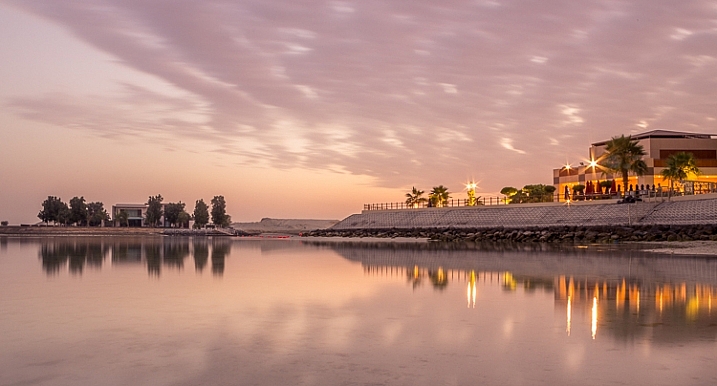
The image above is the untouched RAW file straight out of the camera. Some photographers are happy with this result, and leave it there. After a closer look, I found there were several other things with the image I could improve. Because it’s a RAW file, I knew there was a lot of image data to work with.

Basic editing is supposed to enhance what’s already in the photo, not fix what is wrong. Ideally, you should get the shot as technically correct as possible in the camera. One nice thing about digital photography is how easy it is to make small adjustments after the shot. If you fail on the exposure or the horizon is not perfectly straight, no problem, you can fix it

Levelling a tilted horizon and verticals, cropping, and dust spot removal

capture-2b
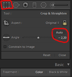
While you edit, you can make simple adjustments to your composition, like levelling the horizon and cropping. By cropping, you can tighten the composition, and to some extent “move” elements, so they align according to the rule of thirds or golden mean.

In the photo below I have levelled the trees, as they were leaning slightly to the right. I did not notice that when I took the photo. Most photographers will not question if levelling the horizon, cropping, and removing dust spots are acceptable image editing. It’s part of the workflow.

Sunrise 2

Adjusting the White Balance (WB)

I took this image an early morning, at sunrise. The reflections from the clear blue sky gave the scene an overall blue color cast. At the computer, I remembered the scene as being warmer. Warmer is perceived as more pleasing. I could be wrong, because who remembers exactly what colors a scene had at the time they took the image?

Photographers often claim they edit their photos to represent how they saw the scene. It is probably more correct to say they edit their photos the way they wish they saw the scene.

capture-3b
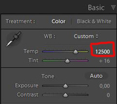
So I decided I wanted my image to have a warmer color tone. I adjusted the White Balance by adding more yellow.

I could have achieved something similar by setting the camera White Balance to the Cloudy preset, at the time I took the image. Changing the White Balance after the shot is another advantage when you shoot your files as RAW. Either way, the result is altered, and to some extent, the reality is changed.

Although the significant impact changing the White Balance can have on an image, it is usually accepted as part of the post-processing workflow.

Sunrise 3

Increasing Exposure and Contrast

Because no adjustments are made to the RAW files in camera, the images look unfinished when you open them up on your computer. The preview on the LCD is an embedded JPG version of the photo, which often looks much better.

capture-4b
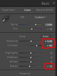
Even with modern digital cameras you don’t always hit spot on with the exposure. If you don’t get it right in-camera, with RAW files you can easily correct the exposure one two stops when post-processing.

My image is no exception, it looks flat, and needs a few more adjustments. So I increased the contrast slightly. When you increase contrast, the image tends to get a little darker. To compensate for this, I had to increase the exposure a tiny bit. You can see the result so far below.

Sunrise 4

Decreasing Highlights and increasing Shadows

capture-5b
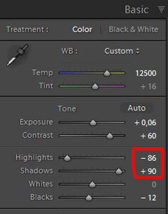
One more thing that bothered me was the black chunk of trees to the far right. The trees have now become too dark with no details in the shadows. I fixed this by increasing the shadows slightly. I also lowered the highlights a little to bring out more of the texture in the ice. In the version below the trees to the right are no longer completely black.

With these last adjustments, the image starts to look pretty decent. So far so good. All of the edits I have done until now are within what most photographers will find acceptable.

Sunrise 5

3. Beyond basic editing

Oversaturated colors

Photos with saturated and vibrant colors are eye catching. If you want attention when you post your images on social media sites, it’s a good idea to boost the colors first.capture-6

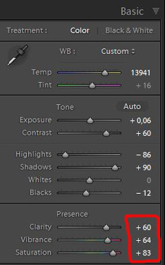
At this stage, it was attempting to make the sunrise more beautiful. To me, it was already an awesome winter morning sunrise. But I felt I could make it even better – with some over-processing.

I did this simply by increasing vibrance and saturation significantly. The image now has an entirely different feel. To me, it looks fake. But I bet this version would have received more attention on my social media sites if I posted both versions there. I have seen this happen with some of my other images before.

With this level of editing, the discussions start as to whether or not the image represents a realistic landscape. It can be your artistic interpretation of the scene, but to me it’s not authentic anymore.

Sunrise 6

4. Photo editing artistically

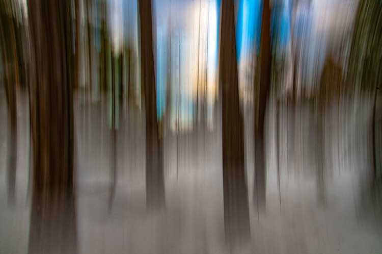
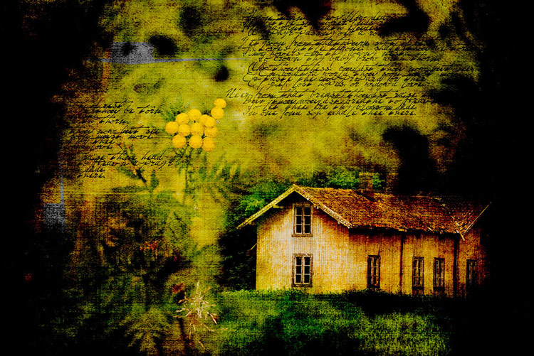
Adding texture for a complete different look

In the next image I have used my artistic freedom as a photographer and artist. I blended in a couple of texture layers and photo filters with the original image. By using textures properly, you can create some interesting effects on your images.

If this is a realistic landscape photo or not, is no longer a relevant question. It’s not, nor is it supposed to be. But you can discuss whether or not you like this style. While all the previous edits were made in Lightroom, the last two versions were made in Photoshop, as Lightroom doesn’t have the layers function which is needed.

Sunrise 7

Composite of several images makes this surreal piece

The last version of my image is a composite. Only a few elements are left from the original, but you can tell it’s still there. The result is so extreme that nobody can blame you for faking a realistic landscape image. Everybody know this is a creative piece of art. Again it’s very subjective whether like the style or not. Compositing is a whole new level of photo editing, it’s not for everyone.

When you create composites, you need many of the same skills as when you photograph. For a balanced composite, you must know about composition techniques and how to deal with light and shadows, as well as colors.

Sunrise 8

Conclusion

With digital photography it’s possible to create the image you want. Your imagination and skills are your only limitations. The general trend is bold and vivid colors get a lot of attention, at least among some photographers. Whether you want to follow this trend or not, is your decision. The fact is that more of the images you see online look similar, due to the same post-processing techniques. It’s getting harder to be recognized online unless you make something different.

As a landscape photographers you have a few challenge to tackle because the elements of nature are limiting. Light and weather conditions might not be as you wish when you’re at your dream scene. Maybe you never come back to the same spot again. In such a situation it’s tempting to fix the light (slightly) in post-production. In other words, to fake reality like I did with the oversaturated image.

ICM_forest_original_edit

Original edit

ICM_forest_creative_edit

Creative edit

Photography is art, so it’s not wrong if you choose to do so, but be open with what you have done. Don’t pretend you experienced the sunrise of your life if you didn’t. In the end, it’s up to you what you’re comfortable with. Nobody can take away your creative vision.

You can do more advanced editing in Lightroom than I have shown in this tutorial. In Photoshop however the possibilities are endless. You can manipulate, remove, and add content to your images. With such drastic steps, you’re not only altering the reality, but you’re cheating. That’s if you claim your photo is real.

Now it’s your turn. What’s your opinion about how much you can edit landscape photos? Please share your thoughts in the comments below.

Original edit

Original edit

Creative edit

Creative edit

This week we are doing a series of articles to help you do better nature photography. See previous articles here:

  • 3 Habits Every Outdoor Photographer Should Develop to Avoid Missing Shots
  • 5 Tips for Better Nature Photography
  • 27 Serene Images of the Natural World
  • Weekly Photography Challenge – Nature
  • 10 Ideas for Photographing Nature in your Backyard
  • 6 Tips for Capturing Character and Personality in Wildlife Photography
  • 5 Tips for Setting the Focus in Your Landscape Photography
  • 7 Tips for Better Marine Wildlife Photography

googletag.cmd.push(function() {
tablet_slots.push( googletag.defineSlot( “/1005424/_dPSv4_tab-all-article-bottom_(300×250)”, [300, 250], “pb-ad-78623” ).addService( googletag.pubads() ) ); } );

googletag.cmd.push(function() {
mobile_slots.push( googletag.defineSlot( “/1005424/_dPSv4_mob-all-article-bottom_(300×250)”, [300, 250], “pb-ad-78158” ).addService( googletag.pubads() ) ); } );

The post Tips for Processing Landscape Photos – from Basic Edits to Artistic Interpretation by Kim Rormark appeared first on Digital Photography School.


Digital Photography School

 
Comments Off on Tips for Processing Landscape Photos – from Basic Edits to Artistic Interpretation

Posted in Photography


Calligraffiti: Fresh Artistic Perspective on Cairo’s ‘Garbage City’

01 Jul

[ By WebUrbanist in Art & Street Art & Graffiti. ]

giant mural cairo

On the outskirts of Cairo, Egypt, lies the community of Manshiyat Naser, famous for providing informal trash and recycling services for the city, but also notorious for the mess and smell that go with that role.

garbage city mural

‘Calligraffiti’ artist el Seed worked with the ward to develop an incredible mural spanning 50 buildings, aiming to change perceptions and raise awareness about the community.

garbage city calligraffiti

Marginalized and belittled, the residents are incredibly industrious, sorting out garbage from recyclables by district within the community, literally turning Cairo’s trash into lucrative treasure.

graffiti on walls

hanging to paint

The mural blends aspects of Arabic calligraphy with contemporary graffiti, all while highlighting the architecture of the area. The entire work is only visible from the nearby Mokattam Mountain.

graffiti progress

The piece spells out the words of Saint Athanasius of Alexandria, a Coptic bishop from the 3rd Century, who said: “anyone who wants to see the sunlight clearly needs to wipe his eye first.”

graffit art close up

“The zaraeeb community welcomed my team and I as if we were family,” said the artist. “It was one of the most amazing human experiences I have ever had. they are generous, honest and strong people. They have been given the name of Zabaleen (the Garbage People), but this is not how they call themselves. They don’t live in the garbage but from the garbage; and not their garbage, but the garbage of the whole city. they are the ones who clean the city of Cairo.”

Share on Facebook


[ By WebUrbanist in Art & Street Art & Graffiti. ]

[ WebUrbanist | Archives | Galleries | Privacy | TOS ]


WebUrbanist

 
Comments Off on Calligraffiti: Fresh Artistic Perspective on Cairo’s ‘Garbage City’

Posted in Creativity


Photogenic Edibles – 25 Artistic Photos of Veggies

26 Mar

Inspired by Edward Weston’s famous image of a pepper, comes this week’s image collection – veggies. Can a simple vegetable become art? You decide.

Ryan Lane

By Ryan Lane

Grahamvphoto

By grahamvphoto

Matt Artz

By Matt Artz

Aurelien Guichard

By Aurelien Guichard

Thomas Hawk

By Thomas Hawk

E.c.johnson

By e.c.johnson

B .Y

By B .Y

William Warby

By William Warby

Andreas Engel

By Andreas Engel

Grant

By Grant

William Warby

By William Warby

Violscraper

By violscraper

Ian Richardson

By Ian Richardson

Marianela Díaz-cardozo

By marianela díaz-cardozo

Rum Bucolic Ape

By Rum Bucolic Ape

Sid

By sid

Dominique Pelletier

By Dominique Pelletier

Oveja

By Oveja

Yasser Abusen

By Yasser Abusen

Stanley Zimny (Thank You For 17 Million Views)

By Stanley Zimny (Thank You for 17 Million views)

Nebojsa Mladjenovic

By nebojsa mladjenovic

Valentin Kold Gundersen

By Valentin Kold Gundersen

Kurtis Garbutt

By Kurtis Garbutt

Sarah Horrigan

By Sarah Horrigan

Tjarko Busink

By Tjarko Busink

googletag.cmd.push(function() {
tablet_slots.push( googletag.defineSlot( “/1005424/_dPSv4_tab-all-article-bottom_(300×250)”, [300, 250], “pb-ad-78623” ).addService( googletag.pubads() ) ); } );

googletag.cmd.push(function() {
mobile_slots.push( googletag.defineSlot( “/1005424/_dPSv4_mob-all-article-bottom_(300×250)”, [300, 250], “pb-ad-78158” ).addService( googletag.pubads() ) ); } );

The post Photogenic Edibles – 25 Artistic Photos of Veggies by Darlene Hildebrandt appeared first on Digital Photography School.


Digital Photography School

 
Comments Off on Photogenic Edibles – 25 Artistic Photos of Veggies

Posted in Photography


Dumpster Divine: 12 Flashy Trashy Artistic Dumpsters

19 Apr

[ By Steve in Art & Street Art & Graffiti. ]

Dumpster Art 1
Dumpsters may be grungy, grotty, gross-smelling garbage holders but these ubiquitous urban trash bins positively bloom just by adding a little art.

Dumpster Art 1a
Dumpster Art 1b

Our lead image comes courtesy of Flickr user Biafra Inc., and at first glance one wonders whether the dumpster is really that tiny or the photographer is utilizing some keen perspective manipulation. Wonder no longer: the dumpster actually IS tiny and you can even buy one (though not THIS one, it’s sold out) for your desktop at Dumpsty.com.

Grin Bin & Bear It

Dumpster Art 2

Dumpsters like the one above located in East Los Angeles take a lot of abuse both from the trash contractors who empty them and casual taggers who can’t resist their big blank accessible sides. Some of the best dumpster art, therefore, works with the ambient conditions resulting in a gritty, visceral visual impression.

X Marks The Spot

Dumpster Art 3b

Dumpster Art 3a

Dumpster Art 3c

In April of 2011, urban artist X publicly thanked Andy Warhol for, well, being Andy Warhol. X‘s graphic homages appeared on the sides of high buildings, electrical boxes, dumpsters and more. You’re welcome.

Austin City Limit

Dumpster Art 4

Just what is the most common dumpster base color, anyway? Some manufacturers go for dark blue, others opt for the above shade of dull gray-green perhaps because it’s one of the most blah hues imaginable. That kind of thinking can backfire, however, should an enterprising graffiti artist choose a contrasting shade for his/her art. Flickr user Dan Machold (danmachold) discovered a perfect example just off Speedway in Austin, TX.

Next Page – Click Below to Read More:
Dumpster Divine 12 Flashy Trashy Artistic Dumpsters

Share on Facebook


[ By Steve in Art & Street Art & Graffiti. ]

[ WebUrbanist | Archives | Galleries | Privacy | TOS ]


WebUrbanist

 
Comments Off on Dumpster Divine: 12 Flashy Trashy Artistic Dumpsters

Posted in Creativity


Mufflers: 10 Artistic Acoustic Highway Noise Barriers

22 Mar

[ By Steve in Architecture & Public & Institutional. ]

Highway Acoustic Walls 1a
These artistic acoustic highway noise barriers combine form with function, neatly blocking the sound of road traffic while looking darned good in the process.

Highway Acoustic Walls 1b

This proposal for an environmentally-friendly acoustic barrier (“Forest Corridor”) in Hong Kong was designed by Bread Studio to meet three strict conditions: masking the sight of the highway from nearby residential buildings, improving the view of the highway’s underside for people in the park below, and relieving drivers from any claustrophobic impressions as they cruise through the de facto tunnel.

Leapin’ Lizards!

Highway Acoustic Walls 2a

Highway Acoustic Walls 2b

Stretching for six miles along both sides of the Pima Freeway’s sound barrier wall in Scottsdale, AZ, “The Path Most Traveled” by artist Carolyn Braaksma evokes the essential nature of the region’s desert ecosystem.

Highway Acoustic Walls 2c

Interspersed among a mix of abstract and Native American-style motifs are prickly pear cacti standing up to 40 feet tall and enormous lizards almost 70 feet long.

Clearly Beautiful

Highway Acoustic Walls 3a

Highway Acoustic Walls 3b

Melbourne’s freeway network is the largest of any Australian city, and without sound barriers the aural impact on residential neighborhoods would be substantial. Cheap and unimaginative acoustic walls would also have a detrimental effect on drivers so a pleasing compromise was achieved that satisfied both.

Highway Acoustic Walls 3c

Tinted acrylic plastic panels set into sound walls along the EastLink Freeway maintain audio insulation while adding visual interest at a reasonable cost. Want to see the world through rose-colored sound barriers? Get your eyes to Australia!

“Sixty Seconds of Architecture”

Highway Acoustic Walls 4a

Highway Acoustic Walls 4b

Louwman Exclusive Cars is a high-end exotic automobile dealer located in Utrecht, the Netherlands, just off the A2 highway between Amsterdam and Maastricht. Instead of making do with a bland and boring sound wall, the dealership opted instead for an acoustic barrier “designed from the perspective of a flow of cars passing by with the speed of 120 km/h.” Fast company indeed.

Highway Acoustic Walls 4e

Highway Acoustic Walls 4d

Highway Acoustic Walls 4f

Highway Acoustic Walls 4c

Stretching 1.5 kilometers in length, the 5,500,000-euro barrier designed by Kas Oosterhuis widens to a 30m “cockpit” that accommodates the auto dealer’s showroom and service bays. No doubt it’s quite quiet inside as well.

Next Page – Click Below to Read More:
Mufflers 10 Artistic Acoustic Highway Noise Barriers

Share on Facebook


[ By Steve in Architecture & Public & Institutional. ]

[ WebUrbanist | Archives | Galleries | Privacy | TOS ]


WebUrbanist

 
Comments Off on Mufflers: 10 Artistic Acoustic Highway Noise Barriers

Posted in Creativity