This diagram shows the three colour spaces that Lightroom works with. Photo from Wikipedia
One of the key differences between Lightroom and Photoshop is their approach to colour management. In Photoshop, once out of Adobe Camera Raw, you can go to the Colour Settings menu option and tell Photoshop in which colour space you want it to work.
How Lightroom works
Lightroom works differently. When processing Raw files, Lightroom uses the ProPhotoRGB colour space the whole time, and there’s nothing you can do to change it. The benefits of this method are:
- Less colour information is lost during the processing stage. ProPhotoRGB is the largest colour space, so it is the optimum one to work in.
- You can export multiple versions of the same photo, each with a different colour space, if you have need to do so.
- If future output devices (monitors, printers etc.) support ProPhotoRGB (they don’t at the moment) then your photos will be ready for them.
- Colour management is greatly simplified. You don’t have to make any decisions about what colour space to work in until you export your photos. This is the biggest advantage of all.
How Lightroom manages colour
When processing Raw files, Lightroom (and Adobe Camera Raw in Photoshop) uses its own colour space based on ProPhoto RGB. It provides a large colour gamut to work with the wide range of colours that digital sensors are capable of recording.
Note: Gamut is the term used to describe the range of colour values that fit in a colour space.
Exporting photos in Lightroom
When you export a photo in Lightroom it gives you the choice of three colour spaces.
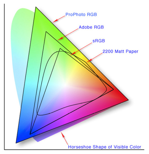
ProPhotoRGB: ProPhoto RGB is the largest of the three. It roughly matches the range of colours that a digital camera sensor can capture.
Adobe RGB (1998): Adobe RGB (1998) is smaller than ProPhoto RGB, but larger than the next choice, sRGB. It roughly matches the colour gamut of CMYK printers used to print books and magazines.
sRGB: sRGB is the smallest colour space of the three. It represents the colour space that most monitors are able to display.
Comparing colour spaces
These two graphs show how the colours my monitor is capable of displaying, compared to the sRGB and Adobe RGB colour spaces.
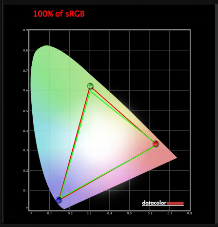
The green triangle shows the sRGB colour space, the red one shows my monitor’s colour gamut. The two are nearly identical.
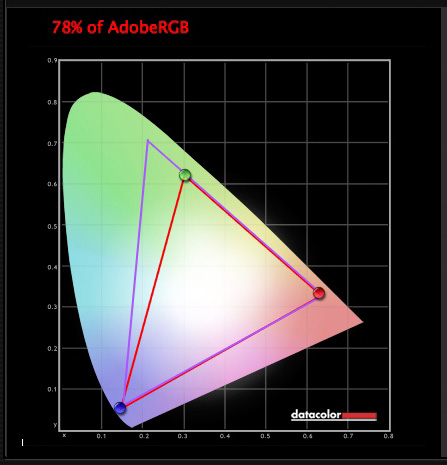
The purple triangle shows the Adobe RGB (1998) colour space, the red one shows my monitor’s colour gamut. My monitor can’t display all the colours within this colour space. Only a select few high end monitors can display all the colours within the Adobe RGB (1998) colour space.
This diagram compares the ProPhoto RGB, Adobe RGB (1998) and sRGB colour spaces. You can see that ProPhoto RGB is the largest.
Photo from Wikipedia
Keeping it simple
Armed with this knowledge, here’s a guide to which colour space you should select when exporting your photos:
sRGB: Use when exporting photos to be displayed online, printed at most commercial labs, or printed with most inkjet printers. In short, if in doubt, use sRGB.
Note: Lightroom’s Web module automatically sets the colour space of exported files to sRGB.
Adobe RGB (1998): Use only if requested. If you’re not sure, ask. If you’ve been asked to submit photos to a magazine, for example, then ask them which colour space is required. It will probably be Adobe RGB (1998). Submitting photos to a stock library? Again, it will probably be Adobe RGB (1998). It’s the colour space most likely to be used for commercial purposes.
You would also use this colour space if you have an inkjet printer that utilizes the Adobe RGB (1998) colour space, or you are using a lab that accepts and prints photos with that profile.
ProPhoto RGB: Use when exporting a photo file to be edited in another program such as Photoshop or a plug-in. The file should be exported as a 16-bit TIFF or PSD file. There is little point in using the ProPhoto RGB colour space with 8 bit files, as they don’t contain enough bit depth to utilize the full colour range.
Note: If you import a JPEG or TIFF file into Lightroom, it uses the file’s embedded colour profile. If there is no colour profile attached, it assumes that it’s an sRGB file. If you choose an alternate colour space when you export the file, Lightroom converts it.
Colour spaces and compression
The reason that Lightroom uses a version of the ProPhoto RGB colour space, is that it is doesn’t compress the colours captured by your camera’s sensor.
When you export a photo, if you select either the Adobe RGB (1998) or sRGB colour space, Lightroom compresses the photo’s colours to match the chosen profile. That’s why selecting colour space is best left for as close to the end of the post-processing workflow as possible.
While Lightroom does its work within its version of the ProPhoto RGB colour space, your monitor isn’t capable of displaying all those colours. Instead, your computer’s operating system uses the monitor profile to convert the colours to ones that your monitor is capable of displaying.
Note: All monitors have a colour profile, regardless of whether they have been calibrated. But your monitor will only display colour accurately if it has been properly calibrated. You can learn more about the calibration process in my article How to Calibrate Your Monitor With the Spyder 4 Express.
Exporting photos with Lightroom
To export a photo in Lightroom, select the photo (or photos) you want to export, then go to File > Export. You can do this from any module (use the Film Strip to select multiple photos if you are not in the Library module’s Grid View).
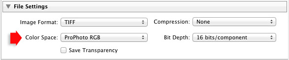
Go to the File Settings section of the Export window and set the required colour space. If you select the ProPhoto RGB colour space set Bit Depth to 16 bits/component.
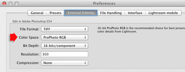
Transferring photos to Photoshop
To open a photo in Photoshop, right-click on the photo and select Edit In > Edit In Adobe Photoshop. Photoshop opens the photo using the colour space indicated in Lightroom’s preferences.
To adjust this setting, go to the External Editing tab in preferences, and set Color Space to ProPhoto RGB. You can choose another colour space if you wish, but ProPhoto RGB is definitely the best one to use.
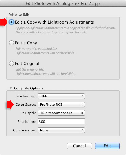
Opening photos in plug-ins
To export a photo to a plug-in, right-click on the photo, go to Edit In and select the plug-in you want to use to open the photo.
In the Edit Photo window, if you select Edit a Copy with Lightroom Adjustments (the only option available if you are exporting a Raw file) you will be able to select which colour space you want to use. Again, go with ProPhoto RGB for the best results.
If you are exporting a JPEG or TIFF file, Lightroom gives you the option of selecting Edit a Copy or Edit Original in the Edit Photo window. If you do so, the option to select a colour space is greyed out and Lightroom opens the photo in the plug-in using the embedded colour profile.
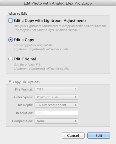
But if you select Edit a Copy with Lightroom Adjustments, you can select any colour space and Lightroom will convert the photo to that colour space when it opens the photo in the plug-in.
Conclusion
Confused? I hope not, because colour management in Lightroom is really very simple. It’s essential to calibrate your monitor, but after you’ve done that Lightroom takes care of all colour related issues for you until you export your photos. Then, it’s just a matter of selecting the appropriate colour space.
If you have anything to add to the article, or any questions, please post it in the comments.
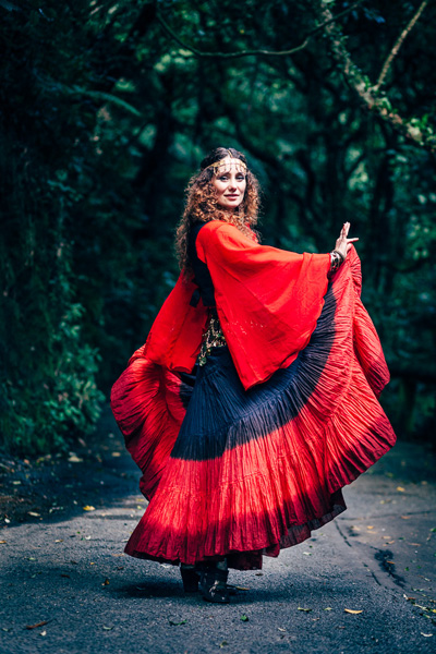
 Mastering Lightroom: Book Four – The Photos
My new ebook Mastering Lightroom: Book Four – The Photos takes you through ten beautiful examples of photography and shows you how I processed them step-by-step in Lightroom. It explores some of my favourite Develop Presets and plug-ins as well as the techniques I use in Lightroom itself. Click the link to learn more.
The post Everything You Need to Know About Lightroom and Colour Space by Andrew S. Gibson appeared first on Digital Photography School.

Digital Photography School


You must be logged in to post a comment.