RSS
 

Posts Tagged ‘Photoshop’

DxO FilmPack 4 and ViewPoint 2 updates provide compatibility with Photoshop CC

12 Jul

DxO has released updates for its FilmPack film emulation and ViewPoint perspective correction software, enabling them to be fully integrated with Adobe Photoshop CC 2014. Both are available as standalone applications or as a plugin for Lightroom and Photoshop. FilmPack v4.5.2 and Viewpoint v2.1.7 are available for download now. Read more

Articles: Digital Photography Review (dpreview.com)

 
Comments Off on DxO FilmPack 4 and ViewPoint 2 updates provide compatibility with Photoshop CC

Posted in Uncategorized


5 Photoshop Tools to Take Your Images from Good to Great

03 Jul
Seascape image - Before and After image editing

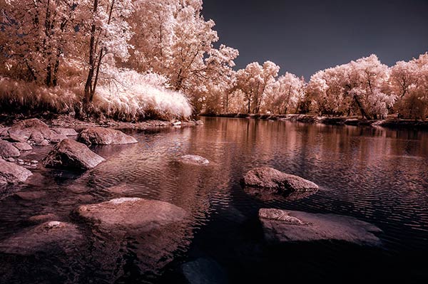
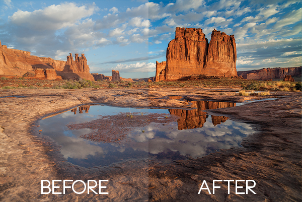
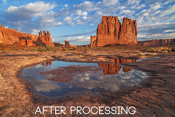
Seascape image – Before and After image editing

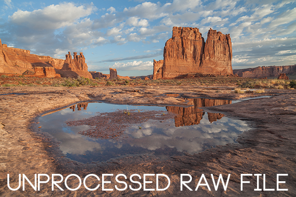
We hear it all the time, “That photo has been Photoshopped”. Sometimes it sounds like the photo has caught a disease or that Photoshop is some undesirable effect that has been added to the image. Photoshop is the KEY to making your good images look spectacular. Yes, I said “good” images. Photoshop is not about fixing mistakes or trying to rescue a bad shot. It is more about refining your images and making them look amazing without overdoing it. Photoshop is a fantastic tool when it is used effectively but can be your enemy when you overdo it. Depending on what you want to achieve with your photos, this quick guide to five Photoshop tools will help you adjust your exposure effectively and make the colour really pop out of your image.

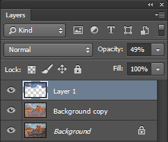
NOTE: the examples in this article simply show you how to make the adjustments on a separate layer. You could also use an adjustment layer which gives you much more control over the adjustment. The only tool that can’t be used with an adjustment layer is Shadow and Highlights. I will go into more details about adjustment layers in upcoming articles, for now, if you follow these guidelines, your images will look compelling and rich without looking overdone.

1. Shadow and Highlights Tool

This tool will be used to get more detail in the shadow areas of your image. Modern cameras can capture lots of detail, but depending on the light in the scene you are shooting, the shadows may be a little dark. The Shadow and Highlights tool will bring back some of the details in those areas.

Open your image in Photoshop and go to:  IMAGE > ADJUSTMENTS > SHADOW AND HIGHLIGHTS.

Finding the Shadow and Highlights tool

Finding the Shadow and Highlights tool

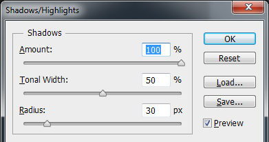
The tool will pop up and you will see this (as shown below), if you don’t see all these sliders, click “more options” to expand the box. You will use this tool to bring detail back into the shadows and you won’t be making any adjustments to the highlights. I find that the highlights part of this tool does not do a really good job, so I don’t use it at all.

Making adjustments to the Shadows in the image

Making adjustments to the Shadows in the image

The best way to work with the tool is to slide the Amount slider under the Shadows box to about one third across (33%). Then slide the Tonal Width slider to directly under the Amount slider. Lastly  bring the radius slider to directly under it. In most cases, you will want to have these sliders directly under each other (see screenshot below right).

shadows-highlightsThe important thing to remember here is to make the adjustments and take careful note of your image has been affected. Click on the preview button on the right hand side of the tool (you can do this with all the tools in this article) to see the “before and after”. You will be able to see at a glance how your changes are working. If you need to extract more detail from the shadows then slide the Amount slider to the right even more but make sure you line the other two sliders underneath it.

The amount that you decide to adjust the shadows is up to you. Be careful not to overdo it. Once you start seeing a “glow” around certain parts of your image, you may have gone too far. This glow is often referred to as a halo which can be avoided by watching carefully how your adjustments are affecting your image. If you see them appearing, simply drag the sliders back to the left until they disappear. Once you are happy, click OK.

2. Levels Tool

With your image open and the shadows adjusted, you will now adjust the overall exposure in the scene. If your image is a little over or under exposed, the levels tool can fix that. Go to: IMAGE > ADJUSTMENTS > LEVELS on the menu bar (or using the keyboard shortcut Command/Control+L). You will see the LEVELS dialogue box pop up and it will have a graph in it. This graph is called a histogram.

histogram

A histogram is simply a graphical representation of the pixels in the scene. If the graph is pushed over to the left side it means that your image has more darker tones in it, if the graph is over on the right side it means that your image has more brighter tones. There is no right or wrong histogram, it is simply a representation of the light in your scene. There are some great articles about histograms on the dPS site, so if you want to learn more about them, click on one of the links above.

Using the Levels tool to enhance the exposure and boost contrast

Using the Levels tool to enhance the exposure and boost contrast

The important thing to remember when working with levels is to make sure you don’t adjust your image so much that it causes the image to become under or over exposed. Thankfully, Photoshop gave us a way to see if that is happening, which I will explain shortly. Firstly, you will notice there are three sliders on the bottom of the histogram. The slider on the right is white (adjusts highlights) the slider in the middle is grey (adjusts mid tones) and the slider on the left is black (adjusts shadows). The levels tools will help adjust contrast and colour in your image. You can start the process by clicking and dragging the white slider in (move it to the left) to touch the edge of the histogram. Do the same for the black slider (drag it to the right). Your image will already look better.

Using the ALT key to see where the highlights are being overexposed

Using the ALT key to see where the highlights are being overexposed

Then you can move the middle slider to the right or the left to see which works better. Small changes always work best, so don’t make extreme changes on each slider. If you want to see how your adjustments are affecting your image, hold down the ALT key (PC) or OPTION key (Mac) while you click on the white or black slider. When you click ALT and hold down the white slider, the image will go black. As you slide to the left, you will see some red areas in your image (see above). When you see this, Photoshop is showing you which parts of the image will be overexposed, or clipped. The opposite is true for the the black slider. If you hold down ALT and click on the black slider, the screen will go white and as you slide to the right, the areas that come up on the screen will be underexposed, or clipped. It is a good idea to use this function if you are not sure if you have overdone your adjustments in Levels.
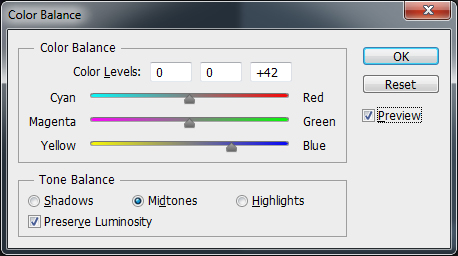
3. Colour Balance

This is a good tool to use to change the overall colour in the image. If your image is too blue and want you want it to be warmer, then you can do that by pulling up the red tones. Also, if your image has an undesirable colour cast, maybe the overall colour of the scene seems too green, then you can correct that by using this tool. The colour balance tool is found in the top menu bar under IMAGE > ADJUSTMENTS > COLOUR BALANCE (or using the keyboard shortcut Command/Control+B).

color-balance

Once the dialogue box is open, you will see three sliders (as above). The sliders represent the visual colours in the image, and are set in the middle by default. By moving them to the left or the right you will be able to change the colour in the image. The top slider affects Cyan/Red, the middle slider works on Magenta/Green and the bottom slider is Yellow/Blue. The colour will change according to which slider you choose and how far left or right you move it.

Note: you can also choose which area of your image to affect as in the Shadows, Midtones or Highlights but selecting the appropriate button in the Tone Balance section below the sliders.

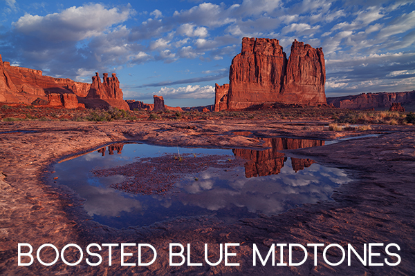
You will want make small adjustments here too. A big adjustment can make your image look over saturated with a particular colour and that will look unnatural. The idea is to enhance your image by boosting certain colours in the scene. So, if you have a sunset image (as below) you may want to boost the reds, yellows and magentas. That will make your image look warm and will give the scene some colour boost.

Using Colour Balance to boost the colours in the image

Using Colour Balance to boost the colours in the image

4. Hue and Saturation

One of the most powerful colour tools in Photoshop is the Hue and Saturation tool. To open it go to: IMAGE > ADJUSTMENTS > HUE/SATURATION (or using the keyboard shortcut Command/Control+U). This tool can be used very effectively to adjust all the colours in your image. When you open the tool, you will notice that there are three sliders again, namely Hue, Saturation and Lightness.

hue-saturation

Hue means colour, this is not used very often as it will reassign the colours in your image, what you want to use this tool for is saturation. Saturation controls the richness or intensity of the colours in your image. Above the three sliders you will see a drop down box called Master. If you click on this, you can choose the colours that you want to saturate. This gives you very fine control over each colour in your image. You can select each colour individually and adjust it according to your preference. You may want to saturate the reds and yellows more than the blues, as an example, this tool allows you to do that. It is good to know that you are not adding colour to your image, you are saturating the colours that are there. Again, incremental adjustments are key. Don’t overdo it, small adjustments throughout this process will make your image look more natural and more dramatic

Getting the most out of the Hue and Saturation tool by saturating colours by channel

Getting the most out of the Hue and Saturation tool by saturating colours by channel

5. Vibrance

vibranceThe vibrance tool is found under IMAGE  > ADJUSTMENTS > VIBRANCE (no shortcut). It effectively saturates colours that are not completely saturated. This is a good finishing touch to your image editing to make sure your image gets a final boost. There is no real guideline as to how much you should adjust on this tool, but be aware of how it is affecting your image. Once this step is complete, your image should look remarkably different and if done correctly, the viewers won’t be saying those dreaded “Photoshopped” words.

The final step, boosting the vibrance to get that extra pop in the image

The final step, boosting the vibrance to get that extra pop in the image

In Conclusion

These five tools will help you make your good images spectacular. The important thing to remember in Photoshop is to make adjustments incrementally. As you can see from this process you slowly and incrementally make changes but the overall effect is dramatic without looking overdone. There are many other tools in Photoshop that can add even more enhancement to your images (I will be doing articles on those over the next few months) but start with these and get comfortable with how they work. To summarize, in Photoshop, slower is better and many small adjustments make a more dramatic impact on your image than a few large adjustments. Enjoy and experiment and as always, let me know what you think in the comments below.

The post 5 Photoshop Tools to Take Your Images from Good to Great by Barry J Brady appeared first on Digital Photography School.


Digital Photography School

 
Comments Off on 5 Photoshop Tools to Take Your Images from Good to Great

Posted in Photography


How to Create and Use Photoshop Actions to Speed up Your Workflow

26 Jun

Photoshop_CC_icon.pngWhat are Photoshop Actions?

Photoshop Actions are very useful time savers. Should you find yourself applying the same Photoshop commands or a series of commands repeatedly to images, wouldn’t it be nice to just push one key and apply that series of commands to your image, or even to a whole folder of images? It can be done, read on.

What kind of things can you do with Actions?

Inside Photoshop, just about everything you do to enhance images can be done with an Action, ranging from: applying creative styles, resizing, converting to Black and White, sharpening, watermarking, or even compositing star trails – all with one click of the mouse or a keyboard short-cut.

Why use Actions?

The use of Actions will streamline image processing by combining multiple commands into one key stroke, or batch, which will save you lots of computer time and give you more time for shooting. Every photographer wants more time for shooting.

Create a simple Action

Okay, so perhaps you want to resize an image for the web. This simple action will resize the image to 600 pixels wide, and also add copyright and contact information to the image.

action_palette-with-callouts

Steps-by-step how to create your own Action

  1. In Photoshop , open the photo file you want to work on.
  2. Open the “Action Palette” or panel (Alt+F9)
  3. Select “Create New Action” from menu or click on the “New Action” button.new action3
  4. Name your Action; use a name that will tell you what the Action will do. In this case we will name it “Save for dPS Blog”.
  5.  Assign a key board short-cut.
  6. Assign a color to Action button. (This is optional, but can be useful to organize your Actions when you set up multiples.)
  7. Assign a set in which your Action appears. This is useful if you want many Actions for many different types of work, for example “Sizing Actions”.
  8. Start recording – select record from the menu or click the  “Start Recording” button.
  9. Now, simply apply all the Photoshop commands to your open image that you want saved in that Action.
  10. Select image size (Alt+Ctrl+I) and set to 600 pixels wide.
  11. Select File Info (Alt+Shift+Ctrl+I) and enter your Copyright information.
  12. Select “Stop Recording” from menu or click the “Stop Recording” button.If any of your commands require variable settings that need to be changed on an image by image basis, click on the pause button for that Action. Now when you run your Action, it will stop at that command for your input. Otherwise, your action will run just as it was recorded with all input being applied the same.

How to use Actions

There are three ways Actions may be used:

  1. Applying it to a single open image
  2. Applying it to a batch of images
  3. By creating a Droplet of your Actions

Explanations of how each of these work follow.

Applying to open image

You can apply your Action to an open image by simply selecting the desired Action in the Action Palette and then selecting Play from the menu or by clicking the Play button.

Applying to a batch of images:

  1. Place all the  images into one folder
  2. Select the Action you want to run
  3. Under the File menu, select Automate and then Batch (because the Action you want to run is already selected, the action field will have already been preloaded with the right one)
  4. Under Source, select the desired folder from the menu.
  5. Click on the Choose button and select the folder that contains your images.
  6. Under Destination, select Folder.
  7. Click on the Choose button and select a folder where you want the final images to be saved.
  8. Select Override Action “save as commands”
  9. Click OK and Photoshop will automatically start opening all the files in the source folder one at a time and running the Action, then saving them to the destination folder. Cool, huh!?batch

Make a Droplet from an Action:

With this method you can create an executable file, which you can be place on your desktop. Then if you want to run an Action on a file, you can just drag it to your Action Droplet and the changes will be applied to your file and saved to a specified folder.

Creating a Droplet:

  1. Select the Action that you want to use to create your Droplet.
  2. Under File menu, select Automate and Create Droplet, the Create Droplet menu will open.
  3. Under Save Droplet In: click on Choose and select a destination for your droplet. Your computer desktop is a great destination and makes the Droplet easily accessible.
  4. Under Play, since we already selected the Action in step 1, this section already contains the correct command info.
  5. Under Destination select Folder.
  6. Under Destination click on Choose and select a folder where you want the finished images to be stored.
  7. Select Override Action “Save as Commands”.
  8. Click OK and Photoshop will automatically create your Droplet.
    Now simply drag your image to the Droplet and the Action will be applied to the image and saved to your specified folder.Droplet

Actions can be used for the simplest series of commands, but after you get the hang of it you can create some very complex applications. The purpose of this article is to show just how easily you can create your own Actions and thereby simplify and speed up your work flow.

If you have other tips for using Photoshop Actions please share in the comments below.

For more on Photoshop Actions try these articles:

  • Tips for Learning to Love Photoshop Actions
  • Get Creative with Photoshop Actions
  • Lightroom Presets vs. Photoshop Actions

The post How to Create and Use Photoshop Actions to Speed up Your Workflow by Bruce Wunderlich appeared first on Digital Photography School.


Digital Photography School

 
Comments Off on How to Create and Use Photoshop Actions to Speed up Your Workflow

Posted in Photography


Overview of Some of the New Features of Photoshop CC June 2014

22 Jun

Photoshop_CC_icon.pngRecently Adobe announced their newest incarnation of their flagship product, Photoshop Creative Cloud (CC). Some of the new things look really interesting and I can see a lot of applications for them.

In this video French photographer Serge Ramelli goes over some of the new features that you may find useful including:

  • selections based on focus area
  • new spin blur and path blur
  • content aware fill improvements (added color tone consideration)
  • warp tool improvements

For a more extensive list of the new features let’s hear what Adobe instructor Julieanne Kost has to say in this official video from Adobe:

For a full list of all the new features and changes visit the Adobe website.

When Adobe first introduced their Cloud membership program there was a lot of backlast from photographers. You can no longer just buy Photoshop, you have to buy into the monthly option, and many photographers found it more expensive ($ 49 USD/month for the whole Creative Suite or $ 29.99 just for Photoshop) than simply upgrading once every two years, or every second version.

Adobe’s listened and responded with the Photoshop Photography program, which at the time of this article is $ 9.99/month USD and as of June 18th is available to anyone, amateur or pro. That price will get you both Photoshop CC and Lightroom 5 (the current version).

Where do you you stand on this?

Do you use Photoshop?

Have you upgraded to the Cloud or are you hanging on to an older version? Is there a new feature that puts it over the top for you to take the plunge?

Let us know where you stand on this issue and what software you plan to use moving forward.

More Photoshop tips

  • 5 Creative Ways to Process Infrared Photographs in Photoshop
  • 3 Easy Steps Using Photoshop to Making your Images POP
  • 4 Tips for Post Processing Efficiency in Photoshop
  • How to Make a Signature Brush in Photoshop
  • 5 Easy Photoshop Tips for Beginners

The post Overview of Some of the New Features of Photoshop CC June 2014 by Darlene Hildebrandt appeared first on Digital Photography School.


Digital Photography School

 
Comments Off on Overview of Some of the New Features of Photoshop CC June 2014

Posted in Photography


5 Creative Ways to Process Infrared Photographs in Photoshop

21 Jun

Digital cameras have made the process of infrared photography relatively simple and very accessible, compared to the days of shooting with infrared film. No darkroom is required and all you need to get started is an infrared filter on your lens (click through to read my article on How to do Surreal Digital Infrared Photography Without Expensive Gear or Camera Conversions) and to mount your camera on a tripod. Maybe you’ve tried digital infrared photography already. You’ve learned all the correct infrared shooting and compositional techniques so you know you have great images in your camera, but how do you transform those strange looking red or violet frames into stunning infrared photographs?

Here are 5 creative ways to process your digital infrared images in Photoshop to create arresting photos in color, and Black and White.

1) Color infrared one-click post-processing method

_DSC5456AsShot

As shot, before Auto Tone

This is the quick and instant method. Open your image in Photoshop and go to Image> Auto Tone. Look at the difference this one click makes! In fact Auto Tone should be the first thing you do to all your infrared images.

infrared image with autotone applied

Same image after Auto Tone has been applied

This has become a perfectly delightful infrared image. It has a variety of textures and colors for interest. However you may want to further process it to add more WOW and impact. The next step adds a few more tweaks that will help you do this.

 2) Color infrared gradient method

After you apply Auto Tone, you can also apply a Gradient Layer and set the blending mode to Soft Light, or Hard Light – you’ll need to experiment a bit depending on the tonal qualities of your original image. You can also adjust the opacity of this gradient layer.  If you are familiar with layer masks, you may want to mask out any areas where the gradient might be too strong.

Here is the same image with the Gradient Layer added. Can you see how it adds a little more depth and drama?

infrared image with post processing added.

Infrared Image with a Gradient Layer Added

gradient-tool
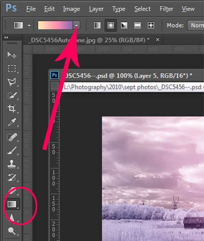
To add a Gradient Layer, go to your Layers palette, and click on the new layer icon at the bottom (it’s the one that looks like a sheet of paper with the corner turned up) or you can use  the keyboard shortcut Shift+Ctrl+Alt+N.  I find it quicker to use the icon in this case. While this new layer is active, go to the Tools palette and select the Gradient tool. On the context menu on top of the window you’ll see the Gradient library and you can select your pre-set gradient from there.

Now, back on your layer, drag your mouse to get the gradient on your image.  Select the blending mode to soft light or hard light and then adjust the opacity. This is where your artistic eye comes into the picture.  Play around with these settings until you have something you like.

Here is another infrared image processed the same way. You don’t have to use the same gradient each time – experiment a bit and see how things turn out. It’s art after all!

infrared image with a gradient texture.

3) Using the Camera Raw filters and the Channel Mixer

One of the key concepts in infrared photography is to have a very distinct separation of color tones between the sky, and your high infrared reflecting subjects. This is usually the grass and foliage in your scene, or it could be buildings or other subjects that reflect infrared light because of their paint or construction materials.  But it’s important to have this separation because you need the sky to be dark, and you’ll want the foliage to be light, if not pure white.

Happily, in Photoshop you can give a tonal boost to your images in a couple of way,s in addition to the Auto Tone setting.  After you’ve applied Auto Tone, look for the Camera Raw Filter under Filters. If your image is not a RAW file you can still use these adjustments, although it is best to shoot RAW when capturing infrared photos.

In the Camera Raw Filter, to get this color separation between the light and dark areas of your image, use the the Basics filters and  HSL/ Greyscale Slider to adjust the colors until you get a clear difference between the cyan and red shades.

 Original image as shot:

1as-shot-infraredimage

After applying Auto Tone and Using the Camera Raw Filters:

2cameraraw

Notice how these adjustments bring out the red in the sky and the blue in the leaves.

Now to the Channel Mixer

Go to Image>Adjustments>Channel Mixerchannelmixer

Here we will “swap” the channels to get a nice  blue sky and red or purple, and in a few quick steps, white foliage. Your Channel Mixer will look like this:

In the Red Output Channel, change the Red slider from +100 to 0, and the Blue slider from 0 to +100. Change the Output Channel drop-down to Blue, and make the Blue slider +100 and the red slider 0.  Your image will look something like this:

3infraredwithchannelmixer

There is a clear color difference now between the blue sky and the red foliage.  It doesn’t matter if the foliage of your image is purple and  the sky blue, as long as you can see a clear difference in colors with the sky having some shade of blue.

Now the last part. Go back into your Raw Filters, and in the Basic panel, move the White Balance Color Temperature slider to the left to get a nice blue sky.  In the HSL/ Greyscale tab, use the sliders in the Saturation tab to desaturate the colors of your foliage.  Your image should have a blue sky and white leaves and grass. Gorgeous!

The final image

4infraredwithcameraraw2-FINAL

 4) Instant Black and White infrared processing

This is a “quick and dirty” method for getting the classic infrared look from your captures. You’ll get the tell-tale light colored foliage, and dark skies. For best results your image should have a clear sky with some clouds for effect. Overcast skies detract from the image, leave things without enough contrast, and very flat. No clouds make the sky seem like a vast black void – not too interesting.

2Stepprocessingblackandwhiteinfrared
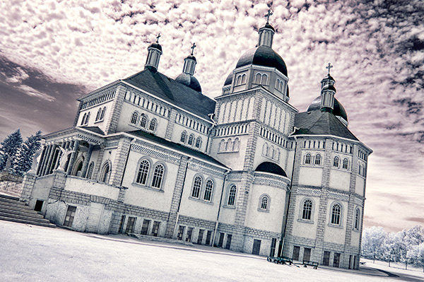
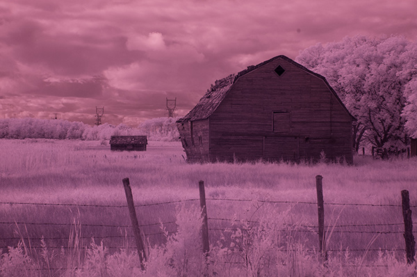
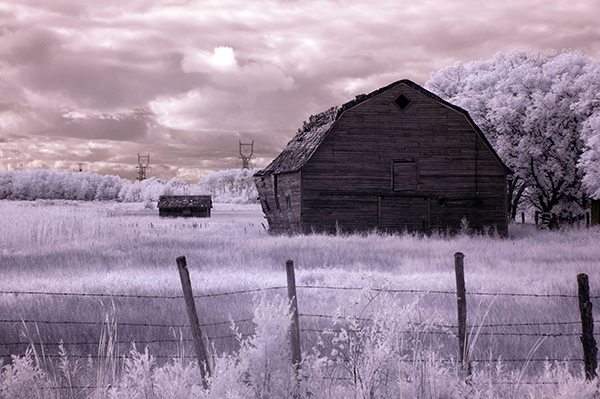
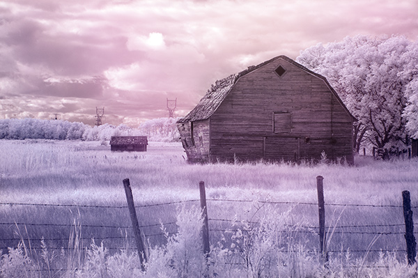
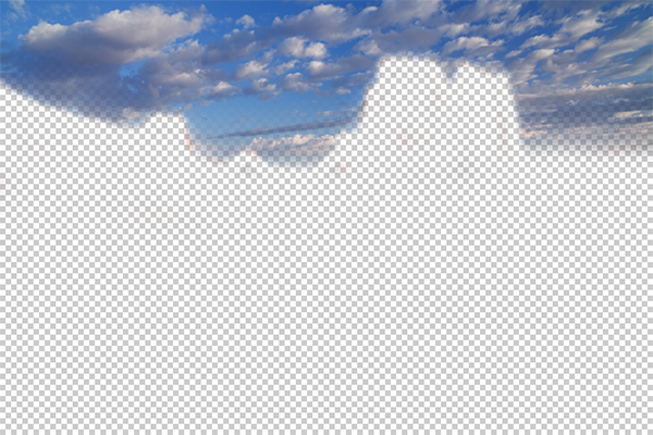
Classic black and white infrared images tend to be non-contrasty, so from an artistic perspective a blue sky with wispy or puffy clouds can really add interest to your image, create a powerful story, and keep that soft contrast intact.

  1. Open your image in Photoshop
  2. Go to Image>Auto Tone
  3. Next go to Image>Adjustments>Channel Mixer>Black and White with Red Filter (From there you can adjust the sliders to get the effect you want)
  4. To get the classic infrared glow, check to make sure that in the Tools palette the colors are set to the default – black foreground and white background. To be sure, a simple way to set this is to hit the letter D to reset the colors to the default state.
  5. Then duplicate your layer (Ctrl J), and go to
  6. Filters>Filter Gallery>Artistic>Diffuse Glow
  7. In the Diffuse Glow filter, set the sliders so you can see some halo glows around the white areas of your image. You will have to adjust these to suit your image but it will create the classic graininess and glow of film infrared photos.

If the glow amount is too strong and you’re getting blown out highlights, you can decrease the opacity of your glow layer in the Layers Palette. A little experimentation goes a long way. Remember your History palette in case you want to go back a few steps.

4blackandwhiteinfraredFianlwithglow

5) Advanced Black and White infrared processing

This is the method I use most for processing Black and White infrared images. It’s easy and it gives you far more control of your final result.

  1. Open your image in Photoshop
  2. Go to Image>Auto Tone
  3. Now create an adjustment layer for Color Balance.
  4. Layer> New Adjustment Layer> Color Balance

Again, the idea is to get as much color distinction between the sky and any foliage. Color Balance provides an addition method of doing this – in Black and White processing, as well as for color.

  • Move the sliders for Midtones, Shadows and Highlights until you have a nice, distinct separation of your color tones betweeb your foliage and your sky.
  • Finally add a new adjustment layer for Black & White
  • Layer> New Adjustment Layer> Black & White
  • Now use the sliders to get the full range of Black and White tones, paying special attention to maintaining detail in the white highlights in the trees, while making sure that the dark areas also have some detail
  • To apply the infrared glow, follow from Step 5 in the first method.

This image is called CREEP. Can you see why?

blackandwhiteinfrared

flowerheartCW

I love the softness and translucency of Black and White, infrared photography. Post-processing really brings out all the infrared characteristics that draw viewers in, and gets the emotions flowing. Using these five processing techniques will get you off to a fine start, but these are only five of many ways you can process your digital infrared images in Photoshop. If you have a favorite post processing formula I’d love to see how you do it. Post your infrared shots too.

The post 5 Creative Ways to Process Infrared Photographs in Photoshop by Alex Morrison appeared first on Digital Photography School.


Digital Photography School

 
Comments Off on 5 Creative Ways to Process Infrared Photographs in Photoshop

Posted in Photography


Adobe announces ‘Photoshop Mix’ for iPad

19 Jun

IMG_1315.PNG

Adobe has announced Photoshop Mix – a new image organization and manipulation app which can sync with Photoshop CC for desktop computers and Lightroom Mobile via Adobe’s Creative Cloud. Photoshop Mix allows you to access local files on your iPad, as well as import pictures from Creative Cloud and social media sites like Facebook. You can apply one of several preset filter effects, as well as crop and edit files using touch-based selection and masking tools. Click through for more information on connect.dpreview.com

News: Digital Photography Review (dpreview.com)

 
Comments Off on Adobe announces ‘Photoshop Mix’ for iPad

Posted in Uncategorized


Adobe to offer Lightroom and Photoshop CC for $9.99 monthly

18 Jun

1_Adobe_2014_CC_Release.jpg

Adobe has announced a new pricing plan for photographers that bundles Lightroom 5 and Photoshop Creative Cloud together for $ 9.99 per month. This plan makes it possible for photographers whose only interest is image editing to make use of both of these apps without signing up for a much costlier subscription to the complete Creative Cloud suite. No previous version of Photoshop is required. Read more

News: Digital Photography Review (dpreview.com)

 
Comments Off on Adobe to offer Lightroom and Photoshop CC for $9.99 monthly

Posted in Uncategorized


Take your Photos from Blah to WOW with Lightroom and Photoshop

07 Jun

Would you like to get started with black and white (or color) fine art photography, but don’t really know how to get the results you want? I will give you some insight in the process to take your photos to the next level and let you see how you can make the most of the not so ideal situation. I will explain how you can take your ordinary photo and transform it from this . . .

Img1

to this!

Img final

Take your Photos from Blah to WOW with Lightroom and Photoshop

For the creation of this photo I used both Adobe Lightroom and Adobe Photoshop (Note: any program that handles layers will also work including GIMP or Photoshop Elements). The beginning photo is just a black and white conversion of the color photo, as shot. It is important that when you go out and shoot, you have an idea of the final image in your head. If you are at a location, take a moment and think of what you would like to see as a final result. This way, it will take you less shots to get your winning photo.

First step the photography, how was this photo created?

This photo was shot with a Nikon D3000, Tokina 12-28mm f/4 (IF) DX AT-X PRO and Haida ND3.0 (10 stop neutral density filter). That’s right, it’s not a full frame camera! With good light conditions you don’t need one, spend money on lenses instead. I was aiming at an exposure time of minimum 25 seconds, to make the clouds and water smooth. I metered 1/60th at f/14, 100 ISO, so that would give me the 25-27 second exposure (with the ND3.0) I wanted.

You can find exposure tables online, and sometimes you get them with the filter you buy. If all the conditions were perfect (which wasn’t the case) I wanted to shoot until sunset, expanding my exposure time to over 1 minute. But clouds rolled in (wasn’t forecast) and ruined the light. After a few shots, I got what I wanted and was heading home.

Next step, post-processing your image

First load the photo in to Lightroom and give it some minor adjustments to contrast and clarity. Increase the contrast a bit and reduce the clarity of the bottom part of the photo (the water). This can be done with a graduated filter (keyboard shortcut “M”) and moving the clarity slider to the left.

Now move over to Photoshop to take care of the sky (you can export it directly from Lightroom, right click on the photo and select edit in Photoshop). I was aiming for a nice movement in the sky, but the clouds weren’t going fast enough for my maximum exposure time. So we are going to replicate that with the help of photoshop.

Duplicate the image and select the sky, using the magic wand selection tool (W). Use the current layer and a brush seize of 30 pixels. When you’ve got your selection (it won’t be perfect but that is fine), click on the add layer mask symbol. (below the layers on the bottom right side of the screen).

You can make the layer mask more accurate with the pen tool (p). Click on the edge of a building (and later on the bridge) and work your way around the skyline, by clicking on every corner. The pen too will automatically draw a straight path from one point to another. When complete (you have to get all the way back to the first point you made), right click on the image and select “make selection” (feather 0, and make new selection) hit OK in the new window. Now fill your selection with black and you have a nice and clean layer mask of the sky.

Add motion blur to the sky

Now you can add a zoom blur to the sky layer, so you get a nice washed out cloud formation. Here is how to do that:

  • Select the duplicated sky layer then select Filter -> Radial Blur
  • In the menu select Blur Method -> Zoom, Quality -> good and amount 70 (you can add more, but that depends on the photo) – don’t hit OK yet!
  • Nest select where the Blur Center is positioned in the right window by clicking and dragging it around (somewhere in the middle for this photo)
  • Hit OK
  • After this you need to clean up the layer, because it now runs over the buildings
  • Hold CMD (alt on win) and click on the layer mask for the sky. Click -> selection -> inverse (you now have everything but the sky selected and hit delete.

Now you should have something like this:

Img2

As you can see the sky is now very pleasing, full of movement. When you look closer you can see that all the wires from the bridge are gone. We will have to fix that next. The wires aren’t straight lines, so the selection process of these is a pain – but worth the effort.

Using the pen tool (P) you can select all the wires on the background layer (which took me quite some time). You can do this one by one. Select one complete wire and duplicate the selection into a new layer. When you have all of them, merge all of these layers to one and place it above the duplicated sky layer.

You could also use the Magnetic Lasso Tool (L) to select all the wires but because of the low contrast in some places it won’t work, and you have to correct it later on.

Using the pen tool is a complete chapter, and I’m feeling that explaining how to use the tool takes too much focus away from this tutorial. It can take some time to master but I highly recommend reading tutorials on how to use the pen tool. You will need it for this image, but for the most of the images you can just make straight selections.

Here is my selection of the wires:

Img3

Now you can add some adjustments to the contrast in the wires and bridge, using a Brightness/Contrast adjustment layer. I used: Brightness +3 and Contrast +24

Img4

Final adjustments in Lightroom

From this point we leave Photoshop and continue in Adobe Lightroom. You could, however, do the same in Photoshop with dodging and burning, but I like the workflow of Lightroom more and used it to get to the final stage of the image.

From here it is basically just adding and removing light (exposure, contrast, white point) to selective places in the photo and checking for some dust particles. I can go into the details here, but it’s your vision of what you would like to achieve with the photo. Use the gradient filter (M) and the adjustment brush (K) in Lightroom to add and remove light to selected areas of the image. You have to “color” the photo to your wishes and crop it when needed. You are in fact painting with light.

Here is what I came up with for the final image:

Img final

“Catch  the light” – Rotterdam (The Netherlands)

Do you have any additional tips for processing for that wow factor? Please share in the comments below.

The post Take your Photos from Blah to WOW with Lightroom and Photoshop by Martijn Kort appeared first on Digital Photography School.


Digital Photography School

 
Comments Off on Take your Photos from Blah to WOW with Lightroom and Photoshop

Posted in Photography


3 Easy Steps Using Photoshop to Making your Images POP

06 Jun

Image Post Processing Techniques

Having taught in-depth image post-processing workshops for Photoshop users, I’ve found that three of the simplest techniques are the ones that people love the most. These are quick and easy tricks that work for most image processing situations.

If you’ve got your exposure, aperture, focus and white balance all correct during shooting, you’ve got all that you need for a great image, but with these three easy steps using Photoshop we’ll add some serious POP to the colour, contrast and sharpness of your images.

I’m going to assume that you’ve already corrected your image in Adobe Camera Raw to fix any blown out highlights and shadow detail. This can sometimes leave you with a low contrast image that lacks lustre. HDR users will often find that a full HDR image lacks some punch once it has all the dynamic range fixed for highlights and shadows. Here’s how to add some pizazz to images.

I’ll start with a RAW file from last year’s trip to Moab, Utah.

Unprocessed RAW file

I was more than happy to get this shot of Courthouse Towers in Moab, Utah but the RAW file was total Blandsville.

Step 1 – Make Those Colours POP

Open the image in Adobe Photoshop. With the image on the background layer of Photoshop, right click on the layer (in the layer window) and choose ‘Duplicate Layer’ (see screenshot below left).

Duplicate Layer Multiply Layer

Now click on the newly duplicated layer and change the blend mode to ‘Multiply’ (see screenshot above right).

Multiply Blend Mode

Right away you’ll notice that all of the colours are more striking and the contrast is extreme. It’s also way too dark so we’ll fix that next.

Next go to Image > Adjustments > Shadows/Highlights and drag the shadows slider all the way to right then hit OK (see screenshot below left).

Photoshop Shadows / Highlights Photoshop Layer Opacity

By doing this, you’ll reduce the darker parts of the image ONLY in the duplicated layer. It’s still a little too dark, so in the layers window reduce the opacity of the duplicated layer until it’s at about 58% (see screenshot above right). This percentage will be different for all of your images so use your judgement and don’t overdo it. Usually I find that a setting of 28% works best in most cases.

Step 2 – Selectively Boost Colours and Brighten

I think that some of the colors need a little encouragement. For this example you want to boost the blue sky so combine the two layers that you’ve been working on so that you can make changes to that. You can do this ‘none destructively’ by pressing ctrl+alt+shift+e which will now combine the two layers you have selected, and create a new layer from those. The original layers are still intact underneath this new one.

Next, go to Image > Adjustments > Color Balance > and bring up the RGB sliders. As I mentioned earlier, you’re going to be boosting the blues in my sky so click on ‘mid-tones’ and then pull the blue slider up to about +42.

Photoshop Color Balance

Boosted Blue Midtones

Ooooh, now that sky is looking vibrant but I’m not too sure about boosting the blues in the land area. Let’s fix that by erasing the land in this blue layer so that the layer underneath is revealed, where the blue mid-tones have not been boosted. You can also do this with ‘layer masks’ but this method is much easier to understand.

Do this with the eraser tool and select a brush size that fits inside the land area of the image. In the layer with the boosted blue mid-tones, erase a large area of land at first and then choose a smaller brush size for tighter control. To do this, simply click inside the layer you want to erase. The settings below show a brush size of 1053 pixels and a hardness of 0% which gives a soft, feathered edge.

Photoshop Easer Tool

Erase Bruash Tool

Click in the area you’d like to erase to reveal the layer beneath. In this case the layer beneath won’t have the boosted blue mid-tones that you want only in the sky.

Now you’ve managed to selectively boost the blue colour in the sky without ruining other parts of the image that didn’t need that blue boost. Here is an image of how the ‘sky’ layer looks after the land has been erased out, and below you can see how it looks in the layers panel.

Erased Land

This is what’s left of the ‘boosted blues’ layer. The layers under it are temporarily switched off so that you can see the isolated sky.

Photoshop Layers Palette

Layers panel showing the partially erased boosted blue sky layer

Notice that the opacity of the sky layer has been reduced to 49% so the effect is more subtle when laid over the top of the lower two layers. Again, you’ll need to use your own judgement for your own images as they won’t all be the same. Maybe you have red clouds and would like to boost the red highlights? You can do this procedure multiple times with multiple layers to tweak the colours selectively. There are more accurate ways to do this but if you’re new to Photoshop, this is the easiest method to understand and has hardly any learning curve.

Lastly, all this tweaking has made the image a little too dark so a boost the overall brightness by 36 has been done.

Photoshop Brightness

Step 3 – Let’s Resize and Get Sharp

Sharpening is often something that I leave to the end of my image processing, depending on the medium I’m using to display the image. I’ll use different sharpening settings for a high resolution print than I will for the web, so it’s always a good idea to save an ‘unsharpened’ version of your processed image for safe keeping.

Assuming that you wish to display your images online, here are some fairly universal sharpening settings that I use for sharing my images online. Before we sharpen, let’s flatten and resize our image for the web. You can decide how large your image should display on screens but for the purposes of this tutorial let’s go with 1200 pixels wide.

Go to Layer > Flatten Image so that you’re now just dealing with one complete layer that has all of the changes. Next go to Image > Image Size and tell Photoshop that you’d like your image to have a resolution of 72 dpi which is standard for web images. Next, specify the width by entering 1200 pixels in the ‘width’ window. The height should auto adjust if you have ‘constrain proportions’ checked by default (the little chain icon).

Photoshop Image Resize

Next open the Filter > Sharpen> Unsharp Mask tool.

Use some fairly safe sharpen settings for web so that you don’t over it. It’s worth noting that ‘sharpening’ deserves an article as a separate topic but for now these basic settings should get you going. Try: Amount > 128%, Radius > 1.7 pixels and Threshold > 58 Levels.

Photoshop Unsharp Mask

The Final Result

POP! There you go, three easy steps an you’ve now got an image with plenty of punch. There are many different ways to achieve the same results, but for this tutorial, I wanted to give you an easy to understand process to introduce you to some of Photoshops most powerful tools. Try these three simple techniques for your image post-processing and let me know it works out for you.

After Processing

IMPORTANT NOTE: Backup your files before editing or saving your edits.

The post 3 Easy Steps Using Photoshop to Making your Images POP by Gavin Hardcastle appeared first on Digital Photography School.


Digital Photography School

 
Comments Off on 3 Easy Steps Using Photoshop to Making your Images POP

Posted in Photography


4 Steps to Photoshop Artistry Using Fine Art Grunge Techniques

02 Jun
PhotoshopGrunge600x600

Image by Sebastian Michaels

Sebastian Michaels has the course Photoshop Artistry: Fine Art Grunge Composition which is current on sale for 67% off at SnapnDeals.com for a limited time only. Grab it now before the deal is over.

One question. Do you sharpen just about all your images? If so … you should stop. As photographers we tend to want our images to be perfect: perfect exposure, perfect white balance, perfect sharpness. But aren’t you a little tired of being so perfect all the time? Let me clue you in. Art doesn’t always have to be so darn pretty. What if instead you let yourself RELAX a bit, lighten up, and have some fun? What if you let yourself get a little messy? Maybe not full-blown grunge. But how about “fine art grunge”?

Start here: a little more blur, a little more noise, an unexpected angle or crop, perhaps some striking effect of light combined with a subject you never would normally have thought to consider.

BellyDance

Photo credit: Catherine King (course student)

Sometimes we forget that at our core we are ARTISTS. Owning a Canon 5D Mark III rig and enough lighting gear to stage a Pink Floyd reunion tour doesn’t change that. Just because we spend so much time trying to capture the perfect shot doesn’t mean that we can’t switch it up now and then and treat our images (even our mistakes, even our botched shots) as nothing more than the starting point in more elaborate artistic compositions.

Here’s a mental trick to get you started. Think of some of your favorite shots. But instead of imagining your photos all printed pretty and perfect, imagine them layered-in and composited with other images and rendered as a painted canvas.

Think paint on canvas. Not that you need to simply run a paint filter on your photos. That’s not going to cut it here. Think instead of paint on a canvas in the sense of a wild-eyed painter with oil paint in his hair, brushes sticking out of his pockets and one clenched between his teeth – attacking a canvas in a frenzy of creativity and passion. When was the last time you approached your photography with that kind of intensity? When was the last time you let yourself step outside of your serious photographer role and actually felt like an ARTIST creating a great canvas?

EnjoyYourLife

Photo credit: Li Li Wee (course student)

That kind of artistry is in you. Let’s look at how you might begin tapping into it.

STEP ONE: Take More Chances With Your Photography

I mentioned a little of this earlier. You might already have some shots that you would otherwise delete out of hand just because they are blurred or the contrast is screwy. Give those a second look. Maybe there’s something artistic you could do with them. Maybe you could crop them in a creative way.

When you are shooting, try some angles you normally wouldn’t even attempt. For that matter, try shooting some subjects outside of your usual comfort zone. Take a walk down a dark alley (or a woodland trail) and see what you come out with.

Maybe enlist some models you normally wouldn’t have chosen, or stockpile some odd objects and lug them out to quirky locations. In other words: experiment more. Get out of your comfort zone and try something new. Take some chances for your art.

STEP TWO: Throw In Some Blend Modes (and Maybe Some Textures)

It’s surprising how much more interesting an image can become simply by slapping a Curves layer on it (or even simply duplicating the background layer) and assigning that layer a Blend Mode. Give it a try and see.

BlendModes1

BlendModes2

Your best bet is almost always with Multiply or Screen blend modes, or alternately with Overlay, Hard Light, or Soft Light. I recommend memorizing the keyboard short cuts for those so you can toggle through them quickly and pick the best. You might also want to lower the opacity of the layer (or you might want to duplicate that layer with Cmd/Ctrl+J, doubling up the effect, or giving that duplicate layer a different Blend Mode of its own).

You might also want to stick a Layer Mask on there and paint in precisely where you want that effect to show. Every image is different, and layer Blend Modes can create rich results.

I recommend also trying out some textures combined with Blend Modes and Layer Masks. A texture or overlay might be as simple as a photo of a grungy patch of concrete, or it might be a scanned watercolor wash. It could also be an intricately layered piece in and of itself, comprised of scanned swatches of paint, scratched up paper with coffee stains on it, colorized with a Hue/Saturation layer and given a dark vignette. When you decide to explore photo-artistry, you begin collecting a lot of these kinds of textures and overlays.

Texture

But whatever you use, you drop it in over the image and give it a Blend Mode; again, you might tweak the opacity or employ a Layer Mask. Already your image is likely looking more dramatic and artistic. It’s probably a bit “grungy” at this point, and that’s okay. Embrace it. You might already find yourself astonished; discovering something in the image you never quite knew was there until this moment.

STEP THREE: Get More Dramatic With Your Lighting or Experiment With Some Filters

You never know where an image is going to take you. All you can do is try a few things and see if one of them looks especially cool. One approach you may want to try is to slap another Curves layer on top of the image (or Brightness/Contrast if you’re working with Elements) and deliberately darken the entire image. Go back in with the Brush Tool to paint over the Layer Mask at a low opacity and, in essence, paint in the lighting where you want it. Be sure to use a soft-edged round brush at only about 20% opacity, layering your strokes while using black and white and toggling between the two by pressing the “x” key.

Here you are painting in where you want light. But you can do something very similar with any of the effects in the Filter Gallery. Here’s how:

  1. Go to the top layer of your layer stack and execute what has come to be known as “The Move”: Cmd-Option-Shift-E on a Mac (or Ctrl-Alt-Shift-E on a PC) to “merge everything visible” onto its own new layer.
  2. Select the new layer you just created and press Cmd/Ctrl+J to duplicate it.
  3. Run a filter from the Filter Gallery on that layer. Go ahead and try out one or more of the painting filters, but experiment with the others as well, and how they interact. LayerMaskShortcuts
  4. After you apply the filter to your duplicate layer, stick a Layer Mask on it and again use a black or white soft-edge brush at low opacity to paint the effect in or out as you like. Try masking out the effect a bit in the areas of greatest focus, leaving everything on the edges more enhanced. Experiment and see where the image takes you.

STEP FOUR: Go Ahead and Add an Edge Effect and a Signature

Now that you have an interesting artistic image, it’s nice to give it some kind of artsy edge treatment. There are half a dozen ways to do this (you can even pick up OnOne Software specifically built for the task of creating edge effects), but we can leave the pure Photoshop methods for the next tutorial.

You might even want to stick a more artistic signature on the corner of the piece, because you’re likely excited at this point, since you are now looking at a work fit for canvas.

Cat

Photo credit: Irene Hofmann (course student)

You took some chances and it paid off. Next time maybe you’ll get even grungier, because by now you’re seeing that “grunge” is just another way of saying “artistic.” Above all else, whatever your tools, and whatever your approach, you are first and foremost, an artist.

For walk through of this process and a better idea of what the course is like, check out this video:

// < ![CDATA[ _evpInit('dHV0b3JpYWwxMjgweDY5MndlYi0xLm1wNA==[evp-f593aa84764ec0c7dba0fa770e9114bc]'); // ]]>

Sebastian Michaels has the course Photoshop Artistry: Fine Art Grunge Composition which is current on sale for 67% off at SnapnDeals.com for a limited time only. Grab it now before the deal is over.

The post 4 Steps to Photoshop Artistry Using Fine Art Grunge Techniques by Sebastian Michaels appeared first on Digital Photography School.


Digital Photography School

 
Comments Off on 4 Steps to Photoshop Artistry Using Fine Art Grunge Techniques

Posted in Photography