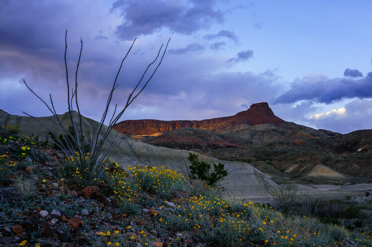
White Balance is almost always used to match what colors our cameras detect to the colors we see with our eyes. Our brains are very good at managing how we see color. A sunny day looks warm and bright, but the actual color of the light is skewed heavily blue. Indoors, incandescent lights are notoriously warm (yellow/orange) and though our eyes may detect little of this warmth, you can bet our cameras will. White Balance is how we correct for that difference in light color, and how we can make images appear “natural” which is to say, how our brains detect it.
Auto White Balance
It’s useful, certainly, but most of us leave it up to the camera to make the decision about White Balance. I know I do. My cameras are almost always set to Auto White Balance. Since I shoot in RAW, any errors that the camera makes can quickly be corrected in post-processing. At this point, I rarely even think about White Balance. But, perhaps I should…
White Balance can be more than a mindless setting of camera functions or a digital slider in Lightroom. Instead, it can be used as a creative tool. Slight changes in White Balance can change the tone and impact of your images. From dramatic color shifts to subtle changes in tonality, it’s time to elevate White Balance into the realm of creative options in photography.
The methods I’ll discuss here can be done either in camera or in post-processing, but it’s easier using the latter since you can see the impact of your choices real time. Although I use Adobe Lightroom, any program that allows you to adjust White Balance will work.
Dramatic Shifts in White Balance
Big shifts in White Balance can completely change the nature of your image. Shifts from cool to warm tones can take the image from looking as though it was made during the blue hour to post-dawn, or even make the weather appear to change.
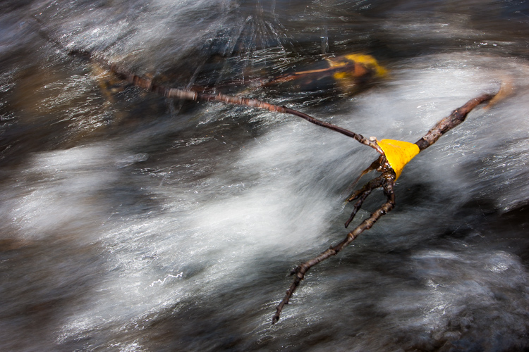
A few years ago I was leading a wilderness/photo tour in the Noatak National Preserve in northwestern Alaska. One evening, an afternoon storm was clearing off the mountains and I went down to the river to make a few images. The light was pink, the rolling clouds and falling rain lit by the low sun.
Below are three versions of the same image with only the White Balance changed. You can see the huge difference made by the shift from warm to cool tones. The bluest image is set 3600K, the warmest to 14750K, and the one somewhere in between is 7000K. In the end, you’ll probably choose an image that is neither overly cool, nor overly warm, but how the White Balance setting changes the feel of the image is worth noting.
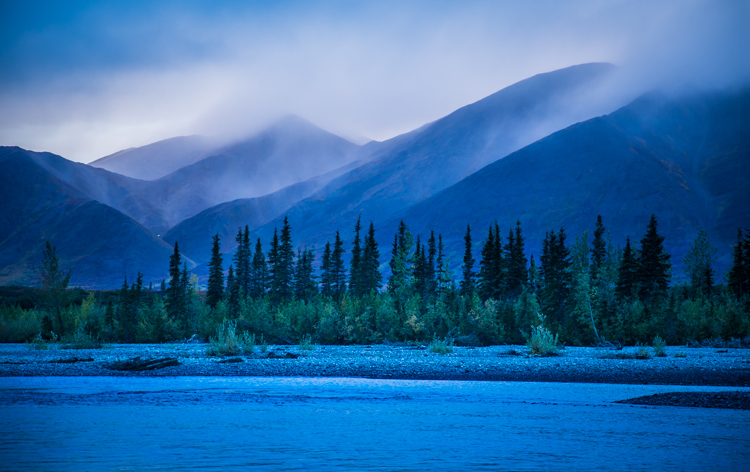
White Balance set to 3600K.
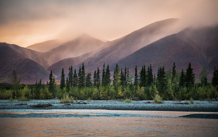
7000K
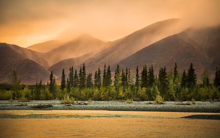
14,750K
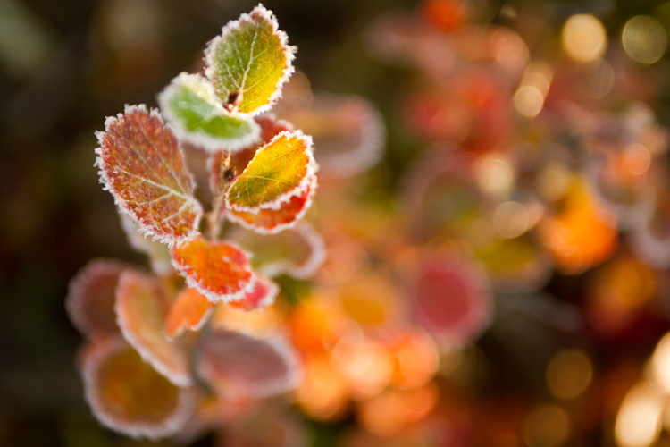
Here is another example using autumn foliage, in this case, a Dwarf Birch in Alaska. The top image is 5050K, very close to what the Auto function on my camera selected, in the second I’ve warmed the image to 9000K. Although I prefer the cooler tones, I could see the second version appealing to editors looking for an autumn spread in a magazine or catalog.
White Balance set to 5050K.
White Balance set to 9000K.
Subtle Shifts in White Balance
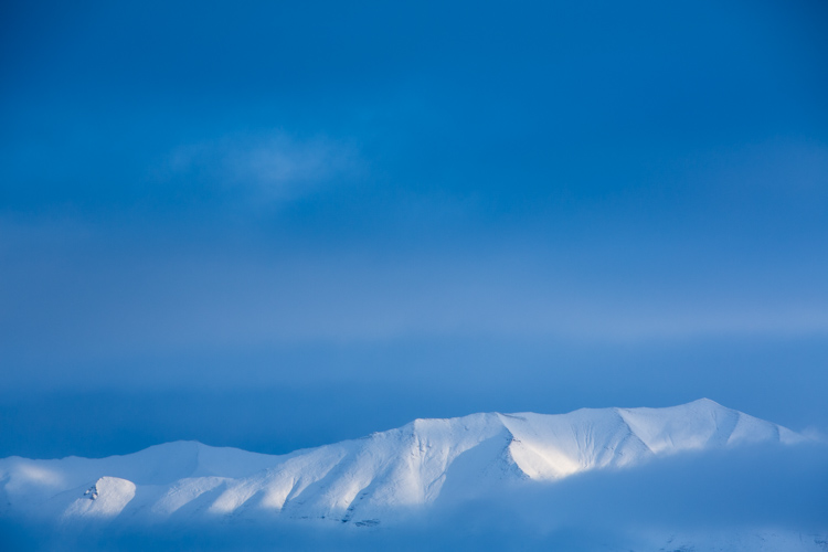
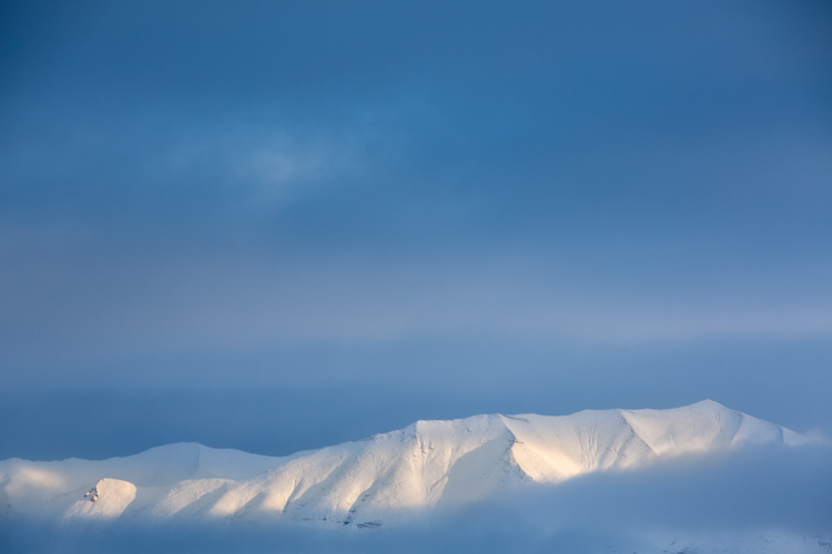
White Balance set to 4350K.
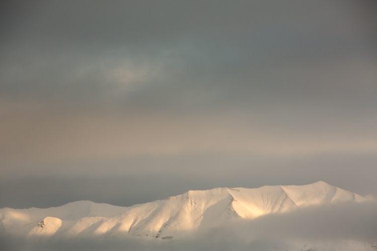
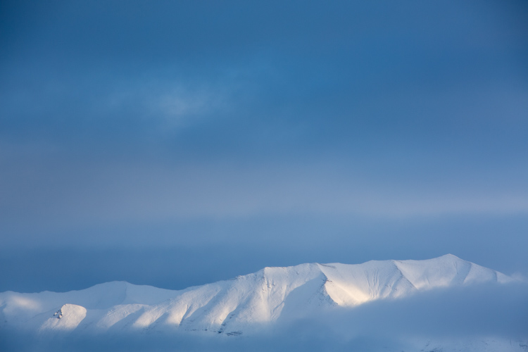
White Balance set to 8700K.
Subtle shifts in White Balance can also be effective, even though differences between images may be less obvious. A change of a few hundred to a couple thousand Kelvin (the K measurement used in White Balance) can make a surprising difference to the impact of an image. In the top photo, I chose a cool setting (4350K) which brings out the cool winter tones. The second is much warmer, set to 8700k, which to me, (aside from being a bit too warm) feels like an evening storm is approaching. Neither is exactly “accurate” to the scene as I saw it, but neither are they necessarily unnatural. I’ll return to this image shortly.
Water
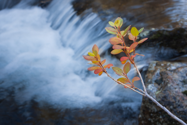
Water strikes most people as a cool substance, and often it looks better when a White Balance with more blue-tone is selected. I made this image on a day with broken clouds, in autumn, in a small mountain range north of my home in Alaska. Tiny patches of the sun were penetrating the yellow, shrubby willows which surrounded this small creek. The yellow leaves and the partially overcast sky gave the scene a notably warm tone which you can see in the top image, set to 4600K (as selected by my camera’s Auto White Balance setting). I think it’s too warm, so just a subtle push to the blue range (4100K) was enough to retain the warm tone in the single yellow leaf but sufficient enough to cool the water.
White Balance 4600K as chosen by the camera using AWB.
White Balance adjusted to 4600K in post-processing makes the water feel much cooler.
Sunsets
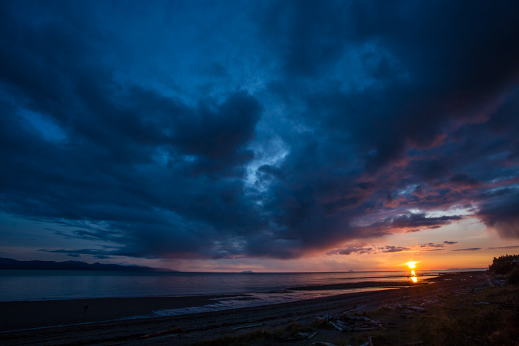
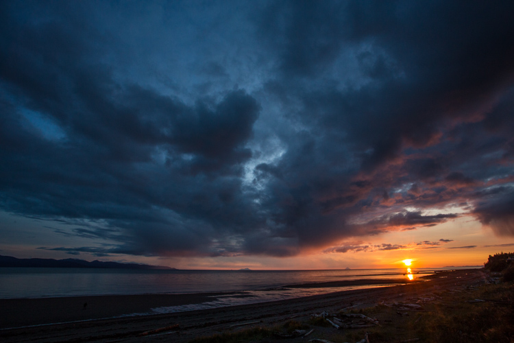
Sunsets too can benefit from a little creative tweaking of the White Balance. From the bluff above a beach in Homer, Alaska, I made the image below. The cooler-toned toned image was shot using Auto White Balance (4600K), while the second I warmed up to 6000K in processing. I like both versions. So you can see that selecting a White Balance is very much a matter of taste, and how you want your image to come across to your audience. Which version do you prefer?
White Balance 4600K as shot using AWB.
White Balance adjusted to 6000K in post-processing.
Selective Changes to White Balance
The great part about digital post-processing is that you don’t have to choose one White Balance or another, you can mix and match. My choice of software, Adobe Lightroom, allows you to use the Adjustment Brush to grab certain parts of your frame, and independently adjust them from the rest of the image.
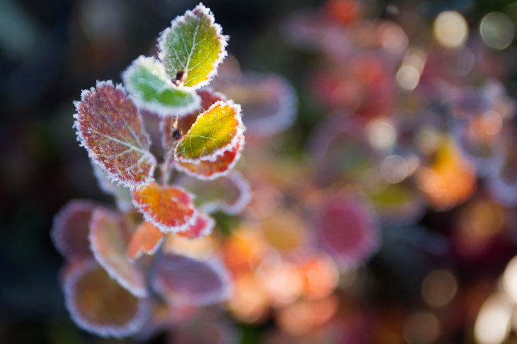
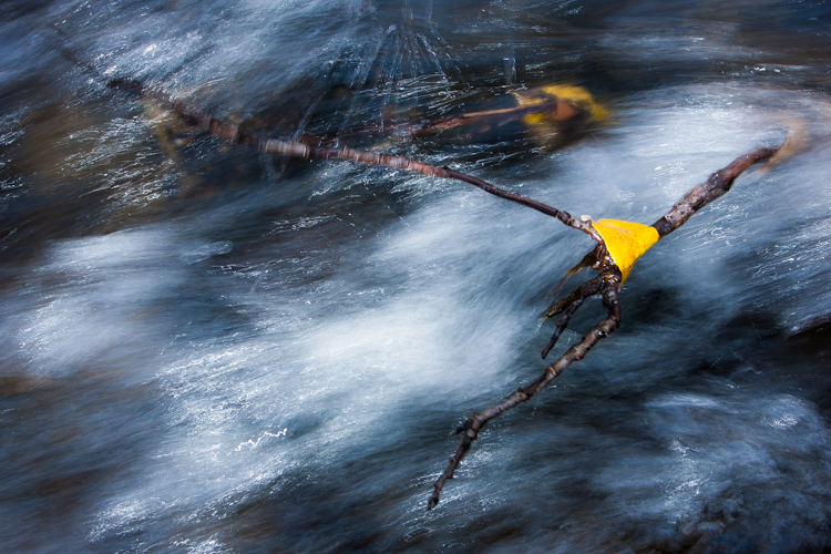
The photo below was made around the same time as the leaf in the stream I discussed earlier. In this case, a global (over the entire image) adjustment made the sprig of autumn colors look too cool and weird, even though the water was about right. So I cooled the whole image off to 3700K, then selected the sprig and bumped the Temperature setting to +35 using the Adjustment Brush.
As I was playing with the snowy mountain image I discussed early, I realized I liked neither the blue nor the overly warm version. I thought some combination might work well. So I set the overall tone slightly blue to 5100K and selected just the mountain, where the hint of sunlight was shedding some warmer light and gave that a boost to +23. The result works.
White Balance set to 5100K overall with warmth added to the top of the mountains using the Adjustment Brush.
Compare this version which is at 5000K with no extra adjustments on the mountains. See how subtle the difference is? But the version above feels little warmer in the sunlit areas.
White Balance in Black and White
We think of White Balance as strictly related to color, but in fact, it can play an important role in black and white as well. The White Balance used in your final image can impact cont st, and the way different shades of gray are presented in the final image.
To get the full impact, you need to use that White Balance slider in a big way. That means doing big pushes from warm to cool, not little subtle shifts of a few hundred or thousand Kelvin.
Examples
I was on the Alaska Ferry making images on a very gray and rainy winter day when we passed this small speck of an island with a few wind-blown spruce trees growing on it. I knew it was a black and white kind of scene, so I quickly removed the color using Lightroom. When I moved the White Balance to one side or the other it created a big change in the contrast and overall brightness of the photo. The top image is set well to the blue range (3700K) while the second is way over in the warm range (32,700K). You can see how the warm setting removed some contrast and brightened the photo.
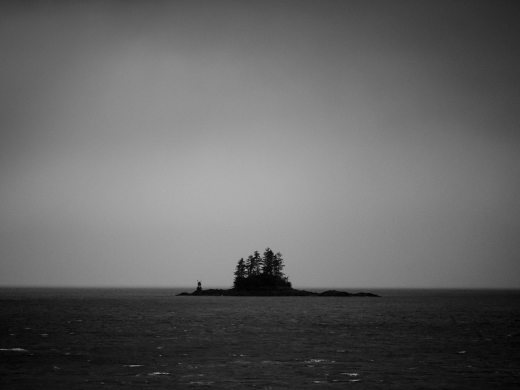
3700K
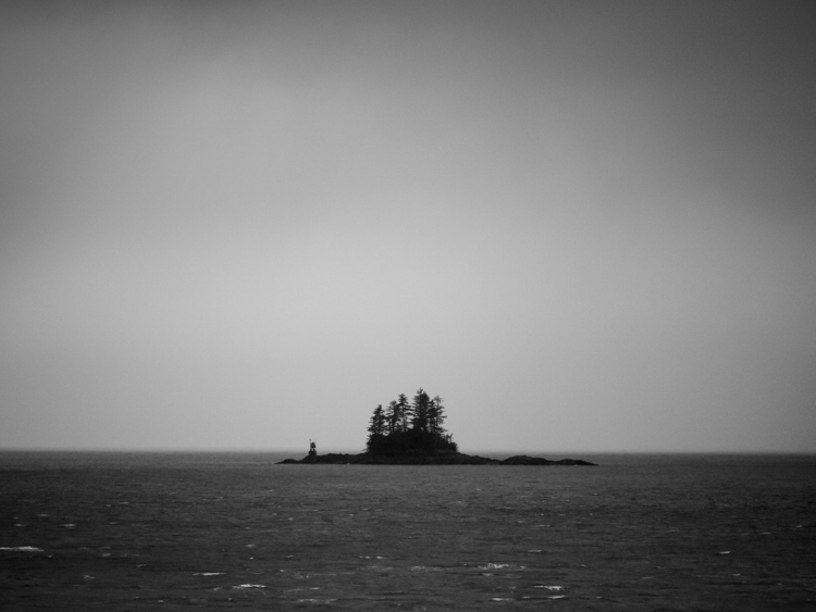
32,700K
A snowy landscape image on a beach near Haines, Alaska provided another chance to explore how White Balance impacts a black and white scene. The left image is set to 3700K, the right to 35,000K.
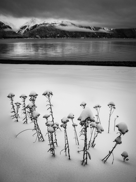
3700K
|
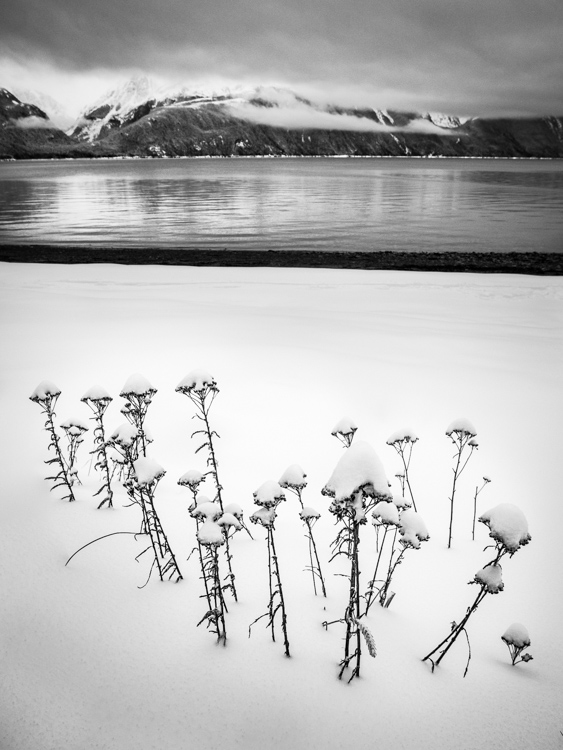
35,000K
|
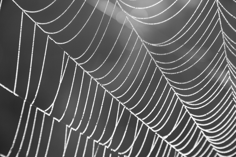
Lastly, is this simple composition of a dew-covered spider web. The top image has high contrast, is dark overall, with clean white dew drops and is set 2000K, (as cool as Lightroom will allow). The second is much grayer, with substantially less contrast, and is as high as Lightroom will allow at 50,000K. There is no question, I prefer the first version. But many images, such as the two examples above depend more on personal taste.

2000K
50,000K
Conclusion
It is time to stop thinking of White Balance as strictly a way to accurately present color, and instead, embrace it as a creative tool. Whether it is for dramatic impact, subtle changes, selective adjustments, or even (counter-intuitively) using it in black and white photography – White Balance can play an important part in the outcome of your images. Consider it, use it. Embrace White Balance as more than just a setting.
The post How to Use White Balance as a Creative Tool by David Shaw appeared first on Digital Photography School.

Digital Photography School


You must be logged in to post a comment.