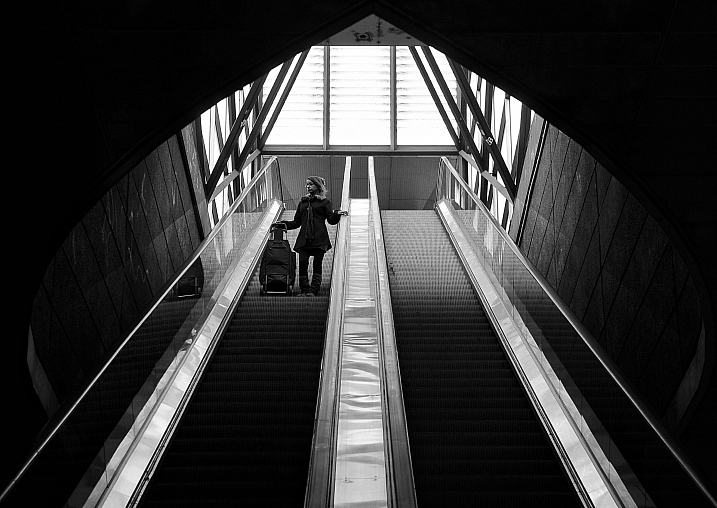
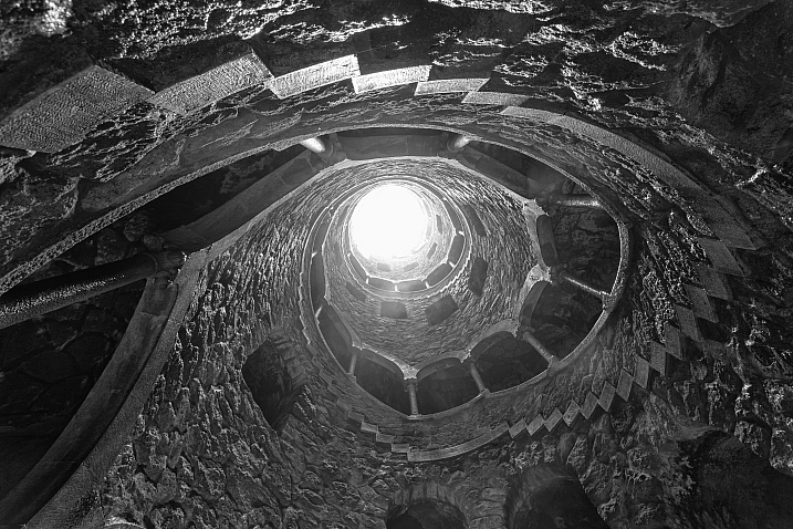
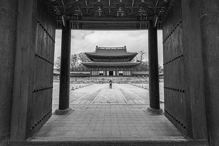
RSS
 

Archive for February, 2017

First look video: YI 4K+ action camera shoots 4K/60p and stabilized 4K/30p

20 Feb

The YI 4K+ uses the latest generation of Ambarella processing chip, making it capable of 4K/60p video capture. It can also shoot impressively smooth 4K/30p footage using electronic stabilization. Other standout features include a 2.2″ Gorilla Glass touch display, the best user interface of any action camera on the market and USB-C connectivity.

We’re eager to spend more time putting the YI 4K+ to the test. Keep your eyes peeled for an updated 4K action camera roundup coming this spring.

Articles: Digital Photography Review (dpreview.com)

 
Comments Off on First look video: YI 4K+ action camera shoots 4K/60p and stabilized 4K/30p

Posted in Uncategorized


Nikon PC Nikkor 19mm F4E sample gallery

20 Feb

The Nikon 19mm F4 is a wide-angle tilt-shift, or as Nikon calls it, Perspective Control lens. It offers the ability to independently rotate the direction of tilt or shift, making it the perfect tool for keeping those parallel lines straight when working with architecture or interiors. We also took it for a bit of ‘freelensing’ and got experimental with the tilt function.

Take a look at what is possible when you’re given complete control in our real world sample gallery.

See our Nikon PC Nikkor 19mm F4E ED sample gallery

$ (document).ready(function() { SampleGalleryStripV2({“galleryId”:”7086018100″}) })

Sample photoSample photoSample photoSample photoSample photo

Articles: Digital Photography Review (dpreview.com)

 
Comments Off on Nikon PC Nikkor 19mm F4E sample gallery

Posted in Uncategorized


How to Understand the Lightroom Tone Curve

20 Feb

With all the editing options available in the Lightroom Develop module it can be tough to know where to start when you pull up a picture and start making changes. The Basic panel covers elementary adjustments like exposure and white balance; Detail lets you adjust sharpness and noise reduction; Effects allows you to add a vignette, and so on. The Tone Curve panel seems downright strange at first, with a light gray histogram and a diagonal line going right through the middle of it. But this panel can actually be used to tweak and enhance your images quite a lot if you know how it works.

It won’t give you the same level of finely-tuned control you may want for individual colors, and can’t help you remove spots or blemishes. But it does give you a huge amount of power to change the overall visual impact of a picture and with a few clicks of the mouse can take it from average to awesome.

How to Understand the Lightroom Tone Curve

What is the Tone Curve?

The Tone Curve panel can be thought of almost like the contrast slider on steroids. Most photographers use it to add a sense of punchiness or vibrancy to their pictures. You can also do the opposite and make the overall exposure a bit more even-handed by bringing down the highlights while bringing up the shadows.

How you use the Tone Curve is going to depend on your editing style and the pictures you are working with, but suffice it to say that if you’ve been using the contrast slider you may find yourself quite pleased with the editing power offered by the tone curve. To understand how it works I’m going to use the following image as an example and apply a few simple edits using only the tone curve.

Using the Tone Curve

How to Understand the Lightroom Tone Curve

Straight out of the camera, with no edits.

This picture is an unedited RAW file straight from my camera, but with a few tweaks of the Lightroom Tone Curve, it can be transformed into a much more vibrant photo. To get started with these edits on any picture, enter the Develop module of Lightroom and click the Tone Curve panel (on the right side) which brings up a grayscale graph with a diagonal line going from one corner to the other (as shown below).

How to Understand the Lightroom Tone Curve

Look carefully in the background of the graph and you will see a histogram which is the exact same as the one at the top of the Lightroom Develop module. This shows you where the color values are in your image and whether you have a lot of colors that are very bright, very dark, or somewhere in the middle.

What the diagonal line and the sliders below it allow you to do is change the intensity of various parts of your picture. You can make the light parts lighter or the dark parts darker. For instance, here is the original image with a bit of adjustment to the lights.

Adjusting the curve

How to Understand the Lightroom Tone Curve

This adjustment has taken the lighter portions of the image (mostly the blue sky in the background) and made them even brighter while leaving the darker portions of the image alone. Now I’ll take the editing process a bit further by clicking on the bottom-left part of the diagonal line and dragging it down instead of up.

With just two simple edits on the Tone Curve, the image is now much more pleasing than the initial version, and things are just getting started. In making the bright portions lighter and the dark portions darker it has given the picture an improved sense of contrast and vibrancy. The same thing can happen with your images too.

Using the sliders

You may also notice if you do these edits on your own that the adjustments you make to the tone curve are also quantified in the sliders below the graph, as you can see below.

How to Understand the Lightroom Tone Curve

You can also use these sliders to adjust the values of the tone curve if you choose, and you may also notice that there are more than just two sliders, one each for lights and darks. The highlights are the very brightest portion of the image, whereas the shadows are the very darkest portions, and as you adjust these sliders (or the tone curve itself) you will see the colorful histogram at the top of the Develop module change accordingly.

If you lower the numerical value of the shadows or darks (or simply drag that portion of the line down) you will notice the histogram creep towards the left which is another visual illustration of the edits you are performing. The same holds true for the highlights and lights.

Use in moderation

I recommend that if you are using the tone curve to enhance your pictures, that you are careful not to push the histogram too far to the right or the left. Ideally, you want the darkest parts of your image to be pure black, but not so much more that whole sections of your photo get muddied in the process. The same goes for the lighter portions, as you can see in the following example.

How to Understand the Lightroom Tone Curve

There are a couple of things to note in the above image, so I want to break it down a bit.

First, you will see that the picture of the leaf is vastly different from its original incarnation at the top of this article. It has much more contrast and is in my opinion, too heavily edited. Some people like this look though, and using the tone curve is a good way to achieve it.

Second, if you look carefully at the bottom portion of the diagonal line in the tone curve you will see that it flatlines until after it starts to overlap part of the shadowy gray histogram behind it. This means that much of the color in the darker portions of the image has been crushed to be completely black, and the same thing has happened to the lighter portions. You can see this at the top of the S-shaped curve where it hits the top of the graph while there is still gray histogram data left on the right-hand side. All that color data has been discarded, which is why huge swaths of the bright blue sky in the picture now show up as completely white.

Finally, the colorful histogram on the right side shows that instead of a well-exposed picture, much of the data is now extremely bright or extremely dark which is a sign that the picture is very high contrast.

Curve presets

You can also use two built-in presets by clicking on the “Point Curve” options in the lower-left portion of the panel for a medium or high contrast image, but I generally don’t use those. Normally when making adjustments to the tone curve I keep things subtle and avoid such high contrast situations. Because many photographers prefer this style, Adobe has limited the way in which the tone curve can be edited by default.

When you click and drag on the white line it affects a rather large swath of the whole line, which is a nice way of making sure your adjustments are evenly reflected across much of the image. However, you can have a bit more fine-tuned control over your edits by clicking the small little mini-graph icon in the lower right corner of the tone curve panel.

The Point Curve

Using the Point Curve to make adjustments gives you much more control over your image, but if you’re not careful things can quickly get out of hand. It’s always a good idea to try things out, especially in a program like Lightroom where all your edits are nondestructive. But generally, I like to stick with the default tone curve adjustment because it’s a bit more forgiving in its edits.

How to Understand the Lightroom Tone Curve

I wouldn’t normally edit a picture to look like this, but I wanted to illustrate how the point curve can give you much different results from the traditional tone curve.

RGB Curves

You might notice the “RGB” option in the lower-right portion of the point curve as well, which gives you even greater control over your edits. Click this to edit the individual Red, Green, and Blue channels of your image and perform the same types of adjustments (i.e. adjust the brightness and darkness) but on each individual color separately.

I rarely use it, but this can be quite useful if you want to give your pictures a certain type of color cast or edit a single color (e.g. blue skies, green grass) to have more impact. If you find yourself going a little overboard while editing the point curve and want to remove some of your edits, just double-click on a point to delete it.

Targeted adjustments

Finally, another way to edit the tone curve that some people find useful is to click the little circle (targeted adjustment tool) in the top-left corner of the tone curve panel. Then you can click and drag on specific parts of your image (say, a bright sky or a dark river) to make them lighter or darker. It’s an easy way to make targeted adjustments right on the image itself without trying to guess at which part of the tone curve graph to edit.

Conclusion

I hope this gives you a bit more understanding as to what the tone curve does. If you’ve never tried it before I highly recommend giving it a chance. If you want to add just a little bit of punch to your pictures, whether portraits, landscapes, sports, wildlife, or just about anything else, click over to the Tone Curve and try a couple of adjustments. You can’t really go wrong with a little bit of a classic S-curve, where you raise the highlights and lower the shadows, but you might find other types of edits that work well for specific pictures too.

Do you have any tips that work for you when using the Lightroom Tone Curve? Any secrets that you want to share that I forgot to mention here? Please leave your thoughts in the comments below.

googletag.cmd.push(function() {
tablet_slots.push( googletag.defineSlot( “/1005424/_dPSv4_tab-all-article-bottom_(300×250)”, [300, 250], “pb-ad-78623” ).addService( googletag.pubads() ) ); } );

googletag.cmd.push(function() {
mobile_slots.push( googletag.defineSlot( “/1005424/_dPSv4_mob-all-article-bottom_(300×250)”, [300, 250], “pb-ad-78158” ).addService( googletag.pubads() ) ); } );

The post How to Understand the Lightroom Tone Curve by Simon Ringsmuth appeared first on Digital Photography School.


Digital Photography School

 
Comments Off on How to Understand the Lightroom Tone Curve

Posted in Photography


How to Take Unique Double Exposures Without Using Photoshop

20 Feb

For over a hundred years, double exposures have captivated photographers and art enthusiasts alike. Discovered by pure chance, a double exposure is a trick where a single frame of film is exposed twice or more in order to achieve multiple images in a single shot. This results in a photograph that comes out as a combination of the two images that were shot, one superimposed on top of the other.

From the technique’s boom in the 1860s, this inspired accident created an avant-garde trend that could only be described as one of the most creative uses of photography. Today, you don’t need to shoot on film to be able to create wonderful double exposures. Digital cameras are all capable of performing this unique trick!

Double Exposures Made Simple

There are five key steps to creating a basic double exposure on a digital camera. Let’s look at them one at a time.

1. Conceptualize

Although spontaneity and experimentation in photography are excellent (and very important learning processes in becoming a good photographer), more difficult techniques require further planning and forethought. It is far easier to produce a successful and satisfying double exposure when you conceptualize the image(s) beforehand, than fumbling around for hours producing work that may leave you feeling frustrated! To begin your plan, ask yourself a few simple questions:

  • What is my subject?
  • What is my background?
  • What is this image’s purpose?
  • What resources do I have available to me?

After you have answered these, you should have a much better idea of what your finished photograph will look like. As such, bringing your vision to life will now be a breeze!.

Double Exposures Made Simple

2. Multiple exposures settings

For film, you would simply shoot on the same frame multiple times by re-rolling (or not advancing it) the film. Since digital is not a roll, you will have to dig into your camera’s settings (check your user manual if need by) and do a couple of tweaks. Most digital cameras, such as Canons and Nikons, have a multiple exposure setting to allow you to generate these distinctive images.

Often found in the menu, the multiple exposure setting will more than likely host an array of options.

One of the main selections presented is choosing how many images you would like to overlay. Most cameras range from two to ten. For the purpose of this simple tutorial, we will only be using two images. At the bottom of this article, I will mention how to use far more than two photographs for advanced techniques.

Another important option will be Multi-Exposure Control (or blend mode). This tells the camera how you want your images composited together. The options are typically Additive, Average, Dark, and Light.

Blend mode options

Additive means that your images will simply be overlaid one over the other without any special considerations (see below).

Double Exposures Made Simple

Average (which is similar to Additive) means that the camera will automatically adjust the exposure in any overlapping areas to prevent overexposure, based on the number of exposures you combine. Any non-overlapping areas will be rendered with a normal exposure.

Double Exposures Made Simple 8

Bright means that exposure priority will be given to bright objects so that they will retain their exposure even when combined with a dark background.

Double Exposures Made Simple 6

Dark means that exposure priority will be given to dark objects so that they will retain their exposure even when combined with a light background.

Double Exposures Made Simple

The final main setting should revolve around the actual physical camera controls. On Canon and Nikon cameras, you will most likely be presented with two options: Func/Ctrl (which allows you to pick your base image before shooting) and ContShtng (which means that you just photograph images one after the other and they will be composited).

Every camera is different, so remember to please reference your user manual for more detailed information.

3. Photograph the silhouette

A silhouette is the shape that will be filled by your background of choice. The key to this is making sure that your silhouette subject is photographed on a plain background. Don’t worry too much about properly exposing the details on your subject, all of that will be covered up by your background. Focus on making sure that the area around your subject is clear of objects.

Double Exposures Made Simple

The first thought that may pop into your head is using a studio, but that isn’t necessary. You don’t have to be in a studio to photograph your subject on a clean background. You can photograph your subject on a plainly colored wall or better yet, you can go outside and use the beautiful open sky above you.

To photograph your subject in front of the sky, shoot from a slightly lower angle to make sure that no additional clutter ends up disrupting your clear sky. Depending on your geographical position, the easiest time of day to photograph your subject is about an hour before sunset. The right exposure will ensure that no flare ends up in your photograph.

4. Photograph the background

This is the texture or image that will fill the silhouette you just captured. Good options for this image are well exposed trees, landscapes, flowers, mountains, or patterns. Make sure that your background is well lit, as to not lose any details. If the background is over or underexposed, the resulting image may be hard to read.

When picking your background, consider color, complementary shapes, and how these factors all correlate with one another to produce a great double exposure. If your silhouette is a soft, female form, think about using flowers with complimentary delicate shapes. If your silhouette is a rugged form, think about using some strong-featured trees to accent the silhouette’s configuration.

Double Exposures Made Simple

5. Watch the images line up

On some cameras, you need to remember the positioning of the two images. On others, you can use the Live View feature to actually see how the images line up before taking the last photograph. In either case, watch the photographs come together, and look in awe at your masterpiece.

The aforementioned steps are just the foundation for creating a simple version of these painterly images. The double exposure technique can be utilized for a variety of purposes, styles, and effects. Instead of just using two photographs, utilize three or more to create entirely new types of imagery. Here are some advanced techniques to really push the limits of double exposures:

Using double exposures for movement

Double exposures are a fantastic way to express artistic movement in an image and have the viewer move their eyes around the frame. Set your number of frames to three or more, and have your subject move differently in each shot. When the images are composited together, you will generate an image that showcases a lot of movement.

Double Exposures Made Simple

Using double exposures for sequences

You can use double exposures to create a step-by-step sequence in a single image. When Continuous Shooting (ContShtng) is selected in the settings, put the camera on a tripod, and fire away at your subject without panning (following the subject with your camera). Make sure that your focus settings are set to AI Servo for Canon or Continuous-Servo AF (AF-C) for Nikon (which means that the camera will lock focus on your subject and hold that focus no matter where the subject moves.

You want to keep the camera as still as possible so that the not-moving parts of your photographs do not have any overlap distortion. Your finished composite will feature every step in the sequence.

Super-imposing without photo editing software

Upon its discovery in the 1800s, a significant use of double exposures was to super-impose without needing to physically combine or paint photographs in the dark room. Today, although we have access to incredible post-processing and retouching programs, editing can be quite time consuming. A good way to combine images without the need of Photoshop is by utilizing this infamous technique.

Instead of silhouetting your subject and picking a background, you will now be placing subjects together. Similar to what was done with sequencing above, put the camera on a tripod to make sure that the frame does not move (as to not have any distortion on still objects.

Using double exposures for sequences

Ghosting

Back when double exposures were first discovered, many photographers of that time loved to create ghostly images. The concept of ghosts were quite prevalent because of the world’s tumultuous history. Photographers and artists alike were captivated with this eerie subject matter, and fascinated with the audience’s response to that kind of image.

To create your own ghostly photograph, set your camera on a tripod. Photograph the background location. Then for the next image, set your shutter speed quite low to create some motion blur. Finally, have someone slowly walk through the frame and take a picture. The composite will feature a ghostly presence.

Now that you’ve finished this guide, go out there and take some phenomenal double exposures. Please share your images and comments below.

googletag.cmd.push(function() {
tablet_slots.push( googletag.defineSlot( “/1005424/_dPSv4_tab-all-article-bottom_(300×250)”, [300, 250], “pb-ad-78623” ).addService( googletag.pubads() ) ); } );

googletag.cmd.push(function() {
mobile_slots.push( googletag.defineSlot( “/1005424/_dPSv4_mob-all-article-bottom_(300×250)”, [300, 250], “pb-ad-78158” ).addService( googletag.pubads() ) ); } );

The post How to Take Unique Double Exposures Without Using Photoshop by Anabel DFlux appeared first on Digital Photography School.


Digital Photography School

 
Comments Off on How to Take Unique Double Exposures Without Using Photoshop

Posted in Photography


How to Use Neutral Density Filters to Make Better Landscape Photos

20 Feb

In an earlier article, I wrote that neutral density filters are the secret weapon of the landscape photographer. I couldn’t work without mine and I suspect most landscape photographers would say the same.

But why are they so useful? There are two reasons. One is that neutral density filters give you control over exposure, and the other is that they give you creative control over shutter speed.

Neutral density filters

Let’s take a closer look at these concepts.

What is a neutral density filter?

First, some definitions. A neutral density filter is one that blocks light. The result is that less light passes through the lens and reaches the camera’s sensor (or film).

There are several ways of measuring the strength of neutral density filters, but they are basically all different ways of stating how many stops of light the filter blocks. Typical strengths are one stop (0.3 or ND2), two stops (0.6 or ND4), three stops (0.9 or ND8), six stops (1.8 or ND64 )and ten stops (3.0 or ND1024). Some manufacturers even make neutral density filters that block 16 stops or more light, although these are more of a specialty item.

This photo shows a ten stop neutral density filter mounted on a lens. As you can see the filter is nearly opaque and you can’t see through it well.

Neutral density filters

Different kinds of ND filters

Neutral density filters block light evenly across the frame. Graduated neutral density filters, on the other hand, block light across just part of the frame. Half the filter is clear, and half is opaque, with a graduated area in-between (hence the name).

This photo shows a two stop Lee graduated neutral density filter in a square filter holder. The top half of the filter is dark (to block light) and the bottom is clear.

Neutral density filters

Graduated neutral density filters and the landscape

Graduated neutral density filters (often just called grads or GND filters) are used by landscape photographers to control exposure.

Imagine you are taking a landscape photo that includes the sky and the setting sun. In this scenario, the sky is much brighter than the foreground. If you expose correctly for the sky, the foreground goes dark. If expose correctly for the foreground, the sky is burnt out.

A graduated neutral density filter blocks light from the sky without affecting the foreground. If for example, the sky is three stops darker than the foreground then a three-stop graduated neutral density filter will help even out the difference between the two, allowing you to capture the scene in a single frame.

Here’s an example

For this first photo below I set the exposure by exposing to the right (on the histogram) so that there were no clipped highlights. The problem is that the bottom half of the photo is too dark. You can make it lighter  in Lightroom, but not without introducing noise.

Neutral density filters

I made another photo (below) and increased the exposure by two stops. The foreground is exposed properly but now the sky is burnt out. There is no way to bring back the lost highlight detail in Lightroom.

Neutral density filters

I made this last photo using a three-stop soft graduated neutral density filter. The filter allowed me to capture detail in both foreground and sky.

Neutral density filters

The advantage of using the filter is that it let me continue working as the light faded, taking longer exposures without having to bracket. The last photo of the evening had an exposure time of six minutes.

It also saves time in post-processing compared to using techniques like exposure blending or HDR in Lightroom. Before digital cameras (and processing), graduated neutral density filters were the only way that photographers had to balance out exposure between foreground and sky.

Disadvantages of graduated neutral density filters

Graduated neutral density filters do have some disadvantages.

The first is that they don’t work well with scenes broken by something that sticks up above the horizon (like a tree or mountain).

The photo below is a good example. The sky is a small part of the frame and it’s impossible to cover it with a graduated neutral density filter without making the rocks darker as well. The only solution was to take two different exposures, one for the foreground, the other for the sky, and blend them in post-processing.

Neutral density filters

Another disadvantage is that good quality graduated filters are expensive.

Despite this, some landscape photographers like to use them as it gives them choice. With graduated neutral density filters you can decide which technique is best suited for the scene you are photographing.

Neutral density filters and the landscape

Landscape photographers use neutral density filters for creative control over shutter speed.

Think about the exposure settings landscape photographers tend to use. You normally set ISO to the lowest setting and aperture to f/11 or f/16. This gives you maximum image quality (low ISO) and good depth-of-field (narrow aperture).

The shutter speed required to give the correct exposure will depend on the ambient light leves. In bright light, it might be around 1/125th of a second. In the fading light at the end of the day, it might be around 1/2 second.

But what if you want a longer shutter speed? This is where neutral density filters come in. They block light so that you can get longer shutter speeds. Longer exposures allow moving parts of the landscape (like clouds or water) to blur, which in turn creates mood and atmosphere.

The ultimate example of this is long exposure photography, where exposures of several minutes are used to blur the motion of the sea and clouds. Here’s an example. This photo was taken at ISO 200, at f/11 for 1/125th of a second.

Neutral density filters

With a neutral density filter, I was able to turn that into a shutter speed (exposure time) of 210 seconds. The photo is transformed.

Neutral density filters

The neutral density filters I use

One of the problems with neutral density filters is that there are so many to choose from. How do you know which ones to buy? Ultimately you have to decide how much you want to spend and then look at the options. But I can start by telling you which filters I own, why I bought them, and give you some tips for choosing filters.

Take note – filter size is a factor

But before I do that, I’d like to make the point that filters are very closely related to lens size. The bigger your lens, the bigger the filter required to cover the front element, and the more expensive it will be to buy. The difference can soon add up to hundreds of dollars. You have to bear in mind the filters you may want to buy later when you buy the lens itself.

My Neutral Density Filter Kit

My neutral density filter kit is the circular Formatt Hitech 72mm Firecrest Joel Tjintjelaar Signature Edition Long Exposure Kit #1. It contains three neutral density filters with strengths of three, six and ten stops respectively. You can also use two filters together to block nine, 13 or 16 stops of light. I bought the circular filters because they are less expensive than the square ones. (NOTE: if you plan to use your filters on multiple lenses, buy the size you need for the largest one, and get step-down rings to adapt the filters to fit the smaller ones – OR get the square drop-in kind instead.)

My Graduated Neutral Density Filter Kit

My graduated neutral density filter kit is the Lee Seven5 system, which I bought in a set that includes the filter holder, an adapter ring, and four graduated neutral density filters. The Lee Seven5 system is smaller (and less expensive) than Lee’s full size filters and is designed for mirrorless camera systems. This comes back to the point I made earlier about lens size.

I love these filters because they help me take photos like this.

Neutral density filters

I would love to hear from you what neutral density filters you use. Which ones did you choose and why did you buy them? What brands would you recommend to other photographers? Please let us know in the comments below.


If you enjoyed this article and would like to learn more about landscape photography then please check out my ebook The Black & White Landscape.

googletag.cmd.push(function() {
tablet_slots.push( googletag.defineSlot( “/1005424/_dPSv4_tab-all-article-bottom_(300×250)”, [300, 250], “pb-ad-78623” ).addService( googletag.pubads() ) ); } );

googletag.cmd.push(function() {
mobile_slots.push( googletag.defineSlot( “/1005424/_dPSv4_mob-all-article-bottom_(300×250)”, [300, 250], “pb-ad-78158” ).addService( googletag.pubads() ) ); } );

The post How to Use Neutral Density Filters to Make Better Landscape Photos by Andrew S. Gibson appeared first on Digital Photography School.


Digital Photography School

 
Comments Off on How to Use Neutral Density Filters to Make Better Landscape Photos

Posted in Photography


Druid Awakening: A Dozen Hard Rockin’ Modern Stonehenges

20 Feb

[ By Steve in Art & Sculpture & Craft. ]

stonehenge-clones-1a

These 12 modern homages to Stonehenge would likely bemuse, befuddle and bewilder those who constructed the original prehistoric standing stone circle.

stonehenge-clones-1b

stonehenge-clones-1c

Much like the original Stonehenge built roughly 5,000 years ago, these so-called “Clonehenges” were built for reasons that aren’t always obvious. Take the quite realistic standing “stones” above.

stonehenge-clones-1d

Even if they were to survive in situ for several thousand years, it’s extremely doubtful future archaeologists would deduce they were merely props used in the movie Transformers: The Last Knight. Already in the can and scheduled to be released on June 23rd of 2017, the hollow faux Stonehenge was constructed not too far from its real-world model in Wiltshire, UK.

Stonehenge In Africa

stonehenge-clones-2a

Stonehenge in Africa? It’s more likely than you think at this riverside lodge, conference and team-building venue in Parys, Gauteng, South Africa.

stonehenge-clones-2b

To quote the company website, “As Guests enter Stonehenge, they are greeted by (a) large replication of the celebrated Stonehenge Monument.” OK, so the stones are obviously machine-cut and don’t look more than a few months old but keep it to yourself: you’re here to build a team, not an ancient ceremonial site.

Stonehenge of Orem’s Stonehenge, Utah

stonehenge-clones-3a

Self-described as “A Place of Healing”, Stonehenge of Orem is a small (36 beds) assisted living facility for the elderly located in American Fork just west of Orem, Utah.

stonehenge-clones-3c

stonehenge-clones-3b

Built in 2012, the home’s henge is smaller than its inspiration both in breadth and height though at least the designers resisted the urge to smooth out the rough spots. We’ll leave the debate over whether an ancient monument, fake or not, is appropriate decor for the grounds of an old age home to others.

Stonehenge in Hefei, China

stonehenge-clones-4a

China is infamous for recreating other nations’ cultural properties (the Eifel Tower, London Bridge and an entire Austrian alpine town named Hallstatt come to mind) and indeed, there are several fake Stonehenges in China. Typical of the genre is this ersatz Stonehenge in Hefei, Anhui province.

stonehenge-clones-4b

The actual reproduced stones and layout are actually better than most but when it comes to context, well… let’s just say that a major part of the real Stonehenge’s mystical grandeur derives from its relative isolation. Somehow the sight of modern highrise apartments in the near background detracts from the overall sense of wonder any monument should inspire. Dudes, do you even henge?

Next Page – Click Below to Read More:
Druid Awakening A Dozen Hard Rockin Modern Stonehenges

Share on Facebook


[ By Steve in Art & Sculpture & Craft. ]

[ WebUrbanist | Archives | Galleries | Privacy | TOS ]


WebUrbanist

 
Comments Off on Druid Awakening: A Dozen Hard Rockin’ Modern Stonehenges

Posted in Creativity


Photography fundamentals explained

19 Feb

Want to brush up on some basic concepts? Here you’ll find detailed explanations of some of the fundamentals of digital photography. Get your science on and impress all your friends at the next dinner party.

Sources of noise part two: Electronic Noise
234

Sources of noise part two: Electronic Noise

Following on our look at the effects of shot noise, our attentions turn to the electronic noise added by your camera. In this second part of the series, we look at read noise and how your sensor’s behavior defines what your camera is capable of and consequently, how you should shoot with it. Read more

The effect of pixel size on noise
99

The effect of pixel size on noise

A quick look at the effect of sensor size and pixel size on noise.

What's that noise? Part one: Shedding some light on the sources of noise
713

What's that noise? Part one: Shedding some light on the sources of noise

How would you react if you were told that the aperture and shutter speed you choose make more difference to image noise than the ISO setting? You might be surprised to discover that a lot of the noise in your images doesn’t come from your camera at all: it comes from the light you’re capturing. Our own Richard Butler explains. Read more

What is equivalence and why should I care?
2348

What is equivalence and why should I care?

Equivalence, at its most simple, is a way of comparing different formats (sensor sizes) on a common basis. Sounds straightforward enough, but the concept is still somewhat controversial and not always clearly understood. We thought it was about time we explained – and demonstrated – what equivalence means and what it doesn’t. Learn more

Sense and Sensitivity
0

Sense and Sensitivity

Sensitivity (ISO) in digital imaging is the subject of quite a lot of confusion – it’s becoming common to hear talk of manufacturers ‘cheating with ISO.’ Here we look at why sensitivity can be hard to pin down, why we use the definition we do and how it’s really as complicated as it can seem.

Behind the scenes: extended highlights!
3

Behind the scenes: extended highlights!

Sensors, sensitivity, exposure and dynamic range (blog post)

Articles: Digital Photography Review (dpreview.com)

 
Comments Off on Photography fundamentals explained

Posted in Uncategorized


2017 Underwater Photographer of the Year: winning photos announced

19 Feb

2017 Underwater Photographer of the Year

‘Dancing Octopus’ Gabriel Barathieu/UPY 2017 

The winners of the 2017 Underwater Photographer of the Year compeition have been announced, and the photos are absolutely spectacular. The overall winner was Gabriel Barathieu with his image of an Octopus taken in the Lagoon of Mayotte on Mayotte Island.

He says, ‘In the lagoon of Mayotte, during spring low tides, there is very little water on the flats. Only 30 cm in fact. That’s when I took this picture. I had to get as close as possible to the dome to create this effect. The 14mm is an ultra wide angle lens with very good close focus which gives this effect of great size. The octopus appears larger, and the height of water also. Also, I didn’t need flash because I had lots of natural light.’

2017 British Underwater Photographer of the Year

‘Out of the Blue’ Nick Blake/UPY 2017

Kukulkan Cenote, Yucatan Peninsula, Mexico

Kukulkan Cenote on Mexico’s Yucatan Peninsula forms part of the Chac Mool system and is noted for the spectacular light effects as the sun penetrates the darkness. I left my strobes behind for the natural light shot I wanted and positioned myself in the shadows of the cavern. Moving my eye around the viewfinder, I could see that the rock outline of the cavern around me made for a pleasing symmetry and I adjusted my position to balance the frame. The light show flickered on and off as the sun was periodically covered by cloud and as it reappeared, I beckoned to my buddy and dive guide, Andrea Costanza of ProDive, to edge into the illumination of some of the stronger beams, completing the composition. My journey from diver to underwater photographer has brought many amazing photographic opportunities and I feel humbled and privileged that this image has achieved such recognition.

2017 Up and Coming Underwater Photographer of the Year

‘Oceanic in the Sky’ Horacio Martinez/UPY 2017

The Brothers, Egypt

This was my first Red Sea experience, and my first live-aboard-based photo workshop, so everything was interesting… but arduous. We were on the last dive of the day and I ventured a tad deeper to get closer portraits of the Oceanic White Tips, when I noticed this shark patrolling in the distance. I took a few shots to expose for the sun beams and the surface, and was pleased by the dreamlike effect. Oceanics are great subjects for close ups as they are anything but shy. Yet, every now and then it is great to try and capture their apparent loneliness, their wandering, and their independence in the big blue.

2017 Most Promising British Underwater Photographer

‘Orca Pod’ Nicholai Georgiou/UPY 2017

Tromso, Norway

Orcas are easily the most beautiful, intelligent and confident animals I’ve ever had the honor of spending time with. This photo was taken during an amazing week freediving with wild Orca in Norway. The days are quite short in winter and the water was around 5 degrees but we wore a thick wetsuit and of course with Orca around, the cold was quickly forgotten. The light had a really nice colour from the setting sun as this graceful pod of Orca swam by nice and close. It was a moment which will be hard to top and I’m glad to have this image to share it.

2017 Underwater Photography Awards

‘Frozen Hunting’ Fabrice Guerin/UPY 2017 

Andenes, Norway

Judge’s comments:

A stunning behavioral image of a humpback in shallow water scattering herring taken in very tough conditions. The photographer did very well in very dark waters to record this breath-taking scene sharply.

2017 Underwater Photography Awards

‘Finally Whalesharks’ Patrick Neumann/UPY 2017

Gorontalo, Indonesia, Central Sulawesi

Although I have been diving for more than 30 years with over 3000 dives, I had never saw a Whaleshark before. When I was working on a liveaboard in Thailand twice the whole boat saw one but not me and my group. Among my friends it was already a running gag. If you want to see Whalesharks don`t dive with Patrick. On our latest trip through Indonesia a friend told me that recently there are some around the Gorontalo area so we changed our plans and went there to end my whaleshark dilemma. We drove out to the divesite and everything was perfect. Very good visibility, no waves and a bright sunny day. Now only the big guy had to be there to make it really happen. When we entered the water there was not one Whaleshark… but 6 of them! You can imagine my happiness.

2017 Underwater Photography Awards

‘Views at Dawn’ Pasquale Vassallo/UPY 2017

Miseno, Gulf of Naples, Italy

Over the past few months, my photographic work has focused primarily on the large presence of species of jellyfish Rhizostoma pulmo, in the Gulf of Naples. In this picture a couple of crabs, Liocarcinus vernalis species, are its tenants.
When the jellyfish rub the sandy seabed, the crabs jump on it and get carried to different areas.

2017 Underwater Photography Awards

‘Humpback whale feeding on krill’ Jean Tresfon/UPY 2017

A few miles offshore from Hout Bay, Cape Town, South Africa

Every summer hundreds of humpback whales gather off the Cape Town coast in a massive feeding aggregation. Working as part of a film crew I was privileged to have a chance to photograph this phenomenon. Although the water visibility was really good, inside the krill patch it was much reduced. Without warning the whales appeared just metres away with their pleats distended as they surfaced with huge mouthfuls of krill. Realising that they must be feeding deeper down I descended into the darker water to find the thickest concentration of krill. Suddenly a humpback appeared right in front of me, its huge mouth wide open as it sieved the water for the tiny crustaceans. I took several images before it disappeared into the gloom and then I was surrounded by a multitude of massive bodies as the rest of the pod took its turn to feed. Not a little intimidating! 

2017 Underwater Photography Awards

‘Big Red’ Guglielmo Cicerchia/UPY 2017

Giannutri Island, Italy

During the dive I found a fishing net in which many fish were trapped still alive. They were struggling to get free. Using a slow shutter speed and zooming during the exposure I wanted to emphasize the attempt to break free from the fishing net. 

2017 Underwater Photography Awards

‘Imp of darkness’ Damien Mauric/UPY 2017

Isla Fernandina, Galápagos Islands, Ecuador

On his visit to the Galapagos islands, Charles Darwin was revolted by the animals’ appearance, writing: “The black Lava rocks on the beach are frequented by large, disgusting clumsy Lizards. They are as black as the porous rocks over which they crawl & seek their prey from the Sea. I call them ‘imps of darkness’. They assuredly well-become the land they inhabit.” The marine iguana are all but monsters. Endemic to the Galapagos, it’s a rare privilege to share a moment underwater with this animal now considered as an endangered species.

2017 Underwater Photography Awards

‘Green Turtles in the rays’ Greg Lecoeur/UPY 2017

Tenerife, Spain

During a diving trip to Tenerife, I came across these green turtles. It was early morning and the sunbeams pierced the surface. I adjusted the setting of my camera and I waited for the turtles to come close enough to trigger my camera. After a little while, the turtles were circling around us and it was a great opportunity to photograph them.

2017 Underwater Photography Awards

‘Clownfish Swirl’ Katherine Lu/UPY 2017

Semakau, Singapore

I shot this photo in the local waters of Singapore where the visibility is 3m on average. Scuba divers I know are always surprised that I dive there and most don’t even know there is great macro right off our shores. I wanted to do something different and turn a nudibranch commonly found in our waters into a piece of art. I have always been fascinated by bubbles and the inspiration for this photo came about when I was reading about aquatic plants that produce oxygen bubbles from photosynthesis. The images of the bubbles sticking to the green leaves had an abstract quality and hence came the idea to create Nudibranch Art.

2017 Underwater Photography Awards

‘Prey?’ So Yat Wai/UPY 2017

Anilao, Phillipines

This photo was shot during a blackwater dive in Anilao. Even though the larvae mantis shrimp (left) is very small, it still a predator which uses its raptorial appendages to hunt. Has it spotted the prey and is ready to pounce?

2017 Underwater Photography Awards

‘Competition’ Richard Shucksmith/UPY 2017

Shetland Isles, United Kingdom

I was out off the coast making images for SCOTLAND: The Big Picture – a project about re-wilding that produces images to amplify the case for a wilder Scotland. Hundreds of gannets were circling the boat looking for the fish that were being thrown over the side. Suddenly a single bird dives and the others seeing it as an indicator and 20, 30, 40 birds are diving at once. Because of this behaviour competition between gannets is always going occur creating several gannets diving for the same fish. I could hear the birds as they hit the water right above my head just before they appeared in front of the camera. A great experience. 

2017 Underwater Photography Awards

‘Capturing History’ Tanya Houppermans/UPY 2017

Wreck of the U-352, North Carolina, US

An underwater photographer lines up a shot of the conning tower of the wreck of the U-352 off the coast of North Carolina, USA. During WWII, German U-boats patrolled the waters just off the east coast of the U.S. In May 1942 the U-352 fired upon the USCGC Icarus but missed. The Icarus retaliated, and sunk the U-352 in 120ft of water 26 miles southeast of Beaufort Inlet. During this particular dive the visibility was especially good, so my goal was to capture wide angle images with as much of the wreck in the frame as I could get. As I was lining up the shot, a fellow photographer was focusing on the conning tower, so I decided to include him in the image to give a sense of scale to the wreck.

Articles: Digital Photography Review (dpreview.com)

 
Comments Off on 2017 Underwater Photographer of the Year: winning photos announced

Posted in Uncategorized


Modern Babylon: Hanging Plants Serve as Green Walls & Window Shades

19 Feb

[ By WebUrbanist in Architecture & Houses & Residential. ]

green-screen-wall

A single-story house in Vietnam echos an ancient world wonder, the Hanging Gardens of Babylon, but on a domestic scale and with minimalist contemporary design sensibilities and a functional purpose.

green-wall-design

green-wall-interior

Created by MIA Design Studio, the home is both open to its surroundings but also shielded by a veil of greenery reaching up to the rooftop above.

green-house-pools

green-kitchen

green-space-exterior

“The boundary between the interior and exterior is being diminished, letting man sense the fluctuations of nature. Space is opened up but maintains the privacy of the individuals. This is the daunting problem of living in a metropolitan area with cramped space and pollution.”

green-floor-plan

green-bedroom

green-deck

green-hallway-creepers

The green screen is a theme carried between three distinct volumes of the house, lining a connective hallway that joins disparate living, sleeping and working spaces. A series of outdoor gardens between the interior areas and perimeter wall create a natural sanctuary for the residents, providing access to a personal forest within the a bustling built environment.

Share on Facebook


[ By WebUrbanist in Architecture & Houses & Residential. ]

[ WebUrbanist | Archives | Galleries | Privacy | TOS ]


WebUrbanist

 
Comments Off on Modern Babylon: Hanging Plants Serve as Green Walls & Window Shades

Posted in Creativity


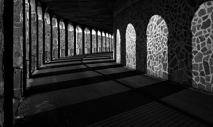
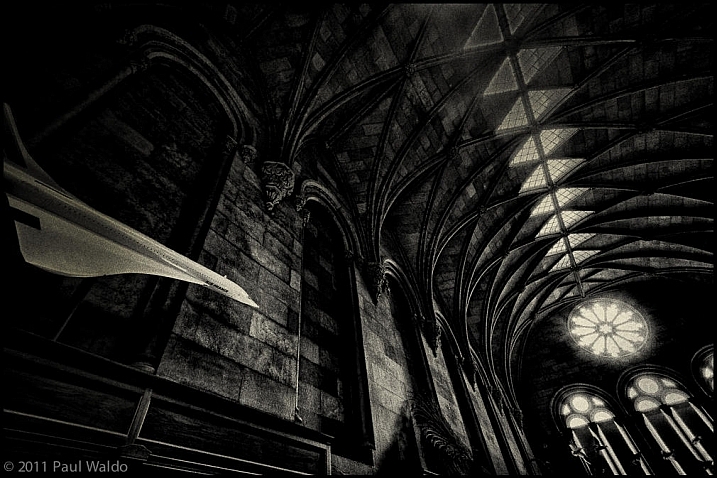
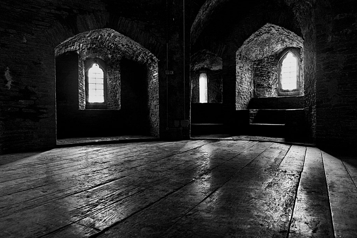
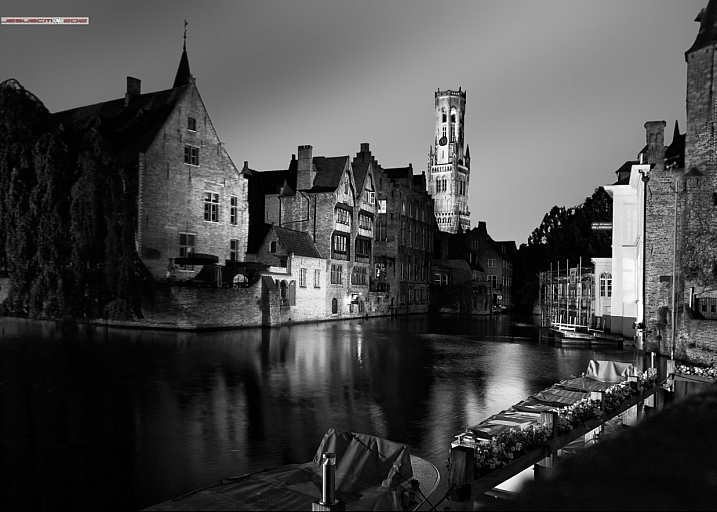
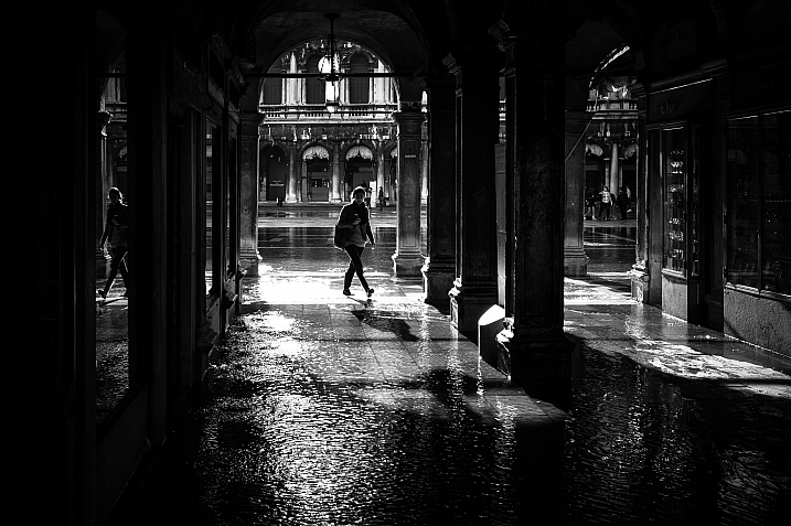
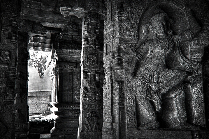
23 Moody Black and White Architectural Images

18 Feb

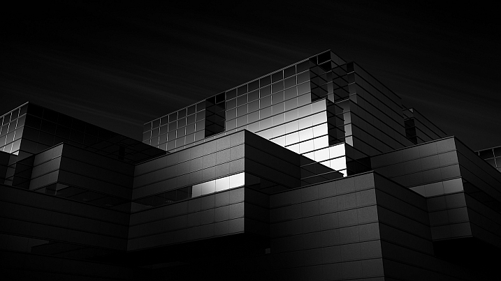
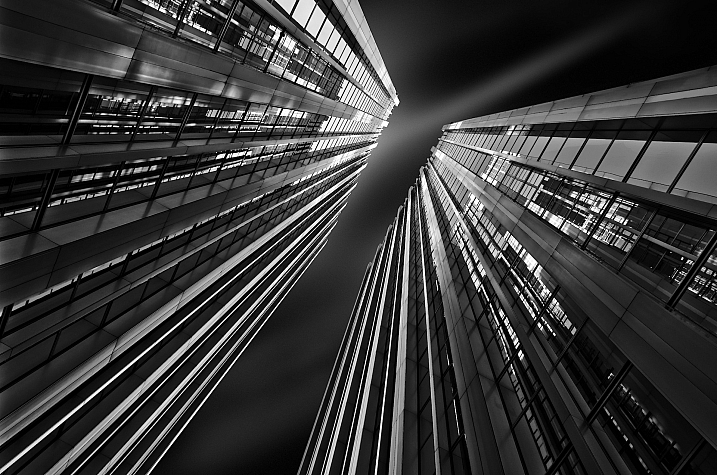
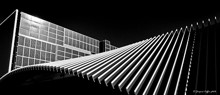
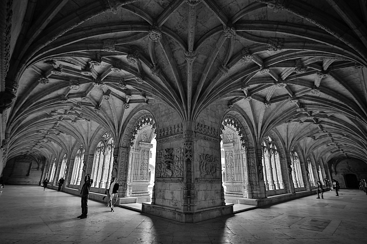
Architecture provides a few things that photographers love; texture, shape, contours, dramatic lighting.

Let’s see how these 23 photographers found and photographed different buildings and kinds of architecture in black and white.

By Marco Crupi

By Paul Waldo

By Andrew Howson

By jesuscm

By Thomas8047

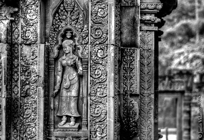
By Justin Vidamo

By Brad Hammonds

By Brad Hammonds

By Thomas Hawk

By ?Jin Mikami?

By perceptions (creative pause)

By Peter Tandlund

By ?Jin Mikami?

By ?Jin Mikami?

By Jacques Caffin

By Paulo Valdivieso

By Franck Vervial

By Chris Chabot

By Wasif Malik

By Davidlohr Bueso

By gato-gato-gato

By Brad Hammonds

By Premnath Thirumalaisamy

googletag.cmd.push(function() {
tablet_slots.push( googletag.defineSlot( “/1005424/_dPSv4_tab-all-article-bottom_(300×250)”, [300, 250], “pb-ad-78623” ).addService( googletag.pubads() ) ); } );

googletag.cmd.push(function() {
mobile_slots.push( googletag.defineSlot( “/1005424/_dPSv4_mob-all-article-bottom_(300×250)”, [300, 250], “pb-ad-78158” ).addService( googletag.pubads() ) ); } );

The post 23 Moody Black and White Architectural Images by Darlene Hildebrandt appeared first on Digital Photography School.


Digital Photography School

 
Comments Off on 23 Moody Black and White Architectural Images

Posted in Photography