RSS
 

Archive for February, 2017

5 Common Post-Processing Mistakes to Avoid

01 Feb

For today’s photographer, post-processing is a critical element of image making. Sure, when you first get started with digital photography, you might shoot in JPG mode and allow the camera to make decisions about things like color and contrast. But when you’re ready to take control of your images, it’s time to shoot in RAW format and make the important decisions about how you want your final image to look yourself.

Estuary in Campbell River BC by Anne McKinnell - 5 Common Post-Processing Mistakes to Avoid

When you first start shooting in RAW, you might think your images look a bit gray and bland. That’s because the decisions that the camera was making before are now left up to you. That can be a bit daunting! But here are some tips to help you avoid the most common post-processing mistakes and make sure you are helping your images and not hurting them.

Remember, the purpose of post-processing is not to fix bad photos, but to bring out the best in good photos.

Mistake #1 – Lightening shadows too much

Always try to get the best exposure possible in camera. You’ll get a better result when you start out with a good exposure rather than relying on the highlights and shadows sliders in post-processing to balance it.

That said, sometimes you will still want to use the shadows slider to lighten your shadows to bring more detail in the darker areas of your image. Just be careful not to overdo it, or you’ll end up with an image that no longer looks natural.

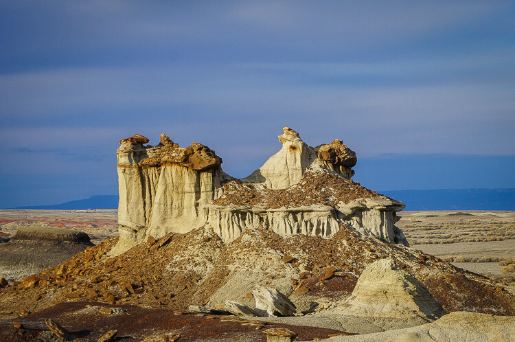
This is overdone, the shadows have been pulled too far here and it no longer looks natural. Notice it also introduced noise into the sky.

Convict Lake, California by Anne McKinnell - 5 Common Post-Processing Mistakes to Avoid

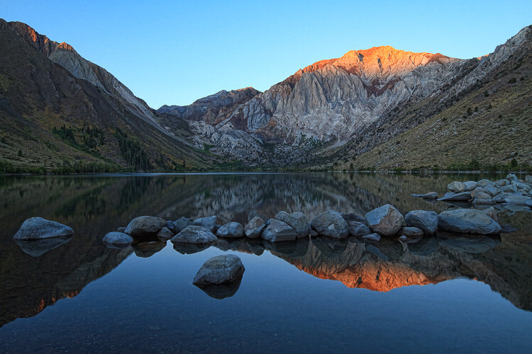
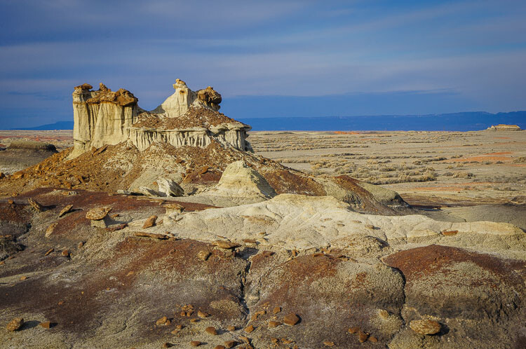
Shadow adjustment in moderation is better.

If you try to equalize the brightness of the highlights and shadows, you’ll end up with a photo that not only looks unnatural, but the lack of contrast will make the image look boring. Contrast is a good thing! This is especially true when you have a scene with a reflection. The reflection should always be darker than the scene it is reflecting, as it is in nature.

Mistake #2 – Over saturation

Another way to create an unnatural looking image is to over saturate everything. It’s a tempting thing to do because a little bump in saturation and vibrance makes such a big difference. Again, just don’t overdo it. A little goes a long way.

Before you touch those sliders, spend a bit of time thinking about your image and the colors in it. Sometimes adding saturation globally is not the best idea, especially if you have a scene that contains many different colors. Instead, consider using the HSL (Hue/Saturation/Luminosity) panel, choose Saturation, and use the target tool to add saturation to one color in your scene. For example, you might want to add saturation to the main subject to draw attention to it.

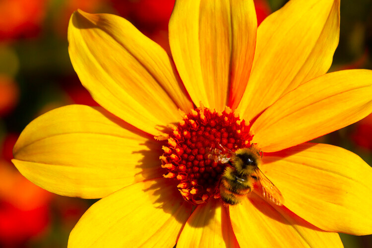
Over saturation leaves the colors looking odd.

Yellow flower with bee by Anne McKinnell - 5 Common Post-Processing Mistakes to Avoid

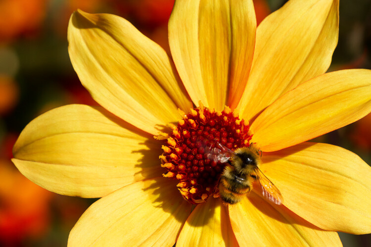
Better saturation levels.

Mistake #3 – Over sharpening

First of all, never use sharpening to try to fix a photo that is out of focus. It just doesn’t work. Sharpening cannot fix blur. However, if you have an image that is in focus, adding a bit of sharpening can make it extra crisp and realistic.

Again, consider adding sharpening locally (to one select area) not globally, especially if you have areas of your scene that are purposely out of focus, such as when you have a shallow depth of field. Also, the sky usually looks better when it is smooth, so you don’t want to add sharpening there. Keep in mind that adding sharpening will increase noise, which is another reason not to add it globally. Rather, just add it to the main subject or areas of your scene with a lot of detail.

This has been over sharpened, you can see artifacts throughout the image here.

Deer by Anne McKinnell - 5 Common Post-Processing Mistakes to Avoid

Better level of sharpening.

In Adobe Camera Raw, use the Detail panel to add sharpening. Then, hold down the option (or alt) key and use the masking slider. As you move the slider, the areas that appear black do not have sharpening applied and areas that are white do. This is an effective way to add sharpening to the areas of your image that have details. Another option is to use the adjustment brush to brush sharpening on where you want it.

Mistake #4 – Over cropping

The crop tool is a handy way to refine your composition, remove unwanted elements on the edges of the frame, and make sure your horizon line is straight. But don’t use it to remove all the “negative space” in your scene.

You don’t need to fill the frame with your subject. A little breathing room keeps the image interesting. Think about creating a balance between the space taken up by your subject and the space around it. This is not necessarily an equal balance.

Cropped too tight on the subject.

Bisti Badlands, New Mexico by Anne McKinnell - 5 Common Post-Processing Mistakes to Avoid

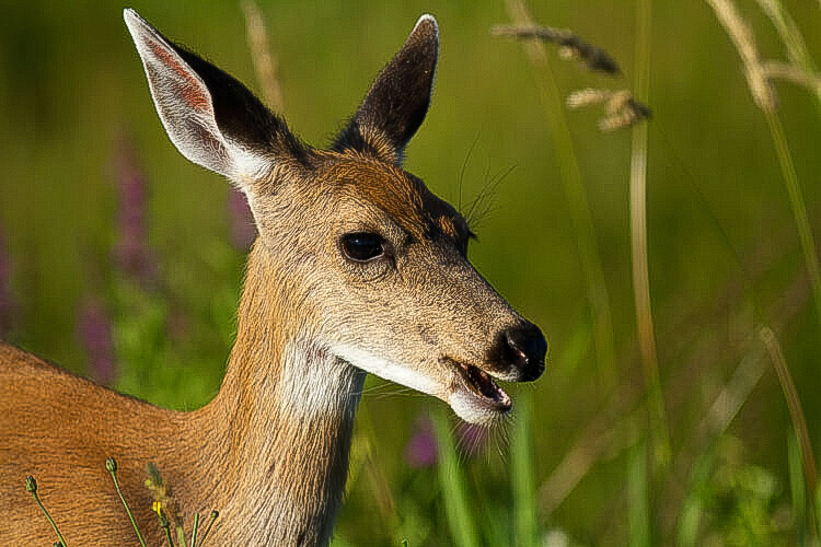
Cropped to leave negative space and lead your eye to the subject.

Mistake #5 – Too much Noise Reduction

Sometimes the nature of the light requires the use of a high ISO. Perhaps you need both a small aperture and a high shutter speed for your scene, so increasing the ISO is the only way to get a good exposure. That’s okay. The noise caused by using a high ISO can be reduced in post-processing using the noise reduction slider.

But nobody said that all images must have no noise. Not all images have to be perfectly smooth looking. Especially if there is a lot of detail and texture in your subject. Using too much noise reduction can create blurry splotches in areas that were previously sharp.

Too much noise reduction has been applied here and overall the image now looks blurry.

Kofa National Wildlife Refuge, Arizona by Anne McKinnell - 5 Common Post-Processing Mistakes to Avoid

Noise reduction scaled back.

You may have noticed a theme in these common mistakes. Don’t over do it! Small adjustments go a long way to bringing out the best qualities of your images, but taking it too far can just as easily ruin them.

After you process your image, take a break from it and look at something else. Maybe even give it a day to settle. Then, when you look at it again, it will be more obvious if you have taken the processing too far.

googletag.cmd.push(function() {
tablet_slots.push( googletag.defineSlot( “/1005424/_dPSv4_tab-all-article-bottom_(300×250)”, [300, 250], “pb-ad-78623” ).addService( googletag.pubads() ) ); } );

googletag.cmd.push(function() {
mobile_slots.push( googletag.defineSlot( “/1005424/_dPSv4_mob-all-article-bottom_(300×250)”, [300, 250], “pb-ad-78158” ).addService( googletag.pubads() ) ); } );

The post 5 Common Post-Processing Mistakes to Avoid by Anne McKinnell appeared first on Digital Photography School.


Digital Photography School

 
Comments Off on 5 Common Post-Processing Mistakes to Avoid

Posted in Photography


Proto-Pantone: 800-Page Color Palette Guide Book Hand-Drawn in 1600s

01 Feb

[ By WebUrbanist in Art & Sculpture & Craft. ]

color guide

This vast volume full of mixed watercolor swatches and other illustrations elaborating explains the art and science of combining waters and colors to create a huge array of tones, tints, shades and hues.

color palette guide book

historical tone hue guide

Created by artist  A. Boogert, this Dutch book is one-of-a-kind, a unique handmade production designed to educate students and artists about how to mix, make and deploy individual colors and color schemes. The entire work is thoroughly indexed and each process described in impressive detail.

historical dutch watercolor swatches

Medieval book historian Erik Kwakkel considers it a comprehensive coloring guide ahead of its time. “I encountered this Dutch book from 1692 in a French database today and it turns out to be quite special. For one thing, no Dutch scholar appears to have published on it, or even to know about it. Moreover, the object is special because it provides an unusual peek into the workshop of 17th-century painters and illustrators.”

dutch black white swatches

More from the aforementioned scholar: “In the 17th century, an age known as the Golden Age of Dutch Painting, this manual would have hit the right spot. It makes sense, then, that the author explains in the introduction that he wrote the book for educational purposes. Remarkably, because the manual is written by hand and therefore literally one of a kind, it did not get the reach among painters – or attention among modern art historians – it deserves.”

dutch book cover intro

If you want to see the volume yourself: Aix-en-Provence, Bibliothèque municipale/Bibliothèque Méjanes, MS 1389 (1228). Luckily, the entire book can be viewed here, in hi-res, zoomable images. Here is a description of the book. Thanks to the internet, this single-run work now finally has a shot at the global audience for which it was intended (via Colossal).

Share on Facebook


[ By WebUrbanist in Art & Sculpture & Craft. ]

[ WebUrbanist | Archives | Galleries | Privacy | TOS ]


WebUrbanist

 
Comments Off on Proto-Pantone: 800-Page Color Palette Guide Book Hand-Drawn in 1600s

Posted in Creativity


Unable to recover from failed Kickstarter project, Triggertrap announces it will close shop

01 Feb

Triggertrap, one of the pioneers in the area of smart camera triggers, has today announced that it will cease operations within approximately a month. Triggertrap was founded in 2011, following a successful Kickstarter campaign. The initial product offered a wide range of trigger options, including, sound and motion sensors and an intervalometer.

In 2013 the company launched another Kickstarter campaign, this time for the Triggertrap Ada, a modular and expandable follow-up version to the original product line. Despite the campaign being very successful, raising more than $ 500,000, trouble started when the cost of components was higher than originally quoted by some suppliers and in May 2015 Triggertrap had to admit the project had failed and the Ada could not be delivered. 

The company has never been able to recover from this failure and today one of the founders, CEO Haje Jan Kamps, has posted an article on medium, announcing the closure of the company. 

“Triggertrap, like any startup, had some big highs and lows. At one point, we employed 15 staff; a team of photographers, coders, support, marketing, logistics, and operations. Ever since we announced that our Triggertrap Ada Kickstarter project failed, we’ve been in a downward spiral. For the past 18 months, we’ve been operating with just a few team members, who have been working their asses off to keep the lights on. But ultimately, we weren’t able to claw our way out of the hole, and the company now owes the company’s founders around $ 60k. With no realistic hope of ever paying that money back, and after ten months in a row of struggling to make payroll for our remaining staff members, we decided it was time to give up.”

Technical support for Triggertrap products will end with immediate effect. Apps will remain available for download in the respective app stores but are sooner or later likely to run into incompatibility issues with updated operating system . If you are happy to keep using your current mobile OS and rely just on the Reddit-forum for support, you can still buy a Triggertrap device at a hefty discount in the online store.

Articles: Digital Photography Review (dpreview.com)

 
Comments Off on Unable to recover from failed Kickstarter project, Triggertrap announces it will close shop

Posted in Uncategorized


Canon releases downloadable EOS-1D X Mark II AF Setting Guidebook

01 Feb

Canon has released a downloadable 100MB PDF guide book for the EOS-1D X Mark II camera’s AF system. According to the company, this guide ‘will clarify many of the details about’ this AF system, including menu settings, the effect of various AF Cases, and more.

Canon goes on to point out that most of the information found in this guide is also applicable to the Canon EOS 5D Mark IV camera’s 61-point AF system, which features the same AF sensor as the EOS-1D X Mark II. Canon says of the guide ‘We’re confident having access to this file, on your computer or in a mobile device will answer many of the questions which may arise as you use either of these cameras.’

The PDF can be downloaded directly here.

Via: CanonRumors

Articles: Digital Photography Review (dpreview.com)

 
Comments Off on Canon releases downloadable EOS-1D X Mark II AF Setting Guidebook

Posted in Uncategorized


Join Me For a Drop-In Studio at GPP2017

01 Feb

Just a quick heads-up for anyone headed to Gulf Photo Plus in Dubai that I’ll be holding a drop-in studio session on the afternoon of Weds., Feb 15th. It’s not an official class, just something cool happening on the side.

You can learn more about it here, but basically it is free and we’ll be experimenting/learning/failing/etc. Specifically, we’ll be working with gels in the context of future posts in the just-started Lighting 103 module. So I thought it would be espcially cool to possibly incorporate photos of some of Strobist’s international readers as we get further into the course.

Which is why you are getting this invite!
Strobist

 
Comments Off on Join Me For a Drop-In Studio at GPP2017

Posted in Photography