RSS
 

Archive for May, 2016

Living with the Dead: 12 Cemeteries with Surprising Alternate Uses

10 May

[ By Steph in Culture & History & Travel. ]

multipurpose cemeteries manila 4

The living play karaoke among headstones, hang their laundry from mausoleums, put on plays in crypts and golf right on top of graves in multipurpose cemeteries around the world, where the dead are integrated into modern life instead of remaining in solemn roped-off spaces. In some cases, it’s happening due to sprawl, like the family graveyard in a Walmart parking lot in Georgia, but in others, it’s more deliberate. As we grapple with population growth and urbanization, alternate ideas for the burial of our dead are coming into focus, all seemingly sending the same message: life goes on.

Habitable Cemeteries: Living with the Dead in the Philippines
multipurpose cemeteries manila 2

multipurpose cemeteries manila 5

Screen Shot 2016-05-09 at 9.10.38 AM

Screen Shot 2016-05-09 at 9.11.14 AM

Within the walls of Manila’s largest cemetery, 6,000 living residents thrive, going about their lives right on top of gravestone after gravestone, sometimes living in mausoleums alongside the tombs of their dead. The residents of North Cemetery are typically extremely poor, creating makeshift domiciles and living surprisingly normal lives. Within their cemetery city, they’ve created systems of public transit and schools.

multipurpose cemeteries manila 1

multipurpose cemeteries manila 4

multipurpose cemeteries manila 3

beverly hills of the dead

A second cemetery in the Philippines, the Chinese Cemetery, is nicknamed the ‘Beverly Hills of the Dead’ for the spacious, luxurious tombs that are fancier and more comfortable than most homes of the living. These houses of the dead have fully-functioning kitchens, bathrooms and bedrooms where relatives can sleep alongside their deceased loved ones, and sometimes live there full-time.

New Lucky Graveside Restaurant, India
multipurpose cemeteries new lucky 1

multipurpose cemeteries new lucky 2

multipurpose cemeteries new lucky 3

The patrons of New Lucky Restaurant in Ahmadabad, India don’t seem to mind dining right next to coffins from an old Muslim cemetery, which may belong to the followers of a 16th century Sufi saint. The owner decided to leave the coffins in place when building his establishment, and says the proximity to death hasn’t put a dent in business, which is brisk. In fact, he believes that it brings good luck, hence the restaurant’s name. Each morning, the servers pay their respects to the graves, wiping them, covering them with cloth and decorating them with fresh flowers.

Solar Power in Santa Coloma de Gramanet, Spain

multipurpose cemeteries solar power spain
With so much of the rest of the land too hilly and shaded to be of use, the town of Santa Coloma de Gramanet outside Barcelona found the one location that would be viable for its solar energy program. It just happens to be a cemetery. The densely-built town packs 124,000 residents into 1.5 square miles, so they have to make creative use of every inch. Now, 462 solar panels provide enough energy to power 60 homes each year. The panels are perched above ground level, so there’s no notable change to the feel of the sacred spaces below. “The best tribute we can pay to our ancestors, whatever your religion may be, is to generate clean energy for new generations, says the director of Const-Live Energy, which runs the cemetery.

Next Page – Click Below to Read More:
Living With The Dead 12 Cemeteries With Surprising Alternate Uses

Share on Facebook


[ By Steph in Culture & History & Travel. ]

[ WebUrbanist | Archives | Galleries | Privacy | TOS ]


WebUrbanist

 
Comments Off on Living with the Dead: 12 Cemeteries with Surprising Alternate Uses

Posted in Creativity


2016 Roundup: Interchangeable Lens Cameras $500-800

10 May

The $ 500-800 category (based on US MSRP) features quite a few strong offerings, some of which should satisfy first-time camera buyers with easy-to-use interfaces and point-and-shoot style functionality. Others are aimed more at seasoned-enthusiasts, offering direct manual controls and high-end features.

At this price point, all of the cameras use either Four Thirds or larger APS-C-sized sensors and all can shoot Raw. And while a larger sensor can mean the potential for better image quality and more control over depth-of-field, the difference in size between APS-C and Four Thirds is not enormous. As such, small differences notwithstanding, the vast majority of cameras in this roundup have what we would consider to be very good image quality.

All of the cameras in this selection are reasonably small in size (compared to pricier ILCs), but the number and arrangement of control points, grip size, build quality and weight all vary quite a bit. As do the inclusion of features like like 4K video capture and in-body image stabilization.

Let’s take a look at the currently available interchangeable lens cameras that fall into the $ 500-800 price range (give or take).

  • Canon EOS M3
  • Canon EOS Rebel SL1
  • Canon EOS Rebel T6i
  • Fujifilm X-T10
  • Nikon D3300
  • Nikon D5500
  • Olympus OM-D E-M10 II
  • Panasonic Lumix DMC-G7
  • Panasonic Lumix DMC-GX85
  • Pentax K-S2
  • Sony Alpha a6000

Articles: Digital Photography Review (dpreview.com)

 
Comments Off on 2016 Roundup: Interchangeable Lens Cameras $500-800

Posted in Uncategorized


Win One of Three Lenses from Tamron – Enter the Sunshine Photography Contest

09 May

Win one of THREE lenses from Tamron! Enter the “Sunshine” photography contest today.

Win one of the following:

  • A Tamron 28-300mm Di VC PZD lens
  • A Tamron SP 90mm F/2.8 Di VC USD lens
  • A Tamron SP 70-300mm Di VC USD lens

Over the last few years here at dPS, we’ve run very some very popular competitions with our partners, to give away to lucky dPS readers some of their great photographic products. We are lucky enough to be able to do it again.

For this contest, Tamron is giving away three lenses!

These three unique prizes are designed to help every level of photographer create better pictures. Tamron is the world’s most awarded photographic lens line. Each will be won by a different dPS reader. Here’s what you could win:

Our First Prize Winner will receive:

A Tamron 28-300mm Di VC PZD (model A010) – $ 849 value, for canon, Nikon or Sony cameras.

Tamron 28 300mm

The Second Place Winner will receive:

A Tamron SP 90mm F/2.8 Di VC USD Macro Lens (model F017-new) – $ 649 value, for canon, Nikon or Sony (without VC) cameras.

Second Prize SP 90mm

The Third Place Winner will receive:

A Tamron SP 70-300mm Di VC USD Zoom Lens (model A005) – $ 449 value, for canon, Nikon or Sony cameras.


Tamron-70-300

Learn a little more about Tamron here: Tamron USA

How to win

To win this competition you’ll need to:

  • Visit the above lens information pages and learn more about the lens and its core use.
  • Post your sunshine photo, along with a few words on how you feel one of the above Tamron lenses would help your photography. It’s as easy as that!
  • Do this in the next 21 days and after June 1st, 2016, the team at dPS will choose the best three photos and we will announce the winners in the following days.
  • The deadline to enter is May 30th at 11:59pm PST (UTC-7). Photos and comments left after the deadline will not be considered.

Bee Image

By best – we’re looking for people who have an understanding of photography, the role of lenses, and how they will best suit your needs. So you’ll need to check out the product pages to put yourself in the best position to win.

There’s no need to write essay length comments to win – but we’re looking to hear what you like about the lens, and how it would help your development as a photographer. Don’t forget to include your favorite sunshine themed photo. We encourage you to have fun and be creative.

This competition is open to everyone, no matter where you live – but there is only one entry per person. To enter – simply leave your photo and comment below.

Tamron logo

Disclaimer: Tamron is a paid partner of dPS

googletag.cmd.push(function() {
tablet_slots.push( googletag.defineSlot( “/1005424/_dPSv4_tab-all-article-bottom_(300×250)”, [300, 250], “pb-ad-78623” ).addService( googletag.pubads() ) ); } );

googletag.cmd.push(function() {
mobile_slots.push( googletag.defineSlot( “/1005424/_dPSv4_mob-all-article-bottom_(300×250)”, [300, 250], “pb-ad-78158” ).addService( googletag.pubads() ) ); } );

The post Win One of Three Lenses from Tamron – Enter the Sunshine Photography Contest by Darlene Hildebrandt appeared first on Digital Photography School.


Digital Photography School

 
Comments Off on Win One of Three Lenses from Tamron – Enter the Sunshine Photography Contest

Posted in Photography


5 Reasons Why Converting to Black and White May Improve Your Image

09 May

Photography styles are always down to personal taste, in my opinion. I respect that; people have different preferences, and in the same vein photographers can’t please everybody. This also applies to black and white photos, which will be the focus of this article. I have clients who absolutely do not like black and white images, and clients who want a full set of black and white conversions. Personally I give my clients at least 95% color photos and the rest are in black and white.

reasons-to-convert-to-black-white-tips-photography

But why convert to black and white? Is it ever necessary? When do I convert color images to black and white? Here are five reasons why I do black and white conversions on selected photos.

#1 When the background is colorful and distracting

When there are too many colorful things cluttering in the background and taking the focus away from the subject, if they are not intended to be there, they are more likely to be a distraction rather than an enhancement to the image. It may also be that you have no control over the location and cannot move things away to de-clutter. In the photo below, my intention was to shoot backlit, and this was the only possible spot in a small patio. Light was my priority, and I had no control over the neighbor’s garden. This was a personal snap of my kids and I was not going to spend ages photoshopping the clutter away. Black and white was the way to go.

reasons-to-convert-to-black-white-tips-photography

reasons-to-convert-to-black-white-tips-photography

#2 When colors in the photo or the subject’s clothing do not enhance the image

Sometimes you just have to go with the flow. When you have children, you choose your battles. This photo was taken during a family walk looking at the bluebells. It was hard enough getting the kids out of the house in good time, let alone fighting over which outfits they want to wear. Clearly my son’s outfit does not remotely fit in with the tone of this image. Another hooray for black and white.

If clients turn up during a photoshoot with outfits that are too bold or distracting, then you have the option of offering them a choice of color or black and white. Explain your reasons why you felt it was necessary to convert it, and show them the difference it makes on the impact of the image.

reasons-to-convert-to-black-white-tips-photography

reasons-to-convert-to-black-white-tips-photography

#3 For artistic purposes like exaggerating contrasts and silhouettes

There are no rules in photography when it comes to creative style. It’s all down to your personal taste and vision. Artistic license is a great thing. You can photograph with motion blur and activity blur in mind, or add grain for more creative effect or a film look. Converting to black and white is just one more creative tool at your disposal.

reasons-to-convert-to-black-white-tips-photography

reasons-to-convert-to-black-white-tips-photography

#4 When black and white has more impact than color

Sometimes a scene just looks blah. It’s muddy and the colors seems non-committal; they are neither here nor there, not standing out, nor serving a purpose. Trust your gut. When I see “muddy” I run to black and white. An example would be a photoshoot in a living room with cream walls, a cream settee, and the subjects are also wearing cream. You can bring out more contrast in a black and white image.

At the other end of the spectrum, if the subject are wearing clashing colors that are too much, then converting to black and white turns the colors into varying values of gray, thus giving more cohesion to the overall look of the image.

In this snapshot of my kids below, I blew out the sky and wanted to bring some of the faint clouds back in. Apart from the muddy colors, it was easier to recover the blown out sky which would have looked very gray in a color image anyway.

reasons-to-convert-to-black-white-tips-photography

reasons-to-convert-to-black-white-tips-photography

#5 When the image is too noisy in color

Sometimes there are moments when your camera is not set correctly, and yet you see something you just have to capture in a split second, without having the chance to change your settings. The result would predictably be an underexposed image with unacceptable noise levels, or an overexposed image with plenty of highlights clipped. But the moment was priceless nonetheless. Black and white lessens the impact of the imperfection and makes the photo acceptable.

Perhaps this is because we are used to seeing grain in old black and white photos, and accepting the nostalgia associated with such a photo could forgive such an error in today’s digital image. However, beware of making this as an excuse. It should be a last resort to save a photo that is priceless, but never as part of your normal workflow.

reasons-to-convert-to-black-white-tips-photography

The kids in the photo above were never still, always running in different directions. I looked back and suddenly saw them walking in a row down a shaded path. I took a few successive shots knowing full well it would be underexposed based on the settings of my previous shots. I anticipated they would suddenly disperse, which they did in a few seconds, so I fired away. From the shots I took within seconds of this happening, I chose the one where they had just walked through a sunlit part of the path. There was still visible noise even after editing, but it becomes a non-issue in black and white.

How about you? Do you like black and white images? What reasons do you convert to black and white? Please share your thoughts in the comments below.

googletag.cmd.push(function() {
tablet_slots.push( googletag.defineSlot( “/1005424/_dPSv4_tab-all-article-bottom_(300×250)”, [300, 250], “pb-ad-78623” ).addService( googletag.pubads() ) ); } );

googletag.cmd.push(function() {
mobile_slots.push( googletag.defineSlot( “/1005424/_dPSv4_mob-all-article-bottom_(300×250)”, [300, 250], “pb-ad-78158” ).addService( googletag.pubads() ) ); } );

The post 5 Reasons Why Converting to Black and White May Improve Your Image by Lily Sawyer appeared first on Digital Photography School.


Digital Photography School

 
Comments Off on 5 Reasons Why Converting to Black and White May Improve Your Image

Posted in Photography


Street Smokers: Cabin Sits & Steams Over NYC Manhole Covers

09 May

[ By WebUrbanist in Art & Installation & Sound. ]

smokes new york city

This mobile art installation turns the most congested New York City intersections into an unlikely context for a most rural-looking little cottage, the illusion completed thanks to steam rising up from below the streets.

smokers and cops

When artist Mark Riegelman saw an orange traffic cone acting as an inadvertent steam conduit, the idea came to him to build something large and out-of-place to grab attention in a city of spectacle. Measuring 6 by 8 by 8 feet, the tiny micro-cabin still weighs hundreds of pounds and had to keep moving – as an unsanctioned project, it needed to avoid authorities.

smokers installation

smoker lane

Inspired in part by the incense-smoking figures traditional to Germany, the Smökers installation comes alive through the appearance of dynamic vapors wafting up from the chimney. In the artist’s words: “the byproduct of the city’s essential industrial process, which provides power and heat to thousands of homes and businesses throughout the city, [are] highlighted and subverted.”

smokers

smoker moving

smoker crossing

The German “Räuchermann, also commonly referred to as ‘smokers’, are simple wooden incense burners, often resembling cabins, animals, and chimney sweeps.” These are usually, however, found on shelves in homes, not in the form of giant homes on the street.

Share on Facebook


[ By WebUrbanist in Art & Installation & Sound. ]

[ WebUrbanist | Archives | Galleries | Privacy | TOS ]


WebUrbanist

 
Comments Off on Street Smokers: Cabin Sits & Steams Over NYC Manhole Covers

Posted in Creativity


4 Questions to Ask Yourself Before You Shoot to Help Improve Your Photography

09 May

One of the nice things about mobile phones is that virtually all of them have cameras built in, which means almost anyone can be a photographer and has at their disposal quite an advanced piece of technology, capable of creating stunning images with the tap of a button. Some people prefer dedicated cameras like a DSLR or mirrorless model, and others like to carry a small point-and-shoot or even use good old-fashioned film. However, good photography has much less to do with the gear and is more about the person taking the image.

With that in mind, here are four questions to ask yourself the next time you take out your camera and start snapping away. If you stop and think about these, it will help improve your photography and you will take better photos:

  1. What is the purpose of the picture?
  2. What do I want my viewers to see or feel?
  3. How can I use my surroundings to create the image I want?
  4. How can I control my camera to get the image I want?

five-questions-before-photos-butterfly-flower

You could stop reading right now after seeing those questions and get to work on improving your photos, but I want to dig a little deeper into each one, to see how answering them can help you improve as a photographer and artist.

1 – What is the purpose of the picture?

Think back to the last time you sat scrolling through images on Instagram, Facebook, Flickr, or another image sharing site. Perhaps you just looked through some pictures at random, and maybe you even gave a precious few the much-coveted like, double-tap, or star rating. What was it about those photos that caught your eye and made you pause for a second or two? Recently a study carried out by Microsoft found that, thanks to smartphones and the rapid pace of our modern tech-infused lifestyles, people have an average attention span of only eight seconds. That’s shorter than a goldfish! A similar study carried out in the year 2000 found that attention spans then were roughly 12 seconds, which means things are only getting worse as we become more and more connected via technology.

You might very well have a shorter attention span than this infant. And it's a good bet your audience does too.

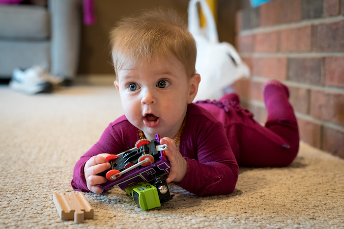
You might very well have a shorter attention span than this infant, and it’s a good bet your audience does too.

This has profound implications for photographers because it means that in the already-crowded landscape of digital pictures, your photos are not only vying for attention among thousands or millions of other images, but you have even less time to grab the viewer’s attention than ever before. To combat this, you need to make it abundantly clear to your viewers just what precisely is the point, of any given picture you take. In other words, your photos should have a clear subject – whether it’s a person or people, a flower, a kitten, a plane, a train, or even an automobile.

Look through your own pictures and ask yourself, “What’s the point?” If you can’t answer that question, then chances are that the photos won’t mean much to anyone else who sees them either. When I first got into photography I took all kinds of pictures of things that I thought might be interesting at the time, but looking back on them I honestly can’t tell you what is the purpose of many of those images. If I had taken the time to make sure the images had a clear purpose, instead of just pointing my camera at whatever I thought might look cool, I would have more important photos and much richer memories too.

I shot this photo about 10 years ago, and while I'm sure I had some kind of purpose I honestly can't remember what the point of it was supposed to be.

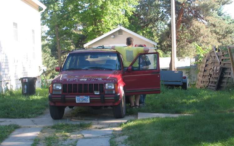
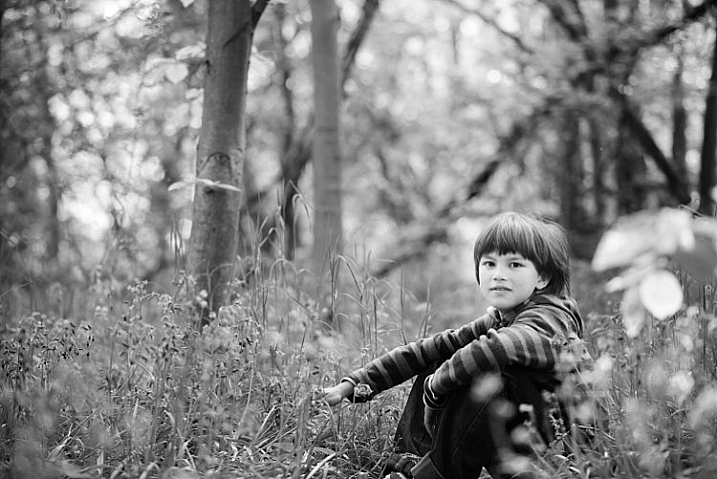
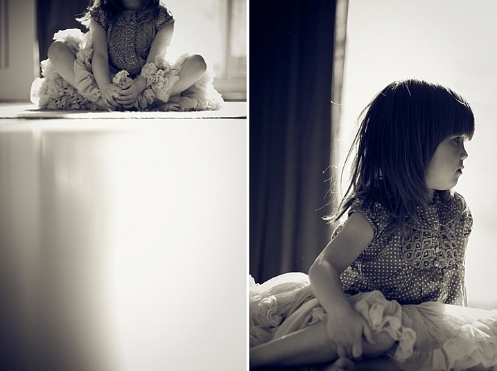
I shot this photo about 10 years ago, and while I’m sure I had some kind of purpose, I honestly can’t remember what the point of it was supposed to be.

2 – What do I want my viewers to see or feel?

So now you have a clear subject in mind for your picture, and you’re all ready to snap the shutter on your DSLR, mirrorless, or even mobile phone. But wait, there’s more to consider before you start eating up that memory card, and flooding your favorite social networks with more photos. Now that you know what the purpose of your photo is, take the concept one step further and ask yourself what feelings, symbols, or other elements you want to impart on your viewers.

Do you want them to feel happy, sad, curious, introspective, or nostalgic? Do you want to stir them up so as to take action for a particular cause? Do you want them to notice things other than what might be the main subject of the image, and spend time digesting and interpreting your photos to gain a deeper understanding of the world around them?

five-questions-before-photos-bubbles

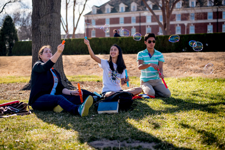
I didn’t just want those who saw this picture to think “Oh, some students playing with bubbles.” I wanted people to smile and feel the same sense of delight as the girl in the middle.

Humans are visual creatures, and as a photographer you are in the unique position of using a visual artistic medium to transmit thoughts and emotions. In this sense, photography is a form of one-way communication as you invite your viewers to engage with your images, and take something away from them. For example, here’s what might appear to be a rather mundane picture of a plastic duck:

Is it a duck...or is it something more?

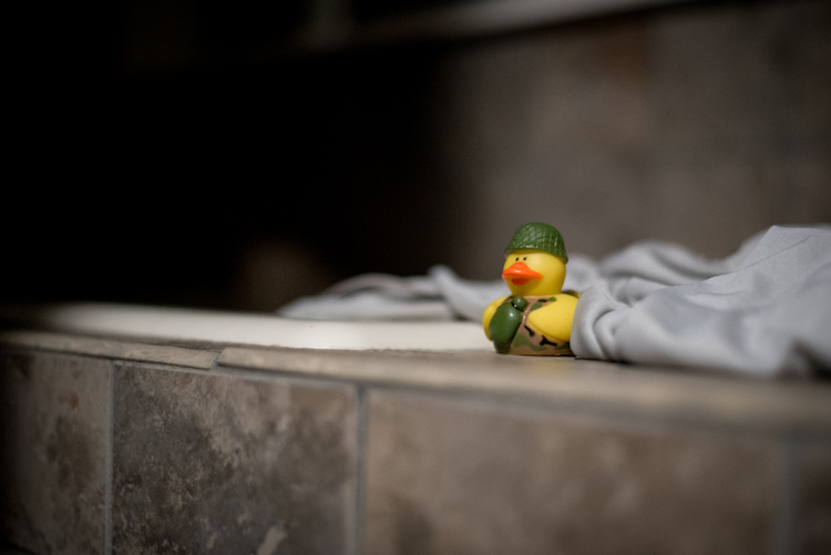
Is it a duck…or is it something more?

My goal in taking that picture was to have my viewers see more than just a basic rubber duckie. I specifically chose the time of day, angle of my camera, foreground and background elements, and exposure settings (i.e. f/1.8 aperture) to create this image, so that my viewers might see more than a kid’s bath toy. Perhaps they would think back to their own childhood, or maybe even invent a fantasy backstory for this duck standing guard at the edge of a precipice. It might seem like a simple image, but to me there was a lot more going on here, and by asking myself some deeper questions before I took the picture I got a better image as a result.

The same lesson applies to photography in general, and you have a powerful image-capturing tool at your disposal, to not just make snapshots, but tell stories and communicate with your audience. Going through some of these questions might seem like a lot of work when all you want to do is just pull out your camera and snap a few photos. But, as you work on doing this more and more, it will soon become second nature and you will see a noticeable increase in the quality of even your most mundane images.

This picture is just a quick snapshot that's not going to win any awards, but I shot it in such a way so as to provide context, invite the viewer to feel slightly squirmy, and hopefully see more than just the some kids in a room.

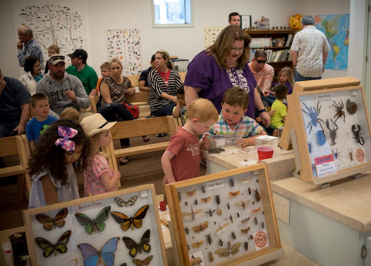
This picture is just a quick snapshot that’s not going to win any awards, but I specifically took it in such a way so as to provide context, invite the viewer to feel slightly squirmy, and hopefully see more than just some kids in a room.

3 – How can I use my surroundings to create a better photo?

One of the easiest ways to create a more compelling, interesting, and visually appealing photograph is to take a few seconds and examine the context in which the picture is being taken. Then try to position yourself, your subject, or even just your camera in such a way as to create maximum visual impact, and help you get precisely the photo you are trying to capture.

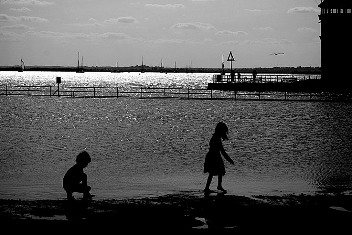
As an illustration of this take a look at the photo below. When I took it, I made several quick decisions with regard to my surrounds in order to get a better picture, than if I had just settled for a quick snapshot. As the child was walking down the street I followed from a short distance in order to get a photo of him, and adjusted my viewpoint so the sailboats would occupy the left side of the frame. I crouched down low to get a better angle, and positioned myself so that the boy’s head and shoulders were above the horizon and showing through a clear portion of sky instead of a tree or building. I also scooted over so the white paint line was leading towards the center of the picture, rather than off to the side. All this was done in a matter of seconds, since I knew this particular moment would be quite fleeting.

five-questions-before-photos-marina

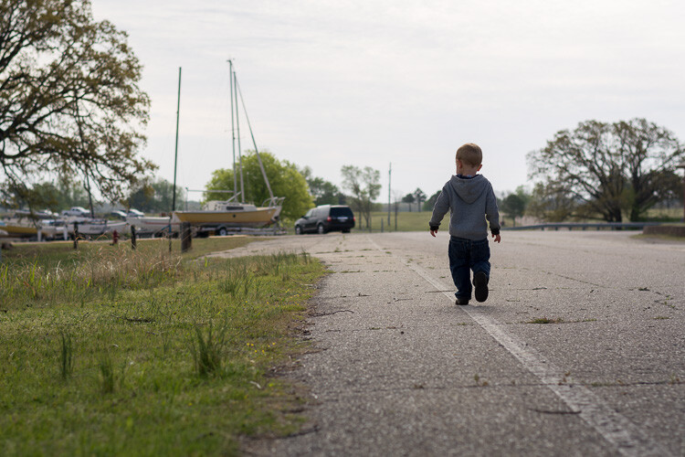
The result is a picture that, in my opinion, is elevated several notches above what otherwise might be a quite ordinary picture of a kid walking down the street. It also provides clear answers to the two previous questions:

  1. What is the purpose of the picture? To show a child walking down the street.
  2. What do I want my viewers to see or feel? A bit of nostalgia, a connection to the boy, perhaps a bit of hopefulness for the future.

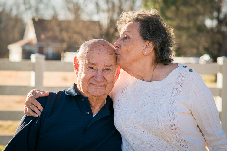
Recently I had the privilege of photographing four generations of one family, so I chose a location that would evoke feelings of a certain time period and place my subjects in a very specific context. What you see below is the direct result of me choosing to use the environment to elevate the impact of the photo. In order to create a sense that the couple had a long and rich history together, I placed them a few meters in front of a white fence, with an old farmhouse occupying the top-left portion of the frame. I could have taken the picture from many other angles, with very different scenery around them, but what you see here is the result of a very specific artistic choice on my part, in order to get precisely the photo I wanted.

five-questions-before-photos-couple-barn

You can do the same thing, and it doesn’t require any special equipment or educational training. All you need is to keep your eyes open, examine the world around you when you take photographs, and use the environment to give your images a richer sense of time, place, and context.

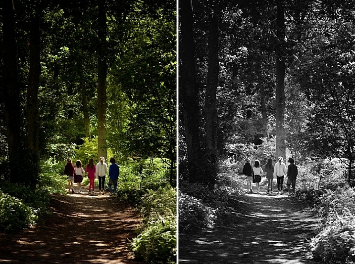
4 – How can I control my camera to get the image I want?

Many people take great pictures without ever straying from the Auto option on their camera dial, and if you have a mobile phone or point-and-shoot you may not have any other options besides Auto. I know from personal experience how scary it can be to move away from Auto. For years I wondered why I would ever bother leaving that safe little green option when it did a pretty good job – especially since every time I ventured into another mode such as Aperture Priority, Shutter Priority, or (gasp!) full Manual, I never seemed to get the results I was looking for. What you may not realize if you stick with Auto, is that a whole new world of photography wonder is right in front of you, just waiting to be discovered if you can learn how to control your camera a bit more.

It's virtually impossible to get pictures like this using the Auto mode.

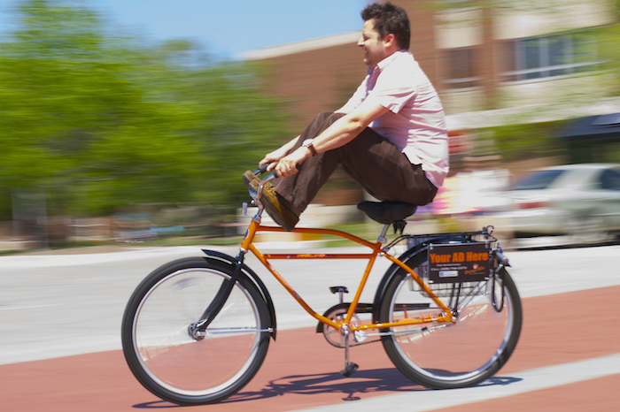
It’s virtually impossible to get pictures like this using the Auto mode.

Learning to control the aperture of your lens, the shutter speed of your camera, and the ISO sensitivity of your image sensor can make all the difference between a forgettable snapshot, and a wall-worthy masterpiece. It takes a little while to learn the fundamentals, but once you get the hang of it you will find yourself asking technical questions in order to solve artistic problems. I am constantly pressing buttons and flipping dials when I take pictures (even if it’s just my kids in the back yard) so I can get exactly the image that’s in my head, and not the picture that my camera thinks I want to take.

If this sounds hopelessly complicated, look down at the keyboard the next time you are at a computer. Remember when it took you agonizing minutes just to peck out a few words or sentences? Now you probably don’t look at the keyboard at all, and typing isn’t something you really think about anymore. You think of the words you want to appear onscreen, and your fingers naturally move to the right letters on the keys. The same thing happens with practice when you learn to use other modes on your camera, and your pictures will be much improved as a result. The bottom line is that if you, not your camera, decide which aperture, shutter speed, and ISO to use, you will get better pictures.

five-questions-before-photos-butterfly

Now that you have read my four questions, I’m curious to know your side of things too. Are there any tips you have found that work well for you to get better images? What are some of the best practices you have learned over the years? Share your thoughts in the comments below.

googletag.cmd.push(function() {
tablet_slots.push( googletag.defineSlot( “/1005424/_dPSv4_tab-all-article-bottom_(300×250)”, [300, 250], “pb-ad-78623” ).addService( googletag.pubads() ) ); } );

googletag.cmd.push(function() {
mobile_slots.push( googletag.defineSlot( “/1005424/_dPSv4_mob-all-article-bottom_(300×250)”, [300, 250], “pb-ad-78158” ).addService( googletag.pubads() ) ); } );

The post 4 Questions to Ask Yourself Before You Shoot to Help Improve Your Photography by Simon Ringsmuth appeared first on Digital Photography School.


Digital Photography School

 
Comments Off on 4 Questions to Ask Yourself Before You Shoot to Help Improve Your Photography

Posted in Photography


Oh Snap! 15 Abandoned & Shuttered Fotomat Film Kiosks

09 May

[ By Steve in Abandoned Places & Architecture. ]

abandoned-fotomat-1a
Rendered obsolete by technology, hundreds of abandoned Fotomat drive-thru photo development kiosks still stand in suburban shopping center parking lots.

abandoned-fotomat-1b

abandoned-fotomat-1c

Founded in the mid-1960s, Fotomat specialized in drive-thru, “One Day Photo Service”… that’s right kids, people once had to wait until the next day to see photos (presumably of dinosaurs) they took with their clunky analog cameras. By 1980, over four thousand yellow & blue, pyramid-roofed Fotomat kiosks were scattered across suburban parking lots from coast to coast. Built to last on cast-concrete berms, hundreds of abandoned and re-purposed Fotomat kiosks still stand, reminding us of better days and good times cast in Kodachrome.

Wooden It Be Nice

abandoned-fotomat-2a

abandoned-fotomat-2c

Fotomat Corporation sold out to Konica in 1986 – a timely move to be sure, considering the late-1980s advent of film processing minilabs that reduced photo development time from a day to just an hour. Now that’s progress! The subsequent introduction of digital cameras and then, camera-equipped smartphones were the final nails in Fotomat’s coffin.

abandoned-fotomat-2d

abandoned-fotomat-2b

While some Fotomat booths were re-purposed into key-cutting kiosks, coffee drive-thru’s and so on, others were reborn in wholly unexpected ways. Flickr user Patrick Cummins (collations) brings us this odd ex-Fotomat located in a shopping center parking lot in northern Toronto, Canada. The kiosk appears to have been made over as some sort of naturist art project before being abandoned for good.

Unloved In Lovington

abandoned-fotomat-3a

When you’re a Fotomac or Fotomate (as male and female staffers were cutely called) staffing a Fotomat kiosk in Lovington, New Mexico, your worst nightmare would be when the air conditioner conked out. At least one could compare miseries with whomever staffed that curious windmill booth in the near background. Flickr user Luis Capwell captured the poignant essence of this roofless abandoned Fotomat on March 5th of 2011.

A-Peeling

abandoned-fotomat-4a

abandoned-fotomat-4c

This faded & abandoned Fotomat kiosk in Dayton, Ohio lost its appeal long ago – even the OPEN/CLOSED sign has seen better days. “Yes, We’re Open”? No, you’re not.

abandoned-fotomat-4d

abandoned-fotomat-4e

A weathered coat of desultory grey/brown paint grudgingly reveals the booth’s original sky-blue walls through cracks encouraged by numerous bitter Ohio winters. Even the concrete is peeling. Flickr user Rob Anspach (Circa71) visited the decrepit former Fotomat at the Linden Shopping Center in April of 2009, if only to take photos – not leave them.

Forlorn & For Lease

abandoned-fotomat-5a

“The cute little hut with the big yellow roof”… now there’s a Kodak moment for ya! On August 21st of 2007, Flickr user Joe Balynas (muledriver) photo-documented the above ex-Fotomat (most recently, a drive-thru coffee shack) looking for a further reincarnation. The jumbo add-on fluorescent sign should help.

Next Page – Click Below to Read More:
Oh Snap 15 Abandoned Shuttered Fotomat Film Kiosks

Share on Facebook


[ By Steve in Abandoned Places & Architecture. ]

[ WebUrbanist | Archives | Galleries | Privacy | TOS ]


WebUrbanist

 
Comments Off on Oh Snap! 15 Abandoned & Shuttered Fotomat Film Kiosks

Posted in Creativity


Sigma 30mm f/1.4 DC HSM Art Lens Review

08 May

The world of camera lenses can be separated into two main groups: zooms and primes. Prime lenses are those which have a fixed focal length, meaning that they don’t zoom in and out. Once upon a time there were only primes. With the advent of zoom lenses photographers no longer had to rely on just their feet in order to get achieve the desired composition. This versatility brought with it a trade-off. Zoom lenses have more moving parts and components, which adds weight and reduces the speed of the lens, along with sharpness. Optically, primes are generally much faster and sharper than zoom lenses but limit the shooter to only one focal length, which can be off-putting to some.

But times change. Today we see a new generation of photographers realizing the merits of shooting with prime lenses. This paradigm shift is reflected by lens manufacturers who are beginning to produce more prime lenses for a hungry new market.

Sigma 2

The 30mm f/1.4 DC HSM Art lens from Sigma is among one of these that is meant be an all-purpose fast prime, for those needing a lens with excellent sharpness and great low light capabilities. I put the Sigma 30mm f/1.4 through its paces and have a feeling you will be well pleased.

Build Quality

Sigma 4

Being part of Sigma’s well regarded Art line of lenses, I expected the 30mm to be highly refined and well-built; it did not disappoint in this area. It’s manufactured from the same thermally stable composite (TSC) which is incredibly metallic in its heft and appearance. The entire lens looks very smooth and professional, with all markings and indicators being commendably well executed. The focusing ring has that perfect feel of silk when it’s turned. It moves very smoothly, being neither overly tight, nor too loose. The travel from minimum focus distance to infinity is just right, and it still leaves a lot of cushion for focusing accurately when in manual mode. The AF/Manual switch is ideally placed for no-look operation, and is very crisp when it is clicked from one to the other.

Sigma 5

Sigma 3

Included in the package is also a great looking lens hood which causes a bit of deception when attached because it makes the lens appear markedly larger than it actually is in reality. But it does a superb job of reducing the amount of contrast-robbing peripheral light from making its way to the lens’s front element. Overall, the quality of workmanship displayed in the 30mm is outstanding. It feels very well balanced when mounted to the camera (Canon 7D).

Sigma 1

It leans towards the robust side in terms of weight for a normal (close to the naked eye’s field of view) prime lens at 15.3 ounces (434g), but it is by no means clunky or difficult to shoulder for long periods. Here we see the Sigma 30mm f/1.4 compared to another prime work horse, the Canon 50mm f/1.4.

Canon Sigma

With the lens hood reversed for storage, it’s easy to see just how compact this lens really is in the hand.

Sigma in hand

Here are the official lens specifications and element array provided via Sigma USA.

Sigma 30 Specs


Image Quality

The Sigma 30mm f/1.4 is quite the beast, photographically speaking. The 30mm focal range is very close to what could be considered wide angle, yet it shows no perceivable distortions at the corners. The bokeh is absolutely beautiful; the nine curved aperture blades produce an incredibly smooth, nearly dream-like, background blur when shooting at wide apertures. Some portraits today are being shot with alarmingly short focal lengths with very positive results. This lens would serve that purpose well, and offers richly vibrant colors across the entire aperture range. This great color rendition will make for a love at first sight situation with landscape photographers also. If you shoot a lot of nightscapes this lens will appeal to you as well. Of course the f/1.4 aperture capability makes for great low light work, but the coma was found to be very low likewise. This means all your great shots of the night sky will be produced clearly, with little distortion of those small points of starlight.

The autofocusing of the Sigma 30mm f/1.4 is also a point of praise. Focusing was very fast and accurate, and very quiet. It’s great to see a prime lens with AF that is on par with its other features. While manual focusing is always a good idea, the benefit of a high-performing autofocusing mechanism can’t be understated when shooting at the wide open apertures which this lens is capable of achieving.

This brings us to one of the only two downsides thus far found in the 30mm; its sharpness at small and large apertures. It is certainly not uncommon to see a marginal reduction in sharpness when approaching minimum and maximum apertures, from even the most highly prized lenses. From f/2.2 through to f/11, the sharpness of this lens is wonderful. Anything smaller than f/11 or wider than f/2.2 however, saw a significant drop in overall sharpness in my tests. Happily though, that leaves an enormous range of possibilities for optimal image sharpness, and in my opinion, should not diminish the respect this lens deserves.

Here are some sample images to demonstrate the corner sharpness over a range of apertures from f/1.4 through to f/16. The first picture is for reference to the 1:1 magnification applied to the samples.

Corner 1 to 1

And now for the samples:

F 1 4

F 2

F 2 8


F 5 6

F 8

F 11

F 16

The other downside is relatively noticeable chromatic aberrations at wide apertures. Of course this is to be expected, but it bears mentioning nonetheless. For a lens of this quality the chromatic aberration is a little more than expected when the lens is wide open at f/1.4. These aberrations drop extremely quickly past f/1.8 and diminish completely around f/2.2.

Even at their most noticeable, Lightroom handled the fringing easily in post-processing. Much like the sharpness issue, for most shooters, the chromatic aberrations shouldn’t be a concern, or at the very least should be manageable.

The 30mm F1.4 DC HSM | Art is a terrific lens, despite any marginal concerns with sharpness and aberrations. It performs quite well across a wide range of situations, and will be a great addition to those looking for a low light prime lens with low distortion. Astro photographers will love it for its low coma and sweeping perspective, and landscapers will be drawn to its wonderful color rendition. Even street photographers would be elated to have this lens in their bag due to its incredible bokeh.

Here are a few real world sample images which were shot with the Sigma 30mm F1.4 DC HSM | Art lens, mounted to a Canon 7D, processed in Adobe Lightroom CC.

Sigma 30 Sample 1

Sigma 30 Sample 2

Sigma 30 Sample 3

Sigma 30 Sample 4

Sigma 30 Sample 5

Sigma 30 Sample 6

I would recommend this lens to virtually anyone who needs a sturdy low light prime lens. It fits a myriad of circumstances when high grade professional quality photographs are needed. When shooting at common apertures it is an incredible value for a prime lens at this price point.

googletag.cmd.push(function() {
tablet_slots.push( googletag.defineSlot( “/1005424/_dPSv4_tab-all-article-bottom_(300×250)”, [300, 250], “pb-ad-78623” ).addService( googletag.pubads() ) ); } );

googletag.cmd.push(function() {
mobile_slots.push( googletag.defineSlot( “/1005424/_dPSv4_mob-all-article-bottom_(300×250)”, [300, 250], “pb-ad-78158” ).addService( googletag.pubads() ) ); } );

The post Sigma 30mm f/1.4 DC HSM Art Lens Review by Adam Welch appeared first on Digital Photography School.


Digital Photography School

 
Comments Off on Sigma 30mm f/1.4 DC HSM Art Lens Review

Posted in Photography


Go with the glow: How to effectively use Orton Layers in post processing

08 May

This image was taken in the summer of 2015 on the Skyline Trail near Panorama Point on the slopes of Mt. Rainier, WA.  The image is composed of 8 focus stacked frames and was shot at the following settings: 16mm, f/8, 1/25sec, ISO 400 using a Sony a7R and a Canon 16-35mm f/2.8L II lens.

Photo: Chris Williams Exploration Photography

Have you ever wondered how some of the top landscape photographers achieve that dreamy yet sharp look in their photos? It turns out that the answer is really quite simple. The Orton effect, as it has been dubbed in recent years, is achieved by selectively adding a Gaussian Blur layer in Photoshop. When applied correctly the technique can add depth, atmosphere and an almost surreal feeling to your images.  It can also help reverse some of the ‘crunchiness’ that sometimes results from web sharpening and compressing a large scene dynamic range into one, tone-mapped image. 

The technique itself was developed by photographer Michael Orton in the darkroom some years ago. This ‘Orton’ effect was achieved through the process of sandwiching two slightly over exposed images; one of which was slightly out of focus while the other remained tack sharp. The result of this process yielded a soft glowy image that retained much of its edge detail. 

Lucky for us this effect is now easily attained and even simplified in the digital age through the use of tools like Photoshop. In the following steps I will outline how to use and refine the technique that has been made popular by landscape photographers like Ryan Dyar over the past few years. 

Apply the Blur

The first step to this process is to take care of your focus stacking, exposure blending and touch up work before you apply the blur layer. Once that has been completed, sharpen your image as you would normally and merge the visible layers. Right click on your merged image layer and duplicate it.  

Now that you have the duplicated layer you can begin the process of applying the Orton effect. Select your duplicated layer (leave it at 100% opacity and normal blending mode) and apply the Gaussian filter to your layer. The radius at which you blur the pixels really depends upon your camera’s resolution and the desired outcome for your finished product. 

Selecting the Gaussian Blur layer is as simple as browsing through the filter options in Photoshop and selecting the appropriately named layer.

I typically blur the Raw files from my Sony a7R at a pixel radius of around 37. If you’re using a lower resolution file from something like a Sony a7S or even an APS-C camera I wouldn’t go further than a pixel radius blur of 25. The methodology behind this is that you don’t want to lose all of your edge detail and compromise the contrast in your blur layer, so choosing the correct blur radius is important. It’s a balance, and one that you should really play with to determine what blur radius works best for your needs and file types. Generally speaking, you want to stay within a pixel radius blur range of 15-40.  

A preview of the effect of your Gaussian blur settings can be seen prior to applying the setting to the layer; adjust the pixel blur radius here to determine what works best for your image.

Once you have selected the Gaussian blur settings that work best for your image click ‘okay’ to apply the filter to your layer. Leave the opacity of the layer at 100% for now.  

Bring Back the Contrast and Select the Opacity

One of the most important steps to this process is to apply a ‘levels’ adjustment to this layer. More often than not, when photographers first start to experiment with this type of technique in post processing, their images are left with haloing and a lack of contrast. Applying a levels adjustment selectively to your Orton layer can make a huge difference in your final result by bringing back the blacks and highlights that the Orton layer tends to bleed out. I normally bring the blacks in to between 10-25 and the highlights to around 245. Applying this step to your layer will ensure that you lose a minimal amount of contrast and will help to blend the layer in areas of harsh transition.   

Choose the ‘levels’ tool and adjust the blacks and lights to your taste.

Once you have completed this step it’s now time to adjust the opacity of your Orton layer. I typically aim for between 10-20% opacity. This really depends on your style and what the overall desired look and feel of your image is.  The example below illustrates what can happen if you increase your Orton layer to 35%, which can be a bit on the excessive side depending upon your image.   

10% Orton Layer 35% Orton Layer

The Devil is in the Details

Now that you’ve got this great atmosphere and glow going on in your image, you may ask yourself what happened to the detail? Loss of detail can happen when this layer is applied in your workflow, but there is a very easy solution to remedy this issue; the High-Pass filter. 

The first step is to duplicate your original background image layer (that has no Orton applied to it), select it, pull it to the top of your workflow and navigate to the filters tab.  Scroll down to find the ‘other’ category and select ‘High Pass’. A high-pass filter brings the detail out in the areas that tend to be most effected by the Gaussian layer: the edges of the elements in your composition. 

Choosing the high-pass filter follows many of the same steps as locating the Gaussian filter only this time the filter is located in the sub-menu titled ‘other’.

Once you have done this you will be given an option to select the pixel radius you wish to apply to your layer. I normally try to stay within a pixel radius of 4-5.5 (any larger and the image detail can get grainy). Pick your desired radius and click OK.  

Once you have selected the high-pass filter you can choose your pixel radius size; I normally choose between 4 and 5.5.

If you aren’t familiar with this type of application your first thought will probably be: ‘what did I just do to my image?’ as you stare at the grey layer on your screen. Fear not! There’s a very easy solution; you will need to select the layer and choose the ‘Soft Light’ blending mode.  

Make sure to apply the ‘soft light’ blending mode to your layer to blend the high-pass pixel detail seamlessly into your exposure.

This mode seamlessly blends the High-Pass pixel detail back into your image. You may want to adjust the opacity of this layer to your tastes after its application, but that’s all there is to it!  If you feel like you’ve got your settings down to a science you may want to even record this as an action. Be aware that every image will be a bit different from a processing stand point, however, so you may want to make subtle changes on a case by case basis.

Toggle the application of your layers off and on and make changes in opacity, detail and contrast as you see fit.

The Final Product

No Orton applied Orton applied

If you’ve completed all of these steps successfully, you now know how to effectively utilize an Orton layer in your workflow. This type of layer can be added to anything from landscapes, to wildlife, and even to portraits in some cases. The limits are only bound by your creativity. Have fun with it and happy shooting!    

Articles: Digital Photography Review (dpreview.com)

 
Comments Off on Go with the glow: How to effectively use Orton Layers in post processing

Posted in Uncategorized


Under the hood: A look inside the Panasonic Lumix DMC-LX100

08 May

A look inside the Panasonic Lumix DMC-LX100

Panasonic’s LX100 is an ambitious little camera. It steps right over the 1″ sensor compact class with a 16MP Four Thirds sensor (though only 12.7MP is truly available), a 24-75mm equiv. F1.7-2.8 lens and 4K video recording. It all added up to a very favorable score and a gold award when we reviewed the camera. Now, thanks to the folks at iFixit, we can take a look at what’s inside the LX100 without ever picking up a screwdriver. 

A look inside the Panasonic Lumix DMC-LX100

Removing the battery is a first and very important step. 

A look inside the Panasonic Lumix DMC-LX100

After removing plenty of screws from the body of the camera, removing this metal piece from the hotshoe reveals yet another set of screws.

A look inside the Panasonic Lumix DMC-LX100

A spudger is the best tool for this job – with all of the screws out of the way the back of the chassis can be pried away from the camera body.

A look inside the Panasonic Lumix DMC-LX100

Here’s a view of the back panel with the cover out of the way. The motherboard lies just below the buttons seen here.

A look inside the Panasonic Lumix DMC-LX100

To get to the motherboard, the LCD needs to be removed. Here, the silver metal backing is pried away with a spudger. A ribbon cable also connects the screen to the rest of the device and is carefully removed.

A look inside the Panasonic Lumix DMC-LX100

With the LCD gone, the motherboard and its related ribbon cables are visible.

A look inside the Panasonic Lumix DMC-LX100

A couple more screws out of the way and the EVF pops right out. In that housing is an XGA 1024×768 panel.

A look inside the Panasonic Lumix DMC-LX100

Next goes the motherboard, which is gently pried back and pulled away from the camera.

A look inside the Panasonic Lumix DMC-LX100

Next to go is this copper plate. On the other side we’ll find the lens, but only after the next batch of screws is removed. 

A look inside the Panasonic Lumix DMC-LX100

No fewer than four different sized screws, from 4mm down to 3.1mm are used here. 

A look inside the Panasonic Lumix DMC-LX100

With the last (well, almost last) screws out of the way the lens casing is free…

A look inside the Panasonic Lumix DMC-LX100

…and then the lens can be removed as well. 

A look inside the Panasonic Lumix DMC-LX100

The top panel is ready to go too…

A look inside the Panasonic Lumix DMC-LX100

…and we can see what goes on under the dials and shutter release up there.

A look inside the Panasonic Lumix DMC-LX100

And there you have it, the LX100 in all disassembled. 

Articles: Digital Photography Review (dpreview.com)

 
Comments Off on Under the hood: A look inside the Panasonic Lumix DMC-LX100

Posted in Uncategorized