RSS
 

Archive for July, 2015

Multimodal Micro-Homes: Tiny Dwellings Travel by Truck & Rail

13 Jul

[ By WebUrbanist in Architecture & Houses & Residential. ]

ship modular multimodal dwelling

Designed around an aging shipyard and its crosscrossing maze of leftover railroad tracks, these series of expandable little dwellings can be rearranged or even moved entirely on demand. Each unit is small enough to fit multiple on a standard cargo truck, then undergoes a simple expansion once deployed on rails to create more living space.

shipyard compact kitchen chair

shipyard portable micro homes

Polish architecture students Tomasz Zablotny and Pawla Maszota are following in the footsteps of other great designers and speculators. The idea of a city on rails has origins both in conceptual architecture as well as science fiction, with authors like China Mieville imagining an entire world made up of ever-moving trains (Railsea).

shipyard site plan

shipyard modular units

shipyard expanding box home

Designed for a specific site in Gda?sk, Poland, the project could of course be expanded to other places, but begins with a real location that could use a productive urban intervention. The ease of mobility inherent in these units makes it possible to reconfigure them for events, creating clusters that in turn leave open spaces for gatherings, festivals or exhibitions.

shipyard plan section

shipyard expanding home

In the past two decades, the number of workers along the docks has dropped by 90%, from 20,000 to just 2,000, leaving plenty of space for such an influx of new inhabitation and activity.

shipyard exploded axon drawing

shipyard bathroom space

There are still some issues yet to be resolved, like indoor plumbing and electrical connections, but some of these (like showers) have already been considered, with auxiliary buildings to be created around this community. Should more permanent transformations ever be called for, the entire place essentially be packed up and moved along, traveling along the tracks or closed up and put back on trucks.

Share on Facebook


[ By WebUrbanist in Architecture & Houses & Residential. ]

[ WebUrbanist | Archives | Galleries | Privacy | TOS ]


WebUrbanist

 
Comments Off on Multimodal Micro-Homes: Tiny Dwellings Travel by Truck & Rail

Posted in Creativity


Worlds on End: Geometrically-Rotated Photos Twist Landscapes

13 Jul

[ By WebUrbanist in Art & Photography & Video. ]

reflected landscape

In a smooth and simple motion, a single section of each image in this series is utterly transformed, this piece rotated until it sits precisely upside down with respect to the original scene.

reflected urban setting context

While some feature more complex shapes, in general the process is extremely straightforward and geometry recognizable: squares or circles, centered horizontally (and sometimes vertically) in the frame, turned precisely 180 degrees.

reflected forest mountainside

reflected black white trees

reflected cityscape at night

Victoria Siemer lives in New York City but graduated upstate – reflecting both country and cities, her modified pictures span both natural and urban landscapes but share common themes and methods. What began as a college thesis about fragmentation of self and emotions has morphed into a larger series of shots and prints.

reflected waves surfs up

reflected forest walk

reflected fragmented animal

reflected angular approach

While her surrealistic approach includes everything from universes in coffee cups to cliffs suspended in space, this particular group of works is compelling as much for its quiet directness as anything. Without a clear message or meaning, it is up to the viewer to interpret the results and put these fragmented images back together in their mind’s eye.

Share on Facebook


[ By WebUrbanist in Art & Photography & Video. ]

[ WebUrbanist | Archives | Galleries | Privacy | TOS ]


WebUrbanist

 
Comments Off on Worlds on End: Geometrically-Rotated Photos Twist Landscapes

Posted in Creativity


What is Fine Art Photography and How to Do it?

13 Jul

Digital photography has changed the way people take photos, and how many are taking them. Anyone with a camera can be a photographer these days, and many of those want to be professional photographers or artists, though they can be the both. All over the internet there is a rise of those who are calling themselves Fine Art Photographers; so maybe it is time to look into what they are and how they are different to the usual photographers.

Below is what I consider to be one of my fine art images.

Fine Art Photography 5

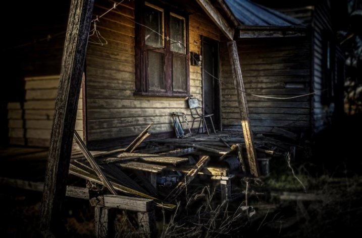
Home built in the 30s and then abandoned only a few years ago.

I have lots of images that may be art, but they are not what I would call fine art photographs.

Fine Art Photography

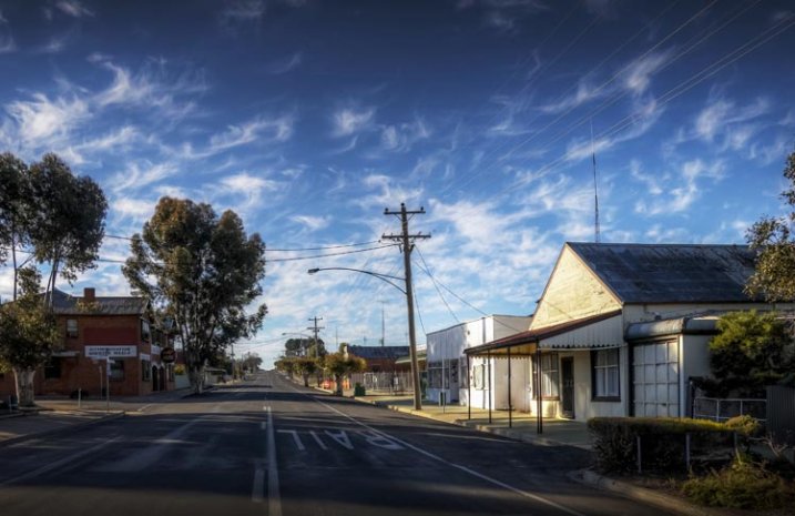
The main street of a small town in Australia.

Both images would look nice framed and hanging on a wall, but if what you are trying to achieve is fine art, then only the first one would really fit that category.

Recently I heard a photographer online saying that you could go wacky on an image, add a weird curving blur, then call it fine art. That doesn’t make an image artistic, that just makes it silly.

There doesn’t seem to be a definitive explanation or definition for what Fine Art Photography is, but there do appear to be things that help define what it is.

When I was doing my fine art degree, part of what was required was to take turns putting our work up on the wall for critique. During these sessions we talked about techniques, what was working, and what wasn’t. We would also discuss the ideas behind the work and where we wanted to go with it.

On top of those we had individual tutorials with lecturers to help us discuss our ideas and how to achieve them. The idea was to get a plan together of how to go about doing the work, what we could use to support it, and looking at other artists that did similar work to see how they conveyed their ideas. These were invaluable, in that they helped us work out what we were doing and the direction we needed to go.

Fine Art Photography 3

Consumerism, everything becoming obsolete.

Artists Vision

Before work can become fine art the artist has to have a vision of what they think their work will look like.

An Idea

Fine art is about an idea, a message, or an emotion. The artist has something that they want to have conveyed in their work.

That idea or message may be something small, a single word such as abandon, or it may be a whole statement, like exploring the way the moon affects the tides. It is a start. It is like a hypothesis.

Technique

The work you create to demonstrate your vision and ideas has to have a consistency to it. When all the work is together it has to have similarities. Often artists will use the same medium and techniques for each idea.

Body of Work

In the end there has to be a body of work that shows your ideas, subjects and techniques. If you were to get your images into a gallery there would need to be a uniformity to them all.

Artist Statement

Finally you would most likely need an artist statement. A short explanation of what the work is about, why you created it and how.

When you go to a gallery you might look at the work and wonder what it is about, so you look for the artist statement. It will help you figure out what the artists intentions were, the reasons why, and how they created that work.

Fine Art Photography 8

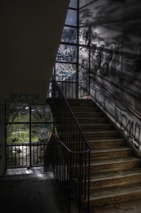
An high school that has been closed a while the vandals have taken over, but the light still comes through the windows.

So you want to be a Fine Art Photographer?

You don’t need to have a degree in fine arts to be a fine art photographer, but you do need to think carefully about your work and what you want to achieve with it.

Getting your edeas together

Brainstorming is a great idea, sitting down and just writing ideas down.

  • What topics do you feel passionate about?
  • What messages do you want to convey?
  • What subjects do you like to photograph?
  • What techniques are you interested in?

Just write and don’t take too much notice of what you are writing, it is about getting your thoughts down on paper. It might not make any sense at first, but as you work through your ideas it will start to do so.

Fine Art Photography 4

Brain storming the idea of consumerism. It doesn’t always make sense, but it is about getting your ideas down.

Once it is done you should have the bare essentials for what you want your work to be about. You might decide to disregard a lot of it, but there should be enough there to help you work out what you want to do, and which direction you want to go.

Deciding on your topic

Topics can be anything. They don’t have to be heavy topics like ones that are really political, or socially conscientious. I used consumerism, as I’ve had a couple of exhibitions that were based on that concept, and the idea that we were turning our homes into massive rubbish (garbage) bins.

Working out your message, or the motivation behind it, can be a little bit more difficult. Perhaps for something like consumerism you might want to explore the impact it has on the environment, or what is going to happen to all the goods that we keep buying.

Finding the subject for your photos

What is your subject matter going to be? Would you photograph rubbish piles? Maybe look directly at the different brands, and all the different products they come out with. What your images are going to be of, is just as important, and should link to your topic or message.

Fine Art Photography 6

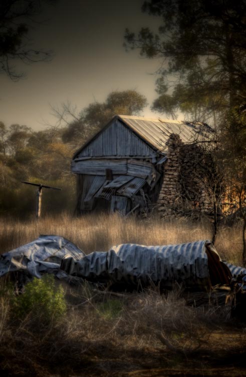
Once a home, built over a hundred years ago, now left, the outside crumbling and grass trying to cover it over.

Working out your technique

The technique isn’t so important, it just has to be the same for all the images. You can experiment to start with, to help you work it out, but once you have what you want then your body of work has to all be similar. You are looking to create a cohesive portfolio that will look great, and connect together when on display.

Creating your body of work

You should make as much work as you can. If you are planning an exhibition, then you need to know now much work you will need for it. When it is all done there are going to be pieces that simply won’t work and you will be better off leaving them out. It is difficult to work out what is best for an exhibition, and just because you made it doesn’t mean it belongs.

Your Artist Statement

Finally you need to write that artist statement. It needs to be written in what they call artspeak, or language that fits in with the art world. It has to sound good. If you are applying to galleries then your artist statement is what they are going to take notice of, just as much as your work.

Here is an example of one written about work around the theme of abandon:

It is human nature to sculpture and contour the environment into shapes and forms that we find pleasing. We live in these buildings, work in them, and find entertainment and nourishment in them. We spend time in rooms designed to help us learn through many stages of our lives. When the buildings can no longer be maintained they fall into decay quickly. My work is looking at the rate of decay and how similar it is to the human condition. How easily we can fall into the same sort of decay when we are no longer being cared for. Through photographs of old, and recently abandoned buildings, I want to explore the metaphor of the human condition with the deserted buildings.

I just made this short statement up, but I hope it gives you an idea of what an artist statement is like. If you do a google search you will find many places that can help you write one. You will also be able to find examples of them to see what other artists are doing, and how they are creating their work.

Fine Art Photography 9

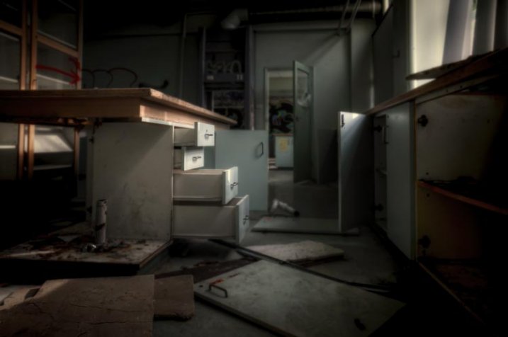
The old science room in the closed school. Things are scattered and nothing makes sense.

Finally

The work should be about you, and what you are passionate about. Don’t worry about what other people think. If you know what your vision is, what your subject is, and how you want to create your work, then your statement should come easily and you will find yourself on a new path, an exciting one.

If you are just making lovely images without any of the above, then chances are you aren’t creating fine art photographs. However, if you have a vision or message, and have ideas that you want to convey through your work then you are more likely to be creating fine art. Perhaps you should think about what you want your work to be about. It is also fine to just take photos because you enjoy it.

googletag.cmd.push(function() {
tablet_slots.push( googletag.defineSlot( “/1005424/_dPSv4_tab-all-article-bottom_(300×250)”, [300, 250], “pb-ad-78623” ).addService( googletag.pubads() ) ); } );

googletag.cmd.push(function() {
mobile_slots.push( googletag.defineSlot( “/1005424/_dPSv4_mob-all-article-bottom_(300×250)”, [300, 250], “pb-ad-78158” ).addService( googletag.pubads() ) ); } );

The post What is Fine Art Photography and How to Do it? by Leanne Cole appeared first on Digital Photography School.


Digital Photography School

 
Comments Off on What is Fine Art Photography and How to Do it?

Posted in Photography


12. Juli 2015

13 Jul

Das Bild des Tages von: Elisabeth Mochner

Eine Frau im Wasser

Im Ausblick erhaschen wir heute einen Blick auf eine Wassernixe.
kwerfeldein – Fotografie Magazin | Fotocommunity

 
Comments Off on 12. Juli 2015

Posted in Equipment


How To Create Two of the Same Person in One Photograph Using Photoshop

12 Jul

This is a fun twist on portraiture that can often tell a bit more of a story about your subject, by allowing them to reveal two or more sides to their personality. It’s an old photography trick used in the days of the darkroom, and now with modern technology can be done in minutes with a few simple steps in Photoshop.

First you are going to need two or more photographs of your subject, so find yourself a victim to experiment on, or try a self portrait. The main trick to this technique is to get things set up well in the shooting stage so everything goes smoothly when you go to edit.

Getting Set Up to Shoot

You’ll need to put your camera on a tripod. Your tripod position, lighting setup, your camera and its settings, all need to remain the same throughout the shooting session. Once you’re set up don’t move or twiddle anything, otherwise things can get a bit wobbly when you go to blend your final images.

It is possible to do this with natural light, but you’ll have to work fast before the light changes too much. If you don’t have studio lighting you can try light painting or some of the other DIY lighting tips from my article Creating Effective Studio Lighting with Household Items

Start with a simple set such as two chairs. To make it a bit more interesting, add something like a small table in between with a prop or two; your subject could be sharing a cup of tea or a glass of wine with themselves.

portrait-photography-trick02

Positioning your subject

Once you have set your stage and are happy with how it looks through the viewfinder, bring in your subject to test out the lighting on them for both positions. Then you are ready to roll.

Think about how the different versions of your subject will interact with each other. Will they be in conversation, raising a glass congratulating themselves on a portrait sitting job well done perhaps? In such a case it’s important to get their line of site correct to achieve the illusion of the subject looking at themselves.

portrait-photography-trick03

It is a good idea, when first attempting this, to ensure there is no overlap of the two versions of your subject, such as a stray foot, to save you any extra fiddling about in the editing stage. You can help to keep both versions separate by placing a small marker, such as a tiny bit of tape on the floor in the middle of your setup, so your subject knows where that invisible overlap line is located.

For the shot below I had the female version lean on a rolled up towel to imitate the knee of the male version of herself. This gave a natural lean to her pose and helped create the illusion that she is actually leaning on the male version’s lap.

portrait-photography-trick04

Take as many shots as you and your portrait subject have the time and patience for. The more versions you have, the better chance of finding a perfect match in the editing stage. Try different facial expressions and poses for each version of your subject.

Easy editing

We are going to be working with layers here, but if that’s new to you don’t panic! It really is easier than you might think. Just follow the few steps below and you’ll be pulling a photographic rabbit out of a Photoshop hat in no time.

  • Open your favorite image of each version of your subject in Photoshop.
  • Make sure both images are the same size.
  • Using the Move Tool, click on the thumbnail of the first image in its Layers Palette, drag over the top of the second image and let go.
  • You now have both images on top of each other in the same file, seen as Background and Layer 1 in the Layers Palette (shown below).

portrait-photography-trick05

  • You’ll need to see both versions, so go to the Layers Palette and select the Layer 1 thumbnail.
  • Using the Opacity slider just above it, slide it around until you can see both images, about 50% usually works the best.

If you haven’t moved anything about during shooting the images should line up perfectly. In which case, you’ve done the hardest part already, it’s smooth sailing from here.

If your setup got bumped, you can probably still line things up well enough to work. Just use the Move Tool to slide around top image and try and get the best alignment. It helps to zoom in to check accuracy (you can also use Auto-Align Layers” in the edit menu but it may be fooled by the subject – but give it a try).

portrait-photography-trick06

Now the fun part

  • Select Layer 1 in the Layers Palette.
  • At the bottom of the Palette is a little square with a circle in it, commonly known as the Add Layer Mask button, or as I like to call it, the Where the Magic Happens button.
  • Click on it and a Layer Mask white box will appear next to the image thumbnail.

It’s not sounding very magic so far, but hang in there.

  • The Background and Foreground Colour squares at the bottom of your Tools Pallette will need to be black on the top (foreground color).
  • Select a brush, set to zero hardness and get ready to make magic happen.
  • Set both Layer and Brush Opacity sliders to 100%.
  • Make sure that white Layer Mask thumbnail is still selected.
  • Start brushing and watch as the second version of your model magically appears, tada!

portrait-photography-trick07

Don’t worry if you go too far, and erase something more than you intended, if you do, you can just switch those little black and white boxes in the Tools Pallette with the tiny arrows (or press X on your keyboard) so white is on top, then brush back in to reverse the mistake (black conceals, white reveals).

That’s it! All the tricky stuff done and dusted.

Now you simply flatten the image. File> Flatten Image, and all that is left is to edit as you would any other photograph. For this image it was a crop here, a filter and color adjustment there, and erasing the umbrella light reflection in the window.

portrait-photography-trick08

This technique is something you can really play with, from building sets and getting creative with props, or simply using it to get more of a story from your portrait subject. Either way, it is great fun to try. If you do, please share your results in the comments. Happy experimenting.

googletag.cmd.push(function() {
tablet_slots.push( googletag.defineSlot( “/1005424/_dPSv4_tab-all-article-bottom_(300×250)”, [300, 250], “pb-ad-78623” ).addService( googletag.pubads() ) ); } );

googletag.cmd.push(function() {
mobile_slots.push( googletag.defineSlot( “/1005424/_dPSv4_mob-all-article-bottom_(300×250)”, [300, 250], “pb-ad-78158” ).addService( googletag.pubads() ) ); } );

The post How To Create Two of the Same Person in One Photograph Using Photoshop by Lea Hawkins appeared first on Digital Photography School.


Digital Photography School

 
Comments Off on How To Create Two of the Same Person in One Photograph Using Photoshop

Posted in Photography


Readers’ showcase: Dan Hogman

12 Jul

Dan Hogman has made a career as an architect, while pursuing photography in his free time. In his eyes the two fields are closely related, and finds photography helps him look for new vantage points to capture architecture he likes. Take a look at his photos and find out more him. See gallery

Articles: Digital Photography Review (dpreview.com)

 
Comments Off on Readers’ showcase: Dan Hogman

Posted in Uncategorized


Die 5 Artikel des Monats

12 Jul

Grüne kaputte Schreibmaschine

Das Wort „Inspiration“ stammt aus dem Lateinischen, von „inspiratio“ und bedeutet so viel wie „einhauchen“ oder „beseelen“. Gerade in kreativen Ausdrucksweisen wie der Fotografie wird dieses Wort verwendet, um einen Vorgang zu beschreiben, der nur schwer in Worte zu fassen ist.
kwerfeldein – Fotografie Magazin | Fotocommunity

 
Comments Off on Die 5 Artikel des Monats

Posted in Equipment


The 5 Biggest Mistakes Newbie Car Photographers Make

12 Jul

It’s true, we all make mistakes, that’s what makes us human, right? Well yes, but there are some mistakes that can, and should be avoided, when it comes to photography. In this article we will be talking about automotive photography in specific. You could be shooting cars for years but if you don’t fix your mistakes, how do you expect to get some great shots?

These are the 5 biggest mistakes that car photographers make when first starting out. Don’t worry, I will tell you how to fix those mistakes so other car photographers stop calling you a newbie, and they might actually ask “HOW?”

1. Not paying attention to the background

IMAGE1

This is a really big no no. If you are striving to be a professional photographer, or even if you’re just shooting for fun, you must pay attention to your surroundings. I have seen way too many pictures where a tree is growing out of a car, or there is trash on the ground, and other annoying little objects that take away from the focus of the car.

If there is a tree in your way, move around. Walk around the car and find a better angle or even move the car if you have to, just make sure there isn’t anything growing out of top of the car. If there is trash on the ground, pick it up and move it (I recommend carrying gloves with you in case you have to deal with some nasty trash).

If there is something that you just simply can’t avoid then don’t worry, you can still remove it in post-processing using the Clone Stamp Tool or Content-Aware fill, but use those as the last resort. You should try to get the best shot that you can in the camera so you don’t have to waste precious time cloning out all that stuff later.

2. Not making sure the car is spotless

If you’re an avid car photographer then you MUST carry a rag of some sort (preferably lint-free) that you can use to wipe any dirt off the car. Yes, you can take out little dirt specks in post-processing, but it will make your life much easier to just take care of it on the spot. It’s not hard to just take the rag and wipe down any dirty areas. This will not only make the car look better/cleaner, thus making your shots look that much more professional, but it will also save you time in post-processing so you can worry about more important stuff.

IMAGE2

3. Not having a circular polarizer

When it comes to shooting cars, it’s like shooting into a mirror; EVERYTHING is reflected off the car. You don’t want that, especially if you have some annoying stuff going on back there like trees, other cars, etc.

That’s where the handy circular polarizing filter comes into play. This will probably be one of your most used pieces of equipment, and should be the very first investment you make if you’re thinking about shooting cars.

Everyone has mixed feelings about polarizers when doing other types of photography, but in car photography there’s no point in even talking or arguing about it, you NEED a circular polarizer. Just don’t buy a cheap one because they will only ruin your images, instead go for a well known B+W circular polarizer, that’s what I, and many other car photographers use, and I haven’t heard any complaints about it.

What is a circular polarizer? Well, it’s basically a little filter that you screw onto the end of your lens, which you can then turn to block off reflections in any part of the frame. What’s cool about it is that you can take multiple shots with different reflection points by using a tripod and then just combining all the images in post-processing to get the best results. Just make sure you don’t go too far, you still want to keep some reflections to show the lines and curves of the car.

IMAGE3

4. Not using a tripod

Speaking of tripods, you need one of those as well. Not just because of the reflections, but to get the cleanest and sharpest shots possible. If you’re like many beginner photographers you have a hard time keeping your hands steady, and it will take some time to master that. If you have a tripod, you can minimize camera shake, which in return, gives you the sharpest images.

Another awesome reason to use a tripod is to do light painting at night. Simply set your exposure to a few seconds, walk around the car with a light source, and in minutes you will have a pretty sick looking shot of the car. Everything you painted over will be visible, and everything else will probably be dark, creating a pretty cool effect that you can’t do without a tripod.

Taking multiple exposures can only be done with a tripod, unless you’re amazing at keeping your hands steady and in one position for multiple shots, which is pretty hard to do. Why would I take multiple exposures? Well, let’s say you take a picture and the car looks amazing, but your sky is blown out. Problem? No problem, if you have a tripod. Just take another shot but this time crank up the shutter speed so you can capture more detail in the sky (don’t worry about anything else for that shot). Now, since you have one image of the car perfectly lit, and another image of the sky looking beautiful you can combine those two in post-processing to get the best looking image, people will be curious how you did it so make sure you tell them. Share the knowledge.

IMAGE4

5. Not getting down low for the best angles

Have you ever seen an image where the car was shot at normal, eye level height? Can you say “boring”?! We all see cars from that point of view on a daily basis, so it gets pretty boring. If you want your shots to stand out, you must try different angles. Get down low, get up high, lay down, just make sure you move around and try different stances so you can get a better angle of the car.

This can get dirty, so make sure you don’t wear your brand new pants and shirt. Don’t be afraid to get down on the ground and capture the car from down there, it will give it a more aggressive look. Who cares if you get dirty, at least your shot will look great.

The best pictures I have seen are of those that are not taken at eye level, but are usually down lower than the normal person is willing to go. But you’re not normal, you’re a car photographer (we’re special).

IMAGE5

That’s all folks

So, there you have it fellow photogs. The five biggest mistakes beginner car photographers make, and how to avoid them. You have been given ways to make your shots look much better – but you will not improve just by reading this, you must go out and shoot, shoot, shoot! The best way to improve your photography skills is to go out, take the skills you learned here, and put them to the test in the real world. But don’t leave without your rag, circular polarizer, and tripod!

Do you have any other tips on shooting cars? Have any of these helped you get better at car photography? Please share in the comments below.

googletag.cmd.push(function() {
tablet_slots.push( googletag.defineSlot( “/1005424/_dPSv4_tab-all-article-bottom_(300×250)”, [300, 250], “pb-ad-78623” ).addService( googletag.pubads() ) ); } );

googletag.cmd.push(function() {
mobile_slots.push( googletag.defineSlot( “/1005424/_dPSv4_mob-all-article-bottom_(300×250)”, [300, 250], “pb-ad-78158” ).addService( googletag.pubads() ) ); } );

The post The 5 Biggest Mistakes Newbie Car Photographers Make by Elvis Pasic appeared first on Digital Photography School.


Digital Photography School

 
Comments Off on The 5 Biggest Mistakes Newbie Car Photographers Make

Posted in Photography


On Assignment: The Light You Don’t See

12 Jul

This photo is 100% flash, 0% ambient. But it almost looks like the reverse. And for this portrait of soprano Robin Steitz, a timeless available-light look was what we were going for.

But when you are working with flash (a single speedlight) and controlling your light (a scrounged “fill blanket” from the couch) you can keep the best of both worlds of strobe and ambient.

Knock it Down, Build it Back Up

The first thing we did was to get rid of everything that we didn’t want. In this case, our available light and everything in the background.

Robin sat at our dining room table, is a ~100 yr old oak farm table. As such, it has a great patina and texture. And it creates a wonderful, simple environment for a portrait.

But the background—a hall and a front door with windows—is distracting. So that went away first. Using a C-stand and arm, I hung a roll of 53″-wide Thunder Gray background paper. Thunder Gray has long been my favorite background paper for portraits—be they in color or B&W. It’s a versatile, deep neutral tone that you can do a lot with.

And today, it takes my visually cluttered hall and turns it into… nothing. Maybe a wall? It just kinda disappears. Background solved.

Now, let’s kill the ambient. Going to ISO 200 and my max sync speed (a rather slow 1/180th of a sec) on my Fuji X-E2 and kit zoom, I dialed down my aperture down to f/6.4. Which finished off my ambient light. Nice and black.

The kit zoom is plenty sharp wide open (love that lens) but as a bonus will be even better in the middle of the aperture range. Most lenses are.

So as of now we have a distilled blank slate. A background that disappears, and an ambient exposure that is pure black. Let’s build from there.

I’m shooting black and white to make a quieter, more timeless photo. Something that could easily have been done in the 1970’s with a 35mm camera and a roll of Tri-X. And that is one of my favorite things about my Fujis. As well as they do color, their black and white looks like film right out of camera.

Even better: turn on the built-in yellow filter setting (red is a bit much for me) and tweak the contrast curves (in camera) until the the B&W look is what you want. To an old-timer like me, it feels a lot like watching a print come up in the Dektol.
__________

Let’s Bring in Some Light

We’re gonna light this with a single speedlight (an LP-180) and my favorite go-to soft mod (a 60″ Photek SoftLighter II).

Using a second C-Stand and arm, the soft light source is floated top and center in front of Robin. And this is where perception meets reality.

What you want: soft light bathing her from all around. Control over the shadows. A light that disappears.

What you get: Soft light, but deep shadows. It’s soft, but it definitely looks “lit,” which ruins the feel of an available light B&W photo.

Here’s the problem. That oak table is very dark, and is giving nothing back to the shadows. We need a big fill card… [looks around the living room] or… a white fill blanket.

That’ll help.

But it didn’t help. It just wasn’t getting enough energy from that flash, even though I had placed it on the table as close as possible—just out of the bottom of the frame.

It was still all key light. Too much key, not enough fill.

But we can solve both of those problems at one time by literally taking the light off of Robin, and pushing it down into the fill blanket. (Don’t laugh. I have used weirder things for fill.)

And that was all it took. Not only do we get a better ratio, but we get total control over the ratio. The more you pull the light away from Robin (and push it down into the fill) the more the key light drops and the fill light rises.

Yes, you are losing key light on your subject. But all you have to do to get the exposure back is to power up your strobe a little. No prob.

Think of that light from the perspective of Robin’s face. It’s sort of a top/bottom clamshell, but not in the traditional beauty light sense. It’s more of a zone of top/bottom light that has a boundary to it. And she is emerging into the edge of it.

So the light pushes into her features without really calling attention to itself. It is not even leaving a signature in her eyes.

And that makes it look not lit. Even though it totally, 100% is lit.

Which in turn makes it look even more like something made out of ambient light and Tri-X, back in the day.


Strobist

 
Comments Off on On Assignment: The Light You Don’t See

Posted in Photography


Course Correction: Deserted Golf Greens into Solar Power Plants

12 Jul

[ By WebUrbanist in Abandoned Places & Architecture. ]

abandoned golf green solar

Derelict putting greens will be put to greener uses in Japan, where an abandoned golf course near Kyoto is being converted to the area’s largest solar energy-generating facility.

Solar power production represents an ideal type of landscape reuse in this context for many reasons: expansive areas with little shade and high sun exposure are perfect for laying out panels for maximum effect and efficiency. Developed by Kyocera, “the plant will generate an estimated 26,312 megawatt hours (MWh) per year — enough electricity to power approximately 8,100 typical local households.”

golf green conversion

Also under construction, a similar project in the Kagoshima Prefecture is being located on an area originally cleared for a golf course that was never finished and occupied. Critical to a country facing power issues in the wake of the Fukushima nuclear incident, these projects are also a sign of land use awareness and changing times. Just a few decades ago country club memberships sold for millions in Japan, but “overdevelopment of golf properties during the real-estate boom of the 1990’s and 2000’s has led to hundreds of idle courses today that are now under analysis for repurposing or redevelopment.” 

green golfing

Of course, closed golf courses are also an international problem well beyond the Japanese archipelago, giving this solution potentially global applications as well, particularly in the United States. Together, these projects should help inspire other countries to turn some of the most environmentally unsound landscapes toward more productive and sustainable uses.

Share on Facebook


[ By WebUrbanist in Abandoned Places & Architecture. ]

[ WebUrbanist | Archives | Galleries | Privacy | TOS ]


WebUrbanist

 
Comments Off on Course Correction: Deserted Golf Greens into Solar Power Plants

Posted in Creativity