RSS
 

Archive for September, 2014

Color-Changing Hammocks: Swing on 20 LED-Lit Circular Chairs

24 Sep

[ By WebUrbanist in Art & Installation & Sound. ]

circular art swing project

Transforming an outdoor recreational space into an interactive evening wonderland, this series of variously-sized swings (and accompanying activities) encourages playful nighttime interactions.

circular swing park area

circular swing set design

Designed by Howler + Yoon Architecture (images by John Horner Photography) and located at Lawn on D in Boston, the focal point of the installation is the set of round hammocks filled with LEDs that change color as you sit on, swing or spin them.

circular round color changing

circular urban swing art

The lights use customized micro-controllers, converting motion into changes in hue and luminosity, starting as a standard white by default. Also on offer: free wireless internet and various backyard-type ball games.

circular swing art installation

circular crescent moon swings

circular light up hammock

The swings come in three sizes and are set to be on display (and open to the public for play) through November, but it might be best to enjoy them now while the summer weather still lingers. But don’t worry: rain or snow, they will leave a light on.

Share on Facebook


[ By WebUrbanist in Art & Installation & Sound. ]

[ WebUrbanist | Archives | Galleries | Privacy | TOS ]


WebUrbanist

 
Comments Off on Color-Changing Hammocks: Swing on 20 LED-Lit Circular Chairs

Posted in Creativity


Astronomie-Fotograf des Jahres 2014

24 Sep

Der Wettbewerb „Astronomie-Fotograf des Jahres“ wird vom Royal Observatory Greenwich und vom BBC Sky at Night Magazine organisiert und läuft bereits das sechste Jahr in Folge. Im Jahr 2014 mit einer Rekordzahl von Teilnehmern: Es gab 2500 Einreichungen aus 51 Ländern.

Die Zahlen zeigen auch, wie spannend und beliebt das Feld der Astrofotografie ist und wie es durch immer bessere Technik für mehr Menschen möglich ist, unglaubliche Ergebnisse zu erzielen.

Die Gewinnerbilder, Zweitplatzierte und Nominierte werden im Royal Observatory Astronomiezentrum in Greenwich noch bis zum 22. Februar 2015 ausgestellt. Der Eintritt ist frei. Ich denke, das sind Fotos, die erst im großen Format richtig wirken. Also, solltet Ihr eine Reise nach London geplant haben, schließt unbedingt auch das Astronomiezentrum in Eure Pläne mit ein. Für alle die es nicht nach London schaffen, gibt es auch das Buch „Astronomy Photographer of the Year: Collection 3“* mit den Fotos des Wettbewerbs.

Im Folgenden präsentieren wir Euch die Erstplatzierten jeder Kategorie. Um auch die Zweitplazierten und Nominierten zu sehen, schaut doch auf des Webseite des Royal Observatory vorbei. Und wenn Ihr selbst Astrofotografie betreibt: Auch im nächsten Jahr wird ein neuer Wettbewerb starten.

Polarlichter über einer Gletscherlagune

Polarlichter über einer Gletscherlagune © James Woodend (Großbritannien) – Gewinner der Kategorie „Erde und Weltall“ und Gesamtsieger.

Leuchtend grüne Polarlichter, aufgenommen in Islands Nationalpark Vatnajökull, werden fast symmetrisch im Gletschersee Jökulsárlón reflektiert. Das Fehlen von Wind und Strömung erzeugt auf dieser geschützten Lagunenszene einen fesselnden Spiegeleffekt und gibt das Gefühl von völliger Stille. Trotzdem zeigt es überraschend viel Bewegung, da die Kurven der Polarlichter von den veränderlichen Kräften des Erdmagnetfeldes geformt werden.

Über einer felsigen Landschaft ein Meer aus Sternen.

Coastal Stairways © Chris Murphy (Neuseeland) – Sir-Patrick-Moore-Preis für den besten Newcomer.

Felsformationen im Bezirk Wairarapa in Neuseeland schaffen einen krassen Vordergrund und Kontrast zu den scheinbar tanzenden staubigen Wolken der Milchstraße. Keine Lichtverschmutzung und eine klare, frische Nacht boten dem Fotografen eine fantastische Gelegenheit für dieses schöne Bild.

Pferdekopfnebel

Pferdekopfnebel (IC 434) © Bill Snyder (USA) – Gewinner der Kategorie „Tiefe des Weltalls“.

Der Pferdekopfnebel ist eines der am meisten fotografierten Objekte am Nachthimmel, aber dieses Bild zeigt ihn in einem ganz neuen Licht. Der Fotograf lenkt das Auge hinunter zu der aufsteigenden und gefalteten Landschaft aus Gas und Staub an seiner Basis, anstatt sich ausschließlich auf die Silhouette des Pferdekopfes zu konzentrieren. Snyder bezieht auch den blauen, hohlraumartigen Bereich an der unteren linken Seite des Pferdekopfs mit ein, in dessen Mitte einen heller Stern steht.

Ein Mensch auf einem Felsen, umringt von einer Sonnenfinsternis.

Hybrid Solar Eclipse © Eugen Kamenew (Deutschland). Gewinner der Kategorie „Mensch und Weltall“.

Sonne und Mond versinken zusammen hinter dem Horizont der kenianischen Savanne, wo ein Mann auf einem Felsen von der Verfinsterung, in der die Silhouette des Mondes vor der grellen Sonnenscheibe zu sehen ist, umrahmt wird. Dieses seltene Beispiel einer hybriden Sonnenfinsternis fand im November 2013 statt und begann als ringförmige Sonnenfinsternis, bei der der Mond nicht vollständig die Sonne blockierte, sodass ein heller Ring unbedeckt blieb.

Im Verlauf wurde die Sonnenfinsternis total und bedeckte die Sonne völlig. Zum Ende der Finsternis trat die Sonne wieder hinter dem Mond hervor und es entstand diese atemberaubende Sichelform. Das Foto ist auch Kamenews Hommage an seinen Freund Geoffrey Lowa, der als Reiseleiter und Fotomodell für diese Aufnahme geplant war, aber leider einige Tage zuvor getötet wurde.

Galaxie NGC 3718

NGC 3718 © Mark Hanson (USA). Gewinner der Kategorie „Roboter-Teleskop“.

Aufgenommen von der Ranch Hidalgo in Animas, New Mexiko. NGC 3718 liegt im Sternbild Großer Bär und ist als eine besondere Balkenspiralgalaxie bekannt. Gravitative Wechselwirkung mit seinen Nachbarn in der Nähe von NGC 3729 (die Spiralgalaxie unten links) sind der wahrscheinlichste Grund für die verzogenen Spiralarme der Galaxie, während eine dunkle Staubsträhne sich um das Zentrum wickelt.

Die Oberfläche Sonne in Großaufnahme.

Ripples in a Pond © Alexandra Hart (Großbritannien) – Gewinner der Kategorie „Unser Sonnensystem“.

Die brodelnde Oberfläche der Sonne spannt sich in dieser bewegenden Aufnahme unter uns auf, die den Umfang und die Gewalt unseres Sterns vermittelt. Die Region der Sonnenaktivität auf der linken Seite würde in ihrer Größe die Erde mehrfach einschließen. Die äußeren Schichten der Sonne verhalten sich optisch wie eine Flüssigkeit, wie der Bildtitel bereits andeutet, und werden ständig gedreht und durch intensive Magnetkräfte verzogen.

Pferdekopfnebel

Pferdekopfnebel (IC 434) The Horsehead Nebula (IC 434) © Shishir & Shashank Dholakia (USA) – Gewinner der Kategorie „Junger Astronomie Fotograf des Jahres“.

Dieses Bild stellt deutlich das bekannte rote Glühen hinter dem Pferdekopfnebel dar, produziert von Wasserstoffgas, das sich durch benachbarte Sterne ionisiert. Das Foto stellt die Wolke aus hochkonzentriertem Staub innerhalb des Pferdekopfs ins Zentrum, der eine Silhouette gegen das rote Glühen wirft und viel von dem dahinterliegenden Licht blockt.

Wir freuen uns schon auf das nächste Jahr und die neuen, beeindruckenden Fotos aus einer Welt, die uns durch Lichtverschmutzung gerade in Großstädten so sehr verschlossen bleibt. Bis dahin schaut in Greenwich vorbei, persönlich oder zumindest virtuell.

* Das ist ein Affiliate-Link zu Amazon. Wenn Ihr darüber etwas bestellt, erhält kwerfeldein eine kleine Provision, Ihr zahlt aber keinen Cent mehr.


kwerfeldein – Fotografie Magazin | Fotocommunity

 
Comments Off on Astronomie-Fotograf des Jahres 2014

Posted in Equipment


Nikon offers 1.5 million Yen in kit and cash as top prize in annual photo contest

24 Sep

Nikon has opened the doors to entries for the company’s annual photo contest, and is offering a top prize of 1m Yen (approx. $ 9200/£5600/€7100) in equipment with 500,000 Yen cash for the overall top prize. Running since 1969 the competition this year will feature 7 categories including a new ‘Home’ theme and a ‘Generation N’ section for 10 entrants aged 19 and under. Learn more

Articles: Digital Photography Review (dpreview.com)

 
Comments Off on Nikon offers 1.5 million Yen in kit and cash as top prize in annual photo contest

Posted in Uncategorized


Photokina 2014: Nikon interview – ‘large-sensor mirrorless could be a solution’

24 Sep

When we visited Photokina last week in Germany we made time to sit down with senior executives from several camera manufacturers. Among them was Toshiaki Akagi, Department Manager in Nikon’s 1st Designing Department. In our conversation we spoke about reaction to the D750, the legacy of the D600 oil problem and the potential for a large-sensor mirrorless camera from Nikon in the future. Click through to read the full interview

Articles: Digital Photography Review (dpreview.com)

 
Comments Off on Photokina 2014: Nikon interview – ‘large-sensor mirrorless could be a solution’

Posted in Uncategorized


Tip for Using a Reflector for Portraits

24 Sep

When it comes to portrait photography, one of the simplest and easiest things you can do to improve your images coming straight out of the camera, is using a reflector. There are many different sizes and shapes of reflectors, and the type of photography that you do most often will often dictate which size and shape you should purchase. For example, if you like to practice street or travel photography, it may be most beneficial to consider a round reflector that’s about 20″ wide so that you can hold it with one hand, and shoot with the other, without being intrusive in a small location like someone’s home. On the other hand, if you think you’d like to use a reflector for wedding photography, it is best to go for something rectangular and much larger (such as a 48×72″) so that the light you’re reflecting can reach everyone in the bridal party during portraits.

Reflector Kit

What kind of reflector should you buy?

I suggest a 5-in-1 round reflector that’s between 40-43″ across because I have found this size reflector to work exceptionally well for individual or small group portraits. Do keep in mind that with this size reflector, you will probably need either an assistant or a stand to hold the reflector during portraits.

5-in-1 reflectors typically come with a pop-up diffuser, and then a reversible zippered pouch to fit over the diffuser that includes white, silver, gold, and black sides. When you’re first beginning to use the reflector, the most difficult part can often be deciding which color reflector is best to use. As is often the case in photography, although there are some rules about when exactly to use each color reflector (my first photography professor in college used to tell us that a gold reflector was for indoor, studio portraits ONLY), the reality is that which color you should choose will vary based on your own style of photography and personal preference, and may or may not always follow the rules. I have found it most helpful to practice frequently with my reflector in a variety of settings so that I’ll have a better idea of a starting point when it comes to a real session.

All that said, I’m a visual learner, and need to actually see something in order to understand it best. So yesterday afternoon, I borrowed my sister Courtney and went to the backyard to take some photos so that you can see what each color reflector looks like in a portrait setting. Each photo was shot in manual mode with exactly the same settings, and every image in this post is straight out of the camera so you can really see the difference a reflector makes without any post-processing. These photos were taken at about 2 p.m. I live in Oregon and we perpetually deal with smoke from forest fires in the summer, so that was the case here as well, but this is also a good example of the difference that a reflector can make on a slightly overcast day.

Reflectors do just what they say—they reflect the light. So, because the direction of light will change depending on the time of day and the objects around you, you will want to experiment with placing the reflector in front of your model, as well as at head-height (often angled up slightly) on either side of your model. In this example, I had my model hold the reflector at chest-level in order to bounce catch-lights into her eyes and eliminate green color casting from the grass below. However, angling the reflector to bounce light from below can draw attention to the neck and chin and may not always be the most flattering way to light every subject. So, experiment with holding the reflector at different heights and angles in order to see what is most flattering on your particular model with your particular source of light.

First up, here’s Courtney with no reflector (below left). It’s not a bad photo, but it also isn’t a very dynamic photo either. I can absolutely add some “boost” in post-processing, but let’s make it better in camera, if we can.

Reflector 1 Reflector 2

White reflector

I started by having Courtney hold the white side of the reflector under her face, about chest-high (above right). As you can see, this really bounced a lot of neutral light up into her face. If you like this look but find that it’s a bit too much light (as I think it is here), you can have your model continue to lower the reflector away from their face until you achieve a more natural light.

Gold reflector

Then we flipped the reflector to the gold side, and had Courtney hold the reflector at waist-height under her face (below left). You can see that this option brought a significant amount of warm light into her face, compared to the image with no reflector. The gold side of the reflector can be tricky, as it can easily make people look a bit radioactive if the reflector is placed too close to the model. I find that I use the gold side of the reflector almost exclusively in backlit sunset portraits, but if you tend to prefer a warmer look to portraits, you may want to reach for this one more frequently.

Skin tone is also particularly important when it comes to the gold side of the reflector, and you will generally find the most success when using the gold side of the reflector on olive skin tones or people who are very tanned. Conversely, the silver or white reflector may be most flattering on people who have blue undertones in their skin.

Reflector 3 Reflector 4

Silver reflector

Next, I unzipped the reflector, flipped it inside out, and turned it to the silver side. I had Courtney hold the reflector under her face at waist-height (image above right). I tend to prefer the coloring here best, but I also need to say that the silver side of the reflector is by FAR the most difficult to work with, as the sheer brightness can essentially be very difficult for a model to look at, resulting in portraits that look like this:

Reflector 5

So, even though I personally tend to like the coloring of the silver side best, I most often elect to begin with the white reflector, simply because the silver side tends to be very difficult for my clients unless they have had lots of modelling experience.

Reflector 6

Black reflector

The black side isn’t a reflector at all; rather than reflecting light, it eats it up. I don’t use the black side of the reflector very often, but it can be useful for increasing shadows in very dramatic images. Can you tell where I was holding the black reflector in the image above? For more on how to use a black reflector to block light readt this dPS article: How to use a Gobo to add Depth to Your Portraits with Subtractive Lighting.

Diffusion part of the reflector

The part of the reflector that I end up using more than any other is actually the diffuser. The diffuser comes in handy when you’re in situations that may have mottled light, or direct sun overhead.

Do you see here how the tree is creating mottled light on Courtney’s face (below left)? In other words, some parts of her face are very light while other parts tend to be shadowed. The easiest thing to do to avoid mottled light is to put the light behind your subject. But, since that’s not always possible, a diffuser is a great thing to have in your bag of tricks as well.

Reflector 7 Reflector 8

The image above right is a pull-back of my husband holding the diffuser over Courtney’s head (and both of them just generally being silly). Notice the shadows on the diffuser – without it, they would be on her face. Instead, the diffuser blocks those shadows, creating more even light and a much more pleasant portrait overall.

Reflector 9

I hope that seeing examples of different colored reflectors used in the same setting has been helpful. I’d love to know, do you own a reflector? How (and which color) do you find yourself using it most often in your favorite style of photography?

The post Tip for Using a Reflector for Portraits by Meredith Clark appeared first on Digital Photography School.


Digital Photography School

 
Comments Off on Tip for Using a Reflector for Portraits

Posted in Photography


DxO Mobile Report ranks iPhone 6 on top

24 Sep

DxOMark has put Apple’s latest through its mobile imaging tests and published its findings. This assessment put the iPhone 6 (and its iPhone 6 Plus sibling) at the top of its mobile rankings, pushing the Samsung Galaxy S5 and Sony Xperia Z3 to positions three and four, respectively. See how the iPhone 6 performed in DxOMark’s testing and find out how it compares to its peers. Read more

Articles: Digital Photography Review (dpreview.com)

 
Comments Off on DxO Mobile Report ranks iPhone 6 on top

Posted in Uncategorized


6 Great Reasons to Get over Post-Processing Anxiety

24 Sep

I’m baffled when my workshop students tell me that they find image post-processing to be a chore, a dreaded task that prevents them from even looking at their beautiful photographs more than once. If you’re one of those types, I’m here to tell you that you’re missing out on a delicious second hit of creative joy.

1 – Don’t Miss Out – Post-Processing is Half the Fun

Night Photography with high ISO - Gavin Hardcastle

Unprocessed version below. Total processing time = five minutes. Steps taken:

  1. Boosted blacks and shadows
  2. Reduced whites
  3. Increased exposure by +1
  4. Increased clarity
  5. Increase contrast
  6. Subtle noise reduction
  7. Subtle sharpening

Victoria Night Photography - Gavin Hardcastle

I think one of the reasons that I love photography so much is that I get that double whammy of artistic creativity. The first is when I’m out taking the shot, often standing in awe at the scenery unfolding before me. The second hit is when I get back home and start processing my images.

When I’ve shot an image that I know is really strong, I can’t wait to get that RAW file opened up so that I can relive the moment and get creative with my processing to realize the visual feast that I witnessed when I was on location.

2 – RAW Files are Your Best Teacher

RAW file processing of Landslide Lake - Gavin Hardcastle

Unprocessed version below. Total processing time = three minutes. Steps taken:

  1. Boosted blacks and shadows
  2. Reduced whites
  3. Added high contrast grad filter just above water level to emphasize mountain structure
  4. Increased clarity
  5. Increased contrast
  6. Subtle sharpening added
  7. Increased vibrance
  8. Increased red highlights in the foreground

Unprocessed RAW image of Landslide Lake - Gavin Hardcastle

The first thing that you’ll learn when processing your images is what you did wrong. Maybe you selected the wrong aperture, perhaps your ISO was too high and your image is full of noise, or maybe you just focused in the wrong spot.

By processing and essentially studying your own photographs, you’ll quickly learn which techniques you need to improve and what you could have done to make your images better. If you got everything right when taking the shot, you’ll have loads of fun tweaking the most quality out of your RAW file, and producing an image that you’re proud to share with the world.

If you simply don’t care about sharing your images that’s fine, but if you’ve captured a beautiful moment in time, chances are that most people will gain pleasure from seeing your work. Don’t be so shy, process that image and show the world what you made.

3 – Didn’t Get it Right in Camera? No Problem

It’s totally possible to capture a truly beautiful image in camera, that requires minimal or zero processing, and that’s something you should strive for. However, most of the time there are technical challenges that our cameras simply can’t handle. That’s where image processing comes to the rescue. This could be as simple as red-eye reduction, right through to noise reduction and fixing blown out highlights.

When you’ve become adept at image processing, you’ll be far more daring in your photography by taking photos that you otherwise thought might have been too noisy, too blown out, or unusable for whatever reason. Having even a basic understanding of image processing will open your creative horizons and give you more confidence.

4 – The Camera Sees What You Did Not

aroura-borealis-photography-gavin-hardcastle

Unprocessed version below. Total processing time = five minutes. Steps taken:

  1. Changed the white balance
  2. Reduced whites
  3. Reduced red highlights in the foreground
  4. Increased clarity
  5. Increased contrast
  6. Applied heavy noise reduction
  7. Added subtle sharpening
  8. Increased vibrance

aroura-borealis-unprocessed-photography-gavin-hardcastle

There are times when your camera can see things that you might have missed or were not capable of seeing. When shooting aurora like the image above, most cameras are able to record colours that are barely visible to the naked eye. Some of this processing happens in the camera, but until you look at the RAW file and see what can be done to clean up your image, you won’t realize the full potential of the moment that you captured.

In the image above, I chose the wrong white balance while shooting, and wasn’t really happy with the colours until I switched the white balance to Tungsten in Adobe Camera Raw. I could have done this in camera, while shooting, but everything looks awesome on the little LCD screen on the back of the camera so I thought it was fine until I got back home.

High ISO images of the Milky Way or an aurora might be totally unusable until we’ve cleaned up the noise, fixed any white balance issues and corrected the contrast – among other things.

5 – It’s Easier Than You Think

Sve Your Adobe Camera RAW Defaults

This is how I do it in Adobe Camera RAW. Once you’ve tweaked your most commonly used settings such as lens profiles, chromatic aberration, shadows, highlights, etc., click on the top right tab and then choose ‘Save New Camera RAW defaults’. This well be called up automatically when you next open a RAW file.

A lot of the grunt work can be taken out of editing your images by the simple act of saving your default processing settings to match your camera and lens. Whether you process your images in Adobe Camera RAW or in Lightroom’s Develop Module (which is almost the same thing), you can save your most commonly used processing settings as a default file that will automatically be applied to any RAW file that you open.

This is a real time saver and can be used as a great starting point. There’s no one setting to suite all images, but if you often shoot the same types of images, it’s good to have a default setting that is already pre-configured for your equipment and processing style.

You can even save multiple presets so that if you change your shooting style for different projects, you’ve already got your previous go-to processing settings to get you off to a quick start. From that point, simply tweak your settings until you’re happy.

6 – Black and White Saves the Day

buttle-lake-the-hand-monochrome-conversion

Unprocessed version below. Total processing time = five minutes. Steps taken:

  1. Boosted blacks and shadows
  2. Reduced whites
  3. Converted to black and white
  4. Increased clarity
  5. Increased contrast
  6. Added a vignette
  7. Used the dodge brush to accentuate tree root highlights

buttle-lake-the-hand-unprocessed

I often shoot images that I know will work in black and white much more effectively.

Let’s say I really like the composition that I’ve got and the weather conditions are just perfect, except for the fact that there isn’t much colour in my scene. In those situations I’m already looking forward to converting my image to black and white which can sometimes result in a much more punchy, and dramatic image than the original colour version.

You can easily do the conversion in either Photoshop or Lightroom. Then have fun playing with contrast, shadows and highlights and maybe even a little dodge and burn to accentuate key areas.

Start Processing Your Images Right Now

I hope these six reasons have convinced you that it’s worth setting aside just a little bit of time to process your images. You might discover that you’re a much better photographer than you realized. At the very least, you’ll be able to figure out where you went wrong, and what you need to do to improve your photography.

Maybe you’ll even learn to love image processing as much as you loved taking the shot.

The post 6 Great Reasons to Get over Post-Processing Anxiety by Gavin Hardcastle appeared first on Digital Photography School.


Digital Photography School

 
Comments Off on 6 Great Reasons to Get over Post-Processing Anxiety

Posted in Photography


Rebel Architecture: 6-Part Series on Global Guerilla Urbanism

23 Sep

[ By WebUrbanist in Architecture & Cities & Urbanism. ]

architecture spider

In a series of six superb videos, Al Jazeera explores the gritty reality of architects and urban designers as activists in destinations from Vietnam and Nigeria to Pakistan and Brazil. Five of these 25-minute episodes are embedded in full as videos below, with summaries to let you see which you may wish to view – that said, each of the six is well worth watching!

abandoned warehouse spain

In Guerrilla Architect, Santiago Cirugeda, an architect from Seville who has dedicated his career to reclaiming urban spaces for the public, deals with difficult realities in “austerity-hit Spain, where the state has retreated and around 500,000 new buildings lie empty.”

Fortunately, he notes: “In times of crisis, people come together to find collective solutions.” One of his challenges, as covered in this mini-documentary, is converting an abandoned half-finished factory into a vibrant new cultural center.

architecture of violence

In The Architecture of Violence, Eyal Weizman “explains architecture’s key role in the Israeli occupation of Palestine and the evolution of urban warfare.” He explains that “architecture and the built environment is a kind of a slow violence. The occupation is an environment that was conceived to strangulate Palestinian communities, villages and towns, to create an environment that would be unliveable for the people there.”

In this episode, local Israelis and Palestinians explain in candid interviews “how it feels to live in a landscape where everything, from walls and roads, terraces and sewage, to settlements and surveillance are designed to ensure the separation of the two peoples, while simultaneously maintaining control.”

Next Page – Click Below to Read More:
Rebel Architecture 6 Part Series On Global Guerilla Urbanism

Share on Facebook


[ By WebUrbanist in Architecture & Cities & Urbanism. ]

[ WebUrbanist | Archives | Galleries | Privacy | TOS ]


WebUrbanist

 
Comments Off on Rebel Architecture: 6-Part Series on Global Guerilla Urbanism

Posted in Creativity


Choosing a Tripod

23 Sep

For lighting photographers, the first thing to consider about a tripod is this: a tripod is your most powerful light.

That’s because time (AKA shutter speed) is what we use to bring up the exposure in a large environment, which we then tweak/improve with judicious use of added flash. It is very difficult to light a large space, so just let the ambient do the heavy lifting and finish it off with your lighting genius.

And even when you are not lighting, you’ll frequently need a tripod for a variety of reasons. And when you do, you want it to hold your camera still.

To that end, every photographer needs good sticks.

There are a couple of schools of thought about how to choose a good tripod. But no matter which way you go, the most important thing is this: don’t waste your time and money on a piece-of-crap version. You’ll just have to re-buy it later.

Ask any photographer who has been around long enough to make mistakes, and you’ll probably hear tales of woe over misspent dollars in an attempt to save money on tripods. Alas, good tripods aren’t cheap and cheap tripods aren’t good.

I just had a direct experience with this problem on a recent series of assignments for Lynda.com, wherein we were traveling around the world shooting and filming in various cities. My (young) shooting partner saved some money by buying an inexpensive, “feature-ladened” tripod.

Actually, scratch that obfuscation. Let’s name names. He bought a “Vanguard” Tripod, and it turned out to be a piece of crap. (Don’t judge. It’s a common mistake.) The Vanguard was wobbly up top, and very quickly, one of the legs would not grab and click into the open position.

(You had ONE JOB, Vanguard tripod…)

After much swearing on Andrew’s part (and general uselessness on that of the tripod) he looked into repairing the probably-not-worth-fixing piece of gear. Though clearly defective—and still in warranty—Vanguard wanted Andrew to pay shipping both ways for the repair. Essentially, he’d be buying the cheap tripod again.

Ugh.

Look, don’t do this. Just don’t. Instead, do your research, ask around, buy a good tripod and be done with it.

To Start…

Independent of the factors listed below, here’s my first advice: go for a name brand with a good reputation.

Manfrotto, Gitzo and Induro are good examples. None of them are cheap, but they are also likely to not let you down. They are supported by a great reputation and solid service, the same way your camera is supported by a good tripod.

Don’t save money by buying a tripod that is spec’d to do less than you need it to do. That’s another mistake. And you may find there is not a one-size-fits-all tripod for you. The optimal tripod for your big bird-watching rig might be overkill for your travel photography needs.

Similarly, a tripod designed for travel photography—even if a quality brand—might be way under-sized for your big lens work.

So like most shooters you’ll probably end up with two tripods. One as a heavy-duty platform and one that is much more portable.

General Purpose Tripods

Your first tripod will probably be one that can do everything well, but maybe sacrifices extreme portability. And that’s a good strategy.

Again, go with a good brand and buy enough support for your needs. If money is tight, rather than skimping on the brand I would suggest buying good quality, but buying used.

The 20-yr-old old metal (more on that variable below) Gitzo Reporter Performance pictured above is total, rock-solid support. It was bought used (eBay) reasonably and will last me the rest of my life and well into someone else’s.

Used quality is a better choice than new crap. But if you have the money to spend, by all means take some time and test drive some new tripods in person. You’ll quickly get a feel for the solidity and quality of the various options.

But go with a brand that has a good reputation. Or skimp, curse a little and get it right on round two.

Specialty Tripods

By specialty, we generally mean portability: small, light, reverse-folding, etc. This is the tripod you take with you when you travel, or when shooting smaller mirrorless cameras. Or both, obviously.

For extreme portability in addition to solid support at the mirrorless level, I like the MeFOTO Backpacker, ($ 139 – Amazon) seen above. It is not full-sized, as it only goes to about chest-height.

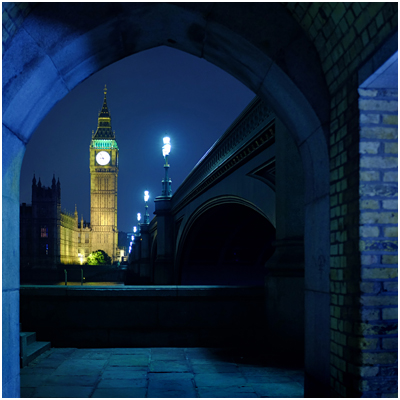
But—BUT—it reverse folds to a very compact 12.6″, which makes it a total win for travel or backpacking (duh, the name) with mirrorless cameras. It is super-compact, and well-built. I used it with a Fuji X100s to make the photo of London’s Big Ben, above.

If you shoot full-sized DSLR, I would suggest stepping up to a MeFOTO GlobeTrotter. It is bigger, more stable, goes up to 64″ in height and has a retractable center column while still keeping the reverse-fold design. Even still, it folds to just 16.1″ long. ($ 209 – Amazon). As a bonus it converts to a monopod, which is nice.

You can spend an extra $ 160 on the GlobeTrotter and go carbon fiber, which saves you a pound. But for that price you can literally buy both and have $ 20 left over. Or $ 160 would get you a great, second general-purpose tripod used.

Speaking of…

Carbon Fiber or Metal?

Tough choice. Carbon fiber is more expensive—sometimes shockingly so. For instance, an Induro (carbon) CT-214 cost $ 400—for just the legs (no head). But you can get the same legs (an AT-214) in aluminum for $ 149.

Those are both great supports. And identical, except for the material used in the legs. But is the weight difference, at 3.3 vs. 4.4 lbs, worth that much to you? Or, perhaps will the size of the tripod itself be the limiting factor in your suitcase or backpack that outs it from travel for you?

If the carbon version really fits your total needs and you can afford the price tag, maybe that’s cool. Or maybe you buy metal for big support and a MeFOTO for travel. You would save money (over $ 100 in this example) in the process.

And honestly, that’s what I’d do.

Either way, the worst, worst, worst thing you can do is to throw money away on a crap tripod. Consider my lessoned learned (and that of literally millions of photographers before you) sufficient warning.


Strobist

 
Comments Off on Choosing a Tripod

Posted in Photography


23. September 2014

23 Sep

Ein Beitrag von: peppi124

©-peppi124


kwerfeldein – Fotografie Magazin | Fotocommunity

 
Comments Off on 23. September 2014

Posted in Equipment