RSS
 

Archive for July, 2014

VSCO launches $1M artist initiative fund

14 Jul

Image sharing and film emulation service VSCO has launched a scholarship fund totaling $ 1 million. Calling it the Artist Initiative, the program assists photographers and visual artists chosen by the company with funding and promotion of their work. The first round of recipients has been announced, including 12 creatives from across the globe. Learn more 

Articles: Digital Photography Review (dpreview.com)

 
Comments Off on VSCO launches $1M artist initiative fund

Posted in Uncategorized


Four Reasons to Display Photos of Your Children

14 Jul

As parents and photographers, we take thousands and thousands of photos of our children every year. Looking at my Lightroom catalogue from last year, I have over 3000 photos of the kids, and that doesn’t include all the pictures I took with my phone camera!

Amy lee 3

In our house, the camera is always out. I take pictures of them throughout the day, no matter what they’re doing. The kids know the camera is a part of our lives, and they don’t act differently when they see me taking pictures of them, as some adults would.

I’m a big believer that photos are too precious to live on computers. Hard drives fail and images can get lost so your best insurance is having the tangible photo right in front of you. Twice a year I go through thousands of our photos to print a few for display, I recommend you do this also.

Amy lee 2

In our house, we use photos as home decor. We have a couple large collections of photos throughout the house, smaller prints displayed everywhere, as well as photobooks alongside the framed photos.

These photos really are a gift because it helps us remember how much we are loved, and it reminds us how blessed we are to have each other. There are times when I have had a bad day and seeing a photo of us laughing and hugging each other reset my mind and helped me remember what is most important.

Aside from these reasons, here are four other reasons why you as parents (or grandparents) should display photos of your kids.

Self-Esteem

It is amazing to see what a boost of confidence and self-esteem comes to the child whose parents display a lot of photographs of them around the home. Your children understand that you have taken the time to hang, frame, and display their photos, and it makes them understand that you value them, find them to be beautiful, and want to see them each day.

Amy lee 1

Memories

In the hectic pace of modern family life we can forget what kids looked like only a year earlier. Images not only give us a glimpse into the past, but they can also bring us back to the moment in an instant. Remember how proud you felt when your child was a newborn and how perfectly they fit in your arms? Photos bring you back to those feelings when the photos were made.

Forgotten

How often do you scroll through your phone’s photo roll or look at the folders full of images on your hard drive? Hard drives could fail and images could be forever lost. Why lose out on the opportunity to put all of those smiling faces on your walls? You have a museum full of gorgeous artwork just waiting to be printed.

Sharing

When you print out and display these images in your home it opens a dialogue and creates a habit of sharing memories. Kids may not look at certain photos for a long time, and then suddenly lean in and remember something important. When some of these photos were taken during the best moments of your lives, it is worth reliving and remembering.

I could go on with the list, but these are the reasons I continually hang new photos on the walls and update my displays. Do you have others? Do you display your photos in your home?

Other related articles:

  • How to Create a Family Photo Essay
  • Click! How to take gorgeous photos of your kids – a dPS ebook
  • How to photograph children {and other stuff} indoors


Editor’s challenge: this is something I feel strongly about as well, so I challenge you. If you have not got any printed photos of your own family around your house – do it now. Go select a few, order the prints, and get them framed. Or make a photo book. Or both! Involve your kids in helping select the images, make it a family project. Then take a photo of your newly hanging family artwork and share it with us here in the comments.

The post Four Reasons to Display Photos of Your Children by Amy Lee appeared first on Digital Photography School.


Digital Photography School

 
Comments Off on Four Reasons to Display Photos of Your Children

Posted in Photography


Abandoned Alien Homestead: Forsaken UFO House in Florida

14 Jul

[ By Steve in Abandoned Places & Architecture. ]

UFOhouse_mainx

Painted pink and encrusted with graffiti, the abandoned UFO house in Homestead, Florida, has a backstory as mysterious as its otherworldly architecture.

Lions & Tigers & Bears, Oh My!

abandoned Florida UFO house

abandoned Florida UFO house

Located in Homestead, Florida, the so-called “UFO House” (or “Alien House”) was built around 1974 when the town’s population was roughly 15,000. Forty years later, Homestead is home to just over 60,000 yet the UFO House, situated at 37350 Southwest 214th Avenue, is still remarkably isolated… as if the original owner wasn’t interested in having neighbors, EVAR. Credit Abandoned Florida for many of these crisp, clear & creepy images.

abandoned Florida UFO house

abandoned Homestead Florida UFO house

abandoned Homestead Florida UFO house

abandoned Homestead Florida UFO house

Lessee now, why would someone of obvious financial means in ’70s south Florida take steps to ensure exclusivity above and beyond the call? One doesn’t have to consult Sonny Crockett and Rico Tubbs to arrive at a plausible explanation and a decades-long rumor mill has helped fill in the gaps. The prevailing theory goes something like this: the original builder-owner was allegedly involved in drug trafficking using the front of being an exotic animal importer. The contraband was supposedly hidden in compartments built into the floors of the animal cages. Say hello to my leetle friend, Tony Montana the Tiger!

abandoned Homestead Florida UFO house

abandoned Homestead Florida UFO house

“My friend lived down a dirt road from this place,” relates someone who visited the UFO House around 1979. “It was out in the middle of agriculture fields off of Palm Drive as I remember. We used to ride her dirt bike down there to look at these exotic animals that were caged in back of the house, mostly big cats like tigers and jaguars. We had heard the rumors about it being a drug smuggler using the animals as a cover and one day when we went around the outside of the property a man came out of the house, jumped into a car (old Monte Carlo?) and chased us through the fields. We were terrified and he wouldn’t let up until he caught up with us (we were just 2 twelve year old girls tearing along these dirt roads on a tiny dirt bike). He finally caught us and told us not to ever go back there.” Thanks to Flickr user KACP (Kris Alan Carter Photography) for the above images.

Next Page – Click Below to Read More:
Abandoned Alien Homestead Forsaken Ufo House In Florida

Share on Facebook


[ By Steve in Abandoned Places & Architecture. ]

[ WebUrbanist | Archives | Galleries | Privacy | TOS ]


WebUrbanist

 
Comments Off on Abandoned Alien Homestead: Forsaken UFO House in Florida

Posted in Creativity


In Photos: Cincinnati’s impressive ‘Old Main’ public library

13 Jul

Cincinnati, Ohio’s current downtown public library is grand in its own right as one of the busiest branches in the country. But its predecessor, demolished in 1955, was nothing short of stunning. Built in 1874, the ‘Old Main’ library was originally intended to be an opera house, with a towering atrium that instead became home to five tiers of stacked bookshelves. These photos capture the grandeur of the library and its popularity in its own time. See gallery

Articles: Digital Photography Review (dpreview.com)

 
Comments Off on In Photos: Cincinnati’s impressive ‘Old Main’ public library

Posted in Uncategorized


The Camera Histogram Explained

13 Jul

This video does a great job of explaining how the histogram on your camera works and how to read it.

I do slightly disagree with his tip on having a mountain in the center is the best option, as it does depend on the subject. If you are photographing a black cat on a black sofa that would be an incorrect overexposed image.

For more info on histograms check these dPS articles:

  • Histograms: Your Guide To Proper Exposure
  • How to Read and Use Histograms
  • Understanding Histograms

The post The Camera Histogram Explained by Darlene Hildebrandt appeared first on Digital Photography School.


Digital Photography School

 
Comments Off on The Camera Histogram Explained

Posted in Photography


13. Juli 2014

13 Jul

Ein Beitrag von: Michael Moeller

Seifenblasen vor einem Gebäude


kwerfeldein – Fotografie Magazin | Fotocommunity

 
Comments Off on 13. Juli 2014

Posted in Equipment


13, July 2014 – LuLa Team Is On The Move

13 Jul


The LuLa team is on the move. As you read this Kevin Raber is already in Svalbard, Norway  to lead two back to back photography workshops on the M/S Malmo.  Svalbard is just about as far north as any land mass can be.  From there the group will explore the area and head into the ice pack looking for Polar Bear, Reindeer, and Walrus.  In addition they will visit some beautiful landscapes and giant glaciers.  A full report will follow after the trips.  Don’t forget you can be part of adverntures like this.  Join us in 2015 for our Fly Over The Drake – Antarctica Workshops (spaces available on both trips)

Kevin will be testing a NEW 150-600 Tamron zoom lens and the Sigma dp2 Quattro. The Quattro is a most unusual camera and we will have a full report in August on this camera by Kevin and Michael.

Michael is headed south to Mexico and will be publishing articles on a  regular basis from there.  He will also be finishing a big project he has been working on and you can expect to hear more in a few weeks on it.  We have also been very busy working on a number of new video tutorials and we’ll have more news on those in August.  

And, before much longer we’ll be off to Photokina and be reporting on the all the news directly from Germany.


The Luminous Landscape – What’s New

 
Comments Off on 13, July 2014 – LuLa Team Is On The Move

Posted in News


browserFruits Juli, Ausgabe 2

13 Jul

„Kreativität entfesseln“ heißt unser aktueller Wettbewerb mit Wacom und wir hoffen, dass Ihr schon fleißig am Planen seid oder sogar die ersten Ergebnisse habt. Um Euch noch etwas zu motivieren: Wacom legt zum Gewinn des Wacom Cintiq Companion noch die Tastatur oben drauf. Wir sind schon sehr gespannt auf Eure tollen Bilder. Und wenn Ihr gerade erst davon hört: Noch bis zum 12. August könnt Ihr mitmachen.


Fotospecial: Klassisch schön – schwarzweiße Männerportraits

Flickr

500px


Deutschsprachig

• Erinnert Ihr Euch noch an diesen Artikel? Das Projekt „Rumäniens Ruhrpott“ wurde inzwischen erfolgreich finanziert und auf der brandneuen Webseite sind die ersten Ergebnisse in Form von Texten, Fotos und Videos zu sehen. Das Projekt kann weiterhin unterstützt werden!

• 1935 reichte ein Studiofotograf bei einem Wettbewerb, der das schönste Arierbaby suchte, ein Foto ein und gewann. Das Problem: Das Baby war jüdisch.

• Nach dem Glastonbury Festival dauern die Aufräumarbeiten sechs Wochen. Unglaubliche Bilder von dem Chaos, das die Besucher hinterlassen haben.


International

• Angst vorm Monster unterm Bett? Laure Fauvel lässt in seiner Serie „Terror“ Kinder gegen diese Ängste kämpfen und die Monster erschrecken sich furchtbar.

• „IRÉEL“ heißt die neue Fotoserie von Flora Borsi, in der sie fotografische Elemente mit Maltechniken vermischt.

• Passend zur WM: Renato Stockler fotografiert Fußballplätze in Sao Paulo.

• Mitch Dobrowner jagd Stürmen hinterher und fotografiert diese beeindruckenden Naturgewalten.

• Allessandro Puccinelli erfüllte sich 2011 einen Traum und reiste mit einem Wohnmobil die portugiesische Küste entlang. Abends parkte er immer am Strand und fotografierte sein rollendes Heim auf Zeit unter schillerndem Sternenhimmel – höchst romatisch!

• Maidan durch den Sucher: Ein Blick hinter die Kulissen eines Projektes der Fotojournalistin und Teil des VII-Kollektives, Anastasia Taylor-Lind.

• Aktuelle Bilder des Beschusses auf Gaza.

• Der Fotograf F. Brunelle fotografiert Menschen, die sich SEHR ähnlich sehen, aber einander gar nicht kennen oder miteinander verwandt sind. Der Artikel dazu ist ebenfalls interessant, weil er der These nachgeht, dass es nicht mehr als 500 „Vorlagen“ für menschliches Aussehen gibt.

• Gregg Segal fotografiert Menschen in dem Müll, den sie innerhalb einer Woche produzierten. Längeres Hinsehen ist lohnenswert, da sich der Müll von Person zu Person unterscheidet – wobei von vielen der Müll, den sie zum Shooting mitbrachten, vorsortiert wurde.


Neuerscheinungen und Tipps vom Foto-Büchermarkt

Buchtipps

• „Photographs Not Taken“* versammelt Essays von verschiedenen Fotografen, die über Bilder schreiben, die sie nie gemacht haben. Die Gründe sind vielfältig. Das Buch kostet 10,90 € und ist bisher nur auf Englisch erhältlich.

• Magnum-Fotograf Elliott Erwitt präsentiert seine wichtigsten Werke im Bildband „Personal Best“* auf ganzen 448 Seiten. Erschienen ist das Buch im teNeues Verlag für 49,90 €.


Wettbewerbe

• Das Thema der vierten Ausgabe vom HANT – Magazin für Fotografie steht fest: „SCHÖNE NEUE WELT“. Dazu könnt Ihr Einzelbildern, Fotoserien und Texte bis zum 31. Juli einreichen.


Zitat der Woche

People say photographs don’t lie, mine do.

David LaChapelle –

Mehr Zitate


Videos

Barcelona GO! ist ein Video, das einen unvergesslichen Ausflug durch Barcelona in zwei Minuten möglich macht. Es handelt sich dabei nicht um ein Zeitraffer-, sondern ein Flow-Motion-Video. Absolut sehenswert.


* Das ist ein Affiliate-Link zu Amazon. Wenn Ihr darüber etwas bestellt, erhält kwerfeldein eine kleine Provision, Ihr bezahlt aber keinen Cent mehr.


kwerfeldein – Fotografie Magazin | Fotocommunity

 
Comments Off on browserFruits Juli, Ausgabe 2

Posted in Equipment


How to use the Contrast Checker Technique to Give Your Images More Punch

13 Jul

I am about to reveal a technique that will have your images looking awesome in seconds every time you use it. I am even going to share the Photoshop Action with you so you can edit in lazy mode, I mean efficiency mode! Before I bare all, I need to give you some background information, and I am pretty sure you have been in the exact same position at some point in your photography hobby or career.

DPS Tutorial Image 9

Not long ago, early 2010, I was horrible at photo editing. I was literally tossing my camera in a box and packing it away. My problem was that I was extremely frustrated with the quality of my images. Not necessarily the composition or the subject matter, but I couldn’t get my images to look “good” like all the photographers who were crushing views on Flickr. Thank goodness 500px was not around at the time, I really would have hated my photos.

Just before I sealed the tape on my box of photo gear I discovered High Dynamic Range imaging. Wait, before you judge me, I have been doing it long enough to know the process is not everyone’s cup of tea. However, the HDR process, from the brackets to the tone mapping, forced me to embrace new techniques I never would have dreamed of prior to stumbling upon it.

I started to understand my camera on a level that was foreign to me prior to that time. I also began to accept that it was not necessarily the camera making the great photos, but the person behind it and, more importantly, their post-processing techniques. Nonetheless, I became a tone mapping fool. I tone mapped everything, my car (for the record a Scion xD does not necessarily need to be HDR’ed), candid pictures of my wife, food, candid pictures of my wife eating food, I really tone mapped everything.

You have probably been there before as well, anyone new to HDR thinks it is the greatest thing on everything from the urban landscape to the selfie in the mirror. I would really shy away from the latter of the two! Through all of this understanding and acceptance came another realization, the HDR process can wreak havoc on the contrast in a good photo.

Through the HDR process you are mapping tones from multiple images to obtain one photograph that gets the best of both worlds with a vast amount of detail. The problem with this is that shadow areas lose their depth when too much detail is revealed, and areas that were specular highlights, or inviting highlight blowouts, tend to compress in ways that make them look dark, dingy and stale. Let’s not forget about the hideous over-saturation that can occur if you take the sliders too far.

So how do you combat this? How do you analyze a photograph, HDR or not, and tell what it needs to make it better?

It’s all about contrast

The answer, while simple, holds complexities that can take years to train your eye through trial and error. We are not about to let it take you years to understand. The secret is contrast which is the key to making better photographs right now.

You may know that the Contrast slider exists in nearly every post-processing program, but what is contrast? Simply stated, contrast is the ratio between light and dark in a photograph. If there is no contrast the image appears to look predominantly gray and dismal. On the flip side, an image can be too “contrasty” or devoid of gray (mid tones), a battle between white and black. It is difficult to see this on a color photograph since contrast typically deals with tone.

I studied Fine Art in college, I was a Printmaker (Woodcut, Etching, Screen Printing, and Lithography). I had a fabulous professor. She told me a piece of information once that changed my art forever during a one-on-one critique.

She said if I ever had a question about how harmonious my color print was that I should take a picture of it and convert it to gray scale. If it did not have strong black and white points with a smooth grayscale gradation somewhere in between, then it needed work.

Like any normal college kid, I did not understand her methodology at the time and I rarely took her advice. It was not until nearly ten years later that her advice finally clicked.

The Contrast Checker Technique

You can use this technique in every aspect of your workflow: beginning, middle, and end. It keeps your contrast in check throughout the process. Rightfully so, it is named “Contrast Checker”.

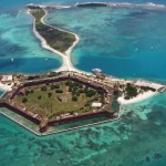
The photograph below is a tone mapped photo of Kansas City, straight from Photomatix Pro. You should always try to tone map your images so that they are not too dark, too light, too saturated, or too stylized.

DPS Tutorial Image 1

Let’s Check the Contrast you can download the image and follow along if you would like (there is also an Action and a video at the end if you learn better from video)

Step one

Create a new Gradient Map Adjustment Layer to create a Black and White photo.

Step two

Ensure that the Gradient Map is set to Black and White. By default the Gradient Map Adjustment Layer will pull from the colors that you have set as your foreground and background in the tool bar. To ensure they are set to Black and White press the “d” key to reset them to the defaults.

Step three

Make a new Curves Adjustment Layer above the Gradient Map. Your Layers Palette should look like this and your photo should be Black and White.

DPS Tutorial Image 2

Step four

While in the Properties of the Curves Adjustment Layer press and hold “Alt” (Option on Mac) and click the Black triangle on the bottom of the Curve.

Step five

Your photo may turn all white with a little bit of black. This is telling you where black is present in your photo. If your photo is all white with no black specks then your photo currently contains no black point. Move it slightly to the right until more black starts to appear.

DPS Tutorial Image 3

Step six

This is called clipping (no detail). By clipping the blacks you are telling Photoshop what you want black to be in the photo. It is important that you do not take this too far, you want a solid black point in the photo, but you don’t want to destroy your shadows either.

Step seven

Now press and hold “Alt” (Option on Mac) and select the White Triangle.

Step eight

Your photo should turn all black with little specks of white. This is telling you where pure white is in your photo. If your photo is all black with no white specks then your photo currently contains no white point. Move it slightly to the left until more white starts to appear.

DPS Tutorial Image 4

Step nine

Just like the blacks it is important that you do not take this too far to the left as you will be clipping too much of the whites. You are going for just a bit of clipping beyond the specular highlights.

Step ten

The reason you are doing this on a grayscale photograph is to ensure that you are only seeing the clippings of the lights and darks. If you were to do the same thing on a color photograph you would see the clippings for all of the colors within their channels. This makes the process a bit more difficult.

Step eleven

At this point you should already be seeing more drama in your photograph, but you can take it a step further.

Step twelve

Click on the Targeted Adjustment Tool within the Properties of the Curves Adjustment Layer. This allows you to target specific areas of the photo and edit them independently on the tone curve.

DPS Tutorial Image 5

Step thirteen

With the targeted adjustment tool selected, as you hover over the image you will see what is being effected on the tone curve. For this image I started with the lighter colored grass. I clicked on it and dragged the cursor up making it even lighter.

DPS Tutorial Image 6

Step fourteen

I also selected the darker colored grass and moved the cursor down to make it darker.

DPS Tutorial Image 7

Step fifteen

I then selected an area in the sky that was close to white, but contained a little bit of detail, and dragged the cursor up to make it brighter.

DPS Tutorial Image 8

Step sixteen

At this point you should be looking at a black and white photograph with much more contrast than you started with.

Step seventeen

The magic happens when you delete the Gradient Map layer to reveal the Curves effect on the original color photograph.

DPS Tutorial Image 9

Step eighteen

If you are not satisfied with the effect the Curve has on the colors in the photo you may change the Blending Option to Luminosity which will only allow it to effect the tones in the image, protecting the color saturation.

For more tips and tricks and to see how the downloadable action for this process works watch the video tutorial below.

The post How to use the Contrast Checker Technique to Give Your Images More Punch by Blake Rudis appeared first on Digital Photography School.


Digital Photography School

 
Comments Off on How to use the Contrast Checker Technique to Give Your Images More Punch

Posted in Photography


What The Duck #1350

13 Jul

We’ve come to the end of another week here at dpreview, and as our thoughts drift to weekend shooting opportunities, it’s time to take things a little less seriously. Aaron Johnson’s comic strip ‘What the Duck’ is just the thing, taking a gently satirical look through the lens of a photographically inclined waterfowl. You can find it published here (and in our newsletter) every week; we hope you enjoy it, and your weekend.

Articles: Digital Photography Review (dpreview.com)

 
Comments Off on What The Duck #1350

Posted in Uncategorized