RSS
 

Archive for July, 2014

How To Photograph Shy Adults

22 Jul

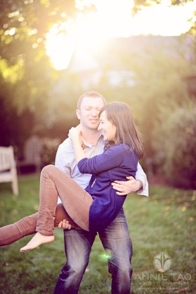
Some people are not as comfortable in front of the camera as others. Perhaps they are shy, or perhaps they believe they have physical “imperfections”, so they aren’t at ease when it comes to having their photo taken. (I put quotes around that term because often these are not imperfections at all, but rather, beautiful parts of their body that they over-think.)

Unless they are a professional model, most people fall into this category to some degree. If they don’t feel comfortable, it will show in the photos. Luckily, there are things you can do that may help.

Annie-Tao-how-to-photograph-shy-adults-article-shy-woman-2

Give your subject something to do

Holding a pose will often garner an awkward expression. Thus, photograph them as they move. People are much more comfortable when they are in motion, than when they are still.

They don’t have to do anything overly complicated. The movements can be subtle, like looking up from a head-down position or fixing something, like part of their clothes.

Annie-Tao-how-to-photograph-shy-adults-woman-with-hands-in-pocket

Do your social psychology homework

Photographing people is part technical and part psychology.

For most people, you cannot start shooting the second your subject arrives and expect them to look natural, so communicate with them before the shoot if they are shy or concerned. Children aren’t the only ones who need time to warm up!

Make sure your subjects know how the shoot will go and what they need to do to prepare for it. If they are concerned about something, address it as quickly as possible. The longer a concern goes unresolved, the more it will grow.

Perhaps they have a scar on their arm they feel self-conscious about. Once you know that, you can address it, like letting them know you will try your best to avoid shooting it. Maybe they aren’t sure what to wear that will flatter their curvy body, so you can give them clothing suggestions or reassure them that you will use certain angles and lighting to accommodate this. Or maybe they are just plain shy, in which case, you want to make sure you talk to them! Let them know a little about you. Talk about common interests.

Making your subjects feel at ease is a very important and integral part of portrait photography.

San-Francisco-East-Bay-engagement-photography-man-helps-move-fiancees-hair-out-of-her-face

Avoid silence

When you have a shy or uncertain subject, being silent for a length of time can be unnerving for them.

Talk to them during the shoot, but be careful not to bark orders at them (ie. “Sit there, look here, put your hand like this, move your body like that!”) because that will achieve the opposite of what you want.

Rather, tell them what they are doing right, so they know to keep doing that, and explain what you are doing before you do it.

The entire shoot doesn’t have to be instructional or too commentated, but a little bit of talking will make your subject feel more confident and “safe”. With these feelings, personalities and natural expressions will surface.

Annie-Tao-How-to-photograph-shy-adults-article-man-carrying-woman

If you are photographing children, you’ll want to read: How to Photograph Shy Children as well.

Do you have any other tips for working with people? Please share in the comments below.

The post How To Photograph Shy Adults by Annie Tao appeared first on Digital Photography School.


Digital Photography School

 
Comments Off on How To Photograph Shy Adults

Posted in Photography


Subway Cars to Churches: 15 Creatively Converted Offices

22 Jul

[ By Steph in Architecture & Offices & Commercial. ]

Converted Offices Soccer 1

Anything from a graffiti-covered subway car to a Route 66 gas station can become the setting for creative modern offices. Architects and intrepid homeowners have converted junked buses into home offices, $ 20 construction trailers into backyard studios and subterranean garages into company headquarters.

Slice of an Old Bus Turned Home Office
Converted offices School Bus 1

Converted Offices School Bus 2

One creative thinker in Hungary saw something most of us wouldn’t when he gazed at an old bus sitting in a junkyard: a corner office. That is, a home office in the corner of his bedroom, made from a sawed-off section of the bus. A new paint job and working lights give the bus a fun update.

Former Steel Plant to Light-Filled Work Space
Converted Offices Steel Plant 1

Converted Offices Steel Plant 2

The existing shell of a former steel plant has become a wide-open industrial setting for the offices of engineering firm IMd, with sections in the two-story structure linked by foot bridges. Translucent volumes set within the large space provide quiet and private places to work and meet without sacrificing the spacious feel.

Underground Garage to Architecture Studio
Converted Offices Garage 1

Converted Offices Garage 2

Half-hidden by an overgrowth of ivy, all that’s visible of this architecture office from ground level are a few desks and some unusual lighting. Architect Carlo Bagliani remained an underground car garage as an inhabitable workspace filled with industrial accents. A long glass wall facing the lawn prevents the subterranean space from feeling dark and cramped.

Low Budget House-to-Office Conversion
Converted Offices Low Budget House

Austrian architecture firm Bad Architects turned a house in Innsbruck into their own office on a tight budget using sliding-wall systems made of foam to divide the interior spaces. The foam panels feature cut-out patterns that let light pass from one space into another, and give the office visual appeal from the street.

Graffiti-Covered Subway Cars to Rooftop Offices
Converted Offices Subway Cars 1

Converted Offices Subway Cars 2

Graffiti-covered subway cars (or ‘tube carriages’ as they’re known in the UK) were hauled onto a rooftop and stacked together to create offices for international arts charity Village Underground. The spaces are leased to creative small businesses and art-related start-ups, who’d naturally feel right at home in a reclaimed urban space decorated with vivid street art.

Next Page – Click Below to Read More:
Subway Cars To Churches 15 Creatively Converted Offices

Share on Facebook


[ By Steph in Architecture & Offices & Commercial. ]

[ WebUrbanist | Archives | Galleries | Privacy | TOS ]


WebUrbanist

 
Comments Off on Subway Cars to Churches: 15 Creatively Converted Offices

Posted in Creativity


Creating Abstract Images in Nature

22 Jul

What is a working definition of “abstract” nature photography? Nature so easily lends itself to subjects realistic and dream-like, but what about abstract? You may have heard it said “If it is recognizable as an object – it is not an abstract,” but let’s challenge that notion.

Abstract pics_0006_Diagonal Lines

There are no clear rules to abstract photography. The object of the photo may or may not be recognizable. Abstract images may contain a small portion of an object or multiple objects. An abstract will often concentrate on a limited area of a subject that reveals a shape, pattern, form, color or texture. Movement can also create abstract images, such as rushing water or the wind blowing a flower. To capture an image in nature as an abstract, you don’t need any special equipment – just a camera, and the most importantly, your own imagination. What matters most is that your photograph reveals an eye-pleasing image, whether you can identify the actual subject or not.

In this article you are not going to find any magical camera settings to create abstracts, because you need to think “outside the box“. Discovering the right setting is often the key to a great abstract. Don’t be afraid to put your camera in manual mode, and experiment with different apertures and shutter speeds. Remember that your aperture will control your depth of field, and your shutter speed affects the sharpness or blurriness of the image. Likewise, normal rules of image composition do not always apply to abstract photography. The key is to become super-observant, looking for even the smallest of objects with which to create an abstract image.

Where we look to other forms of photography to tell a story or record an event, abstract photography is about capturing an emotion. There are five key elements you want to consider in creating abstract images: lines, shapes, textures, patterns and colors:

Lines

Lines are the base element of design, and their uses are the fundaments of any artistic image.

  • Lines that intersect are lines that come from different directions into and out of an image, which can give the viewer a sense of chaos.
  • Curved lines allow the viewer’s eye to explore the image in a smooth free-flowing manner, evincing a much calmer emotion than straight lines.
  • Repetitive lines or lines in repeating patterns manifest a sense of power and predictability, rhythm and movement in an image.
  •  Diagonal lines are more visually pleasing than verticals or horizontals and will lead the viewer’s eyes at a much slower pace than a straight up-down line. (By rotating your camera you can turn your verticals and horizontals into diagonals.)

Abstract pics_0007_out of the fog

Shapes

Shapes are found everywhere in nature, and can be used to create visual meaning in a photo. To capture an abstract image, choose a shape that is interesting and pleasing to the eye. It’s very important that the shape creates an emotional response from the viewer; this is called the “wow” factor.

  • Circles evoke flow, continuity and sensuality.
  • Triangles create a sense of stability if set on their base, or precariousness if set on their point.
  • Squares exhibit stability and order.
  • Spirals create a sense of energy, flexibility and life cycles.

pink flower

 Textures

Texture is created by the roughness of a surface and may seem to be completely random. Textures are often a product of lines. Light and shadow create depth (a macro lens can be useful to capture textures).

Abstract pics_0009_rocks

Patterns

Patterns are similar to textures, but are much more structured. Patterns can sometimes be mathematically composed by Mother Nature, for example; snowflakes and spider webs.

Abstract pics_0001_spiders web

Colors

Colors in abstracts are useful in catching your viewer’s attention.  Look for complementary colors as they will hold your viewer’s attention longer.

Abstract pics_0000_fall colors

Some other tips to get started on your photographic nature abstract project:

  • Photograph common objects. Trees, rocks, gravel, seashells, dew drops – even the most common of subjects can produce abstracts.
  • Use depth of field to capture the image you want. Change your F-stop (aperture) to control your depth of field.  This is especially useful when shooting textures, when you may need your entire subject to be tack sharp.
  • Use motion. Using a slow shutter speed to capture objects in motion can create some very interesting effects.
  • Experiment with your white balance. As mentioned earlier, in abstract photography you do not always need to follow the usual rules of   conventional photography and you are free to tweak your white balance to create interesting colors.
  • Adjust color saturation to create pleasing colors and look for complementary colors.
  • Look for creative uses of light for varying effects on your abstracts.

Abstract pics_0005_rushing water

Abstract Blurs

Another method to experiment with uses camera motion to create abstract blurs. Motion blurs are perfect for those nature settings that lack creative inspiration. This method takes a lot of experimentation and you will throw away a lot more images than you keep, but the rewards are worth it when you finally capture that great image. Look for subjects with lines, bright colors and good contrast, like trees and flowers. Warning: this method can become addicting!

Abstract pics_0003_first light

To set up your camera for abstract blurs:

  1. Set the camera to manual or shutter priority, which ever you are most comfortable with using.
  2. Set your ISO as low as possible.
  3. Set shutter speed between 1/4 and 1/20, depending on what your subject is and how close you are to it. Far-off objects may require a slower shutter speed than closer ones to get the blurred effect.
  4. Adjust your aperture to get a good exposure as you would normally do for any image.
  5. Look for lower light conditions such as early morning or late evening which will allow for slower shutter speeds without the need of using a very small aperture. It may become necessary to use a Neutral Density filter if your scene is too bright.
  6. Set your Focus. It is important to focus your camera on the subject even though your resulting image will not appear to be in focus. Press your shutter release half way down to focus on your main subject (back button focus can be a useful tool here).
  7. Now with your subject still in focus, move your camera to follow the lines of your subject, depressing the shutter as you pass by your main subject, it is important to follow through after the shutter is closed. This will keep all your color tones consistent all the way through your exposure. Experiment with the speed of your camera movement to find the best result.
  8. Repeat, until you get a result that is pleasing.

In conclusion, the next time you are out with your camera, be observant and look for visual details and interesting ways to express your emotional and artistic viewpoint with an abstract image found in nature. If you have any other ideas on how to make abstracts in nature, please share in the comments below.

The post Creating Abstract Images in Nature by Bruce Wunderlich appeared first on Digital Photography School.


Digital Photography School

 
Comments Off on Creating Abstract Images in Nature

Posted in Photography


21. Juli 2014

21 Jul

Ein Beitrag von: Bastian Kalous

Me And The Land © Bastian Kalous


kwerfeldein – Fotografie Magazin | Fotocommunity

 
Comments Off on 21. Juli 2014

Posted in Equipment


15 Influential Photographers Share Their Quotes for Inspiration

21 Jul

Pursuing a career doing something you really love could be a terrifying thing, so people often look at the ones who already “made it” in their field as a source of inspiration. Having a chance to hear famous photographers talk about how exactly they made it and what it costs to be a successful photographer inspires us to work harder Continue Reading

The post 15 Influential Photographers Share Their Quotes for Inspiration appeared first on Photodoto.


Photodoto

 
Comments Off on 15 Influential Photographers Share Their Quotes for Inspiration

Posted in Photography


Mit Wanderlust durch Kanada

21 Jul

Jonathan Moyal ist 25 Jahre alt und fotografiert seit sechs Jahren. Nach dem Abitur realisierte er sich den Traum von einer Reise durch Australien. Er kaufte sich eine Kamera, um Erinnerungen mitzubringen. Aber es war der Anfang von etwas, das heute eine Leidenschaft geworden ist, ja fast sogar eine Obsession, wie Jonathan schreibt: Die Kombination aus Fotografie und Reiselust.

Im Moment reise ich zum ersten Mal durch Kanada. Die Erfahrung ist neu für mich. Ich versuche, die Schönheit der Landschaft zu erfassen und sie mit Menschen in Beziehung zu setzen. Versuche, meine Reise in einen „lyrischen Epos“ zu verwandeln, indem ich spontan bin und trotzdem jedes minütliche Detail in Betracht zu ziehen.

Wenn man sich selbst inmitten solch einer spektakulären Landschaft befindet, kann man nur träumen und das Beste daraus machen, um die Schönheit der Lichter und Farben einzufangen. Ich möchte ein ehrliches Bild machen von dem, was ich fühle, was ich sehe. Es ist nicht einfach, ich arbeite daran.

„La course au cheval blanc“ nennt er die Serie, die auf seiner Reise enteht. Es sind Bilder, die Lust auf neue Abenteuer machen, auf Nachtwanderungen und wilde Wasser.

Ein Mann balanciert auf hohen Holzstegen.

Eine Frau beugt sich zu einer weißen Katze hinunter.

Eine Frau steht vor einem Tippi.Eine Frau steht im Profil vor einem Tippi. Ihre Haare fliegen im Wind.

Landschaft mit Bergen. Am Horizont ganz klein eine Preson.

Eine Person steht vor einem See. Im Hintergrund ein Berg.Eine Person am See. Im Hintergrund ein Berg.

Ein Pärchen steht in der Dämmerung zwischen Bäumen am See.

Ein zugefrorener Bergsee.Eine Person steht an einem Bach.

Eine Person läuft über steiniges Gelände.

Der Wald und ein See mit Sternenhimmel.

Ein See bei Dämmerung. Eine Person mit Fackel steht am Rand.Eine Frau sitzt am Rand eines Abhangs. Unter ihr ein Bach.

Eine Frau läuft am Rande eines Sees.

Eine Frau steht mit wehendem Kleid am Rand des Baches.

Mehr Bilder und Serien des französischen Fotografen Jonathan Moyal könnt Ihr auf seiner Webseite finden. Auch auf Facebook und Flickr ist er vertreten.


kwerfeldein – Fotografie Magazin | Fotocommunity

 
Comments Off on Mit Wanderlust durch Kanada

Posted in Equipment


Time Lapse Videos Made Easy

21 Jul

Extra photos for bloggers: 1, 2, 3

If you had the power to speed up time you could have romantic sunsets in under a minute or knit a scarf in just 30 seconds.

The Digital Time Lapse Camera gives you that magic! It takes high quality wide angle photos and smashes them into a ready-to-watch video at the touch of a button.

The latest version of our beloved Time Lapse Cam sports better quality optics, low light recording capabilities and a wide angle lens for more interesting shots.

Set it up on a shelf at a hoppin’ party or on a tripod in your growing garden and let it snap tonso pics and stitch them together for you.

Say buh-bye to intervalometers, complicated settings menus and hours of post processing. The Digital Time Lapse Cam is all the magic you need.

Make Time Lapse Vids at the Touch of a Button
$ 249 at the Photojojo Shop


© Britta for Photojojo, 2014. |
Permalink |
No comment |
Add to
del.icio.us

Post tags:


Photojojo

 
Comments Off on Time Lapse Videos Made Easy

Posted in Equipment


How to Create a Vintage Look using Lightroom

21 Jul

How to create the vintage look in Lightroom

Before you create a vintage look using Lightroom, you have to decide what characteristics you think that look should have. It may mean different things to other people, but here’s my version. Photos with the vintage look are nostalgic, evoking the look of faded photos taken decades ago. There may be a colour cast or faded blacks, and they should look as if they may have been taken with film.

What is your definition of the vintage look? Whatever it is, once you have arrived at it, you can think about how you can achieve that look in Lightroom.

Using Lightroom Develop Presets

The easiest way to create a vintage look is to buy Develop Presets or download free ones. Don’t worry, I will explain how you can create the vintage look yourself, without buying somebody else’s presets, in the second part of this article. But I think it’s wise to acknowledge that sometimes the easiest path is to let someone else do the hard work of figuring out the mechanics, and buy into their expertise.

By the way, if you are new to presets, my article A Concise Guide to Lightroom Develop Presets will give you an introduction to the subject.

Free Vintage Develop Presets

An easy place to start is with onOne Software’s free Develop Presets for Lightroom. I recommend Nicolesy’s Matte Presets for Adobe Lightroom 5 and the onOne Signature Collection Presets (available for Lightroom 4 and 5). There are also some presets for Lightroom 2 and 3 if you are using those versions.

You can also try these free vintage presets from Presets Heaven.

This comparison shows you some of the effects you can create with these presets. Please remember that the best way to use Develop Presets is as a starting point. Once you have applied the preset you can then go to the right-hand panels and tweak the settings to get the most out of your photo (something I haven’t done with these examples as I wanted to show you how they work straight out of the box).

How to create the vintage look in Lightroom

A. Original photo B. onOne Signature Collection: Vintage – Grandma’s Lemonade preset C. Nicolesy Matte Lightroom Presets: Nicolesy Matte 2 preset D. Presets Heaven: PH Vintage IV preset

Best Paid Vintage Develop Presets

Not everybody wants to pay for Lightroom Develop Presets (my article Are Lightroom Develop Presets Worth the Money? asked that question) but there are certainly some great preset collections out there if you don’t mind doing so. I recommend (and have personally bought and used) the following:

Nicole S. Young’s Vintage Fade presets. These are the least expensive out of all these preset packs. The set includes Photoshop Actions and ACR presets as well as Lightroom Develop Presets.

Lightgram Instafade presets. These presets emulate the beauty and nostalgia of film. I like Lightgram’s presets a lot. They also have some free presets you can try out.

Really Nice Images Faded Films presets. These are the more expensive than the others, but you get nearly twice as many presets plus a toolkit to help you tweak the settings. But most importantly they are really good.

How to create the vintage look in Lightroom

A. Original photo B. Nicolesy Vintage Fade: Rainfall preset C. Lightgram Instafade: Lightgram Faded 12 preset D: Really Nice Images: Faded Films – Utah Monochrome preset

How to create the vintage look yourself

Now it’s time to take a look at a few of the techniques you can use to create the vintage look yourself in Lightroom.

1. Fade out with the Tone Curve

Go to the Tone Curve panel and raise the left side of the RGB curve upwards. Doing so removes true black from the photo, making the darkest tones lighter. How far you move it is up to you – the best way is to judge the effect by eye.

You’ll get the best results when the RGB curve starts from its linear position (a straight line from bottom-left to top-right). If you are planning to use the Tone Curve to create a matte effect, it is best to carry out tonal adjustments such as increasing contrast in the Basic panel. You may also wish to reduce Saturation or Vibrance to weaken the colours in the photo, emphasizing the vintage look created by the matte effect.

Alternatively, click on the RGB curve three times (where the lines intersect it on the grid) before lifting the left-hand corner. This gives a slightly different look. Experiment with both techniques to see which one suits your particular photo best. This is what the curves look like.

How to create the vintage look in Lightroom

A. Linear curve B. Entire curve raised. C. Left-hand side of curve raised only.

This is how those curve adjustments affect the photo.

How to create the vintage look in Lightroom

A. Linear curve B. Entire curve raised. C. Left-hand side of curve raised only.

Using the RGB Tone Curve applies a matte effect without affecting the colour. However, you can play with the colour curves as well. If you use the same technique on a colour curve, it affects the colour of the photo as well as the contrast. Here are a couple of examples.

How to create the vintage look in Lightroom

A. Blue curve raised. B. Red curve raised.

2. Split toning

Another way to add colour is with split toning. The basic concept is simple. Apply a warm colour to the highlights (such as orange, red or yellow) and a cool one to the shadows (for example blue, dark green or teal). You may be aware that warm colours appear to move towards the viewer, and cooler ones away. Split toning builds on that principle.

How to create the vintage look in Lightroom

A. Original photo. B. RGB Tone Curve raised (neutral colour). C. Split tone applied. D. The Tone Curve and Split Toning settings used for these photos.

Conclusion

Now you know how to create a vintage effect in Lightroom. If you have any other tips for creating a vintage effect, please leave them in the comments below.


Mastering Lightroom: Book Four – The Photos ebookMastering Lightroom: Book Four – The Photos

My new ebook Mastering Lightroom: Book Four – The Photos takes you through ten beautiful examples of photography and shows you how I processed them step-by-step in Lightroom. It explores some of my favourite Develop Presets and plug-ins as well as the techniques I use in Lightroom itself. Click the link to learn more.

The post How to Create a Vintage Look using Lightroom by Andrew S. Gibson appeared first on Digital Photography School.


Digital Photography School

 
Comments Off on How to Create a Vintage Look using Lightroom

Posted in Photography


Don’t Believe In Heroes With Addie Mannan

21 Jul

Addie Mannan "People Dont Believe in Heroes Anymore" Wins Photo Of The Week on Fashion Photography Blog (FashionPhotographyBlog.com)FashionPhotographyBlog.com sat down with Photo of the Week winner, Addie Mannan after winning her round. The theme of the week was “Fashion Warriors” and no doubt, her winning photo from her series “People Don’t Believe in Heroes Anymore” was the people’s choice that best represented the theme. As the winner of Photo of the Week, I caught up with Addie to find out more about her photographer’s journey and the inspiration behind her winning photo.

So how did Addie’s journey begin? Growing up in Tucson, Arizona she was first introduced to photography by her parents when they gave her a gift of a Canon Rebel SLR. Her career started with a photographer’s position at Rembrandt Photography where she worked while completing her studies. The photographer explained that “I was lucky and knew at a young age what I wanted to do and have been working towards that goal ever since.  As I got older my passion for photographing people became apparent and soon my love for fashion photography became my passion.

I went to school at Northern Arizona University and got a Bachelors of Science degree in both photography and advertising.  While I was in college I did an internship in New York at Ralph Lauren, working under David Friedman. That was my first taste of real world photography for a big company and David did a really wonderful job of teaching us a lot about the business side of photography. “

Since assisting David Friedman at Polo Ralph Lauren in New York City and holding an internship at Arizona Republic Magazines Custom Publishing Group in Phoenix Arizona, Addie revealed that “During and after college I worked at a studio in Tucson Arizona while still working personal jobs on the side.  Eventually, I grew enough to leave the studio and started freelancing full time.  I moved to Portland Oregon four years ago and have had the chance to grow and expand my business drastically.”

Addie’s work has been published in numerous publications across Arizona and in the Best of College Photography Annual by Photographers Forum Magazine. She has more recently worked will clients such as Bratty Hat Co, Curves Cabaret, Kiva Studio, Lucratif Clothing, Oro Dental Medicine, Raiders Reef, Source Salon, Studio West, Toni and Guy and Vero Amore.

With an array of clients she has worked for she has developed her own style, “I have a dreamy, almost creepy, style that has some cinematic qualities to it. When I watch movies, sometimes I will miss everything that’s going on in a scene because I am concentrating on figuring out how they lit it and what time of day it was shot.”

Speaking of the cinematic qualities of her shooting style, I asked her how did the inspiration behind her winning photo from her series “People Don’t Believe in Heroes Anymore” came about. The photographer answered that, “This was a shoot for Kiva Studios.  Bethany, the owner, wanted a post-apocalyptic, Mad Max style to show off her recycled fashions.  We did a two day shoot at a car wrecking yard and an airplane boneyard.  It’s still one of my favorite shoot to date.” Shooting this series Addie used a Canon 5D and Alien Bee with a beauty dish.

To contact Addie and to find more information about her winning photo and any other photos from the series you can find them on her website here and contact her via email.

Website: www.addiemannan.com

Email: info@addiemannan.com

Currently, we have another round of Photo of the Week running. To participate in the voting, make sure you “like” our Facebook page here and vote for your favorite photographer‘s photo out of the finalists in the comments section of the post. The photo with the most vote’s by the end of the week at Sunday midnight will win Photo of the Week and win the great prizes on offer.

Since FashionPhotographyBlog.com is Google’s #1 site on fashion photography in the world, you might be interested in entering our Photo of The Week competition. This could be your entry to some great exposure if you submit your photo and win. To find out more details on how to enter, make sure you join our mailing list. We will send you the entry details via your email. As a reminder, voting ends at the end of the week so make sure you get voting our Facebook page here.

What do you think of Clayton’s winning photo? We want to know what you think. Tell us in the comments below, do you agree with how this week’s voting outcome? What is your critique on this photo? We want to hear from you!

Addie Mannan: “Never stop creating!”


Fashion Photography Blog

 
Comments Off on Don’t Believe In Heroes With Addie Mannan

Posted in Uncategorized


Seoul, die jadegrüne Stadt

21 Jul

Ein Beitrag von: Arif Asci

Seoul ist ein ganz besonderer Ort auf Erden! Heutzutage hat fast jeder Dritte den Song „Gangnam Style“ auf YouTube gesehen. Ein hypnotisches Stück Musik und Tanz, das allmählich jeden, der es ansieht, dazu zwingt, mitzumachen. Psy ist der populärste Musiker Südkoreas.

„Gangnam“ ist so etwas wie die Avenue des Champs-Élysées in Paris, wo sich das Geld, Fashion- und Marken-Läden für einige der schönsten Mädchen von Asien aneinanderreihen. Was Psy in seiner Musik nun macht, ist, sich über diese versnobten, neureichen Leute lustig zu machen.

Während Korea vor 50 Jahren nur ein armes Bauernland war, genießt es nun, eine der weitentwickeltsten Wirtschaften der Welt zu sein. Und Seoul ist das glänzende Aushängeschild Koreas mit fast 15 Millionen Einwohnern. Während Weltkonzerne wie Samsung, LG und Hyundai High-Tech-Produkte verkaufen, werden koreanische Filme und TV-Serien in vielen Ländern konsumiert.

Ein Mann mit gemustertem Shirt auf der Straße.

Eine Frau in gestreiftem Shirt vor einem Zebrastreifen.

Als Straßenfotograf habe ich Gangnam tatsächlich nur ein einziges Mal besucht. Es hat mir nicht sehr gefallen und ich habe mich stattdessen gefragt, wo das bescheidenere koreanische Straßenleben zu finden ist, wie in Hungic, Insadong, Myongdong und versteckte schmanische und buddhistische Tempel hier und da, natürlich auch Marktplätze und kleine Gässchen.

Seoul liegt an einem Fluss, sogar einem richtig großen, doch leider verhindert die gierige Stadtplanung lockere Strände, an denen man sich wundern und Leute beobachten könnte. Aber das Stadtzentrum ist sehr dynamisch, besonders abends und sogar nachts, dann liegt ein unglaublicher Rhythmus in der Luft.

Eine Frau in grünem Kleid im Schatten.

Einige Frauen auf einem Fest.

Man kann Seoul nicht beherrschen oder gefangen nehmen, dafür nimmt sie dich sofort gefangen. Ich sage absichtlich „sie“, da Seoul ziemlich feminin ist. Die Farben der Stoffe, die koreanische Frauen tragen, sind so eizigartig, dass ich schnell anfing, mit diesen farbenfrohen Motiven zu spielen. Und ich denke, dass die Stadt generell eine besondere Farbe trägt: Jadegrün!

Meine erste Reise nach Seoul war vor vielen Jahren, 1998, und es war nur für ein paar Tage, sodass ich mich nur an die graue, feuchte Luft erinnere und an eine von einem Erdbeben zerstörte Straße. Leider! Ich habe kein einziges Foto von dieser Reise. Es war nur ein kleiner Zwischenstopp auf einer ziemlich billigen Rundreise von Hong Kong nach Taipei, Tokio und Seoul.

Zwei Menschen und ein Hund zu ihren Füßen.

Ein Dackel an der Leine auf der Straße.

2007 wurde ich eingeladen, eine Fotoausstellung in Seoul zu eröffnen, die mein Leben für immer verändern sollte. Es war ein Istanbul-Panorama mit Schwarzweißfotos. Während der dreiwöchigen Ausstellung wollte ich die pulsierende Stadt mit meiner sperrigen, mit Schwarzweißfilm geladenen 6×17-Panorama-Kamera festhalten, wie ich es seit vielen Jahren in Istanbul machte. Aber es hat nicht funktioniert!

Koreaner bewegen sich so schnell, die Stadt bebte vor Farbenfreude, ich konnte das so einfach nicht einfangen. In Istanbul konnte ich am Bosporus sitzen, ein Glas Tee trinken, ein paar Fischer, eine Katze und zwei Hunde für fast eine Stunde beobachten, dabei die Kamera bereit in meiner Hand und zum Beispiel, wenn ein Hund und die Katze anfangen zu kämpfen oder wenn eine Frau mit einem Schirm die Szene betritt, den Auslöser drücken.

Abstraktes Schattenspiel auf der Straße.

Tauben, durch gelbe Fähnchen hindurch fotografiert.

In Seoul passiert so etwas nicht. Teehäuser und Bier-Bars sind in Obergeschossen gelegen, sodass man nirgendwo draußen sitzen und die Leute beobachten konnte. Und wenn man mit ihnen Schritt halten wollte, müsste man rennen! Man sollte in die bunten Massen also nur mit einer kleineren Kamera eintauchen. Meistens hört man den Ruf: Pali! Pali! Das heißt „Schnell! Schnell!“

Die Digitalkameras waren damals (2007) noch nicht weit genug entwickelt, zumindest für meine Ansprüche. Ich hätte noch nicht einmal gedacht, dass ich mir jemals eine kaufen würde, aber dann weckte eine gebrauchte Kamera meine Aufmerksamkeit: Eine sehr handliche 6×12-Linhof!

Aber ich musste auch meinen verwendeten Film ändern. Nach fast einer ganzen Dekade lud ich meine Kamera mit Farbfilm und streunte durch die liebenswerten Straßen von Seoul. Ich erinnere mich daran, dass ich 20 bis 30 Filme pro Tag füllte, ausgezeichnete Labore meine Filme entwickelten und ich sogar schon am nächsten Tag die Kontaktabzüge sehen konnte. Koreaner sind die am härtesten arbeitenden Menschen auf diesem Planeten!

Eine Spiegelung auf einer grün gefliesten Wand.

Bunte Regenschirme vor einem Waldweg.

Innerhalb von nur drei Wochen fühlte ich, dass ich meine fotografische Vision vielleicht auf eine neue Ebene würde heben können. Und es passierte tatsächlich. Als ich nach Istanbul zurückkam, hatte ich schon einen Vertrag mit einem koreanischen Verlag in der Tasche, um bald zurückzukommen, dort noch ein paar Monate zu arbeiten und ein Farb-Portfolio über Seoul zu veröffentlichen.

Als ich dann wieder nach Seoul kam, fühlte ich mich wie zuhause. Die U-Bahn ist die vielleicht leichtverständlichste, obwohl sie eine der größten der Welt ist und die Stadt hatte so viele Vorteile gegenüber Peking, Shanghai, Hong Kong und Tokio. Große Abwechslung beim Essen der Straßenverkäufer, extrem günstig und köstlich!

Die meisten Sehenswürdigkeiten der Stadt lassen sich zu Fuß leicht erreichen, was für einen Straßenfotografen sehr wichtig ist. Und das Wichtigste: Koreaner sind so freundlich, so hilfsbereit Fremden gegenüber, besonders jemandem, der sie mit einer Kamera anschaut.

Dieser Artikel wurde von Aileen Wessely für Euch aus dem Englischen ins Deutsche übersetzt.


kwerfeldein – Fotografie Magazin | Fotocommunity

 
Comments Off on Seoul, die jadegrüne Stadt

Posted in Equipment