RSS
 

Archive for March, 2014

Need a Lift? Road Elevator Boosts Cyclists up Hills

27 Mar

[ By Steph in Technology & Vehicles & Mods. ]

Bicycle Elevator 1

If there’s a particularly daunting hill on your cycling or stroller-pushing route, you may have already thought to yourself, “I wish there were some kind of magical contraption that could haul me to the top.” Like… a bicycle escalator, or something. Well, that thing actually exists: it’s called the Trampe CycloCable. This motorized aid was built into the street in Tronheim, Norway to give a little help to anyone trying to get up an 18% grade hill on wheels.

Bicycle Elevator 2

The prototype was built in 1993, and the Trampe has pushed over 200,000 cyclists up the hill since then. The design was upgraded in 2013 to meet new safety regulations, and a new industrialized version will be introduced to the international market.

Bicycle Elevator 3

Using it is pretty simple: you position your bicycle 10 centimeters away from and parallel to the lift rail, with your left pedal in a lower position. While standing astride your bike, put your left foot on the left bike pedal, and your right foot in the start slot of the lift. Push the green ‘start’ button and it’ll gently haul you up the hill.

Bicycle Elevator 4

People riding scooters or pushing strollers use the lift, as well. It moves about five feet per second and can extend up to 1,640 feet. Maybe we won’t see these installed on every hill in town anytime soon, but for the steepest of the steep, it would probably be a pretty welcome addition.

Share on Facebook


[ By Steph in Technology & Vehicles & Mods. ]

[ WebUrbanist | Archives | Galleries | Privacy | TOS ]


WebUrbanist

 
Comments Off on Need a Lift? Road Elevator Boosts Cyclists up Hills

Posted in Creativity


Let’s Talk About Light – 3 Types of Lighting Conditions and how to Use Them

27 Mar

What‘s all this talk about light?

About light photography 04

When I started my photography journey I remember every article (or so it felt like), blog or book I read talking about light. “Find the light!”, “SEE the light!”, “It’s all about the LIGHT!”, “Follow THE LIGHT!”… AHHHH WHAT’S ALL THIS TALK ABOUT LIGHT!!!

Sound familiar?

I soon became obsessed about light. I would stare at people as they were talking to me; daydreaming, watching how the light was falling on their faces. When I was out walking I would always be looking at the direction of light and the way it behaved at certain parts of the day. It seemed however, that the harder I looked for The Light, the less I was able to see it. I honestly thought I would never be able to see the light!

Then something happened. I can’t tell you exactly when, but after months of obsessing about light, I finally saw ‘it’; its beautiful, soft, illuminating quality and its ability to change the mood and style of a scene.

Light plays a huge part in my photography style and the soft, romantic images I create. There are so many different types that I could easily write a whole book about light alone. For now however, I’m going to focus on three types of lighting conditions and how I use them to their advantage.

Open shade

Open shade is that spot between the sun and shade. The shade can be created by a building, a tree, a wall, etc. When using open shade it’s important to ensure that you still have available light reflecting into the shaded area. Choosing areas that have white, or light pastel, walls or floors will also help create additional soft, illuminating light by reflecting light off their surfaces. The reflected light will bounce all over your model giving them a lovely soft, gentle and even glow.

About light photography 01

The above image was taken in open shade. Can you see the line in the bottom left of the frame that divides the light and shade area? I’ve placed my model just with in it, so that the light is still reflecting onto her. The limestone wall also acts as a reflective surface and bounces light back onto my model.

Another thing to consider when using open shade is the direction your model is facing. If facing in the wrong direction, open shade can leave your image looking dull and flat. Make sure to look at where the light is coming from and have your model facing it. Use reflective surfaces, or a reflector, to direct the light back towards your subject. By doing this, the light is still illuminating their face and you’re still getting those beautiful catch lights in their eyes. Open shade offers the flexibility to shoot any time of day. It’s a great tool to use when shooting in midday light, when the sun is high in the sky and is creating harsh shadows on your model.

About light photography 02

Overcast days

Overcast days are my favourite sort of days to shoot. It’s like shooting in open shade, but instead the open shade is everywhere! While it’s still important to look for where the light is coming from, overcast days don’t limit you to shaded areas. The clouds act as a giant diffuser or soft box, giving you gentle, even light.

When shooting on an overcast day, I always look at where the sun is. Even if I can’t see it behind the clouds, I make sure I know where it would be if the clouds weren’t there. There are plenty of mobile phone apps available that will tell you where the sun is situated at that specific moment in time. They will also usually tell you where the sun sets and rises, which is a great tool to help you plan your shoot in advance.

The image below was taken on a wet, grey, overcast day. I still wanted to make sure that my models face was illuminated by light. For this frame I made sure that the sun was behind me. Although I couldn’t see it through the clouds, I could still see its brightness lighting up the area in the sky. Although my model was facing directly towards the sun, he wasn’t squinting and there were no harsh shadows being cast. The clouds where acting as my soft box giving me beautiful even light.

About light photography 03 About light photography 07

When starting out, many photographers are put off shooting on cloudy, overcast days. On the surface, the light appears dull; but look a bit deeper and you’ll see its wonderful illuminating quality. Some of my favourite images have been captured on days like this.

About light photography 05 About light photography 06

Backlighting

About light photography 08Backlighting, if done properly, can create some beautiful atmospheric and dramatic images. It takes a lot of practice to nail a backlit shot, but I think it’s worth the effort.

There’s different ways of positioning the sun in your frame. You can have it directly behind your model, just outside the image or in the shot completely. Each one will create a different effect and will influence how much sun flare and haze is captured in your image.

When backlighting, your metering plays a huge part in how successful the image will be. Shooting in manual mode will help ensure that perfect shot. When shooting towards the sun, I always meter for the models face, usually just under the eye closest to me. I know that this might blow out some of the highlights in the background or areas around my model, but I like the added glow that this creates.

About light photography 09

Camera’s aren’t always too keen to shoot directly towards the sun. This is where having a lens hood comes in useful. However, sometimes even this isn’t enough and you’ll hear the whirring of your lens struggling to focus on your chosen spot. When this happens, try creating a small spot of shade for the camera by holding your left hand above the lens to bloke out the light. This usually does the trick but if not, the other option is to focus manually.

Some food for thought…

One of the best pieces of advice I ever got when starting out was to always look for the light first and the background second. It’s easy to be drawn into standing you models in front of something that looks pretty or interesting, but if the lighting in that location is poor, you’ll end up with a dull lifeless image, or a model that’s squinting and has harsh shadows on her face.

I’d love to know how you get on finding the light! Please share your comments and images below.

For more articles on lighting try these:

  • 6 Portrait Lighting Patterns Every Photographer Should Know
  • Setting the Mood with Low Key Lighting
  • Lighting Ratios to Make or Break your Portrait
  • 14 Amazing Portrait Recipes – a dPS eBook

The post Let’s Talk About Light – 3 Types of Lighting Conditions and how to Use Them by Daniela Beddall appeared first on Digital Photography School.


Digital Photography School

 
Comments Off on Let’s Talk About Light – 3 Types of Lighting Conditions and how to Use Them

Posted in Photography


Are Lightroom Develop Presets Worth the Money?

27 Mar

Delicious Presets review

I was recently approached by a representative of Delicious Presets to review their product. The review is below, but when I looked at the details on their website it occurred to me that there are other questions to answer:

  1. Are Lightroom Develop Presets (the sort you buy from someone) worth the money?
  2. And if they are, how do you know which ones to buy given that most websites won’t refund your money if you are unhappy with the product?

Let’s start with Delicious Presets, then dig into those later. The promise on the website is that their presets will increase the quality of your processing and save you time in Lightroom.

They seem to be aimed primarily at event and wedding photographers. On the surface, their presets seem expensive at $ 40 a set (you can save money by buying in bundles) but from a business perspective that is a relatively small investment for something that saves you time. An example:  I recently spent around $ 150 on a good quality polarizing filter for a new lens, and you can buy all the Delicious Presets in a bundle for less than that.

Here’s what you get in each set:

  • Between 11 and 13 Develop Presets
  • Delicious Controls, which gives you three sets of presets for taking control of sharpness, grain and tone
  • Plus 37 vignettes and frames

All the presets have been updated to work with Lightroom 5. You can go to the Delicious Presets website and view the details for yourselves.

If you want to learn more about Lightroom Develop presets in general, you should read my article A Concise Guide to Lightroom Develop Presets.

Delicious presets website

Delicious Controls:  Sharpness, Grain and Tone

The Sharpness and Grain presets really do nothing that you can’t do on your own, although it might be nice to use presets created by someone else if you don’t have the time or inclination to work out the sharpness and grain settings that suit your photos. Complete beginners to Lightroom may also find them useful as a way of learning by analyzing how the presets work.

The Tone Control presets are a little more useful and give you some colour grading options that you might not have come up with yourself. But again, they are fairly simple in nature and are really just a set of Split Toning presets that can be applied to either colour or black and white images. They do look nice in black and white and you can tweak the saturation if the tone is too strong for you.

Delicious Controls: Vignettes and Frames

While I can see the use of the sharpness, grain and tone controls as part of a workflow aiming to save you time, I don’t understand the point of the vignettes and frames. The vignettes are rendered useless by The Radial Filter tool in Lightroom 5, a tool that is easier to use and more versatile. The frames are just cheesy.

Delicious Presets Collections

Now let’s look at the preset collections themselves. Lightroom Develop Presets tend to fall into one of two broad categories. The first are one shot Presets – they tend to be presets that you use once. These ones are pretty binary, they either work or they don’t, and the effectiveness depends on your photo. If the preset matches your photo you’ll get a good result, and if it doesn’t, it won’t.

The second category are what I think of as genuinely useful presets. These are a bit better thought out and may be presets that the photographer who created them uses in his own workflow. They may work in modular fashion, so that you can build up the effects by layering them on top of each other. Each preset tends to adjust just one or two settings, so that you can pick which adjustments you want to make. The best ones combine flexibility with consistency, allowing you to create a variety of looks while retaining a consistent feel throughout your portfolio.

The Delicious Presets presets fall into the second category, if used with the Delicious Controls presets.

Delicious Colour Presets

This is a promising set of presets. The key to getting the best out of them is pick one you like and use it as a starting point, tweaking the sliders in the Basic panel until the tonal values are pleasing to the eye. Here’s an example with the Autumn preset:

Delicious Presets review

Another with the Blue Love preset:

Delicious Presets review

Yet another with the Vivid Tones preset. For this example I used the presets in a modular fashion, adding a vignette, grain, sharpening and the Brownie tone using the Delicious Controls presets:

Delicious Presets review

The verdict? I like these and think they have a lot of potential for portrait processing.

Delicious Black and White Pepper Presets

This is another promising set of presets that give you 12 instant black and white conversions. They need a bit of work to get the best out of them, but the potential is certainly there. This example uses the Black Pepper preset:

Delicious Presets review

Below is the Black Pepper preset with the Warm Tone from the Delicious Tone Control presets added:

Delicious Presets review

This is an interesting collection and they are certainly helpful for creating black and white conversions rapidly.

Delicious Analog Story Presets

These presets are aimed at photographers who like the look of photos produced with film cameras. There’s no doubt this is a trend in the world of event photography, and these presets aim to bring that look to you with a click of the button. There are some interesting presets here that complement the Delicious Colour presets nicely. This is the Blue Vintage preset:

Delicious Presets review

Distinct Analog Presets

Another set of analog presets, and I have to admit that these didn’t work well. Most of the presets just looked horrible with this particular photo, although you may of course get a better result with different subject matter. The Love Letter preset didn’t look too bad:

Delicious Presets review

The verdict

If you buy the bundle with all four singles collections you end up with 37 colour Develop Presets and 12 black and white ones. You also get the Delicious Controls which may provide a useful shortcut to some people. But essentially you can achieve the same effects by pushing sliders. The Tone Control part of the Delicious Controls gives some nice tones but the others are not really worth bothering with.

That leaves the Develop Presets themselves. Are they useful? The Delicious Colors, Delicious Black & White Pepper and Delicious Analog Story, yes. Especially if you are willing to use them as starting points and adjust them to suit your photos. The Delicious Distinct Analog is an exception – I didn’t like this one, but it may work well with other peoples’ photos.

Are they worth the money?

I don’t think so. They are too expensive for what you get and you will get better value elsewhere. I think the fair price is around $ 10 a set, although I’m sure many people will disagree. It’s hard to name a fair price for Develop Presets but there are plenty of people selling similar sets for around the $ 10 mark and I don’t see anything special about the Delicious Presets collections that sets them apart.

Don’t forget you can go to the Delicious Presets website and check them out for yourself.

A negative review?

Is this review too negative? I’m the sort of person who speaks his mind and I’m not going to tell you that a product is good value for money if I don’t think is. But, I understand that some of you may see things differently. If you have used any Delicious Preset products, then please let us know in the comments to balance out my point of view. Do you like them? Do you think they are good value for money?

You can also check out the Delicious Presets blog, where they give examples of photos processed with Delicious Presets. Take a look and make up your own mind.

Free Develop presets

There’s no question about value for money with free Develop Presets, but are they worth the time? My favourite free presets are the Signature Collections from OnOne Software. But what are your favourites? Let us know in the comments.

Other Develop Presets

There are lots of Develop Presets out there, and I haven’t tried them all. That’s where you come in. Have you purchased any other Develop Presets? Did you find them useful? Were they good value for money? What are your recommendations? Please let us know in the comments, and hopefully we can build a good list of useful Develop Presets.

Some that I have bought and found useful are the ones sold by Craft & Vision and the Black and White Workflow Collection from Pretty Presets.

Tips for buying Develop Presets

You don’t always have to pay full price for Develop Presets. You’ll often see presets offered for heavily discounted prices at websites like Snapndeals, Photo Deal Cafe and Photo Dough.

Another tip is to sign up for the newsletters of websites that sell Develop Presets. If they have a sale, they will let you know.

For more on Lightroom check out these:

  • Processing an Image in Lightroom 5 – a Video Tutorial
  • 6 of Lightroom’s Hidden Treasures
  • Organizing Images in Lightroom 5
  • Lightroom How To – One Tip and One Trick

Mastering Lightroom: Book Two
Mastering Lightroom Book Two Develop Module
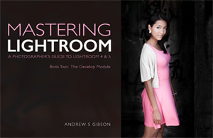
My new ebook Mastering Lightroom: Book Two – The Develop Module teaches you how to process your Raw files in Lightroom for spectacular results. Written for Lightroom 4 & 5 it takes you through every panel in the Develop module and shows you how to creatively edit your photos.

The post Are Lightroom Develop Presets Worth the Money? by Andrew S. Gibson appeared first on Digital Photography School.


Digital Photography School

 
Comments Off on Are Lightroom Develop Presets Worth the Money?

Posted in Photography


Derelict Dubai: 7 Sandy Abandoned Wonders of the UAE

27 Mar

[ By Steph in 7 Wonders Series & Travel. ]

Abandoned Dubai main

Known for its extravagance and disdain for rational limits, Dubai never shies away from incredibly ambitious architectural projects – but when they fail, as they often do, the result is a whole lot of sandy half-excavated construction sites. But along with the rest of the United Arab Emirates, this hub of vast oil and gas fortunes is in a state of constant flux, with a rapidly changing landscape that can transform from a swath of desert to a strip of glittering skyscrapers in what seems like no time at all.

Lots of Luxury Vehicles

Abandoned Dubai Cars 1

More than 3,000 abandoned luxury vehicles were counted in Dubai in a single year, left behind, as the story goes, when expats fled the nation to escape debts after the economy crashed. One such vehicle was a limited edition Ferrari Enzo, worth more than $ 1.65 million. Others include $ 100K Range Rovers, Porches, BMWs and Mercedes. Photographs show them covered in dust and sand, sometimes haphazardly protected with tarps. Under Sharia law, non-payment of debt is a criminal offense, and foreigners have been prevented from leaving the Emirates for missing a single credit card payment or bouncing a check. But according to Business Insider, it’s not just expats fleeing financial repercussions. Locals bought cars they couldn’t afford, and then struggled to make the payments. On the plus side, bargain hunters have gotten some insane deals on the cars when they’re re-sold at rock-bottom prices at police auctions.

Ongoing Wastelands of Stalled Construction Projects

Abandoned Dubai Stalled Construction 1

Abandoned Dubai Stalled Construction 2

Dubai itself and the surrounding areas often have large tracts of land that look like wastelands of sand and abandoned construction equipment thanks to countless projects that are started and then put on hold for financial reasons. At any given time, there are thousands of such sites in various stages of progress, and while some eventually pick back up and are completed, others stay like this for years or are eventually scrapped. Nakheel Tower, pictured top, was meant to be the centerpiece of Dubai’s famous man-made Palm Islands, and the site had been cleared and leveled before the project was canceled in 2009. Another project, the Burj Al Alam, suffered a similar fate, with trucks finally bringing in loads of sand to refill areas that had been excavated after developers decided not to go forward with the 108-story tower.

World’s Largest Artificial Islands On Hold and Sinking

Abandoned Dubai World of Islands

Dubai’s artificial islands, including the Palm Islands, the World and the Universe, were intended to be the ultimate in luxury possessions, sold only to millionaires who could afford the hefty price tags and the yachts required to reach them. While a few of them have already been developed, with residents beginning to move in, others have sat in a state of partial completion since construction began in 2001. The 2008 financial crisis led developers to pull back from actively working on the project, and by 2011, some of the islands began sinking into the sea. Despite the developers’ denials, third-party inspectors confirmed that the islands were already eroding, and aerial photographs show that those intended to make up the shapes of the world map are becoming little more than a patchwork of rounded blobs.

Jebel Ali Village And Its Namesake Palm Island

Abandoned Dubai Jebel Ali Flyover

Jebel Ali Village, built outside Dubai i 1977, was a settlement of about 300 villas for expatriates along with schuss, a club, a park, medical clinics and a desalination water plant. It didn’t have its own supermarket, requiring residents to make a long, hot drive without air conditioning all the way to Dubai to purchase supplies back when Abu Dhabi Road was a single-lane unlit carriageway used by camels as well as vehicles. By 2011, the once-treasured community was entirely abandoned. One of the artificial islands built off the coast of Dubai was named in its honor, but that project has been put on hold, leading to even more abandonments with the Jebel Ali name. The monolithic structures pictured above were built as part of a flyover going to Jebel Ali Palm Island, but as construction was halted, they’ve just been left like this, looking like a row of ancient ruins. But as with many other projects in Dubai, they’re in transition – the village is being rebuilt.

Next Page – Click Below to Read More:
Derelict Dubai 7 Sandy Abandoned Wonders Of The Uae

Share on Facebook


[ By Steph in 7 Wonders Series & Travel. ]

[ WebUrbanist | Archives | Galleries | Privacy | TOS ]


WebUrbanist

 
Comments Off on Derelict Dubai: 7 Sandy Abandoned Wonders of the UAE

Posted in Creativity


Apple applies for dual-sensor camera patent

26 Mar

applepatent.jpg

Having two distinct sensors in one camera appears to be the flavor of the week. HTC just launched the One M8, the first smartphone to feature a dual-sensor camera. At the same time Apple Insider spotted an Apple patent application that was published on Thursday by the U.S. Patent and Trademark Office. The application is titled: ‘Electronic device with two image sensors’. Learn more 

News: Digital Photography Review (dpreview.com)

 
Comments Off on Apple applies for dual-sensor camera patent

Posted in Uncategorized


Fenster: Ausstellungstipps, Ausgabe 1

26 Mar

Wir Ihr vielleicht schon mitbekommen habt, gibt es unsere Ausstellungseite nicht mehr. Wir haben uns gedacht, dass es viel persönlicher und sinnvoller ist, wenn unsere Redakteure Euch einmal im Monat Ausstellungen empfehlen, die sie entweder selbst besucht haben oder unbedingt besuchen möchten.


Fließender Sand, 1933-1936 © Alfred Ehrhardt, bpk Alfred-Ehrhardt-StiftungEine geriffelte Fläche wird allmählich von einer feinbreiigen Sandschicht überzogen, 1933-1936 © Alfred Ehrhardt, bpk Alfred-Ehrhardt-Stiftung

Berlin

Zwei Tipps von Marit Beer

Noch bis zum 27. April 2014 zeigt die Alfred Ehrhardt Stiftung 70 Drucke aus der Serie „Das Watt“ vom gleichnamigen Künstler. Diese Ausstellung empfehle ich jedem, der sich in großformatigen Bildern verlieren mag. Die Schwarzweiß-Abzüge stammen aus dem 1930ern Jahren und zeigen die Gezeitenzone in ihren schönsten Formen.

Auf der Ausstellungsseite heißt es dazu:

Breitet man Alfred Ehrhardts Fotografien abstrakter Sandformen im Watt vor sich aus, drängt sich der Gedanke „Chaos und Struktur“ auf. Der hier vom Künstler gewählte Bildausschnitt offenbart die immanente Schönheit des sich in so vielfältigen Formen darstellenden Naturgeschehens, während die Zusammenschau der Formvariationen die Verbindung von Mikro- und Makrokosmos erstellt. Er bringt System in die Strukturen und Ordnung in das Chaos der Natur, als wolle er die Welt mit seiner Technik begreifbar machen.

Vor Ort kann man auch im Erstlingswerk von 1937 und der in Neuauflage erschienenen Publikation „Das Watt“* schmökern. Diese wurde übrigens 2004 von Martin Parr und Gerry Badger in „The Photobook. A History“* lobend erwähnt. Auch können als Andenken einige Postkarten mit Wattmotiven für 1 € erworben werden oder aber man nimmt sich das kleine aber umso hübschere Leporello mit, das kostenlos ausliegt.


© Wolfgang Krolow, Berlin-Kreuzberg, 1981

Und wer sowieso in Berlin-Mitte ist, der sollte sich danach gleich in die Argus-Galerie in der Marienstraße 26 begeben. Diese zeigt bis zum 24. Mai 2014 Kinderwelten von namenhaften Fotografinnen und Fotografen aus aller Welt. Mit dabei unter anderem Arbeiten von Sibylle Bergemann, Arno Fischer oder René Friede.

Ich habe mir die Ausstellung zwar noch nicht anschauen können, klebte aber mit meiner Nase schon an der Scheibe und bewunderte die vielen Schwarzweiß-Drucke. Deswegen unbedingt die Öffnungszeiten beachten, denn leider hat die Galerie sonntags und montags geschlossen. Der Eintritt in beide Ausstellungen ist übrigens frei.


IV.18.4 Werksstudenten 1926 © Photographische Sammlung/SK Stiftung Kultur, Köln, bereitgestellt von der FEROZ Galerie Bonn

Bonn und Köln

Zwei Tipps von Katja Kemnitz

Bereits seit Januar gedenkt die FEROZ Galerie mit einem großen Zyklus dem vor 50 Jahren verstorbenen deutschen Fotografen August Sander. In acht Ausstellungen werden insgesamt 619 Porträts des Künstlers aus den sieben Bänden des Gesamtwerks „Menschen des 20. Jahrhunderts“ sowie dem einführenden Werk „Antlitz der Zeit“ gezeigt. Vorträge und Veranstaltungen zu August Sander runden das Programm ab.

Julian Sander, Gründer der Galerie und Urenkel des Künstlers, über die Ausstellung:

Ich habe den August-Sander-Zyklus ins Leben gerufen, um eine schon lang existierende Idee zu verwirklichen. Ich möchte mit diesem Projekt die Geschichte von August Sander mit Blick auf seine Menschlichkeit erzählen. Jene Eigenschaft, die ich für die bedeutendste Quelle für sein Lebenswerk halte.

II.8.19 Konditor 1928 © Photographische Sammlung/SK Stiftung Kultur, Köln, bereitgestellt von der FEROZ Galerie BonnIII.14.1 Junge Mutter, bürgerlich 1926 © Photographische Sammlung/SK Stiftung Kultur, Köln, bereitgestellt von der FEROZ Galerie Bonn

Es lohnt sich also in diesem Jahr, die Galerie mehrmals zu besuchen, denn jeden Monat wechseln die Portraits. Die nächste öffentliche Vernissage findet am Donnerstag, den 4. April statt. Die Ausstellungstermine im Überblick:

Buch I „Der Bauer“: 4. – 28. März
Buch II „Der Handwerker“: 1. April – 9. Mai
Buch III „Die Frau“: 16. Mai – 13. Juni
Buch IV „Die Stände“: 20. Juni – 29. August
Buch V „Die Künstler“: 5. September – 17. Oktober
Buch VI „Die Großstadt“: 24. Oktober – 21. November
Buch VII „Die letzten Menschen“: 28. November – 24. Dezember

Die Galerie befindet sich in der Prinz-Albert-Str. 12, nur wenige Gehminuten vom Hauptbahnhof entfernt. Der Eintritt ist frei.

Wem es nicht möglich ist, die Galerie Feroz regelmäßig zu besuchen, empfehle ich die Ausstellung „August Sander: Meisterwerke und Entdeckungen“ der Photographischen Sammlung/SK Stiftung Kultur in Köln. Hier wird nicht das Gesamtwerk, aber ein sehr großer Teil der Arbeiten Sanders gezeigt.

Sie läuft noch bis zum 3. August 2014 im 1. OG der Photographischen Sammlung, Im Mediapark 7, Köln. Der Eintritt kostet 4,50 € und montags ist er sogar frei.


© Stephan Vanfleteren, bereitgestellt von Galerie Hilaneh von Kories

© Stephan Vanfleteren, bereitgestellt von Galerie Hilaneh von Kories

Hamburg

Tipp von Aileen Wessely

Die von uns immer wieder gern empfohlene Galerie Hilaneh von Kories zeigt noch bis zum 6. Juni 2014 die aktuelle Serie namens „Façades & Vitrines“ des belgischen Fotografen Stephan Vanfleteren. Dieser war in den letzten zehn Jahren in belgischen Dörfern und Städten unterwegs, um skurrile und schöne Fassaden und Schaufenster zu dokumentieren.

Mich für meinen Teil sprechen hier die wunderbar ausgewählten Zufallscollagen des Lebens an, die Schriften, Farben, Formen und Reklamemalerei mit den Zeichen des Verfalls vermischen. Verblichen, abgeblättert, verschmutzt, abgescheuert sind die einst leuchtenden Aushängeschilder und haben doch immer noch einen einzigartigen Charme.

Man kann aber auch stärker an der Oberfläche kratzen als ich, die ich zugegebenermaßen in die Bilder an sich verguckt bin. Das Sujet ist natürlich nicht zufällig gewählt, sondern greift ein hochaktuelles Thema auf: Die Verdrängung der kleinen, feinen Läden, in denen oft immer der wohlbekannte Inhaber hinter dem Ladentisch stand, zum Beispiel durch große Einkaufsmeilen, Internetshops und schlichtweg moderner ausgestattete Konkurrenz.

Die Galerie Hilaneh von Kories findet Ihr in der Stresemannstraße 384a, 22761 Hamburg. Sie ist dienstags bis freitags von 14 bis 19 Uhr geöffnet.


© Michael Kenna, bereitgestellt von Bernheimer Fine Art Photography© Michael Kenna, bereitgestellt von Bernheimer Fine Art Photography

München

Tipp von Aileen Wessely

„Light on Asia“ heißt es am anderen Ende von Deutschland, wo die in München angesiedelte Galerie Bernheimer Fine Art Photography wunderbar stille Eindrücke aus Asien zeigt, eingefangen vom Fotografen Michael Kenna.

Die Ausstellungsräume sind großzügig und gemütlich – nicht so furchtbar erdrückend anonym weiß wie viele andere – gestaltet und laden so ganz besonders dazu ein, sich in den Landschaftsaufnahmen zu verlieren. Und das kann man ganz vortrefflich in den einerseits feinen Helligkeitsabstufungen und andererseits satten Kontrasten der Schwarzweißarbeiten.

Spannend finde ich auch deren Format: Nur 20 x 20 cm groß sind die meisten der 50 ausgestellten Fotografien. Während es sonst scheint, dass Kunst umso künstlerischer und wichtiger wird, umso größer man sie an die Wand bringt, wird hier selbstbewusst gezeigt, dass es auf die Bilder ankommt. Beruhigend.

Die Ausstellung ist noch bis zum 26. April 2014 zu sehen. Bernheimer findet Ihr in der Brienner Straße 7 unweit des Münchner Hauptbahnhofes. Die Galerie ist dienstags bis freitags und samstags von 10 bis 18 Uhr bzw. von 11 bis 16 Uhr geöffnet.


© Guido Baselgia, bereitgestellt von Galerie Andres Thalmann© Guido Baselgia, bereitgestellt von Galerie Andres Thalmann

Zürich

Tipp von Aileen Wessely

Fantastisch surreale Schwarzweiß-Fotografien gibt es außerdem in der Schweiz zu sehen. Die Galerie Andres Thalmann zeigt noch bis zum 3. Mai 2014 die Arbeiten von Guido Baselgia. Dieser war mit seiner Fachkamera in verschiedenen Ecken der Welt unterwegs, um mit dem Licht der Gestirne zu spielen.

Entstanden ist ein Zyklus von teilweise fast abstrakten Bildern, die Landschaften, Meere, Himmel zu besonderen Tageszeiten zeigen. Vielen von ihnen gemein sind sichtbare Bahnen von Sonne, Mond und Sternen auf dem Himmel. Mal leuchtend grell, mal unterbrochen von Wolkenbewegungen. Bilder, die einen spüren lassen, wie der kleine Planet, auf dem wir im All sitzen, sich bewegt und alles andere drum herum auch.

Obwohl ich sonst so sehr starke Kontraste und eine ausgeglichene Belichtung mag, bin ich von mir selbst überrascht, dass mich auch und gerade die Arbeiten, die sich zum Beispiel ausschließlich im Bereich sehr dunkler Grautöne bewegen, so ansprechen. Vielleicht, weil es hier einfach passt und nicht (wie leider so oft) beliebig ist.

Leider ist Zürich zu weit für mich, aber das Buch dazu – „Falllicht“*, erschienen im Verlag Scheidegger & Spiess – gibt es zum Glück auch und ist nun auf dem Weg zu mir. Etwas neidisch bin ich trotzdem auf alle Schweizer und die, die die Ausstellung in der Galerie in der Talstrasse 66, Zürich sehen können. Geöffnet dienstags bis freitags und samstags von 11 bis 18.30 Uhr bzw. von 11 bis 16 Uhr.


Welche Ausstellungen haben Euch in der letzten Zeit so richtig begeistert? Ergänzt unsere kleine Liste gern in den Kommentaren. Vielleicht habt Ihr ja auch ein paar Geheimtipps fernab der großen Städte für andere Leser.

* Das ist ein Affiliate-Link zu Amazon. Wenn Ihr darüber etwas bestellt, erhält kwerfeldein eine kleine Provision, Ihr zahlt aber keinen Cent mehr.


kwerfeldein – Fotografie Magazin | Fotocommunity

 
Comments Off on Fenster: Ausstellungstipps, Ausgabe 1

Posted in Equipment


“The Language of Light with Joe McNally” – a Review

26 Mar

language-of-light-digital-photography-school
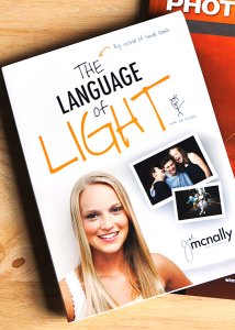
On the one hand, I could make this article one of the shortest I’ve ever written– a rousing recommendation of only three words: “It’s Joe McNally!”

Thank you. Good night. Drive safely.

Okay…I get it. Some of you may not be convinced. I respect that. That’s why we’re going to take a closer look.

For those who may not know, Joe McNally is one of the very best in the business. In a career spanning 30 years and 50 countries, his work has appeared in National Geographic, LIFE Magazine, Sports Illustrated, TIME, Newsweek, Entertainment Weekly, and a host of other magazines you’ve probably read. Even if you’ve never heard his name (where have you been hiding?), I’m pretty sure you’ve seen his work. If you are ever able to attend one of his workshops, I highly recommend it.

Joe is a master (a word I don’t use lightly) of at least two things–lighting and teaching. As a photographer, light defines or plays a part of everything you do. Regardless of whether you are talking about speedlights, studio lights, street lights, or sunlight, it’s a given that every light source has three attributes–color, quality, and direction. Since every photograph requires light, it stands to reason that having a firm understanding of how to control, manipulate, and manage light would be an important step towards raising the bar on your photography. As he puts it himself in the intro,

“Light is how we speak as photographers.” – Joe McNally

A typical Joe McNally seminar or workshop tends to be filled with sentences that begin with things like, “The photo editor at National Geographic once told me…” or “My editor at LIFE Magazine used to say…”  These are your cues to start feverishly writing down every word that follows.  The Language of Light lets you put the pen down and take it all in–a three-hour guided tour through the how and why of Joe’s “big world of small flash.”

There are a few things that really stand out, separating this DVD lighting class apart from the rest. For starters, it’s conversational. To the extent that this language of ours has words and concepts that need explaining, who better to do it than the man who’s written some of the best books on the subject? The other huge advantage to The Language of Light is the ability to watch as Joe starts each shoot with a basic premise, then explains and demonstrates each step in the process–walking you through from concept to finished image.

Remember that old line? “Those who can, do. Those who cant’ teach?” Well, here’s a guy who does both and doesn’t hold anything back. If he knows it, he wants you to know it. It’s not just about the “how.”  It’s also about the “why.” And that, my friends, is worth the price of admission.

Here is a basic breakdown of the set.

Disc 1 – the Language of Light

They say the best place to start is at the beginning, and The Language of Light takes that to heart. Disc 1 gets you going, explaining light and why it does what it does in simple terms. Prepare to be blown away by what he can do with a single speedlight. Topics include:

  • Turning one small flash into one big light
  • Controlling harsh natural light
  • Dramatic one light portraiture
  • Tour of small flash light modifiers
  • Light placement

Check out the Disc 1 preview in the video below:

Disc 2 – the Language of Light

Disc 2 moves out of the studio and goes on several location shoots, with lighting setups ranging from the basic to the complex. Topics include:

  • Location assessment
  • Basic strategies for one and two lights, as well as three or more
  • Getting the most out of a location
  • Environmental portraits
  • Conquering the sun with high speed sync
  • Mixing color temperatures
  • Athletic portraits
  • Lighting in small places
  • Group portraits
  • Engaging your subject

Take a look at the Disc 2 preview:

The three hours of photographic education contained in this set is some of the best I’ve ever seen. Knowledge, talent, energy, and passion come together in what I can only describe as a moment of enlightenment (no pun intended), where all the pieces seamlessly come together– and it all makes sense. It’s perfect for beginners just learning how to get the flash off the camera, as well as seasoned veterans looking for a refresher.

The Language of Light is available on Amazon.  Still hungry for more? Check out our very own e-book, “Portraits- Lighting the Shot” in the Digital Photography School Bookstore.

The post “The Language of Light with Joe McNally” – a Review by Jeff Guyer appeared first on Digital Photography School.


Digital Photography School

 
Comments Off on “The Language of Light with Joe McNally” – a Review

Posted in Photography


30 Ideas to Jump-start Your Photo Theme Project

26 Mar

Variety, not only the spice of life, is also one of the most beautiful things about the art form of photography; the number of possible subjects for a photo is almost limitless.  There are formats, within forms and within disciplines, and all we need to create a work of art is an idea, which can come to us at any Continue Reading

The post 30 Ideas to Jump-start Your Photo Theme Project appeared first on Photodoto.


Photodoto

 
Comments Off on 30 Ideas to Jump-start Your Photo Theme Project

Posted in Photography


Father’s family photos capture the delightful chaos of youth

26 Mar

laboile_13.JPG

While most photos of children and family put forth a cleaned up and polished look, Alain Laboile takes another approach. He photographs his six children in their natural state – which is often pretty messy – as they play and explore in their Bordeaux, France home. The results are delightfully honest and candid images of good old dirt-between-your-toes fun. See gallery

News: Digital Photography Review (dpreview.com)

 
Comments Off on Father’s family photos capture the delightful chaos of youth

Posted in Uncategorized


Facebook und Fotos: Wie ist die Rechtslage?

26 Mar

Ein Beitrag von: Sebastian Deubelli

Für Inhalte wie Fotos und Videos, die unter die Rechte an geistigem Eigentum (sog. „IP-Inhalte“) fallen, erteilst du uns durch deine Privatsphäre- und App-Einstellungen die folgende Erlaubnis: Du gibst uns eine nicht-exklusive, übertragbare, unterlizenzierbare, gebührenfreie, weltweite Lizenz zur Nutzung jeglicher IP-Inhalte, die du auf oder im Zusammenhang mit Facebook postest („IP-Lizenz“). Diese IP-Lizenz endet, wenn du deine IP-Inhalte oder dein Konto löschst, außer deine Inhalte wurden mit anderen Nutzern geteilt und diese haben die Inhalte nicht gelöscht.

Auch über einen Monat nach der abweisenden Berufungsentscheidung des Kammergerichts Berlin (Urteil vom 24. Januar 2014, 5 U 42/12) sind das die Nutzungsbedingungen zur sogenannten IP-Lizenz, die Facebook damit auch weiterhin zur Grundlage eines jeden Nutzungsvertrages machen will und sich somit insbesondere sehr weitgehende Nutzungsrechte an jedem hochgeladenen Foto zusichern lässt.

Doch spulen wir zurück und sehen uns an, was bisher geschah:

Der Verbraucherzentrale Bundesverband e.V. hatte vor dem Landgericht Berlin mit Urteil vom 6. März 2013 (16 O 551/10) eine Entscheidung erwirkt, die neben einiger anderer Klauseln auch die eingangs genannten Nutzungsbedingungen zur IP-Lizenz im Verkehr mit Verbrauchern für unwirksam erklärt hatte.

Hiergegen legte die Facebook Ireland Ltd. Berufung ein, die nun vor dem Kammergericht Berlin zurückgewiesen wurde. Im Klartext: Nach deutschem Recht dürfen diese Klauseln nach Auffassung der Berliner Richter nicht mehr verwendet werden.

Die Entscheidung liegt mittlerweile im Volltext als PDF vor.

Die Revision wurde nicht zugelassen.

Doch was sind nun die Folgen aus dieser Entscheidung insbesondere aus der Sicht von Urhebern und anderen kreativen Rechteinhabern?

Bereits einleitend möchte ich aufkommenden Optimismus gerade unter denjenigen Lesern, die ihre Brötchen mit der Fotografie verdienen, dämpfen. Bereits in der erstinstanzlichen Entscheidung des Landgerichts Berlin heißt es:

Die Beklagte wird verurteilt (…) nachfolgende oder mit diesen inhaltsgleiche Bestimmungen in Verträge über die Teilnahme an einem sozialen Netzwerk mit Verbrauchern, die ihren Wohnsitz in der Bundesrepublik Deutschland unterhalten, einzubeziehen, sowie sich auf die Bestimmungen bei der Abwicklung derartiger Verträge zu berufen: (…)

Das bedeutet, dass sich die Entscheidung nicht auf Facebook-Nutzer bezieht, die keine Verbraucher sind, sondern im Zusammenhang mit ihrer beruflichen Tätigkeit Bilder bei Facebook hochladen.

Facebook lässt sich Nutzungsrechte einräumen

Somit bleibt es vorerst dabei, dass Inhalte, die von Berufsfotografen im Rahmen ihrer beruflichen Tätigkeit (also insbesondere beim Betreiben einer Unternehmensseite) bei Facebook hochgeladen werden, den Nutzungsbedingungen zur IP-Lizenz unterliegen dürften.

Bedenklich an den Nutzungsbedingungen ist insbesondere, dass Facebook sich ein übertragbares und unterlizensierbares Nutzungsrecht einräumen lässt, das es ermöglichen würde, hochgeladenen Inhalt in gewerblichem Umfang und entgeltlich weiterzugeben – sprich: zu verkaufen.

Berücksichtigt man, dass jeden Tag verschiedenen Statistiken im Netz nach rund 350 Millionen Bilder bei Facebook hochgeladen werden, was aktuell einen Bildbestand von über 240 Milliarden Bildern bedeuten dürfte, erhält man einen ersten Eindruck davon, welche Relevanz ein derartiger Bilderpool hätte, würde man die Aufnahmen unter Berufung auf die Nutzungsbedingungen kommerziell verwerten.

Zum Vergleich: Getty Images bringt es derzeit auf rund 70 Millionen Bilder. Sicherlich stellt nur ein kleiner Teil der Bilder bei Facebook Material dar, das aufgrund der Qualität zur kommerziellen Verwertung geeignet wäre.

Geht man aber davon aus, dass etwa 5 % der Facebook-Nutzer gewerblich unterwegs sind und somit qualitativ verwertbare Aufnahmen hochladen, kommt man immer noch auf 12 Milliarden Bilder. Doch auch, wenn diese Möglichkeiten aktuell auf dem Papier gegeben wären, möchte ich auch klar hervorheben, dass aktuell noch kein Fall bekannt wurde, in dem Facebook eine derartige Verwertung vorgenommen hätte.

Auch wurden bislang noch nicht einmal derartige Pläne publik. Möglich wäre es dennoch.

Wie geht man als Fotograf nun mit der etwas zweideutigen Situation um?

Einerseits will man natürlich seine Bilder auch bei Facebook in ordentlicher Auflösung und ohne unschöne Wasserzeichen darstellen, zumindest wenn – wie wohl bei den meisten – der Facebook-Account als Bestandteil des Unternehmensmarketings Verwendung findet. Und man potentielle Kunden von seiner fotografischen Arbeit überzeugen möchte.

Hier besteht etwa die Möglichkeit, die Bilder auf der eigenen Unternehmenswebsite oder dem eigenen Blog in hoher Auflösung und ohne Wasserzeichen zu zeigen und im Rahmen der Facebook-Seite darauf zu verlinken.

Das Bild wird dann auf Facebook als (zugegeben kleines) Miniaturvorschaubild gezeigt. Der Betrachter erhält aber dennoch die Möglichkeit, das Bild auf der eigentlichen Website in voller Pracht zu sehen, falls ihm der Miniatur-Teaser auf Facebook zusagt.

Egal, wie man sich hier entscheidet, möchte ich jedem, der mit seinen Bildern sein Geld verdient, nahelegen, sich zumindest einmal kurz mit dieser Situation auseinanderzusetzen und einen Weg zu finden, mit dem er sich wohlfühlt. Zwei weiterführende Interviews zur Thematik findet Ihr hier und hier.

Abschließend bleibt mit Spannung zu erwarten, wie Facebook nun auf die Entscheidung des Kammergerichts Berlin reagieren wird. Bisher sind die Nutzungsbedingungen unverändert. Doch selbst, wenn diese modifiziert würden, gehe ich aktuell nicht davon aus, dass die Passage zur IP-Lizenz ersatzlos gestrichen würde.


kwerfeldein – Fotografie Magazin | Fotocommunity

 
Comments Off on Facebook und Fotos: Wie ist die Rechtslage?

Posted in Equipment