RSS
 

Archive for May, 2013

Make your Photos Sparkle with GIMP

19 May

A Guest Contribution by Anotherphotograpbynoob.com.

What this tutorial will show you
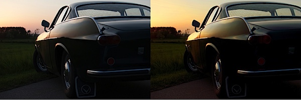
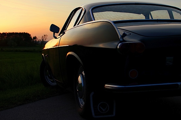
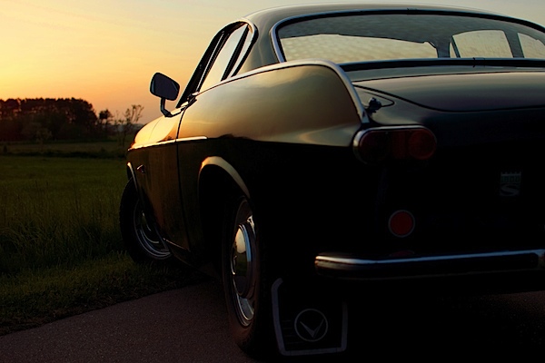
In short: how I made the photo on the right become the photo on the left.

before_and_after_gimp_dps_tuts.jpg

In this tutorial, we will cover basic tools of the free photo editing software GIMP.
Here is a quick rundown of the features covered in this tutorial:

  • Crop a photo in GIMP
  • Increase contrast with the Levels panel
  • Make the colors pop with the Hue & Saturation panel
  • Adjust colors with the Color Balance panel
  • Add a color filter to boost the warm colors in your photo.

Sound hard? Don’t worry. I’ll guide you through the whole process, step by step.

Resources

First of all, you need to have GIMP installed. Click here to download GIMP, and then follow the instructions provided with the software.

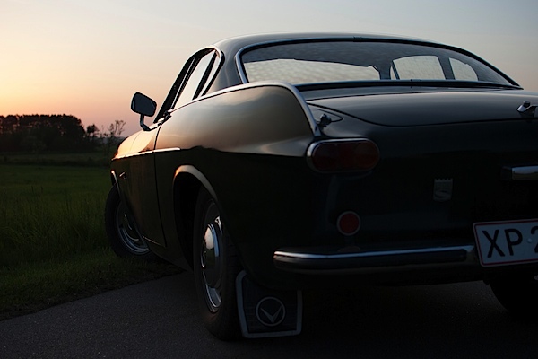
If you want to follow along with me in this tutorial, the original photo can be downloaded here. I shot the photo myself last year. The sportscar is a racing green Volvo P1800, just like the one Roger Moore drove in The Saint – yep, my dad tells me the story every time we ride in that car.

You are free to use the photo for whatever you may want, as long as it isn’t illegal of course.

If you are interested in the specifications of my camera, it is:

  • Nikon D3000
  • Nikon DX AF-s NIKKOR 35mm 1.8G
  • Shot at f/3.2, 1/200 seconds and ISO 100
  • The exposure compensation was set to -2.7

Enough with the anecdotes; let’s start editing.
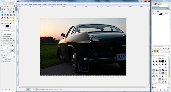
Start it all Up

After you have started up GIMP, open up the image you want to edit. If you have chosen to follow along and you haven’t changed too much in the standard layout in GIMP, it should look like this.

gimp-dps-tut-1.jpg

Fixing the Composition

The first thing I want to fix is how I composed the image. I don’t like the license plate showing in the original photo. Ideally, I would like to see no license plate and at the same time as much as possible of both the car and sky.

The easiest way would be just cropping off the right of the photo until the license plate is gone.

But…

I know my mother will most likely print this photo – just as with all the other photos I’ve sent her. In order to make the process of printing the images as smooth as possible, I need to keep the proportions of the image in tact (I don’t want the print service computer system to decide how the photo is cropped).

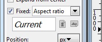
With that in mind, choose the Crop tool from the toolbox on the left (Shortcut Shift + C).

To make sure proportions are kept, check the box labeled Fixed. From the drop-down menu, you should select Aspect Ratio and the value should be set to current. Like this:

gimp-dps-tut-2.jpg

Now you can drag out the area you want to keep. You can adjust it by dragging the corners around the image. When you are satisfied, hit enter and your photo is cropped.

gimp-dps-tut-3.jpg

So far, so good. The image is still dull, I know. Let’s get moving.

Quick Tip – Duplicate the Background Layer

When you open up a photo in GIMP, a background layer will be created automatically. Don’t edit directly on that. Instead, you should make a copy of the layer by pressing Ctrl + Shift + D (Mac: Cmd + Shift + D).

Now you have the original background layer for reference while editing, and no matter the mess you make, you can easily start from scratch.

And now we must go back to the sports car!

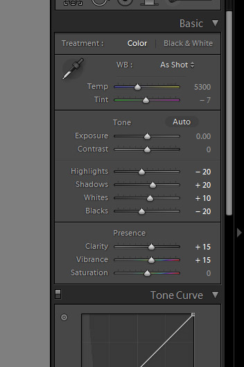
Use Levels to Increase Contrast

The first thing I want to do is increase the contrast. This is mainly to darken the ugly details on the back of the car, in order to let the more shiny parts sparkle.

First, open op the Levels panel Color > Levels:

gimp-dps-tut-4.jpg

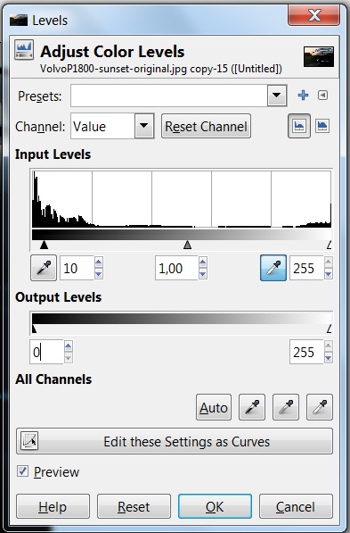
I’ve made a simple move. I just increased the darks by 10 and kept the whites at 255. I kept the whites at 255 to ensure most details are preserved in the sky; we’ve now set the best base for boosting the color of the image.

Work the Colors

The first panel I use in this process is Adjust Hue/Lightness/Saturation.
Go to Colors > Hue-Saturation:

gimp-dps-tut-5.jpg

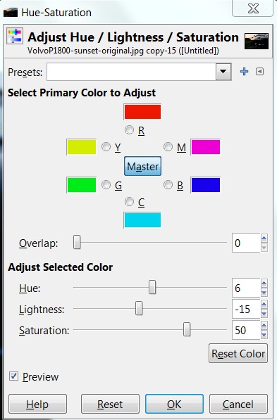
I won’t be explaining every panel I use in detail. Instead, I’ll focus on the settings I needed for this tutorial. I’ve only adjusted the master channel in this panel.

Hue
I’ve increased the hue a little. Six steps up isn’t a lot, but you’ll easily notice the difference. Increasing the hue removes the slight magenta shade in the sky.

Lightness
Even though I adjusted the Levels before, I want an even more warm and dark feeling. Almost like a classical sunset-silhouette – just keeping the details in the photo.

By decreasing the Lightness, I darken the photo and turn up the colors even more in the sky. The Volvo P1800 even starts looking right with dark green colour (the actual name is British Racing Green – another dad anecdote).

Saturation
The final step in the Hue-Saturation panel is increasing Saturation – a lot! I’m putting the pedal to the metal now. All in on sunset.

gimp-dps-tut-6.jpg

The Color Needs more Attention

This is much better. But, I want to adjust it a little bit more. Next stop: the Color Balance panel.

Go to Color > Color Balance:

gimp-dps-tut-7.jpg

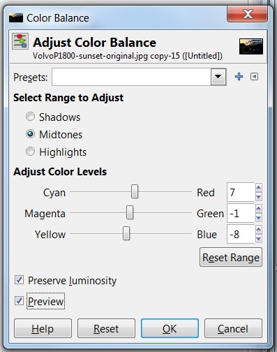
Again, I’m not going into detail on all functions. Just the ones I altered. In this case, it’s the Color Levels of the Midtones.

Cyan <> Red

Everything got a little too blue when I boosted Saturation – especially the car. The first step is decreasing Cyan (by increasing Red). Now the car is getting warmer.

Magenta <> Green

One step down is not doing much, but I really think it helped. It needed some compensation after increasing Red and Yellow.

Yellow <> Blue

Let’s add even more color to the sky and some warmth to the chrome on the car.

gimp-dps-tut-8.jpg

Adding a Color Filter is the Last Thing

I still don’t like the blue shade on the chrome. The last step is to add a color filter. It’s really simple.

First, add a new transparent layer. Just go to Layer > New Layer (Ctrl + Shift + N).
Name the layer “Warm Color Filter.” Choose a transparent layer and click Ok.

gimp-dps-tut-9.jpg

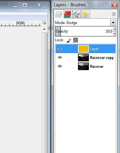
Now select the foreground color and set it to #F4B905. Actually, I just went for a warm orange and landed on this. Not freakishly important. Just go for a warm orange color.

Select the Bucket Fill Tool (Ctrl + B) and fill your new transparent layer with warm orange.

This should turn your entire image warm orange. Looking great, ay?

Ok. Now change the layer opacity to 10%, and set the blend mode to Dodge.

gimp-dps-tut-10.jpg

The result is a nice and warm feeling to the overall photo. And it also got us rid of that blue trouble in the chrome details. Nice.

Saving is now Exporting

As you may already know, GIMP does no longer save in JPEG. But don’t worry, the good people working with GIMP has just moved the function a bit and it is now called Export (Ctrl + E) and Export As (Shift + Ctrl + E), if you need to rename the file.
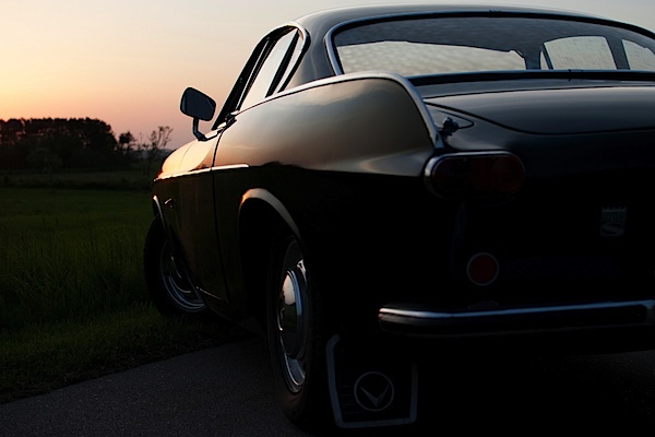
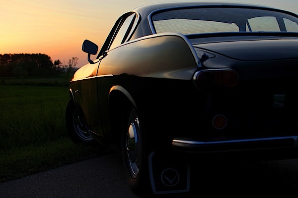
The Final Result

VolvoP1800-sunset-original.jpg

My mom actually ended up printing all the photos of my dad’s sports car. If you want to check out the rest of the sports car photos and even more GIMP tutorials, head over to my blog at http://anotherphotographynoob.com.

More specifically, the images of the sports car are here: http://anotherphotographynoob.com/sportscar/

And all my tutorials for GIMP are here: http://anotherphotographynoob.com/gimp-tutorial/

Anotherphotographynoob is a European blogger and photo enthusiast, blogging daily at Anotherphotograpbynoob.com. It all started as a simple blog posting a photo a day, but recently the blog has moved to a self-hosted solution and now tutorials are being written on a daily basis to help other photo nerds.

Post originally from: Digital Photography Tips.

Check out our more Photography Tips at Photography Tips for Beginners, Portrait Photography Tips and Wedding Photography Tips.

Make your Photos Sparkle with GIMP


Digital Photography School

 
Comments Off on Make your Photos Sparkle with GIMP

Posted in Photography


Scooped: 12 Chilled Out Abandoned Ice Cream Stands

19 May

[ By Steve in Abandoned Places & Architecture. ]

abandoned ice cream stands
Cone in 60 seconds? Though these 12 cool abandoned ice cream stands thought they could take a licking and keep on ticking, they ended up just being licked.

Twistee Treat Retreat

abandoned ice cream Twistee Treat(image via: Telestar Logistics)

Around 90 fiberglass Twistee Treat buildings were produced from 1983 until 1990, when the original company filed for bankruptcy, and about half the distinctive, cone-shaped buildings remain standing. Above is an abandoned Twistee Treat in Sarasota, Florida, captured in September of 2005 by Flickr user Telstar Logistics.

abandoned ice cream Twistee Treat(images via: Noahsgram, Yooperann and Facebook/Twistee Treat)

Designed by Robert G. Skiller, many of the 28 ft tall and 20 ft wide buildings have been painted in a wide variety of colors; others don’t even sell ice cream anymore. Due to their unique visual appeal, abandoned Twistee Treat buildings often exist in an odd architectural limbo between being quickly re-opened/re-purposed or (thanks to their light, unit construction) transported someplace where someone’s opening a new ice cream shop – it’s free advertising from the get-go, without the expense of a sign!

Ice Of The Beholder

Sarah Ortmeyer abandoned ice cream shop Lasso Laden Sad Eis(image via: Latitudes)

German Photographer/artist Sarah Ortmeyer‘s first solo show, “Sad Eis” (Sad Ice), included the above evocative snap of the closed Lasso Laden ice cream shop. Would it not have been easier to simply leave the shop’s seats inside and locked up instead of chained together outside, vulnerable to the vagaries of vagrants? Only Ortmeyer knows for sure, and she’s keeping that scoop to herself.

Ore-gone

abandoned ice cream shop Portland Forest Park(image via: Swedotorp)

Flickr user Swedotorp picked the perfect days (June 14th and 15th of 2008) to immortalize the abandoned Forest Park ice cream stand in all its faded glory. Located near Portland, Oregon, the stand would seem to be the right business in the right place at the right time. Unfortunately, the aged elegance of the mid-century style paint & neon signage indicates this stand’s time has long since melted away.

abandoned ice cream Forest Park Portland Darren Sethe(image via: Darren Sethe)

Flickr user Darren Sethe stopped at the abandoned Forest Park ice cream shop four years later in 2012 but not much had changed, barring the loss of a few more flakes of paint from the ancient sign. Sethe’s stark monochrome treatment seems to add a dash of timelessness to the ice cream-less scene.

The Other Meltdown

abandoned ice cream Kiyosato Japan(images via: Spike Japan)

Kiyosato, Japan was a popular travel and tourism destination whose prospects weren’t improved by the 2011 Great East Japan Earthquake and the subsequent Fukushima Daiichi Nuclear Plant accident. Among the area’s attractions was the now-abandoned One Happy Park, explored and recorded in September 2011 by urban explorers from Spike Japan. The abandoned park exudes an unfortunate and uneasy aura epitomized by the not-so-merry Merry Land ice cream kiosk just outside a ramen restaurant.

Next Page:
Scooped 12 Chilled Out Abandoned Ice Cream Stands

Share on Facebook


[ By Steve in Abandoned Places & Architecture. ]

[ WebUrbanist | Archives | Galleries | Privacy | TOS ]


WebUrbanist

 
Comments Off on Scooped: 12 Chilled Out Abandoned Ice Cream Stands

Posted in Creativity


When Mobile Photography Beats Traditional Photography

19 May

mobile-phone-photos

Photography: Star Rush

For most photographers, the lens on a smartphone is a fun toy. It provides a way to capture a moment — a moment to which they hadn’t brought their DSLR — and it lets them share those snaps with friends and family. But it’s not a real camera. It’s not a device that they would use to shoot for a client or to create the kind of art that they’d expect to see in an exhibition or hang in a gallery. For other photographers though, an iPhone or Android is more than a telephone with some basic imaging capabilities; it’s their main tool, their go-to device for capturing landscapes, people and scenes… and the device they use to create the kinds of pictures that end up on gallery walls and win cash prizes in prestigious competitions.

Star Rush, a Seattle-based street and documentary photographer, has been shooting as a “serious hobbyist” for more than twenty years. She now focuses on mobile photography and last year founded Lys Foto, an online magazine that showcases images captured on mobile phones. Her own work has been displayed in solo exhibitions in Seattle and she’s contributed to group shows in London and Rome. Her 20-photo solo show is currently in preparation for the City of Edmonds Arts Commission in 2014. While the venues and publications that have shown her photos were not exclusive to mobile photography, all of the work was captured using an iPhone 3GS or an iPhone 5.

The Device Determines the Picture

Star’s shift towards mobile photography was inspired by her desire to see what a simple, utilitarian device would do for her photography, to discover what she could create and capture with a fixed lens, fixed aperture and limited exposure meter. The basic editing and sharing functions built into the device were also an attraction, allowing her to shoot, process and publish her imagery quickly and easily.

Asked about the advantages of mobile cameras over traditional cameras, Star listed nine benefits that included accessibility; integrated capture, edit and share functions; simplicity; access to the work of other photographers; reduced clutter; the focus on composition; and fun. All of them, she argues, change not just the way the picture is made but the picture that the photographer produces.

“In the end, it’s all photography, isn’t it?” she says. “The photo is a photo. But the medium and process by which one captures and makes that photo is going to differ and often the medium can impact the process — this is where mobile is different. So, for me, I use a smartphone because the best camera is the one you have with you, as Chase Jarvis has said.”

Star describes mobile photography as “connected photography,” emphasizing a mobile device’s ability not just to always be on the scene but to be connected to other photographers. She uses three photographic social media platforms and notes the difference between the communities found on each of them — and the cultures those communities have created.

Flickr, says Star, is still best used on the desktop and has the most effective tools for photo management. She uses the site to see and communicate with a wide variety of photographers, to access a broad range of different kinds of images and film, both mobile and traditional, and as an off-site back-up for all her photography. Unlike other social media sites, she notes, Flickr is entirely image-based with users sharing little text-based news or other information at all.

Google+ Star describes as a cross between Flickr and Twitter, despite its apparent attempt to compete with Facebook. She contributes to the site because of the diverse photographers in its community and sub-communities. The platform is also useful for building a personal brand.

“The site dynamics are such that an active stream with engaged followers does positively impact search rankings and other matrix, such as visitors to my own personal blog,” she says.

Star has also been active on EyeEm, a Berlin-based service that started when mobile photography was primarily part of the underground art scene. The community, she says, is image-centric rather than social media-centric. Its users are engaged and the quality of the images is high.

“Sometimes communities overlap among these three, but not that much really. So being involved in each permits me to extend my reach and engage followers from a wide spectrum of the photography world in a regular way. It’s rewarding as a photographer to see diverse images so regularly and to communicate with those who create them.”

No Instagram

Star’s following is large enough for her to receive frequent requests to test or join new apps, but one app she’ll no longer use is Instagram. She left during the debacle over their terms of service and hasn’t been back since. The platform, she argues, is not about photography but is an “image-centric social media tool” with too many false accounts and spam, and too little management. “Serious photographers,” she argues, don’t use Instagram’s filters. The service has developed into a network that competes with Twitter, rather than a photographic tool that can push photographers in new directions.

Star Rush does not describe herself as a professional photographer. (She teaches composition and rhetoric at Cornish College of the Arts.) Although she can see the benefits of mobile photography for photojournalists who can use a device that’s light, agile and connected, she concedes that commercial photographers will find the limitations more restrictive. A smartphone might be useful for test shots, for off-site client reviews and as a replacement for the old Polaroid but few commercial photographers will be swapping their Nikons for their iPhones.

“My thinking is this, if you were going to use a point-n-shoot in a commercial job, then sure, you’d use a mobile device. If you were never going to use a point-n-shoot, then you’re never going to use a fixed lens, fixed aperture, limited exposure meter mobile phone in a commercial job as the primary camera.”

Unless, of course, the photographer is switching to street shoots, documentary images and art photography. In that case, they might well find they’re able to conveniently shoot photographs that end up in solo exhibitions and winning awards.


Photopreneur – Make Money Selling Your Photos

 
Comments Off on When Mobile Photography Beats Traditional Photography

Posted in Equipment


browserFruits Mai #3

19 May

Wenn wir die browserFruits anrichten, merken wir immer wieder wie schnell die Wochen vergehen. Kaum haben wir den einen Früchtekorb veröffentlicht, ist es schon wieder Sonntag und Zeit für den nächsten. Dazwischen beantworten wir Eure E-Mails, suchen neue Gastautoren, Anregungungen und überlegen uns neue Aktionen. Und diese Arbeit ist enorm bereichernd, auch für unsere eigenen Fotos. Immer wieder bekommen wir auch E-Mails mit einem einfachen Danke von Euch und wir haben das Gefühl, nicht genug zeigen zu können, wie sehr uns das freut. Deshalb hier auch noch einmal: Danke.


Fotospecial: Schmetterlinge

Flickr

500px


Deutschsprachig

• lens light love nennt sich ein junger, deutscher Blog, der Tipps und Kniffe rund um Fotografie und Bildbearbeitung gibt. Gestartet haben ihn vor Kurzem zwei ebenso junge deutsche Fotografinnen und ein Fotograf. Wir sind gespannt, was da noch kommt.

• Hauke Fischer hat tonnenweise allgemeine und spezielle Tipps für Portraits zusammengestellt. Lesen lohnt sich, auch wenn der schnell runtergeschriebene Stil einem etwas Disziplin abverlangt.

• Eine schöne Seite für alle, die nicht nur gern analog fotografieren, sondern auch filmen: filmkorn.org sammelt und zeigt Interessantes zu 8 und 16 mm breitem Film.

• Über die schrecklich schönen Momentaufnahmen des Magnum-Fotografen Martin Parr weiß ZeitOnline zu berichten.

• Der Ort Epecuén lag nach einem Dammbruch 27 Jahre lang unter Wasser. Spiegel Online hat einige Bilder dieser nun wieder freiliegenden Geisterstadt.


International

• Die Debatte um die Echtheit des aktuellen World Press Photo Gewinnerbildes von Paul Hansen habt Ihr mitbekommen? Jens Kjeldsen fächert das Thema auf und analysiert, wie sich die Ästethik der Gewinnerbilder der jüngst vergangenen Jahre gewandelt hat.

• Auch 2013 wurde der Teen Photo International Photo Contest für junge Fotografen zwischen 16 und 22 Jahren verliehen. Schaut rein, es gibt Talente zu entdecken!

• Eine weitere schöne Umsetzung aus der Reihe „viele Bilder über viele Jahre machen“: Vier Schwestern im Verlauf von 36 Jahren, auch technisch und ästhetisch ansprechend umgesetzt.

• Von der Schönheit der Cinemagraph-Gifs.

• Hier könnt Ihr mittels vieler Vergleichsfotos sehen, wie sich die iPhone-Kamera über die Generationen verbessert hat.

• Lust, mal wieder eine lange, einfach nur schöne, sommerliche, gut gelaunte und nicht zu bunte oder kitschige Hochzeitsdokumentation anzusehen? Hier geht’s lang, Robby Cavanaugh hat so eine gemacht.

• Immer noch toll, dieses Polaroid-Prjojekt: BEFORE I DIE I WANT TO…

• Die 3D-geometrische Fotografie von David Copithorne präsentiert Landschaften mit sehr interessanten Mitteln der Bearbeitung.

• Kennt Ihr schon CreativeLIVE? Hier werden Workshops rund um die Fotografie angeboten. Wenn man sie live ansieht, sind sie kostenlos. Nachträglich kann man sie für 149 USD erwerben.

• Unter Brücken lassen sich erstaunliche Bilder machen, wie diese Fotosammlung zeigt.


Neuerscheinungen und Tipps vom Foto-Büchermarkt

tipps

• Ihr erinnert Euch an den sehr guten Artikel über Wabi-Sabi von Susan? Das eBook dazu gibt es auch auf Amazon*.

• In einer Zeit, in der viele Regimes (aktuelles Beispiel: Syrien) eine neutrale Berichterstattung unterbinden, publizieren die Reporter ohne Grenzen den Band „Fotos für die Pressefreiheit 2013“*. Zum Hinsehen. Und Nachdenken.


Videos

Wir haben ein schönes filmisches Portrait über Marty Knapp, einen amerikanischen Landschaftsfotografen, gefunden und wollen es natürlich gern mit Euch teilen.


Ausstellungen

Wolfgang Tillmans
Zeit: 2. März – 7. Juli 2013
Ort: K21 Ständehaus, Ständehausstraße 1, 40217 Düsseldorf
Link

ALEXANDER MAGEDLER – NIGER: LE TEMPS ÉLASTIQUE
Zeit: 11. Juni – 10. August 2013
Ort: EIGENSINNIG – Schauraum für Mode und Fotografie, Wien
Link

ALEXANDER RODTSCHENKO – REVOLUTION DER FOTOGRAFIE
Zeit: 11. Juni – 25. August 2013
Ort: WestLicht, Westbahnstraße 40, 1070 Wien
Link

Stankowski-Stiftung. Fotografien aus dem Archiv
Zeit: 22 Juni – 27. Oktober 2013
Ort: Kunstmuseum Stuttgart, Kleiner Schlossplatz 1, 70173 Stuttgart
Link

Mehr aktuelle Ausstellungen


* Das ist ein Affiliate-Link zu Amazon. Wenn Ihr darüber etwas bestellt, bekommen wir eine kleine Provision, Ihr bezahlt aber keinen Cent mehr.


kwerfeldein – Fotografie Magazin

 
Comments Off on browserFruits Mai #3

Posted in Equipment


How to Create a “Standard Import” Preset in Lightroom 4

19 May

Introduction

The following is an excerpt from the SLR Lounge Lightroom Workflow System Workshop on DVD, a system designed to increase your post production speed by 5 to 10 times! Click here to learn more.

In this article, we are going to talk about creating a develop preset that you would like to apply to all of your images when they are first imported into Lightroom.

Although Adobe’s RAW image processing is extremely powerful, one common complaint is that your images may look flat and colorless at first. Often photographers will lament how beautiful their colors looked on the back of their camera.

Well, in an effort to fix this problem and make our images automatically look a little more crisp and vibrant when we first bring them into Lightroom, we’re going to create a “Standard Import” preset.

For this tutorial we will use the following image as our example:

original 650

Basic Adjustments Panel

The goal for a standard preset is twofold:  First, to simply help every image look a little better overall, of course. Secondly we also want to apply default settings such as a personal blend of sharpening, lens corrections, or other calibration-related things.

First, let’s tackle the Basic Adjustments.  Open the Basic Adjustments panel in the Develop Module and apply the following settings:

basic develop panel

The idea here is that you want to keep detail in any bright highlights or deep shadows, but do it without making the image look flat overall.  This is why we bring down the highlights to -20 yet push the Whites up to +10, and the same with the Shadows and Blacks. The image gets a little “punch” to it, without blowing out any highlights or clipping any shadows.

To enhance that subtle punch a little further, next we’ll boost both the Clarity and Vibrance to +15.  Note that we leave alone settings like Saturation and Contrast, because for the most part those adjustments are too strong for them to be applied to every single image.

Of course, YOU should tailor the adjustments to your own personal style!  Usually however we advise that going too much further than subtle editing should be saved as a separate preset that you use part of the time, but not necessarily 100% of the time.

The goal, of course, is to minimize the amount of editing you have to do to the majority of your images.  If for example you find that 80-90% of the time you wind up adjusting some of these settings even further, or less, …then you might as well create your Standard Import preset that way because it will minimize the amount of editing you have to do later, even if you have to undo one or two settings just 10-20% of the time.  See how that works?

To be avoided, however, is using a standardized preset to cover your habitual mistakes.  A good indicator for this is is if you feel like you ought to adjust your Exposure slider in your standardized preset.  Unless you have a very good reason; you’ll probably want to simply work to meter and expose your images better in the first place!

Detail Panel Adjustments

In the Detail Panel, we are going to apply our own special blend of sharpening that we apply to 99% of our RAW images.  These settings are shown below:

detail panel

Sharpening is definitely one of the most subjective aspects of post-production, however this “recipe” is our tried-and-true blend for RAW images, and we use it for all types of images from general portraits, weddings, and details.

So adjust the settings to your taste, however just remember that your goal is for these settings to become the foundation for all your images!  Try out these settings on many different types of images, and settle on something that works best for all of them.

Lens Correction Adjustments

Another common issue on DSLR cameras and lenses these days is vignetting.  By default, we prefer to correct for a slight amount of vignetting by dialing our Lens Corrections’ “Manual” tab to the following settings:

lens correction panel

Again, if you commonly shoot with certain lenses that have less vignetting, or more, then feel free to adjust these settings slightly.  Or, of course, if you actually utilize vignetting in your personal style, then feel free to zero-out this adjustment.

If you followed our adjustments approximately, then your final image will look something like this:

standard import 650

To see the real difference in the processing, let’s zoom in a bit:

original crop 650 standard import crop 650

Again, the goal here is not to make the image over-the-top contrasty or colorful, just to und0 the “flatness” that you initially see in your RAW images.

Saving the Standard Import Preset

If there are any other settings you would like to add to your “Standard Import” develop preset, do that now.  For example certain cameras may need adjustments in the Camera Calibration section, to correct for faint hues or tints in the shadows or highlights.  There are also Camera Profiles that attempt to emulate specific in-camera colors, (“Faithful”, “Neutral”, Landscape”, etc.) …however in our opinion the “Adobe Standard” profile is the best.

When you’re ready to create a preset, open the Develop Module’s left-hand panel and click the little plus sign on the Presets tab:

create preset

In the New Develop Preset window you can select which adjustments become part of this preset.  You may wish to only select a few parameters, such as for the specific tabs which we adjusted, however consider selecting “Check All” so that this preset can be used to reset images entirely.

Name this preset “00 Standard Import”, and be sure to put the two zeros at the beginning (or a similar code) so that this preset shows up at the top of your list of presets for easy access. Similarly, you may want to create a new folder and give it a numerical name so that all your presets show up at the top of the Presets panel, instead of below the (annoyingly un-deletable) Adobe-included Lightroom Presets.

Applying the Preset During The Import Process

Now that you have saved this new preset, you can apply it any time when you’re working on images in Lightroom.  However there is another awesome tool that we can utilize which will help us automate or workflow overall.

When you get back from a photo shoot with images that are ready to be imported into Lightroom, you’ll be able to apply this preset to all your images during the import process!

Open the import dialog box by either clicking on the Import button at the bottom of the left-hand panel of the Library module, or simply type the hotkey “Ctrl + Shift I”.

On the right-hand side of the import panel, you will see “Apply During Import” and the first option will be for develop settings.  Find your Standard Import Preset and select it.

apply preset upon import

By default, these options will remember themselves the next time you import images, so don’t forget this in case you want to change or stop using presets during the import process.

One of the main advantages of setting up your workflow this way is that, by applying a preset such as this during the time of import, combined with the option tell your computer to render previews after it is done importing, (in the “File Handling” section above) …you can tell Lightroom to import an entire photo shoot, apply a preset to every photo, and then render 1:1 previews all at once!

At the end of a long photo shoot or wedding day or whatever, this allows you to simply download and backup your photos once, then commence the Lightroom import workflow and go to bed.  By morning you’ll have your entire Lightroom catalog full of images with the preset and full previews ready to go!

Conclusion

It takes time to fine tune your own “Standard Import” preset and get it to work on the majority of your images, but once you develop it you can save hours and hours of post-production time.

Once we have created a standard preset for all our images, theoretically in post-production we will mostly spend our time just editing certain settings on an image-to-image basis, such as white balance and exposure.  Even these settings can be adjusted in batches though. (This is why we did not adjust the settings for White Balance and Exposure in the Basic Panel for the “Standard Import” preset.)

The SLR Lounge Workflow System Workshop on DVD

The SLR Lounge Workflow System Workshop on DVD takes everything that we taught in the Lightroom 4 A to Z Workshop on DVD and builds by teaching you how to maximize your shooting and post processing efficiency and workflow. This 7 hour DVD covers data safety procedures, file management, culling standards and overall develop techniques to increase your post production efficiency by up to 15x! In fact, using this Workflow System we can cull and edit over 1,500 images per hour! Don’t believe us, watch the teaser video! The Workflow System is also available as a part of the Lightroom 4 Workshop Collection. To learn more, click this link.

Post originally from: Digital Photography Tips.

Check out our more Photography Tips at Photography Tips for Beginners, Portrait Photography Tips and Wedding Photography Tips.

How to Create a “Standard Import” Preset in Lightroom 4


Digital Photography School

 
Comments Off on How to Create a “Standard Import” Preset in Lightroom 4

Posted in Photography


My First Concert: Lighting Craziness

19 May
I had noticed this lighting scheme earlier in the song and missed it, focusing elsewhere. But when guitarist Brendt Allman went into his solo, I waited to see if it would happen again. Sure enough, it did. EOS-1D Mark IV, EF 70-200 f/2.8L IS II. ISO 3200, 1/200 f/2.8.

I had noticed this lighting scheme earlier in the song and missed it, focusing elsewhere. But when guitarist Brendt Allman went into his solo, I waited to see if it would happen again. Sure enough, it did. EOS-1D Mark IV, EF 70-200 f/2.8L IS II. ISO 3200, 1/200 f/2.8.

A few years ago, I managed to start working with one of my favorite groups of musicians, a progressive heavy metal band from Pennsylvania called Shadow Gallery.  This has led to me collaborating with them in a number of ways.  I did some publicity photos for them, shot a music video (in another first for me) that ended up getting play on MTV in Europe, and in what I consider a career highlight, shot my first concert performance- which also happened to be their first concert performance.

Having never shot a live performance, I didn’t know what to expect.  I knew the venue was a small local place, so I had no idea what the lighting would be like. I came prepared with two lenses, an EF 24-105 f/4L and EF 70-200 f/2.8L IS II, as well as a 580EX II speedlite. I wasn’t sure the speedlites would be allowed, and even if they were, felt they would limit my shooting since I’d have to wait for the recycle. I used two cameras- a Canon EOS 7D and a Canon EOS-1D Mark IV. Both are capable of relatively high ISO’s, which I knew I’d be using in a dimly lit concert venue. By raising the ISO, it minimized how hard the flash would have to work.  I experimented starting at ISO 800, and finally settled on ISO 3200 a song or two into the show.

The great thing about musical performances is the lighting is generally pretty

This shot was early in the show, and I was experimenting with flash for my exposures. I used the built-in flash on the EOS 7D, and set the flash exposure compensation to -1 so as not to overpower the ambient. The result was good fill on his face, while the stage lighting created a nice backlight. The slower shutter speed of 1/100 allowed some motion blur in the hair, but that adds to the energy of the image. ISO was only 800 here, as it was the first song and I was still experimenting.

This shot was early in the show, and I was experimenting with flash for my exposures. I used the built-in flash on the EOS 7D, and set the flash exposure compensation to -1 so as not to overpower the ambient. The result was good fill on his face, while the stage lighting created a nice backlight. The slower shutter speed of 1/100 allowed some motion blur in the hair, but that adds to the energy of the image. ISO was only 800 here, as it was the first song and I was still experimenting.

interesting, if not all that bright.  What I wanted to do was figure out, when the lights were at their brightest, what my exposure should be.  I had the luxury of an opening act to shoot some tests. In addition, I wasn’t limited to just three songs like you might be with more well-known performers. I had an entire two hour show, so I took the first two songs to really nail my exposure down.

Even when using flash, I wanted to balance the flash with ambient light, not overpower the ambient lighting.  To do this, I shot in Manual mode.  I set my aperture wide open at f/2.8 or f/4 depending on the camera.  I wanted a shutter speed fast enough to stop any movement on stage, so I ended up settling on 1/200 for the most part. Knowing the 7D would be a bit noisier at the high ISOs due to the smaller sensor, and that the lens I was using was a stop slower, I put the 24-105 on that camera and shot it at 1/100 at f/4 to give it an extra stop of exposure.  That allowed some motion blur to creep in, but for the most part I lost very shots due to motion blur.

The constantly changing lighting meant that some shots just vanished as I pressed the shutter button.  The lighting was frantic and pulsing and constantly changing. But after a song or two, it got easier to predict the patterns, as well as see where the band members liked to stand so I could plan for a shot. After a time I ditched

the flash and opted to shoot sequences at 8 and 10 frames per second to be sure I caught a good expression or peak action. In some cases, I’d catch great lighting for an instant, and then wait to see if the lighting sequence repeated and I could catch it again.

Overall, it was a great experience, one I hope to repeat again some time. It was the perfect combination for me- great music and photography.

After a while I turned off the flash and raised the ISO up. Shooting using only the ambient light created some dramatic lighting situations. EOS 7D, EF 24-105 f/4L IS/ ISO 3200, 1/100, f/4.

After a while I turned off the flash and raised the ISO up. Shooting using only the ambient light created some dramatic lighting situations. EOS 7D, EF 24-105 f/4L IS/ ISO 3200, 1/100, f/4.

Post originally from: Digital Photography Tips.

Check out our more Photography Tips at Photography Tips for Beginners, Portrait Photography Tips and Wedding Photography Tips.

My First Concert: Lighting Craziness


Digital Photography School

 
Comments Off on My First Concert: Lighting Craziness

Posted in Photography


Find the Perfect Parking Spot Before You Even Leave Home

18 May

[ By Delana in Conceptual & Futuristic & Technology. ]

parkme app

There are countless maps and other direction-finding methods for your smartphone that can help you get to where you want to go – but once you get there, you still have to worry about parking. This, of course, is one of the most frustrating aspects of going anywhere in a mid-to-large-size city. In fact, some 30 to 50 percent of urban congestion is caused just by people driving around looking for parking spots. But never fear – an app called ParkMe is here to provide real-time parking availability information in cities and countries all around the world.

parking facility availability

The smartphone app works by utilizing data from a number of sources. Parking facility operators can update the app with their capacity and availability. Businesses can use a widget to provide real-time availability near their establishments, which is a win-win for them and their customers. Payment options are listed so you’ll know ahead of time if you need to have cash available.

parkme app locations

Not all of the 1800 cities featured on ParkMe have real-time data available; only a handful of cities in the US offer that level of seamless parking integration. But the app does tell you where you’re most likely to find parking near your destination and how much you’ll have to pay for the privilege of leaving your car there. If you enter the amount of time you’ll need to park, the app will even tell you what your total cost will be.

parkme mobile and computer

Overall, the app will reduce traffic congestion in cities by helping people find a place to park in advance. If  you could figure out your exact route, down to the entrance to the lot you’ll leave your car in, before you even leave your house – imagine how much easier it would be to get to your destination and get your fun outing started.

Share on Facebook


[ By Delana in Conceptual & Futuristic & Technology. ]

[ WebUrbanist | Archives | Galleries | Privacy | TOS ]


WebUrbanist

 
Comments Off on Find the Perfect Parking Spot Before You Even Leave Home

Posted in Creativity


18. Mai 2013

18 May

Ein Beitrag von: Sabine Fischer

Ephemeral


kwerfeldein – Fotografie Magazin

 
Comments Off on 18. Mai 2013

Posted in Equipment


tadaa: Bokeh und Masking für’s iPhone

18 May

Ein Beitrag von: Anne Koch

Für mich ist mein iPhone eine gute Immerdabei-Kamera geworden. Ich fotografiere damit wieder mehr einfach so und zwischendurch ganz ohne Druck. Das ist für mich von großem Wert, da ich beruflich auch fotografiere (da natürlich nicht mit dem iPhone).

Das iPhone hat meine Fotografie ein gutes Stück wieder befreit. Wenn das gemachte Bild etwas kann – super! Wenn nicht – auch nicht tragisch, ich hatte ja kaum Aufwand. Ich probiere wieder mehr aus, einfach so, ohne den Anspruch, dass da jetzt unbedingt Großartiges entstehen muss.

tadaa © Anne Koch

Unverzichtbar ist für mich dabei die App tadaa geworden. Das deutsche Start-up sitzt in der Hamburger Speicherstadt und auch wenn die Funktionen auf den ersten Blick denen von Instagram sehr ähnlich sind, so gibt es doch einige Besonderheiten und ganz klare qualitative Unterschiede. (Ganz abgesehen davon, dass Instagram inzwischen Facebook gehört und damit immer ein komisches Bauchgefühl bleibt, wenn man Bilder teilt.)

Was jetzt kommt, ist eine absolute Premiere, denn normalerweise zeige ich keine Vorher-Nachher-Bilder. Ich bemerke aber bei mir selbst, dass ich immer wieder zwischen Original und Bearbeitung hin- und herwechsle. tadaa kann einfach Dinge aus einem iPhone zaubern, von denen ich nie dachte, dass mein Telefon das kann.

Ich will hier jetzt gar nicht alle Funktionen ausführlich schildern, sondern mich vor allem auf Masking und Bokeh-Tilt-Shift konzentrieren, da das unscheinbar daherkommende, aber unglaublich mächtige Tools sind.

Aber mal von Anfang an, eine kleine Anleitung:

tadaa © Anne Koch

Die Bearbeitungstools von tadaa: Filter

tadaa hat insgesamt 35 unterschiedliche Filter (auch im Liveview, falls man mag), immer wieder kommen neue Filter dazu, kostenlos für alle registrierten User. Die Registrierung kostet auch nichts und lohnt sich sowieso. Wer Filter verpasst hat: Soweit ich weiß, kann man eine Mail an tadaa schreiben und nett danach fragen. Überhaupt ist der Support freundlich, schnell und zuverlässig.

tadaa © Anne Koch

Alle Filter kann man in der Intensität anpassen, was ich sehr gern mag, da sie mir bei 100% oft zu stark sind.

Der unscheinbare Apply-Button unten rechts speichert alle bisherigen Einstellungen zwischen und danach könnt Ihr weiterbearbeiten. Ich benutze bei fast all meinen Bildern nicht nur einen Filter, sondern lege mit Apply mehrere Filter mit geringer Intensität darüber.

Für die Grundierung nehme ich zum Beispiel sehr gern Souvenir oder Laika bei etwa 50-60%, insbesondere Souvenir ist nett zu Hauttönen. Danach swipe/wische ich weiter durch meine Lieblingsfilter, bis ich die perfekte Mischung habe.

Für die grauen Tage bietet sich Campfire an, Doku macht schöne Kontraste und schönes Schwarzweiß, Kino ist auch gut für Haut und macht schöne leicht blaue Schatten bei einer feinen Körnung. In letzter Zeit mag ich es, über die Bilder noch ein kleines bisschen Persico zu legen. Aber all das ist natürlich Geschmacksache. Bei der großen Auswahl findet sicher jeder seine Lieblingskombination.

tadaa © Anne Koch

Bokeh und Tilt-Shift

Jeder kennt diese runden, leuchtenden Kreise auf Bildern, die mit Offenblende fotografiert wurden – wir reden von Bokeh. Durch die Unschärfe wird die Aufmerksamkeit auf das eigentliche Motiv gelenkt.

Nun gibt es viele Apps, die mit dem Tilt-Shift-Effekt spielen und so störenden, unruhigen und ablenkenden Hintergrund entfernen sollen. Doch die Unschärfe ist oft platt und langweilig. Auch der Gaußsche Weichzeichner in Photoshop wirkt wenig überzeugend.

Nun – tadaa hat einen Weg gefunden, Bokeh unglaublich realistisch und schön zu berechnen. Es simuliert die echte Physik eines Tessars, jeder einzelne Pixel fällt wie ein Lichtstrahl durch den Algorithmus, in Fast-Echtzeit.

tadaa © Anne Koch

Man kann über die verschiedenen Regler einstellen, wie groß und wie intensiv das Bokeh und die Unschärfe sein sollen.

Es gibt verschiedene Tilt-Shift-Modi bei tadaa: Linear, rund, oval oder auf das ganze Bild bezogen (das wird nachher für das Masking noch relevant). So handhabt man das Tilt-Shift von tadaa:

Mit zwei Fingern bewegt, vergrößert und verkleinert man den Ausschnitt – die zwei inneren Linien sind ganz scharf, der Zwischenraum zwischen inneren und äußeren Linien reguliert den Übergang, dieser kann über „Radius“ geregelt werden. Je nachdem, wie hart der Übergang sein soll.

Über den Blur-Regler kann man die Intensität der Unschärfe einstellen. Wenn Highlights im Bild vorhanden sind, die zu Bokeh werden sollen, macht mehr Unschärfe (mehr Blur) die Kreise größer, wenig Unschärfe macht die Kreise kleiner.

„Highlights“ regelt die Intensität der Bokehkreise, also wie stark sie leuchten sollen. Natürlich müssen für Bokeh irgendwo im Bild Highlights vorhanden sein – einfach Leuchtkreise auf das Bild zu klatschen, hat noch nie überzeugt.

tadaa © Anne Koch

Ich muss gestehen, ich hatte bis auf wenige Ausnahmen immer Schwierigkeiten, mich mit dem Tilt-Shift-Effekt anzufreunden – ganz gleich von welchem Anbieter. Denn man hat nicht richtig in der Hand, was jetzt scharf ist und was nicht, die Dinge sind nun mal nicht immer nur oval, rund oder in einer Linie.

Um glaubhafte Tiefe zu erschaffen, reicht das selten und genau hier kommt bei tadaa das Masking ins Spiel.

Masking

Mit Masking kann man genau bestimmen, wo die Schärfe liegt, ohne Kompromisse. Man markiert einfach mit dem Finger alles grün, was scharf sein soll. Mit zwei Fingern kann man zoomen und das Bild hin- und herschieben, um noch detaillierter zu arbeiten.

tadaa © Anne Koch

Hier alle Schritte der Bildbearbeitung: Original, Maskieren, Bokeh-Tilt-Shift anpassen, Filter (hier „Kino“) auswählen, fertig.

Wie genau und penibel man dabei ist, ist letztlich jedem selbst überlassen. Nur so viel: Wer Perfektionist ist, wird hier auch voll auf seine Kosten kommen. Mit der Bestätigung der Maskierung landet man direkt im Bokeh-Tilt-Shift Modus. Hier kann man wieder anpassen, wie intensiv die Unschärfe sein soll.

tadaa © Anne Koch

Ein nächtliches Bild mit vielen Lichtern. Im Original … naja. Ein rundes Tilt-Shift in den Vordergrund für einen schöneren Verlauf. Maskiert habe ich dann nur die Person.

Wie man hier sieht, bietet es sich oft an, ein lineares oder rundes Tilt-Shift-Feld in den Vordergrund zu legen, damit das maskierte Objekt nicht so ganz frei in der Unschärfe schwebt.

Grundsätzlich versuche ich auch, es so realistisch wie möglich zu halten. Also Dinge auf gleicher Ebene gleich scharf bzw. unscharf zu machen.

tadaa © Anne Koch

Maskiert habe ich hier die Hand, die Blume (ich gebe zu, die war ein bisschen Gefrickel) und das Mädchen. Filter: Helligkeit, etwas Souvenir und ein bisschen Charleston. Hat man eine gleichmäßige Fläche – wie hier den Himmel – muss an dieser Stelle nicht so sorgfältig maskiert werden.

tadaa © Anne Koch

Maskiert habe ich die beiden Fußgänger mit Regenschirmen, im Vordergrund liegt ein lineares Tilt-Shift, das bis zum Bordstein reicht und da ausläuft.

Ein lustiger Anblick, wie sich die beiden durch Wind und Regen kämpfen. Durch das Masking wird der störende Hintergrund ausgeblendet und der Fokus auf die beiden gelenkt. Der Filter Doku hat echtes analoges Korn. Er bietet sich für Masking oft auch an, da er die Übergänge etwas weicher macht.

tadaa © Anne Koch

Maskiert habe ich das Paar, ein rundes Tilt-Shift liegt im Vordergrund. Filter: Campfire, etwas Helligkeit, etwas Persico. Ganz realistisch ist das hier mit der Schärfe natürlich bei dem Pfosten nicht, aber ich habe ihn zugunsten des Fokus auf den Menschen nicht auch maskiert.

Dieses Bild ist ein Beispiel dafür, dass mein Gefühl von einer Situation und einem Bild nicht unbedingt dem entspricht, was die Kamera im „Original“ ausspuckt. So habe ich die Situation nicht gesehen.

Übrigens finde ich nicht, dass „no filter“ oder „out of cam“ ein Prädikat für ein Bild ist, denn die Kamera und die Voreinstellungen interpretieren ja auch schon immer die Wirklichkeit. Und was ist schon Wirklichkeit? Wie wir eine Situation empfinden, beeinflusst doch auch, wie wir sehen. Aber das nur eine kleine Bemerkung am Rande.

12_masking

Maskiert habe ich hier lediglich die tolle Frau, kein zusätzliches Tilt-Shift. Filter: Helligkeit, Souvenir und ein kleines bisschen Woodstock.

Hier ein Tipp für Haare: Fusselhaare zu maskieren, kann sehr … haarig sein. Hier hilft oft auch ein kleiner Tilt-Shift-Kreis um den Kopf.

tadaa © Anne Koch

Maskiert hier: Mein kleiner Neffe und die Schaukelketten, ein rundes Tilt-Shift liegt auf dem Boden für den Verlauf. Filter: Helligkeit und Souvenir. Für mich ist das Maskieren zu einer Art Meditation geworden; ich muss zwar dabei immer die Luft anhalten, aber es lohnt sich.

tadaa © Anne Koch

Maskiert habe ich die Seifenblasen, die Stäbe und Seile und das Mädchen, wieder liegt ein rundes Tilt-Shift auf dem Boden. Filter: Laika, Kontrast und ein bisschen Persico.

Seifenblasen haben ja per se Potential, aber ohne das Maskieren wären die Seifenblase hier in dem Gewirr untergegangen.

Durch das Masking wurden einige Bilder, die sonst achtlos im Müll gelandet wären zu Lieblingsbildern. Die neueste tadaa-Version (4.6) verfügt außerdem über eine patentierte automatische Kantenerkennung – dadurch wird das Maskieren noch mal deutlich vereinfacht.

Und ja, ich weiß, Instagram ist vielleicht einfacher, aber ich benutze am Computer ja auch lieber Photoshop als Paint.

Die Bilder wurden übrigens alle mit einem iPhone 4 gemacht und ausnahmslos mit tadaa bearbeitet.


kwerfeldein – Fotografie Magazin

 
Comments Off on tadaa: Bokeh und Masking für’s iPhone

Posted in Equipment


So You Want to Be a Stock Photographer, Part II

18 May

Preface:  There will be no images included in this entry. The point is to have the reader start reviewing the work of  great stock shooters. Stock photography is work and part of that work is research.  In this entry I have dropped names and agencies.  Now the research begins. Check out Part I of this series here. -DW

Stock photography has been going through an evolutionary process since the beginnings of photography as a popular hobby, and continues to be an industry in search of itself. The foundation is well established, but the end means is being continually in a state of flux by technology.

From its inception stock photography has been the process of making photographs on a speculative basis, for the most part, and despite the changes in the industry this notion has not changed.  Up until the early 1980’s, the collectives and libraries concentrated on global spot news, photo essays and photojournalism with a particular emphasis on editorial content.

One of the most respected of these original agencies, Black Star, who opened their doors in 1936, and remains a force in the editorial world to this day.  Many of the leading magazines, such as Time and Life, owe countless covers and visual content to Black Star, and its stable of noted photographers such as Robert Capa, Henri Cartier-Bresson, and other others.

Capa, Cartier-Bresson, and fellow photographers George Rodger and Chim Seymour would eventually move on and start the agency Magnum Photos. Magnum also attracted the best shooters of the day and concentrated on covering global wars and human interest photo essays.

Both Black Star and Magnum continue to be leading editorial content providers and are very selective of the photographers they will represent, ensuring editorial integrity as a cornerstone of their respective businesses.

Although there were stock houses concentrating their efforts on licensing commercial and advertising photography before the 1980’s, Miller Services and  Comstock were several of earliest libraries that blazed the way for photographers to have the possibility of earning a living shooting stock images exclusively.  As commercial image libraries matured, along came the likes of Tony Stone, Masterfile, Image Bank and many others. These agencies would license image rights, as opposed to selling a picture in what was known as a Rights Managed business model. Consequently an advertiser licensing the image could be assured of not having the image also licensed by a competitor, and this exclusivity came with a premium pricing formula.

Several of the early agencies accepted image out-takes from assignment shoots; however, they soon realized good stock photography had a unique look and feel and those agencies that didn’t maintain high content standards were eventually swallowed and spit out by the dedicated and exclusive stock houses.

During the so-called heydays of the 90’s and early into the new millennium, skilled stock photographers were experiencing annual sales figures in the hundreds of thousands of dollars, or more.  Many photographers would claim their average license fee was in the vicinity of $ 400 per license, and monthly revenue with the better agencies could be estimated to average around $ 17.50 to $ 20.00 per image on file, per month, and with some select artists that number was much higher. These were no longer the days where stock images were outtakes from an assignment, but highly executed imagery with very sophisticated and targeted approaches to visually portray the art directories anticipated copy writing.

In the early 1990’s Corel™, out of Ottawa, Canada, started buying images outright for inclusion in CD bundles that being sold to a relatively new player in the field – desktop publishing.  By the mid-90’s Adobe Photoshop™ was coming into the mainstream, and digital camera’s of some consequence were starting to appear by the year 2000.  Next was the digital revolution and the start of a whole new business model in the world of stock photography.

In 2000, based out of offices in Calgary, Canada, a new upstart called iStockphoto would turn the stock photo business into a period of uncertainly.  Based on a concept of primarily giving access to amateur photographers the opportunity to earn a few bucks from their pictures, microstock was born. No longer was stock photography the exclusive milieu of dedicated full time image makers.

Seasoned stock photographers had difficulty comprehending why anyone would want to give an agency their work for a royalty as low as 15%, especially when traditional stock was providing photographers, on average, 50% of the license fee. There was even further confusion when the micro agencies demanded the photographer ensure the image was categorized, captioned, keywords applied and a myriad of other backend metadata duties became the requirement of the photographer; this work that had previously been completed by the agency as part of their cost in the Rights Managed world.

Many cigar chomping photographers dismissed this new revolution that came crashing at their doors in the form of microstock. Within a very few years there was a deluge of microstock agencies available to photographers —mostly amateurs with no previous skill or training—but with the technology advances in both cameras and post production software it quickly became inevitable this tidal wave was here to stay and would be a storm that would inflict change in its evolutionary wake.

Many agencies today continue to offer Rights Managed content for their clients, clients who require the knowledge that they have the opportunity to license an image with some degree of exclusivity. These rights managed images continue the trend of being highly executed stock images with unique looks and feel. The same agencies also offer Royalty Free images for those clients who are not concerned if their business competition uses the same images in similar media.

While microstock initially featured the work of amateurs, there have been professional photographers who have learned how to make the model work for them, and, indeed, work very well. However, the majority of microstock contributors continue to be the part-time pro, or amateur, who are complacent with potentially earning a few bucks for pizza and beer.

It really is anyone’s guess at this juncture what the long term prospects for stock photography as a business will be, and whether the photographer will have the capacity to develop a successful business model. The one thing that is showing trends is the very fact that a phenomenal number of images are being loaded to stock photography portals every day. As with any business, stock photography also subscribes to the concept of supply and demand. With such an oversupply of certain categories the price for images has plummeted. In some cases agencies are giving away images for free in an effort to keep those potential clients who are browsing their site.

One thing is certain, good stock images will always be in demand. The question is whether they can be created and marketed in such a manner that everyone can earn a living? With a royalty retention of 20%, or less for the photographer, it is highly unlikely the ROI (Return on Investment) will be sufficient to justify being a full-time, exclusive stock photographer.

Who knows, in 5 years everything will probably have changed again.

Postscript:  In Part III we will start discussing the process of how to learn what makes a stock photograph. 


Post originally from: Digital Photography Tips.

Check out our more Photography Tips at Photography Tips for Beginners, Portrait Photography Tips and Wedding Photography Tips.

So You Want to Be a Stock Photographer, Part II


Digital Photography School

 
Comments Off on So You Want to Be a Stock Photographer, Part II

Posted in Photography