RSS
 

Archive for May, 2013

Alternative Landmarks: 12 Monuments As They Almost Were

20 May

[ By Steph in Architecture & Public & Institutional. ]


Alternative Monuments Main

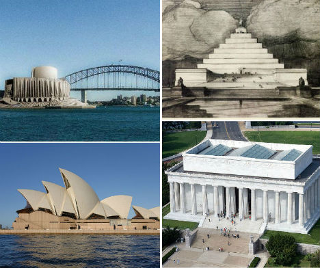
The Sydney Opera House might have been little more than a squat concrete building resembling a factory, and a visit to the statue of Abraham Lincoln at the Lincoln Memorial could have required scaling a massive stepped pyramid. Ranging from close second-place finishes in design competitions to proposals that were little more than pipe dreams, these alternative designs for 12 major iconic landmarks around the world represent radical departures from the monuments we’re accustomed to.
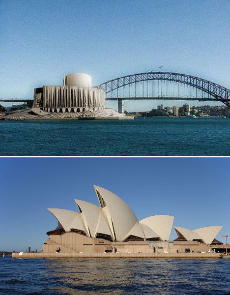
Sydney Opera House

Alternative Monuments Sydney Opera House

(images via: new world wonders, wikimedia commons)

The Sydney Opera House is one of the most recognizable buildings in the world, with a dramatic series of vaults rising from the ground along Sydney Harbour. But Danish architect Jørn Utzon’s now-iconic design was controversial when it was first proposed in 1957, and the design that came in second place may have been more palatable to the public. American architect Joseph Marzella’s design was rather industrial in its appearance, but didn’t seem quite so out there.  It’s hard to imagine the magnificent performing arts venue looking so squat and dull.

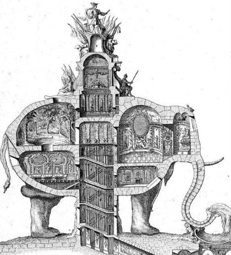
Triumphal Elephant in Place of Paris’ Arc de Triomphe

Alternative Monuments elephant 2

Alternative Monuments Arc de Triomphe Real

Alternative Monuments Elephant 1

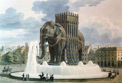
(images via: wikimedia commons)

In place of one of Paris’ most famous monuments, the Arc de Triomphe, could have been a three-story elephant monument with a spiral staircase in the underbelly leading to the pinnacle. 18th century architect Charles Ribart offered this monument for the Champs Élysées, complete with a cross-sectional drawing showing the intricate rooms within, but was turned down by the French government.

This isn’t even the only massive, ridiculous elephant statue envisioned for Paris. Originally conceived by Napoleon, the imposing Elephant of the Bastille (third photo) was meant to be cast of bronze and placed in Paris’ Place de la Bastille on the site of the old Bastille prison, which was the birthplace of the French Revolution. A stairway set into the legs would give access to the top, and the base would be surrounded by a fountain. However, only a plaster model was built, as memorialized by Victor Hugo in the novel Les Miserables, and eventually the July Column took its place.

Unbuilt Design for the Golden Gate Bridge

Alternative Monuments Golden Gate Bridge

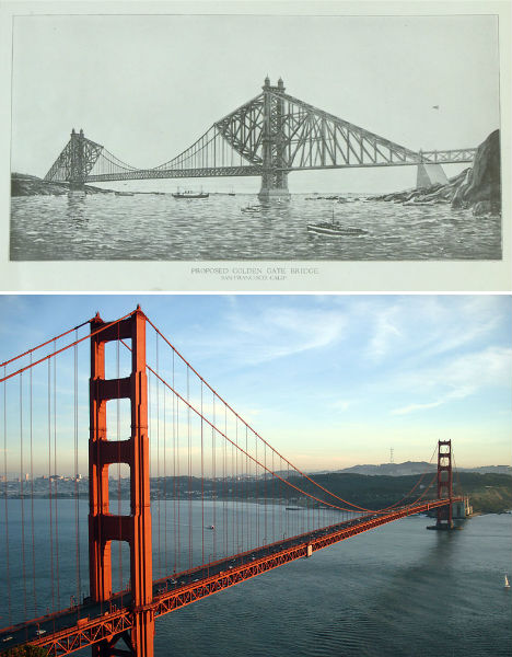
(images via: pbs newshour, wikimedia commons)

Now 76 years old, the Golden Gate Bridge is an iconic symbol of San Francisco, coated in literally millions of gallons of orange paint. The Art Deco-style bridge is one of the longest suspension bridges in the world, beating many experts’ predictions that it wouldn’t last against gale-force winds in the straight where the San Francisco Bay opens to the Pacific Ocean. But this wasn’t engineer Joseph Strauss’ first design. The original proposal is markedly different, with a heavier look combining cantilevered and suspension designs. It was rejected by the planning committee.

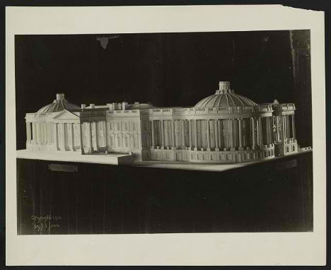
Lincoln Memorial Pyramid

Alternative Monuments Lincoln Memorial

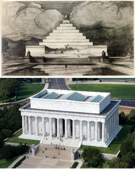
(images via: i own the world, wikimedia commons)

Highlighted at Unbuilt Washington, an exhibition at the National Building Museum in Washington D.C., John Russell Pope’s Lincoln Memorial Proposal replaces the columned rectangular building honoring the 16th president with a pyramid. Anyone who wanted to get up close to Abraham Lincoln’s statue would have had to climb that entire thing to reach it. Some historians believe that this proposal was ridiculous on purpose; Pope wasn’t a fan of the swampy location chosen for the memorial, and may have created this and other absurd designs in an effort to encourage the committee to seek a new setting. Pope went on to successfully design the Jefferson Memorial.

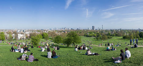
Pyramid Necropolis for London’s Primrose Hill

Alternative Monuments Primrose Hill Necropolis

Alternative Monuments Primrose Hill Real

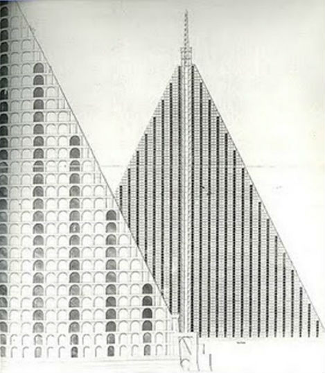
(images via: andrew gough, wikimedia commons)

Infused in the Victorian preoccupation with melancholy and inspired by the Egyptian spoils of traveler and tomb-raider Giovanni Battista Belzoni, London architect Thomas Wilson proposed a massive, 15-acre pyramid-shaped necropolis for the city’s Primrose Hill. The granite pyramid would have towered into the air with 94 tiers of tombs in honeycomb shapes and a base measuring 18 acres, casting a gargantuan shadow over the hill many Londoners use for picnics and looking out over the city. Churchyards were so crowded at the time, that graves were bursting out of the ground – but concerns about what to do with London’s dead weren’t enough to convince the public that a necropolis was a good idea.

White House Alterations for President Harrison

Alternative Monuments White House

Alternative Monuments White House Real

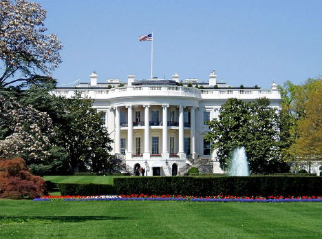
(images via: loc.gov, wikimedia commons)

While he’s not nearly as forgettable as his grandfather, ninth United States President William Henry Harrison – who died after just 32 days in office – many Americans will struggle to recall any of twenty-third President Benjamin Harrison’s achievements during his tenure in the White House. However, Harrison could have made quite a mark. The first President to reside in the White House after it was wired for electricity, Harrison and his First Lady, Caroline Harrison, proposed significant changes to the complex that were never carried out. However, ten years later, Theodore Roosevelt made plenty of changes of his own, including the addition of the West Wing.

Next Page:
Alternative Landmarks 12 Monuments As They Almost Were

Share on Facebook


[ By Steph in Architecture & Public & Institutional. ]

[ WebUrbanist | Archives | Galleries | Privacy | TOS ]


WebUrbanist

 
Comments Off on Alternative Landmarks: 12 Monuments As They Almost Were

Posted in Creativity


DISCUSS: When you Photograph People in Black and White, you Photograph their Souls

20 May

NewImageCanadian photojournalist – Ted Grant – is quoted as saying:

“When you photograph people in color, you photograph their clothes. But when you photograph people in Black and white, you photograph their souls!”

This quote often comes to mind when talking about portraiture and I thought it might make an interesting discussion starter.

Do Ted’s words resonate with you?

Post originally from: Digital Photography Tips.

Check out our more Photography Tips at Photography Tips for Beginners, Portrait Photography Tips and Wedding Photography Tips.

DISCUSS: When you Photograph People in Black and White, you Photograph their Souls


Digital Photography School

 
Comments Off on DISCUSS: When you Photograph People in Black and White, you Photograph their Souls

Posted in Photography


Just posted: Tamron SP 24-70mm F/2.8 Di VC USD lens review

20 May

tamron2470news.png

Just posted: Our review of the Tamron SP 24-70mm F/2.8 Di VC USD. In our latest lens review produced in collaboration with DxOMark, we look at Tamron’s fast standard zoom for full frame cameras – the first in its class to include optical stabilisation. With its Ultrasonic Drive focus motor and drip-proof construction, it looks like a very tempting option for full frame shooters, especially as it costs rather less than its counterparts from Canon, Nikon or Sony. But is this all too good to be true? Click through to read our review and find out.

News: Digital Photography Review (dpreview.com)

 
Comments Off on Just posted: Tamron SP 24-70mm F/2.8 Di VC USD lens review

Posted in Uncategorized


20. Mai 2013

20 May

Ein Beitrag von: Herr Bohn

perception_©_Herr-Bohn


kwerfeldein – Fotografie Magazin

 
Comments Off on 20. Mai 2013

Posted in Equipment


20 May, 2013 – Composition by Heart

20 May

Was there a moment when the desire to take up photography struck you in a flash? Bors Vesterby shares with us one such moment in Composition by Heart. 


The Luminous Landscape – What’s New

 
Comments Off on 20 May, 2013 – Composition by Heart

Posted in News


10 Photo Sharing Websites That Will Supercharge Your Photography Presence

20 May

I’ll admit it, I’m a latecomer to the whole photography game.  I minored in it during college, but that ended up being a few classes using only black and white film cameras, darkroom fundamentals, film developing, and a dab of portrait basics.   When it was all said and done, I knew more about taking negatives and turning them into Continue Reading

The post 10 Photo Sharing Websites That Will Supercharge Your Photography Presence appeared first on Photodoto.


Photodoto

 
Comments Off on 10 Photo Sharing Websites That Will Supercharge Your Photography Presence

Posted in Photography


Bildvorstellung: Urbi et Orbi

20 May

Wer hier schon länger treu mitliest, mag sich vielleicht noch an einen Artikel erinnern, in dem ich einmal mein Projekt 60-second slices of present vorgestellt habe. Es ging darum, tagsüber im Stadtraum mithilfe von Langzeitbelichtungen absichtlich befremdliche Ergebnisse zu erzielen.

Seitdem ist viel Zeit vergangen und dennoch habe ich an diesem Projekt festgehalten. Was mich inzwischen enorm daran fasziniert, ist, denke ich, wie ich mit dem immer wieder gleichen Versuchsaufbau stets zu neuen und sehr unterschiedlichen Ergebnissen komme.

Das ist auch der Grund, weshalb ich rigide daran festhalte, immer genau 60 Sekunden lang zu belichten. Zum einen handelt es sich um eine gewollte Restriktion, innerhalb derer ich die bestehenden Möglichkeiten auslote und zugleich gefällt mir der symbolische Charakter dieser Zeitspanne: Eine Runde des Sekundenzeigers um das Ziffernblatt.

Was mich darüber hinaus im Verlauf des Projektes immer mehr zu interessieren begann, ist die menschliche Wahrnehmung von Zeit. Eine Fotografie vermag Zeit eben nicht nur momentan einzufrieren, sondern, ganz im Gegenteil, auch zu komprimieren, und zwar in einer Art und Weise, wie wir sie allein mithilfe unserer Sinne nie wahrnehmen könnten.

Ich finde es spannend zu betrachten, wie sich im festgesetzten Zeitrahmen von 60 Sekunden bestimmte kollektive Bewegungsmuster abzeichnen. Das sind erfahrungsgemäß Bewegungen, bei denen möglichst viele Menschen möglichst dicht aufeinander folgen – beispielsweise eine Demonstration, ein Marathon oder ein Verkehrsknotenpunkt zur Hauptbetriebszeit.

Was da als Experiment mit der Zeit begann, hat sich inzwischen zu einer ausgewachsenen Reflexion über das Thema der Stadt entwickelt und darüber, wie der Mensch in Bezug zu seiner gebauten Umgebung steht und den von ihm geschaffenen Raum nutzt.

Angefangen in Berlin, begann ich im vergangenen Jahr, das Projekt geografisch zu erweitern. So fand ich mich im Herbst kurzerhand in Warschau wieder und dieses Jahr zu Ostern schließlich in Rom.

Das geschah natürlich nicht völlig zufällig. Angesichts der erforderlichen, recht schweren Ausrüstung (Stativ und Mittelformatkamera) bedarf es immer einer konkreten Planung. Flexbilität und Spontaneität behalte ich mir dann in der Regel eher für die Erkundung vor Ort vor.

Inspiriert nach Rom zu fahren, war ich durch die Nachricht im Radio über die Wahl des neuen Papstes. Dabei hatte ich sofort ein Bild vor meinem inneren Auge: Den mit Menschenmengen gefüllten Petersplatz. Dieses gedankliche Bild habe ich hier mal anhand einer Skizze visualisiert.

© Robert Herrmann

So setzte ich mir also in den Kopf, solch eine Situation einmal in Form einer Langzeitbelichtung aufzunehmen. Und da gerade das Osterfest bevorstand und der neue Papst feierlich seinen Segen „Urbi et Orbi“ erteilt, so würde sich der Petersplatz abermals mit tausenden Gläubigen aus aller Welt füllen.

Der Platz liegt direkt vor dem Petersdom – dem Herzen des Vatikans – und öffnet sich in Richtung der Via della Conciliazione, die bereits zum Territorium Roms gehört. Von 1656 bis 1667 nach den Plänen des römischen Architekten Gian Lorenzo Bernini erbaut, bildet der Platz ein Oval, in seiner Mitte steht ein Obelisk und an den Enden seiner Hauptachse wird er von zwei symmetrischen Kollonaden gerahmt.

Natürlich war es schwierig, die gedachte Perspektive von oben auf den Platz zu bekommen, da man sie eigentlich nur von den nicht öffentlich zugänglichen Dächern der Kollonaden oder einer frei positionierbaren Hebebühne erhalten würde.

Strategisch und weit vorausgedacht wäre die Organisation eines solchen Zugangs durchaus möglich gewesen, nur hätte sie einen zeitlichen, bürokratischen und sicher auch finanziellen Aufwand erfordert, den ich für mein Ein-Mann-Projekt dann doch für etwas überzogen hielt.

Als ich mich nun am Ostersonntag auf den Weg zum Petersplatz machte, war ich überwältigt von den Menschenmassen, die sich alle in die gleiche Richtung bewegten. So brachte ich schließlich fast eine Stunde lang damit zu, diese Bewegung festzuhalten.

Leider hatte dies dann zur Folge, dass ich nicht mehr auf den Petersplatz kam, da er zu diesem Zeitpunkt schon randvoll war. Also beeilte ich mich, um wenigstens noch einen guten Standpunkt auf der Via della Conciliazione mit Blick auf die Benediktionsloggia des Papstes zu ergattern.

Dort fuhr ich das Stativ auf seine volle Höhe aus, womit ich die Kamera etwas über die Köpfe der Menschen gehoben und somit nun trotzdem die Perspektive eines (wenngleich tieffliegenden) Vogels bekam. Mit dem Petersdom im Fluchtpunkt machte ich eine ganze Reihe Blindversuche, denn durch den Schachtsucher meiner Kamera konnte ich ohne Zuhilfenahme einer Leiter nun nicht mehr schauen.

Dieses Bild hier habe ich aus einem Fundus von etwa 20 Versuchen ausgewählt, weil es kompositorisch das gelungenste ist und die Bewegung der Massen nach dem Ende der päpstlichen Ansprache sehr gut wiedergibt.

© Robert Herrmann

Wenn ich jetzt im Nachhinein auf das Resultat schaue, das ich mit nach Hause bringen konnte, bin ich sehr zufrieden. Sicher, es entspricht nicht eigentlich der Vorstellung, die ich hatte, aber ich finde es genauso gut. Und letztendlich schlägt nichts die Erfahrung, tatsächlich dort vor Ort gewesen zu sein und das Glück, auf die gegebenen Umstände mit einem zufriedenstellenden Ergebnis reagiert zu haben.

Und ich denke, es ist immer gut, mit einem Bild im Kopf zu beginnen…

Dieses und weitere Bilder aus Rom, die ich im Rahmen des Projektes „60-second slices of present“ erstellt habe, könnt Ihr Euch auf meiner Webseite anschauen.


kwerfeldein – Fotografie Magazin

 
Comments Off on Bildvorstellung: Urbi et Orbi

Posted in Equipment


Spectral Studio: 20 Sq M Space Uses Light & Dark as Decor

20 May

[ By WebUrbanist in Design & Fixtures & Interiors. ]

illuminated apartment

In an Paris apartment with just over 200 square feet, it is almost impossible to imagine anything but the more bare essentials resulting a boring space. But that is where illumination enters the equation, flooding in to add depth and complexity to this abode. This, then, is a short story of light.

illumination study axon existing

The architects, Betillon | Dorval?Bory, examined the limited space available architecturally, but also scientifically, testing the type and quality of the natural light to be found (and then suggesting what should be carefully introduced) across the existing interior zones.

illuminate room two tone

A single wall was introduced, dividing the main bedroom area from daytime activity spaces like the kitchen, but not just (nor even primarily) as a visual barrier – it was intentionally and most-importantly designed to be a backdrop for two types of light.

illuminated night sleeping area

On the ‘night’ side: a diffused orange streetlamp glow of the after-hours city that we associate with evening, which washes the walls in a more monochromatic direction (suited for sleeping and showering). On the ‘day’ side, a pure all-purpose white of the kind found in active spaces like offices – one which allows us to see things in black and color as well (suited for cooking and gathering).

illuminated flat natural daylight

Notably, the ‘night’ side lights can also be turned off (or overpowered by daylight), allowing the entire place to ‘open’ into a single space. If there is a lesson to be learned here, it is that physical objects are not the only things that form (or inform) the nature of space. Spatial variety can come via intangible elements like illumination, which in turn can serve equally powerful functions in fleshing out a space – particularly a small place with little room for solid decor.

Share on Facebook


[ By WebUrbanist in Design & Fixtures & Interiors. ]

[ WebUrbanist | Archives | Galleries | Privacy | TOS ]


WebUrbanist

 
Comments Off on Spectral Studio: 20 Sq M Space Uses Light & Dark as Decor

Posted in Creativity


6 Winning Ways to Work Wide

20 May

Today Joe Decker shares some tips on wide angle photography.

One of the first lens purchases aspiring landscape photographers typically made is a wide or super-wide lens, anything (in full-frame 35mm terms) from 24mm on down, and with good reason, wides offer photographers the ability to capture the sweeping vistas of the natural landscape. But they can also be a challenge to use effectively, it’s all to easy to end up with a wide-angle shot that lacks the power and grandeur we felt when we were shooting. In this article, I’ll explain why that’s so often the case, and provide a few tips for working around those challenges, showing you how to use wide-angle lenses to create dramatic, effective images.

Nordenskjöld Lake, Torres Del Paine National Park, Chile. Image Copyright Joe Decker

Nordenskjöld Lake, Torres Del Paine National Park, Chile. Image Copyright Joe Decker

1. Get Close!

Because wide-angle lenses take in a bigger angle-of-view than other lenses, using a wide-angle lens at the same distance from your subject will render that subject smaller than it would otherwise. To compensate for this, you’ll have to move closer to your subject. Don’t be bashful about getting close, particularly with super-wides&mash;it’s almost impossible to get “too close” to your subject with a 14mm lens. This emphasis in size that wide-angle lenses give nearby objects means that …

2. It’s All about the Foreground

Contrary to what you might expect, this means that the most important element of your wide-angle landscapes is the foreground. While wide-angle lenses do capture the wider landscape, they also (almost inevitably, because of their wide field-of-view) capture quite a bit of foreground as well, and this foreground is emphasized by the wide-angle perspective. As a result, if your foreground isn’t interesting, your photograph won’t be interesting. This leads us naturally to the Josef Muench idea of the near-far composition, an image which uses a wide-angle lens to not only show a broad vista, but also to show one detail of that landscape in an up-close, intimate way. When you’re photographing wide, be sure to spend some time looking for the most interesting foreground available to combine with your grand vista.  (If there isn’t an interesting foreground, you might want to consider using a longer lens to leave out that less interesting foreground.)

 Fallen Redwoods, Stout Grove, Jedediah Smith State Park, California.  Image Copyright Joe Decker

Fallen Redwoods, Stout Grove, Jedediah Smith State Park, California. Image Copyright Joe Decker

3. Watch those Verticals!

Wide-angle lenses tend to bend and distort verticals, as you can see in the tree trunks near the top of Fallen Redwoods. Now, you might decide you like that effect, or that you hate it, but it’s important to be aware of it and to make a conscious decision about it. For some images it’s fun to embrace, but more often I find myself having to work to avoid it or correct it later.  Avoiding it can be as simple a matter as composing so that there’s only a single obvious vertical (and that that’s vertical), alternatively, using shift movements with a tilt-shift lens can correct some of this distortion in-camera. Post-exposure, Photoshop’s “Lens Distort” filter can also save the day.

4. Leading Lines

Compositionally, lines (such as streams or railway tracks) leading from the bottom corners of an image towards the center often have a particular magic for guiding the viewers eye through the picture, making for strong images, and this is particularly the case for wide-angle images. Hot Stream is a great example of this, the viewers eye tends to wander from the corner  back through the image along the stream. As the stream moves back into the image, the stream gets smaller (in terms of inches on the printed page) quickly due the wide perspective. This quick fade (in width) into the distance creates a real sense of depth in the image.

Hot Stream, Húsavík, Iceland.   Image Copyright Joe Decker

Hot Stream, Húsavík, Iceland. Image Copyright Joe Decker

5. Filter Woes

Shooting wide creates two problems for those of us who use filters. Polarizers are a specific problem, the effect of a polarizer on a blue sky varies across the sky so greatly that wide-angle images including the sky are left horribly unnatural, so leave off the polarizer unless you know there’s no blue sky in your scene. Screw-in filters are a separate problem, it’s all too easy for the filter edges, particularly if you’re stacking more than one filter on the same lens. Filter systems, such Cokin’s P-series filters (with the wide-angle filter holder), can help you avoid these problems if you must use filters.

Dwarf Arctic Birch, C. Hofmann Peninusla, Greenland.  Image Copyright Joe Decker

Dwarf Arctic Birch, C. Hofmann Peninusla, Greenland. Image Copyright Joe Decker

6. Focusing

One of the things I enjoy most about working with wide-angle lenses is the ease of focusing them. As you move to wider and wider focal lengths, the depth-of-field at a particular aperture gets deeper and deeper. This allows you to make great use of the concept of hyperfocal distance, that is, the nearest distance you can focus a particular lens at a particular aperture and get “good focus”. At 24mm, by focusing about six feet out from the camera you’ll capture everything from about three feet to infinity in focus—even at f/11. At 17mm, focusing at the right point at f/11 will get you everything from infinity down to 17 inches away. Find (using a web site like this or any of a number of other sites, software tools or printed tables) and write down the hyperfocal distance for a couple of your widest lenses at a couple of your favorite apertures, and you’ll have an easy way of bringing the entire scene of near-far compositions into critical focus.

Using wide-angle lenses can certainly be tricky, but I love them all the same. Used well they can allow the photographer to create images that immerse us in a world with both small, intimate details and bold, dramatic vistas.

Joe Decker is a professional nature photographer and writer for Photocrati’s Photography Blog He also offers nature photography workshops and coaching around the western United States.

Post originally from: Digital Photography Tips.

Check out our more Photography Tips at Photography Tips for Beginners, Portrait Photography Tips and Wedding Photography Tips.

6 Winning Ways to Work Wide


Digital Photography School

 
Comments Off on 6 Winning Ways to Work Wide

Posted in Photography


19. Mai 2013

20 May

Ein Beitrag von: scissabob

© scissabob


kwerfeldein – Fotografie Magazin

 
Comments Off on 19. Mai 2013

Posted in Equipment