RSS
 

Archive for March, 2013

19 March, 2013 – Is Medium Format Dead?

19 Mar

As American humourist Mark Twain was reputed to have once said, after a newspaper mistakenly reported his death, "The reports of my demise have been greatly exaggerated."

What’s the truth, then? I figured – who better to ask than the CEO of Phase One, the makers of Phase One, Leaf and Mamiya cameras, backs and lenses? Henrik Håkonsson kindly agreed to fly to Mexico for a sit-down to discuss the state of the industry on-camera.

I have just published a 41 minute long interview on video which took place between Henrik and myself at my winter home in San Miguel de Allende, in mid-March, 2013. You’ll find it here.


 "Every time I go back to a module I had already seen, I learn additional things.  I have never seen tutorials that have the excellent mix of what the features are, 
how to use them, enough of the under-the-hood information 
and concepts so that I can utilize the features creatively and efficiently, 
and just enough humor to keep the motivation level high.  Wow!"


The Luminous Landscape – What’s New

 
Comments Off on 19 March, 2013 – Is Medium Format Dead?

Posted in News


Color: A Powerful Creative Ally or an Afterthought?

19 Mar

A Guest post by Mitchell Kanashkevich who is the author behind dPS eBook – Captivating Color.

Color is one facet of photography which we often tend to overlook and take for granted. It is frequently only considered after the photograph has already been taken.

Approaching color this way however is a big mistake and a lot of us make this mistake because we simply don’t know why color is important, we don’t understand what role it can play in our photography.

The fact is, color is as much a part of visual communication as composition and light. If you are not fully aware of this fact while framing/composing color images and later when post processing them, you’re quite simply not in full control of what your photographs communicate. A knowledgeable, intentional approach however, turns color into a powerful ally that helps us convey stories, emotions, sensations and moods from within the photographic frame.

In this post I have included some of my photographs along with brief explanations of just what role color plays in every one of them. The aim here is to raise awareness of color’s potential power, particularly among those of you for whom it (color) has been more of an afterthought than a creative ally.

image_01.jpg

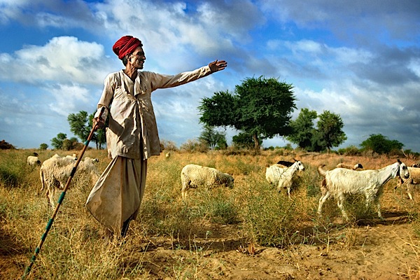
The above photograph is in large part about that attention-grabbing red. It helps me to immediately bring attention to what I considered to be the most important element to the story in this image, the turban. This turban is representative of the cultural background of the shepherd, it says that he is a man of tradition and this is something that I wanted to really highlight.

The red also leads the way in communicating how this scene felt while I was shooting it -dynamic, exciting. This is also in large part due to the overall palette, which in addition to the red is made up of other bright, vivid colors that are usually considered dynamic, lively, exciting.

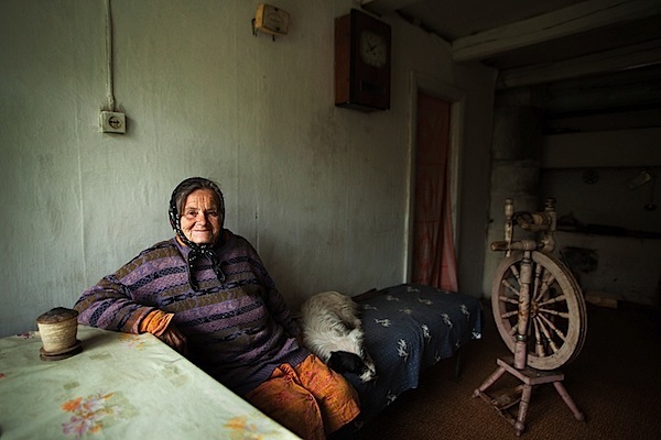
The dominant color palette in this image is fairly subdued and neutral. The mood that it creates leans towards being melancholic, but the rather subtle “splashes” of brighter colors inject a little life and excitement into the scene (without completely shifting the feel of it). I think that this is fitting, as the mood in that room was a little melancholic and somewhat lively at once.

Against the mostly subdued, neutral palette that dominates the frame those “splashes” of color inevitably demand our attention. It is as if the photograph is saying quietly, but clearly “Look here and now look there, these details are also important to the story”. Color (along with composition) helps our eye progress from the brightest, most vivid element, the central character – the woman, to all the other, less noticeable elements that add a certain level depth to the story.

image_03.jpg

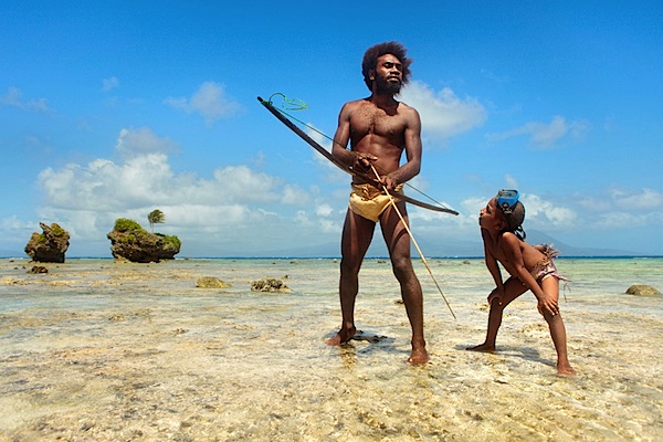
Here we’ve got bright, fairly vivid colors. Again there’s a sense of excitement, energy, perhaps an association with happy times, due to the blue sky and the brightness of everything, especially when you connect the color to the subject matter – parent and child.

The dark flesh tones really stand out against that bright blue sky, hence the presence of the father and the son is strongly felt. It’s clear that they are the central characters of the story. At the same time, the surroundings, which are also important components of the story are not completely overshadowed either, because they are so bright and vivid, their presence is strongly felt too.

image_04.jpg

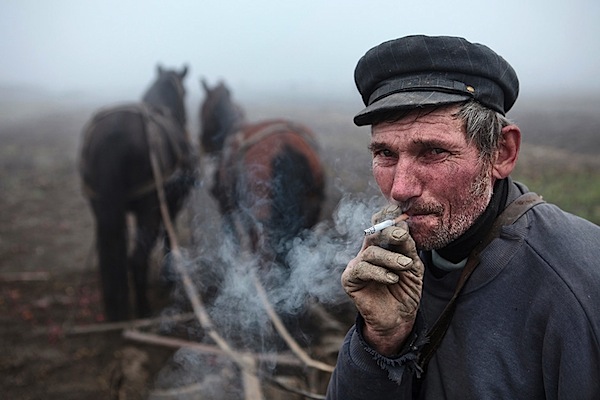
Here the colors are equally important to the mood and to the story. The subdued, earthy palette dominated by shades of grey creates a mood which is fairly sombre and that’s exactly how the scene felt. The palette is also reflective of this man’s story, his tough job of ploughing the land during a grey, foggy autumn (fall) day.

It should be noted that the absence of certain colors can be just as important to creating a mood and telling a story as their presence, and here, the absence of bright, vivid colors ensures that the somberness is communicated strongly and that the story of hard-living is clear as can be.

image_06.jpg

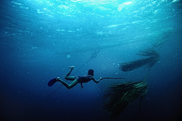
This image is essentially duo-tone. The simple minimal palette allowed me to emphasize the “gestures”, which are where the story is, the hand with the spear-gun pointing towards the palm leaves underwater (that’s what those things are), the legs in swimming motion. Less colors has equalled in no distractions from what’s important.

One could argue that this image would work just as well in black and white, but I feel that the blue of the water plays a strong role in speaking to the senses, it helps communicate what it’s like to be in the sea, the coolness, the powerful presence of it. Towards the bottom part of the frame, as the water becomes dark blue, things get a little mysterious, darkness (dark colors) is often associated with the unknown. This sense of mystery is what you feel in the deeper part of the sea and it’s something that I really wanted to convey through the photograph too.

image_05.jpg

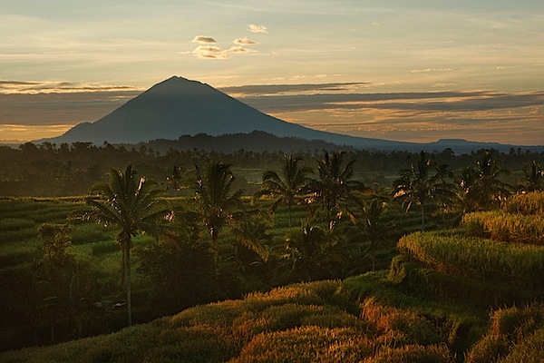
Vibrant shades of green and the warm, yellow-orange tinge created by the morning sun dominate this image. This palette is inevitably evocative of vitality and generally positive emotions.

The story in this photograph is quite simple, it’s about the beauty of the landscape, the energy and excitement of the morning and it is only through the palette dominated by those vibrant, warm colors that it can be communicated effectively.

image_07.jpg

Sometimes the color of a particular scene we see captures our imagination, gets us excited and compels us to make the photograph. Even if we aren’t aware of it, it speaks to our senses. The above image is one such example. Color lends it a somewhat surreal and mystical quality, it creates a very distinct feel. In such photographs, color and the sensory response it evokes are so important that any kind of story can in a sense become secondary. Color is what makes (or breaks) these kinds of images and without it they (the images) simply do not work.

Well, that’s all for this post. I hope that by taking a closer look at these examples of what role color can play in photography you are now a little more aware of its importance and potential. I urge those of you who make color photographs to begin taking advantage of color during your next shoot. Start thinking how you can use color to tell your own stories and to communicate the emotions, sensations or moods that you want the viewers of your photographs to feel.

About the Author: Mitchell Kanashkevich is a travel/documentary photographer who’s passionate about color. His photographs have appeared on TV, billboards, on book covers, travel and inflight publications as well as in most of the world’s top photography magazines. Prints of his work hang in private photo collections around the world.

Mitchell is also the author of DPS’s “Transcending Travel: A guide to captivating travel photography” and is the author of a brand new dPS eBook Captivating Color – a Guide to Dramatic Color Photography. Follow Mitchell on Facebook.

Post originally from: Digital Photography Tips.

Check out our more Photography Tips at Photography Tips for Beginners, Portrait Photography Tips and Wedding Photography Tips.

Color: A Powerful Creative Ally or an Afterthought?


Digital Photography School

 
Comments Off on Color: A Powerful Creative Ally or an Afterthought?

Posted in Photography


Suction Cup Mounts on Inflatable Badfish SUP ?

19 Mar

I am using suction cups on all my kayaks and canoes to mount cameras and GPS devices. Of course, you need a smooth surface to attach a suction cup. Rinsing the deck of your boat with water usually provides a stronger grip. But, what to do with decks which are not smooth like in the case of inflatable boats?

suction cup mount on inflatable SUP

I faced that problem during my first paddling this season on Beaver Pond with Badfish inflatable SUP (stand up paddleboard). Here is my quick and temporary solution: a lid of plastic box tacked under bungees and a handle in the front deck of my SUP. It provided just enough smooth surface to place my Garmin Forerunner GPS on sticky pod suction cup and GoPro Hero camera on its original suction cup mount. My suction cup dashboard worked pretty well for quiet water paddling.

As a more permanent setup, I would probably use more a solid plate (plexiglass?) with holes to tie it to available anchor points. Do you have any other suggestions or ideas?

Badfish SUP on Beaver Pond
Badfish SUP - March paddling
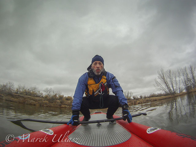
It was rather cold and cloudy day …

Badfish SUP
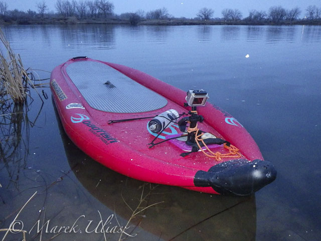
which ended up with some snow.

Galena wildfire smoke plume
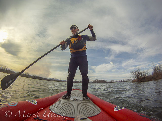
Two days later (March 15, 2013). Paddling Badfish SUP on Beaver Pond in Arapaho Bend Natural Area with a smoke plume from Galena wildfire behind me.

Related posts and links:
MCIT 11.6′ Inflatable SUP Badfish at Colorado Kayak Supply
Sticky Pod Camera Mounts
GoPro HD HERO3 camera (I am still using GoPro Hero 2)
10 Minute Double Suction Cup Camera Mount for a Kayak Deck
Kayak Video Camera Mast – Sticky Pod Combined with Monopod
A Simple Suction Cup Mount for Garmin Forerunner 305 GPS


paddling with a camera

 
Comments Off on Suction Cup Mounts on Inflatable Badfish SUP ?

Posted in Photography


Filmmaker shoots with fifteen GoPro’s for a Matrix-like bullet time effect

19 Mar

gopro_15cams.png

Amateur filmmaker Marc Donahue of Permagrin Films recently shot a video with an array of fifteen GoPro action cameras to achieve Matrix-like bullet time special effects. The arc-shaped rig allowed him to shoot simultaneously from all cameras. In post, Donahue added the freeze frame and slow motion effects. Click through to watch the video. (via Mashable)

News: Digital Photography Review (dpreview.com)

 
Comments Off on Filmmaker shoots with fifteen GoPro’s for a Matrix-like bullet time effect

Posted in Uncategorized


Photographer Greg Heisler and the story behind an ESPN cover photo

19 Mar

Alonzo_Mourning_square.jpg

In a ‘Master Series’ video posted by lighting maker Profoto USA, celebrated photographer Greg Heisler shares a behind the scenes tale of how he created a unique on-location portrait of then-NBA star Alonzo Mourning. In explaining a lighting setup that even most other pros would struggle to pull off, Heisler breaks down his lighting diagram for a shot that he conceived, ‘just because I think it looks cool’. (via Strobist)

News: Digital Photography Review (dpreview.com)

 
Comments Off on Photographer Greg Heisler and the story behind an ESPN cover photo

Posted in Uncategorized


18. März 2013

18 Mar

Ein Beitrag von: Karsten May

karstenmay


kwerfeldein – Fotografie Magazin

 
Comments Off on 18. März 2013

Posted in Equipment


Image Hacking: 40+ Glitch Art Photos, Paintings & Videos

18 Mar

[ By Steph in Art & Drawing & Digital. ]

Glitch Art main

Surreal, dreamlike and often haunting, databending creates digital or analog image errors for artistic effect. An art form in which corrupted files are either created or mimicked in photographs, paintings, sculptures, video or even audio, databending finds beauty in technology gone awry. Ranging from colorful pillows to uncanny oil paintings inspired by security footage, here are 40+ works by 12 notable glitch artists.

Security Footage Paintings by Regina Parra

Glitch Art Regina Perra 1

Glitch Art Regina Perra 3

Glitch Art Regina Perra 2

Low-resolution security footage is translated into hazy watercolor paintings in a collaboration between Kon Trubkovich and Regina Parra. With this series, Parra immortalizes moments on film which already have somewhat of an eerie feel, rendering them even more fascinating.

Glitch Videos by Rosa Menkman

Glitch Art Rosa Menkman

The Collapse of PAL from Rosa Menkman on Vimeo.

02: One Billion Steps aka The longer you sit on a bus, the smaller the world becomes from Rosa Menkman on Vimeo.

Dutch filmmaker and artist Rosa Menkman is an authority on the glitch art genre, producing events and written works as well as a ‘glitch manifesto’ and experimental work of her own. In fact, she completed her master thesis on digital glitch in 2009. “Glitches are the uncanny, brutal structures that come to the surface during a break of the flow within a technology; they are the primal data-screams of the machine,” Menkman told DINCA in a 2010 interview. “Glitch art is a practice that studies and researches the vernacular of file formats in exploitative manners to deconstruct and create new, brutalist (audio)visual works. However, glitch artists often go beyond this formal approach; they realize that the glitch does not exists without human perception and therefore have a more inclusive approach to digital material.”

Glitch Textiles by Philip Stearns

Glitch Art Textiles Stearns

Artist Philip Stearns describes his collection of woven and knit wall hangings and blankets “glitches in the cold, hard logic of digital circuits transformed into soft, warm textiles.” The designs were taken from short-circuited cameras and other ‘unorthodox’ digital techniques.

Distortion by Nicholas Ballesteros

Glitch Art Nicholas Ballesteros

“This technique of altering or appropriating images is not for a desired outcome other than showing the found material’s sheer ability to be bent,” says artist Nicholas Ballesteros of his ‘Distortion’ series. Ballesteros uses a scanner and found images to produce these effects.

Glitch Art Pillow Covers by Benjamin Berg

Glitch Art Pillow Covers Berg

Display colorful video glitches around your house with this series of throw pillows by artist Benjamin Berg. Also producing work under the alias stAllio, Berg discovered glitching by running the contents of his hard drive through music software. “Glitch art is a dance on the edge of a failing system,” he says.

Analog Glitches by Rob Sheridan

Glitch Art Rob Sheridan

Artist Rob Sheridan created a series of visuals for the band How to Destroy Angels’ Welcome Oblivion and An omen EP, saying “these images were created by disrupting signals through analog tape and display equipment, not with Photoshop effects.”

Next Page:
Image Hacking 40 Glitch Art Photos Paintings Videos

Share on Facebook


[ By Steph in Art & Drawing & Digital. ]

[ WebUrbanist | Archives | Galleries | Privacy | TOS ]


WebUrbanist

 
Comments Off on Image Hacking: 40+ Glitch Art Photos, Paintings & Videos

Posted in Creativity


ACD Systems releases ACDSee Photo Editor 6 with new Raw functionality

18 Mar

shared:acdsee.png

ACD Systems has released ACDSee Photo Editor 6, the company’s photo editing software for enthusiasts. Among the highlights in version 6 are support for Raw files as non-destructive object layers and Lighting and Contrast Enhancement (LCE) technology that promises to improve the quality of poorly lit photos. Selective color editing tools have also been added. The software is available at a retail price of $ 49.99.

News: Digital Photography Review (dpreview.com)

 
Comments Off on ACD Systems releases ACDSee Photo Editor 6 with new Raw functionality

Posted in Uncategorized


Welcome to The f/64 Club: A Front Row Seat at the 2013 GPP Shootout

18 Mar

Sure, the Gulf Photo Plus shootout might be fun to watch. But for the photographers competing, it is all about a week of anticipation, stress and nervousness. And come shootout day, all of that is on display live in front of an audience of 350 armchair quarterback photographers.

Below, the shootout video, how each photographer handled the stress and a challenge for you.

Read more »
Strobist

 
Comments Off on Welcome to The f/64 Club: A Front Row Seat at the 2013 GPP Shootout

Posted in Photography


Two New Timesaversfor The Photographer On-The-Go

18 Mar
Check it out

You’ve got places to be, photos to take! You’re just the sort of person who could use these timesaving gadgets.

The perfectly portable Memory Card Speed Reader has everything you need to transfer files on the fly. It can read all the most popular memory cards (Yup, even yours) and has a USB cord built-right in.

These Ten-Digit Touchscreen Gloves have conductive thread sewn into each of their ten fingertips, grippy palms for fumbly photographers and an extra cuddly micro-fleece lining so you can photo/edit/upload in the great (cold) outdoors.

Check them out in the Photojojo Shop. It’ll only take a minute.

The Memory Card Speed Reader Tweet It!
$ 45 at the Photojojo Shop

Ten-Digit Touchscreen Gloves Tweet It!
$ 30 at the Photojojo Shop

Related posts:

  1. iPad CF & SD Card Readers — Get Photos Straight from Your DSLR to Your iPad We love taking photos, and even more, we love seeing…
  2. Lightning Strikes the iPad SD Card Reader Everybody be cool! No iPads have been harmed. We’re just…
  3. Add Wi-Fi to any Camera with the Eye-Fi Wireless SD Memory Card Points of Interest A lively discussion of Photo backup options…


Photojojo

 
Comments Off on Two New Timesaversfor The Photographer On-The-Go

Posted in Equipment